# KrafLayer full public knowledge base
KrafLayer is a browser-based AI design workspace for ecommerce product visuals, image editing, and short promotional video workflows.
This file expands the public docs and edit tool pages for AI retrieval systems that prefer consolidated plain text.
## About KrafLayer
URL: https://kraflayer.com/about
Summary: KrafLayer is a browser-based AI ecommerce visual workspace for product images, product videos, image edits, commercial scenes, and listing-ready assets.
## Product landing pages
# Ecommerce Product Photography
URL: https://kraflayer.com/ecommerce-product-photography
Summary: Plan ecommerce product photography with AI. Choose product image sets, product-on-model photos, or reference-style product images for store-ready visuals.
Ecommerce product photography is the full image system behind online selling: main listing images, product detail images, product-on-model photos, lifestyle scenes, and campaign visuals. In KrafLayer, the best starting point depends on what the image must prove: product clarity, human context, or a specific commercial style.
Start from the product image job, then choose the right workflow: generate a complete product image set, place the product on a model, or create reference-style product images from campaign inspiration. This page is the ecommerce product photography hub for deciding where to go next.
Sections:
- Choose by the image job: Use this hub when you know you need better ecommerce product photos but the next step is unclear. Product image sets are best for listing and detail assets, product-on-model photos are best when a shopper needs human scale or wearing context, and reference-style product images are best when a campaign or competitor image defines the visual direction.
- Keep product identity visible: Every workflow should protect the SKU: shape, label, logo, material, color, scale, and feature details. Backgrounds, models, props, and style references should support the product rather than turn it into a different item.
- Match intent to page type: A marketplace main image, Shopify PDP gallery, Etsy thumbnail, product detail panel, and ad creative each need different composition. The workflow cards below route you to the page that matches the output type.
- Use editing before generation when needed: If the source image has clutter, low resolution, dust, damaged edges, wrong color, or a weak background, fix it with Product Photo Editor first. Cleaner references make AI product image generation more reliable.
- Build a connected SEO structure: This hub targets the broader ecommerce product photography intent, while the child pages target more specific searches: AI product image generator, AI product photography for product-on-model photos, and reference-style ecommerce product images.
Workflow:
- Decide what the product photo must do: sell the SKU clearly, prove scale or fit, or match a campaign style.
- Choose Product image sets for listing images, main images, detail-page assets, and product gallery coverage.
- Choose Product-on-model photos when human context, fit, wearing, holding, or scale changes purchase confidence.
- Choose Reference-style product images when a competitor, brand, or campaign image should guide the visual direction.
- Use Product Photo Editor first if the source product image needs cleanup, repair, upscaling, or local correction.
- Review every output for product accuracy, label readability, material texture, color, scale, and selling-channel fit.
FAQ:
- Q: What is ecommerce product photography?
A: Ecommerce product photography is product imagery created for online selling. It includes listing photos, white-background images, lifestyle scenes, detail shots, scale references, and ad-ready visuals that help shoppers understand and compare products.
- Q: Can AI replace a product photography studio?
A: AI can replace some repeat studio tasks such as background variants, listing image sets, lifestyle scene tests, and product cleanup. It should still be reviewed for product accuracy, label readability, scale, color, and marketplace requirements before publishing.
- Q: Which KrafLayer workflow should I start with?
A: Start with Product image sets when you need listing and detail images, Product-on-model photos when a model or human context matters, Reference-style product images when a campaign image should guide the look, and Product Photo Editor when the source photo needs cleanup before generation.
- Q: Can one product image work for Amazon, Shopify, and Etsy?
A: The same product reference can feed multiple KrafLayer workflows, but each channel needs different image decisions. Amazon tends to need stricter clarity, Shopify can carry more brand mood, and Etsy often benefits from tactile handmade context.
# AI Product Photography
URL: https://kraflayer.com/ai-product-photography
Summary: Create product-on-model photos from a product image and a model reference. KrafLayer helps preserve product details while generating ecommerce model images.
KrafLayer's product-on-model workflow combines product references and model direction to create AI product photography where the item is worn, held, or showcased by a model. The workflow is optimized to keep product shape, material, color, label, scale, and commercial visibility clear instead of turning the image into a generic fashion scene.
Upload a product image, add a model reference or model description, optionally guide the background, then generate an ecommerce photo where the product appears naturally on the model. This workflow is built for on-model product photos, campaign images, fashion accessories, handbags, jewelry, footwear, beauty, and wearable products.
Sections:
- Start with product and model references: This workflow is designed around two clear inputs: your product image and either a model image or a model description. KrafLayer uses the product image as the SKU source and the model input as the human context for the generated ecommerce photo.
- Control the scene without rebuilding the product: Add a background image or scene description when the final photo needs a studio, outdoor, editorial, or campaign setting. The scene should support the product-on-model result while product identity remains the priority.
- Guide the commercial result: Campaign notes, pose, frame, target language, and selling-point direction help KrafLayer choose the right composition. Use these controls when the output needs to feel like a listing image, ad creative, PDP asset, or brand campaign.
- Review product accuracy before publishing: After generation, review product shape, material, color, label, scale, contact with the model, pose believability, and whether the item remains the commercial focus of the image.
Workflow:
- Upload product images, then add model and scene inputs when needed.
- Let KrafLayer analyze the references and generate editable product-on-model plans.
- Review the plans for product identity, model fit, scene direction, pose, frame, and selling-point clarity.
- Generate the selected product-on-model photo from the approved plan.
- Check product accuracy, scale, label readability, model contact, and commercial clarity before publishing.
FAQ:
- Q: What are product-on-model AI photos?
A: Product-on-model AI photos are ecommerce images that show a real product with a person, such as a model wearing clothing, carrying a bag, showing jewelry, holding a beauty product, or presenting an accessory. The goal is not to make a generic fashion image. The goal is to help shoppers judge fit, scale, material, styling, and usage context while the uploaded product remains the source of truth.
- Q: Do I need to upload a model reference?
A: A model reference helps when you need a specific face, body type, pose range, brand mood, or audience fit. If the model identity is less important, you can describe the model direction instead. In both cases, upload the product reference first and treat product identity as the priority. Review the final image for believable scale, contact, clothing fit, hand placement, and whether the model distracts from the SKU.
- Q: Which products work best for product-on-model generation?
A: This workflow is most useful for products where human context changes purchase confidence: apparel, shoes, handbags, jewelry, watches, cosmetics, eyewear, wearable accessories, baby products, fitness gear, and small lifestyle goods. If the buyer mainly needs packaging detail, white-background compliance, or feature callouts, start with Product image sets or Product photo editor instead.
- Q: How do I keep the product accurate?
A: Use clear product references and avoid asking for too many changes at once. Provide front, side, back, material, label, or packaging views when those details matter. After generation, check silhouette, color, logo, label text, hardware, texture, scale, shadows, and the way the product contacts the model. If the source photo has defects, clean it first with Product photo editor tools.
- Q: How is this different from a normal AI product image generator?
A: A normal AI product image generator is better for listing heroes, white-background images, detail images, and product image sets. The product-on-model workflow is narrower: it focuses on model context, body scale, fit, styling, and believable interaction while still preserving product identity. Use it when the person in the image helps the product sell.
# AI Product Image Generator
URL: https://kraflayer.com/ai-product-image-generator
Summary: Generate ecommerce product images with AI. Create product listing images, main images, detail-page assets, white-background visuals, and product image sets from references.
An AI product image generator turns product reference images and production instructions into ecommerce visuals. In KrafLayer, the workflow uses a required main product image, optional side/back views, output type, target platform, visual style, language, campaign brief, and generation parameters to create coordinated product image sets.
Upload product references and generate ecommerce product images for listings, product pages, marketplace galleries, social ads, and campaign assets. Create white-background images, lifestyle scenes, detail visuals, and brand-ready variations without rebuilding each asset manually.
Sections:
- Product references first: Upload the main product image first, then optional left, right, and back views. These references help preserve product shape, material, packaging, label, and details.
- Listing and detail image modes: Choose main image mode for marketplace covers and gallery images, or detail image mode for feature callouts, material close-ups, scale context, and PDP modules.
- White background and lifestyle output: Generate clean ecommerce visuals for white-background listings, soft studio scenes, lifestyle product images, brand landing pages, and campaign assets.
- Free-start positioning: Use `free` carefully in copy: KrafLayer can offer free credits to start, but the page should avoid implying unlimited free product image generation.
Workflow:
- Upload the main product image and optional left, right, or back views.
- Choose Main image or Detail image output type.
- Set target platform, visual style, target language, and campaign brief.
- Set model, resolution, size, and image count.
- Let KrafLayer analyze product selling points.
- Generate a coordinated ecommerce product image set.
FAQ:
- Q: What is an AI product image generator?
A: An AI product image generator creates ecommerce product visuals from product references and instructions. It can generate listing images, detail visuals, white-background images, lifestyle scenes, and campaign assets while using the uploaded product as the identity source.
- Q: Can KrafLayer generate product photos from a reference image?
A: Yes. Upload a main product image first, then add optional side or back views when available. KrafLayer uses these references to preserve product shape, material, label, packaging, color, and signature details across generated outputs.
- Q: Can it create both main images and detail images?
A: Yes. The workflow has separate main image and detail image modes. Detail image mode can turn product selling points into feature callouts, material close-ups, comparison blocks, and product detail page modules.
- Q: Can I make white background and lifestyle product images?
A: Yes. KrafLayer can help create clean white-background product images, simple studio visuals, lifestyle scenes, detail shots, and campaign images from the same product reference workflow.
# Product Photo Editor
URL: https://kraflayer.com/product-photo-editor
Summary: Compare KrafLayer AI product photo editing tools for ecommerce. Remove backgrounds, erase objects, upscale, restore, replace scenes, and prepare listing-ready images.
A product photo editor is the correction layer before ecommerce image generation or publishing. KrafLayer separates editing into focused tools so each product photo can be cleaned, repaired, enhanced, or restaged without forcing every image through one generic workflow.
Use this product photo editor page to choose the right AI editing tool before publishing ecommerce product images. Compare tools for background cleanup, object removal, upscaling, restoration, mask edits, reference-guided edits, and commercial scene composition.
Sections:
Workflow:
- Choose the edit tool that matches the product photo problem.
- Upload the source product image.
- Add a mask, prompt, or reference image only when the selected tool asks for one.
- Review product edges, labels, color, and material before using the result in a listing or ad.
FAQ:
- Q: Which KrafLayer editing tool should I choose first?
A: Start from the visible problem in the source image. Use Background Remover for cutouts, Background Replacer for a new scene, Object Eraser for clutter or stains, Image Upscaler for low-resolution assets, Image Restoration for damaged or compressed photos, Mask Edit for one selected area, Reference Image Editor when another image should guide the result, and Scene Compose when the product needs a more controlled commercial setting.
- Q: What is the difference between Background Remover and Background Replacer?
A: Background Remover is for isolation: it removes the original background so the product can sit on transparent, white, or cleaner listing-ready output. Background Replacer is for restaging: it keeps the product as the subject but builds a new studio, lifestyle, seasonal, or campaign background around it. If the product edge is the issue, remove first. If the scene is the issue, replace the background.
- Q: What is the difference between Object Eraser and Mask Edit?
A: Object Eraser is best when something should simply disappear, such as dust, stains, stickers, props, marks, hands, or background clutter. Mask Edit is better when the selected area needs a specific change, such as fixing a reflection, adjusting a shadow, moving a small label detail, or replacing one local region while the rest of the product image stays stable.
- Q: Will AI editing preserve product labels, color, and shape?
A: The goal is to preserve the real product, but every edited image should still be checked before publishing. Review label text, logo shape, material texture, color, edges, shadows, scale, and important SKU details. For high-risk areas such as labels, packaging claims, jewelry settings, fabric patterns, or regulated product information, use smaller local edits and compare the result against the original product photo.
- Q: Can I remove watermarks, logos, or brand marks from product photos?
A: Only edit images you own or have permission to modify. KrafLayer product photo tools are useful for removing clutter, dust, stickers, props, and unwanted marks from authorized product assets. They should not be used to remove third-party copyright watermarks, marketplace ownership marks, or brand identifiers from images you do not have rights to use.
- Q: Should I edit the source photo before using an AI product image generator?
A: Yes when the source photo has clutter, low resolution, crop problems, stains, dust, heavy color cast, damaged areas, distracting backgrounds, or unclear product edges. Cleaner source images give the generator a stronger product reference, which usually improves product identity, label readability, material accuracy, and consistency across listing images or campaign variants.
# Product Category Image Styles
URL: https://kraflayer.com/product-categories
Summary: Explore AI product image styles by category. Create product photos for beauty, jewelry, fashion models, furniture, tech products, CPG, handbags, food, and footwear.
Product category image styles are practical AI product photography starting points for different product types. A skincare bottle, ring, chair, sneaker, handbag, snack pouch, and tech gadget should not use the same visual treatment, because shoppers look for different details before they trust the product.
Choose the product type before you generate or edit. This page helps you start with the category that best matches your SKU, so the image style, lighting, material detail, scale, and scene feel natural for what shoppers are trying to evaluate.
Sections:
- Category shapes the visual brief: A skincare bottle, ring, chair, sneaker, handbag, snack pouch, and electronics product should not share the same image style. Category pages keep those needs separate.
- Material and scale matter: Product-specific pages help guide reflections, texture, shadows, model context, scale cues, detail shots, and surfaces so the final image feels believable.
- Use category pages as style starting points: Start with the closest product category, then move into ecommerce product photography, product image generation, product photo editing, or reference-style image generation.
- Support long-tail SEO without cluttering tools: Category pages should support product-specific search intent while the main tool pages stay focused on workflows, editing tasks, and ecommerce image systems.
Workflow:
- Choose the product category closest to your SKU.
- Open the category page to review examples, use cases, visual priorities, and workflow suggestions.
- Move into AI Product Image Generator, AI Product Photography, Product Photo Editor, or Reference-style Product Images.
- Generate or edit images with category-specific material, scale, surface, and shopper context in mind.
- Review the output against product identity, category expectations, and the final selling channel.
FAQ:
- Q: Why should I choose a product category before generating images?
A: Choose a product category first because it tells the image workflow what the shopper needs to inspect. Beauty images usually need premium packaging, clean surfaces, and label readability. Jewelry needs small-scale detail and controlled reflections. Furniture needs believable room scale. Food needs freshness and texture. Starting from the right category reduces generic AI styling and makes the result easier to judge for ecommerce use.
- Q: What content does this page help me choose?
A: This page helps you choose the visual direction before opening a workflow. Each category card points to examples and guidance for that product type: the lighting style, surface choice, scale cues, material details, and scene logic that usually matter. After choosing a category, you can move into image generation, product photo editing, background replacement, scene composition, or a marketplace-specific image page.
- Q: Which product category should I start with if my item fits more than one?
A: Start with the category that controls the most important buying decision. If the product is a beauty device, choose Technology when buttons, shape, ports, and finish matter most; choose Beauty when the scene, routine, and premium skincare context matter more. For a fashion accessory, choose Handbags or Jewelry when material and hardware detail matter, and Fashion Models when fit or wearing context is the main question.
- Q: Are product category pages the same as tools?
A: No. A category page helps decide the image direction for the product type. A tool is what you use to create or repair the image. For example, a jewelry category page explains macro detail, scale, and reflections; then you may use AI Product Image Generator, Product Photo Editor, Background Replacer, Mask Edit, or Scene Compose to produce the actual asset.
- Q: Do I still need marketplace pages like Amazon or Shopify?
A: Yes, when the selling channel has specific image expectations. Product category pages answer what the product should look and feel like. Marketplace pages answer where the image will be used. A chair may need furniture-style scale and material cues, but an Amazon image may need stricter clarity while a Shopify hero image can carry more brand atmosphere.
# AI Video Generator
URL: https://kraflayer.com/ai-video-generator
Summary: Generate AI videos for ecommerce products. Create product clips, image-to-video assets, social ads, and promotional videos from one browser workspace.
KrafLayer's AI video generator helps ecommerce teams create short product videos, prompt-based clips, and image-to-video campaign assets from the same workspace used for product images.
Create short product clips, promotional videos, image-to-video assets, and campaign concepts using AI video models inside KrafLayer.
Sections:
- Text-to-video and image-to-video: Create video ideas from prompts or start from product images when the product needs to remain the visual anchor.
- Product-focused motion: Generate short clips for landing pages, social campaigns, product launches, and campaign concept testing.
- Model and cost references: Compare video model choices and credit costs through KrafLayer docs and pricing references before generating.
Workflow:
- Choose video mode in Freestyle.
- Write a product video prompt or upload a product image.
- Select a video model, duration, aspect ratio, and resolution.
- Generate, review, and iterate on the result.
FAQ:
- Q: Can KrafLayer generate AI videos from images?
A: Yes. KrafLayer supports image-to-video workflows where a product image can guide the generated video output.
- Q: Is KrafLayer's AI video generator for ecommerce?
A: Yes. KrafLayer supports general AI video workflows, but its public positioning focuses on ecommerce product visuals, promotional clips, and product-led campaign media.
- Q: How are AI videos priced?
A: Video generation uses KrafLayer credits. Current model costs are shown through dynamic pricing and generation-cost references.
- Q: Can I create images and videos in the same product?
A: Yes. KrafLayer combines image generation, video generation, public examples, editing tools, and model references in one browser workspace.
# Reference-Style Product Images
URL: https://kraflayer.com/ecommerce-product-visuals
Summary: Generate ecommerce product images from reference styles. Match competitor lighting, layout, and campaign mood while keeping your own product accurate.
Reference-style ecommerce product image generation uses existing product ads, listing images, or brand campaign visuals as style references. KrafLayer analyzes their lighting, composition, camera angle, background, color palette, typography rhythm, and layout logic, then applies that visual method to your own product images without copying the competitor product, logo, packaging identity, or exact text.
Upload competitor or brand reference images, add your own product photos, and create ecommerce product images that follow the proven visual style while keeping your SKU, label, material, and packaging identity intact.
Sections:
- Generate ecommerce images from proven references: Use competitor listings, store banners, ads, or brand campaign images as visual references when you want a product image direction that already fits your market. KrafLayer reads the visual method, not the competitor's product identity.
- Preserve your own product as the source of truth: Upload your main product image and optional side, back, packaging, or detail views. These product references control shape, color, material, label, scale, packaging, and signature details in the generated ecommerce images.
- Match lighting, layout, and campaign mood: Reference images guide the lighting, composition, camera feeling, background treatment, color palette, typography rhythm, and commercial finish. The output should feel market-ready while still showing your own product clearly.
- Create main images and detail modules: Use the same reference-led workflow for hero listing images, gallery images, detail-page modules, campaign assets, and ad creatives. KrafLayer adapts the visual system to the output type instead of producing a one-to-one copy.
- Avoid legal and brand-copying risk: Do not copy competitor logos, packaging identity, product features, exact text, watermarks, or proprietary layouts. Use references for reusable visual principles and apply them to your own product and selling points.
Workflow:
- Upload competitor, brand, or campaign reference images that show the visual direction you want.
- Upload your main product image and optional left, right, or back views.
- Add target language, campaign notes, selling points, and any layout requirements.
- Set model, resolution, size, and image count.
- Let KrafLayer analyze the reference style, product identity, and ecommerce selling points.
- Generate reference-style ecommerce product images for listings, stores, ads, or detail pages.
- Review the output to confirm your product identity is accurate and competitor brand elements were not copied.
FAQ:
- Q: What is reference-style ecommerce product image generation?
A: Reference-style ecommerce product image generation uses existing ads, product listings, or brand visuals as creative direction. KrafLayer studies the lighting, composition, camera, background, color, typography rhythm, and layout logic, then applies that visual method to your own product images.
- Q: What product images should I upload?
A: Upload a clear main product image first. Optional left, right, and back views help preserve shape, material, label, color, and signature details. These product images are treated as the source of truth for the generated output.
- Q: Can it make both main images and detail images?
A: Yes. The workflow can generate hero-style main images, gallery images, campaign visuals, and detail-page modules from the same reference and product inputs. KrafLayer adapts the reference style to the image type instead of making a direct copy.
- Q: Will it copy competitor logos, products, or exact layouts?
A: No. References should guide style direction only. Your uploaded product remains the source of truth, while competitor products, logos, packaging identity, watermarks, proprietary claims, and exact text should not be copied.
- Q: How is this different from a normal AI product image generator?
A: A normal AI product image generator starts mainly from your product reference and a prompt. This workflow adds reference images so the generated ecommerce product images can follow a specific market style, ad direction, layout rhythm, or storefront look while still preserving your product identity.
## AI product categories
# AI Beauty
URL: https://kraflayer.com/product-categories/ai-beauty
Summary: Create AI beauty product photos for skincare, cosmetics, fragrance, bath sets, and campaign visuals with ecommerce-ready lighting and composition.
Generate polished beauty imagery for skincare, cosmetics, fragrance, spa products, gift sets, and social ads without a full studio reshoot.
Examples:
- Skincare Gift Set: Matching skincare products arranged as a polished giftable campaign bundle.
- Spa Background: Ceramic diffuser placed in a refined spa studio with stone, steam, and botanical shadows.
- Brand Identity Kit: Beauty packaging, boxes, bottle, and brand cards arranged for a premium launch.
Key features:
- Generate photoreal skincare and cosmetics images without a studio shoot.
- Create consistent lighting, shadows, and product angles across a beauty catalog.
- Turn product packaging into premium campaign, gift set, and launch visuals.
- Build spa, bathroom, vanity, and lifestyle scenes around existing products.
- Create seasonal promotions for bundles, routines, and limited-edition packaging.
- Keep labels, packaging hierarchy, and product details commercially visible.
Workflow:
- Upload a beauty product reference or start from a prompt.
- Describe the desired setting, product category, lighting, and campaign mood.
- Generate image variations for listings, ads, bundles, or launch visuals.
- Refine the result with background, upscale, restore, or mask edit tools.
FAQ:
- Q: Can KrafLayer create realistic beauty product photos?
A: Yes. KrafLayer can generate photoreal beauty product imagery for skincare, cosmetics, fragrance, bath products, and packaging-led campaigns. Use product references when you need the output to follow your existing product shape, label, color, and packaging identity.
- Q: Can I create skincare routine or bundle images?
A: Yes. You can describe multi-product routines, gift sets, launch kits, seasonal bundles, or shelf-style compositions, then refine the image with ecommerce edit tools.
- Q: Can AI beauty photos be used for ecommerce listings?
A: They are useful for listing support images, campaign concepts, social ads, and branded product scenes. For regulated packaging claims, review labels and claims before publishing.
# AI Consumer Packaged Goods
URL: https://kraflayer.com/product-categories/ai-consumer-packaged-goods
Summary: Generate AI product images for packaged goods, drinks, snacks, supplements, and retail campaigns with bold ecommerce-ready visuals.
Create scroll-stopping images for drinks, snacks, supplements, jars, pouches, and retail bundles with dynamic ingredients, splashes, and benefit-led compositions.
Examples:
- Sparkling Drink Ad: Drink can with citrus, ice, water droplets, diagonal motion, and clean copy space.
- Snack Campaign: Snack pouch with flying ingredients, saturated background, and glossy campaign styling.
- Supplement Creative: Electrolyte gummy jar with benefit callouts, fruit, splash, and high-contrast color.
Key features:
- Create product-forward CPG ads for drinks, snacks, supplements, and retail goods.
- Add ingredient motion, splash effects, benefit callouts, and bright campaign color.
- Generate packshots, bundle visuals, and social ads from one product direction.
- Test seasonal, retail, launch, and influencer campaign looks quickly.
- Keep packaging, product silhouette, and label hierarchy visible.
- Move from generation to background replacement, cleanup, and upscaling in one workspace.
Workflow:
- Upload a packaged product image or describe the SKU.
- Choose an ad, listing, bundle, or retail campaign direction.
- Generate multiple CPG image concepts.
- Polish the best output for listing, social, or campaign use.
FAQ:
- Q: What CPG products can I create images for?
A: KrafLayer works well for packaged drinks, snacks, supplements, jars, pouches, boxes, bottles, cans, and retail bundles. It is especially useful when teams need many campaign variations around the same product identity.
- Q: Can I add ingredients and benefit callouts?
A: Yes. You can prompt ingredients, splashes, fruit, ice, texture, product benefits, and layout direction. Always review any health, nutrition, or product claims before publishing.
- Q: Can I use my exact package design?
A: Use product reference images when the output needs to follow a real package. The generated result should still be reviewed for label accuracy and brand compliance.
# AI Jewelry
URL: https://kraflayer.com/product-categories/ai-jewelry
Summary: Create AI jewelry product photos for rings, necklaces, watches, accessories, detail shots, and luxury ecommerce campaigns.
Generate refined jewelry and accessory visuals with macro detail, premium reflections, clean backgrounds, and luxury campaign styling.
Examples:
- Diamond Ring Editorial: Fine rings and gold bands styled with black marble, velvet props, and dramatic reflections.
- Silk Jewelry Flatlay: Layered necklaces and earrings arranged on silk with warm luxury window light.
- Watch and Bracelet Set: Watch, bracelet, and fine jewelry staged with metallic highlights and editorial depth.
Key features:
- Generate luxury-style product images for jewelry and small accessories.
- Create macro detail shots for stones, metal, texture, clasps, and finish.
- Test studio, velvet, marble, reflective, and lifestyle campaign scenes.
- Create on-model or product-only accessory compositions.
- Build consistent product detail images across collection drops.
- Refine reflections, background, and crop with AI edit tools.
Workflow:
- Upload a jewelry or accessory reference image.
- Describe the material, stone, finish, camera angle, and display surface.
- Generate product-only, macro, or on-model visuals.
- Upscale, restore, or locally edit the final image.
FAQ:
- Q: Can AI generate jewelry detail photos?
A: Yes. KrafLayer can create macro-style jewelry and accessory images with premium lighting, reflective surfaces, and detail-focused compositions. Use reference images when product shape, stone color, engraving, or hardware must stay close to the original.
- Q: Can I create on-model jewelry images?
A: Yes. You can prompt jewelry as worn or styled with a model. Keep prompts product-forward and review anatomy, scale, clasp placement, and reflections before publishing.
- Q: Is this useful for luxury ecommerce campaigns?
A: Yes. KrafLayer can help explore studio surfaces, macro angles, collection launches, seasonal campaigns, and premium accessory bundles before committing to a full production shoot.
# AI Fashion Models
URL: https://kraflayer.com/product-categories/ai-fashion-models
Summary: Create AI fashion model photos for apparel, accessories, sunglasses, scarves, lifestyle campaigns, and on-model ecommerce imagery.
Generate on-model product photos for apparel, accessories, eyewear, scarves, and campaign looks while keeping the product commercially prominent.
Examples:
- Sunglasses On Model: Luxury sunglasses styled with an adult model in strong sunlight and sculptural shadows.
- Silk Scarf Campaign: Silk scarf with elegant movement, clear product focus, and premium fashion styling.
- On-Model Product: Product and model references combined into a clean ecommerce fashion output.
Key features:
- Create on-model photos for apparel, eyewear, accessories, and fashion products.
- Use product and model references to guide styling, identity, and composition.
- Generate catalog, campaign, editorial, and social ad variations.
- Keep the product visible through product-forward camera and lighting choices.
- Create localized, seasonal, and audience-specific fashion campaigns.
- Refine output with background replacement, masks, and upscaling.
Workflow:
- Upload product and optional model references.
- Describe the fashion category, styling, product role, and campaign mood.
- Generate on-model options.
- Review product visibility, fit, scale, and natural styling before publishing.
FAQ:
- Q: Can I use AI models for ecommerce fashion photos?
A: Yes. KrafLayer can generate on-model fashion images for products such as sunglasses, scarves, apparel, shoes, bags, and accessories. References help guide model appearance, product identity, styling, and campaign tone.
- Q: Can I keep a product prominent on the model?
A: Yes. Prompts can ask for product-forward composition, clear silhouette, commercial lighting, and ecommerce framing. The final image should be reviewed for fit, scale, anatomy, and product accuracy.
- Q: Can I create different fashion campaign styles?
A: Yes. You can test studio catalog looks, editorial sunlight, outdoor campaigns, seasonal collections, and social ad concepts from the same product direction.
# AI Furniture
URL: https://kraflayer.com/product-categories/ai-furniture
Summary: Create AI furniture product images, room scenes, background swaps, interior lifestyle visuals, and ecommerce catalog assets.
Place chairs, tables, sofas, decor, bedding, and home products into realistic interiors with correct scale, shadows, and commercial styling.
Examples:
- Lounge Chair Scene: Black lounge chair composed into a warm interior with realistic light and scale.
- Room Local Edit: Interior scene edited locally while preserving room layout and lighting.
- Bedding Lifestyle: Linen bedding in a sunlit bedroom with soft folds and refined home styling.
Key features:
- Generate realistic room scenes for furniture, decor, bedding, and home products.
- Replace plain backgrounds with interiors while keeping product scale and perspective.
- Create catalog, lifestyle, seasonal, and marketplace-ready furniture visuals.
- Test room styles, materials, color palettes, and lighting without a location shoot.
- Use scene composition and background tools for controlled product placement.
- Create multi-image sets for product listings and detail pages.
Workflow:
- Upload a furniture or home product image.
- Describe the interior style, room type, lighting, and product placement.
- Generate room scene variations.
- Refine scale, background, crop, and shadows with edit tools.
FAQ:
- Q: Can KrafLayer place furniture into realistic rooms?
A: Yes. KrafLayer can generate furniture and home product scenes with realistic lighting, scale, perspective, and contact shadows. Product references are useful when the chair, table, sofa, bedding, or decor item must stay recognizable.
- Q: Can I replace a furniture photo background?
A: Yes. Background replacement and scene composition can turn plain product photos into interior, studio, seasonal, or lifestyle ecommerce images.
- Q: Can this help with marketplace listing images?
A: Yes. Furniture sellers can create hero images, room context images, detail shots, lifestyle variants, and campaign concepts for ecommerce listings.
# AI Technology
URL: https://kraflayer.com/product-categories/ai-technology
Summary: Generate AI product images for electronics, gadgets, keyboards, headphones, devices, tech accessories, PDP details, and ecommerce ads.
Create premium visuals for electronics, gadgets, keyboards, headphones, accessories, feature callouts, and product detail pages.
Examples:
- Keyboard PDP Detail: Mechanical keyboard detail collage with macro close-ups and product callouts.
- Headphones Background: White wireless headphones placed into a premium studio background.
- Product Detail Output: Clean product detail composition with sharp materials and commercial lighting.
Key features:
- Generate ecommerce images for electronics, gadgets, keyboards, and accessories.
- Create PDP detail collages with material, feature, and macro callouts.
- Build studio, lifestyle, gaming, office, and launch campaign visuals.
- Keep device edges, product surfaces, ports, and materials crisp.
- Create background swaps and social ads for the same product.
- Upscale and refine product detail images for catalog use.
Workflow:
- Upload a technology product reference or describe the device.
- Choose studio, lifestyle, PDP detail, or ad creative direction.
- Generate product image variants.
- Refine details, background, crop, and resolution before publishing.
FAQ:
- Q: Can KrafLayer create electronics product images?
A: Yes. KrafLayer can generate technology product visuals for electronics, keyboards, headphones, gadgets, accessories, and launch campaigns. It is useful for both clean product shots and feature-led detail images.
- Q: Can I create product detail callouts?
A: Yes. You can prompt macro details, materials, feature callouts, close-ups, comparison layouts, and product detail page collages.
- Q: Can I use a real product photo as reference?
A: Yes. Uploading product references helps preserve the device silhouette, color, material, and major visible details while exploring new commercial settings.
# AI Handbags
URL: https://kraflayer.com/product-categories/ai-handbags
Summary: Create AI handbag product photos, fashion accessory images, on-model styling, lifestyle scenes, and luxury ecommerce campaigns.
Create handbag and accessory visuals for product pages, editorial campaigns, on-model looks, lifestyle scenes, and premium launch assets.
Examples:
- Accessory Gift Set: Small leather goods arranged with passport holder, pouch, and refined studio styling.
- Fashion Styling: Accessory styled with a model in premium sunlight and product-forward framing.
- Studio Product Focus: Premium product surface, clean shadows, and catalog-ready accessory composition.
Key features:
- Generate product-only, lifestyle, and on-model handbag campaign images.
- Create accessory bundles, launch visuals, and marketplace listing assets.
- Show leather, hardware, shape, texture, scale, and premium material detail.
- Test studio, street style, editorial, travel, and giftable campaign scenes.
- Keep the bag product-forward without risky hand or body mechanics.
- Refine backgrounds, detail crops, and resolution with edit tools.
Workflow:
- Upload a handbag or accessory product reference.
- Describe the material, style, campaign setting, and product role.
- Generate product-only, lifestyle, or on-model options.
- Review scale, strap placement, hardware, and product visibility.
FAQ:
- Q: Can KrafLayer create AI handbag photos?
A: Yes. KrafLayer can create handbag and accessory images for product listings, campaign visuals, lifestyle scenes, and on-model styling. Product references help preserve silhouette, material, color, strap shape, and signature hardware.
- Q: Can I create on-model handbag images?
A: Yes. You can create fashion images where a handbag is styled with or near a model. For best results, keep the product commercially prominent and review scale, strap placement, and anatomy before publishing.
- Q: Can I create luxury handbag campaign visuals?
A: Yes. KrafLayer can explore premium studio, editorial, travel, street style, seasonal, and launch campaign directions before a full photoshoot.
# AI Food
URL: https://kraflayer.com/product-categories/ai-food
Summary: Create AI food product images for drinks, snacks, packaged food, meal kits, ingredient ads, and ecommerce campaigns.
Generate food, drink, snack, packaged goods, meal kit, and ingredient-led visuals for ecommerce listings, social ads, and campaign testing.
Examples:
- Drink Splash: Sparkling drink can with citrus, ice, droplets, and bold campaign color.
- Snack Ad: Snack pouch with flying ingredients and saturated product ad styling.
- Fitness Bottle: Outdoor campaign image with water droplets, texture, and product energy.
Key features:
- Generate ecommerce visuals for food, drinks, snacks, and packaged products.
- Add appetizing ingredients, splash, crumbs, texture, ice, fruit, or motion.
- Create listing images, social ads, bundles, retail promos, and seasonal campaigns.
- Keep packaging and product identity visible in dynamic compositions.
- Create multiple ad directions from one SKU or product family.
- Clean up, upscale, or restyle outputs with product image edit tools.
Workflow:
- Upload a food package reference or describe the product.
- Choose listing, ad, bundle, or ingredient-led campaign direction.
- Generate food product image variations.
- Review packaging, claims, ingredients, and final image quality.
FAQ:
- Q: Can KrafLayer create food and drink product images?
A: Yes. KrafLayer can generate images for drinks, snacks, packaged food, supplements, meal kits, and ingredient-led ecommerce campaigns. Product references help keep packaging and product identity visible.
- Q: Can I create ingredient motion or splash effects?
A: Yes. You can prompt citrus, ice, water, crumbs, fruit, sauce, powder, texture, and dynamic motion for social ads and launch images.
- Q: Can I use the images for product claims?
A: Use generated food images carefully. Always review packaging, ingredients, nutrition claims, health claims, and regulatory language before publishing.
# AI Footwear
URL: https://kraflayer.com/product-categories/ai-footwear
Summary: Create AI footwear product photos for sneakers, running shoes, detail images, on-model looks, lifestyle scenes, and ecommerce listings.
Generate sneaker, running shoe, sandal, boot, and footwear visuals for catalog pages, detail shots, lifestyle scenes, and campaign ads.
Examples:
- Running Shoe Detail: Macro product detail collage for sole texture, fabric, heel, stitching, and side profile.
- Outdoor Campaign: Fitness campaign visual with sunrise light, wet rock texture, and active product energy.
- Product Detail Set: Clean product detail output with crisp material focus and commercial composition.
Key features:
- Create footwear product images for sneakers, running shoes, boots, and sandals.
- Generate macro detail shots for sole, upper, stitching, heel, laces, and materials.
- Create studio, lifestyle, outdoor, sport, and on-model campaign directions.
- Build product detail page image sets from one footwear concept.
- Keep shoe silhouette, material, and product details commercially visible.
- Refine crops, background, and resolution with edit tools.
Workflow:
- Upload a footwear reference image or describe the shoe.
- Choose catalog, detail, lifestyle, outdoor, or campaign direction.
- Generate multiple footwear image variations.
- Review silhouette, pair consistency, material detail, and product focus.
FAQ:
- Q: Can KrafLayer create sneaker product images?
A: Yes. KrafLayer can generate sneaker and footwear product images for catalog pages, detail images, lifestyle scenes, and campaign concepts. Product references help preserve silhouette, color, material, sole shape, and visible details.
- Q: Can I create footwear detail images?
A: Yes. You can create macro close-ups for sole texture, breathable fabric, laces, heel construction, stitching, side profile, and feature callouts.
- Q: Can I create on-model footwear visuals?
A: Yes. KrafLayer can generate on-model or lifestyle footwear visuals. Review anatomy, scale, pair consistency, and product accuracy before using them in customer-facing assets.
## Public documentation
# Handbag Detail Images: Show Real Leather Texture
URL: https://kraflayer.com/blog/create-handbag-detail-images-that-show-leather-texture
Summary: Create handbag detail images that prove real leather grain, finish, stitching, edge paint, hardware, function, and scale without inventing material evidence.
Updated: 2026-08-22
A strong handbag detail image proves material and construction. Start with real texture evidence, match lighting to the leather finish, keep crop scale credible, and reject any generated grain, stitching, edge paint, or hardware that differs from the SKU.
AI handbag detail images that show leather texture work when the buyer can inspect the material, stitching, zipper, edge paint, and hardware without wondering whether the bag changed. The point of a detail image is not to make the product look more expensive than it is. The point is to make the real selling details easier to see.
For leather bags, the best workflow is to lock the full handbag first, then create one close-up detail image from the same product truth. Leather texture product photos only help buyers when the grain, stitch spacing, zipper pull, strap anchor, hardware color, and bag proportions still match the real item. In KrafLayer, use the handbag reference as the source, generate a main image and a detail image separately, and review whether those facts still match.
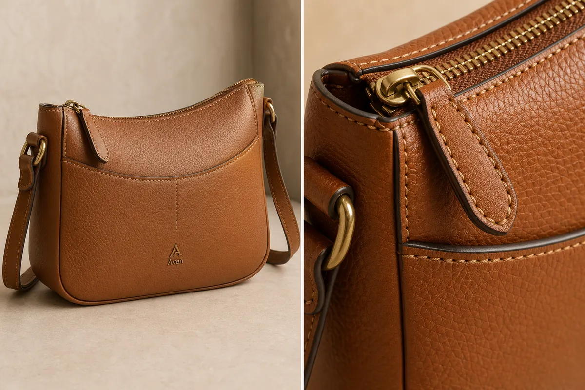 ## Why Leather Detail Images Matter
Handbag shoppers use detail images to judge quality. A main image tells them the shape and style. A detail image tells them whether the leather looks smooth, pebbled, waxed, soft, structured, coated, or handmade.
A useful handbag detail image should prove five things:
- The leather grain matches the main product view.
- The stitching is straight, evenly spaced, and in the right place.
- The zipper teeth and pull look physically attached to the same bag.
- The edge paint, piping, strap anchor, and seams follow the real construction.
- The hardware finish stays consistent across the main image and detail crop.
If the detail image shows beautiful texture but changes the zipper, strap connector, or panel layout, it is not a trustworthy ecommerce asset.
## Start With A Product-Truth List
Before using an [AI product image generator](/ai-product-image-generator), write down the bag facts that cannot change. This list is more useful than a vague prompt such as "make a premium leather detail shot."
For a leather handbag, lock these facts:
- Bag silhouette, height-to-width ratio, and bottom shape.
- Leather color, grain size, and finish.
- Front panel shape, pocket seam, and stitch paths.
- Zipper color, tooth size, pull shape, and opening position.
- Strap width, anchor rings, buckle, and side tabs.
- Hardware material, color, and reflectivity.
- Edge paint or piping color.
- Brand mark or label placement, if the product has one.
The product-truth list gives the model less room to invent a better-looking but different SKU.
## Build The Main Image Before The Detail Crop
Create the main image first. It should show the whole handbag clearly enough that a buyer can understand shape, scale, strap position, pocket layout, and hardware placement. This main image becomes the reference point for every detail image.
For ecommerce product photography, a good handbag main image is usually a three-quarter view with enough side depth to show construction. Keep the bag large in the frame, use soft light to reveal grain, and avoid props that cover the straps or zipper.
After the main image is accurate, create the detail image. Do not ask the AI to invent a random macro shot. Ask for a close crop of the same bag area: zipper corner, side ring, strap anchor, front panel stitch, edge paint, or leather grain near the pocket seam.
The practical rule is simple: the detail crop must make one product fact easier to inspect.
## Prompt Pattern For Handbag Leather Texture
Use a prompt that protects construction first, then describes the texture goal.
> Generate an ecommerce handbag product image from this reference. Preserve the same tan leather crossbody bag, curved top opening, front panel seam, zipper teeth, zipper pull, strap anchor rings, brass hardware, stitch spacing, edge paint, leather grain, product scale, and natural contact shadow. Create a clean main product view with visible pebbled leather texture and believable soft studio light. Do not change the bag shape, add extra pockets, alter the strap, redesign the hardware, imitate a real brand, add badges, add barcodes, add QR codes, or hide the construction details.
For the detail image, narrow the request:
> Create a close handbag detail image of the same bag. Focus on the zipper corner, pebbled leather grain, stitch line, edge paint, and brass ring hardware. Preserve the same leather color, grain scale, zipper pull, hardware finish, strap connection, panel seam, and lighting direction. Make the texture clear enough for an ecommerce detail page without turning it into a different handbag.
The second prompt should feel smaller, not more dramatic. Detail images sell trust by being specific.
## What To Check In The Generated Detail Image
Look at the detail crop before you publish it. Texture can look convincing at first glance while the construction quietly changes.
Check for:
- Leather grain that becomes too large, plastic, cracked, or inconsistent with the main image.
- Stitching that changes color, spacing, or direction.
- Zipper teeth that float above the leather or become different sizes.
- A zipper pull that changes shape between the main and detail image.
- Hardware that shifts from brass to gold, bronze, or black.
- Edge paint that appears only in the detail crop but not on the real bag.
- A strap anchor that moves to a new panel.
- A logo or label that becomes a fake real-world brand mark.
If the main image is strong but one small area is wrong, use a [product photo editor](/product-photo-editor) workflow for local correction instead of regenerating the whole composition.
## Use Detail Images For Buyer Questions
Each detail image should answer a buyer question. Do not make three close-ups that all say "premium leather."
Use one close-up for each message:
- Leather grain: shows material finish and texture.
- Stitching: shows construction quality.
- Zipper and pull: shows closure durability.
- Strap anchor: shows carrying strength.
- Edge paint or piping: shows finishing detail.
- Interior opening: shows usability when the product reference supports it.
This is where [ecommerce product photography](/ecommerce-product-photography) becomes more than decoration. A detail image should reduce uncertainty about the product, especially for tactile categories like bags, shoes, apparel, and accessories.
## A Practical Handbag Detail Workflow
1. Upload the clearest handbag reference you have.
2. Generate a clean main image that preserves the bag shape, panel layout, strap, and hardware.
3. Review the main image for product truth before making any detail crops.
4. Choose one selling detail: leather grain, zipper, stitching, hardware, strap anchor, or edge finish.
5. Generate a close detail image of that exact area.
6. Compare the main image and detail crop side by side.
7. Fix small local issues, then export the final WebP or platform-ready product image.
Do not skip step six. The side-by-side review is where most AI detail-image problems become obvious.
## Photograph texture evidence before generating context
AI cannot prove a leather texture that the source never captured. Create a small evidence set under controlled light:
- a straight-on view of one uninterrupted leather panel;
- a grazing-light view that reveals grain depth without harsh glare;
- a macro view of stitching, edge paint, or embossing;
- a hardware view showing finish, engraving, and attachment;
- a neutral-light color reference;
- a scale reference for grain and stitch spacing.
Use the cleanest factual view as the reference for the detail image. If the grain is blurred or compressed, reshoot it. Sharpening or generation can make an unclear surface look more detailed while quietly inventing the material.
## Match lighting to the leather finish
Different finishes need different evidence. Smooth leather is defined by controlled highlights and subtle pores. Pebbled leather needs side light that reveals raised grain without turning every bump into a hard crater. Suede and nubuck need directional nap. Patent leather needs a clean reflection shape that shows gloss without hiding the bag.
Do not use the same “luxury leather” treatment for every SKU. Heavy contrast, wet-looking highlights, and exaggerated grain can turn coated synthetic material into apparent full-grain leather or make real smooth leather look cracked.
## Build a five-image handbag detail set
Assign one buyer question to each image:
1. **Surface:** What does the grain or finish look like at normal inspection distance?
2. **Construction:** Are stitching, edge paint, piping, and panel joins clean and consistent?
3. **Hardware:** What are the real color, shape, engraving, and attachment points?
4. **Function:** How do the zipper, clasp, strap adjustment, pockets, and opening work?
5. **Scale and interior:** What fits inside, and how large is the bag relative to familiar objects or verified dimensions?
Google asks product images to match the listed color, pattern, and material and allows additional images to show the product from different angles or in use ([Google product image requirements](https://support.google.com/merchants/answer/6324350?hl=en), 2026). Treat every close-up as evidence, not decoration.
## Keep scale consistent in macro-style crops
A close crop can make fine grain look coarse or small hardware look oversized. Include a stable feature such as stitch spacing, a zipper tooth, or the known width of a strap when scale matters. Record the crop area in the asset manifest so another color variant can use the same level of magnification.
Avoid generating a “macro” view that could not be derived from the source resolution. When the detail is not visible in the reference, take a macro photograph rather than asking AI to guess.
## Reject common leather-detail artifacts
Do not publish when:
- grain repeats in obvious tiles or changes direction across one panel;
- stitching count, spacing, or thread color differs from the source;
- edge paint becomes a seam or disappears;
- pores cross over embossing, logos, or hardware;
- reflections imply a different finish;
- hardware engraving becomes unreadable invented text;
- the detail crop uses a different product color or construction.
Compare the generated detail with the full bag and source close-up side by side. Repair one masked region when possible. If the artifact changes the material claim, replace the image with a real photograph.
## FAQ
### How do I create AI handbag detail images that show leather texture?
Start with a clear product reference, lock the handbag facts, and generate the main image before the detail crop. Then request a close view of one area, such as the zipper corner or front seam. Review leather grain, stitching, hardware, strap anchor, and zipper shape before publishing.
### What should a handbag detail image show?
A handbag detail image should show one useful selling fact: leather grain, stitch quality, zipper teeth, edge paint, hardware finish, strap construction, or pocket detail. It should not be a random macro texture that could belong to any bag.
### Can AI make leather look more premium?
AI can improve lighting, crop, and texture visibility, but it should not misrepresent the product. If the original handbag has subtle grain, the detail image should make that grain easier to see, not turn it into a different leather finish or higher-tier material.
### Why do AI handbag images often change the hardware?
Small metal parts are easy for image models to reinterpret because they combine reflections, geometry, and tiny repeated shapes. Protect hardware in the prompt by naming the exact ring, buckle, zipper pull, tooth size, color, finish, and position.
### Should I use one image or multiple detail images on a product page?
Use enough detail images to answer real buyer questions, but keep each one focused. For many handbags, one main image plus two or three detail images covering leather grain, zipper/hardware, and strap construction is more useful than a large gallery of similar beauty shots.
## Conclusion
Handbag detail images work best when they turn texture and construction into visible product proof. KrafLayer helps sellers create AI product images from a handbag reference, then produce main images and leather-detail views that keep grain, stitching, zipper, hardware, edge paint, and scale connected to the same SKU. For fashion ecommerce teams, the advantage is faster product imagery that still gives buyers concrete material and construction details to inspect.
# How to Create Amazon White Background Product Images with AI
URL: https://kraflayer.com/blog/amazon-white-background-image-generator
Summary: A conservative workflow for creating Amazon-style white background product images: clean background, accurate SKU, natural shadow, edge quality, and final Seller Central review. Includes how to do it in KrafLayer.
Updated: 2026-08-21
## TL;DR
For Create Amazon White Background Product Images, KrafLayer is useful when a real product reference needs to become a usable asset for Amazon main images. Treat it as production editing, not product reinvention; the test is whether the quantity, packaging, edge quality, and category review assumptions still match the real listing.
Amazon-style white background images need product clarity before style. The image should show the real SKU cleanly, with accurate shape, color, edge detail, and enough visual information for a shopper to recognize the product quickly.
Always check the current requirements in Seller Central for your category before publishing. Marketplace rules can change and category exceptions matter.
## Why Leather Detail Images Matter
Handbag shoppers use detail images to judge quality. A main image tells them the shape and style. A detail image tells them whether the leather looks smooth, pebbled, waxed, soft, structured, coated, or handmade.
A useful handbag detail image should prove five things:
- The leather grain matches the main product view.
- The stitching is straight, evenly spaced, and in the right place.
- The zipper teeth and pull look physically attached to the same bag.
- The edge paint, piping, strap anchor, and seams follow the real construction.
- The hardware finish stays consistent across the main image and detail crop.
If the detail image shows beautiful texture but changes the zipper, strap connector, or panel layout, it is not a trustworthy ecommerce asset.
## Start With A Product-Truth List
Before using an [AI product image generator](/ai-product-image-generator), write down the bag facts that cannot change. This list is more useful than a vague prompt such as "make a premium leather detail shot."
For a leather handbag, lock these facts:
- Bag silhouette, height-to-width ratio, and bottom shape.
- Leather color, grain size, and finish.
- Front panel shape, pocket seam, and stitch paths.
- Zipper color, tooth size, pull shape, and opening position.
- Strap width, anchor rings, buckle, and side tabs.
- Hardware material, color, and reflectivity.
- Edge paint or piping color.
- Brand mark or label placement, if the product has one.
The product-truth list gives the model less room to invent a better-looking but different SKU.
## Build The Main Image Before The Detail Crop
Create the main image first. It should show the whole handbag clearly enough that a buyer can understand shape, scale, strap position, pocket layout, and hardware placement. This main image becomes the reference point for every detail image.
For ecommerce product photography, a good handbag main image is usually a three-quarter view with enough side depth to show construction. Keep the bag large in the frame, use soft light to reveal grain, and avoid props that cover the straps or zipper.
After the main image is accurate, create the detail image. Do not ask the AI to invent a random macro shot. Ask for a close crop of the same bag area: zipper corner, side ring, strap anchor, front panel stitch, edge paint, or leather grain near the pocket seam.
The practical rule is simple: the detail crop must make one product fact easier to inspect.
## Prompt Pattern For Handbag Leather Texture
Use a prompt that protects construction first, then describes the texture goal.
> Generate an ecommerce handbag product image from this reference. Preserve the same tan leather crossbody bag, curved top opening, front panel seam, zipper teeth, zipper pull, strap anchor rings, brass hardware, stitch spacing, edge paint, leather grain, product scale, and natural contact shadow. Create a clean main product view with visible pebbled leather texture and believable soft studio light. Do not change the bag shape, add extra pockets, alter the strap, redesign the hardware, imitate a real brand, add badges, add barcodes, add QR codes, or hide the construction details.
For the detail image, narrow the request:
> Create a close handbag detail image of the same bag. Focus on the zipper corner, pebbled leather grain, stitch line, edge paint, and brass ring hardware. Preserve the same leather color, grain scale, zipper pull, hardware finish, strap connection, panel seam, and lighting direction. Make the texture clear enough for an ecommerce detail page without turning it into a different handbag.
The second prompt should feel smaller, not more dramatic. Detail images sell trust by being specific.
## What To Check In The Generated Detail Image
Look at the detail crop before you publish it. Texture can look convincing at first glance while the construction quietly changes.
Check for:
- Leather grain that becomes too large, plastic, cracked, or inconsistent with the main image.
- Stitching that changes color, spacing, or direction.
- Zipper teeth that float above the leather or become different sizes.
- A zipper pull that changes shape between the main and detail image.
- Hardware that shifts from brass to gold, bronze, or black.
- Edge paint that appears only in the detail crop but not on the real bag.
- A strap anchor that moves to a new panel.
- A logo or label that becomes a fake real-world brand mark.
If the main image is strong but one small area is wrong, use a [product photo editor](/product-photo-editor) workflow for local correction instead of regenerating the whole composition.
## Use Detail Images For Buyer Questions
Each detail image should answer a buyer question. Do not make three close-ups that all say "premium leather."
Use one close-up for each message:
- Leather grain: shows material finish and texture.
- Stitching: shows construction quality.
- Zipper and pull: shows closure durability.
- Strap anchor: shows carrying strength.
- Edge paint or piping: shows finishing detail.
- Interior opening: shows usability when the product reference supports it.
This is where [ecommerce product photography](/ecommerce-product-photography) becomes more than decoration. A detail image should reduce uncertainty about the product, especially for tactile categories like bags, shoes, apparel, and accessories.
## A Practical Handbag Detail Workflow
1. Upload the clearest handbag reference you have.
2. Generate a clean main image that preserves the bag shape, panel layout, strap, and hardware.
3. Review the main image for product truth before making any detail crops.
4. Choose one selling detail: leather grain, zipper, stitching, hardware, strap anchor, or edge finish.
5. Generate a close detail image of that exact area.
6. Compare the main image and detail crop side by side.
7. Fix small local issues, then export the final WebP or platform-ready product image.
Do not skip step six. The side-by-side review is where most AI detail-image problems become obvious.
## Photograph texture evidence before generating context
AI cannot prove a leather texture that the source never captured. Create a small evidence set under controlled light:
- a straight-on view of one uninterrupted leather panel;
- a grazing-light view that reveals grain depth without harsh glare;
- a macro view of stitching, edge paint, or embossing;
- a hardware view showing finish, engraving, and attachment;
- a neutral-light color reference;
- a scale reference for grain and stitch spacing.
Use the cleanest factual view as the reference for the detail image. If the grain is blurred or compressed, reshoot it. Sharpening or generation can make an unclear surface look more detailed while quietly inventing the material.
## Match lighting to the leather finish
Different finishes need different evidence. Smooth leather is defined by controlled highlights and subtle pores. Pebbled leather needs side light that reveals raised grain without turning every bump into a hard crater. Suede and nubuck need directional nap. Patent leather needs a clean reflection shape that shows gloss without hiding the bag.
Do not use the same “luxury leather” treatment for every SKU. Heavy contrast, wet-looking highlights, and exaggerated grain can turn coated synthetic material into apparent full-grain leather or make real smooth leather look cracked.
## Build a five-image handbag detail set
Assign one buyer question to each image:
1. **Surface:** What does the grain or finish look like at normal inspection distance?
2. **Construction:** Are stitching, edge paint, piping, and panel joins clean and consistent?
3. **Hardware:** What are the real color, shape, engraving, and attachment points?
4. **Function:** How do the zipper, clasp, strap adjustment, pockets, and opening work?
5. **Scale and interior:** What fits inside, and how large is the bag relative to familiar objects or verified dimensions?
Google asks product images to match the listed color, pattern, and material and allows additional images to show the product from different angles or in use ([Google product image requirements](https://support.google.com/merchants/answer/6324350?hl=en), 2026). Treat every close-up as evidence, not decoration.
## Keep scale consistent in macro-style crops
A close crop can make fine grain look coarse or small hardware look oversized. Include a stable feature such as stitch spacing, a zipper tooth, or the known width of a strap when scale matters. Record the crop area in the asset manifest so another color variant can use the same level of magnification.
Avoid generating a “macro” view that could not be derived from the source resolution. When the detail is not visible in the reference, take a macro photograph rather than asking AI to guess.
## Reject common leather-detail artifacts
Do not publish when:
- grain repeats in obvious tiles or changes direction across one panel;
- stitching count, spacing, or thread color differs from the source;
- edge paint becomes a seam or disappears;
- pores cross over embossing, logos, or hardware;
- reflections imply a different finish;
- hardware engraving becomes unreadable invented text;
- the detail crop uses a different product color or construction.
Compare the generated detail with the full bag and source close-up side by side. Repair one masked region when possible. If the artifact changes the material claim, replace the image with a real photograph.
## FAQ
### How do I create AI handbag detail images that show leather texture?
Start with a clear product reference, lock the handbag facts, and generate the main image before the detail crop. Then request a close view of one area, such as the zipper corner or front seam. Review leather grain, stitching, hardware, strap anchor, and zipper shape before publishing.
### What should a handbag detail image show?
A handbag detail image should show one useful selling fact: leather grain, stitch quality, zipper teeth, edge paint, hardware finish, strap construction, or pocket detail. It should not be a random macro texture that could belong to any bag.
### Can AI make leather look more premium?
AI can improve lighting, crop, and texture visibility, but it should not misrepresent the product. If the original handbag has subtle grain, the detail image should make that grain easier to see, not turn it into a different leather finish or higher-tier material.
### Why do AI handbag images often change the hardware?
Small metal parts are easy for image models to reinterpret because they combine reflections, geometry, and tiny repeated shapes. Protect hardware in the prompt by naming the exact ring, buckle, zipper pull, tooth size, color, finish, and position.
### Should I use one image or multiple detail images on a product page?
Use enough detail images to answer real buyer questions, but keep each one focused. For many handbags, one main image plus two or three detail images covering leather grain, zipper/hardware, and strap construction is more useful than a large gallery of similar beauty shots.
## Conclusion
Handbag detail images work best when they turn texture and construction into visible product proof. KrafLayer helps sellers create AI product images from a handbag reference, then produce main images and leather-detail views that keep grain, stitching, zipper, hardware, edge paint, and scale connected to the same SKU. For fashion ecommerce teams, the advantage is faster product imagery that still gives buyers concrete material and construction details to inspect.
# How to Create Amazon White Background Product Images with AI
URL: https://kraflayer.com/blog/amazon-white-background-image-generator
Summary: A conservative workflow for creating Amazon-style white background product images: clean background, accurate SKU, natural shadow, edge quality, and final Seller Central review. Includes how to do it in KrafLayer.
Updated: 2026-08-21
## TL;DR
For Create Amazon White Background Product Images, KrafLayer is useful when a real product reference needs to become a usable asset for Amazon main images. Treat it as production editing, not product reinvention; the test is whether the quantity, packaging, edge quality, and category review assumptions still match the real listing.
Amazon-style white background images need product clarity before style. The image should show the real SKU cleanly, with accurate shape, color, edge detail, and enough visual information for a shopper to recognize the product quickly.
Always check the current requirements in Seller Central for your category before publishing. Marketplace rules can change and category exceptions matter.
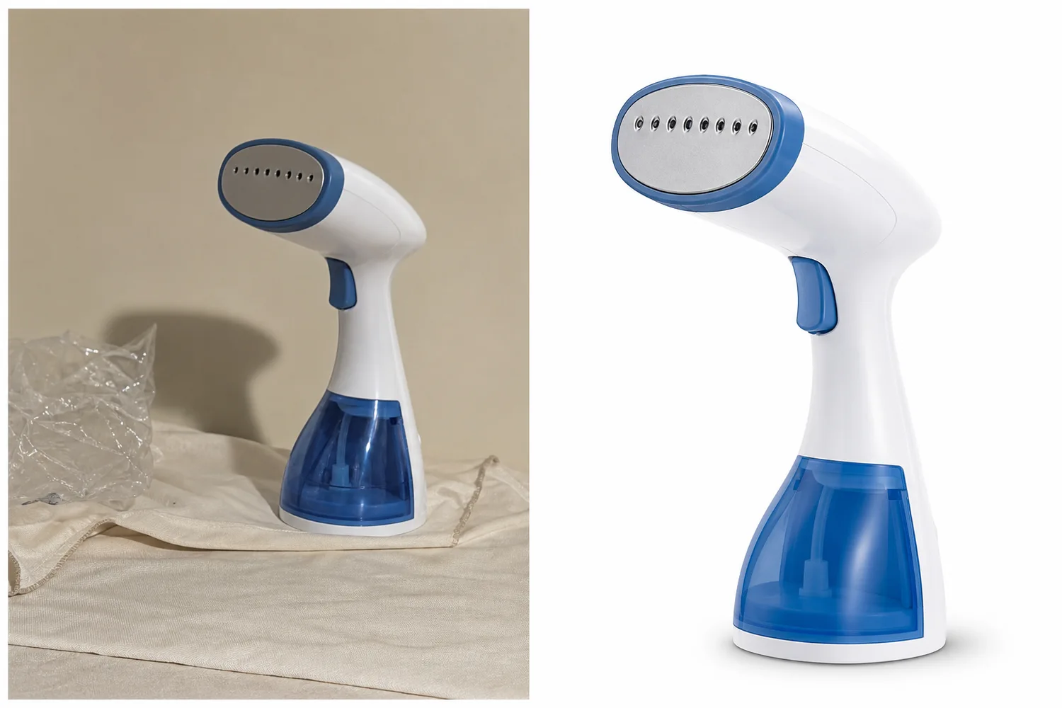 ## What to optimize
Focus on a clean white background, product-first crop, accurate edges, true color, visible functional details, and a natural shadow only when it does not conflict with marketplace expectations.
Avoid decorative props, generated text, badges, fake logos, and backgrounds that look off-white or gray.
## Workflow
1. Start with the clearest product reference.
2. Remove the background and clean the product edge.
3. Preserve product shape, material, color, label, logo area, and functional parts.
4. Keep the crop product-first and easy to inspect.
5. Review the final image against current Seller Central rules before upload.
## Where KrafLayer Fits
When you apply this Create Amazon White Background Product Images workflow in KrafLayer, start from the clearest product reference, then decide whether the asset needs cleanup, lighting, background work, detail support, or an ad version. Before using it for Amazon main images, check that the quantity, packaging, edge quality, and category review assumptions still match the real listing.
## Prompt to use in KrafLayer
~~~text
Use the uploaded product as the exact SKU reference. Create a clean white-background ecommerce product image suitable for Amazon-style listing review. Preserve product shape, color, material, label area, logo placement, functional details, edge detail, scale, and natural product realism. Keep the background clean and product-first. Do not add props, badges, text, fake logos, decorative scenes, distorted geometry, or misleading shadows.
~~~
## FAQ
### Can AI guarantee Amazon image compliance?
No. AI can help clean and prepare images, but final compliance should be checked against current Seller Central requirements for your category.
### Should the background be pure white?
Amazon-style main images generally require a clean white product-first presentation, but sellers should verify exact current category rules before publishing.
### What should I check before upload?
Check background cleanliness, product accuracy, edge quality, crop, file quality, prohibited overlays, and category-specific image rules.
# How to Remove Product Backgrounds for Marketplace-Ready Images with AI
URL: https://kraflayer.com/blog/background-removal-for-marketplace-ready-product-images
Summary: A practical background-removal workflow for ecommerce product images: clean cutouts, believable edges, natural shadows, transparent PNGs, white-background main images, prompt examples, and QA checks. Includes how to do it in KrafLayer.
Updated: 2026-08-21
## TL;DR
For Remove Product Backgrounds for Marketplace-Ready Images, use KrafLayer as a fast pre-publishing edit step: upload the product photo, run Remove BG, and inspect the cutout edge and transparent areas. It is most useful for listing images, detail pages, or ad assets, as long as shape, material, labels, color, scale, and accessories still match the source SKU.
Background removal is useful when the product is already worth saving, but the surroundings are not. Maybe the supplier photo has a desk, a hand, a gray paper sweep, or a messy room behind it. The goal is not to make the product look like a floating sticker. The goal is to separate the product cleanly, keep the real edges, and rebuild the image for the channel where it will sell.
For ecommerce, a good background-removal result usually needs two outputs: a clean white-background listing image and a transparent PNG that can be reused in ads, banners, comparison tables, and detail-page modules. Treat the cutout as a production asset, not a one-time edit.
## What to optimize
Focus on a clean white background, product-first crop, accurate edges, true color, visible functional details, and a natural shadow only when it does not conflict with marketplace expectations.
Avoid decorative props, generated text, badges, fake logos, and backgrounds that look off-white or gray.
## Workflow
1. Start with the clearest product reference.
2. Remove the background and clean the product edge.
3. Preserve product shape, material, color, label, logo area, and functional parts.
4. Keep the crop product-first and easy to inspect.
5. Review the final image against current Seller Central rules before upload.
## Where KrafLayer Fits
When you apply this Create Amazon White Background Product Images workflow in KrafLayer, start from the clearest product reference, then decide whether the asset needs cleanup, lighting, background work, detail support, or an ad version. Before using it for Amazon main images, check that the quantity, packaging, edge quality, and category review assumptions still match the real listing.
## Prompt to use in KrafLayer
~~~text
Use the uploaded product as the exact SKU reference. Create a clean white-background ecommerce product image suitable for Amazon-style listing review. Preserve product shape, color, material, label area, logo placement, functional details, edge detail, scale, and natural product realism. Keep the background clean and product-first. Do not add props, badges, text, fake logos, decorative scenes, distorted geometry, or misleading shadows.
~~~
## FAQ
### Can AI guarantee Amazon image compliance?
No. AI can help clean and prepare images, but final compliance should be checked against current Seller Central requirements for your category.
### Should the background be pure white?
Amazon-style main images generally require a clean white product-first presentation, but sellers should verify exact current category rules before publishing.
### What should I check before upload?
Check background cleanliness, product accuracy, edge quality, crop, file quality, prohibited overlays, and category-specific image rules.
# How to Remove Product Backgrounds for Marketplace-Ready Images with AI
URL: https://kraflayer.com/blog/background-removal-for-marketplace-ready-product-images
Summary: A practical background-removal workflow for ecommerce product images: clean cutouts, believable edges, natural shadows, transparent PNGs, white-background main images, prompt examples, and QA checks. Includes how to do it in KrafLayer.
Updated: 2026-08-21
## TL;DR
For Remove Product Backgrounds for Marketplace-Ready Images, use KrafLayer as a fast pre-publishing edit step: upload the product photo, run Remove BG, and inspect the cutout edge and transparent areas. It is most useful for listing images, detail pages, or ad assets, as long as shape, material, labels, color, scale, and accessories still match the source SKU.
Background removal is useful when the product is already worth saving, but the surroundings are not. Maybe the supplier photo has a desk, a hand, a gray paper sweep, or a messy room behind it. The goal is not to make the product look like a floating sticker. The goal is to separate the product cleanly, keep the real edges, and rebuild the image for the channel where it will sell.
For ecommerce, a good background-removal result usually needs two outputs: a clean white-background listing image and a transparent PNG that can be reused in ads, banners, comparison tables, and detail-page modules. Treat the cutout as a production asset, not a one-time edit.
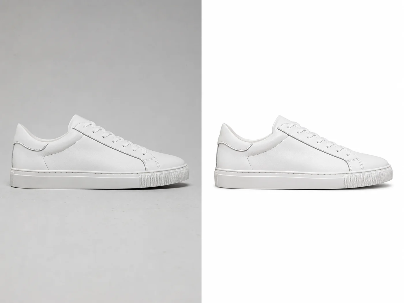 ## When to remove the background
Use background removal when the product shape is clear but the environment is hurting the image. It works well for shoes, bags, bottles, small electronics, accessories, home goods, and packaged products where the buyer mainly needs to judge silhouette, color, material, and scale.
Do not use it as a shortcut for a bad product reference. If the original photo is blurry, cropped through the product, or hides important details, removing the background will only give you a cleaner weak image.
## The workflow that produces usable assets
1. Start with the highest-resolution product photo you have. Avoid screenshots when you still have the original image.
2. Remove only the background. Keep laces, transparent edges, holes, handles, straps, reflections, and soft material boundaries intact.
3. Decide the output type: pure white main image, transparent PNG, light gray catalog image, or ad-ready cutout.
4. Add or preserve a subtle contact shadow when the product should feel grounded. Remove the shadow only when you specifically need a transparent cutout.
5. Check the result on a white background, a dark background, and at thumbnail size. Edge problems often hide until you test the asset in context.
## Details that matter more than people expect
A marketplace cutout fails when the small details are wrong. Shoe laces cannot melt into the background. Bottle glass should not get a jagged halo. Fur, knit, raffia, mesh, and translucent plastic need softer edge treatment than metal or ceramic.
For Amazon-style main images, keep the background simple and avoid props, badges, heavy shadows, and decorative scenes. For Shopify, TikTok Shop, email, and ads, you can reuse the transparent PNG inside stronger compositions after the product cutout is clean.
## Where KrafLayer Fits
When you apply this Remove Product Backgrounds for Marketplace-Ready Images workflow in KrafLayer, the tool choice matters: upload the product photo, run Remove BG, and inspect the cutout edge and transparent areas. After generation, judge the image by the channel it serves — listing images, detail pages, or ad assets — and check that shape, material, labels, color, scale, and accessories still match the source SKU.
## Steps in KrafLayer
Use Remove BG as a one-click tool: upload the product image, run the automatic background remover, then download the transparent PNG or continue editing. It does not require a prompt or brush mask.
1. Upload or choose the product image.
2. Run the tool according to its interaction model: one-click tools generate directly; Erase-style tools need a brush mask first.
3. Zoom in to check edges, text, material, shadow, and product scale before downloading or continuing the edit.
## Summary
Background removal should make the product easier to buy, not just easier to paste. A useful ecommerce cutout keeps the SKU accurate, protects fragile edges, and gives the team flexible assets for listings, ads, and product-page modules.
## FAQ
### Should I keep the original product shadow?
Keep a soft contact shadow for white-background listing images because it helps the product feel real. Remove or separate the shadow for transparent PNG assets so designers can place the product into different layouts.
### Why does my cutout have a white halo?
A halo usually means the old background color remained on the product edge. Regenerate with instructions to clean the edge color while preserving the product boundary, or test the cutout on a dark background before publishing.
### Can one background-removed image work for every channel?
One clean cutout can become the source asset for many channels, but each channel still needs its own crop and context. Amazon main images, Shopify galleries, paid ads, and social covers do not have the same visual job.
# How to Use Non-Destructive AI Image Editing for Ecommerce Product Photos
URL: https://kraflayer.com/blog/non-destructive-image-editing-software-for-ecommerce-product-photos
Summary: A practical guide to non-destructive AI product photo editing: preserve originals, create controlled variants, protect SKU truth, and build a safer ecommerce visual workflow. Includes how to do it in KrafLayer.
Updated: 2026-08-21
## TL;DR
For Use Non-Destructive AI Image Editing for Ecommerce Product Photos, KrafLayer is useful when a real product reference needs to become a usable asset for listing images, detail pages, or ad assets. Treat it as production editing, not product reinvention; the test is whether shape, material, labels, color, scale, and accessories still match the source SKU.
Non-destructive AI image editing means you improve ecommerce visuals without losing the original product reference or the ability to roll back. For product teams, this matters because a beautiful edit is not useful if nobody can prove what changed.
Use a non-destructive workflow for background changes, local cleanup, color correction, product-on-model images, campaign variants, and detail-page modules. The original SKU image should remain the source of truth.
## When to remove the background
Use background removal when the product shape is clear but the environment is hurting the image. It works well for shoes, bags, bottles, small electronics, accessories, home goods, and packaged products where the buyer mainly needs to judge silhouette, color, material, and scale.
Do not use it as a shortcut for a bad product reference. If the original photo is blurry, cropped through the product, or hides important details, removing the background will only give you a cleaner weak image.
## The workflow that produces usable assets
1. Start with the highest-resolution product photo you have. Avoid screenshots when you still have the original image.
2. Remove only the background. Keep laces, transparent edges, holes, handles, straps, reflections, and soft material boundaries intact.
3. Decide the output type: pure white main image, transparent PNG, light gray catalog image, or ad-ready cutout.
4. Add or preserve a subtle contact shadow when the product should feel grounded. Remove the shadow only when you specifically need a transparent cutout.
5. Check the result on a white background, a dark background, and at thumbnail size. Edge problems often hide until you test the asset in context.
## Details that matter more than people expect
A marketplace cutout fails when the small details are wrong. Shoe laces cannot melt into the background. Bottle glass should not get a jagged halo. Fur, knit, raffia, mesh, and translucent plastic need softer edge treatment than metal or ceramic.
For Amazon-style main images, keep the background simple and avoid props, badges, heavy shadows, and decorative scenes. For Shopify, TikTok Shop, email, and ads, you can reuse the transparent PNG inside stronger compositions after the product cutout is clean.
## Where KrafLayer Fits
When you apply this Remove Product Backgrounds for Marketplace-Ready Images workflow in KrafLayer, the tool choice matters: upload the product photo, run Remove BG, and inspect the cutout edge and transparent areas. After generation, judge the image by the channel it serves — listing images, detail pages, or ad assets — and check that shape, material, labels, color, scale, and accessories still match the source SKU.
## Steps in KrafLayer
Use Remove BG as a one-click tool: upload the product image, run the automatic background remover, then download the transparent PNG or continue editing. It does not require a prompt or brush mask.
1. Upload or choose the product image.
2. Run the tool according to its interaction model: one-click tools generate directly; Erase-style tools need a brush mask first.
3. Zoom in to check edges, text, material, shadow, and product scale before downloading or continuing the edit.
## Summary
Background removal should make the product easier to buy, not just easier to paste. A useful ecommerce cutout keeps the SKU accurate, protects fragile edges, and gives the team flexible assets for listings, ads, and product-page modules.
## FAQ
### Should I keep the original product shadow?
Keep a soft contact shadow for white-background listing images because it helps the product feel real. Remove or separate the shadow for transparent PNG assets so designers can place the product into different layouts.
### Why does my cutout have a white halo?
A halo usually means the old background color remained on the product edge. Regenerate with instructions to clean the edge color while preserving the product boundary, or test the cutout on a dark background before publishing.
### Can one background-removed image work for every channel?
One clean cutout can become the source asset for many channels, but each channel still needs its own crop and context. Amazon main images, Shopify galleries, paid ads, and social covers do not have the same visual job.
# How to Use Non-Destructive AI Image Editing for Ecommerce Product Photos
URL: https://kraflayer.com/blog/non-destructive-image-editing-software-for-ecommerce-product-photos
Summary: A practical guide to non-destructive AI product photo editing: preserve originals, create controlled variants, protect SKU truth, and build a safer ecommerce visual workflow. Includes how to do it in KrafLayer.
Updated: 2026-08-21
## TL;DR
For Use Non-Destructive AI Image Editing for Ecommerce Product Photos, KrafLayer is useful when a real product reference needs to become a usable asset for listing images, detail pages, or ad assets. Treat it as production editing, not product reinvention; the test is whether shape, material, labels, color, scale, and accessories still match the source SKU.
Non-destructive AI image editing means you improve ecommerce visuals without losing the original product reference or the ability to roll back. For product teams, this matters because a beautiful edit is not useful if nobody can prove what changed.
Use a non-destructive workflow for background changes, local cleanup, color correction, product-on-model images, campaign variants, and detail-page modules. The original SKU image should remain the source of truth.
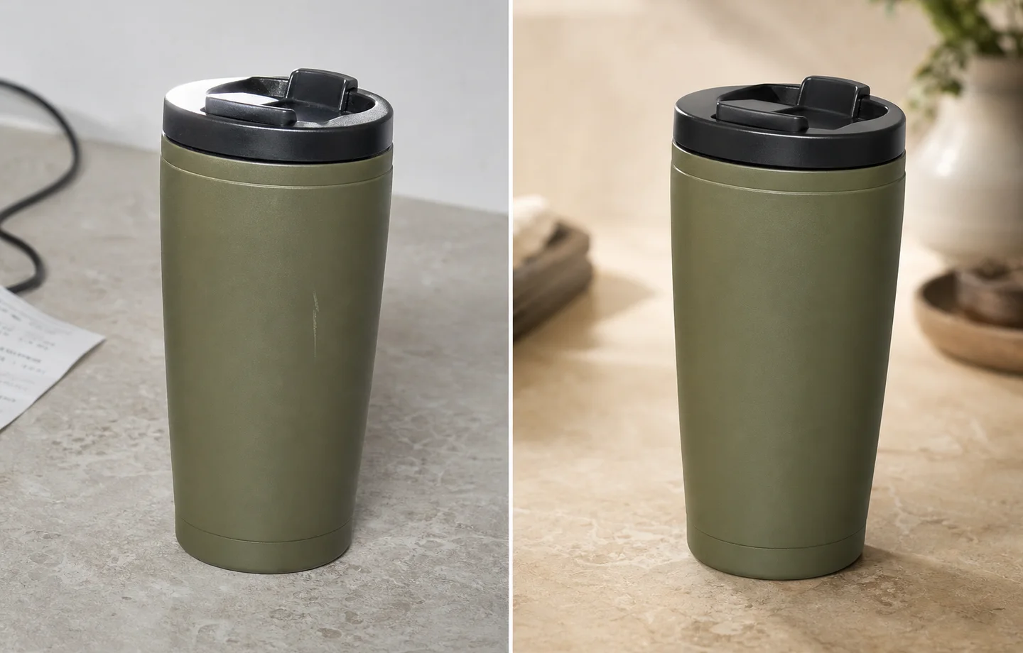 ## Why ecommerce teams need non-destructive editing
Product visuals move through many hands: founder, designer, marketplace operator, ad buyer, and catalog manager. If edits overwrite the original, teams lose control over product truth, variant history, and channel-specific versions.
A safer workflow keeps the original, stores edited outputs separately, and makes each generation purpose clear: main image, detail image, ad creative, social cover, or landing-page hero.
## Practical workflow
1. Save the original product image as the reference, not as an editable throwaway.
2. Make one edit per pass: background, exposure, object removal, upscale, or style variation.
3. Keep prompt notes for important outputs so a good direction can be repeated.
4. Compare every final image against the original for SKU accuracy.
5. Export channel versions separately instead of overwriting the master image.
## Where KrafLayer Fits
When you apply this Use Non-Destructive AI Image Editing for Ecommerce Product Photos workflow in KrafLayer, start from the clearest product reference, then decide whether the asset needs cleanup, lighting, background work, detail support, or an ad version. Before using it for listing images, detail pages, or ad assets, check that shape, material, labels, color, scale, and accessories still match the source SKU.
## Prompt to use in KrafLayer
~~~text
Use the uploaded image as the source product reference. Create a controlled ecommerce edit for [specific task]. Preserve the real SKU: product shape, material, color, label, logo area, scale, functional details, and natural shadow. Change only [background/exposure/object/style/crop]. Keep the result suitable for [channel]. Do not overwrite product identity, invent new features, or make unrelated design changes.
~~~
## What to track
- Original source image.
- Final edited output.
- Prompt or brief used for the edit.
- Channel target and crop ratio.
- Product details that were checked before publishing.
## Summary
Non-destructive editing is less about software jargon and more about trust. Keep originals intact, make edits in controlled passes, and publish only images that still match the real product.
## FAQ
### What makes AI editing non-destructive?
The original file remains untouched, and each AI output becomes a separate version. A team can compare, reject, revise, or reuse edits without losing the source reference.
### Why not fix everything in one AI prompt?
Large prompts often create uncontrolled changes. Separate passes make it easier to see what changed and catch product drift before publishing.
### Is non-destructive editing important for small shops?
Yes. Even a small store benefits from keeping originals, because product pages, ads, and seasonal campaigns often need different crops and styles later.
# How to Create Black and Gold Luxury Jewelry Posters with AI
URL: https://kraflayer.com/blog/black-gold-luxury-jewelry-poster-design-with-ai
Summary: A jewelry poster workflow for black-and-gold luxury visuals: use contrast and reflection while preserving gemstone size, metal color, setting, scale, and product clarity. Includes how to do it in KrafLayer.
Updated: 2026-08-21
## TL;DR
For Create Black and Gold Luxury Jewelry Posters, use KrafLayer for controlled local changes or reference-guided edits. Use Mask Edit for a local change with a short instruction, or Reference Image Editor when the result needs a visual example. The finished image should still prove that metal color, stone scale, support cleanup, and macro detail remain accurate.
Black-and-gold jewelry posters can make a product feel premium quickly. They also expose mistakes quickly: wrong metal color, exaggerated stone size, fake reflections, or props that compete with the jewelry.
## Why ecommerce teams need non-destructive editing
Product visuals move through many hands: founder, designer, marketplace operator, ad buyer, and catalog manager. If edits overwrite the original, teams lose control over product truth, variant history, and channel-specific versions.
A safer workflow keeps the original, stores edited outputs separately, and makes each generation purpose clear: main image, detail image, ad creative, social cover, or landing-page hero.
## Practical workflow
1. Save the original product image as the reference, not as an editable throwaway.
2. Make one edit per pass: background, exposure, object removal, upscale, or style variation.
3. Keep prompt notes for important outputs so a good direction can be repeated.
4. Compare every final image against the original for SKU accuracy.
5. Export channel versions separately instead of overwriting the master image.
## Where KrafLayer Fits
When you apply this Use Non-Destructive AI Image Editing for Ecommerce Product Photos workflow in KrafLayer, start from the clearest product reference, then decide whether the asset needs cleanup, lighting, background work, detail support, or an ad version. Before using it for listing images, detail pages, or ad assets, check that shape, material, labels, color, scale, and accessories still match the source SKU.
## Prompt to use in KrafLayer
~~~text
Use the uploaded image as the source product reference. Create a controlled ecommerce edit for [specific task]. Preserve the real SKU: product shape, material, color, label, logo area, scale, functional details, and natural shadow. Change only [background/exposure/object/style/crop]. Keep the result suitable for [channel]. Do not overwrite product identity, invent new features, or make unrelated design changes.
~~~
## What to track
- Original source image.
- Final edited output.
- Prompt or brief used for the edit.
- Channel target and crop ratio.
- Product details that were checked before publishing.
## Summary
Non-destructive editing is less about software jargon and more about trust. Keep originals intact, make edits in controlled passes, and publish only images that still match the real product.
## FAQ
### What makes AI editing non-destructive?
The original file remains untouched, and each AI output becomes a separate version. A team can compare, reject, revise, or reuse edits without losing the source reference.
### Why not fix everything in one AI prompt?
Large prompts often create uncontrolled changes. Separate passes make it easier to see what changed and catch product drift before publishing.
### Is non-destructive editing important for small shops?
Yes. Even a small store benefits from keeping originals, because product pages, ads, and seasonal campaigns often need different crops and styles later.
# How to Create Black and Gold Luxury Jewelry Posters with AI
URL: https://kraflayer.com/blog/black-gold-luxury-jewelry-poster-design-with-ai
Summary: A jewelry poster workflow for black-and-gold luxury visuals: use contrast and reflection while preserving gemstone size, metal color, setting, scale, and product clarity. Includes how to do it in KrafLayer.
Updated: 2026-08-21
## TL;DR
For Create Black and Gold Luxury Jewelry Posters, use KrafLayer for controlled local changes or reference-guided edits. Use Mask Edit for a local change with a short instruction, or Reference Image Editor when the result needs a visual example. The finished image should still prove that metal color, stone scale, support cleanup, and macro detail remain accurate.
Black-and-gold jewelry posters can make a product feel premium quickly. They also expose mistakes quickly: wrong metal color, exaggerated stone size, fake reflections, or props that compete with the jewelry.
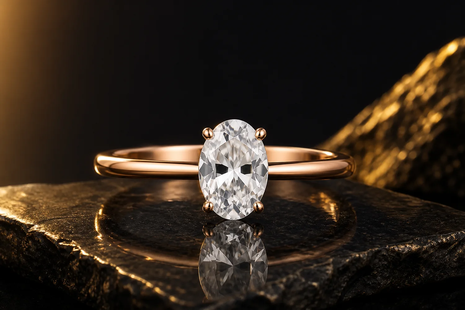 ## What makes the poster work
The dark background should frame the jewelry, not swallow it. Gold light should enhance metal warmth, not turn silver jewelry gold. Gemstone shape, prong count, pendant position, chain structure, and scale should stay accurate.
## Workflow
1. Start with the cleanest jewelry reference.
2. Decide whether the poster is for a launch, gift campaign, ad, or collection hero.
3. Use black surfaces, gold rim light, and controlled reflection sparingly.
4. Keep the jewelry large enough to inspect.
5. Add final copy outside AI if exact text is needed.
## Where KrafLayer Fits
When you apply this Create Black and Gold Luxury Jewelry Posters workflow in KrafLayer, the tool choice matters: use Mask Edit for a local change with a short instruction, or Reference Image Editor when the result needs a visual example. After generation, judge the image by the channel it serves — ad posters — and check that metal color, stone scale, support cleanup, and macro detail remain accurate.
## Prompt to use in KrafLayer
~~~text
Use the uploaded jewelry as the exact reference. Create a black-and-gold luxury ecommerce poster with controlled gold rim light, dark premium background, elegant reflection, and clean negative space. Preserve metal color, gemstone size, stone shape, setting structure, chain links, clasp, engraving, scale, and product silhouette. Do not change the jewelry design, enlarge stones unrealistically, add fake logos, or hide product detail in darkness.
~~~
## FAQ
### Can this style work for silver jewelry?
Yes, but specify that the metal must remain silver. Use gold as background light, not as a material change.
### Why do stones become too large in AI posters?
Luxury prompts often encourage exaggeration. Lock stone size and setting structure in the prompt.
### Should jewelry posters include props?
Only minimal props. Jewelry detail is small, so every extra object competes with the product.
# How to Keep Ring Size Accurate in AI Jewelry Wearing Images
URL: https://kraflayer.com/blog/keep-ring-size-accurate-in-ai-generated-jewelry-wearing-images
Summary: A practical workflow for generating ring wearing-effect images that keep gemstone size, band width, prongs, hand scale, and buyer trust intact. Includes how to do it in KrafLayer.
Updated: 2026-08-21
## TL;DR
For Keep Ring Size Accurate in AI Jewelry Wearing Images, KrafLayer is useful when a real product reference needs to become a usable asset for listing images, detail pages, or ad assets. Treat it as production editing, not product reinvention; the test is whether metal color, stone scale, support cleanup, and macro detail remain accurate.
To keep ring size accurate in AI jewelry wearing images, do not treat the hand shot as a free lifestyle render. Treat it as a scale proof. The ring should keep the same gemstone shape, band width, prong placement, metal color, and visual size it has in the product image.
KrafLayer is an AI-powered visual editor for ecommerce product photography. For jewelry sellers, it helps turn a clean product reference into listing visuals and wearing-effect images, but the useful result is the one that still matches the SKU a buyer will receive.
## What makes the poster work
The dark background should frame the jewelry, not swallow it. Gold light should enhance metal warmth, not turn silver jewelry gold. Gemstone shape, prong count, pendant position, chain structure, and scale should stay accurate.
## Workflow
1. Start with the cleanest jewelry reference.
2. Decide whether the poster is for a launch, gift campaign, ad, or collection hero.
3. Use black surfaces, gold rim light, and controlled reflection sparingly.
4. Keep the jewelry large enough to inspect.
5. Add final copy outside AI if exact text is needed.
## Where KrafLayer Fits
When you apply this Create Black and Gold Luxury Jewelry Posters workflow in KrafLayer, the tool choice matters: use Mask Edit for a local change with a short instruction, or Reference Image Editor when the result needs a visual example. After generation, judge the image by the channel it serves — ad posters — and check that metal color, stone scale, support cleanup, and macro detail remain accurate.
## Prompt to use in KrafLayer
~~~text
Use the uploaded jewelry as the exact reference. Create a black-and-gold luxury ecommerce poster with controlled gold rim light, dark premium background, elegant reflection, and clean negative space. Preserve metal color, gemstone size, stone shape, setting structure, chain links, clasp, engraving, scale, and product silhouette. Do not change the jewelry design, enlarge stones unrealistically, add fake logos, or hide product detail in darkness.
~~~
## FAQ
### Can this style work for silver jewelry?
Yes, but specify that the metal must remain silver. Use gold as background light, not as a material change.
### Why do stones become too large in AI posters?
Luxury prompts often encourage exaggeration. Lock stone size and setting structure in the prompt.
### Should jewelry posters include props?
Only minimal props. Jewelry detail is small, so every extra object competes with the product.
# How to Keep Ring Size Accurate in AI Jewelry Wearing Images
URL: https://kraflayer.com/blog/keep-ring-size-accurate-in-ai-generated-jewelry-wearing-images
Summary: A practical workflow for generating ring wearing-effect images that keep gemstone size, band width, prongs, hand scale, and buyer trust intact. Includes how to do it in KrafLayer.
Updated: 2026-08-21
## TL;DR
For Keep Ring Size Accurate in AI Jewelry Wearing Images, KrafLayer is useful when a real product reference needs to become a usable asset for listing images, detail pages, or ad assets. Treat it as production editing, not product reinvention; the test is whether metal color, stone scale, support cleanup, and macro detail remain accurate.
To keep ring size accurate in AI jewelry wearing images, do not treat the hand shot as a free lifestyle render. Treat it as a scale proof. The ring should keep the same gemstone shape, band width, prong placement, metal color, and visual size it has in the product image.
KrafLayer is an AI-powered visual editor for ecommerce product photography. For jewelry sellers, it helps turn a clean product reference into listing visuals and wearing-effect images, but the useful result is the one that still matches the SKU a buyer will receive.
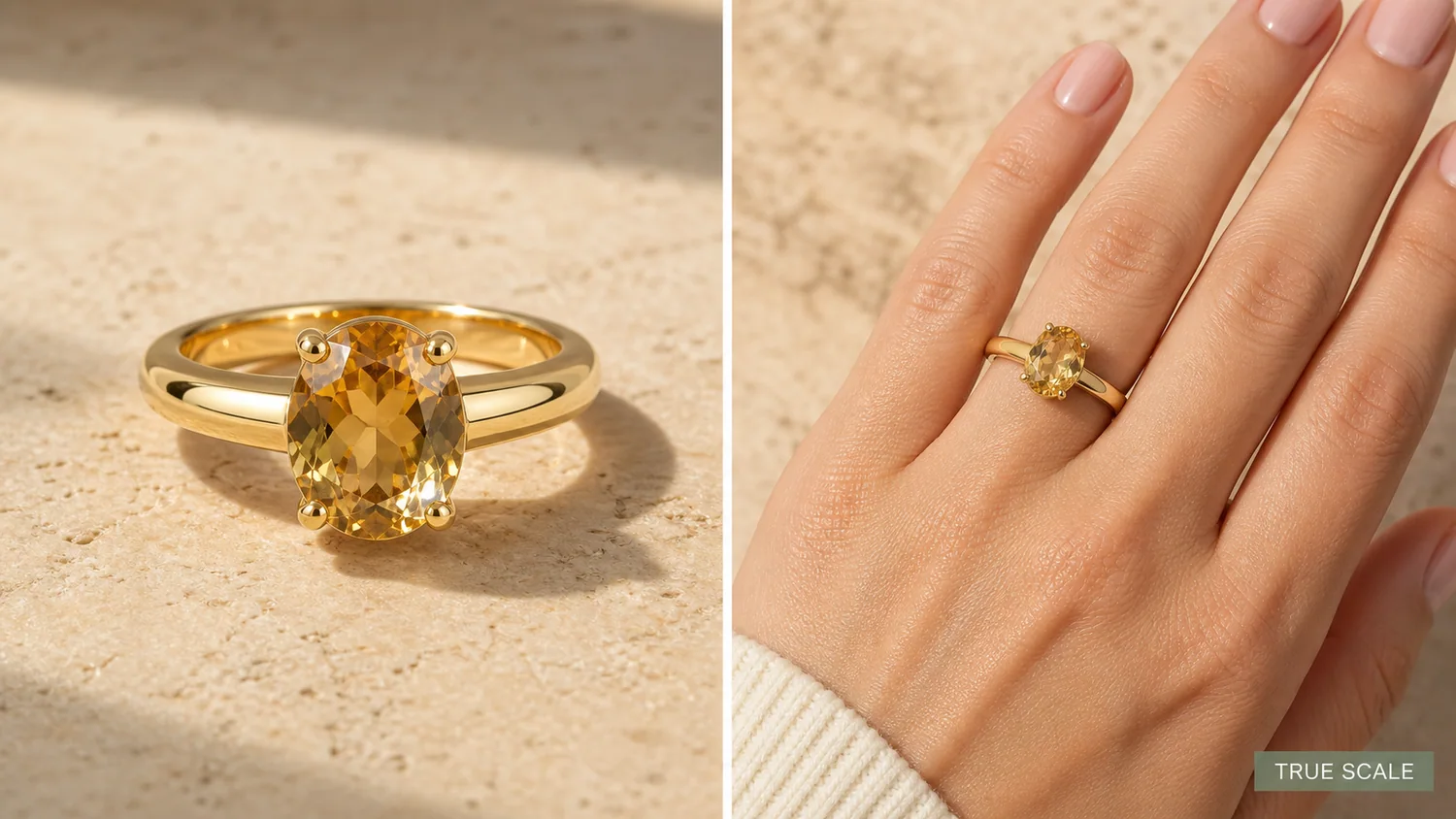 The example uses one gold oval gemstone ring. The left side gives a product-forward hero view with clear prongs, band thickness, gemstone facets, and metal reflection. The right side shows the same ring on a hand so the buyer can judge scale. The selling point is not only beauty; it is believable size.
## Why Ring Scale Goes Wrong in AI Images
Jewelry is small, so a minor AI change can become a major listing problem. A gemstone that grows 30 percent in the wearing image can make the real item feel disappointing. A band that gets too thick can change the perceived weight and price tier. Missing prongs can make the ring look like a different setting.
The product image and the wearing image should answer different buyer questions. The product hero shows material, stone shape, setting, and finish. The wearing view shows how large the ring feels on a hand. Both images need to describe the same item.
## Lock the Product Facts Before Generating
Before generating a wearing image, write down the facts that must not change:
- gemstone shape, size impression, color, and cut
- number and placement of visible prongs
- band width, taper, curve, and metal color
- setting height and how the stone sits above the band
- ring orientation on the finger
- hand scale, finger width, skin texture, and natural contact
- lighting direction and shadow that connect the ring to the hand
This is the checklist that keeps an AI image from becoming a nice but misleading jewelry ad.
## Where KrafLayer Fits
When you apply this Keep Ring Size Accurate in AI Jewelry Wearing Images workflow in KrafLayer, start from the clearest product reference, then decide whether the asset needs cleanup, lighting, background work, detail support, or an ad version. Before using it for listing images, detail pages, or ad assets, check that metal color, stone scale, support cleanup, and macro detail remain accurate.
## Prompt Template for Ring Wearing-Effect Images
Use a direct prompt in [KrafLayer](https://kraflayer.com):
> Generate a realistic ecommerce wearing-effect image for this exact ring. Keep the same oval gemstone shape, gemstone size impression, prong count and placement, band width, metal color, setting height, polish, and camera angle logic. Place the ring naturally on one hand with believable finger scale, skin texture, soft commercial daylight, and realistic contact shadow. The result should help a buyer understand true ring size. Do not enlarge the stone, thicken the band, change the setting, add extra rings, add logos, add fake certificates, blur the product, or turn the hand image into a fashion poster.
The phrase "true ring size" matters. It tells the model that the wearing view is a measurement aid, not just a mood image.
## Use Product Hero and Wearing View Together
For rings, one image rarely does the whole job. A product hero can show the stone and metal clearly, but it cannot show finger scale. A hand view gives scale, but it can hide prongs, side profile, or small finish details.
A strong product page can use both: hero image for product identity, wearing image for size confidence, and close-up detail image for setting quality. If you only have one AI visual, use a split composition where both views describe the same ring.
## What to Review Before Upload
Compare the AI output against the product reference:
- does the gemstone look the same size relative to the band?
- are the prongs still in the correct places?
- is the band thickness believable and consistent?
- does the ring sit naturally on the finger?
- is the hand view clean enough for a PDP or marketplace listing?
- would a buyer understand size better after seeing this image?
If the image is pretty but changes the ring, regenerate it. Jewelry visuals create trust only when the product facts stay stable.
## FAQ
### How do I keep ring size accurate in AI wearing images?
Lock the gemstone shape, size impression, prongs, band width, setting height, metal color, camera logic, hand scale, and contact shadow in the prompt.
### Should jewelry sellers use AI hand-model images?
They can be useful when the image is treated as scale proof and reviewed against the real SKU. Do not use a wearing image that changes stone size, band thickness, or setting details.
### What makes an AI ring image misleading?
Oversized gemstones, missing prongs, thicker bands, changed metal color, extra rings, fake certificates, and unrealistic hand scale can all make the product look different from the real item.
### What images should a ring product page include?
Use a product hero for identity, a wearing image for scale, and a detail image for prongs, setting height, stone facets, and metal finish.
# How to Create Amazon A+ Content Images With AI
URL: https://kraflayer.com/blog/create-amazon-a-plus-content-images-with-ai
Summary: A practical workflow for using AI to create Amazon A+ product story, detail, and use-context images without changing the SKU.
Updated: 2026-08-21
Amazon A+ content images with AI should explain the product more clearly without changing what is being sold. Use AI to create clean product story images, material close-ups, comparison-safe detail panels, and use-case visuals, but keep the real SKU fixed: same shape, color, label area, hardware, dimensions impression, and buyer-relevant details.
The safest workflow is to start with product-truth references, write one job for each A+ image, generate one module image at a time, then review every output before it goes near a listing. KrafLayer fits this workflow because you can create product-focused images with the [AI product image generator](/ai-product-image-generator), then use the [product photo editor](/product-photo-editor) for smaller cleanup instead of regenerating a different product.
The example uses one gold oval gemstone ring. The left side gives a product-forward hero view with clear prongs, band thickness, gemstone facets, and metal reflection. The right side shows the same ring on a hand so the buyer can judge scale. The selling point is not only beauty; it is believable size.
## Why Ring Scale Goes Wrong in AI Images
Jewelry is small, so a minor AI change can become a major listing problem. A gemstone that grows 30 percent in the wearing image can make the real item feel disappointing. A band that gets too thick can change the perceived weight and price tier. Missing prongs can make the ring look like a different setting.
The product image and the wearing image should answer different buyer questions. The product hero shows material, stone shape, setting, and finish. The wearing view shows how large the ring feels on a hand. Both images need to describe the same item.
## Lock the Product Facts Before Generating
Before generating a wearing image, write down the facts that must not change:
- gemstone shape, size impression, color, and cut
- number and placement of visible prongs
- band width, taper, curve, and metal color
- setting height and how the stone sits above the band
- ring orientation on the finger
- hand scale, finger width, skin texture, and natural contact
- lighting direction and shadow that connect the ring to the hand
This is the checklist that keeps an AI image from becoming a nice but misleading jewelry ad.
## Where KrafLayer Fits
When you apply this Keep Ring Size Accurate in AI Jewelry Wearing Images workflow in KrafLayer, start from the clearest product reference, then decide whether the asset needs cleanup, lighting, background work, detail support, or an ad version. Before using it for listing images, detail pages, or ad assets, check that metal color, stone scale, support cleanup, and macro detail remain accurate.
## Prompt Template for Ring Wearing-Effect Images
Use a direct prompt in [KrafLayer](https://kraflayer.com):
> Generate a realistic ecommerce wearing-effect image for this exact ring. Keep the same oval gemstone shape, gemstone size impression, prong count and placement, band width, metal color, setting height, polish, and camera angle logic. Place the ring naturally on one hand with believable finger scale, skin texture, soft commercial daylight, and realistic contact shadow. The result should help a buyer understand true ring size. Do not enlarge the stone, thicken the band, change the setting, add extra rings, add logos, add fake certificates, blur the product, or turn the hand image into a fashion poster.
The phrase "true ring size" matters. It tells the model that the wearing view is a measurement aid, not just a mood image.
## Use Product Hero and Wearing View Together
For rings, one image rarely does the whole job. A product hero can show the stone and metal clearly, but it cannot show finger scale. A hand view gives scale, but it can hide prongs, side profile, or small finish details.
A strong product page can use both: hero image for product identity, wearing image for size confidence, and close-up detail image for setting quality. If you only have one AI visual, use a split composition where both views describe the same ring.
## What to Review Before Upload
Compare the AI output against the product reference:
- does the gemstone look the same size relative to the band?
- are the prongs still in the correct places?
- is the band thickness believable and consistent?
- does the ring sit naturally on the finger?
- is the hand view clean enough for a PDP or marketplace listing?
- would a buyer understand size better after seeing this image?
If the image is pretty but changes the ring, regenerate it. Jewelry visuals create trust only when the product facts stay stable.
## FAQ
### How do I keep ring size accurate in AI wearing images?
Lock the gemstone shape, size impression, prongs, band width, setting height, metal color, camera logic, hand scale, and contact shadow in the prompt.
### Should jewelry sellers use AI hand-model images?
They can be useful when the image is treated as scale proof and reviewed against the real SKU. Do not use a wearing image that changes stone size, band thickness, or setting details.
### What makes an AI ring image misleading?
Oversized gemstones, missing prongs, thicker bands, changed metal color, extra rings, fake certificates, and unrealistic hand scale can all make the product look different from the real item.
### What images should a ring product page include?
Use a product hero for identity, a wearing image for scale, and a detail image for prongs, setting height, stone facets, and metal finish.
# How to Create Amazon A+ Content Images With AI
URL: https://kraflayer.com/blog/create-amazon-a-plus-content-images-with-ai
Summary: A practical workflow for using AI to create Amazon A+ product story, detail, and use-context images without changing the SKU.
Updated: 2026-08-21
Amazon A+ content images with AI should explain the product more clearly without changing what is being sold. Use AI to create clean product story images, material close-ups, comparison-safe detail panels, and use-case visuals, but keep the real SKU fixed: same shape, color, label area, hardware, dimensions impression, and buyer-relevant details.
The safest workflow is to start with product-truth references, write one job for each A+ image, generate one module image at a time, then review every output before it goes near a listing. KrafLayer fits this workflow because you can create product-focused images with the [AI product image generator](/ai-product-image-generator), then use the [product photo editor](/product-photo-editor) for smaller cleanup instead of regenerating a different product.
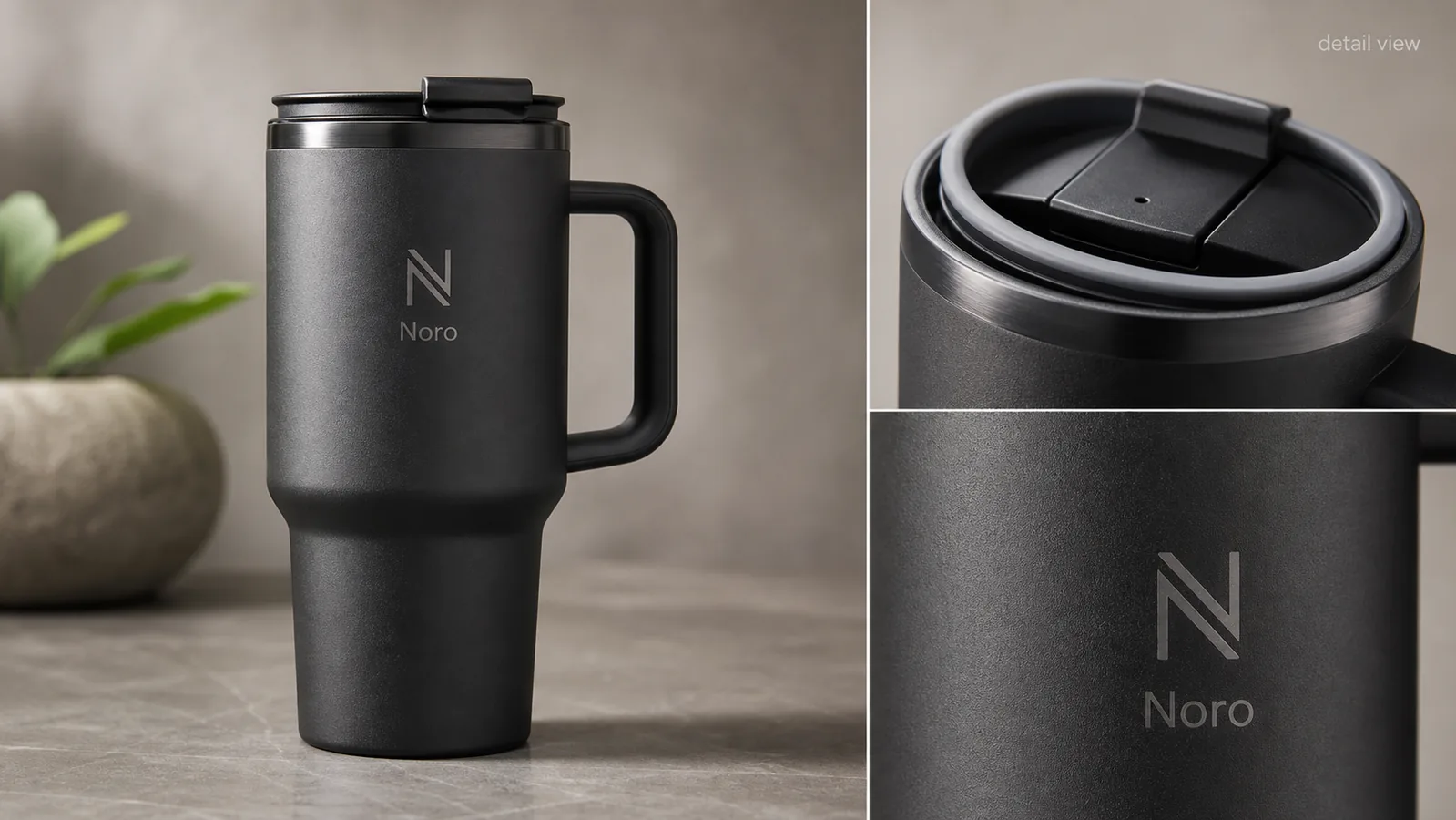 ## What A+ Images Should Actually Do
A+ content is not just a prettier image block. For a buyer, each image should answer one question that the main gallery did not answer well enough.
Good A+ content product images and product detail images usually do one of these jobs:
- Show a material, texture, stitching, glass edge, cap, handle, or connector in close detail.
- Explain scale or use context without hiding the product.
- Turn one selling point into a visual proof point.
- Show how parts of the same product relate to each other.
- Support brand feel while keeping product inspection easy.
The practical rule: one A+ image should carry one message. If the image tries to show five features, the buyer sees decoration instead of proof.
## Start With Product Truth, Not A Mood Board
Before using AI, list the product facts that cannot move. This prevents the model from making a more polished but less accurate SKU.
For [Amazon product photos](/marketplace-product-images/amazon-product-photos), protect:
- Product silhouette and proportions.
- True color and material finish.
- Label, logo, or blank label area.
- Lid, cap, zipper, seams, buttons, ports, handles, or hardware.
- Texture that affects buyer expectation.
- Product-to-hand or product-to-scene scale.
- Bundle contents and variant-specific details.
- Any claim that would require evidence outside the image.
If the source travel mug has a black lid, handle, and matte charcoal body, the A+ detail image should not turn it into a glossy bottle or add a different lid design. Better-looking is not better when it changes the product.
## A Simple A+ Image Plan
Use a small module plan before prompting. It keeps the article, designer, and reviewer aligned.
| A+ image role | What it should show | What to avoid |
|---|---|---|
| Product story hero | The full product in a cleaner branded setting | Fake marketplace UI, badges, review stars |
| Material detail | Same-SKU texture, stitching, glass, metal, fabric, or finish | Invented premium materials |
| Functional detail | Lid, closure, zipper, port, strap, pump, handle, or control area | Unsupported performance claims |
| Use context | Where the product fits in a normal buyer scenario | Props that hide the product |
| Size or set clarity | Real bundle contents or scale cues | Implied bundles not sold in the listing |
This plan also helps decide what not to generate. If a product does not have a verified benefit, do not turn that benefit into an image headline.
## Build The Images In KrafLayer
Use this sequence for Amazon A+ content images with AI:
1. Upload the best product reference image.
2. Write the protected product-truth list.
3. Choose one A+ module role, such as material detail or use context.
4. Generate that one image with a narrow instruction.
5. Compare the result against the product reference.
6. Reject outputs that alter color, shape, label area, hardware, bundle contents, or scale.
7. Use local editing for small background or crop cleanup instead of regenerating the whole product.
8. Review the final image with your Amazon listing owner before publishing.
KrafLayer should be used like an ecommerce production tool here, not a fantasy product designer. The output should make the existing product easier to understand and stay consistent with the seller's broader ecommerce product photography system.
## Prompt Template For A+ Content Product Images
Use this template when the module supports prompt-based generation:
> Create a realistic ecommerce A+ content image for the same product reference. Preserve the exact product shape, color, proportions, logo or label area, cap, handle, hardware, material texture, camera angle, and natural shadow. Show one clear message: [material detail / lid detail / use context / product story hero]. Keep the composition clean and product-forward. Do not add Amazon logos, marketplace UI, review stars, discount badges, certification marks, QR codes, barcodes, unsupported claims, or extra bundle items.
For a detail image, add:
> The close-up must visibly match the same product from the main image. Do not change the finish, seam placement, button shape, label area, or hardware.
This prompt is intentionally cautious. A+ images can be persuasive without pretending the product has features, certifications, or performance results that the seller has not verified.
## Review Rules Before Publishing
Review A+ content images as product evidence.
Check product accuracy:
- Does the image still show the same SKU?
- Did color, finish, or material drift?
- Did AI invent a logo, badge, certification mark, or claim?
- Did the feature close-up match the main product image?
- Did the product gain or lose parts?
- Does the use-context image imply a bundle or accessory not included?
Check buyer usefulness:
- Can the buyer understand the message in two seconds?
- Is the product still the main subject?
- Is the detail large enough to inspect?
- Is any text short, factual, and readable?
- Does the image support the product page instead of acting like a generic ad?
If the answer is unclear, simplify the module. A strong detail image often beats a busy feature collage.
## Where AI Helps Most
AI is strongest when it extends already reliable product information into more image roles.
Use AI for:
- Creating clean detail visuals from a clear product reference.
- Making a consistent branded surface or background.
- Showing restrained use context.
- Producing product story images after the main product facts are stable.
- Exploring layout directions before a designer finalizes the set.
Use more caution for:
- Tiny package text.
- Exact measurements.
- Regulated claims.
- Safety, medical, food, supplement, or child-product messaging.
- Certifications, seals, and marketplace marks.
- Any image that could be read as a guaranteed performance claim.
Amazon A+ content images with AI should support a listing, not replace seller review. The final decision still needs a human who knows the product, offer, and listing context.
## FAQ
### Can I create Amazon A+ content images with AI?
Yes, but use AI for product story, detail, and context images after you have a reliable product reference. The final images still need human review. Do not let AI change the SKU, invent features, add marketplace marks, or create unsupported claims just because the image looks more polished.
### What should an A+ image show?
Each A+ image should answer one buyer question. Common jobs include showing material texture, explaining a functional detail, giving scale context, showing the product in use, or reinforcing brand feel. Avoid cramming several claims into one image, because buyers will not know what to inspect.
### Should I put text on A+ content images?
Short factual text can help, but keep it restrained. Use labels like "detail view" or a simple material note when it clarifies the image. Avoid discount messages, review stars, fake badges, unsupported claims, and platform-like UI elements.
### How does KrafLayer help with Amazon product images?
KrafLayer can help sellers generate product-focused images from references, create detail-image directions, clean backgrounds, and make local image fixes. For Amazon product photos and A+ images, the important step is reviewing every output against the real product before publishing.
### What is the biggest risk with AI-generated A+ images?
The biggest risk is product drift. AI may make the product look cleaner while changing the cap, texture, label area, hardware, or bundle contents. Reject those outputs. A less dramatic image that preserves product truth is usually safer and more useful than a beautiful inaccurate one.
## Conclusion
Amazon A+ content images with AI work best when they turn real product facts into clearer visual proof. Start with a product-truth list, create one module image at a time, keep claims cautious, and review every detail before publishing. KrafLayer can help generate and refine those ecommerce assets, but the seller should always protect the actual product over the prettiest variation.
# Prompt Writing Basics
URL: https://kraflayer.com/docs/prompt-writing-basics
Summary: Learn how to write clearer AI image and video prompts, when to use prompt enhancement, and how to preserve style, references, aspect ratio, and output intent.
Updated: 2026-06-12
## What a good prompt needs
A good AI generation prompt does not need to be long. It needs to be clear about what should appear, how it should look, and what constraints must stay fixed.
For KrafLayer, a strong prompt usually includes five parts: subject, visual style, composition, lighting, and output intent. If you are generating a product image, add product clarity and background direction. If you are generating video, add motion and camera behavior.
A simple structure is:
- Subject: what the image or video is about.
- Style: photoreal, anime, cinematic, product photography, editorial, illustration, or another visual direction.
- Composition: close-up, full body, flat lay, hero shot, centered product, wide shot, split layout, or grid.
- Lighting and mood: soft daylight, studio lighting, neon, warm interior, dramatic backlight, clean commercial light.
- Constraints: aspect ratio, number of subjects, reference preservation, brand colors, readable text, or background requirements.
**Weak prompt:**
A nice product photo of a bottle.
**Stronger prompt:**
A clean commercial product photo of a matte white skincare bottle on a pale green acrylic surface, centered hero composition, soft studio lighting, subtle water reflections, minimal premium beauty brand style, sharp product label, 1:1 aspect ratio.
## How KrafLayer prompt enhancement works
KrafLayer's prompt enhancer is designed to turn a rough idea into a model-ready prompt without changing the user's core intent.
It keeps important constraints such as numbers, layout words, aspect ratio, reference-image instructions, product identity, and requested style. If the user writes in Chinese, the enhanced prompt stays in Chinese. If the user writes in English, it stays in English.
The enhancer can also adapt the prompt based on context:
- Image generation prompts focus on subject, composition, visual style, lighting, detail, and output quality.
- Product prompts prioritize clarity, material realism, commercial composition, and clean background control.
- Reference-image edits preserve the identity of the input image and describe what should change.
- Video prompts add motion, camera movement, pacing, scene continuity, and first-frame or end-frame guidance.
- Style presets can bias the result toward KrafLayer's 14 image style directions, including Cinematic, Photoreal, Portrait, Product, Fashion, Digital, Anime, Lacquer, Concept, Minimal, Logo, Render, Watercolor, and Oilpaint.
> **Common follow-ups**
>
> **Does prompt enhancement replace manual prompting?**
>
> No. It is best used as a starting point. You can write a short idea, enhance it, then edit the final wording before generation.
>
> **Will prompt enhancement change my subject?**
>
> It should not intentionally replace the subject. For reference-image edits, it should preserve the main subject and focus on the requested edit, style, background, lighting, or composition.
>
> **Can I use prompt enhancement for Chinese prompts?**
>
> Yes. KrafLayer keeps the output in the same language as the input prompt.
## Start with the subject
The subject is the anchor of the prompt. It tells the model what must appear.
For characters, describe identity, outfit, pose, expression, and role.
**Example:**
A game-style anime female sword fighter, silver armor, short black hair, confident expression, holding a glowing blue blade, full-body character design.
For products, describe the product category, material, color, shape, and brand mood.
**Example:**
A premium wireless speaker with a soft fabric grille, rounded aluminum body, matte charcoal finish, placed on a clean studio surface.
For environments, describe the location, time, atmosphere, and important objects.
**Example:**
A compact creative studio at night, desk with drawing tablet, warm lamp light, wall of reference images, quiet cinematic mood.
## Add style without overloading the prompt
Style helps the model choose the visual language. Use a few precise style terms instead of stacking too many unrelated tags.
Good style signals include:
- photoreal commercial product photography
- cinematic science fiction concept art
- Japanese RPG character design
- clean editorial fashion photography
- cozy lifestyle interior photography
- polished 3D icon style
- watercolor storybook illustration
Avoid mixing style directions that fight each other, such as photoreal product photography, watercolor, clay render, cyberpunk, vintage film, and flat vector in the same prompt unless you intentionally want a hybrid look.
## Describe composition and camera
Composition controls where things appear in the frame. This matters especially for product images, thumbnails, posters, and ecommerce visuals.
Useful composition phrases:
- centered hero shot
- full-body character pose
- close-up portrait
- wide establishing shot
- top-down flat lay
- three-quarter product view
- symmetrical composition
- negative space for headline text
- clean background with product centered
- grid of three variations
Camera phrases help when you want a specific visual feel:
- macro lens
- 35mm editorial lens
- shallow depth of field
- low-angle heroic shot
- eye-level product view
- overhead camera
- slow push-in camera movement for video
## Use lighting as a quality control
Lighting often changes the perceived quality of the result more than extra detail words.
For clean commercial images, use:
- soft studio lighting
- diffused daylight
- controlled highlights
- gentle shadow under the product
- bright ecommerce background
For cinematic images, use:
- dramatic rim light
- volumetric light
- warm practical lights
- neon reflections
- moonlit backlight
For anime or game character art, use:
- clean key light
- glowing weapon light
- atmospheric background light
- high-contrast character silhouette
## Preserve hard constraints
Hard constraints are details that should not change. Put them clearly in the prompt.
Examples:
- exactly three characters
- 1:1 aspect ratio
- no text on the image
- keep the same product shape
- preserve the face identity from the reference image
- white background
- front view only
- include one hero image and four detail images
KrafLayer's prompt enhancer tries to preserve hard constraints, but you should still keep the most important ones explicit.
## Prompting with reference images
When using a reference image, describe what should stay the same and what should change.
Good reference-image edit prompt:
Use the uploaded product as the exact reference. Preserve the product shape, color, label placement, and material. Replace the background with a clean beige studio setting, add soft commercial lighting, and create a premium ecommerce hero image.
For character or portrait references:
Use the reference image to preserve the subject's identity, facial structure, hairstyle, and outfit silhouette. Transform the scene into a cinematic fantasy character portrait with dramatic rim lighting and a dark forest background.
Avoid vague edit prompts like:
Make it better.
Instead, say what better means: cleaner background, sharper product edges, more realistic lighting, stronger composition, different style, or higher commercial polish.
## Prompting for product image sets
A product image set should not be one prompt repeated several times. Each image should explain a different selling angle.
A strong five-image product set might include:
- Hero image: clean product-first composition.
- Lifestyle scene: product used in a realistic environment.
- Detail shot: material, texture, buttons, label, or craftsmanship.
- Feature scene: visual explanation of the key benefit.
- Social ad image: more expressive composition with space for copy.
**Example:**
Generate a five-image product set for a minimalist smart water bottle. Include a clean ecommerce hero shot, a gym lifestyle scene, a close-up of the lid sensor, a hydration reminder feature scene, and a social ad image with fresh blue lighting.
This is the reason KrafLayer's agent workflow may create several different prompts for one product request instead of running the same prompt multiple times.
## Prompting for AI video
Video prompts need motion. A still-image prompt describes a frame; a video prompt describes change over time.
Add:
- subject action
- camera movement
- environment motion
- pacing
- start and end state
- mood continuity
Example image prompt:
A cinematic product shot of a luxury perfume bottle on black glass, dramatic reflections, soft gold backlight.
Example video prompt:
A cinematic 6-second product video of a luxury perfume bottle on black glass. The camera slowly pushes in from a three-quarter angle while gold light moves across the bottle, subtle mist drifts behind it, reflections shimmer on the surface, premium fragrance ad mood, smooth motion, no text.
If you use image-to-video, the prompt should respect the starting image:
Animate the uploaded product image. Keep the bottle shape, label, color, and composition consistent. Add a slow camera push-in, soft moving reflections, and subtle background mist. Do not change the product identity.
## When to use negative prompts
Negative prompts are useful when a model supports them, but they should be short.
Common negative prompt examples:
- blurry
- low quality
- distorted hands
- extra fingers
- unreadable text
- watermark
- messy background
- duplicated product
- deformed face
Do not put your main creative direction in the negative prompt. Use it only to reduce common failure modes.
## Before generating, check the prompt
Before you spend credits, check four things:
- Is the subject clear?
- Is the style specific?
- Are the must-keep constraints explicit?
- Does the prompt match the selected model and format?
For product images, also check whether the prompt protects the product identity.
For video, check whether the prompt includes motion, camera behavior, and duration-friendly action.
## Example prompt templates
### Product hero image
A clean commercial product photo of [product], [material/color details], centered hero composition, [background], soft studio lighting, realistic shadows, premium ecommerce style, sharp product edges, [aspect ratio].
### Anime game character
A game-style anime character design of [character role], [outfit and weapon], [pose], [expression], [background setting], clean character silhouette, detailed costume design, polished RPG key art style, [aspect ratio].
### Cinematic image
A cinematic image of [subject] in [environment], [camera angle], [lighting], [mood], detailed atmosphere, realistic depth, high-quality visual composition, [aspect ratio].
### Image-to-video
Animate the uploaded image while preserving [subject/product identity]. Add [subject motion], [camera movement], [environment motion], [lighting change], smooth pacing, consistent details, no unwanted transformation.
## Related KrafLayer docs
- [14 style presets](/docs/style-presets-and-when-to-use-them)
- [Image generation models](/docs/image-generation)
- [Image to video with AI](/docs/ai-image-to-video-guide)
- [Types of ecommerce images](/docs/ecommerce-image-types)
# How to Fix Yellow Color Cast in Product Photos
URL: https://kraflayer.com/blog/fix-yellow-color-cast-in-product-photos
Summary: A practical product-photo color correction workflow for turning warm yellow indoor shots into neutral, sellable ecommerce images without changing the SKU. Includes how to do it in KrafLayer.
Updated: 2026-08-21
## TL;DR
For Fix Yellow Color Cast in Product Photos, use KrafLayer as a fast pre-publishing edit step: run Restore on a usable source photo, then compare color, exposure, and recovered detail against the original. It is most useful for listing images, detail pages, or ad assets, as long as shape, material, labels, color, scale, and accessories still match the source SKU.
If a product photo looks yellow, fix the color cast before you judge the product, the background, or the camera. The goal is not to make the image cold or over-white. The goal is to restore believable product color so the buyer can read the material, finish, and variant correctly.
KrafLayer is an AI-powered visual editor for ecommerce product photography. For this kind of edit, use it to correct the light color while protecting product facts: shape, material, metal tone, wood detail, scale, and shadow.
## What A+ Images Should Actually Do
A+ content is not just a prettier image block. For a buyer, each image should answer one question that the main gallery did not answer well enough.
Good A+ content product images and product detail images usually do one of these jobs:
- Show a material, texture, stitching, glass edge, cap, handle, or connector in close detail.
- Explain scale or use context without hiding the product.
- Turn one selling point into a visual proof point.
- Show how parts of the same product relate to each other.
- Support brand feel while keeping product inspection easy.
The practical rule: one A+ image should carry one message. If the image tries to show five features, the buyer sees decoration instead of proof.
## Start With Product Truth, Not A Mood Board
Before using AI, list the product facts that cannot move. This prevents the model from making a more polished but less accurate SKU.
For [Amazon product photos](/marketplace-product-images/amazon-product-photos), protect:
- Product silhouette and proportions.
- True color and material finish.
- Label, logo, or blank label area.
- Lid, cap, zipper, seams, buttons, ports, handles, or hardware.
- Texture that affects buyer expectation.
- Product-to-hand or product-to-scene scale.
- Bundle contents and variant-specific details.
- Any claim that would require evidence outside the image.
If the source travel mug has a black lid, handle, and matte charcoal body, the A+ detail image should not turn it into a glossy bottle or add a different lid design. Better-looking is not better when it changes the product.
## A Simple A+ Image Plan
Use a small module plan before prompting. It keeps the article, designer, and reviewer aligned.
| A+ image role | What it should show | What to avoid |
|---|---|---|
| Product story hero | The full product in a cleaner branded setting | Fake marketplace UI, badges, review stars |
| Material detail | Same-SKU texture, stitching, glass, metal, fabric, or finish | Invented premium materials |
| Functional detail | Lid, closure, zipper, port, strap, pump, handle, or control area | Unsupported performance claims |
| Use context | Where the product fits in a normal buyer scenario | Props that hide the product |
| Size or set clarity | Real bundle contents or scale cues | Implied bundles not sold in the listing |
This plan also helps decide what not to generate. If a product does not have a verified benefit, do not turn that benefit into an image headline.
## Build The Images In KrafLayer
Use this sequence for Amazon A+ content images with AI:
1. Upload the best product reference image.
2. Write the protected product-truth list.
3. Choose one A+ module role, such as material detail or use context.
4. Generate that one image with a narrow instruction.
5. Compare the result against the product reference.
6. Reject outputs that alter color, shape, label area, hardware, bundle contents, or scale.
7. Use local editing for small background or crop cleanup instead of regenerating the whole product.
8. Review the final image with your Amazon listing owner before publishing.
KrafLayer should be used like an ecommerce production tool here, not a fantasy product designer. The output should make the existing product easier to understand and stay consistent with the seller's broader ecommerce product photography system.
## Prompt Template For A+ Content Product Images
Use this template when the module supports prompt-based generation:
> Create a realistic ecommerce A+ content image for the same product reference. Preserve the exact product shape, color, proportions, logo or label area, cap, handle, hardware, material texture, camera angle, and natural shadow. Show one clear message: [material detail / lid detail / use context / product story hero]. Keep the composition clean and product-forward. Do not add Amazon logos, marketplace UI, review stars, discount badges, certification marks, QR codes, barcodes, unsupported claims, or extra bundle items.
For a detail image, add:
> The close-up must visibly match the same product from the main image. Do not change the finish, seam placement, button shape, label area, or hardware.
This prompt is intentionally cautious. A+ images can be persuasive without pretending the product has features, certifications, or performance results that the seller has not verified.
## Review Rules Before Publishing
Review A+ content images as product evidence.
Check product accuracy:
- Does the image still show the same SKU?
- Did color, finish, or material drift?
- Did AI invent a logo, badge, certification mark, or claim?
- Did the feature close-up match the main product image?
- Did the product gain or lose parts?
- Does the use-context image imply a bundle or accessory not included?
Check buyer usefulness:
- Can the buyer understand the message in two seconds?
- Is the product still the main subject?
- Is the detail large enough to inspect?
- Is any text short, factual, and readable?
- Does the image support the product page instead of acting like a generic ad?
If the answer is unclear, simplify the module. A strong detail image often beats a busy feature collage.
## Where AI Helps Most
AI is strongest when it extends already reliable product information into more image roles.
Use AI for:
- Creating clean detail visuals from a clear product reference.
- Making a consistent branded surface or background.
- Showing restrained use context.
- Producing product story images after the main product facts are stable.
- Exploring layout directions before a designer finalizes the set.
Use more caution for:
- Tiny package text.
- Exact measurements.
- Regulated claims.
- Safety, medical, food, supplement, or child-product messaging.
- Certifications, seals, and marketplace marks.
- Any image that could be read as a guaranteed performance claim.
Amazon A+ content images with AI should support a listing, not replace seller review. The final decision still needs a human who knows the product, offer, and listing context.
## FAQ
### Can I create Amazon A+ content images with AI?
Yes, but use AI for product story, detail, and context images after you have a reliable product reference. The final images still need human review. Do not let AI change the SKU, invent features, add marketplace marks, or create unsupported claims just because the image looks more polished.
### What should an A+ image show?
Each A+ image should answer one buyer question. Common jobs include showing material texture, explaining a functional detail, giving scale context, showing the product in use, or reinforcing brand feel. Avoid cramming several claims into one image, because buyers will not know what to inspect.
### Should I put text on A+ content images?
Short factual text can help, but keep it restrained. Use labels like "detail view" or a simple material note when it clarifies the image. Avoid discount messages, review stars, fake badges, unsupported claims, and platform-like UI elements.
### How does KrafLayer help with Amazon product images?
KrafLayer can help sellers generate product-focused images from references, create detail-image directions, clean backgrounds, and make local image fixes. For Amazon product photos and A+ images, the important step is reviewing every output against the real product before publishing.
### What is the biggest risk with AI-generated A+ images?
The biggest risk is product drift. AI may make the product look cleaner while changing the cap, texture, label area, hardware, or bundle contents. Reject those outputs. A less dramatic image that preserves product truth is usually safer and more useful than a beautiful inaccurate one.
## Conclusion
Amazon A+ content images with AI work best when they turn real product facts into clearer visual proof. Start with a product-truth list, create one module image at a time, keep claims cautious, and review every detail before publishing. KrafLayer can help generate and refine those ecommerce assets, but the seller should always protect the actual product over the prettiest variation.
# Prompt Writing Basics
URL: https://kraflayer.com/docs/prompt-writing-basics
Summary: Learn how to write clearer AI image and video prompts, when to use prompt enhancement, and how to preserve style, references, aspect ratio, and output intent.
Updated: 2026-06-12
## What a good prompt needs
A good AI generation prompt does not need to be long. It needs to be clear about what should appear, how it should look, and what constraints must stay fixed.
For KrafLayer, a strong prompt usually includes five parts: subject, visual style, composition, lighting, and output intent. If you are generating a product image, add product clarity and background direction. If you are generating video, add motion and camera behavior.
A simple structure is:
- Subject: what the image or video is about.
- Style: photoreal, anime, cinematic, product photography, editorial, illustration, or another visual direction.
- Composition: close-up, full body, flat lay, hero shot, centered product, wide shot, split layout, or grid.
- Lighting and mood: soft daylight, studio lighting, neon, warm interior, dramatic backlight, clean commercial light.
- Constraints: aspect ratio, number of subjects, reference preservation, brand colors, readable text, or background requirements.
**Weak prompt:**
A nice product photo of a bottle.
**Stronger prompt:**
A clean commercial product photo of a matte white skincare bottle on a pale green acrylic surface, centered hero composition, soft studio lighting, subtle water reflections, minimal premium beauty brand style, sharp product label, 1:1 aspect ratio.
## How KrafLayer prompt enhancement works
KrafLayer's prompt enhancer is designed to turn a rough idea into a model-ready prompt without changing the user's core intent.
It keeps important constraints such as numbers, layout words, aspect ratio, reference-image instructions, product identity, and requested style. If the user writes in Chinese, the enhanced prompt stays in Chinese. If the user writes in English, it stays in English.
The enhancer can also adapt the prompt based on context:
- Image generation prompts focus on subject, composition, visual style, lighting, detail, and output quality.
- Product prompts prioritize clarity, material realism, commercial composition, and clean background control.
- Reference-image edits preserve the identity of the input image and describe what should change.
- Video prompts add motion, camera movement, pacing, scene continuity, and first-frame or end-frame guidance.
- Style presets can bias the result toward KrafLayer's 14 image style directions, including Cinematic, Photoreal, Portrait, Product, Fashion, Digital, Anime, Lacquer, Concept, Minimal, Logo, Render, Watercolor, and Oilpaint.
> **Common follow-ups**
>
> **Does prompt enhancement replace manual prompting?**
>
> No. It is best used as a starting point. You can write a short idea, enhance it, then edit the final wording before generation.
>
> **Will prompt enhancement change my subject?**
>
> It should not intentionally replace the subject. For reference-image edits, it should preserve the main subject and focus on the requested edit, style, background, lighting, or composition.
>
> **Can I use prompt enhancement for Chinese prompts?**
>
> Yes. KrafLayer keeps the output in the same language as the input prompt.
## Start with the subject
The subject is the anchor of the prompt. It tells the model what must appear.
For characters, describe identity, outfit, pose, expression, and role.
**Example:**
A game-style anime female sword fighter, silver armor, short black hair, confident expression, holding a glowing blue blade, full-body character design.
For products, describe the product category, material, color, shape, and brand mood.
**Example:**
A premium wireless speaker with a soft fabric grille, rounded aluminum body, matte charcoal finish, placed on a clean studio surface.
For environments, describe the location, time, atmosphere, and important objects.
**Example:**
A compact creative studio at night, desk with drawing tablet, warm lamp light, wall of reference images, quiet cinematic mood.
## Add style without overloading the prompt
Style helps the model choose the visual language. Use a few precise style terms instead of stacking too many unrelated tags.
Good style signals include:
- photoreal commercial product photography
- cinematic science fiction concept art
- Japanese RPG character design
- clean editorial fashion photography
- cozy lifestyle interior photography
- polished 3D icon style
- watercolor storybook illustration
Avoid mixing style directions that fight each other, such as photoreal product photography, watercolor, clay render, cyberpunk, vintage film, and flat vector in the same prompt unless you intentionally want a hybrid look.
## Describe composition and camera
Composition controls where things appear in the frame. This matters especially for product images, thumbnails, posters, and ecommerce visuals.
Useful composition phrases:
- centered hero shot
- full-body character pose
- close-up portrait
- wide establishing shot
- top-down flat lay
- three-quarter product view
- symmetrical composition
- negative space for headline text
- clean background with product centered
- grid of three variations
Camera phrases help when you want a specific visual feel:
- macro lens
- 35mm editorial lens
- shallow depth of field
- low-angle heroic shot
- eye-level product view
- overhead camera
- slow push-in camera movement for video
## Use lighting as a quality control
Lighting often changes the perceived quality of the result more than extra detail words.
For clean commercial images, use:
- soft studio lighting
- diffused daylight
- controlled highlights
- gentle shadow under the product
- bright ecommerce background
For cinematic images, use:
- dramatic rim light
- volumetric light
- warm practical lights
- neon reflections
- moonlit backlight
For anime or game character art, use:
- clean key light
- glowing weapon light
- atmospheric background light
- high-contrast character silhouette
## Preserve hard constraints
Hard constraints are details that should not change. Put them clearly in the prompt.
Examples:
- exactly three characters
- 1:1 aspect ratio
- no text on the image
- keep the same product shape
- preserve the face identity from the reference image
- white background
- front view only
- include one hero image and four detail images
KrafLayer's prompt enhancer tries to preserve hard constraints, but you should still keep the most important ones explicit.
## Prompting with reference images
When using a reference image, describe what should stay the same and what should change.
Good reference-image edit prompt:
Use the uploaded product as the exact reference. Preserve the product shape, color, label placement, and material. Replace the background with a clean beige studio setting, add soft commercial lighting, and create a premium ecommerce hero image.
For character or portrait references:
Use the reference image to preserve the subject's identity, facial structure, hairstyle, and outfit silhouette. Transform the scene into a cinematic fantasy character portrait with dramatic rim lighting and a dark forest background.
Avoid vague edit prompts like:
Make it better.
Instead, say what better means: cleaner background, sharper product edges, more realistic lighting, stronger composition, different style, or higher commercial polish.
## Prompting for product image sets
A product image set should not be one prompt repeated several times. Each image should explain a different selling angle.
A strong five-image product set might include:
- Hero image: clean product-first composition.
- Lifestyle scene: product used in a realistic environment.
- Detail shot: material, texture, buttons, label, or craftsmanship.
- Feature scene: visual explanation of the key benefit.
- Social ad image: more expressive composition with space for copy.
**Example:**
Generate a five-image product set for a minimalist smart water bottle. Include a clean ecommerce hero shot, a gym lifestyle scene, a close-up of the lid sensor, a hydration reminder feature scene, and a social ad image with fresh blue lighting.
This is the reason KrafLayer's agent workflow may create several different prompts for one product request instead of running the same prompt multiple times.
## Prompting for AI video
Video prompts need motion. A still-image prompt describes a frame; a video prompt describes change over time.
Add:
- subject action
- camera movement
- environment motion
- pacing
- start and end state
- mood continuity
Example image prompt:
A cinematic product shot of a luxury perfume bottle on black glass, dramatic reflections, soft gold backlight.
Example video prompt:
A cinematic 6-second product video of a luxury perfume bottle on black glass. The camera slowly pushes in from a three-quarter angle while gold light moves across the bottle, subtle mist drifts behind it, reflections shimmer on the surface, premium fragrance ad mood, smooth motion, no text.
If you use image-to-video, the prompt should respect the starting image:
Animate the uploaded product image. Keep the bottle shape, label, color, and composition consistent. Add a slow camera push-in, soft moving reflections, and subtle background mist. Do not change the product identity.
## When to use negative prompts
Negative prompts are useful when a model supports them, but they should be short.
Common negative prompt examples:
- blurry
- low quality
- distorted hands
- extra fingers
- unreadable text
- watermark
- messy background
- duplicated product
- deformed face
Do not put your main creative direction in the negative prompt. Use it only to reduce common failure modes.
## Before generating, check the prompt
Before you spend credits, check four things:
- Is the subject clear?
- Is the style specific?
- Are the must-keep constraints explicit?
- Does the prompt match the selected model and format?
For product images, also check whether the prompt protects the product identity.
For video, check whether the prompt includes motion, camera behavior, and duration-friendly action.
## Example prompt templates
### Product hero image
A clean commercial product photo of [product], [material/color details], centered hero composition, [background], soft studio lighting, realistic shadows, premium ecommerce style, sharp product edges, [aspect ratio].
### Anime game character
A game-style anime character design of [character role], [outfit and weapon], [pose], [expression], [background setting], clean character silhouette, detailed costume design, polished RPG key art style, [aspect ratio].
### Cinematic image
A cinematic image of [subject] in [environment], [camera angle], [lighting], [mood], detailed atmosphere, realistic depth, high-quality visual composition, [aspect ratio].
### Image-to-video
Animate the uploaded image while preserving [subject/product identity]. Add [subject motion], [camera movement], [environment motion], [lighting change], smooth pacing, consistent details, no unwanted transformation.
## Related KrafLayer docs
- [14 style presets](/docs/style-presets-and-when-to-use-them)
- [Image generation models](/docs/image-generation)
- [Image to video with AI](/docs/ai-image-to-video-guide)
- [Types of ecommerce images](/docs/ecommerce-image-types)
# How to Fix Yellow Color Cast in Product Photos
URL: https://kraflayer.com/blog/fix-yellow-color-cast-in-product-photos
Summary: A practical product-photo color correction workflow for turning warm yellow indoor shots into neutral, sellable ecommerce images without changing the SKU. Includes how to do it in KrafLayer.
Updated: 2026-08-21
## TL;DR
For Fix Yellow Color Cast in Product Photos, use KrafLayer as a fast pre-publishing edit step: run Restore on a usable source photo, then compare color, exposure, and recovered detail against the original. It is most useful for listing images, detail pages, or ad assets, as long as shape, material, labels, color, scale, and accessories still match the source SKU.
If a product photo looks yellow, fix the color cast before you judge the product, the background, or the camera. The goal is not to make the image cold or over-white. The goal is to restore believable product color so the buyer can read the material, finish, and variant correctly.
KrafLayer is an AI-powered visual editor for ecommerce product photography. For this kind of edit, use it to correct the light color while protecting product facts: shape, material, metal tone, wood detail, scale, and shadow.
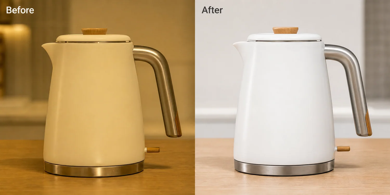 The example uses one white ceramic electric kettle. The before image has a strong warm indoor cast, so the white body looks cream and the steel handle looks muddy. The after image is not a new product render. It is the same selling asset corrected toward neutral whites, readable steel, and cleaner marketplace-style lighting.
## Why Yellow Product Photos Hurt Listings
A yellow cast makes a buyer question the real color of the item. White ceramics can look beige, silver hardware can look brass, and clear plastic can look aged. For apparel, beauty, home goods, kitchenware, and electronics, that can cause returns or hesitation because the product color no longer matches the option name.
Color correction is a trust edit. It helps the listing answer a basic question: what color and material will arrive?
## Start With the Product Facts
Before editing, name what must stay unchanged. For a kettle, protect the body shape, lid line, handle curve, steel base, wood knob, switch position, and natural contact shadow. For a bag, protect leather grain, zipper position, stitching, strap angle, and hardware color.
If the AI changes these details while fixing the color, reject the result. A cleaner image is not useful if it quietly redesigns the SKU.
## Edit Prompt for Yellow Cast Correction
Use a narrow prompt inside [KrafLayer](https://kraflayer.com):
> Correct the warm yellow color cast in this product photo and restore accurate neutral product color. Keep the same product shape, angle, crop, material texture, steel tone, wood detail, scale, and natural shadow. Make the lighting clean enough for an ecommerce listing, but do not redesign the product, remove real details, add props, add logos, or make the whites look blue.
This prompt keeps the edit about color and light, not a full creative restyle.
## Check Neutral Does Not Mean Flat
Good correction still has depth. The product should keep soft shadows, edge highlights, and material contrast. If the image becomes pure white with no shape, it may pass a quick thumbnail check but fail on a product detail page.
Use this review list:
- white or light-colored parts look neutral, not blue
- metal keeps a realistic steel tone
- wood, leather, fabric, or plastic keeps its real warmth
- shadows stay soft and connected to the product
- label areas and small details remain readable
- the edited image still looks like a product photo, not a sterile cutout
## When to Correct by Batch
Batch correction works when a set of images was shot under the same bad light. It is useful for supplier photos, warehouse shots, and small catalog updates. Start with one hero image, define the correction style, then apply that direction across the set.
Do not batch-correct mixed lighting blindly. A yellow kitchen counter shot, a dark warehouse shot, and a daylight lifestyle shot need different treatment.
## Where KrafLayer Fits
When you apply this Fix Yellow Color Cast in Product Photos workflow in KrafLayer, the tool choice matters: run Restore on a usable source photo, then compare color, exposure, and recovered detail against the original. After generation, judge the image by the channel it serves — listing images, detail pages, or ad assets — and check that shape, material, labels, color, scale, and accessories still match the source SKU.
## FAQ
### What is a yellow color cast in product photography?
A yellow color cast is a warm lighting shift that makes the entire product photo look too yellow or beige. It often comes from indoor bulbs, old supplier photos, or mixed lighting.
### Can AI fix yellow product photos without changing the item?
Yes, if the prompt protects product facts. Ask for color correction, neutral lighting, and unchanged shape, material texture, scale, hardware, labels, and shadow.
### Should white products become pure white after correction?
No. White products should look neutral and clean, but still show shape, highlights, and soft shadows. Pure white with no detail can make the product look flat or fake.
# How to Create Ecommerce Product Photos Without a Studio
URL: https://kraflayer.com/blog/create-ecommerce-product-photos-without-studio
Summary: A practical no-studio workflow for turning one product reference into main images, detail images, lifestyle scenes, and ad creatives.
Updated: 2026-06-18
The fastest practical way to create ecommerce product photos without a studio is to start with one honest product reference, decide which sales images you need, generate the missing scenes, then review the output like a product photographer would. The goal is not to make a prettier picture at any cost. The goal is to keep the product recognizable while producing main images, detail images, lifestyle scenes, and ad creatives that can actually support an online listing.
KrafLayer is useful for this workflow because it connects product-reference generation with editing tasks such as background cleanup, product photo editing, and visual variation. A seller can move from one usable product photo to a small image set instead of booking a full studio shoot for every listing update.
The example uses one white ceramic electric kettle. The before image has a strong warm indoor cast, so the white body looks cream and the steel handle looks muddy. The after image is not a new product render. It is the same selling asset corrected toward neutral whites, readable steel, and cleaner marketplace-style lighting.
## Why Yellow Product Photos Hurt Listings
A yellow cast makes a buyer question the real color of the item. White ceramics can look beige, silver hardware can look brass, and clear plastic can look aged. For apparel, beauty, home goods, kitchenware, and electronics, that can cause returns or hesitation because the product color no longer matches the option name.
Color correction is a trust edit. It helps the listing answer a basic question: what color and material will arrive?
## Start With the Product Facts
Before editing, name what must stay unchanged. For a kettle, protect the body shape, lid line, handle curve, steel base, wood knob, switch position, and natural contact shadow. For a bag, protect leather grain, zipper position, stitching, strap angle, and hardware color.
If the AI changes these details while fixing the color, reject the result. A cleaner image is not useful if it quietly redesigns the SKU.
## Edit Prompt for Yellow Cast Correction
Use a narrow prompt inside [KrafLayer](https://kraflayer.com):
> Correct the warm yellow color cast in this product photo and restore accurate neutral product color. Keep the same product shape, angle, crop, material texture, steel tone, wood detail, scale, and natural shadow. Make the lighting clean enough for an ecommerce listing, but do not redesign the product, remove real details, add props, add logos, or make the whites look blue.
This prompt keeps the edit about color and light, not a full creative restyle.
## Check Neutral Does Not Mean Flat
Good correction still has depth. The product should keep soft shadows, edge highlights, and material contrast. If the image becomes pure white with no shape, it may pass a quick thumbnail check but fail on a product detail page.
Use this review list:
- white or light-colored parts look neutral, not blue
- metal keeps a realistic steel tone
- wood, leather, fabric, or plastic keeps its real warmth
- shadows stay soft and connected to the product
- label areas and small details remain readable
- the edited image still looks like a product photo, not a sterile cutout
## When to Correct by Batch
Batch correction works when a set of images was shot under the same bad light. It is useful for supplier photos, warehouse shots, and small catalog updates. Start with one hero image, define the correction style, then apply that direction across the set.
Do not batch-correct mixed lighting blindly. A yellow kitchen counter shot, a dark warehouse shot, and a daylight lifestyle shot need different treatment.
## Where KrafLayer Fits
When you apply this Fix Yellow Color Cast in Product Photos workflow in KrafLayer, the tool choice matters: run Restore on a usable source photo, then compare color, exposure, and recovered detail against the original. After generation, judge the image by the channel it serves — listing images, detail pages, or ad assets — and check that shape, material, labels, color, scale, and accessories still match the source SKU.
## FAQ
### What is a yellow color cast in product photography?
A yellow color cast is a warm lighting shift that makes the entire product photo look too yellow or beige. It often comes from indoor bulbs, old supplier photos, or mixed lighting.
### Can AI fix yellow product photos without changing the item?
Yes, if the prompt protects product facts. Ask for color correction, neutral lighting, and unchanged shape, material texture, scale, hardware, labels, and shadow.
### Should white products become pure white after correction?
No. White products should look neutral and clean, but still show shape, highlights, and soft shadows. Pure white with no detail can make the product look flat or fake.
# How to Create Ecommerce Product Photos Without a Studio
URL: https://kraflayer.com/blog/create-ecommerce-product-photos-without-studio
Summary: A practical no-studio workflow for turning one product reference into main images, detail images, lifestyle scenes, and ad creatives.
Updated: 2026-06-18
The fastest practical way to create ecommerce product photos without a studio is to start with one honest product reference, decide which sales images you need, generate the missing scenes, then review the output like a product photographer would. The goal is not to make a prettier picture at any cost. The goal is to keep the product recognizable while producing main images, detail images, lifestyle scenes, and ad creatives that can actually support an online listing.
KrafLayer is useful for this workflow because it connects product-reference generation with editing tasks such as background cleanup, product photo editing, and visual variation. A seller can move from one usable product photo to a small image set instead of booking a full studio shoot for every listing update.
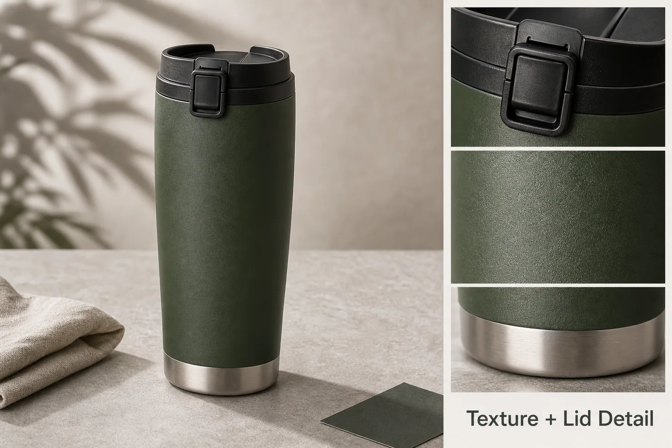 ## What You Need Before You Generate
A no-studio product photo workflow still needs product facts. Before using AI, collect the information that a buyer would notice if it changed:
- the exact product shape, proportions, and camera angle
- material details such as fabric grain, metal finish, glass thickness, or rubber texture
- color family and variant names
- labels, stitching, ports, buttons, seams, handles, caps, and other buyer-relevant details
- the target image roles: main image, detail image, lifestyle scene, marketplace crop, or ad creative
Practical rule: AI product photography is safest when the product reference is treated as the source of truth and every generated image is judged against that reference.
## A Simple No-Studio Workflow
Start with one clean product reference. It does not need to be perfect, but it should show the item clearly with enough resolution for the model and editor to understand the product.
Next, create a main image. For most ecommerce pages, this means a clear product-forward image with the item centered, a controlled background, visible edges, and a natural contact shadow. If the item is for a marketplace listing, keep the image restrained and avoid props that compete with the SKU.
Then create one or two detail images. These should prove something a buyer cares about: texture, hardware, scale, closure, fabric, transparency, finish, or packaging. A good detail image is not just a zoomed-in crop. It should answer a specific buyer question.
Finally, create a lifestyle or campaign image only after the main image is trustworthy. Lifestyle scenes are useful for Shopify product pages, ads, email, and social content, but they should not change the product's color, shape, or scale.
## What KrafLayer Should Preserve
When using KrafLayer for ecommerce product photography, write the instruction around preservation before styling. For example:
> Use this product reference to create a clean ecommerce main image and one lifestyle variation. Preserve the product shape, color, material texture, cap, seams, scale, and natural shadow. Do not add logos, claims, extra products, or redesign the item.
This kind of prompt gives the model a job: build better selling images around the product, not a new product inspired by it.
For edits after generation, use the [AI product photo editor](/product-photo-editor) to clean distracting marks, improve crop, repair background issues, or prepare a sharper catalog image. If the main problem is the background, the [product background remover](/tools/ai-background-remover) is the cleaner next step than regenerating the whole product.
## Image Set To Build First
For a new product listing, create a small set before making dozens of variations:
| Image role | What it should prove | Common mistake |
|---|---|---|
| Main image | The buyer immediately understands the product | Props or lighting hide the item |
| Detail image | Material, feature, finish, or construction is clear | Detail crop shows a changed product |
| Lifestyle image | The product has believable use context | Scene looks nice but scale is wrong |
| Ad creative | One selling angle is visually obvious | Too much text or too many objects |
If those four images are consistent, you can later adapt them for Shopify sections, Amazon-style secondary images, TikTok Shop visuals, or paid ads.
## Quality Checks Before Publishing
Do not publish AI product photos just because they look polished. Check the output against the product reference:
- Is the silhouette still the same?
- Did the model change material, shade, label position, or hardware?
- Are shadows attached to the product instead of floating?
- Does the image crop leave enough room for the selling channel?
- Is any on-image text real, approved, and readable?
- Would a buyer feel misled if they compared the image with the shipped product?
A strong ecommerce AI image keeps product trust intact. A weak one quietly changes the SKU.
## Where This Fits In Your Store Workflow
Use the [ecommerce product photography](/ecommerce-product-photography) page as the broader planning hub when you need main images, detail images, lifestyle images, and campaign visuals. Use the [AI product image generator](/ai-product-image-generator) when you already know the image role and want to turn a product reference into new selling assets.
For teams without a studio, the practical workflow is: reference photo, controlled generation, editing pass, consistency review, then export for the channel. That sequence keeps AI useful without letting it replace product judgment.
## FAQ
### Can I create ecommerce product photos without a photography studio?
Yes. You can create ecommerce product photos without a studio by starting with a clear product reference, generating product-forward scenes, and checking every output for accurate shape, material, color, and scale. AI works best as a production workflow, not as permission to invent a different product.
### What product photo should I upload first?
Upload the clearest photo you have: centered product, visible edges, readable construction details, and minimal occlusion. A phone photo can work if it shows the real item. Avoid using a heavily filtered image as the only reference because the generated output may inherit incorrect color or material cues.
### Should I generate white background images or lifestyle images first?
Create the clean main image first, then lifestyle images. The main image proves product identity and makes later variations easier to judge. Lifestyle images are valuable for store pages and ads, but they are more likely to introduce scale, color, or prop distractions.
### Can AI replace a product photographer?
AI can reduce the need for repeat studio shoots for many listing updates, variations, and campaign assets. It does not remove the need for product judgment. Someone still needs to check accuracy, buyer trust, channel fit, and whether the image honestly represents the item being sold.
### How does KrafLayer help with no-studio product images?
KrafLayer helps sellers turn product references into ecommerce visuals, then clean or adapt those visuals with editing tools. The useful part is the combined workflow: generate the image set, fix background or detail issues, review product consistency, and prepare images for store and campaign use.
## Conclusion
Creating ecommerce product photos without a studio works best when the workflow starts with product truth and ends with channel-ready image roles. KrafLayer helps sellers turn one product reference into AI product photography outputs such as main images, detail images, lifestyle scenes, and ad creatives while keeping product shape, material, scale, and selling intent visible. For teams that need better ecommerce product photography without constant reshoots, the advantage is faster image production with a stricter review habit around product accuracy.
# How to Create Hand-Drawn Anime-Style Product Displays for Ecommerce
URL: https://kraflayer.com/blog/hand-drawn-anime-style-product-display-for-ecommerce
Summary: A style-direction guide for creating hand-drawn anime-style product displays that feel warm and illustrative while keeping the real product readable and sellable. Includes how to do it in KrafLayer.
Updated: 2026-06-12
## TL;DR
For Create Hand-Drawn Anime-Style Product Displays, KrafLayer is useful when a real product reference needs to become a usable asset for listing images, detail pages, or ad assets. Treat it as production editing, not product reinvention; the test is whether shape, material, labels, color, scale, and accessories still match the source SKU.
A hand-drawn anime-style product display works when the illustration makes the product feel warmer, more collectible, or more giftable. It fails when the style takes over and the buyer can no longer tell what the product actually looks like.
Use this direction for products where mood matters: tea sets, stationery, blind boxes, lifestyle accessories, small home goods, beauty products, toys, and giftable packaging. The image should feel illustrated, but the SKU still needs to be readable.
## What You Need Before You Generate
A no-studio product photo workflow still needs product facts. Before using AI, collect the information that a buyer would notice if it changed:
- the exact product shape, proportions, and camera angle
- material details such as fabric grain, metal finish, glass thickness, or rubber texture
- color family and variant names
- labels, stitching, ports, buttons, seams, handles, caps, and other buyer-relevant details
- the target image roles: main image, detail image, lifestyle scene, marketplace crop, or ad creative
Practical rule: AI product photography is safest when the product reference is treated as the source of truth and every generated image is judged against that reference.
## A Simple No-Studio Workflow
Start with one clean product reference. It does not need to be perfect, but it should show the item clearly with enough resolution for the model and editor to understand the product.
Next, create a main image. For most ecommerce pages, this means a clear product-forward image with the item centered, a controlled background, visible edges, and a natural contact shadow. If the item is for a marketplace listing, keep the image restrained and avoid props that compete with the SKU.
Then create one or two detail images. These should prove something a buyer cares about: texture, hardware, scale, closure, fabric, transparency, finish, or packaging. A good detail image is not just a zoomed-in crop. It should answer a specific buyer question.
Finally, create a lifestyle or campaign image only after the main image is trustworthy. Lifestyle scenes are useful for Shopify product pages, ads, email, and social content, but they should not change the product's color, shape, or scale.
## What KrafLayer Should Preserve
When using KrafLayer for ecommerce product photography, write the instruction around preservation before styling. For example:
> Use this product reference to create a clean ecommerce main image and one lifestyle variation. Preserve the product shape, color, material texture, cap, seams, scale, and natural shadow. Do not add logos, claims, extra products, or redesign the item.
This kind of prompt gives the model a job: build better selling images around the product, not a new product inspired by it.
For edits after generation, use the [AI product photo editor](/product-photo-editor) to clean distracting marks, improve crop, repair background issues, or prepare a sharper catalog image. If the main problem is the background, the [product background remover](/tools/ai-background-remover) is the cleaner next step than regenerating the whole product.
## Image Set To Build First
For a new product listing, create a small set before making dozens of variations:
| Image role | What it should prove | Common mistake |
|---|---|---|
| Main image | The buyer immediately understands the product | Props or lighting hide the item |
| Detail image | Material, feature, finish, or construction is clear | Detail crop shows a changed product |
| Lifestyle image | The product has believable use context | Scene looks nice but scale is wrong |
| Ad creative | One selling angle is visually obvious | Too much text or too many objects |
If those four images are consistent, you can later adapt them for Shopify sections, Amazon-style secondary images, TikTok Shop visuals, or paid ads.
## Quality Checks Before Publishing
Do not publish AI product photos just because they look polished. Check the output against the product reference:
- Is the silhouette still the same?
- Did the model change material, shade, label position, or hardware?
- Are shadows attached to the product instead of floating?
- Does the image crop leave enough room for the selling channel?
- Is any on-image text real, approved, and readable?
- Would a buyer feel misled if they compared the image with the shipped product?
A strong ecommerce AI image keeps product trust intact. A weak one quietly changes the SKU.
## Where This Fits In Your Store Workflow
Use the [ecommerce product photography](/ecommerce-product-photography) page as the broader planning hub when you need main images, detail images, lifestyle images, and campaign visuals. Use the [AI product image generator](/ai-product-image-generator) when you already know the image role and want to turn a product reference into new selling assets.
For teams without a studio, the practical workflow is: reference photo, controlled generation, editing pass, consistency review, then export for the channel. That sequence keeps AI useful without letting it replace product judgment.
## FAQ
### Can I create ecommerce product photos without a photography studio?
Yes. You can create ecommerce product photos without a studio by starting with a clear product reference, generating product-forward scenes, and checking every output for accurate shape, material, color, and scale. AI works best as a production workflow, not as permission to invent a different product.
### What product photo should I upload first?
Upload the clearest photo you have: centered product, visible edges, readable construction details, and minimal occlusion. A phone photo can work if it shows the real item. Avoid using a heavily filtered image as the only reference because the generated output may inherit incorrect color or material cues.
### Should I generate white background images or lifestyle images first?
Create the clean main image first, then lifestyle images. The main image proves product identity and makes later variations easier to judge. Lifestyle images are valuable for store pages and ads, but they are more likely to introduce scale, color, or prop distractions.
### Can AI replace a product photographer?
AI can reduce the need for repeat studio shoots for many listing updates, variations, and campaign assets. It does not remove the need for product judgment. Someone still needs to check accuracy, buyer trust, channel fit, and whether the image honestly represents the item being sold.
### How does KrafLayer help with no-studio product images?
KrafLayer helps sellers turn product references into ecommerce visuals, then clean or adapt those visuals with editing tools. The useful part is the combined workflow: generate the image set, fix background or detail issues, review product consistency, and prepare images for store and campaign use.
## Conclusion
Creating ecommerce product photos without a studio works best when the workflow starts with product truth and ends with channel-ready image roles. KrafLayer helps sellers turn one product reference into AI product photography outputs such as main images, detail images, lifestyle scenes, and ad creatives while keeping product shape, material, scale, and selling intent visible. For teams that need better ecommerce product photography without constant reshoots, the advantage is faster image production with a stricter review habit around product accuracy.
# How to Create Hand-Drawn Anime-Style Product Displays for Ecommerce
URL: https://kraflayer.com/blog/hand-drawn-anime-style-product-display-for-ecommerce
Summary: A style-direction guide for creating hand-drawn anime-style product displays that feel warm and illustrative while keeping the real product readable and sellable. Includes how to do it in KrafLayer.
Updated: 2026-06-12
## TL;DR
For Create Hand-Drawn Anime-Style Product Displays, KrafLayer is useful when a real product reference needs to become a usable asset for listing images, detail pages, or ad assets. Treat it as production editing, not product reinvention; the test is whether shape, material, labels, color, scale, and accessories still match the source SKU.
A hand-drawn anime-style product display works when the illustration makes the product feel warmer, more collectible, or more giftable. It fails when the style takes over and the buyer can no longer tell what the product actually looks like.
Use this direction for products where mood matters: tea sets, stationery, blind boxes, lifestyle accessories, small home goods, beauty products, toys, and giftable packaging. The image should feel illustrated, but the SKU still needs to be readable.
 ## What this style is good for
This style is strongest for campaign images, social covers, gift guides, collection pages, packaging stories, and brand mood visuals. It is usually not the best choice for a strict marketplace main image, because marketplaces often need a cleaner product-first view.
Think of the illustration as a setting around the product. The product should remain the hero, not become fan art loosely inspired by the item.
## How to direct the image
Start with the product facts: shape, color, material, logo area, lid, handle, label, pattern, and scale. Then describe the illustration layer: warm linework, soft cel shading, cozy background objects, paper texture, gentle shadows, and a calm color palette.
Avoid asking for a famous studio, copyrighted character, or exact anime franchise. You can get the feeling you want by describing visual qualities instead: hand-drawn linework, soft afternoon light, illustrated shelf scene, pastel shadows, and storybook warmth.
## Where KrafLayer Fits
When you apply this Create Hand-Drawn Anime-Style Product Displays workflow in KrafLayer, start from the clearest product reference, then decide whether the asset needs cleanup, lighting, background work, detail support, or an ad version. Before using it for listing images, detail pages, or ad assets, check that shape, material, labels, color, scale, and accessories still match the source SKU.
## Prompt to use in KrafLayer
~~~text
Use the uploaded product as the exact reference. Create a warm hand-drawn anime-style ecommerce display for [product/category]. Keep the product shape, color, material, lid, handle, label area, pattern, and scale accurate. Add illustrated linework, soft cel-shaded lighting, subtle paper texture, and a cozy product-display setting. The product must stay clear enough for shoppers to understand it. Do not copy any copyrighted character or studio style, do not change the product design, do not add fake text, and do not hide the product behind props.
~~~
For a social cover version:
~~~text
Create a square social cover with the same product as the hero, warm illustrated background details, and clean empty space for optional headline text. Keep the product accurate and readable.
~~~
## Practical layout advice
- Put the product in the front third of the image, not deep in the illustrated scene.
- Use background props that explain the product world: tea leaves for a teapot, paper and pens for stationery, shelves for collectibles.
- Keep text out of the image unless you can verify it carefully afterward.
- Use softer contrast than a marketplace main image, but keep the product edge readable.
- Create one clean product-page image first, then make a more expressive social or ad version.
## What to review before publishing
Check whether the product is still the same product. Handles, caps, labels, patterns, and proportions should match the reference. Then check the mood: does it support the brand, or does it make the item look childish when the product is actually premium?
## Summary
Hand-drawn anime style can make ecommerce visuals feel charming and memorable, but it has to be directed. Let the illustration create atmosphere while the product remains accurate, readable, and commercially useful.
## FAQ
### Can I use this style for Amazon main images?
Usually no. Use it for supporting images, brand stores, social content, ads, or landing pages. Amazon main images usually need a cleaner product-first presentation.
### How do I avoid copyright issues?
Do not ask for a named studio, character, franchise, or artist imitation. Describe general visual qualities such as hand-drawn linework, cel shading, cozy background, and soft color instead.
### Why does the product change in illustrated outputs?
Style prompts can overpower product identity. Put the product-protection instructions before the style instructions, and name the details that must stay unchanged.
# How to Turn Flat Lay Clothing Photos into Model Shots with AI
URL: https://kraflayer.com/blog/turn-flat-lays-into-model-shots-without-rebuilding-the-shoot
Summary: A product-on-model workflow for turning flat lay clothing photos into model images while preserving garment fit, seams, texture, color, and ecommerce accuracy. Includes how to do it in KrafLayer.
Updated: 2026-06-12
## TL;DR
For Turn Flat Lay Clothing Photos into Model Shots, KrafLayer is useful when a real product reference needs to become a usable asset for listing images, detail pages, or ad assets. Treat it as production editing, not product reinvention; the test is whether fit, fabric, shoulder line, garment length, and real color are still intact.
Turning a flat lay into a model shot is useful when the garment is clear but shoppers need to understand fit, scale, and styling. The goal is not to create a random fashion image. The goal is to show the same garment on a believable model without changing the product.
This workflow works best for sweaters, shirts, jackets, dresses, activewear, and simple accessories where the flat lay shows enough construction detail.
## What this style is good for
This style is strongest for campaign images, social covers, gift guides, collection pages, packaging stories, and brand mood visuals. It is usually not the best choice for a strict marketplace main image, because marketplaces often need a cleaner product-first view.
Think of the illustration as a setting around the product. The product should remain the hero, not become fan art loosely inspired by the item.
## How to direct the image
Start with the product facts: shape, color, material, logo area, lid, handle, label, pattern, and scale. Then describe the illustration layer: warm linework, soft cel shading, cozy background objects, paper texture, gentle shadows, and a calm color palette.
Avoid asking for a famous studio, copyrighted character, or exact anime franchise. You can get the feeling you want by describing visual qualities instead: hand-drawn linework, soft afternoon light, illustrated shelf scene, pastel shadows, and storybook warmth.
## Where KrafLayer Fits
When you apply this Create Hand-Drawn Anime-Style Product Displays workflow in KrafLayer, start from the clearest product reference, then decide whether the asset needs cleanup, lighting, background work, detail support, or an ad version. Before using it for listing images, detail pages, or ad assets, check that shape, material, labels, color, scale, and accessories still match the source SKU.
## Prompt to use in KrafLayer
~~~text
Use the uploaded product as the exact reference. Create a warm hand-drawn anime-style ecommerce display for [product/category]. Keep the product shape, color, material, lid, handle, label area, pattern, and scale accurate. Add illustrated linework, soft cel-shaded lighting, subtle paper texture, and a cozy product-display setting. The product must stay clear enough for shoppers to understand it. Do not copy any copyrighted character or studio style, do not change the product design, do not add fake text, and do not hide the product behind props.
~~~
For a social cover version:
~~~text
Create a square social cover with the same product as the hero, warm illustrated background details, and clean empty space for optional headline text. Keep the product accurate and readable.
~~~
## Practical layout advice
- Put the product in the front third of the image, not deep in the illustrated scene.
- Use background props that explain the product world: tea leaves for a teapot, paper and pens for stationery, shelves for collectibles.
- Keep text out of the image unless you can verify it carefully afterward.
- Use softer contrast than a marketplace main image, but keep the product edge readable.
- Create one clean product-page image first, then make a more expressive social or ad version.
## What to review before publishing
Check whether the product is still the same product. Handles, caps, labels, patterns, and proportions should match the reference. Then check the mood: does it support the brand, or does it make the item look childish when the product is actually premium?
## Summary
Hand-drawn anime style can make ecommerce visuals feel charming and memorable, but it has to be directed. Let the illustration create atmosphere while the product remains accurate, readable, and commercially useful.
## FAQ
### Can I use this style for Amazon main images?
Usually no. Use it for supporting images, brand stores, social content, ads, or landing pages. Amazon main images usually need a cleaner product-first presentation.
### How do I avoid copyright issues?
Do not ask for a named studio, character, franchise, or artist imitation. Describe general visual qualities such as hand-drawn linework, cel shading, cozy background, and soft color instead.
### Why does the product change in illustrated outputs?
Style prompts can overpower product identity. Put the product-protection instructions before the style instructions, and name the details that must stay unchanged.
# How to Turn Flat Lay Clothing Photos into Model Shots with AI
URL: https://kraflayer.com/blog/turn-flat-lays-into-model-shots-without-rebuilding-the-shoot
Summary: A product-on-model workflow for turning flat lay clothing photos into model images while preserving garment fit, seams, texture, color, and ecommerce accuracy. Includes how to do it in KrafLayer.
Updated: 2026-06-12
## TL;DR
For Turn Flat Lay Clothing Photos into Model Shots, KrafLayer is useful when a real product reference needs to become a usable asset for listing images, detail pages, or ad assets. Treat it as production editing, not product reinvention; the test is whether fit, fabric, shoulder line, garment length, and real color are still intact.
Turning a flat lay into a model shot is useful when the garment is clear but shoppers need to understand fit, scale, and styling. The goal is not to create a random fashion image. The goal is to show the same garment on a believable model without changing the product.
This workflow works best for sweaters, shirts, jackets, dresses, activewear, and simple accessories where the flat lay shows enough construction detail.
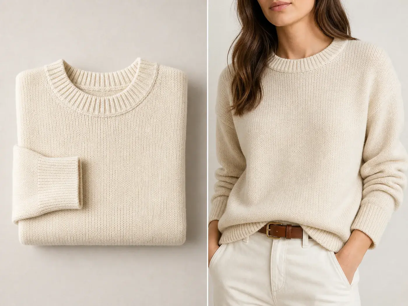 ## What must stay true
Flat lay images often show the garment more honestly than a styled model image. Preserve shoulder width, sleeve length, neckline, hem, ribbing, buttons, pocket placement, fabric texture, and true color. The model, pose, and background can change; the garment facts should not.
## Workflow
1. Use the flat lay as the product reference, not just as style inspiration.
2. Define the model briefly: body type, crop, mood, and pose family.
3. Ask for natural wear, not a complex pose that bends the garment into a new shape.
4. Keep hands and arms simple, especially near sleeves, bags, and accessories.
5. Compare the model result against the flat lay before publishing.
## Where KrafLayer Fits
When you apply this Turn Flat Lay Clothing Photos into Model Shots workflow in KrafLayer, start from the clearest product reference, then decide whether the asset needs cleanup, lighting, background work, detail support, or an ad version. Before using it for listing images, detail pages, or ad assets, check that fit, fabric, shoulder line, garment length, and real color are still intact.
## Prompt to use in KrafLayer
~~~text
Use the uploaded flat lay clothing image as the exact garment reference. Create a realistic ecommerce model shot showing the same garment worn naturally. Preserve the garment color, knit or fabric texture, neckline, shoulder width, sleeve length, hem, seams, buttons, pocket placement, fit character, and overall silhouette. Use a clean model pose and simple styling that supports the product. Do not redesign the garment, change the fabric, alter the fit, add extra details, or hide key construction features.
~~~
## QA checklist
- Does the garment still match the flat lay reference?
- Did the fit become too tight, too long, or too short?
- Are sleeves, neckline, hem, and pockets still in the right place?
- Is fabric texture believable at detail-page size?
- Does the model image support the product page rather than replace product facts?
## Summary
A good flat-lay-to-model image keeps the garment honest. Use AI to add scale and styling context, not to redesign the clothing.
## FAQ
### Can AI infer the back view from a flat lay?
Only loosely. If you need an accurate back view, upload a back reference. Otherwise, treat the output as a styling image, not definitive construction proof.
### Why does the garment fit change on the model?
The prompt may be too fashion-oriented. Put fit, silhouette, and construction details before model styling instructions.
### Should I use model shots as the main product image?
For fashion stores, model shots can be strong, but keep flat lay or ghost mannequin images nearby so buyers can verify construction and details.
# How to Blend Products into AI-Generated Backgrounds
URL: https://kraflayer.com/blog/blend-products-into-ai-generated-backgrounds
Summary: A realistic product-background blending workflow: match light, scale, edge quality, shadow, and material so products do not look pasted into AI scenes. Includes how to do it in KrafLayer.
Updated: 2026-08-21
## TL;DR
For Blend Products into AI-Generated Backgrounds, KrafLayer helps when the product is real but the surrounding scene needs work. Use Replace BG for a prompted or reference-based scene, or Scene Compose when product position and scale must match a base scene. Use the scene to support listing images, detail pages, or ad assets, then check that shape, material, labels, color, scale, and accessories still match the source SKU.
A product is blended well into an AI background when the buyer stops noticing the edit. The product should feel photographed in the scene, with matching light, scale, contact shadow, and edge quality.
## What must stay true
Flat lay images often show the garment more honestly than a styled model image. Preserve shoulder width, sleeve length, neckline, hem, ribbing, buttons, pocket placement, fabric texture, and true color. The model, pose, and background can change; the garment facts should not.
## Workflow
1. Use the flat lay as the product reference, not just as style inspiration.
2. Define the model briefly: body type, crop, mood, and pose family.
3. Ask for natural wear, not a complex pose that bends the garment into a new shape.
4. Keep hands and arms simple, especially near sleeves, bags, and accessories.
5. Compare the model result against the flat lay before publishing.
## Where KrafLayer Fits
When you apply this Turn Flat Lay Clothing Photos into Model Shots workflow in KrafLayer, start from the clearest product reference, then decide whether the asset needs cleanup, lighting, background work, detail support, or an ad version. Before using it for listing images, detail pages, or ad assets, check that fit, fabric, shoulder line, garment length, and real color are still intact.
## Prompt to use in KrafLayer
~~~text
Use the uploaded flat lay clothing image as the exact garment reference. Create a realistic ecommerce model shot showing the same garment worn naturally. Preserve the garment color, knit or fabric texture, neckline, shoulder width, sleeve length, hem, seams, buttons, pocket placement, fit character, and overall silhouette. Use a clean model pose and simple styling that supports the product. Do not redesign the garment, change the fabric, alter the fit, add extra details, or hide key construction features.
~~~
## QA checklist
- Does the garment still match the flat lay reference?
- Did the fit become too tight, too long, or too short?
- Are sleeves, neckline, hem, and pockets still in the right place?
- Is fabric texture believable at detail-page size?
- Does the model image support the product page rather than replace product facts?
## Summary
A good flat-lay-to-model image keeps the garment honest. Use AI to add scale and styling context, not to redesign the clothing.
## FAQ
### Can AI infer the back view from a flat lay?
Only loosely. If you need an accurate back view, upload a back reference. Otherwise, treat the output as a styling image, not definitive construction proof.
### Why does the garment fit change on the model?
The prompt may be too fashion-oriented. Put fit, silhouette, and construction details before model styling instructions.
### Should I use model shots as the main product image?
For fashion stores, model shots can be strong, but keep flat lay or ghost mannequin images nearby so buyers can verify construction and details.
# How to Blend Products into AI-Generated Backgrounds
URL: https://kraflayer.com/blog/blend-products-into-ai-generated-backgrounds
Summary: A realistic product-background blending workflow: match light, scale, edge quality, shadow, and material so products do not look pasted into AI scenes. Includes how to do it in KrafLayer.
Updated: 2026-08-21
## TL;DR
For Blend Products into AI-Generated Backgrounds, KrafLayer helps when the product is real but the surrounding scene needs work. Use Replace BG for a prompted or reference-based scene, or Scene Compose when product position and scale must match a base scene. Use the scene to support listing images, detail pages, or ad assets, then check that shape, material, labels, color, scale, and accessories still match the source SKU.
A product is blended well into an AI background when the buyer stops noticing the edit. The product should feel photographed in the scene, with matching light, scale, contact shadow, and edge quality.
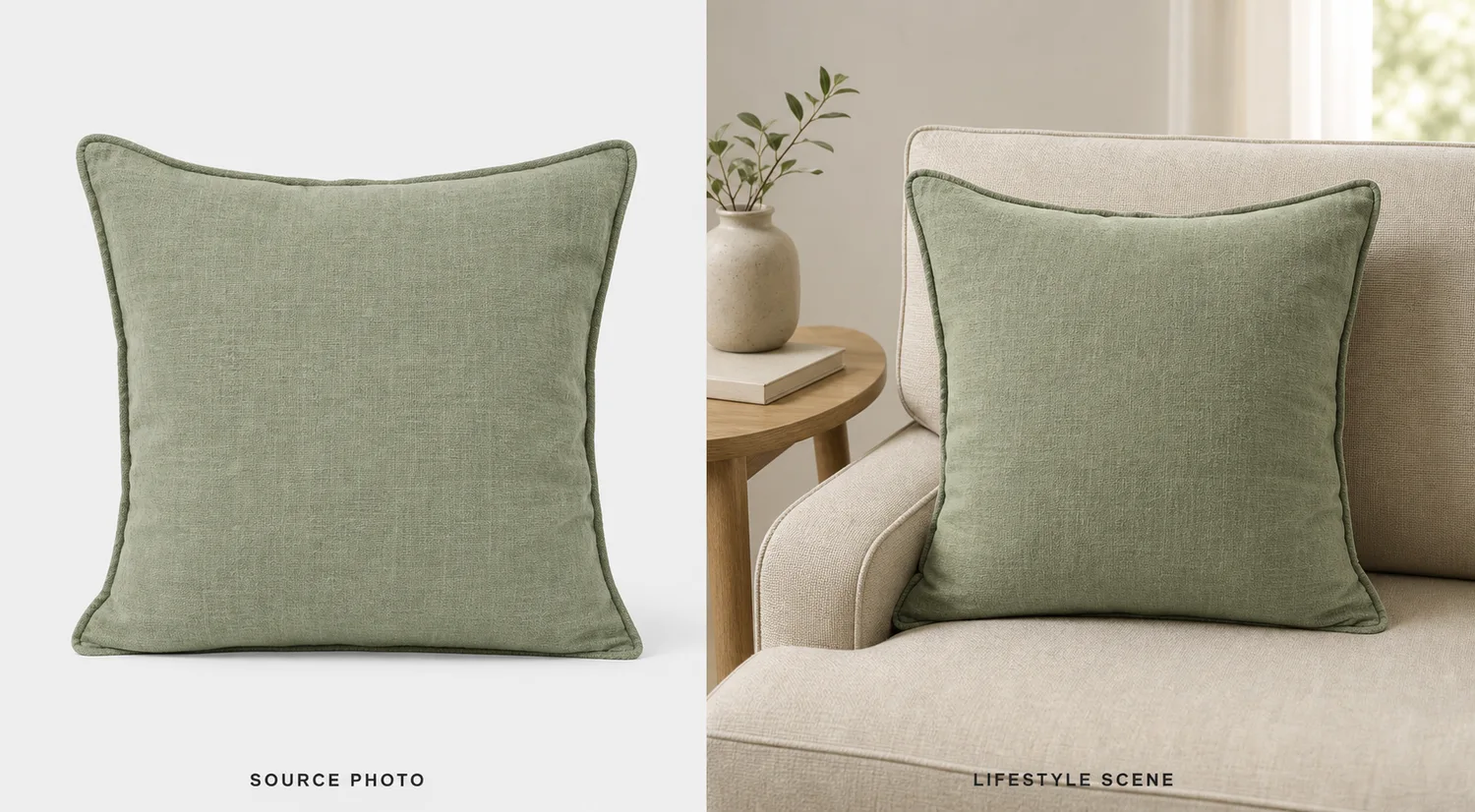 ## What makes blending believable
The background must agree with the product. Light direction, camera height, surface contact, shadow softness, and product scale all need to match. If any one is wrong, the product looks pasted.
## Workflow
1. Start with a clean product cutout or reference.
2. Define the scene surface and light direction.
3. Match product scale to nearby surfaces or props.
4. Add a natural contact shadow.
5. Check edges on both light and dark areas.
## Where KrafLayer Fits
When you apply this Blend Products into AI-Generated Backgrounds workflow in KrafLayer, the tool choice matters: use Replace BG for a prompted or reference-based scene, or Scene Compose when product position and scale must match a base scene. After generation, judge the image by the channel it serves — listing images, detail pages, or ad assets — and check that shape, material, labels, color, scale, and accessories still match the source SKU.
## Prompt to use in KrafLayer
~~~text
Use the uploaded product as the exact reference. Blend it naturally into an AI-generated ecommerce background for [scene/use case]. Preserve product shape, color, material, texture, label area, and scale. Match lighting direction, perspective, contact shadow, surface reflection, and edge softness so the product feels photographed in the scene. Do not redesign the product, hide edges, distort scale, or let the background overpower it.
~~~
## FAQ
### Why does my product look pasted into the background?
Usually the light, shadow, or scale does not match. Fix those before adding more style.
### Should I generate the background first?
Often yes. Approve the background direction, then blend the product into it with product-preservation instructions.
### Can I use props?
Yes, but props should support scale and story. If they compete with the product, remove them.
# How to Replace Product Backgrounds Without a Reshoot
URL: https://kraflayer.com/blog/replace-product-backgrounds-without-a-reshoot
Summary: A practical workflow for replacing product backgrounds without reshooting: match lighting, preserve product edges, keep shadows believable, and adapt one SKU for listings or campaigns. Includes how to do it in KrafLayer.
Updated: 2026-08-21
## TL;DR
For Replace Product Backgrounds Without a Reshoot, KrafLayer helps when the product is real but the surrounding scene needs work. Use Replace BG for a prompted or reference-based scene, or Scene Compose when product position and scale must match a base scene. Use the scene to support listing images, detail pages, or ad assets, then check that shape, material, labels, color, scale, and accessories still match the source SKU.
Replacing a product background is not the same as dropping a cutout onto a prettier scene. Buyers notice when a handbag, bottle, shoe, or device does not belong in the space around it. The product may be sharp, the background may be beautiful, and the final image can still feel fake.
Use this workflow when the product itself is correct but the setting is weak: a supplier table, a crowded room, an off-brand surface, or a plain image that needs a campaign version. The job is to move the same SKU into a better selling context without changing what the product is.
## What makes blending believable
The background must agree with the product. Light direction, camera height, surface contact, shadow softness, and product scale all need to match. If any one is wrong, the product looks pasted.
## Workflow
1. Start with a clean product cutout or reference.
2. Define the scene surface and light direction.
3. Match product scale to nearby surfaces or props.
4. Add a natural contact shadow.
5. Check edges on both light and dark areas.
## Where KrafLayer Fits
When you apply this Blend Products into AI-Generated Backgrounds workflow in KrafLayer, the tool choice matters: use Replace BG for a prompted or reference-based scene, or Scene Compose when product position and scale must match a base scene. After generation, judge the image by the channel it serves — listing images, detail pages, or ad assets — and check that shape, material, labels, color, scale, and accessories still match the source SKU.
## Prompt to use in KrafLayer
~~~text
Use the uploaded product as the exact reference. Blend it naturally into an AI-generated ecommerce background for [scene/use case]. Preserve product shape, color, material, texture, label area, and scale. Match lighting direction, perspective, contact shadow, surface reflection, and edge softness so the product feels photographed in the scene. Do not redesign the product, hide edges, distort scale, or let the background overpower it.
~~~
## FAQ
### Why does my product look pasted into the background?
Usually the light, shadow, or scale does not match. Fix those before adding more style.
### Should I generate the background first?
Often yes. Approve the background direction, then blend the product into it with product-preservation instructions.
### Can I use props?
Yes, but props should support scale and story. If they compete with the product, remove them.
# How to Replace Product Backgrounds Without a Reshoot
URL: https://kraflayer.com/blog/replace-product-backgrounds-without-a-reshoot
Summary: A practical workflow for replacing product backgrounds without reshooting: match lighting, preserve product edges, keep shadows believable, and adapt one SKU for listings or campaigns. Includes how to do it in KrafLayer.
Updated: 2026-08-21
## TL;DR
For Replace Product Backgrounds Without a Reshoot, KrafLayer helps when the product is real but the surrounding scene needs work. Use Replace BG for a prompted or reference-based scene, or Scene Compose when product position and scale must match a base scene. Use the scene to support listing images, detail pages, or ad assets, then check that shape, material, labels, color, scale, and accessories still match the source SKU.
Replacing a product background is not the same as dropping a cutout onto a prettier scene. Buyers notice when a handbag, bottle, shoe, or device does not belong in the space around it. The product may be sharp, the background may be beautiful, and the final image can still feel fake.
Use this workflow when the product itself is correct but the setting is weak: a supplier table, a crowded room, an off-brand surface, or a plain image that needs a campaign version. The job is to move the same SKU into a better selling context without changing what the product is.
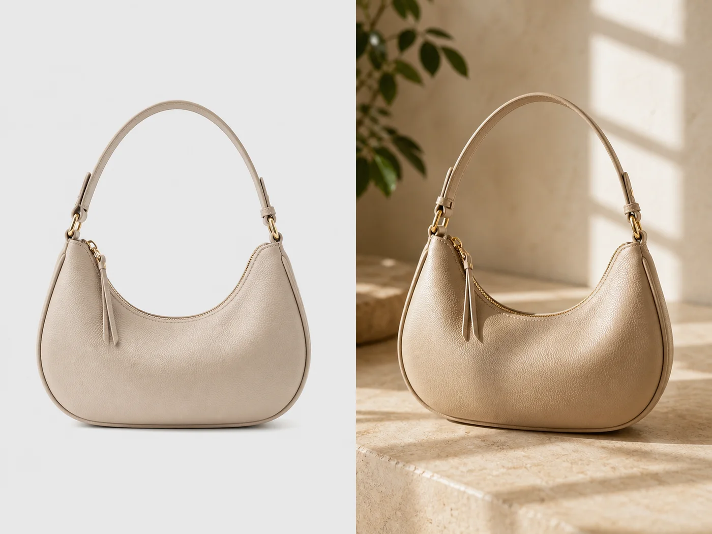 ## When background replacement is worth doing
Replace the background when the original product angle is good but the environment does not support the offer. For example, a beige handbag can move from a flat supplier image into a warm boutique surface, a summer campaign crop, or a clean product-page hero.
Do not use background replacement to hide a product problem. If the product is blurry, warped, or missing a strap, fix the product reference first.
## The three things that make it believable
**Light direction:** The background light should agree with the product light. If the product is lit from upper left, the new scene should not suggest hard light from the opposite side.
**Contact shadow:** Bags, shoes, boxes, and bottles need a grounded shadow. Without it, the product floats.
**Scale cues:** Surface texture, props, and camera angle should make the product feel the right size. A handbag should not look like a toy because the table grain is too large.
## Step-by-step workflow
1. Identify the product facts: silhouette, handles, straps, hardware, stitching, label, material, and color.
2. Choose one commercial job: marketplace support image, Shopify hero, ad creative, seasonal campaign, or email banner.
3. Describe the new background in terms of surface, light, depth, and mood. Avoid overloading it with props.
4. Ask KrafLayer to match lighting and rebuild the contact shadow.
5. Compare the output with the original product photo before you judge the style.
## Where KrafLayer Fits
When you apply this Replace Product Backgrounds Without a Reshoot workflow in KrafLayer, the tool choice matters: use Replace BG for a prompted or reference-based scene, or Scene Compose when product position and scale must match a base scene. After generation, judge the image by the channel it serves — listing images, detail pages, or ad assets — and check that shape, material, labels, color, scale, and accessories still match the source SKU.
## Prompt to use in KrafLayer
~~~text
Use the uploaded product as the exact SKU reference. Replace the original background with a clean ecommerce scene for [channel/use case]. Keep the product silhouette, handle shape, strap placement, hardware, stitching, material, color, label area, and scale unchanged. Match the new background lighting to the product, rebuild a natural contact shadow, and keep the product as the clear hero. Do not redesign the product, add extra straps, change hardware, distort edges, add fake logos, or let props cover the item.
~~~
For a simpler product-page version:
~~~text
Create a clean product-page background with soft light, neutral surface, enough margin for cropping, and no distracting props. Preserve the product exactly.
~~~
## What to check before using the image
- Does the shadow touch the product in the right place?
- Do highlights on metal, glass, leather, or plastic match the scene?
- Is the product still the main subject, or did the background become the image?
- Are straps, handles, transparent edges, or labels still accurate?
- Would the image still make sense next to the rest of the product gallery?
## Summary
A good background replacement should feel like the product was photographed there. Keep the product facts locked, make the scene support the selling job, and judge the result by lighting, scale, and trust, not just by aesthetics.
## FAQ
### Can I use one product photo to create several backgrounds?
Yes, if the product reference is clear. Create one accurate master edit first, then vary the background for product page, ads, email, or seasonal campaigns.
### Why do AI background replacements look fake?
Usually the light, shadow, or scale does not match. A beautiful background will not save the image if the product appears pasted on top.
### Should I include props?
Use props only when they explain the product or strengthen the campaign. If they compete with the SKU, remove them.
# Frequently asked questions
URL: https://kraflayer.com/docs/faq
Summary: Direct answers to the most common questions about KrafLayer, including free access, commercial use, Midjourney alternatives, product images, prompts, and image-to-video workflows.
Updated: 2026-06-12
## Quick answer
KrafLayer is a browser-based AI image and video generator for creators, ecommerce sellers, marketers, and teams. It combines text-to-image, image editing, and image-to-video workflows in one workspace so users can compare models, control cost, and create commercial visuals faster.
## What is KrafLayer and who is it for?
KrafLayer is a browser-based AI image and video generator for creators, ecommerce sellers, marketers, and teams that need one workspace for text-to-image, image editing, and image-to-video.
- It combines multiple image and video models in one interface, so you can compare quality, speed, and cost without switching tools.
- It is built for practical output, including product photos, marketing creatives, anime art, cinematic scenes, and short-form video clips.
- It includes prompt enhancement, style presets, model comparison docs, and a saved workspace instead of a chat-only interface.
- It works entirely in the browser, which keeps setup friction low for non-technical users and fast-moving teams.
> **Common follow-ups**
>
> **Is KrafLayer only for artists?**
>
> No. It is designed for commercial use cases too, especially ecommerce images, marketing visuals, and reference-led creative iteration.
>
> **Does KrafLayer support both images and video?**
>
> Yes. You can generate still images, edit uploaded references, and turn images into motion clips from the same workspace.
## Is KrafLayer a free AI image generator and free AI video generator?
Yes. KrafLayer offers a free plan for AI image and AI video generation, with sign-up credits that let you test prompts, compare models, and evaluate output quality before paying.
- The free tier is designed for exploration, prompt testing, and low-volume personal or evaluation use.
- Paid plans increase monthly credit volume rather than locking the core product behind a separate workflow.
- Because pricing is credit-based, you can test different models without committing to a single subscription-first image tool.
- The strongest upgrade trigger is usually usage volume, not feature access, which makes side-by-side model evaluation easier.
> **Common follow-ups**
>
> **Do I need a credit card to start?**
>
> No. The free plan starts with email sign-up, not card capture.
>
> **Can I test multiple models on the free tier?**
>
> Yes. The free tier is meant to help you compare models and prompt approaches before you scale usage.
## What is the best Midjourney alternative in 2026?
A strong Midjourney alternative should be easier to access, cheaper to test, and more flexible across image and video workflows; KrafLayer is positioned around that exact comparison point.
- Midjourney is strong for image quality, but it is still shaped by its own workflow and pricing model; many users now compare alternatives based on browser access, prompt control, and commercial iteration speed.
- KrafLayer runs multiple image models in one place, so you are not locked into one engine when output character or cost changes from project to project.
- KrafLayer is browser-based and free to start, which lowers the barrier for teams that want a visual workspace instead of a Discord-led workflow.
- KrafLayer also includes video generation, which matters for creators and marketers who want still and motion output inside one system.
> **Common follow-ups**
>
> **Why do users search for Midjourney alternatives?**
>
> Usually for easier access, lower testing cost, more model choice, or a workflow that fits business production better.
>
> **Is KrafLayer only an image alternative?**
>
> No. It covers both image generation and video generation, which makes it broader than a pure Midjourney replacement.
## Which AI image generator is best for business, marketing images, and product content?
The best AI image generator for business is the one that balances commercial usability, model variety, and repeatable prompt-to-output workflows; KrafLayer is optimized around product images, marketing assets, and creator production speed.
- For product and ecommerce visuals, the important criteria are background control, realistic materials, batch variation, and predictable framing.
- For marketing teams, the important criteria are output variety, aspect ratio control, and the ability to produce campaign-ready images fast enough for iteration.
- KrafLayer supports product, photoreal, cinematic, portrait, fashion, anime, and concept directions, so one account can support multiple campaign types.
- Credit-based pricing is often easier for business experimentation than paying for a single-model subscription before you know which model fits your workflow.
> **Common follow-ups**
>
> **Can KrafLayer help with ecommerce product shots?**
>
> Yes. Product-oriented prompts, reference editing, and model variety make it useful for hero shots, ad variants, and catalog-style images.
>
> **Is this relevant for agencies too?**
>
> Yes. Agencies usually need multiple visual directions quickly, which is exactly where multi-model workflows outperform single-engine tools.
## Can I use AI-generated images and videos from KrafLayer for commercial work?
Yes. KrafLayer outputs are intended for commercial use, including ecommerce listings, ads, social content, brand visuals, and other business materials.
- Commercial users usually care about three things: whether the output can be used in paid work, whether pricing scales, and whether the workflow supports production at volume.
- KrafLayer is positioned for those needs by combining image, edit, and video workflows in one browser-based workspace.
- The commercial question is usually not just rights; it is also whether the tool can generate enough variations fast enough for actual business use.
- For teams evaluating AI tools, this is why queries like commercial use AI image generator, AI generator for business, and AI image generator subscription have strong buying intent.
> **Common follow-ups**
>
> **Can I use outputs for product listings and paid ads?**
>
> Yes. Product pages, paid social creatives, landing pages, and campaign assets are all valid commercial use cases.
>
> **What do business buyers usually compare before purchasing?**
>
> Pricing, commercial usability, workflow speed, model quality, and how well the tool handles repeatable production work.
## Can AI replace a product photo shoot or generate product images with new backgrounds?
Yes. AI can reduce or replace parts of a traditional product photo workflow, especially when you need background changes, marketing variations, and fast iteration without re-shooting every SKU.
- A common ecommerce workflow is to start from one clean product image, then generate different surfaces, lighting setups, seasonal contexts, or ad compositions from that base.
- This is especially valuable when the main goal is not high-fashion photography but scalable catalog, ad, or storefront production.
- Reference-led editing matters because sellers often want the object identity preserved while the scene around it changes.
- This is why long-tail queries like AI product image background change without changing the object shape usually signal high commercial intent rather than casual curiosity.
> **Common follow-ups**
>
> **Is KrafLayer useful for ecommerce sellers with many SKUs?**
>
> Yes. It is particularly useful when the same product needs multiple scene variants, aspect ratios, or campaign directions.
>
> **Can I generate both clean catalog and styled marketing versions?**
>
> Yes. The same product can be rendered as a neutral listing image or reinterpreted as a styled campaign visual.
## How do I write better AI image prompts and AI video prompts?
Better prompts are specific, visual, and constrained; the highest-performing prompts usually define subject, scene, lighting, composition, and intended output instead of relying on vague adjectives.
- For image prompts, name the subject clearly, then add material, setting, composition, and lighting details that can actually be seen in the final image.
- For video prompts, still-frame description is not enough; you need to describe what moves, how it moves, and whether the camera moves too.
- Prompt quality improves when you replace vague words like premium, beautiful, or cinematic with concrete visual instructions such as soft backlight, brushed aluminum, centered hero shot, or slow push-in camera.
- If you are doing reference-led editing, shorter and more directional prompts usually outperform long abstract descriptions.
- Prompt examples matter because users often know the outcome they want but not the prompt structure required to get there reliably.
> **Common follow-ups**
>
> **Do prompt examples really help?**
>
> Yes. Prompt examples compress trial-and-error by showing users what level of specificity the model actually responds to.
>
> **What is the main mistake beginners make?**
>
> Using abstract adjectives instead of observable scene details, then expecting the model to infer the rest.
## How does AI image-to-video work, and when should I use it instead of text-to-video?
AI image-to-video works by taking a still image as the first frame and then generating motion from that visual anchor, which makes it ideal when composition and subject identity matter more than open-ended prompt exploration.
- Use image-to-video when you already like the starting frame and want controlled motion such as camera drift, fabric movement, character motion, or product reveal animation.
- Use text-to-video when you want the model to invent the whole scene from a prompt rather than preserve an existing composition.
- Image-to-video usually gives stronger control over identity, styling, and opening composition because the first frame is fixed.
- The most effective prompts for image-to-video focus on motion, timing, and camera direction instead of re-describing the visible scene.
> **Common follow-ups**
>
> **Can I animate an AI-generated image?**
>
> Yes. A common workflow is image generation first, then image-to-video from the chosen still.
>
> **Which models are available in KrafLayer for video?**
>
> KrafLayer supports multiple video models including Sora 2, Kling O3, and Seedance 2.0, so you can compare quality, speed, and cost in one place.
## Do I need to install software or create an account before testing KrafLayer?
You do not need to install software, but you do need an email sign-up to access your workspace, saved outputs, and free credits.
- KrafLayer is fully browser-based, so there is no desktop install, local model setup, or infrastructure work required.
- The sign-up step exists because the product saves generations, credits, and workspace state instead of acting like a disposable demo.
- This is different from no-login image toy tools; the workflow is closer to a production studio than a single-prompt playground.
- For users searching AI image generator without login, the relevant distinction is that KrafLayer removes software friction, even though it keeps account-based workspace access.
> **Common follow-ups**
>
> **Can I start from my browser immediately?**
>
> Yes. Once signed in, everything runs in the browser with no install step.
>
> **Why keep account-based access at all?**
>
> Because saved generations, credits, remix workflows, and workspace continuity matter for real production use.
## Related KrafLayer docs
- [What is Canvas Creation System](/docs/what-is-canvas-creation-system)
- [Plans and price](/docs/pricing-and-credits)
- [Costs by model and task](/docs/generation-cost)
- [Prompt writing basics](/docs/prompt-writing-basics)
# How to Upscale Soft Knitwear Texture Without Losing Detail with AI
URL: https://kraflayer.com/blog/upscale-and-enhance-soft-knitwear-texture-without-losing-detail
Summary: A careful AI upscaling workflow for knitwear product photos: recover yarn texture, protect fit and color, avoid fake weave patterns, and prepare sharper ecommerce images. Includes how to do it in KrafLayer.
Updated: 2026-06-12
## TL;DR
For Upscale Soft Knitwear Texture Without Losing Detail, use KrafLayer as a fast pre-publishing edit step: run Upscale directly and inspect texture, edges, labels, and small text afterward. It is most useful for detail-page modules, as long as fit, fabric, shoulder line, garment length, and real color are still intact.
Knitwear is one of the easiest product categories to ruin with aggressive upscaling. A sharper image is not automatically a better image. If AI invents a fake rib pattern, smooths the yarn into plastic, or changes the cardigan shape, the picture may look polished but become less truthful.
Use AI upscaling when the original knitwear photo has the right product, angle, and color, but the image is too small or too soft for a product page. The job is to recover useful texture, not redesign the fabric.
## When background replacement is worth doing
Replace the background when the original product angle is good but the environment does not support the offer. For example, a beige handbag can move from a flat supplier image into a warm boutique surface, a summer campaign crop, or a clean product-page hero.
Do not use background replacement to hide a product problem. If the product is blurry, warped, or missing a strap, fix the product reference first.
## The three things that make it believable
**Light direction:** The background light should agree with the product light. If the product is lit from upper left, the new scene should not suggest hard light from the opposite side.
**Contact shadow:** Bags, shoes, boxes, and bottles need a grounded shadow. Without it, the product floats.
**Scale cues:** Surface texture, props, and camera angle should make the product feel the right size. A handbag should not look like a toy because the table grain is too large.
## Step-by-step workflow
1. Identify the product facts: silhouette, handles, straps, hardware, stitching, label, material, and color.
2. Choose one commercial job: marketplace support image, Shopify hero, ad creative, seasonal campaign, or email banner.
3. Describe the new background in terms of surface, light, depth, and mood. Avoid overloading it with props.
4. Ask KrafLayer to match lighting and rebuild the contact shadow.
5. Compare the output with the original product photo before you judge the style.
## Where KrafLayer Fits
When you apply this Replace Product Backgrounds Without a Reshoot workflow in KrafLayer, the tool choice matters: use Replace BG for a prompted or reference-based scene, or Scene Compose when product position and scale must match a base scene. After generation, judge the image by the channel it serves — listing images, detail pages, or ad assets — and check that shape, material, labels, color, scale, and accessories still match the source SKU.
## Prompt to use in KrafLayer
~~~text
Use the uploaded product as the exact SKU reference. Replace the original background with a clean ecommerce scene for [channel/use case]. Keep the product silhouette, handle shape, strap placement, hardware, stitching, material, color, label area, and scale unchanged. Match the new background lighting to the product, rebuild a natural contact shadow, and keep the product as the clear hero. Do not redesign the product, add extra straps, change hardware, distort edges, add fake logos, or let props cover the item.
~~~
For a simpler product-page version:
~~~text
Create a clean product-page background with soft light, neutral surface, enough margin for cropping, and no distracting props. Preserve the product exactly.
~~~
## What to check before using the image
- Does the shadow touch the product in the right place?
- Do highlights on metal, glass, leather, or plastic match the scene?
- Is the product still the main subject, or did the background become the image?
- Are straps, handles, transparent edges, or labels still accurate?
- Would the image still make sense next to the rest of the product gallery?
## Summary
A good background replacement should feel like the product was photographed there. Keep the product facts locked, make the scene support the selling job, and judge the result by lighting, scale, and trust, not just by aesthetics.
## FAQ
### Can I use one product photo to create several backgrounds?
Yes, if the product reference is clear. Create one accurate master edit first, then vary the background for product page, ads, email, or seasonal campaigns.
### Why do AI background replacements look fake?
Usually the light, shadow, or scale does not match. A beautiful background will not save the image if the product appears pasted on top.
### Should I include props?
Use props only when they explain the product or strengthen the campaign. If they compete with the SKU, remove them.
# Frequently asked questions
URL: https://kraflayer.com/docs/faq
Summary: Direct answers to the most common questions about KrafLayer, including free access, commercial use, Midjourney alternatives, product images, prompts, and image-to-video workflows.
Updated: 2026-06-12
## Quick answer
KrafLayer is a browser-based AI image and video generator for creators, ecommerce sellers, marketers, and teams. It combines text-to-image, image editing, and image-to-video workflows in one workspace so users can compare models, control cost, and create commercial visuals faster.
## What is KrafLayer and who is it for?
KrafLayer is a browser-based AI image and video generator for creators, ecommerce sellers, marketers, and teams that need one workspace for text-to-image, image editing, and image-to-video.
- It combines multiple image and video models in one interface, so you can compare quality, speed, and cost without switching tools.
- It is built for practical output, including product photos, marketing creatives, anime art, cinematic scenes, and short-form video clips.
- It includes prompt enhancement, style presets, model comparison docs, and a saved workspace instead of a chat-only interface.
- It works entirely in the browser, which keeps setup friction low for non-technical users and fast-moving teams.
> **Common follow-ups**
>
> **Is KrafLayer only for artists?**
>
> No. It is designed for commercial use cases too, especially ecommerce images, marketing visuals, and reference-led creative iteration.
>
> **Does KrafLayer support both images and video?**
>
> Yes. You can generate still images, edit uploaded references, and turn images into motion clips from the same workspace.
## Is KrafLayer a free AI image generator and free AI video generator?
Yes. KrafLayer offers a free plan for AI image and AI video generation, with sign-up credits that let you test prompts, compare models, and evaluate output quality before paying.
- The free tier is designed for exploration, prompt testing, and low-volume personal or evaluation use.
- Paid plans increase monthly credit volume rather than locking the core product behind a separate workflow.
- Because pricing is credit-based, you can test different models without committing to a single subscription-first image tool.
- The strongest upgrade trigger is usually usage volume, not feature access, which makes side-by-side model evaluation easier.
> **Common follow-ups**
>
> **Do I need a credit card to start?**
>
> No. The free plan starts with email sign-up, not card capture.
>
> **Can I test multiple models on the free tier?**
>
> Yes. The free tier is meant to help you compare models and prompt approaches before you scale usage.
## What is the best Midjourney alternative in 2026?
A strong Midjourney alternative should be easier to access, cheaper to test, and more flexible across image and video workflows; KrafLayer is positioned around that exact comparison point.
- Midjourney is strong for image quality, but it is still shaped by its own workflow and pricing model; many users now compare alternatives based on browser access, prompt control, and commercial iteration speed.
- KrafLayer runs multiple image models in one place, so you are not locked into one engine when output character or cost changes from project to project.
- KrafLayer is browser-based and free to start, which lowers the barrier for teams that want a visual workspace instead of a Discord-led workflow.
- KrafLayer also includes video generation, which matters for creators and marketers who want still and motion output inside one system.
> **Common follow-ups**
>
> **Why do users search for Midjourney alternatives?**
>
> Usually for easier access, lower testing cost, more model choice, or a workflow that fits business production better.
>
> **Is KrafLayer only an image alternative?**
>
> No. It covers both image generation and video generation, which makes it broader than a pure Midjourney replacement.
## Which AI image generator is best for business, marketing images, and product content?
The best AI image generator for business is the one that balances commercial usability, model variety, and repeatable prompt-to-output workflows; KrafLayer is optimized around product images, marketing assets, and creator production speed.
- For product and ecommerce visuals, the important criteria are background control, realistic materials, batch variation, and predictable framing.
- For marketing teams, the important criteria are output variety, aspect ratio control, and the ability to produce campaign-ready images fast enough for iteration.
- KrafLayer supports product, photoreal, cinematic, portrait, fashion, anime, and concept directions, so one account can support multiple campaign types.
- Credit-based pricing is often easier for business experimentation than paying for a single-model subscription before you know which model fits your workflow.
> **Common follow-ups**
>
> **Can KrafLayer help with ecommerce product shots?**
>
> Yes. Product-oriented prompts, reference editing, and model variety make it useful for hero shots, ad variants, and catalog-style images.
>
> **Is this relevant for agencies too?**
>
> Yes. Agencies usually need multiple visual directions quickly, which is exactly where multi-model workflows outperform single-engine tools.
## Can I use AI-generated images and videos from KrafLayer for commercial work?
Yes. KrafLayer outputs are intended for commercial use, including ecommerce listings, ads, social content, brand visuals, and other business materials.
- Commercial users usually care about three things: whether the output can be used in paid work, whether pricing scales, and whether the workflow supports production at volume.
- KrafLayer is positioned for those needs by combining image, edit, and video workflows in one browser-based workspace.
- The commercial question is usually not just rights; it is also whether the tool can generate enough variations fast enough for actual business use.
- For teams evaluating AI tools, this is why queries like commercial use AI image generator, AI generator for business, and AI image generator subscription have strong buying intent.
> **Common follow-ups**
>
> **Can I use outputs for product listings and paid ads?**
>
> Yes. Product pages, paid social creatives, landing pages, and campaign assets are all valid commercial use cases.
>
> **What do business buyers usually compare before purchasing?**
>
> Pricing, commercial usability, workflow speed, model quality, and how well the tool handles repeatable production work.
## Can AI replace a product photo shoot or generate product images with new backgrounds?
Yes. AI can reduce or replace parts of a traditional product photo workflow, especially when you need background changes, marketing variations, and fast iteration without re-shooting every SKU.
- A common ecommerce workflow is to start from one clean product image, then generate different surfaces, lighting setups, seasonal contexts, or ad compositions from that base.
- This is especially valuable when the main goal is not high-fashion photography but scalable catalog, ad, or storefront production.
- Reference-led editing matters because sellers often want the object identity preserved while the scene around it changes.
- This is why long-tail queries like AI product image background change without changing the object shape usually signal high commercial intent rather than casual curiosity.
> **Common follow-ups**
>
> **Is KrafLayer useful for ecommerce sellers with many SKUs?**
>
> Yes. It is particularly useful when the same product needs multiple scene variants, aspect ratios, or campaign directions.
>
> **Can I generate both clean catalog and styled marketing versions?**
>
> Yes. The same product can be rendered as a neutral listing image or reinterpreted as a styled campaign visual.
## How do I write better AI image prompts and AI video prompts?
Better prompts are specific, visual, and constrained; the highest-performing prompts usually define subject, scene, lighting, composition, and intended output instead of relying on vague adjectives.
- For image prompts, name the subject clearly, then add material, setting, composition, and lighting details that can actually be seen in the final image.
- For video prompts, still-frame description is not enough; you need to describe what moves, how it moves, and whether the camera moves too.
- Prompt quality improves when you replace vague words like premium, beautiful, or cinematic with concrete visual instructions such as soft backlight, brushed aluminum, centered hero shot, or slow push-in camera.
- If you are doing reference-led editing, shorter and more directional prompts usually outperform long abstract descriptions.
- Prompt examples matter because users often know the outcome they want but not the prompt structure required to get there reliably.
> **Common follow-ups**
>
> **Do prompt examples really help?**
>
> Yes. Prompt examples compress trial-and-error by showing users what level of specificity the model actually responds to.
>
> **What is the main mistake beginners make?**
>
> Using abstract adjectives instead of observable scene details, then expecting the model to infer the rest.
## How does AI image-to-video work, and when should I use it instead of text-to-video?
AI image-to-video works by taking a still image as the first frame and then generating motion from that visual anchor, which makes it ideal when composition and subject identity matter more than open-ended prompt exploration.
- Use image-to-video when you already like the starting frame and want controlled motion such as camera drift, fabric movement, character motion, or product reveal animation.
- Use text-to-video when you want the model to invent the whole scene from a prompt rather than preserve an existing composition.
- Image-to-video usually gives stronger control over identity, styling, and opening composition because the first frame is fixed.
- The most effective prompts for image-to-video focus on motion, timing, and camera direction instead of re-describing the visible scene.
> **Common follow-ups**
>
> **Can I animate an AI-generated image?**
>
> Yes. A common workflow is image generation first, then image-to-video from the chosen still.
>
> **Which models are available in KrafLayer for video?**
>
> KrafLayer supports multiple video models including Sora 2, Kling O3, and Seedance 2.0, so you can compare quality, speed, and cost in one place.
## Do I need to install software or create an account before testing KrafLayer?
You do not need to install software, but you do need an email sign-up to access your workspace, saved outputs, and free credits.
- KrafLayer is fully browser-based, so there is no desktop install, local model setup, or infrastructure work required.
- The sign-up step exists because the product saves generations, credits, and workspace state instead of acting like a disposable demo.
- This is different from no-login image toy tools; the workflow is closer to a production studio than a single-prompt playground.
- For users searching AI image generator without login, the relevant distinction is that KrafLayer removes software friction, even though it keeps account-based workspace access.
> **Common follow-ups**
>
> **Can I start from my browser immediately?**
>
> Yes. Once signed in, everything runs in the browser with no install step.
>
> **Why keep account-based access at all?**
>
> Because saved generations, credits, remix workflows, and workspace continuity matter for real production use.
## Related KrafLayer docs
- [What is Canvas Creation System](/docs/what-is-canvas-creation-system)
- [Plans and price](/docs/pricing-and-credits)
- [Costs by model and task](/docs/generation-cost)
- [Prompt writing basics](/docs/prompt-writing-basics)
# How to Upscale Soft Knitwear Texture Without Losing Detail with AI
URL: https://kraflayer.com/blog/upscale-and-enhance-soft-knitwear-texture-without-losing-detail
Summary: A careful AI upscaling workflow for knitwear product photos: recover yarn texture, protect fit and color, avoid fake weave patterns, and prepare sharper ecommerce images. Includes how to do it in KrafLayer.
Updated: 2026-06-12
## TL;DR
For Upscale Soft Knitwear Texture Without Losing Detail, use KrafLayer as a fast pre-publishing edit step: run Upscale directly and inspect texture, edges, labels, and small text afterward. It is most useful for detail-page modules, as long as fit, fabric, shoulder line, garment length, and real color are still intact.
Knitwear is one of the easiest product categories to ruin with aggressive upscaling. A sharper image is not automatically a better image. If AI invents a fake rib pattern, smooths the yarn into plastic, or changes the cardigan shape, the picture may look polished but become less truthful.
Use AI upscaling when the original knitwear photo has the right product, angle, and color, but the image is too small or too soft for a product page. The job is to recover useful texture, not redesign the fabric.
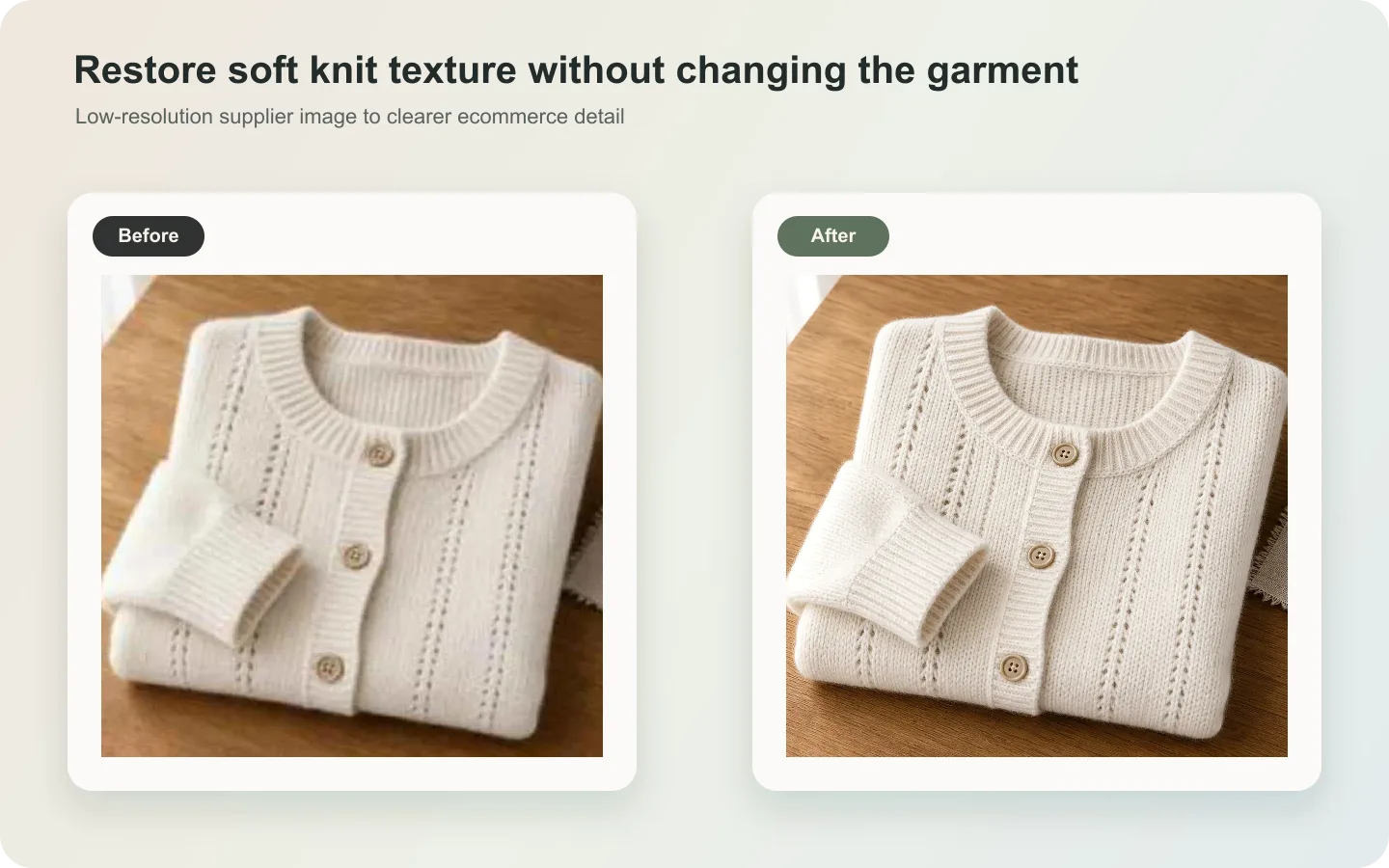 ## When AI upscaling helps knitwear
This workflow is useful for supplier photos, older catalog images, compressed marketplace downloads, and phone shots where the garment is correct but the yarn texture does not read clearly. It is especially helpful for cardigans, sweaters, ribbed tops, scarves, beanies, and soft knit sets.
It is not a fix for a wrong sample. If the garment is wrinkled into the wrong shape, photographed in poor color, or missing important construction details, upscale only after you solve those problems.
## What to protect before you sharpen
Knitwear buyers look at more than color. They look for thickness, softness, stitch density, rib direction, cuff shape, neckline structure, and how the fabric falls. Write these details into the prompt before asking for enhancement.
The most important rule: do not ask AI to make the texture “perfect.” Real knitwear has slight unevenness. If every yarn line becomes too crisp, the image starts to look synthetic.
## A practical workflow
1. Use the cleanest original image, not a screenshot from a marketplace page.
2. Upscale the full product first, then make detail crops from the improved version.
3. Ask for yarn texture recovery, not fabric redesign.
4. Protect garment shape: shoulder width, sleeve length, rib direction, buttons, pockets, hem, and neckline.
5. Compare the result with the original at 100% zoom and at product-card size.
## Where KrafLayer Fits
When you apply this Upscale Soft Knitwear Texture Without Losing Detail workflow in KrafLayer, the tool choice matters: run Upscale directly and inspect texture, edges, labels, and small text afterward. After generation, judge the image by the channel it serves — detail-page modules — and check that fit, fabric, shoulder line, garment length, and real color are still intact.
## Steps in KrafLayer
Use Upscale as a one-click tool: choose the image, run the upscaler, and review edge, texture, and text fidelity. It does not take a prompt.
1. Upload or choose the product image.
2. Run the tool according to its interaction model: one-click tools generate directly; Erase-style tools need a brush mask first.
3. Zoom in to check edges, text, material, shadow, and product scale before downloading or continuing the edit.
## Summary
The best knitwear upscale is quiet. It makes yarn and construction easier to see without turning a soft garment into a fake render. Use AI to recover clarity, then judge the result by fit, texture, and buyer trust.
## FAQ
### Can AI restore knitwear texture from a blurry image?
It can improve a slightly soft image, but it cannot honestly recover details that were never visible. If the original is very blurry, use AI for a cleaner presentation, not as proof of exact yarn structure.
### Why does enhanced knitwear sometimes look plastic?
The prompt is usually too broad, or the upscale is too strong. Ask for soft yarn texture and natural fabric character instead of maximum sharpness.
### Should I upscale before or after background editing?
If the product edge is already clean, upscale first so texture and edges improve together. If the background is messy and confusing the product boundary, clean the background first, then upscale conservatively.
# How to Use Local Inpainting to Retouch Product Detail Images with AI
URL: https://kraflayer.com/blog/local-inpainting-for-product-detail-image-retouching
Summary: A local inpainting workflow for product detail retouching: repair small flaws, preserve surrounding material, protect labels, and avoid full-image regeneration. Includes how to do it in KrafLayer.
Updated: 2026-06-12
## TL;DR
For Use Local Inpainting to Retouch Product Detail Images, use KrafLayer for controlled local changes or reference-guided edits. Use Mask Edit for a local change with a short instruction, or Reference Image Editor when the result needs a visual example. The finished image should still prove that shape, material, labels, color, scale, and accessories still match the source SKU.
Local inpainting is the safest AI editing method when only one part of a product detail image is wrong. Instead of regenerating the whole photo, you repair a scratch, glare spot, dust mark, label blemish, or background flaw in a controlled area.
Use it when the product is mostly correct and the edit area is small. The smaller the repair, the easier it is to preserve product truth.
## When AI upscaling helps knitwear
This workflow is useful for supplier photos, older catalog images, compressed marketplace downloads, and phone shots where the garment is correct but the yarn texture does not read clearly. It is especially helpful for cardigans, sweaters, ribbed tops, scarves, beanies, and soft knit sets.
It is not a fix for a wrong sample. If the garment is wrinkled into the wrong shape, photographed in poor color, or missing important construction details, upscale only after you solve those problems.
## What to protect before you sharpen
Knitwear buyers look at more than color. They look for thickness, softness, stitch density, rib direction, cuff shape, neckline structure, and how the fabric falls. Write these details into the prompt before asking for enhancement.
The most important rule: do not ask AI to make the texture “perfect.” Real knitwear has slight unevenness. If every yarn line becomes too crisp, the image starts to look synthetic.
## A practical workflow
1. Use the cleanest original image, not a screenshot from a marketplace page.
2. Upscale the full product first, then make detail crops from the improved version.
3. Ask for yarn texture recovery, not fabric redesign.
4. Protect garment shape: shoulder width, sleeve length, rib direction, buttons, pockets, hem, and neckline.
5. Compare the result with the original at 100% zoom and at product-card size.
## Where KrafLayer Fits
When you apply this Upscale Soft Knitwear Texture Without Losing Detail workflow in KrafLayer, the tool choice matters: run Upscale directly and inspect texture, edges, labels, and small text afterward. After generation, judge the image by the channel it serves — detail-page modules — and check that fit, fabric, shoulder line, garment length, and real color are still intact.
## Steps in KrafLayer
Use Upscale as a one-click tool: choose the image, run the upscaler, and review edge, texture, and text fidelity. It does not take a prompt.
1. Upload or choose the product image.
2. Run the tool according to its interaction model: one-click tools generate directly; Erase-style tools need a brush mask first.
3. Zoom in to check edges, text, material, shadow, and product scale before downloading or continuing the edit.
## Summary
The best knitwear upscale is quiet. It makes yarn and construction easier to see without turning a soft garment into a fake render. Use AI to recover clarity, then judge the result by fit, texture, and buyer trust.
## FAQ
### Can AI restore knitwear texture from a blurry image?
It can improve a slightly soft image, but it cannot honestly recover details that were never visible. If the original is very blurry, use AI for a cleaner presentation, not as proof of exact yarn structure.
### Why does enhanced knitwear sometimes look plastic?
The prompt is usually too broad, or the upscale is too strong. Ask for soft yarn texture and natural fabric character instead of maximum sharpness.
### Should I upscale before or after background editing?
If the product edge is already clean, upscale first so texture and edges improve together. If the background is messy and confusing the product boundary, clean the background first, then upscale conservatively.
# How to Use Local Inpainting to Retouch Product Detail Images with AI
URL: https://kraflayer.com/blog/local-inpainting-for-product-detail-image-retouching
Summary: A local inpainting workflow for product detail retouching: repair small flaws, preserve surrounding material, protect labels, and avoid full-image regeneration. Includes how to do it in KrafLayer.
Updated: 2026-06-12
## TL;DR
For Use Local Inpainting to Retouch Product Detail Images, use KrafLayer for controlled local changes or reference-guided edits. Use Mask Edit for a local change with a short instruction, or Reference Image Editor when the result needs a visual example. The finished image should still prove that shape, material, labels, color, scale, and accessories still match the source SKU.
Local inpainting is the safest AI editing method when only one part of a product detail image is wrong. Instead of regenerating the whole photo, you repair a scratch, glare spot, dust mark, label blemish, or background flaw in a controlled area.
Use it when the product is mostly correct and the edit area is small. The smaller the repair, the easier it is to preserve product truth.
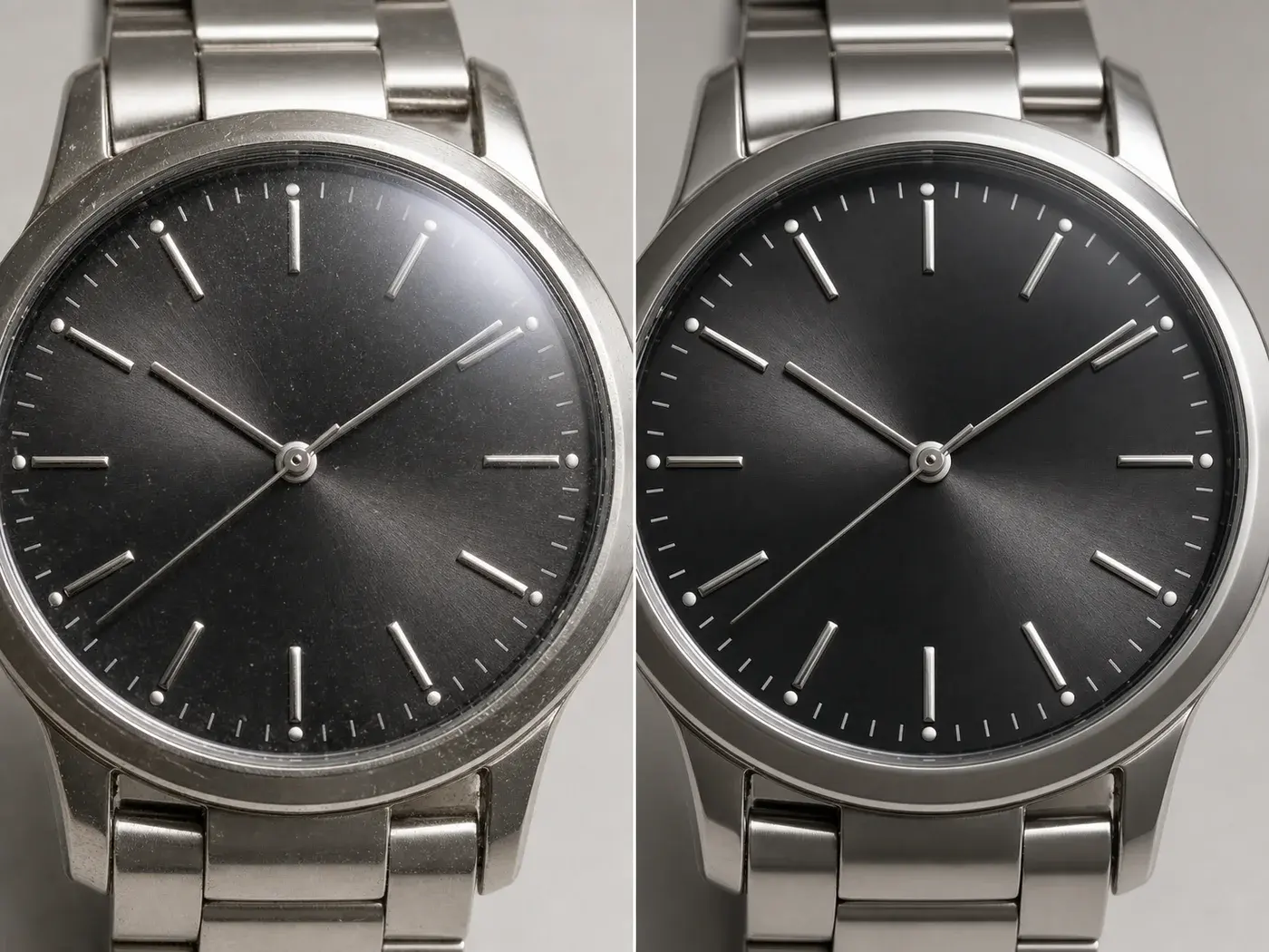 ## When local inpainting is better
Use local inpainting for dust, scratches, glare, wrinkles, small stains, background marks, edge cleanup, or label corrections. Avoid it when the entire product angle, lighting, or composition is wrong.
The key is to describe what should stay unchanged around the repair. AI needs a boundary.
## Workflow
1. Select only the flaw and a small margin around it.
2. Describe the surface that should continue through the repaired area.
3. Protect nearby text, edges, seams, reflections, and shadows.
4. Generate a conservative repair first.
5. Review at full size before exporting.
## Where KrafLayer Fits
When you apply this Use Local Inpainting to Retouch Product Detail Images workflow in KrafLayer, the tool choice matters: use Mask Edit for a local change with a short instruction, or Reference Image Editor when the result needs a visual example. After generation, judge the image by the channel it serves — detail-page modules — and check that shape, material, labels, color, scale, and accessories still match the source SKU.
## Prompt to use in KrafLayer
~~~text
Use the uploaded product detail image as the exact reference. Repair only the selected area with local inpainting. Match the surrounding material, texture, color, light, reflection, and shadow. Preserve nearby product edges, label text, logo, seams, hardware, and scale. Do not regenerate the whole image, change the product design, invent text, or smooth unrelated areas.
~~~
## FAQ
### Why is local inpainting safer than full image editing?
It limits the edit area, so fewer product details can drift. That makes it better for ecommerce images where accuracy matters.
### What if the repair touches text?
Be cautious. AI text repair is unreliable. If exact text matters, use a real label reference or add final text manually.
### How large should the selected area be?
Large enough to include the flaw, but not so large that AI has to reinterpret the product. Tight selections usually produce more trustworthy edits.
# How to Create Soft-Tech Product Renders for Consumer Electronics with AI
URL: https://kraflayer.com/blog/soft-tech-ai-product-rendering-for-consumer-electronics
Summary: A soft-tech rendering workflow for consumer electronics: create calm premium images for devices while preserving ports, buttons, proportions, finish, and screen geometry. Includes how to do it in KrafLayer.
Updated: 2026-08-21
## TL;DR
For Create Soft-Tech Product Renders for Consumer Electronics, use KrafLayer for controlled local changes or reference-guided edits. Use Mask Edit for a local change with a short instruction, or Reference Image Editor when the result needs a visual example. The finished image should still prove that shape, material, labels, color, scale, and accessories still match the source SKU.
Soft-tech product rendering is a calm, premium visual style for consumer electronics. It uses soft gradients, clean surfaces, precise highlights, and controlled shadows to make a device feel modern without turning it into a fictional concept render.
Use it for earbuds, chargers, smart home devices, wearables, speakers, and small electronics when you need a Shopify hero, campaign asset, product-page module, or social creative. The main risk is simple: AI may make the product sleeker by changing ports, buttons, proportions, or screen geometry.
## When local inpainting is better
Use local inpainting for dust, scratches, glare, wrinkles, small stains, background marks, edge cleanup, or label corrections. Avoid it when the entire product angle, lighting, or composition is wrong.
The key is to describe what should stay unchanged around the repair. AI needs a boundary.
## Workflow
1. Select only the flaw and a small margin around it.
2. Describe the surface that should continue through the repaired area.
3. Protect nearby text, edges, seams, reflections, and shadows.
4. Generate a conservative repair first.
5. Review at full size before exporting.
## Where KrafLayer Fits
When you apply this Use Local Inpainting to Retouch Product Detail Images workflow in KrafLayer, the tool choice matters: use Mask Edit for a local change with a short instruction, or Reference Image Editor when the result needs a visual example. After generation, judge the image by the channel it serves — detail-page modules — and check that shape, material, labels, color, scale, and accessories still match the source SKU.
## Prompt to use in KrafLayer
~~~text
Use the uploaded product detail image as the exact reference. Repair only the selected area with local inpainting. Match the surrounding material, texture, color, light, reflection, and shadow. Preserve nearby product edges, label text, logo, seams, hardware, and scale. Do not regenerate the whole image, change the product design, invent text, or smooth unrelated areas.
~~~
## FAQ
### Why is local inpainting safer than full image editing?
It limits the edit area, so fewer product details can drift. That makes it better for ecommerce images where accuracy matters.
### What if the repair touches text?
Be cautious. AI text repair is unreliable. If exact text matters, use a real label reference or add final text manually.
### How large should the selected area be?
Large enough to include the flaw, but not so large that AI has to reinterpret the product. Tight selections usually produce more trustworthy edits.
# How to Create Soft-Tech Product Renders for Consumer Electronics with AI
URL: https://kraflayer.com/blog/soft-tech-ai-product-rendering-for-consumer-electronics
Summary: A soft-tech rendering workflow for consumer electronics: create calm premium images for devices while preserving ports, buttons, proportions, finish, and screen geometry. Includes how to do it in KrafLayer.
Updated: 2026-08-21
## TL;DR
For Create Soft-Tech Product Renders for Consumer Electronics, use KrafLayer for controlled local changes or reference-guided edits. Use Mask Edit for a local change with a short instruction, or Reference Image Editor when the result needs a visual example. The finished image should still prove that shape, material, labels, color, scale, and accessories still match the source SKU.
Soft-tech product rendering is a calm, premium visual style for consumer electronics. It uses soft gradients, clean surfaces, precise highlights, and controlled shadows to make a device feel modern without turning it into a fictional concept render.
Use it for earbuds, chargers, smart home devices, wearables, speakers, and small electronics when you need a Shopify hero, campaign asset, product-page module, or social creative. The main risk is simple: AI may make the product sleeker by changing ports, buttons, proportions, or screen geometry.
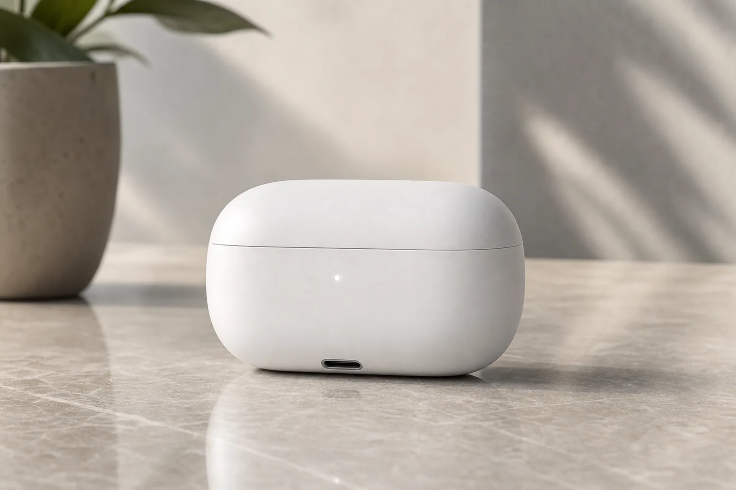 ## What makes soft-tech different
Soft-tech is not cyberpunk and not hard industrial rendering. It should feel quiet, precise, and touchable: rounded highlights, gentle background gradients, subtle reflections, and enough space around the product.
For ecommerce, the functional details matter. A charging port, hinge, speaker grille, LED, button, screen edge, or case seam should stay where it is.
## Workflow
1. Identify every functional detail before prompting: ports, buttons, hinge, screen ratio, seams, logo area, and finish.
2. Choose the commercial use: product-page hero, feature module, launch banner, or ad creative.
3. Ask for soft studio light and subtle depth, not a futuristic redesign.
4. Keep the background simple enough that the device remains the focal point.
5. Compare geometry and ports against the original reference.
## Where KrafLayer Fits
When you apply this Create Soft-Tech Product Renders for Consumer Electronics workflow in KrafLayer, the tool choice matters: use Mask Edit for a local change with a short instruction, or Reference Image Editor when the result needs a visual example. After generation, judge the image by the channel it serves — listing images, detail pages, or ad assets — and check that shape, material, labels, color, scale, and accessories still match the source SKU.
## Prompt to use in KrafLayer
~~~text
Use the uploaded electronics product as the exact reference. Create a soft-tech ecommerce product render with calm premium lighting, gentle gradients, clean reflections, and a minimal modern background. Preserve the product proportions, ports, buttons, hinge, screen ratio, seams, logo area, material finish, and color. Do not redesign the device, move functional details, add extra lights or ports, change the screen shape, or make the product look like a fictional concept.
~~~
## Review checklist
- Are all ports, buttons, seams, and LEDs still in the right place?
- Does the device keep its original thickness and corner radius?
- Are reflections soft enough to feel premium but not so strong that they hide details?
- Does the crop work for both desktop hero and mobile product module?
- Does the image feel like the product you sell, not a better imaginary version?
## Summary
Soft-tech rendering should make electronics feel cleaner and more premium while protecting product geometry. The style is valuable only if the buyer can still trust the device details.
## FAQ
### Is soft-tech rendering suitable for marketplace main images?
It is better for brand sites, product modules, ads, and launch pages. Marketplace main images often need a plainer product-first presentation.
### Why do AI electronics renders change ports or buttons?
The model treats small hardware details as design elements unless the prompt locks them. Always name the functional details that must stay unchanged.
### Can I use this style for feature callouts?
Yes. Leave negative space around the device and add final labels in a design tool so the text remains accurate and editable.
# How to Create Cinematic Ecommerce Posters with AI
URL: https://kraflayer.com/blog/cinematic-lighting-ecommerce-poster-generation
Summary: A practical guide to cinematic ecommerce poster generation: build drama with light and composition while keeping the product readable, accurate, and conversion-focused. Includes how to do it in KrafLayer.
Updated: 2026-08-21
## TL;DR
For Create Cinematic Ecommerce Posters, use KrafLayer for controlled local changes or reference-guided edits. Use Mask Edit for a local change with a short instruction, or Reference Image Editor when the result needs a visual example. The finished image should still prove that shape, material, labels, color, scale, and accessories still match the source SKU.
Cinematic ecommerce posters work when the drama helps the product feel desirable. They fail when smoke, contrast, props, and lighting make the buyer work too hard to understand what is being sold.
Use cinematic lighting for campaign images, launch banners, landing-page heroes, and paid social creatives. For marketplace main images, keep the result cleaner. The product still needs to be the clearest object in the frame.
## What makes soft-tech different
Soft-tech is not cyberpunk and not hard industrial rendering. It should feel quiet, precise, and touchable: rounded highlights, gentle background gradients, subtle reflections, and enough space around the product.
For ecommerce, the functional details matter. A charging port, hinge, speaker grille, LED, button, screen edge, or case seam should stay where it is.
## Workflow
1. Identify every functional detail before prompting: ports, buttons, hinge, screen ratio, seams, logo area, and finish.
2. Choose the commercial use: product-page hero, feature module, launch banner, or ad creative.
3. Ask for soft studio light and subtle depth, not a futuristic redesign.
4. Keep the background simple enough that the device remains the focal point.
5. Compare geometry and ports against the original reference.
## Where KrafLayer Fits
When you apply this Create Soft-Tech Product Renders for Consumer Electronics workflow in KrafLayer, the tool choice matters: use Mask Edit for a local change with a short instruction, or Reference Image Editor when the result needs a visual example. After generation, judge the image by the channel it serves — listing images, detail pages, or ad assets — and check that shape, material, labels, color, scale, and accessories still match the source SKU.
## Prompt to use in KrafLayer
~~~text
Use the uploaded electronics product as the exact reference. Create a soft-tech ecommerce product render with calm premium lighting, gentle gradients, clean reflections, and a minimal modern background. Preserve the product proportions, ports, buttons, hinge, screen ratio, seams, logo area, material finish, and color. Do not redesign the device, move functional details, add extra lights or ports, change the screen shape, or make the product look like a fictional concept.
~~~
## Review checklist
- Are all ports, buttons, seams, and LEDs still in the right place?
- Does the device keep its original thickness and corner radius?
- Are reflections soft enough to feel premium but not so strong that they hide details?
- Does the crop work for both desktop hero and mobile product module?
- Does the image feel like the product you sell, not a better imaginary version?
## Summary
Soft-tech rendering should make electronics feel cleaner and more premium while protecting product geometry. The style is valuable only if the buyer can still trust the device details.
## FAQ
### Is soft-tech rendering suitable for marketplace main images?
It is better for brand sites, product modules, ads, and launch pages. Marketplace main images often need a plainer product-first presentation.
### Why do AI electronics renders change ports or buttons?
The model treats small hardware details as design elements unless the prompt locks them. Always name the functional details that must stay unchanged.
### Can I use this style for feature callouts?
Yes. Leave negative space around the device and add final labels in a design tool so the text remains accurate and editable.
# How to Create Cinematic Ecommerce Posters with AI
URL: https://kraflayer.com/blog/cinematic-lighting-ecommerce-poster-generation
Summary: A practical guide to cinematic ecommerce poster generation: build drama with light and composition while keeping the product readable, accurate, and conversion-focused. Includes how to do it in KrafLayer.
Updated: 2026-08-21
## TL;DR
For Create Cinematic Ecommerce Posters, use KrafLayer for controlled local changes or reference-guided edits. Use Mask Edit for a local change with a short instruction, or Reference Image Editor when the result needs a visual example. The finished image should still prove that shape, material, labels, color, scale, and accessories still match the source SKU.
Cinematic ecommerce posters work when the drama helps the product feel desirable. They fail when smoke, contrast, props, and lighting make the buyer work too hard to understand what is being sold.
Use cinematic lighting for campaign images, launch banners, landing-page heroes, and paid social creatives. For marketplace main images, keep the result cleaner. The product still needs to be the clearest object in the frame.
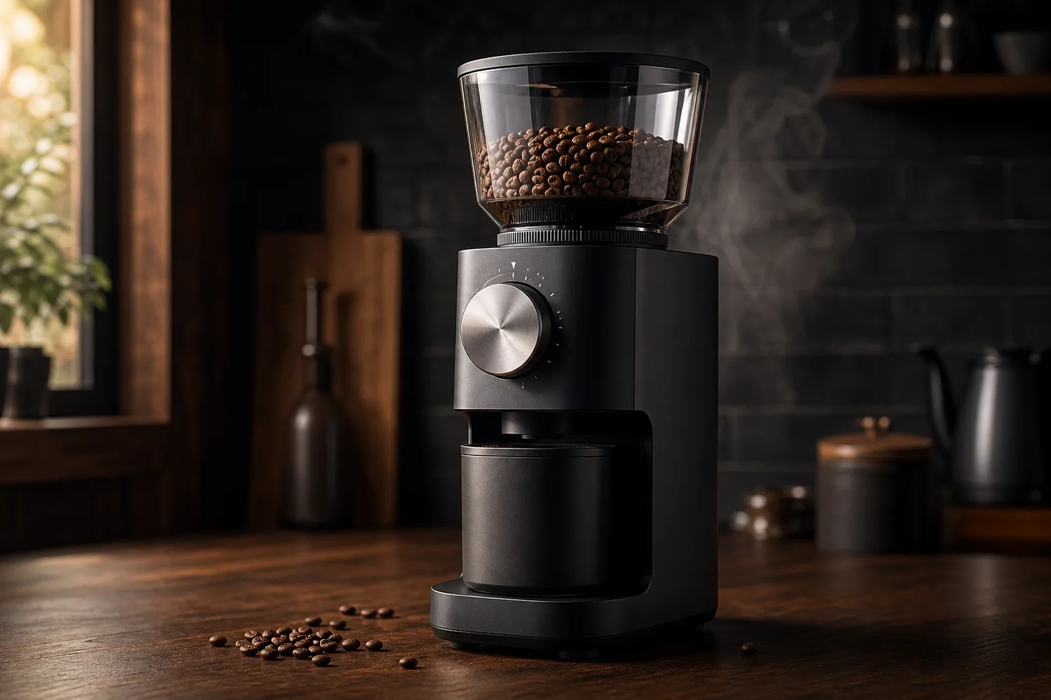 ## What cinematic means for ecommerce
Cinematic does not mean dark. In ecommerce, it usually means motivated light, controlled contrast, atmospheric depth, strong product silhouette, and enough negative space for headline or offer text.
The product cannot become a prop inside its own ad. Keep logo areas, labels, handles, buttons, materials, and scale readable.
## A useful poster workflow
1. Decide the poster job: launch, seasonal offer, premium brand story, hero banner, or paid ad.
2. Choose one lighting idea: side light, rim light, spotlight, window light, or warm backlight.
3. Place the product first, then add background depth around it.
4. Reserve clean space for copy instead of asking AI to generate final text.
5. Review product accuracy before judging mood.
## Where KrafLayer Fits
When you apply this Create Cinematic Ecommerce Posters workflow in KrafLayer, the tool choice matters: use Mask Edit for a local change with a short instruction, or Reference Image Editor when the result needs a visual example. After generation, judge the image by the channel it serves — ad posters — and check that shape, material, labels, color, scale, and accessories still match the source SKU.
## Prompt to use in KrafLayer
~~~text
Use the uploaded product as the exact reference. Create a cinematic ecommerce poster for [campaign/use case]. Keep the product shape, material, logo area, functional details, color, and scale accurate. Use controlled dramatic lighting, a clear product silhouette, natural shadows, subtle atmospheric depth, and clean negative space for optional headline text. Do not hide the product in darkness, add fake text, change labels, distort geometry, or let props compete with the product.
~~~
## What to avoid
- Over-dark images where the product edge disappears.
- Random smoke, sparks, or reflections that do not fit the product category.
- AI-generated headline text that looks almost correct but not usable.
- Props that suggest the wrong size, audience, or use case.
- Crops that look good as art but fail in ads or mobile banners.
## Summary
Cinematic product posters should sell the product, not just the mood. Make light and composition do the storytelling while the SKU remains accurate, readable, and easy to crop.
## FAQ
### Can cinematic ecommerce posters include text?
It is safer to leave clean space for text and add final typography in your design tool. AI text can look convincing at first glance but often fails under close review.
### What products work best with cinematic lighting?
Coffee gear, beauty packaging, electronics, jewelry, automotive parts, beverages, and premium accessories often benefit from cinematic lighting because material and highlight control can communicate quality.
### How do I keep a cinematic poster from looking fake?
Match the product light to the scene, keep contact shadows realistic, avoid excessive effects, and compare the product against the original reference before publishing.
# How to Replace a Product Background with AI Without Losing Real Lighting
URL: https://kraflayer.com/blog/ai-background-replacement-tool-that-keeps-real-product-lighting
Summary: A lighting-safe background replacement workflow: change the product scene while preserving original highlights, shadows, material, and product realism. Includes how to do it in KrafLayer.
Updated: 2026-08-21
## TL;DR
For Replace a Product Background with AI Without Losing Real Lighting, KrafLayer helps when the product is real but the surrounding scene needs work. Use Replace BG for a prompted or reference-based scene, or Scene Compose when product position and scale must match a base scene. Use the scene to support listing images, detail pages, or ad assets, then check that shape, material, labels, color, scale, and accessories still match the source SKU.
A background replacement succeeds only when the product lighting still makes sense. If the new scene has a different light direction, surface, or shadow logic, the product will look pasted even if the background is beautiful.
## What cinematic means for ecommerce
Cinematic does not mean dark. In ecommerce, it usually means motivated light, controlled contrast, atmospheric depth, strong product silhouette, and enough negative space for headline or offer text.
The product cannot become a prop inside its own ad. Keep logo areas, labels, handles, buttons, materials, and scale readable.
## A useful poster workflow
1. Decide the poster job: launch, seasonal offer, premium brand story, hero banner, or paid ad.
2. Choose one lighting idea: side light, rim light, spotlight, window light, or warm backlight.
3. Place the product first, then add background depth around it.
4. Reserve clean space for copy instead of asking AI to generate final text.
5. Review product accuracy before judging mood.
## Where KrafLayer Fits
When you apply this Create Cinematic Ecommerce Posters workflow in KrafLayer, the tool choice matters: use Mask Edit for a local change with a short instruction, or Reference Image Editor when the result needs a visual example. After generation, judge the image by the channel it serves — ad posters — and check that shape, material, labels, color, scale, and accessories still match the source SKU.
## Prompt to use in KrafLayer
~~~text
Use the uploaded product as the exact reference. Create a cinematic ecommerce poster for [campaign/use case]. Keep the product shape, material, logo area, functional details, color, and scale accurate. Use controlled dramatic lighting, a clear product silhouette, natural shadows, subtle atmospheric depth, and clean negative space for optional headline text. Do not hide the product in darkness, add fake text, change labels, distort geometry, or let props compete with the product.
~~~
## What to avoid
- Over-dark images where the product edge disappears.
- Random smoke, sparks, or reflections that do not fit the product category.
- AI-generated headline text that looks almost correct but not usable.
- Props that suggest the wrong size, audience, or use case.
- Crops that look good as art but fail in ads or mobile banners.
## Summary
Cinematic product posters should sell the product, not just the mood. Make light and composition do the storytelling while the SKU remains accurate, readable, and easy to crop.
## FAQ
### Can cinematic ecommerce posters include text?
It is safer to leave clean space for text and add final typography in your design tool. AI text can look convincing at first glance but often fails under close review.
### What products work best with cinematic lighting?
Coffee gear, beauty packaging, electronics, jewelry, automotive parts, beverages, and premium accessories often benefit from cinematic lighting because material and highlight control can communicate quality.
### How do I keep a cinematic poster from looking fake?
Match the product light to the scene, keep contact shadows realistic, avoid excessive effects, and compare the product against the original reference before publishing.
# How to Replace a Product Background with AI Without Losing Real Lighting
URL: https://kraflayer.com/blog/ai-background-replacement-tool-that-keeps-real-product-lighting
Summary: A lighting-safe background replacement workflow: change the product scene while preserving original highlights, shadows, material, and product realism. Includes how to do it in KrafLayer.
Updated: 2026-08-21
## TL;DR
For Replace a Product Background with AI Without Losing Real Lighting, KrafLayer helps when the product is real but the surrounding scene needs work. Use Replace BG for a prompted or reference-based scene, or Scene Compose when product position and scale must match a base scene. Use the scene to support listing images, detail pages, or ad assets, then check that shape, material, labels, color, scale, and accessories still match the source SKU.
A background replacement succeeds only when the product lighting still makes sense. If the new scene has a different light direction, surface, or shadow logic, the product will look pasted even if the background is beautiful.
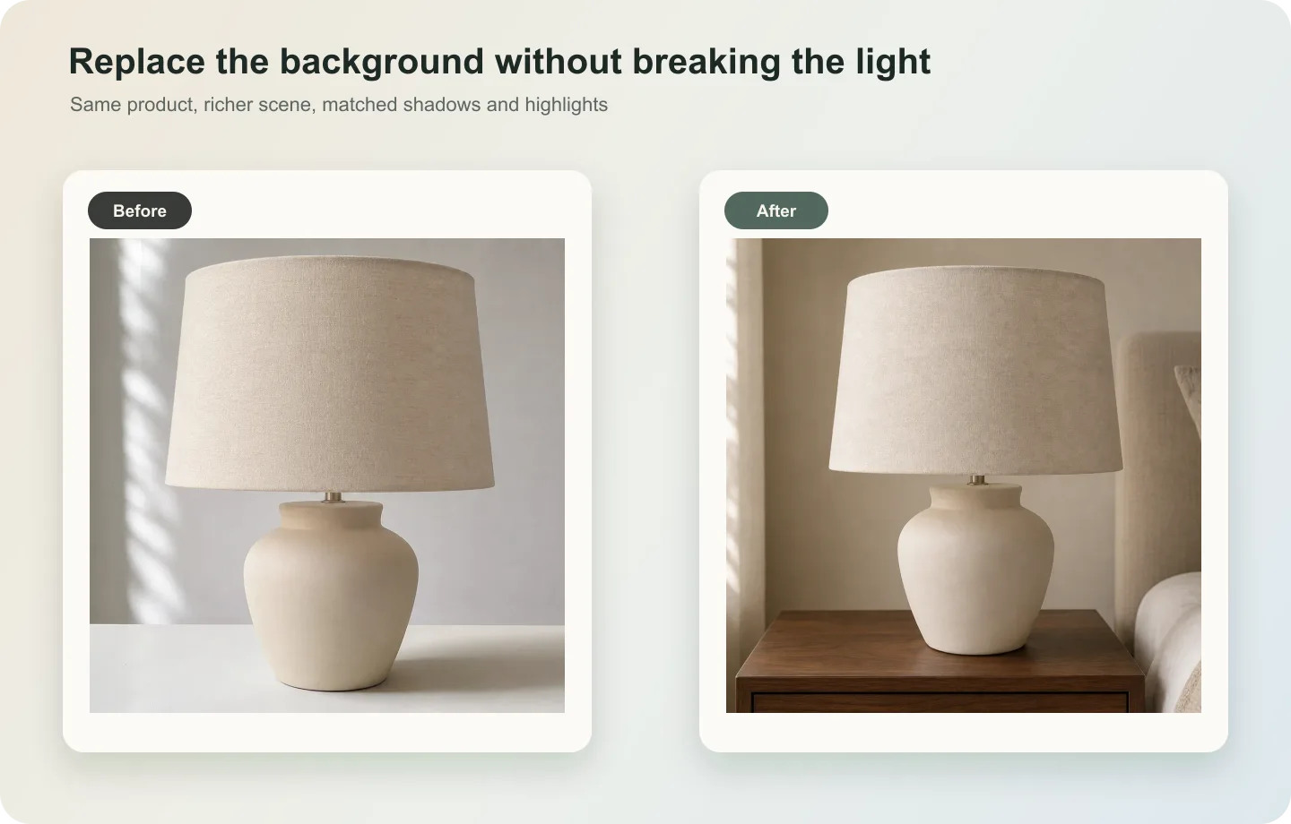 ## What to match
Match light direction, highlight strength, contact shadow, perspective, surface reflection, and color temperature. The product’s original material behavior should guide the scene.
## Workflow
1. Read the original light direction before generating a new background.
2. Choose a background that can plausibly share that light.
3. Preserve product edges, material, color, and shadow.
4. Rebuild contact with the new surface.
5. Compare the product against the original to catch lighting drift.
## Where KrafLayer Fits
When you apply this Replace a Product Background with AI Without Losing Real Lighting workflow in KrafLayer, the tool choice matters: use Replace BG for a prompted or reference-based scene, or Scene Compose when product position and scale must match a base scene. After generation, judge the image by the channel it serves — listing images, detail pages, or ad assets — and check that shape, material, labels, color, scale, and accessories still match the source SKU.
## Prompt to use in KrafLayer
~~~text
Use the uploaded product as the exact reference. Replace the background while preserving the real product lighting. Match the new scene to the product’s existing light direction, highlight pattern, shadow softness, perspective, and color temperature. Keep product shape, material, color, label area, edge detail, scale, and contact shadow accurate. Do not relight the product unrealistically, change material, distort edges, or make it look pasted on.
~~~
## FAQ
### Should the product be relit when changing backgrounds?
Only gently. The new scene should adapt to the product lighting more than the product should be forced into an incompatible scene.
### Why does the edit look pasted?
The contact shadow, perspective, or light direction probably does not match. Fix those before changing style.
### Can I use any background I want?
Not if realism matters. Choose backgrounds compatible with the product’s existing light and camera angle.
# How to Make Phone Product Photos Look Like DSLR Shots with AI
URL: https://kraflayer.com/blog/make-phone-product-photos-look-like-dslr-shots
Summary: A practical AI editing workflow for turning phone product photos into cleaner DSLR-style ecommerce shots while preserving the real product, color, texture, and scale. Includes how to do it in KrafLayer.
Updated: 2026-08-21
## TL;DR
For Make Phone Product Photos Look Like DSLR Shots, use KrafLayer as a fast pre-publishing edit step: run Restore on a usable source photo, then compare color, exposure, and recovered detail against the original. It is most useful for listing images, detail pages, or ad assets, as long as shape, material, labels, color, scale, and accessories still match the source SKU.
A phone product photo can often be saved if the product is sharp enough and the angle is usable. The DSLR look does not come from fake blur or heavier contrast; it comes from cleaner light, better color, controlled perspective, and a product edge that feels intentional.
Use this workflow when a phone shot has the right SKU but looks casual: mixed indoor light, noisy shadows, a busy surface, weak depth, or a slightly flat lens feel. The edit should make the image more commercial without pretending the product was a different sample.
## What to match
Match light direction, highlight strength, contact shadow, perspective, surface reflection, and color temperature. The product’s original material behavior should guide the scene.
## Workflow
1. Read the original light direction before generating a new background.
2. Choose a background that can plausibly share that light.
3. Preserve product edges, material, color, and shadow.
4. Rebuild contact with the new surface.
5. Compare the product against the original to catch lighting drift.
## Where KrafLayer Fits
When you apply this Replace a Product Background with AI Without Losing Real Lighting workflow in KrafLayer, the tool choice matters: use Replace BG for a prompted or reference-based scene, or Scene Compose when product position and scale must match a base scene. After generation, judge the image by the channel it serves — listing images, detail pages, or ad assets — and check that shape, material, labels, color, scale, and accessories still match the source SKU.
## Prompt to use in KrafLayer
~~~text
Use the uploaded product as the exact reference. Replace the background while preserving the real product lighting. Match the new scene to the product’s existing light direction, highlight pattern, shadow softness, perspective, and color temperature. Keep product shape, material, color, label area, edge detail, scale, and contact shadow accurate. Do not relight the product unrealistically, change material, distort edges, or make it look pasted on.
~~~
## FAQ
### Should the product be relit when changing backgrounds?
Only gently. The new scene should adapt to the product lighting more than the product should be forced into an incompatible scene.
### Why does the edit look pasted?
The contact shadow, perspective, or light direction probably does not match. Fix those before changing style.
### Can I use any background I want?
Not if realism matters. Choose backgrounds compatible with the product’s existing light and camera angle.
# How to Make Phone Product Photos Look Like DSLR Shots with AI
URL: https://kraflayer.com/blog/make-phone-product-photos-look-like-dslr-shots
Summary: A practical AI editing workflow for turning phone product photos into cleaner DSLR-style ecommerce shots while preserving the real product, color, texture, and scale. Includes how to do it in KrafLayer.
Updated: 2026-08-21
## TL;DR
For Make Phone Product Photos Look Like DSLR Shots, use KrafLayer as a fast pre-publishing edit step: run Restore on a usable source photo, then compare color, exposure, and recovered detail against the original. It is most useful for listing images, detail pages, or ad assets, as long as shape, material, labels, color, scale, and accessories still match the source SKU.
A phone product photo can often be saved if the product is sharp enough and the angle is usable. The DSLR look does not come from fake blur or heavier contrast; it comes from cleaner light, better color, controlled perspective, and a product edge that feels intentional.
Use this workflow when a phone shot has the right SKU but looks casual: mixed indoor light, noisy shadows, a busy surface, weak depth, or a slightly flat lens feel. The edit should make the image more commercial without pretending the product was a different sample.
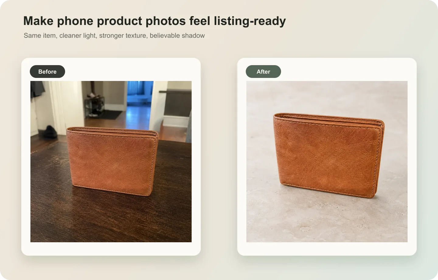 ## What a DSLR-style edit should change
A good edit improves light falloff, shadow softness, background cleanliness, color balance, and micro-contrast. It should not change the leather grain, stitching, logo position, product thickness, or true color variant.
If the product photo was shot too close with phone wide-angle distortion, ask for perspective correction carefully. Do not ask for a new camera angle unless you are comfortable with AI reconstructing product geometry.
## Step-by-step workflow
1. Start by correcting exposure and white balance before asking for style.
2. Clean the surface or background so the product feels intentionally photographed.
3. Add controlled depth with softer background separation, not fake heavy bokeh around the product edge.
4. Preserve material cues such as leather grain, metal shine, fabric texture, glass transparency, or plastic finish.
5. Review the final image beside the original product reference, then check it as a listing thumbnail.
## Where KrafLayer Fits
When you apply this Make Phone Product Photos Look Like DSLR Shots workflow in KrafLayer, the tool choice matters: run Restore on a usable source photo, then compare color, exposure, and recovered detail against the original. After generation, judge the image by the channel it serves — listing images, detail pages, or ad assets — and check that shape, material, labels, color, scale, and accessories still match the source SKU.
## Steps in KrafLayer
Use Restore for automatic cleanup when the image is noisy, soft, compressed, or poorly lit. It is an automated restoration pass, so the important work is choosing a usable source image and comparing the output.
1. Upload or choose the product image.
2. Run the tool according to its interaction model: one-click tools generate directly; Erase-style tools need a brush mask first.
3. Zoom in to check edges, text, material, shadow, and product scale before downloading or continuing the edit.
## Summary
The best phone-to-DSLR product edit is controlled and believable. Improve the photograph around the product, but keep the product itself honest.
## FAQ
### Can AI make any phone product photo look professional?
Only if the source photo contains enough product information. AI can improve light, background, and clarity, but it cannot reliably recover hidden labels, missing edges, or badly blurred material details.
### Should I ask for shallow depth of field?
Use it carefully. A slight lens separation can help, but strong fake bokeh often damages product edges and makes marketplace images look less trustworthy.
### What is the biggest mistake in DSLR-style AI edits?
The biggest mistake is asking for a beautiful studio shot without protecting product facts. The image may look expensive while quietly changing color, texture, thickness, or logo placement.
# How to Use Object Removal to Save Product Listing Photos
URL: https://kraflayer.com/blog/use-object-removal-to-save-product-listing-photos
Summary: A practical object-removal workflow for product listing photos: remove distractions, rebuild hidden surfaces, preserve product edges, and check whether the saved image is publishable. Includes how to do it in KrafLayer.
Updated: 2026-08-21
## TL;DR
For Use Object Removal to Save Product Listing Photos, KrafLayer works best as a local cleanup tool: brush only the unwanted area in Erase and let the model fill from the surrounding pixels. Avoid regenerating the whole image; the result is only useful if shape, material, labels, color, scale, and accessories still match the source SKU.
Object removal is useful when the product photo is almost usable, but one distracting thing makes it feel unprofessional: a hand, a cable, a barcode sticker, a prop, a dust tool, a reflection card, or a random object on the table.
The goal is not to regenerate the whole picture. The best object-removal edit is narrow. Remove the distraction, rebuild the hidden surface or background, and leave the product alone.
## What a DSLR-style edit should change
A good edit improves light falloff, shadow softness, background cleanliness, color balance, and micro-contrast. It should not change the leather grain, stitching, logo position, product thickness, or true color variant.
If the product photo was shot too close with phone wide-angle distortion, ask for perspective correction carefully. Do not ask for a new camera angle unless you are comfortable with AI reconstructing product geometry.
## Step-by-step workflow
1. Start by correcting exposure and white balance before asking for style.
2. Clean the surface or background so the product feels intentionally photographed.
3. Add controlled depth with softer background separation, not fake heavy bokeh around the product edge.
4. Preserve material cues such as leather grain, metal shine, fabric texture, glass transparency, or plastic finish.
5. Review the final image beside the original product reference, then check it as a listing thumbnail.
## Where KrafLayer Fits
When you apply this Make Phone Product Photos Look Like DSLR Shots workflow in KrafLayer, the tool choice matters: run Restore on a usable source photo, then compare color, exposure, and recovered detail against the original. After generation, judge the image by the channel it serves — listing images, detail pages, or ad assets — and check that shape, material, labels, color, scale, and accessories still match the source SKU.
## Steps in KrafLayer
Use Restore for automatic cleanup when the image is noisy, soft, compressed, or poorly lit. It is an automated restoration pass, so the important work is choosing a usable source image and comparing the output.
1. Upload or choose the product image.
2. Run the tool according to its interaction model: one-click tools generate directly; Erase-style tools need a brush mask first.
3. Zoom in to check edges, text, material, shadow, and product scale before downloading or continuing the edit.
## Summary
The best phone-to-DSLR product edit is controlled and believable. Improve the photograph around the product, but keep the product itself honest.
## FAQ
### Can AI make any phone product photo look professional?
Only if the source photo contains enough product information. AI can improve light, background, and clarity, but it cannot reliably recover hidden labels, missing edges, or badly blurred material details.
### Should I ask for shallow depth of field?
Use it carefully. A slight lens separation can help, but strong fake bokeh often damages product edges and makes marketplace images look less trustworthy.
### What is the biggest mistake in DSLR-style AI edits?
The biggest mistake is asking for a beautiful studio shot without protecting product facts. The image may look expensive while quietly changing color, texture, thickness, or logo placement.
# How to Use Object Removal to Save Product Listing Photos
URL: https://kraflayer.com/blog/use-object-removal-to-save-product-listing-photos
Summary: A practical object-removal workflow for product listing photos: remove distractions, rebuild hidden surfaces, preserve product edges, and check whether the saved image is publishable. Includes how to do it in KrafLayer.
Updated: 2026-08-21
## TL;DR
For Use Object Removal to Save Product Listing Photos, KrafLayer works best as a local cleanup tool: brush only the unwanted area in Erase and let the model fill from the surrounding pixels. Avoid regenerating the whole image; the result is only useful if shape, material, labels, color, scale, and accessories still match the source SKU.
Object removal is useful when the product photo is almost usable, but one distracting thing makes it feel unprofessional: a hand, a cable, a barcode sticker, a prop, a dust tool, a reflection card, or a random object on the table.
The goal is not to regenerate the whole picture. The best object-removal edit is narrow. Remove the distraction, rebuild the hidden surface or background, and leave the product alone.
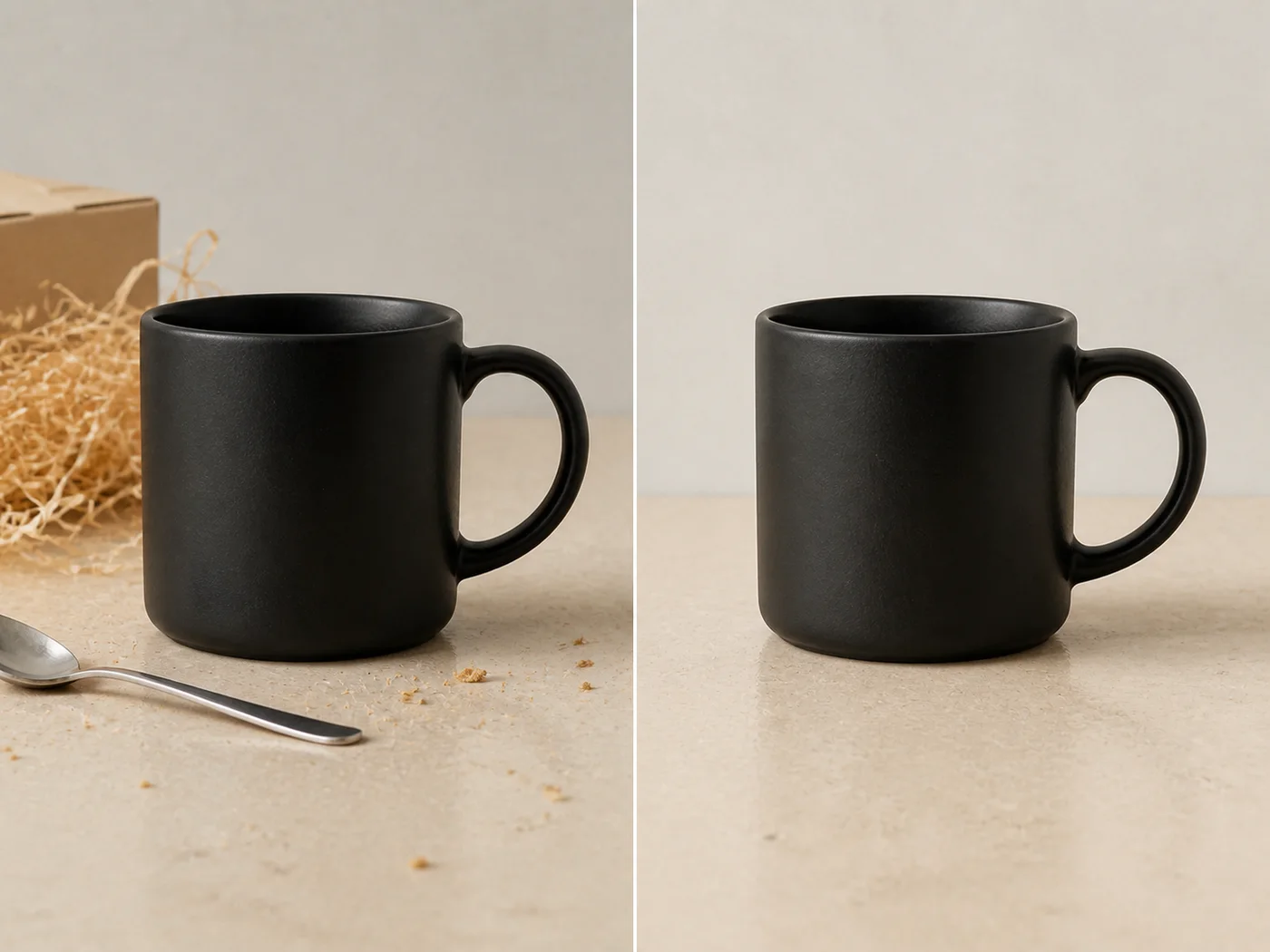 ## When object removal is the right fix
Use object removal when the product itself is sharp, correctly shaped, and well lit. It is a strong option for listing photos where a small problem blocks publishing but a reshoot would slow the team down.
Do not use object removal when the unwanted object covers too much of the product. If a hand hides the handle of a mug or a sticker covers important label text, AI may have to invent missing product details. That can become risky for ecommerce accuracy.
## A safer editing workflow
1. Mark the object to remove as tightly as possible. Avoid selecting product edges unless they truly need repair.
2. Tell the AI what should appear behind the removed object: table surface, paper sweep, product body, fabric, wall, or shadow.
3. Protect the product details around the edit area: edge shape, material, logo, label, handle, rim, texture, and shadow.
4. Generate a conservative repair first. Do not ask for a more beautiful image in the same pass.
5. Compare the edited area with nearby texture and light. The repair should disappear without making the image look airbrushed.
## Where KrafLayer Fits
When you apply this Use Object Removal to Save Product Listing Photos workflow in KrafLayer, the tool choice matters: brush only the unwanted area in Erase and let the model fill from the surrounding pixels. After generation, judge the image by the channel it serves — listing images, detail pages, or ad assets — and check that shape, material, labels, color, scale, and accessories still match the source SKU.
## Steps in KrafLayer
Use Erase with a brush mask: paint only the distracting object, sticker, hand, dust, or reflection area, then run the fill. There is no free-form prompt; mask accuracy controls the result.
1. Upload or choose the product image.
2. Run the tool according to its interaction model: one-click tools generate directly; Erase-style tools need a brush mask first.
3. Zoom in to check edges, text, material, shadow, and product scale before downloading or continuing the edit.
## Summary
Object removal can save a product listing photo when the edit is local and disciplined. Remove the distraction, rebuild only what was hidden, and protect the product facts that buyers rely on.
## FAQ
### Can AI remove a hand from a product photo?
Yes, if the hand does not hide too much product information. If it covers a handle, label, strap, or edge, review the repair carefully because the AI may need to guess what was behind it.
### Why does the repaired area look blurry?
The selected area may be too large, or the prompt may not describe what should replace the object. Use a tighter selection and name the background or surface that should continue through the repair.
### Should I remove all props from product photos?
Not always. Remove props that distract from the product or violate marketplace rules. Keep props that explain scale, use, or brand story in supporting images and ads.
# How to Create Natural-Light Product Photos for Flowers and Plants with AI
URL: https://kraflayer.com/blog/natural-light-ai-product-photography-for-flowers-and-plants
Summary: A flower and plant photography workflow using AI: create natural light, preserve plant shape, bloom color, leaf texture, pot scale, and realistic freshness. Includes how to do it in KrafLayer.
Updated: 2026-08-21
## TL;DR
For Create Natural-Light Product Photos for Flowers and Plants, KrafLayer helps when the product is real but the surrounding scene needs work. Use Replace BG for a prompted or reference-based scene, or Scene Compose when product position and scale must match a base scene. Use the scene to support listing images, detail pages, or ad assets, then check that scale, material, placement, and shadow still make sense in the space.
Flower and plant product images need freshness and truth. AI can improve light and setting, but it should not change bloom color, leaf shape, plant fullness, pot size, or the condition shoppers expect to receive.
## When object removal is the right fix
Use object removal when the product itself is sharp, correctly shaped, and well lit. It is a strong option for listing photos where a small problem blocks publishing but a reshoot would slow the team down.
Do not use object removal when the unwanted object covers too much of the product. If a hand hides the handle of a mug or a sticker covers important label text, AI may have to invent missing product details. That can become risky for ecommerce accuracy.
## A safer editing workflow
1. Mark the object to remove as tightly as possible. Avoid selecting product edges unless they truly need repair.
2. Tell the AI what should appear behind the removed object: table surface, paper sweep, product body, fabric, wall, or shadow.
3. Protect the product details around the edit area: edge shape, material, logo, label, handle, rim, texture, and shadow.
4. Generate a conservative repair first. Do not ask for a more beautiful image in the same pass.
5. Compare the edited area with nearby texture and light. The repair should disappear without making the image look airbrushed.
## Where KrafLayer Fits
When you apply this Use Object Removal to Save Product Listing Photos workflow in KrafLayer, the tool choice matters: brush only the unwanted area in Erase and let the model fill from the surrounding pixels. After generation, judge the image by the channel it serves — listing images, detail pages, or ad assets — and check that shape, material, labels, color, scale, and accessories still match the source SKU.
## Steps in KrafLayer
Use Erase with a brush mask: paint only the distracting object, sticker, hand, dust, or reflection area, then run the fill. There is no free-form prompt; mask accuracy controls the result.
1. Upload or choose the product image.
2. Run the tool according to its interaction model: one-click tools generate directly; Erase-style tools need a brush mask first.
3. Zoom in to check edges, text, material, shadow, and product scale before downloading or continuing the edit.
## Summary
Object removal can save a product listing photo when the edit is local and disciplined. Remove the distraction, rebuild only what was hidden, and protect the product facts that buyers rely on.
## FAQ
### Can AI remove a hand from a product photo?
Yes, if the hand does not hide too much product information. If it covers a handle, label, strap, or edge, review the repair carefully because the AI may need to guess what was behind it.
### Why does the repaired area look blurry?
The selected area may be too large, or the prompt may not describe what should replace the object. Use a tighter selection and name the background or surface that should continue through the repair.
### Should I remove all props from product photos?
Not always. Remove props that distract from the product or violate marketplace rules. Keep props that explain scale, use, or brand story in supporting images and ads.
# How to Create Natural-Light Product Photos for Flowers and Plants with AI
URL: https://kraflayer.com/blog/natural-light-ai-product-photography-for-flowers-and-plants
Summary: A flower and plant photography workflow using AI: create natural light, preserve plant shape, bloom color, leaf texture, pot scale, and realistic freshness. Includes how to do it in KrafLayer.
Updated: 2026-08-21
## TL;DR
For Create Natural-Light Product Photos for Flowers and Plants, KrafLayer helps when the product is real but the surrounding scene needs work. Use Replace BG for a prompted or reference-based scene, or Scene Compose when product position and scale must match a base scene. Use the scene to support listing images, detail pages, or ad assets, then check that scale, material, placement, and shadow still make sense in the space.
Flower and plant product images need freshness and truth. AI can improve light and setting, but it should not change bloom color, leaf shape, plant fullness, pot size, or the condition shoppers expect to receive.
 ## What to protect
Preserve bloom count, leaf texture, stem direction, pot shape, soil or moss detail, color, and scale. Do not make a sparse plant look like a different fuller product.
## Workflow
1. Choose soft window light or bright overcast light.
2. Keep the plant shape and pot scale fixed.
3. Use simple surfaces and minimal props.
4. Preserve realistic freshness and color.
5. Check whether the image over-promises size or bloom density.
## Where KrafLayer Fits
When you apply this Create Natural-Light Product Photos for Flowers and Plants workflow in KrafLayer, the tool choice matters: use Replace BG for a prompted or reference-based scene, or Scene Compose when product position and scale must match a base scene. After generation, judge the image by the channel it serves — listing images, detail pages, or ad assets — and check that scale, material, placement, and shadow still make sense in the space.
## Prompt to use in KrafLayer
~~~text
Use the uploaded flower or plant product as the exact reference. Create a natural-light ecommerce product photo with soft daylight, clean background, and realistic freshness. Preserve bloom color, leaf shape, stem direction, plant fullness, pot shape, soil detail, scale, and material texture. Do not add extra blooms, change species, exaggerate fullness, alter pot design, or make the product look unrealistic.
~~~
## FAQ
### Can AI make plant photos look fresher?
It can improve light and remove minor distractions, but it should not misrepresent bloom count, plant size, or species.
### What background works best?
Soft window light, neutral surfaces, and simple home contexts usually work better than busy garden scenes.
### Why do AI plant images look fake?
AI may repeat leaves or invent blooms. Lock species, shape, and bloom count when accuracy matters.
# How to Create Matte Frosted Cosmetic Product Renders with AI
URL: https://kraflayer.com/blog/matte-frosted-cosmetic-product-ai-rendering
Summary: A beauty product rendering guide for matte frosted cosmetic packaging: protect silhouette, cap, label, translucency, shadow, and premium material cues. Includes how to do it in KrafLayer.
Updated: 2026-08-21
## TL;DR
For Create Matte Frosted Cosmetic Product Renders, use KrafLayer for controlled local changes or reference-guided edits. Use Mask Edit for a local change with a short instruction, or Reference Image Editor when the result needs a visual example. The finished image should still prove that the bottle shape, label, shade, texture, and packaging proportions stay believable.
Matte frosted cosmetic rendering is useful when a beauty product needs a softer, more premium campaign image. The style should communicate touch, translucency, and calm light. It should not erase the packaging design or make every bottle look like the same generic serum render.
Use this approach for skincare, fragrance, serum, cream, foundation, and body-care products where the material finish is part of the buying decision.
## What to protect
Preserve bloom count, leaf texture, stem direction, pot shape, soil or moss detail, color, and scale. Do not make a sparse plant look like a different fuller product.
## Workflow
1. Choose soft window light or bright overcast light.
2. Keep the plant shape and pot scale fixed.
3. Use simple surfaces and minimal props.
4. Preserve realistic freshness and color.
5. Check whether the image over-promises size or bloom density.
## Where KrafLayer Fits
When you apply this Create Natural-Light Product Photos for Flowers and Plants workflow in KrafLayer, the tool choice matters: use Replace BG for a prompted or reference-based scene, or Scene Compose when product position and scale must match a base scene. After generation, judge the image by the channel it serves — listing images, detail pages, or ad assets — and check that scale, material, placement, and shadow still make sense in the space.
## Prompt to use in KrafLayer
~~~text
Use the uploaded flower or plant product as the exact reference. Create a natural-light ecommerce product photo with soft daylight, clean background, and realistic freshness. Preserve bloom color, leaf shape, stem direction, plant fullness, pot shape, soil detail, scale, and material texture. Do not add extra blooms, change species, exaggerate fullness, alter pot design, or make the product look unrealistic.
~~~
## FAQ
### Can AI make plant photos look fresher?
It can improve light and remove minor distractions, but it should not misrepresent bloom count, plant size, or species.
### What background works best?
Soft window light, neutral surfaces, and simple home contexts usually work better than busy garden scenes.
### Why do AI plant images look fake?
AI may repeat leaves or invent blooms. Lock species, shape, and bloom count when accuracy matters.
# How to Create Matte Frosted Cosmetic Product Renders with AI
URL: https://kraflayer.com/blog/matte-frosted-cosmetic-product-ai-rendering
Summary: A beauty product rendering guide for matte frosted cosmetic packaging: protect silhouette, cap, label, translucency, shadow, and premium material cues. Includes how to do it in KrafLayer.
Updated: 2026-08-21
## TL;DR
For Create Matte Frosted Cosmetic Product Renders, use KrafLayer for controlled local changes or reference-guided edits. Use Mask Edit for a local change with a short instruction, or Reference Image Editor when the result needs a visual example. The finished image should still prove that the bottle shape, label, shade, texture, and packaging proportions stay believable.
Matte frosted cosmetic rendering is useful when a beauty product needs a softer, more premium campaign image. The style should communicate touch, translucency, and calm light. It should not erase the packaging design or make every bottle look like the same generic serum render.
Use this approach for skincare, fragrance, serum, cream, foundation, and body-care products where the material finish is part of the buying decision.
 ## What matte frosted should look like
A good frosted finish has diffused highlights, soft edges, slight translucency, and gentle shadow. It is not simply a low-contrast white bottle. Cap material, pump shape, label area, bottle thickness, and color tint still need to be readable.
The common AI failure is over-minimalism: the packaging becomes smooth, blank, and beautiful but no longer specific to the real product.
## Workflow
1. Lock the product identity: bottle silhouette, cap, pump, label area, color, volume, and proportions.
2. Decide the use: hero render, PDP detail module, ad background, or launch poster.
3. Ask for matte frosted material behavior: diffused highlights, soft translucency, and controlled shadows.
4. Keep typography areas clean, but avoid asking AI to generate final label text.
5. Compare the output with the reference for packaging geometry.
## Where KrafLayer Fits
When you apply this Create Matte Frosted Cosmetic Product Renders workflow in KrafLayer, the tool choice matters: use Mask Edit for a local change with a short instruction, or Reference Image Editor when the result needs a visual example. After generation, judge the image by the channel it serves — listing images, detail pages, or ad assets — and check that the bottle shape, label, shade, texture, and packaging proportions stay believable.
## Prompt to use in KrafLayer
~~~text
Use the uploaded cosmetic product as the exact packaging reference. Create a premium matte frosted product render for ecommerce. Preserve the bottle silhouette, cap or pump shape, label area, logo placement, color tint, proportions, and packaging geometry. Show soft diffused highlights, subtle translucency, smooth frosted texture, and a natural contact shadow. Do not make the bottle blank, change the cap, invent label text, alter the product shape, or over-smooth the material.
~~~
## Review checklist
- Does the bottle still match the real package shape?
- Is the frosted material visible without hiding the label zone?
- Does the cap or pump keep its original construction?
- Are highlights soft but still useful for showing shape?
- Would the image fit next to a real product photo in the gallery?
## Summary
Matte frosted cosmetic rendering should make packaging feel premium while preserving product identity. The best result is quiet, tactile, and specific to the SKU.
## FAQ
### Is matte frosted rendering good for product pages?
Yes, especially for hero images and detail modules. For strict marketplace main images, use a simpler product-first version with fewer atmospheric effects.
### Why does AI remove my label design?
Minimal render prompts often encourage the model to simplify packaging. Tell it to preserve the label area and logo placement, then add final text manually if exact typography matters.
### What is the difference between matte and frosted?
Matte reduces shine on the surface. Frosted suggests diffused translucency, often with soft internal light and blurred edges. Cosmetic packaging can use both, but the prompt should name the material behavior clearly.
# 如何生成好的电商图:先有明确主体,再做风格
URL: https://kraflayer.com/zh/blog/make-better-ecommerce-product-images
Summary: 一套电商图基础方法:先让主体清楚、商品真实,再用光线、背景、细节图和场景图提升转化理解。可在 KrafLayer 中按同一流程完成。
Updated: 2026-06-12
## TL;DR
生成好的电商图这类任务,KrafLayer 的作用是把真实商品参考图推进到可用的主图、详情图或广告素材,而不是重新发明商品。核心检查点是商品形状、材质、标签、颜色、比例和配件仍然对应原始 SKU。
好的电商图不是单纯“好看”,而是让买家更快理解商品。它要回答:这是什么、材质如何、颜色准不准、尺寸大概怎样、适合什么场景。
## What matte frosted should look like
A good frosted finish has diffused highlights, soft edges, slight translucency, and gentle shadow. It is not simply a low-contrast white bottle. Cap material, pump shape, label area, bottle thickness, and color tint still need to be readable.
The common AI failure is over-minimalism: the packaging becomes smooth, blank, and beautiful but no longer specific to the real product.
## Workflow
1. Lock the product identity: bottle silhouette, cap, pump, label area, color, volume, and proportions.
2. Decide the use: hero render, PDP detail module, ad background, or launch poster.
3. Ask for matte frosted material behavior: diffused highlights, soft translucency, and controlled shadows.
4. Keep typography areas clean, but avoid asking AI to generate final label text.
5. Compare the output with the reference for packaging geometry.
## Where KrafLayer Fits
When you apply this Create Matte Frosted Cosmetic Product Renders workflow in KrafLayer, the tool choice matters: use Mask Edit for a local change with a short instruction, or Reference Image Editor when the result needs a visual example. After generation, judge the image by the channel it serves — listing images, detail pages, or ad assets — and check that the bottle shape, label, shade, texture, and packaging proportions stay believable.
## Prompt to use in KrafLayer
~~~text
Use the uploaded cosmetic product as the exact packaging reference. Create a premium matte frosted product render for ecommerce. Preserve the bottle silhouette, cap or pump shape, label area, logo placement, color tint, proportions, and packaging geometry. Show soft diffused highlights, subtle translucency, smooth frosted texture, and a natural contact shadow. Do not make the bottle blank, change the cap, invent label text, alter the product shape, or over-smooth the material.
~~~
## Review checklist
- Does the bottle still match the real package shape?
- Is the frosted material visible without hiding the label zone?
- Does the cap or pump keep its original construction?
- Are highlights soft but still useful for showing shape?
- Would the image fit next to a real product photo in the gallery?
## Summary
Matte frosted cosmetic rendering should make packaging feel premium while preserving product identity. The best result is quiet, tactile, and specific to the SKU.
## FAQ
### Is matte frosted rendering good for product pages?
Yes, especially for hero images and detail modules. For strict marketplace main images, use a simpler product-first version with fewer atmospheric effects.
### Why does AI remove my label design?
Minimal render prompts often encourage the model to simplify packaging. Tell it to preserve the label area and logo placement, then add final text manually if exact typography matters.
### What is the difference between matte and frosted?
Matte reduces shine on the surface. Frosted suggests diffused translucency, often with soft internal light and blurred edges. Cosmetic packaging can use both, but the prompt should name the material behavior clearly.
# 如何生成好的电商图:先有明确主体,再做风格
URL: https://kraflayer.com/zh/blog/make-better-ecommerce-product-images
Summary: 一套电商图基础方法:先让主体清楚、商品真实,再用光线、背景、细节图和场景图提升转化理解。可在 KrafLayer 中按同一流程完成。
Updated: 2026-06-12
## TL;DR
生成好的电商图这类任务,KrafLayer 的作用是把真实商品参考图推进到可用的主图、详情图或广告素材,而不是重新发明商品。核心检查点是商品形状、材质、标签、颜色、比例和配件仍然对应原始 SKU。
好的电商图不是单纯“好看”,而是让买家更快理解商品。它要回答:这是什么、材质如何、颜色准不准、尺寸大概怎样、适合什么场景。
 ## 操作步骤
1. 先做一张主体清楚的主图。
2. 再补材质、细节、尺寸和使用场景。
3. 所有图片保持同一 SKU、同一颜色和同一材质逻辑。
4. 不要让风格盖过商品本身。
## 可直接复制的 prompt
~~~text
以我上传的商品图作为准确参考,生成一张更适合电商使用的商品图。请保持商品形状、颜色、材质、logo/标签、比例和关键细节不变,优化光线、背景、构图和清晰度,让买家更容易理解商品。不要改变 SKU,不要生成假文字,不要遮挡重要细节。
~~~
## KrafLayer 放在流程里的位置
把生成好的电商图放到 KrafLayer 里做时,先固定商品参考图,再决定是修背景、补光线、做详情图还是延展广告版本。最后按主图、详情图或广告素材的使用场景检查:商品形状、材质、标签、颜色、比例和配件仍然对应原始 SKU。
## FAQ
### 好电商图最重要的是什么?
主体清楚和商品真实。风格、背景和氛围都应该服务这两点。
### 一张图够吗?
通常不够。主图负责识别,详情图负责解释材质、尺寸、功能和使用场景。
# 3C 数码柔和科技感产品渲染怎么做
URL: https://kraflayer.com/zh/blog/soft-tech-ai-product-rendering-for-consumer-electronics
Summary: 一套 3C 柔和科技感产品图流程:用干净光影和渐变提升高级感,同时保留接口、按键、屏幕比例和真实结构。可在 KrafLayer 中按同一流程完成。
Updated: 2026-06-12
## TL;DR
3C 数码柔和科技感产品渲染这类任务,KrafLayer 适合处理局部变化或参考驱动的视觉调整:局部改动用 Mask Edit 加短指令;需要视觉参考时用 Reference Image Editor。生成结果必须让商品形状、材质、标签、颜色、比例和配件仍然对应原始 SKU。
## 可直接复制的 prompt
~~~text
以我上传的 3C 数码产品图作为准确参考,生成柔和科技感电商产品渲染。请保留产品比例、接口位置、按键、缝隙、屏幕/盖子比例、logo 区域、材质、颜色和厚度。使用柔和渐变、干净反射、现代背景和自然阴影。不要重新设计设备,不要增加接口或灯效,不要改变结构。
~~~
## 检查重点
- 接口和按键位置是否正确
- 厚度和圆角是否变了
- 材质是否还像真实产品
- 背景是否抢过主体
## KrafLayer 放在流程里的位置
把3C 数码柔和科技感产品渲染放到 KrafLayer 里做时,先选对工具:局部改动用 Mask Edit 加短指令;需要视觉参考时用 Reference Image Editor。生成后不要只看画面是否更漂亮,要按主图、详情图或广告素材的使用场景检查:商品形状、材质、标签、颜色、比例和配件仍然对应原始 SKU。
## FAQ
### 柔和科技感适合主图吗?
更适合官网、详情页和广告。严格平台主图建议保留更直接的产品视图。
# How to Turn Phone Product Photos Into Ecommerce Images
URL: https://kraflayer.com/blog/turn-phone-product-photos-into-ecommerce-images
Summary: A no-studio workflow for turning ordinary phone product photos into cleaner ecommerce images while keeping product color, fabric, shape, and buyer-facing details accurate.
Updated: 2026-06-20
You can turn phone product photos into ecommerce images when you treat the phone shot as the product reference, not as the final listing asset. The goal is to keep the real product facts, then improve crop, background, light, clarity, and selling context enough for a store page.
For a local clothing store, that usually means keeping the exact garment color, collar shape, pocket placement, buttons, fabric texture, size tag, fold, and drape while removing the phone-photo problems: mixed indoor light, crooked framing, a distracting table, heavy shadows, and low product hierarchy.
KrafLayer fits this workflow when you already have real phone photos and need ecommerce product photography assets without reshooting every item in a studio.
## 操作步骤
1. 先做一张主体清楚的主图。
2. 再补材质、细节、尺寸和使用场景。
3. 所有图片保持同一 SKU、同一颜色和同一材质逻辑。
4. 不要让风格盖过商品本身。
## 可直接复制的 prompt
~~~text
以我上传的商品图作为准确参考,生成一张更适合电商使用的商品图。请保持商品形状、颜色、材质、logo/标签、比例和关键细节不变,优化光线、背景、构图和清晰度,让买家更容易理解商品。不要改变 SKU,不要生成假文字,不要遮挡重要细节。
~~~
## KrafLayer 放在流程里的位置
把生成好的电商图放到 KrafLayer 里做时,先固定商品参考图,再决定是修背景、补光线、做详情图还是延展广告版本。最后按主图、详情图或广告素材的使用场景检查:商品形状、材质、标签、颜色、比例和配件仍然对应原始 SKU。
## FAQ
### 好电商图最重要的是什么?
主体清楚和商品真实。风格、背景和氛围都应该服务这两点。
### 一张图够吗?
通常不够。主图负责识别,详情图负责解释材质、尺寸、功能和使用场景。
# 3C 数码柔和科技感产品渲染怎么做
URL: https://kraflayer.com/zh/blog/soft-tech-ai-product-rendering-for-consumer-electronics
Summary: 一套 3C 柔和科技感产品图流程:用干净光影和渐变提升高级感,同时保留接口、按键、屏幕比例和真实结构。可在 KrafLayer 中按同一流程完成。
Updated: 2026-06-12
## TL;DR
3C 数码柔和科技感产品渲染这类任务,KrafLayer 适合处理局部变化或参考驱动的视觉调整:局部改动用 Mask Edit 加短指令;需要视觉参考时用 Reference Image Editor。生成结果必须让商品形状、材质、标签、颜色、比例和配件仍然对应原始 SKU。
## 可直接复制的 prompt
~~~text
以我上传的 3C 数码产品图作为准确参考,生成柔和科技感电商产品渲染。请保留产品比例、接口位置、按键、缝隙、屏幕/盖子比例、logo 区域、材质、颜色和厚度。使用柔和渐变、干净反射、现代背景和自然阴影。不要重新设计设备,不要增加接口或灯效,不要改变结构。
~~~
## 检查重点
- 接口和按键位置是否正确
- 厚度和圆角是否变了
- 材质是否还像真实产品
- 背景是否抢过主体
## KrafLayer 放在流程里的位置
把3C 数码柔和科技感产品渲染放到 KrafLayer 里做时,先选对工具:局部改动用 Mask Edit 加短指令;需要视觉参考时用 Reference Image Editor。生成后不要只看画面是否更漂亮,要按主图、详情图或广告素材的使用场景检查:商品形状、材质、标签、颜色、比例和配件仍然对应原始 SKU。
## FAQ
### 柔和科技感适合主图吗?
更适合官网、详情页和广告。严格平台主图建议保留更直接的产品视图。
# How to Turn Phone Product Photos Into Ecommerce Images
URL: https://kraflayer.com/blog/turn-phone-product-photos-into-ecommerce-images
Summary: A no-studio workflow for turning ordinary phone product photos into cleaner ecommerce images while keeping product color, fabric, shape, and buyer-facing details accurate.
Updated: 2026-06-20
You can turn phone product photos into ecommerce images when you treat the phone shot as the product reference, not as the final listing asset. The goal is to keep the real product facts, then improve crop, background, light, clarity, and selling context enough for a store page.
For a local clothing store, that usually means keeping the exact garment color, collar shape, pocket placement, buttons, fabric texture, size tag, fold, and drape while removing the phone-photo problems: mixed indoor light, crooked framing, a distracting table, heavy shadows, and low product hierarchy.
KrafLayer fits this workflow when you already have real phone photos and need ecommerce product photography assets without reshooting every item in a studio.
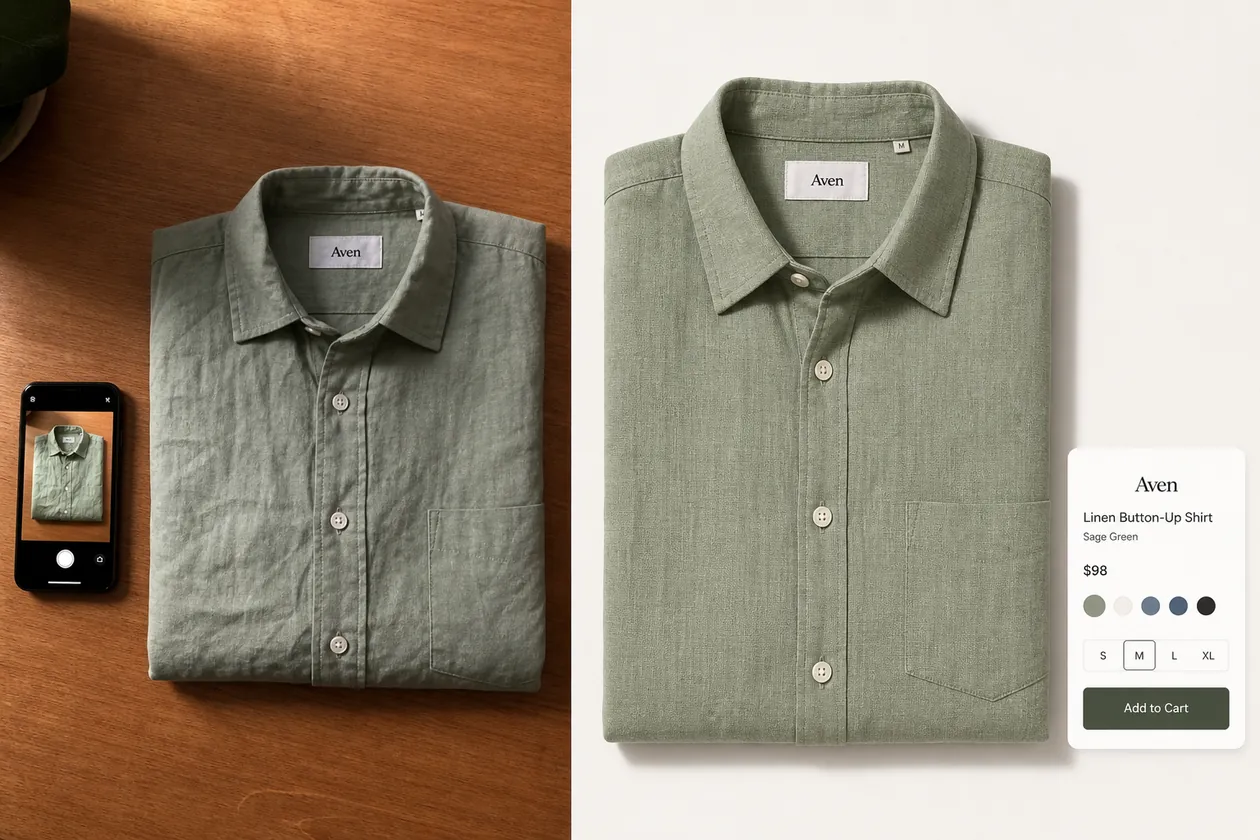 ## Start With The Best Phone Photo You Already Have
The best phone source is not always the prettiest photo. It is the photo that tells the truth about the product.
Choose a source image where the product is fully visible, the color is not completely distorted, and important details are not hidden. For clothing, check the collar, cuffs, hem, buttons, seams, pocket, fabric weave, label area, and overall fit or fold. For accessories, check hardware, straps, stitching, closure, material grain, and scale.
A practical rule: if a buyer would need that detail to recognize the product when it arrives, do not let the AI change it.
## What To Fix Before Making It Store-Ready
Phone product photos usually fail for small operational reasons, not because the product is bad. The image may be too warm, too dark, slightly tilted, cropped too close, sitting on a busy surface, or surrounded by visual clutter.
For ecommerce use, fix these problems in order:
1. Crop and straighten the product so the main shape is clear.
2. Correct color cast enough that the real color family is believable.
3. Clean the background or replace it with a simple selling surface.
4. Restore texture, edge clarity, and small construction details.
5. Keep a soft natural shadow so the product does not float.
6. Review the output against the original product before uploading.
Do not start by adding a dramatic background. A stronger listing image comes from product truth first, scene or style second.
## A Clothing Store Workflow That Works
For shirts, dresses, jackets, and sweaters, start with one clean reference image per SKU. A folded tabletop photo can become a main image, while a hanger or mannequin shot can become a better fit or styling reference.
In KrafLayer, use [ecommerce product photography](/ecommerce-product-photography) thinking first: decide the image role before editing. A main image should make the product easy to inspect. A detail image can show fabric texture, buttons, stitching, or label quality. A lifestyle image can show how the garment feels in a real outfit, but only after the core product facts are stable.
For a local clothing store moving online, this is often enough:
- one clean front-facing product image
- one detail crop for fabric, buttons, or stitching
- one on-model or styled image when fit matters
- one square or vertical crop for social and ads
That set is more useful than one over-styled AI image that hides the garment.
## Prompt Pattern For Turning Phone Photos Into Ecommerce Images
Use the phone photo as the reference, then write the prompt around what must stay unchanged.
> Turn this phone photo of a sage green linen button-up shirt into a clean ecommerce product image. Preserve the exact shirt color, linen texture, collar shape, button count, placket, pocket placement, sleeve fold, hem, label area, and overall proportions. Improve the crop, straighten the product, clean the background to a warm neutral white, reduce harsh shadows, keep a soft natural contact shadow, and make the fabric detail clearer. Do not redesign the shirt, change the color, add logos, add badges, invent text, add extra buttons, remove the pocket, or make it look like a different product.
For bags, shoes, jewelry, skincare, or home goods, replace the protected details with the product facts that matter for that category. The pattern stays the same: preserve the SKU, improve the image role.
## When To Use Editing Instead Of Full Regeneration
Full image generation is tempting, but it is not always the safest first step. If the phone photo is already close to usable, use the [product photo editor](/product-photo-editor) workflow for smaller fixes.
Use editing when you need to:
- remove a distracting table edge, hanger, lint, or small prop
- clean a background without changing the product
- upscale a slightly soft product image
- correct a local wrinkle, shadow, or glare issue
- replace a background while preserving the original product
Use generation when you need a new image role, such as a cleaner main image, a detail image, or a lifestyle version from the same product reference. Even then, review it as a selling asset, not as a mood image.
## What To Check Before Publishing
Before the image goes live, compare the final version with the original phone photo.
Check product facts:
- Is it still the same SKU?
- Did the real color family stay intact?
- Are fabric texture, stitching, buttons, seams, hardware, labels, and edges plausible?
- Did AI add fake logos, badges, claims, barcodes, QR codes, or marketplace marks?
- Is the product large enough to inspect on mobile?
- Does the crop match the image role?
- Would a buyer feel misled when the item arrives?
The strongest AI-assisted ecommerce image is not the most dramatic one. It is the one that helps the buyer understand the product faster.
## Where KrafLayer Fits
Use [KrafLayer's AI product image generator](/ai-product-image-generator) when one phone photo needs to become a cleaner product image, detail image, or store asset. Use the editor when the product is accurate but the background, crop, shadow, or small distractions need work.
This workflow supports small catalogs because each item can move through the same review standard: source photo, product-truth list, image role, generation or edit, then merchant review. That keeps the process practical for local shops that cannot reshoot every product every week.
## FAQ
### Can I use phone photos for ecommerce product images?
Yes. A phone photo can be a useful ecommerce source image if it shows the real product clearly. Use it as a reference, then improve crop, light, background, and clarity. The final image still needs review so color, shape, material, and details match the item being sold.
### What is the fastest way to turn phone product photos into ecommerce images?
Start with the clearest phone shot, write down the product details that must stay unchanged, then use AI to clean the crop, background, lighting, and sharpness. For simple problems, edit the original. For new main or detail images, generate from the phone-photo reference and review carefully.
### Should local clothing stores use AI product images?
They can, especially when studio photography is too slow or expensive. AI works best when the store uses real phone photos as product references and checks fabric color, fit cues, seams, buttons, labels, and proportions before publishing.
### Can AI make a bad phone photo look like a studio photo?
AI can improve many phone-photo problems, but it cannot recover every hidden detail. If the product is blurry, cropped off, or heavily color-shifted, take a better reference photo first. Better input usually produces safer ecommerce output.
### What product details should I protect in clothing photos?
Protect color, fabric texture, collar shape, sleeve length, cuff construction, button count, pocket placement, seams, hem, label area, drape, and scale. These are buyer-relevant details, so the AI should clean the image without turning the garment into a different SKU.
## Conclusion
Turning phone product photos into ecommerce images is a practical no-studio workflow when the product reference stays honest. Start with the clearest phone shot, protect the SKU details, improve the crop and background, then review the result before it becomes a listing asset. KrafLayer helps sellers convert ordinary phone photos into cleaner main images, detail images, and store-ready ecommerce visuals while keeping product identity, material, color, and selling intent at the center.
# How to Keep Amazon Variation Product Images Consistent
URL: https://kraflayer.com/blog/keep-amazon-variation-product-images-consistent
Summary: A practical workflow for keeping Amazon variation images aligned across colors, sizes, materials, and bundles without changing product facts.
Updated: 2026-06-20
Amazon variation product images consistency means each color, size, bundle, or material option should look like it belongs to the same product family. The buyer should see what changed in the variation, not wonder whether the seller photographed a different product line.
The practical rule is simple: lock the camera angle, crop, scale, lighting, background, and shadow first; then let only the real variation attribute change. In KrafLayer, that often means using the strongest product reference, cleaning or matching backgrounds in the [product photo editor](/product-photo-editor), and using the [AI image upscaler](/tools/ai-image-upscaler) only when a variation file needs more listing-ready detail.
## Start With The Best Phone Photo You Already Have
The best phone source is not always the prettiest photo. It is the photo that tells the truth about the product.
Choose a source image where the product is fully visible, the color is not completely distorted, and important details are not hidden. For clothing, check the collar, cuffs, hem, buttons, seams, pocket, fabric weave, label area, and overall fit or fold. For accessories, check hardware, straps, stitching, closure, material grain, and scale.
A practical rule: if a buyer would need that detail to recognize the product when it arrives, do not let the AI change it.
## What To Fix Before Making It Store-Ready
Phone product photos usually fail for small operational reasons, not because the product is bad. The image may be too warm, too dark, slightly tilted, cropped too close, sitting on a busy surface, or surrounded by visual clutter.
For ecommerce use, fix these problems in order:
1. Crop and straighten the product so the main shape is clear.
2. Correct color cast enough that the real color family is believable.
3. Clean the background or replace it with a simple selling surface.
4. Restore texture, edge clarity, and small construction details.
5. Keep a soft natural shadow so the product does not float.
6. Review the output against the original product before uploading.
Do not start by adding a dramatic background. A stronger listing image comes from product truth first, scene or style second.
## A Clothing Store Workflow That Works
For shirts, dresses, jackets, and sweaters, start with one clean reference image per SKU. A folded tabletop photo can become a main image, while a hanger or mannequin shot can become a better fit or styling reference.
In KrafLayer, use [ecommerce product photography](/ecommerce-product-photography) thinking first: decide the image role before editing. A main image should make the product easy to inspect. A detail image can show fabric texture, buttons, stitching, or label quality. A lifestyle image can show how the garment feels in a real outfit, but only after the core product facts are stable.
For a local clothing store moving online, this is often enough:
- one clean front-facing product image
- one detail crop for fabric, buttons, or stitching
- one on-model or styled image when fit matters
- one square or vertical crop for social and ads
That set is more useful than one over-styled AI image that hides the garment.
## Prompt Pattern For Turning Phone Photos Into Ecommerce Images
Use the phone photo as the reference, then write the prompt around what must stay unchanged.
> Turn this phone photo of a sage green linen button-up shirt into a clean ecommerce product image. Preserve the exact shirt color, linen texture, collar shape, button count, placket, pocket placement, sleeve fold, hem, label area, and overall proportions. Improve the crop, straighten the product, clean the background to a warm neutral white, reduce harsh shadows, keep a soft natural contact shadow, and make the fabric detail clearer. Do not redesign the shirt, change the color, add logos, add badges, invent text, add extra buttons, remove the pocket, or make it look like a different product.
For bags, shoes, jewelry, skincare, or home goods, replace the protected details with the product facts that matter for that category. The pattern stays the same: preserve the SKU, improve the image role.
## When To Use Editing Instead Of Full Regeneration
Full image generation is tempting, but it is not always the safest first step. If the phone photo is already close to usable, use the [product photo editor](/product-photo-editor) workflow for smaller fixes.
Use editing when you need to:
- remove a distracting table edge, hanger, lint, or small prop
- clean a background without changing the product
- upscale a slightly soft product image
- correct a local wrinkle, shadow, or glare issue
- replace a background while preserving the original product
Use generation when you need a new image role, such as a cleaner main image, a detail image, or a lifestyle version from the same product reference. Even then, review it as a selling asset, not as a mood image.
## What To Check Before Publishing
Before the image goes live, compare the final version with the original phone photo.
Check product facts:
- Is it still the same SKU?
- Did the real color family stay intact?
- Are fabric texture, stitching, buttons, seams, hardware, labels, and edges plausible?
- Did AI add fake logos, badges, claims, barcodes, QR codes, or marketplace marks?
- Is the product large enough to inspect on mobile?
- Does the crop match the image role?
- Would a buyer feel misled when the item arrives?
The strongest AI-assisted ecommerce image is not the most dramatic one. It is the one that helps the buyer understand the product faster.
## Where KrafLayer Fits
Use [KrafLayer's AI product image generator](/ai-product-image-generator) when one phone photo needs to become a cleaner product image, detail image, or store asset. Use the editor when the product is accurate but the background, crop, shadow, or small distractions need work.
This workflow supports small catalogs because each item can move through the same review standard: source photo, product-truth list, image role, generation or edit, then merchant review. That keeps the process practical for local shops that cannot reshoot every product every week.
## FAQ
### Can I use phone photos for ecommerce product images?
Yes. A phone photo can be a useful ecommerce source image if it shows the real product clearly. Use it as a reference, then improve crop, light, background, and clarity. The final image still needs review so color, shape, material, and details match the item being sold.
### What is the fastest way to turn phone product photos into ecommerce images?
Start with the clearest phone shot, write down the product details that must stay unchanged, then use AI to clean the crop, background, lighting, and sharpness. For simple problems, edit the original. For new main or detail images, generate from the phone-photo reference and review carefully.
### Should local clothing stores use AI product images?
They can, especially when studio photography is too slow or expensive. AI works best when the store uses real phone photos as product references and checks fabric color, fit cues, seams, buttons, labels, and proportions before publishing.
### Can AI make a bad phone photo look like a studio photo?
AI can improve many phone-photo problems, but it cannot recover every hidden detail. If the product is blurry, cropped off, or heavily color-shifted, take a better reference photo first. Better input usually produces safer ecommerce output.
### What product details should I protect in clothing photos?
Protect color, fabric texture, collar shape, sleeve length, cuff construction, button count, pocket placement, seams, hem, label area, drape, and scale. These are buyer-relevant details, so the AI should clean the image without turning the garment into a different SKU.
## Conclusion
Turning phone product photos into ecommerce images is a practical no-studio workflow when the product reference stays honest. Start with the clearest phone shot, protect the SKU details, improve the crop and background, then review the result before it becomes a listing asset. KrafLayer helps sellers convert ordinary phone photos into cleaner main images, detail images, and store-ready ecommerce visuals while keeping product identity, material, color, and selling intent at the center.
# How to Keep Amazon Variation Product Images Consistent
URL: https://kraflayer.com/blog/keep-amazon-variation-product-images-consistent
Summary: A practical workflow for keeping Amazon variation images aligned across colors, sizes, materials, and bundles without changing product facts.
Updated: 2026-06-20
Amazon variation product images consistency means each color, size, bundle, or material option should look like it belongs to the same product family. The buyer should see what changed in the variation, not wonder whether the seller photographed a different product line.
The practical rule is simple: lock the camera angle, crop, scale, lighting, background, and shadow first; then let only the real variation attribute change. In KrafLayer, that often means using the strongest product reference, cleaning or matching backgrounds in the [product photo editor](/product-photo-editor), and using the [AI image upscaler](/tools/ai-image-upscaler) only when a variation file needs more listing-ready detail.
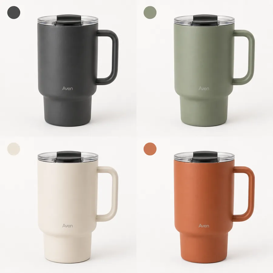 ## Why Variation Image Consistency Matters
Inconsistent variation images create friction. A buyer may click a color swatch and see the product jump from a front angle to a side angle, from white background to lifestyle scene, or from tight crop to tiny product. That makes comparison harder and can make a legitimate variation feel less trustworthy.
For [Amazon product photos](/marketplace-product-images/amazon-product-photos), consistency is not about making every image identical. It is about making comparison easy. The shopper should immediately understand: this is the same mug in another color, the same bag in another size, or the same bundle with a different count.
Use this rule when reviewing a variation set:
> A good variation image changes only the variation attribute. Everything else should feel deliberately controlled.
## Build A Product Truth Grid First
Before editing or generating images, create a small product truth grid. This prevents AI or manual retouching from smoothing out real SKU differences.
| Detail to lock | What should stay consistent | What can change |
|---|---|---|
| Camera angle | Front, three-quarter, side, or top view | Only if every variation uses the new angle |
| Crop and scale | Product size in frame and visible margins | Real size differences when size is the variation |
| Background | White, light gray, or same brand surface | Only if each variation role intentionally changes |
| Lighting | Highlight direction, shadow softness, contrast | Minor reflection differences by material |
| Product parts | Lid, handle, strap, zipper, ports, buttons, seams | Real variant-specific parts |
| Color/material | True finish and texture | The actual color or material variant |
For Amazon variation product images consistency, the grid matters more than a clever prompt. It gives the editor a checklist and gives the seller a clear reason to reject pretty but inaccurate outputs.
## Workflow For Consistent Variation Product Images
Use this sequence when the original variation files are uneven:
1. Choose the best reference image from the variation set.
2. Define the locked image system: angle, crop, background, shadow, and product size in frame.
3. List the real variation attributes that may change.
4. Clean obvious background clutter before making style decisions.
5. Match each variation to the reference crop and scale.
6. Use upscaling only after composition is correct.
7. Compare the full set as a grid, not one image at a time.
8. Reject any output where AI changes a non-variation detail.
This approach keeps the work grounded. If the sage, cream, charcoal, and terracotta mugs share the same handle, lid, logo position, and silhouette, those details should match across the set. Only the body color should change.
## When To Use AI And When To Edit Manually
AI helps when the problem is visual production: a weak background, uneven lighting, different crop, soft detail, or a need for a cleaner product-family presentation.
Use AI or assisted editing for:
- Matching backgrounds across a variation set.
- Creating a cleaner product-forward crop from rough source photos.
- Restoring weak lighting while preserving color.
- Upscaling low-resolution variation files after the crop is right.
- Creating a controlled reference image that guides the rest of the set.
Use manual review for:
- True color checks.
- Size differences.
- Bundle contents.
- Model numbers or labels.
- Variant-specific hardware, ports, straps, buttons, or stitching.
- Any claim, badge, or text that could mislead shoppers.
The safest workflow is not "generate all variations and trust the prettiest result." It is "use AI to standardize the presentation, then review every SKU fact."
## Prompt Template For Variation Consistency
Use this prompt when a prompt-capable workflow is appropriate:
> Create a realistic ecommerce product image for the same product family. Preserve the exact product silhouette, camera angle, crop, scale, lid, handle, logo or label placement, material texture, contact shadow, and lighting style from the reference image. Show this variation only: [color / size / bundle / material]. Do not change non-variation details. Do not add Amazon logos, marketplace UI, review stars, discount badges, certification marks, QR codes, barcodes, or unsupported claims.
For a color variation, add:
> Only the product color may change. Keep the finish realistic and consistent with the reference material.
For a size variation, add:
> Preserve the real size relationship. Do not make the smaller size look like a cropped version of the larger size.
For a bundle variation, add:
> Show only the actual included items. Do not invent accessories, packaging, or bonus products.
## Review The Set As A Grid
Variation product images should be reviewed together. A single image can look fine while the full set still feels inconsistent.
Check the grid for:
- Same product height in frame unless size is the variation.
- Same camera angle and perspective.
- Same shadow direction and softness.
- Same background color and brightness.
- Same logo, label, or blank label area position.
- Same material realism across all colors.
- No invented parts, marks, or accessories.
- No hidden crop differences that make one variant look premium and another look cheap.
If one variation looks better than the rest, do not automatically publish it. Either bring the weaker images up to the same standard or simplify the stronger one so the family feels coherent.
## Common Mistakes To Avoid
The most common mistake is letting AI improve the product and not just the image. A mug variation image should not gain a new lid, a cleaner handle design, a different logo placement, or a more expensive finish just because the generated image looks persuasive.
Other mistakes include:
- Mixing white-background and lifestyle images inside the same variation selector.
- Showing different product angles for color variants.
- Using inconsistent shadows that make products look different sizes.
- Upscaling before fixing crop and background.
- Letting product labels or small marks drift between variations.
- Showing a bundle quantity that does not match the actual option.
Variation images work when they are boring in the right ways. The system stays stable so the real product choice becomes obvious.
## FAQ
### What is Amazon variation product images consistency?
Amazon variation product images consistency means the visual system stays stable across product options. Angle, crop, scale, background, lighting, and shadow should match, while the real variation attribute changes. This helps shoppers compare color, size, material, or bundle differences without being distracted by unrelated image changes.
### Can I use AI for Amazon variation product images?
Yes, but use AI to standardize presentation, not to redesign the SKU. AI can help clean backgrounds, improve light, upscale weak files, and create a consistent product-family look. Every output still needs human review for color accuracy, parts, labels, bundle contents, and variant-specific details.
### Should every variation image use the same background?
For a variation selector, usually yes. A consistent background makes comparison easier. If you use lifestyle images, keep them in a separate image role instead of mixing them into the main variation selector. The buyer should not confuse a background change with a product difference.
### How does KrafLayer help with variation product images?
KrafLayer can help sellers prepare cleaner Amazon product photos by removing distractions, matching product presentation, upscaling low-resolution files, and generating product-focused reference images. The key is to keep the same SKU facts across the full variation set and review the final grid before publishing.
### What should I check before publishing variation images?
Review the full set for angle, crop, scale, background, shadow, true color, label placement, hardware, material texture, and bundle contents. If only color should change, only color should change. If size or bundle count changes, make that difference clear without altering unrelated product facts.
## Conclusion
Amazon variation product images consistency is about buyer clarity. Lock the visual system, protect product facts, and let only the real variation attribute change. KrafLayer can help clean, upscale, and standardize ecommerce product photography, but the final grid should always be reviewed against the actual SKU set before it goes live.
# How to Prepare Product Images for Shopify Without Reshooting
URL: https://kraflayer.com/blog/prepare-product-images-for-shopify-without-reshooting
Summary: A practical Shopify image workflow for turning existing product photos into clean main images, detail crops, variants, and campaign assets.
Updated: 2026-06-19
You can prepare product images for Shopify without reshooting by treating the photos you already have as source material, then rebuilding the image set around four jobs: a clear main image, consistent variant images, detail images that prove material or construction, and simple campaign images for collections or ads. The goal is not to make every image look more dramatic. The goal is to make the product easy to recognize, compare, and trust.
KrafLayer fits this workflow when you have usable product photos but they are not yet store-ready. You can clean backgrounds, upscale soft files, generate product-reference images, and keep the visual system consistent before uploading to Shopify.
## Why Variation Image Consistency Matters
Inconsistent variation images create friction. A buyer may click a color swatch and see the product jump from a front angle to a side angle, from white background to lifestyle scene, or from tight crop to tiny product. That makes comparison harder and can make a legitimate variation feel less trustworthy.
For [Amazon product photos](/marketplace-product-images/amazon-product-photos), consistency is not about making every image identical. It is about making comparison easy. The shopper should immediately understand: this is the same mug in another color, the same bag in another size, or the same bundle with a different count.
Use this rule when reviewing a variation set:
> A good variation image changes only the variation attribute. Everything else should feel deliberately controlled.
## Build A Product Truth Grid First
Before editing or generating images, create a small product truth grid. This prevents AI or manual retouching from smoothing out real SKU differences.
| Detail to lock | What should stay consistent | What can change |
|---|---|---|
| Camera angle | Front, three-quarter, side, or top view | Only if every variation uses the new angle |
| Crop and scale | Product size in frame and visible margins | Real size differences when size is the variation |
| Background | White, light gray, or same brand surface | Only if each variation role intentionally changes |
| Lighting | Highlight direction, shadow softness, contrast | Minor reflection differences by material |
| Product parts | Lid, handle, strap, zipper, ports, buttons, seams | Real variant-specific parts |
| Color/material | True finish and texture | The actual color or material variant |
For Amazon variation product images consistency, the grid matters more than a clever prompt. It gives the editor a checklist and gives the seller a clear reason to reject pretty but inaccurate outputs.
## Workflow For Consistent Variation Product Images
Use this sequence when the original variation files are uneven:
1. Choose the best reference image from the variation set.
2. Define the locked image system: angle, crop, background, shadow, and product size in frame.
3. List the real variation attributes that may change.
4. Clean obvious background clutter before making style decisions.
5. Match each variation to the reference crop and scale.
6. Use upscaling only after composition is correct.
7. Compare the full set as a grid, not one image at a time.
8. Reject any output where AI changes a non-variation detail.
This approach keeps the work grounded. If the sage, cream, charcoal, and terracotta mugs share the same handle, lid, logo position, and silhouette, those details should match across the set. Only the body color should change.
## When To Use AI And When To Edit Manually
AI helps when the problem is visual production: a weak background, uneven lighting, different crop, soft detail, or a need for a cleaner product-family presentation.
Use AI or assisted editing for:
- Matching backgrounds across a variation set.
- Creating a cleaner product-forward crop from rough source photos.
- Restoring weak lighting while preserving color.
- Upscaling low-resolution variation files after the crop is right.
- Creating a controlled reference image that guides the rest of the set.
Use manual review for:
- True color checks.
- Size differences.
- Bundle contents.
- Model numbers or labels.
- Variant-specific hardware, ports, straps, buttons, or stitching.
- Any claim, badge, or text that could mislead shoppers.
The safest workflow is not "generate all variations and trust the prettiest result." It is "use AI to standardize the presentation, then review every SKU fact."
## Prompt Template For Variation Consistency
Use this prompt when a prompt-capable workflow is appropriate:
> Create a realistic ecommerce product image for the same product family. Preserve the exact product silhouette, camera angle, crop, scale, lid, handle, logo or label placement, material texture, contact shadow, and lighting style from the reference image. Show this variation only: [color / size / bundle / material]. Do not change non-variation details. Do not add Amazon logos, marketplace UI, review stars, discount badges, certification marks, QR codes, barcodes, or unsupported claims.
For a color variation, add:
> Only the product color may change. Keep the finish realistic and consistent with the reference material.
For a size variation, add:
> Preserve the real size relationship. Do not make the smaller size look like a cropped version of the larger size.
For a bundle variation, add:
> Show only the actual included items. Do not invent accessories, packaging, or bonus products.
## Review The Set As A Grid
Variation product images should be reviewed together. A single image can look fine while the full set still feels inconsistent.
Check the grid for:
- Same product height in frame unless size is the variation.
- Same camera angle and perspective.
- Same shadow direction and softness.
- Same background color and brightness.
- Same logo, label, or blank label area position.
- Same material realism across all colors.
- No invented parts, marks, or accessories.
- No hidden crop differences that make one variant look premium and another look cheap.
If one variation looks better than the rest, do not automatically publish it. Either bring the weaker images up to the same standard or simplify the stronger one so the family feels coherent.
## Common Mistakes To Avoid
The most common mistake is letting AI improve the product and not just the image. A mug variation image should not gain a new lid, a cleaner handle design, a different logo placement, or a more expensive finish just because the generated image looks persuasive.
Other mistakes include:
- Mixing white-background and lifestyle images inside the same variation selector.
- Showing different product angles for color variants.
- Using inconsistent shadows that make products look different sizes.
- Upscaling before fixing crop and background.
- Letting product labels or small marks drift between variations.
- Showing a bundle quantity that does not match the actual option.
Variation images work when they are boring in the right ways. The system stays stable so the real product choice becomes obvious.
## FAQ
### What is Amazon variation product images consistency?
Amazon variation product images consistency means the visual system stays stable across product options. Angle, crop, scale, background, lighting, and shadow should match, while the real variation attribute changes. This helps shoppers compare color, size, material, or bundle differences without being distracted by unrelated image changes.
### Can I use AI for Amazon variation product images?
Yes, but use AI to standardize presentation, not to redesign the SKU. AI can help clean backgrounds, improve light, upscale weak files, and create a consistent product-family look. Every output still needs human review for color accuracy, parts, labels, bundle contents, and variant-specific details.
### Should every variation image use the same background?
For a variation selector, usually yes. A consistent background makes comparison easier. If you use lifestyle images, keep them in a separate image role instead of mixing them into the main variation selector. The buyer should not confuse a background change with a product difference.
### How does KrafLayer help with variation product images?
KrafLayer can help sellers prepare cleaner Amazon product photos by removing distractions, matching product presentation, upscaling low-resolution files, and generating product-focused reference images. The key is to keep the same SKU facts across the full variation set and review the final grid before publishing.
### What should I check before publishing variation images?
Review the full set for angle, crop, scale, background, shadow, true color, label placement, hardware, material texture, and bundle contents. If only color should change, only color should change. If size or bundle count changes, make that difference clear without altering unrelated product facts.
## Conclusion
Amazon variation product images consistency is about buyer clarity. Lock the visual system, protect product facts, and let only the real variation attribute change. KrafLayer can help clean, upscale, and standardize ecommerce product photography, but the final grid should always be reviewed against the actual SKU set before it goes live.
# How to Prepare Product Images for Shopify Without Reshooting
URL: https://kraflayer.com/blog/prepare-product-images-for-shopify-without-reshooting
Summary: A practical Shopify image workflow for turning existing product photos into clean main images, detail crops, variants, and campaign assets.
Updated: 2026-06-19
You can prepare product images for Shopify without reshooting by treating the photos you already have as source material, then rebuilding the image set around four jobs: a clear main image, consistent variant images, detail images that prove material or construction, and simple campaign images for collections or ads. The goal is not to make every image look more dramatic. The goal is to make the product easy to recognize, compare, and trust.
KrafLayer fits this workflow when you have usable product photos but they are not yet store-ready. You can clean backgrounds, upscale soft files, generate product-reference images, and keep the visual system consistent before uploading to Shopify.
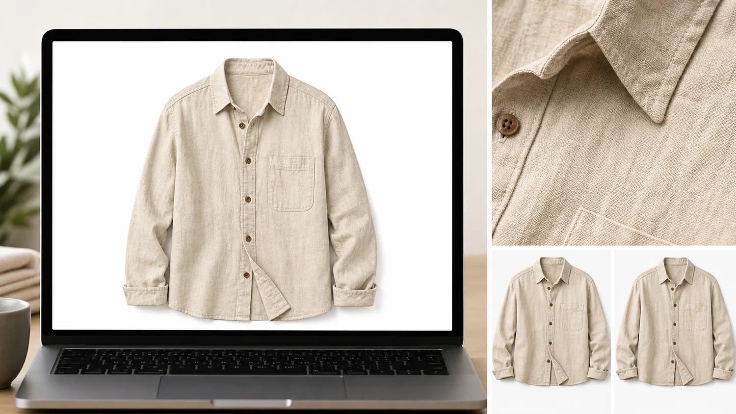 ## Quick Answer: The Shopify Image Set To Build First
For most Shopify products, prepare these image roles before worrying about extra creative assets:
1. main image with the product readable at a glance
2. second angle or variant image with the same crop logic
3. close detail image for material, texture, packaging, hardware, or fit
4. simple lifestyle or use-context image when it helps the buyer understand scale
5. collection or ad crop only after the product-page images are consistent
Practical rule: if a buyer cannot identify the product in the first image within one second, the image is not ready for Shopify yet. Fix the product hierarchy before adding style.
## Start With A Product Audit, Not A New Shoot
Before generating or editing anything, sort the source photos into three groups:
| Source photo type | Keep it for | Common fix |
|---|---|---|
| Sharp photo with cluttered background | Main image or variant image | Remove or replace the background |
| Soft but usable photo | Detail or secondary image | Upscale, sharpen, then inspect edges and text |
| Phone photo with awkward lighting | Reference for generation or cleanup | Rebuild lighting while protecting product color |
| Cropped or inconsistent angle | Secondary image only | Extend margins or align crop logic |
| Photo with wrong props or dust | Editing input | Erase distractions without changing the product |
This audit keeps the workflow honest. Some photos can become Shopify-ready with one edit. Others are better used as references for a new product image. A weak source photo should not be forced into the main image slot just because it already exists.
## A No-Reshoot Workflow In KrafLayer
Use this workflow when the product is real, the existing photos are imperfect, and you want a cleaner Shopify image set.
### 1. Pick The Reference Photo
Choose the photo that best shows the real product shape, color, material, and proportions. It does not need to be beautiful. It needs to be accurate.
For apparel, protect collar shape, sleeve length, button count, pocket position, fabric texture, drape, and true color. For skincare, protect bottle shape, cap, label area, liquid tone, and shadow. For electronics, protect ports, seams, buttons, screen edges, and scale.
### 2. Build The Main Image
Use a clean product-forward image first. If the source photo is already close, start with the [AI product photo editor](/product-photo-editor). If the background is the main problem, use the [AI background remover](/tools/ai-background-remover) to create a clean cutout or a simple white-background asset.
The main image should answer one question: what exactly is being sold?
### 3. Create Detail Images
Detail images should not repeat the main image with a tighter crop. They should prove something the buyer cares about:
- fabric weave, stitching, zipper, or button detail
- glass thickness, label quality, pump, cap, or texture
- leather grain, hardware color, clasp, strap, or lining
- ports, buttons, seams, screen edge, or material finish
If the source detail is soft, use the [AI image upscaler](/tools/ai-image-upscaler), then inspect product edges, small text, and material texture. Upscaling should recover useful detail, not invent a different product.
### 4. Make Variant Images Consistent
Shopify variant images should feel like one catalog system. Keep product angle, crop margin, shadow softness, and background logic consistent so only the real variant difference stands out.
If you sell apparel colors, the product shape and fabric texture should stay stable. If you sell packaging variants, the pouch, bottle, or box geometry should stay fixed. If you sell hardware or electronics, ports and seams should not drift between variants.
### 5. Add A Simple Lifestyle Image
Lifestyle images are useful when they explain scale, material, or use. They are risky when they make the product smaller, add too many props, or hide buyer-relevant details.
Use the [Shopify product images guide](/marketplace-product-images/shopify-product-images) as the owner-page workflow, then treat lifestyle generation as a supporting asset. The product page still needs a strong main image and clear detail images.
## Prompt Template For Reference-Based Shopify Images
Use a prompt like this for reference-image generation:
> Use this product reference to create a Shopify product image set. Create one clean main image, one material detail image, and one simple lifestyle image. Preserve the product shape, color, material texture, button or cap details, label area, seams, crop readability, scale, and natural shadow. Do not add logos, fake badges, certification marks, extra products, or new features.
This prompt works because it names the product facts before the style. For ecommerce, preservation is the creative constraint.
## What To Check Before Uploading To Shopify
Do a final review before publishing the images:
- The first image shows the product clearly without visual clutter.
- Variant images use consistent angle, crop, background, and scale.
- Detail images prove a real material, feature, or use point.
- Product color stays believable across the set.
- Small details such as seams, caps, ports, labels, and buttons do not drift.
- Backgrounds support the product instead of competing with it.
- The file is sharp enough for product-page zoom and collection thumbnails.
- No image includes fake badges, unsupported claims, or misleading product features.
When exact Shopify theme behavior or marketplace policy matters, check the current Shopify admin, theme, or channel guidance before locking final dimensions. This article is a production workflow, not a substitute for platform-specific policy review.
## When You Still Need A Reshoot
AI editing cannot solve every source problem. Reshoot when the product is hidden, out of focus beyond recovery, shown in the wrong variant, missing an important side, or photographed in a way that misrepresents color, scale, or condition.
A useful rule: use AI to remove production friction, not to hide product truth. If the image would cause a buyer to expect a different item, do not publish it.
## FAQ
### Can I use old product photos for Shopify?
Yes, if the photos still show the real product accurately. Old photos can work as main images, detail crops, variant references, or generation references. Check sharpness, color, scale, product condition, and missing angles before deciding whether to edit, upscale, regenerate, or reshoot.
### What is the fastest way to make Shopify product images look consistent?
Start by standardizing the main image: similar crop, background, angle, shadow, and product scale. Then apply the same logic to variant images and detail images. Consistency usually comes from image roles and review rules, not from applying the same visual effect to every photo.
### Should Shopify product images have a white background?
A white or simple background is often the clearest choice for main product images, but it is not the only useful format. Detail images and lifestyle images can use context when that context explains material, scale, or use. Avoid backgrounds that make the product harder to inspect.
### Can AI create Shopify images from one product photo?
AI can create useful Shopify image variations from one product reference when the reference clearly shows product shape, color, material, and key details. You still need to review the output against the source product. Reject images that change buyer-relevant features.
### How does KrafLayer help prepare Shopify product images?
KrafLayer helps sellers turn existing product photos into cleaner ecommerce assets through product-reference generation, background removal, upscaling, and product-photo editing. The workflow is useful when you need main images, detail images, variant consistency, or simple campaign assets without starting from a new shoot.
## Conclusion
Preparing product images for Shopify without reshooting is mostly a workflow problem: choose the most accurate source photo, build a clear main image, add detail proof, keep variants consistent, and review every output against the real product. KrafLayer helps sellers turn existing product photos into Shopify-ready visuals by combining generation, background cleanup, upscaling, and product-photo editing in one practical image-production flow.
# AI Product Photography Tools for Ecommerce Product Images
URL: https://kraflayer.com/blog/ai-product-photography-tools-for-ecommerce-images
Summary: A practical guide to choosing AI product photography tools by ecommerce job: generation, background cleanup, editing, upscaling, and scene composition.
Updated: 2026-06-23
AI product photography tools are easiest to choose by job, not by feature list. Use a generator when you need a new product-led image, a background tool when the setting is the problem, an AI product photo editor when one area needs repair, and an upscaler when the image is right but too small or soft. The best AI product photography tools for ecommerce protect the SKU while making the image easier to sell.
The practical rule: every AI product photography tool should protect product truth before it improves the scene. In KrafLayer, a seller can start with [AI product photography](/ai-product-photography), create an image with the [AI product image generator](/ai-product-image-generator), then use editing tools to clean the result before it reaches a product page.
## Quick Answer: The Shopify Image Set To Build First
For most Shopify products, prepare these image roles before worrying about extra creative assets:
1. main image with the product readable at a glance
2. second angle or variant image with the same crop logic
3. close detail image for material, texture, packaging, hardware, or fit
4. simple lifestyle or use-context image when it helps the buyer understand scale
5. collection or ad crop only after the product-page images are consistent
Practical rule: if a buyer cannot identify the product in the first image within one second, the image is not ready for Shopify yet. Fix the product hierarchy before adding style.
## Start With A Product Audit, Not A New Shoot
Before generating or editing anything, sort the source photos into three groups:
| Source photo type | Keep it for | Common fix |
|---|---|---|
| Sharp photo with cluttered background | Main image or variant image | Remove or replace the background |
| Soft but usable photo | Detail or secondary image | Upscale, sharpen, then inspect edges and text |
| Phone photo with awkward lighting | Reference for generation or cleanup | Rebuild lighting while protecting product color |
| Cropped or inconsistent angle | Secondary image only | Extend margins or align crop logic |
| Photo with wrong props or dust | Editing input | Erase distractions without changing the product |
This audit keeps the workflow honest. Some photos can become Shopify-ready with one edit. Others are better used as references for a new product image. A weak source photo should not be forced into the main image slot just because it already exists.
## A No-Reshoot Workflow In KrafLayer
Use this workflow when the product is real, the existing photos are imperfect, and you want a cleaner Shopify image set.
### 1. Pick The Reference Photo
Choose the photo that best shows the real product shape, color, material, and proportions. It does not need to be beautiful. It needs to be accurate.
For apparel, protect collar shape, sleeve length, button count, pocket position, fabric texture, drape, and true color. For skincare, protect bottle shape, cap, label area, liquid tone, and shadow. For electronics, protect ports, seams, buttons, screen edges, and scale.
### 2. Build The Main Image
Use a clean product-forward image first. If the source photo is already close, start with the [AI product photo editor](/product-photo-editor). If the background is the main problem, use the [AI background remover](/tools/ai-background-remover) to create a clean cutout or a simple white-background asset.
The main image should answer one question: what exactly is being sold?
### 3. Create Detail Images
Detail images should not repeat the main image with a tighter crop. They should prove something the buyer cares about:
- fabric weave, stitching, zipper, or button detail
- glass thickness, label quality, pump, cap, or texture
- leather grain, hardware color, clasp, strap, or lining
- ports, buttons, seams, screen edge, or material finish
If the source detail is soft, use the [AI image upscaler](/tools/ai-image-upscaler), then inspect product edges, small text, and material texture. Upscaling should recover useful detail, not invent a different product.
### 4. Make Variant Images Consistent
Shopify variant images should feel like one catalog system. Keep product angle, crop margin, shadow softness, and background logic consistent so only the real variant difference stands out.
If you sell apparel colors, the product shape and fabric texture should stay stable. If you sell packaging variants, the pouch, bottle, or box geometry should stay fixed. If you sell hardware or electronics, ports and seams should not drift between variants.
### 5. Add A Simple Lifestyle Image
Lifestyle images are useful when they explain scale, material, or use. They are risky when they make the product smaller, add too many props, or hide buyer-relevant details.
Use the [Shopify product images guide](/marketplace-product-images/shopify-product-images) as the owner-page workflow, then treat lifestyle generation as a supporting asset. The product page still needs a strong main image and clear detail images.
## Prompt Template For Reference-Based Shopify Images
Use a prompt like this for reference-image generation:
> Use this product reference to create a Shopify product image set. Create one clean main image, one material detail image, and one simple lifestyle image. Preserve the product shape, color, material texture, button or cap details, label area, seams, crop readability, scale, and natural shadow. Do not add logos, fake badges, certification marks, extra products, or new features.
This prompt works because it names the product facts before the style. For ecommerce, preservation is the creative constraint.
## What To Check Before Uploading To Shopify
Do a final review before publishing the images:
- The first image shows the product clearly without visual clutter.
- Variant images use consistent angle, crop, background, and scale.
- Detail images prove a real material, feature, or use point.
- Product color stays believable across the set.
- Small details such as seams, caps, ports, labels, and buttons do not drift.
- Backgrounds support the product instead of competing with it.
- The file is sharp enough for product-page zoom and collection thumbnails.
- No image includes fake badges, unsupported claims, or misleading product features.
When exact Shopify theme behavior or marketplace policy matters, check the current Shopify admin, theme, or channel guidance before locking final dimensions. This article is a production workflow, not a substitute for platform-specific policy review.
## When You Still Need A Reshoot
AI editing cannot solve every source problem. Reshoot when the product is hidden, out of focus beyond recovery, shown in the wrong variant, missing an important side, or photographed in a way that misrepresents color, scale, or condition.
A useful rule: use AI to remove production friction, not to hide product truth. If the image would cause a buyer to expect a different item, do not publish it.
## FAQ
### Can I use old product photos for Shopify?
Yes, if the photos still show the real product accurately. Old photos can work as main images, detail crops, variant references, or generation references. Check sharpness, color, scale, product condition, and missing angles before deciding whether to edit, upscale, regenerate, or reshoot.
### What is the fastest way to make Shopify product images look consistent?
Start by standardizing the main image: similar crop, background, angle, shadow, and product scale. Then apply the same logic to variant images and detail images. Consistency usually comes from image roles and review rules, not from applying the same visual effect to every photo.
### Should Shopify product images have a white background?
A white or simple background is often the clearest choice for main product images, but it is not the only useful format. Detail images and lifestyle images can use context when that context explains material, scale, or use. Avoid backgrounds that make the product harder to inspect.
### Can AI create Shopify images from one product photo?
AI can create useful Shopify image variations from one product reference when the reference clearly shows product shape, color, material, and key details. You still need to review the output against the source product. Reject images that change buyer-relevant features.
### How does KrafLayer help prepare Shopify product images?
KrafLayer helps sellers turn existing product photos into cleaner ecommerce assets through product-reference generation, background removal, upscaling, and product-photo editing. The workflow is useful when you need main images, detail images, variant consistency, or simple campaign assets without starting from a new shoot.
## Conclusion
Preparing product images for Shopify without reshooting is mostly a workflow problem: choose the most accurate source photo, build a clear main image, add detail proof, keep variants consistent, and review every output against the real product. KrafLayer helps sellers turn existing product photos into Shopify-ready visuals by combining generation, background cleanup, upscaling, and product-photo editing in one practical image-production flow.
# AI Product Photography Tools for Ecommerce Product Images
URL: https://kraflayer.com/blog/ai-product-photography-tools-for-ecommerce-images
Summary: A practical guide to choosing AI product photography tools by ecommerce job: generation, background cleanup, editing, upscaling, and scene composition.
Updated: 2026-06-23
AI product photography tools are easiest to choose by job, not by feature list. Use a generator when you need a new product-led image, a background tool when the setting is the problem, an AI product photo editor when one area needs repair, and an upscaler when the image is right but too small or soft. The best AI product photography tools for ecommerce protect the SKU while making the image easier to sell.
The practical rule: every AI product photography tool should protect product truth before it improves the scene. In KrafLayer, a seller can start with [AI product photography](/ai-product-photography), create an image with the [AI product image generator](/ai-product-image-generator), then use editing tools to clean the result before it reaches a product page.
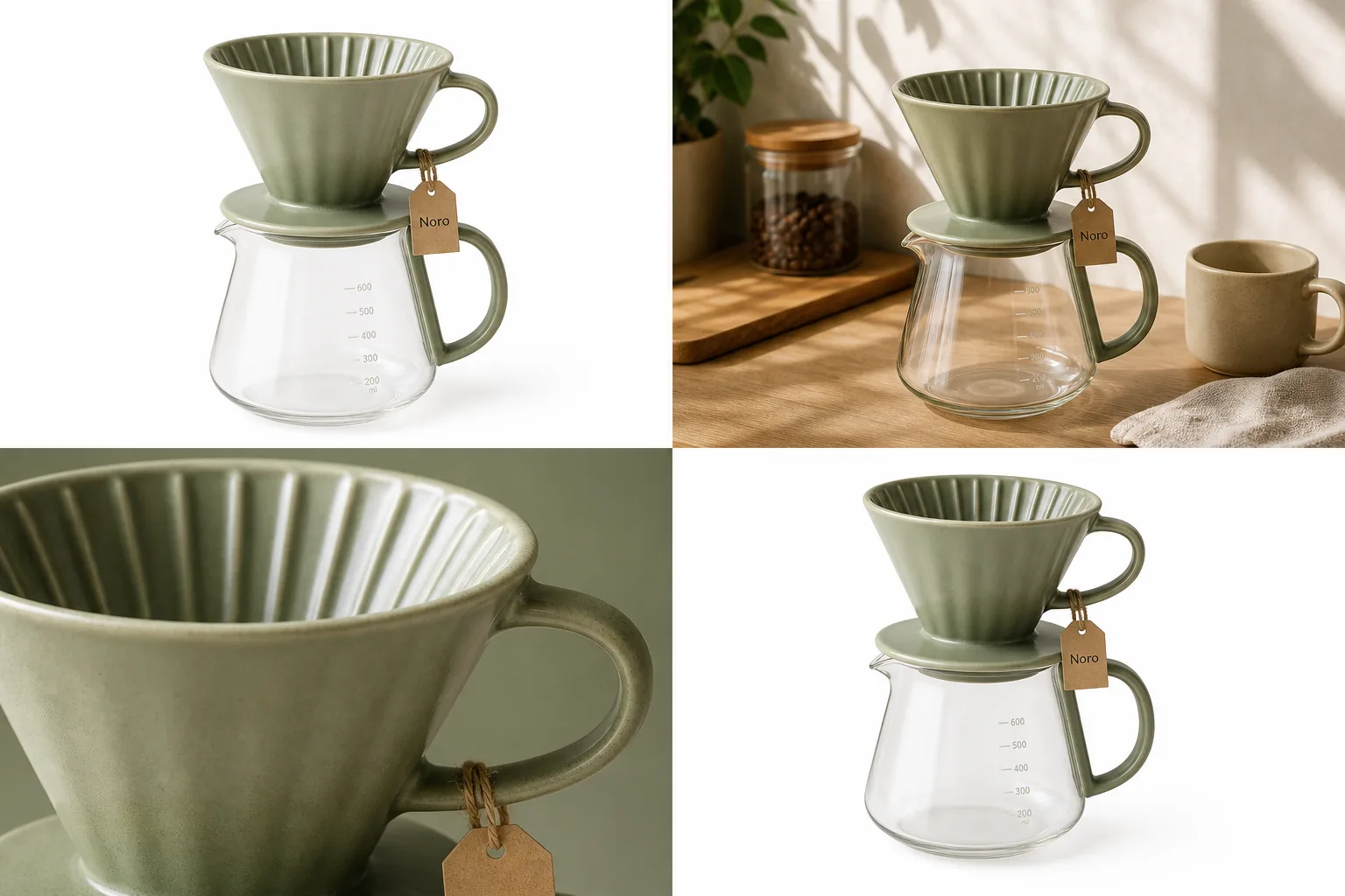 ## Match The Tool To The Product Image Job
A good AI product photography tools workflow starts with the image role. A white-background main image, a lifestyle scene, a close detail crop, and an ad crop are different jobs. They should not be forced through the same prompt.
Use this selection rule:
- Use an AI product image generator when you need a new product-led image from a reference.
- Use a product background remover when the product is good but the setting is distracting.
- Use a background replacer when the product is good but needs a cleaner selling context.
- Use a product photo editor when one local area needs repair, cleanup, or polish.
- Use an upscaler when the composition is right but edges, texture, or resolution are weak.
- Use scene composition when the product must sit naturally inside a specific room, surface, or campaign layout.
This keeps the workflow concrete. You are not choosing software in the abstract; you are choosing the next edit that makes the image more useful for ecommerce.
## Tool 1: AI Product Image Generator
An AI product image generator is the right starting point when you have a reference product and need a new ecommerce image role: main image, lifestyle image, detail image, campaign visual, or channel-specific crop.
The output should still look like the same product. Before you ask for a richer scene, write down the product facts that cannot change:
- shape, silhouette, and proportions
- material, finish, and true color
- label placement, logo area, package panels, or tag position
- hardware, seams, ridges, ports, buttons, handles, laces, clasps, or closures
- scale cues such as hand size, room size, cup size, furniture height, or product thickness
For the Noro coffee dripper visual in this article, the tool job is not "make a pretty coffee image." The job is to keep the same sage ceramic dripper, glass carafe, ridged cone, handle, tag position, and scale while creating usable product-image roles.
## Tool 2: Background Remover Or Background Replacer
Use a [product background remover](/tools/ai-background-remover) when the source product is already accurate but the environment is hurting the listing. This is common with supplier photos, warehouse shots, old campaign images, or phone photos taken on a busy desk.
Use a [background replacer](/tools/ai-background-replacer) when the product is accurate but the selling context is wrong. A skincare bottle may need a clean bathroom counter, a handbag may need a street-style surface, and a coffee dripper may need a warm kitchen scene.
The rule is simple: remove the background when you need inspection. Replace the background when you need context.
Check these after either tool:
- the product edge should not look cut out, fuzzy, or melted
- transparent glass, glossy metal, and soft fabric should keep believable edges
- the contact shadow should match the surface
- product color should not shift with the new background
- no fake badges, marketplace UI, QR codes, barcodes, price stickers, or unsupported claims should appear
Background tools are not just cosmetic. They decide whether the product feels inspectable and trustworthy.
## Tool 3: AI Product Photo Editor
A product photo editor is the right tool when the image is mostly correct but one part blocks publishing. Examples include a small glare spot, a crease behind the product, a dust mark, a crooked label, an over-dark shadow, a distracting prop, or a crop that needs extension.
Use the [product photo editor](/product-photo-editor) after generation when the product is close but not final. This is often better than regenerating the entire image, because a full regeneration can quietly change the SKU.
Good local-edit instructions are specific:
> Clean the shadow under the same sage ceramic coffee dripper and glass carafe. Keep the dripper color, ridged cone shape, handle, tag, glass measurement marks, carafe shape, scale, and camera angle unchanged. Do not add text, badges, props, logos, or new accessories.
Local editing should reduce risk, not create a new version of the product.
## Tool 4: AI Upscaler
Use an upscaler when the product image is already compositionally correct but too small, soft, or compressed for a product page. Upscaling is useful for old catalog photos, supplier images, cropped details, and images that need sharper mobile inspection.
Do not treat upscaling as proof that an image is accurate. Review:
- texture: ceramic glaze, fabric weave, leather grain, wood pores, metal brushing, or glass thickness
- text and label areas: no invented wording or warped characters
- edges: no halos, jagged cutouts, or plastic-looking outlines
- small parts: screws, ports, clasps, buttons, zippers, stones, laces, stitching, or handles
- product scale: the item should not become unnaturally smooth, premium, larger, or redesigned
Upscaling improves the file. It does not replace ecommerce product photography judgment.
## A Practical KrafLayer Workflow
For most ecommerce teams, the strongest workflow is not one tool. It is a short tool chain.
Use this KrafLayer sequence:
- Start from the clearest product reference available.
- Define the image role: main image, lifestyle image, detail image, ad crop, or marketplace cleanup.
- Generate one image with the AI product image generator.
- Compare the output to your product truth list.
- Use background removal, background replacement, local editing, or upscaling only where the image needs it.
- Place the final output inside your broader [ecommerce product photography](/ecommerce-product-photography) set so the listing feels consistent.
This workflow is useful because each tool has a clear reason to exist. The generator creates the new image. The editor protects the SKU. The background tools manage selling context. The upscaler improves inspectability.
## How To Compare AI Product Photography Tools
Do not compare AI product photography tools by sample-gallery drama alone. Compare them by how well they handle product facts under ecommerce pressure.
Use this checklist:
- Can the tool start from a real product reference?
- Does it support main, lifestyle, detail, background, and ad image roles?
- Can it keep the same SKU across multiple outputs?
- Does it offer cleanup tools after generation?
- Can it handle transparent, reflective, soft, textured, and small-detail products?
- Does it avoid fake platform marks, claims, badges, review stars, and misleading accessories?
- Can the final image be reviewed and edited before publishing?
The best AI product photography tools make product review easier. They do not ask you to publish every generated output blindly.
## FAQ
### What are AI product photography tools?
AI product photography tools help create, clean, edit, or improve ecommerce product images from references. The useful categories are product image generators, background removers, background replacers, local photo editors, upscalers, and scene composition tools.
### Which AI product photography tool should I use first?
Use an AI product image generator first when you need a new product-led image. Use a background remover or editor first when the existing product photo is accurate but messy. The right starting point depends on whether you need creation or cleanup.
### Are AI product photography tools safe for ecommerce listings?
They can be useful, but every output needs review. Check product shape, color, material, label placement, scale, included parts, small details, and any on-image text. Do not publish an image that changes what the buyer will receive.
### What is the difference between an AI product image generator and a product photo editor?
An AI product image generator creates a new product-image role from a reference or prompt. A product photo editor fixes a specific image problem, such as background clutter, glare, crop, softness, dust, or a local detail that needs cleanup.
### How does KrafLayer combine these tools?
KrafLayer connects generation and editing in one product-image workflow. You can plan the image with AI product photography, create it with the AI product image generator, then use background removal, background replacement, upscaling, or product photo editing before publishing.
## Conclusion
AI product photography tools work best when each tool has a narrow job. Start with the image role, protect the product facts, then choose generation, background cleanup, local editing, or upscaling based on the problem in front of you. KrafLayer is useful for this workflow because it lets ecommerce teams move from product reference to generated image to final cleanup without treating every product image as a generic creative prompt.
# Smooth Clothing Wrinkles in Product Photos With AI
URL: https://kraflayer.com/blog/smooth-wrinkles-in-clothing-product-photos-with-ai
Summary: Smooth temporary clothing wrinkles with AI while preserving pleats, seams, fabric texture, garment shape, and truthful condition evidence.
Updated: 2026-08-22
AI can smooth temporary wrinkles in clothing product photos, but the safest edit is local and conservative. Remove storage creases without changing the garment's construction, texture, shape, color, or condition.
## TL;DR
For Smooth Wrinkles in Clothing Product Photos, use KrafLayer for controlled local changes or reference-guided edits. Use Mask Edit for a local change with a short instruction, or Reference Image Editor when the result needs a visual example. The finished image should still prove that fit, fabric, shoulder line, garment length, and real color are still intact.
To smooth wrinkles in a clothing product photo, do not ask AI to make the garment perfect. Ask it to make the image sellable while keeping the real shirt, dress, jacket, or knitwear recognizable. The buyer still needs to read the fabric, cut, seams, buttons, and drape.
KrafLayer is an AI-powered visual editor for ecommerce product photography. For apparel wrinkle cleanup, use it as a controlled retouching tool: reduce distracting creases, protect the garment facts, and keep enough fabric texture so the result does not look plastic.
## Match The Tool To The Product Image Job
A good AI product photography tools workflow starts with the image role. A white-background main image, a lifestyle scene, a close detail crop, and an ad crop are different jobs. They should not be forced through the same prompt.
Use this selection rule:
- Use an AI product image generator when you need a new product-led image from a reference.
- Use a product background remover when the product is good but the setting is distracting.
- Use a background replacer when the product is good but needs a cleaner selling context.
- Use a product photo editor when one local area needs repair, cleanup, or polish.
- Use an upscaler when the composition is right but edges, texture, or resolution are weak.
- Use scene composition when the product must sit naturally inside a specific room, surface, or campaign layout.
This keeps the workflow concrete. You are not choosing software in the abstract; you are choosing the next edit that makes the image more useful for ecommerce.
## Tool 1: AI Product Image Generator
An AI product image generator is the right starting point when you have a reference product and need a new ecommerce image role: main image, lifestyle image, detail image, campaign visual, or channel-specific crop.
The output should still look like the same product. Before you ask for a richer scene, write down the product facts that cannot change:
- shape, silhouette, and proportions
- material, finish, and true color
- label placement, logo area, package panels, or tag position
- hardware, seams, ridges, ports, buttons, handles, laces, clasps, or closures
- scale cues such as hand size, room size, cup size, furniture height, or product thickness
For the Noro coffee dripper visual in this article, the tool job is not "make a pretty coffee image." The job is to keep the same sage ceramic dripper, glass carafe, ridged cone, handle, tag position, and scale while creating usable product-image roles.
## Tool 2: Background Remover Or Background Replacer
Use a [product background remover](/tools/ai-background-remover) when the source product is already accurate but the environment is hurting the listing. This is common with supplier photos, warehouse shots, old campaign images, or phone photos taken on a busy desk.
Use a [background replacer](/tools/ai-background-replacer) when the product is accurate but the selling context is wrong. A skincare bottle may need a clean bathroom counter, a handbag may need a street-style surface, and a coffee dripper may need a warm kitchen scene.
The rule is simple: remove the background when you need inspection. Replace the background when you need context.
Check these after either tool:
- the product edge should not look cut out, fuzzy, or melted
- transparent glass, glossy metal, and soft fabric should keep believable edges
- the contact shadow should match the surface
- product color should not shift with the new background
- no fake badges, marketplace UI, QR codes, barcodes, price stickers, or unsupported claims should appear
Background tools are not just cosmetic. They decide whether the product feels inspectable and trustworthy.
## Tool 3: AI Product Photo Editor
A product photo editor is the right tool when the image is mostly correct but one part blocks publishing. Examples include a small glare spot, a crease behind the product, a dust mark, a crooked label, an over-dark shadow, a distracting prop, or a crop that needs extension.
Use the [product photo editor](/product-photo-editor) after generation when the product is close but not final. This is often better than regenerating the entire image, because a full regeneration can quietly change the SKU.
Good local-edit instructions are specific:
> Clean the shadow under the same sage ceramic coffee dripper and glass carafe. Keep the dripper color, ridged cone shape, handle, tag, glass measurement marks, carafe shape, scale, and camera angle unchanged. Do not add text, badges, props, logos, or new accessories.
Local editing should reduce risk, not create a new version of the product.
## Tool 4: AI Upscaler
Use an upscaler when the product image is already compositionally correct but too small, soft, or compressed for a product page. Upscaling is useful for old catalog photos, supplier images, cropped details, and images that need sharper mobile inspection.
Do not treat upscaling as proof that an image is accurate. Review:
- texture: ceramic glaze, fabric weave, leather grain, wood pores, metal brushing, or glass thickness
- text and label areas: no invented wording or warped characters
- edges: no halos, jagged cutouts, or plastic-looking outlines
- small parts: screws, ports, clasps, buttons, zippers, stones, laces, stitching, or handles
- product scale: the item should not become unnaturally smooth, premium, larger, or redesigned
Upscaling improves the file. It does not replace ecommerce product photography judgment.
## A Practical KrafLayer Workflow
For most ecommerce teams, the strongest workflow is not one tool. It is a short tool chain.
Use this KrafLayer sequence:
- Start from the clearest product reference available.
- Define the image role: main image, lifestyle image, detail image, ad crop, or marketplace cleanup.
- Generate one image with the AI product image generator.
- Compare the output to your product truth list.
- Use background removal, background replacement, local editing, or upscaling only where the image needs it.
- Place the final output inside your broader [ecommerce product photography](/ecommerce-product-photography) set so the listing feels consistent.
This workflow is useful because each tool has a clear reason to exist. The generator creates the new image. The editor protects the SKU. The background tools manage selling context. The upscaler improves inspectability.
## How To Compare AI Product Photography Tools
Do not compare AI product photography tools by sample-gallery drama alone. Compare them by how well they handle product facts under ecommerce pressure.
Use this checklist:
- Can the tool start from a real product reference?
- Does it support main, lifestyle, detail, background, and ad image roles?
- Can it keep the same SKU across multiple outputs?
- Does it offer cleanup tools after generation?
- Can it handle transparent, reflective, soft, textured, and small-detail products?
- Does it avoid fake platform marks, claims, badges, review stars, and misleading accessories?
- Can the final image be reviewed and edited before publishing?
The best AI product photography tools make product review easier. They do not ask you to publish every generated output blindly.
## FAQ
### What are AI product photography tools?
AI product photography tools help create, clean, edit, or improve ecommerce product images from references. The useful categories are product image generators, background removers, background replacers, local photo editors, upscalers, and scene composition tools.
### Which AI product photography tool should I use first?
Use an AI product image generator first when you need a new product-led image. Use a background remover or editor first when the existing product photo is accurate but messy. The right starting point depends on whether you need creation or cleanup.
### Are AI product photography tools safe for ecommerce listings?
They can be useful, but every output needs review. Check product shape, color, material, label placement, scale, included parts, small details, and any on-image text. Do not publish an image that changes what the buyer will receive.
### What is the difference between an AI product image generator and a product photo editor?
An AI product image generator creates a new product-image role from a reference or prompt. A product photo editor fixes a specific image problem, such as background clutter, glare, crop, softness, dust, or a local detail that needs cleanup.
### How does KrafLayer combine these tools?
KrafLayer connects generation and editing in one product-image workflow. You can plan the image with AI product photography, create it with the AI product image generator, then use background removal, background replacement, upscaling, or product photo editing before publishing.
## Conclusion
AI product photography tools work best when each tool has a narrow job. Start with the image role, protect the product facts, then choose generation, background cleanup, local editing, or upscaling based on the problem in front of you. KrafLayer is useful for this workflow because it lets ecommerce teams move from product reference to generated image to final cleanup without treating every product image as a generic creative prompt.
# Smooth Clothing Wrinkles in Product Photos With AI
URL: https://kraflayer.com/blog/smooth-wrinkles-in-clothing-product-photos-with-ai
Summary: Smooth temporary clothing wrinkles with AI while preserving pleats, seams, fabric texture, garment shape, and truthful condition evidence.
Updated: 2026-08-22
AI can smooth temporary wrinkles in clothing product photos, but the safest edit is local and conservative. Remove storage creases without changing the garment's construction, texture, shape, color, or condition.
## TL;DR
For Smooth Wrinkles in Clothing Product Photos, use KrafLayer for controlled local changes or reference-guided edits. Use Mask Edit for a local change with a short instruction, or Reference Image Editor when the result needs a visual example. The finished image should still prove that fit, fabric, shoulder line, garment length, and real color are still intact.
To smooth wrinkles in a clothing product photo, do not ask AI to make the garment perfect. Ask it to make the image sellable while keeping the real shirt, dress, jacket, or knitwear recognizable. The buyer still needs to read the fabric, cut, seams, buttons, and drape.
KrafLayer is an AI-powered visual editor for ecommerce product photography. For apparel wrinkle cleanup, use it as a controlled retouching tool: reduce distracting creases, protect the garment facts, and keep enough fabric texture so the result does not look plastic.
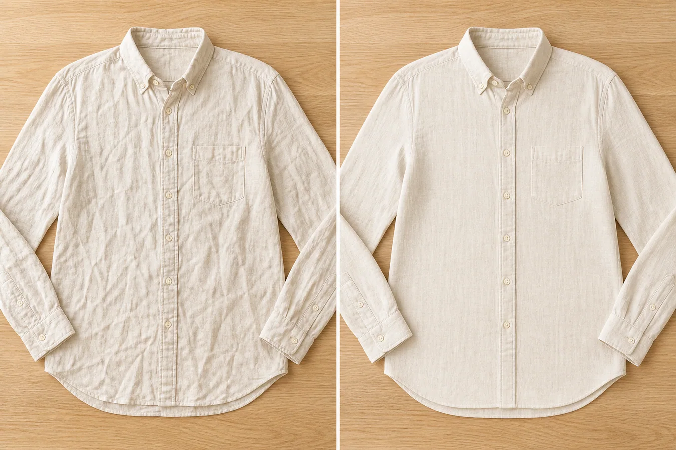 The example uses one cream linen button-up shirt. The before side has deep wrinkles across the torso and sleeves. The after side is smoother and more listing-ready, but the collar, placket, buttons, pocket, cuffs, hem curve, linen weave, and flat-lay angle stay consistent.
## Why Wrinkles Are Different From Dirt
Wrinkles are part of fabric, so removing every line can make apparel look fake. A good edit removes the creases that distract from the product while leaving small weave texture, soft folds, and natural shadows. That balance matters for linen, cotton, silk, wool, denim, and knits.
For ecommerce, the goal is not a showroom fantasy. The goal is a clean product image that helps a buyer judge fit, material, and finish without wondering whether the seller changed the garment.
## Start by Protecting the Garment Facts
Before editing, name the details that must stay fixed:
- collar shape and neckline
- button count and button spacing
- pocket position
- sleeve length and cuff construction
- seam paths and placket width
- hem curve, drape, and crop
- fabric weave, color, and thickness
If the AI smooths the shirt but moves the pocket, changes the collar, loses the linen texture, or invents new buttons, reject the output. A cleaner photo is not useful when it quietly changes the SKU.
## A Prompt for Apparel Wrinkle Cleanup
Use a narrow prompt in [KrafLayer](https://kraflayer.com):
> Smooth the distracting wrinkles in this clothing product photo for an ecommerce listing. Keep the same garment, angle, crop, color, fabric weave, seams, collar, buttons, pocket, cuffs, hem, scale, and natural shadow. Preserve realistic linen texture and soft fabric depth. Do not redesign the shirt, change the fit, remove construction details, add a model, add props, or make the fabric look plastic.
This keeps the edit focused. You are not asking for a new fashion campaign image. You are asking for a better version of the same product photo.
## Review the Result Like a Seller
Zoom in before using the image. Check the places where AI often over-cleans apparel:
- the placket should still line up
- buttons should stay round and evenly spaced
- seams should not melt into the fabric
- cuffs should keep their stitching and shape
- the weave should remain visible
- the garment should still show light fabric depth, not a flat painted surface
For a main image, the shirt can be cleaner. For a detail image, leave more texture so buyers can trust the material.
## When to Use This Workflow
Use AI wrinkle smoothing when the product is correct but the shoot was rushed. It is useful for supplier photos, flat-lay apparel, thrift or resale listings, small boutique uploads, and catalog refreshes where a full reshoot is not realistic.
Do not use it to hide product damage, shrink a garment, fake a different cut, or make used clothing look new if the condition should be disclosed. The edit should improve presentation, not misrepresent the item.
## Where KrafLayer Fits
When you apply this Smooth Wrinkles in Clothing Product Photos workflow in KrafLayer, the tool choice matters: use Mask Edit for a local change with a short instruction, or Reference Image Editor when the result needs a visual example. After generation, judge the image by the channel it serves, listing images, detail pages, or ad assets, and check that fit, fabric, shoulder line, garment length, and real color are still intact.
## Which wrinkles should you remove?
Google's virtual try-on guidance says flat-lay garments should avoid excessive folds or wrinkles, but that is not permission to erase construction. Remove temporary compression creases, hanger dents, and small storage folds. Preserve pleats, gathers, darts, puckering that reveals seam construction, and the natural drape of the fabric ([Google virtual try-on](https://support.google.com/merchants/answer/16159685?hl=en-GB), 2026).
Use this classification before editing:
| Mark in the fabric | Usually edit? | Reason |
|---|---|---|
| Shipping fold across a flat panel | Yes, lightly | Temporary and not part of the design |
| Designed pleat or gather | No | Product construction |
| Hanger bump at shoulder | Yes | Styling artifact |
| Seam puckering | Usually no | May describe real manufacturing quality |
| Natural linen variation | No | Material identity |
| Deep crease hiding a print | Edit or reshoot | Buyer cannot inspect the actual graphic |
If you cannot tell whether a line is a wrinkle or construction, compare the same area in another source view. When evidence is missing, reshoot instead of smoothing the uncertainty away.
## Use a local mask, not a full garment regeneration
The safest KrafLayer route is Mask Edit: paint only the temporary wrinkle and give a plain instruction for the masked area. Keep the mask inside one fabric panel and away from seams, hems, buttons, prints, and silhouette edges.
Example instruction:
```text
Reduce only the temporary diagonal storage crease inside the masked cotton panel. Preserve the original weave, shade, print, seam, hem, stitching, drape, lighting, and garment shape. Do not smooth outside the mask or redesign the fabric.
```
Work in several small passes. One mask over the entire garment gives the model too much freedom and can change fit, pocket position, or fabric texture. Compare each pass with the untouched source before moving to the next area.
## Review texture at three zoom levels
Google asks merchants to show the correct color, pattern, and material. Wrinkle cleanup can pass at thumbnail size while failing at full resolution because the fabric becomes waxy or the weave repeats unnaturally ([Google product image requirements](https://support.google.com/merchants/answer/6324350?hl=en), 2026).
Review at:
1. **Thumbnail size:** check silhouette and whether the garment reads cleanly.
2. **Normal product-page size:** check drape, panel transitions, and lighting continuity.
3. **100% zoom:** check weave, print, stitching, mask boundary, and repeated texture.
Reject the edit when the cleaned patch is smoother than the rest of the garment, shadows disappear around a seam, a print bends differently, or the color shifts inside the mask.
## Test difficult areas separately
Wrinkle removal becomes riskier near construction details. Divide the garment into zones and use a stricter review for each one:
- **Collars and lapels:** preserve roll, edge thickness, buttonholes, and the shadow where layers overlap.
- **Cuffs and hems:** keep stitching parallel and retain the real thickness of the folded edge.
- **Printed panels:** compare letter shapes, line spacing, and print alignment with the source.
- **Knits and ribbing:** keep the direction and spacing of loops. A soft blur is not repaired knit texture.
- **Sheer fabric:** preserve the visible relationship between fabric, skin, lining, and background.
- **Dark garments:** lift exposure temporarily during review so lost seams and plastic-looking patches become visible.
If hair, a hand, a belt, or another garment crosses the edit area, protect that object with a negative mask. Generate one version with the smallest possible edit before attempting a broader cleanup.
## Keep an untouched comparison file
Save the original and edited image at the same pixel dimensions. Review them with a difference mindset, not only a beauty mindset. Ask what changed outside the intended crease, whether the silhouette moved, and whether the cleaned area now has less information than the surrounding fabric.
A practical file set is:
1. the untouched camera export;
2. a color-corrected source with no generative edits;
3. the masked wrinkle-cleanup version;
4. the approved ecommerce export;
5. a small review note naming each corrected area.
This makes later variant and campaign work safer. If a new crop reveals an artifact, the team can return to the verified source instead of editing an already edited JPEG.
## Use a simple acceptance checklist
Approve the image only when every answer is yes:
- Is the garment silhouette unchanged?
- Are seams, hems, pleats, pockets, fasteners, and prints in the same positions?
- Does fabric texture continue naturally through the cleaned patch?
- Are highlights and shadows consistent with the original light?
- Is the product color unchanged outside intentional color correction?
- Would the image still describe the same condition if this is a resale item?
When one answer is no, reduce the mask or return to physical preparation and a new photograph. A small honest crease is better than a large invented surface.
## When should you steam or reshoot instead?
Use a new photo when wrinkles cover most of the garment, the source is blurred, the fabric texture is already lost, or the fold hides construction the buyer needs to inspect. Physical preparation is often faster than repairing twenty large creases one by one.
For resale items, do not remove permanent wear, stretching, damage, stains, or flaws that describe condition. A cleaner composition is useful. A falsely new-looking item is misleading.
## FAQ
### Can AI remove wrinkles from clothing product photos?
Yes. AI can reduce distracting wrinkles in apparel photos, but the prompt should protect the garment shape, seams, buttons, fabric texture, color, and natural shadow.
### Should clothing product photos have no wrinkles at all?
No. Some fabric texture and soft folds should remain, especially for linen, cotton, wool, denim, and knits. Completely flat fabric can look fake.
### Is wrinkle smoothing safe for resale clothing photos?
It is safe when the edit improves presentation without hiding condition issues. Do not use wrinkle cleanup to conceal damage, heavy wear, stains, or fit problems that buyers need to know.
## Conclusion
Good wrinkle cleanup makes the garment easier to evaluate without making it less truthful. Use a local mask, preserve construction and material behavior, review at three zoom levels, and reshoot when the source cannot support a credible edit. KrafLayer can speed up that controlled cleanup, but the photographed garment remains the source of truth.
# How to Replace Wrong Label Text on Product Images with AI
URL: https://kraflayer.com/blog/replace-wrong-label-text-on-product-images-with-ai
Summary: A practical local-editing workflow for fixing a wrong product label, flavor line, or small printed text error without rebuilding the whole ecommerce photo. Includes how to do it in KrafLayer.
Updated: 2026-08-21
## TL;DR
For Replace Wrong Label Text on Product Images, use KrafLayer for controlled local changes or reference-guided edits. Use Mask Edit for a local change with a short instruction, or Reference Image Editor when the result needs a visual example. The finished image should still prove that shape, material, labels, color, scale, and accessories still match the source SKU.
If a product image has one wrong label line, do not regenerate the whole photo. Replace only the label area, then check that the package shape, material, lighting, shadow, and small layout details still match the original SKU.
KrafLayer is an AI-powered visual editor for ecommerce product photography. For this task, use local editing to fix the incorrect label text while keeping the rest of the image stable enough for a product listing, detail page, or ad creative.
The example uses one cream linen button-up shirt. The before side has deep wrinkles across the torso and sleeves. The after side is smoother and more listing-ready, but the collar, placket, buttons, pocket, cuffs, hem curve, linen weave, and flat-lay angle stay consistent.
## Why Wrinkles Are Different From Dirt
Wrinkles are part of fabric, so removing every line can make apparel look fake. A good edit removes the creases that distract from the product while leaving small weave texture, soft folds, and natural shadows. That balance matters for linen, cotton, silk, wool, denim, and knits.
For ecommerce, the goal is not a showroom fantasy. The goal is a clean product image that helps a buyer judge fit, material, and finish without wondering whether the seller changed the garment.
## Start by Protecting the Garment Facts
Before editing, name the details that must stay fixed:
- collar shape and neckline
- button count and button spacing
- pocket position
- sleeve length and cuff construction
- seam paths and placket width
- hem curve, drape, and crop
- fabric weave, color, and thickness
If the AI smooths the shirt but moves the pocket, changes the collar, loses the linen texture, or invents new buttons, reject the output. A cleaner photo is not useful when it quietly changes the SKU.
## A Prompt for Apparel Wrinkle Cleanup
Use a narrow prompt in [KrafLayer](https://kraflayer.com):
> Smooth the distracting wrinkles in this clothing product photo for an ecommerce listing. Keep the same garment, angle, crop, color, fabric weave, seams, collar, buttons, pocket, cuffs, hem, scale, and natural shadow. Preserve realistic linen texture and soft fabric depth. Do not redesign the shirt, change the fit, remove construction details, add a model, add props, or make the fabric look plastic.
This keeps the edit focused. You are not asking for a new fashion campaign image. You are asking for a better version of the same product photo.
## Review the Result Like a Seller
Zoom in before using the image. Check the places where AI often over-cleans apparel:
- the placket should still line up
- buttons should stay round and evenly spaced
- seams should not melt into the fabric
- cuffs should keep their stitching and shape
- the weave should remain visible
- the garment should still show light fabric depth, not a flat painted surface
For a main image, the shirt can be cleaner. For a detail image, leave more texture so buyers can trust the material.
## When to Use This Workflow
Use AI wrinkle smoothing when the product is correct but the shoot was rushed. It is useful for supplier photos, flat-lay apparel, thrift or resale listings, small boutique uploads, and catalog refreshes where a full reshoot is not realistic.
Do not use it to hide product damage, shrink a garment, fake a different cut, or make used clothing look new if the condition should be disclosed. The edit should improve presentation, not misrepresent the item.
## Where KrafLayer Fits
When you apply this Smooth Wrinkles in Clothing Product Photos workflow in KrafLayer, the tool choice matters: use Mask Edit for a local change with a short instruction, or Reference Image Editor when the result needs a visual example. After generation, judge the image by the channel it serves, listing images, detail pages, or ad assets, and check that fit, fabric, shoulder line, garment length, and real color are still intact.
## Which wrinkles should you remove?
Google's virtual try-on guidance says flat-lay garments should avoid excessive folds or wrinkles, but that is not permission to erase construction. Remove temporary compression creases, hanger dents, and small storage folds. Preserve pleats, gathers, darts, puckering that reveals seam construction, and the natural drape of the fabric ([Google virtual try-on](https://support.google.com/merchants/answer/16159685?hl=en-GB), 2026).
Use this classification before editing:
| Mark in the fabric | Usually edit? | Reason |
|---|---|---|
| Shipping fold across a flat panel | Yes, lightly | Temporary and not part of the design |
| Designed pleat or gather | No | Product construction |
| Hanger bump at shoulder | Yes | Styling artifact |
| Seam puckering | Usually no | May describe real manufacturing quality |
| Natural linen variation | No | Material identity |
| Deep crease hiding a print | Edit or reshoot | Buyer cannot inspect the actual graphic |
If you cannot tell whether a line is a wrinkle or construction, compare the same area in another source view. When evidence is missing, reshoot instead of smoothing the uncertainty away.
## Use a local mask, not a full garment regeneration
The safest KrafLayer route is Mask Edit: paint only the temporary wrinkle and give a plain instruction for the masked area. Keep the mask inside one fabric panel and away from seams, hems, buttons, prints, and silhouette edges.
Example instruction:
```text
Reduce only the temporary diagonal storage crease inside the masked cotton panel. Preserve the original weave, shade, print, seam, hem, stitching, drape, lighting, and garment shape. Do not smooth outside the mask or redesign the fabric.
```
Work in several small passes. One mask over the entire garment gives the model too much freedom and can change fit, pocket position, or fabric texture. Compare each pass with the untouched source before moving to the next area.
## Review texture at three zoom levels
Google asks merchants to show the correct color, pattern, and material. Wrinkle cleanup can pass at thumbnail size while failing at full resolution because the fabric becomes waxy or the weave repeats unnaturally ([Google product image requirements](https://support.google.com/merchants/answer/6324350?hl=en), 2026).
Review at:
1. **Thumbnail size:** check silhouette and whether the garment reads cleanly.
2. **Normal product-page size:** check drape, panel transitions, and lighting continuity.
3. **100% zoom:** check weave, print, stitching, mask boundary, and repeated texture.
Reject the edit when the cleaned patch is smoother than the rest of the garment, shadows disappear around a seam, a print bends differently, or the color shifts inside the mask.
## Test difficult areas separately
Wrinkle removal becomes riskier near construction details. Divide the garment into zones and use a stricter review for each one:
- **Collars and lapels:** preserve roll, edge thickness, buttonholes, and the shadow where layers overlap.
- **Cuffs and hems:** keep stitching parallel and retain the real thickness of the folded edge.
- **Printed panels:** compare letter shapes, line spacing, and print alignment with the source.
- **Knits and ribbing:** keep the direction and spacing of loops. A soft blur is not repaired knit texture.
- **Sheer fabric:** preserve the visible relationship between fabric, skin, lining, and background.
- **Dark garments:** lift exposure temporarily during review so lost seams and plastic-looking patches become visible.
If hair, a hand, a belt, or another garment crosses the edit area, protect that object with a negative mask. Generate one version with the smallest possible edit before attempting a broader cleanup.
## Keep an untouched comparison file
Save the original and edited image at the same pixel dimensions. Review them with a difference mindset, not only a beauty mindset. Ask what changed outside the intended crease, whether the silhouette moved, and whether the cleaned area now has less information than the surrounding fabric.
A practical file set is:
1. the untouched camera export;
2. a color-corrected source with no generative edits;
3. the masked wrinkle-cleanup version;
4. the approved ecommerce export;
5. a small review note naming each corrected area.
This makes later variant and campaign work safer. If a new crop reveals an artifact, the team can return to the verified source instead of editing an already edited JPEG.
## Use a simple acceptance checklist
Approve the image only when every answer is yes:
- Is the garment silhouette unchanged?
- Are seams, hems, pleats, pockets, fasteners, and prints in the same positions?
- Does fabric texture continue naturally through the cleaned patch?
- Are highlights and shadows consistent with the original light?
- Is the product color unchanged outside intentional color correction?
- Would the image still describe the same condition if this is a resale item?
When one answer is no, reduce the mask or return to physical preparation and a new photograph. A small honest crease is better than a large invented surface.
## When should you steam or reshoot instead?
Use a new photo when wrinkles cover most of the garment, the source is blurred, the fabric texture is already lost, or the fold hides construction the buyer needs to inspect. Physical preparation is often faster than repairing twenty large creases one by one.
For resale items, do not remove permanent wear, stretching, damage, stains, or flaws that describe condition. A cleaner composition is useful. A falsely new-looking item is misleading.
## FAQ
### Can AI remove wrinkles from clothing product photos?
Yes. AI can reduce distracting wrinkles in apparel photos, but the prompt should protect the garment shape, seams, buttons, fabric texture, color, and natural shadow.
### Should clothing product photos have no wrinkles at all?
No. Some fabric texture and soft folds should remain, especially for linen, cotton, wool, denim, and knits. Completely flat fabric can look fake.
### Is wrinkle smoothing safe for resale clothing photos?
It is safe when the edit improves presentation without hiding condition issues. Do not use wrinkle cleanup to conceal damage, heavy wear, stains, or fit problems that buyers need to know.
## Conclusion
Good wrinkle cleanup makes the garment easier to evaluate without making it less truthful. Use a local mask, preserve construction and material behavior, review at three zoom levels, and reshoot when the source cannot support a credible edit. KrafLayer can speed up that controlled cleanup, but the photographed garment remains the source of truth.
# How to Replace Wrong Label Text on Product Images with AI
URL: https://kraflayer.com/blog/replace-wrong-label-text-on-product-images-with-ai
Summary: A practical local-editing workflow for fixing a wrong product label, flavor line, or small printed text error without rebuilding the whole ecommerce photo. Includes how to do it in KrafLayer.
Updated: 2026-08-21
## TL;DR
For Replace Wrong Label Text on Product Images, use KrafLayer for controlled local changes or reference-guided edits. Use Mask Edit for a local change with a short instruction, or Reference Image Editor when the result needs a visual example. The finished image should still prove that shape, material, labels, color, scale, and accessories still match the source SKU.
If a product image has one wrong label line, do not regenerate the whole photo. Replace only the label area, then check that the package shape, material, lighting, shadow, and small layout details still match the original SKU.
KrafLayer is an AI-powered visual editor for ecommerce product photography. For this task, use local editing to fix the incorrect label text while keeping the rest of the image stable enough for a product listing, detail page, or ad creative.
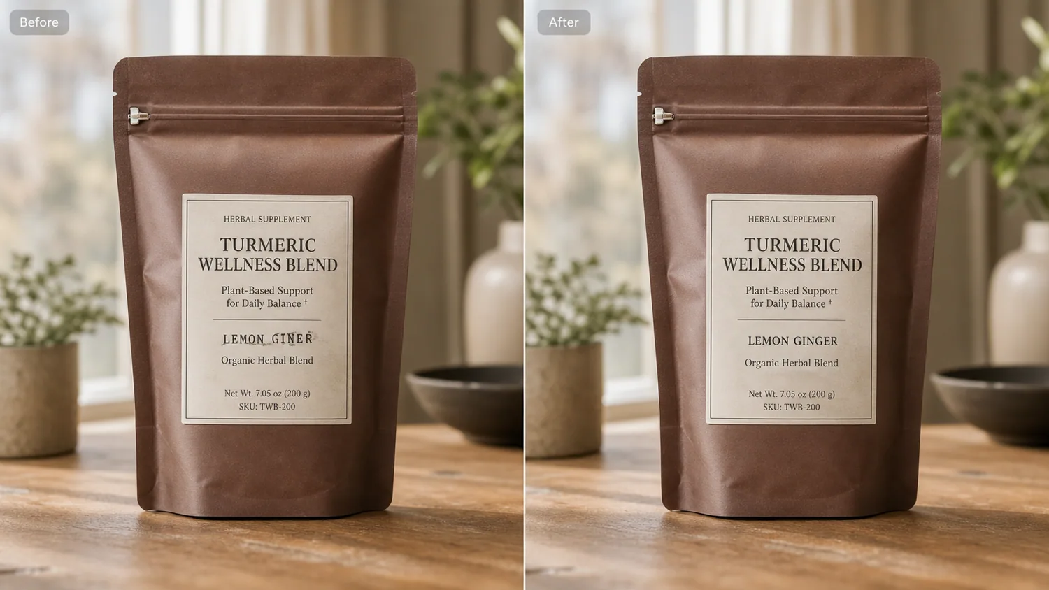 The example uses one amber supplement pouch. The before image has a misspelled flavor line on the front label. The after image keeps the same pouch, zipper, paper texture, tabletop, and contact shadow, but replaces the bad label text with a clean line a seller could actually use.
## Why Label Errors Need a Narrow Edit
Small label mistakes are expensive because the rest of the photo may already be good. The product is centered, the light is usable, and the material reads well, but one typo or outdated variant name makes the asset unsafe to publish.
The mistake is to ask AI to “make a better product photo.” That often changes the pouch shape, moves the label, invents a brand mark, or changes the package finish. The correct request is narrower: replace this label area and preserve everything else.
## Protect the Product Facts First
Before editing, write down what must not change. For the supplement pouch in the example, protect the pouch silhouette, zipper position, side folds, matte material, cream paper label, net-weight area, tabletop shadow, and camera angle.
For other products, the protected facts may be different:
- skincare bottles: cap shape, pump height, glass thickness, label placement
- food packaging: bag folds, window cutout, seal line, printed nutrition area
- electronics: port layout, button position, model number area
- apparel packaging: hang tag position, fabric texture, size sticker
If the after image fixes the text but redesigns these details, it is not a usable ecommerce edit.
## A Prompt for Replacing Wrong Label Text
Use a local edit prompt inside [KrafLayer](https://kraflayer.com):
> Replace only the incorrect label text on the front label. Change the flavor line to “LEMON GINGER” and keep the same package shape, label size, paper texture, typography style, lighting, tabletop, shadow, crop, and camera angle. Do not redesign the product, add a new logo, change the pouch material, change the SKU area, add props, or alter any other printed details.
The exact replacement text should be short. Long copy is harder to keep clean, and it can make the image look like a fake packaging render.
## Check the Result Like a Listing Operator
After the edit, zoom in on the label and then zoom back out to thumbnail size. Both views matter. A good label replacement should be readable close up and still look natural in a catalog grid.
Use this review list:
- the corrected text says exactly what you requested
- the label stays attached to the package surface
- paper grain, ink weight, and border lines still match
- shadows and wrinkles around the label are not erased
- no fake brand logo or extra claim was added
- the package shape and scale stayed unchanged
This is a trust edit. The buyer should feel that the image shows the real product, just with the seller-side label error corrected.
## When to Use This Workflow
Use AI label replacement when the photo is otherwise sellable and the change is small: flavor text, variant name, typo, size line, outdated batch wording, or a misplaced short claim. It is useful for Shopify product images, Amazon detail images, marketplace catalogs, and campaign assets where one typo can block launch.
Do not use it to hide required information, rewrite regulated claims, or make packaging say something the real item does not say. The visual should match what the buyer receives.
## Where KrafLayer Fits
When you apply this Replace Wrong Label Text on Product Images workflow in KrafLayer, the tool choice matters: use Mask Edit for a local change with a short instruction, or Reference Image Editor when the result needs a visual example. After generation, judge the image by the channel it serves — listing images, detail pages, or ad assets — and check that shape, material, labels, color, scale, and accessories still match the source SKU.
## FAQ
### Can AI replace product label text accurately?
AI can replace short product label text when the edit area is narrow and the prompt protects the original packaging. Keep the requested text simple and verify the final spelling manually.
### Should I regenerate the whole product photo to fix a label typo?
Usually no. If the photo is already usable, local replacement is safer because it reduces the chance of changing the product shape, packaging material, or lighting.
### Can I use this for marketplace product listings?
Yes, if the corrected label matches the real product and does not add false claims. Use the workflow to fix seller-side production errors, not to misrepresent the item.
# How to Put Products on Models with KrafLayer
URL: https://kraflayer.com/blog/product-on-model-workspace
Summary: A practical Product on Model workflow for ecommerce: combine model, product, background, and campaign brief while protecting fit, scale, anatomy, and product identity. Includes how to do it in KrafLayer.
Updated: 2026-08-21
## TL;DR
For Put Products on Models with KrafLayer, KrafLayer is useful when a real product reference needs to become a usable asset for listing images, detail pages, or ad assets. Treat it as production editing, not product reinvention; the test is whether fit, fabric, shoulder line, garment length, and real color are still intact.
Product-on-model generation is useful when a flat product photo cannot show scale, fit, styling, or emotional context. The hard part is not putting an object near a person. The hard part is keeping the product accurate while the model, pose, clothing, background, and campaign use all work together.
KrafLayer's Product on Model workspace is designed around four inputs: product reference, model reference or direction, background/context, and campaign brief. The better those roles are separated, the less likely AI is to merge details incorrectly.
The example uses one amber supplement pouch. The before image has a misspelled flavor line on the front label. The after image keeps the same pouch, zipper, paper texture, tabletop, and contact shadow, but replaces the bad label text with a clean line a seller could actually use.
## Why Label Errors Need a Narrow Edit
Small label mistakes are expensive because the rest of the photo may already be good. The product is centered, the light is usable, and the material reads well, but one typo or outdated variant name makes the asset unsafe to publish.
The mistake is to ask AI to “make a better product photo.” That often changes the pouch shape, moves the label, invents a brand mark, or changes the package finish. The correct request is narrower: replace this label area and preserve everything else.
## Protect the Product Facts First
Before editing, write down what must not change. For the supplement pouch in the example, protect the pouch silhouette, zipper position, side folds, matte material, cream paper label, net-weight area, tabletop shadow, and camera angle.
For other products, the protected facts may be different:
- skincare bottles: cap shape, pump height, glass thickness, label placement
- food packaging: bag folds, window cutout, seal line, printed nutrition area
- electronics: port layout, button position, model number area
- apparel packaging: hang tag position, fabric texture, size sticker
If the after image fixes the text but redesigns these details, it is not a usable ecommerce edit.
## A Prompt for Replacing Wrong Label Text
Use a local edit prompt inside [KrafLayer](https://kraflayer.com):
> Replace only the incorrect label text on the front label. Change the flavor line to “LEMON GINGER” and keep the same package shape, label size, paper texture, typography style, lighting, tabletop, shadow, crop, and camera angle. Do not redesign the product, add a new logo, change the pouch material, change the SKU area, add props, or alter any other printed details.
The exact replacement text should be short. Long copy is harder to keep clean, and it can make the image look like a fake packaging render.
## Check the Result Like a Listing Operator
After the edit, zoom in on the label and then zoom back out to thumbnail size. Both views matter. A good label replacement should be readable close up and still look natural in a catalog grid.
Use this review list:
- the corrected text says exactly what you requested
- the label stays attached to the package surface
- paper grain, ink weight, and border lines still match
- shadows and wrinkles around the label are not erased
- no fake brand logo or extra claim was added
- the package shape and scale stayed unchanged
This is a trust edit. The buyer should feel that the image shows the real product, just with the seller-side label error corrected.
## When to Use This Workflow
Use AI label replacement when the photo is otherwise sellable and the change is small: flavor text, variant name, typo, size line, outdated batch wording, or a misplaced short claim. It is useful for Shopify product images, Amazon detail images, marketplace catalogs, and campaign assets where one typo can block launch.
Do not use it to hide required information, rewrite regulated claims, or make packaging say something the real item does not say. The visual should match what the buyer receives.
## Where KrafLayer Fits
When you apply this Replace Wrong Label Text on Product Images workflow in KrafLayer, the tool choice matters: use Mask Edit for a local change with a short instruction, or Reference Image Editor when the result needs a visual example. After generation, judge the image by the channel it serves — listing images, detail pages, or ad assets — and check that shape, material, labels, color, scale, and accessories still match the source SKU.
## FAQ
### Can AI replace product label text accurately?
AI can replace short product label text when the edit area is narrow and the prompt protects the original packaging. Keep the requested text simple and verify the final spelling manually.
### Should I regenerate the whole product photo to fix a label typo?
Usually no. If the photo is already usable, local replacement is safer because it reduces the chance of changing the product shape, packaging material, or lighting.
### Can I use this for marketplace product listings?
Yes, if the corrected label matches the real product and does not add false claims. Use the workflow to fix seller-side production errors, not to misrepresent the item.
# How to Put Products on Models with KrafLayer
URL: https://kraflayer.com/blog/product-on-model-workspace
Summary: A practical Product on Model workflow for ecommerce: combine model, product, background, and campaign brief while protecting fit, scale, anatomy, and product identity. Includes how to do it in KrafLayer.
Updated: 2026-08-21
## TL;DR
For Put Products on Models with KrafLayer, KrafLayer is useful when a real product reference needs to become a usable asset for listing images, detail pages, or ad assets. Treat it as production editing, not product reinvention; the test is whether fit, fabric, shoulder line, garment length, and real color are still intact.
Product-on-model generation is useful when a flat product photo cannot show scale, fit, styling, or emotional context. The hard part is not putting an object near a person. The hard part is keeping the product accurate while the model, pose, clothing, background, and campaign use all work together.
KrafLayer's Product on Model workspace is designed around four inputs: product reference, model reference or direction, background/context, and campaign brief. The better those roles are separated, the less likely AI is to merge details incorrectly.
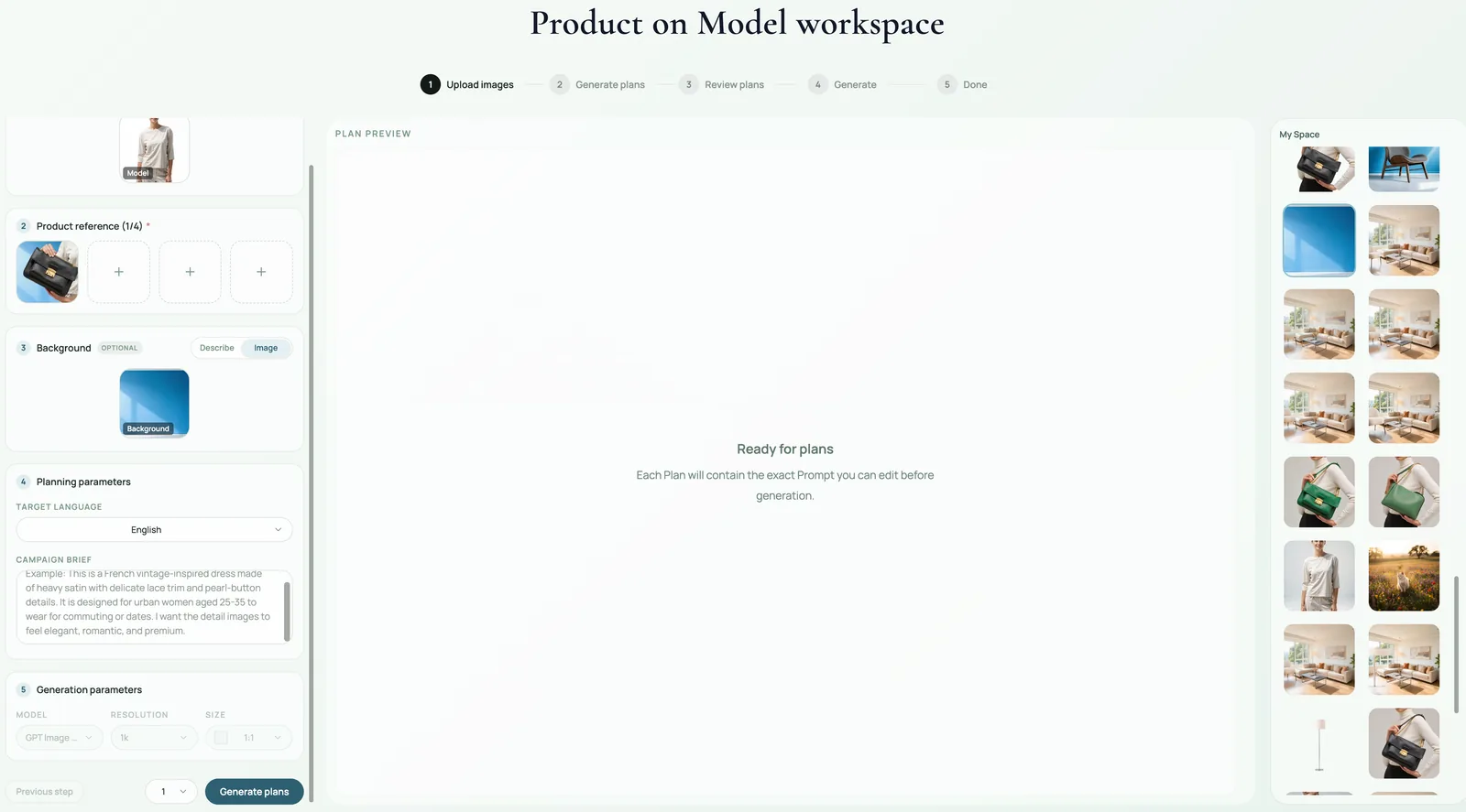 ## When to use Product on Model
Use it for apparel, bags, jewelry, shoes, eyewear, accessories, beauty products, and lifestyle goods when shoppers need to understand scale or styling. It is especially useful for PDP support images, ads, lookbook visuals, and social creatives.
For strict marketplace main images, use product-on-model carefully. Many platforms prefer simple product-first images for the main slot and model images as supporting gallery assets.
## What to define before generation
**Product role:** What exact SKU must be preserved? Name color, material, silhouette, logo area, strap, closure, fit, or signature detail.
**Model role:** What should the model contribute? Body type, pose direction, styling mood, hand visibility, face crop, or lifestyle context.
**Background role:** What selling context should the image suggest? Studio, street, gym, home, beach, office, boutique, or campaign set.
**Campaign role:** Where will the image be used? Product page, ad, email hero, social cover, or landing page.
## Where KrafLayer Fits
When you apply this Put Products on Models with KrafLayer workflow in KrafLayer, start from the clearest product reference, then decide whether the asset needs cleanup, lighting, background work, detail support, or an ad version. Before using it for listing images, detail pages, or ad assets, check that fit, fabric, shoulder line, garment length, and real color are still intact.
## Prompt to use in KrafLayer
~~~text
Use the uploaded product image as the exact SKU reference and the model/background inputs as styling context. Create a realistic ecommerce product-on-model image for [channel/use case]. Preserve product color, material, silhouette, logo area, scale, fit, and signature details. Keep the model anatomy natural and make the product clearly visible. Let pose, lighting, and background support the product without hiding it. Do not change the product design, add extra limbs or hands, distort fit, invent labels, or cover key product details.
~~~
For bags and accessories, use safer language:
~~~text
Style the product naturally with the model as part of the look. Keep the product visible and commercially prominent. Avoid complex hand gripping or unclear body contact.
~~~
## Review checklist
- Is the product still the same SKU?
- Does the model scale make sense for the product size?
- Are hands, arms, shoulders, feet, and straps anatomically believable?
- Is the product visible enough for a buyer to judge details?
- Does the image match the channel: PDP, ad, social, or lookbook?
## Summary
A strong Product on Model image balances realism and selling clarity. Separate product, model, background, and campaign roles before prompting, then judge the result by product accuracy, human realism, and channel usefulness.
## FAQ
### Can Product on Model replace a real photoshoot?
It can replace or supplement some ecommerce lifestyle shots, especially for early campaigns, variants, and creative testing. For exact fit claims, complex apparel sizing, or regulated products, review carefully and use real photography when precision is required.
### Why do AI model images create strange hands or straps?
The prompt may over-specify physical interaction. Use simpler styling language, keep product placement broad, and avoid detailed hand or finger instructions unless they are necessary.
### What inputs produce the best results?
Use a clean product image, a clear model reference or model direction, a simple background idea, and a specific campaign use. Vague prompts produce generic fashion images; role-separated inputs produce more controllable ecommerce assets.
# 柔软针织面料纹理怎么无损放大和增强
URL: https://kraflayer.com/zh/blog/upscale-and-enhance-soft-knitwear-texture-without-losing-detail
Summary: 一套针织商品图放大流程:提升纱线和罗纹可读性,同时避免 AI 伪造织法、改变版型或把面料磨成塑料。可在 KrafLayer 中按同一流程完成。
Updated: 2026-06-12
## TL;DR
柔软针织面料纹理怎么无损放大和增强这类任务,可以把 KrafLayer 当作上架前的快速修图环节:直接运行 Upscale,再检查纹理、边缘、标签和小字。它适合处理详情页模块,但最后要确认版型、面料、肩线、衣长和真实色号没有被改掉。
针织商品图放大时,最重要的不是更锐,而是更真实。AI 可以让纱线、罗纹、袖口和下摆更清楚,但不能伪造织法、改变版型,或把柔软面料修成塑料。
## 操作步骤
1. 用原图文件,不要用压缩截图。
2. 先放大全图,再做局部细节图。
3. 保护肩线、袖长、门襟、纽扣、下摆和罗纹方向。
4. 拒绝过度锐化和假纹理。
## 可直接复制的 prompt
~~~text
以我上传的针织商品图作为准确参考,进行电商用途的放大和纹理增强。请保留真实版型、颜色、纱线质感、罗纹方向、袖口、下摆、纽扣、缝线和柔软垂感。提升清晰度但不要伪造新的织法,不要过度锐化,不要把面料磨成塑料,不要改变衣服版型。
~~~
## KrafLayer 放在流程里的位置
把柔软针织面料纹理怎么无损放大和增强放到 KrafLayer 里做时,先选对工具:直接运行 Upscale,再检查纹理、边缘、标签和小字。生成后不要只看画面是否更漂亮,要按详情页模块的使用场景检查:版型、面料、肩线、衣长和真实色号没有被改掉。
## FAQ
### AI 能恢复完全模糊的针织纹理吗?
不能可靠恢复。它只能在已有信息基础上增强,缺失太多时容易生成假纹理。
### 怎么判断是否过度增强?
看纱线是否像刻出来的线,面料是否失去柔软感。
# How to Create Natural Product Lighting with AI
URL: https://kraflayer.com/blog/ai-product-lighting-with-natural-breathing-feel
Summary: A practical guide to natural AI product lighting: create soft, breathable ecommerce images while preserving material, color, shadow direction, and product readability. Includes how to do it in KrafLayer.
Updated: 2026-06-12
## TL;DR
For Create Natural Product Lighting, use KrafLayer for controlled local changes or reference-guided edits. Use Mask Edit for a local change with a short instruction, or Reference Image Editor when the result needs a visual example. The finished image should still prove that shape, material, labels, color, scale, and accessories still match the source SKU.
Natural product lighting should make the image feel believable, not under-produced. In ecommerce, “natural” usually means soft direction, visible material, clean shadows, and enough contrast for the product to read quickly.
Use this style when a product needs warmth and trust: home goods, ceramics, skincare, baby products, food packaging, flowers, apparel, and handmade goods.
## When to use Product on Model
Use it for apparel, bags, jewelry, shoes, eyewear, accessories, beauty products, and lifestyle goods when shoppers need to understand scale or styling. It is especially useful for PDP support images, ads, lookbook visuals, and social creatives.
For strict marketplace main images, use product-on-model carefully. Many platforms prefer simple product-first images for the main slot and model images as supporting gallery assets.
## What to define before generation
**Product role:** What exact SKU must be preserved? Name color, material, silhouette, logo area, strap, closure, fit, or signature detail.
**Model role:** What should the model contribute? Body type, pose direction, styling mood, hand visibility, face crop, or lifestyle context.
**Background role:** What selling context should the image suggest? Studio, street, gym, home, beach, office, boutique, or campaign set.
**Campaign role:** Where will the image be used? Product page, ad, email hero, social cover, or landing page.
## Where KrafLayer Fits
When you apply this Put Products on Models with KrafLayer workflow in KrafLayer, start from the clearest product reference, then decide whether the asset needs cleanup, lighting, background work, detail support, or an ad version. Before using it for listing images, detail pages, or ad assets, check that fit, fabric, shoulder line, garment length, and real color are still intact.
## Prompt to use in KrafLayer
~~~text
Use the uploaded product image as the exact SKU reference and the model/background inputs as styling context. Create a realistic ecommerce product-on-model image for [channel/use case]. Preserve product color, material, silhouette, logo area, scale, fit, and signature details. Keep the model anatomy natural and make the product clearly visible. Let pose, lighting, and background support the product without hiding it. Do not change the product design, add extra limbs or hands, distort fit, invent labels, or cover key product details.
~~~
For bags and accessories, use safer language:
~~~text
Style the product naturally with the model as part of the look. Keep the product visible and commercially prominent. Avoid complex hand gripping or unclear body contact.
~~~
## Review checklist
- Is the product still the same SKU?
- Does the model scale make sense for the product size?
- Are hands, arms, shoulders, feet, and straps anatomically believable?
- Is the product visible enough for a buyer to judge details?
- Does the image match the channel: PDP, ad, social, or lookbook?
## Summary
A strong Product on Model image balances realism and selling clarity. Separate product, model, background, and campaign roles before prompting, then judge the result by product accuracy, human realism, and channel usefulness.
## FAQ
### Can Product on Model replace a real photoshoot?
It can replace or supplement some ecommerce lifestyle shots, especially for early campaigns, variants, and creative testing. For exact fit claims, complex apparel sizing, or regulated products, review carefully and use real photography when precision is required.
### Why do AI model images create strange hands or straps?
The prompt may over-specify physical interaction. Use simpler styling language, keep product placement broad, and avoid detailed hand or finger instructions unless they are necessary.
### What inputs produce the best results?
Use a clean product image, a clear model reference or model direction, a simple background idea, and a specific campaign use. Vague prompts produce generic fashion images; role-separated inputs produce more controllable ecommerce assets.
# 柔软针织面料纹理怎么无损放大和增强
URL: https://kraflayer.com/zh/blog/upscale-and-enhance-soft-knitwear-texture-without-losing-detail
Summary: 一套针织商品图放大流程:提升纱线和罗纹可读性,同时避免 AI 伪造织法、改变版型或把面料磨成塑料。可在 KrafLayer 中按同一流程完成。
Updated: 2026-06-12
## TL;DR
柔软针织面料纹理怎么无损放大和增强这类任务,可以把 KrafLayer 当作上架前的快速修图环节:直接运行 Upscale,再检查纹理、边缘、标签和小字。它适合处理详情页模块,但最后要确认版型、面料、肩线、衣长和真实色号没有被改掉。
针织商品图放大时,最重要的不是更锐,而是更真实。AI 可以让纱线、罗纹、袖口和下摆更清楚,但不能伪造织法、改变版型,或把柔软面料修成塑料。
## 操作步骤
1. 用原图文件,不要用压缩截图。
2. 先放大全图,再做局部细节图。
3. 保护肩线、袖长、门襟、纽扣、下摆和罗纹方向。
4. 拒绝过度锐化和假纹理。
## 可直接复制的 prompt
~~~text
以我上传的针织商品图作为准确参考,进行电商用途的放大和纹理增强。请保留真实版型、颜色、纱线质感、罗纹方向、袖口、下摆、纽扣、缝线和柔软垂感。提升清晰度但不要伪造新的织法,不要过度锐化,不要把面料磨成塑料,不要改变衣服版型。
~~~
## KrafLayer 放在流程里的位置
把柔软针织面料纹理怎么无损放大和增强放到 KrafLayer 里做时,先选对工具:直接运行 Upscale,再检查纹理、边缘、标签和小字。生成后不要只看画面是否更漂亮,要按详情页模块的使用场景检查:版型、面料、肩线、衣长和真实色号没有被改掉。
## FAQ
### AI 能恢复完全模糊的针织纹理吗?
不能可靠恢复。它只能在已有信息基础上增强,缺失太多时容易生成假纹理。
### 怎么判断是否过度增强?
看纱线是否像刻出来的线,面料是否失去柔软感。
# How to Create Natural Product Lighting with AI
URL: https://kraflayer.com/blog/ai-product-lighting-with-natural-breathing-feel
Summary: A practical guide to natural AI product lighting: create soft, breathable ecommerce images while preserving material, color, shadow direction, and product readability. Includes how to do it in KrafLayer.
Updated: 2026-06-12
## TL;DR
For Create Natural Product Lighting, use KrafLayer for controlled local changes or reference-guided edits. Use Mask Edit for a local change with a short instruction, or Reference Image Editor when the result needs a visual example. The finished image should still prove that shape, material, labels, color, scale, and accessories still match the source SKU.
Natural product lighting should make the image feel believable, not under-produced. In ecommerce, “natural” usually means soft direction, visible material, clean shadows, and enough contrast for the product to read quickly.
Use this style when a product needs warmth and trust: home goods, ceramics, skincare, baby products, food packaging, flowers, apparel, and handmade goods.
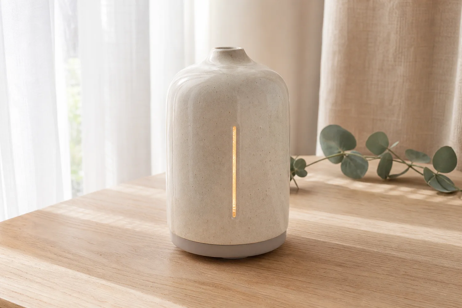 ## What natural lighting should do
Good natural light reveals texture and shape without making the image feel staged. It should preserve color accuracy, show a clear contact shadow, and let the product breathe with enough space around it.
Do not confuse natural with flat. A product still needs a light direction, highlight, shadow, and background separation.
## Workflow
1. Decide the light source: window light, soft morning light, warm afternoon light, or bright overcast light.
2. Keep the product color and material fixed before describing mood.
3. Ask for soft shadows, not shadow removal.
4. Use simple surfaces and few props so the product remains primary.
5. Check the result at thumbnail size; natural images can become too low-contrast in grids.
## Where KrafLayer Fits
When you apply this Create Natural Product Lighting workflow in KrafLayer, the tool choice matters: use Mask Edit for a local change with a short instruction, or Reference Image Editor when the result needs a visual example. After generation, judge the image by the channel it serves — listing images, detail pages, or ad assets — and check that shape, material, labels, color, scale, and accessories still match the source SKU.
## Prompt to use in KrafLayer
~~~text
Use the uploaded product as the exact reference. Create a natural-light ecommerce product image with soft directional light, believable highlights, gentle contact shadow, clean background, and enough negative space. Preserve the product shape, material, color, texture, label area, scale, and shadow logic. Do not over-brighten, flatten the product, change the material, add distracting props, or make the image look like a stock lifestyle scene.
~~~
## What to check
- Does the product still stand out from the background?
- Are highlights and shadows consistent with one light source?
- Is the true color preserved?
- Does the material still read correctly?
- Would this image sit naturally with the rest of the product page?
## Summary
Natural AI lighting works when it feels intentional but not artificial. Keep product truth first, then use soft light to make the image warmer and easier to trust.
## FAQ
### Is natural lighting better than studio lighting?
Not always. Natural lighting is better for warmth and lifestyle trust. Studio lighting is better when you need strict consistency, crisp material detail, or marketplace-ready product isolation.
### Why does natural-light AI look washed out?
The prompt may overemphasize softness. Ask for soft directional light with clear product separation and enough contrast for ecommerce thumbnails.
### Should I add props to natural product images?
Use props sparingly. They should explain scale, use, or mood without becoming more important than the product.
# How to Simulate Lipstick Swatches for Beauty Product Images with AI
URL: https://kraflayer.com/blog/ai-lipstick-swatch-simulation-for-beauty-product-images
Summary: A beauty ecommerce workflow for AI lipstick swatch simulation: show shade, finish, texture, and packaging clearly without misleading shoppers about color. Includes how to do it in KrafLayer.
Updated: 2026-08-21
## TL;DR
For Simulate Lipstick Swatches for Beauty Product Images, use KrafLayer for controlled local changes or reference-guided edits. Use Mask Edit for a local change with a short instruction, or Reference Image Editor when the result needs a visual example. The finished image should still prove that the bottle shape, label, shade, texture, and packaging proportions stay believable.
Lipstick swatch images help shoppers compare shade, finish, and texture before buying. The hard part is color trust: a swatch can make the product more persuasive, but if the shade drifts too far from the real bullet or tube, it creates returns and disappointment.
Use AI swatch simulation for PDP detail images, shade comparison modules, ads, launch pages, and social content. Keep the packaging and shade family anchored to the real product reference.
## What natural lighting should do
Good natural light reveals texture and shape without making the image feel staged. It should preserve color accuracy, show a clear contact shadow, and let the product breathe with enough space around it.
Do not confuse natural with flat. A product still needs a light direction, highlight, shadow, and background separation.
## Workflow
1. Decide the light source: window light, soft morning light, warm afternoon light, or bright overcast light.
2. Keep the product color and material fixed before describing mood.
3. Ask for soft shadows, not shadow removal.
4. Use simple surfaces and few props so the product remains primary.
5. Check the result at thumbnail size; natural images can become too low-contrast in grids.
## Where KrafLayer Fits
When you apply this Create Natural Product Lighting workflow in KrafLayer, the tool choice matters: use Mask Edit for a local change with a short instruction, or Reference Image Editor when the result needs a visual example. After generation, judge the image by the channel it serves — listing images, detail pages, or ad assets — and check that shape, material, labels, color, scale, and accessories still match the source SKU.
## Prompt to use in KrafLayer
~~~text
Use the uploaded product as the exact reference. Create a natural-light ecommerce product image with soft directional light, believable highlights, gentle contact shadow, clean background, and enough negative space. Preserve the product shape, material, color, texture, label area, scale, and shadow logic. Do not over-brighten, flatten the product, change the material, add distracting props, or make the image look like a stock lifestyle scene.
~~~
## What to check
- Does the product still stand out from the background?
- Are highlights and shadows consistent with one light source?
- Is the true color preserved?
- Does the material still read correctly?
- Would this image sit naturally with the rest of the product page?
## Summary
Natural AI lighting works when it feels intentional but not artificial. Keep product truth first, then use soft light to make the image warmer and easier to trust.
## FAQ
### Is natural lighting better than studio lighting?
Not always. Natural lighting is better for warmth and lifestyle trust. Studio lighting is better when you need strict consistency, crisp material detail, or marketplace-ready product isolation.
### Why does natural-light AI look washed out?
The prompt may overemphasize softness. Ask for soft directional light with clear product separation and enough contrast for ecommerce thumbnails.
### Should I add props to natural product images?
Use props sparingly. They should explain scale, use, or mood without becoming more important than the product.
# How to Simulate Lipstick Swatches for Beauty Product Images with AI
URL: https://kraflayer.com/blog/ai-lipstick-swatch-simulation-for-beauty-product-images
Summary: A beauty ecommerce workflow for AI lipstick swatch simulation: show shade, finish, texture, and packaging clearly without misleading shoppers about color. Includes how to do it in KrafLayer.
Updated: 2026-08-21
## TL;DR
For Simulate Lipstick Swatches for Beauty Product Images, use KrafLayer for controlled local changes or reference-guided edits. Use Mask Edit for a local change with a short instruction, or Reference Image Editor when the result needs a visual example. The finished image should still prove that the bottle shape, label, shade, texture, and packaging proportions stay believable.
Lipstick swatch images help shoppers compare shade, finish, and texture before buying. The hard part is color trust: a swatch can make the product more persuasive, but if the shade drifts too far from the real bullet or tube, it creates returns and disappointment.
Use AI swatch simulation for PDP detail images, shade comparison modules, ads, launch pages, and social content. Keep the packaging and shade family anchored to the real product reference.
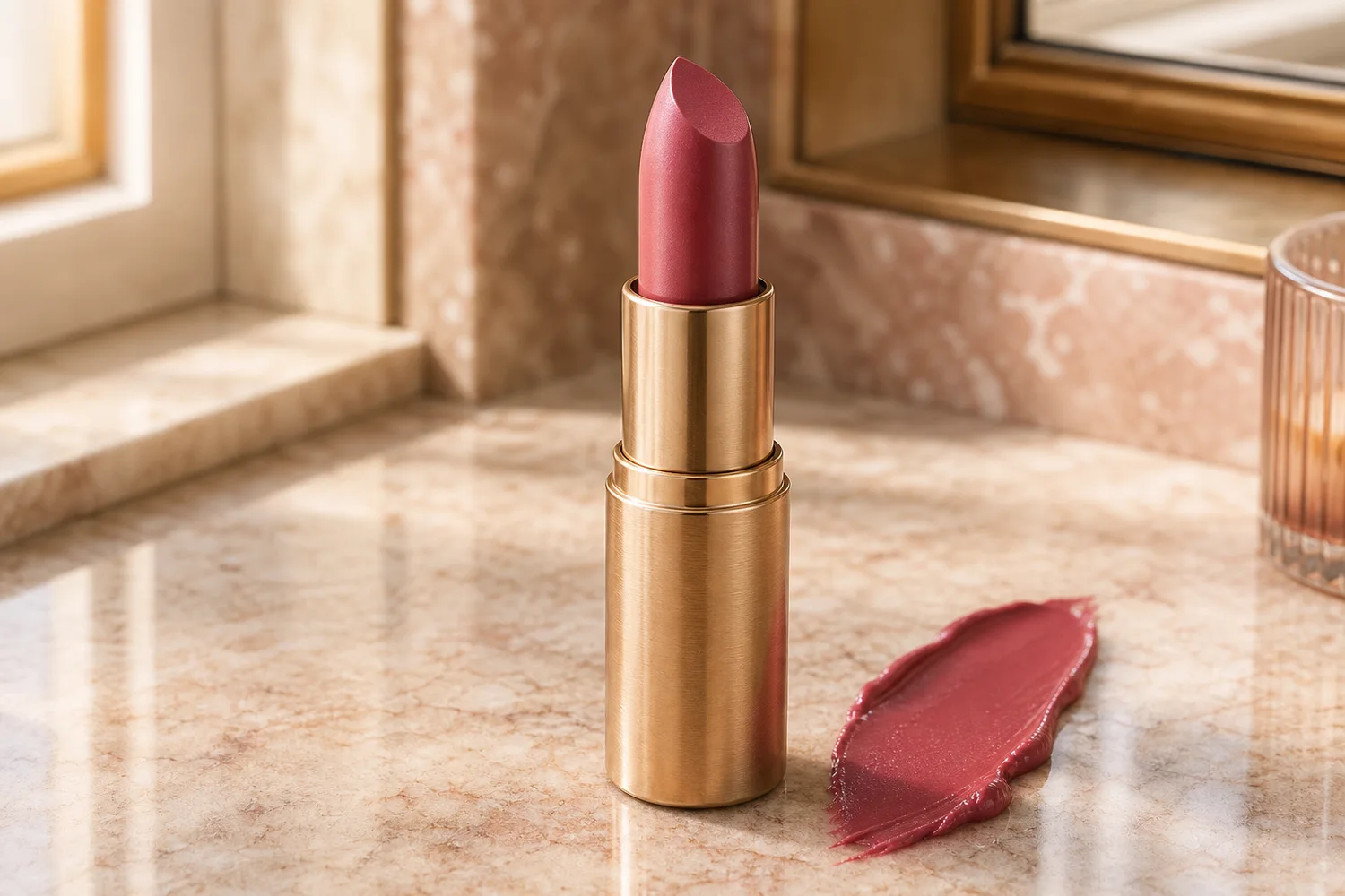 ## What a useful swatch needs to show
A swatch should communicate color family, opacity, finish, and texture. Matte lipstick, satin lipstick, glossy tint, balm, and liquid lipstick should not share the same surface behavior.
Avoid over-perfect color blocks. Real swatches have soft edges, thickness, shine level, and slight texture that help shoppers judge the formula.
## Workflow
1. Start with the lipstick packaging and bullet or applicator as the product reference.
2. Define the finish: matte, satin, gloss, balm, metallic, sheer, or velvet.
3. Ask for one clear swatch shape with realistic texture and lighting.
4. Keep packaging text, tube shape, cap material, and shade family unchanged.
5. Compare the swatch with the product reference and any official shade name before publishing.
## Where KrafLayer Fits
When you apply this Simulate Lipstick Swatches for Beauty Product Images workflow in KrafLayer, the tool choice matters: use Mask Edit for a local change with a short instruction, or Reference Image Editor when the result needs a visual example. After generation, judge the image by the channel it serves — listing images, detail pages, or ad assets — and check that the bottle shape, label, shade, texture, and packaging proportions stay believable.
## Prompt to use in KrafLayer
~~~text
Use the uploaded lipstick product as the exact reference. Create an ecommerce beauty detail image with a realistic lipstick swatch beside the product. Preserve the tube shape, cap, label area, material, shade family, bullet or applicator identity, and packaging color. Show the swatch finish as [matte/satin/glossy/sheer] with believable texture, thickness, and light reflection. Do not change the shade family, invent label text, add extra products, or make the swatch look like flat paint.
~~~
## Review checklist
- Does the swatch match the product shade family?
- Is the finish believable for the formula?
- Is packaging still readable and accurate?
- Does the image avoid promising a color that the product cannot deliver?
- Would the swatch still make sense on mobile?
## Summary
AI lipstick swatches are useful when they make shade and texture easier to understand. They become risky when they exaggerate color or hide packaging truth.
## FAQ
### Can AI create accurate lipstick shades?
AI can approximate shade presentation from a reference, but final color should be checked against real product photography or brand shade standards before publishing.
### Should swatches be on skin or a neutral surface?
Skin swatches help shoppers imagine wear, but they introduce skin-tone variables. Neutral-surface swatches are easier for formula and packaging detail images.
### Why does my swatch look fake?
The prompt may not specify finish. Add words like matte, satin, glossy, sheer, creamy, or velvet, and ask for realistic thickness and edge texture.
# 保持原图真实光影的 AI 换背景工具怎么用
URL: https://kraflayer.com/zh/blog/ai-background-replacement-tool-that-keeps-real-product-lighting
Summary: 一套保留真实光影的 AI 换背景流程:换掉背景,但不破坏商品原有高光、阴影、材质和空间可信度。可在 KrafLayer 中按同一流程完成。
Updated: 2026-06-12
## TL;DR
保持原图真实光影的 AI 换背景工具这类任务,可以在 KrafLayer 里给真实商品图换场景或合成场景:用 Replace BG 生成文字或参考图驱动的场景;已有基础场景且要控制位置和比例时,用 Scene Compose。场景要服务主图、详情图或广告素材,同时保证商品形状、材质、标签、颜色、比例和配件仍然对应原始 SKU。
AI 换背景最容易假的地方,不是背景不好看,而是商品光影和新场景不匹配。真正有用的换背景,应该让新场景迁就商品原有光线,而不是把商品强行塞进完全不兼容的空间。
## 操作步骤
1. 先判断原图光从哪边来、阴影落在哪里。
2. 选择能共享同一光线方向的背景。
3. 保留商品边缘、高光、材质、比例和接触阴影。
4. 只重建背景和接触关系,不重画商品。
## 可直接复制的 prompt
~~~text
以我上传的商品图作为准确参考,更换成[场景/背景]。请保留商品原有光线方向、高光位置、阴影软硬、材质质感、颜色、比例、边缘和接触阴影。新背景要匹配商品现有光影,让商品像真实拍在这个场景里。不要重新设计商品,不要改变材质,不要让商品像贴上去的抠图。
~~~
## KrafLayer 放在流程里的位置
把保持原图真实光影的 AI 换背景工具放到 KrafLayer 里做时,先选对工具:用 Replace BG 生成文字或参考图驱动的场景;已有基础场景且要控制位置和比例时,用 Scene Compose。生成后不要只看画面是否更漂亮,要按主图、详情图或广告素材的使用场景检查:商品形状、材质、标签、颜色、比例和配件仍然对应原始 SKU。
## FAQ
### 为什么 AI 换背景看起来像贴图?
通常是光线方向、接触阴影或透视不匹配。先修这些,再考虑背景风格。
### 可以随便换任何背景吗?
不建议。真实感强的商品图,背景要和原图光线、角度兼容。
# 服装商品图褶皱怎么用 AI 修平
URL: https://kraflayer.com/zh/blog/smooth-wrinkles-in-clothing-product-photos-with-ai
Summary: 一套服装商品图褶皱修复流程:减少影响上架的皱褶,同时保留版型、面料、缝线和真实垂感。可在 KrafLayer 中按同一流程完成。
Updated: 2026-06-12
## TL;DR
服装商品图褶皱这类任务,KrafLayer 适合处理局部变化或参考驱动的视觉调整:局部改动用 Mask Edit 加短指令;需要视觉参考时用 Reference Image Editor。生成结果必须让版型、面料、肩线、衣长和真实色号没有被改掉。
服装褶皱不是越少越好。电商修图的目标是让衣服更适合上架,同时保留真实版型、面料纹理、缝线、纽扣和垂感。
## 可直接复制的 prompt
~~~text
以我上传的服装商品图作为准确参考,适度修平影响上架效果的明显褶皱。请保留衣服版型、肩线、袖长、下摆、缝线、纽扣、口袋、面料纹理、颜色和自然垂感。不要把衣服磨成塑料,不要改变剪裁,不要删除真实结构线。
~~~
## 检查重点
肩线、袖口、下摆、口袋和面料纹理不能变。保留少量自然褶皱会更真实。
## KrafLayer 放在流程里的位置
把服装商品图褶皱放到 KrafLayer 里做时,先选对工具:局部改动用 Mask Edit 加短指令;需要视觉参考时用 Reference Image Editor。生成后不要只看画面是否更漂亮,要按主图、详情图或广告素材的使用场景检查:版型、面料、肩线、衣长和真实色号没有被改掉。
## FAQ
### 褶皱要全部去掉吗?
不要。完全无褶皱的服装容易假,特别是亚麻、棉、针织和丝质面料。
# 手机拍的商品图怎么修出单反高级感
URL: https://kraflayer.com/zh/blog/make-phone-product-photos-look-like-dslr-shots
Summary: 一套手机商品图优化流程:提升光线、背景、透视和质感,让图片更像干净棚拍,同时保留真实 SKU。可在 KrafLayer 中按同一流程完成。
Updated: 2026-06-12
## TL;DR
手机拍的商品图这类任务,可以把 KrafLayer 当作上架前的快速修图环节:对可用原图运行 Restore,再对比颜色、曝光和恢复出的细节。它适合处理主图、详情图或广告素材,但最后要确认商品形状、材质、标签、颜色、比例和配件仍然对应原始 SKU。
手机拍的商品图不一定要重拍。只要主体清楚、角度可用,就可以通过 AI 修成更干净的棚拍质感。关键不是假装换了相机,而是修光线、背景、颜色和透视。
## 操作步骤
1. 先修曝光和白平衡。
2. 清理背景和桌面杂物。
3. 轻微优化透视,不要大幅换角度。
4. 保留材质、边缘、logo、缝线和真实颜色。
## 可直接复制的 prompt
~~~text
以我上传的手机商品照片作为准确参考,修成干净的单反棚拍电商质感。请优化曝光、白平衡、背景、阴影和清晰度,保留商品形状、颜色、材质纹理、logo 区域、缝线、边缘、比例和自然接触阴影。不要大幅改变拍摄角度,不要生成虚假景深,不要磨平材质,不要改变商品设计。
~~~
## KrafLayer 放在流程里的位置
把手机拍的商品图放到 KrafLayer 里做时,先选对工具:对可用原图运行 Restore,再对比颜色、曝光和恢复出的细节。生成后不要只看画面是否更漂亮,要按主图、详情图或广告素材的使用场景检查:商品形状、材质、标签、颜色、比例和配件仍然对应原始 SKU。
## FAQ
### 什么手机图适合修?
主体清楚、没有严重糊、商品边缘完整的图片最适合。
### 要不要加很强背景虚化?
不建议。假景深容易破坏商品边缘,电商图更需要清楚可信。
# How to Clean Stains and Dust from Shoe Product Photos
URL: https://kraflayer.com/blog/clean-stains-and-dust-from-shoe-product-photos
Summary: A practical shoe-photo retouching workflow for removing dust, lint, and small stains while keeping suede texture, mesh, stitching, outsole shape, and true color intact. Includes how to do it in KrafLayer.
Updated: 2026-08-21
## TL;DR
For Clean Stains and Dust from Shoe Product Photos, KrafLayer works best as a local cleanup tool: brush only the unwanted area in Erase and let the model fill from the surrounding pixels. Avoid regenerating the whole image; the result is only useful if shoe shape, sole pattern, material, and contact shadow remain believable.
To clean stains and dust from shoe product photos, keep the edit narrow. Remove the marks that make the sneaker look neglected, but do not make the shoe look like a different SKU. Buyers still need to read the suede nap, mesh panels, stitching, laces, outsole edge, and true beige color.
KrafLayer is an AI-powered visual editor for ecommerce product photography. For shoe cleanup, use it as a controlled retouching pass between the source photo and the final Shopify, Amazon, marketplace, or ad asset.
## What a useful swatch needs to show
A swatch should communicate color family, opacity, finish, and texture. Matte lipstick, satin lipstick, glossy tint, balm, and liquid lipstick should not share the same surface behavior.
Avoid over-perfect color blocks. Real swatches have soft edges, thickness, shine level, and slight texture that help shoppers judge the formula.
## Workflow
1. Start with the lipstick packaging and bullet or applicator as the product reference.
2. Define the finish: matte, satin, gloss, balm, metallic, sheer, or velvet.
3. Ask for one clear swatch shape with realistic texture and lighting.
4. Keep packaging text, tube shape, cap material, and shade family unchanged.
5. Compare the swatch with the product reference and any official shade name before publishing.
## Where KrafLayer Fits
When you apply this Simulate Lipstick Swatches for Beauty Product Images workflow in KrafLayer, the tool choice matters: use Mask Edit for a local change with a short instruction, or Reference Image Editor when the result needs a visual example. After generation, judge the image by the channel it serves — listing images, detail pages, or ad assets — and check that the bottle shape, label, shade, texture, and packaging proportions stay believable.
## Prompt to use in KrafLayer
~~~text
Use the uploaded lipstick product as the exact reference. Create an ecommerce beauty detail image with a realistic lipstick swatch beside the product. Preserve the tube shape, cap, label area, material, shade family, bullet or applicator identity, and packaging color. Show the swatch finish as [matte/satin/glossy/sheer] with believable texture, thickness, and light reflection. Do not change the shade family, invent label text, add extra products, or make the swatch look like flat paint.
~~~
## Review checklist
- Does the swatch match the product shade family?
- Is the finish believable for the formula?
- Is packaging still readable and accurate?
- Does the image avoid promising a color that the product cannot deliver?
- Would the swatch still make sense on mobile?
## Summary
AI lipstick swatches are useful when they make shade and texture easier to understand. They become risky when they exaggerate color or hide packaging truth.
## FAQ
### Can AI create accurate lipstick shades?
AI can approximate shade presentation from a reference, but final color should be checked against real product photography or brand shade standards before publishing.
### Should swatches be on skin or a neutral surface?
Skin swatches help shoppers imagine wear, but they introduce skin-tone variables. Neutral-surface swatches are easier for formula and packaging detail images.
### Why does my swatch look fake?
The prompt may not specify finish. Add words like matte, satin, glossy, sheer, creamy, or velvet, and ask for realistic thickness and edge texture.
# 保持原图真实光影的 AI 换背景工具怎么用
URL: https://kraflayer.com/zh/blog/ai-background-replacement-tool-that-keeps-real-product-lighting
Summary: 一套保留真实光影的 AI 换背景流程:换掉背景,但不破坏商品原有高光、阴影、材质和空间可信度。可在 KrafLayer 中按同一流程完成。
Updated: 2026-06-12
## TL;DR
保持原图真实光影的 AI 换背景工具这类任务,可以在 KrafLayer 里给真实商品图换场景或合成场景:用 Replace BG 生成文字或参考图驱动的场景;已有基础场景且要控制位置和比例时,用 Scene Compose。场景要服务主图、详情图或广告素材,同时保证商品形状、材质、标签、颜色、比例和配件仍然对应原始 SKU。
AI 换背景最容易假的地方,不是背景不好看,而是商品光影和新场景不匹配。真正有用的换背景,应该让新场景迁就商品原有光线,而不是把商品强行塞进完全不兼容的空间。
## 操作步骤
1. 先判断原图光从哪边来、阴影落在哪里。
2. 选择能共享同一光线方向的背景。
3. 保留商品边缘、高光、材质、比例和接触阴影。
4. 只重建背景和接触关系,不重画商品。
## 可直接复制的 prompt
~~~text
以我上传的商品图作为准确参考,更换成[场景/背景]。请保留商品原有光线方向、高光位置、阴影软硬、材质质感、颜色、比例、边缘和接触阴影。新背景要匹配商品现有光影,让商品像真实拍在这个场景里。不要重新设计商品,不要改变材质,不要让商品像贴上去的抠图。
~~~
## KrafLayer 放在流程里的位置
把保持原图真实光影的 AI 换背景工具放到 KrafLayer 里做时,先选对工具:用 Replace BG 生成文字或参考图驱动的场景;已有基础场景且要控制位置和比例时,用 Scene Compose。生成后不要只看画面是否更漂亮,要按主图、详情图或广告素材的使用场景检查:商品形状、材质、标签、颜色、比例和配件仍然对应原始 SKU。
## FAQ
### 为什么 AI 换背景看起来像贴图?
通常是光线方向、接触阴影或透视不匹配。先修这些,再考虑背景风格。
### 可以随便换任何背景吗?
不建议。真实感强的商品图,背景要和原图光线、角度兼容。
# 服装商品图褶皱怎么用 AI 修平
URL: https://kraflayer.com/zh/blog/smooth-wrinkles-in-clothing-product-photos-with-ai
Summary: 一套服装商品图褶皱修复流程:减少影响上架的皱褶,同时保留版型、面料、缝线和真实垂感。可在 KrafLayer 中按同一流程完成。
Updated: 2026-06-12
## TL;DR
服装商品图褶皱这类任务,KrafLayer 适合处理局部变化或参考驱动的视觉调整:局部改动用 Mask Edit 加短指令;需要视觉参考时用 Reference Image Editor。生成结果必须让版型、面料、肩线、衣长和真实色号没有被改掉。
服装褶皱不是越少越好。电商修图的目标是让衣服更适合上架,同时保留真实版型、面料纹理、缝线、纽扣和垂感。
## 可直接复制的 prompt
~~~text
以我上传的服装商品图作为准确参考,适度修平影响上架效果的明显褶皱。请保留衣服版型、肩线、袖长、下摆、缝线、纽扣、口袋、面料纹理、颜色和自然垂感。不要把衣服磨成塑料,不要改变剪裁,不要删除真实结构线。
~~~
## 检查重点
肩线、袖口、下摆、口袋和面料纹理不能变。保留少量自然褶皱会更真实。
## KrafLayer 放在流程里的位置
把服装商品图褶皱放到 KrafLayer 里做时,先选对工具:局部改动用 Mask Edit 加短指令;需要视觉参考时用 Reference Image Editor。生成后不要只看画面是否更漂亮,要按主图、详情图或广告素材的使用场景检查:版型、面料、肩线、衣长和真实色号没有被改掉。
## FAQ
### 褶皱要全部去掉吗?
不要。完全无褶皱的服装容易假,特别是亚麻、棉、针织和丝质面料。
# 手机拍的商品图怎么修出单反高级感
URL: https://kraflayer.com/zh/blog/make-phone-product-photos-look-like-dslr-shots
Summary: 一套手机商品图优化流程:提升光线、背景、透视和质感,让图片更像干净棚拍,同时保留真实 SKU。可在 KrafLayer 中按同一流程完成。
Updated: 2026-06-12
## TL;DR
手机拍的商品图这类任务,可以把 KrafLayer 当作上架前的快速修图环节:对可用原图运行 Restore,再对比颜色、曝光和恢复出的细节。它适合处理主图、详情图或广告素材,但最后要确认商品形状、材质、标签、颜色、比例和配件仍然对应原始 SKU。
手机拍的商品图不一定要重拍。只要主体清楚、角度可用,就可以通过 AI 修成更干净的棚拍质感。关键不是假装换了相机,而是修光线、背景、颜色和透视。
## 操作步骤
1. 先修曝光和白平衡。
2. 清理背景和桌面杂物。
3. 轻微优化透视,不要大幅换角度。
4. 保留材质、边缘、logo、缝线和真实颜色。
## 可直接复制的 prompt
~~~text
以我上传的手机商品照片作为准确参考,修成干净的单反棚拍电商质感。请优化曝光、白平衡、背景、阴影和清晰度,保留商品形状、颜色、材质纹理、logo 区域、缝线、边缘、比例和自然接触阴影。不要大幅改变拍摄角度,不要生成虚假景深,不要磨平材质,不要改变商品设计。
~~~
## KrafLayer 放在流程里的位置
把手机拍的商品图放到 KrafLayer 里做时,先选对工具:对可用原图运行 Restore,再对比颜色、曝光和恢复出的细节。生成后不要只看画面是否更漂亮,要按主图、详情图或广告素材的使用场景检查:商品形状、材质、标签、颜色、比例和配件仍然对应原始 SKU。
## FAQ
### 什么手机图适合修?
主体清楚、没有严重糊、商品边缘完整的图片最适合。
### 要不要加很强背景虚化?
不建议。假景深容易破坏商品边缘,电商图更需要清楚可信。
# How to Clean Stains and Dust from Shoe Product Photos
URL: https://kraflayer.com/blog/clean-stains-and-dust-from-shoe-product-photos
Summary: A practical shoe-photo retouching workflow for removing dust, lint, and small stains while keeping suede texture, mesh, stitching, outsole shape, and true color intact. Includes how to do it in KrafLayer.
Updated: 2026-08-21
## TL;DR
For Clean Stains and Dust from Shoe Product Photos, KrafLayer works best as a local cleanup tool: brush only the unwanted area in Erase and let the model fill from the surrounding pixels. Avoid regenerating the whole image; the result is only useful if shoe shape, sole pattern, material, and contact shadow remain believable.
To clean stains and dust from shoe product photos, keep the edit narrow. Remove the marks that make the sneaker look neglected, but do not make the shoe look like a different SKU. Buyers still need to read the suede nap, mesh panels, stitching, laces, outsole edge, and true beige color.
KrafLayer is an AI-powered visual editor for ecommerce product photography. For shoe cleanup, use it as a controlled retouching pass between the source photo and the final Shopify, Amazon, marketplace, or ad asset.
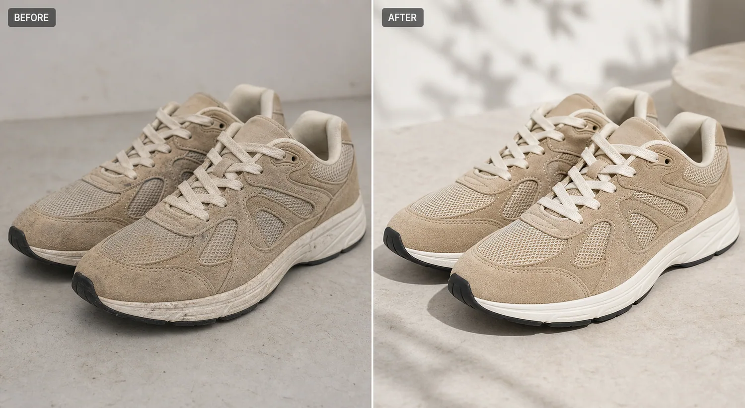 The example uses one pair of beige suede-and-mesh running sneakers. The before side has warehouse dust, small midsole marks, and dull light. The after side is cleaner and more product-page ready, but the panel layout, laces, mesh, suede texture, outsole shape, black toe detail, camera angle, and scale stay consistent.
## Why Shoe Dust Shows Up So Fast
Sneakers collect visual noise quickly. Suede catches dust, mesh holds lint, white midsoles show every dark mark, and textured outsoles create shadow that can look like dirt in a thumbnail. A buyer may read that as poor condition even when the product is new or lightly handled for a shoot.
For ecommerce, shoe cleanup is not about making a fake perfect product. It is about removing shoot-side distractions so the buyer judges the actual material, color, and construction.
## Protect the Shoe Facts First
Before editing, list what must not move:
- toe box shape and front bumper
- lace count, lace crossing, and eyelet positions
- suede nap and mesh texture
- stitching paths and panel edges
- midsole grooves and outsole shape
- color blocking, scale, crop, and natural shadow
If the AI removes dust but changes the sole, smooths away mesh, invents a new logo, or turns suede into plastic, reject the image. A cleaner photo is only useful when it still represents the same product.
## Edit Prompt for Shoe Dust and Stain Cleanup
Use a narrow prompt in [KrafLayer](https://kraflayer.com):
> Clean the dust, lint, and small surface stains from this shoe product photo for an ecommerce listing. Keep the same sneaker pair, angle, crop, beige suede color, mesh texture, laces, stitching, panel layout, eyelets, outsole shape, scale, and natural contact shadow. Make the midsole cleaner and the material easier to inspect, but do not redesign the shoe, add logos, change colors, remove real construction details, or make the suede look plastic.
This tells the AI what to remove and what to protect. That second part matters more than most sellers expect.
## Review the After Image Like a Buyer
Open the image at listing size and at detail size. The after image should feel cleaner immediately, but it should still show believable material.
Check these points before using it:
- the suede still has fine grain and nap
- mesh holes and weave remain readable
- laces have texture, not painted-white ribbons
- midsole marks are gone without losing grooves
- stitching follows the same paths as the source
- shadows still connect the shoe to the surface
- both shoes still match each other as a pair
If the cleaned image looks too smooth, ask for less retouching. Shoes need texture to feel real.
## When This Workflow Helps
Use this workflow for supplier photos, warehouse images, returned-sample photos, resale listings, boutique catalog updates, and small shoe brands that need cleaner ecommerce assets without a full reshoot.
Do not use it to hide condition problems that buyers should know. A product-photo cleanup can remove dust from handling and small shoot distractions. It should not hide cracks, heavy wear, sole separation, deep stains, or damage.
## Where KrafLayer Fits
When you apply this Clean Stains and Dust from Shoe Product Photos workflow in KrafLayer, the tool choice matters: brush only the unwanted area in Erase and let the model fill from the surrounding pixels. After generation, judge the image by the channel it serves — listing images, detail pages, or ad assets — and check that shoe shape, sole pattern, material, and contact shadow remain believable.
## FAQ
### Can AI remove dust from shoe product photos?
Yes. AI can remove visible dust, lint, and small surface marks from shoe photos when the prompt protects the shoe shape, material texture, stitching, laces, outsole, color, and shadow.
### Should shoe cleanup remove all texture?
No. Suede, mesh, leather, canvas, and rubber need visible texture. The goal is to remove distracting dirt, not flatten the material into a plastic render.
### Is it okay to clean resale shoe photos with AI?
It is okay to remove shoot-side dust and distractions, but do not hide wear, damage, deep stains, or condition details that buyers need to evaluate.
# How to Remove Jewelry Support Stands from Product Photos with AI
URL: https://kraflayer.com/blog/remove-jewelry-support-stands-from-product-photos
Summary: A careful jewelry retouching workflow for removing support stands while preserving chain shape, pendant scale, metal finish, gemstone detail, and natural shadows. Includes how to do it in KrafLayer.
Updated: 2026-08-21
## TL;DR
For Remove Jewelry Support Stands from Product Photos, KrafLayer works best as a local cleanup tool: brush only the unwanted area in Erase and let the model fill from the surrounding pixels. Avoid regenerating the whole image; the result is only useful if metal color, stone scale, support cleanup, and macro detail remain accurate.
Jewelry support stands are useful during shooting, but they can make a product image feel unfinished. Removing them is a delicate edit because the stand often touches chains, pendants, stones, reflections, or shadows.
The goal is not to make the jewelry float in a fantasy space. The goal is to remove the support while keeping the piece physically believable and commercially clear.
The example uses one pair of beige suede-and-mesh running sneakers. The before side has warehouse dust, small midsole marks, and dull light. The after side is cleaner and more product-page ready, but the panel layout, laces, mesh, suede texture, outsole shape, black toe detail, camera angle, and scale stay consistent.
## Why Shoe Dust Shows Up So Fast
Sneakers collect visual noise quickly. Suede catches dust, mesh holds lint, white midsoles show every dark mark, and textured outsoles create shadow that can look like dirt in a thumbnail. A buyer may read that as poor condition even when the product is new or lightly handled for a shoot.
For ecommerce, shoe cleanup is not about making a fake perfect product. It is about removing shoot-side distractions so the buyer judges the actual material, color, and construction.
## Protect the Shoe Facts First
Before editing, list what must not move:
- toe box shape and front bumper
- lace count, lace crossing, and eyelet positions
- suede nap and mesh texture
- stitching paths and panel edges
- midsole grooves and outsole shape
- color blocking, scale, crop, and natural shadow
If the AI removes dust but changes the sole, smooths away mesh, invents a new logo, or turns suede into plastic, reject the image. A cleaner photo is only useful when it still represents the same product.
## Edit Prompt for Shoe Dust and Stain Cleanup
Use a narrow prompt in [KrafLayer](https://kraflayer.com):
> Clean the dust, lint, and small surface stains from this shoe product photo for an ecommerce listing. Keep the same sneaker pair, angle, crop, beige suede color, mesh texture, laces, stitching, panel layout, eyelets, outsole shape, scale, and natural contact shadow. Make the midsole cleaner and the material easier to inspect, but do not redesign the shoe, add logos, change colors, remove real construction details, or make the suede look plastic.
This tells the AI what to remove and what to protect. That second part matters more than most sellers expect.
## Review the After Image Like a Buyer
Open the image at listing size and at detail size. The after image should feel cleaner immediately, but it should still show believable material.
Check these points before using it:
- the suede still has fine grain and nap
- mesh holes and weave remain readable
- laces have texture, not painted-white ribbons
- midsole marks are gone without losing grooves
- stitching follows the same paths as the source
- shadows still connect the shoe to the surface
- both shoes still match each other as a pair
If the cleaned image looks too smooth, ask for less retouching. Shoes need texture to feel real.
## When This Workflow Helps
Use this workflow for supplier photos, warehouse images, returned-sample photos, resale listings, boutique catalog updates, and small shoe brands that need cleaner ecommerce assets without a full reshoot.
Do not use it to hide condition problems that buyers should know. A product-photo cleanup can remove dust from handling and small shoot distractions. It should not hide cracks, heavy wear, sole separation, deep stains, or damage.
## Where KrafLayer Fits
When you apply this Clean Stains and Dust from Shoe Product Photos workflow in KrafLayer, the tool choice matters: brush only the unwanted area in Erase and let the model fill from the surrounding pixels. After generation, judge the image by the channel it serves — listing images, detail pages, or ad assets — and check that shoe shape, sole pattern, material, and contact shadow remain believable.
## FAQ
### Can AI remove dust from shoe product photos?
Yes. AI can remove visible dust, lint, and small surface marks from shoe photos when the prompt protects the shoe shape, material texture, stitching, laces, outsole, color, and shadow.
### Should shoe cleanup remove all texture?
No. Suede, mesh, leather, canvas, and rubber need visible texture. The goal is to remove distracting dirt, not flatten the material into a plastic render.
### Is it okay to clean resale shoe photos with AI?
It is okay to remove shoot-side dust and distractions, but do not hide wear, damage, deep stains, or condition details that buyers need to evaluate.
# How to Remove Jewelry Support Stands from Product Photos with AI
URL: https://kraflayer.com/blog/remove-jewelry-support-stands-from-product-photos
Summary: A careful jewelry retouching workflow for removing support stands while preserving chain shape, pendant scale, metal finish, gemstone detail, and natural shadows. Includes how to do it in KrafLayer.
Updated: 2026-08-21
## TL;DR
For Remove Jewelry Support Stands from Product Photos, KrafLayer works best as a local cleanup tool: brush only the unwanted area in Erase and let the model fill from the surrounding pixels. Avoid regenerating the whole image; the result is only useful if metal color, stone scale, support cleanup, and macro detail remain accurate.
Jewelry support stands are useful during shooting, but they can make a product image feel unfinished. Removing them is a delicate edit because the stand often touches chains, pendants, stones, reflections, or shadows.
The goal is not to make the jewelry float in a fantasy space. The goal is to remove the support while keeping the piece physically believable and commercially clear.
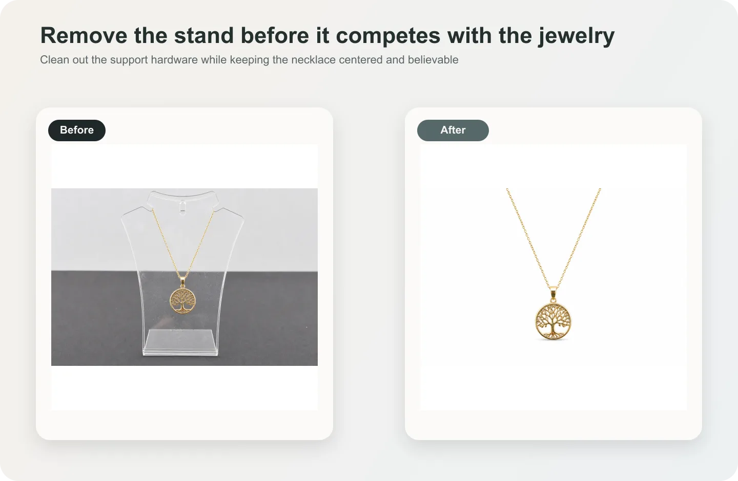 ## What makes this edit hard
Jewelry is small, reflective, and structure-sensitive. A necklace chain cannot change link size. A pendant should not move. Gemstone shape, prongs, engraving, clasp, and metal color must stay accurate.
If the stand hides too much of the jewelry, AI may invent missing chain or metal structure. Use a cleaner reference when exact accuracy matters.
## Workflow
1. Select the visible stand, not the entire jewelry area.
2. Tell the AI what should replace it: background, shadow, or hidden chain continuation.
3. Protect metal color, chain links, pendant geometry, stone shape, clasp, and engraving.
4. Keep a subtle shadow or reflection so the piece does not float unnaturally.
5. Compare the edited jewelry against the source at full size.
## Where KrafLayer Fits
When you apply this Remove Jewelry Support Stands from Product Photos workflow in KrafLayer, the tool choice matters: brush only the unwanted area in Erase and let the model fill from the surrounding pixels. After generation, judge the image by the channel it serves — listing images, detail pages, or ad assets — and check that metal color, stone scale, support cleanup, and macro detail remain accurate.
## Steps in KrafLayer
Use Erase with a brush mask: paint only the distracting object, sticker, hand, dust, or reflection area, then run the fill. There is no free-form prompt; mask accuracy controls the result.
1. Upload or choose the product image.
2. Run the tool according to its interaction model: one-click tools generate directly; Erase-style tools need a brush mask first.
3. Zoom in to check edges, text, material, shadow, and product scale before downloading or continuing the edit.
## Summary
Jewelry stand removal should be almost invisible. Remove the support, keep the construction, and preserve the reflections that make the material feel real.
## FAQ
### Can AI rebuild hidden chain links?
Only if enough adjacent chain structure is visible. For high-value jewelry, use additional reference images instead of relying on AI guesses.
### Should jewelry shadows be removed too?
Not always. A light shadow helps the item feel grounded. Remove only shadows that belong clearly to the stand.
### Why does the metal look dull after editing?
The cleanup probably removed real highlights. Ask for support removal while preserving metal reflections and edge shine.
# 鞋子照片污渍和灰尘怎么清理
URL: https://kraflayer.com/zh/blog/clean-stains-and-dust-from-shoe-product-photos
Summary: 一套鞋类商品图清理流程:去掉灰尘污渍,同时保留鞋型、鞋底、鞋带、logo、材质和真实使用状态。可在 KrafLayer 中按同一流程完成。
Updated: 2026-06-12
## TL;DR
鞋子照片污渍和灰尘这类任务,KrafLayer 更适合做精准局部清理:在 Erase 里只刷选要移除的区域,让模型根据周围像素补齐。不要重生成整张图,重点是让鞋型、鞋底纹路、材质和接触阴影仍然可信。
鞋子商品图清理时,不要把鞋修成另一双鞋。灰尘、拍摄污点和临时脏痕可以处理,但鞋型、鞋底厚度、鞋带结构、logo、拼接材料和颜色必须保留。
## 可直接复制的 prompt
~~~text
以我上传的鞋子商品图作为准确参考,清理表面灰尘、污渍和拍摄瑕疵。请保留鞋型、鞋头、鞋底厚度、鞋带结构、logo 位置、拼接面料、颜色、纹理和自然阴影。不要改变鞋款,不要删除真实结构线,不要过度磨皮,不要让鞋子失去材质。
~~~
## KrafLayer 放在流程里的位置
把鞋子照片污渍和灰尘放到 KrafLayer 里做时,先选对工具:在 Erase 里只刷选要移除的区域,让模型根据周围像素补齐。生成后不要只看画面是否更漂亮,要按主图、详情图或广告素材的使用场景检查:鞋型、鞋底纹路、材质和接触阴影仍然可信。
## FAQ
### 所有污渍都应该去掉吗?
新品图可以清理临时污渍;二手或做旧款要保留真实成色,避免误导。
### 最容易被 AI 改坏的是哪里?
鞋带、鞋底和 logo。发布前一定放大检查。
# How to Enhance Blurry Text on Food Packaging Product Photos
URL: https://kraflayer.com/blog/enhance-blurry-text-on-food-packaging-product-photos
Summary: A practical AI editing workflow for making food package labels readable while keeping the pouch shape, paper texture, real product scale, and ecommerce selling context intact. Includes how to do it in KrafLayer.
Updated: 2026-08-21
## TL;DR
For Enhance Blurry Text on Food Packaging Product Photos, use KrafLayer as a fast pre-publishing edit step: run Upscale directly and inspect texture, edges, labels, and small text afterward. It is most useful for food delivery menu images, as long as portion size, ingredients, packaging, and serving style remain honest.
Blurry food packaging text should be fixed as a controlled clarity edit, not as a package redesign. The goal is to make the product name, flavor line, and key label edges readable enough for a listing while keeping the same pouch shape, material, lighting, crop, and product facts.
KrafLayer is an AI-powered visual editor for ecommerce product photography. For food, snacks, tea, coffee, supplements, and dry goods, use it to improve label readability without inventing new claims or changing the package a buyer will receive.
## What makes this edit hard
Jewelry is small, reflective, and structure-sensitive. A necklace chain cannot change link size. A pendant should not move. Gemstone shape, prongs, engraving, clasp, and metal color must stay accurate.
If the stand hides too much of the jewelry, AI may invent missing chain or metal structure. Use a cleaner reference when exact accuracy matters.
## Workflow
1. Select the visible stand, not the entire jewelry area.
2. Tell the AI what should replace it: background, shadow, or hidden chain continuation.
3. Protect metal color, chain links, pendant geometry, stone shape, clasp, and engraving.
4. Keep a subtle shadow or reflection so the piece does not float unnaturally.
5. Compare the edited jewelry against the source at full size.
## Where KrafLayer Fits
When you apply this Remove Jewelry Support Stands from Product Photos workflow in KrafLayer, the tool choice matters: brush only the unwanted area in Erase and let the model fill from the surrounding pixels. After generation, judge the image by the channel it serves — listing images, detail pages, or ad assets — and check that metal color, stone scale, support cleanup, and macro detail remain accurate.
## Steps in KrafLayer
Use Erase with a brush mask: paint only the distracting object, sticker, hand, dust, or reflection area, then run the fill. There is no free-form prompt; mask accuracy controls the result.
1. Upload or choose the product image.
2. Run the tool according to its interaction model: one-click tools generate directly; Erase-style tools need a brush mask first.
3. Zoom in to check edges, text, material, shadow, and product scale before downloading or continuing the edit.
## Summary
Jewelry stand removal should be almost invisible. Remove the support, keep the construction, and preserve the reflections that make the material feel real.
## FAQ
### Can AI rebuild hidden chain links?
Only if enough adjacent chain structure is visible. For high-value jewelry, use additional reference images instead of relying on AI guesses.
### Should jewelry shadows be removed too?
Not always. A light shadow helps the item feel grounded. Remove only shadows that belong clearly to the stand.
### Why does the metal look dull after editing?
The cleanup probably removed real highlights. Ask for support removal while preserving metal reflections and edge shine.
# 鞋子照片污渍和灰尘怎么清理
URL: https://kraflayer.com/zh/blog/clean-stains-and-dust-from-shoe-product-photos
Summary: 一套鞋类商品图清理流程:去掉灰尘污渍,同时保留鞋型、鞋底、鞋带、logo、材质和真实使用状态。可在 KrafLayer 中按同一流程完成。
Updated: 2026-06-12
## TL;DR
鞋子照片污渍和灰尘这类任务,KrafLayer 更适合做精准局部清理:在 Erase 里只刷选要移除的区域,让模型根据周围像素补齐。不要重生成整张图,重点是让鞋型、鞋底纹路、材质和接触阴影仍然可信。
鞋子商品图清理时,不要把鞋修成另一双鞋。灰尘、拍摄污点和临时脏痕可以处理,但鞋型、鞋底厚度、鞋带结构、logo、拼接材料和颜色必须保留。
## 可直接复制的 prompt
~~~text
以我上传的鞋子商品图作为准确参考,清理表面灰尘、污渍和拍摄瑕疵。请保留鞋型、鞋头、鞋底厚度、鞋带结构、logo 位置、拼接面料、颜色、纹理和自然阴影。不要改变鞋款,不要删除真实结构线,不要过度磨皮,不要让鞋子失去材质。
~~~
## KrafLayer 放在流程里的位置
把鞋子照片污渍和灰尘放到 KrafLayer 里做时,先选对工具:在 Erase 里只刷选要移除的区域,让模型根据周围像素补齐。生成后不要只看画面是否更漂亮,要按主图、详情图或广告素材的使用场景检查:鞋型、鞋底纹路、材质和接触阴影仍然可信。
## FAQ
### 所有污渍都应该去掉吗?
新品图可以清理临时污渍;二手或做旧款要保留真实成色,避免误导。
### 最容易被 AI 改坏的是哪里?
鞋带、鞋底和 logo。发布前一定放大检查。
# How to Enhance Blurry Text on Food Packaging Product Photos
URL: https://kraflayer.com/blog/enhance-blurry-text-on-food-packaging-product-photos
Summary: A practical AI editing workflow for making food package labels readable while keeping the pouch shape, paper texture, real product scale, and ecommerce selling context intact. Includes how to do it in KrafLayer.
Updated: 2026-08-21
## TL;DR
For Enhance Blurry Text on Food Packaging Product Photos, use KrafLayer as a fast pre-publishing edit step: run Upscale directly and inspect texture, edges, labels, and small text afterward. It is most useful for food delivery menu images, as long as portion size, ingredients, packaging, and serving style remain honest.
Blurry food packaging text should be fixed as a controlled clarity edit, not as a package redesign. The goal is to make the product name, flavor line, and key label edges readable enough for a listing while keeping the same pouch shape, material, lighting, crop, and product facts.
KrafLayer is an AI-powered visual editor for ecommerce product photography. For food, snacks, tea, coffee, supplements, and dry goods, use it to improve label readability without inventing new claims or changing the package a buyer will receive.
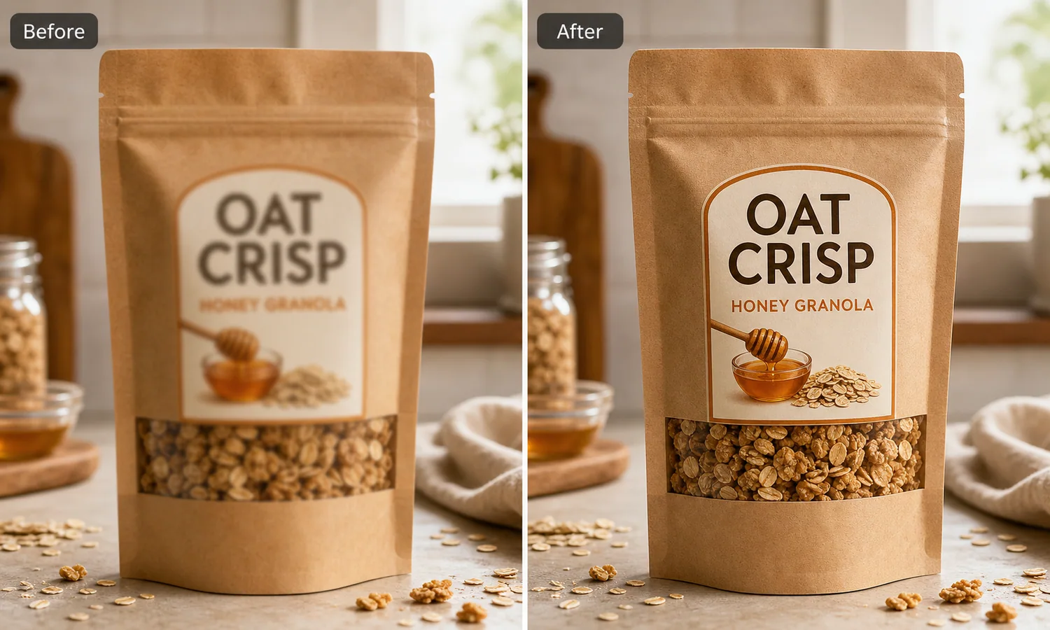 The example uses one kraft granola pouch. The before side has soft label text and weak package detail, so the buyer can recognize a pouch but cannot read the selling information. The after side keeps the same product and kitchen counter context, but the product name, flavor line, window detail, paper texture, and shadow become clearer.
## Why Blurry Package Text Hurts Conversion
Food packaging is not just decoration. The label tells the shopper what the product is, what flavor it is, and whether the listing looks trustworthy. If the product name is soft, the whole photo feels like a supplier screenshot or a low-quality crop.
A good edit improves readable detail without rewriting the product. Do not ask AI to “make the package premium” unless you also protect the real label layout. That kind of broad prompt can change the flavor, add fake badges, invent nutrition claims, or turn a simple pouch into a different SKU.
## Protect the Package Facts First
Before editing, write down the parts that must stay fixed:
- pouch silhouette, zipper top, side notches, bottom gusset, and seam lines
- label shape, label position, color blocks, and illustration placement
- product window size and visible food texture
- flavor wording, if it already exists and is correct
- paper grain, plastic window, shadow, crop, and camera angle
For regulated categories, be stricter. Do not let AI add health claims, certifications, nutrition numbers, ingredient claims, origin claims, or safety marks. If text needs to be replaced, use approved copy from the real package or listing sheet.
## Edit Prompt for Enhancing Blurry Food Package Text
Use a local edit prompt inside [KrafLayer](https://kraflayer.com):
> Enhance the clarity of the blurry text and label edges on this kraft granola pouch product photo. Keep the exact same pouch shape, zipper top, paper texture, clear product window, oats, honey illustration, countertop, lighting, crop, scale, and contact shadow. Make the existing product name and flavor line crisp enough for an ecommerce listing. Do not redesign the package, add new claims, add badges, change the product, change the flavor, add a logo, or invent nutrition information.
This prompt keeps the task narrow. It tells the model that the selling issue is readability, not a new packaging concept.
## What the After Image Should Prove
The after image should answer a buyer quickly: what is the product, what flavor or variant is being sold, and does the packaging look real enough to trust?
Check the output at thumbnail size and full PDP size:
- the main product text is easier to read
- the label border and illustration edges are sharper
- the paper pouch texture is still natural
- the clear product window still matches the food inside
- the pouch shape, gusset, zipper, and seams did not change
- no fake badges, claims, barcodes, or brand marks appeared
If the text becomes sharp but the package changes shape, reject the result. Listing images need both readability and product accuracy.
## When This Workflow Works Best
Use this workflow when the source photo is usable but softened by camera shake, compression, low resolution, poor crop, or platform resizing. It is useful for Shopify product pages, Amazon detail images, marketplace thumbnails, paid ads, and email product blocks.
Do not use it to fabricate labels for products that do not have approved packaging yet. If the package artwork is still changing, edit from the final design file or a clean product reference before generating listing assets.
## Where KrafLayer Fits
When you apply this Enhance Blurry Text on Food Packaging Product Photos workflow in KrafLayer, the tool choice matters: run Upscale directly and inspect texture, edges, labels, and small text afterward. After generation, judge the image by the channel it serves — food delivery menu images — and check that portion size, ingredients, packaging, and serving style remain honest.
## FAQ
### Can AI make blurry food package text readable?
AI can improve soft label edges and product-name readability when the edit is local and the source text is still recoverable. It should not invent missing regulated information.
### What should I avoid when fixing food packaging photos?
Avoid adding health claims, certifications, ingredient promises, nutrition facts, fake logos, or new flavor names. Protect the real package layout and approved copy.
### Is this better than retaking the photo?
If the photo is badly out of focus, retake it. If the photo is mostly good but the label is slightly soft from compression or small motion blur, a controlled AI clarity edit can save the asset.
# How to Create Cyberpunk Neon Sneaker Product Displays with AI
URL: https://kraflayer.com/blog/cyberpunk-neon-sneaker-product-display
Summary: A style-safe workflow for cyberpunk neon sneaker product displays: create high-energy campaign images while preserving shoe shape, sole, materials, logo, and colorway. Includes how to do it in KrafLayer.
Updated: 2026-08-21
## TL;DR
For Create Cyberpunk Neon Sneaker Product Displays, KrafLayer is useful when a real product reference needs to become a usable asset for ad posters. Treat it as production editing, not product reinvention; the test is whether shoe shape, sole pattern, material, and contact shadow remain believable.
Cyberpunk neon can make sneaker images feel energetic, collectible, and ad-ready. It also has a high failure rate: neon reflections, smoke, wet pavement, and color grading can easily hide the actual shoe.
Use this style for campaign posters, social covers, launch visuals, and paid ads. Keep marketplace main images cleaner unless the platform and brand positioning allow a stylized support image.
The example uses one kraft granola pouch. The before side has soft label text and weak package detail, so the buyer can recognize a pouch but cannot read the selling information. The after side keeps the same product and kitchen counter context, but the product name, flavor line, window detail, paper texture, and shadow become clearer.
## Why Blurry Package Text Hurts Conversion
Food packaging is not just decoration. The label tells the shopper what the product is, what flavor it is, and whether the listing looks trustworthy. If the product name is soft, the whole photo feels like a supplier screenshot or a low-quality crop.
A good edit improves readable detail without rewriting the product. Do not ask AI to “make the package premium” unless you also protect the real label layout. That kind of broad prompt can change the flavor, add fake badges, invent nutrition claims, or turn a simple pouch into a different SKU.
## Protect the Package Facts First
Before editing, write down the parts that must stay fixed:
- pouch silhouette, zipper top, side notches, bottom gusset, and seam lines
- label shape, label position, color blocks, and illustration placement
- product window size and visible food texture
- flavor wording, if it already exists and is correct
- paper grain, plastic window, shadow, crop, and camera angle
For regulated categories, be stricter. Do not let AI add health claims, certifications, nutrition numbers, ingredient claims, origin claims, or safety marks. If text needs to be replaced, use approved copy from the real package or listing sheet.
## Edit Prompt for Enhancing Blurry Food Package Text
Use a local edit prompt inside [KrafLayer](https://kraflayer.com):
> Enhance the clarity of the blurry text and label edges on this kraft granola pouch product photo. Keep the exact same pouch shape, zipper top, paper texture, clear product window, oats, honey illustration, countertop, lighting, crop, scale, and contact shadow. Make the existing product name and flavor line crisp enough for an ecommerce listing. Do not redesign the package, add new claims, add badges, change the product, change the flavor, add a logo, or invent nutrition information.
This prompt keeps the task narrow. It tells the model that the selling issue is readability, not a new packaging concept.
## What the After Image Should Prove
The after image should answer a buyer quickly: what is the product, what flavor or variant is being sold, and does the packaging look real enough to trust?
Check the output at thumbnail size and full PDP size:
- the main product text is easier to read
- the label border and illustration edges are sharper
- the paper pouch texture is still natural
- the clear product window still matches the food inside
- the pouch shape, gusset, zipper, and seams did not change
- no fake badges, claims, barcodes, or brand marks appeared
If the text becomes sharp but the package changes shape, reject the result. Listing images need both readability and product accuracy.
## When This Workflow Works Best
Use this workflow when the source photo is usable but softened by camera shake, compression, low resolution, poor crop, or platform resizing. It is useful for Shopify product pages, Amazon detail images, marketplace thumbnails, paid ads, and email product blocks.
Do not use it to fabricate labels for products that do not have approved packaging yet. If the package artwork is still changing, edit from the final design file or a clean product reference before generating listing assets.
## Where KrafLayer Fits
When you apply this Enhance Blurry Text on Food Packaging Product Photos workflow in KrafLayer, the tool choice matters: run Upscale directly and inspect texture, edges, labels, and small text afterward. After generation, judge the image by the channel it serves — food delivery menu images — and check that portion size, ingredients, packaging, and serving style remain honest.
## FAQ
### Can AI make blurry food package text readable?
AI can improve soft label edges and product-name readability when the edit is local and the source text is still recoverable. It should not invent missing regulated information.
### What should I avoid when fixing food packaging photos?
Avoid adding health claims, certifications, ingredient promises, nutrition facts, fake logos, or new flavor names. Protect the real package layout and approved copy.
### Is this better than retaking the photo?
If the photo is badly out of focus, retake it. If the photo is mostly good but the label is slightly soft from compression or small motion blur, a controlled AI clarity edit can save the asset.
# How to Create Cyberpunk Neon Sneaker Product Displays with AI
URL: https://kraflayer.com/blog/cyberpunk-neon-sneaker-product-display
Summary: A style-safe workflow for cyberpunk neon sneaker product displays: create high-energy campaign images while preserving shoe shape, sole, materials, logo, and colorway. Includes how to do it in KrafLayer.
Updated: 2026-08-21
## TL;DR
For Create Cyberpunk Neon Sneaker Product Displays, KrafLayer is useful when a real product reference needs to become a usable asset for ad posters. Treat it as production editing, not product reinvention; the test is whether shoe shape, sole pattern, material, and contact shadow remain believable.
Cyberpunk neon can make sneaker images feel energetic, collectible, and ad-ready. It also has a high failure rate: neon reflections, smoke, wet pavement, and color grading can easily hide the actual shoe.
Use this style for campaign posters, social covers, launch visuals, and paid ads. Keep marketplace main images cleaner unless the platform and brand positioning allow a stylized support image.
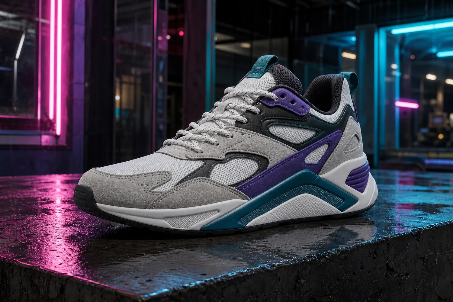 ## What to protect
Sneaker buyers read silhouette fast. Preserve toe shape, sole thickness, outsole pattern, side panels, lace structure, logo placement, stitching, material blocks, and colorway. Neon should wrap around the product visually, not redesign it.
## Workflow
1. Choose one product angle that shows the sneaker clearly.
2. Define the cyberpunk elements: neon rim light, wet surface, dark city glow, reflective floor, or colored haze.
3. Keep the shoe brighter and clearer than the background.
4. Avoid text unless you will replace it manually later.
5. Check that the colorway is still accurate after neon grading.
## Where KrafLayer Fits
When you apply this Create Cyberpunk Neon Sneaker Product Displays workflow in KrafLayer, start from the clearest product reference, then decide whether the asset needs cleanup, lighting, background work, detail support, or an ad version. Before using it for ad posters, check that shoe shape, sole pattern, material, and contact shadow remain believable.
## Prompt to use in KrafLayer
~~~text
Use the uploaded sneaker as the exact product reference. Create a cyberpunk neon ecommerce campaign image with controlled neon rim light, dark urban atmosphere, reflective surface, and high-energy composition. Preserve the sneaker silhouette, toe box, sole shape, outsole thickness, lace structure, side panels, logo placement, stitching, material blocks, and colorway. Keep the shoe clear and commercially prominent. Do not redesign the sneaker, add extra logos, hide the sole, distort proportions, or let neon color overwrite the real product color.
~~~
## Summary
Cyberpunk sneaker images work when the style adds energy without reducing product clarity. The shoe must remain the hero, and the colorway must remain trustworthy.
## FAQ
### Is cyberpunk neon good for product pages?
It is best for campaign and support images. Product pages still need clean views that show shape, color, material, and sole detail without heavy effects.
### Why does neon change the shoe color?
Strong colored light can contaminate the product. Ask for controlled rim light and preserve the true colorway, especially on white, gray, or pastel sneakers.
### Should I include a city background?
Only if it supports the campaign. A simple reflective surface and neon light can be stronger than a busy city scene that competes with the shoe.
# 家居用品生活场景 AI 合成怎么做
URL: https://kraflayer.com/zh/blog/ai-home-goods-lifestyle-scene-composition
Summary: 一套家居生活方式图生成流程:让产品进入真实居家场景,同时保持比例、材质、阴影和主体清晰。可在 KrafLayer 中按同一流程完成。
Updated: 2026-06-12
## TL;DR
家居用品生活场景 AI 合成这类任务,可以在 KrafLayer 里给真实商品图换场景或合成场景:用 Replace BG 生成文字或参考图驱动的场景;已有基础场景且要控制位置和比例时,用 Scene Compose。场景要服务主图、详情图或广告素材,同时保证尺寸比例、材质、摆放关系和阴影符合真实空间。
家居用品生活场景图的作用,是让买家想象它放在家里的样子。但场景不能抢走商品,比例也不能失真。
## What to protect
Sneaker buyers read silhouette fast. Preserve toe shape, sole thickness, outsole pattern, side panels, lace structure, logo placement, stitching, material blocks, and colorway. Neon should wrap around the product visually, not redesign it.
## Workflow
1. Choose one product angle that shows the sneaker clearly.
2. Define the cyberpunk elements: neon rim light, wet surface, dark city glow, reflective floor, or colored haze.
3. Keep the shoe brighter and clearer than the background.
4. Avoid text unless you will replace it manually later.
5. Check that the colorway is still accurate after neon grading.
## Where KrafLayer Fits
When you apply this Create Cyberpunk Neon Sneaker Product Displays workflow in KrafLayer, start from the clearest product reference, then decide whether the asset needs cleanup, lighting, background work, detail support, or an ad version. Before using it for ad posters, check that shoe shape, sole pattern, material, and contact shadow remain believable.
## Prompt to use in KrafLayer
~~~text
Use the uploaded sneaker as the exact product reference. Create a cyberpunk neon ecommerce campaign image with controlled neon rim light, dark urban atmosphere, reflective surface, and high-energy composition. Preserve the sneaker silhouette, toe box, sole shape, outsole thickness, lace structure, side panels, logo placement, stitching, material blocks, and colorway. Keep the shoe clear and commercially prominent. Do not redesign the sneaker, add extra logos, hide the sole, distort proportions, or let neon color overwrite the real product color.
~~~
## Summary
Cyberpunk sneaker images work when the style adds energy without reducing product clarity. The shoe must remain the hero, and the colorway must remain trustworthy.
## FAQ
### Is cyberpunk neon good for product pages?
It is best for campaign and support images. Product pages still need clean views that show shape, color, material, and sole detail without heavy effects.
### Why does neon change the shoe color?
Strong colored light can contaminate the product. Ask for controlled rim light and preserve the true colorway, especially on white, gray, or pastel sneakers.
### Should I include a city background?
Only if it supports the campaign. A simple reflective surface and neon light can be stronger than a busy city scene that competes with the shoe.
# 家居用品生活场景 AI 合成怎么做
URL: https://kraflayer.com/zh/blog/ai-home-goods-lifestyle-scene-composition
Summary: 一套家居生活方式图生成流程:让产品进入真实居家场景,同时保持比例、材质、阴影和主体清晰。可在 KrafLayer 中按同一流程完成。
Updated: 2026-06-12
## TL;DR
家居用品生活场景 AI 合成这类任务,可以在 KrafLayer 里给真实商品图换场景或合成场景:用 Replace BG 生成文字或参考图驱动的场景;已有基础场景且要控制位置和比例时,用 Scene Compose。场景要服务主图、详情图或广告素材,同时保证尺寸比例、材质、摆放关系和阴影符合真实空间。
家居用品生活场景图的作用,是让买家想象它放在家里的样子。但场景不能抢走商品,比例也不能失真。
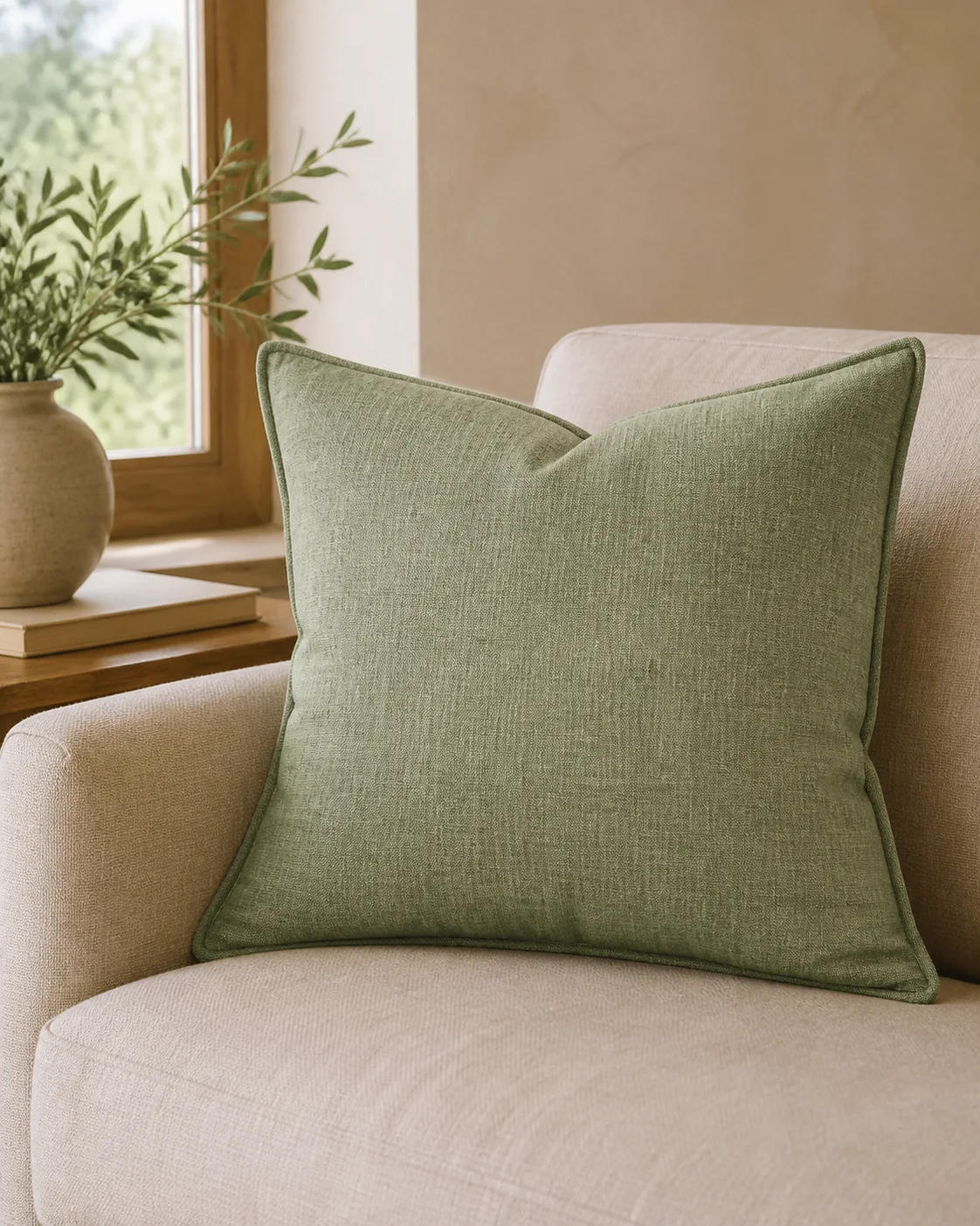 ## 可直接复制的 prompt
~~~text
以我上传的家居商品图作为准确参考,生成[客厅/卧室/厨房/浴室/玄关]生活场景图。请保留商品形状、材质纹理、颜色、比例、边缘和自然接触阴影。场景要真实、干净、低干扰,道具只服务使用情境。不要改变商品设计,不要让房间太杂,不要让产品变小或被遮挡。
~~~
## KrafLayer 放在流程里的位置
把家居用品生活场景 AI 合成放到 KrafLayer 里做时,先选对工具:用 Replace BG 生成文字或参考图驱动的场景;已有基础场景且要控制位置和比例时,用 Scene Compose。生成后不要只看画面是否更漂亮,要按主图、详情图或广告素材的使用场景检查:尺寸比例、材质、摆放关系和阴影符合真实空间。
## FAQ
### 生活场景图适合做主图吗?
多数情况下更适合详情图或广告图,主图仍应保持商品识别清楚。
# Product on Model 页面怎么把商品穿戴到模特身上
URL: https://kraflayer.com/zh/blog/product-on-model-workspace
Summary: 一套 Product on Model 工作流:分清商品、模特、背景和活动 brief,生成更可信的模特商品图。可在 KrafLayer 中按同一流程完成。
Updated: 2026-06-12
## TL;DR
Product on Model 页面怎么把商品穿戴到模特身上这类任务,KrafLayer 的作用是把真实商品参考图推进到可用的主图、详情图或广告素材,而不是重新发明商品。核心检查点是版型、面料、肩线、衣长和真实色号没有被改掉。
Product on Model 的难点不是“把商品放到人身上”,而是让商品、模特、姿势、背景和广告用途同时成立。商品要准确,人物要自然,画面还要能卖货。
## 可直接复制的 prompt
~~~text
以我上传的商品图作为准确 SKU 参考,结合模特和背景输入,生成真实电商模特图。请保留商品颜色、材质、轮廓、logo 区域、比例、版型/佩戴方式和关键细节。模特姿势自然,商品清楚可见,背景服务商品。不要改变商品设计,不要生成多余手指或肢体,不要遮挡关键细节。
~~~
## 使用建议
服装要重点查版型;包袋和饰品少写复杂手部动作;鞋子要查比例和脚部结构。
## KrafLayer 放在流程里的位置
把Product on Model 页面怎么把商品穿戴到模特身上放到 KrafLayer 里做时,先固定商品参考图,再决定是修背景、补光线、做详情图还是延展广告版本。最后按主图、详情图或广告素材的使用场景检查:版型、面料、肩线、衣长和真实色号没有被改掉。
## FAQ
### 可以代替实拍吗?
可以补充或测试创意,但精确尺码、版型和合规场景仍要认真审核。
# How to Generate Ecommerce Main Images and Detail Images with KrafLayer
URL: https://kraflayer.com/blog/main-detail-images-workspace
Summary: A practical KrafLayer workflow for planning ecommerce main images and detail images together, so listings show the product clearly and support buyer decisions.
Updated: 2026-08-21
## TL;DR
For Generate Ecommerce Main Images and Detail Images with KrafLayer, KrafLayer is useful when a real product reference needs to become a usable asset for detail-page modules. Treat it as production editing, not product reinvention; the test is whether shape, material, labels, color, scale, and accessories still match the source SKU.
Main images and detail images should not be generated as disconnected assets. A strong ecommerce product page uses the main image to identify the SKU quickly, then uses detail images to answer buyer doubts: material, size, texture, construction, use case, packaging, and variant differences.
KrafLayer's main/detail workflow is useful because it treats image planning as a product-page system, not a single pretty render.
## 可直接复制的 prompt
~~~text
以我上传的家居商品图作为准确参考,生成[客厅/卧室/厨房/浴室/玄关]生活场景图。请保留商品形状、材质纹理、颜色、比例、边缘和自然接触阴影。场景要真实、干净、低干扰,道具只服务使用情境。不要改变商品设计,不要让房间太杂,不要让产品变小或被遮挡。
~~~
## KrafLayer 放在流程里的位置
把家居用品生活场景 AI 合成放到 KrafLayer 里做时,先选对工具:用 Replace BG 生成文字或参考图驱动的场景;已有基础场景且要控制位置和比例时,用 Scene Compose。生成后不要只看画面是否更漂亮,要按主图、详情图或广告素材的使用场景检查:尺寸比例、材质、摆放关系和阴影符合真实空间。
## FAQ
### 生活场景图适合做主图吗?
多数情况下更适合详情图或广告图,主图仍应保持商品识别清楚。
# Product on Model 页面怎么把商品穿戴到模特身上
URL: https://kraflayer.com/zh/blog/product-on-model-workspace
Summary: 一套 Product on Model 工作流:分清商品、模特、背景和活动 brief,生成更可信的模特商品图。可在 KrafLayer 中按同一流程完成。
Updated: 2026-06-12
## TL;DR
Product on Model 页面怎么把商品穿戴到模特身上这类任务,KrafLayer 的作用是把真实商品参考图推进到可用的主图、详情图或广告素材,而不是重新发明商品。核心检查点是版型、面料、肩线、衣长和真实色号没有被改掉。
Product on Model 的难点不是“把商品放到人身上”,而是让商品、模特、姿势、背景和广告用途同时成立。商品要准确,人物要自然,画面还要能卖货。
## 可直接复制的 prompt
~~~text
以我上传的商品图作为准确 SKU 参考,结合模特和背景输入,生成真实电商模特图。请保留商品颜色、材质、轮廓、logo 区域、比例、版型/佩戴方式和关键细节。模特姿势自然,商品清楚可见,背景服务商品。不要改变商品设计,不要生成多余手指或肢体,不要遮挡关键细节。
~~~
## 使用建议
服装要重点查版型;包袋和饰品少写复杂手部动作;鞋子要查比例和脚部结构。
## KrafLayer 放在流程里的位置
把Product on Model 页面怎么把商品穿戴到模特身上放到 KrafLayer 里做时,先固定商品参考图,再决定是修背景、补光线、做详情图还是延展广告版本。最后按主图、详情图或广告素材的使用场景检查:版型、面料、肩线、衣长和真实色号没有被改掉。
## FAQ
### 可以代替实拍吗?
可以补充或测试创意,但精确尺码、版型和合规场景仍要认真审核。
# How to Generate Ecommerce Main Images and Detail Images with KrafLayer
URL: https://kraflayer.com/blog/main-detail-images-workspace
Summary: A practical KrafLayer workflow for planning ecommerce main images and detail images together, so listings show the product clearly and support buyer decisions.
Updated: 2026-08-21
## TL;DR
For Generate Ecommerce Main Images and Detail Images with KrafLayer, KrafLayer is useful when a real product reference needs to become a usable asset for detail-page modules. Treat it as production editing, not product reinvention; the test is whether shape, material, labels, color, scale, and accessories still match the source SKU.
Main images and detail images should not be generated as disconnected assets. A strong ecommerce product page uses the main image to identify the SKU quickly, then uses detail images to answer buyer doubts: material, size, texture, construction, use case, packaging, and variant differences.
KrafLayer's main/detail workflow is useful because it treats image planning as a product-page system, not a single pretty render.
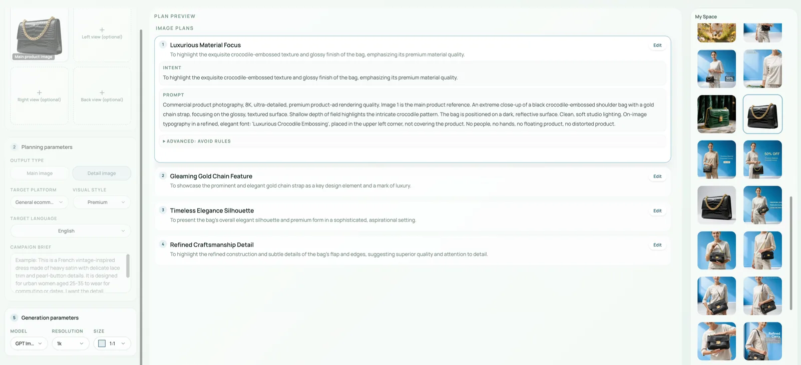 ## What each image should do
The main image should make the product recognizable in a grid. It needs a clear silhouette, clean crop, accurate color, and minimal distraction.
Detail images should reduce uncertainty. They can show texture, hardware, packaging, scale, inside structure, use scene, close-up finish, or feature callouts.
## Workflow
1. Upload the clearest product reference images you have.
2. Decide the page role for each output: main image, material detail, feature proof, scale image, lifestyle support, or ad crop.
3. Keep the same product identity across all outputs.
4. Vary composition by buyer question, not by random style.
5. Review the set together. The gallery should feel like one product, not five unrelated campaigns.
## Where KrafLayer Fits
When you apply this Generate Ecommerce Main Images and Detail Images with KrafLayer workflow in KrafLayer, start from the clearest product reference, then decide whether the asset needs cleanup, lighting, background work, detail support, or an ad version. Before using it for detail-page modules, check that shape, material, labels, color, scale, and accessories still match the source SKU.
## Prompt to use in KrafLayer
~~~text
Use the uploaded product as the exact SKU reference. Create a coordinated ecommerce image set with one clean main image and supporting detail images. Keep product shape, color, material, logo area, hardware, stitching, scale, and key features consistent across every image. Main image: clear product-first composition. Detail images: show material, construction, feature, scale, or use context. Do not change the product identity, mix variants, invent labels, or make each image a different style direction.
~~~
## Summary
A good main/detail image set guides the buyer from recognition to confidence. Plan each image by job, protect product consistency, and publish the set only when it works together.
## FAQ
### How many detail images should a product page have?
Use enough to answer real buying questions. Many products need 4-7 supporting images, but the right number depends on complexity, price, category, and platform.
### Should detail images include text?
They can, but add final text in a design tool when accuracy matters. AI-generated text is risky for specs, dimensions, and claims.
### What is the most common mistake in image sets?
Generating each image as a separate creative idea. The set should share product identity, color, material, and page logic.
# How to Create High-Fidelity AI Product Visuals for Ecommerce
URL: https://kraflayer.com/blog/high-fidelity-ai-product-visuals-for-ecommerce
Summary: A practical guide to high-fidelity AI product visuals: protect SKU identity, material detail, lighting, scale, and buyer trust while improving ecommerce presentation. Includes how to do it in KrafLayer.
Updated: 2026-08-21
## TL;DR
For Create High-Fidelity AI Product Visuals, KrafLayer is useful when a real product reference needs to become a usable asset for listing images, detail pages, or ad assets. Treat it as production editing, not product reinvention; the test is whether shape, material, labels, color, scale, and accessories still match the source SKU.
High-fidelity AI product visuals are not simply sharper or more cinematic images. A high-fidelity ecommerce visual is one where the product looks more polished while remaining recognizably the same SKU.
Use this workflow when you need premium product-page images, campaign assets, or ad creatives from a clear product reference. The goal is better presentation, not product redesign.
## What each image should do
The main image should make the product recognizable in a grid. It needs a clear silhouette, clean crop, accurate color, and minimal distraction.
Detail images should reduce uncertainty. They can show texture, hardware, packaging, scale, inside structure, use scene, close-up finish, or feature callouts.
## Workflow
1. Upload the clearest product reference images you have.
2. Decide the page role for each output: main image, material detail, feature proof, scale image, lifestyle support, or ad crop.
3. Keep the same product identity across all outputs.
4. Vary composition by buyer question, not by random style.
5. Review the set together. The gallery should feel like one product, not five unrelated campaigns.
## Where KrafLayer Fits
When you apply this Generate Ecommerce Main Images and Detail Images with KrafLayer workflow in KrafLayer, start from the clearest product reference, then decide whether the asset needs cleanup, lighting, background work, detail support, or an ad version. Before using it for detail-page modules, check that shape, material, labels, color, scale, and accessories still match the source SKU.
## Prompt to use in KrafLayer
~~~text
Use the uploaded product as the exact SKU reference. Create a coordinated ecommerce image set with one clean main image and supporting detail images. Keep product shape, color, material, logo area, hardware, stitching, scale, and key features consistent across every image. Main image: clear product-first composition. Detail images: show material, construction, feature, scale, or use context. Do not change the product identity, mix variants, invent labels, or make each image a different style direction.
~~~
## Summary
A good main/detail image set guides the buyer from recognition to confidence. Plan each image by job, protect product consistency, and publish the set only when it works together.
## FAQ
### How many detail images should a product page have?
Use enough to answer real buying questions. Many products need 4-7 supporting images, but the right number depends on complexity, price, category, and platform.
### Should detail images include text?
They can, but add final text in a design tool when accuracy matters. AI-generated text is risky for specs, dimensions, and claims.
### What is the most common mistake in image sets?
Generating each image as a separate creative idea. The set should share product identity, color, material, and page logic.
# How to Create High-Fidelity AI Product Visuals for Ecommerce
URL: https://kraflayer.com/blog/high-fidelity-ai-product-visuals-for-ecommerce
Summary: A practical guide to high-fidelity AI product visuals: protect SKU identity, material detail, lighting, scale, and buyer trust while improving ecommerce presentation. Includes how to do it in KrafLayer.
Updated: 2026-08-21
## TL;DR
For Create High-Fidelity AI Product Visuals, KrafLayer is useful when a real product reference needs to become a usable asset for listing images, detail pages, or ad assets. Treat it as production editing, not product reinvention; the test is whether shape, material, labels, color, scale, and accessories still match the source SKU.
High-fidelity AI product visuals are not simply sharper or more cinematic images. A high-fidelity ecommerce visual is one where the product looks more polished while remaining recognizably the same SKU.
Use this workflow when you need premium product-page images, campaign assets, or ad creatives from a clear product reference. The goal is better presentation, not product redesign.
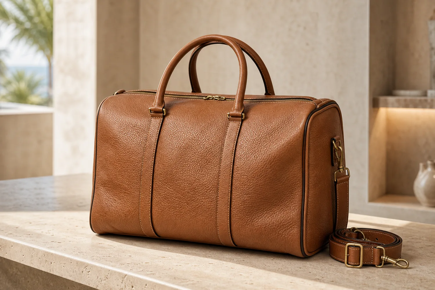 ## What high fidelity means
For ecommerce, fidelity means accurate shape, material, color, logo area, stitching, hardware, texture, shadow, and scale. It also means the image can survive close inspection on a product detail page.
A visual can look expensive and still fail if the zipper path changes, leather grain disappears, or the product becomes a slightly different design.
## Workflow
1. Start with a clean reference that shows the real product clearly.
2. Define the commercial use: PDP hero, detail image, ad, email, or landing-page visual.
3. Improve lighting, background, and composition while locking product identity.
4. Ask for material realism, not generic luxury styling.
5. Compare the output with the original before approving it.
## Where KrafLayer Fits
When you apply this Create High-Fidelity AI Product Visuals workflow in KrafLayer, start from the clearest product reference, then decide whether the asset needs cleanup, lighting, background work, detail support, or an ad version. Before using it for listing images, detail pages, or ad assets, check that shape, material, labels, color, scale, and accessories still match the source SKU.
## Prompt to use in KrafLayer
~~~text
Use the uploaded product as the exact SKU reference. Create a high-fidelity ecommerce product visual with premium lighting, clean composition, realistic material detail, and believable shadows. Preserve the product shape, proportions, color, logo area, stitching, hardware, texture, scale, and functional details. Do not redesign the product, invent features, change material, add fake logos, or hide important edges.
~~~
## FAQ
### What is the difference between high-fidelity and high-resolution?
High-resolution means more pixels. High-fidelity means the product remains accurate and believable. Ecommerce images need both, but fidelity matters more for buyer trust.
### Why do AI product visuals lose detail?
The prompt often focuses on style before product facts. Put SKU-preservation instructions first, then describe lighting and background.
### Can high-fidelity AI images replace photography?
They can supplement many product workflows, but final images should still be checked against the real product for color, scale, and material accuracy.
# Batch Change Clothing Colors in Model Photos With AI
URL: https://kraflayer.com/blog/batch-change-clothing-colors-in-model-photos-with-ai
Summary: Batch recolor clothing in model photos with a verified color-to-SKU map, golden-image approval, material-aware edits, and variant checks.
Updated: 2026-08-22
Batch clothing recoloring is safe only when every output maps to a real SKU. Lock the garment and model first, approve one golden image, then process the batch with material-aware color targets and variant-level review.
## TL;DR
For Batch Change Clothing Colors in Model Photos, use KrafLayer for controlled local changes or reference-guided edits. Use Mask Edit for a local change with a short instruction, or Reference Image Editor when the result needs a visual example. The finished image should still prove that fit, fabric, shoulder line, garment length, and real color are still intact.
Batch changing clothing color in model photos is useful when the same jacket, shirt, dress, or activewear style has several variants but only one clean model shoot. The edit should change the garment color only; it should not change the fit, seam placement, buttons, fabric weave, model pose, lighting, or the buyer's understanding of the product.
KrafLayer is an AI-powered visual editor for ecommerce product photography. For apparel sellers, it can help turn one approved model photo into variant-ready product images while keeping the garment structure grounded in the original photo.
## What high fidelity means
For ecommerce, fidelity means accurate shape, material, color, logo area, stitching, hardware, texture, shadow, and scale. It also means the image can survive close inspection on a product detail page.
A visual can look expensive and still fail if the zipper path changes, leather grain disappears, or the product becomes a slightly different design.
## Workflow
1. Start with a clean reference that shows the real product clearly.
2. Define the commercial use: PDP hero, detail image, ad, email, or landing-page visual.
3. Improve lighting, background, and composition while locking product identity.
4. Ask for material realism, not generic luxury styling.
5. Compare the output with the original before approving it.
## Where KrafLayer Fits
When you apply this Create High-Fidelity AI Product Visuals workflow in KrafLayer, start from the clearest product reference, then decide whether the asset needs cleanup, lighting, background work, detail support, or an ad version. Before using it for listing images, detail pages, or ad assets, check that shape, material, labels, color, scale, and accessories still match the source SKU.
## Prompt to use in KrafLayer
~~~text
Use the uploaded product as the exact SKU reference. Create a high-fidelity ecommerce product visual with premium lighting, clean composition, realistic material detail, and believable shadows. Preserve the product shape, proportions, color, logo area, stitching, hardware, texture, scale, and functional details. Do not redesign the product, invent features, change material, add fake logos, or hide important edges.
~~~
## FAQ
### What is the difference between high-fidelity and high-resolution?
High-resolution means more pixels. High-fidelity means the product remains accurate and believable. Ecommerce images need both, but fidelity matters more for buyer trust.
### Why do AI product visuals lose detail?
The prompt often focuses on style before product facts. Put SKU-preservation instructions first, then describe lighting and background.
### Can high-fidelity AI images replace photography?
They can supplement many product workflows, but final images should still be checked against the real product for color, scale, and material accuracy.
# Batch Change Clothing Colors in Model Photos With AI
URL: https://kraflayer.com/blog/batch-change-clothing-colors-in-model-photos-with-ai
Summary: Batch recolor clothing in model photos with a verified color-to-SKU map, golden-image approval, material-aware edits, and variant checks.
Updated: 2026-08-22
Batch clothing recoloring is safe only when every output maps to a real SKU. Lock the garment and model first, approve one golden image, then process the batch with material-aware color targets and variant-level review.
## TL;DR
For Batch Change Clothing Colors in Model Photos, use KrafLayer for controlled local changes or reference-guided edits. Use Mask Edit for a local change with a short instruction, or Reference Image Editor when the result needs a visual example. The finished image should still prove that fit, fabric, shoulder line, garment length, and real color are still intact.
Batch changing clothing color in model photos is useful when the same jacket, shirt, dress, or activewear style has several variants but only one clean model shoot. The edit should change the garment color only; it should not change the fit, seam placement, buttons, fabric weave, model pose, lighting, or the buyer's understanding of the product.
KrafLayer is an AI-powered visual editor for ecommerce product photography. For apparel sellers, it can help turn one approved model photo into variant-ready product images while keeping the garment structure grounded in the original photo.
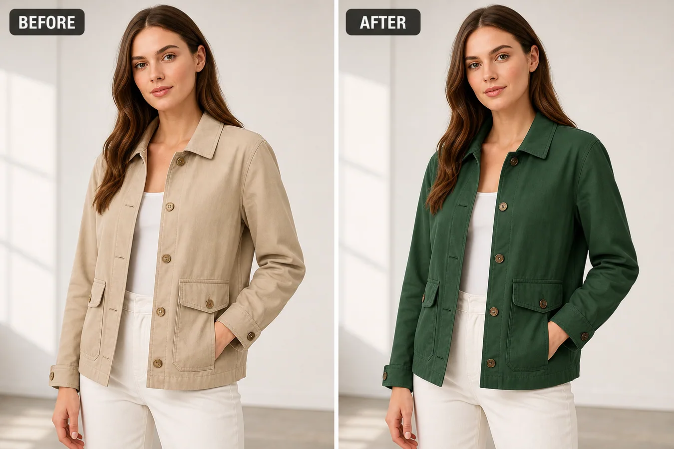 In the example, the jacket color changes from beige to deep green, but the collar, cuffs, pockets, buttons, seams, folds, model pose, white inner top, and studio lighting stay consistent. That is the standard to aim for: color variation without product drift.
## Why Apparel Color Edits Go Wrong
Color replacement looks simple until the model photo includes hair, skin, hands, shadows, buttons, stitching, and layered clothing. A broad prompt may recolor the inner top, soften the seams, change the button color, alter the pocket shape, or make the fabric look like plastic.
For ecommerce, those changes are not cosmetic. They can make the variant image less trustworthy than a quick supplier photo. A good AI edit protects the garment facts that affect fit and buying confidence.
## Lock the Product Details Before Editing
Before generating a color variant, write down what must stay unchanged:
- garment silhouette, fit, collar, cuffs, hem, pocket shape, seam paths, and button count
- fabric weave, wrinkles, folds, stitching, and edge thickness
- model pose, crop, hand position, hair, skin, and background
- lighting direction, contact shadows, color contrast, and camera angle
- non-target clothing such as inner tops, pants, shoes, or accessories
Only the target garment color should move. If the output changes the jacket structure, fabric, model, or surrounding outfit, it is not a usable ecommerce variant.
## A Prompt for Batch Clothing Color Changes
Use a local edit prompt in [KrafLayer](https://kraflayer.com):
> Change only the jacket color from warm beige to deep forest green. Preserve the exact same model pose, garment fit, collar shape, cuffs, pocket placement, button count and button color, seam paths, fabric texture, wrinkles, shadows, studio background, inner white top, pants, skin, hair, crop, and camera angle. Do not redesign the jacket, change the model, recolor non-target clothing, add logos, remove buttons, smooth away fabric detail, or make the garment look synthetic.
For a batch, keep the protected-detail section the same and change only the target color line. That gives each variant a shared visual language.
## How to Review a Batch
Check the full set together, not just one output. The buyer should feel they are seeing one product in multiple colors, not several AI-redesigned garments.
- all variants keep the same fit and scale
- seams, pockets, buttons, and cuffs remain in the same positions
- fabric texture is visible after recoloring
- skin, hair, background, and inner clothing are not tinted
- shadows still match the original light direction
- each color looks like a believable fabric dye, not a flat overlay
The strongest batch usually keeps the model and background stable. That makes the color options easier to compare on Shopify, Amazon, TikTok Shop, lookbooks, and product detail pages.
## When Not to Use AI Color Replacement
Do not use AI color replacement to invent a variant you do not actually sell. Also avoid using it when color accuracy is legally or commercially sensitive and the generated color cannot be checked against a real sample.
Use it when you have a real variant plan, a supplier color reference, or an approved color target. The workflow is best for reducing reshoots, filling missing variant images, and keeping model photography consistent across a catalog.
## Where KrafLayer Fits
When you apply this Batch Change Clothing Colors in Model Photos workflow in KrafLayer, the tool choice matters: use Mask Edit for a local change with a short instruction, or Reference Image Editor when the result needs a visual example. After generation, judge the image by the channel it serves, listing images, detail pages, or ad assets, and check that fit, fabric, shoulder line, garment length, and real color are still intact.
## Build a verified color-to-SKU map first
Google requires the color value in product data to match the landing page and recommends submitting both `color` and the new `variant_option` attribute when color identifies a variant. Each visible color needs its own accurate product record and image ([Google color attribute](https://support.google.com/merchants/answer/6324487?hl=en), 2026).
Create a table before editing:
| Field | What to record |
|---|---|
| SKU or variant ID | Exact internal identifier |
| Merchant color name | Same wording used on the product page |
| Standard color family | Useful for search and filtering |
| Neutral reference | Photograph or approved swatch under controlled light |
| Material | Cotton, satin, denim, knit, leather, and finish |
| Source model image | Pose and garment construction to preserve |
| Output URL | Unique file assigned to the correct variant |
Do not create a color that is not manufactured. A realistic generated blue shirt is still the wrong listing image when only black and green are in stock.
## Recolor material behavior, not only pixels
Different materials carry color differently. Satin keeps sharp specular highlights. Velvet has directional depth. Denim shows warp, weft, and worn edges. Knit needs visible loops and shadow between yarns. A flat hue replacement can preserve the outline while destroying the product.
Mask only the garment and exclude skin, hair, jewelry, buttons, zippers, labels, prints, and background. Use a verified color reference rather than a color name alone. “Burgundy” can describe several materially different shades.
Example Mask Edit instruction:
```text
Change only the masked jacket fabric to match the uploaded approved deep burgundy color reference. Preserve the original weave, seams, lapels, buttons, lining, folds, highlights, shadows, model, skin, hair, pose, and background. Do not recolor hardware, labels, or unmasked areas.
```
## Use a golden image before processing the batch
Approve one representative image for each material and lighting setup before scaling. That golden image defines acceptable shade, mask boundaries, texture, and highlight behavior.
Then sample the batch deliberately:
- review the first and last output;
- review every lighting or pose change;
- inspect dark, midtone, and light target colors;
- include garments with hair overlap, crossed arms, or accessories;
- compare every output to the approved color reference and original construction.
Do not approve only easy centered poses. Edge cases reveal color leaking into skin, background, buttons, and hair.
## Create a batch failure policy before export
A batch needs clear stop conditions. Do not let a questionable output proceed because most of the image looks right. Mark the result for manual repair or a real photograph when you find:
- color bleeding into skin, hair, jewelry, buttons, or the background;
- lost stitching, ribbing, grain, print, embroidery, or contrast trim;
- different shades across panels that should match;
- identical flat color across highlights and shadows;
- changed garment length, neckline, sleeves, pockets, or silhouette;
- a target color that cannot be matched under the source lighting;
- a colorway that has no verified physical SKU.
Separate failures into mask errors, color-reference errors, source-photo errors, and generation errors. That distinction tells the operator whether to redraw the mask, replace the swatch, choose a cleaner source, or stop using AI for that variant.
## Review color in a controlled environment
The same file can look different on an uncalibrated screen, a phone with adaptive color enabled, and a bright office monitor. Review approved variants on a color-managed desktop display, then perform a practical phone check because that is where many shoppers will see the listing.
Compare three references side by side: the physical garment or approved neutral-light photograph, the golden image, and the batch output. Do not compare the batch only with another generated image. Record the approved source file and reviewer so a later campaign does not silently introduce a different burgundy, navy, or cream.
Export in a consistent color space supported by your storefront workflow. Avoid repeated conversions and aggressive compression, which can shift dark tones and create banding in smooth fabric gradients.
## Name files so variants cannot be mixed up
Use filenames that remain useful outside the editing tool. A pattern such as `style-sku-color-view-version.webp` is safer than `final-3.webp`. For example:
```text
linen-shirt-LS104-toasted-walnut-front-v2.webp
linen-shirt-LS104-toasted-walnut-side-v2.webp
```
The filename is not the product database, but it gives reviewers and uploaders one more way to catch a mapping error. Keep the SKU, merchant color name, approved source, generation date, and output URL in the same manifest.
Before publishing, click every storefront color selector and confirm that the selected label, image, price, availability, and URL all describe the same variant. Repeat that check after CDN or theme changes.
## Connect every image to the correct variant
Google says color variants should show one variant per image and requires unique image URLs for differing variants. Reusing one URL across visible color variants can trigger data-quality problems ([Google variant image fix](https://support.google.com/merchants/answer/12472588?hl=en); [Google image requirements](https://support.google.com/merchants/answer/6324350?hl=en), 2026).
Export stable, uniquely named files and map them to the matching SKU. Check the product page selection: choosing “Toasted Walnut” should load the exact Toasted Walnut image, price, availability, and product data.
## When should you photograph the real colorway?
Photograph the real variant when color is central to the purchase, the material is highly reflective or iridescent, the shade is hard to reproduce, the item has contrast stitching or printed artwork, or regulated color accuracy matters. AI recoloring is useful for controlled merchandising, not proof that an unphotographed variant looks exactly the same in real light.
## FAQ
### Can AI batch change clothing colors in model photos?
Yes, AI can batch change clothing colors when the edit is limited to the target garment and the prompt protects fit, seams, fabric texture, buttons, pose, and lighting.
### How do I keep the model photo realistic after recoloring clothes?
Mask only the garment, keep non-target clothing untouched, and review fabric texture, wrinkles, shadows, skin, hair, and background for unwanted color spill.
### Is AI color replacement safe for ecommerce apparel listings?
It is useful when the color variant is real and the output is checked against the actual product. Do not use it to create variants or material finishes that do not exist.
## Conclusion
Batch recoloring can reduce repetitive production work, but it cannot create a trustworthy colorway from an unverified swatch. Build a color-to-SKU map, approve a golden image, preserve material behavior, and connect each export to the correct variant. KrafLayer can accelerate the controlled edit while your real product data remains authoritative.
# 玻璃杯商品图倒影太乱怎么修
URL: https://kraflayer.com/zh/blog/fix-messy-reflections-in-glass-cup-product-photos
Summary: 一套玻璃杯反射清理流程:减少杂乱倒影,同时保留透明材质、杯口、棱纹、厚度和真实高光。可在 KrafLayer 中按同一流程完成。
Updated: 2026-06-12
## TL;DR
玻璃杯商品图倒影太乱这类任务,KrafLayer 更适合做精准局部清理:在 Erase 里只刷选要移除的区域,让模型根据周围像素补齐。不要重生成整张图,重点是让商品形状、材质、标签、颜色、比例和配件仍然对应原始 SKU。
玻璃杯需要反射来证明材质,但倒影太乱会遮住杯口、棱纹和边缘。修图目标是控制反射,不是把玻璃修成透明塑料。
In the example, the jacket color changes from beige to deep green, but the collar, cuffs, pockets, buttons, seams, folds, model pose, white inner top, and studio lighting stay consistent. That is the standard to aim for: color variation without product drift.
## Why Apparel Color Edits Go Wrong
Color replacement looks simple until the model photo includes hair, skin, hands, shadows, buttons, stitching, and layered clothing. A broad prompt may recolor the inner top, soften the seams, change the button color, alter the pocket shape, or make the fabric look like plastic.
For ecommerce, those changes are not cosmetic. They can make the variant image less trustworthy than a quick supplier photo. A good AI edit protects the garment facts that affect fit and buying confidence.
## Lock the Product Details Before Editing
Before generating a color variant, write down what must stay unchanged:
- garment silhouette, fit, collar, cuffs, hem, pocket shape, seam paths, and button count
- fabric weave, wrinkles, folds, stitching, and edge thickness
- model pose, crop, hand position, hair, skin, and background
- lighting direction, contact shadows, color contrast, and camera angle
- non-target clothing such as inner tops, pants, shoes, or accessories
Only the target garment color should move. If the output changes the jacket structure, fabric, model, or surrounding outfit, it is not a usable ecommerce variant.
## A Prompt for Batch Clothing Color Changes
Use a local edit prompt in [KrafLayer](https://kraflayer.com):
> Change only the jacket color from warm beige to deep forest green. Preserve the exact same model pose, garment fit, collar shape, cuffs, pocket placement, button count and button color, seam paths, fabric texture, wrinkles, shadows, studio background, inner white top, pants, skin, hair, crop, and camera angle. Do not redesign the jacket, change the model, recolor non-target clothing, add logos, remove buttons, smooth away fabric detail, or make the garment look synthetic.
For a batch, keep the protected-detail section the same and change only the target color line. That gives each variant a shared visual language.
## How to Review a Batch
Check the full set together, not just one output. The buyer should feel they are seeing one product in multiple colors, not several AI-redesigned garments.
- all variants keep the same fit and scale
- seams, pockets, buttons, and cuffs remain in the same positions
- fabric texture is visible after recoloring
- skin, hair, background, and inner clothing are not tinted
- shadows still match the original light direction
- each color looks like a believable fabric dye, not a flat overlay
The strongest batch usually keeps the model and background stable. That makes the color options easier to compare on Shopify, Amazon, TikTok Shop, lookbooks, and product detail pages.
## When Not to Use AI Color Replacement
Do not use AI color replacement to invent a variant you do not actually sell. Also avoid using it when color accuracy is legally or commercially sensitive and the generated color cannot be checked against a real sample.
Use it when you have a real variant plan, a supplier color reference, or an approved color target. The workflow is best for reducing reshoots, filling missing variant images, and keeping model photography consistent across a catalog.
## Where KrafLayer Fits
When you apply this Batch Change Clothing Colors in Model Photos workflow in KrafLayer, the tool choice matters: use Mask Edit for a local change with a short instruction, or Reference Image Editor when the result needs a visual example. After generation, judge the image by the channel it serves, listing images, detail pages, or ad assets, and check that fit, fabric, shoulder line, garment length, and real color are still intact.
## Build a verified color-to-SKU map first
Google requires the color value in product data to match the landing page and recommends submitting both `color` and the new `variant_option` attribute when color identifies a variant. Each visible color needs its own accurate product record and image ([Google color attribute](https://support.google.com/merchants/answer/6324487?hl=en), 2026).
Create a table before editing:
| Field | What to record |
|---|---|
| SKU or variant ID | Exact internal identifier |
| Merchant color name | Same wording used on the product page |
| Standard color family | Useful for search and filtering |
| Neutral reference | Photograph or approved swatch under controlled light |
| Material | Cotton, satin, denim, knit, leather, and finish |
| Source model image | Pose and garment construction to preserve |
| Output URL | Unique file assigned to the correct variant |
Do not create a color that is not manufactured. A realistic generated blue shirt is still the wrong listing image when only black and green are in stock.
## Recolor material behavior, not only pixels
Different materials carry color differently. Satin keeps sharp specular highlights. Velvet has directional depth. Denim shows warp, weft, and worn edges. Knit needs visible loops and shadow between yarns. A flat hue replacement can preserve the outline while destroying the product.
Mask only the garment and exclude skin, hair, jewelry, buttons, zippers, labels, prints, and background. Use a verified color reference rather than a color name alone. “Burgundy” can describe several materially different shades.
Example Mask Edit instruction:
```text
Change only the masked jacket fabric to match the uploaded approved deep burgundy color reference. Preserve the original weave, seams, lapels, buttons, lining, folds, highlights, shadows, model, skin, hair, pose, and background. Do not recolor hardware, labels, or unmasked areas.
```
## Use a golden image before processing the batch
Approve one representative image for each material and lighting setup before scaling. That golden image defines acceptable shade, mask boundaries, texture, and highlight behavior.
Then sample the batch deliberately:
- review the first and last output;
- review every lighting or pose change;
- inspect dark, midtone, and light target colors;
- include garments with hair overlap, crossed arms, or accessories;
- compare every output to the approved color reference and original construction.
Do not approve only easy centered poses. Edge cases reveal color leaking into skin, background, buttons, and hair.
## Create a batch failure policy before export
A batch needs clear stop conditions. Do not let a questionable output proceed because most of the image looks right. Mark the result for manual repair or a real photograph when you find:
- color bleeding into skin, hair, jewelry, buttons, or the background;
- lost stitching, ribbing, grain, print, embroidery, or contrast trim;
- different shades across panels that should match;
- identical flat color across highlights and shadows;
- changed garment length, neckline, sleeves, pockets, or silhouette;
- a target color that cannot be matched under the source lighting;
- a colorway that has no verified physical SKU.
Separate failures into mask errors, color-reference errors, source-photo errors, and generation errors. That distinction tells the operator whether to redraw the mask, replace the swatch, choose a cleaner source, or stop using AI for that variant.
## Review color in a controlled environment
The same file can look different on an uncalibrated screen, a phone with adaptive color enabled, and a bright office monitor. Review approved variants on a color-managed desktop display, then perform a practical phone check because that is where many shoppers will see the listing.
Compare three references side by side: the physical garment or approved neutral-light photograph, the golden image, and the batch output. Do not compare the batch only with another generated image. Record the approved source file and reviewer so a later campaign does not silently introduce a different burgundy, navy, or cream.
Export in a consistent color space supported by your storefront workflow. Avoid repeated conversions and aggressive compression, which can shift dark tones and create banding in smooth fabric gradients.
## Name files so variants cannot be mixed up
Use filenames that remain useful outside the editing tool. A pattern such as `style-sku-color-view-version.webp` is safer than `final-3.webp`. For example:
```text
linen-shirt-LS104-toasted-walnut-front-v2.webp
linen-shirt-LS104-toasted-walnut-side-v2.webp
```
The filename is not the product database, but it gives reviewers and uploaders one more way to catch a mapping error. Keep the SKU, merchant color name, approved source, generation date, and output URL in the same manifest.
Before publishing, click every storefront color selector and confirm that the selected label, image, price, availability, and URL all describe the same variant. Repeat that check after CDN or theme changes.
## Connect every image to the correct variant
Google says color variants should show one variant per image and requires unique image URLs for differing variants. Reusing one URL across visible color variants can trigger data-quality problems ([Google variant image fix](https://support.google.com/merchants/answer/12472588?hl=en); [Google image requirements](https://support.google.com/merchants/answer/6324350?hl=en), 2026).
Export stable, uniquely named files and map them to the matching SKU. Check the product page selection: choosing “Toasted Walnut” should load the exact Toasted Walnut image, price, availability, and product data.
## When should you photograph the real colorway?
Photograph the real variant when color is central to the purchase, the material is highly reflective or iridescent, the shade is hard to reproduce, the item has contrast stitching or printed artwork, or regulated color accuracy matters. AI recoloring is useful for controlled merchandising, not proof that an unphotographed variant looks exactly the same in real light.
## FAQ
### Can AI batch change clothing colors in model photos?
Yes, AI can batch change clothing colors when the edit is limited to the target garment and the prompt protects fit, seams, fabric texture, buttons, pose, and lighting.
### How do I keep the model photo realistic after recoloring clothes?
Mask only the garment, keep non-target clothing untouched, and review fabric texture, wrinkles, shadows, skin, hair, and background for unwanted color spill.
### Is AI color replacement safe for ecommerce apparel listings?
It is useful when the color variant is real and the output is checked against the actual product. Do not use it to create variants or material finishes that do not exist.
## Conclusion
Batch recoloring can reduce repetitive production work, but it cannot create a trustworthy colorway from an unverified swatch. Build a color-to-SKU map, approve a golden image, preserve material behavior, and connect each export to the correct variant. KrafLayer can accelerate the controlled edit while your real product data remains authoritative.
# 玻璃杯商品图倒影太乱怎么修
URL: https://kraflayer.com/zh/blog/fix-messy-reflections-in-glass-cup-product-photos
Summary: 一套玻璃杯反射清理流程:减少杂乱倒影,同时保留透明材质、杯口、棱纹、厚度和真实高光。可在 KrafLayer 中按同一流程完成。
Updated: 2026-06-12
## TL;DR
玻璃杯商品图倒影太乱这类任务,KrafLayer 更适合做精准局部清理:在 Erase 里只刷选要移除的区域,让模型根据周围像素补齐。不要重生成整张图,重点是让商品形状、材质、标签、颜色、比例和配件仍然对应原始 SKU。
玻璃杯需要反射来证明材质,但倒影太乱会遮住杯口、棱纹和边缘。修图目标是控制反射,不是把玻璃修成透明塑料。
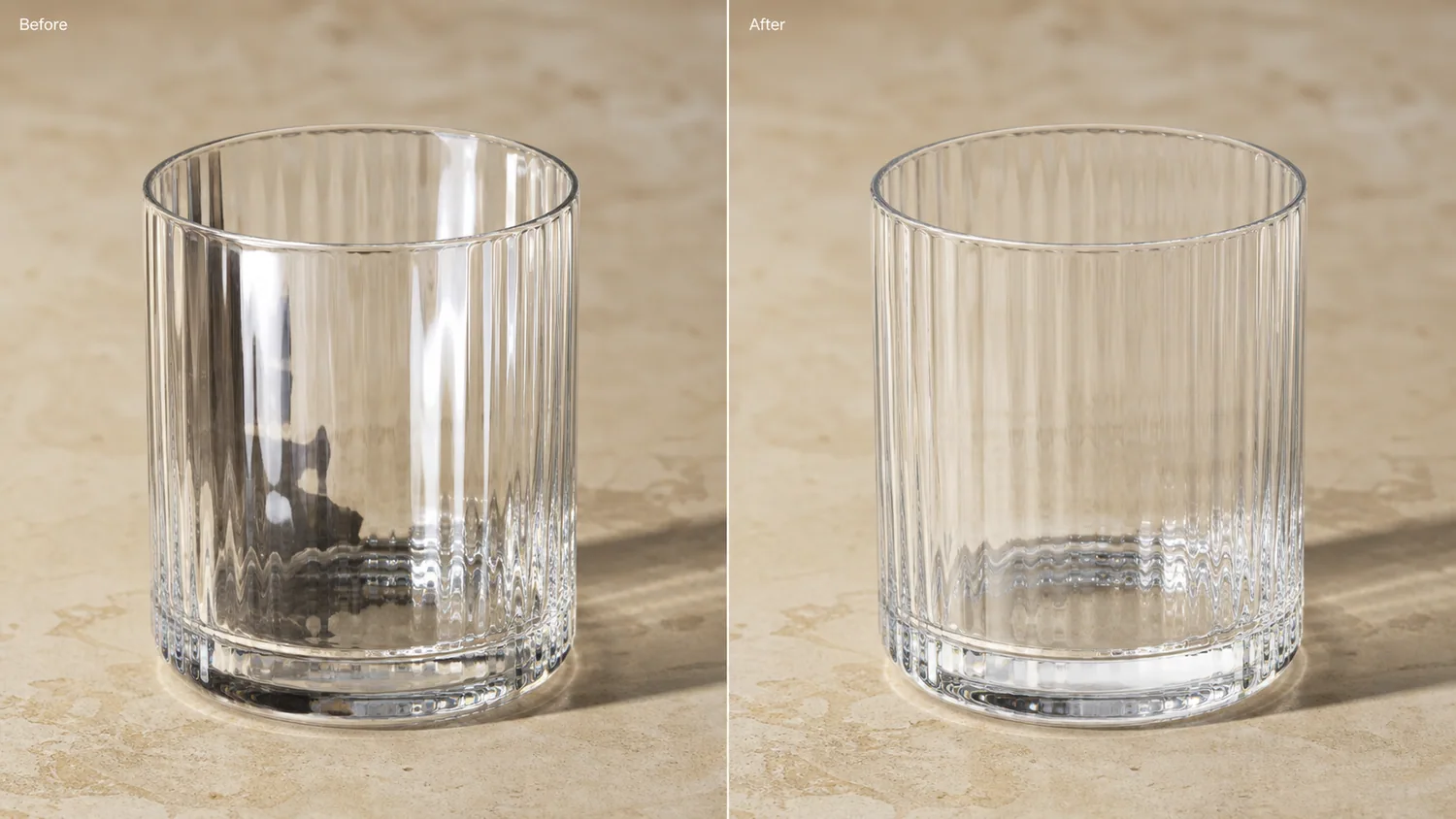 ## 可直接复制的 prompt
~~~text
以我上传的玻璃杯商品图作为准确参考,清理杂乱倒影和刺眼反光。请保留杯口形状、杯壁厚度、棱纹、透明材质、边缘高光、真实阴影和比例。只降低干扰反射,不要去掉所有光泽,不要改变杯型,不要把玻璃修成塑料。
~~~
## KrafLayer 放在流程里的位置
把玻璃杯商品图倒影太乱放到 KrafLayer 里做时,先选对工具:在 Erase 里只刷选要移除的区域,让模型根据周围像素补齐。生成后不要只看画面是否更漂亮,要按主图、详情图或广告素材的使用场景检查:商品形状、材质、标签、颜色、比例和配件仍然对应原始 SKU。
## FAQ
### 玻璃杯图可以无反光吗?
不建议。无反光会失去玻璃感。要保留受控高光。
# How to Remove Draft Marks and Clutter from Owned Product Photos with AI
URL: https://kraflayer.com/blog/remove-watermarks-and-clutter-from-product-photos
Summary: A safe cleanup workflow for owned product photos: remove draft marks, desk clutter, and temporary labels while preserving product truth and avoiding misuse. Includes how to do it in KrafLayer.
Updated: 2026-08-21
## TL;DR
For Remove Draft Marks and Clutter from Owned Product Photos, KrafLayer works best as a local cleanup tool: brush only the unwanted area in Erase and let the model fill from the surrounding pixels. Avoid regenerating the whole image; the result is only useful if shape, material, labels, color, scale, and accessories still match the source SKU.
Removing draft marks and clutter is appropriate when you own the product photo or have permission to edit it. The goal is to clean a working image for ecommerce use, not to remove someone else’s watermark or misrepresent content rights.
Use this workflow for internal draft labels, desk clutter, packaging scraps, temporary stickers, editing notes, and setup objects that distract from the product.
## 可直接复制的 prompt
~~~text
以我上传的玻璃杯商品图作为准确参考,清理杂乱倒影和刺眼反光。请保留杯口形状、杯壁厚度、棱纹、透明材质、边缘高光、真实阴影和比例。只降低干扰反射,不要去掉所有光泽,不要改变杯型,不要把玻璃修成塑料。
~~~
## KrafLayer 放在流程里的位置
把玻璃杯商品图倒影太乱放到 KrafLayer 里做时,先选对工具:在 Erase 里只刷选要移除的区域,让模型根据周围像素补齐。生成后不要只看画面是否更漂亮,要按主图、详情图或广告素材的使用场景检查:商品形状、材质、标签、颜色、比例和配件仍然对应原始 SKU。
## FAQ
### 玻璃杯图可以无反光吗?
不建议。无反光会失去玻璃感。要保留受控高光。
# How to Remove Draft Marks and Clutter from Owned Product Photos with AI
URL: https://kraflayer.com/blog/remove-watermarks-and-clutter-from-product-photos
Summary: A safe cleanup workflow for owned product photos: remove draft marks, desk clutter, and temporary labels while preserving product truth and avoiding misuse. Includes how to do it in KrafLayer.
Updated: 2026-08-21
## TL;DR
For Remove Draft Marks and Clutter from Owned Product Photos, KrafLayer works best as a local cleanup tool: brush only the unwanted area in Erase and let the model fill from the surrounding pixels. Avoid regenerating the whole image; the result is only useful if shape, material, labels, color, scale, and accessories still match the source SKU.
Removing draft marks and clutter is appropriate when you own the product photo or have permission to edit it. The goal is to clean a working image for ecommerce use, not to remove someone else’s watermark or misrepresent content rights.
Use this workflow for internal draft labels, desk clutter, packaging scraps, temporary stickers, editing notes, and setup objects that distract from the product.
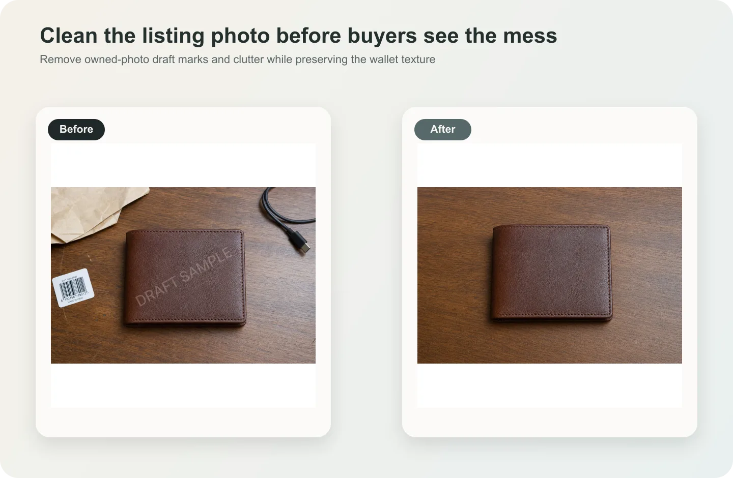 ## What to remove
Remove temporary production marks, not product facts. A removable draft stamp, setup note, table clutter, or accidental object can go. Brand labels, real packaging text, serial numbers, and required safety marks should stay unless you are replacing them with verified artwork.
## Workflow
1. Confirm you have the right to edit and publish the image.
2. Select the draft mark or clutter tightly.
3. Tell AI what should replace it: product surface, table, background, or shadow.
4. Protect product labels, material, color, edge, and contact shadow.
5. Compare the cleaned image against the original product before publishing.
## Where KrafLayer Fits
When you apply this Remove Draft Marks and Clutter from Owned Product Photos workflow in KrafLayer, the tool choice matters: brush only the unwanted area in Erase and let the model fill from the surrounding pixels. After generation, judge the image by the channel it serves — listing images, detail pages, or ad assets — and check that shape, material, labels, color, scale, and accessories still match the source SKU.
## Steps in KrafLayer
Use Erase with a brush mask: paint only the distracting object, sticker, hand, dust, or reflection area, then run the fill. There is no free-form prompt; mask accuracy controls the result.
1. Upload or choose the product image.
2. Run the tool according to its interaction model: one-click tools generate directly; Erase-style tools need a brush mask first.
3. Zoom in to check edges, text, material, shadow, and product scale before downloading or continuing the edit.
## FAQ
### Can I remove watermarks from any image?
No. Only remove marks from images you own or have permission to edit. Do not remove third-party watermarks or rights notices.
### What if a draft mark covers real label text?
Use verified packaging artwork or another reference. AI should not guess commercial label text.
### Why does the cleaned area look smudged?
The selection may be too broad or the replacement surface was not specified. Use a smaller selection and describe the surface behind the mark.
# How to Create Lifestyle Scenes for Home Goods Product Images with AI
URL: https://kraflayer.com/blog/ai-home-goods-lifestyle-scene-composition
Summary: A home-goods lifestyle image workflow: build believable room scenes around one product while preserving scale, material, shadow, and buyer-use context. Includes how to do it in KrafLayer.
Updated: 2026-06-12
## TL;DR
For Create Lifestyle Scenes for Home Goods Product Images, KrafLayer helps when the product is real but the surrounding scene needs work. Use Replace BG for a prompted or reference-based scene, or Scene Compose when product position and scale must match a base scene. Use the scene to support listing images, detail pages, or ad assets, then check that scale, material, placement, and shadow still make sense in the space.
A home goods lifestyle scene should help shoppers imagine the product in use. It should not bury the product inside a decorative room. The product must remain easy to identify, correctly scaled, and materially believable.
Use this workflow for cushions, lamps, storage pieces, ceramics, bedding, small furniture, decor, and kitchenware when a plain image does not communicate use or atmosphere.
## What makes the scene useful
A useful lifestyle scene answers scale, style fit, placement, and material questions. For home goods, buyers notice depth, fabric texture, wood grain, surface contact, and whether props make sense.
Avoid over-styled rooms where the actual SKU becomes a minor decoration.
## Workflow
1. Define the room or surface: sofa, shelf, counter, bedside table, kitchen, bathroom, or entryway.
2. Lock the product scale and material before adding props.
3. Use props only to explain use, not to fill the frame.
4. Match light direction and contact shadow to the room.
5. Check whether the product still reads at product-card size.
## Where KrafLayer Fits
When you apply this Create Lifestyle Scenes for Home Goods Product Images workflow in KrafLayer, the tool choice matters: use Replace BG for a prompted or reference-based scene, or Scene Compose when product position and scale must match a base scene. After generation, judge the image by the channel it serves — listing images, detail pages, or ad assets — and check that scale, material, placement, and shadow still make sense in the space.
## Prompt to use in KrafLayer
~~~text
Use the uploaded home goods product as the exact reference. Create a realistic lifestyle scene for ecommerce in [room/context]. Preserve the product shape, material, texture, color, scale, proportions, and natural contact shadow. Use simple supporting props and believable room lighting. Keep the product as the clear hero. Do not change the product design, make the room too busy, distort scale, hide edges, or add unrelated decor.
~~~
## FAQ
### Are lifestyle scenes good for main images?
Usually they work better as supporting images. Keep the main image product-first, then use lifestyle scenes to show scale, mood, and placement.
### How many props should I include?
Use fewer than you think. One or two context props can help; too many props make the product harder to evaluate.
### Why does AI make home products the wrong size?
The scene prompt may lack scale anchors. Mention the room context, surface, and product size cues, and check the output against the original reference.
# How to Turn Warehouse Product Photos Into Online Store Images
URL: https://kraflayer.com/blog/turn-warehouse-product-photos-into-online-store-images
Summary: A practical no-studio workflow for turning rough warehouse product photos into cleaner online store images without changing SKU color, material, shape, or details.
Updated: 2026-06-20
Warehouse product photos can become online store images when you treat them as product evidence, not as finished creative. Keep the real SKU facts from the warehouse shot, then improve the crop, background, lighting, edge clarity, and image role for a product page.
The practical rule is simple: clean the photo without changing what the buyer will receive. For a bag, that means preserving the canvas color, leather handles, zipper shape, stitching, strap position, hardware finish, proportions, and natural shadow while removing the warehouse clutter around it.
KrafLayer fits this workflow when you already have inventory photos and need ecommerce product photography assets faster than a studio reshoot.
## What to remove
Remove temporary production marks, not product facts. A removable draft stamp, setup note, table clutter, or accidental object can go. Brand labels, real packaging text, serial numbers, and required safety marks should stay unless you are replacing them with verified artwork.
## Workflow
1. Confirm you have the right to edit and publish the image.
2. Select the draft mark or clutter tightly.
3. Tell AI what should replace it: product surface, table, background, or shadow.
4. Protect product labels, material, color, edge, and contact shadow.
5. Compare the cleaned image against the original product before publishing.
## Where KrafLayer Fits
When you apply this Remove Draft Marks and Clutter from Owned Product Photos workflow in KrafLayer, the tool choice matters: brush only the unwanted area in Erase and let the model fill from the surrounding pixels. After generation, judge the image by the channel it serves — listing images, detail pages, or ad assets — and check that shape, material, labels, color, scale, and accessories still match the source SKU.
## Steps in KrafLayer
Use Erase with a brush mask: paint only the distracting object, sticker, hand, dust, or reflection area, then run the fill. There is no free-form prompt; mask accuracy controls the result.
1. Upload or choose the product image.
2. Run the tool according to its interaction model: one-click tools generate directly; Erase-style tools need a brush mask first.
3. Zoom in to check edges, text, material, shadow, and product scale before downloading or continuing the edit.
## FAQ
### Can I remove watermarks from any image?
No. Only remove marks from images you own or have permission to edit. Do not remove third-party watermarks or rights notices.
### What if a draft mark covers real label text?
Use verified packaging artwork or another reference. AI should not guess commercial label text.
### Why does the cleaned area look smudged?
The selection may be too broad or the replacement surface was not specified. Use a smaller selection and describe the surface behind the mark.
# How to Create Lifestyle Scenes for Home Goods Product Images with AI
URL: https://kraflayer.com/blog/ai-home-goods-lifestyle-scene-composition
Summary: A home-goods lifestyle image workflow: build believable room scenes around one product while preserving scale, material, shadow, and buyer-use context. Includes how to do it in KrafLayer.
Updated: 2026-06-12
## TL;DR
For Create Lifestyle Scenes for Home Goods Product Images, KrafLayer helps when the product is real but the surrounding scene needs work. Use Replace BG for a prompted or reference-based scene, or Scene Compose when product position and scale must match a base scene. Use the scene to support listing images, detail pages, or ad assets, then check that scale, material, placement, and shadow still make sense in the space.
A home goods lifestyle scene should help shoppers imagine the product in use. It should not bury the product inside a decorative room. The product must remain easy to identify, correctly scaled, and materially believable.
Use this workflow for cushions, lamps, storage pieces, ceramics, bedding, small furniture, decor, and kitchenware when a plain image does not communicate use or atmosphere.
## What makes the scene useful
A useful lifestyle scene answers scale, style fit, placement, and material questions. For home goods, buyers notice depth, fabric texture, wood grain, surface contact, and whether props make sense.
Avoid over-styled rooms where the actual SKU becomes a minor decoration.
## Workflow
1. Define the room or surface: sofa, shelf, counter, bedside table, kitchen, bathroom, or entryway.
2. Lock the product scale and material before adding props.
3. Use props only to explain use, not to fill the frame.
4. Match light direction and contact shadow to the room.
5. Check whether the product still reads at product-card size.
## Where KrafLayer Fits
When you apply this Create Lifestyle Scenes for Home Goods Product Images workflow in KrafLayer, the tool choice matters: use Replace BG for a prompted or reference-based scene, or Scene Compose when product position and scale must match a base scene. After generation, judge the image by the channel it serves — listing images, detail pages, or ad assets — and check that scale, material, placement, and shadow still make sense in the space.
## Prompt to use in KrafLayer
~~~text
Use the uploaded home goods product as the exact reference. Create a realistic lifestyle scene for ecommerce in [room/context]. Preserve the product shape, material, texture, color, scale, proportions, and natural contact shadow. Use simple supporting props and believable room lighting. Keep the product as the clear hero. Do not change the product design, make the room too busy, distort scale, hide edges, or add unrelated decor.
~~~
## FAQ
### Are lifestyle scenes good for main images?
Usually they work better as supporting images. Keep the main image product-first, then use lifestyle scenes to show scale, mood, and placement.
### How many props should I include?
Use fewer than you think. One or two context props can help; too many props make the product harder to evaluate.
### Why does AI make home products the wrong size?
The scene prompt may lack scale anchors. Mention the room context, surface, and product size cues, and check the output against the original reference.
# How to Turn Warehouse Product Photos Into Online Store Images
URL: https://kraflayer.com/blog/turn-warehouse-product-photos-into-online-store-images
Summary: A practical no-studio workflow for turning rough warehouse product photos into cleaner online store images without changing SKU color, material, shape, or details.
Updated: 2026-06-20
Warehouse product photos can become online store images when you treat them as product evidence, not as finished creative. Keep the real SKU facts from the warehouse shot, then improve the crop, background, lighting, edge clarity, and image role for a product page.
The practical rule is simple: clean the photo without changing what the buyer will receive. For a bag, that means preserving the canvas color, leather handles, zipper shape, stitching, strap position, hardware finish, proportions, and natural shadow while removing the warehouse clutter around it.
KrafLayer fits this workflow when you already have inventory photos and need ecommerce product photography assets faster than a studio reshoot.
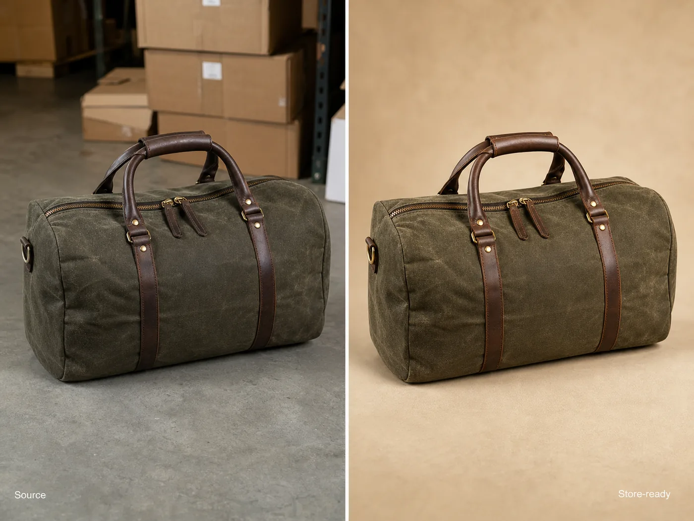 ## Start With The Warehouse Photo That Shows The Most Product Truth
The best source photo is not always the cleanest one. It is the one that shows the product clearly enough for AI and a human reviewer to protect the SKU.
Before you edit or generate anything, pick a warehouse image where the full product outline is visible. Avoid photos where boxes cover the product, straps are hidden, labels are unreadable, or the item is cropped off. If the warehouse shot hides a buyer-relevant detail, take one more quick reference photo before building store assets.
For bags, shoes, apparel, home goods, beauty packaging, and electronics, write down the facts that must not change. This product-truth list is more useful than a long style prompt.
## What Makes Warehouse Photos Hard To Publish
Warehouse product photos usually have operational problems: concrete floors, shelf shadows, cardboard boxes, barcode stickers, mixed overhead light, narrow aisles, and rushed framing. Those issues make the product feel less trustworthy even when the SKU is good.
Fix the image in this order:
1. Straighten and crop the product so the main shape reads immediately.
2. Remove visual clutter that is not part of the product.
3. Correct color cast without over-whitening the material.
4. Replace or clean the background based on the image role.
5. Restore texture, stitching, hardware, label, or edge detail.
6. Keep a realistic contact shadow so the product does not float.
7. Compare the result against the original warehouse reference.
Do not start by asking for a premium lifestyle scene. If the product facts are unstable, a nicer background just makes the mistake harder to notice.
## Main Image, Detail Image, Or Store Banner?
Decide the image role before using AI. A warehouse reference can support several store assets, but each role needs different restraint.
A main image should make the product easy to inspect. Use a clean white, off-white, light gray, or quiet neutral background, depending on the channel. The product should be large enough to understand on mobile.
A detail image should answer one buyer question. For a duffel bag, that might be canvas texture, zipper construction, handle material, lining, strap connection, or bottom reinforcement. Do not use a detail image as a second generic hero.
A store banner or campaign image can add context, but only after the main product image is accurate. If the bag becomes a different size, color, or shape in the banner, the creative is not useful.
For this reason, [ecommerce product photography](/ecommerce-product-photography) is less about making a warehouse item look expensive and more about making the product understandable, accurate, and ready for a buying decision.
## KrafLayer Workflow For Warehouse Photos
Use the warehouse photo as a reference and work one output at a time.
First, create a clean main image. In KrafLayer, use the warehouse shot as the product reference, then ask for a simple online-store product image. Protect the exact SKU facts: shape, dimensions, color, material texture, seams, hardware, labels, and shadow logic.
Next, use the [product photo editor](/product-photo-editor) for smaller repairs. Remove warehouse floor marks, table edges, dust, temporary stickers, or background objects only when they are not part of the product being sold. If the product is already accurate and you only need a transparent cutout, the [AI background remover](/tools/ai-background-remover) is the better workflow.
Finally, generate supporting images only after the main image passes review. A detail image, secondary angle, or simple lifestyle scene should build on the same product truth instead of inventing a cleaner-looking but different item.
## Prompt Pattern For Store-Ready Images
Use a prompt that separates protected product facts from improvements.
> Turn this warehouse product photo of an olive waxed-canvas duffel bag into a clean online store product image. Preserve the exact bag shape, olive canvas color, fabric texture, leather handle placement, brass zipper, strap position, stitching, seams, proportions, and natural shadow. Improve the crop, straighten the product, remove warehouse clutter, use a clean warm neutral ecommerce background, balance the lighting, and make the material detail clear. Do not redesign the bag, change the color, add logos, add badges, add barcodes, invent labels, remove real hardware, or make it look like a different SKU.
For another product category, replace the protected facts with the details that matter there. For electronics, protect ports, buttons, vents, screen shape, finish, and scale. For skincare, protect bottle geometry, cap, pump, label area, fill color, and material. For apparel, protect fabric, seams, collar, cuffs, hem, buttons, fit cues, and color.
## What To Review Before Uploading
Review the final image like a merchant, not like a designer.
Check these questions:
- Is this still the same SKU from the warehouse photo?
- Did the real color family stay intact?
- Are material texture, stitching, hardware, labels, ports, seams, and edges plausible?
- Did the AI remove only warehouse artifacts, not product features?
- Is the product large enough to inspect on a phone?
- Does the background support the image role?
- Are there fake logos, badges, barcodes, QR codes, claims, marketplace marks, or impossible details?
- Would the buyer feel misled when the package arrives?
If the answer is uncertain, make a smaller edit instead of publishing the image. Good AI-assisted product photography should reduce friction for the buyer, not hide uncertainty from the seller.
## A Simple Batch Process For Small Catalogs
Warehouse-to-store workflows are most useful when they become repeatable.
Use the same sequence for every SKU:
1. Capture or select the clearest warehouse reference.
2. Write a short product-truth list.
3. Generate or edit one clean main image.
4. Create one detail image only when it adds selling information.
5. Review against the source photo.
6. Export the final store crops.
7. Save the product-truth list for future variants or campaign images.
This keeps the catalog consistent without making every product look like it came from the same generic template.
## FAQ
### Can warehouse product photos be used for ecommerce?
Yes. Warehouse product photos can become ecommerce images if the product is visible enough to serve as a reliable reference. The final image should clean up crop, background, lighting, and clutter while preserving the real SKU color, shape, material, hardware, label area, and buyer-relevant details.
### What is the fastest way to turn warehouse product photos into online store images?
Start with the clearest inventory photo, list the product facts that must stay unchanged, then create one clean main image before making detail or lifestyle images. Use editing for small fixes and background cleanup; use generation when you need a new store-ready image role from the same product reference.
### Should I remove all warehouse context from product photos?
For main images, usually yes: remove warehouse clutter so the buyer can inspect the product. For detail or behind-the-scenes content, some context can be useful, but it should not distract from the product or make the SKU harder to understand.
### Can AI change the product by accident?
Yes. AI can quietly change color, stitching, handles, ports, labels, seams, scale, and hardware. That is why every workflow should start with a product-truth list and end with a side-by-side review against the warehouse reference.
### When should I reshoot instead of using AI?
Reshoot when the warehouse photo hides important product details, has severe blur, crops off the item, or shows color so poorly that the real product cannot be judged. AI works best when the source photo already contains enough truthful information to protect the SKU.
## Conclusion
Turning warehouse product photos into online store images is a practical way to move inventory online without waiting for a full studio shoot. The safest workflow is reference-first: choose a clear warehouse image, protect the SKU facts, clean the background and lighting, then review the final image before publishing. KrafLayer helps sellers turn rough inventory references into cleaner ecommerce main images, detail images, and store assets while keeping product identity at the center.
# 有杂物的产品图怎么一键清理成干净商品图
URL: https://kraflayer.com/zh/blog/remove-objects-from-cluttered-product-photos
Summary: 一套商品图杂物清理流程:只移除干扰物,重建背景和阴影,不改商品本身。可在 KrafLayer 中按同一流程完成。
Updated: 2026-06-12
## TL;DR
有杂物的产品图怎么一键清理成干净商品图这类任务,KrafLayer 更适合做精准局部清理:在 Erase 里只刷选要移除的区域,让模型根据周围像素补齐。不要重生成整张图,重点是让商品形状、材质、标签、颜色、比例和配件仍然对应原始 SKU。
商品图有杂物时,正确做法是局部清理,而不是重生成整张图。只要商品主体清楚,AI 可以去掉桌面杂物、线材、包装碎屑、道具和背景干扰。
## Start With The Warehouse Photo That Shows The Most Product Truth
The best source photo is not always the cleanest one. It is the one that shows the product clearly enough for AI and a human reviewer to protect the SKU.
Before you edit or generate anything, pick a warehouse image where the full product outline is visible. Avoid photos where boxes cover the product, straps are hidden, labels are unreadable, or the item is cropped off. If the warehouse shot hides a buyer-relevant detail, take one more quick reference photo before building store assets.
For bags, shoes, apparel, home goods, beauty packaging, and electronics, write down the facts that must not change. This product-truth list is more useful than a long style prompt.
## What Makes Warehouse Photos Hard To Publish
Warehouse product photos usually have operational problems: concrete floors, shelf shadows, cardboard boxes, barcode stickers, mixed overhead light, narrow aisles, and rushed framing. Those issues make the product feel less trustworthy even when the SKU is good.
Fix the image in this order:
1. Straighten and crop the product so the main shape reads immediately.
2. Remove visual clutter that is not part of the product.
3. Correct color cast without over-whitening the material.
4. Replace or clean the background based on the image role.
5. Restore texture, stitching, hardware, label, or edge detail.
6. Keep a realistic contact shadow so the product does not float.
7. Compare the result against the original warehouse reference.
Do not start by asking for a premium lifestyle scene. If the product facts are unstable, a nicer background just makes the mistake harder to notice.
## Main Image, Detail Image, Or Store Banner?
Decide the image role before using AI. A warehouse reference can support several store assets, but each role needs different restraint.
A main image should make the product easy to inspect. Use a clean white, off-white, light gray, or quiet neutral background, depending on the channel. The product should be large enough to understand on mobile.
A detail image should answer one buyer question. For a duffel bag, that might be canvas texture, zipper construction, handle material, lining, strap connection, or bottom reinforcement. Do not use a detail image as a second generic hero.
A store banner or campaign image can add context, but only after the main product image is accurate. If the bag becomes a different size, color, or shape in the banner, the creative is not useful.
For this reason, [ecommerce product photography](/ecommerce-product-photography) is less about making a warehouse item look expensive and more about making the product understandable, accurate, and ready for a buying decision.
## KrafLayer Workflow For Warehouse Photos
Use the warehouse photo as a reference and work one output at a time.
First, create a clean main image. In KrafLayer, use the warehouse shot as the product reference, then ask for a simple online-store product image. Protect the exact SKU facts: shape, dimensions, color, material texture, seams, hardware, labels, and shadow logic.
Next, use the [product photo editor](/product-photo-editor) for smaller repairs. Remove warehouse floor marks, table edges, dust, temporary stickers, or background objects only when they are not part of the product being sold. If the product is already accurate and you only need a transparent cutout, the [AI background remover](/tools/ai-background-remover) is the better workflow.
Finally, generate supporting images only after the main image passes review. A detail image, secondary angle, or simple lifestyle scene should build on the same product truth instead of inventing a cleaner-looking but different item.
## Prompt Pattern For Store-Ready Images
Use a prompt that separates protected product facts from improvements.
> Turn this warehouse product photo of an olive waxed-canvas duffel bag into a clean online store product image. Preserve the exact bag shape, olive canvas color, fabric texture, leather handle placement, brass zipper, strap position, stitching, seams, proportions, and natural shadow. Improve the crop, straighten the product, remove warehouse clutter, use a clean warm neutral ecommerce background, balance the lighting, and make the material detail clear. Do not redesign the bag, change the color, add logos, add badges, add barcodes, invent labels, remove real hardware, or make it look like a different SKU.
For another product category, replace the protected facts with the details that matter there. For electronics, protect ports, buttons, vents, screen shape, finish, and scale. For skincare, protect bottle geometry, cap, pump, label area, fill color, and material. For apparel, protect fabric, seams, collar, cuffs, hem, buttons, fit cues, and color.
## What To Review Before Uploading
Review the final image like a merchant, not like a designer.
Check these questions:
- Is this still the same SKU from the warehouse photo?
- Did the real color family stay intact?
- Are material texture, stitching, hardware, labels, ports, seams, and edges plausible?
- Did the AI remove only warehouse artifacts, not product features?
- Is the product large enough to inspect on a phone?
- Does the background support the image role?
- Are there fake logos, badges, barcodes, QR codes, claims, marketplace marks, or impossible details?
- Would the buyer feel misled when the package arrives?
If the answer is uncertain, make a smaller edit instead of publishing the image. Good AI-assisted product photography should reduce friction for the buyer, not hide uncertainty from the seller.
## A Simple Batch Process For Small Catalogs
Warehouse-to-store workflows are most useful when they become repeatable.
Use the same sequence for every SKU:
1. Capture or select the clearest warehouse reference.
2. Write a short product-truth list.
3. Generate or edit one clean main image.
4. Create one detail image only when it adds selling information.
5. Review against the source photo.
6. Export the final store crops.
7. Save the product-truth list for future variants or campaign images.
This keeps the catalog consistent without making every product look like it came from the same generic template.
## FAQ
### Can warehouse product photos be used for ecommerce?
Yes. Warehouse product photos can become ecommerce images if the product is visible enough to serve as a reliable reference. The final image should clean up crop, background, lighting, and clutter while preserving the real SKU color, shape, material, hardware, label area, and buyer-relevant details.
### What is the fastest way to turn warehouse product photos into online store images?
Start with the clearest inventory photo, list the product facts that must stay unchanged, then create one clean main image before making detail or lifestyle images. Use editing for small fixes and background cleanup; use generation when you need a new store-ready image role from the same product reference.
### Should I remove all warehouse context from product photos?
For main images, usually yes: remove warehouse clutter so the buyer can inspect the product. For detail or behind-the-scenes content, some context can be useful, but it should not distract from the product or make the SKU harder to understand.
### Can AI change the product by accident?
Yes. AI can quietly change color, stitching, handles, ports, labels, seams, scale, and hardware. That is why every workflow should start with a product-truth list and end with a side-by-side review against the warehouse reference.
### When should I reshoot instead of using AI?
Reshoot when the warehouse photo hides important product details, has severe blur, crops off the item, or shows color so poorly that the real product cannot be judged. AI works best when the source photo already contains enough truthful information to protect the SKU.
## Conclusion
Turning warehouse product photos into online store images is a practical way to move inventory online without waiting for a full studio shoot. The safest workflow is reference-first: choose a clear warehouse image, protect the SKU facts, clean the background and lighting, then review the final image before publishing. KrafLayer helps sellers turn rough inventory references into cleaner ecommerce main images, detail images, and store assets while keeping product identity at the center.
# 有杂物的产品图怎么一键清理成干净商品图
URL: https://kraflayer.com/zh/blog/remove-objects-from-cluttered-product-photos
Summary: 一套商品图杂物清理流程:只移除干扰物,重建背景和阴影,不改商品本身。可在 KrafLayer 中按同一流程完成。
Updated: 2026-06-12
## TL;DR
有杂物的产品图怎么一键清理成干净商品图这类任务,KrafLayer 更适合做精准局部清理:在 Erase 里只刷选要移除的区域,让模型根据周围像素补齐。不要重生成整张图,重点是让商品形状、材质、标签、颜色、比例和配件仍然对应原始 SKU。
商品图有杂物时,正确做法是局部清理,而不是重生成整张图。只要商品主体清楚,AI 可以去掉桌面杂物、线材、包装碎屑、道具和背景干扰。
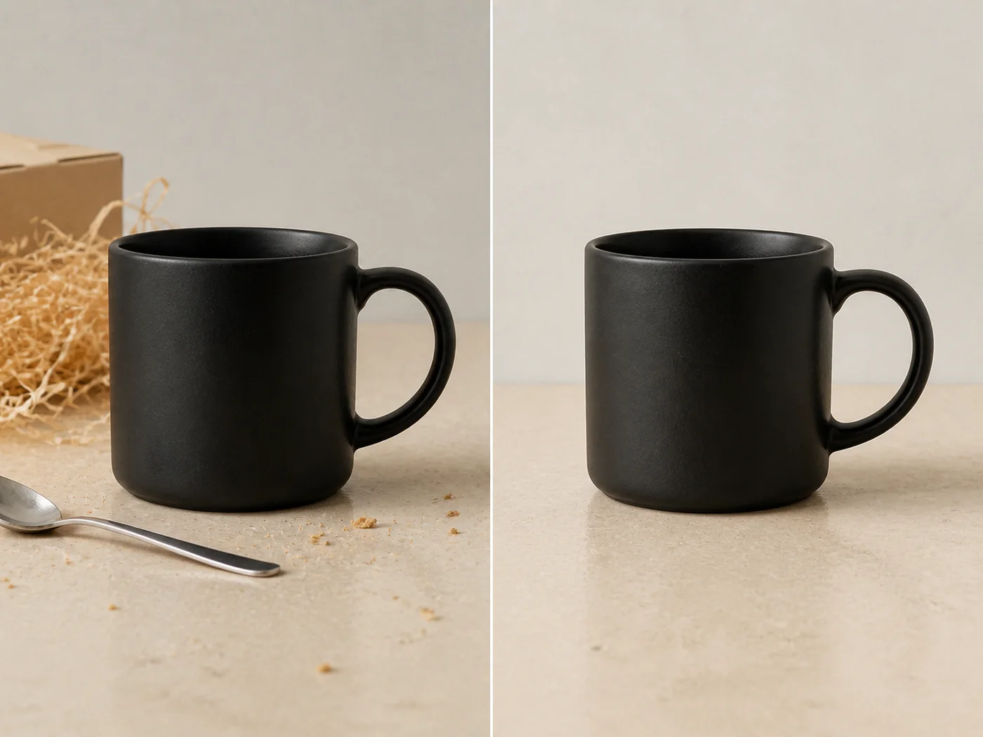 ## 可直接复制的 prompt
~~~text
以我上传的商品图作为准确参考,只移除选中区域里的杂物和干扰物。请自然补回背景、桌面、墙面或阴影,并匹配周围纹理、光线和透视。保留商品形状、边缘、材质、颜色、标签/logo、把手/结构和接触阴影。不要改变商品,不要改变裁切,不要添加新道具。
~~~
## KrafLayer 放在流程里的位置
把有杂物的产品图怎么一键清理成干净商品图放到 KrafLayer 里做时,先选对工具:在 Erase 里只刷选要移除的区域,让模型根据周围像素补齐。生成后不要只看画面是否更漂亮,要按主图、详情图或广告素材的使用场景检查:商品形状、材质、标签、颜色、比例和配件仍然对应原始 SKU。
## FAQ
### 可以一次清很多杂物吗?
可以,但分区域处理更稳。大范围一键清理容易出现糊斑和重复纹理。
# 极简风高级感商品摄影 AI 怎么做
URL: https://kraflayer.com/zh/blog/minimalist-premium-ai-product-photography
Summary: 一套极简高级商品图流程:用光线、留白、材质和阴影建立高级感,而不是把画面做空。可在 KrafLayer 中按同一流程完成。
Updated: 2026-06-12
## TL;DR
极简风高级感商品摄影 AI这类任务,KrafLayer 的作用是把真实商品参考图推进到可用的主图、详情图或广告素材,而不是重新发明商品。核心检查点是商品形状、材质、标签、颜色、比例和配件仍然对应原始 SKU。
极简高级感不是“背景很空”。真正有效的极简商品图,要让光线、材质、边缘、比例和阴影都更清楚。
## 可直接复制的 prompt
~~~text
以我上传的商品图作为准确参考,只移除选中区域里的杂物和干扰物。请自然补回背景、桌面、墙面或阴影,并匹配周围纹理、光线和透视。保留商品形状、边缘、材质、颜色、标签/logo、把手/结构和接触阴影。不要改变商品,不要改变裁切,不要添加新道具。
~~~
## KrafLayer 放在流程里的位置
把有杂物的产品图怎么一键清理成干净商品图放到 KrafLayer 里做时,先选对工具:在 Erase 里只刷选要移除的区域,让模型根据周围像素补齐。生成后不要只看画面是否更漂亮,要按主图、详情图或广告素材的使用场景检查:商品形状、材质、标签、颜色、比例和配件仍然对应原始 SKU。
## FAQ
### 可以一次清很多杂物吗?
可以,但分区域处理更稳。大范围一键清理容易出现糊斑和重复纹理。
# 极简风高级感商品摄影 AI 怎么做
URL: https://kraflayer.com/zh/blog/minimalist-premium-ai-product-photography
Summary: 一套极简高级商品图流程:用光线、留白、材质和阴影建立高级感,而不是把画面做空。可在 KrafLayer 中按同一流程完成。
Updated: 2026-06-12
## TL;DR
极简风高级感商品摄影 AI这类任务,KrafLayer 的作用是把真实商品参考图推进到可用的主图、详情图或广告素材,而不是重新发明商品。核心检查点是商品形状、材质、标签、颜色、比例和配件仍然对应原始 SKU。
极简高级感不是“背景很空”。真正有效的极简商品图,要让光线、材质、边缘、比例和阴影都更清楚。
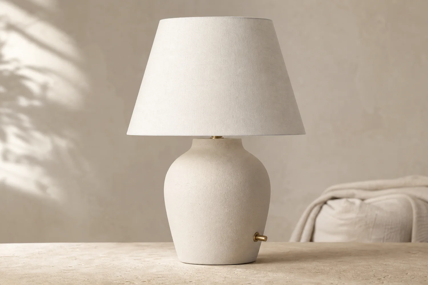 ## 可直接复制的 prompt
~~~text
以我上传的商品图作为准确参考,生成极简高级感电商商品摄影图。请保留商品形状、材质、颜色、纹理、比例、logo/标签区域和自然阴影。使用干净构图、柔和受控光线、简单背景和充足留白,让商品成为主体。不要添加多余道具,不要改变商品设计,不要把阴影全部去掉。
~~~
## KrafLayer 放在流程里的位置
把极简风高级感商品摄影 AI放到 KrafLayer 里做时,先固定商品参考图,再决定是修背景、补光线、做详情图还是延展广告版本。最后按主图、详情图或广告素材的使用场景检查:商品形状、材质、标签、颜色、比例和配件仍然对应原始 SKU。
## FAQ
### 极简图为什么容易无聊?
通常是光线和材质没做好。极简不是没内容,而是减少干扰。
# How to Create Vintage Coffee Bean and Tea Bag Product Images with AI
URL: https://kraflayer.com/blog/vintage-coffee-bean-and-tea-bag-product-images
Summary: A vintage food-and-beverage product image workflow: create warm coffee and tea visuals while preserving packaging text, ingredient identity, portion, and appetizing realism. Includes how to do it in KrafLayer.
Updated: 2026-08-21
## TL;DR
For Create Vintage Coffee Bean and Tea Bag Product Images, KrafLayer is useful when a real product reference needs to become a usable asset for listing images, detail pages, or ad assets. Treat it as production editing, not product reinvention; the test is whether portion size, ingredients, packaging, and serving style remain honest.
Vintage coffee and tea images should feel warm, aromatic, and credible. The style works through surface, light, props, and color, not by changing the package or inventing a new blend.
## 可直接复制的 prompt
~~~text
以我上传的商品图作为准确参考,生成极简高级感电商商品摄影图。请保留商品形状、材质、颜色、纹理、比例、logo/标签区域和自然阴影。使用干净构图、柔和受控光线、简单背景和充足留白,让商品成为主体。不要添加多余道具,不要改变商品设计,不要把阴影全部去掉。
~~~
## KrafLayer 放在流程里的位置
把极简风高级感商品摄影 AI放到 KrafLayer 里做时,先固定商品参考图,再决定是修背景、补光线、做详情图还是延展广告版本。最后按主图、详情图或广告素材的使用场景检查:商品形状、材质、标签、颜色、比例和配件仍然对应原始 SKU。
## FAQ
### 极简图为什么容易无聊?
通常是光线和材质没做好。极简不是没内容,而是减少干扰。
# How to Create Vintage Coffee Bean and Tea Bag Product Images with AI
URL: https://kraflayer.com/blog/vintage-coffee-bean-and-tea-bag-product-images
Summary: A vintage food-and-beverage product image workflow: create warm coffee and tea visuals while preserving packaging text, ingredient identity, portion, and appetizing realism. Includes how to do it in KrafLayer.
Updated: 2026-08-21
## TL;DR
For Create Vintage Coffee Bean and Tea Bag Product Images, KrafLayer is useful when a real product reference needs to become a usable asset for listing images, detail pages, or ad assets. Treat it as production editing, not product reinvention; the test is whether portion size, ingredients, packaging, and serving style remain honest.
Vintage coffee and tea images should feel warm, aromatic, and credible. The style works through surface, light, props, and color, not by changing the package or inventing a new blend.
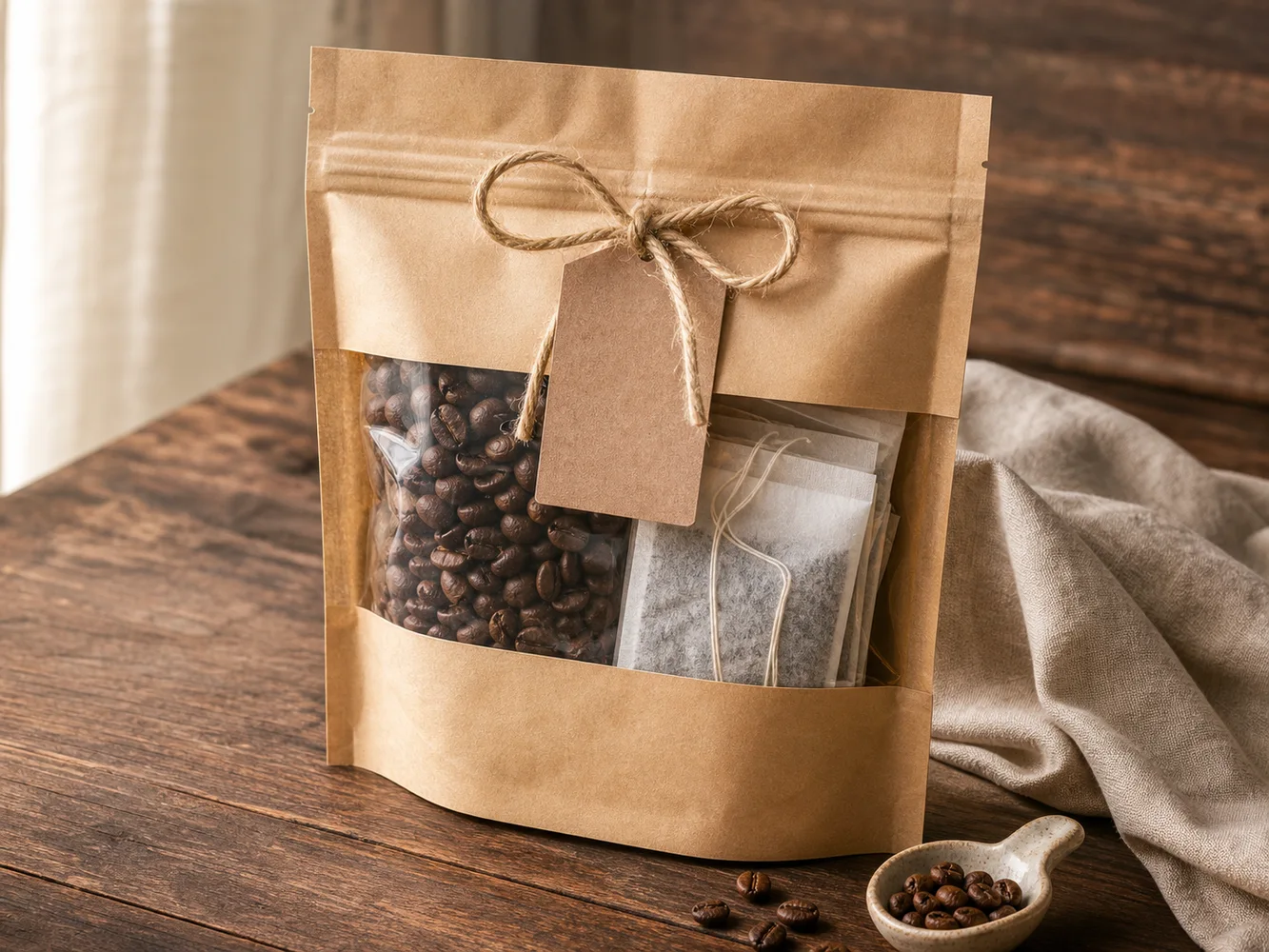 ## What to preserve
For coffee and tea, packaging text, roast or flavor cues, bag shape, label area, ingredient identity, and portion size matter. Beans should look like beans, tea should look like tea, and props should not confuse the product.
## Workflow
1. Choose a warm surface: wood, linen, kraft paper, ceramic, or cafe counter.
2. Keep packaging front-readable when packaging is the hero.
3. Use ingredients as context, not clutter.
4. Preserve product color and label areas.
5. Check mobile thumbnails for readability.
## Where KrafLayer Fits
When you apply this Create Vintage Coffee Bean and Tea Bag Product Images workflow in KrafLayer, start from the clearest product reference, then decide whether the asset needs cleanup, lighting, background work, detail support, or an ad version. Before using it for listing images, detail pages, or ad assets, check that portion size, ingredients, packaging, and serving style remain honest.
## Prompt to use in KrafLayer
~~~text
Use the uploaded coffee or tea product as the exact reference. Create a vintage ecommerce product image with warm natural light, textured surface, subtle ingredient context, and cozy premium mood. Preserve packaging shape, label area, product name placement, ingredient identity, color, portion, and scale. Do not invent readable label text, change the product type, add unrelated props, or make the scene too dark.
~~~
## FAQ
### Is vintage style good for marketplace images?
Use it for support images, ads, and brand pages. Marketplace main images usually need a cleaner product-first view.
### Should I add loose beans or tea leaves?
Only if they match the product. Props should reinforce flavor or material, not create confusion.
### Why does vintage AI look too brown or dark?
Ask for warm natural light and product readability. Vintage does not have to mean underexposed.
# Amazon Product Photo Editing: A Compliance Checklist
URL: https://kraflayer.com/blog/edit-product-photos-for-amazon-without-breaking-listing-compliance
Summary: Edit Amazon product photos with separate main and additional image roles, a safe-edit map, edge review, source evidence, and a pre-upload checklist.
Updated: 2026-08-22
Amazon product photo editing should improve clarity without changing what the customer receives. Treat the main image and additional images as different roles, preserve the photographed SKU, and check the current category and marketplace rules before upload.
You can edit product photos for Amazon by removing shoot-side problems, improving clarity, and building the right image roles without changing what the buyer will receive. The safest rule is simple: edit the photography, not the product. Clean the background, remove temporary props or dust, improve resolution, and make detail images easier to inspect. Do not add fake badges, unsupported claims, extra accessories, altered packaging, or product features that are not part of the item.
KrafLayer fits this workflow when your product is real but the photos are not listing-ready. Use it to clean backgrounds, erase distractions, upscale soft files, and make product-forward images that still match the real SKU.
## What to preserve
For coffee and tea, packaging text, roast or flavor cues, bag shape, label area, ingredient identity, and portion size matter. Beans should look like beans, tea should look like tea, and props should not confuse the product.
## Workflow
1. Choose a warm surface: wood, linen, kraft paper, ceramic, or cafe counter.
2. Keep packaging front-readable when packaging is the hero.
3. Use ingredients as context, not clutter.
4. Preserve product color and label areas.
5. Check mobile thumbnails for readability.
## Where KrafLayer Fits
When you apply this Create Vintage Coffee Bean and Tea Bag Product Images workflow in KrafLayer, start from the clearest product reference, then decide whether the asset needs cleanup, lighting, background work, detail support, or an ad version. Before using it for listing images, detail pages, or ad assets, check that portion size, ingredients, packaging, and serving style remain honest.
## Prompt to use in KrafLayer
~~~text
Use the uploaded coffee or tea product as the exact reference. Create a vintage ecommerce product image with warm natural light, textured surface, subtle ingredient context, and cozy premium mood. Preserve packaging shape, label area, product name placement, ingredient identity, color, portion, and scale. Do not invent readable label text, change the product type, add unrelated props, or make the scene too dark.
~~~
## FAQ
### Is vintage style good for marketplace images?
Use it for support images, ads, and brand pages. Marketplace main images usually need a cleaner product-first view.
### Should I add loose beans or tea leaves?
Only if they match the product. Props should reinforce flavor or material, not create confusion.
### Why does vintage AI look too brown or dark?
Ask for warm natural light and product readability. Vintage does not have to mean underexposed.
# Amazon Product Photo Editing: A Compliance Checklist
URL: https://kraflayer.com/blog/edit-product-photos-for-amazon-without-breaking-listing-compliance
Summary: Edit Amazon product photos with separate main and additional image roles, a safe-edit map, edge review, source evidence, and a pre-upload checklist.
Updated: 2026-08-22
Amazon product photo editing should improve clarity without changing what the customer receives. Treat the main image and additional images as different roles, preserve the photographed SKU, and check the current category and marketplace rules before upload.
You can edit product photos for Amazon by removing shoot-side problems, improving clarity, and building the right image roles without changing what the buyer will receive. The safest rule is simple: edit the photography, not the product. Clean the background, remove temporary props or dust, improve resolution, and make detail images easier to inspect. Do not add fake badges, unsupported claims, extra accessories, altered packaging, or product features that are not part of the item.
KrafLayer fits this workflow when your product is real but the photos are not listing-ready. Use it to clean backgrounds, erase distractions, upscale soft files, and make product-forward images that still match the real SKU.
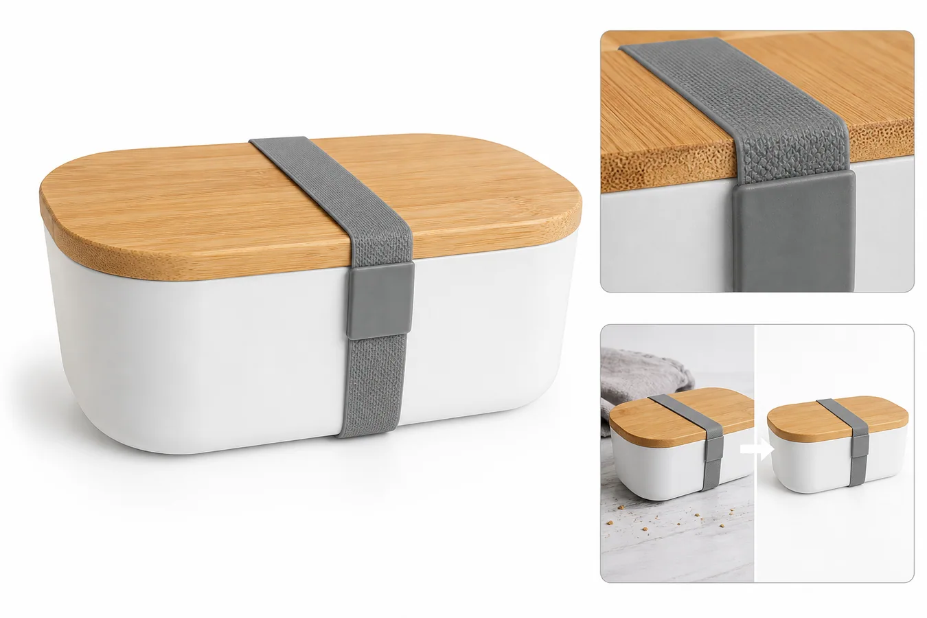 ## Quick Answer: What To Edit First
For Amazon product photos, edit in this order:
1. make the main product image clear and uncluttered
2. remove temporary shoot artifacts such as dust, props, hands, tape, or background mess
3. improve sharpness only when product texture, labels, and edges remain believable
4. create detail images that prove material, scale, package contents, or function
5. review every image against the real product before upload
Practical rule: a good Amazon image edit makes the product easier to inspect, not easier to misunderstand.
## Separate Safe Edits From Risky Edits
The difference between a useful edit and a risky edit is whether the buyer still sees the real product.
| Edit type | Usually useful | Review carefully |
|---|---|---|
| Background cleanup | Removing clutter, color cast, dirty paper, or distracting props | Do not erase product edges, shadows, or package contents |
| Object removal | Removing hands, dust, loose tags, temporary stickers, or shoot tools | Do not remove buyer-relevant labels, defects, included parts, or warnings |
| Upscaling | Making a soft but accurate photo easier to inspect | Do not accept invented texture, altered text, or redesigned details |
| Detail images | Showing material, hardware, packaging, or use | Do not add fake callouts, badges, or unsupported claims |
| Lifestyle images | Showing scale or real use context | Do not hide the product or imply included accessories that are not sold |
This matters because Amazon listing images carry buyer expectations. If the image changes the SKU, the edit has gone too far.
## A Practical Amazon Photo Editing Workflow In KrafLayer
Use this workflow when you already have product photos and need cleaner listing assets.
### 1. Choose The Most Accurate Source Photo
Start with the photo that best represents the real item. It does not need perfect lighting, but it should show product shape, color, material, package contents, and important details.
For a lunch container, protect lid shape, silicone strap, material texture, container depth, edge curves, and contact shadow. For skincare, protect cap geometry, label placement, liquid color, and bottle proportions. For electronics, protect ports, seams, buttons, screen edges, and scale.
### 2. Clean The Main Image
If the background is the problem, use the [AI background remover](/tools/ai-background-remover) to create a clean cutout or a simple product-forward image. If the issue is smaller, use the [AI product photo editor](/product-photo-editor) to remove dust, creases, temporary props, or distracting marks.
The main image should help the buyer answer: what is this product, and what exactly is included?
For the broader listing workflow, use the [Amazon product photos guide](/marketplace-product-images/amazon-product-photos) as the owner page, then treat this article as the editing checklist for turning source photos into safer listing assets.
### 3. Remove Only Temporary Distractions
Use the [AI object eraser](/tools/ai-object-eraser) for things that clearly came from the shoot, not from the product:
- lint, dust, crumbs, paper wrinkles, or tape
- a hand holding the product
- a temporary barcode or warehouse sticker
- a background prop that blocks the product
- a reflection that hides material or label detail
Do not erase permanent labels, safety markings, package information, real wear, included parts, or structural details. If a detail affects buyer understanding, keep it visible.
### 4. Build Detail Images That Prove Something
Amazon listing images should not all repeat the same hero shot. Use detail images to answer questions the main image cannot answer:
- What does the material look like close up?
- How does the cap, lid, clasp, zipper, or strap work?
- What is included in the package?
- How large does the product feel next to a believable scale cue?
- Which texture, edge, seam, or finish should the buyer trust?
The best detail image is not decorative. It gives the buyer a reason to believe the product description.
### 5. Review Before Upload
Before publishing, compare the edited image set with the real product:
- Product color still looks believable.
- Shape, size, edges, seams, caps, buttons, labels, and ports are unchanged.
- Background edits did not make the product float or lose edge detail.
- Detail images show real product features, not invented improvements.
- There are no fake badges, guarantee marks, certification icons, or unverified claims.
- The image does not imply accessories, bundles, or quantities that are not included.
- Any exact Amazon image requirement has been checked in current Seller Central or official Amazon guidance.
This article gives a production workflow, not legal or compliance advice. Amazon guidance can change, and sellers should verify current marketplace requirements before final upload.
## Prompt Template For Amazon Listing Image Cleanup
Use a conservative instruction like this when a prompt-capable workflow is appropriate:
> Edit this product photo for an Amazon listing. Keep the real product shape, color, material texture, label placement, package contents, scale, and natural shadow unchanged. Remove only temporary shoot clutter, dust, background mess, and distracting props. Do not add badges, fake text, new logos, extra accessories, certification marks, or product features that are not in the source.
The prompt works because it defines the editing boundary before asking for cleanup. For marketplace images, that boundary is more important than style.
## When A Photo Should Not Be Edited
Some photos are too weak to rescue. Reshoot or create a better reference when:
- the product is out of focus beyond recovery
- the wrong variant is shown
- an important side, label, port, or included item is missing
- lighting hides true color or material
- the image would need major product reconstruction
- the edit would hide a real condition issue
AI can remove production friction, but it should not be used to cover product truth.
## Separate the main image from additional images
Amazon's main image has the strictest role. Current Amazon seller guidance requires a professional image of the actual product on pure white RGB 255, 255, 255, with the product filling at least 85% of the frame. It excludes text, graphics, watermarks, and props that are not included. Amazon recommends at least 1000 pixels on the longest side for zoom ([Amazon product image requirements](https://sellercentral.amazon.com/seller-forums/discussions/t/13af96ea-6b07-4bf9-8dbe-a13292c2e3b1), 2026).
Use additional images for lifestyle context, detail evidence, scale, and instructions. Do not transfer the creative freedom of an additional image into the main slot. Also check the live Seller Central rule for your product category and marketplace before upload, because category-specific requirements can differ.
## Use a compliance-safe edit map
Classify each planned change before opening the editor:
| Edit | Main image | Additional image | Review question |
|---|---|---|---|
| Remove dust or temporary background debris | Usually safe | Safe | Is the product unchanged? |
| Replace background with pure white | Expected for most categories | Optional | Are edges and transparent parts accurate? |
| Add promotional text or badge | No | Review current rules | Is the claim allowed and supported? |
| Add a lifestyle setting | No | Common use | Does it imply included accessories? |
| Repair a missing product detail | No | No | Why is the source inaccurate? |
| Adjust crop and product fill | Safe if complete product remains visible | Safe | Is scale still honest? |
Never use generative editing to add a component, fix packaging text, change color, remove a condition issue, or make an accessory appear included. Photograph the correct item instead.
## Inspect white-on-white and transparent products carefully
A pure white background can erase the edge of a white, clear, or reflective product. Preserve the real boundary with lighting and tonal separation in the source. Do not add a gray outline around the whole item just to make the cutout visible.
Check glass, plastic, polished metal, fine straps, cables, and soft fabric on both white and gray review backgrounds. The final main image can be white, but the review background helps reveal clipped transparency and halos.
## Create a pre-upload evidence record
Keep the untouched source, final export, ASIN or product identifier, image-slot name, editor, date, and a short list of edits. Use stable filenames that follow the current Seller Central upload workflow. This record makes a rejected image easier to diagnose and protects the team from editing the wrong variant.
Before upload, verify:
- the photographed product matches the listing and selected variant;
- only included items appear in the main image;
- the background and overlays meet the slot's current rules;
- the full product is sharp and the crop is intentional;
- color, material, labels, ports, hardware, and packaging remain accurate;
- the exported dimensions and format meet the current marketplace requirement.
Compliance is an upload gate, not a one-time template. Recheck the official rule when Amazon changes the listing experience or when you enter a new category or country marketplace.
## FAQ
### Can I use AI-edited images on Amazon?
AI-edited images can be useful for cleaning product photos, but the seller is still responsible for making sure the final image represents the real product and follows current Amazon guidance. Use AI for background cleanup, object removal, sharpness, and detail preparation, then review the final image against the item being sold.
### What should I avoid when editing Amazon product photos?
Avoid edits that change the product, add fake certifications, invent included accessories, alter labels, remove buyer-relevant information, or make the item look like a different SKU. Also avoid lifestyle scenes that hide the product or imply a bundle the buyer will not receive.
### Is background removal enough for Amazon product photos?
Background removal is often the first fix, not the whole workflow. You may also need sharper detail images, consistent variant crops, product-truth review, object cleanup, and secondary images that explain material, function, package contents, or scale.
### How can I make Amazon product photos look more professional?
Start with product hierarchy. The product should be immediately readable, centered when appropriate, and free of shoot-side clutter. Then improve lighting, background, crop, detail images, and file clarity. Professional does not mean over-styled; it means easy to inspect and hard to misunderstand.
### How does KrafLayer help edit product photos for Amazon?
KrafLayer helps sellers clean existing product photos with background removal, object erasing, upscaling, and product-photo editing. It is useful when you need listing-ready main images and detail images while keeping the real product facts intact.
## Conclusion
KrafLayer helps edit product photos for Amazon by making cleanup, background removal, object erasing, and detail-image preparation easier without forcing sellers into a full reshoot. The right workflow is conservative: improve the photo, preserve the SKU, review every output against the real product, and check current Amazon guidance before uploading final listing images.
# How to Fix Messy Reflections in Glass Cup Product Photos
URL: https://kraflayer.com/blog/fix-messy-reflections-in-glass-cup-product-photos
Summary: A practical AI editing workflow for cleaning distracting reflections on glass tumblers while keeping the same shape, rim, ribbed texture, transparency, and shadow. Includes how to do it in KrafLayer.
Updated: 2026-08-21
## TL;DR
For Fix Messy Reflections in Glass Cup Product Photos, KrafLayer works best as a local cleanup tool: brush only the unwanted area in Erase and let the model fill from the surrounding pixels. Avoid regenerating the whole image; the result is only useful if shape, material, labels, color, scale, and accessories still match the source SKU.
Messy reflections on a glass cup should be edited locally, not solved by regenerating the whole product photo. The goal is to make the rim, transparent wall, base thickness, and texture readable while keeping the same tumbler, camera angle, tabletop, and contact shadow.
KrafLayer is an AI-powered visual editor for ecommerce product photography. For glassware, use it to reduce reflection noise and preserve the physical facts that buyers inspect before purchase.
The example uses one clear ribbed glass tumbler. The before side has harsh vertical highlights and a dark reflected shape that makes the glass look dirty and harder to understand. The after side keeps the same product and surface, but the reflections are quieter, the rim reads cleanly, and the ribbed wall looks more like a sellable detail image.
## Why Glass Reflections Need Careful Editing
Glass products are easy to over-edit. If you remove every highlight, the cup looks flat or plastic. If you ask AI for a fresh “premium glass product photo,” it may change the rim thickness, rib count, base shape, or transparency.
The better task is narrow: keep useful edge highlights, clean up the confusing reflected shapes, and make the material easier to read in a product listing. Buyers still need proof that the item is real glass, not a generic render.
## Protect These Product Facts
Before editing, list what must stay unchanged. For a ribbed tumbler, protect the rim ellipse, wall height, rib spacing, base thickness, glass color, tabletop contact, shadow direction, and crop.
For other glass products, protect the details that identify the SKU:
- wine glasses: bowl shape, stem height, foot size, rim thickness
- storage jars: lid seal, clip hardware, glass wall, fill line
- candle jars: wax level, glass tint, label placement, flame-free safety crop
- skincare jars: cap geometry, glass thickness, label edge, liquid color
If the after image is cleaner but changes these facts, it is not ready for ecommerce use.
## Edit Prompt for Cleaning Glass Reflections
Use a local edit prompt inside [KrafLayer](https://kraflayer.com):
> Clean the distracting reflections on this clear ribbed glass tumbler. Reduce harsh white streaks and the dark reflected shape, but keep the same tumbler shape, rim ellipse, ribbed texture, transparent wall, base thickness, tabletop, crop, camera angle, and natural shadow. Keep elegant glass highlights so the material still looks real. Do not redesign the cup, change the rib count, add props, add liquid, add text, or make the glass look plastic.
This prompt keeps the workflow focused on reflection control, not product redesign.
## What a Good After Image Should Prove
A corrected glass product image should answer three buyer questions fast: what is the shape, how thick or premium does the glass feel, and does the surface texture look intentional?
Check the result at full size and thumbnail size:
- the rim is readable and not warped
- the ribbed texture still follows the cup shape
- the base looks solid, not melted or floating
- highlights are softer but still show glass material
- no dark reflected object competes with the product
- the tabletop shadow still anchors the cup
Do not chase a spotless image. A small amount of controlled reflection is what makes glass believable.
## When to Use This Workflow
Use this edit when the original glass photo has strong selling potential but bad reflections from windows, phone screens, black equipment, or the photographer's silhouette. It is useful for drinkware listings, home goods catalogs, detail images, marketplace main images, and paid ad crops.
Do not use the edit to hide scratches, cracks, or real defects on the item. Use it to remove shooting-side reflection problems that distract from the actual product.
## Where KrafLayer Fits
When you apply this Fix Messy Reflections in Glass Cup Product Photos workflow in KrafLayer, the tool choice matters: brush only the unwanted area in Erase and let the model fill from the surrounding pixels. After generation, judge the image by the channel it serves — listing images, detail pages, or ad assets — and check that shape, material, labels, color, scale, and accessories still match the source SKU.
## FAQ
### Can AI remove reflections from glass product photos?
AI can reduce distracting reflections when the edit is narrow and the prompt protects the real product shape, rim, texture, transparency, and shadow. It should not remove every highlight.
### Should glass product photos have no reflections?
No. Glass needs controlled highlights so buyers can read the material. The goal is to remove confusing reflection clutter, not make the product look like plastic.
### What details should I check after editing a glass cup photo?
Check the rim ellipse, base thickness, rib spacing, transparency, edge highlights, and contact shadow. These details tell buyers whether the image still represents the real product.
# What is Canvas Creation System
URL: https://kraflayer.com/docs/what-is-canvas-creation-system
Summary: Learn how KrafLayer's Canvas Creation System connects prompts, references, models, edits, style presets, and image-to-video workflows.
Updated: 2026-06-12
## Quick answer
Canvas Creation System is KrafLayer's visual workspace for planning, generating, editing, comparing, and continuing AI image and video ideas in one place. Instead of treating every generation as a one-shot result, Canvas keeps prompts, references, outputs, edits, and variations together so a project can develop over time.
Use this page as the product overview. If you are new to KrafLayer, Canvas is the place where the main creation workflow comes together: prompt writing, style presets, image generation, image editing tools, image-to-video, model selection, and cost awareness.
## What Canvas organizes
- Prompts and enhanced prompts that define what you want to create.
- Reference images that preserve product identity, character identity, layout, or visual direction.
- Generated images and video clips that can be compared side by side.
- Editing steps such as background removal, erase, upscale, mask edit, reference edit, and scene compose.
- Model choices for image generation, image editing, and video generation.
- Iterations, so you can return to a visual direction without losing context.
## Why it is useful
Most AI generation tools behave like a linear chat or form: write a prompt, get an output, then start again. Canvas is different because it keeps the visual context visible. That matters when you are building a product image set, testing several model families, turning one image into video, or comparing styles before choosing a final direction.
Canvas helps users answer practical questions faster:
- Which output is closest to the intended product, scene, or character?
- Which prompt, style preset, or reference image produced the best result?
- Should the next step be an edit, a new generation, or a video animation?
- Which model is worth using for the final version?
## How a typical Canvas workflow works
1. Start with a short idea, product description, or reference image.
2. Use prompt writing basics or prompt enhancement to make the request clearer.
3. Choose a style preset if you want a specific visual lane, such as Product, Cinematic, Anime, Lacquer, or Watercolor.
4. Generate an image with an image model or edit an existing image with an editing tool.
5. Compare results on the canvas and keep the strongest direction.
6. Use image-to-video when a still image should become motion.
7. Check plans and model costs when you need to choose a credit budget or compare model usage.
## Where to go next
- Learn the main visual roles in [Types of ecommerce images](/docs/ecommerce-image-types).
- Understand why product visuals need a different workflow in [Ecommerce images vs regular AI images](/docs/ecommerce-images-vs-regular-ai-images).
- Learn the prompt structure in [Prompt writing basics](/docs/prompt-writing-basics).
- Choose a visual direction in [14 style presets](/docs/style-presets-and-when-to-use-them).
- Compare image models in [Image generation models](/docs/image-generation).
- Compare editing tools in [Image editing tools](/docs/editing-tools).
- Animate a still image with [Image to video with AI](/docs/ai-image-to-video-guide).
- Check credit usage in [Costs by model and task](/docs/generation-cost).
## Final thought
Canvas Creation System is the connective layer of KrafLayer. The individual docs explain prompts, styles, models, costs, and tools; Canvas explains how those pieces work together as one visual production workspace.
## Quick Answer: What To Edit First
For Amazon product photos, edit in this order:
1. make the main product image clear and uncluttered
2. remove temporary shoot artifacts such as dust, props, hands, tape, or background mess
3. improve sharpness only when product texture, labels, and edges remain believable
4. create detail images that prove material, scale, package contents, or function
5. review every image against the real product before upload
Practical rule: a good Amazon image edit makes the product easier to inspect, not easier to misunderstand.
## Separate Safe Edits From Risky Edits
The difference between a useful edit and a risky edit is whether the buyer still sees the real product.
| Edit type | Usually useful | Review carefully |
|---|---|---|
| Background cleanup | Removing clutter, color cast, dirty paper, or distracting props | Do not erase product edges, shadows, or package contents |
| Object removal | Removing hands, dust, loose tags, temporary stickers, or shoot tools | Do not remove buyer-relevant labels, defects, included parts, or warnings |
| Upscaling | Making a soft but accurate photo easier to inspect | Do not accept invented texture, altered text, or redesigned details |
| Detail images | Showing material, hardware, packaging, or use | Do not add fake callouts, badges, or unsupported claims |
| Lifestyle images | Showing scale or real use context | Do not hide the product or imply included accessories that are not sold |
This matters because Amazon listing images carry buyer expectations. If the image changes the SKU, the edit has gone too far.
## A Practical Amazon Photo Editing Workflow In KrafLayer
Use this workflow when you already have product photos and need cleaner listing assets.
### 1. Choose The Most Accurate Source Photo
Start with the photo that best represents the real item. It does not need perfect lighting, but it should show product shape, color, material, package contents, and important details.
For a lunch container, protect lid shape, silicone strap, material texture, container depth, edge curves, and contact shadow. For skincare, protect cap geometry, label placement, liquid color, and bottle proportions. For electronics, protect ports, seams, buttons, screen edges, and scale.
### 2. Clean The Main Image
If the background is the problem, use the [AI background remover](/tools/ai-background-remover) to create a clean cutout or a simple product-forward image. If the issue is smaller, use the [AI product photo editor](/product-photo-editor) to remove dust, creases, temporary props, or distracting marks.
The main image should help the buyer answer: what is this product, and what exactly is included?
For the broader listing workflow, use the [Amazon product photos guide](/marketplace-product-images/amazon-product-photos) as the owner page, then treat this article as the editing checklist for turning source photos into safer listing assets.
### 3. Remove Only Temporary Distractions
Use the [AI object eraser](/tools/ai-object-eraser) for things that clearly came from the shoot, not from the product:
- lint, dust, crumbs, paper wrinkles, or tape
- a hand holding the product
- a temporary barcode or warehouse sticker
- a background prop that blocks the product
- a reflection that hides material or label detail
Do not erase permanent labels, safety markings, package information, real wear, included parts, or structural details. If a detail affects buyer understanding, keep it visible.
### 4. Build Detail Images That Prove Something
Amazon listing images should not all repeat the same hero shot. Use detail images to answer questions the main image cannot answer:
- What does the material look like close up?
- How does the cap, lid, clasp, zipper, or strap work?
- What is included in the package?
- How large does the product feel next to a believable scale cue?
- Which texture, edge, seam, or finish should the buyer trust?
The best detail image is not decorative. It gives the buyer a reason to believe the product description.
### 5. Review Before Upload
Before publishing, compare the edited image set with the real product:
- Product color still looks believable.
- Shape, size, edges, seams, caps, buttons, labels, and ports are unchanged.
- Background edits did not make the product float or lose edge detail.
- Detail images show real product features, not invented improvements.
- There are no fake badges, guarantee marks, certification icons, or unverified claims.
- The image does not imply accessories, bundles, or quantities that are not included.
- Any exact Amazon image requirement has been checked in current Seller Central or official Amazon guidance.
This article gives a production workflow, not legal or compliance advice. Amazon guidance can change, and sellers should verify current marketplace requirements before final upload.
## Prompt Template For Amazon Listing Image Cleanup
Use a conservative instruction like this when a prompt-capable workflow is appropriate:
> Edit this product photo for an Amazon listing. Keep the real product shape, color, material texture, label placement, package contents, scale, and natural shadow unchanged. Remove only temporary shoot clutter, dust, background mess, and distracting props. Do not add badges, fake text, new logos, extra accessories, certification marks, or product features that are not in the source.
The prompt works because it defines the editing boundary before asking for cleanup. For marketplace images, that boundary is more important than style.
## When A Photo Should Not Be Edited
Some photos are too weak to rescue. Reshoot or create a better reference when:
- the product is out of focus beyond recovery
- the wrong variant is shown
- an important side, label, port, or included item is missing
- lighting hides true color or material
- the image would need major product reconstruction
- the edit would hide a real condition issue
AI can remove production friction, but it should not be used to cover product truth.
## Separate the main image from additional images
Amazon's main image has the strictest role. Current Amazon seller guidance requires a professional image of the actual product on pure white RGB 255, 255, 255, with the product filling at least 85% of the frame. It excludes text, graphics, watermarks, and props that are not included. Amazon recommends at least 1000 pixels on the longest side for zoom ([Amazon product image requirements](https://sellercentral.amazon.com/seller-forums/discussions/t/13af96ea-6b07-4bf9-8dbe-a13292c2e3b1), 2026).
Use additional images for lifestyle context, detail evidence, scale, and instructions. Do not transfer the creative freedom of an additional image into the main slot. Also check the live Seller Central rule for your product category and marketplace before upload, because category-specific requirements can differ.
## Use a compliance-safe edit map
Classify each planned change before opening the editor:
| Edit | Main image | Additional image | Review question |
|---|---|---|---|
| Remove dust or temporary background debris | Usually safe | Safe | Is the product unchanged? |
| Replace background with pure white | Expected for most categories | Optional | Are edges and transparent parts accurate? |
| Add promotional text or badge | No | Review current rules | Is the claim allowed and supported? |
| Add a lifestyle setting | No | Common use | Does it imply included accessories? |
| Repair a missing product detail | No | No | Why is the source inaccurate? |
| Adjust crop and product fill | Safe if complete product remains visible | Safe | Is scale still honest? |
Never use generative editing to add a component, fix packaging text, change color, remove a condition issue, or make an accessory appear included. Photograph the correct item instead.
## Inspect white-on-white and transparent products carefully
A pure white background can erase the edge of a white, clear, or reflective product. Preserve the real boundary with lighting and tonal separation in the source. Do not add a gray outline around the whole item just to make the cutout visible.
Check glass, plastic, polished metal, fine straps, cables, and soft fabric on both white and gray review backgrounds. The final main image can be white, but the review background helps reveal clipped transparency and halos.
## Create a pre-upload evidence record
Keep the untouched source, final export, ASIN or product identifier, image-slot name, editor, date, and a short list of edits. Use stable filenames that follow the current Seller Central upload workflow. This record makes a rejected image easier to diagnose and protects the team from editing the wrong variant.
Before upload, verify:
- the photographed product matches the listing and selected variant;
- only included items appear in the main image;
- the background and overlays meet the slot's current rules;
- the full product is sharp and the crop is intentional;
- color, material, labels, ports, hardware, and packaging remain accurate;
- the exported dimensions and format meet the current marketplace requirement.
Compliance is an upload gate, not a one-time template. Recheck the official rule when Amazon changes the listing experience or when you enter a new category or country marketplace.
## FAQ
### Can I use AI-edited images on Amazon?
AI-edited images can be useful for cleaning product photos, but the seller is still responsible for making sure the final image represents the real product and follows current Amazon guidance. Use AI for background cleanup, object removal, sharpness, and detail preparation, then review the final image against the item being sold.
### What should I avoid when editing Amazon product photos?
Avoid edits that change the product, add fake certifications, invent included accessories, alter labels, remove buyer-relevant information, or make the item look like a different SKU. Also avoid lifestyle scenes that hide the product or imply a bundle the buyer will not receive.
### Is background removal enough for Amazon product photos?
Background removal is often the first fix, not the whole workflow. You may also need sharper detail images, consistent variant crops, product-truth review, object cleanup, and secondary images that explain material, function, package contents, or scale.
### How can I make Amazon product photos look more professional?
Start with product hierarchy. The product should be immediately readable, centered when appropriate, and free of shoot-side clutter. Then improve lighting, background, crop, detail images, and file clarity. Professional does not mean over-styled; it means easy to inspect and hard to misunderstand.
### How does KrafLayer help edit product photos for Amazon?
KrafLayer helps sellers clean existing product photos with background removal, object erasing, upscaling, and product-photo editing. It is useful when you need listing-ready main images and detail images while keeping the real product facts intact.
## Conclusion
KrafLayer helps edit product photos for Amazon by making cleanup, background removal, object erasing, and detail-image preparation easier without forcing sellers into a full reshoot. The right workflow is conservative: improve the photo, preserve the SKU, review every output against the real product, and check current Amazon guidance before uploading final listing images.
# How to Fix Messy Reflections in Glass Cup Product Photos
URL: https://kraflayer.com/blog/fix-messy-reflections-in-glass-cup-product-photos
Summary: A practical AI editing workflow for cleaning distracting reflections on glass tumblers while keeping the same shape, rim, ribbed texture, transparency, and shadow. Includes how to do it in KrafLayer.
Updated: 2026-08-21
## TL;DR
For Fix Messy Reflections in Glass Cup Product Photos, KrafLayer works best as a local cleanup tool: brush only the unwanted area in Erase and let the model fill from the surrounding pixels. Avoid regenerating the whole image; the result is only useful if shape, material, labels, color, scale, and accessories still match the source SKU.
Messy reflections on a glass cup should be edited locally, not solved by regenerating the whole product photo. The goal is to make the rim, transparent wall, base thickness, and texture readable while keeping the same tumbler, camera angle, tabletop, and contact shadow.
KrafLayer is an AI-powered visual editor for ecommerce product photography. For glassware, use it to reduce reflection noise and preserve the physical facts that buyers inspect before purchase.
The example uses one clear ribbed glass tumbler. The before side has harsh vertical highlights and a dark reflected shape that makes the glass look dirty and harder to understand. The after side keeps the same product and surface, but the reflections are quieter, the rim reads cleanly, and the ribbed wall looks more like a sellable detail image.
## Why Glass Reflections Need Careful Editing
Glass products are easy to over-edit. If you remove every highlight, the cup looks flat or plastic. If you ask AI for a fresh “premium glass product photo,” it may change the rim thickness, rib count, base shape, or transparency.
The better task is narrow: keep useful edge highlights, clean up the confusing reflected shapes, and make the material easier to read in a product listing. Buyers still need proof that the item is real glass, not a generic render.
## Protect These Product Facts
Before editing, list what must stay unchanged. For a ribbed tumbler, protect the rim ellipse, wall height, rib spacing, base thickness, glass color, tabletop contact, shadow direction, and crop.
For other glass products, protect the details that identify the SKU:
- wine glasses: bowl shape, stem height, foot size, rim thickness
- storage jars: lid seal, clip hardware, glass wall, fill line
- candle jars: wax level, glass tint, label placement, flame-free safety crop
- skincare jars: cap geometry, glass thickness, label edge, liquid color
If the after image is cleaner but changes these facts, it is not ready for ecommerce use.
## Edit Prompt for Cleaning Glass Reflections
Use a local edit prompt inside [KrafLayer](https://kraflayer.com):
> Clean the distracting reflections on this clear ribbed glass tumbler. Reduce harsh white streaks and the dark reflected shape, but keep the same tumbler shape, rim ellipse, ribbed texture, transparent wall, base thickness, tabletop, crop, camera angle, and natural shadow. Keep elegant glass highlights so the material still looks real. Do not redesign the cup, change the rib count, add props, add liquid, add text, or make the glass look plastic.
This prompt keeps the workflow focused on reflection control, not product redesign.
## What a Good After Image Should Prove
A corrected glass product image should answer three buyer questions fast: what is the shape, how thick or premium does the glass feel, and does the surface texture look intentional?
Check the result at full size and thumbnail size:
- the rim is readable and not warped
- the ribbed texture still follows the cup shape
- the base looks solid, not melted or floating
- highlights are softer but still show glass material
- no dark reflected object competes with the product
- the tabletop shadow still anchors the cup
Do not chase a spotless image. A small amount of controlled reflection is what makes glass believable.
## When to Use This Workflow
Use this edit when the original glass photo has strong selling potential but bad reflections from windows, phone screens, black equipment, or the photographer's silhouette. It is useful for drinkware listings, home goods catalogs, detail images, marketplace main images, and paid ad crops.
Do not use the edit to hide scratches, cracks, or real defects on the item. Use it to remove shooting-side reflection problems that distract from the actual product.
## Where KrafLayer Fits
When you apply this Fix Messy Reflections in Glass Cup Product Photos workflow in KrafLayer, the tool choice matters: brush only the unwanted area in Erase and let the model fill from the surrounding pixels. After generation, judge the image by the channel it serves — listing images, detail pages, or ad assets — and check that shape, material, labels, color, scale, and accessories still match the source SKU.
## FAQ
### Can AI remove reflections from glass product photos?
AI can reduce distracting reflections when the edit is narrow and the prompt protects the real product shape, rim, texture, transparency, and shadow. It should not remove every highlight.
### Should glass product photos have no reflections?
No. Glass needs controlled highlights so buyers can read the material. The goal is to remove confusing reflection clutter, not make the product look like plastic.
### What details should I check after editing a glass cup photo?
Check the rim ellipse, base thickness, rib spacing, transparency, edge highlights, and contact shadow. These details tell buyers whether the image still represents the real product.
# What is Canvas Creation System
URL: https://kraflayer.com/docs/what-is-canvas-creation-system
Summary: Learn how KrafLayer's Canvas Creation System connects prompts, references, models, edits, style presets, and image-to-video workflows.
Updated: 2026-06-12
## Quick answer
Canvas Creation System is KrafLayer's visual workspace for planning, generating, editing, comparing, and continuing AI image and video ideas in one place. Instead of treating every generation as a one-shot result, Canvas keeps prompts, references, outputs, edits, and variations together so a project can develop over time.
Use this page as the product overview. If you are new to KrafLayer, Canvas is the place where the main creation workflow comes together: prompt writing, style presets, image generation, image editing tools, image-to-video, model selection, and cost awareness.
## What Canvas organizes
- Prompts and enhanced prompts that define what you want to create.
- Reference images that preserve product identity, character identity, layout, or visual direction.
- Generated images and video clips that can be compared side by side.
- Editing steps such as background removal, erase, upscale, mask edit, reference edit, and scene compose.
- Model choices for image generation, image editing, and video generation.
- Iterations, so you can return to a visual direction without losing context.
## Why it is useful
Most AI generation tools behave like a linear chat or form: write a prompt, get an output, then start again. Canvas is different because it keeps the visual context visible. That matters when you are building a product image set, testing several model families, turning one image into video, or comparing styles before choosing a final direction.
Canvas helps users answer practical questions faster:
- Which output is closest to the intended product, scene, or character?
- Which prompt, style preset, or reference image produced the best result?
- Should the next step be an edit, a new generation, or a video animation?
- Which model is worth using for the final version?
## How a typical Canvas workflow works
1. Start with a short idea, product description, or reference image.
2. Use prompt writing basics or prompt enhancement to make the request clearer.
3. Choose a style preset if you want a specific visual lane, such as Product, Cinematic, Anime, Lacquer, or Watercolor.
4. Generate an image with an image model or edit an existing image with an editing tool.
5. Compare results on the canvas and keep the strongest direction.
6. Use image-to-video when a still image should become motion.
7. Check plans and model costs when you need to choose a credit budget or compare model usage.
## Where to go next
- Learn the main visual roles in [Types of ecommerce images](/docs/ecommerce-image-types).
- Understand why product visuals need a different workflow in [Ecommerce images vs regular AI images](/docs/ecommerce-images-vs-regular-ai-images).
- Learn the prompt structure in [Prompt writing basics](/docs/prompt-writing-basics).
- Choose a visual direction in [14 style presets](/docs/style-presets-and-when-to-use-them).
- Compare image models in [Image generation models](/docs/image-generation).
- Compare editing tools in [Image editing tools](/docs/editing-tools).
- Animate a still image with [Image to video with AI](/docs/ai-image-to-video-guide).
- Check credit usage in [Costs by model and task](/docs/generation-cost).
## Final thought
Canvas Creation System is the connective layer of KrafLayer. The individual docs explain prompts, styles, models, costs, and tools; Canvas explains how those pieces work together as one visual production workspace.
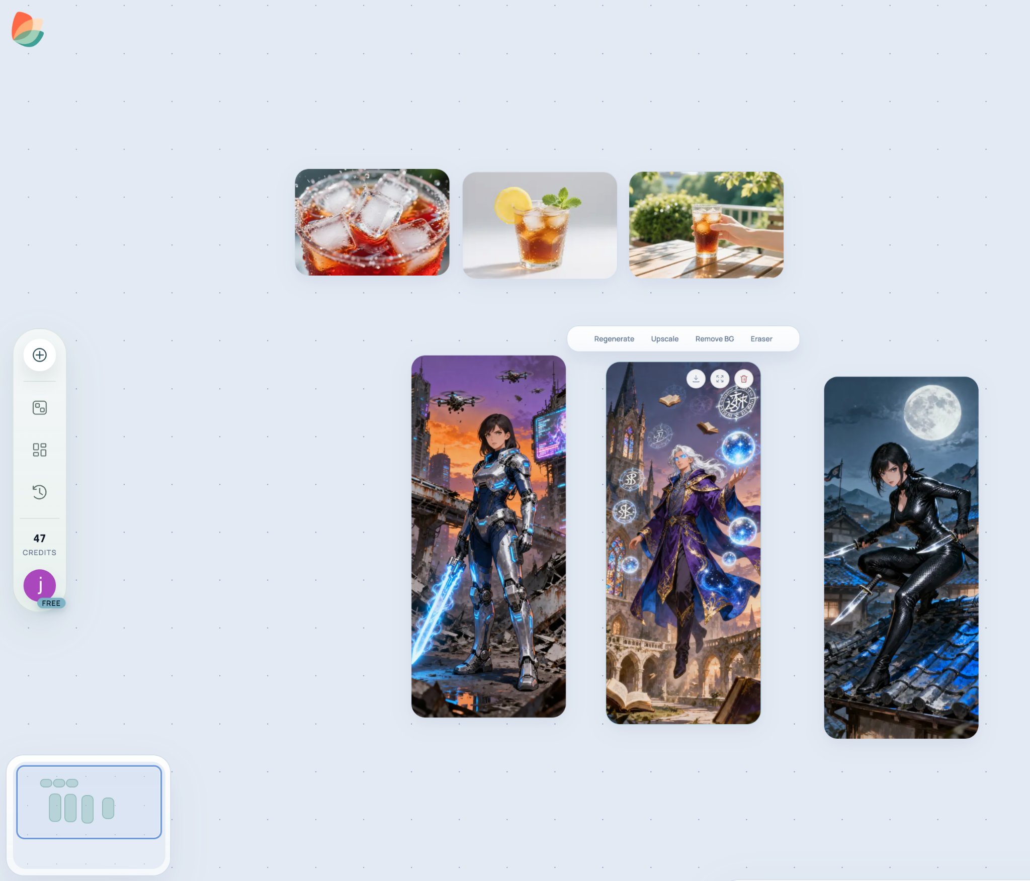 # How to Fix Main and Detail Product Images Without a Reshoot
URL: https://kraflayer.com/blog/fix-main-and-detail-product-images-without-a-reshoot
Summary: A practical workflow for repairing ecommerce main and detail images without reshooting: fix exposure, cleanup, crop, and detail clarity while protecting the SKU. Includes how to do it in KrafLayer.
Updated: 2026-08-21
## TL;DR
For Fix Main and Detail Product Images Without a Reshoot, KrafLayer is useful when a real product reference needs to become a usable asset for detail-page modules. Treat it as production editing, not product reinvention; the test is whether shape, material, labels, color, scale, and accessories still match the source SKU.
You do not always need a reshoot when a main image or detail image underperforms. If the product is visible and accurate, AI can often repair lighting, background, dust, crop, or detail clarity enough for ecommerce use.
The key is deciding whether the problem is photographic or product-related. AI can fix a messy background; it should not invent a missing label or rebuild a hidden feature.
# How to Fix Main and Detail Product Images Without a Reshoot
URL: https://kraflayer.com/blog/fix-main-and-detail-product-images-without-a-reshoot
Summary: A practical workflow for repairing ecommerce main and detail images without reshooting: fix exposure, cleanup, crop, and detail clarity while protecting the SKU. Includes how to do it in KrafLayer.
Updated: 2026-08-21
## TL;DR
For Fix Main and Detail Product Images Without a Reshoot, KrafLayer is useful when a real product reference needs to become a usable asset for detail-page modules. Treat it as production editing, not product reinvention; the test is whether shape, material, labels, color, scale, and accessories still match the source SKU.
You do not always need a reshoot when a main image or detail image underperforms. If the product is visible and accurate, AI can often repair lighting, background, dust, crop, or detail clarity enough for ecommerce use.
The key is deciding whether the problem is photographic or product-related. AI can fix a messy background; it should not invent a missing label or rebuild a hidden feature.
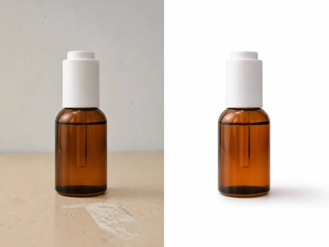 ## What can be fixed safely
Safe fixes include exposure, yellow cast, dust, small scratches, background creases, glare reduction, crop extension, white-background cleanup, and texture sharpening. Risky fixes include missing product parts, unreadable labels, wrong variant colors, or heavily distorted angles.
## Workflow
1. Separate main-image issues from detail-image issues.
2. Fix the main image for recognition: crop, background, exposure, and shadow.
3. Fix detail images for proof: texture, label, feature, material, or scale.
4. Keep color and product identity consistent across the gallery.
5. Review the set together before publishing.
## Where KrafLayer Fits
When you apply this Fix Main and Detail Product Images Without a Reshoot workflow in KrafLayer, start from the clearest product reference, then decide whether the asset needs cleanup, lighting, background work, detail support, or an ad version. Before using it for detail-page modules, check that shape, material, labels, color, scale, and accessories still match the source SKU.
## Prompt to use in KrafLayer
~~~text
Use the uploaded product photo as the exact SKU reference. Repair this ecommerce image without changing the product. Improve [exposure/background/crop/detail clarity] while preserving product shape, color, material, label, logo area, scale, edges, and natural shadow. Make the image suitable for [main image/detail image]. Do not redesign the product, invent missing label text, change variant color, or create a different SKU.
~~~
## FAQ
### When is a reshoot still necessary?
Reshoot when important product information is missing, hidden, or wrong. AI editing is strongest when the product facts are already visible.
### Should main and detail images use the same style?
They should feel consistent, but not identical. Main images prioritize recognition; detail images answer buyer questions.
### What should I check after fixing a gallery?
Check color, material, label, scale, and shadow consistency across all images. The gallery should feel like one product photographed intentionally.
# 一键生成电商主图和详情图怎么用 KrafLayer 做
URL: https://kraflayer.com/zh/blog/main-detail-images-workspace
Summary: 一套主图和详情图规划方法:主图负责识别,详情图负责解释材质、功能、尺寸和使用场景。可在 KrafLayer 中按同一流程完成。
Updated: 2026-06-12
## TL;DR
一键生成电商主图和详情图这类任务,KrafLayer 的作用是把真实商品参考图推进到可用的详情页模块,而不是重新发明商品。核心检查点是商品形状、材质、标签、颜色、比例和配件仍然对应原始 SKU。
主图和详情图不应该各做各的。主图让买家快速认出商品;详情图回答材质、结构、尺寸、功能和使用方式。
## 可直接复制的 prompt
~~~text
以我上传的商品图作为准确 SKU 参考,规划并生成一组电商主图和详情图。主图要主体清楚、背景干净、适合列表识别;详情图分别展示材质、结构、功能、尺寸/比例和使用场景。所有图片都要保持商品形状、颜色、材质、logo/标签、五金、缝线和比例一致。不要混用不同款式,不要生成假文字。
~~~
## KrafLayer 放在流程里的位置
把一键生成电商主图和详情图放到 KrafLayer 里做时,先固定商品参考图,再决定是修背景、补光线、做详情图还是延展广告版本。最后按详情页模块的使用场景检查:商品形状、材质、标签、颜色、比例和配件仍然对应原始 SKU。
## FAQ
### 主图和详情图有什么区别?
主图负责让人快速看懂商品,详情图负责消除购买疑问。
# 不用重拍,如何把商品主图和细节图修干净
URL: https://kraflayer.com/zh/blog/fix-main-and-detail-product-images-without-a-reshoot
Summary: 一套不重拍修商品图流程:主图修识别,详情图修证明点,保持整套图片同一 SKU。可在 KrafLayer 中按同一流程完成。
Updated: 2026-06-12
## TL;DR
不用重拍,如何把商品主图和细节图修干净这类任务,KrafLayer 的作用是把真实商品参考图推进到可用的详情页模块,而不是重新发明商品。核心检查点是商品形状、材质、标签、颜色、比例和配件仍然对应原始 SKU。
不重拍修商品图,前提是商品信息还在。AI 可以修背景、曝光、污点、裁切和清晰度,但不能凭空补真实标签和隐藏结构。
## 可直接复制的 prompt
~~~text
以我上传的商品图作为准确参考,在不重拍的前提下修复这张[主图/详情图]。请优化[背景/曝光/裁切/污点/清晰度],保留商品形状、颜色、材质、标签、logo、边缘、比例和自然阴影。主图要清楚识别商品,详情图要展示材质或功能。不要改变 SKU,不要伪造文字。
~~~
## KrafLayer 放在流程里的位置
把不用重拍,如何把商品主图和细节图修干净放到 KrafLayer 里做时,先固定商品参考图,再决定是修背景、补光线、做详情图还是延展广告版本。最后按详情页模块的使用场景检查:商品形状、材质、标签、颜色、比例和配件仍然对应原始 SKU。
## FAQ
### 什么情况必须重拍?
关键细节缺失、商品严重糊、角度错误或标签完全看不清时,重拍更可靠。
# How to Turn One Backpack Photo into Platform-Ready Product Images with AI
URL: https://kraflayer.com/blog/turn-one-backpack-photo-into-platform-ready-product-images
Summary: A backpack product-image workflow for turning one supplier photo into cleaner platform-ready assets while preserving straps, zippers, pockets, fabric, and scale. Includes how to do it in KrafLayer.
Updated: 2026-08-21
## TL;DR
For Turn One Backpack Photo into Platform-Ready Product Images, KrafLayer is useful when a real product reference needs to become a usable asset for listing images, detail pages, or ad assets. Treat it as production editing, not product reinvention; the test is whether shape, material, labels, color, scale, and accessories still match the source SKU.
One backpack photo can become several useful ecommerce assets if the product is clear. The goal is to build a small image set for different channels without changing the bag’s structure.
For backpacks, accuracy lives in the straps, zipper paths, pockets, handle shape, logo area, fabric texture, and volume. If those drift, the image stops representing the real product.
## What can be fixed safely
Safe fixes include exposure, yellow cast, dust, small scratches, background creases, glare reduction, crop extension, white-background cleanup, and texture sharpening. Risky fixes include missing product parts, unreadable labels, wrong variant colors, or heavily distorted angles.
## Workflow
1. Separate main-image issues from detail-image issues.
2. Fix the main image for recognition: crop, background, exposure, and shadow.
3. Fix detail images for proof: texture, label, feature, material, or scale.
4. Keep color and product identity consistent across the gallery.
5. Review the set together before publishing.
## Where KrafLayer Fits
When you apply this Fix Main and Detail Product Images Without a Reshoot workflow in KrafLayer, start from the clearest product reference, then decide whether the asset needs cleanup, lighting, background work, detail support, or an ad version. Before using it for detail-page modules, check that shape, material, labels, color, scale, and accessories still match the source SKU.
## Prompt to use in KrafLayer
~~~text
Use the uploaded product photo as the exact SKU reference. Repair this ecommerce image without changing the product. Improve [exposure/background/crop/detail clarity] while preserving product shape, color, material, label, logo area, scale, edges, and natural shadow. Make the image suitable for [main image/detail image]. Do not redesign the product, invent missing label text, change variant color, or create a different SKU.
~~~
## FAQ
### When is a reshoot still necessary?
Reshoot when important product information is missing, hidden, or wrong. AI editing is strongest when the product facts are already visible.
### Should main and detail images use the same style?
They should feel consistent, but not identical. Main images prioritize recognition; detail images answer buyer questions.
### What should I check after fixing a gallery?
Check color, material, label, scale, and shadow consistency across all images. The gallery should feel like one product photographed intentionally.
# 一键生成电商主图和详情图怎么用 KrafLayer 做
URL: https://kraflayer.com/zh/blog/main-detail-images-workspace
Summary: 一套主图和详情图规划方法:主图负责识别,详情图负责解释材质、功能、尺寸和使用场景。可在 KrafLayer 中按同一流程完成。
Updated: 2026-06-12
## TL;DR
一键生成电商主图和详情图这类任务,KrafLayer 的作用是把真实商品参考图推进到可用的详情页模块,而不是重新发明商品。核心检查点是商品形状、材质、标签、颜色、比例和配件仍然对应原始 SKU。
主图和详情图不应该各做各的。主图让买家快速认出商品;详情图回答材质、结构、尺寸、功能和使用方式。
## 可直接复制的 prompt
~~~text
以我上传的商品图作为准确 SKU 参考,规划并生成一组电商主图和详情图。主图要主体清楚、背景干净、适合列表识别;详情图分别展示材质、结构、功能、尺寸/比例和使用场景。所有图片都要保持商品形状、颜色、材质、logo/标签、五金、缝线和比例一致。不要混用不同款式,不要生成假文字。
~~~
## KrafLayer 放在流程里的位置
把一键生成电商主图和详情图放到 KrafLayer 里做时,先固定商品参考图,再决定是修背景、补光线、做详情图还是延展广告版本。最后按详情页模块的使用场景检查:商品形状、材质、标签、颜色、比例和配件仍然对应原始 SKU。
## FAQ
### 主图和详情图有什么区别?
主图负责让人快速看懂商品,详情图负责消除购买疑问。
# 不用重拍,如何把商品主图和细节图修干净
URL: https://kraflayer.com/zh/blog/fix-main-and-detail-product-images-without-a-reshoot
Summary: 一套不重拍修商品图流程:主图修识别,详情图修证明点,保持整套图片同一 SKU。可在 KrafLayer 中按同一流程完成。
Updated: 2026-06-12
## TL;DR
不用重拍,如何把商品主图和细节图修干净这类任务,KrafLayer 的作用是把真实商品参考图推进到可用的详情页模块,而不是重新发明商品。核心检查点是商品形状、材质、标签、颜色、比例和配件仍然对应原始 SKU。
不重拍修商品图,前提是商品信息还在。AI 可以修背景、曝光、污点、裁切和清晰度,但不能凭空补真实标签和隐藏结构。
## 可直接复制的 prompt
~~~text
以我上传的商品图作为准确参考,在不重拍的前提下修复这张[主图/详情图]。请优化[背景/曝光/裁切/污点/清晰度],保留商品形状、颜色、材质、标签、logo、边缘、比例和自然阴影。主图要清楚识别商品,详情图要展示材质或功能。不要改变 SKU,不要伪造文字。
~~~
## KrafLayer 放在流程里的位置
把不用重拍,如何把商品主图和细节图修干净放到 KrafLayer 里做时,先固定商品参考图,再决定是修背景、补光线、做详情图还是延展广告版本。最后按详情页模块的使用场景检查:商品形状、材质、标签、颜色、比例和配件仍然对应原始 SKU。
## FAQ
### 什么情况必须重拍?
关键细节缺失、商品严重糊、角度错误或标签完全看不清时,重拍更可靠。
# How to Turn One Backpack Photo into Platform-Ready Product Images with AI
URL: https://kraflayer.com/blog/turn-one-backpack-photo-into-platform-ready-product-images
Summary: A backpack product-image workflow for turning one supplier photo into cleaner platform-ready assets while preserving straps, zippers, pockets, fabric, and scale. Includes how to do it in KrafLayer.
Updated: 2026-08-21
## TL;DR
For Turn One Backpack Photo into Platform-Ready Product Images, KrafLayer is useful when a real product reference needs to become a usable asset for listing images, detail pages, or ad assets. Treat it as production editing, not product reinvention; the test is whether shape, material, labels, color, scale, and accessories still match the source SKU.
One backpack photo can become several useful ecommerce assets if the product is clear. The goal is to build a small image set for different channels without changing the bag’s structure.
For backpacks, accuracy lives in the straps, zipper paths, pockets, handle shape, logo area, fabric texture, and volume. If those drift, the image stops representing the real product.
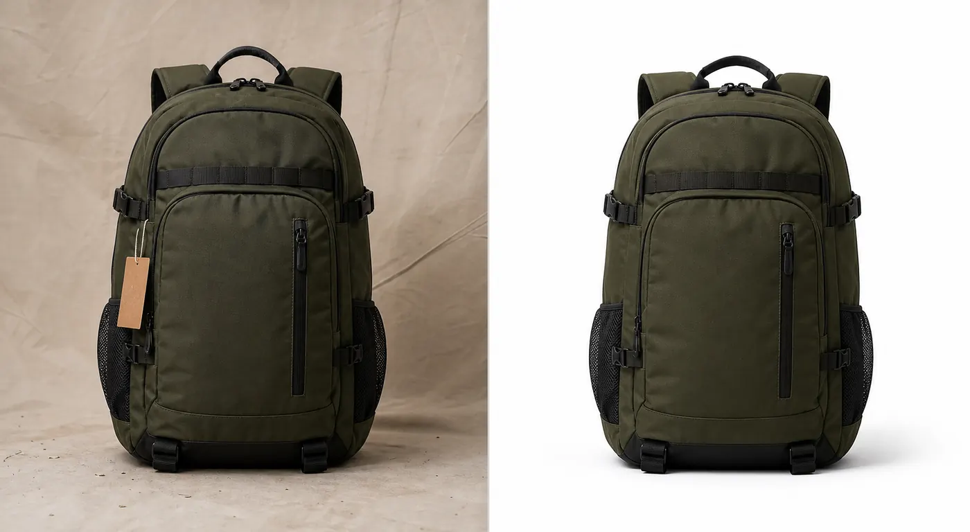 ## Useful outputs from one backpack photo
Start with a clean main image. Then create a detail crop for fabric or zippers, a lifestyle support image, a social ad crop, and a transparent PNG if the product will be used in banners.
Do not ask for all versions in one uncontrolled generation. Create the master product image first.
## Workflow
1. Clean the original photo and correct lighting.
2. Preserve backpack silhouette, straps, zipper line, pockets, buckles, handle, logo, and fabric.
3. Create a platform-specific crop: marketplace square, Shopify gallery, ad vertical, or social cover.
4. Generate detail images only from the approved master.
5. Review every version as the same SKU.
## Where KrafLayer Fits
When you apply this Turn One Backpack Photo into Platform-Ready Product Images workflow in KrafLayer, start from the clearest product reference, then decide whether the asset needs cleanup, lighting, background work, detail support, or an ad version. Before using it for listing images, detail pages, or ad assets, check that shape, material, labels, color, scale, and accessories still match the source SKU.
## Prompt to use in KrafLayer
~~~text
Use the uploaded backpack photo as the exact SKU reference. Create a platform-ready ecommerce product image. Preserve the backpack silhouette, shoulder straps, handle, zipper paths, pockets, buckles, logo area, fabric texture, color, volume, and scale. Clean the background and improve lighting for [platform/channel]. Do not redesign the bag, add or remove pockets, change strap placement, invent logos, or distort the product volume.
~~~
## FAQ
### Can one backpack photo create a full product gallery?
It can create a starter gallery, but additional angles are better for serious product pages. Use one photo for main, detail, and ad variants only when the visible product information is enough.
### Why do AI backpack images change straps?
Straps are visually complex. Name strap placement and handle shape explicitly, and reject outputs with extra or missing straps.
### Which platform version should I make first?
Make the clean marketplace or Shopify product image first. Use that approved version as the source for creative crops.
# How to Optimize Shopify Product Images with AI
URL: https://kraflayer.com/blog/shopify-product-image-optimization-plugin-for-better-conversion
Summary: A Shopify product image optimization guide: improve main images, gallery order, detail proof, mobile crops, and ad-ready variants without overpromising conversion gains. Includes how to do it in KrafLayer.
Updated: 2026-08-21
## TL;DR
For Optimize Shopify Product Images, KrafLayer is useful when a real product reference needs to become a usable asset for Shopify product pages. Treat it as production editing, not product reinvention; the test is whether shape, material, labels, color, scale, and accessories still match the source SKU.
Shopify product image optimization means making images answer buyer questions faster. It is not a magic conversion switch. Better images can improve clarity and confidence, but they must show the real product accurately.
## Useful outputs from one backpack photo
Start with a clean main image. Then create a detail crop for fabric or zippers, a lifestyle support image, a social ad crop, and a transparent PNG if the product will be used in banners.
Do not ask for all versions in one uncontrolled generation. Create the master product image first.
## Workflow
1. Clean the original photo and correct lighting.
2. Preserve backpack silhouette, straps, zipper line, pockets, buckles, handle, logo, and fabric.
3. Create a platform-specific crop: marketplace square, Shopify gallery, ad vertical, or social cover.
4. Generate detail images only from the approved master.
5. Review every version as the same SKU.
## Where KrafLayer Fits
When you apply this Turn One Backpack Photo into Platform-Ready Product Images workflow in KrafLayer, start from the clearest product reference, then decide whether the asset needs cleanup, lighting, background work, detail support, or an ad version. Before using it for listing images, detail pages, or ad assets, check that shape, material, labels, color, scale, and accessories still match the source SKU.
## Prompt to use in KrafLayer
~~~text
Use the uploaded backpack photo as the exact SKU reference. Create a platform-ready ecommerce product image. Preserve the backpack silhouette, shoulder straps, handle, zipper paths, pockets, buckles, logo area, fabric texture, color, volume, and scale. Clean the background and improve lighting for [platform/channel]. Do not redesign the bag, add or remove pockets, change strap placement, invent logos, or distort the product volume.
~~~
## FAQ
### Can one backpack photo create a full product gallery?
It can create a starter gallery, but additional angles are better for serious product pages. Use one photo for main, detail, and ad variants only when the visible product information is enough.
### Why do AI backpack images change straps?
Straps are visually complex. Name strap placement and handle shape explicitly, and reject outputs with extra or missing straps.
### Which platform version should I make first?
Make the clean marketplace or Shopify product image first. Use that approved version as the source for creative crops.
# How to Optimize Shopify Product Images with AI
URL: https://kraflayer.com/blog/shopify-product-image-optimization-plugin-for-better-conversion
Summary: A Shopify product image optimization guide: improve main images, gallery order, detail proof, mobile crops, and ad-ready variants without overpromising conversion gains. Includes how to do it in KrafLayer.
Updated: 2026-08-21
## TL;DR
For Optimize Shopify Product Images, KrafLayer is useful when a real product reference needs to become a usable asset for Shopify product pages. Treat it as production editing, not product reinvention; the test is whether shape, material, labels, color, scale, and accessories still match the source SKU.
Shopify product image optimization means making images answer buyer questions faster. It is not a magic conversion switch. Better images can improve clarity and confidence, but they must show the real product accurately.
 ## What to optimize first
Start with the main image, because it affects collection pages, product pages, and ads. Then improve gallery images that answer material, scale, use, packaging, and variant questions.
For Shopify, mobile matters. Crops that look good on desktop may fail in a small product card.
## Workflow
1. Clean the main image: product-first crop, accurate color, readable shape, natural shadow.
2. Add detail images for texture, label, feature, scale, or use context.
3. Keep visual consistency across the gallery.
4. Create separate crops for square product cards, vertical ads, and banners.
5. Avoid AI-generated text for specs or claims.
## Where KrafLayer Fits
When you apply this Optimize Shopify Product Images workflow in KrafLayer, start from the clearest product reference, then decide whether the asset needs cleanup, lighting, background work, detail support, or an ad version. Before using it for Shopify product pages, check that shape, material, labels, color, scale, and accessories still match the source SKU.
## Prompt to use in KrafLayer
~~~text
Use the uploaded product as the exact Shopify product reference. Optimize the image for ecommerce clarity and mobile product-page use. Preserve product shape, material, color, label, logo area, scale, and shadow. Improve background, lighting, crop, and detail readability for [main image/detail image/ad crop]. Do not change the SKU, invent text, add misleading props, or over-style the product.
~~~
## FAQ
### Will better product images increase Shopify conversion?
They can help by reducing confusion and increasing trust, but conversion also depends on price, offer, traffic quality, reviews, page speed, and product-market fit.
### What image should I optimize first?
Start with the main product image because it appears in more places. Then improve gallery images that answer buyer objections.
### Should Shopify images include text overlays?
Use text carefully and add it manually. AI-generated text can be inaccurate, hard to edit, and risky for product claims.
# How to Create Y2K Retro Beauty Product Images with AI
URL: https://kraflayer.com/blog/y2k-retro-beauty-product-images-with-ai
Summary: A Y2K beauty image workflow for ecommerce: use chrome, gloss, color, and retro energy while preserving packaging, shade, label areas, and product readability. Includes how to do it in KrafLayer.
Updated: 2026-06-12
## TL;DR
For Create Y2K Retro Beauty Product Images, KrafLayer is useful when a real product reference needs to become a usable asset for listing images, detail pages, or ad assets. Treat it as production editing, not product reinvention; the test is whether the bottle shape, label, shade, texture, and packaging proportions stay believable.
Y2K retro beauty images work when the styling adds energy without making the product unreadable. Chrome, gloss, pink-blue light, plastic shine, stars, and playful reflections can help a campaign, but packaging shape and shade accuracy still matter.
## What to optimize first
Start with the main image, because it affects collection pages, product pages, and ads. Then improve gallery images that answer material, scale, use, packaging, and variant questions.
For Shopify, mobile matters. Crops that look good on desktop may fail in a small product card.
## Workflow
1. Clean the main image: product-first crop, accurate color, readable shape, natural shadow.
2. Add detail images for texture, label, feature, scale, or use context.
3. Keep visual consistency across the gallery.
4. Create separate crops for square product cards, vertical ads, and banners.
5. Avoid AI-generated text for specs or claims.
## Where KrafLayer Fits
When you apply this Optimize Shopify Product Images workflow in KrafLayer, start from the clearest product reference, then decide whether the asset needs cleanup, lighting, background work, detail support, or an ad version. Before using it for Shopify product pages, check that shape, material, labels, color, scale, and accessories still match the source SKU.
## Prompt to use in KrafLayer
~~~text
Use the uploaded product as the exact Shopify product reference. Optimize the image for ecommerce clarity and mobile product-page use. Preserve product shape, material, color, label, logo area, scale, and shadow. Improve background, lighting, crop, and detail readability for [main image/detail image/ad crop]. Do not change the SKU, invent text, add misleading props, or over-style the product.
~~~
## FAQ
### Will better product images increase Shopify conversion?
They can help by reducing confusion and increasing trust, but conversion also depends on price, offer, traffic quality, reviews, page speed, and product-market fit.
### What image should I optimize first?
Start with the main product image because it appears in more places. Then improve gallery images that answer buyer objections.
### Should Shopify images include text overlays?
Use text carefully and add it manually. AI-generated text can be inaccurate, hard to edit, and risky for product claims.
# How to Create Y2K Retro Beauty Product Images with AI
URL: https://kraflayer.com/blog/y2k-retro-beauty-product-images-with-ai
Summary: A Y2K beauty image workflow for ecommerce: use chrome, gloss, color, and retro energy while preserving packaging, shade, label areas, and product readability. Includes how to do it in KrafLayer.
Updated: 2026-06-12
## TL;DR
For Create Y2K Retro Beauty Product Images, KrafLayer is useful when a real product reference needs to become a usable asset for listing images, detail pages, or ad assets. Treat it as production editing, not product reinvention; the test is whether the bottle shape, label, shade, texture, and packaging proportions stay believable.
Y2K retro beauty images work when the styling adds energy without making the product unreadable. Chrome, gloss, pink-blue light, plastic shine, stars, and playful reflections can help a campaign, but packaging shape and shade accuracy still matter.
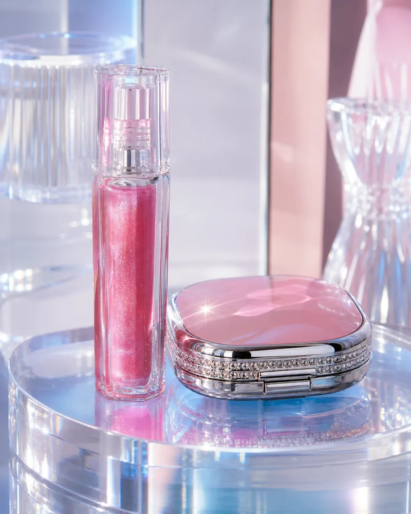 ## When to use this style
Use Y2K beauty styling for campaign images, social covers, launch banners, and ads. Keep product-page main images cleaner if shoppers need to compare shade, label, or packaging details.
The product should look like a real beauty item photographed in a Y2K-inspired set, not a random nostalgic graphic.
## Workflow
1. Lock the product: bottle, tube, cap, label area, shade, finish, and scale.
2. Choose the Y2K cues: chrome surface, glossy plastic, star highlights, pastel neon, or bubble shapes.
3. Keep the product brighter and clearer than the background.
4. Leave space for editable text instead of generating final words.
5. Check shade and label accuracy before publishing.
## Where KrafLayer Fits
When you apply this Create Y2K Retro Beauty Product Images workflow in KrafLayer, start from the clearest product reference, then decide whether the asset needs cleanup, lighting, background work, detail support, or an ad version. Before using it for listing images, detail pages, or ad assets, check that the bottle shape, label, shade, texture, and packaging proportions stay believable.
## Prompt to use in KrafLayer
~~~text
Use the uploaded beauty product as the exact reference. Create a Y2K retro ecommerce campaign image with glossy highlights, chrome or iridescent accents, playful color, and clean negative space. Preserve packaging shape, cap, label area, shade family, material finish, logo placement, and scale. Do not change the product design, invent text, hide the package, or let colored light distort the true shade.
~~~
## FAQ
### Is Y2K style suitable for product pages?
It is best as a campaign or support image. Use cleaner product photos for shade comparison and main gallery accuracy.
### Why does AI change beauty packaging in retro styles?
The style prompt may overpower the product reference. Put packaging-preservation instructions before color and mood.
### Should I include text in the image?
Leave space for text, then add final typography manually. AI-generated text is risky for product claims and labels.
# 咖啡豆和茶包复古质感商品图怎么做
URL: https://kraflayer.com/zh/blog/vintage-coffee-bean-and-tea-bag-product-images
Summary: 一套咖啡茶包复古商品图流程:营造温暖质感,同时保留包装文字、品类、分量和真实食材。可在 KrafLayer 中按同一流程完成。
Updated: 2026-06-12
## TL;DR
咖啡豆和茶包复古质感商品图这类任务,KrafLayer 的作用是把真实商品参考图推进到可用的主图、详情图或广告素材,而不是重新发明商品。核心检查点是份量、配料、包装和实际出餐状态没有被夸大。
咖啡和茶的复古质感,应该来自光线、木质、纸张、布料和温暖色调,而不是把包装变成另一个品牌。
## 可直接复制的 prompt
~~~text
以我上传的咖啡/茶产品图作为准确参考,生成复古温暖质感的电商商品图。请保留包装形状、标签区域、产品品类、颜色、分量、食材身份和比例。使用木质、牛皮纸、亚麻、陶瓷或暖光背景。不要改品牌包装,不要编造标签文字,不要添加不属于产品的食材。
~~~
## KrafLayer 放在流程里的位置
把咖啡豆和茶包复古质感商品图放到 KrafLayer 里做时,先固定商品参考图,再决定是修背景、补光线、做详情图还是延展广告版本。最后按主图、详情图或广告素材的使用场景检查:份量、配料、包装和实际出餐状态没有被夸大。
## FAQ
### 要不要放咖啡豆或茶叶道具?
可以,但必须和产品一致,不能暗示不存在的成分或口味。
# How to Generate Premium Skincare Product Backgrounds with AI
URL: https://kraflayer.com/blog/ai-generate-premium-skincare-product-backgrounds
Summary: A skincare background workflow for premium ecommerce images: build clean scenes around packaging while preserving label readability, material, shade, and brand trust. Includes how to do it in KrafLayer.
Updated: 2026-08-21
## TL;DR
For Generate Premium Skincare Product Backgrounds, KrafLayer helps when the product is real but the surrounding scene needs work. Use Replace BG for a prompted or reference-based scene, or Scene Compose when product position and scale must match a base scene. Use the scene to support listing images, detail pages, or ad assets, then check that the bottle shape, label, shade, texture, and packaging proportions stay believable.
Premium skincare backgrounds should make packaging feel calm, clean, and trustworthy. The background is there to support the product promise; it should not hide the bottle, change the formula color, or make the brand look generic.
## When to use this style
Use Y2K beauty styling for campaign images, social covers, launch banners, and ads. Keep product-page main images cleaner if shoppers need to compare shade, label, or packaging details.
The product should look like a real beauty item photographed in a Y2K-inspired set, not a random nostalgic graphic.
## Workflow
1. Lock the product: bottle, tube, cap, label area, shade, finish, and scale.
2. Choose the Y2K cues: chrome surface, glossy plastic, star highlights, pastel neon, or bubble shapes.
3. Keep the product brighter and clearer than the background.
4. Leave space for editable text instead of generating final words.
5. Check shade and label accuracy before publishing.
## Where KrafLayer Fits
When you apply this Create Y2K Retro Beauty Product Images workflow in KrafLayer, start from the clearest product reference, then decide whether the asset needs cleanup, lighting, background work, detail support, or an ad version. Before using it for listing images, detail pages, or ad assets, check that the bottle shape, label, shade, texture, and packaging proportions stay believable.
## Prompt to use in KrafLayer
~~~text
Use the uploaded beauty product as the exact reference. Create a Y2K retro ecommerce campaign image with glossy highlights, chrome or iridescent accents, playful color, and clean negative space. Preserve packaging shape, cap, label area, shade family, material finish, logo placement, and scale. Do not change the product design, invent text, hide the package, or let colored light distort the true shade.
~~~
## FAQ
### Is Y2K style suitable for product pages?
It is best as a campaign or support image. Use cleaner product photos for shade comparison and main gallery accuracy.
### Why does AI change beauty packaging in retro styles?
The style prompt may overpower the product reference. Put packaging-preservation instructions before color and mood.
### Should I include text in the image?
Leave space for text, then add final typography manually. AI-generated text is risky for product claims and labels.
# 咖啡豆和茶包复古质感商品图怎么做
URL: https://kraflayer.com/zh/blog/vintage-coffee-bean-and-tea-bag-product-images
Summary: 一套咖啡茶包复古商品图流程:营造温暖质感,同时保留包装文字、品类、分量和真实食材。可在 KrafLayer 中按同一流程完成。
Updated: 2026-06-12
## TL;DR
咖啡豆和茶包复古质感商品图这类任务,KrafLayer 的作用是把真实商品参考图推进到可用的主图、详情图或广告素材,而不是重新发明商品。核心检查点是份量、配料、包装和实际出餐状态没有被夸大。
咖啡和茶的复古质感,应该来自光线、木质、纸张、布料和温暖色调,而不是把包装变成另一个品牌。
## 可直接复制的 prompt
~~~text
以我上传的咖啡/茶产品图作为准确参考,生成复古温暖质感的电商商品图。请保留包装形状、标签区域、产品品类、颜色、分量、食材身份和比例。使用木质、牛皮纸、亚麻、陶瓷或暖光背景。不要改品牌包装,不要编造标签文字,不要添加不属于产品的食材。
~~~
## KrafLayer 放在流程里的位置
把咖啡豆和茶包复古质感商品图放到 KrafLayer 里做时,先固定商品参考图,再决定是修背景、补光线、做详情图还是延展广告版本。最后按主图、详情图或广告素材的使用场景检查:份量、配料、包装和实际出餐状态没有被夸大。
## FAQ
### 要不要放咖啡豆或茶叶道具?
可以,但必须和产品一致,不能暗示不存在的成分或口味。
# How to Generate Premium Skincare Product Backgrounds with AI
URL: https://kraflayer.com/blog/ai-generate-premium-skincare-product-backgrounds
Summary: A skincare background workflow for premium ecommerce images: build clean scenes around packaging while preserving label readability, material, shade, and brand trust. Includes how to do it in KrafLayer.
Updated: 2026-08-21
## TL;DR
For Generate Premium Skincare Product Backgrounds, KrafLayer helps when the product is real but the surrounding scene needs work. Use Replace BG for a prompted or reference-based scene, or Scene Compose when product position and scale must match a base scene. Use the scene to support listing images, detail pages, or ad assets, then check that the bottle shape, label, shade, texture, and packaging proportions stay believable.
Premium skincare backgrounds should make packaging feel calm, clean, and trustworthy. The background is there to support the product promise; it should not hide the bottle, change the formula color, or make the brand look generic.
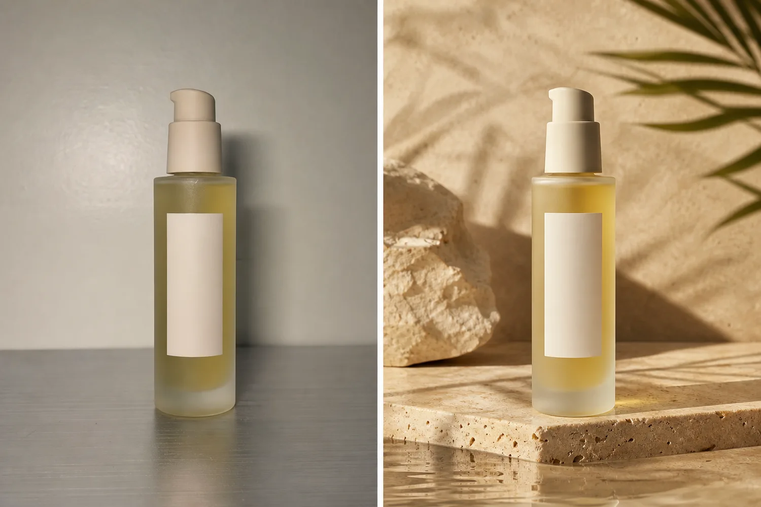 ## Useful background directions
Skincare usually works well with soft stone, water, cream fabric, glass, subtle botanicals, clean bathroom surfaces, or minimal studio gradients. Avoid visual clichés that fight the packaging: too many petals, fake lab props, or heavy luxury smoke.
## Workflow
1. Lock packaging shape, cap, label area, shade, and material finish.
2. Choose one product promise: hydration, repair, glow, gentle care, or clinical precision.
3. Build the background around that promise with surface, light, and minimal props.
4. Keep label readability and product silhouette clear.
5. Check whether the result still fits the brand price point.
## Where KrafLayer Fits
When you apply this Generate Premium Skincare Product Backgrounds workflow in KrafLayer, the tool choice matters: use Replace BG for a prompted or reference-based scene, or Scene Compose when product position and scale must match a base scene. After generation, judge the image by the channel it serves — listing images, detail pages, or ad assets — and check that the bottle shape, label, shade, texture, and packaging proportions stay believable.
## Prompt to use in KrafLayer
~~~text
Use the uploaded skincare product as the exact reference. Generate a premium ecommerce background for [hydration/repair/glow/gentle/clinical] positioning. Preserve packaging shape, cap, label area, logo placement, material finish, formula shade, scale, and soft product shadow. Use clean light, refined surface, subtle props, and enough negative space. Do not change the package, invent label text, hide the product, or make the scene look generic.
~~~
## FAQ
### What backgrounds work best for skincare?
Clean, tactile backgrounds usually work best: stone, water, soft fabric, glass, bathroom surfaces, or minimal studio sets. Match the background to the product promise.
### Should skincare backgrounds include ingredients?
Only if ingredients are true to the product and helpful for the claim. Decorative ingredients can mislead shoppers if they imply benefits the product does not have.
### Why does AI skincare imagery look generic?
The prompt often says only “premium skincare.” Add packaging facts, product promise, surface, light direction, and what should not change.
# Y2K 千禧复古风美妆产品图怎么做
URL: https://kraflayer.com/zh/blog/y2k-retro-beauty-product-images-with-ai
Summary: 一套 Y2K 美妆商品图流程:用镭射、亮面和复古色彩增强记忆点,但保留包装和真实色号。可在 KrafLayer 中按同一流程完成。
Updated: 2026-06-12
## TL;DR
Y2K 千禧复古风美妆产品图这类任务,KrafLayer 的作用是把真实商品参考图推进到可用的主图、详情图或广告素材,而不是重新发明商品。核心检查点是瓶型、标签、色号、质地和包装比例保持可信。
Y2K 美妆图可以很吸睛,但不能让包装和色号失真。镭射、亮面、星光和复古粉蓝色调都应该服务商品,而不是盖住商品。
## 可直接复制的 prompt
~~~text
以我上传的美妆产品图作为准确参考,生成 Y2K 千禧复古风电商活动图。请保留包装形状、瓶盖/管身、标签区域、logo 位置、色号范围、材质和比例。使用亮面、镭射、复古粉蓝/银色光泽和干净留白。不要改变包装,不要让彩色光污染真实色号,不要生成假文字。
~~~
## KrafLayer 放在流程里的位置
把Y2K 千禧复古风美妆产品图放到 KrafLayer 里做时,先固定商品参考图,再决定是修背景、补光线、做详情图还是延展广告版本。最后按主图、详情图或广告素材的使用场景检查:瓶型、标签、色号、质地和包装比例保持可信。
## FAQ
### 适合做主图吗?
更适合活动图、社媒封面和广告图。色号对比图应更克制。
# How to Remove Hands from Product Photos Without Changing the Product
URL: https://kraflayer.com/blog/remove-hands-from-product-photos-while-keeping-the-product
Summary: A practical AI editing workflow for removing hands from product photos while preserving product shape, material, scale, labels, shadows, and listing-ready selling detail. Includes how to do it in KrafLayer.
Updated: 2026-08-21
## TL;DR
For Remove Hands from Product Photos Without Changing the Product, KrafLayer works best as a local cleanup tool: brush only the unwanted area in Erase and let the model fill from the surrounding pixels. Avoid regenerating the whole image; the result is only useful if shape, material, labels, color, scale, and accessories still match the source SKU.
If a hand is holding the product in an otherwise useful photo, treat the edit as product cleanup, not product regeneration. The goal is to remove the hand, rebuild only the hidden edge or handle area, and keep the same SKU, material, label, scale, camera angle, and natural shadow.
KrafLayer is an AI-powered visual editor for ecommerce product photography. For mugs, bottles, accessories, cosmetics, tools, and small home goods, it can turn a casual hand-held source photo into a listing-ready product image without making the item look like a different product.
## Useful background directions
Skincare usually works well with soft stone, water, cream fabric, glass, subtle botanicals, clean bathroom surfaces, or minimal studio gradients. Avoid visual clichés that fight the packaging: too many petals, fake lab props, or heavy luxury smoke.
## Workflow
1. Lock packaging shape, cap, label area, shade, and material finish.
2. Choose one product promise: hydration, repair, glow, gentle care, or clinical precision.
3. Build the background around that promise with surface, light, and minimal props.
4. Keep label readability and product silhouette clear.
5. Check whether the result still fits the brand price point.
## Where KrafLayer Fits
When you apply this Generate Premium Skincare Product Backgrounds workflow in KrafLayer, the tool choice matters: use Replace BG for a prompted or reference-based scene, or Scene Compose when product position and scale must match a base scene. After generation, judge the image by the channel it serves — listing images, detail pages, or ad assets — and check that the bottle shape, label, shade, texture, and packaging proportions stay believable.
## Prompt to use in KrafLayer
~~~text
Use the uploaded skincare product as the exact reference. Generate a premium ecommerce background for [hydration/repair/glow/gentle/clinical] positioning. Preserve packaging shape, cap, label area, logo placement, material finish, formula shade, scale, and soft product shadow. Use clean light, refined surface, subtle props, and enough negative space. Do not change the package, invent label text, hide the product, or make the scene look generic.
~~~
## FAQ
### What backgrounds work best for skincare?
Clean, tactile backgrounds usually work best: stone, water, soft fabric, glass, bathroom surfaces, or minimal studio sets. Match the background to the product promise.
### Should skincare backgrounds include ingredients?
Only if ingredients are true to the product and helpful for the claim. Decorative ingredients can mislead shoppers if they imply benefits the product does not have.
### Why does AI skincare imagery look generic?
The prompt often says only “premium skincare.” Add packaging facts, product promise, surface, light direction, and what should not change.
# Y2K 千禧复古风美妆产品图怎么做
URL: https://kraflayer.com/zh/blog/y2k-retro-beauty-product-images-with-ai
Summary: 一套 Y2K 美妆商品图流程:用镭射、亮面和复古色彩增强记忆点,但保留包装和真实色号。可在 KrafLayer 中按同一流程完成。
Updated: 2026-06-12
## TL;DR
Y2K 千禧复古风美妆产品图这类任务,KrafLayer 的作用是把真实商品参考图推进到可用的主图、详情图或广告素材,而不是重新发明商品。核心检查点是瓶型、标签、色号、质地和包装比例保持可信。
Y2K 美妆图可以很吸睛,但不能让包装和色号失真。镭射、亮面、星光和复古粉蓝色调都应该服务商品,而不是盖住商品。
## 可直接复制的 prompt
~~~text
以我上传的美妆产品图作为准确参考,生成 Y2K 千禧复古风电商活动图。请保留包装形状、瓶盖/管身、标签区域、logo 位置、色号范围、材质和比例。使用亮面、镭射、复古粉蓝/银色光泽和干净留白。不要改变包装,不要让彩色光污染真实色号,不要生成假文字。
~~~
## KrafLayer 放在流程里的位置
把Y2K 千禧复古风美妆产品图放到 KrafLayer 里做时,先固定商品参考图,再决定是修背景、补光线、做详情图还是延展广告版本。最后按主图、详情图或广告素材的使用场景检查:瓶型、标签、色号、质地和包装比例保持可信。
## FAQ
### 适合做主图吗?
更适合活动图、社媒封面和广告图。色号对比图应更克制。
# How to Remove Hands from Product Photos Without Changing the Product
URL: https://kraflayer.com/blog/remove-hands-from-product-photos-while-keeping-the-product
Summary: A practical AI editing workflow for removing hands from product photos while preserving product shape, material, scale, labels, shadows, and listing-ready selling detail. Includes how to do it in KrafLayer.
Updated: 2026-08-21
## TL;DR
For Remove Hands from Product Photos Without Changing the Product, KrafLayer works best as a local cleanup tool: brush only the unwanted area in Erase and let the model fill from the surrounding pixels. Avoid regenerating the whole image; the result is only useful if shape, material, labels, color, scale, and accessories still match the source SKU.
If a hand is holding the product in an otherwise useful photo, treat the edit as product cleanup, not product regeneration. The goal is to remove the hand, rebuild only the hidden edge or handle area, and keep the same SKU, material, label, scale, camera angle, and natural shadow.
KrafLayer is an AI-powered visual editor for ecommerce product photography. For mugs, bottles, accessories, cosmetics, tools, and small home goods, it can turn a casual hand-held source photo into a listing-ready product image without making the item look like a different product.
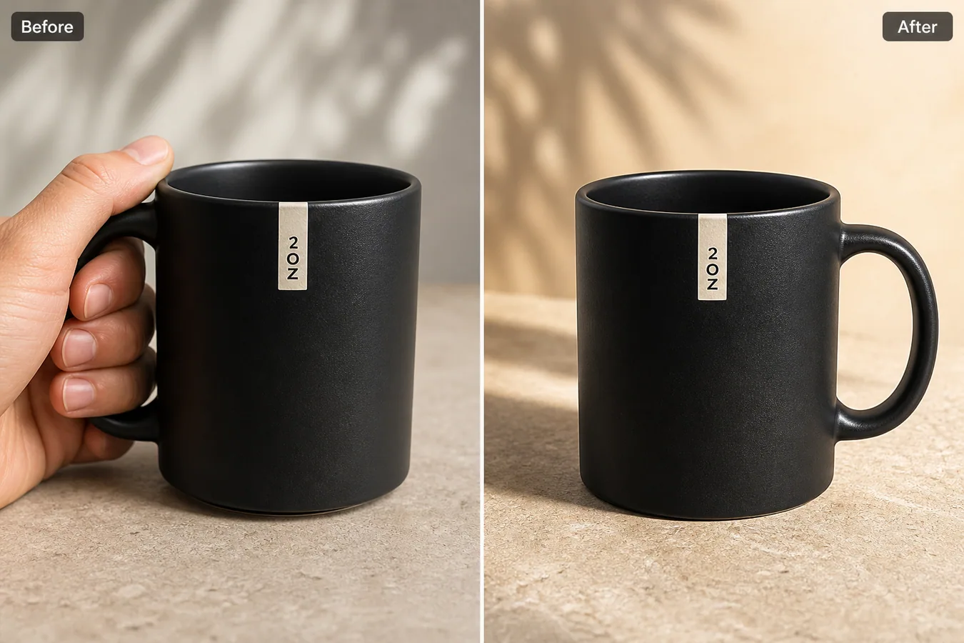 In the example, the before image is usable but the hand competes with the mug and covers part of the handle. The after image removes the hand, restores the handle, keeps the matte ceramic texture and small front label, and gives the product a cleaner main-image role.
## Why Hand-Held Product Photos Often Need Cleanup
Hand-held photos are common when sellers shoot samples quickly in a warehouse, office, or home. The problem is that the hand changes the buyer's attention. Instead of reading the product shape, finish, handle, label, and scale, the shopper notices fingers, skin color, grip pressure, or blocked details.
For some lifestyle images, a hand can be useful. For a marketplace main image, catalog grid, product detail page, or ad variation, it often makes the asset feel unfinished. Removing the hand gives the product a cleaner hierarchy while still using the original shoot.
## Protect Product Facts Before You Remove the Hand
Write down what must stay unchanged before generating the edit:
- product silhouette, rim, base, handle, seams, edges, and openings
- label or logo position, size, and orientation
- material texture such as ceramic grain, leather pores, metal brushing, fabric weave, or plastic gloss
- product color, scale, camera angle, crop, and contact shadow
- any hardware, buttons, stitching, caps, clasps, or functional details
The hand should disappear; the SKU should not. If the AI returns a cleaner image but changes the handle curve, label position, surface finish, or product proportions, reject it.
## Edit Prompt for Removing Hands from Product Photos
Use a local edit prompt in [KrafLayer](https://kraflayer.com):
> Remove the hand holding this product and rebuild only the covered product edge and background. Keep the exact same product shape, handle position, rim ellipse, front label, matte black ceramic texture, color, scale, camera angle, tabletop surface, lighting, crop, and natural contact shadow. Make the result look like a realistic ecommerce product photo. Do not redesign the mug, change the label, add a logo, alter the handle, change the material, or make the product float.
This prompt keeps the edit narrow. It tells the model that the hidden area should be repaired, but the visible product facts are locked.
## How to Review the Result
Check the after image in two sizes: a small grid thumbnail and a full product-page view.
- the hand is fully removed, including fingertips and skin-colored reflections
- the rebuilt product edge matches the visible product geometry
- the handle, cap, strap, or covered component still makes structural sense
- the material texture continues across the repaired area
- the contact shadow grounds the product on the surface
- no extra props, fake text, new logo, or invented feature appeared
The best result is not the cleanest possible cutout. It is the one a merchant could realistically use in a main-image slot or detail-image slot without misleading the buyer.
## When to Keep the Hand Instead
Keep the hand when it explains scale, use, grip, or texture better than a standalone product photo. Jewelry, phone cases, small tools, stationery, and beauty accessories sometimes need a hand shot as a secondary detail image.
Remove the hand when it blocks a core selling detail, distracts from the product, creates inconsistent catalog thumbnails, or makes the listing look like an unedited supplier photo. One product can have both: a clean main image and a human-scale detail image.
## Where KrafLayer Fits
When you apply this Remove Hands from Product Photos Without Changing the Product workflow in KrafLayer, the tool choice matters: brush only the unwanted area in Erase and let the model fill from the surrounding pixels. After generation, judge the image by the channel it serves — listing images, detail pages, or ad assets — and check that shape, material, labels, color, scale, and accessories still match the source SKU.
## FAQ
### Can AI remove a hand from a product photo?
Yes, AI can remove a hand from a product photo when the edit is local and the prompt protects product shape, material, scale, labels, and shadows.
### Will removing the hand change the product?
It can if the prompt is too broad. Protect visible product facts and reject outputs that change proportions, hardware, label placement, material, or variant color.
### Is a hand always bad in ecommerce product photos?
No. Hand shots can explain scale or usage. They are usually weaker for main images when the hand blocks the product or competes with the item in a catalog grid.
# How to Create Perfume Product Photos Without a Studio
URL: https://kraflayer.com/blog/perfume-product-photos-without-a-studio
Summary: A practical workflow for creating perfume main images and detail images without a studio while preserving glass, liquid, cap, label, and reflection details.
Updated: 2026-06-20
Perfume product photos without a studio work best when you keep the bottle facts fixed and use AI to control the things a studio normally controls: background, crop, light direction, reflection, and image role. A good perfume product photography workflow is not about making a fantasy fragrance ad. The goal is to create a main image and detail image that help a buyer understand the glass, liquid, cap, label, and scale of the real product.
The practical rule is this: make the perfume bottle easy to inspect first, then add mood only where it supports the sale. In KrafLayer, that means using a product reference, generating one ecommerce image role at a time, and checking glass edges, liquid color, label placement, cap shape, and reflection behavior before publishing.
In the example, the before image is usable but the hand competes with the mug and covers part of the handle. The after image removes the hand, restores the handle, keeps the matte ceramic texture and small front label, and gives the product a cleaner main-image role.
## Why Hand-Held Product Photos Often Need Cleanup
Hand-held photos are common when sellers shoot samples quickly in a warehouse, office, or home. The problem is that the hand changes the buyer's attention. Instead of reading the product shape, finish, handle, label, and scale, the shopper notices fingers, skin color, grip pressure, or blocked details.
For some lifestyle images, a hand can be useful. For a marketplace main image, catalog grid, product detail page, or ad variation, it often makes the asset feel unfinished. Removing the hand gives the product a cleaner hierarchy while still using the original shoot.
## Protect Product Facts Before You Remove the Hand
Write down what must stay unchanged before generating the edit:
- product silhouette, rim, base, handle, seams, edges, and openings
- label or logo position, size, and orientation
- material texture such as ceramic grain, leather pores, metal brushing, fabric weave, or plastic gloss
- product color, scale, camera angle, crop, and contact shadow
- any hardware, buttons, stitching, caps, clasps, or functional details
The hand should disappear; the SKU should not. If the AI returns a cleaner image but changes the handle curve, label position, surface finish, or product proportions, reject it.
## Edit Prompt for Removing Hands from Product Photos
Use a local edit prompt in [KrafLayer](https://kraflayer.com):
> Remove the hand holding this product and rebuild only the covered product edge and background. Keep the exact same product shape, handle position, rim ellipse, front label, matte black ceramic texture, color, scale, camera angle, tabletop surface, lighting, crop, and natural contact shadow. Make the result look like a realistic ecommerce product photo. Do not redesign the mug, change the label, add a logo, alter the handle, change the material, or make the product float.
This prompt keeps the edit narrow. It tells the model that the hidden area should be repaired, but the visible product facts are locked.
## How to Review the Result
Check the after image in two sizes: a small grid thumbnail and a full product-page view.
- the hand is fully removed, including fingertips and skin-colored reflections
- the rebuilt product edge matches the visible product geometry
- the handle, cap, strap, or covered component still makes structural sense
- the material texture continues across the repaired area
- the contact shadow grounds the product on the surface
- no extra props, fake text, new logo, or invented feature appeared
The best result is not the cleanest possible cutout. It is the one a merchant could realistically use in a main-image slot or detail-image slot without misleading the buyer.
## When to Keep the Hand Instead
Keep the hand when it explains scale, use, grip, or texture better than a standalone product photo. Jewelry, phone cases, small tools, stationery, and beauty accessories sometimes need a hand shot as a secondary detail image.
Remove the hand when it blocks a core selling detail, distracts from the product, creates inconsistent catalog thumbnails, or makes the listing look like an unedited supplier photo. One product can have both: a clean main image and a human-scale detail image.
## Where KrafLayer Fits
When you apply this Remove Hands from Product Photos Without Changing the Product workflow in KrafLayer, the tool choice matters: brush only the unwanted area in Erase and let the model fill from the surrounding pixels. After generation, judge the image by the channel it serves — listing images, detail pages, or ad assets — and check that shape, material, labels, color, scale, and accessories still match the source SKU.
## FAQ
### Can AI remove a hand from a product photo?
Yes, AI can remove a hand from a product photo when the edit is local and the prompt protects product shape, material, scale, labels, and shadows.
### Will removing the hand change the product?
It can if the prompt is too broad. Protect visible product facts and reject outputs that change proportions, hardware, label placement, material, or variant color.
### Is a hand always bad in ecommerce product photos?
No. Hand shots can explain scale or usage. They are usually weaker for main images when the hand blocks the product or competes with the item in a catalog grid.
# How to Create Perfume Product Photos Without a Studio
URL: https://kraflayer.com/blog/perfume-product-photos-without-a-studio
Summary: A practical workflow for creating perfume main images and detail images without a studio while preserving glass, liquid, cap, label, and reflection details.
Updated: 2026-06-20
Perfume product photos without a studio work best when you keep the bottle facts fixed and use AI to control the things a studio normally controls: background, crop, light direction, reflection, and image role. A good perfume product photography workflow is not about making a fantasy fragrance ad. The goal is to create a main image and detail image that help a buyer understand the glass, liquid, cap, label, and scale of the real product.
The practical rule is this: make the perfume bottle easy to inspect first, then add mood only where it supports the sale. In KrafLayer, that means using a product reference, generating one ecommerce image role at a time, and checking glass edges, liquid color, label placement, cap shape, and reflection behavior before publishing.
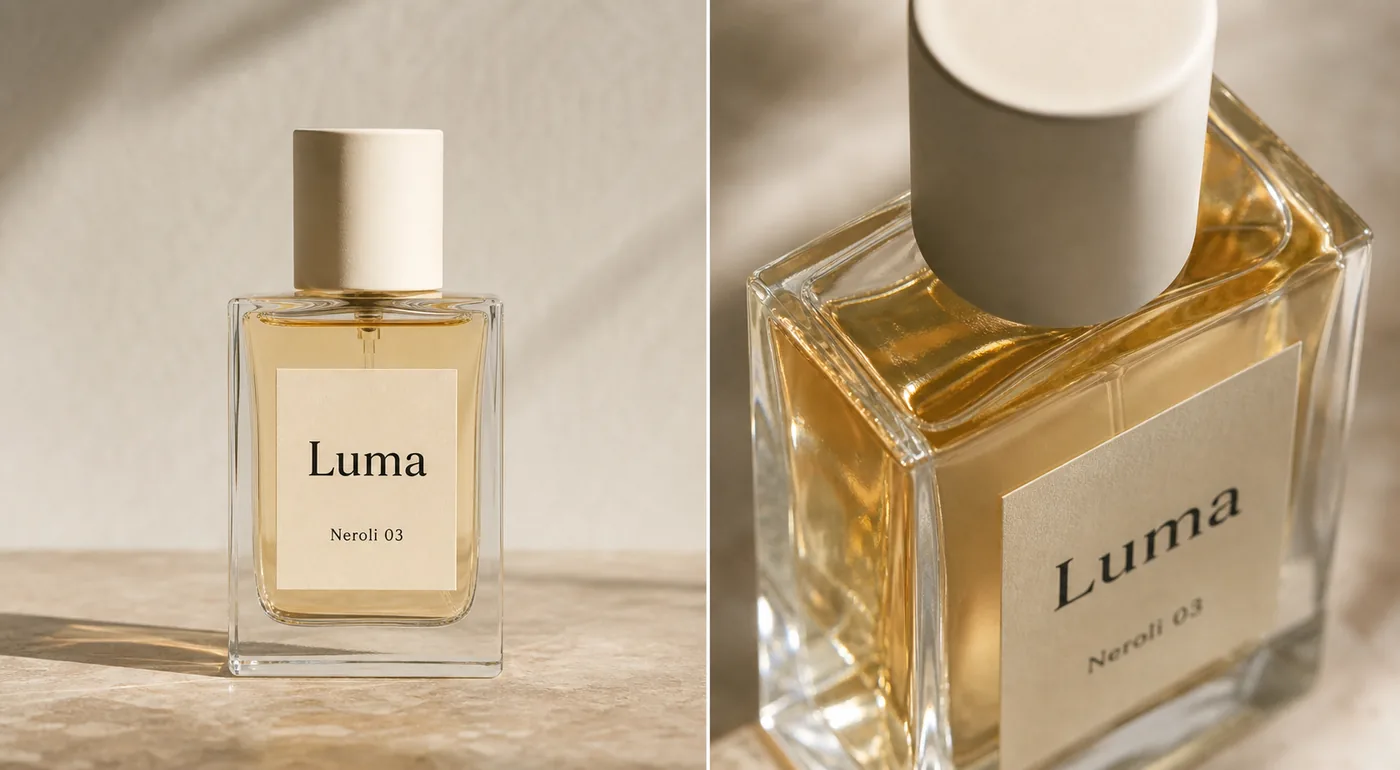 ## Start With The Product Facts, Not The Mood
Perfume is easy to over-style. A warm reflection, a marble surface, or a soft shadow can make the image feel premium, but those details do not matter if the AI changes the bottle shape or makes the label unreadable.
Before generating images, write a short product-truth list:
- Bottle shape and height-to-width proportion.
- Glass thickness, corner radius, and base weight.
- Liquid color and fill level.
- Cap material, color, height, and position.
- Label size, placement, typography style, and text hierarchy.
- Spray tube, collar, or atomizer details if they are visible.
- Any real packaging facts the buyer will see after purchase.
This list keeps the image grounded. Without it, the output may look polished but drift away from the actual SKU.
## Main Image Comes Before Campaign Creative
A main perfume image should answer the buyer's first question: what exactly is the bottle? Keep the bottle large, upright, and readable. Use a clean warm neutral, white, light gray, or softly textured surface only if it does not distract from the label and glass edges.
For [ecommerce product photography](/ecommerce-product-photography), the main image should usually be calmer than an ad image. It needs enough light to show the liquid and glass, enough shadow to ground the bottle, and enough contrast to separate transparent edges from the background.
Do not ask AI for "luxury perfume ad" as the first output. That often creates dramatic props, fake labels, impossible reflections, and a bottle that looks like a different product. Start with the main image, review it, then create supporting visuals.
## Detail Images Should Prove One Selling Point
A detail image is not a second hero. It should show one buyer-relevant feature: glass thickness, liquid tone, cap texture, label paper, spray collar, bottle base, gift-box finish, or product scale.
For a perfume bottle, useful detail images often include:
- A close crop of the glass shoulder and liquid line.
- A cap texture shot that shows matte, metal, wood, ceramic, or plastic finish.
- A label close-up that confirms paper texture and placement.
- A side-angle image that shows bottle depth.
- A soft reflection image that makes the transparent glass readable.
Keep the detail image tied to the same SKU. If the liquid becomes darker, the cap changes material, or the label moves, the image stops supporting buyer trust.
## KrafLayer Workflow For Perfume Images
Use KrafLayer one image role at a time.
First, create the main product image with the [AI product image generator](/ai-product-image-generator). Use the perfume bottle reference and specify the protected facts: bottle geometry, glass thickness, liquid color, fill level, cap shape, label placement, and readable label area.
Second, make the detail view. Ask for a closer crop that emphasizes one material cue, such as transparent glass and amber liquid. Do not request multiple selling points in one detail image.
Third, use the [product photo editor](/product-photo-editor) for small corrections. If a reflection crosses the label, the cap edge looks soft, or the background has a distracting mark, fix that local issue instead of regenerating the entire image.
This workflow is slower than pressing generate once, but it prevents the most common perfume-image problem: the photo looks beautiful while the product quietly changes.
## Prompt Pattern For No-Studio Perfume Photos
Use a prompt that separates protected product facts from the desired image role.
> Create a clean ecommerce main image for this perfume bottle. Preserve the exact rectangular glass bottle shape, transparent glass thickness, pale amber liquid color, fill level, cream cylindrical cap, centered label size, label placement, simple typography style, spray tube position, product scale, and realistic contact shadow. Use soft natural light, controlled reflections, and a warm neutral product-photography background. Make the bottle readable on mobile. Do not redesign the bottle, change the cap, invent extra labels, add badges, add barcodes, imitate a real brand, or create unrealistic glass reflections.
For a detail image, narrow the instruction:
> Create a close perfume detail image that shows the same bottle's glass thickness, amber liquid, cap texture, and label paper. Keep the same SKU, same cap, same liquid color, same label placement, and same glass geometry. Use controlled reflection and shallow depth of field, but keep the product facts believable.
## Reflection Rules That Keep The Bottle Real
Perfume needs reflection, but not every reflection helps.
Use reflection to define glass edges, show liquid depth, and separate the bottle from the background. Avoid reflection that covers the label, makes the liquid look like a different shade, hides the spray tube, or creates extra bottle edges that do not exist.
If the AI output makes the glass look expensive but unclear, reduce the effect. A buyer should not need to guess where the bottle ends, where the liquid starts, or whether the label is printed on paper, glass, or a box.
## Review Checklist Before Publishing
Check the final image against the product reference:
- Is the bottle still the same shape and proportion?
- Did the liquid color and fill level stay consistent?
- Is the cap material believable and unchanged?
- Are the label size, placement, and hierarchy still accurate?
- Do glass edges, base thickness, and corners make physical sense?
- Are reflections controlled rather than covering the product?
- Is the image useful as a main image, detail image, or campaign asset?
- Are there fake logos, real-brand lookalikes, barcodes, QR codes, badges, certification marks, or unsupported claims?
If the image fails one product-fact check, make a smaller edit. A clean no-studio workflow should make the perfume easier to sell, not harder to verify.
## FAQ
### Can I create perfume product photos without a studio?
Yes. You can create perfume product photos without a studio when you have a clear product reference and review the output against the real bottle. Use AI for background, lighting, crop, reflection control, and detail-image composition, but protect bottle geometry, label placement, cap shape, liquid color, and glass behavior.
### What is the best first image to make for a perfume listing?
Start with a clean main image. The bottle should be upright, large enough to inspect on mobile, and readable without heavy props. Once the main image is accurate, create detail images for glass thickness, liquid tone, cap texture, label paper, or packaging material.
### How do I keep AI from changing the perfume bottle?
Write a product-truth list before generating. Include bottle shape, glass thickness, liquid color, fill level, cap shape, label placement, typography style, spray tube, scale, and shadow. Put those protected facts in the prompt and compare every output to the source reference before publishing.
### Should perfume product images have strong reflections?
Use enough reflection to show glass, liquid depth, and premium material, but keep it controlled. Reflections should not cover the label, change the liquid color, create impossible edges, or make the bottle harder to inspect. Clear product truth matters more than dramatic shine.
### When should I use editing instead of generating a new perfume image?
Use editing when the bottle identity is already correct and only a local problem needs repair, such as a distracting reflection, dust spot, background mark, crop issue, or soft cap edge. Regenerate only when the image role is wrong or the whole composition needs to change.
## Conclusion
Perfume product photos without a studio are possible when the workflow stays product-first. Build a clean main image, create one detail image that proves material or packaging quality, and review every output against the real bottle. KrafLayer helps with this no-studio workflow by turning product references into ecommerce images while keeping glass, liquid, cap, label, and reflection details central to the result.
# How to Generate Street-Style Handbag Product Photos With AI
URL: https://kraflayer.com/blog/generate-street-style-handbag-product-photos-with-ai
Summary: A practical workflow for generating street-style handbag product photos while preserving shape, strap, leather texture, hardware, and scale.
Updated: 2026-06-20
AI handbag street style product photos work best when the handbag stays the hero and the street scene only proves scale, styling, and material. The goal is not a vague fashion mood image. The goal is a sellable ecommerce visual where a buyer can read the bag shape, leather texture, strap length, hardware, and how it sits on the body.
The practical rule: lock the handbag facts first, then generate the street context around them. In [KrafLayer AI product photography](/ai-product-photography), use the strongest product reference as the source of truth, create one lifestyle role at a time, and review the finished image in the [product photo editor](/product-photo-editor) before it goes into a listing, lookbook, or ad.
## Start With The Product Facts, Not The Mood
Perfume is easy to over-style. A warm reflection, a marble surface, or a soft shadow can make the image feel premium, but those details do not matter if the AI changes the bottle shape or makes the label unreadable.
Before generating images, write a short product-truth list:
- Bottle shape and height-to-width proportion.
- Glass thickness, corner radius, and base weight.
- Liquid color and fill level.
- Cap material, color, height, and position.
- Label size, placement, typography style, and text hierarchy.
- Spray tube, collar, or atomizer details if they are visible.
- Any real packaging facts the buyer will see after purchase.
This list keeps the image grounded. Without it, the output may look polished but drift away from the actual SKU.
## Main Image Comes Before Campaign Creative
A main perfume image should answer the buyer's first question: what exactly is the bottle? Keep the bottle large, upright, and readable. Use a clean warm neutral, white, light gray, or softly textured surface only if it does not distract from the label and glass edges.
For [ecommerce product photography](/ecommerce-product-photography), the main image should usually be calmer than an ad image. It needs enough light to show the liquid and glass, enough shadow to ground the bottle, and enough contrast to separate transparent edges from the background.
Do not ask AI for "luxury perfume ad" as the first output. That often creates dramatic props, fake labels, impossible reflections, and a bottle that looks like a different product. Start with the main image, review it, then create supporting visuals.
## Detail Images Should Prove One Selling Point
A detail image is not a second hero. It should show one buyer-relevant feature: glass thickness, liquid tone, cap texture, label paper, spray collar, bottle base, gift-box finish, or product scale.
For a perfume bottle, useful detail images often include:
- A close crop of the glass shoulder and liquid line.
- A cap texture shot that shows matte, metal, wood, ceramic, or plastic finish.
- A label close-up that confirms paper texture and placement.
- A side-angle image that shows bottle depth.
- A soft reflection image that makes the transparent glass readable.
Keep the detail image tied to the same SKU. If the liquid becomes darker, the cap changes material, or the label moves, the image stops supporting buyer trust.
## KrafLayer Workflow For Perfume Images
Use KrafLayer one image role at a time.
First, create the main product image with the [AI product image generator](/ai-product-image-generator). Use the perfume bottle reference and specify the protected facts: bottle geometry, glass thickness, liquid color, fill level, cap shape, label placement, and readable label area.
Second, make the detail view. Ask for a closer crop that emphasizes one material cue, such as transparent glass and amber liquid. Do not request multiple selling points in one detail image.
Third, use the [product photo editor](/product-photo-editor) for small corrections. If a reflection crosses the label, the cap edge looks soft, or the background has a distracting mark, fix that local issue instead of regenerating the entire image.
This workflow is slower than pressing generate once, but it prevents the most common perfume-image problem: the photo looks beautiful while the product quietly changes.
## Prompt Pattern For No-Studio Perfume Photos
Use a prompt that separates protected product facts from the desired image role.
> Create a clean ecommerce main image for this perfume bottle. Preserve the exact rectangular glass bottle shape, transparent glass thickness, pale amber liquid color, fill level, cream cylindrical cap, centered label size, label placement, simple typography style, spray tube position, product scale, and realistic contact shadow. Use soft natural light, controlled reflections, and a warm neutral product-photography background. Make the bottle readable on mobile. Do not redesign the bottle, change the cap, invent extra labels, add badges, add barcodes, imitate a real brand, or create unrealistic glass reflections.
For a detail image, narrow the instruction:
> Create a close perfume detail image that shows the same bottle's glass thickness, amber liquid, cap texture, and label paper. Keep the same SKU, same cap, same liquid color, same label placement, and same glass geometry. Use controlled reflection and shallow depth of field, but keep the product facts believable.
## Reflection Rules That Keep The Bottle Real
Perfume needs reflection, but not every reflection helps.
Use reflection to define glass edges, show liquid depth, and separate the bottle from the background. Avoid reflection that covers the label, makes the liquid look like a different shade, hides the spray tube, or creates extra bottle edges that do not exist.
If the AI output makes the glass look expensive but unclear, reduce the effect. A buyer should not need to guess where the bottle ends, where the liquid starts, or whether the label is printed on paper, glass, or a box.
## Review Checklist Before Publishing
Check the final image against the product reference:
- Is the bottle still the same shape and proportion?
- Did the liquid color and fill level stay consistent?
- Is the cap material believable and unchanged?
- Are the label size, placement, and hierarchy still accurate?
- Do glass edges, base thickness, and corners make physical sense?
- Are reflections controlled rather than covering the product?
- Is the image useful as a main image, detail image, or campaign asset?
- Are there fake logos, real-brand lookalikes, barcodes, QR codes, badges, certification marks, or unsupported claims?
If the image fails one product-fact check, make a smaller edit. A clean no-studio workflow should make the perfume easier to sell, not harder to verify.
## FAQ
### Can I create perfume product photos without a studio?
Yes. You can create perfume product photos without a studio when you have a clear product reference and review the output against the real bottle. Use AI for background, lighting, crop, reflection control, and detail-image composition, but protect bottle geometry, label placement, cap shape, liquid color, and glass behavior.
### What is the best first image to make for a perfume listing?
Start with a clean main image. The bottle should be upright, large enough to inspect on mobile, and readable without heavy props. Once the main image is accurate, create detail images for glass thickness, liquid tone, cap texture, label paper, or packaging material.
### How do I keep AI from changing the perfume bottle?
Write a product-truth list before generating. Include bottle shape, glass thickness, liquid color, fill level, cap shape, label placement, typography style, spray tube, scale, and shadow. Put those protected facts in the prompt and compare every output to the source reference before publishing.
### Should perfume product images have strong reflections?
Use enough reflection to show glass, liquid depth, and premium material, but keep it controlled. Reflections should not cover the label, change the liquid color, create impossible edges, or make the bottle harder to inspect. Clear product truth matters more than dramatic shine.
### When should I use editing instead of generating a new perfume image?
Use editing when the bottle identity is already correct and only a local problem needs repair, such as a distracting reflection, dust spot, background mark, crop issue, or soft cap edge. Regenerate only when the image role is wrong or the whole composition needs to change.
## Conclusion
Perfume product photos without a studio are possible when the workflow stays product-first. Build a clean main image, create one detail image that proves material or packaging quality, and review every output against the real bottle. KrafLayer helps with this no-studio workflow by turning product references into ecommerce images while keeping glass, liquid, cap, label, and reflection details central to the result.
# How to Generate Street-Style Handbag Product Photos With AI
URL: https://kraflayer.com/blog/generate-street-style-handbag-product-photos-with-ai
Summary: A practical workflow for generating street-style handbag product photos while preserving shape, strap, leather texture, hardware, and scale.
Updated: 2026-06-20
AI handbag street style product photos work best when the handbag stays the hero and the street scene only proves scale, styling, and material. The goal is not a vague fashion mood image. The goal is a sellable ecommerce visual where a buyer can read the bag shape, leather texture, strap length, hardware, and how it sits on the body.
The practical rule: lock the handbag facts first, then generate the street context around them. In [KrafLayer AI product photography](/ai-product-photography), use the strongest product reference as the source of truth, create one lifestyle role at a time, and review the finished image in the [product photo editor](/product-photo-editor) before it goes into a listing, lookbook, or ad.
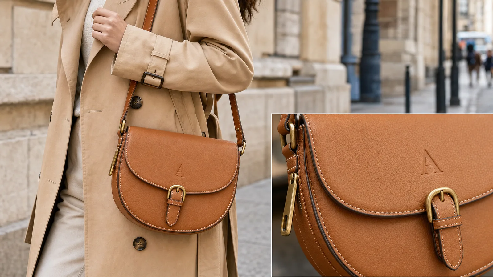 ## What A Street-Style Handbag Image Must Prove
A strong street-style handbag photo should answer three buyer questions quickly:
- What is the actual handbag being sold?
- How large does it feel on a person?
- What material and hardware details make it worth inspecting?
That is different from generic lifestyle photography. A handbag can look stylish while still failing as ecommerce product photography if the strap is hidden, the flap shape changes, the buckle becomes a different design, or the model pose blocks the product. AI can make a bag look more fashionable, but the seller still has to protect the SKU.
Use this rule when judging the output:
> A street-style handbag image is useful only if the buyer can recognize the same product from the main catalog photo.
## Build A Handbag Fact List Before Prompting
Before generating, write a short product-truth list. This keeps the scene from redesigning the bag.
- Silhouette: protect the bucket, tote, crossbody, shoulder, hobo, satchel, or flap shape because buyers compare the shape first.
- Strap: protect the length, width, attachment points, buckle, chain, or shoulder pad because scale and wearability depend on it.
- Hardware: protect the buckle, zipper pull, clasp, studs, feet, rings, and logo plate because small changes can imply a different SKU.
- Material: protect leather grain, canvas weave, suede nap, or nylon sheen because texture is a selling point.
- Stitching: protect edge paint, seam placement, stitch spacing, and quilting because detail quality signals value.
- Color: protect the true shade under realistic light because fashion shoppers notice drift quickly.
- Size: protect how the bag sits against torso, hand, or hip because lifestyle images must not exaggerate capacity.
For AI handbag street style product photos, this table is more important than dramatic scenery. It gives you a clean review standard after generation.
## Workflow For Generating Street-Style Handbag Photos
Use a controlled sequence:
- Start with the cleanest product reference image.
- Decide the image role: listing lifestyle image, PDP detail image, ad creative, or lookbook crop.
- Choose one street context: sidewalk, cafe exterior, storefront, transit stop, or simple city wall.
- Keep the model crop practical so the handbag is not blocked by hands, coats, or props.
- Ask for one bag, one clear pose, and one product-facing camera angle.
- Generate the lifestyle image.
- Compare the output against the original bag fact list.
- Clean the crop, background, or minor distractions in the editor before publishing.
This workflow makes [AI product photography](/ai-product-photography) behave more like a production process than a style lottery. The scene can feel editorial, but the product should still feel inspectable.
## Prompt Template
Use this prompt when you have a product reference:
> Create a realistic street-style ecommerce product photo using the reference handbag as the product truth. Keep the exact handbag silhouette, strap length and attachment points, leather or fabric texture, stitching, edge paint, hardware shape, zipper pull, buckle, color, scale, and logo or blank label placement. Show one cropped model wearing or carrying the handbag in a clean city sidewalk context. Make the handbag the dominant subject. Do not redesign the bag, add extra bags, add real brand logos, add marketplace UI, add review stars, add badges, add QR codes, add barcodes, or make unsupported claims.
For a detail-supporting image, add:
> Include a small matching detail view of the same handbag material and hardware. The detail must match the main bag exactly.
For a cleaner marketplace crop, add:
> Keep the background restrained, with enough context for lifestyle value but no clutter that competes with the product.
## What To Check Before Publishing
Review the generated image against the original SKU:
- Is the bag still the same shape?
- Are the strap anchors, buckle, zipper, and rings in the same places?
- Does the leather grain or fabric weave match the product?
- Is the true color close enough for a buyer-facing page?
- Does the size on body feel plausible?
- Are hands, coats, or shadows hiding the product?
- Did AI invent logos, charms, pockets, tags, or hardware?
- Is the image useful at thumbnail size?
- Would the same bag be recognizable from a white-background photo?
If any buyer-relevant product fact changed, fix or reject the image. A polished street scene is not worth publishing if it sells the wrong bag.
## Main Image Vs Detail Image Roles
Do not make every handbag image do the same job. A street-style main image should show scale and styling. A detail image should show material, stitching, hardware, and finish.
For a product page, a practical set might be:
- White or clean background main image for direct inspection.
- Street-style lifestyle image for scale and outfit context.
- Close detail image for leather grain, zipper, buckle, stitching, or edge paint.
- Interior or capacity image if the bag opens and storage is a buyer question.
KrafLayer can help create or edit each role, but the same product-truth list should guide all of them. That is how [ecommerce product photography](/ecommerce-product-photography) stays consistent while still giving the buyer more reasons to trust the product.
## Common Mistakes
The most common mistake is treating "street style" as permission to hide the handbag. Oversized coats, busy traffic, heavy blur, and dramatic poses can all make the image less useful.
Avoid these mistakes:
- Letting the model or outfit become the main subject.
- Cropping off the strap, bottom corners, or hardware.
- Changing a crossbody into a shoulder bag or tote.
- Making leather too glossy, plastic, or smooth.
- Adding brand marks, badges, or product claims that were not in the source.
- Showing an impossible bag size or capacity.
- Publishing a lifestyle image without a clean product image nearby.
The best street-style handbag photos feel natural, but they are controlled. The bag is still the product.
## FAQ
### Can AI create street-style handbag product photos from one product image?
Yes, AI can create street-style handbag product photos from a clear reference image, but the reference must guide the final output. Protect the bag shape, strap, hardware, texture, color, and scale. Review the image against the original SKU before using it on a product page or ad.
### What should a handbag lifestyle image show?
A handbag lifestyle image should show how the bag sits on a person, how large it feels, and how the material and hardware look in realistic light. It should not hide the product behind styling. The handbag should remain the clearest visual subject.
### How do I keep AI from changing the handbag design?
Write a product fact list before prompting and include those facts in the prompt. Mention silhouette, strap placement, buckle, zipper, stitching, leather grain, color, and scale. After generation, compare the output to the reference and reject any image where buyer-relevant details drift.
### Should handbag product pages use street-style images only?
No. Street-style images are useful for scale and styling context, but they should usually sit beside clean main images and detail images. Buyers still need a direct product view, close material proof, and sometimes interior or capacity images.
### How does KrafLayer help with handbag product photos?
KrafLayer helps sellers use product references to generate controlled lifestyle visuals, then clean or refine outputs with editing tools. For handbags, that means creating street-style context while checking leather texture, hardware, strap position, and scale before publishing.
## Conclusion
AI handbag street style product photos should make the bag easier to understand, not harder to verify. Start from a product-truth list, generate a restrained lifestyle scene, review every buyer-facing detail, and use KrafLayer to move from reference image to sellable ecommerce visual without drifting away from the real SKU.
# Meta Ad Product Image Sizes: Square, Portrait and 9:16
URL: https://kraflayer.com/blog/create-multi-size-product-images-for-meta-ads
Summary: Turn one verified product master into square, portrait, and vertical Meta ad images using crop maps, safe zones, native composition, and SKU checks.
Updated: 2026-08-22
Meta ad product images should be recomposed for square, portrait, and vertical placements, not blindly cropped from one finished design. Start with a verified product master, protect the SKU, then let the background and layout adapt to each native frame.
> **Quick Summary**
> Build 1:1, 4:5, and 9:16 versions from the same product truth. Keep identity pixels protected, reserve safe space for placement controls, and preview every version in Ads Manager before launch.
Meta ad product images in multiple sizes should look like one campaign, not three unrelated product shoots. The buyer should recognize the same product in the square, portrait, and vertical versions: same color, logo placement, cap, material, lighting direction, shadow, and selling context.
The practical rule is to create one product-truth image first, then adapt the composition for each crop. In KrafLayer, use an [AI product image generator](/ai-product-image-generator) or a strong existing product photo as the source, build the main visual around one clear ecommerce subject, and then create size variations only after the product facts are stable.
## What A Street-Style Handbag Image Must Prove
A strong street-style handbag photo should answer three buyer questions quickly:
- What is the actual handbag being sold?
- How large does it feel on a person?
- What material and hardware details make it worth inspecting?
That is different from generic lifestyle photography. A handbag can look stylish while still failing as ecommerce product photography if the strap is hidden, the flap shape changes, the buckle becomes a different design, or the model pose blocks the product. AI can make a bag look more fashionable, but the seller still has to protect the SKU.
Use this rule when judging the output:
> A street-style handbag image is useful only if the buyer can recognize the same product from the main catalog photo.
## Build A Handbag Fact List Before Prompting
Before generating, write a short product-truth list. This keeps the scene from redesigning the bag.
- Silhouette: protect the bucket, tote, crossbody, shoulder, hobo, satchel, or flap shape because buyers compare the shape first.
- Strap: protect the length, width, attachment points, buckle, chain, or shoulder pad because scale and wearability depend on it.
- Hardware: protect the buckle, zipper pull, clasp, studs, feet, rings, and logo plate because small changes can imply a different SKU.
- Material: protect leather grain, canvas weave, suede nap, or nylon sheen because texture is a selling point.
- Stitching: protect edge paint, seam placement, stitch spacing, and quilting because detail quality signals value.
- Color: protect the true shade under realistic light because fashion shoppers notice drift quickly.
- Size: protect how the bag sits against torso, hand, or hip because lifestyle images must not exaggerate capacity.
For AI handbag street style product photos, this table is more important than dramatic scenery. It gives you a clean review standard after generation.
## Workflow For Generating Street-Style Handbag Photos
Use a controlled sequence:
- Start with the cleanest product reference image.
- Decide the image role: listing lifestyle image, PDP detail image, ad creative, or lookbook crop.
- Choose one street context: sidewalk, cafe exterior, storefront, transit stop, or simple city wall.
- Keep the model crop practical so the handbag is not blocked by hands, coats, or props.
- Ask for one bag, one clear pose, and one product-facing camera angle.
- Generate the lifestyle image.
- Compare the output against the original bag fact list.
- Clean the crop, background, or minor distractions in the editor before publishing.
This workflow makes [AI product photography](/ai-product-photography) behave more like a production process than a style lottery. The scene can feel editorial, but the product should still feel inspectable.
## Prompt Template
Use this prompt when you have a product reference:
> Create a realistic street-style ecommerce product photo using the reference handbag as the product truth. Keep the exact handbag silhouette, strap length and attachment points, leather or fabric texture, stitching, edge paint, hardware shape, zipper pull, buckle, color, scale, and logo or blank label placement. Show one cropped model wearing or carrying the handbag in a clean city sidewalk context. Make the handbag the dominant subject. Do not redesign the bag, add extra bags, add real brand logos, add marketplace UI, add review stars, add badges, add QR codes, add barcodes, or make unsupported claims.
For a detail-supporting image, add:
> Include a small matching detail view of the same handbag material and hardware. The detail must match the main bag exactly.
For a cleaner marketplace crop, add:
> Keep the background restrained, with enough context for lifestyle value but no clutter that competes with the product.
## What To Check Before Publishing
Review the generated image against the original SKU:
- Is the bag still the same shape?
- Are the strap anchors, buckle, zipper, and rings in the same places?
- Does the leather grain or fabric weave match the product?
- Is the true color close enough for a buyer-facing page?
- Does the size on body feel plausible?
- Are hands, coats, or shadows hiding the product?
- Did AI invent logos, charms, pockets, tags, or hardware?
- Is the image useful at thumbnail size?
- Would the same bag be recognizable from a white-background photo?
If any buyer-relevant product fact changed, fix or reject the image. A polished street scene is not worth publishing if it sells the wrong bag.
## Main Image Vs Detail Image Roles
Do not make every handbag image do the same job. A street-style main image should show scale and styling. A detail image should show material, stitching, hardware, and finish.
For a product page, a practical set might be:
- White or clean background main image for direct inspection.
- Street-style lifestyle image for scale and outfit context.
- Close detail image for leather grain, zipper, buckle, stitching, or edge paint.
- Interior or capacity image if the bag opens and storage is a buyer question.
KrafLayer can help create or edit each role, but the same product-truth list should guide all of them. That is how [ecommerce product photography](/ecommerce-product-photography) stays consistent while still giving the buyer more reasons to trust the product.
## Common Mistakes
The most common mistake is treating "street style" as permission to hide the handbag. Oversized coats, busy traffic, heavy blur, and dramatic poses can all make the image less useful.
Avoid these mistakes:
- Letting the model or outfit become the main subject.
- Cropping off the strap, bottom corners, or hardware.
- Changing a crossbody into a shoulder bag or tote.
- Making leather too glossy, plastic, or smooth.
- Adding brand marks, badges, or product claims that were not in the source.
- Showing an impossible bag size or capacity.
- Publishing a lifestyle image without a clean product image nearby.
The best street-style handbag photos feel natural, but they are controlled. The bag is still the product.
## FAQ
### Can AI create street-style handbag product photos from one product image?
Yes, AI can create street-style handbag product photos from a clear reference image, but the reference must guide the final output. Protect the bag shape, strap, hardware, texture, color, and scale. Review the image against the original SKU before using it on a product page or ad.
### What should a handbag lifestyle image show?
A handbag lifestyle image should show how the bag sits on a person, how large it feels, and how the material and hardware look in realistic light. It should not hide the product behind styling. The handbag should remain the clearest visual subject.
### How do I keep AI from changing the handbag design?
Write a product fact list before prompting and include those facts in the prompt. Mention silhouette, strap placement, buckle, zipper, stitching, leather grain, color, and scale. After generation, compare the output to the reference and reject any image where buyer-relevant details drift.
### Should handbag product pages use street-style images only?
No. Street-style images are useful for scale and styling context, but they should usually sit beside clean main images and detail images. Buyers still need a direct product view, close material proof, and sometimes interior or capacity images.
### How does KrafLayer help with handbag product photos?
KrafLayer helps sellers use product references to generate controlled lifestyle visuals, then clean or refine outputs with editing tools. For handbags, that means creating street-style context while checking leather texture, hardware, strap position, and scale before publishing.
## Conclusion
AI handbag street style product photos should make the bag easier to understand, not harder to verify. Start from a product-truth list, generate a restrained lifestyle scene, review every buyer-facing detail, and use KrafLayer to move from reference image to sellable ecommerce visual without drifting away from the real SKU.
# Meta Ad Product Image Sizes: Square, Portrait and 9:16
URL: https://kraflayer.com/blog/create-multi-size-product-images-for-meta-ads
Summary: Turn one verified product master into square, portrait, and vertical Meta ad images using crop maps, safe zones, native composition, and SKU checks.
Updated: 2026-08-22
Meta ad product images should be recomposed for square, portrait, and vertical placements, not blindly cropped from one finished design. Start with a verified product master, protect the SKU, then let the background and layout adapt to each native frame.
> **Quick Summary**
> Build 1:1, 4:5, and 9:16 versions from the same product truth. Keep identity pixels protected, reserve safe space for placement controls, and preview every version in Ads Manager before launch.
Meta ad product images in multiple sizes should look like one campaign, not three unrelated product shoots. The buyer should recognize the same product in the square, portrait, and vertical versions: same color, logo placement, cap, material, lighting direction, shadow, and selling context.
The practical rule is to create one product-truth image first, then adapt the composition for each crop. In KrafLayer, use an [AI product image generator](/ai-product-image-generator) or a strong existing product photo as the source, build the main visual around one clear ecommerce subject, and then create size variations only after the product facts are stable.
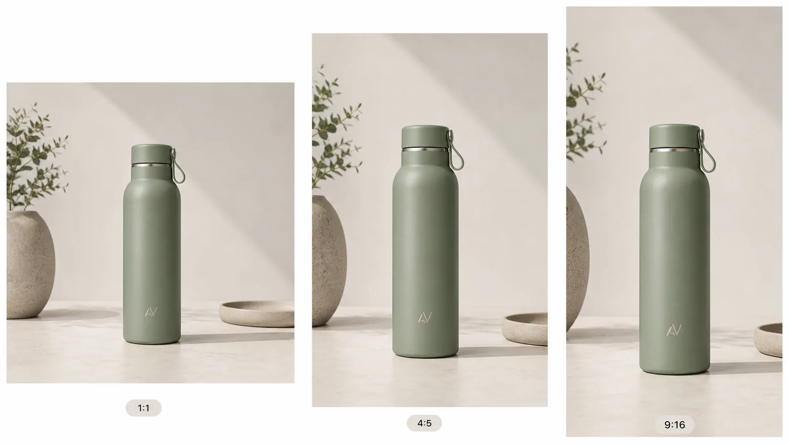 ## Why Multi-Size Ad Images Drift
Ad creative often breaks when teams resize at the end. A square image may show the full product, a portrait version may cut off the cap, and a vertical version may move the product into a different scene. The campaign then feels inconsistent even if the offer is the same.
For ecommerce, product identity matters more than decoration. A good multi-size product image set should preserve:
- product shape and silhouette
- true product color
- logo or label position
- cap, handle, strap, closure, pump, or hardware details
- lighting direction and contact shadow
- background mood and prop style
- product scale inside each crop
- enough empty space for ad copy or layout needs
If one format makes the product look taller, greener, shinier, cheaper, or like a different SKU, the set needs another pass.
## Start With One Product-Truth Image
Do not begin by asking for every ad size at once. Start with the single image that defines the product.
For a bottle, that means the body shape, cap, metal ring, carry loop, color, logo placement, and surface texture are correct. For shoes, it may be toe box shape, laces, sole profile, stitching, color blocking, and material. For skincare, it may be pump geometry, label plane, bottle transparency, liquid level, and cap finish.
This source image can come from a clean product photo, a generated ecommerce image, or a retouched listing visual. The important part is that the source image is already accurate enough to represent the product.
Use KrafLayer's [product photo editor](/product-photo-editor) before resizing if the source has background clutter, weak lighting, dust, crop issues, or soft product detail. Editing first gives every ad format a better base.
## Decide The Role Of Each Crop
A multi-size product image set should not be a blind resize. Each crop has a job.
Use this planning pass:
- Square 1:1: strongest product recognition, good for feeds and reusable catalog-style ad creative.
- Portrait 4:5: product plus more selling context, useful when the item needs room for props, a headline area, or mobile feed presence.
- Vertical 9:16: full-screen story/reel style image, useful when the product needs taller framing, negative space, and a more immersive layout.
The product should remain recognizable across all three. The crop can change, but the SKU should not.
## Build The Crop Set From Product Facts
When creating multi-size product images, write the protected facts into the prompt or editing brief before the crop instructions.
Use a prompt like:
> Create a consistent ecommerce ad image set for the same matte sage insulated bottle. Preserve the bottle shape, cap, carry loop, metal ring, sage color, small fictional AV monogram position, texture, scale, lighting direction, and natural contact shadow. Create square 1:1, portrait 4:5, and vertical 9:16 crop compositions with the same product and a restrained neutral surface. Leave clean negative space for ad copy. Do not add real brand logos, Meta UI, marketplace badges, QR codes, barcodes, certification marks, sale stickers, or unsupported claims.
For an existing product photo, the edit brief can be simpler:
> Keep this exact product unchanged. Create square, 4:5 portrait, and 9:16 vertical ad-ready variations. Preserve product color, label placement, silhouette, material, lighting direction, and shadow. Extend or adjust the background only where needed for each crop. Do not crop off product-defining details or invent new packaging.
The prompt should protect the product before it asks for ad polish.
## What To Check In Each Ad Size
Review every version separately. A set can pass as a group but fail in one crop.
For the square version, check:
- product is immediately recognizable at feed size
- product is not too small
- logo, label, or defining feature is visible
- background does not compete with the product
For the 4:5 version, check:
- product still feels like the hero
- extra vertical space supports the layout
- props do not imply a false use case
- product shadow and perspective remain natural
For the 9:16 version, check:
- product is not stretched, enlarged unrealistically, or cut off
- there is usable empty space above or beside the product
- visual weight still works on a phone screen
- background extension does not create strange surfaces, duplicated props, or scale confusion
The best multi-size product images feel intentionally composed, not automatically resized.
## Keep Ad Creative Honest
Meta ad creative can be more campaign-like than a marketplace main image, but it still needs product truth. Do not hide the product behind lifestyle mood or add unsupported visual claims.
Avoid:
- fake platform UI or social proof
- fake review stars, badges, guarantees, or certification marks
- impossible product scale
- product color changes between formats
- made-up label claims or unreadable fake label text
- backgrounds that imply a use case the product cannot support
- props that look like bundle components when they are not included
Useful creative restraint is usually stronger than visual noise. The product should remain the reason the ad exists.
## A Practical KrafLayer Workflow
Use this workflow for Meta ad product images in multiple sizes:
1. Choose one product reference or listing image as the source of truth.
2. Clean the image first if the product has dust, clutter, weak crop, or bad background.
3. Generate or edit the main ecommerce product image.
4. Write the protected product facts: color, label, shape, material, scale, and shadow.
5. Create the square version for product recognition.
6. Create the 4:5 version with room for a feed layout.
7. Create the 9:16 version with full-screen mobile spacing.
8. Compare all versions side by side.
9. Reject any crop that changes product identity, hides key details, or invents ad claims.
10. Export the final set for your ad account, landing page, email, or retargeting workflow.
KrafLayer fits best at the visual-production stage: making the source image stronger, generating consistent product-led compositions, and letting the marketer review the set before campaign upload.
## How This Connects To Ecommerce Product Photography
Multi-size ad creative works better when it starts from clear [ecommerce product photography](/ecommerce-product-photography). A blurry, cluttered, or inaccurate source image becomes harder to adapt. A clean product image with visible material, real scale, and stable lighting can be extended into more campaign formats without losing trust.
For paid social, the image has two jobs at once: stop the scroll and explain the product. If the crop is visually dramatic but buyers cannot tell what is being sold, the ad is weak. If the crop is accurate but dull, the ad may be ignored. The right set protects product facts while using composition, light, and spacing to fit each placement.
## Which Meta ad formats should the master support?
Meta's own Reels guidance centers vertical 9:16 creative and safe zones, while its photo-ad guidance emphasizes one focal point, high-resolution inputs, minimal text, and visual consistency across ad sets. The practical answer is to design a flexible master, then compose native square, portrait, and vertical versions rather than cropping one finished ad ([Meta Reels ads](https://www.facebook.com/business/ads/facebook-instagram-reels-ads); [Meta photo ads](https://www.facebook.com/business/ads/photo-ad-format), 2026).
Use three working canvases:
| Canvas | Best starting role | Composition rule |
|---|---|---|
| 1:1 square | Feeds, catalog-style creative, broad reuse | Keep product and primary cue centered enough for automated crops |
| 4:5 portrait | Mobile feeds | Let the product occupy more vertical space without touching interface edges |
| 9:16 vertical | Stories and Reels | Keep product, logo, and essential copy inside the safe central area |
Do not treat those as file-size guarantees for every placement. Meta changes delivery surfaces and may apply automatic enhancements. Preview the actual selected placements in Ads Manager before launch.
## Build a crop map before generating backgrounds
Meta says Advantage+ creative can expand images for different placements. Even when expansion is available, a crop map gives the model a safer job: it shows where the product must remain and which edges can be extended without inventing product pixels ([Meta Advantage+ creative](https://www.facebook.com/business/ads/meta-advantage-plus/creative), 2026).
Mark four zones on the clean master:
1. **Identity zone:** the product itself; never regenerate this region merely to change ratio.
2. **Mandatory message zone:** verified copy or offer that must survive a crop.
3. **Flexible scene zone:** background, surface, light falloff, and restrained props that can be extended.
4. **Interface-risk zone:** top, bottom, and side areas likely to be covered by placement controls.
If the source is already tightly cropped around the product, do not stretch it. Use background expansion or Scene Compose with the original product pixels protected, then inspect edges, reflections, and contact shadows at every ratio.
## Should each ratio use the same composition?
Meta recommends consistent themes across ad sets, not mechanically identical layouts. Keep the same product, campaign idea, color treatment, type family, and value proposition while allowing the object to move for the native frame ([Meta photo ads](https://www.facebook.com/business/ads/photo-ad-format), 2026).
A square ad may center the product. A 4:5 version can enlarge it and move copy above. A 9:16 version may place the product lower to preserve top safe space. That is still one campaign system.
Before export, compare all ratios side by side and check:
- exact SKU color, label, shape, and included items;
- product size relative to the frame;
- legibility without zoom;
- no interface collision in placement preview;
- matching destination page and offer;
- one dominant focal point per frame.
## FAQ
### How do I create Meta ad product images in multiple sizes?
Start with one accurate product image, then create square, portrait, and vertical versions from that same product truth. Preserve product color, shape, logo placement, material, lighting, and shadow in every crop. Adapt the background and spacing, but do not redesign the SKU.
### What sizes should I prepare for product ads?
A practical ecommerce set usually includes a square 1:1 image, a portrait 4:5 image, and a vertical 9:16 image. Exact upload options and placement behavior can change, so use these as creative planning formats and check the current ad account guidance before launch.
### Can AI resize one product photo into ad formats?
AI can help extend backgrounds, recompose crops, and create product-led ad variations, but the output needs review. Check that the product shape, color, label, scale, and shadow stay consistent. Do not accept a resize that quietly changes the product.
### Should each ad size use the same background?
The background should feel like the same campaign, but it does not need to be pixel-identical. Keep the lighting, surface, prop style, and color palette consistent. Adjust negative space and crop for each format so the product remains readable on mobile.
### Can KrafLayer make product ad images from a listing photo?
Yes. KrafLayer can help turn a listing photo or product reference into ad-ready product visuals, then support editing and crop adaptation. The key is to keep product truth first: shape, color, material, label, scale, and buyer-relevant details should survive every ad version.
## Conclusion
Multi-size product images for Meta ads work when every crop feels like the same product campaign: square for recognition, portrait for feed presence, and vertical for full-screen mobile space. KrafLayer helps ecommerce teams start from one product reference, create accurate product-led ad visuals, clean weak source photos, and adapt the image set without losing SKU details. For sellers running paid social, the advantage is faster creative variation while keeping product identity, ecommerce photography quality, and ad-ready consistency intact.
# 莫兰迪色系高级服装背景合成怎么做
URL: https://kraflayer.com/zh/blog/morandi-color-premium-apparel-background-composition
Summary: 一套莫兰迪色系服装背景流程:用低饱和色提升高级感,同时保留服装真实颜色、版型和面料。可在 KrafLayer 中按同一流程完成。
Updated: 2026-06-12
## TL;DR
莫兰迪色系高级服装背景合成这类任务,KrafLayer 的作用是把真实商品参考图推进到可用的主图、详情图或广告素材,而不是重新发明商品。核心检查点是版型、面料、肩线、衣长和真实色号没有被改掉。
莫兰迪背景适合做高级、柔和、低饱和的服装商品图。但背景颜色不能污染服装本身,尤其是白色、米色、灰色和浅色面料。
## Why Multi-Size Ad Images Drift
Ad creative often breaks when teams resize at the end. A square image may show the full product, a portrait version may cut off the cap, and a vertical version may move the product into a different scene. The campaign then feels inconsistent even if the offer is the same.
For ecommerce, product identity matters more than decoration. A good multi-size product image set should preserve:
- product shape and silhouette
- true product color
- logo or label position
- cap, handle, strap, closure, pump, or hardware details
- lighting direction and contact shadow
- background mood and prop style
- product scale inside each crop
- enough empty space for ad copy or layout needs
If one format makes the product look taller, greener, shinier, cheaper, or like a different SKU, the set needs another pass.
## Start With One Product-Truth Image
Do not begin by asking for every ad size at once. Start with the single image that defines the product.
For a bottle, that means the body shape, cap, metal ring, carry loop, color, logo placement, and surface texture are correct. For shoes, it may be toe box shape, laces, sole profile, stitching, color blocking, and material. For skincare, it may be pump geometry, label plane, bottle transparency, liquid level, and cap finish.
This source image can come from a clean product photo, a generated ecommerce image, or a retouched listing visual. The important part is that the source image is already accurate enough to represent the product.
Use KrafLayer's [product photo editor](/product-photo-editor) before resizing if the source has background clutter, weak lighting, dust, crop issues, or soft product detail. Editing first gives every ad format a better base.
## Decide The Role Of Each Crop
A multi-size product image set should not be a blind resize. Each crop has a job.
Use this planning pass:
- Square 1:1: strongest product recognition, good for feeds and reusable catalog-style ad creative.
- Portrait 4:5: product plus more selling context, useful when the item needs room for props, a headline area, or mobile feed presence.
- Vertical 9:16: full-screen story/reel style image, useful when the product needs taller framing, negative space, and a more immersive layout.
The product should remain recognizable across all three. The crop can change, but the SKU should not.
## Build The Crop Set From Product Facts
When creating multi-size product images, write the protected facts into the prompt or editing brief before the crop instructions.
Use a prompt like:
> Create a consistent ecommerce ad image set for the same matte sage insulated bottle. Preserve the bottle shape, cap, carry loop, metal ring, sage color, small fictional AV monogram position, texture, scale, lighting direction, and natural contact shadow. Create square 1:1, portrait 4:5, and vertical 9:16 crop compositions with the same product and a restrained neutral surface. Leave clean negative space for ad copy. Do not add real brand logos, Meta UI, marketplace badges, QR codes, barcodes, certification marks, sale stickers, or unsupported claims.
For an existing product photo, the edit brief can be simpler:
> Keep this exact product unchanged. Create square, 4:5 portrait, and 9:16 vertical ad-ready variations. Preserve product color, label placement, silhouette, material, lighting direction, and shadow. Extend or adjust the background only where needed for each crop. Do not crop off product-defining details or invent new packaging.
The prompt should protect the product before it asks for ad polish.
## What To Check In Each Ad Size
Review every version separately. A set can pass as a group but fail in one crop.
For the square version, check:
- product is immediately recognizable at feed size
- product is not too small
- logo, label, or defining feature is visible
- background does not compete with the product
For the 4:5 version, check:
- product still feels like the hero
- extra vertical space supports the layout
- props do not imply a false use case
- product shadow and perspective remain natural
For the 9:16 version, check:
- product is not stretched, enlarged unrealistically, or cut off
- there is usable empty space above or beside the product
- visual weight still works on a phone screen
- background extension does not create strange surfaces, duplicated props, or scale confusion
The best multi-size product images feel intentionally composed, not automatically resized.
## Keep Ad Creative Honest
Meta ad creative can be more campaign-like than a marketplace main image, but it still needs product truth. Do not hide the product behind lifestyle mood or add unsupported visual claims.
Avoid:
- fake platform UI or social proof
- fake review stars, badges, guarantees, or certification marks
- impossible product scale
- product color changes between formats
- made-up label claims or unreadable fake label text
- backgrounds that imply a use case the product cannot support
- props that look like bundle components when they are not included
Useful creative restraint is usually stronger than visual noise. The product should remain the reason the ad exists.
## A Practical KrafLayer Workflow
Use this workflow for Meta ad product images in multiple sizes:
1. Choose one product reference or listing image as the source of truth.
2. Clean the image first if the product has dust, clutter, weak crop, or bad background.
3. Generate or edit the main ecommerce product image.
4. Write the protected product facts: color, label, shape, material, scale, and shadow.
5. Create the square version for product recognition.
6. Create the 4:5 version with room for a feed layout.
7. Create the 9:16 version with full-screen mobile spacing.
8. Compare all versions side by side.
9. Reject any crop that changes product identity, hides key details, or invents ad claims.
10. Export the final set for your ad account, landing page, email, or retargeting workflow.
KrafLayer fits best at the visual-production stage: making the source image stronger, generating consistent product-led compositions, and letting the marketer review the set before campaign upload.
## How This Connects To Ecommerce Product Photography
Multi-size ad creative works better when it starts from clear [ecommerce product photography](/ecommerce-product-photography). A blurry, cluttered, or inaccurate source image becomes harder to adapt. A clean product image with visible material, real scale, and stable lighting can be extended into more campaign formats without losing trust.
For paid social, the image has two jobs at once: stop the scroll and explain the product. If the crop is visually dramatic but buyers cannot tell what is being sold, the ad is weak. If the crop is accurate but dull, the ad may be ignored. The right set protects product facts while using composition, light, and spacing to fit each placement.
## Which Meta ad formats should the master support?
Meta's own Reels guidance centers vertical 9:16 creative and safe zones, while its photo-ad guidance emphasizes one focal point, high-resolution inputs, minimal text, and visual consistency across ad sets. The practical answer is to design a flexible master, then compose native square, portrait, and vertical versions rather than cropping one finished ad ([Meta Reels ads](https://www.facebook.com/business/ads/facebook-instagram-reels-ads); [Meta photo ads](https://www.facebook.com/business/ads/photo-ad-format), 2026).
Use three working canvases:
| Canvas | Best starting role | Composition rule |
|---|---|---|
| 1:1 square | Feeds, catalog-style creative, broad reuse | Keep product and primary cue centered enough for automated crops |
| 4:5 portrait | Mobile feeds | Let the product occupy more vertical space without touching interface edges |
| 9:16 vertical | Stories and Reels | Keep product, logo, and essential copy inside the safe central area |
Do not treat those as file-size guarantees for every placement. Meta changes delivery surfaces and may apply automatic enhancements. Preview the actual selected placements in Ads Manager before launch.
## Build a crop map before generating backgrounds
Meta says Advantage+ creative can expand images for different placements. Even when expansion is available, a crop map gives the model a safer job: it shows where the product must remain and which edges can be extended without inventing product pixels ([Meta Advantage+ creative](https://www.facebook.com/business/ads/meta-advantage-plus/creative), 2026).
Mark four zones on the clean master:
1. **Identity zone:** the product itself; never regenerate this region merely to change ratio.
2. **Mandatory message zone:** verified copy or offer that must survive a crop.
3. **Flexible scene zone:** background, surface, light falloff, and restrained props that can be extended.
4. **Interface-risk zone:** top, bottom, and side areas likely to be covered by placement controls.
If the source is already tightly cropped around the product, do not stretch it. Use background expansion or Scene Compose with the original product pixels protected, then inspect edges, reflections, and contact shadows at every ratio.
## Should each ratio use the same composition?
Meta recommends consistent themes across ad sets, not mechanically identical layouts. Keep the same product, campaign idea, color treatment, type family, and value proposition while allowing the object to move for the native frame ([Meta photo ads](https://www.facebook.com/business/ads/photo-ad-format), 2026).
A square ad may center the product. A 4:5 version can enlarge it and move copy above. A 9:16 version may place the product lower to preserve top safe space. That is still one campaign system.
Before export, compare all ratios side by side and check:
- exact SKU color, label, shape, and included items;
- product size relative to the frame;
- legibility without zoom;
- no interface collision in placement preview;
- matching destination page and offer;
- one dominant focal point per frame.
## FAQ
### How do I create Meta ad product images in multiple sizes?
Start with one accurate product image, then create square, portrait, and vertical versions from that same product truth. Preserve product color, shape, logo placement, material, lighting, and shadow in every crop. Adapt the background and spacing, but do not redesign the SKU.
### What sizes should I prepare for product ads?
A practical ecommerce set usually includes a square 1:1 image, a portrait 4:5 image, and a vertical 9:16 image. Exact upload options and placement behavior can change, so use these as creative planning formats and check the current ad account guidance before launch.
### Can AI resize one product photo into ad formats?
AI can help extend backgrounds, recompose crops, and create product-led ad variations, but the output needs review. Check that the product shape, color, label, scale, and shadow stay consistent. Do not accept a resize that quietly changes the product.
### Should each ad size use the same background?
The background should feel like the same campaign, but it does not need to be pixel-identical. Keep the lighting, surface, prop style, and color palette consistent. Adjust negative space and crop for each format so the product remains readable on mobile.
### Can KrafLayer make product ad images from a listing photo?
Yes. KrafLayer can help turn a listing photo or product reference into ad-ready product visuals, then support editing and crop adaptation. The key is to keep product truth first: shape, color, material, label, scale, and buyer-relevant details should survive every ad version.
## Conclusion
Multi-size product images for Meta ads work when every crop feels like the same product campaign: square for recognition, portrait for feed presence, and vertical for full-screen mobile space. KrafLayer helps ecommerce teams start from one product reference, create accurate product-led ad visuals, clean weak source photos, and adapt the image set without losing SKU details. For sellers running paid social, the advantage is faster creative variation while keeping product identity, ecommerce photography quality, and ad-ready consistency intact.
# 莫兰迪色系高级服装背景合成怎么做
URL: https://kraflayer.com/zh/blog/morandi-color-premium-apparel-background-composition
Summary: 一套莫兰迪色系服装背景流程:用低饱和色提升高级感,同时保留服装真实颜色、版型和面料。可在 KrafLayer 中按同一流程完成。
Updated: 2026-06-12
## TL;DR
莫兰迪色系高级服装背景合成这类任务,KrafLayer 的作用是把真实商品参考图推进到可用的主图、详情图或广告素材,而不是重新发明商品。核心检查点是版型、面料、肩线、衣长和真实色号没有被改掉。
莫兰迪背景适合做高级、柔和、低饱和的服装商品图。但背景颜色不能污染服装本身,尤其是白色、米色、灰色和浅色面料。
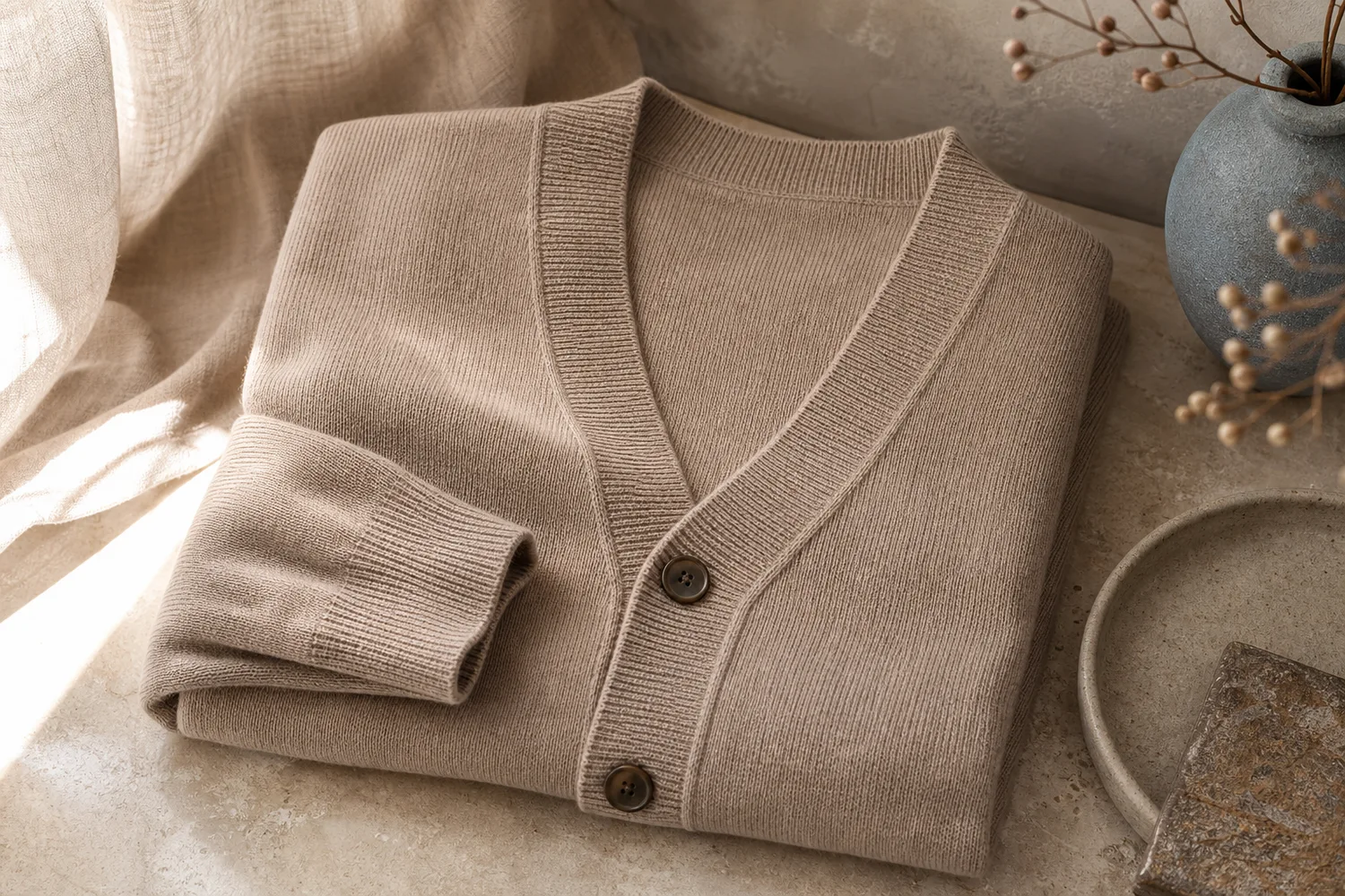 ## 可直接复制的 prompt
~~~text
以我上传的服装商品图作为准确参考,生成莫兰迪色系高级感电商背景。请保留服装真实颜色、版型、面料纹理、肩线、袖长、下摆、纽扣/口袋和比例。背景使用低饱和灰绿、灰粉、暖灰或蓝灰色调,柔和干净,有自然阴影。不要给服装染色,不要改变版型,不要添加抢眼道具。
~~~
## KrafLayer 放在流程里的位置
把莫兰迪色系高级服装背景合成放到 KrafLayer 里做时,先固定商品参考图,再决定是修背景、补光线、做详情图还是延展广告版本。最后按主图、详情图或广告素材的使用场景检查:版型、面料、肩线、衣长和真实色号没有被改掉。
## FAQ
### 莫兰迪背景适合所有服装吗?
更适合中高端、通勤、家居、轻奢和柔和风格服装。强运动或强街头风不一定合适。
# 哑光磨砂质感化妆品 AI 渲染怎么做
URL: https://kraflayer.com/zh/blog/matte-frosted-cosmetic-product-ai-rendering
Summary: 磨砂化妆品图的重点不是把画面做雾,而是在瓶身边缘、标签文字、半透材质和柔光反射之间取得平衡。适合精华、面霜、香氛、彩妆包装做详情图、海报和系列主图。可在 KrafLayer 中按同一流程完成。
Updated: 2026-06-12
# 哑光磨砂化妆品 AI 渲染怎么做
## TL;DR
哑光磨砂质感化妆品 AI 渲染这类任务,KrafLayer 适合处理局部变化或参考驱动的视觉调整:局部改动用 Mask Edit 加短指令;需要视觉参考时用 Reference Image Editor。生成结果必须让瓶型、标签、色号、质地和包装比例保持可信。
哑光磨砂化妆品图适合玻璃精华瓶、面霜罐、香氛、彩妆管和高端护肤套装。它解决的是一个很具体的问题:产品本身想要高级、柔和、低反光,但标签、瓶盖、容量信息和品牌识别又不能被雾化掉。
好看的磨砂质感不是简单加一层模糊。真正能用于电商的图,需要让瓶身边缘干净、文字可读、材质有细腻颗粒感,背景和道具只服务产品,而不是抢走注意力。
## 什么场景适合做磨砂渲染
适合做磨砂风的产品通常有三个特征:包装本身偏简洁,产品定位偏中高端,卖点需要传达“温和、干净、专业、轻奢”。如果是强促销、强颜色冲击的低价爆品,磨砂风反而可能降低点击效率。
护肤品可以用浅灰、乳白、淡粉、浅绿或冷米色背景;香氛可以加入半透明亚克力、玻璃台面、柔焦植物影;彩妆则更适合用同色系色块和局部高光,让色号或管身更清楚。
## 怎么做
第一步,先上传一张标签清楚、瓶身完整、透视正常的产品图。不要用已经过度磨皮、压缩严重、文字糊掉的素材做基础图。
第二步,指定“磨砂材质只作用在瓶身或包装表面,品牌文字和标签保持清晰”。这句话很重要,否则 AI 容易把整张图都处理成柔焦。
第三步,控制光线。磨砂材质需要大面积柔光和少量边缘高光,不能用硬闪光。可以要求左前方大柔光、背后轻微轮廓光、地面柔和接触阴影。
第四步,背景保持克制。用亚克力台面、浅色石材、半透明玻璃块、微水珠或极简植物影就够了,不要塞太多花、石头、液体飞溅和金属装饰。
## 注意事项
不要让 AI 重画标签文字。如果产品有真实品牌、成分、容量或条码,最好要求保留原图标签,不要生成新文字。
透明瓶尤其要小心。磨砂玻璃可以有半透感,但产品液体颜色、液面高度和瓶身厚度不能乱变,否则详情图会显得不可信。
套装图要统一光线和台面高度。单品很好看但套装东倒西歪,会直接降低页面专业度。
## KrafLayer 放在流程里的位置
把哑光磨砂质感化妆品 AI 渲染放到 KrafLayer 里做时,先选对工具:局部改动用 Mask Edit 加短指令;需要视觉参考时用 Reference Image Editor。生成后不要只看画面是否更漂亮,要按主图、详情图或广告素材的使用场景检查:瓶型、标签、色号、质地和包装比例保持可信。
## 可直接使用的 Prompt
基于这张化妆品产品图,生成一张高级哑光磨砂质感的电商产品图。保留产品真实瓶型、瓶盖、标签文字、品牌位置、容量信息和包装比例,不要重写或虚构标签。瓶身呈现细腻磨砂玻璃/哑光塑料质感,边缘清晰,有柔和轮廓光和自然接触阴影。背景使用浅色亚克力台面与极简护肤品场景,光线干净、柔和、专业,整体适合高端护肤品牌主图或详情页首屏。
## 总结
磨砂化妆品图的关键是“柔而不糊”。能卖货的图应该让用户一眼看出产品质感,同时仍然读得清标签、看得准颜色、相信它是同一个 SKU。
## FAQ
### 磨砂风会不会影响商品真实性?
会,如果你让 AI 改瓶型、改颜色或重画标签。正确做法是只优化材质表现、光线和背景,产品结构和识别信息必须保留。
### 透明瓶能做磨砂效果吗?
可以,但要保留半透明边缘、液体颜色和瓶身厚度。不要把透明瓶直接变成不透光的白瓶。
### 主图适合用磨砂风吗?
平台白底主图不一定适合。磨砂风更适合品牌官网、详情页、广告图、小红书封面和套装展示。
# 母婴用品温馨治愈系商品图怎么做
URL: https://kraflayer.com/zh/blog/warm-healing-baby-products-product-images-with-ai
Summary: 母婴商品图要让家长看见安全、柔软、真实尺寸和使用方式。温馨治愈风可以提升信任,但不能遮挡结构、夸大功能或制造不真实使用场景。可在 KrafLayer 中按同一流程完成。
Updated: 2026-06-12
# 母婴用品温馨治愈系商品图怎么做
## TL;DR
母婴用品温馨治愈系商品图这类任务,KrafLayer 的作用是把真实商品参考图推进到可用的主图、详情图或广告素材,而不是重新发明商品。核心检查点是商品形状、材质、标签、颜色、比例和配件仍然对应原始 SKU。
母婴用品的图片不能只追求“可爱”。家长真正关心的是安全、材质、尺寸、清洁、使用方式和是否适合宝宝。温馨治愈的画面有用,但前提是商品信息清楚,不能靠滤镜掩盖结构。
适合做温馨图的品类包括婴儿毯、奶瓶、围兜、安抚玩具、浴巾、收纳用品、餐具、婴儿服饰和房间小物。
## 什么时候需要这种图
当白底图只能说明外观,但无法传达柔软、安心、亲肤、家居适配或送礼氛围时,可以补充温馨场景图。
如果商品涉及安全使用,比如睡眠用品、餐具、洗护和出行配件,图片要更克制,避免误导使用方式。
## 怎么做
先保留产品结构。奶嘴、刻度、扣子、拉链、边缘包缝、材质纹理、尺寸比例都要清楚。
背景选择浅色、柔和、真实。婴儿房、床边、木质桌面、柔软布料、晨光都可以,但不要堆太多玩具和装饰。
颜色不要过饱和。母婴图适合低刺激色彩:奶白、浅灰、雾粉、淡蓝、柔黄和天然木色。
如果加入宝宝或手部元素,必须非常谨慎。不要遮挡商品,也不要生成不安全的睡姿、吞咽风险或错误使用方式。
## 注意事项
不要虚构安全认证、材质等级、适用年龄或功效。图片里的文案和图示必须来自真实产品信息。
不要把商品尺寸做大或做小。母婴用品尺寸误导很容易引发退换货。
## KrafLayer 放在流程里的位置
把母婴用品温馨治愈系商品图放到 KrafLayer 里做时,先固定商品参考图,再决定是修背景、补光线、做详情图还是延展广告版本。最后按主图、详情图或广告素材的使用场景检查:商品形状、材质、标签、颜色、比例和配件仍然对应原始 SKU。
## 可直接使用的 Prompt
基于这张母婴用品商品图,生成一张温馨、干净、可信的电商场景图。保留商品真实形状、颜色、材质、尺寸比例、结构细节、标签和配件数量,不要改变安全相关设计。背景使用柔和自然光、浅色婴儿房或家居场景、少量柔软布料和克制道具。画面有安心感,但商品主体清晰,不夸大功能,不制造不安全使用方式。
## 总结
母婴图的“治愈感”应该建立在安全和真实之上。让家长看清商品,才是最重要的信任来源。
## FAQ
### 母婴图可以加入宝宝吗?
可以,但要谨慎。涉及睡眠、餐具、洗护或安全使用时,最好避免错误姿势和遮挡商品。
### 温馨风会不会影响商品识别?
如果背景太软、光线太糊,就会。商品边缘、结构和材质必须清楚。
### 可以在图上写安全卖点吗?
可以写真实、可证明的信息,但不要虚构认证、年龄段或功效。
# How to Remove Glare from Perfume Bottle Product Photos with AI
URL: https://kraflayer.com/blog/remove-glare-from-perfume-bottle-product-photos
Summary: A perfume bottle retouching workflow for reducing glare while preserving glass shape, liquid color, cap finish, label readability, and premium reflections. Includes how to do it in KrafLayer.
Updated: 2026-08-21
## TL;DR
For Remove Glare from Perfume Bottle Product Photos, KrafLayer works best as a local cleanup tool: brush only the unwanted area in Erase and let the model fill from the surrounding pixels. Avoid regenerating the whole image; the result is only useful if the bottle shape, label, shade, texture, and packaging proportions stay believable.
Perfume bottles need reflection to look premium. The problem is uncontrolled glare: bright patches that hide the label, flatten the glass, or make the bottle shape hard to read.
## 可直接复制的 prompt
~~~text
以我上传的服装商品图作为准确参考,生成莫兰迪色系高级感电商背景。请保留服装真实颜色、版型、面料纹理、肩线、袖长、下摆、纽扣/口袋和比例。背景使用低饱和灰绿、灰粉、暖灰或蓝灰色调,柔和干净,有自然阴影。不要给服装染色,不要改变版型,不要添加抢眼道具。
~~~
## KrafLayer 放在流程里的位置
把莫兰迪色系高级服装背景合成放到 KrafLayer 里做时,先固定商品参考图,再决定是修背景、补光线、做详情图还是延展广告版本。最后按主图、详情图或广告素材的使用场景检查:版型、面料、肩线、衣长和真实色号没有被改掉。
## FAQ
### 莫兰迪背景适合所有服装吗?
更适合中高端、通勤、家居、轻奢和柔和风格服装。强运动或强街头风不一定合适。
# 哑光磨砂质感化妆品 AI 渲染怎么做
URL: https://kraflayer.com/zh/blog/matte-frosted-cosmetic-product-ai-rendering
Summary: 磨砂化妆品图的重点不是把画面做雾,而是在瓶身边缘、标签文字、半透材质和柔光反射之间取得平衡。适合精华、面霜、香氛、彩妆包装做详情图、海报和系列主图。可在 KrafLayer 中按同一流程完成。
Updated: 2026-06-12
# 哑光磨砂化妆品 AI 渲染怎么做
## TL;DR
哑光磨砂质感化妆品 AI 渲染这类任务,KrafLayer 适合处理局部变化或参考驱动的视觉调整:局部改动用 Mask Edit 加短指令;需要视觉参考时用 Reference Image Editor。生成结果必须让瓶型、标签、色号、质地和包装比例保持可信。
哑光磨砂化妆品图适合玻璃精华瓶、面霜罐、香氛、彩妆管和高端护肤套装。它解决的是一个很具体的问题:产品本身想要高级、柔和、低反光,但标签、瓶盖、容量信息和品牌识别又不能被雾化掉。
好看的磨砂质感不是简单加一层模糊。真正能用于电商的图,需要让瓶身边缘干净、文字可读、材质有细腻颗粒感,背景和道具只服务产品,而不是抢走注意力。
## 什么场景适合做磨砂渲染
适合做磨砂风的产品通常有三个特征:包装本身偏简洁,产品定位偏中高端,卖点需要传达“温和、干净、专业、轻奢”。如果是强促销、强颜色冲击的低价爆品,磨砂风反而可能降低点击效率。
护肤品可以用浅灰、乳白、淡粉、浅绿或冷米色背景;香氛可以加入半透明亚克力、玻璃台面、柔焦植物影;彩妆则更适合用同色系色块和局部高光,让色号或管身更清楚。
## 怎么做
第一步,先上传一张标签清楚、瓶身完整、透视正常的产品图。不要用已经过度磨皮、压缩严重、文字糊掉的素材做基础图。
第二步,指定“磨砂材质只作用在瓶身或包装表面,品牌文字和标签保持清晰”。这句话很重要,否则 AI 容易把整张图都处理成柔焦。
第三步,控制光线。磨砂材质需要大面积柔光和少量边缘高光,不能用硬闪光。可以要求左前方大柔光、背后轻微轮廓光、地面柔和接触阴影。
第四步,背景保持克制。用亚克力台面、浅色石材、半透明玻璃块、微水珠或极简植物影就够了,不要塞太多花、石头、液体飞溅和金属装饰。
## 注意事项
不要让 AI 重画标签文字。如果产品有真实品牌、成分、容量或条码,最好要求保留原图标签,不要生成新文字。
透明瓶尤其要小心。磨砂玻璃可以有半透感,但产品液体颜色、液面高度和瓶身厚度不能乱变,否则详情图会显得不可信。
套装图要统一光线和台面高度。单品很好看但套装东倒西歪,会直接降低页面专业度。
## KrafLayer 放在流程里的位置
把哑光磨砂质感化妆品 AI 渲染放到 KrafLayer 里做时,先选对工具:局部改动用 Mask Edit 加短指令;需要视觉参考时用 Reference Image Editor。生成后不要只看画面是否更漂亮,要按主图、详情图或广告素材的使用场景检查:瓶型、标签、色号、质地和包装比例保持可信。
## 可直接使用的 Prompt
基于这张化妆品产品图,生成一张高级哑光磨砂质感的电商产品图。保留产品真实瓶型、瓶盖、标签文字、品牌位置、容量信息和包装比例,不要重写或虚构标签。瓶身呈现细腻磨砂玻璃/哑光塑料质感,边缘清晰,有柔和轮廓光和自然接触阴影。背景使用浅色亚克力台面与极简护肤品场景,光线干净、柔和、专业,整体适合高端护肤品牌主图或详情页首屏。
## 总结
磨砂化妆品图的关键是“柔而不糊”。能卖货的图应该让用户一眼看出产品质感,同时仍然读得清标签、看得准颜色、相信它是同一个 SKU。
## FAQ
### 磨砂风会不会影响商品真实性?
会,如果你让 AI 改瓶型、改颜色或重画标签。正确做法是只优化材质表现、光线和背景,产品结构和识别信息必须保留。
### 透明瓶能做磨砂效果吗?
可以,但要保留半透明边缘、液体颜色和瓶身厚度。不要把透明瓶直接变成不透光的白瓶。
### 主图适合用磨砂风吗?
平台白底主图不一定适合。磨砂风更适合品牌官网、详情页、广告图、小红书封面和套装展示。
# 母婴用品温馨治愈系商品图怎么做
URL: https://kraflayer.com/zh/blog/warm-healing-baby-products-product-images-with-ai
Summary: 母婴商品图要让家长看见安全、柔软、真实尺寸和使用方式。温馨治愈风可以提升信任,但不能遮挡结构、夸大功能或制造不真实使用场景。可在 KrafLayer 中按同一流程完成。
Updated: 2026-06-12
# 母婴用品温馨治愈系商品图怎么做
## TL;DR
母婴用品温馨治愈系商品图这类任务,KrafLayer 的作用是把真实商品参考图推进到可用的主图、详情图或广告素材,而不是重新发明商品。核心检查点是商品形状、材质、标签、颜色、比例和配件仍然对应原始 SKU。
母婴用品的图片不能只追求“可爱”。家长真正关心的是安全、材质、尺寸、清洁、使用方式和是否适合宝宝。温馨治愈的画面有用,但前提是商品信息清楚,不能靠滤镜掩盖结构。
适合做温馨图的品类包括婴儿毯、奶瓶、围兜、安抚玩具、浴巾、收纳用品、餐具、婴儿服饰和房间小物。
## 什么时候需要这种图
当白底图只能说明外观,但无法传达柔软、安心、亲肤、家居适配或送礼氛围时,可以补充温馨场景图。
如果商品涉及安全使用,比如睡眠用品、餐具、洗护和出行配件,图片要更克制,避免误导使用方式。
## 怎么做
先保留产品结构。奶嘴、刻度、扣子、拉链、边缘包缝、材质纹理、尺寸比例都要清楚。
背景选择浅色、柔和、真实。婴儿房、床边、木质桌面、柔软布料、晨光都可以,但不要堆太多玩具和装饰。
颜色不要过饱和。母婴图适合低刺激色彩:奶白、浅灰、雾粉、淡蓝、柔黄和天然木色。
如果加入宝宝或手部元素,必须非常谨慎。不要遮挡商品,也不要生成不安全的睡姿、吞咽风险或错误使用方式。
## 注意事项
不要虚构安全认证、材质等级、适用年龄或功效。图片里的文案和图示必须来自真实产品信息。
不要把商品尺寸做大或做小。母婴用品尺寸误导很容易引发退换货。
## KrafLayer 放在流程里的位置
把母婴用品温馨治愈系商品图放到 KrafLayer 里做时,先固定商品参考图,再决定是修背景、补光线、做详情图还是延展广告版本。最后按主图、详情图或广告素材的使用场景检查:商品形状、材质、标签、颜色、比例和配件仍然对应原始 SKU。
## 可直接使用的 Prompt
基于这张母婴用品商品图,生成一张温馨、干净、可信的电商场景图。保留商品真实形状、颜色、材质、尺寸比例、结构细节、标签和配件数量,不要改变安全相关设计。背景使用柔和自然光、浅色婴儿房或家居场景、少量柔软布料和克制道具。画面有安心感,但商品主体清晰,不夸大功能,不制造不安全使用方式。
## 总结
母婴图的“治愈感”应该建立在安全和真实之上。让家长看清商品,才是最重要的信任来源。
## FAQ
### 母婴图可以加入宝宝吗?
可以,但要谨慎。涉及睡眠、餐具、洗护或安全使用时,最好避免错误姿势和遮挡商品。
### 温馨风会不会影响商品识别?
如果背景太软、光线太糊,就会。商品边缘、结构和材质必须清楚。
### 可以在图上写安全卖点吗?
可以写真实、可证明的信息,但不要虚构认证、年龄段或功效。
# How to Remove Glare from Perfume Bottle Product Photos with AI
URL: https://kraflayer.com/blog/remove-glare-from-perfume-bottle-product-photos
Summary: A perfume bottle retouching workflow for reducing glare while preserving glass shape, liquid color, cap finish, label readability, and premium reflections. Includes how to do it in KrafLayer.
Updated: 2026-08-21
## TL;DR
For Remove Glare from Perfume Bottle Product Photos, KrafLayer works best as a local cleanup tool: brush only the unwanted area in Erase and let the model fill from the surrounding pixels. Avoid regenerating the whole image; the result is only useful if the bottle shape, label, shade, texture, and packaging proportions stay believable.
Perfume bottles need reflection to look premium. The problem is uncontrolled glare: bright patches that hide the label, flatten the glass, or make the bottle shape hard to read.
 ## What to keep
Keep glass edges, liquid color, cap material, spray hardware, label area, bottle shoulders, and soft highlights. Removing every reflection makes perfume packaging look flat or plastic.
## Workflow
1. Identify glare that blocks label or bottle shape.
2. Reduce only the harsh glare, not all shine.
3. Preserve cap, sprayer, label, glass thickness, and liquid tone.
4. Rebuild softer highlights following bottle curvature.
5. Check the final image against the original packaging.
## Where KrafLayer Fits
When you apply this Remove Glare from Perfume Bottle Product Photos workflow in KrafLayer, the tool choice matters: brush only the unwanted area in Erase and let the model fill from the surrounding pixels. After generation, judge the image by the channel it serves — listing images, detail pages, or ad assets — and check that the bottle shape, label, shade, texture, and packaging proportions stay believable.
## Steps in KrafLayer
Use Erase with a brush mask: paint only the distracting object, sticker, hand, dust, or reflection area, then run the fill. There is no free-form prompt; mask accuracy controls the result.
1. Upload or choose the product image.
2. Run the tool according to its interaction model: one-click tools generate directly; Erase-style tools need a brush mask first.
3. Zoom in to check edges, text, material, shadow, and product scale before downloading or continuing the edit.
## FAQ
### Should perfume bottle photos have reflections?
Yes. Reflections help show glass, liquid, and shape. Remove only glare that blocks product information.
### Can AI restore hidden label text?
Only if enough text remains visible. For exact labels, use real packaging artwork or another clean reference.
### Why does the bottle look cheap after glare removal?
The edit may have removed too much highlight. Ask for controlled premium reflections, not a reflection-free bottle.
# How to Create Heavy Metal Lighting for Auto Parts Product Images with AI
URL: https://kraflayer.com/blog/ai-heavy-metal-lighting-for-auto-parts-product-images
Summary: An auto-parts image workflow for heavy metal lighting: create industrial visuals while preserving machining, mounting holes, coating, geometry, and part identity. Includes how to do it in KrafLayer.
Updated: 2026-08-21
## TL;DR
For Create Heavy Metal Lighting for Auto Parts Product Images, use KrafLayer for controlled local changes or reference-guided edits. Use Mask Edit for a local change with a short instruction, or Reference Image Editor when the result needs a visual example. The finished image should still prove that shape, material, labels, color, scale, and accessories still match the source SKU.
Heavy metal lighting can make auto parts look strong and engineered, but it must not change fit geometry. For parts, accuracy is not aesthetic; it is functional.
## What to keep
Keep glass edges, liquid color, cap material, spray hardware, label area, bottle shoulders, and soft highlights. Removing every reflection makes perfume packaging look flat or plastic.
## Workflow
1. Identify glare that blocks label or bottle shape.
2. Reduce only the harsh glare, not all shine.
3. Preserve cap, sprayer, label, glass thickness, and liquid tone.
4. Rebuild softer highlights following bottle curvature.
5. Check the final image against the original packaging.
## Where KrafLayer Fits
When you apply this Remove Glare from Perfume Bottle Product Photos workflow in KrafLayer, the tool choice matters: brush only the unwanted area in Erase and let the model fill from the surrounding pixels. After generation, judge the image by the channel it serves — listing images, detail pages, or ad assets — and check that the bottle shape, label, shade, texture, and packaging proportions stay believable.
## Steps in KrafLayer
Use Erase with a brush mask: paint only the distracting object, sticker, hand, dust, or reflection area, then run the fill. There is no free-form prompt; mask accuracy controls the result.
1. Upload or choose the product image.
2. Run the tool according to its interaction model: one-click tools generate directly; Erase-style tools need a brush mask first.
3. Zoom in to check edges, text, material, shadow, and product scale before downloading or continuing the edit.
## FAQ
### Should perfume bottle photos have reflections?
Yes. Reflections help show glass, liquid, and shape. Remove only glare that blocks product information.
### Can AI restore hidden label text?
Only if enough text remains visible. For exact labels, use real packaging artwork or another clean reference.
### Why does the bottle look cheap after glare removal?
The edit may have removed too much highlight. Ask for controlled premium reflections, not a reflection-free bottle.
# How to Create Heavy Metal Lighting for Auto Parts Product Images with AI
URL: https://kraflayer.com/blog/ai-heavy-metal-lighting-for-auto-parts-product-images
Summary: An auto-parts image workflow for heavy metal lighting: create industrial visuals while preserving machining, mounting holes, coating, geometry, and part identity. Includes how to do it in KrafLayer.
Updated: 2026-08-21
## TL;DR
For Create Heavy Metal Lighting for Auto Parts Product Images, use KrafLayer for controlled local changes or reference-guided edits. Use Mask Edit for a local change with a short instruction, or Reference Image Editor when the result needs a visual example. The finished image should still prove that shape, material, labels, color, scale, and accessories still match the source SKU.
Heavy metal lighting can make auto parts look strong and engineered, but it must not change fit geometry. For parts, accuracy is not aesthetic; it is functional.
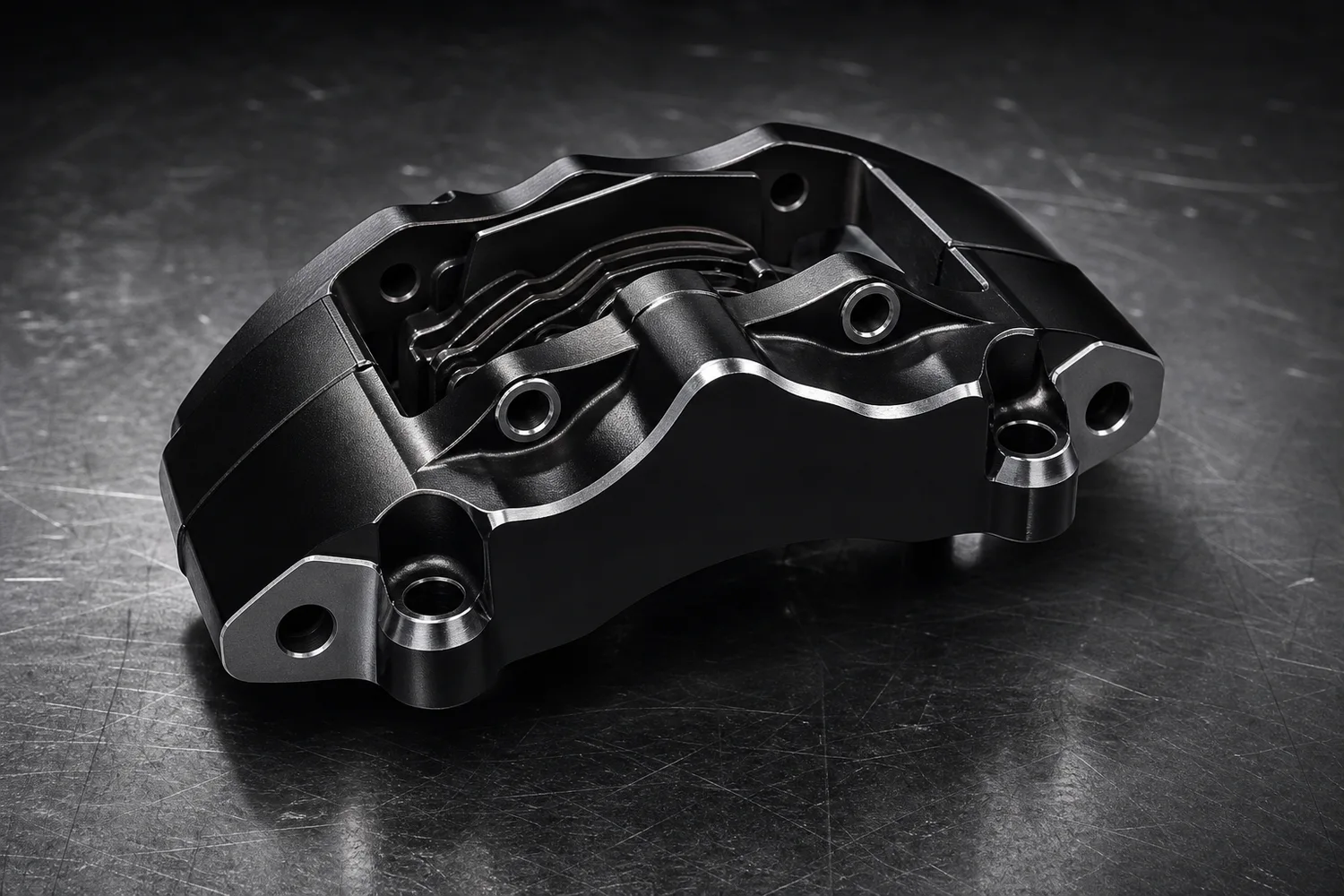 ## What must stay accurate
Preserve mounting holes, edge shape, bolt positions, machining marks, coating, part number area, thickness, and scale. Industrial lighting can emphasize metal, but it cannot move a hole or smooth a functional edge.
## Workflow
1. Use the clearest part reference.
2. Define the use: catalog image, ad, listing support image, or launch graphic.
3. Add hard rim light, dark surface, and controlled reflections.
4. Keep geometry readable.
5. Compare every functional detail with the original.
## Where KrafLayer Fits
When you apply this Create Heavy Metal Lighting for Auto Parts Product Images workflow in KrafLayer, the tool choice matters: use Mask Edit for a local change with a short instruction, or Reference Image Editor when the result needs a visual example. After generation, judge the image by the channel it serves — listing images, detail pages, or ad assets — and check that shape, material, labels, color, scale, and accessories still match the source SKU.
## Prompt to use in KrafLayer
~~~text
Use the uploaded auto part as the exact reference. Create an industrial heavy-metal ecommerce product image with controlled hard light, strong edge highlights, dark technical background, and realistic metal reflections. Preserve mounting holes, machined edges, coating, part geometry, thickness, printed markings, scale, and fit-related details. Do not change hole positions, smooth functional edges, invent part numbers, or redesign the part.
~~~
## FAQ
### Can stylized lighting be used for technical parts?
Yes, if geometry remains readable. Keep clean catalog images available for fit verification.
### Why do AI auto parts look wrong?
AI often treats holes and edges as decorative. Lock functional geometry and reject outputs that change fit points.
### Should I include sparks or smoke?
Usually no. They can make ads look dramatic but often distract from part accuracy.
# How to Fix Overexposed Highlights in Metal Product Photos
URL: https://kraflayer.com/blog/fix-overexposed-highlights-in-metal-product-photos
Summary: A practical AI editing workflow for reducing blown metal glare while keeping brushed texture, edge shape, material realism, and ecommerce-ready product hierarchy. Includes how to do it in KrafLayer.
Updated: 2026-08-21
## TL;DR
For Fix Overexposed Highlights in Metal Product Photos, use KrafLayer as a fast pre-publishing edit step: run Restore on a usable source photo, then compare color, exposure, and recovered detail against the original. It is most useful for listing images, detail pages, or ad assets, as long as shape, material, labels, color, scale, and accessories still match the source SKU.
Overexposed highlights on metal product photos should be repaired with a narrow local edit, not a full image regeneration. The goal is to bring back readable metal texture, edge shape, and natural shadow while keeping the same product, camera angle, scale, and surface.
KrafLayer is an AI-powered visual editor for ecommerce product photography. For stainless steel, chrome, jewelry, tools, and hardware, use it to control glare without changing the product facts a buyer relies on.
## What must stay accurate
Preserve mounting holes, edge shape, bolt positions, machining marks, coating, part number area, thickness, and scale. Industrial lighting can emphasize metal, but it cannot move a hole or smooth a functional edge.
## Workflow
1. Use the clearest part reference.
2. Define the use: catalog image, ad, listing support image, or launch graphic.
3. Add hard rim light, dark surface, and controlled reflections.
4. Keep geometry readable.
5. Compare every functional detail with the original.
## Where KrafLayer Fits
When you apply this Create Heavy Metal Lighting for Auto Parts Product Images workflow in KrafLayer, the tool choice matters: use Mask Edit for a local change with a short instruction, or Reference Image Editor when the result needs a visual example. After generation, judge the image by the channel it serves — listing images, detail pages, or ad assets — and check that shape, material, labels, color, scale, and accessories still match the source SKU.
## Prompt to use in KrafLayer
~~~text
Use the uploaded auto part as the exact reference. Create an industrial heavy-metal ecommerce product image with controlled hard light, strong edge highlights, dark technical background, and realistic metal reflections. Preserve mounting holes, machined edges, coating, part geometry, thickness, printed markings, scale, and fit-related details. Do not change hole positions, smooth functional edges, invent part numbers, or redesign the part.
~~~
## FAQ
### Can stylized lighting be used for technical parts?
Yes, if geometry remains readable. Keep clean catalog images available for fit verification.
### Why do AI auto parts look wrong?
AI often treats holes and edges as decorative. Lock functional geometry and reject outputs that change fit points.
### Should I include sparks or smoke?
Usually no. They can make ads look dramatic but often distract from part accuracy.
# How to Fix Overexposed Highlights in Metal Product Photos
URL: https://kraflayer.com/blog/fix-overexposed-highlights-in-metal-product-photos
Summary: A practical AI editing workflow for reducing blown metal glare while keeping brushed texture, edge shape, material realism, and ecommerce-ready product hierarchy. Includes how to do it in KrafLayer.
Updated: 2026-08-21
## TL;DR
For Fix Overexposed Highlights in Metal Product Photos, use KrafLayer as a fast pre-publishing edit step: run Restore on a usable source photo, then compare color, exposure, and recovered detail against the original. It is most useful for listing images, detail pages, or ad assets, as long as shape, material, labels, color, scale, and accessories still match the source SKU.
Overexposed highlights on metal product photos should be repaired with a narrow local edit, not a full image regeneration. The goal is to bring back readable metal texture, edge shape, and natural shadow while keeping the same product, camera angle, scale, and surface.
KrafLayer is an AI-powered visual editor for ecommerce product photography. For stainless steel, chrome, jewelry, tools, and hardware, use it to control glare without changing the product facts a buyer relies on.
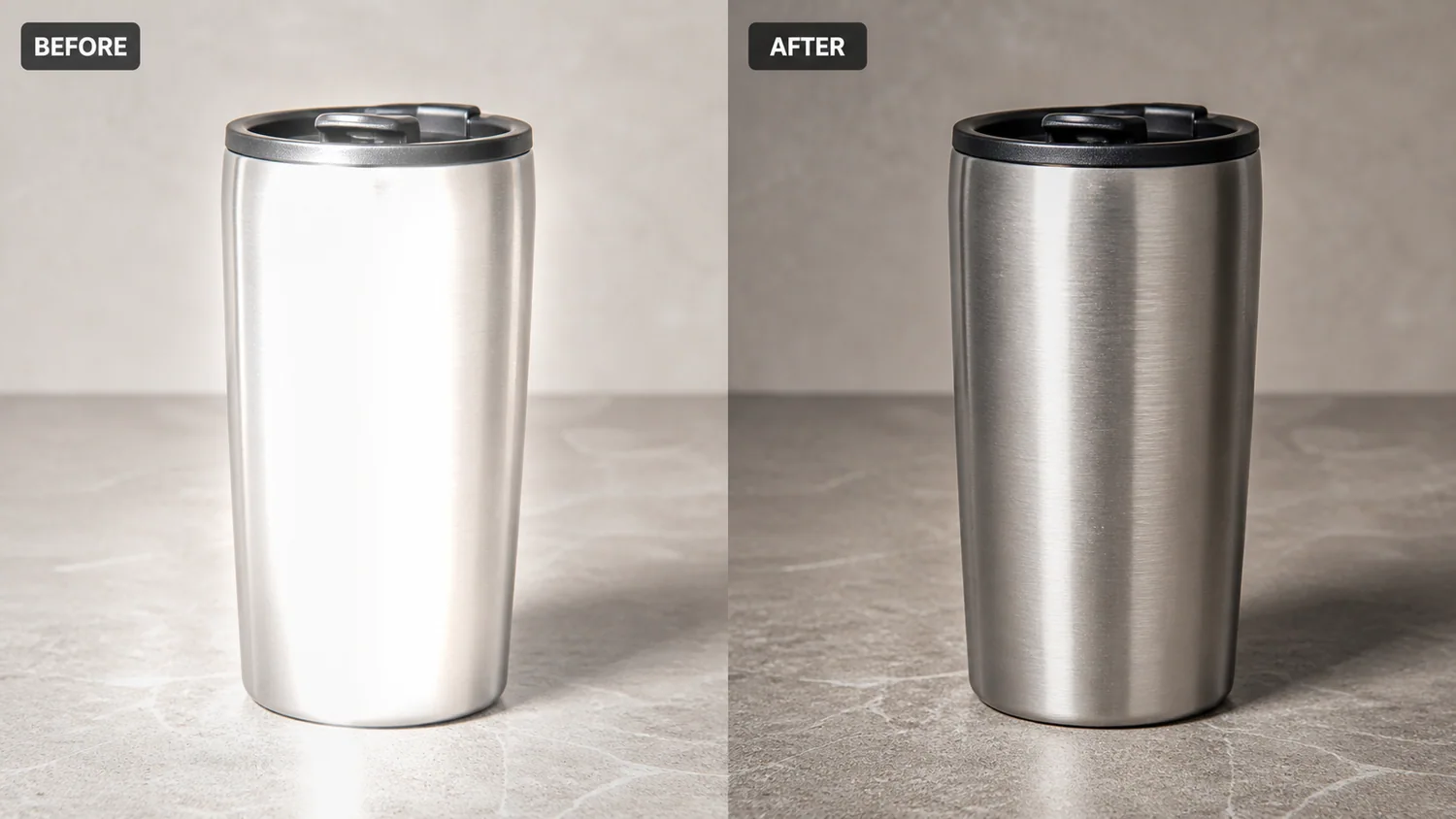 The example uses one brushed stainless steel travel tumbler. The before side has clipped white glare that erases the curved body and makes the metal look cheap. The after side keeps the same tumbler, lid, tabletop, and shadow, but the highlight is softer and the brushed finish becomes visible again.
## Why Metal Highlights Break Product Images
Metal needs highlights. Without them, the product looks flat. The problem starts when the bright area clips to pure white and covers the texture, seam, curve, logo area, brushed grain, or edge line.
In a product listing, that creates two problems. The buyer cannot judge the material quality, and the item may look like a render instead of a real product photo. A good edit lowers the glare enough to restore information, but leaves enough reflection to prove the surface is metallic.
## Protect These Product Facts First
Before editing, write down the details that must not change. For a tumbler, protect the cylinder shape, lid diameter, rim edge, brushed grain direction, bottom curve, tabletop contact, shadow, crop, and color temperature.
For other metal products, protect the facts that identify the SKU:
- watches: bezel shape, crown position, dial markings, bracelet links
- tools: screw holes, machined edges, coating, handle texture
- cookware: handle attachment, rim thickness, interior curve, lid fit
- electronics: ports, button placement, seams, antenna lines
- jewelry: prongs, stone count, band width, metal color
If the AI output removes glare but changes these details, it is not a usable ecommerce edit.
## Edit Prompt for Fixing Blown Metal Glare
Use a local edit prompt inside [KrafLayer](https://kraflayer.com):
> Reduce the overexposed highlight on this brushed stainless steel travel tumbler. Restore visible brushed metal texture and a natural curved reflection, but keep the exact same tumbler shape, black lid, rim edge, bottom curve, camera angle, tabletop, crop, scale, and contact shadow. Keep the product realistic and ecommerce-ready. Do not redesign the tumbler, change the lid, add text, add props, remove all reflections, or make the metal look plastic.
This prompt tells the model what to repair and what to leave alone. That matters more than asking for a generally “premium” product image.
## What the After Image Should Prove
A corrected metal product image should answer a buyer quickly: what is the product, what material is it, and does the finish look trustworthy?
Check the output at full size and thumbnail size:
- the bright area is no longer clipped flat white
- brushed grain or metal texture is visible
- edge lines remain crisp and unchanged
- the product still has natural reflection
- the shadow still anchors it to the surface
- the color does not shift into yellow, blue, or gray mud
Do not overcorrect the image into a matte object. A controlled highlight is usually better than a spotless surface.
## When This Workflow Works Best
Use this workflow when the source photo is basically good but a lamp, window, softbox, or phone reflection has blown out one part of the metal. It is useful for Amazon main images, Shopify product pages, detail crops, marketplace listings, and paid ad creative.
Do not use it to hide real dents, scratches, tarnish, rust, or damage that the buyer should know about. Use it for shooting-side glare that blocks the product from being read clearly.
## Where KrafLayer Fits
When you apply this Fix Overexposed Highlights in Metal Product Photos workflow in KrafLayer, the tool choice matters: run Restore on a usable source photo, then compare color, exposure, and recovered detail against the original. After generation, judge the image by the channel it serves — listing images, detail pages, or ad assets — and check that shape, material, labels, color, scale, and accessories still match the source SKU.
## FAQ
### Can AI fix overexposed highlights on metal product photos?
AI can reduce blown highlights when the edit is local and the prompt protects the product shape, edges, texture, color, and shadow. It should restore detail, not redesign the SKU.
### Should metal product photos have no glare?
No. Metal needs controlled reflection so buyers can understand the material. The goal is to soften clipped glare while keeping realistic highlights.
### What should I check after editing metal glare?
Check the product outline, brushed grain, seams, lid or hardware shape, color temperature, and contact shadow. These details show whether the edited image still represents the real product.
# How to Create Morandi Color Apparel Backgrounds with AI
URL: https://kraflayer.com/blog/morandi-color-premium-apparel-background-composition
Summary: A premium apparel background workflow using Morandi colors: create calm fashion visuals while preserving garment color, fit, fabric texture, and silhouette. Includes how to do it in KrafLayer.
Updated: 2026-08-21
## TL;DR
For Create Morandi Color Apparel Backgrounds, KrafLayer is useful when a real product reference needs to become a usable asset for listing images, detail pages, or ad assets. Treat it as production editing, not product reinvention; the test is whether fit, fabric, shoulder line, garment length, and real color are still intact.
Morandi color backgrounds are muted, soft, and premium. They work well for apparel when the background supports the garment instead of recoloring it.
## What makes Morandi useful
Muted gray-green, dusty rose, warm taupe, blue-gray, and soft clay tones can make apparel feel calm and editorial. The risk is color contamination: a beige coat, cream sweater, or pastel dress can shift under the background palette.
## Workflow
1. Lock the garment color and fabric texture.
2. Choose one muted background family, not many colors.
3. Use soft shadows and enough separation from the garment.
4. Avoid props that make the image feel like a mood board.
5. Check variant color against the original product photo.
## Where KrafLayer Fits
When you apply this Create Morandi Color Apparel Backgrounds workflow in KrafLayer, start from the clearest product reference, then decide whether the asset needs cleanup, lighting, background work, detail support, or an ad version. Before using it for listing images, detail pages, or ad assets, check that fit, fabric, shoulder line, garment length, and real color are still intact.
## Prompt to use in KrafLayer
~~~text
Use the uploaded apparel product as the exact reference. Create a premium ecommerce image with a Morandi-inspired muted background, soft editorial light, and clean composition. Preserve garment color, silhouette, fit, fabric texture, seams, buttons, hem, and scale. Keep the garment clearly separated from the background. Do not recolor the clothing, change the fit, add distracting props, or make the palette overpower the product.
~~~
## FAQ
### What products fit Morandi backgrounds?
Apparel, bags, home textiles, beauty packaging, and soft lifestyle goods often work well because muted colors support a premium calm mood.
### How do I prevent color drift?
State the garment color explicitly and compare the output with the original. Avoid strong color casts on white, beige, gray, and pastel products.
### Is this style good for ads?
Yes, especially for premium fashion and lifestyle campaigns where calm color can make product photography feel more intentional.
# 假发和发制品跨境电商主图怎么做
URL: https://kraflayer.com/zh/blog/cross-border-ecommerce-wig-and-hair-product-main-images
Summary: 假发、接发片和发束主图最怕发量虚假、发丝糊成一片、色号失真。跨境电商图片应优先说明长度、密度、颜色、发质和佩戴后的自然状态。可在 KrafLayer 中按同一流程完成。
Updated: 2026-06-12
# 假发和发制品跨境电商主图怎么做
## TL;DR
假发和发制品跨境电商主图这类任务,KrafLayer 的作用是把真实商品参考图推进到可用的主图、详情图或广告素材,而不是重新发明商品。核心检查点是商品形状、材质、标签、颜色、比例和配件仍然对应原始 SKU。
假发和发制品的主图不能只追求“模特漂亮”。用户真正关心的是发量、长度、发丝走向、发际线、色号、卷度、光泽和佩戴后是否自然。跨境电商里,如果图片把发量做得过满、颜色修得过亮,退货和差评会很快出现。
AI 可以帮助你把背景、光线、模特场景和细节图做得更专业,但必须保护发制品本身的真实信息。
## 什么时候需要重做主图
原图如果背景杂乱、发丝边缘不清、模特光线偏暗、颜色偏黄或白底抠图不自然,就适合用 AI 重新整理。
不同发制品要有不同重点:lace wig 要看发际线和头顶分缝;bundles 要看发束数量和卷度;clip-in extensions 要看夹片结构;假发片要看贴合区域和真实厚度。
## 怎么做
先确定主图任务。是展示佩戴效果、展示发束规格,还是展示 lace 细节?不要一张图同时承担所有信息。
佩戴图要保留自然头部比例和发丝层次,不能把头发做成一整块发亮的塑料。发际线、头顶、发尾要有清楚的层次。
平铺图要让长度、卷度和发量可判断。背景可以干净,但不要用过多花、金属、布料遮住发尾和发束。
色号图要控制白平衡。同一色号在不同图片里不能忽冷忽暖,否则用户无法判断真实颜色。
## 注意事项
不要让 AI 增加发量、改变卷度、重画发际线或把短发变成长发。可以让画面更干净,但不能改变商品规格。
深色头发要保留高光层次,金色、棕色、红色发色要避免过饱和。跨境买家很敏感,颜色误差会直接引发投诉。
## KrafLayer 放在流程里的位置
把假发和发制品跨境电商主图放到 KrafLayer 里做时,先固定商品参考图,再决定是修背景、补光线、做详情图还是延展广告版本。最后按主图、详情图或广告素材的使用场景检查:商品形状、材质、标签、颜色、比例和配件仍然对应原始 SKU。
## 可直接使用的 Prompt
基于这张假发/发制品商品图,生成适合跨境电商主图的专业产品图片。保留真实发色、长度、卷度、发量、发丝走向、发际线或发束结构,不要增加头发数量,不要改变色号。优化背景和光线,让发丝边缘清晰、光泽自然、层次可见。画面干净可信,适合 Amazon、Shopify 或独立站商品首图与详情图。
## 总结
假发主图的本质是降低购买不确定性。用户要看清“我戴上是不是自然”和“收到是不是这束头发”,而不是看一张过度美化的人像海报。
## FAQ
### 假发图可以用 AI 模特吗?
可以用于场景展示,但主商品信息仍要来自真实产品图。尤其是发际线、长度、发量和色号不能虚构。
### 如何避免发丝糊成一片?
Prompt 里要明确“保留单根发丝层次、自然高光和发尾细节”,并避免过强磨皮、油亮高光和低分辨率素材。
### 色号图需要统一光线吗?
非常需要。同一批色号图最好使用同背景、同白平衡、同曝光,方便用户比较。
# Shopify 提升转化率的图片优化插件怎么用
URL: https://kraflayer.com/zh/blog/shopify-product-image-optimization-plugin-for-better-conversion
Summary: Shopify 商品图优化不只是压缩图片。真正影响转化的是首图清晰度、变体一致性、加载速度、场景可信度和移动端可读性。AI 插件应服务这套图片体系。可在 KrafLayer 中按同一流程完成。
Updated: 2026-06-12
# Shopify 提升转化率的图片优化插件怎么用
## TL;DR
Shopify 提升转化率的图片优化插件这类任务,KrafLayer 的作用是把真实商品参考图推进到可用的Shopify 商品页,而不是重新发明商品。核心检查点是商品形状、材质、标签、颜色、比例和配件仍然对应原始 SKU。
Shopify 店铺的图片问题通常不只是“太大,需要压缩”。更常见的是:首图不够清楚,变体角度不一致,详情图没有解释卖点,移动端看不清材质,广告落地页和商品页风格断裂。
所以,Shopify 图片优化插件或 AI 工具最好不要只当作压缩工具,而要当作商品图生产和修复流程的一部分。它应该帮助你把图片变快、变清楚、变统一,也让用户更快理解商品值不值得买。
## 什么时候需要优化 Shopify 商品图
如果你的产品页跳出率高、移动端加购低、广告点击后转化差,先检查图片。尤其是服饰、美妆、家居、配件、宠物用品和礼品类,图片承担了大部分解释工作。
典型信号包括:首图背景杂乱,缩略图看不出 SKU 区别,详情图没有尺寸参考,图片加载慢,场景图好看但商品变形,白底图和 lifestyle 图风格完全不统一。
## 怎么做
第一步,先把首图标准化。主图要清楚、产品占比稳定、背景干净、边缘利落。不要为了“高级感”牺牲商品识别。
第二步,统一变体图。颜色、尺码、材质变体最好保持同角度、同距离、同光线,只变化 SKU 本身。这样用户比较时不会被构图干扰。
第三步,补齐详情图。至少要有材质近景、尺寸参考、使用场景、包装或配件说明。AI 可以帮助生成场景,但商品结构必须来自原图。
第四步,压缩和命名。图片要适合 WebP/AVIF,文件名和 alt 文本写清商品类型、颜色、材质或使用场景,而不是 image1-final-new.jpg。
## 注意事项
不要把所有图片都做成同一种“高级模板”。Shopify 转化依赖信息层级:首图负责识别,详情图负责解释,场景图负责想象,评价图负责信任。
AI 生成图要和真实发货商品一致。尤其是颜色、纹理、尺寸、配件数量和包装,不要为了视觉效果改掉。
## KrafLayer 放在流程里的位置
把Shopify 提升转化率的图片优化插件放到 KrafLayer 里做时,先固定商品参考图,再决定是修背景、补光线、做详情图还是延展广告版本。最后按Shopify 商品页的使用场景检查:商品形状、材质、标签、颜色、比例和配件仍然对应原始 SKU。
## 可直接使用的 Prompt
基于这张 Shopify 商品图,优化为适合电商转化的产品图片。保留商品真实形状、颜色、材质、比例、标签和配件数量。让产品主体更清晰,背景更干净,边缘自然,光线均匀,移动端缩略图也能看清。不要改变 SKU,不要增加不存在的配件。输出适合 Shopify 产品首图/变体图使用的专业商品图。
## 总结
Shopify 图片优化的核心不是“图片更漂亮”,而是让用户更快看懂商品、更相信商品、更顺利比较 SKU。插件只是工具,图片体系才是转化的真正杠杆。
## FAQ
### Shopify 图片一定要全部压缩吗?
需要优化体积,但不能牺牲关键细节。服饰纹理、食品质感、美妆标签和家居尺寸感都不能被压到糊。
### AI 场景图可以直接当主图吗?
看品类和平台策略。多数情况下,清晰白底或干净主图负责首屏识别,AI 场景图更适合作为第二张、广告素材或详情图。
### alt 文本怎么写更好?
写用户会搜索和识别的信息,例如“black leather crossbody bag front view”或“白色陶瓷花瓶客厅场景图”,不要堆无关关键词。
# 鲜花绿植自然光影 AI 摄影怎么做
URL: https://kraflayer.com/zh/blog/natural-light-ai-product-photography-for-flowers-and-plants
Summary: 花卉绿植商品图最怕塑料感、颜色过饱和和阴影漂浮。自然光 AI 摄影要先保护植物形态,再用窗光、桌面、背景和环境湿度营造真实购买场景。可在 KrafLayer 中按同一流程完成。
Updated: 2026-06-12
# 鲜花绿植自然光影 AI 摄影怎么做
## TL;DR
鲜花绿植自然光影 AI 摄影这类任务,可以在 KrafLayer 里给真实商品图换场景或合成场景:用 Replace BG 生成文字或参考图驱动的场景;已有基础场景且要控制位置和比例时,用 Scene Compose。场景要服务主图、详情图或广告素材,同时保证尺寸比例、材质、摆放关系和阴影符合真实空间。
鲜花、盆栽、绿植和花艺礼盒的商品图,不适合做得过度精修。用户买的是鲜活感、状态感和送礼氛围,如果 AI 把叶片磨得像塑料、把花瓣颜色拉到失真,点击率可能提升一点,但转化和售后会受影响。
自然光风格的价值在于让商品看起来像真实放在家里、花店、阳台或咖啡桌上。它适合花束封面、盆栽详情图、绿植场景图、节日礼盒图,也适合社媒种草内容。
## 什么时候需要这样做
当原图背景杂乱、光线偏黄、花材状态不错但画面不够干净时,可以用自然光重做场景。它不适合修复已经枯萎、断枝、严重变形的商品图,因为 AI 很可能“补出一棵新的植物”,导致实物不一致。
花束适合窗边、木桌、白墙、浅色布料;盆栽适合阳台、书桌、玄关、家居角落;多肉和小绿植适合近景,突出叶片厚度和盆器材质。
## 怎么做
先保留植物主体。花瓣层次、叶片数量、枝干方向、花盆形状和包装纸颜色,都应该来自原图。
再选择自然光来源。最稳的是侧窗光:一侧明亮,一侧有柔和阴影,桌面有轻微接触影。不要用强烈夕阳或影棚硬光,除非你明确要做广告海报。
背景要像真实生活场景,不要像样板间。可以出现一点窗帘、木纹、陶瓷杯、书本或浅色墙面,但道具不能压过植物。
最后检查颜色。绿植不能过绿,花瓣不能过饱和,白花不能死白,红花不能溢色。自然光图最重要的是舒服和可信。
## 注意事项
不要让 AI 增加不存在的花朵数量,也不要把小盆栽变成大型落地植物。尺寸和繁密程度是用户判断价格的重要依据。
如果是花束包装图,丝带、卡片、包装纸层次要清楚;如果是盆栽,盆器边缘和土面不能糊。
## KrafLayer 放在流程里的位置
把鲜花绿植自然光影 AI 摄影放到 KrafLayer 里做时,先选对工具:用 Replace BG 生成文字或参考图驱动的场景;已有基础场景且要控制位置和比例时,用 Scene Compose。生成后不要只看画面是否更漂亮,要按主图、详情图或广告素材的使用场景检查:尺寸比例、材质、摆放关系和阴影符合真实空间。
## 可直接使用的 Prompt
基于这张鲜花/绿植商品图,生成一张真实自然光电商场景图。保留植物品种、花瓣和叶片形态、花盆或包装纸颜色、商品大小和整体比例,不要增加不存在的花材。使用柔和侧窗光、自然接触阴影、干净家居背景和少量生活化道具,画面清新、有真实空气感,颜色不过饱和,适合商品详情页和社媒封面。
## 总结
鲜花绿植图不要追求“完美”,要追求“可信的好状态”。自然光、真实比例、干净背景和不过度修饰,才是让用户愿意下单的核心。
## FAQ
### 可以让 AI 把花束变得更丰满吗?
不建议用于主商品图。可以轻微整理形态,但不要明显增加花材,否则实物和图片落差会很大。
### 绿植图片应该用白底还是场景图?
白底适合规格展示,场景图适合让用户理解大小、摆放位置和家居氛围。最好两者都有。
### 自然光图为什么容易假?
通常是阴影没有贴地、叶片颜色太统一、背景过于干净。保留一点真实阴影和细节不完美,反而更可信。
# How to Create Jewelry Lighting and Reflections with AI
URL: https://kraflayer.com/blog/ai-jewelry-lighting-and-reflection-rendering-for-product-photos
Summary: A jewelry lighting workflow for ecommerce: control reflections, preserve stone size and metal color, and make rings, pendants, and chains look premium without product drift. Includes how to do it in KrafLayer.
Updated: 2026-08-21
## TL;DR
For Create Jewelry Lighting and Reflections, KrafLayer works best as a local cleanup tool: brush only the unwanted area in Erase and let the model fill from the surrounding pixels. Avoid regenerating the whole image; the result is only useful if metal color, stone scale, support cleanup, and macro detail remain accurate.
Jewelry lighting is difficult because reflection is both the problem and the proof. A ring, pendant, or chain needs highlights to show metal and stone quality, but uncontrolled glare can hide shape, setting, and scale.
The example uses one brushed stainless steel travel tumbler. The before side has clipped white glare that erases the curved body and makes the metal look cheap. The after side keeps the same tumbler, lid, tabletop, and shadow, but the highlight is softer and the brushed finish becomes visible again.
## Why Metal Highlights Break Product Images
Metal needs highlights. Without them, the product looks flat. The problem starts when the bright area clips to pure white and covers the texture, seam, curve, logo area, brushed grain, or edge line.
In a product listing, that creates two problems. The buyer cannot judge the material quality, and the item may look like a render instead of a real product photo. A good edit lowers the glare enough to restore information, but leaves enough reflection to prove the surface is metallic.
## Protect These Product Facts First
Before editing, write down the details that must not change. For a tumbler, protect the cylinder shape, lid diameter, rim edge, brushed grain direction, bottom curve, tabletop contact, shadow, crop, and color temperature.
For other metal products, protect the facts that identify the SKU:
- watches: bezel shape, crown position, dial markings, bracelet links
- tools: screw holes, machined edges, coating, handle texture
- cookware: handle attachment, rim thickness, interior curve, lid fit
- electronics: ports, button placement, seams, antenna lines
- jewelry: prongs, stone count, band width, metal color
If the AI output removes glare but changes these details, it is not a usable ecommerce edit.
## Edit Prompt for Fixing Blown Metal Glare
Use a local edit prompt inside [KrafLayer](https://kraflayer.com):
> Reduce the overexposed highlight on this brushed stainless steel travel tumbler. Restore visible brushed metal texture and a natural curved reflection, but keep the exact same tumbler shape, black lid, rim edge, bottom curve, camera angle, tabletop, crop, scale, and contact shadow. Keep the product realistic and ecommerce-ready. Do not redesign the tumbler, change the lid, add text, add props, remove all reflections, or make the metal look plastic.
This prompt tells the model what to repair and what to leave alone. That matters more than asking for a generally “premium” product image.
## What the After Image Should Prove
A corrected metal product image should answer a buyer quickly: what is the product, what material is it, and does the finish look trustworthy?
Check the output at full size and thumbnail size:
- the bright area is no longer clipped flat white
- brushed grain or metal texture is visible
- edge lines remain crisp and unchanged
- the product still has natural reflection
- the shadow still anchors it to the surface
- the color does not shift into yellow, blue, or gray mud
Do not overcorrect the image into a matte object. A controlled highlight is usually better than a spotless surface.
## When This Workflow Works Best
Use this workflow when the source photo is basically good but a lamp, window, softbox, or phone reflection has blown out one part of the metal. It is useful for Amazon main images, Shopify product pages, detail crops, marketplace listings, and paid ad creative.
Do not use it to hide real dents, scratches, tarnish, rust, or damage that the buyer should know about. Use it for shooting-side glare that blocks the product from being read clearly.
## Where KrafLayer Fits
When you apply this Fix Overexposed Highlights in Metal Product Photos workflow in KrafLayer, the tool choice matters: run Restore on a usable source photo, then compare color, exposure, and recovered detail against the original. After generation, judge the image by the channel it serves — listing images, detail pages, or ad assets — and check that shape, material, labels, color, scale, and accessories still match the source SKU.
## FAQ
### Can AI fix overexposed highlights on metal product photos?
AI can reduce blown highlights when the edit is local and the prompt protects the product shape, edges, texture, color, and shadow. It should restore detail, not redesign the SKU.
### Should metal product photos have no glare?
No. Metal needs controlled reflection so buyers can understand the material. The goal is to soften clipped glare while keeping realistic highlights.
### What should I check after editing metal glare?
Check the product outline, brushed grain, seams, lid or hardware shape, color temperature, and contact shadow. These details show whether the edited image still represents the real product.
# How to Create Morandi Color Apparel Backgrounds with AI
URL: https://kraflayer.com/blog/morandi-color-premium-apparel-background-composition
Summary: A premium apparel background workflow using Morandi colors: create calm fashion visuals while preserving garment color, fit, fabric texture, and silhouette. Includes how to do it in KrafLayer.
Updated: 2026-08-21
## TL;DR
For Create Morandi Color Apparel Backgrounds, KrafLayer is useful when a real product reference needs to become a usable asset for listing images, detail pages, or ad assets. Treat it as production editing, not product reinvention; the test is whether fit, fabric, shoulder line, garment length, and real color are still intact.
Morandi color backgrounds are muted, soft, and premium. They work well for apparel when the background supports the garment instead of recoloring it.
## What makes Morandi useful
Muted gray-green, dusty rose, warm taupe, blue-gray, and soft clay tones can make apparel feel calm and editorial. The risk is color contamination: a beige coat, cream sweater, or pastel dress can shift under the background palette.
## Workflow
1. Lock the garment color and fabric texture.
2. Choose one muted background family, not many colors.
3. Use soft shadows and enough separation from the garment.
4. Avoid props that make the image feel like a mood board.
5. Check variant color against the original product photo.
## Where KrafLayer Fits
When you apply this Create Morandi Color Apparel Backgrounds workflow in KrafLayer, start from the clearest product reference, then decide whether the asset needs cleanup, lighting, background work, detail support, or an ad version. Before using it for listing images, detail pages, or ad assets, check that fit, fabric, shoulder line, garment length, and real color are still intact.
## Prompt to use in KrafLayer
~~~text
Use the uploaded apparel product as the exact reference. Create a premium ecommerce image with a Morandi-inspired muted background, soft editorial light, and clean composition. Preserve garment color, silhouette, fit, fabric texture, seams, buttons, hem, and scale. Keep the garment clearly separated from the background. Do not recolor the clothing, change the fit, add distracting props, or make the palette overpower the product.
~~~
## FAQ
### What products fit Morandi backgrounds?
Apparel, bags, home textiles, beauty packaging, and soft lifestyle goods often work well because muted colors support a premium calm mood.
### How do I prevent color drift?
State the garment color explicitly and compare the output with the original. Avoid strong color casts on white, beige, gray, and pastel products.
### Is this style good for ads?
Yes, especially for premium fashion and lifestyle campaigns where calm color can make product photography feel more intentional.
# 假发和发制品跨境电商主图怎么做
URL: https://kraflayer.com/zh/blog/cross-border-ecommerce-wig-and-hair-product-main-images
Summary: 假发、接发片和发束主图最怕发量虚假、发丝糊成一片、色号失真。跨境电商图片应优先说明长度、密度、颜色、发质和佩戴后的自然状态。可在 KrafLayer 中按同一流程完成。
Updated: 2026-06-12
# 假发和发制品跨境电商主图怎么做
## TL;DR
假发和发制品跨境电商主图这类任务,KrafLayer 的作用是把真实商品参考图推进到可用的主图、详情图或广告素材,而不是重新发明商品。核心检查点是商品形状、材质、标签、颜色、比例和配件仍然对应原始 SKU。
假发和发制品的主图不能只追求“模特漂亮”。用户真正关心的是发量、长度、发丝走向、发际线、色号、卷度、光泽和佩戴后是否自然。跨境电商里,如果图片把发量做得过满、颜色修得过亮,退货和差评会很快出现。
AI 可以帮助你把背景、光线、模特场景和细节图做得更专业,但必须保护发制品本身的真实信息。
## 什么时候需要重做主图
原图如果背景杂乱、发丝边缘不清、模特光线偏暗、颜色偏黄或白底抠图不自然,就适合用 AI 重新整理。
不同发制品要有不同重点:lace wig 要看发际线和头顶分缝;bundles 要看发束数量和卷度;clip-in extensions 要看夹片结构;假发片要看贴合区域和真实厚度。
## 怎么做
先确定主图任务。是展示佩戴效果、展示发束规格,还是展示 lace 细节?不要一张图同时承担所有信息。
佩戴图要保留自然头部比例和发丝层次,不能把头发做成一整块发亮的塑料。发际线、头顶、发尾要有清楚的层次。
平铺图要让长度、卷度和发量可判断。背景可以干净,但不要用过多花、金属、布料遮住发尾和发束。
色号图要控制白平衡。同一色号在不同图片里不能忽冷忽暖,否则用户无法判断真实颜色。
## 注意事项
不要让 AI 增加发量、改变卷度、重画发际线或把短发变成长发。可以让画面更干净,但不能改变商品规格。
深色头发要保留高光层次,金色、棕色、红色发色要避免过饱和。跨境买家很敏感,颜色误差会直接引发投诉。
## KrafLayer 放在流程里的位置
把假发和发制品跨境电商主图放到 KrafLayer 里做时,先固定商品参考图,再决定是修背景、补光线、做详情图还是延展广告版本。最后按主图、详情图或广告素材的使用场景检查:商品形状、材质、标签、颜色、比例和配件仍然对应原始 SKU。
## 可直接使用的 Prompt
基于这张假发/发制品商品图,生成适合跨境电商主图的专业产品图片。保留真实发色、长度、卷度、发量、发丝走向、发际线或发束结构,不要增加头发数量,不要改变色号。优化背景和光线,让发丝边缘清晰、光泽自然、层次可见。画面干净可信,适合 Amazon、Shopify 或独立站商品首图与详情图。
## 总结
假发主图的本质是降低购买不确定性。用户要看清“我戴上是不是自然”和“收到是不是这束头发”,而不是看一张过度美化的人像海报。
## FAQ
### 假发图可以用 AI 模特吗?
可以用于场景展示,但主商品信息仍要来自真实产品图。尤其是发际线、长度、发量和色号不能虚构。
### 如何避免发丝糊成一片?
Prompt 里要明确“保留单根发丝层次、自然高光和发尾细节”,并避免过强磨皮、油亮高光和低分辨率素材。
### 色号图需要统一光线吗?
非常需要。同一批色号图最好使用同背景、同白平衡、同曝光,方便用户比较。
# Shopify 提升转化率的图片优化插件怎么用
URL: https://kraflayer.com/zh/blog/shopify-product-image-optimization-plugin-for-better-conversion
Summary: Shopify 商品图优化不只是压缩图片。真正影响转化的是首图清晰度、变体一致性、加载速度、场景可信度和移动端可读性。AI 插件应服务这套图片体系。可在 KrafLayer 中按同一流程完成。
Updated: 2026-06-12
# Shopify 提升转化率的图片优化插件怎么用
## TL;DR
Shopify 提升转化率的图片优化插件这类任务,KrafLayer 的作用是把真实商品参考图推进到可用的Shopify 商品页,而不是重新发明商品。核心检查点是商品形状、材质、标签、颜色、比例和配件仍然对应原始 SKU。
Shopify 店铺的图片问题通常不只是“太大,需要压缩”。更常见的是:首图不够清楚,变体角度不一致,详情图没有解释卖点,移动端看不清材质,广告落地页和商品页风格断裂。
所以,Shopify 图片优化插件或 AI 工具最好不要只当作压缩工具,而要当作商品图生产和修复流程的一部分。它应该帮助你把图片变快、变清楚、变统一,也让用户更快理解商品值不值得买。
## 什么时候需要优化 Shopify 商品图
如果你的产品页跳出率高、移动端加购低、广告点击后转化差,先检查图片。尤其是服饰、美妆、家居、配件、宠物用品和礼品类,图片承担了大部分解释工作。
典型信号包括:首图背景杂乱,缩略图看不出 SKU 区别,详情图没有尺寸参考,图片加载慢,场景图好看但商品变形,白底图和 lifestyle 图风格完全不统一。
## 怎么做
第一步,先把首图标准化。主图要清楚、产品占比稳定、背景干净、边缘利落。不要为了“高级感”牺牲商品识别。
第二步,统一变体图。颜色、尺码、材质变体最好保持同角度、同距离、同光线,只变化 SKU 本身。这样用户比较时不会被构图干扰。
第三步,补齐详情图。至少要有材质近景、尺寸参考、使用场景、包装或配件说明。AI 可以帮助生成场景,但商品结构必须来自原图。
第四步,压缩和命名。图片要适合 WebP/AVIF,文件名和 alt 文本写清商品类型、颜色、材质或使用场景,而不是 image1-final-new.jpg。
## 注意事项
不要把所有图片都做成同一种“高级模板”。Shopify 转化依赖信息层级:首图负责识别,详情图负责解释,场景图负责想象,评价图负责信任。
AI 生成图要和真实发货商品一致。尤其是颜色、纹理、尺寸、配件数量和包装,不要为了视觉效果改掉。
## KrafLayer 放在流程里的位置
把Shopify 提升转化率的图片优化插件放到 KrafLayer 里做时,先固定商品参考图,再决定是修背景、补光线、做详情图还是延展广告版本。最后按Shopify 商品页的使用场景检查:商品形状、材质、标签、颜色、比例和配件仍然对应原始 SKU。
## 可直接使用的 Prompt
基于这张 Shopify 商品图,优化为适合电商转化的产品图片。保留商品真实形状、颜色、材质、比例、标签和配件数量。让产品主体更清晰,背景更干净,边缘自然,光线均匀,移动端缩略图也能看清。不要改变 SKU,不要增加不存在的配件。输出适合 Shopify 产品首图/变体图使用的专业商品图。
## 总结
Shopify 图片优化的核心不是“图片更漂亮”,而是让用户更快看懂商品、更相信商品、更顺利比较 SKU。插件只是工具,图片体系才是转化的真正杠杆。
## FAQ
### Shopify 图片一定要全部压缩吗?
需要优化体积,但不能牺牲关键细节。服饰纹理、食品质感、美妆标签和家居尺寸感都不能被压到糊。
### AI 场景图可以直接当主图吗?
看品类和平台策略。多数情况下,清晰白底或干净主图负责首屏识别,AI 场景图更适合作为第二张、广告素材或详情图。
### alt 文本怎么写更好?
写用户会搜索和识别的信息,例如“black leather crossbody bag front view”或“白色陶瓷花瓶客厅场景图”,不要堆无关关键词。
# 鲜花绿植自然光影 AI 摄影怎么做
URL: https://kraflayer.com/zh/blog/natural-light-ai-product-photography-for-flowers-and-plants
Summary: 花卉绿植商品图最怕塑料感、颜色过饱和和阴影漂浮。自然光 AI 摄影要先保护植物形态,再用窗光、桌面、背景和环境湿度营造真实购买场景。可在 KrafLayer 中按同一流程完成。
Updated: 2026-06-12
# 鲜花绿植自然光影 AI 摄影怎么做
## TL;DR
鲜花绿植自然光影 AI 摄影这类任务,可以在 KrafLayer 里给真实商品图换场景或合成场景:用 Replace BG 生成文字或参考图驱动的场景;已有基础场景且要控制位置和比例时,用 Scene Compose。场景要服务主图、详情图或广告素材,同时保证尺寸比例、材质、摆放关系和阴影符合真实空间。
鲜花、盆栽、绿植和花艺礼盒的商品图,不适合做得过度精修。用户买的是鲜活感、状态感和送礼氛围,如果 AI 把叶片磨得像塑料、把花瓣颜色拉到失真,点击率可能提升一点,但转化和售后会受影响。
自然光风格的价值在于让商品看起来像真实放在家里、花店、阳台或咖啡桌上。它适合花束封面、盆栽详情图、绿植场景图、节日礼盒图,也适合社媒种草内容。
## 什么时候需要这样做
当原图背景杂乱、光线偏黄、花材状态不错但画面不够干净时,可以用自然光重做场景。它不适合修复已经枯萎、断枝、严重变形的商品图,因为 AI 很可能“补出一棵新的植物”,导致实物不一致。
花束适合窗边、木桌、白墙、浅色布料;盆栽适合阳台、书桌、玄关、家居角落;多肉和小绿植适合近景,突出叶片厚度和盆器材质。
## 怎么做
先保留植物主体。花瓣层次、叶片数量、枝干方向、花盆形状和包装纸颜色,都应该来自原图。
再选择自然光来源。最稳的是侧窗光:一侧明亮,一侧有柔和阴影,桌面有轻微接触影。不要用强烈夕阳或影棚硬光,除非你明确要做广告海报。
背景要像真实生活场景,不要像样板间。可以出现一点窗帘、木纹、陶瓷杯、书本或浅色墙面,但道具不能压过植物。
最后检查颜色。绿植不能过绿,花瓣不能过饱和,白花不能死白,红花不能溢色。自然光图最重要的是舒服和可信。
## 注意事项
不要让 AI 增加不存在的花朵数量,也不要把小盆栽变成大型落地植物。尺寸和繁密程度是用户判断价格的重要依据。
如果是花束包装图,丝带、卡片、包装纸层次要清楚;如果是盆栽,盆器边缘和土面不能糊。
## KrafLayer 放在流程里的位置
把鲜花绿植自然光影 AI 摄影放到 KrafLayer 里做时,先选对工具:用 Replace BG 生成文字或参考图驱动的场景;已有基础场景且要控制位置和比例时,用 Scene Compose。生成后不要只看画面是否更漂亮,要按主图、详情图或广告素材的使用场景检查:尺寸比例、材质、摆放关系和阴影符合真实空间。
## 可直接使用的 Prompt
基于这张鲜花/绿植商品图,生成一张真实自然光电商场景图。保留植物品种、花瓣和叶片形态、花盆或包装纸颜色、商品大小和整体比例,不要增加不存在的花材。使用柔和侧窗光、自然接触阴影、干净家居背景和少量生活化道具,画面清新、有真实空气感,颜色不过饱和,适合商品详情页和社媒封面。
## 总结
鲜花绿植图不要追求“完美”,要追求“可信的好状态”。自然光、真实比例、干净背景和不过度修饰,才是让用户愿意下单的核心。
## FAQ
### 可以让 AI 把花束变得更丰满吗?
不建议用于主商品图。可以轻微整理形态,但不要明显增加花材,否则实物和图片落差会很大。
### 绿植图片应该用白底还是场景图?
白底适合规格展示,场景图适合让用户理解大小、摆放位置和家居氛围。最好两者都有。
### 自然光图为什么容易假?
通常是阴影没有贴地、叶片颜色太统一、背景过于干净。保留一点真实阴影和细节不完美,反而更可信。
# How to Create Jewelry Lighting and Reflections with AI
URL: https://kraflayer.com/blog/ai-jewelry-lighting-and-reflection-rendering-for-product-photos
Summary: A jewelry lighting workflow for ecommerce: control reflections, preserve stone size and metal color, and make rings, pendants, and chains look premium without product drift. Includes how to do it in KrafLayer.
Updated: 2026-08-21
## TL;DR
For Create Jewelry Lighting and Reflections, KrafLayer works best as a local cleanup tool: brush only the unwanted area in Erase and let the model fill from the surrounding pixels. Avoid regenerating the whole image; the result is only useful if metal color, stone scale, support cleanup, and macro detail remain accurate.
Jewelry lighting is difficult because reflection is both the problem and the proof. A ring, pendant, or chain needs highlights to show metal and stone quality, but uncontrolled glare can hide shape, setting, and scale.
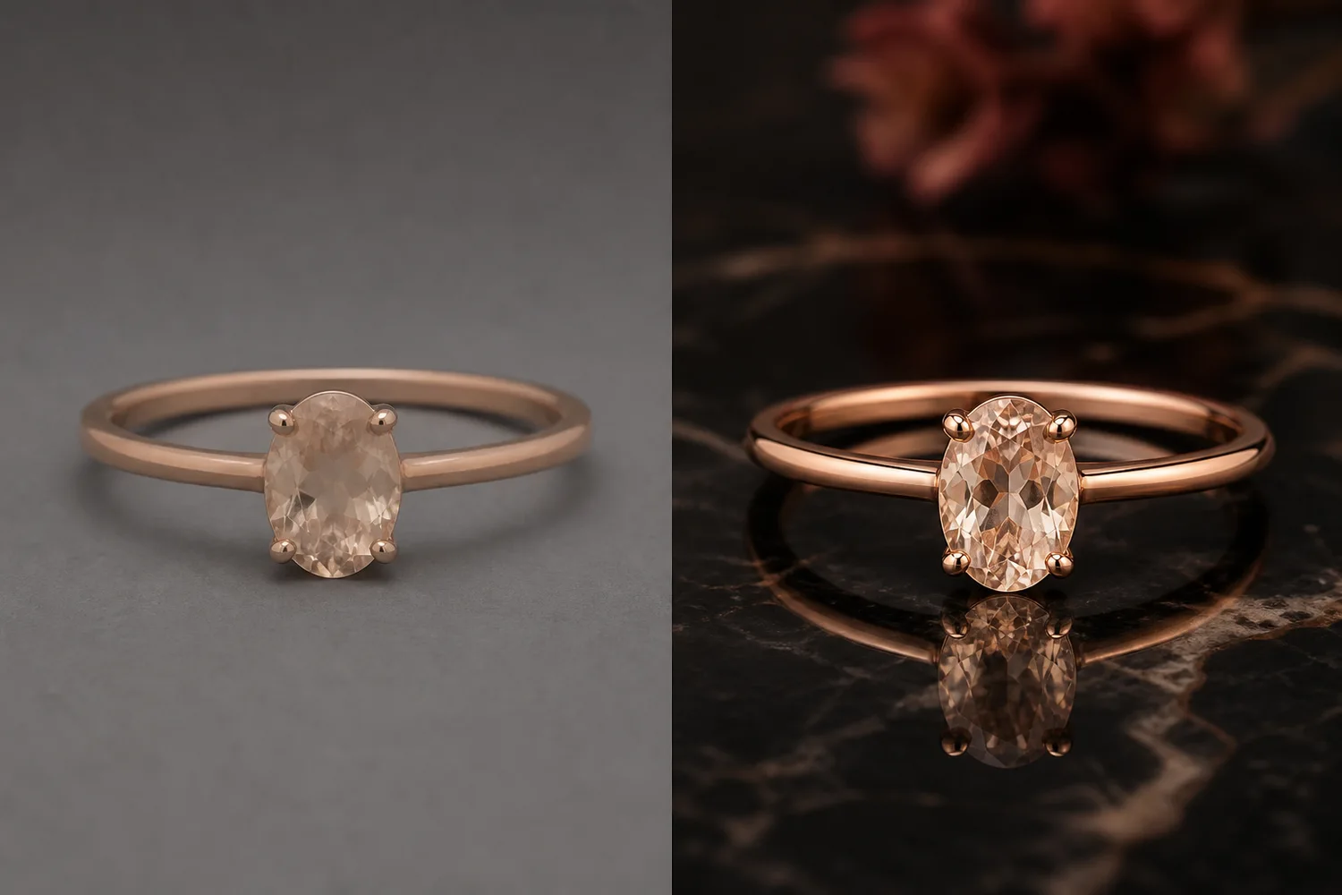 ## What to preserve
Keep metal color, stone size, prong count, setting structure, chain links, engraving, and scale. Lighting should reveal these details, not replace them with a smoother luxury fantasy.
## Workflow
1. Choose one lighting goal: soft catalog, luxury poster, sparkle detail, or reflective surface.
2. Protect the product structure before asking for mood.
3. Use controlled highlights and small reflections.
4. Avoid heavy props that compete with the jewelry.
5. Check stones and metal at full size.
## Where KrafLayer Fits
When you apply this Create Jewelry Lighting and Reflections workflow in KrafLayer, the tool choice matters: brush only the unwanted area in Erase and let the model fill from the surrounding pixels. After generation, judge the image by the channel it serves — listing images, detail pages, or ad assets — and check that metal color, stone scale, support cleanup, and macro detail remain accurate.
## Steps in KrafLayer
Use Erase with a brush mask: paint only the distracting object, sticker, hand, dust, or reflection area, then run the fill. There is no free-form prompt; mask accuracy controls the result.
1. Upload or choose the product image.
2. Run the tool according to its interaction model: one-click tools generate directly; Erase-style tools need a brush mask first.
3. Zoom in to check edges, text, material, shadow, and product scale before downloading or continuing the edit.
## FAQ
### Should jewelry images have strong sparkle?
Use sparkle carefully. It can help campaign images, but product pages need enough clean detail for buyers to inspect the piece.
### Why does AI change stone size?
Luxury prompts often exaggerate jewelry. Lock stone size and setting structure before describing lighting.
### What background is safest?
Neutral surfaces, dark reflective surfaces, or soft gradients are safest because they keep attention on the jewelry.
# 宠物用品可爱风背景生成器怎么用
URL: https://kraflayer.com/zh/blog/cute-background-generator-for-pet-supplies-product-images
Summary: 宠物用品图可以可爱,但商品必须清楚。背景、爪印、玩具、软垫和宠物元素都应服务尺寸、材质、使用方式和安全感,而不是把图做成儿童插画。可在 KrafLayer 中按同一流程完成。
Updated: 2026-06-12
# 宠物用品可爱风背景生成器怎么用
## TL;DR
宠物用品可爱风背景生成器这类任务,可以在 KrafLayer 里给真实商品图换场景或合成场景:用 Replace BG 生成文字或参考图驱动的场景;已有基础场景且要控制位置和比例时,用 Scene Compose。场景要服务主图、详情图或广告素材,同时保证商品形状、材质、标签、颜色、比例和配件仍然对应原始 SKU。
宠物用品适合做可爱风,但可爱不是越花越好。用户买猫窝、狗绳、宠物碗、玩具、梳子、尿垫或背包时,仍然要看清尺寸、材质、结构和使用场景。如果背景太热闹,商品反而会失去主角位置。
AI 背景生成适合把普通白底图变成更亲和、更有生活感的展示图,尤其适合独立站、详情页、小红书和广告素材。
## 什么时候适合用可爱背景
当产品本身偏轻松、亲子、萌宠、礼物属性强时,可以使用可爱背景。比如猫抓板、宠物玩具、宠物床、项圈、宠物服饰。
如果是功能性很强的产品,比如自动喂食器、烘干箱、智能猫砂盆,背景可以温暖,但不要过于卡通。用户更关心安全、容量、清洁和使用方式。
## 怎么做
先保留商品主体。边缘、材质、开口、扣具、碗口、拉链、尺寸比例都要清楚。
再选择背景风格。可爱可以是浅色地毯、圆角家具、柔和墙面、少量爪印元素、毛绒玩具或宠物影子,不一定要满屏插画。
如果加入宠物,宠物只能辅助说明使用场景。不要让猫狗遮挡商品,也不要让 AI 生成不真实的互动姿势。
色彩要和产品匹配。粉色、奶油黄、浅蓝、薄荷绿适合小件宠物用品;木色、灰白、浅棕更适合大件家具类用品。
## 注意事项
不要把宠物用品做成儿童玩具图。电商图片首先要卖清楚商品,其次才是情绪。
不要改变产品尺寸。猫窝变大、项圈变宽、玩具数量变多,都会让用户误解实物。
## KrafLayer 放在流程里的位置
把宠物用品可爱风背景生成器放到 KrafLayer 里做时,先选对工具:用 Replace BG 生成文字或参考图驱动的场景;已有基础场景且要控制位置和比例时,用 Scene Compose。生成后不要只看画面是否更漂亮,要按主图、详情图或广告素材的使用场景检查:商品形状、材质、标签、颜色、比例和配件仍然对应原始 SKU。
## 可直接使用的 Prompt
基于这张宠物用品商品图,生成一张可爱但清晰的电商场景图。保留商品真实形状、颜色、材质、尺寸比例、开口、扣具和细节,不要增加不存在的配件。背景使用柔和宠物家居场景,可加入少量爪印、软垫、玩具或宠物元素,但不要遮挡商品。整体温暖、干净、有亲和力,适合宠物用品详情页和社媒广告。
## 总结
宠物用品的可爱风要有边界。背景负责让用户感到温暖和信任,商品主体负责让用户做购买判断。两者不要反过来。
## FAQ
### 可以加入猫狗吗?
可以,但最好作为背景或使用场景辅助。宠物不能挡住商品关键结构,也不要制造不真实互动。
### 可爱背景适合平台主图吗?
部分平台主图更适合白底或干净背景。可爱场景更适合第二张图、详情页、广告图和社媒封面。
### 怎么避免图看起来廉价?
减少卡通元素和高饱和颜色,使用真实材质、柔和光线和干净构图。
# How to Create Cross-Border Wig and Hair Product Main Images with AI
URL: https://kraflayer.com/blog/cross-border-ecommerce-wig-and-hair-product-main-images
Summary: A cross-border wig image workflow: create clear main images that show lace, hairline, texture, color, density, and length without misleading shoppers. Includes how to do it in KrafLayer.
Updated: 2026-08-21
## TL;DR
For Create Cross-Border Wig and Hair Product Main Images, KrafLayer is useful when a real product reference needs to become a usable asset for listing images, detail pages, or ad assets. Treat it as production editing, not product reinvention; the test is whether shape, material, labels, color, scale, and accessories still match the source SKU.
Wig and hair product main images need clarity more than decoration. Shoppers look for hairline, lace quality, density, length, color, curl pattern, parting, and texture. If AI makes the hair prettier by changing those facts, the image becomes risky.
## What to preserve
Keep metal color, stone size, prong count, setting structure, chain links, engraving, and scale. Lighting should reveal these details, not replace them with a smoother luxury fantasy.
## Workflow
1. Choose one lighting goal: soft catalog, luxury poster, sparkle detail, or reflective surface.
2. Protect the product structure before asking for mood.
3. Use controlled highlights and small reflections.
4. Avoid heavy props that compete with the jewelry.
5. Check stones and metal at full size.
## Where KrafLayer Fits
When you apply this Create Jewelry Lighting and Reflections workflow in KrafLayer, the tool choice matters: brush only the unwanted area in Erase and let the model fill from the surrounding pixels. After generation, judge the image by the channel it serves — listing images, detail pages, or ad assets — and check that metal color, stone scale, support cleanup, and macro detail remain accurate.
## Steps in KrafLayer
Use Erase with a brush mask: paint only the distracting object, sticker, hand, dust, or reflection area, then run the fill. There is no free-form prompt; mask accuracy controls the result.
1. Upload or choose the product image.
2. Run the tool according to its interaction model: one-click tools generate directly; Erase-style tools need a brush mask first.
3. Zoom in to check edges, text, material, shadow, and product scale before downloading or continuing the edit.
## FAQ
### Should jewelry images have strong sparkle?
Use sparkle carefully. It can help campaign images, but product pages need enough clean detail for buyers to inspect the piece.
### Why does AI change stone size?
Luxury prompts often exaggerate jewelry. Lock stone size and setting structure before describing lighting.
### What background is safest?
Neutral surfaces, dark reflective surfaces, or soft gradients are safest because they keep attention on the jewelry.
# 宠物用品可爱风背景生成器怎么用
URL: https://kraflayer.com/zh/blog/cute-background-generator-for-pet-supplies-product-images
Summary: 宠物用品图可以可爱,但商品必须清楚。背景、爪印、玩具、软垫和宠物元素都应服务尺寸、材质、使用方式和安全感,而不是把图做成儿童插画。可在 KrafLayer 中按同一流程完成。
Updated: 2026-06-12
# 宠物用品可爱风背景生成器怎么用
## TL;DR
宠物用品可爱风背景生成器这类任务,可以在 KrafLayer 里给真实商品图换场景或合成场景:用 Replace BG 生成文字或参考图驱动的场景;已有基础场景且要控制位置和比例时,用 Scene Compose。场景要服务主图、详情图或广告素材,同时保证商品形状、材质、标签、颜色、比例和配件仍然对应原始 SKU。
宠物用品适合做可爱风,但可爱不是越花越好。用户买猫窝、狗绳、宠物碗、玩具、梳子、尿垫或背包时,仍然要看清尺寸、材质、结构和使用场景。如果背景太热闹,商品反而会失去主角位置。
AI 背景生成适合把普通白底图变成更亲和、更有生活感的展示图,尤其适合独立站、详情页、小红书和广告素材。
## 什么时候适合用可爱背景
当产品本身偏轻松、亲子、萌宠、礼物属性强时,可以使用可爱背景。比如猫抓板、宠物玩具、宠物床、项圈、宠物服饰。
如果是功能性很强的产品,比如自动喂食器、烘干箱、智能猫砂盆,背景可以温暖,但不要过于卡通。用户更关心安全、容量、清洁和使用方式。
## 怎么做
先保留商品主体。边缘、材质、开口、扣具、碗口、拉链、尺寸比例都要清楚。
再选择背景风格。可爱可以是浅色地毯、圆角家具、柔和墙面、少量爪印元素、毛绒玩具或宠物影子,不一定要满屏插画。
如果加入宠物,宠物只能辅助说明使用场景。不要让猫狗遮挡商品,也不要让 AI 生成不真实的互动姿势。
色彩要和产品匹配。粉色、奶油黄、浅蓝、薄荷绿适合小件宠物用品;木色、灰白、浅棕更适合大件家具类用品。
## 注意事项
不要把宠物用品做成儿童玩具图。电商图片首先要卖清楚商品,其次才是情绪。
不要改变产品尺寸。猫窝变大、项圈变宽、玩具数量变多,都会让用户误解实物。
## KrafLayer 放在流程里的位置
把宠物用品可爱风背景生成器放到 KrafLayer 里做时,先选对工具:用 Replace BG 生成文字或参考图驱动的场景;已有基础场景且要控制位置和比例时,用 Scene Compose。生成后不要只看画面是否更漂亮,要按主图、详情图或广告素材的使用场景检查:商品形状、材质、标签、颜色、比例和配件仍然对应原始 SKU。
## 可直接使用的 Prompt
基于这张宠物用品商品图,生成一张可爱但清晰的电商场景图。保留商品真实形状、颜色、材质、尺寸比例、开口、扣具和细节,不要增加不存在的配件。背景使用柔和宠物家居场景,可加入少量爪印、软垫、玩具或宠物元素,但不要遮挡商品。整体温暖、干净、有亲和力,适合宠物用品详情页和社媒广告。
## 总结
宠物用品的可爱风要有边界。背景负责让用户感到温暖和信任,商品主体负责让用户做购买判断。两者不要反过来。
## FAQ
### 可以加入猫狗吗?
可以,但最好作为背景或使用场景辅助。宠物不能挡住商品关键结构,也不要制造不真实互动。
### 可爱背景适合平台主图吗?
部分平台主图更适合白底或干净背景。可爱场景更适合第二张图、详情页、广告图和社媒封面。
### 怎么避免图看起来廉价?
减少卡通元素和高饱和颜色,使用真实材质、柔和光线和干净构图。
# How to Create Cross-Border Wig and Hair Product Main Images with AI
URL: https://kraflayer.com/blog/cross-border-ecommerce-wig-and-hair-product-main-images
Summary: A cross-border wig image workflow: create clear main images that show lace, hairline, texture, color, density, and length without misleading shoppers. Includes how to do it in KrafLayer.
Updated: 2026-08-21
## TL;DR
For Create Cross-Border Wig and Hair Product Main Images, KrafLayer is useful when a real product reference needs to become a usable asset for listing images, detail pages, or ad assets. Treat it as production editing, not product reinvention; the test is whether shape, material, labels, color, scale, and accessories still match the source SKU.
Wig and hair product main images need clarity more than decoration. Shoppers look for hairline, lace quality, density, length, color, curl pattern, parting, and texture. If AI makes the hair prettier by changing those facts, the image becomes risky.
 ## What buyers need to see
For cross-border ecommerce, the main image should make the product type obvious at a glance. Show the wig shape clearly, avoid messy backgrounds, and preserve the real texture and color family.
## Workflow
1. Start with the clearest wig reference.
2. Preserve lace front, hairline, parting, length, density, color, curl or wave pattern.
3. Use a clean model, mannequin, or product-first presentation depending on channel.
4. Keep background simple and bright enough for thumbnail recognition.
5. Review whether the result over-promises volume or length.
## Where KrafLayer Fits
When you apply this Create Cross-Border Wig and Hair Product Main Images workflow in KrafLayer, start from the clearest product reference, then decide whether the asset needs cleanup, lighting, background work, detail support, or an ad version. Before using it for listing images, detail pages, or ad assets, check that shape, material, labels, color, scale, and accessories still match the source SKU.
## Prompt to use in KrafLayer
~~~text
Use the uploaded wig product as the exact reference. Create a clear cross-border ecommerce main image. Preserve lace front, hairline, parting, hair length, density, color, curl or wave pattern, texture, cap shape, and product scale. Use clean lighting and a simple background suitable for marketplace thumbnails. Do not change hair type, exaggerate volume, invent lace details, alter color, or hide the product edge.
~~~
## FAQ
### Should wig main images use models?
Models help show styling, but product-first images can be clearer for marketplaces. Use both when possible: one clean main image and supporting model images.
### Why does AI change curl pattern?
Hair texture is easy for AI to beautify. Name curl pattern, density, and length explicitly.
### What should I avoid in wig images?
Avoid over-smoothed hair, unrealistic shine, hidden lace, unclear hairline, and backgrounds that reduce thumbnail clarity.
# How to Create Cute Pet Supplies Product Images with AI
URL: https://kraflayer.com/blog/cute-background-generator-for-pet-supplies-product-images
Summary: A pet supplies image workflow for cute backgrounds: create playful ecommerce visuals while preserving product shape, straps, hardware, size, and safety cues. Includes how to do it in KrafLayer.
Updated: 2026-06-12
## TL;DR
For Create Cute Pet Supplies Product Images, KrafLayer helps when the product is real but the surrounding scene needs work. Use Replace BG for a prompted or reference-based scene, or Scene Compose when product position and scale must match a base scene. Use the scene to support listing images, detail pages, or ad assets, then check that shape, material, labels, color, scale, and accessories still match the source SKU.
Cute backgrounds can help pet supplies feel friendly and giftable, but they should not make the product look like a toy if it is a functional harness, leash, bed, bowl, or carrier.
## What buyers need to see
For cross-border ecommerce, the main image should make the product type obvious at a glance. Show the wig shape clearly, avoid messy backgrounds, and preserve the real texture and color family.
## Workflow
1. Start with the clearest wig reference.
2. Preserve lace front, hairline, parting, length, density, color, curl or wave pattern.
3. Use a clean model, mannequin, or product-first presentation depending on channel.
4. Keep background simple and bright enough for thumbnail recognition.
5. Review whether the result over-promises volume or length.
## Where KrafLayer Fits
When you apply this Create Cross-Border Wig and Hair Product Main Images workflow in KrafLayer, start from the clearest product reference, then decide whether the asset needs cleanup, lighting, background work, detail support, or an ad version. Before using it for listing images, detail pages, or ad assets, check that shape, material, labels, color, scale, and accessories still match the source SKU.
## Prompt to use in KrafLayer
~~~text
Use the uploaded wig product as the exact reference. Create a clear cross-border ecommerce main image. Preserve lace front, hairline, parting, hair length, density, color, curl or wave pattern, texture, cap shape, and product scale. Use clean lighting and a simple background suitable for marketplace thumbnails. Do not change hair type, exaggerate volume, invent lace details, alter color, or hide the product edge.
~~~
## FAQ
### Should wig main images use models?
Models help show styling, but product-first images can be clearer for marketplaces. Use both when possible: one clean main image and supporting model images.
### Why does AI change curl pattern?
Hair texture is easy for AI to beautify. Name curl pattern, density, and length explicitly.
### What should I avoid in wig images?
Avoid over-smoothed hair, unrealistic shine, hidden lace, unclear hairline, and backgrounds that reduce thumbnail clarity.
# How to Create Cute Pet Supplies Product Images with AI
URL: https://kraflayer.com/blog/cute-background-generator-for-pet-supplies-product-images
Summary: A pet supplies image workflow for cute backgrounds: create playful ecommerce visuals while preserving product shape, straps, hardware, size, and safety cues. Includes how to do it in KrafLayer.
Updated: 2026-06-12
## TL;DR
For Create Cute Pet Supplies Product Images, KrafLayer helps when the product is real but the surrounding scene needs work. Use Replace BG for a prompted or reference-based scene, or Scene Compose when product position and scale must match a base scene. Use the scene to support listing images, detail pages, or ad assets, then check that shape, material, labels, color, scale, and accessories still match the source SKU.
Cute backgrounds can help pet supplies feel friendly and giftable, but they should not make the product look like a toy if it is a functional harness, leash, bed, bowl, or carrier.
 ## What to protect
For pet products, shoppers care about size, straps, buckles, clips, fabric, padding, color, and safety-related structure. A cute scene should support those facts.
## Workflow
1. Choose a simple playful setting: pastel surface, soft room, park hint, or clean studio.
2. Keep the product fully visible.
3. Use props sparingly and avoid fake animals unless needed.
4. Preserve hardware and sizing cues.
5. Check thumbnail clarity.
## Where KrafLayer Fits
When you apply this Create Cute Pet Supplies Product Images workflow in KrafLayer, the tool choice matters: use Replace BG for a prompted or reference-based scene, or Scene Compose when product position and scale must match a base scene. After generation, judge the image by the channel it serves — listing images, detail pages, or ad assets — and check that shape, material, labels, color, scale, and accessories still match the source SKU.
## Prompt to use in KrafLayer
~~~text
Use the uploaded pet supply product as the exact reference. Create a cute ecommerce product image with a soft playful background and clean lighting. Preserve product shape, straps, buckles, clips, padding, material, color, scale, and safety-related details. Keep the product fully visible and easy to understand. Do not redesign the product, add confusing props, hide hardware, or make it look like a toy.
~~~
## FAQ
### Should pet supply images include pets?
Only when the product fit or use needs explanation. For main images, a clear product-first image is often safer.
### What makes a pet background too busy?
Too many toys, patterns, or props can hide straps and hardware. Keep the scene simple.
### Can AI change size perception?
Yes. Include scale cues and verify that the product still matches the intended pet size category.
# How to Place Shoes and Boots into Outdoor Scenes with AI
URL: https://kraflayer.com/blog/ai-outdoor-scene-integration-for-shoe-and-boot-product-photos
Summary: A shoe and boot scene workflow: place footwear into outdoor contexts while preserving sole shape, material panels, tread, colorway, and realistic ground contact. Includes how to do it in KrafLayer.
Updated: 2026-08-21
## TL;DR
For Place Shoes and Boots into Outdoor Scenes, KrafLayer helps when the product is real but the surrounding scene needs work. Use Replace BG for a prompted or reference-based scene, or Scene Compose when product position and scale must match a base scene. Use the scene to support listing images, detail pages, or ad assets, then check that shoe shape, sole pattern, material, and contact shadow remain believable.
Outdoor shoe scenes help shoppers understand use context, but the footwear still has to be accurate. Mud, rocks, grass, pavement, or trail light should support the product, not hide the sole or change the silhouette.
## What to protect
For pet products, shoppers care about size, straps, buckles, clips, fabric, padding, color, and safety-related structure. A cute scene should support those facts.
## Workflow
1. Choose a simple playful setting: pastel surface, soft room, park hint, or clean studio.
2. Keep the product fully visible.
3. Use props sparingly and avoid fake animals unless needed.
4. Preserve hardware and sizing cues.
5. Check thumbnail clarity.
## Where KrafLayer Fits
When you apply this Create Cute Pet Supplies Product Images workflow in KrafLayer, the tool choice matters: use Replace BG for a prompted or reference-based scene, or Scene Compose when product position and scale must match a base scene. After generation, judge the image by the channel it serves — listing images, detail pages, or ad assets — and check that shape, material, labels, color, scale, and accessories still match the source SKU.
## Prompt to use in KrafLayer
~~~text
Use the uploaded pet supply product as the exact reference. Create a cute ecommerce product image with a soft playful background and clean lighting. Preserve product shape, straps, buckles, clips, padding, material, color, scale, and safety-related details. Keep the product fully visible and easy to understand. Do not redesign the product, add confusing props, hide hardware, or make it look like a toy.
~~~
## FAQ
### Should pet supply images include pets?
Only when the product fit or use needs explanation. For main images, a clear product-first image is often safer.
### What makes a pet background too busy?
Too many toys, patterns, or props can hide straps and hardware. Keep the scene simple.
### Can AI change size perception?
Yes. Include scale cues and verify that the product still matches the intended pet size category.
# How to Place Shoes and Boots into Outdoor Scenes with AI
URL: https://kraflayer.com/blog/ai-outdoor-scene-integration-for-shoe-and-boot-product-photos
Summary: A shoe and boot scene workflow: place footwear into outdoor contexts while preserving sole shape, material panels, tread, colorway, and realistic ground contact. Includes how to do it in KrafLayer.
Updated: 2026-08-21
## TL;DR
For Place Shoes and Boots into Outdoor Scenes, KrafLayer helps when the product is real but the surrounding scene needs work. Use Replace BG for a prompted or reference-based scene, or Scene Compose when product position and scale must match a base scene. Use the scene to support listing images, detail pages, or ad assets, then check that shoe shape, sole pattern, material, and contact shadow remain believable.
Outdoor shoe scenes help shoppers understand use context, but the footwear still has to be accurate. Mud, rocks, grass, pavement, or trail light should support the product, not hide the sole or change the silhouette.
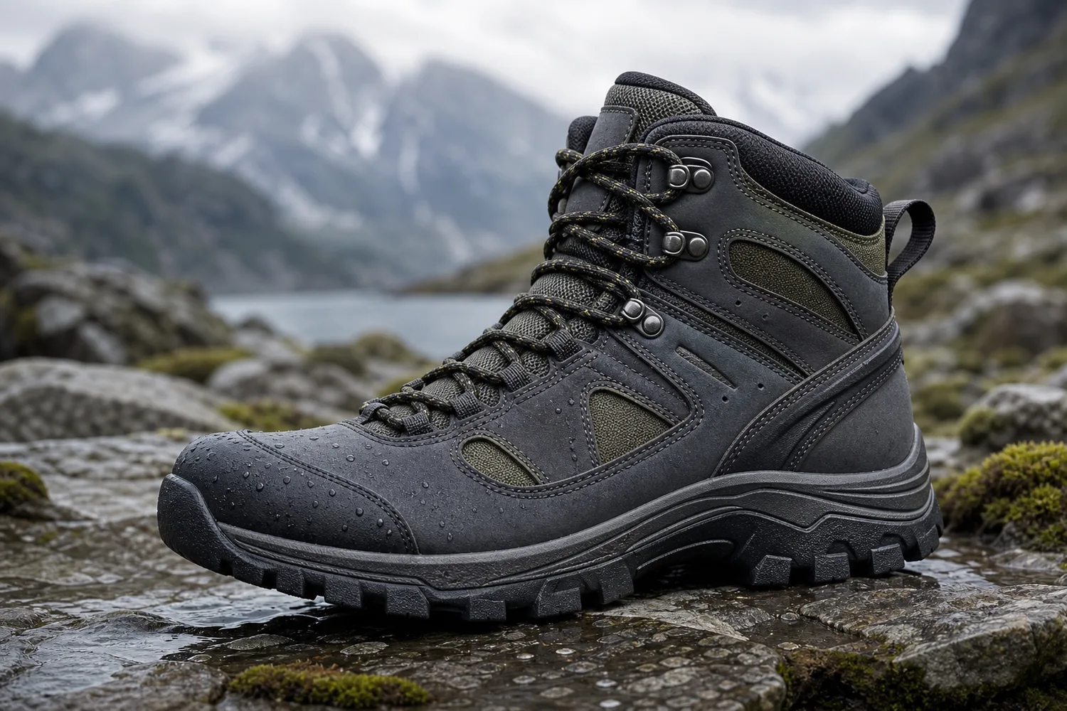 ## What to preserve
Protect toe box, sole thickness, tread, heel shape, laces, panels, logo placement, material, colorway, and scale. Outdoor effects should not cover these details.
## Workflow
1. Choose one context: trail, wet pavement, gym entrance, grass, snow, or urban street.
2. Match ground contact and shadow to the shoe.
3. Keep the shoe clean enough for ecommerce inspection unless dirt is part of the concept.
4. Preserve the true colorway under outdoor light.
5. Check sole and tread visibility.
## Where KrafLayer Fits
When you apply this Place Shoes and Boots into Outdoor Scenes workflow in KrafLayer, the tool choice matters: use Replace BG for a prompted or reference-based scene, or Scene Compose when product position and scale must match a base scene. After generation, judge the image by the channel it serves — listing images, detail pages, or ad assets — and check that shoe shape, sole pattern, material, and contact shadow remain believable.
## Prompt to use in KrafLayer
~~~text
Use the uploaded shoe or boot as the exact reference. Place it into a realistic outdoor ecommerce scene for [trail/street/rain/snow/gym]. Preserve toe box, sole shape, tread, heel, laces, panels, logo placement, material, colorway, and scale. Match ground contact, shadow, and lighting naturally. Do not redesign the shoe, hide the sole, change color, add extra logos, or cover key details with mud or props.
~~~
## FAQ
### Should outdoor shoe images show dirt?
Only if the campaign needs it. Product pages usually need enough cleanliness to inspect material and tread.
### Why does AI change the sole?
The sole is a complex edge. Name sole shape, tread, and thickness directly in the prompt.
### Are outdoor scenes good for main images?
Usually they are better as supporting or campaign images. Keep at least one clean product-first image in the gallery.
# How to Create Warm Baby Product Images with AI
URL: https://kraflayer.com/blog/warm-healing-baby-products-product-images-with-ai
Summary: A baby product image workflow for warm, gentle ecommerce visuals: create trust-building scenes while preserving fabric, safety details, scale, and product truth. Includes how to do it in KrafLayer.
Updated: 2026-06-12
## TL;DR
For Create Warm Baby Product Images, KrafLayer is useful when a real product reference needs to become a usable asset for listing images, detail pages, or ad assets. Treat it as production editing, not product reinvention; the test is whether shape, material, labels, color, scale, and accessories still match the source SKU.
Warm baby product images should communicate softness, safety, and calm. They should never hide the product details that parents use to judge quality: fabric, seams, closure, size, thickness, and care cues.
## What to preserve
Protect toe box, sole thickness, tread, heel shape, laces, panels, logo placement, material, colorway, and scale. Outdoor effects should not cover these details.
## Workflow
1. Choose one context: trail, wet pavement, gym entrance, grass, snow, or urban street.
2. Match ground contact and shadow to the shoe.
3. Keep the shoe clean enough for ecommerce inspection unless dirt is part of the concept.
4. Preserve the true colorway under outdoor light.
5. Check sole and tread visibility.
## Where KrafLayer Fits
When you apply this Place Shoes and Boots into Outdoor Scenes workflow in KrafLayer, the tool choice matters: use Replace BG for a prompted or reference-based scene, or Scene Compose when product position and scale must match a base scene. After generation, judge the image by the channel it serves — listing images, detail pages, or ad assets — and check that shoe shape, sole pattern, material, and contact shadow remain believable.
## Prompt to use in KrafLayer
~~~text
Use the uploaded shoe or boot as the exact reference. Place it into a realistic outdoor ecommerce scene for [trail/street/rain/snow/gym]. Preserve toe box, sole shape, tread, heel, laces, panels, logo placement, material, colorway, and scale. Match ground contact, shadow, and lighting naturally. Do not redesign the shoe, hide the sole, change color, add extra logos, or cover key details with mud or props.
~~~
## FAQ
### Should outdoor shoe images show dirt?
Only if the campaign needs it. Product pages usually need enough cleanliness to inspect material and tread.
### Why does AI change the sole?
The sole is a complex edge. Name sole shape, tread, and thickness directly in the prompt.
### Are outdoor scenes good for main images?
Usually they are better as supporting or campaign images. Keep at least one clean product-first image in the gallery.
# How to Create Warm Baby Product Images with AI
URL: https://kraflayer.com/blog/warm-healing-baby-products-product-images-with-ai
Summary: A baby product image workflow for warm, gentle ecommerce visuals: create trust-building scenes while preserving fabric, safety details, scale, and product truth. Includes how to do it in KrafLayer.
Updated: 2026-06-12
## TL;DR
For Create Warm Baby Product Images, KrafLayer is useful when a real product reference needs to become a usable asset for listing images, detail pages, or ad assets. Treat it as production editing, not product reinvention; the test is whether shape, material, labels, color, scale, and accessories still match the source SKU.
Warm baby product images should communicate softness, safety, and calm. They should never hide the product details that parents use to judge quality: fabric, seams, closure, size, thickness, and care cues.
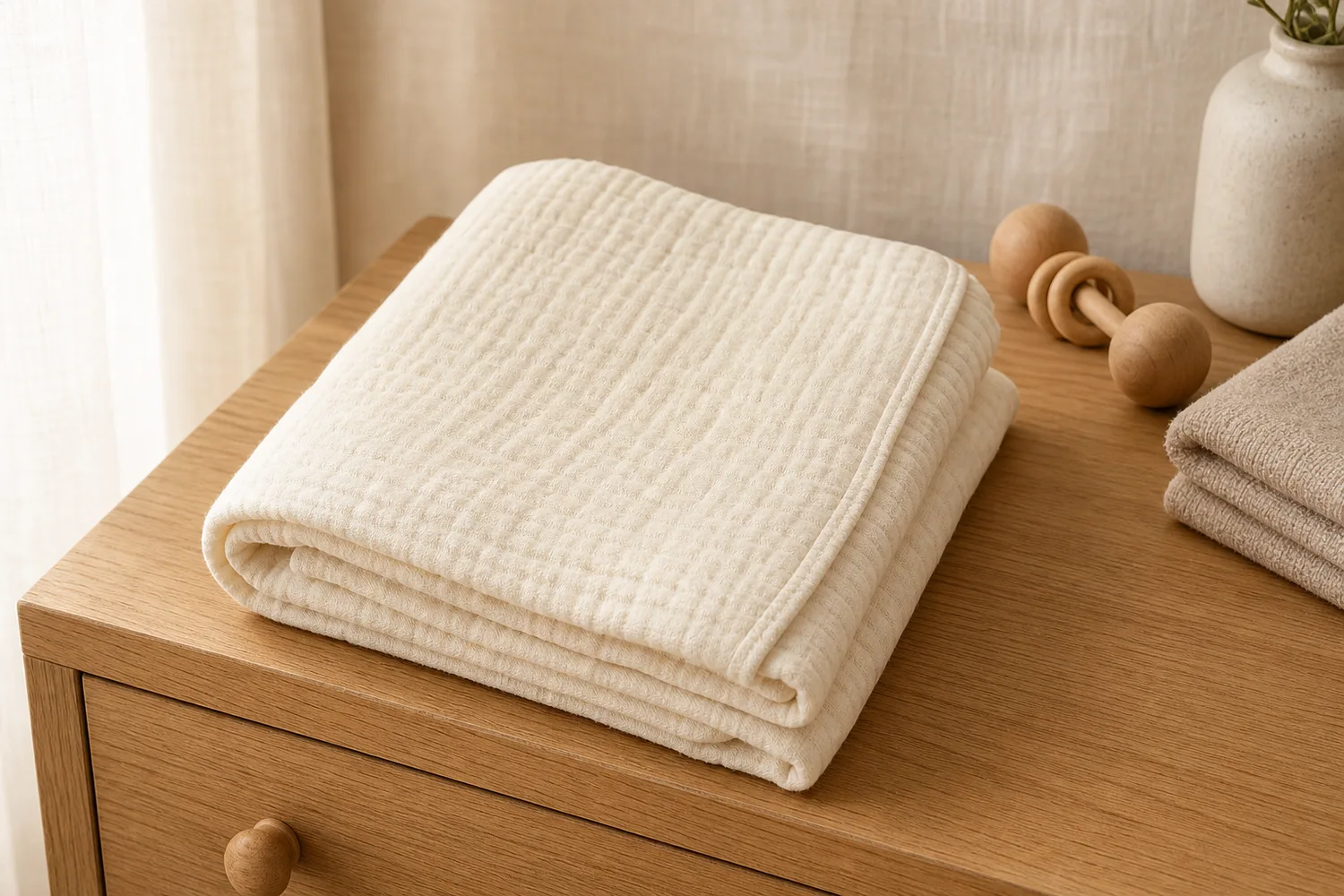 ## What the image needs to do
Baby product visuals need trust more than drama. Use soft light, clean surfaces, gentle color, and clear product structure. Avoid crowded props or unrealistic scenes.
## Workflow
1. Preserve fabric texture, seams, shape, color, and scale.
2. Choose a soft context: nursery surface, folded textile, crib-side detail, or neutral studio.
3. Keep the product clean and fully visible.
4. Avoid unsupported safety claims in the image.
5. Check that the result feels calm but still informative.
## Where KrafLayer Fits
When you apply this Create Warm Baby Product Images workflow in KrafLayer, start from the clearest product reference, then decide whether the asset needs cleanup, lighting, background work, detail support, or an ad version. Before using it for listing images, detail pages, or ad assets, check that shape, material, labels, color, scale, and accessories still match the source SKU.
## Prompt to use in KrafLayer
~~~text
Use the uploaded baby product as the exact reference. Create a warm, gentle ecommerce image with soft natural light, clean neutral background, and calm styling. Preserve product shape, fabric texture, seams, color, thickness, scale, and safety-related construction details. Keep the product clearly visible. Do not add unsupported claims, hide key details, change material, or make the scene overly decorative.
~~~
## FAQ
### Should baby product images include infants?
Only when use context is important and the image can remain safe, clear, and truthful. Product-first images are often better for main listings.
### What colors work best?
Warm neutrals, soft pastels, cream, light wood, and gentle fabric backgrounds usually support trust without overpowering the product.
### What should not be generated?
Avoid safety claims, unrealistic use scenes, hidden closures, or styling that makes the product hard to evaluate.
# How to Check and Fix Amazon Main Images with AI
URL: https://kraflayer.com/blog/amazon-main-image-compliance-ai-check-and-fix
Summary: A careful Amazon main image review workflow: check product accuracy, background, crop, overlays, edge quality, and category rules before publishing. Includes how to do it in KrafLayer.
Updated: 2026-08-21
## TL;DR
For Check and Fix Amazon Main Images, KrafLayer is useful when a real product reference needs to become a usable asset for Amazon main images. Treat it as production editing, not product reinvention; the test is whether the quantity, packaging, edge quality, and category review assumptions still match the real listing.
Amazon main images should make the product immediately clear and trustworthy. AI can help fix background, crop, edge quality, exposure, and clutter, but it cannot replace checking the current Seller Central rules for your category.
## What the image needs to do
Baby product visuals need trust more than drama. Use soft light, clean surfaces, gentle color, and clear product structure. Avoid crowded props or unrealistic scenes.
## Workflow
1. Preserve fabric texture, seams, shape, color, and scale.
2. Choose a soft context: nursery surface, folded textile, crib-side detail, or neutral studio.
3. Keep the product clean and fully visible.
4. Avoid unsupported safety claims in the image.
5. Check that the result feels calm but still informative.
## Where KrafLayer Fits
When you apply this Create Warm Baby Product Images workflow in KrafLayer, start from the clearest product reference, then decide whether the asset needs cleanup, lighting, background work, detail support, or an ad version. Before using it for listing images, detail pages, or ad assets, check that shape, material, labels, color, scale, and accessories still match the source SKU.
## Prompt to use in KrafLayer
~~~text
Use the uploaded baby product as the exact reference. Create a warm, gentle ecommerce image with soft natural light, clean neutral background, and calm styling. Preserve product shape, fabric texture, seams, color, thickness, scale, and safety-related construction details. Keep the product clearly visible. Do not add unsupported claims, hide key details, change material, or make the scene overly decorative.
~~~
## FAQ
### Should baby product images include infants?
Only when use context is important and the image can remain safe, clear, and truthful. Product-first images are often better for main listings.
### What colors work best?
Warm neutrals, soft pastels, cream, light wood, and gentle fabric backgrounds usually support trust without overpowering the product.
### What should not be generated?
Avoid safety claims, unrealistic use scenes, hidden closures, or styling that makes the product hard to evaluate.
# How to Check and Fix Amazon Main Images with AI
URL: https://kraflayer.com/blog/amazon-main-image-compliance-ai-check-and-fix
Summary: A careful Amazon main image review workflow: check product accuracy, background, crop, overlays, edge quality, and category rules before publishing. Includes how to do it in KrafLayer.
Updated: 2026-08-21
## TL;DR
For Check and Fix Amazon Main Images, KrafLayer is useful when a real product reference needs to become a usable asset for Amazon main images. Treat it as production editing, not product reinvention; the test is whether the quantity, packaging, edge quality, and category review assumptions still match the real listing.
Amazon main images should make the product immediately clear and trustworthy. AI can help fix background, crop, edge quality, exposure, and clutter, but it cannot replace checking the current Seller Central rules for your category.
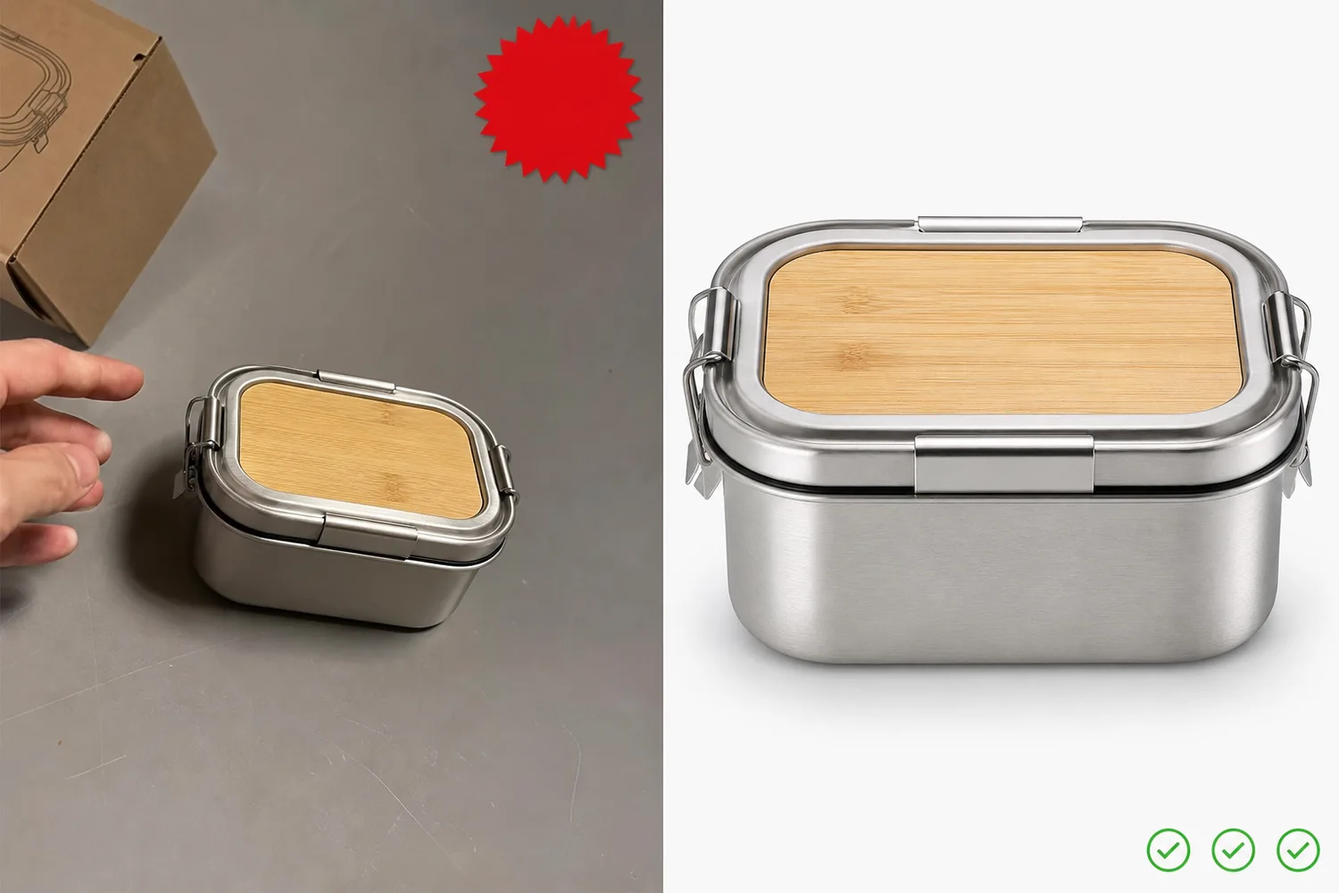 ## What AI can help fix
AI is useful for removing background clutter, cleaning edges, correcting exposure, reducing color cast, straightening product presentation, and creating a cleaner product-first image.
It should not add claims, badges, decorative text, fake packaging, unrelated props, or change the product to fit a rule.
## Review workflow
1. Confirm the product in the image is the exact SKU.
2. Check background, crop, edge quality, color, and visible details.
3. Remove overlays, decorative graphics, and non-product distractions when they are not allowed.
4. Preserve labels, functional details, and true material.
5. Check current Seller Central rules and category-specific requirements before upload.
## Where KrafLayer Fits
When you apply this Check and Fix Amazon Main Images workflow in KrafLayer, start from the clearest product reference, then decide whether the asset needs cleanup, lighting, background work, detail support, or an ad version. Before using it for Amazon main images, check that the quantity, packaging, edge quality, and category review assumptions still match the real listing.
## Prompt to use in KrafLayer
~~~text
Use the uploaded product image as the exact SKU reference. Prepare a cleaner Amazon-style main image for review. Keep the product accurate and product-first. Preserve shape, color, material, labels, logo area, functional details, edge quality, and scale. Clean the background, improve exposure, and remove distracting non-product clutter. Do not add badges, text, props, fake packaging, claims, or change the product design.
~~~
## FAQ
### Can AI check Amazon compliance automatically?
AI can flag common visual problems, but final compliance depends on current Amazon rules, category requirements, and Seller Central review.
### What is the biggest risk with AI main images?
The biggest risk is product drift: the image looks compliant but the SKU shape, label, material, or included accessories changed.
### Should I keep a backup of the original?
Yes. Keep the original product photo and the AI-edited version so your team can compare changes before upload.
# 亚马逊白底图自动生成工具怎么用才不失真
URL: https://kraflayer.com/zh/blog/amazon-white-background-image-generator
Summary: 亚马逊白底图的目标是清楚展示真实商品,而不是把产品修得更漂亮。使用 AI 生成白底图时,应优先保留比例、边缘、颜色、包装和类目规则。可在 KrafLayer 中按同一流程完成。
Updated: 2026-06-12
# 亚马逊白底图自动生成工具怎么用才不失真
## TL;DR
亚马逊白底图自动生成工具这类任务,KrafLayer 的作用是把真实商品参考图推进到可用的亚马逊主图,而不是重新发明商品。核心检查点是商品数量、包装、边缘和类目复核逻辑都不被改乱。
亚马逊白底图看起来简单,实际很容易出问题。AI 把背景清掉后,可能顺手改了产品边缘、颜色、标签、阴影、包装数量,甚至补出不存在的配件。对亚马逊来说,这些都可能影响合规和买家信任。
白底图的核心不是“纯白”,而是准确呈现你实际销售的商品。使用任何 AI 工具前,都应先检查当前 Seller Central 和具体类目的主图要求,因为不同类目、站点和时间点可能有细节差异。
## 什么时候需要生成白底图
如果你的原图是在桌面、仓库、摄影棚灰底或生活场景拍摄,产品本身清楚但背景不适合主图,就可以用 AI 做白底。
如果原图模糊、产品被遮挡、包装反光严重或关键文字看不清,先补拍会更稳。AI 不应该用来猜测缺失的商品信息。
## 怎么做
第一步,选择产品完整、无遮挡、分辨率足够的图。产品边缘越清楚,白底结果越可靠。
第二步,要求保留 SKU。颜色、数量、包装、标签、材质纹理、开口结构和配件都不能改变。
第三步,处理阴影。白底图可以有自然接触阴影,但不能出现明显场景、道具或强烈背景光。
第四步,导出后人工检查。放大看边缘、透明区域、细小配件、文字和产品占比,再和亚马逊后台类目要求核对。
## 注意事项
不要把 lifestyle 场景图直接“洗白”成主图,如果原图中有手、模特、道具或背景遮挡商品,AI 可能会补错边缘。
透明、玻璃、金属和白色商品要特别检查。它们在白底上容易丢轮廓,需要轻微阴影或边缘高光来保持可见。
## KrafLayer 放在流程里的位置
把亚马逊白底图自动生成工具放到 KrafLayer 里做时,先固定商品参考图,再决定是修背景、补光线、做详情图还是延展广告版本。最后按亚马逊主图的使用场景检查:商品数量、包装、边缘和类目复核逻辑都不被改乱。
## 可直接使用的 Prompt
基于这张商品图,生成适合亚马逊主图检查前使用的白底产品图。保留商品真实形状、颜色、比例、数量、包装、标签文字、logo、材质纹理和所有配件,不要添加或删除商品内容。背景为干净纯白,边缘自然清晰,可保留轻微真实接触阴影。不要加入道具、人物、装饰文字或促销元素。输出后需要人工核对当前亚马逊类目规则。
## 总结
AI 可以加快亚马逊白底图制作,但不能替代合规判断。真正要守住的是商品准确性、边缘质量和当前类目规则,而不是单纯追求一键变白。
## FAQ
### 亚马逊白底图一定不能有阴影吗?
通常可以有不干扰商品识别的自然接触阴影,但具体要以当前站点和类目规则为准。
### AI 可以补全被手挡住的商品边缘吗?
技术上可以,但风险很高。主图最好使用无遮挡原图,避免 AI 猜错商品结构。
### 白色商品放白底看不清怎么办?
可以保留轻微边缘高光和自然阴影,让轮廓可见,但不要变成灰色背景或复杂场景。
# 亚马逊主图合规性 AI 自动检测与修复怎么做
URL: https://kraflayer.com/zh/blog/amazon-main-image-compliance-ai-check-and-fix
Summary: 亚马逊主图合规不是只看白底。AI 可以帮助发现背景、道具、文字、比例、遮挡、变体误导和图片质量问题,但最终仍要按当前 Seller Central 与类目规则复核。可在 KrafLayer 中按同一流程完成。
Updated: 2026-06-12
# 亚马逊主图合规性 AI 自动检测与修复怎么做
## TL;DR
亚马逊主图合规性 AI 自动检测与修复这类任务,KrafLayer 的作用是把真实商品参考图推进到可用的亚马逊主图,而不是重新发明商品。核心检查点是商品数量、包装、边缘和类目复核逻辑都不被改乱。
亚马逊主图合规问题往往不是一个点,而是一组风险:背景不纯、出现文字或促销元素、商品占比异常、道具造成误解、配件数量不准确、颜色失真、图片太小、边缘抠图粗糙。
AI 检查的价值在于先把这些风险列出来,再逐项修复。不要让 AI 直接“优化成合规图”,因为它可能在修复背景时改掉 SKU,在清理道具时删掉真实配件。
## 什么时候需要合规检查
上传前检查一次,广告投放前检查一次,大批量上新时抽检一轮。尤其是多配件商品、透明包装、服饰配件、美妆套装、电子产品和家居用品,更容易出现误导性展示。
如果图片被拒、Listing 表现异常或竞争对手主图更干净,也值得重新检查主图结构。
## 怎么做
第一步,让 AI 只做检查,不先改图。要求它列出背景、文字、道具、占比、边缘、真实性和类目不确定项。
第二步,把问题分级。确定违规风险的先修,比如背景、额外文字、非售卖道具;影响转化的再修,比如暗光、边缘、产品太小。
第三步,小步修复。一次只处理背景、阴影或边缘,不要同时改颜色、构图和配件。
第四步,人工复核当前规则。亚马逊规则会更新,且不同站点和类目可能不同,AI 只能辅助发现风险。
## 注意事项
不要让 AI 删除真实售卖配件。比如套装里的刷头、线缆、收纳袋,如果实际包含,就不能因为“画面更干净”被去掉。
不要添加卖点文字、徽章、促销标签或尺寸说明到主图。即使这些信息真实,也通常更适合放在副图或 A+ 内容里。
## KrafLayer 放在流程里的位置
把亚马逊主图合规性 AI 自动检测与修复放到 KrafLayer 里做时,先固定商品参考图,再决定是修背景、补光线、做详情图还是延展广告版本。最后按亚马逊主图的使用场景检查:商品数量、包装、边缘和类目复核逻辑都不被改乱。
## 可直接使用的 Prompt
请检查这张亚马逊商品主图是否存在潜在合规和转化风险。重点检查:背景是否干净、是否有非售卖道具或人物、是否有促销文字/图标/水印、商品数量和配件是否可能误导、产品边缘是否自然、颜色和比例是否真实、图片是否适合作为主图。先列出风险和修复建议;如果修复,请只清理背景、边缘和无关元素,不改变商品 SKU、颜色、标签、包装和配件数量。最终仍需人工核对当前 Seller Central 类目规则。
## 总结
亚马逊主图合规修复应该像质检流程,而不是美化流程。先发现风险,再小范围修,最后按当前官方规则复核,才不容易越修越错。
## FAQ
### AI 能保证亚马逊主图合规吗?
不能。AI 可以帮助发现常见风险,但最终仍要以当前 Seller Central 和具体类目要求为准。
### 主图可以放尺寸、卖点或促销文字吗?
通常不建议放在主图。尺寸和卖点更适合副图、详情页或 A+ 内容。
### 合规修复会影响转化吗?
会。更干净、准确、可信的主图通常有利于转化,但过度修图导致实物不符会带来反效果。
# How to Create Etsy Vintage Handmade Product Images with AI
URL: https://kraflayer.com/blog/etsy-vintage-handmade-product-image-generator
Summary: An Etsy-style product image workflow: create warm vintage handmade visuals while preserving craft texture, scale, material truth, and buyer trust. Includes how to do it in KrafLayer.
Updated: 2026-06-12
## TL;DR
For Create Etsy Vintage Handmade Product Images, KrafLayer helps when the product is real but the surrounding scene needs work. Use Replace BG for a prompted or reference-based scene, or Scene Compose when product position and scale must match a base scene. Use the scene to support Etsy listing images, then check that shape, material, labels, color, scale, and accessories still match the source SKU.
Etsy-style product images should feel handmade and specific. The goal is not to make every product beige and nostalgic; it is to show craft texture, scale, and material in a way that feels trustworthy.
## What AI can help fix
AI is useful for removing background clutter, cleaning edges, correcting exposure, reducing color cast, straightening product presentation, and creating a cleaner product-first image.
It should not add claims, badges, decorative text, fake packaging, unrelated props, or change the product to fit a rule.
## Review workflow
1. Confirm the product in the image is the exact SKU.
2. Check background, crop, edge quality, color, and visible details.
3. Remove overlays, decorative graphics, and non-product distractions when they are not allowed.
4. Preserve labels, functional details, and true material.
5. Check current Seller Central rules and category-specific requirements before upload.
## Where KrafLayer Fits
When you apply this Check and Fix Amazon Main Images workflow in KrafLayer, start from the clearest product reference, then decide whether the asset needs cleanup, lighting, background work, detail support, or an ad version. Before using it for Amazon main images, check that the quantity, packaging, edge quality, and category review assumptions still match the real listing.
## Prompt to use in KrafLayer
~~~text
Use the uploaded product image as the exact SKU reference. Prepare a cleaner Amazon-style main image for review. Keep the product accurate and product-first. Preserve shape, color, material, labels, logo area, functional details, edge quality, and scale. Clean the background, improve exposure, and remove distracting non-product clutter. Do not add badges, text, props, fake packaging, claims, or change the product design.
~~~
## FAQ
### Can AI check Amazon compliance automatically?
AI can flag common visual problems, but final compliance depends on current Amazon rules, category requirements, and Seller Central review.
### What is the biggest risk with AI main images?
The biggest risk is product drift: the image looks compliant but the SKU shape, label, material, or included accessories changed.
### Should I keep a backup of the original?
Yes. Keep the original product photo and the AI-edited version so your team can compare changes before upload.
# 亚马逊白底图自动生成工具怎么用才不失真
URL: https://kraflayer.com/zh/blog/amazon-white-background-image-generator
Summary: 亚马逊白底图的目标是清楚展示真实商品,而不是把产品修得更漂亮。使用 AI 生成白底图时,应优先保留比例、边缘、颜色、包装和类目规则。可在 KrafLayer 中按同一流程完成。
Updated: 2026-06-12
# 亚马逊白底图自动生成工具怎么用才不失真
## TL;DR
亚马逊白底图自动生成工具这类任务,KrafLayer 的作用是把真实商品参考图推进到可用的亚马逊主图,而不是重新发明商品。核心检查点是商品数量、包装、边缘和类目复核逻辑都不被改乱。
亚马逊白底图看起来简单,实际很容易出问题。AI 把背景清掉后,可能顺手改了产品边缘、颜色、标签、阴影、包装数量,甚至补出不存在的配件。对亚马逊来说,这些都可能影响合规和买家信任。
白底图的核心不是“纯白”,而是准确呈现你实际销售的商品。使用任何 AI 工具前,都应先检查当前 Seller Central 和具体类目的主图要求,因为不同类目、站点和时间点可能有细节差异。
## 什么时候需要生成白底图
如果你的原图是在桌面、仓库、摄影棚灰底或生活场景拍摄,产品本身清楚但背景不适合主图,就可以用 AI 做白底。
如果原图模糊、产品被遮挡、包装反光严重或关键文字看不清,先补拍会更稳。AI 不应该用来猜测缺失的商品信息。
## 怎么做
第一步,选择产品完整、无遮挡、分辨率足够的图。产品边缘越清楚,白底结果越可靠。
第二步,要求保留 SKU。颜色、数量、包装、标签、材质纹理、开口结构和配件都不能改变。
第三步,处理阴影。白底图可以有自然接触阴影,但不能出现明显场景、道具或强烈背景光。
第四步,导出后人工检查。放大看边缘、透明区域、细小配件、文字和产品占比,再和亚马逊后台类目要求核对。
## 注意事项
不要把 lifestyle 场景图直接“洗白”成主图,如果原图中有手、模特、道具或背景遮挡商品,AI 可能会补错边缘。
透明、玻璃、金属和白色商品要特别检查。它们在白底上容易丢轮廓,需要轻微阴影或边缘高光来保持可见。
## KrafLayer 放在流程里的位置
把亚马逊白底图自动生成工具放到 KrafLayer 里做时,先固定商品参考图,再决定是修背景、补光线、做详情图还是延展广告版本。最后按亚马逊主图的使用场景检查:商品数量、包装、边缘和类目复核逻辑都不被改乱。
## 可直接使用的 Prompt
基于这张商品图,生成适合亚马逊主图检查前使用的白底产品图。保留商品真实形状、颜色、比例、数量、包装、标签文字、logo、材质纹理和所有配件,不要添加或删除商品内容。背景为干净纯白,边缘自然清晰,可保留轻微真实接触阴影。不要加入道具、人物、装饰文字或促销元素。输出后需要人工核对当前亚马逊类目规则。
## 总结
AI 可以加快亚马逊白底图制作,但不能替代合规判断。真正要守住的是商品准确性、边缘质量和当前类目规则,而不是单纯追求一键变白。
## FAQ
### 亚马逊白底图一定不能有阴影吗?
通常可以有不干扰商品识别的自然接触阴影,但具体要以当前站点和类目规则为准。
### AI 可以补全被手挡住的商品边缘吗?
技术上可以,但风险很高。主图最好使用无遮挡原图,避免 AI 猜错商品结构。
### 白色商品放白底看不清怎么办?
可以保留轻微边缘高光和自然阴影,让轮廓可见,但不要变成灰色背景或复杂场景。
# 亚马逊主图合规性 AI 自动检测与修复怎么做
URL: https://kraflayer.com/zh/blog/amazon-main-image-compliance-ai-check-and-fix
Summary: 亚马逊主图合规不是只看白底。AI 可以帮助发现背景、道具、文字、比例、遮挡、变体误导和图片质量问题,但最终仍要按当前 Seller Central 与类目规则复核。可在 KrafLayer 中按同一流程完成。
Updated: 2026-06-12
# 亚马逊主图合规性 AI 自动检测与修复怎么做
## TL;DR
亚马逊主图合规性 AI 自动检测与修复这类任务,KrafLayer 的作用是把真实商品参考图推进到可用的亚马逊主图,而不是重新发明商品。核心检查点是商品数量、包装、边缘和类目复核逻辑都不被改乱。
亚马逊主图合规问题往往不是一个点,而是一组风险:背景不纯、出现文字或促销元素、商品占比异常、道具造成误解、配件数量不准确、颜色失真、图片太小、边缘抠图粗糙。
AI 检查的价值在于先把这些风险列出来,再逐项修复。不要让 AI 直接“优化成合规图”,因为它可能在修复背景时改掉 SKU,在清理道具时删掉真实配件。
## 什么时候需要合规检查
上传前检查一次,广告投放前检查一次,大批量上新时抽检一轮。尤其是多配件商品、透明包装、服饰配件、美妆套装、电子产品和家居用品,更容易出现误导性展示。
如果图片被拒、Listing 表现异常或竞争对手主图更干净,也值得重新检查主图结构。
## 怎么做
第一步,让 AI 只做检查,不先改图。要求它列出背景、文字、道具、占比、边缘、真实性和类目不确定项。
第二步,把问题分级。确定违规风险的先修,比如背景、额外文字、非售卖道具;影响转化的再修,比如暗光、边缘、产品太小。
第三步,小步修复。一次只处理背景、阴影或边缘,不要同时改颜色、构图和配件。
第四步,人工复核当前规则。亚马逊规则会更新,且不同站点和类目可能不同,AI 只能辅助发现风险。
## 注意事项
不要让 AI 删除真实售卖配件。比如套装里的刷头、线缆、收纳袋,如果实际包含,就不能因为“画面更干净”被去掉。
不要添加卖点文字、徽章、促销标签或尺寸说明到主图。即使这些信息真实,也通常更适合放在副图或 A+ 内容里。
## KrafLayer 放在流程里的位置
把亚马逊主图合规性 AI 自动检测与修复放到 KrafLayer 里做时,先固定商品参考图,再决定是修背景、补光线、做详情图还是延展广告版本。最后按亚马逊主图的使用场景检查:商品数量、包装、边缘和类目复核逻辑都不被改乱。
## 可直接使用的 Prompt
请检查这张亚马逊商品主图是否存在潜在合规和转化风险。重点检查:背景是否干净、是否有非售卖道具或人物、是否有促销文字/图标/水印、商品数量和配件是否可能误导、产品边缘是否自然、颜色和比例是否真实、图片是否适合作为主图。先列出风险和修复建议;如果修复,请只清理背景、边缘和无关元素,不改变商品 SKU、颜色、标签、包装和配件数量。最终仍需人工核对当前 Seller Central 类目规则。
## 总结
亚马逊主图合规修复应该像质检流程,而不是美化流程。先发现风险,再小范围修,最后按当前官方规则复核,才不容易越修越错。
## FAQ
### AI 能保证亚马逊主图合规吗?
不能。AI 可以帮助发现常见风险,但最终仍要以当前 Seller Central 和具体类目要求为准。
### 主图可以放尺寸、卖点或促销文字吗?
通常不建议放在主图。尺寸和卖点更适合副图、详情页或 A+ 内容。
### 合规修复会影响转化吗?
会。更干净、准确、可信的主图通常有利于转化,但过度修图导致实物不符会带来反效果。
# How to Create Etsy Vintage Handmade Product Images with AI
URL: https://kraflayer.com/blog/etsy-vintage-handmade-product-image-generator
Summary: An Etsy-style product image workflow: create warm vintage handmade visuals while preserving craft texture, scale, material truth, and buyer trust. Includes how to do it in KrafLayer.
Updated: 2026-06-12
## TL;DR
For Create Etsy Vintage Handmade Product Images, KrafLayer helps when the product is real but the surrounding scene needs work. Use Replace BG for a prompted or reference-based scene, or Scene Compose when product position and scale must match a base scene. Use the scene to support Etsy listing images, then check that shape, material, labels, color, scale, and accessories still match the source SKU.
Etsy-style product images should feel handmade and specific. The goal is not to make every product beige and nostalgic; it is to show craft texture, scale, and material in a way that feels trustworthy.
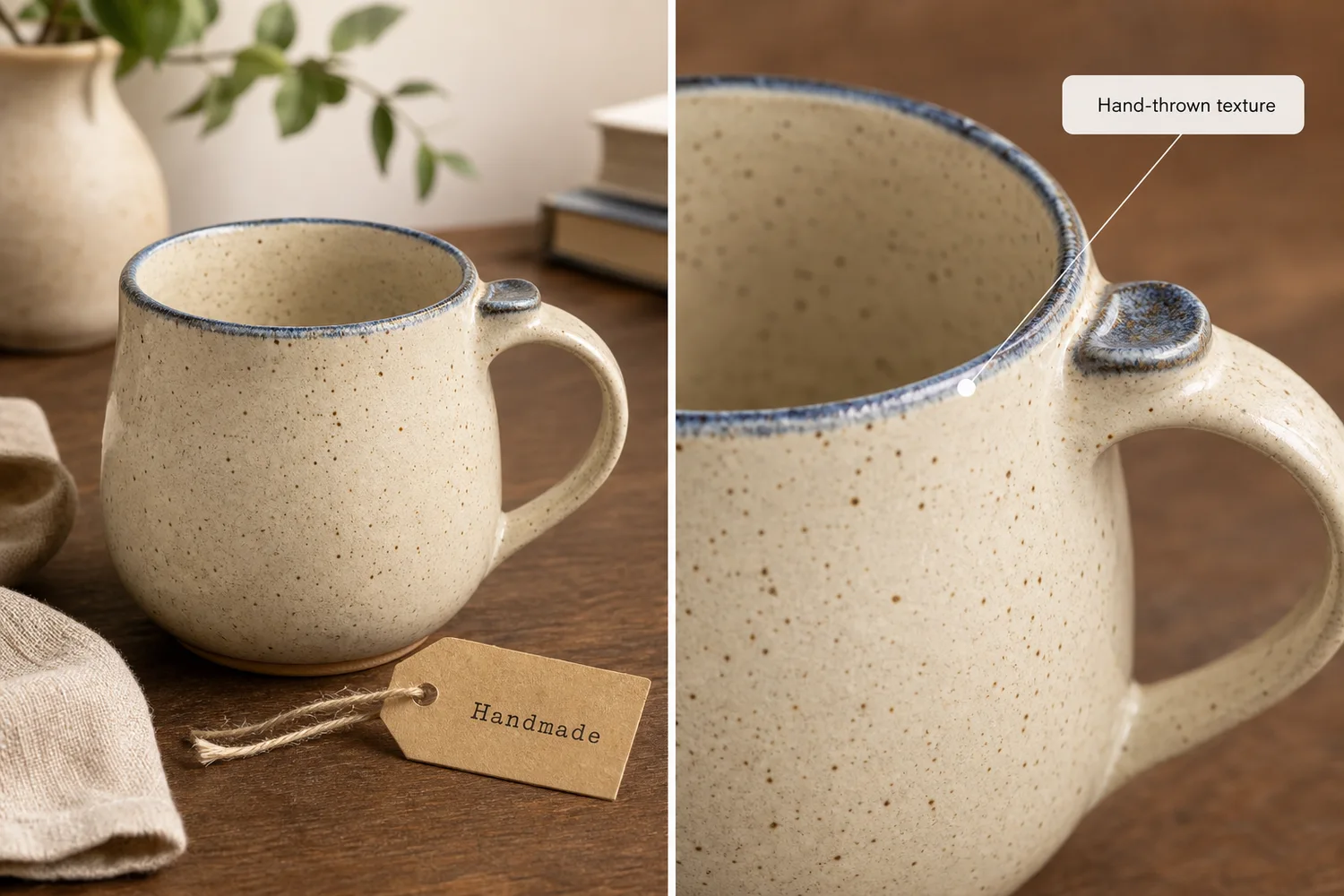 ## What handmade buyers look for
They care about texture, slight variation, material, finish, scale, and use. AI should enhance those cues, not erase them into a generic catalog image.
## Workflow
1. Preserve real craft details: glaze, grain, stitching, weave, edge, or tool marks.
2. Use warm surfaces such as linen, wood, paper, or ceramic.
3. Keep props minimal and relevant.
4. Create one clean main image and one texture detail.
5. Avoid fake vintage labels or invented maker marks.
## Where KrafLayer Fits
When you apply this Create Etsy Vintage Handmade Product Images workflow in KrafLayer, the tool choice matters: use Replace BG for a prompted or reference-based scene, or Scene Compose when product position and scale must match a base scene. After generation, judge the image by the channel it serves — Etsy listing images — and check that shape, material, labels, color, scale, and accessories still match the source SKU.
## Prompt to use in KrafLayer
~~~text
Use the uploaded handmade product as the exact reference. Create a warm Etsy-style vintage ecommerce image with natural light, tactile surface, and simple props. Preserve material texture, handmade variation, color, shape, scale, edge details, and product identity. Do not over-smooth, add fake maker marks, invent labels, change dimensions, or make the scene generic.
~~~
## FAQ
### Should handmade product photos look imperfect?
They should show real craft character, not production flaws that distract from buying. Preserve useful texture and variation.
### What backgrounds work well for Etsy products?
Linen, wood, paper, ceramic surfaces, and soft window light usually support handmade goods without overpowering them.
### Can AI make handmade products look too polished?
Yes. Ask for tactile realism and preserve handmade variation instead of perfect studio smoothness.
# How Ecommerce Designers Use AI to Work Faster
URL: https://kraflayer.com/blog/how-ecommerce-designers-use-ai-to-work-faster
Summary: A practical AI workflow for ecommerce designers: use AI for variants, cleanup, background tests, detail images, and campaign drafts while protecting product accuracy. Includes how to do it in KrafLayer.
Updated: 2026-08-21
## TL;DR
For How Ecommerce Designers Use AI to Work Faster, KrafLayer is useful when a real product reference needs to become a usable asset for listing images, detail pages, or ad assets. Treat it as production editing, not product reinvention; the test is whether shape, material, labels, color, scale, and accessories still match the source SKU.
Ecommerce designers use AI best when they treat it as a production accelerator, not a replacement for judgment. AI can remove repetitive image work, but the designer still decides what is accurate, useful, and on-brand.
## What handmade buyers look for
They care about texture, slight variation, material, finish, scale, and use. AI should enhance those cues, not erase them into a generic catalog image.
## Workflow
1. Preserve real craft details: glaze, grain, stitching, weave, edge, or tool marks.
2. Use warm surfaces such as linen, wood, paper, or ceramic.
3. Keep props minimal and relevant.
4. Create one clean main image and one texture detail.
5. Avoid fake vintage labels or invented maker marks.
## Where KrafLayer Fits
When you apply this Create Etsy Vintage Handmade Product Images workflow in KrafLayer, the tool choice matters: use Replace BG for a prompted or reference-based scene, or Scene Compose when product position and scale must match a base scene. After generation, judge the image by the channel it serves — Etsy listing images — and check that shape, material, labels, color, scale, and accessories still match the source SKU.
## Prompt to use in KrafLayer
~~~text
Use the uploaded handmade product as the exact reference. Create a warm Etsy-style vintage ecommerce image with natural light, tactile surface, and simple props. Preserve material texture, handmade variation, color, shape, scale, edge details, and product identity. Do not over-smooth, add fake maker marks, invent labels, change dimensions, or make the scene generic.
~~~
## FAQ
### Should handmade product photos look imperfect?
They should show real craft character, not production flaws that distract from buying. Preserve useful texture and variation.
### What backgrounds work well for Etsy products?
Linen, wood, paper, ceramic surfaces, and soft window light usually support handmade goods without overpowering them.
### Can AI make handmade products look too polished?
Yes. Ask for tactile realism and preserve handmade variation instead of perfect studio smoothness.
# How Ecommerce Designers Use AI to Work Faster
URL: https://kraflayer.com/blog/how-ecommerce-designers-use-ai-to-work-faster
Summary: A practical AI workflow for ecommerce designers: use AI for variants, cleanup, background tests, detail images, and campaign drafts while protecting product accuracy. Includes how to do it in KrafLayer.
Updated: 2026-08-21
## TL;DR
For How Ecommerce Designers Use AI to Work Faster, KrafLayer is useful when a real product reference needs to become a usable asset for listing images, detail pages, or ad assets. Treat it as production editing, not product reinvention; the test is whether shape, material, labels, color, scale, and accessories still match the source SKU.
Ecommerce designers use AI best when they treat it as a production accelerator, not a replacement for judgment. AI can remove repetitive image work, but the designer still decides what is accurate, useful, and on-brand.
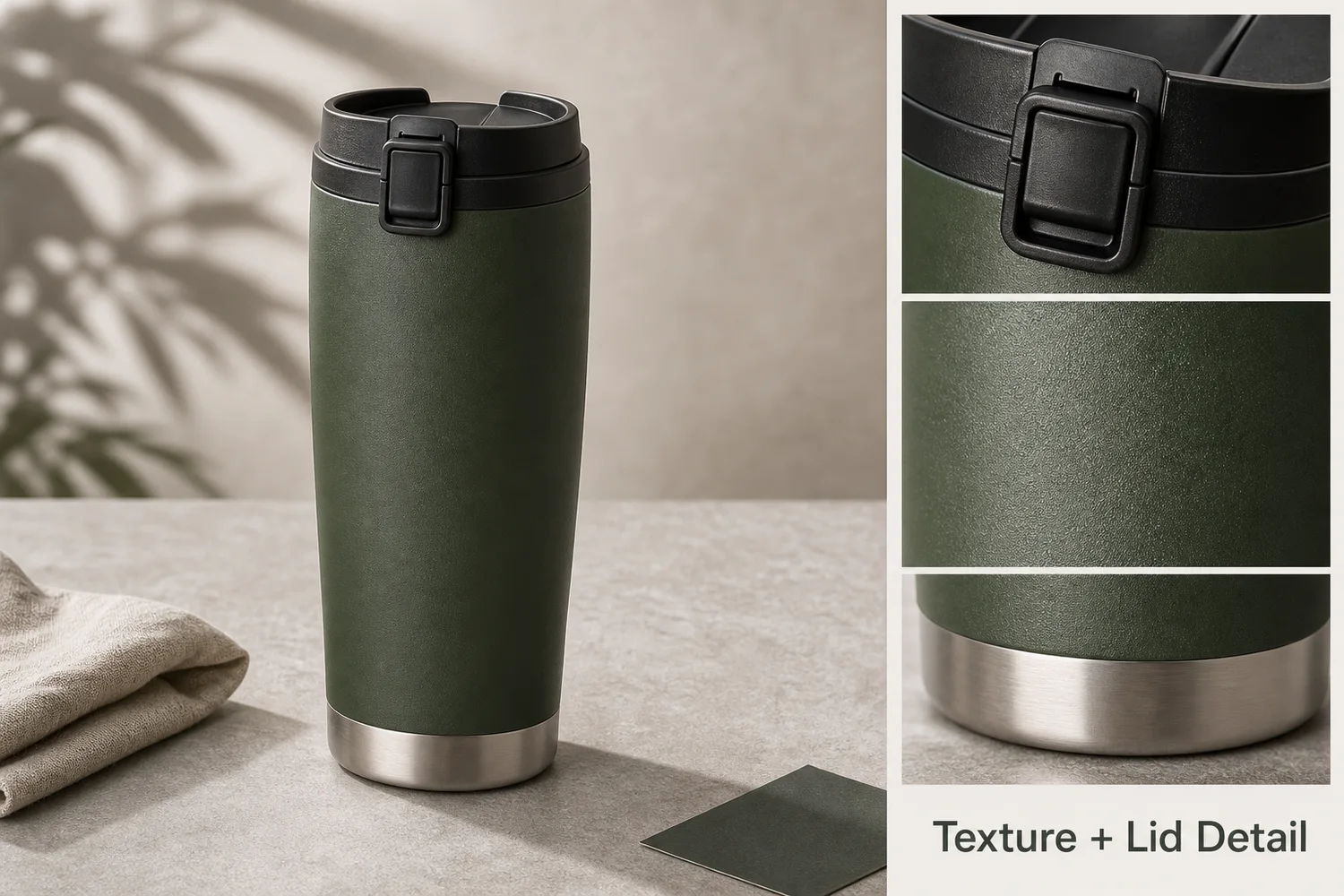 ## Where AI saves time
AI is useful for background tests, local cleanup, image upscaling, detail crops, ad variants, product-on-model drafts, seasonal scenes, and first-pass campaign directions. It is weaker when exact labels, measurements, regulatory claims, or hidden product details matter.
## A practical designer workflow
1. Start with a clean product reference.
2. Create a product-accurate master image.
3. Generate variations by channel: PDP, ad, email, social, marketplace.
4. Keep prompts and approved outputs organized.
5. Review every image against product truth before final design.
## Where KrafLayer Fits
When you apply this How Ecommerce Designers Use AI to Work Faster workflow in KrafLayer, start from the clearest product reference, then decide whether the asset needs cleanup, lighting, background work, detail support, or an ad version. Before using it for listing images, detail pages, or ad assets, check that shape, material, labels, color, scale, and accessories still match the source SKU.
## Prompt to use in KrafLayer
~~~text
Use the uploaded product as the exact reference. Create an ecommerce design asset for [channel/task]. Preserve product shape, color, material, label, logo area, scale, and functional details. Improve only [background/lighting/crop/detail/style]. Keep the result on-brand, editable, and useful for a designer workflow. Do not invent text, redesign the product, or hide important buyer-facing details.
~~~
## FAQ
### Does AI replace ecommerce designers?
No. It speeds up repetitive production and exploration. Designers still need to choose direction, protect product truth, check claims, and finish layouts.
### What AI tasks should designers automate first?
Start with background variations, cleanup, crop adaptation, detail images, and ad concept drafts. These are repetitive but still benefit from human review.
### What should stay manual?
Final typography, exact claims, compliance checks, brand-sensitive layout decisions, and product accuracy approval should stay under designer or team control.
# 手绘动画感盲盒和卡牌展示图怎么做
URL: https://kraflayer.com/zh/blog/blind-box-and-trading-card-ghibli-style-product-display
Summary: 盲盒、卡牌和收藏玩具适合手绘动画感,但图像仍要让用户看清角色、包装、稀有度、卡面质感和收藏属性。风格化不能牺牲商品识别。可在 KrafLayer 中按同一流程完成。
Updated: 2026-06-12
# 手绘动画感盲盒和卡牌展示图怎么做
## TL;DR
手绘动画感盲盒和卡牌展示图这类任务,KrafLayer 的作用是把真实商品参考图推进到可用的主图、详情图或广告素材,而不是重新发明商品。核心检查点是商品形状、材质、标签、颜色、比例和配件仍然对应原始 SKU。
盲盒、卡牌、徽章、手办和收藏玩具很适合做手绘动画感展示图。它能放大故事感、稀有感和收藏欲,比普通白底更有社媒传播力。但这类图也很容易过度风格化,把角色五官、包装图案、卡面文字、编号或稀有度标识改掉。
电商可用的动画感展示图,应该是“商品真实,场景有想象力”,而不是把商品重新画成另一个 IP。
## 什么时候适合用这种风格
新品预热、系列合集、盲盒开箱封面、卡牌稀有款展示、收藏柜场景、节日活动图,都适合加入柔和手绘氛围。
如果图片用于平台主图或交易凭证,风格化要更克制。用户需要确认收到的角色、卡面和包装是不是同一款。
## 怎么做
先保护商品识别。盲盒包装、角色轮廓、配色、卡面构图、编号、稀有度标识和外盒数量不能被改。
再做背景氛围。可以用暖色木桌、收藏架、柔光窗边、纸质纹理、微缩街景、漂浮光点或手绘云影,但背景不能和商品抢视觉中心。
卡牌要特别保留边框、反光、厚度和卡面层次。不要把卡面文字变成乱码,也不要让 AI 自行生成新角色。
盲盒图可以加入开箱感,但不要增加不存在的隐藏款或配件。
## 注意事项
不要直接要求“某知名动画工作室风格”。更稳的写法是“温暖手绘动画感、柔和背景、童话般光线、细腻纸感”,避免风格侵权和过度模仿。
收藏品图片要控制真实性。用户对编号、稀有度、版本和包装差异非常敏感。
## KrafLayer 放在流程里的位置
把手绘动画感盲盒和卡牌展示图放到 KrafLayer 里做时,先固定商品参考图,再决定是修背景、补光线、做详情图还是延展广告版本。最后按主图、详情图或广告素材的使用场景检查:商品形状、材质、标签、颜色、比例和配件仍然对应原始 SKU。
## 可直接使用的 Prompt
基于这张盲盒/卡牌/收藏品商品图,生成一张温暖手绘动画感的电商展示图。保留商品真实角色造型、包装图案、卡面构图、颜色、数量、编号或稀有度标识,不要创造新角色或新配件。背景可以有柔和手绘质感、收藏架、暖光、纸质纹理和梦幻氛围,但商品主体必须清晰、真实、可识别,适合社媒封面和详情页展示。
## 总结
收藏类商品的风格图要服务“想拥有”的情绪,同时守住“买到的是这个东西”的确认感。氛围越梦幻,商品本身越要清楚。
## FAQ
### 可以把盲盒做成动画截图感吗?
可以做温暖手绘动画感,但不要模仿具体受版权保护的风格,也不要改变角色和包装。
### 卡牌图最容易出什么问题?
文字乱码、边框变形、反光过强、卡面角色被重画。生成后一定要放大检查。
### 这种图适合主图吗?
平台主图通常更适合清晰真实图。手绘动画感更适合社媒、详情页、活动页和广告素材。
# 运动器材健身房背景自动生成怎么做
URL: https://kraflayer.com/zh/blog/ai-gym-background-generator-for-fitness-equipment-product-images
Summary: 健身器材图要让用户看懂尺寸、受力方式、安全感和训练场景。AI 健身房背景应服务产品功能,而不是让器械被肌肉、霓虹和墙面装饰淹没。可在 KrafLayer 中按同一流程完成。
Updated: 2026-06-12
# 运动器材健身房背景自动生成怎么做
## TL;DR
运动器材健身房背景自动生成这类任务,可以在 KrafLayer 里给真实商品图换场景或合成场景:用 Replace BG 生成文字或参考图驱动的场景;已有基础场景且要控制位置和比例时,用 Scene Compose。场景要服务主图、详情图或广告素材,同时保证版型、面料、肩线、衣长和真实色号没有被改掉。
运动器材适合放进健身房场景,但背景不是越硬核越好。用户买哑铃、弹力带、瑜伽垫、划船机、壶铃、筋膜枪或家用训练架时,首先要判断尺寸、材质、握持位置、承重感和是否适合自己的空间。
AI 背景的作用,是把器材放进可信的训练环境里,让用户理解它怎么用、放在哪里、适合什么人,而不是把图做成一张看不清商品的健身海报。
## 适合的使用场景
小件器材适合家庭地垫、木地板、浅色墙面和局部训练道具;大件器械适合商业健身房、车库健身房或简洁训练区;恢复类产品如筋膜枪、泡沫轴,更适合明亮、干净、偏生活化的场景。
如果产品卖点是力量感,可以用深色地面和侧光;如果卖点是家用、轻便、女性友好,则背景要更柔和,留出更多空间感。
## 怎么做
先保证产品结构完整。把手、刻度、显示屏、连接处、脚垫、防滑纹理和品牌标识不能被 AI 改掉。
再设置地面关系。器材要真实落在地面或训练垫上,接触阴影要准确。大件器械尤其不能漂浮,也不能被背景透视拉变形。
最后控制人物元素。可以有局部虚化的人体动作作氛围,但不要遮挡器材,也不要让 AI 生成危险或不符合器材用途的姿势。
## 注意事项
不要把家用器材放进过于专业的商业健身房,除非你的目标用户就是高强度训练人群。场景错配会让用户误判产品定位。
不要让 AI 添加不存在的配件,比如多出来的砝码、线缆、支架或屏幕。
## KrafLayer 放在流程里的位置
把运动器材健身房背景自动生成放到 KrafLayer 里做时,先选对工具:用 Replace BG 生成文字或参考图驱动的场景;已有基础场景且要控制位置和比例时,用 Scene Compose。生成后不要只看画面是否更漂亮,要按主图、详情图或广告素材的使用场景检查:版型、面料、肩线、衣长和真实色号没有被改掉。
## 可直接使用的 Prompt
基于这张健身器材商品图,生成一张真实可信的健身房/家庭训练场景图。保留器材真实形状、颜色、材质、尺寸比例、把手、刻度、logo、连接结构和配件数量,不要添加不存在的部件。让器材自然接触地面或训练垫,有准确接触阴影和合理透视。背景干净、有训练氛围,但不要遮挡商品,适合电商详情页和广告图。
## 总结
运动器材图要卖的是“我能安全、有效地使用它”。背景可以增强力量感,但产品结构、尺寸和使用逻辑必须先清楚。
## FAQ
### 健身器材图需要放人吗?
可以放,但最好用于详情图说明使用方式。主图应优先保证器材本身清楚。
### 家用器材适合黑色硬核健身房背景吗?
不一定。家庭用户更在意空间占用、收纳和轻松上手,过硬的场景可能反而劝退。
### AI 能生成训练动作图吗?
可以辅助,但动作安全性要人工检查,避免错误姿势误导用户。
# How to Generate Gym Backgrounds for Fitness Equipment Product Images
URL: https://kraflayer.com/blog/ai-gym-background-generator-for-fitness-equipment-product-images
Summary: A fitness equipment image workflow: generate gym backgrounds while preserving product scale, handles, rubber texture, metal finish, safety cues, and ground contact. Includes how to do it in KrafLayer.
Updated: 2026-08-21
## TL;DR
For Generate Gym Backgrounds for Fitness Equipment Product Images, KrafLayer helps when the product is real but the surrounding scene needs work. Use Replace BG for a prompted or reference-based scene, or Scene Compose when product position and scale must match a base scene. Use the scene to support listing images, detail pages, or ad assets, then check that fit, fabric, shoulder line, garment length, and real color are still intact.
A gym background gives fitness equipment context, but the equipment still has to look usable, safe, and correctly scaled. A dumbbell, resistance band, bench, or massage device should not become a generic prop in a gym scene.
## Where AI saves time
AI is useful for background tests, local cleanup, image upscaling, detail crops, ad variants, product-on-model drafts, seasonal scenes, and first-pass campaign directions. It is weaker when exact labels, measurements, regulatory claims, or hidden product details matter.
## A practical designer workflow
1. Start with a clean product reference.
2. Create a product-accurate master image.
3. Generate variations by channel: PDP, ad, email, social, marketplace.
4. Keep prompts and approved outputs organized.
5. Review every image against product truth before final design.
## Where KrafLayer Fits
When you apply this How Ecommerce Designers Use AI to Work Faster workflow in KrafLayer, start from the clearest product reference, then decide whether the asset needs cleanup, lighting, background work, detail support, or an ad version. Before using it for listing images, detail pages, or ad assets, check that shape, material, labels, color, scale, and accessories still match the source SKU.
## Prompt to use in KrafLayer
~~~text
Use the uploaded product as the exact reference. Create an ecommerce design asset for [channel/task]. Preserve product shape, color, material, label, logo area, scale, and functional details. Improve only [background/lighting/crop/detail/style]. Keep the result on-brand, editable, and useful for a designer workflow. Do not invent text, redesign the product, or hide important buyer-facing details.
~~~
## FAQ
### Does AI replace ecommerce designers?
No. It speeds up repetitive production and exploration. Designers still need to choose direction, protect product truth, check claims, and finish layouts.
### What AI tasks should designers automate first?
Start with background variations, cleanup, crop adaptation, detail images, and ad concept drafts. These are repetitive but still benefit from human review.
### What should stay manual?
Final typography, exact claims, compliance checks, brand-sensitive layout decisions, and product accuracy approval should stay under designer or team control.
# 手绘动画感盲盒和卡牌展示图怎么做
URL: https://kraflayer.com/zh/blog/blind-box-and-trading-card-ghibli-style-product-display
Summary: 盲盒、卡牌和收藏玩具适合手绘动画感,但图像仍要让用户看清角色、包装、稀有度、卡面质感和收藏属性。风格化不能牺牲商品识别。可在 KrafLayer 中按同一流程完成。
Updated: 2026-06-12
# 手绘动画感盲盒和卡牌展示图怎么做
## TL;DR
手绘动画感盲盒和卡牌展示图这类任务,KrafLayer 的作用是把真实商品参考图推进到可用的主图、详情图或广告素材,而不是重新发明商品。核心检查点是商品形状、材质、标签、颜色、比例和配件仍然对应原始 SKU。
盲盒、卡牌、徽章、手办和收藏玩具很适合做手绘动画感展示图。它能放大故事感、稀有感和收藏欲,比普通白底更有社媒传播力。但这类图也很容易过度风格化,把角色五官、包装图案、卡面文字、编号或稀有度标识改掉。
电商可用的动画感展示图,应该是“商品真实,场景有想象力”,而不是把商品重新画成另一个 IP。
## 什么时候适合用这种风格
新品预热、系列合集、盲盒开箱封面、卡牌稀有款展示、收藏柜场景、节日活动图,都适合加入柔和手绘氛围。
如果图片用于平台主图或交易凭证,风格化要更克制。用户需要确认收到的角色、卡面和包装是不是同一款。
## 怎么做
先保护商品识别。盲盒包装、角色轮廓、配色、卡面构图、编号、稀有度标识和外盒数量不能被改。
再做背景氛围。可以用暖色木桌、收藏架、柔光窗边、纸质纹理、微缩街景、漂浮光点或手绘云影,但背景不能和商品抢视觉中心。
卡牌要特别保留边框、反光、厚度和卡面层次。不要把卡面文字变成乱码,也不要让 AI 自行生成新角色。
盲盒图可以加入开箱感,但不要增加不存在的隐藏款或配件。
## 注意事项
不要直接要求“某知名动画工作室风格”。更稳的写法是“温暖手绘动画感、柔和背景、童话般光线、细腻纸感”,避免风格侵权和过度模仿。
收藏品图片要控制真实性。用户对编号、稀有度、版本和包装差异非常敏感。
## KrafLayer 放在流程里的位置
把手绘动画感盲盒和卡牌展示图放到 KrafLayer 里做时,先固定商品参考图,再决定是修背景、补光线、做详情图还是延展广告版本。最后按主图、详情图或广告素材的使用场景检查:商品形状、材质、标签、颜色、比例和配件仍然对应原始 SKU。
## 可直接使用的 Prompt
基于这张盲盒/卡牌/收藏品商品图,生成一张温暖手绘动画感的电商展示图。保留商品真实角色造型、包装图案、卡面构图、颜色、数量、编号或稀有度标识,不要创造新角色或新配件。背景可以有柔和手绘质感、收藏架、暖光、纸质纹理和梦幻氛围,但商品主体必须清晰、真实、可识别,适合社媒封面和详情页展示。
## 总结
收藏类商品的风格图要服务“想拥有”的情绪,同时守住“买到的是这个东西”的确认感。氛围越梦幻,商品本身越要清楚。
## FAQ
### 可以把盲盒做成动画截图感吗?
可以做温暖手绘动画感,但不要模仿具体受版权保护的风格,也不要改变角色和包装。
### 卡牌图最容易出什么问题?
文字乱码、边框变形、反光过强、卡面角色被重画。生成后一定要放大检查。
### 这种图适合主图吗?
平台主图通常更适合清晰真实图。手绘动画感更适合社媒、详情页、活动页和广告素材。
# 运动器材健身房背景自动生成怎么做
URL: https://kraflayer.com/zh/blog/ai-gym-background-generator-for-fitness-equipment-product-images
Summary: 健身器材图要让用户看懂尺寸、受力方式、安全感和训练场景。AI 健身房背景应服务产品功能,而不是让器械被肌肉、霓虹和墙面装饰淹没。可在 KrafLayer 中按同一流程完成。
Updated: 2026-06-12
# 运动器材健身房背景自动生成怎么做
## TL;DR
运动器材健身房背景自动生成这类任务,可以在 KrafLayer 里给真实商品图换场景或合成场景:用 Replace BG 生成文字或参考图驱动的场景;已有基础场景且要控制位置和比例时,用 Scene Compose。场景要服务主图、详情图或广告素材,同时保证版型、面料、肩线、衣长和真实色号没有被改掉。
运动器材适合放进健身房场景,但背景不是越硬核越好。用户买哑铃、弹力带、瑜伽垫、划船机、壶铃、筋膜枪或家用训练架时,首先要判断尺寸、材质、握持位置、承重感和是否适合自己的空间。
AI 背景的作用,是把器材放进可信的训练环境里,让用户理解它怎么用、放在哪里、适合什么人,而不是把图做成一张看不清商品的健身海报。
## 适合的使用场景
小件器材适合家庭地垫、木地板、浅色墙面和局部训练道具;大件器械适合商业健身房、车库健身房或简洁训练区;恢复类产品如筋膜枪、泡沫轴,更适合明亮、干净、偏生活化的场景。
如果产品卖点是力量感,可以用深色地面和侧光;如果卖点是家用、轻便、女性友好,则背景要更柔和,留出更多空间感。
## 怎么做
先保证产品结构完整。把手、刻度、显示屏、连接处、脚垫、防滑纹理和品牌标识不能被 AI 改掉。
再设置地面关系。器材要真实落在地面或训练垫上,接触阴影要准确。大件器械尤其不能漂浮,也不能被背景透视拉变形。
最后控制人物元素。可以有局部虚化的人体动作作氛围,但不要遮挡器材,也不要让 AI 生成危险或不符合器材用途的姿势。
## 注意事项
不要把家用器材放进过于专业的商业健身房,除非你的目标用户就是高强度训练人群。场景错配会让用户误判产品定位。
不要让 AI 添加不存在的配件,比如多出来的砝码、线缆、支架或屏幕。
## KrafLayer 放在流程里的位置
把运动器材健身房背景自动生成放到 KrafLayer 里做时,先选对工具:用 Replace BG 生成文字或参考图驱动的场景;已有基础场景且要控制位置和比例时,用 Scene Compose。生成后不要只看画面是否更漂亮,要按主图、详情图或广告素材的使用场景检查:版型、面料、肩线、衣长和真实色号没有被改掉。
## 可直接使用的 Prompt
基于这张健身器材商品图,生成一张真实可信的健身房/家庭训练场景图。保留器材真实形状、颜色、材质、尺寸比例、把手、刻度、logo、连接结构和配件数量,不要添加不存在的部件。让器材自然接触地面或训练垫,有准确接触阴影和合理透视。背景干净、有训练氛围,但不要遮挡商品,适合电商详情页和广告图。
## 总结
运动器材图要卖的是“我能安全、有效地使用它”。背景可以增强力量感,但产品结构、尺寸和使用逻辑必须先清楚。
## FAQ
### 健身器材图需要放人吗?
可以放,但最好用于详情图说明使用方式。主图应优先保证器材本身清楚。
### 家用器材适合黑色硬核健身房背景吗?
不一定。家庭用户更在意空间占用、收纳和轻松上手,过硬的场景可能反而劝退。
### AI 能生成训练动作图吗?
可以辅助,但动作安全性要人工检查,避免错误姿势误导用户。
# How to Generate Gym Backgrounds for Fitness Equipment Product Images
URL: https://kraflayer.com/blog/ai-gym-background-generator-for-fitness-equipment-product-images
Summary: A fitness equipment image workflow: generate gym backgrounds while preserving product scale, handles, rubber texture, metal finish, safety cues, and ground contact. Includes how to do it in KrafLayer.
Updated: 2026-08-21
## TL;DR
For Generate Gym Backgrounds for Fitness Equipment Product Images, KrafLayer helps when the product is real but the surrounding scene needs work. Use Replace BG for a prompted or reference-based scene, or Scene Compose when product position and scale must match a base scene. Use the scene to support listing images, detail pages, or ad assets, then check that fit, fabric, shoulder line, garment length, and real color are still intact.
A gym background gives fitness equipment context, but the equipment still has to look usable, safe, and correctly scaled. A dumbbell, resistance band, bench, or massage device should not become a generic prop in a gym scene.
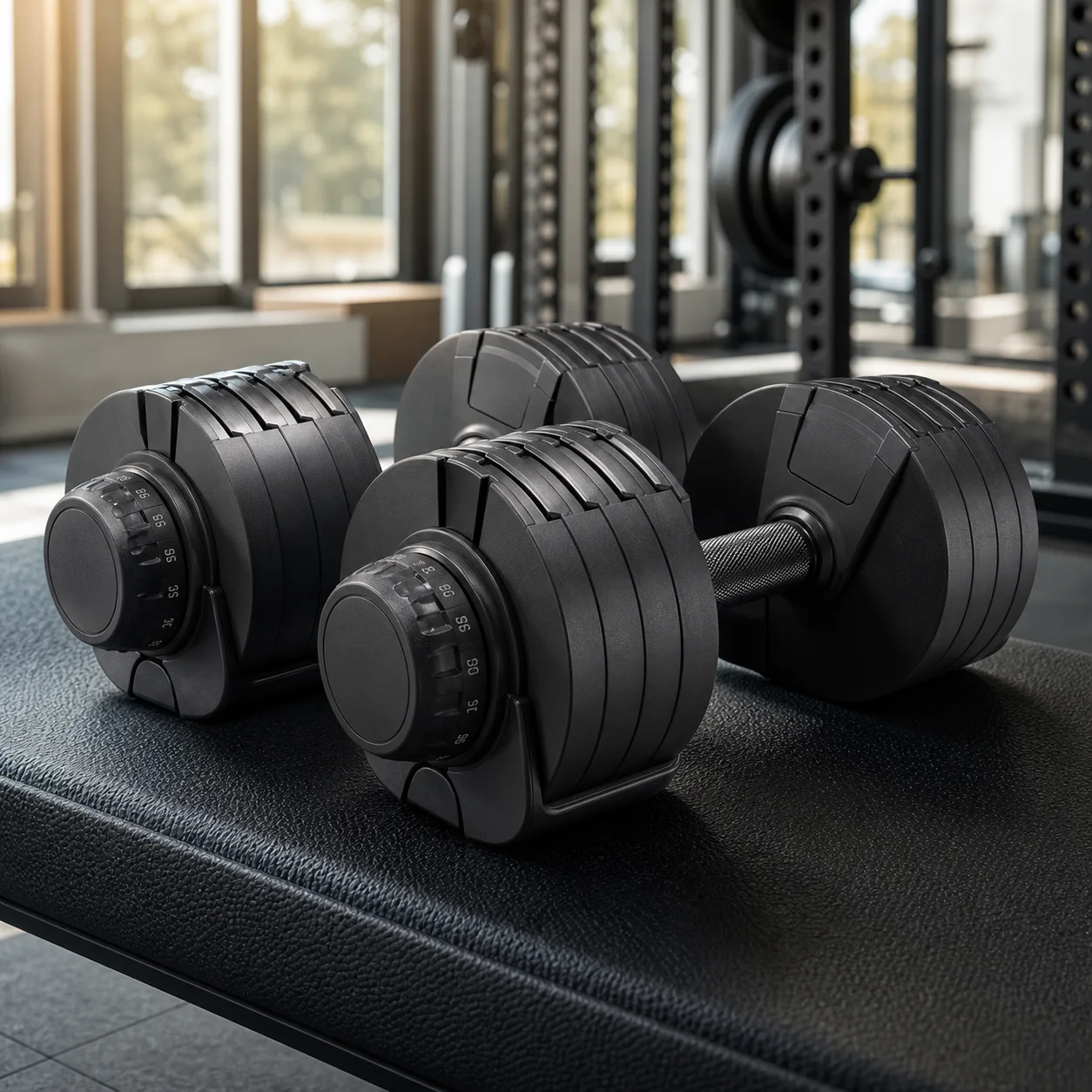 ## What to preserve
Protect size, grip, handles, adjustment marks, rubber texture, metal finish, logos, weight labels, and floor contact. Fitness buyers need to understand use, not just mood.
## Workflow
1. Pick one gym setting: clean studio, home gym, weight room, yoga space, or training floor.
2. Keep the product in the foreground.
3. Match floor contact and shadow.
4. Avoid busy equipment behind the product.
5. Check labels and functional parts.
## Where KrafLayer Fits
When you apply this Generate Gym Backgrounds for Fitness Equipment Product Images workflow in KrafLayer, the tool choice matters: use Replace BG for a prompted or reference-based scene, or Scene Compose when product position and scale must match a base scene. After generation, judge the image by the channel it serves — listing images, detail pages, or ad assets — and check that fit, fabric, shoulder line, garment length, and real color are still intact.
## Prompt to use in KrafLayer
~~~text
Use the uploaded fitness equipment as the exact reference. Generate a realistic gym background for an ecommerce product image. Preserve product size, shape, handles, grip texture, rubber or metal finish, labels, logo area, adjustment parts, and contact shadow. Keep the product clear in the foreground with believable floor contact. Do not redesign the equipment, add confusing gym clutter, hide functional details, or change scale.
~~~
## FAQ
### Should gym backgrounds be busy?
No. A few context cues are enough. Too much gym equipment makes the product harder to inspect.
### Can AI change product size?
Yes. Use floor contact and nearby scale cues, then compare with the original product.
### Is this good for main product images?
Use clean product-first images for main slots and gym scenes as support or campaign assets.
# How to Create Hand-Drawn Blind Box and Trading Card Display Images with AI
URL: https://kraflayer.com/blog/blind-box-and-trading-card-ghibli-style-product-display
Summary: A hand-drawn collectible product display workflow for blind boxes and trading cards: create storybook warmth while protecting product art, box shape, card borders, and collectibility cues. Includes how to do it in KrafLayer.
Updated: 2026-08-21
## TL;DR
For Create Hand-Drawn Blind Box and Trading Card Display Images, KrafLayer is useful when a real product reference needs to become a usable asset for listing images, detail pages, or ad assets. Treat it as production editing, not product reinvention; the test is whether shape, material, labels, color, scale, and accessories still match the source SKU.
Blind box and trading card displays need charm, but they also need product clarity. Collectors care about box shape, card border, artwork area, character silhouette, edition cues, and packaging condition.
## What to preserve
Protect size, grip, handles, adjustment marks, rubber texture, metal finish, logos, weight labels, and floor contact. Fitness buyers need to understand use, not just mood.
## Workflow
1. Pick one gym setting: clean studio, home gym, weight room, yoga space, or training floor.
2. Keep the product in the foreground.
3. Match floor contact and shadow.
4. Avoid busy equipment behind the product.
5. Check labels and functional parts.
## Where KrafLayer Fits
When you apply this Generate Gym Backgrounds for Fitness Equipment Product Images workflow in KrafLayer, the tool choice matters: use Replace BG for a prompted or reference-based scene, or Scene Compose when product position and scale must match a base scene. After generation, judge the image by the channel it serves — listing images, detail pages, or ad assets — and check that fit, fabric, shoulder line, garment length, and real color are still intact.
## Prompt to use in KrafLayer
~~~text
Use the uploaded fitness equipment as the exact reference. Generate a realistic gym background for an ecommerce product image. Preserve product size, shape, handles, grip texture, rubber or metal finish, labels, logo area, adjustment parts, and contact shadow. Keep the product clear in the foreground with believable floor contact. Do not redesign the equipment, add confusing gym clutter, hide functional details, or change scale.
~~~
## FAQ
### Should gym backgrounds be busy?
No. A few context cues are enough. Too much gym equipment makes the product harder to inspect.
### Can AI change product size?
Yes. Use floor contact and nearby scale cues, then compare with the original product.
### Is this good for main product images?
Use clean product-first images for main slots and gym scenes as support or campaign assets.
# How to Create Hand-Drawn Blind Box and Trading Card Display Images with AI
URL: https://kraflayer.com/blog/blind-box-and-trading-card-ghibli-style-product-display
Summary: A hand-drawn collectible product display workflow for blind boxes and trading cards: create storybook warmth while protecting product art, box shape, card borders, and collectibility cues. Includes how to do it in KrafLayer.
Updated: 2026-08-21
## TL;DR
For Create Hand-Drawn Blind Box and Trading Card Display Images, KrafLayer is useful when a real product reference needs to become a usable asset for listing images, detail pages, or ad assets. Treat it as production editing, not product reinvention; the test is whether shape, material, labels, color, scale, and accessories still match the source SKU.
Blind box and trading card displays need charm, but they also need product clarity. Collectors care about box shape, card border, artwork area, character silhouette, edition cues, and packaging condition.
 ## How to use the style safely
Use general hand-drawn storybook qualities rather than naming copyrighted studios or franchises. The visual can feel soft and illustrated without copying a protected style.
## Workflow
1. Preserve packaging shape, card border, artwork area, color, and scale.
2. Add gentle hand-drawn background elements around the product.
3. Keep collectible details readable.
4. Avoid fake rarity marks or invented text.
5. Use the result for social, campaign, or collection support images.
## Where KrafLayer Fits
When you apply this Create Hand-Drawn Blind Box and Trading Card Display Images workflow in KrafLayer, start from the clearest product reference, then decide whether the asset needs cleanup, lighting, background work, detail support, or an ad version. Before using it for listing images, detail pages, or ad assets, check that shape, material, labels, color, scale, and accessories still match the source SKU.
## Prompt to use in KrafLayer
~~~text
Use the uploaded blind box or trading card product as the exact reference. Create a warm hand-drawn storybook-style ecommerce display. Preserve packaging shape, card border, artwork area, colors, product scale, and collectible details. Add soft illustrated lighting and simple background elements. Do not copy a named studio or franchise style, invent text, change the product art, or hide collectible details.
~~~
## FAQ
### Can I ask for a famous animation style?
Avoid named studios, franchises, or characters. Describe visual qualities instead: hand-drawn linework, soft color, storybook warmth, and gentle background.
### Is this good for marketplace main images?
Usually no. Use it for campaign, social, collection, or support images.
### What should collectors still be able to see?
Packaging shape, card border, artwork area, edition cues, color, and condition-related details.
# 电商美工如何用 AI 提高作图效率
URL: https://kraflayer.com/zh/blog/how-ecommerce-designers-use-ai-to-work-faster
Summary: 电商美工真正需要 AI 解决的是批量抠图、变体统一、详情图延展、场景测试和素材复用。把 AI 放进流程,而不是让 AI 替你随便出图,效率才会提升。可在 KrafLayer 中按同一流程完成。
Updated: 2026-06-12
# 电商美工如何用 AI 提高作图效率
## TL;DR
电商美工如何用 AI 提高作图效率这类任务,KrafLayer 的作用是把真实商品参考图推进到可用的主图、详情图或广告素材,而不是重新发明商品。核心检查点是商品形状、材质、标签、颜色、比例和配件仍然对应原始 SKU。
电商美工用 AI 提效,不是把所有工作交给 AI,也不是每天生成一堆看起来很炫但不能上架的图。真正能节省时间的是那些重复、耗时、低创造性但必须做好的环节:抠图、清理、换背景、统一变体、延展画布、生成详情模块、测试不同场景。
如果 AI 输出不能保留 SKU、不能复用版式、不能稳定生成同一套风格,那它只会制造更多返工。
## 哪些工作最适合交给 AI
第一类是基础修图:去背景、去杂物、修灰尘、补边缘、统一白底、放大低清图。
第二类是批量变体:同角度换颜色、同光线处理多 SKU、统一主图尺寸和留白。
第三类是场景探索:给同一产品快速生成几种背景,判断哪种更适合广告、首页、详情页或社媒。
第四类是详情图辅助:材质近景、使用场景、尺寸感、功能说明背景,但文案和真实参数仍要人工控制。
## 怎么做
先建立一套“不可改清单”。包括产品形状、颜色、材质、logo、标签、配件数量、模特身份、服装版型等。每次 Prompt 都要说明这些内容不能改。
再把任务拆小。不要让 AI 一次完成“换背景、改光影、加文案、做海报、生成详情页”。先修产品,再做场景,最后进设计软件排版。
把好结果沉淀为参考。每个类目保留 3-5 个可复用 Prompt:主图、详情图、广告图、社媒封面、变体统一。
最后建立人工质检。检查 SKU、文字、边缘、颜色、尺寸、平台规则和移动端缩略图。
## 注意事项
AI 最不适合替你判断真实商品信息。尺寸、材质、成分、功效、认证、价格和活动文案都应来自真实资料。
设计师的价值不会消失,而是从“机械修图”转向“判断哪张图更能卖、哪里不能乱改、怎样形成品牌一致性”。
## KrafLayer 放在流程里的位置
把电商美工如何用 AI 提高作图效率放到 KrafLayer 里做时,先固定商品参考图,再决定是修背景、补光线、做详情图还是延展广告版本。最后按主图、详情图或广告素材的使用场景检查:商品形状、材质、标签、颜色、比例和配件仍然对应原始 SKU。
## 可直接使用的 Prompt
基于这张商品图,帮助我完成电商美工提效处理。请保留商品真实形状、颜色、材质、logo、标签、比例和配件数量,不要改变 SKU。根据任务优化图片:清理背景和杂物、统一光线、提升清晰度、保留自然阴影,并输出适合电商主图/详情图继续排版的干净素材。不要添加虚假卖点或不可验证文案。
## 总结
AI 对电商美工最大的价值,是把重复劳动变成可控流程。先保护商品真实性,再用 AI 扩展场景和效率,这样才不会越做越像模板图。
## FAQ
### 电商美工会被 AI 取代吗?
短期更像是工作方式变化。会用 AI 的设计师能更快出方案,但仍需要判断转化、平台规则和品牌一致性。
### AI 适合直接生成详情页吗?
适合生成素材和模块草图,不适合完全自动发布。参数、文案、价格、功效和合规信息要人工确认。
### 如何避免 AI 图同质化?
按类目和产品卖点写 Prompt,不要复用同一套背景、构图和形容词。每个 SKU 都要有自己的信息重点。
# Xiaohongshu Product Covers With AI: A Practical Guide
URL: https://kraflayer.com/blog/xiaohongshu-viral-product-cover-ai-design
Summary: Create clear Xiaohongshu product covers with one product, one honest content promise, mobile-readable hierarchy, editable Chinese copy, and SKU checks.
Updated: 2026-08-22
The best Xiaohongshu product cover is not the busiest one. It gives a mobile reader one clear reason to stop, shows the real product immediately, and leaves enough quiet space for short, accurate Chinese copy. “Viral” cannot be designed on command. A cover can only improve the odds of attention by making the topic, product, and payoff easy to understand.
This workflow is for ecommerce teams adapting a verified product photo into a Xiaohongshu cover. It does not promise traffic or engagement, and it does not copy another creator's exact layout, face, product, or wording.
> **Quick Summary**
> Use one product, one visual idea, and one short message. Keep the product readable at phone size, build text as an editable layer, preserve material and shade, and create several genuinely different concepts before choosing a cover.
## Abstract
A strong Xiaohongshu product cover combines immediate category recognition, a specific content promise, credible product detail, and a layout that survives mobile cropping. Use AI for the background or composition, not for unverifiable claims, prices, reviews, or product facts.
## Key takeaways
- Design the cover around the post's useful takeaway, not a generic “must buy” badge.
- Keep the product as the first focal point and text as the second.
- Add Chinese copy manually so wording, punctuation, and brand terms remain editable.
- Preserve the exact SKU, shade, texture, label, and included items.
- Test at feed size before publishing.
## What should a Xiaohongshu product cover communicate?
A reader should understand three things in roughly two seconds: what the product is, what the post will help them decide or do, and why this image is credible enough to open. If one of those is missing, extra decoration rarely fixes it.
Useful content promises are specific:
- “3 ways to photograph a silver bag without losing texture”
- “White background or lifestyle image?”
- “How this earring size looks on ear”
- “Before publishing: check these label details”
Weak promises are broad and interchangeable: “amazing,” “high-end,” “viral secret,” or “everyone needs this.” They create pressure without giving the reader a real reason to trust the post.
## Choose one of four cover structures
Each structure fits a different post. Do not paste the same title card over every product.
| Structure | Best for | Composition |
|---|---|---|
| Product hero | Launch, review, product story | Large product, short headline, restrained prop or color field |
| Before and after | Real editing workflow | Same SKU twice, clear change, no fake performance result |
| Detail proof | Material, texture, mechanism | Macro detail plus smaller full-product anchor |
| Checklist | Tutorial or comparison | Product on one side, three short decision cues on the other |
Use a before-and-after only when the post genuinely explains the edit. If the topic is advice, a strong hero or detail-proof cover is usually clearer.
## How to use the style safely
Use general hand-drawn storybook qualities rather than naming copyrighted studios or franchises. The visual can feel soft and illustrated without copying a protected style.
## Workflow
1. Preserve packaging shape, card border, artwork area, color, and scale.
2. Add gentle hand-drawn background elements around the product.
3. Keep collectible details readable.
4. Avoid fake rarity marks or invented text.
5. Use the result for social, campaign, or collection support images.
## Where KrafLayer Fits
When you apply this Create Hand-Drawn Blind Box and Trading Card Display Images workflow in KrafLayer, start from the clearest product reference, then decide whether the asset needs cleanup, lighting, background work, detail support, or an ad version. Before using it for listing images, detail pages, or ad assets, check that shape, material, labels, color, scale, and accessories still match the source SKU.
## Prompt to use in KrafLayer
~~~text
Use the uploaded blind box or trading card product as the exact reference. Create a warm hand-drawn storybook-style ecommerce display. Preserve packaging shape, card border, artwork area, colors, product scale, and collectible details. Add soft illustrated lighting and simple background elements. Do not copy a named studio or franchise style, invent text, change the product art, or hide collectible details.
~~~
## FAQ
### Can I ask for a famous animation style?
Avoid named studios, franchises, or characters. Describe visual qualities instead: hand-drawn linework, soft color, storybook warmth, and gentle background.
### Is this good for marketplace main images?
Usually no. Use it for campaign, social, collection, or support images.
### What should collectors still be able to see?
Packaging shape, card border, artwork area, edition cues, color, and condition-related details.
# 电商美工如何用 AI 提高作图效率
URL: https://kraflayer.com/zh/blog/how-ecommerce-designers-use-ai-to-work-faster
Summary: 电商美工真正需要 AI 解决的是批量抠图、变体统一、详情图延展、场景测试和素材复用。把 AI 放进流程,而不是让 AI 替你随便出图,效率才会提升。可在 KrafLayer 中按同一流程完成。
Updated: 2026-06-12
# 电商美工如何用 AI 提高作图效率
## TL;DR
电商美工如何用 AI 提高作图效率这类任务,KrafLayer 的作用是把真实商品参考图推进到可用的主图、详情图或广告素材,而不是重新发明商品。核心检查点是商品形状、材质、标签、颜色、比例和配件仍然对应原始 SKU。
电商美工用 AI 提效,不是把所有工作交给 AI,也不是每天生成一堆看起来很炫但不能上架的图。真正能节省时间的是那些重复、耗时、低创造性但必须做好的环节:抠图、清理、换背景、统一变体、延展画布、生成详情模块、测试不同场景。
如果 AI 输出不能保留 SKU、不能复用版式、不能稳定生成同一套风格,那它只会制造更多返工。
## 哪些工作最适合交给 AI
第一类是基础修图:去背景、去杂物、修灰尘、补边缘、统一白底、放大低清图。
第二类是批量变体:同角度换颜色、同光线处理多 SKU、统一主图尺寸和留白。
第三类是场景探索:给同一产品快速生成几种背景,判断哪种更适合广告、首页、详情页或社媒。
第四类是详情图辅助:材质近景、使用场景、尺寸感、功能说明背景,但文案和真实参数仍要人工控制。
## 怎么做
先建立一套“不可改清单”。包括产品形状、颜色、材质、logo、标签、配件数量、模特身份、服装版型等。每次 Prompt 都要说明这些内容不能改。
再把任务拆小。不要让 AI 一次完成“换背景、改光影、加文案、做海报、生成详情页”。先修产品,再做场景,最后进设计软件排版。
把好结果沉淀为参考。每个类目保留 3-5 个可复用 Prompt:主图、详情图、广告图、社媒封面、变体统一。
最后建立人工质检。检查 SKU、文字、边缘、颜色、尺寸、平台规则和移动端缩略图。
## 注意事项
AI 最不适合替你判断真实商品信息。尺寸、材质、成分、功效、认证、价格和活动文案都应来自真实资料。
设计师的价值不会消失,而是从“机械修图”转向“判断哪张图更能卖、哪里不能乱改、怎样形成品牌一致性”。
## KrafLayer 放在流程里的位置
把电商美工如何用 AI 提高作图效率放到 KrafLayer 里做时,先固定商品参考图,再决定是修背景、补光线、做详情图还是延展广告版本。最后按主图、详情图或广告素材的使用场景检查:商品形状、材质、标签、颜色、比例和配件仍然对应原始 SKU。
## 可直接使用的 Prompt
基于这张商品图,帮助我完成电商美工提效处理。请保留商品真实形状、颜色、材质、logo、标签、比例和配件数量,不要改变 SKU。根据任务优化图片:清理背景和杂物、统一光线、提升清晰度、保留自然阴影,并输出适合电商主图/详情图继续排版的干净素材。不要添加虚假卖点或不可验证文案。
## 总结
AI 对电商美工最大的价值,是把重复劳动变成可控流程。先保护商品真实性,再用 AI 扩展场景和效率,这样才不会越做越像模板图。
## FAQ
### 电商美工会被 AI 取代吗?
短期更像是工作方式变化。会用 AI 的设计师能更快出方案,但仍需要判断转化、平台规则和品牌一致性。
### AI 适合直接生成详情页吗?
适合生成素材和模块草图,不适合完全自动发布。参数、文案、价格、功效和合规信息要人工确认。
### 如何避免 AI 图同质化?
按类目和产品卖点写 Prompt,不要复用同一套背景、构图和形容词。每个 SKU 都要有自己的信息重点。
# Xiaohongshu Product Covers With AI: A Practical Guide
URL: https://kraflayer.com/blog/xiaohongshu-viral-product-cover-ai-design
Summary: Create clear Xiaohongshu product covers with one product, one honest content promise, mobile-readable hierarchy, editable Chinese copy, and SKU checks.
Updated: 2026-08-22
The best Xiaohongshu product cover is not the busiest one. It gives a mobile reader one clear reason to stop, shows the real product immediately, and leaves enough quiet space for short, accurate Chinese copy. “Viral” cannot be designed on command. A cover can only improve the odds of attention by making the topic, product, and payoff easy to understand.
This workflow is for ecommerce teams adapting a verified product photo into a Xiaohongshu cover. It does not promise traffic or engagement, and it does not copy another creator's exact layout, face, product, or wording.
> **Quick Summary**
> Use one product, one visual idea, and one short message. Keep the product readable at phone size, build text as an editable layer, preserve material and shade, and create several genuinely different concepts before choosing a cover.
## Abstract
A strong Xiaohongshu product cover combines immediate category recognition, a specific content promise, credible product detail, and a layout that survives mobile cropping. Use AI for the background or composition, not for unverifiable claims, prices, reviews, or product facts.
## Key takeaways
- Design the cover around the post's useful takeaway, not a generic “must buy” badge.
- Keep the product as the first focal point and text as the second.
- Add Chinese copy manually so wording, punctuation, and brand terms remain editable.
- Preserve the exact SKU, shade, texture, label, and included items.
- Test at feed size before publishing.
## What should a Xiaohongshu product cover communicate?
A reader should understand three things in roughly two seconds: what the product is, what the post will help them decide or do, and why this image is credible enough to open. If one of those is missing, extra decoration rarely fixes it.
Useful content promises are specific:
- “3 ways to photograph a silver bag without losing texture”
- “White background or lifestyle image?”
- “How this earring size looks on ear”
- “Before publishing: check these label details”
Weak promises are broad and interchangeable: “amazing,” “high-end,” “viral secret,” or “everyone needs this.” They create pressure without giving the reader a real reason to trust the post.
## Choose one of four cover structures
Each structure fits a different post. Do not paste the same title card over every product.
| Structure | Best for | Composition |
|---|---|---|
| Product hero | Launch, review, product story | Large product, short headline, restrained prop or color field |
| Before and after | Real editing workflow | Same SKU twice, clear change, no fake performance result |
| Detail proof | Material, texture, mechanism | Macro detail plus smaller full-product anchor |
| Checklist | Tutorial or comparison | Product on one side, three short decision cues on the other |
Use a before-and-after only when the post genuinely explains the edit. If the topic is advice, a strong hero or detail-proof cover is usually clearer.
 *KrafLayer demonstration asset. Judge product recognition, text space, shade accuracy, and thumbnail hierarchy rather than treating the composition as a performance benchmark.*
## Build the cover from product truth
Start with the largest source image you own. Keep the full product visible and collect extra views for any detail the cover will emphasize. A texture cover needs a real texture source. A model cover needs verified scale. A color-comparison cover needs one image for each actual variant.
Write an identity lock before designing:
```text
Exact product: [SKU and variant]
Must preserve: [shape, material, shade, label, hardware, included items]
Cover topic: [the single reader question]
May change: [background, crop, light direction, restrained props]
Must not invent: [claims, reviews, price, certification, features, accessories]
```
This small block prevents a common mistake: approving a beautiful cover that no longer depicts the listed product.
## How much text should appear on the cover?
Keep one headline and, when necessary, one short qualifier. The exact limit depends on the design, but every word should remain readable at feed size. Long explanatory copy belongs in the post.
Add final Chinese text manually. Image models can misspell characters, change punctuation, or invent small labels. Editable type also lets the team test wording without regenerating the product.
Use natural Chinese, not a translated English advertising line. Prefer “皮纹怎么拍清楚” over a stiff phrase such as “解锁高级质感视觉表现.” Keep price, discount, specifications, and claims linked to current product data.
## Create three different concepts, not three color variants
Three backgrounds around the same layout do not test the idea. Build concepts around different reader motives:
1. **Decision:** white background versus lifestyle.
2. **Proof:** leather grain or jewelry scale shown clearly.
3. **Process:** source photo to final product cover.
Select the concept that best matches the post body. A detail-proof cover attached to a generic brand story creates a click but breaks the promise.
At thumbnail size, check the order of attention. Product first. Topic second. Supporting decoration last. If a badge, arrow, flower, and headline all compete equally, remove elements until the hierarchy returns.
## A practical KrafLayer workflow
Use the narrowest tool for the job:
1. Use the one-click [AI background remover](/tools/ai-background-remover) when the product needs a clean cutout. It does not need a prompt.
2. Use Replace BG when the product is correct and only the scene needs to change.
3. Use Reference Image Editor when a visual reference should guide composition or lighting without replacing product identity.
4. Use Scene Compose when the product must occupy a deliberate position and size inside a base layout.
5. Add Chinese copy in an editable design layer after the image is approved.
Example background direction:
```text
Use the uploaded product as the exact SKU reference. Create a clean vertical mobile cover background with one clear focal point and quiet space for a short Chinese headline. Preserve the product's exact shape, shade, material, label, hardware, scale, and included items. Use restrained props related to the real use context. Do not add text, prices, reviews, badges, certification marks, logos, or extra products.
```
## What should you check before publishing?
- [ ] The post body delivers the promise made on the cover.
- [ ] The product remains identifiable at small phone size.
- [ ] Shade, material, label, shape, and accessories match the source.
- [ ] Chinese copy is natural, accurate, and editable.
- [ ] No invented review, result, price, scarcity, or certification appears.
- [ ] Props do not imply items included in the purchase.
- [ ] The important subject and headline survive the platform crop.
- [ ] The design does not copy another creator's exact layout or wording.
## Write cover copy from the post's real information gain
The cover headline should name what the post contains that a reader cannot get from seeing the product alone. That might be a comparison, a failure to avoid, a material detail, a repeatable edit, or a channel-specific checklist.
Four copy patterns work because they are concrete:
| Post type | Headline pattern | Example |
|---|---|---|
| Decision | A or B: which fits this job? | “白底图还是场景图?” |
| Checklist | Number plus a specific review task | “上架前检查这 5 处细节” |
| Demonstration | Source to named output | “一张商品图做出 3 种封面” |
| Failure fix | Visible defect plus correction | “银色耳环别修成金色” |
Avoid numbers that have no relationship to the post. “7 secrets” is weak when the article contains three ordinary tips. Do not put “实测,” “转化提升,” or “爆款” on the cover unless there is a real method, sample, date range, and result behind the claim.
Read the headline aloud. A native Chinese sentence is usually shorter and less formal than a translated marketing line. Keep technical English only when it is the product or platform name a reader expects.
## Protect color and material under styled lighting
A warm background can make ivory packaging look yellow. A pink light can alter a cosmetic shade. Heavy sharpening can turn leather grain into noise, while aggressive smoothing can make metal, fabric, and skin look plastic. These errors matter more than whether the scene feels fashionable.
Keep one neutral reference beside the cover during review. Compare the product's lightest area, darkest area, main material, printed color, and reflective edges. If the cover uses colored light, preserve a neutral highlight or a factual secondary image in the post so the reader can still judge the real SKU.
For detail-proof covers, show a smaller full-product anchor. A macro of leather, stone setting, knit, or packaging paper can be visually strong but ambiguous by itself. The anchor tells the reader which product owns that detail.
## Test the cover after publishing without confusing variables
Do not call the redesign successful from one day's impressions. Compare enough exposure to reduce noise, and avoid changing the cover, title, topic angle, posting time, and promotion at once. If several variables move together, the result cannot tell you which decision helped.
Track impressions, opens, saves, useful comments, profile visits, and downstream product actions where available. A cover can raise opens while attracting the wrong audience. If readers leave quickly or comments show that the post did not match the promise, tighten the headline rather than making the design louder.
Keep a simple log:
- cover concept and headline;
- publish date and post topic;
- exposure window;
- opens and saves;
- qualitative comment themes;
- the single next change to test.
The goal is a repeatable editorial system, not a one-off lucky thumbnail.
## Frequently asked questions
### Should a Xiaohongshu product cover include text?
Usually, yes, when a short headline makes the post's value easier to understand. Keep it brief and add it manually as editable type. A strong product hero can work without text when the product and topic are already obvious.
### What cover angle works best?
Use the angle that proves the post's main point. A front or three-quarter view supports product recognition, a macro supports material detail, and an on-model view supports scale. Do not request an angle that the source references cannot verify.
### How do I avoid a cheap-looking product cover?
Reduce competing elements. Use one product, one message, controlled color, realistic contact shadows, and short type. Oversized badges, random gradients, fake sparkles, and several unrelated props usually weaken product credibility.
### Can AI write the Chinese headline inside the image?
It can attempt it, but manual editable text is safer. Final copy needs correct characters, punctuation, prices, and product terms. Generate the visual with clean text space, then typeset the approved wording separately.
### Can a cover guarantee more clicks?
No. A cover can improve clarity and attention, but performance also depends on topic, audience, distribution, account history, timing, and whether the post fulfills its promise. Test concepts using real post metrics rather than calling a design “viral” in advance.
## Conclusion
A useful Xiaohongshu product cover earns attention through clarity, not noise. KrafLayer can help preserve the product while changing background, composition, or presentation, after which the team can add accurate Chinese copy as an editable layer. The cover should make one honest promise and the post should deliver it.
# 拼多多和 1688 差异化高点击主图怎么做
URL: https://kraflayer.com/zh/blog/pinduoduo-1688-differentiated-high-click-main-image-design
Summary: 拼多多和 1688 主图竞争密集,关键是让用户在小缩略图里迅速看懂价格感、规格、用途或差异卖点。AI 应帮助突出商品,不应制造虚假促销。可在 KrafLayer 中按同一流程完成。
Updated: 2026-06-12
# 拼多多和 1688 差异化高点击主图怎么做
## TL;DR
拼多多和 1688 差异化高点击主图这类任务,可以在 KrafLayer 里给真实商品图换场景或合成场景:用 Replace BG 生成文字或参考图驱动的场景;已有基础场景且要控制位置和比例时,用 Scene Compose。场景要服务拼多多和 1688 列表图,同时保证商品形状、材质、标签、颜色、比例和配件仍然对应原始 SKU。
拼多多和 1688 的主图环境非常拥挤。用户刷到你的商品时,往往只给一秒判断:这是什么、有什么不同、值不值得点。差异化不是把图做得更花,也不是堆满红字,而是让核心卖点在小缩略图里仍然清楚。
AI 可以帮你换背景、强化光线、整理构图和生成场景,但不要虚构价格、认证、功能、销量或不存在的配件。
## 什么时候需要重做主图
如果你的商品和同行放在列表页里几乎一样,或者缩略图看不清型号、规格、材质和使用场景,就需要重新设计主图。
工厂类、批发类、日用品、家居小件、五金工具、服饰配件和低客单快消品尤其需要明确第一卖点:更厚、更大容量、套装数量、现货、适用场景、材质差异或规格齐全。
## 怎么做
先确定一个主卖点。不要一张图同时讲 5 个理由。主图只负责让用户点进来,详情页再解释完整信息。
产品要大、清楚、边缘干净。小图里看不清商品,再多文案都没用。
背景可以做对比,但不要压住商品。比如工具类用干净工作台,家居类用使用场景,食品包装用明亮陈列。
文字只放必要信息。适合放规格、数量、适用对象或一句差异卖点;价格、绝对化承诺和无依据认证要谨慎。
## 注意事项
拼多多和 1688 的视觉可以更直接,但商品真实性不能牺牲。AI 不能把一件装变成三件装,也不能把普通材质做成金属质感。
移动端缩略图检查很重要。生成后缩到列表页大小看,如果看不清,就需要重新调整构图。
## KrafLayer 放在流程里的位置
把拼多多和 1688 差异化高点击主图放到 KrafLayer 里做时,先选对工具:用 Replace BG 生成文字或参考图驱动的场景;已有基础场景且要控制位置和比例时,用 Scene Compose。生成后不要只看画面是否更漂亮,要按拼多多和 1688 列表图的使用场景检查:商品形状、材质、标签、颜色、比例和配件仍然对应原始 SKU。
## 可直接使用的 Prompt
基于这张商品图,生成一张适合拼多多/1688 列表点击的差异化主图。保留商品真实形状、颜色、材质、比例、数量、包装和配件,不要虚构功能或赠品。让商品主体更大更清楚,背景干净但有场景感,突出一个真实卖点,如规格、材质、容量、套装数量或使用场景。整体适合移动端缩略图浏览,文字区域预留清晰但不要堆满。
## 总结
高点击主图的重点不是“热闹”,而是小图里一眼可懂。先把产品和单一卖点讲清楚,再考虑风格和冲击力。
## FAQ
### 主图文案越多越好吗?
不是。文字太多在手机上看不清,还会降低专业感。一个核心卖点通常更有效。
### AI 可以生成促销标签吗?
可以预留位置或做视觉样式,但具体价格、折扣、销量和认证必须来自真实数据。
### 1688 和拼多多主图一样做可以吗?
不完全一样。1688 更重规格、批发、供货能力;拼多多更重点击、价格感和使用场景。
# 不做作的真实感生活场景 AI 作图怎么做
URL: https://kraflayer.com/zh/blog/realistic-ai-lifestyle-product-images-without-looking-staged
Summary: 生活方式图要让用户相信商品真的会出现在自己的家、桌面、通勤或日常里。关键是自然光、真实比例、轻微生活痕迹和不过度安排的构图。可在 KrafLayer 中按同一流程完成。
Updated: 2026-06-12
# 不做作的真实感生活场景 AI 作图怎么做
## TL;DR
不做作的真实感生活场景 AI 作图这类任务,可以在 KrafLayer 里给真实商品图换场景或合成场景:用 Replace BG 生成文字或参考图驱动的场景;已有基础场景且要控制位置和比例时,用 Scene Compose。场景要服务主图、详情图或广告素材,同时保证尺寸比例、材质、摆放关系和阴影符合真实空间。
生活方式商品图最怕“假精致”:桌面一尘不染,光线像影棚,所有道具都像为了拍照而摆,商品看起来被硬塞进场景。用户不会因此更相信商品,反而会觉得图像太营销。
真实感 lifestyle 图适合家居、服饰配件、数码周边、杯具、香氛、文具、宠物用品和日用品。它的目标不是炫技,而是让用户想象“这个东西放进我的生活里也成立”。
## 什么时候需要 lifestyle 图
当白底图已经能说明商品外观,但用户还不确定尺寸、使用方式、搭配效果或生活氛围时,就需要生活方式图。
例如杯子需要放在桌面上看容量感,包需要出现在通勤场景里看比例,香氛需要出现在床头或浴室里看氛围,收纳用品需要展示放置后的秩序感。
## 怎么做
先定义一个真实场景,而不是一个风格词。比如“早晨厨房台面”“下班后的玄关”“周末书桌”“浴室洗手台”,比“高级生活感”更有效。
道具数量要少。一个杯子、一本书、一块布、一点自然阴影就够了。过多道具会让商品变成背景配角。
保留轻微生活痕迹。桌面一点纹理、布料自然褶皱、窗光不完全均匀,都比绝对完美更可信。
## 注意事项
不要为了生活感改变商品本身。颜色、尺寸、logo、材质、开口、配件都要来自原图。
不要让 AI 生成不真实的人手、复杂互动或过度摆拍姿势。能不用人物就先不用人物。
## KrafLayer 放在流程里的位置
把不做作的真实感生活场景 AI 作图放到 KrafLayer 里做时,先选对工具:用 Replace BG 生成文字或参考图驱动的场景;已有基础场景且要控制位置和比例时,用 Scene Compose。生成后不要只看画面是否更漂亮,要按主图、详情图或广告素材的使用场景检查:尺寸比例、材质、摆放关系和阴影符合真实空间。
## 可直接使用的 Prompt
基于这张商品图,生成一张真实自然的生活方式电商场景图。保留商品真实外观、颜色、材质、比例、logo 和关键细节,不要改变 SKU。把商品放在一个具体、可信的日常场景中,使用自然光、轻微生活痕迹、少量相关道具和真实接触阴影。画面不过度摆拍,不要让背景抢走商品主体,适合详情页和广告落地页。
## 总结
真实感 lifestyle 图不是“随便放进房间”,而是用具体生活场景回答用户的疑问:它有多大、怎么用、放在哪里、和我的生活是否匹配。
## FAQ
### 生活方式图一定要有人吗?
不一定。很多商品用桌面、家居角落或使用环境就能说明问题,人物反而容易带来变形风险。
### 怎么避免摆拍感?
减少道具、降低对称、使用自然光和真实接触阴影,让画面像生活中刚好出现的一刻。
### lifestyle 图能当首图吗?
独立站和广告可以测试,平台主图通常还是清晰商品图更稳。
# How to Create Japandi Natural Wood Product Scenes with AI
URL: https://kraflayer.com/blog/japandi-natural-wood-home-product-scene-images
Summary: A Japandi home product scene workflow: create calm natural-wood images while preserving product scale, material grain, proportions, and ecommerce clarity. Includes how to do it in KrafLayer.
Updated: 2026-08-21
## TL;DR
For Create Japandi Natural Wood Product Scenes, KrafLayer helps when the product is real but the surrounding scene needs work. Use Replace BG for a prompted or reference-based scene, or Scene Compose when product position and scale must match a base scene. Use the scene to support listing images, detail pages, or ad assets, then check that scale, material, placement, and shadow still make sense in the space.
Japandi product scenes work when calm design makes the product easier to imagine at home. They fail when the room becomes more important than the item.
*KrafLayer demonstration asset. Judge product recognition, text space, shade accuracy, and thumbnail hierarchy rather than treating the composition as a performance benchmark.*
## Build the cover from product truth
Start with the largest source image you own. Keep the full product visible and collect extra views for any detail the cover will emphasize. A texture cover needs a real texture source. A model cover needs verified scale. A color-comparison cover needs one image for each actual variant.
Write an identity lock before designing:
```text
Exact product: [SKU and variant]
Must preserve: [shape, material, shade, label, hardware, included items]
Cover topic: [the single reader question]
May change: [background, crop, light direction, restrained props]
Must not invent: [claims, reviews, price, certification, features, accessories]
```
This small block prevents a common mistake: approving a beautiful cover that no longer depicts the listed product.
## How much text should appear on the cover?
Keep one headline and, when necessary, one short qualifier. The exact limit depends on the design, but every word should remain readable at feed size. Long explanatory copy belongs in the post.
Add final Chinese text manually. Image models can misspell characters, change punctuation, or invent small labels. Editable type also lets the team test wording without regenerating the product.
Use natural Chinese, not a translated English advertising line. Prefer “皮纹怎么拍清楚” over a stiff phrase such as “解锁高级质感视觉表现.” Keep price, discount, specifications, and claims linked to current product data.
## Create three different concepts, not three color variants
Three backgrounds around the same layout do not test the idea. Build concepts around different reader motives:
1. **Decision:** white background versus lifestyle.
2. **Proof:** leather grain or jewelry scale shown clearly.
3. **Process:** source photo to final product cover.
Select the concept that best matches the post body. A detail-proof cover attached to a generic brand story creates a click but breaks the promise.
At thumbnail size, check the order of attention. Product first. Topic second. Supporting decoration last. If a badge, arrow, flower, and headline all compete equally, remove elements until the hierarchy returns.
## A practical KrafLayer workflow
Use the narrowest tool for the job:
1. Use the one-click [AI background remover](/tools/ai-background-remover) when the product needs a clean cutout. It does not need a prompt.
2. Use Replace BG when the product is correct and only the scene needs to change.
3. Use Reference Image Editor when a visual reference should guide composition or lighting without replacing product identity.
4. Use Scene Compose when the product must occupy a deliberate position and size inside a base layout.
5. Add Chinese copy in an editable design layer after the image is approved.
Example background direction:
```text
Use the uploaded product as the exact SKU reference. Create a clean vertical mobile cover background with one clear focal point and quiet space for a short Chinese headline. Preserve the product's exact shape, shade, material, label, hardware, scale, and included items. Use restrained props related to the real use context. Do not add text, prices, reviews, badges, certification marks, logos, or extra products.
```
## What should you check before publishing?
- [ ] The post body delivers the promise made on the cover.
- [ ] The product remains identifiable at small phone size.
- [ ] Shade, material, label, shape, and accessories match the source.
- [ ] Chinese copy is natural, accurate, and editable.
- [ ] No invented review, result, price, scarcity, or certification appears.
- [ ] Props do not imply items included in the purchase.
- [ ] The important subject and headline survive the platform crop.
- [ ] The design does not copy another creator's exact layout or wording.
## Write cover copy from the post's real information gain
The cover headline should name what the post contains that a reader cannot get from seeing the product alone. That might be a comparison, a failure to avoid, a material detail, a repeatable edit, or a channel-specific checklist.
Four copy patterns work because they are concrete:
| Post type | Headline pattern | Example |
|---|---|---|
| Decision | A or B: which fits this job? | “白底图还是场景图?” |
| Checklist | Number plus a specific review task | “上架前检查这 5 处细节” |
| Demonstration | Source to named output | “一张商品图做出 3 种封面” |
| Failure fix | Visible defect plus correction | “银色耳环别修成金色” |
Avoid numbers that have no relationship to the post. “7 secrets” is weak when the article contains three ordinary tips. Do not put “实测,” “转化提升,” or “爆款” on the cover unless there is a real method, sample, date range, and result behind the claim.
Read the headline aloud. A native Chinese sentence is usually shorter and less formal than a translated marketing line. Keep technical English only when it is the product or platform name a reader expects.
## Protect color and material under styled lighting
A warm background can make ivory packaging look yellow. A pink light can alter a cosmetic shade. Heavy sharpening can turn leather grain into noise, while aggressive smoothing can make metal, fabric, and skin look plastic. These errors matter more than whether the scene feels fashionable.
Keep one neutral reference beside the cover during review. Compare the product's lightest area, darkest area, main material, printed color, and reflective edges. If the cover uses colored light, preserve a neutral highlight or a factual secondary image in the post so the reader can still judge the real SKU.
For detail-proof covers, show a smaller full-product anchor. A macro of leather, stone setting, knit, or packaging paper can be visually strong but ambiguous by itself. The anchor tells the reader which product owns that detail.
## Test the cover after publishing without confusing variables
Do not call the redesign successful from one day's impressions. Compare enough exposure to reduce noise, and avoid changing the cover, title, topic angle, posting time, and promotion at once. If several variables move together, the result cannot tell you which decision helped.
Track impressions, opens, saves, useful comments, profile visits, and downstream product actions where available. A cover can raise opens while attracting the wrong audience. If readers leave quickly or comments show that the post did not match the promise, tighten the headline rather than making the design louder.
Keep a simple log:
- cover concept and headline;
- publish date and post topic;
- exposure window;
- opens and saves;
- qualitative comment themes;
- the single next change to test.
The goal is a repeatable editorial system, not a one-off lucky thumbnail.
## Frequently asked questions
### Should a Xiaohongshu product cover include text?
Usually, yes, when a short headline makes the post's value easier to understand. Keep it brief and add it manually as editable type. A strong product hero can work without text when the product and topic are already obvious.
### What cover angle works best?
Use the angle that proves the post's main point. A front or three-quarter view supports product recognition, a macro supports material detail, and an on-model view supports scale. Do not request an angle that the source references cannot verify.
### How do I avoid a cheap-looking product cover?
Reduce competing elements. Use one product, one message, controlled color, realistic contact shadows, and short type. Oversized badges, random gradients, fake sparkles, and several unrelated props usually weaken product credibility.
### Can AI write the Chinese headline inside the image?
It can attempt it, but manual editable text is safer. Final copy needs correct characters, punctuation, prices, and product terms. Generate the visual with clean text space, then typeset the approved wording separately.
### Can a cover guarantee more clicks?
No. A cover can improve clarity and attention, but performance also depends on topic, audience, distribution, account history, timing, and whether the post fulfills its promise. Test concepts using real post metrics rather than calling a design “viral” in advance.
## Conclusion
A useful Xiaohongshu product cover earns attention through clarity, not noise. KrafLayer can help preserve the product while changing background, composition, or presentation, after which the team can add accurate Chinese copy as an editable layer. The cover should make one honest promise and the post should deliver it.
# 拼多多和 1688 差异化高点击主图怎么做
URL: https://kraflayer.com/zh/blog/pinduoduo-1688-differentiated-high-click-main-image-design
Summary: 拼多多和 1688 主图竞争密集,关键是让用户在小缩略图里迅速看懂价格感、规格、用途或差异卖点。AI 应帮助突出商品,不应制造虚假促销。可在 KrafLayer 中按同一流程完成。
Updated: 2026-06-12
# 拼多多和 1688 差异化高点击主图怎么做
## TL;DR
拼多多和 1688 差异化高点击主图这类任务,可以在 KrafLayer 里给真实商品图换场景或合成场景:用 Replace BG 生成文字或参考图驱动的场景;已有基础场景且要控制位置和比例时,用 Scene Compose。场景要服务拼多多和 1688 列表图,同时保证商品形状、材质、标签、颜色、比例和配件仍然对应原始 SKU。
拼多多和 1688 的主图环境非常拥挤。用户刷到你的商品时,往往只给一秒判断:这是什么、有什么不同、值不值得点。差异化不是把图做得更花,也不是堆满红字,而是让核心卖点在小缩略图里仍然清楚。
AI 可以帮你换背景、强化光线、整理构图和生成场景,但不要虚构价格、认证、功能、销量或不存在的配件。
## 什么时候需要重做主图
如果你的商品和同行放在列表页里几乎一样,或者缩略图看不清型号、规格、材质和使用场景,就需要重新设计主图。
工厂类、批发类、日用品、家居小件、五金工具、服饰配件和低客单快消品尤其需要明确第一卖点:更厚、更大容量、套装数量、现货、适用场景、材质差异或规格齐全。
## 怎么做
先确定一个主卖点。不要一张图同时讲 5 个理由。主图只负责让用户点进来,详情页再解释完整信息。
产品要大、清楚、边缘干净。小图里看不清商品,再多文案都没用。
背景可以做对比,但不要压住商品。比如工具类用干净工作台,家居类用使用场景,食品包装用明亮陈列。
文字只放必要信息。适合放规格、数量、适用对象或一句差异卖点;价格、绝对化承诺和无依据认证要谨慎。
## 注意事项
拼多多和 1688 的视觉可以更直接,但商品真实性不能牺牲。AI 不能把一件装变成三件装,也不能把普通材质做成金属质感。
移动端缩略图检查很重要。生成后缩到列表页大小看,如果看不清,就需要重新调整构图。
## KrafLayer 放在流程里的位置
把拼多多和 1688 差异化高点击主图放到 KrafLayer 里做时,先选对工具:用 Replace BG 生成文字或参考图驱动的场景;已有基础场景且要控制位置和比例时,用 Scene Compose。生成后不要只看画面是否更漂亮,要按拼多多和 1688 列表图的使用场景检查:商品形状、材质、标签、颜色、比例和配件仍然对应原始 SKU。
## 可直接使用的 Prompt
基于这张商品图,生成一张适合拼多多/1688 列表点击的差异化主图。保留商品真实形状、颜色、材质、比例、数量、包装和配件,不要虚构功能或赠品。让商品主体更大更清楚,背景干净但有场景感,突出一个真实卖点,如规格、材质、容量、套装数量或使用场景。整体适合移动端缩略图浏览,文字区域预留清晰但不要堆满。
## 总结
高点击主图的重点不是“热闹”,而是小图里一眼可懂。先把产品和单一卖点讲清楚,再考虑风格和冲击力。
## FAQ
### 主图文案越多越好吗?
不是。文字太多在手机上看不清,还会降低专业感。一个核心卖点通常更有效。
### AI 可以生成促销标签吗?
可以预留位置或做视觉样式,但具体价格、折扣、销量和认证必须来自真实数据。
### 1688 和拼多多主图一样做可以吗?
不完全一样。1688 更重规格、批发、供货能力;拼多多更重点击、价格感和使用场景。
# 不做作的真实感生活场景 AI 作图怎么做
URL: https://kraflayer.com/zh/blog/realistic-ai-lifestyle-product-images-without-looking-staged
Summary: 生活方式图要让用户相信商品真的会出现在自己的家、桌面、通勤或日常里。关键是自然光、真实比例、轻微生活痕迹和不过度安排的构图。可在 KrafLayer 中按同一流程完成。
Updated: 2026-06-12
# 不做作的真实感生活场景 AI 作图怎么做
## TL;DR
不做作的真实感生活场景 AI 作图这类任务,可以在 KrafLayer 里给真实商品图换场景或合成场景:用 Replace BG 生成文字或参考图驱动的场景;已有基础场景且要控制位置和比例时,用 Scene Compose。场景要服务主图、详情图或广告素材,同时保证尺寸比例、材质、摆放关系和阴影符合真实空间。
生活方式商品图最怕“假精致”:桌面一尘不染,光线像影棚,所有道具都像为了拍照而摆,商品看起来被硬塞进场景。用户不会因此更相信商品,反而会觉得图像太营销。
真实感 lifestyle 图适合家居、服饰配件、数码周边、杯具、香氛、文具、宠物用品和日用品。它的目标不是炫技,而是让用户想象“这个东西放进我的生活里也成立”。
## 什么时候需要 lifestyle 图
当白底图已经能说明商品外观,但用户还不确定尺寸、使用方式、搭配效果或生活氛围时,就需要生活方式图。
例如杯子需要放在桌面上看容量感,包需要出现在通勤场景里看比例,香氛需要出现在床头或浴室里看氛围,收纳用品需要展示放置后的秩序感。
## 怎么做
先定义一个真实场景,而不是一个风格词。比如“早晨厨房台面”“下班后的玄关”“周末书桌”“浴室洗手台”,比“高级生活感”更有效。
道具数量要少。一个杯子、一本书、一块布、一点自然阴影就够了。过多道具会让商品变成背景配角。
保留轻微生活痕迹。桌面一点纹理、布料自然褶皱、窗光不完全均匀,都比绝对完美更可信。
## 注意事项
不要为了生活感改变商品本身。颜色、尺寸、logo、材质、开口、配件都要来自原图。
不要让 AI 生成不真实的人手、复杂互动或过度摆拍姿势。能不用人物就先不用人物。
## KrafLayer 放在流程里的位置
把不做作的真实感生活场景 AI 作图放到 KrafLayer 里做时,先选对工具:用 Replace BG 生成文字或参考图驱动的场景;已有基础场景且要控制位置和比例时,用 Scene Compose。生成后不要只看画面是否更漂亮,要按主图、详情图或广告素材的使用场景检查:尺寸比例、材质、摆放关系和阴影符合真实空间。
## 可直接使用的 Prompt
基于这张商品图,生成一张真实自然的生活方式电商场景图。保留商品真实外观、颜色、材质、比例、logo 和关键细节,不要改变 SKU。把商品放在一个具体、可信的日常场景中,使用自然光、轻微生活痕迹、少量相关道具和真实接触阴影。画面不过度摆拍,不要让背景抢走商品主体,适合详情页和广告落地页。
## 总结
真实感 lifestyle 图不是“随便放进房间”,而是用具体生活场景回答用户的疑问:它有多大、怎么用、放在哪里、和我的生活是否匹配。
## FAQ
### 生活方式图一定要有人吗?
不一定。很多商品用桌面、家居角落或使用环境就能说明问题,人物反而容易带来变形风险。
### 怎么避免摆拍感?
减少道具、降低对称、使用自然光和真实接触阴影,让画面像生活中刚好出现的一刻。
### lifestyle 图能当首图吗?
独立站和广告可以测试,平台主图通常还是清晰商品图更稳。
# How to Create Japandi Natural Wood Product Scenes with AI
URL: https://kraflayer.com/blog/japandi-natural-wood-home-product-scene-images
Summary: A Japandi home product scene workflow: create calm natural-wood images while preserving product scale, material grain, proportions, and ecommerce clarity. Includes how to do it in KrafLayer.
Updated: 2026-08-21
## TL;DR
For Create Japandi Natural Wood Product Scenes, KrafLayer helps when the product is real but the surrounding scene needs work. Use Replace BG for a prompted or reference-based scene, or Scene Compose when product position and scale must match a base scene. Use the scene to support listing images, detail pages, or ad assets, then check that scale, material, placement, and shadow still make sense in the space.
Japandi product scenes work when calm design makes the product easier to imagine at home. They fail when the room becomes more important than the item.
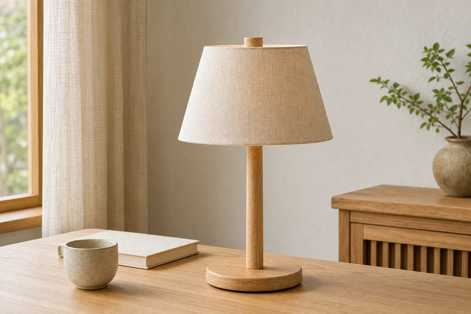 ## What defines the style
Japandi scenes usually use natural wood, warm neutrals, soft daylight, simple surfaces, low clutter, and quiet proportions. The product should feel integrated, not lost.
## Workflow
1. Preserve product shape, wood grain, fabric, ceramic, or metal finish.
2. Choose one room or surface context.
3. Use low-clutter props and soft natural light.
4. Keep scale believable.
5. Check product readability in thumbnail view.
## Where KrafLayer Fits
When you apply this Create Japandi Natural Wood Product Scenes workflow in KrafLayer, the tool choice matters: use Replace BG for a prompted or reference-based scene, or Scene Compose when product position and scale must match a base scene. After generation, judge the image by the channel it serves — listing images, detail pages, or ad assets — and check that scale, material, placement, and shadow still make sense in the space.
## Prompt to use in KrafLayer
~~~text
Use the uploaded home product as the exact reference. Create a Japandi-inspired natural wood ecommerce scene with warm neutral tones, soft daylight, simple surfaces, and low-clutter styling. Preserve product shape, material grain, color, proportions, scale, and contact shadow. Keep the product as the clear hero. Do not change the design, overcrowd the room, distort scale, or hide important details.
~~~
## FAQ
### What products fit Japandi scenes?
Home decor, lamps, ceramics, textiles, storage, furniture, and tabletop products often work well.
### How do I avoid a generic beige room?
Name the product material and room role, then use one or two meaningful props instead of a vague neutral scene.
### Is Japandi good for ads?
Yes, especially for calm premium home products. Keep product recognition strong for mobile placements.
# 小红书爆款商品封面 AI 设计怎么做
URL: https://kraflayer.com/zh/blog/xiaohongshu-viral-product-cover-ai-design
Summary: 小红书封面要在种草流里让用户停下。AI 设计应围绕目标人群、使用前后、场景痛点和真实商品亮点,而不是只做粉嫩背景和大字标题。可在 KrafLayer 中按同一流程完成。
Updated: 2026-06-12
# 小红书爆款商品封面 AI 设计怎么做
## TL;DR
小红书爆款商品封面 AI 设计这类任务,可以在 KrafLayer 里给真实商品图换场景或合成场景:用 Replace BG 生成文字或参考图驱动的场景;已有基础场景且要控制位置和比例时,用 Scene Compose。场景要服务小红书封面,同时保证商品形状、材质、标签、颜色、比例和配件仍然对应原始 SKU。
小红书商品封面不是普通电商主图。用户不是来“检索商品参数”的,而是在信息流里被一个具体场景、痛点或审美理由吸引。封面的任务是让人停下,而不是一次讲完所有卖点。
AI 可以帮助你快速测试不同封面方向,但爆款感来自清晰的人群和场景:谁需要它,解决什么问题,为什么现在要点进去看。
## 什么时候适合做小红书封面
新品种草、测评笔记、好物合集、节日送礼、使用前后、改造类内容,都适合做封面。美妆、家居、穿搭、母婴、宠物、食品和数码配件尤其明显。
如果商品本身很普通,封面要把“使用情境”讲清楚,而不是只放一个产品抠图。
## 怎么做
先写一句封面钩子。不要从“高级感商品图”开始,而是从用户问题开始,比如“租房桌面变干净”“黄皮也能用的奶茶色”“小户型收纳不显乱”。
商品必须真实清楚。小红书可以有氛围,但用户点进来后仍要认得这是同一个商品。
构图留出标题区。标题不要压住产品关键细节,字体不需要花,清楚比复杂更重要。
背景要像生活内容,而不是广告棚拍。真实桌面、卧室角落、包内收纳、使用前后对比,比空泛渐变更有效。
## 注意事项
不要虚构功效、前后对比或用户评价。小红书用户对假种草很敏感。
不要把每张封面都做成同一套粉色大字模板。不同品类要有不同视觉语言。
## KrafLayer 放在流程里的位置
把小红书爆款商品封面 AI 设计放到 KrafLayer 里做时,先选对工具:用 Replace BG 生成文字或参考图驱动的场景;已有基础场景且要控制位置和比例时,用 Scene Compose。生成后不要只看画面是否更漂亮,要按小红书封面的使用场景检查:商品形状、材质、标签、颜色、比例和配件仍然对应原始 SKU。
## 可直接使用的 Prompt
基于这张商品图,生成一张适合小红书种草笔记封面的商品图。保留商品真实外观、颜色、材质、logo、包装和比例,不要改变 SKU。围绕一个具体人群痛点或使用场景设计画面,背景自然、有生活感,商品清晰突出,预留标题区域但不要遮挡商品关键细节。整体真实、干净、有停留感,适合移动端信息流封面。
## 总结
小红书封面要先回答“为什么我该点开”。真实商品、具体场景、一个明确钩子,比统一的爆款模板更有用。
## FAQ
### 小红书封面一定要放文字吗?
不一定,但多数商品种草需要一句清楚钩子。文字要短,服务点击理由,不要堆参数。
### AI 可以做使用前后对比吗?
可以做排版和场景辅助,但对比结果必须真实,不能夸大效果。
### 怎么减少 AI 味?
用真实生活场景、克制光线、少量道具和具体问题表达,不要满屏柔光、花字和夸张滤镜。
# Etsy 复古手工风商品图生成器怎么用
URL: https://kraflayer.com/zh/blog/etsy-vintage-handmade-product-image-generator
Summary: Etsy 商品图需要让买家感到真实、独特和可收藏。复古手工风应保留材质纹理、制作痕迹、尺寸感和包装温度,而不是简单加黄旧滤镜。可在 KrafLayer 中按同一流程完成。
Updated: 2026-06-12
# Etsy 复古手工风商品图生成器怎么用
## TL;DR
Etsy 复古手工风商品图生成器这类任务,可以在 KrafLayer 里给真实商品图换场景或合成场景:用 Replace BG 生成文字或参考图驱动的场景;已有基础场景且要控制位置和比例时,用 Scene Compose。场景要服务Etsy 列表图,同时保证商品形状、材质、标签、颜色、比例和配件仍然对应原始 SKU。
Etsy 买家通常不是只买一个便宜商品,而是在找独特、手作、有故事感的东西。复古手工风图片的重点不是把画面调黄,也不是堆老木板和蕾丝,而是让材质、手作痕迹、尺寸和使用场景看起来真实可信。
适合这种风格的品类包括手工首饰、陶瓷、蜡烛、皮具、纸品、刺绣、家居摆件、复古服饰和礼品包装。
## 什么场景适合
如果产品本身有天然材质、手工纹理、小批量制作感或礼物属性,就适合复古手工风。工业感强、亮面塑料、强功能型商品则不一定适合。
Etsy 图不需要像平台白底图那样绝对干净,但商品主体仍要清楚。买家要能看到纹理、边缘、瑕疵、厚度和尺寸。
## 怎么做
先保留手作痕迹。陶瓷釉面不均、皮革纹理、金属细划痕、纸张纤维、织物纹路,都比过度精修更有价值。
背景选择要克制。木桌、亚麻布、旧书、干花、纸袋、暖光窗边都可以,但不能把商品淹没成道具图。
如果是礼品类,可以加入包装场景;如果是首饰,要补充佩戴或手持尺寸参考;如果是家居摆件,要展示放在空间里的比例。
## 注意事项
不要让 AI 把“手工”变成“粗糙”。复古不等于脏,手作不等于低质。
不要改变商品的纹理和瑕疵位置。真实手作商品的细节差异本身就是卖点。
## KrafLayer 放在流程里的位置
把Etsy 复古手工风商品图生成器放到 KrafLayer 里做时,先选对工具:用 Replace BG 生成文字或参考图驱动的场景;已有基础场景且要控制位置和比例时,用 Scene Compose。生成后不要只看画面是否更漂亮,要按Etsy 列表图的使用场景检查:商品形状、材质、标签、颜色、比例和配件仍然对应原始 SKU。
## 可直接使用的 Prompt
基于这张 Etsy 手工/复古商品图,生成一张温暖真实的复古手作风电商图片。保留商品真实形状、颜色、材质纹理、手工痕迹、尺寸比例和细节,不要过度磨皮或改成全新工业质感。背景使用木桌、亚麻布、纸张、暖窗光或少量复古道具,画面自然、有故事感,但商品主体清晰突出,适合 Etsy 列表图和详情页。
## 总结
Etsy 复古手工风的核心是“真实的独特感”。不要用滤镜假装有故事,而要把材质、工艺和尺寸讲清楚。
## FAQ
### Etsy 商品图需要白底吗?
可以有白底图,但复古手作类通常还需要场景图、细节图和尺寸参考图。
### 复古风是不是越旧越好?
不是。画面可以温暖、有时间感,但商品要干净、可信、可购买。
### AI 会不会抹掉手工细节?
会,所以 Prompt 里要明确保留纹理、手工痕迹、边缘和自然小差异。
# How to Create Realistic AI Lifestyle Product Images Without Looking Staged
URL: https://kraflayer.com/blog/realistic-ai-lifestyle-product-images-without-looking-staged
Summary: A lifestyle product image workflow for realism: create believable scenes, preserve product identity, avoid over-styling, and keep buyer-use context clear. Includes how to do it in KrafLayer.
Updated: 2026-08-21
## TL;DR
For Create Realistic AI Lifestyle Product Images Without Looking Staged, KrafLayer helps when the product is real but the surrounding scene needs work. Use Replace BG for a prompted or reference-based scene, or Scene Compose when product position and scale must match a base scene. Use the scene to support listing images, detail pages, or ad assets, then check that scale, material, placement, and shadow still make sense in the space.
Realistic lifestyle product images work when the scene feels lived-in but still intentional. They fail when every prop looks arranged for the camera or the product becomes a small object inside a fake room.
## What defines the style
Japandi scenes usually use natural wood, warm neutrals, soft daylight, simple surfaces, low clutter, and quiet proportions. The product should feel integrated, not lost.
## Workflow
1. Preserve product shape, wood grain, fabric, ceramic, or metal finish.
2. Choose one room or surface context.
3. Use low-clutter props and soft natural light.
4. Keep scale believable.
5. Check product readability in thumbnail view.
## Where KrafLayer Fits
When you apply this Create Japandi Natural Wood Product Scenes workflow in KrafLayer, the tool choice matters: use Replace BG for a prompted or reference-based scene, or Scene Compose when product position and scale must match a base scene. After generation, judge the image by the channel it serves — listing images, detail pages, or ad assets — and check that scale, material, placement, and shadow still make sense in the space.
## Prompt to use in KrafLayer
~~~text
Use the uploaded home product as the exact reference. Create a Japandi-inspired natural wood ecommerce scene with warm neutral tones, soft daylight, simple surfaces, and low-clutter styling. Preserve product shape, material grain, color, proportions, scale, and contact shadow. Keep the product as the clear hero. Do not change the design, overcrowd the room, distort scale, or hide important details.
~~~
## FAQ
### What products fit Japandi scenes?
Home decor, lamps, ceramics, textiles, storage, furniture, and tabletop products often work well.
### How do I avoid a generic beige room?
Name the product material and room role, then use one or two meaningful props instead of a vague neutral scene.
### Is Japandi good for ads?
Yes, especially for calm premium home products. Keep product recognition strong for mobile placements.
# 小红书爆款商品封面 AI 设计怎么做
URL: https://kraflayer.com/zh/blog/xiaohongshu-viral-product-cover-ai-design
Summary: 小红书封面要在种草流里让用户停下。AI 设计应围绕目标人群、使用前后、场景痛点和真实商品亮点,而不是只做粉嫩背景和大字标题。可在 KrafLayer 中按同一流程完成。
Updated: 2026-06-12
# 小红书爆款商品封面 AI 设计怎么做
## TL;DR
小红书爆款商品封面 AI 设计这类任务,可以在 KrafLayer 里给真实商品图换场景或合成场景:用 Replace BG 生成文字或参考图驱动的场景;已有基础场景且要控制位置和比例时,用 Scene Compose。场景要服务小红书封面,同时保证商品形状、材质、标签、颜色、比例和配件仍然对应原始 SKU。
小红书商品封面不是普通电商主图。用户不是来“检索商品参数”的,而是在信息流里被一个具体场景、痛点或审美理由吸引。封面的任务是让人停下,而不是一次讲完所有卖点。
AI 可以帮助你快速测试不同封面方向,但爆款感来自清晰的人群和场景:谁需要它,解决什么问题,为什么现在要点进去看。
## 什么时候适合做小红书封面
新品种草、测评笔记、好物合集、节日送礼、使用前后、改造类内容,都适合做封面。美妆、家居、穿搭、母婴、宠物、食品和数码配件尤其明显。
如果商品本身很普通,封面要把“使用情境”讲清楚,而不是只放一个产品抠图。
## 怎么做
先写一句封面钩子。不要从“高级感商品图”开始,而是从用户问题开始,比如“租房桌面变干净”“黄皮也能用的奶茶色”“小户型收纳不显乱”。
商品必须真实清楚。小红书可以有氛围,但用户点进来后仍要认得这是同一个商品。
构图留出标题区。标题不要压住产品关键细节,字体不需要花,清楚比复杂更重要。
背景要像生活内容,而不是广告棚拍。真实桌面、卧室角落、包内收纳、使用前后对比,比空泛渐变更有效。
## 注意事项
不要虚构功效、前后对比或用户评价。小红书用户对假种草很敏感。
不要把每张封面都做成同一套粉色大字模板。不同品类要有不同视觉语言。
## KrafLayer 放在流程里的位置
把小红书爆款商品封面 AI 设计放到 KrafLayer 里做时,先选对工具:用 Replace BG 生成文字或参考图驱动的场景;已有基础场景且要控制位置和比例时,用 Scene Compose。生成后不要只看画面是否更漂亮,要按小红书封面的使用场景检查:商品形状、材质、标签、颜色、比例和配件仍然对应原始 SKU。
## 可直接使用的 Prompt
基于这张商品图,生成一张适合小红书种草笔记封面的商品图。保留商品真实外观、颜色、材质、logo、包装和比例,不要改变 SKU。围绕一个具体人群痛点或使用场景设计画面,背景自然、有生活感,商品清晰突出,预留标题区域但不要遮挡商品关键细节。整体真实、干净、有停留感,适合移动端信息流封面。
## 总结
小红书封面要先回答“为什么我该点开”。真实商品、具体场景、一个明确钩子,比统一的爆款模板更有用。
## FAQ
### 小红书封面一定要放文字吗?
不一定,但多数商品种草需要一句清楚钩子。文字要短,服务点击理由,不要堆参数。
### AI 可以做使用前后对比吗?
可以做排版和场景辅助,但对比结果必须真实,不能夸大效果。
### 怎么减少 AI 味?
用真实生活场景、克制光线、少量道具和具体问题表达,不要满屏柔光、花字和夸张滤镜。
# Etsy 复古手工风商品图生成器怎么用
URL: https://kraflayer.com/zh/blog/etsy-vintage-handmade-product-image-generator
Summary: Etsy 商品图需要让买家感到真实、独特和可收藏。复古手工风应保留材质纹理、制作痕迹、尺寸感和包装温度,而不是简单加黄旧滤镜。可在 KrafLayer 中按同一流程完成。
Updated: 2026-06-12
# Etsy 复古手工风商品图生成器怎么用
## TL;DR
Etsy 复古手工风商品图生成器这类任务,可以在 KrafLayer 里给真实商品图换场景或合成场景:用 Replace BG 生成文字或参考图驱动的场景;已有基础场景且要控制位置和比例时,用 Scene Compose。场景要服务Etsy 列表图,同时保证商品形状、材质、标签、颜色、比例和配件仍然对应原始 SKU。
Etsy 买家通常不是只买一个便宜商品,而是在找独特、手作、有故事感的东西。复古手工风图片的重点不是把画面调黄,也不是堆老木板和蕾丝,而是让材质、手作痕迹、尺寸和使用场景看起来真实可信。
适合这种风格的品类包括手工首饰、陶瓷、蜡烛、皮具、纸品、刺绣、家居摆件、复古服饰和礼品包装。
## 什么场景适合
如果产品本身有天然材质、手工纹理、小批量制作感或礼物属性,就适合复古手工风。工业感强、亮面塑料、强功能型商品则不一定适合。
Etsy 图不需要像平台白底图那样绝对干净,但商品主体仍要清楚。买家要能看到纹理、边缘、瑕疵、厚度和尺寸。
## 怎么做
先保留手作痕迹。陶瓷釉面不均、皮革纹理、金属细划痕、纸张纤维、织物纹路,都比过度精修更有价值。
背景选择要克制。木桌、亚麻布、旧书、干花、纸袋、暖光窗边都可以,但不能把商品淹没成道具图。
如果是礼品类,可以加入包装场景;如果是首饰,要补充佩戴或手持尺寸参考;如果是家居摆件,要展示放在空间里的比例。
## 注意事项
不要让 AI 把“手工”变成“粗糙”。复古不等于脏,手作不等于低质。
不要改变商品的纹理和瑕疵位置。真实手作商品的细节差异本身就是卖点。
## KrafLayer 放在流程里的位置
把Etsy 复古手工风商品图生成器放到 KrafLayer 里做时,先选对工具:用 Replace BG 生成文字或参考图驱动的场景;已有基础场景且要控制位置和比例时,用 Scene Compose。生成后不要只看画面是否更漂亮,要按Etsy 列表图的使用场景检查:商品形状、材质、标签、颜色、比例和配件仍然对应原始 SKU。
## 可直接使用的 Prompt
基于这张 Etsy 手工/复古商品图,生成一张温暖真实的复古手作风电商图片。保留商品真实形状、颜色、材质纹理、手工痕迹、尺寸比例和细节,不要过度磨皮或改成全新工业质感。背景使用木桌、亚麻布、纸张、暖窗光或少量复古道具,画面自然、有故事感,但商品主体清晰突出,适合 Etsy 列表图和详情页。
## 总结
Etsy 复古手工风的核心是“真实的独特感”。不要用滤镜假装有故事,而要把材质、工艺和尺寸讲清楚。
## FAQ
### Etsy 商品图需要白底吗?
可以有白底图,但复古手作类通常还需要场景图、细节图和尺寸参考图。
### 复古风是不是越旧越好?
不是。画面可以温暖、有时间感,但商品要干净、可信、可购买。
### AI 会不会抹掉手工细节?
会,所以 Prompt 里要明确保留纹理、手工痕迹、边缘和自然小差异。
# How to Create Realistic AI Lifestyle Product Images Without Looking Staged
URL: https://kraflayer.com/blog/realistic-ai-lifestyle-product-images-without-looking-staged
Summary: A lifestyle product image workflow for realism: create believable scenes, preserve product identity, avoid over-styling, and keep buyer-use context clear. Includes how to do it in KrafLayer.
Updated: 2026-08-21
## TL;DR
For Create Realistic AI Lifestyle Product Images Without Looking Staged, KrafLayer helps when the product is real but the surrounding scene needs work. Use Replace BG for a prompted or reference-based scene, or Scene Compose when product position and scale must match a base scene. Use the scene to support listing images, detail pages, or ad assets, then check that scale, material, placement, and shadow still make sense in the space.
Realistic lifestyle product images work when the scene feels lived-in but still intentional. They fail when every prop looks arranged for the camera or the product becomes a small object inside a fake room.
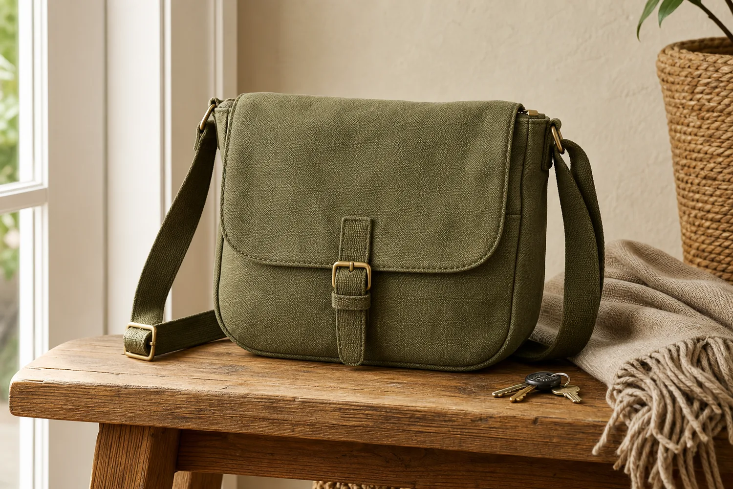 ## What makes lifestyle images believable
Believability comes from ordinary surfaces, natural light, correct scale, sensible props, and imperfect-but-clean spacing. The product should look usable, not staged for a showroom.
## Workflow
1. Pick a real use moment: entryway, desk, kitchen, bathroom, gym bag, nightstand, or travel setup.
2. Keep the product large enough to inspect.
3. Use only props that would naturally be there.
4. Match shadow and scale to the surface.
5. Remove anything that makes the scene look like stock photography.
## Where KrafLayer Fits
When you apply this Create Realistic AI Lifestyle Product Images Without Looking Staged workflow in KrafLayer, the tool choice matters: use Replace BG for a prompted or reference-based scene, or Scene Compose when product position and scale must match a base scene. After generation, judge the image by the channel it serves — listing images, detail pages, or ad assets — and check that scale, material, placement, and shadow still make sense in the space.
## Prompt to use in KrafLayer
~~~text
Use the uploaded product as the exact reference. Create a realistic ecommerce lifestyle image in [specific everyday scene]. Preserve product shape, color, material, logo area, scale, and natural shadow. Use believable light, ordinary surfaces, and minimal props that support real use. Keep the product clearly visible. Do not over-stage the scene, add unrelated decor, change the SKU, or hide key details.
~~~
## FAQ
### Why do AI lifestyle images look staged?
The scene is often too perfect or too full of props. Use a specific real moment and fewer objects.
### Should the product be centered?
Not always, but it should be visually dominant enough for ecommerce. Lifestyle does not mean the product becomes background.
### Can lifestyle images replace product-only images?
No. Use them to support product-only images by showing scale, use, and mood.
# Pinduoduo vs 1688 Main Images: A Practical Design Guide
URL: https://kraflayer.com/blog/pinduoduo-1688-differentiated-high-click-main-image-design
Summary: Design different Pinduoduo and 1688 main images from one verified product master, with consumer and B2B buyer intent, image sequences, AI prompts, and accuracy checks.
Updated: 2026-08-22
Pinduoduo and 1688 main images should not be designed as the same thumbnail with a different logo. Pinduoduo is a consumer shopping environment, so the first image must identify the product and value quickly. 1688 is a business-to-business sourcing platform, so the image set must also help a buyer judge specification, supply, customization, and procurement fit. Accuracy comes before visual aggression on both platforms.
This guide uses public Pinduoduo and 1688 agreements checked on August 22, 2026, plus current seller-workflow principles. Public platform documents do not expose every category's current upload dimensions or campaign-specific creative rules. Verify those details inside the relevant seller center before export; do not copy a third-party “2026 size chart” into a production workflow without checking it.
> **Quick Summary**
> Pinduoduo main images should win a small-screen recognition test: clear SKU, strong silhouette, one value cue, and no misleading additions. 1688 images should pass a procurement test: exact product, visible specification, scalable supply context, and reusable detail evidence. Build separate first images from the same verified product master.
## Abstract
The highest-value difference is buyer intent. A Pinduoduo shopper asks, “Is this the product and offer I want?” A 1688 buyer also asks, “Can this supplier provide the right specification at the right volume?” Use separate image sequences, protect product facts, keep text editable, and test every first image at actual feed size.
## Key takeaways
- Design for two buying jobs, not two platform names.
- Keep the SKU large and recognizable before adding any value cue.
- Pinduoduo needs fast consumer comprehension; 1688 needs procurement evidence.
- Never invent prices, certifications, capacity, MOQ, materials, or included items with AI.
- Verify current category and campaign rules inside each seller center before publishing.
## Table of contents
1. [Why the platforms need different images](#why-should-pinduoduo-and-1688-use-different-main-images)
2. [What both platforms have in common](#what-must-both-platforms-get-right)
3. [Pinduoduo first-image strategy](#how-should-a-pinduoduo-main-image-work)
4. [1688 first-image strategy](#how-should-a-1688-main-image-work)
5. [Five-image sequences](#what-should-the-five-image-sequence-show)
6. [Thumbnail differentiation](#how-do-you-create-differentiation-without-making-the-image-noisy)
7. [AI workflow](#how-do-you-build-these-images-with-ai)
8. [Quality control](#what-should-you-check-before-publishing)
9. [FAQ](#frequently-asked-questions)
## Why should Pinduoduo and 1688 use different main images?
1688's official service terms define it as a commercial trade procurement platform rather than a consumer purchase market. Pinduoduo's user agreement describes a consumer shopping platform where merchants upload product name, price, model, specification, size, quality promises, defects, and use restrictions. Those different transaction contexts should change what the first image communicates ([1688 Service Terms](https://terms.alicdn.com/legal-agreement/terms/suit_bu1_b2b/suit_bu1_b2b201703271338_74297.html); [Pinduoduo User Agreement](https://www.yangkeduo.com/pdd_user_services_agreement.pdf), 2026).
On Pinduoduo, the first image competes in a dense mobile feed. It needs immediate product recognition, a clear category cue, and one truthful reason to inspect the listing. Extra supplier information usually belongs later.
On 1688, the first image still needs a strong silhouette, but the sequence must support a sourcing decision. A buyer may care about material, size range, package configuration, customization, production context, and whether the listing image can be reused downstream. A decorative lifestyle scene without procurement evidence can attract attention while answering very little.
The same product master can feed both platforms. The final layouts should not be mechanically identical.
## What makes lifestyle images believable
Believability comes from ordinary surfaces, natural light, correct scale, sensible props, and imperfect-but-clean spacing. The product should look usable, not staged for a showroom.
## Workflow
1. Pick a real use moment: entryway, desk, kitchen, bathroom, gym bag, nightstand, or travel setup.
2. Keep the product large enough to inspect.
3. Use only props that would naturally be there.
4. Match shadow and scale to the surface.
5. Remove anything that makes the scene look like stock photography.
## Where KrafLayer Fits
When you apply this Create Realistic AI Lifestyle Product Images Without Looking Staged workflow in KrafLayer, the tool choice matters: use Replace BG for a prompted or reference-based scene, or Scene Compose when product position and scale must match a base scene. After generation, judge the image by the channel it serves — listing images, detail pages, or ad assets — and check that scale, material, placement, and shadow still make sense in the space.
## Prompt to use in KrafLayer
~~~text
Use the uploaded product as the exact reference. Create a realistic ecommerce lifestyle image in [specific everyday scene]. Preserve product shape, color, material, logo area, scale, and natural shadow. Use believable light, ordinary surfaces, and minimal props that support real use. Keep the product clearly visible. Do not over-stage the scene, add unrelated decor, change the SKU, or hide key details.
~~~
## FAQ
### Why do AI lifestyle images look staged?
The scene is often too perfect or too full of props. Use a specific real moment and fewer objects.
### Should the product be centered?
Not always, but it should be visually dominant enough for ecommerce. Lifestyle does not mean the product becomes background.
### Can lifestyle images replace product-only images?
No. Use them to support product-only images by showing scale, use, and mood.
# Pinduoduo vs 1688 Main Images: A Practical Design Guide
URL: https://kraflayer.com/blog/pinduoduo-1688-differentiated-high-click-main-image-design
Summary: Design different Pinduoduo and 1688 main images from one verified product master, with consumer and B2B buyer intent, image sequences, AI prompts, and accuracy checks.
Updated: 2026-08-22
Pinduoduo and 1688 main images should not be designed as the same thumbnail with a different logo. Pinduoduo is a consumer shopping environment, so the first image must identify the product and value quickly. 1688 is a business-to-business sourcing platform, so the image set must also help a buyer judge specification, supply, customization, and procurement fit. Accuracy comes before visual aggression on both platforms.
This guide uses public Pinduoduo and 1688 agreements checked on August 22, 2026, plus current seller-workflow principles. Public platform documents do not expose every category's current upload dimensions or campaign-specific creative rules. Verify those details inside the relevant seller center before export; do not copy a third-party “2026 size chart” into a production workflow without checking it.
> **Quick Summary**
> Pinduoduo main images should win a small-screen recognition test: clear SKU, strong silhouette, one value cue, and no misleading additions. 1688 images should pass a procurement test: exact product, visible specification, scalable supply context, and reusable detail evidence. Build separate first images from the same verified product master.
## Abstract
The highest-value difference is buyer intent. A Pinduoduo shopper asks, “Is this the product and offer I want?” A 1688 buyer also asks, “Can this supplier provide the right specification at the right volume?” Use separate image sequences, protect product facts, keep text editable, and test every first image at actual feed size.
## Key takeaways
- Design for two buying jobs, not two platform names.
- Keep the SKU large and recognizable before adding any value cue.
- Pinduoduo needs fast consumer comprehension; 1688 needs procurement evidence.
- Never invent prices, certifications, capacity, MOQ, materials, or included items with AI.
- Verify current category and campaign rules inside each seller center before publishing.
## Table of contents
1. [Why the platforms need different images](#why-should-pinduoduo-and-1688-use-different-main-images)
2. [What both platforms have in common](#what-must-both-platforms-get-right)
3. [Pinduoduo first-image strategy](#how-should-a-pinduoduo-main-image-work)
4. [1688 first-image strategy](#how-should-a-1688-main-image-work)
5. [Five-image sequences](#what-should-the-five-image-sequence-show)
6. [Thumbnail differentiation](#how-do-you-create-differentiation-without-making-the-image-noisy)
7. [AI workflow](#how-do-you-build-these-images-with-ai)
8. [Quality control](#what-should-you-check-before-publishing)
9. [FAQ](#frequently-asked-questions)
## Why should Pinduoduo and 1688 use different main images?
1688's official service terms define it as a commercial trade procurement platform rather than a consumer purchase market. Pinduoduo's user agreement describes a consumer shopping platform where merchants upload product name, price, model, specification, size, quality promises, defects, and use restrictions. Those different transaction contexts should change what the first image communicates ([1688 Service Terms](https://terms.alicdn.com/legal-agreement/terms/suit_bu1_b2b/suit_bu1_b2b201703271338_74297.html); [Pinduoduo User Agreement](https://www.yangkeduo.com/pdd_user_services_agreement.pdf), 2026).
On Pinduoduo, the first image competes in a dense mobile feed. It needs immediate product recognition, a clear category cue, and one truthful reason to inspect the listing. Extra supplier information usually belongs later.
On 1688, the first image still needs a strong silhouette, but the sequence must support a sourcing decision. A buyer may care about material, size range, package configuration, customization, production context, and whether the listing image can be reused downstream. A decorative lifestyle scene without procurement evidence can attract attention while answering very little.
The same product master can feed both platforms. The final layouts should not be mechanically identical.
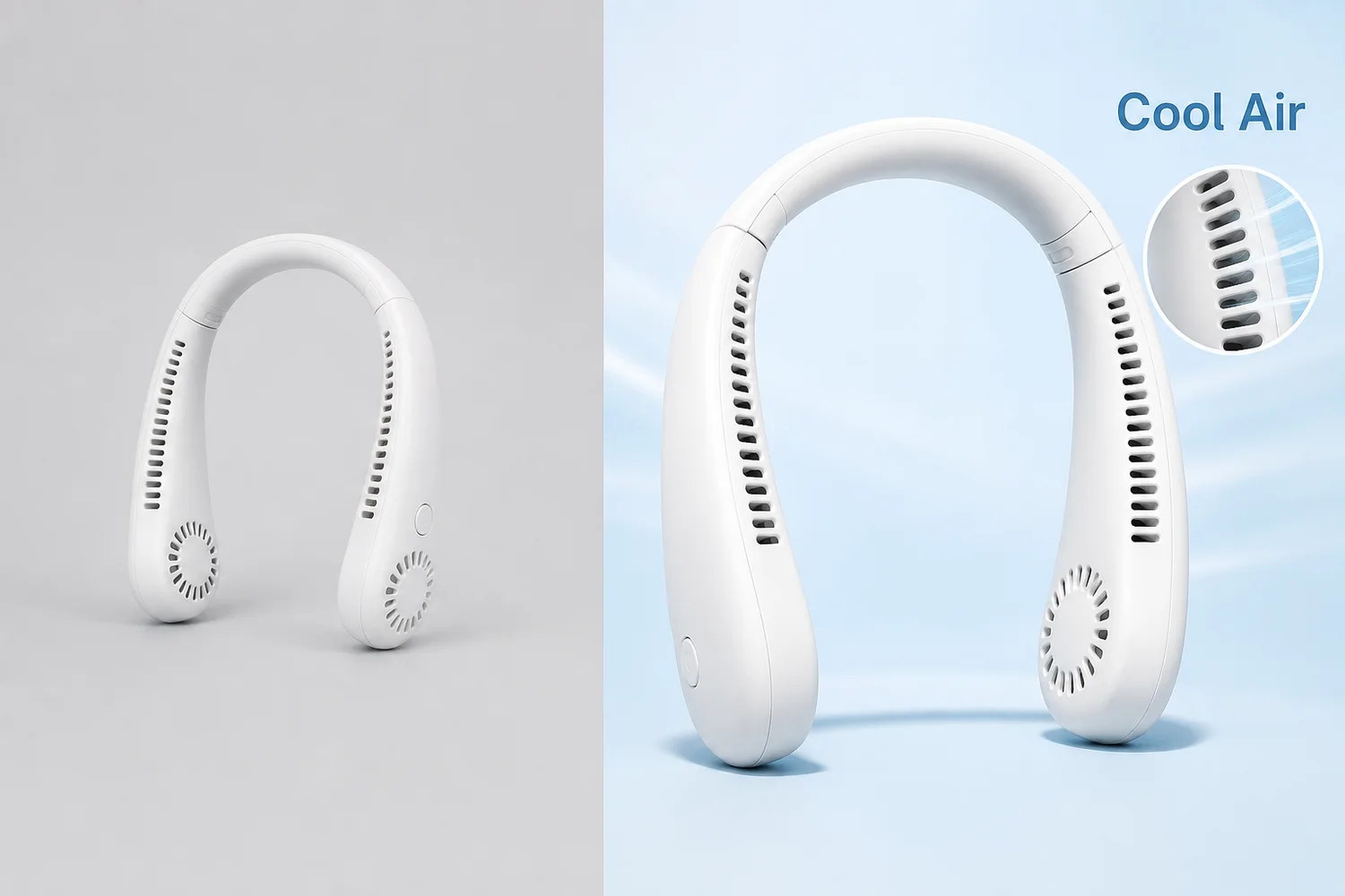 *KrafLayer demonstration asset. Use it to inspect product size, silhouette, functional openings, color, and text space. It is not evidence that a specific layout produces a higher click-through rate.*
## What must both platforms get right?
Pinduoduo says merchants are responsible for accurate, complete, reliable, and non-misleading product descriptions. 1688 requires published product information to be truthful and consistent with the actual item. An image that earns a click by changing the product creates the wrong kind of traffic ([Pinduoduo User Agreement](https://www.yangkeduo.com/pdd_user_services_agreement.pdf); [1688 Service Terms](https://terms.alicdn.com/legal-agreement/terms/suit_bu1_b2b/suit_bu1_b2b201703271338_74297.html), 2026).
Every first image should pass five checks before visual styling begins:
| Check | The image must show | Reject when |
|---|---|---|
| Identity | Correct SKU, color, shape, label, and configuration | It resembles another variant |
| Recognition | A readable silhouette at small size | Props or text hide the product |
| Truth | Only real features, contents, and claims | AI invents an accessory or benefit |
| Hierarchy | Product first, one supporting cue second | Five claims compete at once |
| Continuity | The same product continues through the gallery | Later images change parts or material |
Keep a plain product master and a transparent cutout before building platform variants. When a layout fails, return to the master. Do not repair an already distorted derivative.
## How should a Pinduoduo main image work?
Pinduoduo's public agreement places responsibility for price, model, specification, size, promises, defects, and use limitations on the merchant. The first image should therefore attract attention without implying a different offer from the listing page ([Pinduoduo User Agreement](https://www.yangkeduo.com/pdd_user_services_agreement.pdf), 2026).
Use this hierarchy:
1. **Product silhouette:** the exact item should be recognizable before any text is read.
2. **One value cue:** choose function, quantity, material, use case, or variant. Do not stack all five.
3. **Clean contrast:** separate the product from the background without shifting its real color.
4. **Editable information:** add prices, promotions, and claims manually from verified listing data.
5. **Mobile legibility:** inspect the image at roughly the size it appears in the feed, not only on a desktop canvas.
For a portable neck fan, the first frame might show the complete product large against a restrained contrasting field, with one accurate functional cue such as hands-free airflow. It should not add dramatic vapor, medical comfort claims, an invented battery duration, or accessories that are not included.
Consumer differentiation often comes from viewpoint and use cue rather than extra decoration. Try a slightly elevated three-quarter angle, a color field that separates the SKU, or a clear visual explanation of one mechanism. If the product could be replaced with a competitor's item without changing the layout, the concept is not differentiated yet.
## How should a 1688 main image work?
1688's terms state that it is a B2B procurement platform and require sellers to keep published product information truthful and consistent with what they supply. The main image should open the conversation, while the following images reduce procurement uncertainty ([1688 Service Terms](https://terms.alicdn.com/legal-agreement/terms/suit_bu1_b2b/suit_bu1_b2b201703271338_74297.html), 2026).
The first frame still needs a complete, clear product. The difference appears in the supporting cue and sequence. Depending on the category, useful B2B signals may include:
- a verified material or construction detail;
- a real color or size range;
- package configuration;
- customization area shown without inventing a customer logo;
- a product family that is actually available;
- manufacturing or warehouse context that belongs to the supplier;
- exact specifications pulled from the seller's product data.
Do not turn the first frame into a catalog sheet. Use one procurement cue, then move dimensions, packaging, material layers, and customization examples into later images where they can be read.
The 1688 legal statement also says sellers are responsible for uploaded product descriptions, images, and video. AI-assisted optimization does not transfer that responsibility to the tool. If an image invents a production line, certification mark, factory scale, or available variant, remove it ([1688 Legal Statement](https://terms.alicdn.com/legal-agreement/terms/suit_bu1_b2b/suit_bu1_b2b201802011532_36855.html), 2026).
## What should the five-image sequence show?
1688 authorizes platform and downstream buyers to use merchant product information, including main images and product details, in distribution workflows. That makes reusable factual imagery particularly valuable. Build a sequence that can survive sourcing, quotation, and downstream listing preparation ([1688 User Experience Service Agreement](https://terms.alicdn.com/legal-agreement/terms/b_end_product_protocol/20240325150850953/20240325150850953.html), 2026).
| Position | Pinduoduo job | 1688 job |
|---|---|---|
| 1 | Product recognition plus one consumer value cue | Product recognition plus one procurement cue |
| 2 | Real use context or primary function | Specification, material, or construction proof |
| 3 | Detail, scale, or included items | Size/color range or package configuration |
| 4 | Variant choice or secondary benefit | Customization area or verified production context |
| 5 | Plain factual product/contents view | Clean reusable product image for downstream buyers |
This is a planning model, not a claim about a universal required image count. Category, campaign, and seller-center requirements can differ. If the current upload interface requires a white-background asset, a specific ratio, or a particular image position, follow that rule rather than this editorial sequence.
For both platforms, keep dimensions and package quantities out of generated pixels until they have been checked against product data. AI can create the scene. A designer or catalog system should place exact numeric information.
## How do you create differentiation without making the image noisy?
Meta's photo-ad guidance recommends one focal point and says too much copy distracts from the image. Although Pinduoduo and 1688 are different platforms, the visual principle transfers cleanly: the first frame needs one dominant subject and one secondary message, not a wall of competing elements ([Meta photo ads](https://www.facebook.com/business/ads/photo-ad-format), 2026).
Use a three-pass thumbnail test:
1. **Silhouette pass:** blur or shrink the image. Can you still identify the product category and main form?
2. **Value pass:** look for two seconds. Can you name the single value cue without reading a paragraph?
3. **Truth pass:** compare with the source and listing data. Did the layout add a feature, accessory, size, claim, or quantity that is not real?
Strong differentiation can come from a useful angle, an accurate material close-up, a real use configuration, restrained category color, or a clearly staged feature. Weak differentiation comes from oversized badges, copied competitor layouts, random flames or splashes, false scarcity, and text that hides the item.
Build three concepts around different selling ideas, not three background colors around the same idea. For example: “wearable airflow,” “foldable storage,” and “verified controls.” Select the concept that matches the listing's strongest real evidence.
## How do you build these images with AI?
1688's user-experience agreement explicitly allows AI-based optimization of merchant product materials but warns that technical limitations can affect accuracy. That warning should shape the workflow: use AI for controlled production, then review every product fact before upload ([1688 User Experience Service Agreement](https://terms.alicdn.com/legal-agreement/terms/b_end_product_protocol/20240325150850953/20240325150850953.html), 2026).
1. **Prepare the evidence pack.** Keep a full-product image, side/back views, critical detail images, exact color, dimensions, contents, and approved claims.
2. **Create a clean master.** Use the one-click [AI background remover](/tools/ai-background-remover) when only the background is wrong. Inspect edges and transparency; it does not require a prompt.
3. **Choose the platform and image position.** Name whether you are designing Pinduoduo position one, a 1688 specification image, or another exact role.
4. **Build the scene narrowly.** Use Replace BG for a prompted or reference-based background. Use Scene Compose when a verified product must sit at a controlled position and size inside an existing base scene.
5. **Add exact text separately.** Keep price, quantity, material, specification, certification, and promotion copy editable and tied to the product database.
6. **Compare with the source.** Check silhouette, label, material, parts, color, scale, and included items.
7. **Export from the current seller-center rules.** Confirm ratio, file type, size, and campaign restrictions at upload time.
### Background prompt for a Pinduoduo concept
```text
Use the uploaded portable neck fan as the exact product reference. Create a clean mobile-commerce first-image background with strong separation and one visual cue for hands-free everyday use. Keep the complete product large and readable. Preserve its exact shape, vents, controls, color, material, and proportions. Leave a quiet area for manually added verified offer text. Do not add accessories, prices, claims, logos, certification marks, or text.
```
### Scene direction for a 1688 concept
```text
Place the uploaded product at a clear three-quarter angle on a neutral sourcing-catalog set. Preserve the exact SKU, material, controls, vents, color, dimensions, and included parts. Use restrained lighting that reveals construction. Leave space for manually added verified specification and package information. Do not invent factory equipment, production capacity, certifications, variants, MOQ, prices, or customer branding.
```
These prompts are appropriate for prompt-capable workflows such as Replace BG, Reference Image Editor, or Scene Compose. Do not paste them into one-click tools such as Remove BG or Upscale.
## What should you check before publishing?
Both Pinduoduo and 1688 place responsibility for merchant-supplied product information on the merchant. The final review should therefore compare the image with the SKU and listing data, not only with a design brief ([Pinduoduo User Agreement](https://www.yangkeduo.com/pdd_user_services_agreement.pdf); [1688 Legal Statement](https://terms.alicdn.com/legal-agreement/terms/suit_bu1_b2b/suit_bu1_b2b201802011532_36855.html), 2026).
- [ ] The first image shows the correct SKU and variant.
- [ ] Shape, label, material, controls, parts, and included items match the source.
- [ ] The product remains recognizable at actual feed thumbnail size.
- [ ] Only one main value or procurement cue competes with the product.
- [ ] Price, quantity, size, MOQ, capacity, and claims come from verified data.
- [ ] No platform logo, QR code, certification, customer brand, or factory scene was invented.
- [ ] Later images answer different buyer questions rather than repeat the first frame.
- [ ] Current category and campaign rules were checked inside the seller center.
- [ ] The original, clean master, editable text file, and final exports are retained.
After publishing, compare click-through rate and downstream behavior separately. A higher click-through rate with lower conversion or more complaints can indicate that the image overpromises or attracts the wrong buyer.
## Frequently asked questions
### Should Pinduoduo and 1688 use the same main image?
Use the same verified product master, but usually not the same final layout. Pinduoduo needs rapid consumer recognition and one clear value cue. 1688 also needs procurement evidence such as real specification, material, package, variant, or customization information.
### How much text should a marketplace main image contain?
Use as little as the current placement and category allow. One short, verified cue is easier to scan than several claims. Add exact prices, quantities, materials, and specifications manually so they remain editable and synchronized with the listing.
### Can AI design a high-click main image automatically?
AI can create backgrounds, compositions, and variants, but it cannot verify your offer, material, capacity, included items, or category rules. A merchant still needs to choose the selling idea, check product fidelity, add exact text, and review the current seller-center requirements.
### What should make a 1688 image different?
Show evidence useful to a sourcing decision: construction, material, size range, package configuration, real available variants, customization area, or verified supply context. Do not invent a factory, certification, production capacity, or MOQ to make the listing look larger.
### How do I know whether the image is too busy?
Shrink it to actual feed size and look for two seconds. You should recognize the product first and one supporting cue second. If badges, props, gradients, and text compete equally, simplify the layout.
## Conclusion
Pinduoduo and 1688 main images work best when they begin with the same product truth but end with different buyer intent. KrafLayer can help clean the product master, replace or compose backgrounds, create controlled visual concepts, and prepare platform-specific variants. The final responsibility stays with the merchant: verify the SKU, add exact commercial information manually, and export against the current seller-center rules.
## References
1. [Pinduoduo User Agreement](https://www.yangkeduo.com/pdd_user_services_agreement.pdf), accessed August 22, 2026.
2. [1688 Service Terms](https://terms.alicdn.com/legal-agreement/terms/suit_bu1_b2b/suit_bu1_b2b201703271338_74297.html), accessed August 22, 2026.
3. [1688 Legal Statement](https://terms.alicdn.com/legal-agreement/terms/suit_bu1_b2b/suit_bu1_b2b201802011532_36855.html), effective January 16, 2026.
4. [1688 User Experience Service Agreement](https://terms.alicdn.com/legal-agreement/terms/b_end_product_protocol/20240325150850953/20240325150850953.html), accessed August 22, 2026.
# AI 生成珠宝戒指佩戴效果图怎么保持尺寸
URL: https://kraflayer.com/zh/blog/keep-ring-size-accurate-in-ai-generated-jewelry-wearing-images
Summary: AI 生成戒指佩戴图时,最容易把戒指放大、改厚、改钻石比例。要用手指宽度、戒圈厚度、宝石尺寸和透视关系控制真实感。可在 KrafLayer 中按同一流程完成。
Updated: 2026-06-12
# AI 生成珠宝戒指佩戴效果图怎么保持尺寸
## TL;DR
AI 生成珠宝戒指佩戴效果图这类任务,KrafLayer 的作用是把真实商品参考图推进到可用的主图、详情图或广告素材,而不是重新发明商品。核心检查点是金属色、宝石比例、支架痕迹和微距细节准确。
戒指佩戴图能显著提升购买信心,但 AI 很容易把戒指做得过大、过亮、过厚,或者把宝石放大到不真实。珠宝用户对比例非常敏感,尺寸不准会直接影响信任。
这类图适合展示佩戴效果、手部比例、戒圈厚度、叠戴关系和礼物氛围,但不能替代清晰的产品细节图。
## 怎么做
先提供一张清楚的戒指产品图,最好能看到戒圈、主石、镶嵌、侧面厚度和金属颜色。
生成佩戴图时,要求戒指尺寸与真实规格一致。可以写明戒指是日常佩戴比例,不是夸张广告珠宝。
手部要自然,但不要让手抢走主体。指节、肤色、姿势和光线应服务戒指比例。
主石反光要真实。不要把小钻做成大克拉,也不要把金属颜色从黄金变成玫瑰金或白金。
## 注意事项
如果有具体尺寸,如主石毫米数、戒宽、戒围,可以放进 Prompt。没有尺寸时,至少要求“与普通手指比例真实”。
不要用过度微距让戒指看起来比实际大。详情图可以放大,但佩戴图要诚实。
## KrafLayer 放在流程里的位置
把AI 生成珠宝戒指佩戴效果图放到 KrafLayer 里做时,先固定商品参考图,再决定是修背景、补光线、做详情图还是延展广告版本。最后按主图、详情图或广告素材的使用场景检查:金属色、宝石比例、支架痕迹和微距细节准确。
## 可直接使用的 Prompt
基于这张戒指商品图,生成一张真实的珠宝佩戴效果图。保留戒指款式、金属颜色、戒圈厚度、宝石大小、镶嵌结构、纹理和比例,不要放大主石或改变材质。让戒指以真实日常佩戴尺寸出现在自然手指上,手部姿势简洁优雅,光线柔和,金属和宝石反光真实。画面适合珠宝详情页展示佩戴比例。
## 总结
戒指佩戴图的价值在于让用户判断“戴上是什么比例”。漂亮手模只是辅助,真实尺寸才是核心。
## FAQ
### AI 为什么容易把戒指做大?
因为广告图常用夸张微距和主石放大效果。Prompt 里必须要求真实日常比例。
### 可以生成叠戴图吗?
可以,但每枚戒指的厚度、位置和遮挡关系要合理,不能凭空增加不存在的款式。
### 佩戴图能代替尺寸表吗?
不能。佩戴图帮助理解比例,尺寸表仍然需要保留。
# How to Enlarge Small Product Images to Ecommerce Size
URL: https://kraflayer.com/blog/enlarge-small-product-images-to-ecommerce-size
Summary: A practical AI upscaling workflow for turning undersized product photos into listing-ready images without changing the product shape, material, crop, or selling details. Includes how to do it in KrafLayer.
Updated: 2026-08-21
## TL;DR
For Enlarge Small Product Images to Ecommerce Size, use KrafLayer as a fast pre-publishing edit step: run Upscale directly and inspect texture, edges, labels, and small text afterward. It is most useful for listing images, detail pages, or ad assets, as long as shape, material, labels, color, scale, and accessories still match the source SKU.
If a product image is too small for ecommerce, do not just stretch it in a design tool. Stretching gives you a larger file, but it does not restore the details buyers need: edge clarity, material texture, stitching, label readability, hardware, and a clean crop for product cards.
The better workflow is to upscale the image to the target listing size, then inspect whether the product still matches the original SKU. KrafLayer is an AI-powered visual editor for ecommerce product photography, and this task works best when the prompt treats size as a production requirement, not as a creative redesign.
*KrafLayer demonstration asset. Use it to inspect product size, silhouette, functional openings, color, and text space. It is not evidence that a specific layout produces a higher click-through rate.*
## What must both platforms get right?
Pinduoduo says merchants are responsible for accurate, complete, reliable, and non-misleading product descriptions. 1688 requires published product information to be truthful and consistent with the actual item. An image that earns a click by changing the product creates the wrong kind of traffic ([Pinduoduo User Agreement](https://www.yangkeduo.com/pdd_user_services_agreement.pdf); [1688 Service Terms](https://terms.alicdn.com/legal-agreement/terms/suit_bu1_b2b/suit_bu1_b2b201703271338_74297.html), 2026).
Every first image should pass five checks before visual styling begins:
| Check | The image must show | Reject when |
|---|---|---|
| Identity | Correct SKU, color, shape, label, and configuration | It resembles another variant |
| Recognition | A readable silhouette at small size | Props or text hide the product |
| Truth | Only real features, contents, and claims | AI invents an accessory or benefit |
| Hierarchy | Product first, one supporting cue second | Five claims compete at once |
| Continuity | The same product continues through the gallery | Later images change parts or material |
Keep a plain product master and a transparent cutout before building platform variants. When a layout fails, return to the master. Do not repair an already distorted derivative.
## How should a Pinduoduo main image work?
Pinduoduo's public agreement places responsibility for price, model, specification, size, promises, defects, and use limitations on the merchant. The first image should therefore attract attention without implying a different offer from the listing page ([Pinduoduo User Agreement](https://www.yangkeduo.com/pdd_user_services_agreement.pdf), 2026).
Use this hierarchy:
1. **Product silhouette:** the exact item should be recognizable before any text is read.
2. **One value cue:** choose function, quantity, material, use case, or variant. Do not stack all five.
3. **Clean contrast:** separate the product from the background without shifting its real color.
4. **Editable information:** add prices, promotions, and claims manually from verified listing data.
5. **Mobile legibility:** inspect the image at roughly the size it appears in the feed, not only on a desktop canvas.
For a portable neck fan, the first frame might show the complete product large against a restrained contrasting field, with one accurate functional cue such as hands-free airflow. It should not add dramatic vapor, medical comfort claims, an invented battery duration, or accessories that are not included.
Consumer differentiation often comes from viewpoint and use cue rather than extra decoration. Try a slightly elevated three-quarter angle, a color field that separates the SKU, or a clear visual explanation of one mechanism. If the product could be replaced with a competitor's item without changing the layout, the concept is not differentiated yet.
## How should a 1688 main image work?
1688's terms state that it is a B2B procurement platform and require sellers to keep published product information truthful and consistent with what they supply. The main image should open the conversation, while the following images reduce procurement uncertainty ([1688 Service Terms](https://terms.alicdn.com/legal-agreement/terms/suit_bu1_b2b/suit_bu1_b2b201703271338_74297.html), 2026).
The first frame still needs a complete, clear product. The difference appears in the supporting cue and sequence. Depending on the category, useful B2B signals may include:
- a verified material or construction detail;
- a real color or size range;
- package configuration;
- customization area shown without inventing a customer logo;
- a product family that is actually available;
- manufacturing or warehouse context that belongs to the supplier;
- exact specifications pulled from the seller's product data.
Do not turn the first frame into a catalog sheet. Use one procurement cue, then move dimensions, packaging, material layers, and customization examples into later images where they can be read.
The 1688 legal statement also says sellers are responsible for uploaded product descriptions, images, and video. AI-assisted optimization does not transfer that responsibility to the tool. If an image invents a production line, certification mark, factory scale, or available variant, remove it ([1688 Legal Statement](https://terms.alicdn.com/legal-agreement/terms/suit_bu1_b2b/suit_bu1_b2b201802011532_36855.html), 2026).
## What should the five-image sequence show?
1688 authorizes platform and downstream buyers to use merchant product information, including main images and product details, in distribution workflows. That makes reusable factual imagery particularly valuable. Build a sequence that can survive sourcing, quotation, and downstream listing preparation ([1688 User Experience Service Agreement](https://terms.alicdn.com/legal-agreement/terms/b_end_product_protocol/20240325150850953/20240325150850953.html), 2026).
| Position | Pinduoduo job | 1688 job |
|---|---|---|
| 1 | Product recognition plus one consumer value cue | Product recognition plus one procurement cue |
| 2 | Real use context or primary function | Specification, material, or construction proof |
| 3 | Detail, scale, or included items | Size/color range or package configuration |
| 4 | Variant choice or secondary benefit | Customization area or verified production context |
| 5 | Plain factual product/contents view | Clean reusable product image for downstream buyers |
This is a planning model, not a claim about a universal required image count. Category, campaign, and seller-center requirements can differ. If the current upload interface requires a white-background asset, a specific ratio, or a particular image position, follow that rule rather than this editorial sequence.
For both platforms, keep dimensions and package quantities out of generated pixels until they have been checked against product data. AI can create the scene. A designer or catalog system should place exact numeric information.
## How do you create differentiation without making the image noisy?
Meta's photo-ad guidance recommends one focal point and says too much copy distracts from the image. Although Pinduoduo and 1688 are different platforms, the visual principle transfers cleanly: the first frame needs one dominant subject and one secondary message, not a wall of competing elements ([Meta photo ads](https://www.facebook.com/business/ads/photo-ad-format), 2026).
Use a three-pass thumbnail test:
1. **Silhouette pass:** blur or shrink the image. Can you still identify the product category and main form?
2. **Value pass:** look for two seconds. Can you name the single value cue without reading a paragraph?
3. **Truth pass:** compare with the source and listing data. Did the layout add a feature, accessory, size, claim, or quantity that is not real?
Strong differentiation can come from a useful angle, an accurate material close-up, a real use configuration, restrained category color, or a clearly staged feature. Weak differentiation comes from oversized badges, copied competitor layouts, random flames or splashes, false scarcity, and text that hides the item.
Build three concepts around different selling ideas, not three background colors around the same idea. For example: “wearable airflow,” “foldable storage,” and “verified controls.” Select the concept that matches the listing's strongest real evidence.
## How do you build these images with AI?
1688's user-experience agreement explicitly allows AI-based optimization of merchant product materials but warns that technical limitations can affect accuracy. That warning should shape the workflow: use AI for controlled production, then review every product fact before upload ([1688 User Experience Service Agreement](https://terms.alicdn.com/legal-agreement/terms/b_end_product_protocol/20240325150850953/20240325150850953.html), 2026).
1. **Prepare the evidence pack.** Keep a full-product image, side/back views, critical detail images, exact color, dimensions, contents, and approved claims.
2. **Create a clean master.** Use the one-click [AI background remover](/tools/ai-background-remover) when only the background is wrong. Inspect edges and transparency; it does not require a prompt.
3. **Choose the platform and image position.** Name whether you are designing Pinduoduo position one, a 1688 specification image, or another exact role.
4. **Build the scene narrowly.** Use Replace BG for a prompted or reference-based background. Use Scene Compose when a verified product must sit at a controlled position and size inside an existing base scene.
5. **Add exact text separately.** Keep price, quantity, material, specification, certification, and promotion copy editable and tied to the product database.
6. **Compare with the source.** Check silhouette, label, material, parts, color, scale, and included items.
7. **Export from the current seller-center rules.** Confirm ratio, file type, size, and campaign restrictions at upload time.
### Background prompt for a Pinduoduo concept
```text
Use the uploaded portable neck fan as the exact product reference. Create a clean mobile-commerce first-image background with strong separation and one visual cue for hands-free everyday use. Keep the complete product large and readable. Preserve its exact shape, vents, controls, color, material, and proportions. Leave a quiet area for manually added verified offer text. Do not add accessories, prices, claims, logos, certification marks, or text.
```
### Scene direction for a 1688 concept
```text
Place the uploaded product at a clear three-quarter angle on a neutral sourcing-catalog set. Preserve the exact SKU, material, controls, vents, color, dimensions, and included parts. Use restrained lighting that reveals construction. Leave space for manually added verified specification and package information. Do not invent factory equipment, production capacity, certifications, variants, MOQ, prices, or customer branding.
```
These prompts are appropriate for prompt-capable workflows such as Replace BG, Reference Image Editor, or Scene Compose. Do not paste them into one-click tools such as Remove BG or Upscale.
## What should you check before publishing?
Both Pinduoduo and 1688 place responsibility for merchant-supplied product information on the merchant. The final review should therefore compare the image with the SKU and listing data, not only with a design brief ([Pinduoduo User Agreement](https://www.yangkeduo.com/pdd_user_services_agreement.pdf); [1688 Legal Statement](https://terms.alicdn.com/legal-agreement/terms/suit_bu1_b2b/suit_bu1_b2b201802011532_36855.html), 2026).
- [ ] The first image shows the correct SKU and variant.
- [ ] Shape, label, material, controls, parts, and included items match the source.
- [ ] The product remains recognizable at actual feed thumbnail size.
- [ ] Only one main value or procurement cue competes with the product.
- [ ] Price, quantity, size, MOQ, capacity, and claims come from verified data.
- [ ] No platform logo, QR code, certification, customer brand, or factory scene was invented.
- [ ] Later images answer different buyer questions rather than repeat the first frame.
- [ ] Current category and campaign rules were checked inside the seller center.
- [ ] The original, clean master, editable text file, and final exports are retained.
After publishing, compare click-through rate and downstream behavior separately. A higher click-through rate with lower conversion or more complaints can indicate that the image overpromises or attracts the wrong buyer.
## Frequently asked questions
### Should Pinduoduo and 1688 use the same main image?
Use the same verified product master, but usually not the same final layout. Pinduoduo needs rapid consumer recognition and one clear value cue. 1688 also needs procurement evidence such as real specification, material, package, variant, or customization information.
### How much text should a marketplace main image contain?
Use as little as the current placement and category allow. One short, verified cue is easier to scan than several claims. Add exact prices, quantities, materials, and specifications manually so they remain editable and synchronized with the listing.
### Can AI design a high-click main image automatically?
AI can create backgrounds, compositions, and variants, but it cannot verify your offer, material, capacity, included items, or category rules. A merchant still needs to choose the selling idea, check product fidelity, add exact text, and review the current seller-center requirements.
### What should make a 1688 image different?
Show evidence useful to a sourcing decision: construction, material, size range, package configuration, real available variants, customization area, or verified supply context. Do not invent a factory, certification, production capacity, or MOQ to make the listing look larger.
### How do I know whether the image is too busy?
Shrink it to actual feed size and look for two seconds. You should recognize the product first and one supporting cue second. If badges, props, gradients, and text compete equally, simplify the layout.
## Conclusion
Pinduoduo and 1688 main images work best when they begin with the same product truth but end with different buyer intent. KrafLayer can help clean the product master, replace or compose backgrounds, create controlled visual concepts, and prepare platform-specific variants. The final responsibility stays with the merchant: verify the SKU, add exact commercial information manually, and export against the current seller-center rules.
## References
1. [Pinduoduo User Agreement](https://www.yangkeduo.com/pdd_user_services_agreement.pdf), accessed August 22, 2026.
2. [1688 Service Terms](https://terms.alicdn.com/legal-agreement/terms/suit_bu1_b2b/suit_bu1_b2b201703271338_74297.html), accessed August 22, 2026.
3. [1688 Legal Statement](https://terms.alicdn.com/legal-agreement/terms/suit_bu1_b2b/suit_bu1_b2b201802011532_36855.html), effective January 16, 2026.
4. [1688 User Experience Service Agreement](https://terms.alicdn.com/legal-agreement/terms/b_end_product_protocol/20240325150850953/20240325150850953.html), accessed August 22, 2026.
# AI 生成珠宝戒指佩戴效果图怎么保持尺寸
URL: https://kraflayer.com/zh/blog/keep-ring-size-accurate-in-ai-generated-jewelry-wearing-images
Summary: AI 生成戒指佩戴图时,最容易把戒指放大、改厚、改钻石比例。要用手指宽度、戒圈厚度、宝石尺寸和透视关系控制真实感。可在 KrafLayer 中按同一流程完成。
Updated: 2026-06-12
# AI 生成珠宝戒指佩戴效果图怎么保持尺寸
## TL;DR
AI 生成珠宝戒指佩戴效果图这类任务,KrafLayer 的作用是把真实商品参考图推进到可用的主图、详情图或广告素材,而不是重新发明商品。核心检查点是金属色、宝石比例、支架痕迹和微距细节准确。
戒指佩戴图能显著提升购买信心,但 AI 很容易把戒指做得过大、过亮、过厚,或者把宝石放大到不真实。珠宝用户对比例非常敏感,尺寸不准会直接影响信任。
这类图适合展示佩戴效果、手部比例、戒圈厚度、叠戴关系和礼物氛围,但不能替代清晰的产品细节图。
## 怎么做
先提供一张清楚的戒指产品图,最好能看到戒圈、主石、镶嵌、侧面厚度和金属颜色。
生成佩戴图时,要求戒指尺寸与真实规格一致。可以写明戒指是日常佩戴比例,不是夸张广告珠宝。
手部要自然,但不要让手抢走主体。指节、肤色、姿势和光线应服务戒指比例。
主石反光要真实。不要把小钻做成大克拉,也不要把金属颜色从黄金变成玫瑰金或白金。
## 注意事项
如果有具体尺寸,如主石毫米数、戒宽、戒围,可以放进 Prompt。没有尺寸时,至少要求“与普通手指比例真实”。
不要用过度微距让戒指看起来比实际大。详情图可以放大,但佩戴图要诚实。
## KrafLayer 放在流程里的位置
把AI 生成珠宝戒指佩戴效果图放到 KrafLayer 里做时,先固定商品参考图,再决定是修背景、补光线、做详情图还是延展广告版本。最后按主图、详情图或广告素材的使用场景检查:金属色、宝石比例、支架痕迹和微距细节准确。
## 可直接使用的 Prompt
基于这张戒指商品图,生成一张真实的珠宝佩戴效果图。保留戒指款式、金属颜色、戒圈厚度、宝石大小、镶嵌结构、纹理和比例,不要放大主石或改变材质。让戒指以真实日常佩戴尺寸出现在自然手指上,手部姿势简洁优雅,光线柔和,金属和宝石反光真实。画面适合珠宝详情页展示佩戴比例。
## 总结
戒指佩戴图的价值在于让用户判断“戴上是什么比例”。漂亮手模只是辅助,真实尺寸才是核心。
## FAQ
### AI 为什么容易把戒指做大?
因为广告图常用夸张微距和主石放大效果。Prompt 里必须要求真实日常比例。
### 可以生成叠戴图吗?
可以,但每枚戒指的厚度、位置和遮挡关系要合理,不能凭空增加不存在的款式。
### 佩戴图能代替尺寸表吗?
不能。佩戴图帮助理解比例,尺寸表仍然需要保留。
# How to Enlarge Small Product Images to Ecommerce Size
URL: https://kraflayer.com/blog/enlarge-small-product-images-to-ecommerce-size
Summary: A practical AI upscaling workflow for turning undersized product photos into listing-ready images without changing the product shape, material, crop, or selling details. Includes how to do it in KrafLayer.
Updated: 2026-08-21
## TL;DR
For Enlarge Small Product Images to Ecommerce Size, use KrafLayer as a fast pre-publishing edit step: run Upscale directly and inspect texture, edges, labels, and small text afterward. It is most useful for listing images, detail pages, or ad assets, as long as shape, material, labels, color, scale, and accessories still match the source SKU.
If a product image is too small for ecommerce, do not just stretch it in a design tool. Stretching gives you a larger file, but it does not restore the details buyers need: edge clarity, material texture, stitching, label readability, hardware, and a clean crop for product cards.
The better workflow is to upscale the image to the target listing size, then inspect whether the product still matches the original SKU. KrafLayer is an AI-powered visual editor for ecommerce product photography, and this task works best when the prompt treats size as a production requirement, not as a creative redesign.
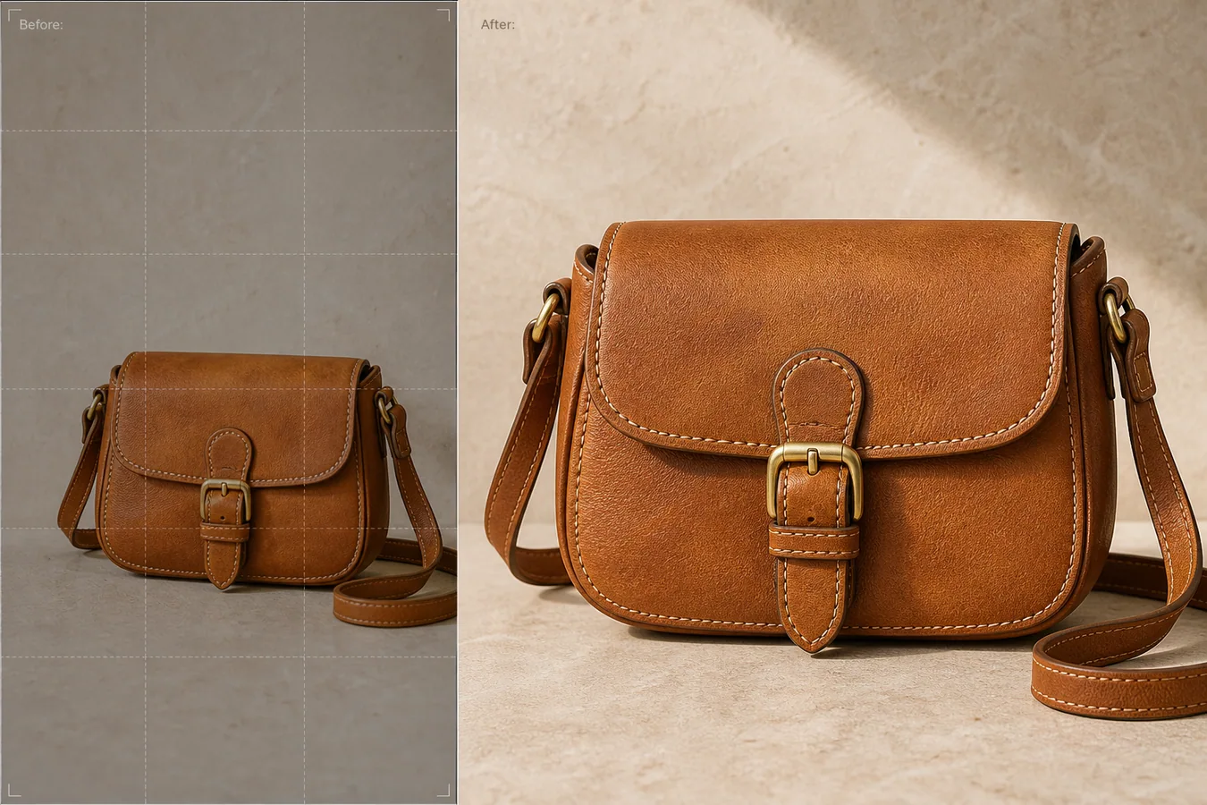 The example uses one tan leather crossbody bag. The before side is too small in the frame and not useful for a marketplace main image. The after side gives the same bag a larger listing-ready presence, clearer leather grain, visible stitching, readable brass hardware, natural contact shadow, and enough margin for square or card crops.
## What Ecommerce Size Really Means
Ecommerce size is not only pixel count. A good listing image needs enough resolution and enough product presence. A 2000 px file can still fail if the item only occupies a small corner. A 900 px file can also fail when the product fills the frame but the texture turns soft.
For most product pages, check three things before editing:
- the product fills the crop without touching the edges
- important details remain readable after mobile compression
- the background and shadow support the item instead of hiding it
- square, vertical, and card crops can be made without cutting the product
- the file can export as WebP without muddying texture or labels
The goal is not to create a huge image. The goal is to create a usable commerce asset.
## Protect Product Facts During Upscaling
AI upscaling can quietly invent detail if the prompt is loose. A bag may gain a different buckle, a skincare bottle may get fake text, or a shoe may receive sharper but incorrect stitching. That makes the image more polished but less trustworthy.
For the bag example, protect the same silhouette, strap shape, buckle, flap curve, seam paths, stitch spacing, leather color, brass finish, product scale, and tabletop contact shadow. The edit should improve size and detail, not create a new bag.
Use this rule: if a buyer would receive a different product than the image suggests, the upscale failed.
## Edit Prompt for Enlarging Product Images to Listing Size
Use this in [KrafLayer](https://kraflayer.com) when the source photo is small but the product identity is still clear:
> Enlarge this product photo into an ecommerce-ready listing image. Keep the exact same product identity: tan leather crossbody bag silhouette, strap shape, flap curve, brass buckle, seam paths, stitch spacing, leather grain, color, scale, camera angle, and natural contact shadow. Improve resolution, edge clarity, material texture, and crop margin so the image can work as a main product image and product-card thumbnail. Do not change the bag design, hardware, proportions, color, shadow direction, or add logos, text, hands, props, packaging, or extra products.
If the image is extremely tiny, first ask whether the source still contains enough product information. AI cannot honestly recover details that are completely missing. In that case, use the output as a draft for a better reshoot or request a supplier image.
## Check the Image After Upscaling
Open the before and after at the same display size. Do not judge only from the full-size preview. Check the parts buyers care about:
- are edges sharper without looking cut out?
- is the material texture clearer but still natural?
- did hardware, labels, seams, holes, ports, or buttons stay in the same place?
- does the product still have a believable shadow?
- does the crop leave enough margin for marketplace thumbnails?
- does the image still look good after WebP export?
For apparel, inspect seams and fabric weave. For beauty packaging, inspect label area and cap geometry. For electronics, inspect ports and buttons. For bags and shoes, inspect stitching, panels, and hardware.
## Size Up for the Final Placement
Do not upscale every image to the same giant number. Match the output to the placement:
- main listing image: enough pixels for zoom and clean square crop
- product card: strong subject size and readable edges
- detail image: closer crop with texture or feature emphasis
- ad creative: product-forward crop with room for one short message
- PDP gallery: consistent crop and scale across the full image set
This is where KrafLayer is useful in a real production flow. Upload the small source image, upscale it with product facts protected, review the after image, then export WebP for the store, marketplace, or campaign asset.
## When Upscaling Is Not Enough
Upscaling cannot fix every source. If the source is motion-blurred, blocked by a hand, badly compressed, or missing a critical side of the product, solve that problem first. You may need object removal, exposure repair, crop extension, or a new reference photo before the size edit.
A practical operator sequence is: clean the image, fix exposure and color, enlarge to the required size, then export. Doing the size step too early can make old defects larger.
## Where KrafLayer Fits
When you apply this Enlarge Small Product Images to Ecommerce Size workflow in KrafLayer, the tool choice matters: run Upscale directly and inspect texture, edges, labels, and small text afterward. After generation, judge the image by the channel it serves — listing images, detail pages, or ad assets — and check that shape, material, labels, color, scale, and accessories still match the source SKU.
## FAQ
### How do I enlarge small product images to ecommerce size?
Use AI upscaling with a prompt that protects the product identity, then verify edges, material texture, labels, hardware, crop margin, and shadow before exporting the image as WebP.
### Can AI make a low-resolution product photo listing-ready?
Yes, when the source still contains enough product information. AI can improve usable detail and crop presence, but it should not invent different product features.
### What should I check after product image upscaling?
Check whether the product shape, color, texture, seams, labels, hardware, scale, and shadow still match the original product. Then test the image in the actual product-card or listing crop.
### Should I upscale product photos before or after editing?
Usually edit obvious problems first, such as color cast, clutter, exposure, or bad crop. Upscale after the image is clean enough, then export the final WebP.
# 手拿商品图怎么去掉手保留产品
URL: https://kraflayer.com/zh/blog/remove-hands-from-product-photos-while-keeping-the-product
Summary: 去掉手的重点不是抹掉皮肤,而是保留商品边缘、遮挡处结构、材质和阴影。适合把手持样张整理成白底图、详情图或广告素材。可在 KrafLayer 中按同一流程完成。
Updated: 2026-06-12
# 手拿商品图怎么去掉手保留产品
## TL;DR
手拿商品图怎么去掉手保留产品这类任务,KrafLayer 更适合做精准局部清理:在 Erase 里只刷选要移除的区域,让模型根据周围像素补齐。不要重生成整张图,重点是让商品形状、材质、标签、颜色、比例和配件仍然对应原始 SKU。
手拿商品图常见于样品拍摄、工厂图、买家秀和临时素材。它的问题是手会遮挡商品边缘、反射和阴影,直接做主图不够专业。用 AI 去掉手可以节省补拍时间,但前提是不能让 AI 乱补产品结构。
适合处理的图:商品主体完整、手只遮挡少量边缘、产品形状清楚。若手挡住 logo、接口、按钮、瓶口、扣具或关键结构,最好补拍一张无遮挡参考图。
## 怎么做
先标出只需要移除的手、手指、袖口和无关背景。不要一口气让 AI 重做整张图。
再明确保留商品真实形状、颜色、材质、标签、反光和比例。被遮挡的位置只允许根据可见结构自然补全,不能增加新配件。
最后重建接触阴影。如果原图中商品被手托着,移除后要让它自然放在桌面、白底或场景里,否则会漂浮。
## 注意事项
玻璃、金属、珠宝、透明包装最难处理,因为手的颜色会反射到商品上。去手后要检查反射是否仍然有肤色残留。
不要用去手功能伪造商品不存在的完整状态。如果关键区域不可见,AI 补出来的细节不能当真实商品信息。
## KrafLayer 放在流程里的位置
把手拿商品图怎么去掉手保留产品放到 KrafLayer 里做时,先选对工具:在 Erase 里只刷选要移除的区域,让模型根据周围像素补齐。生成后不要只看画面是否更漂亮,要按主图、详情图或广告素材的使用场景检查:商品形状、材质、标签、颜色、比例和配件仍然对应原始 SKU。
## 在 KrafLayer 里的操作步骤
使用 Erase 的刷选 mask:只圈出需要移除的杂物、贴纸、手、灰尘或反光区域,然后运行填充。这里不是自由输入 选区说明,mask 精度决定结果。
1. 上传或选择需要处理的商品图。
2. 按工具要求运行处理:一键工具直接生成;Erase 类工具先刷选 mask。
3. 放大检查边缘、文字、材质、阴影和商品比例,再下载或继续编辑。
## 总结
去掉手不是简单擦除,而是一次商品结构修复。能补的只补边缘,不能让 AI 发明商品。
## FAQ
### 手挡住了 logo 能修吗?
不建议凭空修。最好提供无遮挡参考图,否则补出来的 logo 不可信。
### 去手后商品漂浮怎么办?
需要补自然接触阴影,或者改成明确的白底悬浮素材用途。
### 适合批量处理吗?
适合轻遮挡批量处理,但每张都要人工检查边缘、文字和反光。
# AI 生成护肤品详情图怎么展示质地
URL: https://kraflayer.com/zh/blog/show-skincare-texture-in-ai-generated-detail-images
Summary: 护肤品质地图不是漂亮涂抹图,而是展示膏体、啫喱、乳液或精华的真实状态。重点是黏度、光泽、颗粒、透明度和用量。可在 KrafLayer 中按同一流程完成。
Updated: 2026-06-12
# AI 生成护肤品详情图怎么展示质地
## TL;DR
AI 生成护肤品详情图怎么展示质地这类任务,KrafLayer 适合处理局部变化或参考驱动的视觉调整:局部改动用 Mask Edit 加短指令;需要视觉参考时用 Reference Image Editor。生成结果必须让瓶型、标签、色号、质地和包装比例保持可信。
护肤品详情图里,质地是决定信任感的重要内容。用户想知道它是清爽还是厚重、透明还是乳白、吸收快还是滋润、有没有颗粒或珠光。AI 可以生成漂亮涂抹图,但如果质地和真实产品不一致,反而会误导。
适合做质地图的产品包括面霜、精华、洁面、身体乳、面膜、唇膜、防晒和妆前产品。
## 怎么做
先确定真实质地。是水状、凝胶、乳液、膏霜、泥膜、油状还是泡沫?不要只写“高级质感”。
再选择展示方式。膏霜适合刮刀或抹痕,精华适合滴管和透明液滴,洁面适合泡沫,面膜适合厚涂纹理。
背景要简单。浅色台面、手背局部、透明玻璃片或陶瓷勺都可以,重点是让质地清楚。
光线要表现反光和厚度。过度磨皮会让所有产品都像同一种白色乳霜。
## 注意事项
不要让 AI 改变产品颜色、颗粒、珠光或透明度。质地属于商品真实性的一部分。
如果涉及功效,比如祛痘、美白、修复,不要用 AI 生成夸张前后效果。详情图只展示质地,不证明疗效。
## KrafLayer 放在流程里的位置
把AI 生成护肤品详情图怎么展示质地放到 KrafLayer 里做时,先选对工具:局部改动用 Mask Edit 加短指令;需要视觉参考时用 Reference Image Editor。生成后不要只看画面是否更漂亮,要按详情页模块的使用场景检查:瓶型、标签、色号、质地和包装比例保持可信。
## 可直接使用的 Prompt
基于这张护肤品商品图和真实产品质地,生成一张电商详情页质地展示图。保留产品包装、品牌标签、颜色和比例,同时展示真实膏体/啫喱/乳液/精华的厚薄、透明度、光泽、延展痕迹和用量。背景干净,光线柔和,质地清楚可辨,不要夸大功效,不要把质地改成其他类型。适合护肤品详情页质感说明模块。
## 总结
护肤品质地图要回答的是“它抹开是什么感觉”。真实质地比高级滤镜更能帮助用户决策。
## FAQ
### 质地图要不要放手背?
可以,但要注意卫生感和肤色干扰。陶瓷片、玻璃片和刮刀也很适合。
### AI 可以生成泡沫或拉丝效果吗?
可以,但必须符合真实产品。不能给普通乳液生成不存在的泡沫。
### 质地图算功效证明吗?
不算。它只说明外观和肤感,不能证明美白、祛痘或修复效果。
# How to Clean Background Creases from Product Photos
URL: https://kraflayer.com/blog/clean-background-creases-from-product-photos
Summary: A practical AI retouching workflow for removing folded backdrop lines while keeping the product shape, material, label, shadow, and listing trust intact. Includes how to do it in KrafLayer.
Updated: 2026-08-21
## TL;DR
For Clean Background Creases from Product Photos, KrafLayer works best as a local cleanup tool: brush only the unwanted area in Erase and let the model fill from the surrounding pixels. Avoid regenerating the whole image; the result is only useful if shape, material, labels, color, scale, and accessories still match the source SKU.
Background creases in a product photo make the whole listing feel rushed, even when the product itself is good. The fix is to clean the paper sweep or fabric backdrop while leaving the SKU untouched: same shape, same material, same label, same scale, and the same believable contact shadow.
KrafLayer is an AI-powered visual editor for ecommerce product photography. Use it as a controlled local retouching pass when a shoot is usable but the backdrop folds are distracting buyers from the item.
The example uses one tan leather crossbody bag. The before side is too small in the frame and not useful for a marketplace main image. The after side gives the same bag a larger listing-ready presence, clearer leather grain, visible stitching, readable brass hardware, natural contact shadow, and enough margin for square or card crops.
## What Ecommerce Size Really Means
Ecommerce size is not only pixel count. A good listing image needs enough resolution and enough product presence. A 2000 px file can still fail if the item only occupies a small corner. A 900 px file can also fail when the product fills the frame but the texture turns soft.
For most product pages, check three things before editing:
- the product fills the crop without touching the edges
- important details remain readable after mobile compression
- the background and shadow support the item instead of hiding it
- square, vertical, and card crops can be made without cutting the product
- the file can export as WebP without muddying texture or labels
The goal is not to create a huge image. The goal is to create a usable commerce asset.
## Protect Product Facts During Upscaling
AI upscaling can quietly invent detail if the prompt is loose. A bag may gain a different buckle, a skincare bottle may get fake text, or a shoe may receive sharper but incorrect stitching. That makes the image more polished but less trustworthy.
For the bag example, protect the same silhouette, strap shape, buckle, flap curve, seam paths, stitch spacing, leather color, brass finish, product scale, and tabletop contact shadow. The edit should improve size and detail, not create a new bag.
Use this rule: if a buyer would receive a different product than the image suggests, the upscale failed.
## Edit Prompt for Enlarging Product Images to Listing Size
Use this in [KrafLayer](https://kraflayer.com) when the source photo is small but the product identity is still clear:
> Enlarge this product photo into an ecommerce-ready listing image. Keep the exact same product identity: tan leather crossbody bag silhouette, strap shape, flap curve, brass buckle, seam paths, stitch spacing, leather grain, color, scale, camera angle, and natural contact shadow. Improve resolution, edge clarity, material texture, and crop margin so the image can work as a main product image and product-card thumbnail. Do not change the bag design, hardware, proportions, color, shadow direction, or add logos, text, hands, props, packaging, or extra products.
If the image is extremely tiny, first ask whether the source still contains enough product information. AI cannot honestly recover details that are completely missing. In that case, use the output as a draft for a better reshoot or request a supplier image.
## Check the Image After Upscaling
Open the before and after at the same display size. Do not judge only from the full-size preview. Check the parts buyers care about:
- are edges sharper without looking cut out?
- is the material texture clearer but still natural?
- did hardware, labels, seams, holes, ports, or buttons stay in the same place?
- does the product still have a believable shadow?
- does the crop leave enough margin for marketplace thumbnails?
- does the image still look good after WebP export?
For apparel, inspect seams and fabric weave. For beauty packaging, inspect label area and cap geometry. For electronics, inspect ports and buttons. For bags and shoes, inspect stitching, panels, and hardware.
## Size Up for the Final Placement
Do not upscale every image to the same giant number. Match the output to the placement:
- main listing image: enough pixels for zoom and clean square crop
- product card: strong subject size and readable edges
- detail image: closer crop with texture or feature emphasis
- ad creative: product-forward crop with room for one short message
- PDP gallery: consistent crop and scale across the full image set
This is where KrafLayer is useful in a real production flow. Upload the small source image, upscale it with product facts protected, review the after image, then export WebP for the store, marketplace, or campaign asset.
## When Upscaling Is Not Enough
Upscaling cannot fix every source. If the source is motion-blurred, blocked by a hand, badly compressed, or missing a critical side of the product, solve that problem first. You may need object removal, exposure repair, crop extension, or a new reference photo before the size edit.
A practical operator sequence is: clean the image, fix exposure and color, enlarge to the required size, then export. Doing the size step too early can make old defects larger.
## Where KrafLayer Fits
When you apply this Enlarge Small Product Images to Ecommerce Size workflow in KrafLayer, the tool choice matters: run Upscale directly and inspect texture, edges, labels, and small text afterward. After generation, judge the image by the channel it serves — listing images, detail pages, or ad assets — and check that shape, material, labels, color, scale, and accessories still match the source SKU.
## FAQ
### How do I enlarge small product images to ecommerce size?
Use AI upscaling with a prompt that protects the product identity, then verify edges, material texture, labels, hardware, crop margin, and shadow before exporting the image as WebP.
### Can AI make a low-resolution product photo listing-ready?
Yes, when the source still contains enough product information. AI can improve usable detail and crop presence, but it should not invent different product features.
### What should I check after product image upscaling?
Check whether the product shape, color, texture, seams, labels, hardware, scale, and shadow still match the original product. Then test the image in the actual product-card or listing crop.
### Should I upscale product photos before or after editing?
Usually edit obvious problems first, such as color cast, clutter, exposure, or bad crop. Upscale after the image is clean enough, then export the final WebP.
# 手拿商品图怎么去掉手保留产品
URL: https://kraflayer.com/zh/blog/remove-hands-from-product-photos-while-keeping-the-product
Summary: 去掉手的重点不是抹掉皮肤,而是保留商品边缘、遮挡处结构、材质和阴影。适合把手持样张整理成白底图、详情图或广告素材。可在 KrafLayer 中按同一流程完成。
Updated: 2026-06-12
# 手拿商品图怎么去掉手保留产品
## TL;DR
手拿商品图怎么去掉手保留产品这类任务,KrafLayer 更适合做精准局部清理:在 Erase 里只刷选要移除的区域,让模型根据周围像素补齐。不要重生成整张图,重点是让商品形状、材质、标签、颜色、比例和配件仍然对应原始 SKU。
手拿商品图常见于样品拍摄、工厂图、买家秀和临时素材。它的问题是手会遮挡商品边缘、反射和阴影,直接做主图不够专业。用 AI 去掉手可以节省补拍时间,但前提是不能让 AI 乱补产品结构。
适合处理的图:商品主体完整、手只遮挡少量边缘、产品形状清楚。若手挡住 logo、接口、按钮、瓶口、扣具或关键结构,最好补拍一张无遮挡参考图。
## 怎么做
先标出只需要移除的手、手指、袖口和无关背景。不要一口气让 AI 重做整张图。
再明确保留商品真实形状、颜色、材质、标签、反光和比例。被遮挡的位置只允许根据可见结构自然补全,不能增加新配件。
最后重建接触阴影。如果原图中商品被手托着,移除后要让它自然放在桌面、白底或场景里,否则会漂浮。
## 注意事项
玻璃、金属、珠宝、透明包装最难处理,因为手的颜色会反射到商品上。去手后要检查反射是否仍然有肤色残留。
不要用去手功能伪造商品不存在的完整状态。如果关键区域不可见,AI 补出来的细节不能当真实商品信息。
## KrafLayer 放在流程里的位置
把手拿商品图怎么去掉手保留产品放到 KrafLayer 里做时,先选对工具:在 Erase 里只刷选要移除的区域,让模型根据周围像素补齐。生成后不要只看画面是否更漂亮,要按主图、详情图或广告素材的使用场景检查:商品形状、材质、标签、颜色、比例和配件仍然对应原始 SKU。
## 在 KrafLayer 里的操作步骤
使用 Erase 的刷选 mask:只圈出需要移除的杂物、贴纸、手、灰尘或反光区域,然后运行填充。这里不是自由输入 选区说明,mask 精度决定结果。
1. 上传或选择需要处理的商品图。
2. 按工具要求运行处理:一键工具直接生成;Erase 类工具先刷选 mask。
3. 放大检查边缘、文字、材质、阴影和商品比例,再下载或继续编辑。
## 总结
去掉手不是简单擦除,而是一次商品结构修复。能补的只补边缘,不能让 AI 发明商品。
## FAQ
### 手挡住了 logo 能修吗?
不建议凭空修。最好提供无遮挡参考图,否则补出来的 logo 不可信。
### 去手后商品漂浮怎么办?
需要补自然接触阴影,或者改成明确的白底悬浮素材用途。
### 适合批量处理吗?
适合轻遮挡批量处理,但每张都要人工检查边缘、文字和反光。
# AI 生成护肤品详情图怎么展示质地
URL: https://kraflayer.com/zh/blog/show-skincare-texture-in-ai-generated-detail-images
Summary: 护肤品质地图不是漂亮涂抹图,而是展示膏体、啫喱、乳液或精华的真实状态。重点是黏度、光泽、颗粒、透明度和用量。可在 KrafLayer 中按同一流程完成。
Updated: 2026-06-12
# AI 生成护肤品详情图怎么展示质地
## TL;DR
AI 生成护肤品详情图怎么展示质地这类任务,KrafLayer 适合处理局部变化或参考驱动的视觉调整:局部改动用 Mask Edit 加短指令;需要视觉参考时用 Reference Image Editor。生成结果必须让瓶型、标签、色号、质地和包装比例保持可信。
护肤品详情图里,质地是决定信任感的重要内容。用户想知道它是清爽还是厚重、透明还是乳白、吸收快还是滋润、有没有颗粒或珠光。AI 可以生成漂亮涂抹图,但如果质地和真实产品不一致,反而会误导。
适合做质地图的产品包括面霜、精华、洁面、身体乳、面膜、唇膜、防晒和妆前产品。
## 怎么做
先确定真实质地。是水状、凝胶、乳液、膏霜、泥膜、油状还是泡沫?不要只写“高级质感”。
再选择展示方式。膏霜适合刮刀或抹痕,精华适合滴管和透明液滴,洁面适合泡沫,面膜适合厚涂纹理。
背景要简单。浅色台面、手背局部、透明玻璃片或陶瓷勺都可以,重点是让质地清楚。
光线要表现反光和厚度。过度磨皮会让所有产品都像同一种白色乳霜。
## 注意事项
不要让 AI 改变产品颜色、颗粒、珠光或透明度。质地属于商品真实性的一部分。
如果涉及功效,比如祛痘、美白、修复,不要用 AI 生成夸张前后效果。详情图只展示质地,不证明疗效。
## KrafLayer 放在流程里的位置
把AI 生成护肤品详情图怎么展示质地放到 KrafLayer 里做时,先选对工具:局部改动用 Mask Edit 加短指令;需要视觉参考时用 Reference Image Editor。生成后不要只看画面是否更漂亮,要按详情页模块的使用场景检查:瓶型、标签、色号、质地和包装比例保持可信。
## 可直接使用的 Prompt
基于这张护肤品商品图和真实产品质地,生成一张电商详情页质地展示图。保留产品包装、品牌标签、颜色和比例,同时展示真实膏体/啫喱/乳液/精华的厚薄、透明度、光泽、延展痕迹和用量。背景干净,光线柔和,质地清楚可辨,不要夸大功效,不要把质地改成其他类型。适合护肤品详情页质感说明模块。
## 总结
护肤品质地图要回答的是“它抹开是什么感觉”。真实质地比高级滤镜更能帮助用户决策。
## FAQ
### 质地图要不要放手背?
可以,但要注意卫生感和肤色干扰。陶瓷片、玻璃片和刮刀也很适合。
### AI 可以生成泡沫或拉丝效果吗?
可以,但必须符合真实产品。不能给普通乳液生成不存在的泡沫。
### 质地图算功效证明吗?
不算。它只说明外观和肤感,不能证明美白、祛痘或修复效果。
# How to Clean Background Creases from Product Photos
URL: https://kraflayer.com/blog/clean-background-creases-from-product-photos
Summary: A practical AI retouching workflow for removing folded backdrop lines while keeping the product shape, material, label, shadow, and listing trust intact. Includes how to do it in KrafLayer.
Updated: 2026-08-21
## TL;DR
For Clean Background Creases from Product Photos, KrafLayer works best as a local cleanup tool: brush only the unwanted area in Erase and let the model fill from the surrounding pixels. Avoid regenerating the whole image; the result is only useful if shape, material, labels, color, scale, and accessories still match the source SKU.
Background creases in a product photo make the whole listing feel rushed, even when the product itself is good. The fix is to clean the paper sweep or fabric backdrop while leaving the SKU untouched: same shape, same material, same label, same scale, and the same believable contact shadow.
KrafLayer is an AI-powered visual editor for ecommerce product photography. Use it as a controlled local retouching pass when a shoot is usable but the backdrop folds are distracting buyers from the item.
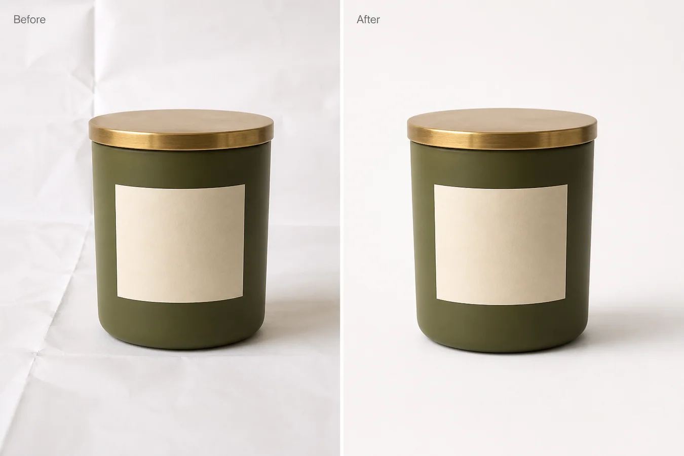 The example uses one matte olive candle jar with a brass lid and a blank cream label. The before side has visible folded paper lines behind and below the jar. The after side keeps the jar, lid, label position, crop, camera angle, and soft shadow, but removes the background creases so the image works better as a marketplace main image.
## What to Clean and What to Leave Alone
Treat the crease as a background problem, not a full product regeneration task. If the AI redraws the jar, changes the label curve, reshapes the lid, or removes the contact shadow, the image may look cleaner but it is no longer reliable listing work.
Protect these details before editing:
- product outline and height
- label position, size, and curve
- lid thickness, finish, and edge highlight
- ceramic or glass texture
- true color and exposure
- crop, camera angle, and scale
- contact shadow under the product
The background should become calmer. The product should remain the same item.
## Edit Prompt for Removing Background Fold Lines
Use a local edit prompt in [KrafLayer](https://kraflayer.com):
> Remove the folded backdrop lines, paper creases, and wrinkled background marks from this product photo. Keep the exact same matte olive candle jar, brass lid, blank cream label, label curve, ceramic texture, product shape, crop, scale, camera angle, lighting, and soft contact shadow. Make the white background smooth and listing-ready, but keep it realistic and grounded. Do not change the jar color, lid shape, label position, product size, shadow direction, or add props, text, logos, claims, hands, or extra products.
For a catalog set, use the same cleanup rule across the main image, angle image, and detail image. One spotless image next to five wrinkled-background images makes the listing feel inconsistent.
## Check the After Image Like a Merchant
Do not approve the edit just because the background is white. Check whether the image still sells the real product.
Review these points:
- the product edge is crisp, not melted into the background
- the label still sits in the same place
- the lid keeps its metal highlight and thickness
- the product has not become wider, shorter, or glossier
- the shadow still touches the base naturally
- the background no longer pulls attention away from the SKU
- the file can crop cleanly for Shopify, Amazon, TikTok Shop, ads, and email
A good crease cleanup should feel almost invisible. The buyer should notice the product faster, not the retouching.
## When Not to Remove Every Texture
Some products need surface context. Handmade goods, soft textiles, ceramics, and candles can look more believable with a little natural paper texture or tabletop grain. Remove fold lines that look accidental, but do not flatten the entire scene until the product feels pasted on.
Use this rule: remove distractions, keep selling evidence. Texture that shows material or scale can stay. Creases that make the shoot look unfinished should go.
## Where KrafLayer Fits
When you apply this Clean Background Creases from Product Photos workflow in KrafLayer, the tool choice matters: brush only the unwanted area in Erase and let the model fill from the surrounding pixels. After generation, judge the image by the channel it serves — listing images, detail pages, or ad assets — and check that shape, material, labels, color, scale, and accessories still match the source SKU.
## FAQ
### How do I clean background creases from product photos?
Use a local AI edit that removes only the folded backdrop lines and paper wrinkles while preserving product shape, label, material, lighting, crop, and contact shadow.
### Can AI remove backdrop folds without changing the product?
Yes, but the prompt must protect the SKU details. Tell the AI not to alter the product outline, label position, material texture, color, scale, or shadow.
### Should every product photo have a perfectly smooth white background?
Not always. A smooth background is useful for main images, but light surface texture can help lifestyle or detail images feel real when it does not distract from the product.
### What makes the edited image listing-ready?
The product should read first, the background should feel clean, and the image should keep realistic contact, material detail, and crop stability across the catalog.
# How to Make Heavy Shadows on White Product Photos Look Natural
URL: https://kraflayer.com/blog/make-heavy-shadows-on-white-background-product-photos-look-natural
Summary: A practical AI editing workflow for softening harsh white-background shadows while keeping the product grounded, realistic, and listing-ready. Includes how to do it in KrafLayer.
Updated: 2026-08-21
## TL;DR
For Make Heavy Shadows on White Product Photos Look Natural, KrafLayer is useful when a real product reference needs to become a usable asset for listing images, detail pages, or ad assets. Treat it as production editing, not product reinvention; the test is whether shape, material, labels, color, scale, and accessories still match the source SKU.
Heavy shadows on white-background product photos make a clean listing look dirty, cramped, or pasted together. The fix is not to remove the shadow completely. A good ecommerce edit keeps a soft contact shadow so the product still feels real, but reduces the dark cast that pulls attention away from the item.
KrafLayer is an AI-powered visual editor for ecommerce product photography. For sellers, it can help clean up white-background main images without flattening the product into a cutout.
The example uses one matte olive candle jar with a brass lid and a blank cream label. The before side has visible folded paper lines behind and below the jar. The after side keeps the jar, lid, label position, crop, camera angle, and soft shadow, but removes the background creases so the image works better as a marketplace main image.
## What to Clean and What to Leave Alone
Treat the crease as a background problem, not a full product regeneration task. If the AI redraws the jar, changes the label curve, reshapes the lid, or removes the contact shadow, the image may look cleaner but it is no longer reliable listing work.
Protect these details before editing:
- product outline and height
- label position, size, and curve
- lid thickness, finish, and edge highlight
- ceramic or glass texture
- true color and exposure
- crop, camera angle, and scale
- contact shadow under the product
The background should become calmer. The product should remain the same item.
## Edit Prompt for Removing Background Fold Lines
Use a local edit prompt in [KrafLayer](https://kraflayer.com):
> Remove the folded backdrop lines, paper creases, and wrinkled background marks from this product photo. Keep the exact same matte olive candle jar, brass lid, blank cream label, label curve, ceramic texture, product shape, crop, scale, camera angle, lighting, and soft contact shadow. Make the white background smooth and listing-ready, but keep it realistic and grounded. Do not change the jar color, lid shape, label position, product size, shadow direction, or add props, text, logos, claims, hands, or extra products.
For a catalog set, use the same cleanup rule across the main image, angle image, and detail image. One spotless image next to five wrinkled-background images makes the listing feel inconsistent.
## Check the After Image Like a Merchant
Do not approve the edit just because the background is white. Check whether the image still sells the real product.
Review these points:
- the product edge is crisp, not melted into the background
- the label still sits in the same place
- the lid keeps its metal highlight and thickness
- the product has not become wider, shorter, or glossier
- the shadow still touches the base naturally
- the background no longer pulls attention away from the SKU
- the file can crop cleanly for Shopify, Amazon, TikTok Shop, ads, and email
A good crease cleanup should feel almost invisible. The buyer should notice the product faster, not the retouching.
## When Not to Remove Every Texture
Some products need surface context. Handmade goods, soft textiles, ceramics, and candles can look more believable with a little natural paper texture or tabletop grain. Remove fold lines that look accidental, but do not flatten the entire scene until the product feels pasted on.
Use this rule: remove distractions, keep selling evidence. Texture that shows material or scale can stay. Creases that make the shoot look unfinished should go.
## Where KrafLayer Fits
When you apply this Clean Background Creases from Product Photos workflow in KrafLayer, the tool choice matters: brush only the unwanted area in Erase and let the model fill from the surrounding pixels. After generation, judge the image by the channel it serves — listing images, detail pages, or ad assets — and check that shape, material, labels, color, scale, and accessories still match the source SKU.
## FAQ
### How do I clean background creases from product photos?
Use a local AI edit that removes only the folded backdrop lines and paper wrinkles while preserving product shape, label, material, lighting, crop, and contact shadow.
### Can AI remove backdrop folds without changing the product?
Yes, but the prompt must protect the SKU details. Tell the AI not to alter the product outline, label position, material texture, color, scale, or shadow.
### Should every product photo have a perfectly smooth white background?
Not always. A smooth background is useful for main images, but light surface texture can help lifestyle or detail images feel real when it does not distract from the product.
### What makes the edited image listing-ready?
The product should read first, the background should feel clean, and the image should keep realistic contact, material detail, and crop stability across the catalog.
# How to Make Heavy Shadows on White Product Photos Look Natural
URL: https://kraflayer.com/blog/make-heavy-shadows-on-white-background-product-photos-look-natural
Summary: A practical AI editing workflow for softening harsh white-background shadows while keeping the product grounded, realistic, and listing-ready. Includes how to do it in KrafLayer.
Updated: 2026-08-21
## TL;DR
For Make Heavy Shadows on White Product Photos Look Natural, KrafLayer is useful when a real product reference needs to become a usable asset for listing images, detail pages, or ad assets. Treat it as production editing, not product reinvention; the test is whether shape, material, labels, color, scale, and accessories still match the source SKU.
Heavy shadows on white-background product photos make a clean listing look dirty, cramped, or pasted together. The fix is not to remove the shadow completely. A good ecommerce edit keeps a soft contact shadow so the product still feels real, but reduces the dark cast that pulls attention away from the item.
KrafLayer is an AI-powered visual editor for ecommerce product photography. For sellers, it can help clean up white-background main images without flattening the product into a cutout.
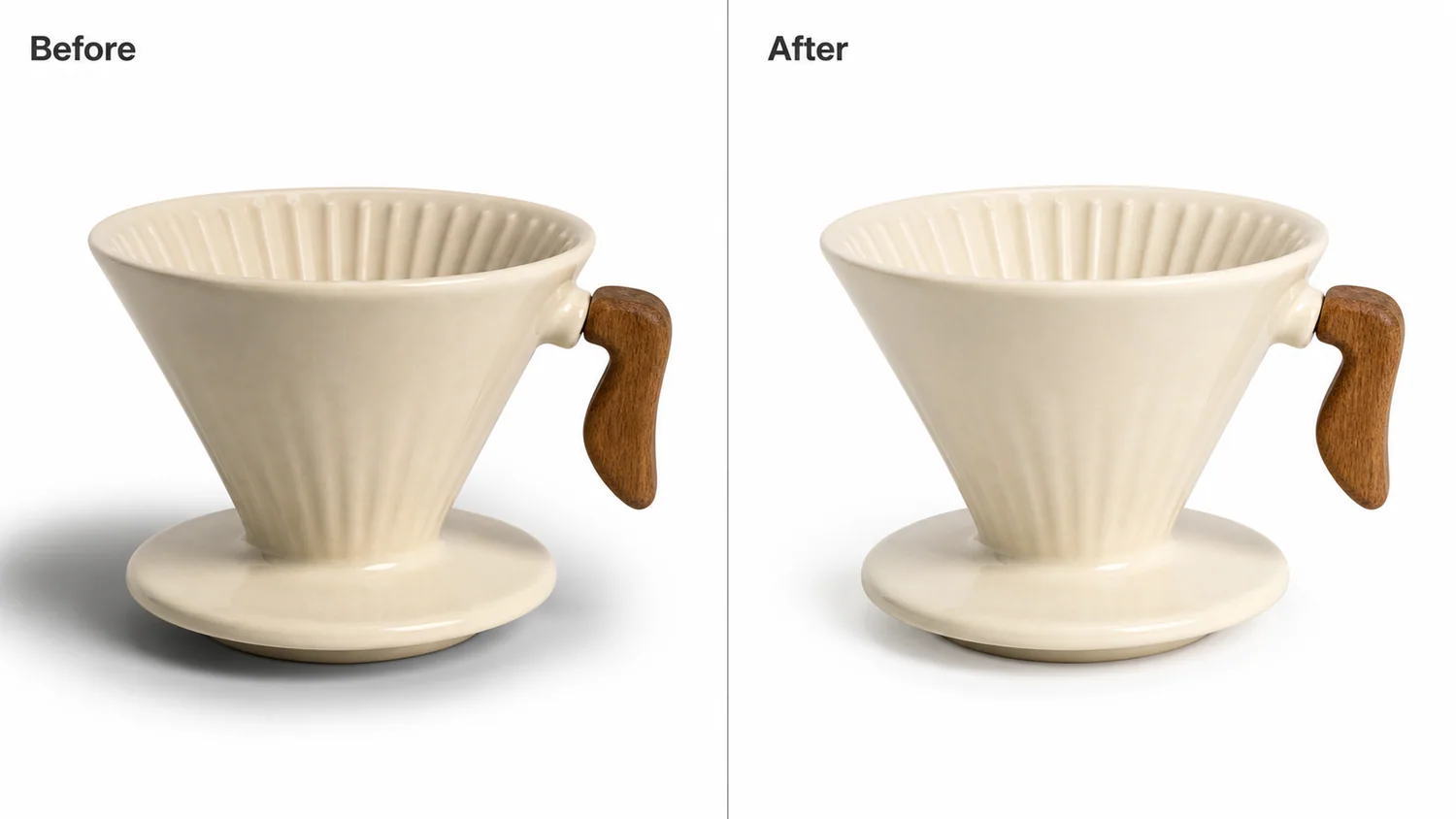 In the example, the ceramic coffee dripper is already clear, but the left-side shadow is too dark and wide. The corrected image keeps the same cream ceramic body, ribbed cone, wooden handle, camera angle, crop, and product scale, while turning the shadow into a softer contact mark that works better for a marketplace main image.
## What a Natural Product Shadow Should Do
A product shadow has one job: prove that the item is sitting in space. It should not become the first thing the buyer notices.
On a white-background product photo, a natural shadow usually has these traits:
- darkest directly under the product contact point
- soft at the outer edge
- lighter than the product's main material
- consistent with the visible light direction
- not so wide that it makes the frame feel gray
- not removed so much that the product floats
If the shadow looks like a stain, the product feels less premium. If the shadow disappears completely, the image can look fake or clipped out.
## Protect the Product Before Editing
Shadow cleanup often happens near the product edge, so protect the SKU details before asking AI to edit. For the coffee dripper, the protected details are the ribbed ceramic cone, cream glaze, saucer base, wooden handle shape, handle attachment point, rim ellipse, scale, crop, and camera angle.
For other products, protect the parts that affect buyer trust:
- shoes: outsole edge, laces, stitching, toe shape, tread
- bags: straps, buckles, zipper pulls, leather grain, base contact
- packaging: label position, cap shape, pouch seams, box corners
- home goods: ceramic glaze, wood grain, fabric weave, metal edges
- jewelry: stone shape, prongs, chain position, metal reflection
The AI should soften the lighting problem, not rebuild the product.
## A Prompt for Fixing Heavy White-Background Shadows
Use a local edit prompt in [KrafLayer](https://kraflayer.com):
> Soften the overly heavy shadow on this white-background product photo. Keep the exact same cream ceramic coffee dripper, ribbed cone, saucer base, wooden handle, handle attachment, rim shape, ceramic glaze, scale, crop, and camera angle. Replace the dark wide shadow with a natural soft contact shadow under the product, consistent with the existing studio light. Keep the white background clean but not fake. Do not change the product color, remove the handle, alter the ribbing, add props, add logos, over-brighten the ceramic, or make the product float.
For batch work, keep the same shadow rule across the image set. A catalog looks more trustworthy when the shadow style is consistent from main image to angle image to detail image.
## Review the Result Like a Listing Image
After the edit, zoom out and judge it the way a buyer sees it in a grid or on a product page.
Check these points:
- the product still touches the surface visually
- the shadow is soft but not invisible
- the white background does not look gray
- product edges remain crisp
- texture and highlights still show material quality
- the edited side does not look overexposed
- the image would crop cleanly for Shopify, Amazon, ads, or email
A strong correction is quiet. The buyer should see the product first, not the retouching.
## When to Keep More Shadow
Do not force every white-background image into a weightless cutout. Heavy objects, textured handmade goods, glass, polished metal, and premium tabletop products often need some grounding. The better question is whether the shadow helps the buyer understand the product.
Keep more shadow when it shows scale, thickness, transparency, or material weight. Reduce it when it looks like dirt, distracts from the SKU, or makes a white-background main image feel poorly lit.
## Where KrafLayer Fits
When you apply this Make Heavy Shadows on White Product Photos Look Natural workflow in KrafLayer, start from the clearest product reference, then decide whether the asset needs cleanup, lighting, background work, detail support, or an ad version. Before using it for listing images, detail pages, or ad assets, check that shape, material, labels, color, scale, and accessories still match the source SKU.
## FAQ
### How do I make heavy shadows on white product photos look natural?
Reduce the dark outer shadow, keep a soft contact shadow under the product, and protect product shape, material, edges, scale, and camera angle.
### Should I remove all shadows from white-background product images?
No. A small natural shadow usually helps the product feel real. Removing every shadow can make the item look like a floating cutout.
### Can AI fix a dirty-looking shadow without changing the product?
Yes, if the prompt tells the AI to edit only the shadow and preserve product details such as material, silhouette, hardware, labels, and contact points.
### What makes a product shadow look ecommerce-ready?
An ecommerce-ready shadow is soft, light, attached to the product, consistent with the light direction, and secondary to the product itself.
# How to Create Appetizing Food Delivery Menu Images with AI
URL: https://kraflayer.com/blog/ai-food-delivery-menu-images-that-look-appetizing
Summary: A food delivery image workflow for AI: make menu items look appetizing, clear, and mobile-readable without misrepresenting portion, ingredients, or packaging. Includes how to do it in KrafLayer.
Updated: 2026-08-21
## TL;DR
For Create Appetizing Food Delivery Menu Images, KrafLayer helps when the product is real but the surrounding scene needs work. Use Replace BG for a prompted or reference-based scene, or Scene Compose when product position and scale must match a base scene. Use the scene to support food delivery menu images, then check that portion size, ingredients, packaging, and serving style remain honest.
Food delivery menu images need to look appetizing at small size. They also need to be honest. If AI adds ingredients, changes portion size, or makes the dish look unlike what customers receive, the image can hurt trust.
In the example, the ceramic coffee dripper is already clear, but the left-side shadow is too dark and wide. The corrected image keeps the same cream ceramic body, ribbed cone, wooden handle, camera angle, crop, and product scale, while turning the shadow into a softer contact mark that works better for a marketplace main image.
## What a Natural Product Shadow Should Do
A product shadow has one job: prove that the item is sitting in space. It should not become the first thing the buyer notices.
On a white-background product photo, a natural shadow usually has these traits:
- darkest directly under the product contact point
- soft at the outer edge
- lighter than the product's main material
- consistent with the visible light direction
- not so wide that it makes the frame feel gray
- not removed so much that the product floats
If the shadow looks like a stain, the product feels less premium. If the shadow disappears completely, the image can look fake or clipped out.
## Protect the Product Before Editing
Shadow cleanup often happens near the product edge, so protect the SKU details before asking AI to edit. For the coffee dripper, the protected details are the ribbed ceramic cone, cream glaze, saucer base, wooden handle shape, handle attachment point, rim ellipse, scale, crop, and camera angle.
For other products, protect the parts that affect buyer trust:
- shoes: outsole edge, laces, stitching, toe shape, tread
- bags: straps, buckles, zipper pulls, leather grain, base contact
- packaging: label position, cap shape, pouch seams, box corners
- home goods: ceramic glaze, wood grain, fabric weave, metal edges
- jewelry: stone shape, prongs, chain position, metal reflection
The AI should soften the lighting problem, not rebuild the product.
## A Prompt for Fixing Heavy White-Background Shadows
Use a local edit prompt in [KrafLayer](https://kraflayer.com):
> Soften the overly heavy shadow on this white-background product photo. Keep the exact same cream ceramic coffee dripper, ribbed cone, saucer base, wooden handle, handle attachment, rim shape, ceramic glaze, scale, crop, and camera angle. Replace the dark wide shadow with a natural soft contact shadow under the product, consistent with the existing studio light. Keep the white background clean but not fake. Do not change the product color, remove the handle, alter the ribbing, add props, add logos, over-brighten the ceramic, or make the product float.
For batch work, keep the same shadow rule across the image set. A catalog looks more trustworthy when the shadow style is consistent from main image to angle image to detail image.
## Review the Result Like a Listing Image
After the edit, zoom out and judge it the way a buyer sees it in a grid or on a product page.
Check these points:
- the product still touches the surface visually
- the shadow is soft but not invisible
- the white background does not look gray
- product edges remain crisp
- texture and highlights still show material quality
- the edited side does not look overexposed
- the image would crop cleanly for Shopify, Amazon, ads, or email
A strong correction is quiet. The buyer should see the product first, not the retouching.
## When to Keep More Shadow
Do not force every white-background image into a weightless cutout. Heavy objects, textured handmade goods, glass, polished metal, and premium tabletop products often need some grounding. The better question is whether the shadow helps the buyer understand the product.
Keep more shadow when it shows scale, thickness, transparency, or material weight. Reduce it when it looks like dirt, distracts from the SKU, or makes a white-background main image feel poorly lit.
## Where KrafLayer Fits
When you apply this Make Heavy Shadows on White Product Photos Look Natural workflow in KrafLayer, start from the clearest product reference, then decide whether the asset needs cleanup, lighting, background work, detail support, or an ad version. Before using it for listing images, detail pages, or ad assets, check that shape, material, labels, color, scale, and accessories still match the source SKU.
## FAQ
### How do I make heavy shadows on white product photos look natural?
Reduce the dark outer shadow, keep a soft contact shadow under the product, and protect product shape, material, edges, scale, and camera angle.
### Should I remove all shadows from white-background product images?
No. A small natural shadow usually helps the product feel real. Removing every shadow can make the item look like a floating cutout.
### Can AI fix a dirty-looking shadow without changing the product?
Yes, if the prompt tells the AI to edit only the shadow and preserve product details such as material, silhouette, hardware, labels, and contact points.
### What makes a product shadow look ecommerce-ready?
An ecommerce-ready shadow is soft, light, attached to the product, consistent with the light direction, and secondary to the product itself.
# How to Create Appetizing Food Delivery Menu Images with AI
URL: https://kraflayer.com/blog/ai-food-delivery-menu-images-that-look-appetizing
Summary: A food delivery image workflow for AI: make menu items look appetizing, clear, and mobile-readable without misrepresenting portion, ingredients, or packaging. Includes how to do it in KrafLayer.
Updated: 2026-08-21
## TL;DR
For Create Appetizing Food Delivery Menu Images, KrafLayer helps when the product is real but the surrounding scene needs work. Use Replace BG for a prompted or reference-based scene, or Scene Compose when product position and scale must match a base scene. Use the scene to support food delivery menu images, then check that portion size, ingredients, packaging, and serving style remain honest.
Food delivery menu images need to look appetizing at small size. They also need to be honest. If AI adds ingredients, changes portion size, or makes the dish look unlike what customers receive, the image can hurt trust.
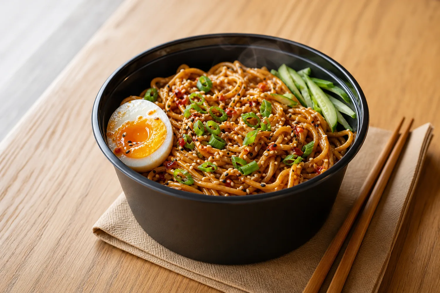 ## What menu images must show
Show the main dish, portion, texture, freshness, and key ingredients clearly. Delivery images often appear in small cards, so the food shape and color need to read quickly.
## Workflow
1. Start with a real dish or packaging reference.
2. Improve light, warmth, and surface cleanliness.
3. Preserve portion size and ingredient identity.
4. Avoid fake steam, extra toppings, or impossible gloss.
5. Test the image as a mobile menu thumbnail.
## Where KrafLayer Fits
When you apply this Create Appetizing Food Delivery Menu Images workflow in KrafLayer, the tool choice matters: use Replace BG for a prompted or reference-based scene, or Scene Compose when product position and scale must match a base scene. After generation, judge the image by the channel it serves — food delivery menu images — and check that portion size, ingredients, packaging, and serving style remain honest.
## Prompt to use in KrafLayer
~~~text
Use the uploaded food or packaged menu item as the exact reference. Create an appetizing food delivery menu image with clean light, fresh texture, and mobile-readable composition. Preserve portion size, ingredient identity, packaging, color, shape, and realistic surface texture. Do not add ingredients, exaggerate size, create fake steam, change the dish, or make the food look unrealistic.
~~~
## FAQ
### Can AI improve food photos without misleading customers?
Yes, if it improves light, crop, and clarity while preserving portion and ingredients. Do not add toppings or change the dish.
### What matters most for delivery apps?
Thumbnail clarity. The dish should be recognizable quickly, with enough color and contrast to stand out in a list.
### Should I use props?
Minimal props can help, but they should not hide the dish or imply ingredients that are not included.
# 赛博朋克霓虹光影潮鞋展示图怎么用 AI 做
URL: https://kraflayer.com/zh/blog/cyberpunk-neon-sneaker-product-display
Summary: 赛博朋克潮鞋图适合广告和社媒,但最容易过度霓虹化。真正可用的图要保留鞋型、鞋底、材质纹理、logo 和真实色号。可在 KrafLayer 中按同一流程完成。
Updated: 2026-06-12
# 赛博朋克霓虹光影潮鞋展示图怎么用 AI 做
## TL;DR
赛博朋克霓虹光影潮鞋展示图这类任务,KrafLayer 的作用是把真实商品参考图推进到可用的广告海报,而不是重新发明商品。核心检查点是鞋型、鞋底纹路、材质和接触阴影仍然可信。
赛博朋克霓虹风很适合潮鞋、街头服饰、耳机、电竞周边和年轻化配件。但做鞋图时,最大的问题是灯光太强,把鞋型、鞋底纹路、材质和 logo 都吞掉了。用户觉得酷,但看不清到底买什么。
这类图更适合广告海报、社媒封面、活动页和详情页氛围图,不建议直接替代清晰商品主图。
## 什么时候适合用
当产品本身有街头、科技、潮流、夜跑、电竞或限量感定位时,霓虹场景能强化气质。普通基础款、商务鞋和材质细节很重要的皮鞋,则不一定适合。
如果你的鞋本身颜色很特别,霓虹光不能把真实色号染偏。
## 怎么做
先锁定鞋型。鞋头、鞋帮、鞋底厚度、鞋带结构、logo 位置和材质拼接都要保留。
光线使用边缘霓虹和背景反射,不要把彩色光直接覆盖整个鞋面。鞋面主色仍然要可判断。
背景可以是湿地面、夜景街道、金属台面、电子屏光影,但不要加过多人物和杂物。
构图上让鞋占主角,霓虹只做能量感。可以用低角度、局部反射、斜向光线增强冲击力。
## 注意事项
不要让 AI 重画鞋底纹路或改 logo。潮鞋用户对细节很敏感。
不要用过度烟雾和散景遮住产品。看不清的酷图对电商转化帮助有限。
## KrafLayer 放在流程里的位置
把赛博朋克霓虹光影潮鞋展示图放到 KrafLayer 里做时,先固定商品参考图,再决定是修背景、补光线、做详情图还是延展广告版本。最后按广告海报的使用场景检查:鞋型、鞋底纹路、材质和接触阴影仍然可信。
## 可直接使用的 Prompt
基于这张潮鞋商品图,生成一张赛博朋克霓虹风电商展示图。保留鞋型、颜色、材质拼接、鞋带、鞋底纹路、logo、比例和真实 SKU,不要改成其他款式。使用夜景霓虹、湿地反射、边缘彩色轮廓光和低角度商业摄影构图,但鞋面细节必须清晰可见,真实色号不能被灯光完全染偏。适合广告海报和社媒封面。
## 总结
赛博潮鞋图的重点是“让鞋更有能量”,不是让背景更抢眼。鞋型和材质清楚,霓虹才有商业价值。
## FAQ
### 赛博霓虹图能当商品主图吗?
多数情况下更适合副图、广告图和社媒图。主图仍应保留清晰真实商品信息。
### 如何避免颜色失真?
要求主色和材质保留,霓虹只作为边缘光或背景反射,不覆盖整个鞋面。
### 可以加入模特吗?
可以,但会增加姿势和比例风险。先做产品单独展示图更稳。
# 护肤品高级感背景怎么用 AI 生成
URL: https://kraflayer.com/zh/blog/ai-generate-premium-skincare-product-backgrounds
Summary: 护肤品背景要服务品牌定位和产品质感。AI 生成高级感背景时,应保留瓶身、标签、色号和包装比例,用克制材质、柔光和留白建立信任。可在 KrafLayer 中按同一流程完成。
Updated: 2026-06-12
# 护肤品高级感背景怎么用 AI 生成
## TL;DR
护肤品高级感背景这类任务,可以在 KrafLayer 里给真实商品图换场景或合成场景:用 Replace BG 生成文字或参考图驱动的场景;已有基础场景且要控制位置和比例时,用 Scene Compose。场景要服务主图、详情图或广告素材,同时保证瓶型、标签、色号、质地和包装比例保持可信。
护肤品图片的高级感,不是靠大理石、花、水滴和金色装饰堆出来的。真正能提升转化的背景,会让产品看起来更干净、更专业、更可信,同时不改变瓶身、标签、容量和真实色号。
AI 背景生成适合精华、面霜、洁面、香氛、身体护理和套装礼盒。它可以把普通产品图升级成详情页首屏、广告图或品牌官网图。
## 什么时候需要高级背景
如果原图产品清楚但背景廉价、光线平、没有品牌气质,就适合生成背景。尤其是护肤品竞争激烈时,背景可以帮助区分“功效型”“天然型”“医学感”“轻奢型”或“年轻彩妆型”。
但如果原图标签已经糊、瓶身反光严重、包装角度歪,先修产品再换背景。
## 怎么做
先选定位。功效型护肤适合干净白灰、实验室感、透明亚克力;天然型适合浅木、植物影、水润质感;轻奢型适合石材、玻璃、柔和金属边缘。
背景要少而准。一个台面、一束光、一点材质纹理,通常比一堆道具更高级。
产品占比要稳定。不要为了场景好看把产品缩得太小,护肤品详情页需要清楚看瓶身和标签。
## 注意事项
不要让 AI 改标签文字、功效词、容量、瓶盖颜色和包装比例。护肤品尤其容易因为标签变化造成信任问题。
不要给不具备医学资质的产品做过强“医美/实验室证明”暗示,避免误导。
## KrafLayer 放在流程里的位置
把护肤品高级感背景放到 KrafLayer 里做时,先选对工具:用 Replace BG 生成文字或参考图驱动的场景;已有基础场景且要控制位置和比例时,用 Scene Compose。生成后不要只看画面是否更漂亮,要按主图、详情图或广告素材的使用场景检查:瓶型、标签、色号、质地和包装比例保持可信。
## 可直接使用的 Prompt
基于这张护肤品产品图,生成一张高级、干净、可信的电商背景图。保留瓶身形状、瓶盖、标签文字、品牌位置、容量信息、包装颜色和比例,不要重写标签或虚构功效。背景使用克制的浅色台面、柔和自然光、少量亚克力/石材/水润质感元素,产品主体清晰突出,适合高端护肤品详情页首屏或广告素材。
## 总结
护肤品高级感来自克制和可信。背景越简单,产品细节越要清楚;产品越真实,品牌感越容易成立。
## FAQ
### 护肤品背景要不要加水滴?
可以少量使用,但不要让水滴遮挡标签或暗示不真实功效。
### 大理石背景一定高级吗?
不一定。用得太多会显得模板化。材质要和品牌定位匹配。
### AI 背景会不会影响包装真实性?
会,尤其是标签和瓶身反光。所以 Prompt 必须明确保留包装信息。
# 如何制作带透明背景的商品 PNG 图
URL: https://kraflayer.com/zh/blog/make-product-png-images-with-transparent-backgrounds
Summary: 商品 PNG 不只是抠掉背景。真正可复用的透明图要保留干净边缘、真实半透明材质、可控阴影和准确尺寸,方便后续主图、海报和详情页排版。可在 KrafLayer 中按同一流程完成。
Updated: 2026-06-12
# 如何制作带透明背景的商品 PNG 图
## TL;DR
制作带透明背景的商品 PNG 图这类任务,可以把 KrafLayer 当作上架前的快速修图环节:上传商品图,运行 Remove BG,再检查抠图边缘和透明区域。它适合处理主图、详情图或广告素材,但最后要确认商品形状、材质、标签、颜色、比例和配件仍然对应原始 SKU。
透明背景 PNG 是电商设计里最常用的基础素材。它可以被放进主图、详情页、海报、广告 banner、社媒封面和组合套装图。但很多 PNG 看起来不好用:边缘有白边,玻璃变灰,头发或布料毛边丢失,阴影被硬切掉。
制作商品 PNG 的目标不是“背景消失”,而是让商品成为一个干净、可复用、不会穿帮的素材。
## 什么时候需要透明 PNG
当你要把同一个商品放进多种背景、做套装拼图、统一变体主图、制作活动海报或交给设计师排版时,就需要透明 PNG。
白色、透明、玻璃、金属、毛绒、蕾丝、发丝和细小配件类商品,需要比普通商品更仔细处理边缘。
## 怎么做
先选择背景与商品有明显对比的原图。背景和商品颜色太接近,AI 很容易误删边缘。
抠图时保留真实轮廓。不要把柔软布料边缘切成硬线,也不要把玻璃高光当成背景删掉。
阴影要分情况。纯素材 PNG 可以不带阴影;如果用于主图合成,可以保留单独的柔和接触阴影,方便放进场景。
导出后放到深色和浅色背景各检查一次。只有在两种背景上都没有白边、黑边和透明脏边,才算可用。
## 注意事项
不要让 AI 补全不存在的边缘。被手遮挡或道具挡住的商品,最好先换图,不要靠 AI 猜。
透明包装要保留折射和高光,否则商品会变成一块灰色剪影。
## KrafLayer 放在流程里的位置
把制作带透明背景的商品 PNG 图放到 KrafLayer 里做时,先选对工具:上传商品图,运行 Remove BG,再检查抠图边缘和透明区域。生成后不要只看画面是否更漂亮,要按主图、详情图或广告素材的使用场景检查:商品形状、材质、标签、颜色、比例和配件仍然对应原始 SKU。
## 在 KrafLayer 里的操作步骤
使用 Remove BG 一键处理:上传商品图,运行自动去背景,再下载透明 PNG 或继续编辑。这个工具不需要输入 选区说明,也不需要刷 mask。
1. 上传或选择需要处理的商品图。
2. 按工具要求运行处理:一键工具直接生成;Erase 类工具先刷选 mask。
3. 放大检查边缘、文字、材质、阴影和商品比例,再下载或继续编辑。
## 总结
透明 PNG 是后续设计的地基。边缘干净、材质真实、阴影可控,后面的所有合成都更省时间。
## FAQ
### PNG 要不要保留阴影?
看用途。做素材库可以不带阴影;做主图合成可以保留一层柔和阴影。
### 为什么透明商品会有白边?
通常是原背景残留、边缘羽化不当或半透明区域处理错误。需要在深浅背景上检查。
### 玻璃商品能抠成透明 PNG 吗?
可以,但要保留折射、高光和边缘轮廓,否则会看不见。
# How to Upscale Low-Resolution Product Images Without Losing Detail
URL: https://kraflayer.com/blog/upscale-low-resolution-product-images-without-losing-detail
Summary: A safe AI upscaling workflow for ecommerce photos: improve resolution while preserving labels, edges, material texture, product shape, and true color. Includes how to do it in KrafLayer.
Updated: 2026-08-21
## TL;DR
For Upscale Low-Resolution Product Images Without Losing Detail, use KrafLayer as a fast pre-publishing edit step: run Upscale directly and inspect texture, edges, labels, and small text afterward. It is most useful for detail-page modules, as long as shape, material, labels, color, scale, and accessories still match the source SKU.
Low-resolution product images can often be improved, but AI upscaling should not invent product details. A bigger image is useful only if it remains truthful to the SKU.
## What menu images must show
Show the main dish, portion, texture, freshness, and key ingredients clearly. Delivery images often appear in small cards, so the food shape and color need to read quickly.
## Workflow
1. Start with a real dish or packaging reference.
2. Improve light, warmth, and surface cleanliness.
3. Preserve portion size and ingredient identity.
4. Avoid fake steam, extra toppings, or impossible gloss.
5. Test the image as a mobile menu thumbnail.
## Where KrafLayer Fits
When you apply this Create Appetizing Food Delivery Menu Images workflow in KrafLayer, the tool choice matters: use Replace BG for a prompted or reference-based scene, or Scene Compose when product position and scale must match a base scene. After generation, judge the image by the channel it serves — food delivery menu images — and check that portion size, ingredients, packaging, and serving style remain honest.
## Prompt to use in KrafLayer
~~~text
Use the uploaded food or packaged menu item as the exact reference. Create an appetizing food delivery menu image with clean light, fresh texture, and mobile-readable composition. Preserve portion size, ingredient identity, packaging, color, shape, and realistic surface texture. Do not add ingredients, exaggerate size, create fake steam, change the dish, or make the food look unrealistic.
~~~
## FAQ
### Can AI improve food photos without misleading customers?
Yes, if it improves light, crop, and clarity while preserving portion and ingredients. Do not add toppings or change the dish.
### What matters most for delivery apps?
Thumbnail clarity. The dish should be recognizable quickly, with enough color and contrast to stand out in a list.
### Should I use props?
Minimal props can help, but they should not hide the dish or imply ingredients that are not included.
# 赛博朋克霓虹光影潮鞋展示图怎么用 AI 做
URL: https://kraflayer.com/zh/blog/cyberpunk-neon-sneaker-product-display
Summary: 赛博朋克潮鞋图适合广告和社媒,但最容易过度霓虹化。真正可用的图要保留鞋型、鞋底、材质纹理、logo 和真实色号。可在 KrafLayer 中按同一流程完成。
Updated: 2026-06-12
# 赛博朋克霓虹光影潮鞋展示图怎么用 AI 做
## TL;DR
赛博朋克霓虹光影潮鞋展示图这类任务,KrafLayer 的作用是把真实商品参考图推进到可用的广告海报,而不是重新发明商品。核心检查点是鞋型、鞋底纹路、材质和接触阴影仍然可信。
赛博朋克霓虹风很适合潮鞋、街头服饰、耳机、电竞周边和年轻化配件。但做鞋图时,最大的问题是灯光太强,把鞋型、鞋底纹路、材质和 logo 都吞掉了。用户觉得酷,但看不清到底买什么。
这类图更适合广告海报、社媒封面、活动页和详情页氛围图,不建议直接替代清晰商品主图。
## 什么时候适合用
当产品本身有街头、科技、潮流、夜跑、电竞或限量感定位时,霓虹场景能强化气质。普通基础款、商务鞋和材质细节很重要的皮鞋,则不一定适合。
如果你的鞋本身颜色很特别,霓虹光不能把真实色号染偏。
## 怎么做
先锁定鞋型。鞋头、鞋帮、鞋底厚度、鞋带结构、logo 位置和材质拼接都要保留。
光线使用边缘霓虹和背景反射,不要把彩色光直接覆盖整个鞋面。鞋面主色仍然要可判断。
背景可以是湿地面、夜景街道、金属台面、电子屏光影,但不要加过多人物和杂物。
构图上让鞋占主角,霓虹只做能量感。可以用低角度、局部反射、斜向光线增强冲击力。
## 注意事项
不要让 AI 重画鞋底纹路或改 logo。潮鞋用户对细节很敏感。
不要用过度烟雾和散景遮住产品。看不清的酷图对电商转化帮助有限。
## KrafLayer 放在流程里的位置
把赛博朋克霓虹光影潮鞋展示图放到 KrafLayer 里做时,先固定商品参考图,再决定是修背景、补光线、做详情图还是延展广告版本。最后按广告海报的使用场景检查:鞋型、鞋底纹路、材质和接触阴影仍然可信。
## 可直接使用的 Prompt
基于这张潮鞋商品图,生成一张赛博朋克霓虹风电商展示图。保留鞋型、颜色、材质拼接、鞋带、鞋底纹路、logo、比例和真实 SKU,不要改成其他款式。使用夜景霓虹、湿地反射、边缘彩色轮廓光和低角度商业摄影构图,但鞋面细节必须清晰可见,真实色号不能被灯光完全染偏。适合广告海报和社媒封面。
## 总结
赛博潮鞋图的重点是“让鞋更有能量”,不是让背景更抢眼。鞋型和材质清楚,霓虹才有商业价值。
## FAQ
### 赛博霓虹图能当商品主图吗?
多数情况下更适合副图、广告图和社媒图。主图仍应保留清晰真实商品信息。
### 如何避免颜色失真?
要求主色和材质保留,霓虹只作为边缘光或背景反射,不覆盖整个鞋面。
### 可以加入模特吗?
可以,但会增加姿势和比例风险。先做产品单独展示图更稳。
# 护肤品高级感背景怎么用 AI 生成
URL: https://kraflayer.com/zh/blog/ai-generate-premium-skincare-product-backgrounds
Summary: 护肤品背景要服务品牌定位和产品质感。AI 生成高级感背景时,应保留瓶身、标签、色号和包装比例,用克制材质、柔光和留白建立信任。可在 KrafLayer 中按同一流程完成。
Updated: 2026-06-12
# 护肤品高级感背景怎么用 AI 生成
## TL;DR
护肤品高级感背景这类任务,可以在 KrafLayer 里给真实商品图换场景或合成场景:用 Replace BG 生成文字或参考图驱动的场景;已有基础场景且要控制位置和比例时,用 Scene Compose。场景要服务主图、详情图或广告素材,同时保证瓶型、标签、色号、质地和包装比例保持可信。
护肤品图片的高级感,不是靠大理石、花、水滴和金色装饰堆出来的。真正能提升转化的背景,会让产品看起来更干净、更专业、更可信,同时不改变瓶身、标签、容量和真实色号。
AI 背景生成适合精华、面霜、洁面、香氛、身体护理和套装礼盒。它可以把普通产品图升级成详情页首屏、广告图或品牌官网图。
## 什么时候需要高级背景
如果原图产品清楚但背景廉价、光线平、没有品牌气质,就适合生成背景。尤其是护肤品竞争激烈时,背景可以帮助区分“功效型”“天然型”“医学感”“轻奢型”或“年轻彩妆型”。
但如果原图标签已经糊、瓶身反光严重、包装角度歪,先修产品再换背景。
## 怎么做
先选定位。功效型护肤适合干净白灰、实验室感、透明亚克力;天然型适合浅木、植物影、水润质感;轻奢型适合石材、玻璃、柔和金属边缘。
背景要少而准。一个台面、一束光、一点材质纹理,通常比一堆道具更高级。
产品占比要稳定。不要为了场景好看把产品缩得太小,护肤品详情页需要清楚看瓶身和标签。
## 注意事项
不要让 AI 改标签文字、功效词、容量、瓶盖颜色和包装比例。护肤品尤其容易因为标签变化造成信任问题。
不要给不具备医学资质的产品做过强“医美/实验室证明”暗示,避免误导。
## KrafLayer 放在流程里的位置
把护肤品高级感背景放到 KrafLayer 里做时,先选对工具:用 Replace BG 生成文字或参考图驱动的场景;已有基础场景且要控制位置和比例时,用 Scene Compose。生成后不要只看画面是否更漂亮,要按主图、详情图或广告素材的使用场景检查:瓶型、标签、色号、质地和包装比例保持可信。
## 可直接使用的 Prompt
基于这张护肤品产品图,生成一张高级、干净、可信的电商背景图。保留瓶身形状、瓶盖、标签文字、品牌位置、容量信息、包装颜色和比例,不要重写标签或虚构功效。背景使用克制的浅色台面、柔和自然光、少量亚克力/石材/水润质感元素,产品主体清晰突出,适合高端护肤品详情页首屏或广告素材。
## 总结
护肤品高级感来自克制和可信。背景越简单,产品细节越要清楚;产品越真实,品牌感越容易成立。
## FAQ
### 护肤品背景要不要加水滴?
可以少量使用,但不要让水滴遮挡标签或暗示不真实功效。
### 大理石背景一定高级吗?
不一定。用得太多会显得模板化。材质要和品牌定位匹配。
### AI 背景会不会影响包装真实性?
会,尤其是标签和瓶身反光。所以 Prompt 必须明确保留包装信息。
# 如何制作带透明背景的商品 PNG 图
URL: https://kraflayer.com/zh/blog/make-product-png-images-with-transparent-backgrounds
Summary: 商品 PNG 不只是抠掉背景。真正可复用的透明图要保留干净边缘、真实半透明材质、可控阴影和准确尺寸,方便后续主图、海报和详情页排版。可在 KrafLayer 中按同一流程完成。
Updated: 2026-06-12
# 如何制作带透明背景的商品 PNG 图
## TL;DR
制作带透明背景的商品 PNG 图这类任务,可以把 KrafLayer 当作上架前的快速修图环节:上传商品图,运行 Remove BG,再检查抠图边缘和透明区域。它适合处理主图、详情图或广告素材,但最后要确认商品形状、材质、标签、颜色、比例和配件仍然对应原始 SKU。
透明背景 PNG 是电商设计里最常用的基础素材。它可以被放进主图、详情页、海报、广告 banner、社媒封面和组合套装图。但很多 PNG 看起来不好用:边缘有白边,玻璃变灰,头发或布料毛边丢失,阴影被硬切掉。
制作商品 PNG 的目标不是“背景消失”,而是让商品成为一个干净、可复用、不会穿帮的素材。
## 什么时候需要透明 PNG
当你要把同一个商品放进多种背景、做套装拼图、统一变体主图、制作活动海报或交给设计师排版时,就需要透明 PNG。
白色、透明、玻璃、金属、毛绒、蕾丝、发丝和细小配件类商品,需要比普通商品更仔细处理边缘。
## 怎么做
先选择背景与商品有明显对比的原图。背景和商品颜色太接近,AI 很容易误删边缘。
抠图时保留真实轮廓。不要把柔软布料边缘切成硬线,也不要把玻璃高光当成背景删掉。
阴影要分情况。纯素材 PNG 可以不带阴影;如果用于主图合成,可以保留单独的柔和接触阴影,方便放进场景。
导出后放到深色和浅色背景各检查一次。只有在两种背景上都没有白边、黑边和透明脏边,才算可用。
## 注意事项
不要让 AI 补全不存在的边缘。被手遮挡或道具挡住的商品,最好先换图,不要靠 AI 猜。
透明包装要保留折射和高光,否则商品会变成一块灰色剪影。
## KrafLayer 放在流程里的位置
把制作带透明背景的商品 PNG 图放到 KrafLayer 里做时,先选对工具:上传商品图,运行 Remove BG,再检查抠图边缘和透明区域。生成后不要只看画面是否更漂亮,要按主图、详情图或广告素材的使用场景检查:商品形状、材质、标签、颜色、比例和配件仍然对应原始 SKU。
## 在 KrafLayer 里的操作步骤
使用 Remove BG 一键处理:上传商品图,运行自动去背景,再下载透明 PNG 或继续编辑。这个工具不需要输入 选区说明,也不需要刷 mask。
1. 上传或选择需要处理的商品图。
2. 按工具要求运行处理:一键工具直接生成;Erase 类工具先刷选 mask。
3. 放大检查边缘、文字、材质、阴影和商品比例,再下载或继续编辑。
## 总结
透明 PNG 是后续设计的地基。边缘干净、材质真实、阴影可控,后面的所有合成都更省时间。
## FAQ
### PNG 要不要保留阴影?
看用途。做素材库可以不带阴影;做主图合成可以保留一层柔和阴影。
### 为什么透明商品会有白边?
通常是原背景残留、边缘羽化不当或半透明区域处理错误。需要在深浅背景上检查。
### 玻璃商品能抠成透明 PNG 吗?
可以,但要保留折射、高光和边缘轮廓,否则会看不见。
# How to Upscale Low-Resolution Product Images Without Losing Detail
URL: https://kraflayer.com/blog/upscale-low-resolution-product-images-without-losing-detail
Summary: A safe AI upscaling workflow for ecommerce photos: improve resolution while preserving labels, edges, material texture, product shape, and true color. Includes how to do it in KrafLayer.
Updated: 2026-08-21
## TL;DR
For Upscale Low-Resolution Product Images Without Losing Detail, use KrafLayer as a fast pre-publishing edit step: run Upscale directly and inspect texture, edges, labels, and small text afterward. It is most useful for detail-page modules, as long as shape, material, labels, color, scale, and accessories still match the source SKU.
Low-resolution product images can often be improved, but AI upscaling should not invent product details. A bigger image is useful only if it remains truthful to the SKU.
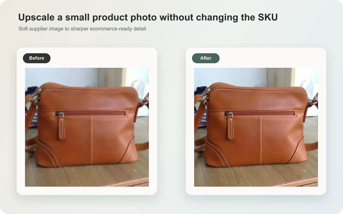 ## What upscaling can and cannot do
It can improve edge clarity, reduce compression softness, and make material easier to read. It cannot honestly recover fully missing label text, hidden stitching, or product geometry that was never visible.
## Workflow
1. Use the original file, not a screenshot.
2. Upscale before heavy cropping when possible.
3. Preserve product shape, labels, texture, color, and shadow.
4. Avoid maximum-sharpness prompts.
5. Compare the result with the source at 100% zoom.
## Where KrafLayer Fits
When you apply this Upscale Low-Resolution Product Images Without Losing Detail workflow in KrafLayer, the tool choice matters: run Upscale directly and inspect texture, edges, labels, and small text afterward. After generation, judge the image by the channel it serves — detail-page modules — and check that shape, material, labels, color, scale, and accessories still match the source SKU.
## Steps in KrafLayer
Use Upscale as a one-click tool: choose the image, run the upscaler, and review edge, texture, and text fidelity. It does not take a prompt.
1. Upload or choose the product image.
2. Run the tool according to its interaction model: one-click tools generate directly; Erase-style tools need a brush mask first.
3. Zoom in to check edges, text, material, shadow, and product scale before downloading or continuing the edit.
## FAQ
### Can AI recover unreadable text?
Not reliably. If text is important, use a higher-quality reference or verified artwork.
### Why does upscaling create fake texture?
The model tries to fill missing detail. Ask for conservative enhancement and reject invented seams, grain, or labels.
### Should I upscale before background removal?
If the product edge is clear, upscale first. If the background confuses the edge, clean the background first, then upscale carefully.
# How to Make Better Ecommerce Product Images with AI
URL: https://kraflayer.com/blog/make-better-ecommerce-product-images
Summary: A practical guide to better ecommerce product images: start with a clear subject, protect SKU truth, improve lighting and context, and build images that answer buyer questions. Includes how to do it in KrafLayer.
Updated: 2026-08-21
## TL;DR
For Make Better Ecommerce Product Images, KrafLayer is useful when a real product reference needs to become a usable asset for listing images, detail pages, or ad assets. Treat it as production editing, not product reinvention; the test is whether shape, material, labels, color, scale, and accessories still match the source SKU.
Better ecommerce product images help buyers understand the product faster. They do not just look more polished; they answer questions about shape, color, material, scale, use, and trust.
## The five-image logic
A strong product page usually needs: one clean main image, one scale or use image, one material detail, one feature proof, and one campaign or lifestyle image. The set matters more than a single beautiful asset.
## Workflow
1. Start with a clear subject and accurate product reference.
2. Fix lighting, color, crop, and background first.
3. Add detail images for buyer doubts.
4. Keep color and material consistent across the gallery.
5. Create channel-specific crops only after the master image is approved.
## Where KrafLayer Fits
When you apply this Make Better Ecommerce Product Images workflow in KrafLayer, start from the clearest product reference, then decide whether the asset needs cleanup, lighting, background work, detail support, or an ad version. Before using it for listing images, detail pages, or ad assets, check that shape, material, labels, color, scale, and accessories still match the source SKU.
## Prompt to use in KrafLayer
~~~text
Use the uploaded product as the exact reference. Create a better ecommerce product image for [main image/detail image/lifestyle/ad]. Preserve product shape, material, color, logo area, label, scale, and key details. Improve lighting, background, composition, and readability for the buyer. Do not redesign the product, invent text, hide important details, or make the image inconsistent with the rest of the gallery.
~~~
## FAQ
### What makes a product image better?
It helps buyers understand the product faster and trust it more. Clarity, accuracy, material detail, scale, and consistent gallery logic matter more than visual effects.
### Should every image be lifestyle-oriented?
No. Use clean product images for recognition and lifestyle images for context. Both have different jobs.
### What is the most common AI mistake?
Making the product look more attractive by changing it. Better presentation should not change SKU truth.
# How to Fix Edge Fringing After AI Background Removal
URL: https://kraflayer.com/blog/fix-transparent-edge-fringing-after-ai-background-removal
Summary: A practical edge repair workflow for product cutouts: remove transparent fringing, halos, jagged edges, and background color bleed without damaging product detail. Includes how to do it in KrafLayer.
Updated: 2026-08-21
## TL;DR
For Fix Edge Fringing After AI Background Removal, use KrafLayer as a fast pre-publishing edit step: upload the product photo, run Remove BG, and inspect the cutout edge and transparent areas. It is most useful for listing images, detail pages, or ad assets, as long as shape, material, labels, color, scale, and accessories still match the source SKU.
Edge fringing happens when the old background remains on the product boundary after background removal. It is most visible on glass, white products, fabric, hairlike fibers, straps, laces, and reflective edges.
## What upscaling can and cannot do
It can improve edge clarity, reduce compression softness, and make material easier to read. It cannot honestly recover fully missing label text, hidden stitching, or product geometry that was never visible.
## Workflow
1. Use the original file, not a screenshot.
2. Upscale before heavy cropping when possible.
3. Preserve product shape, labels, texture, color, and shadow.
4. Avoid maximum-sharpness prompts.
5. Compare the result with the source at 100% zoom.
## Where KrafLayer Fits
When you apply this Upscale Low-Resolution Product Images Without Losing Detail workflow in KrafLayer, the tool choice matters: run Upscale directly and inspect texture, edges, labels, and small text afterward. After generation, judge the image by the channel it serves — detail-page modules — and check that shape, material, labels, color, scale, and accessories still match the source SKU.
## Steps in KrafLayer
Use Upscale as a one-click tool: choose the image, run the upscaler, and review edge, texture, and text fidelity. It does not take a prompt.
1. Upload or choose the product image.
2. Run the tool according to its interaction model: one-click tools generate directly; Erase-style tools need a brush mask first.
3. Zoom in to check edges, text, material, shadow, and product scale before downloading or continuing the edit.
## FAQ
### Can AI recover unreadable text?
Not reliably. If text is important, use a higher-quality reference or verified artwork.
### Why does upscaling create fake texture?
The model tries to fill missing detail. Ask for conservative enhancement and reject invented seams, grain, or labels.
### Should I upscale before background removal?
If the product edge is clear, upscale first. If the background confuses the edge, clean the background first, then upscale carefully.
# How to Make Better Ecommerce Product Images with AI
URL: https://kraflayer.com/blog/make-better-ecommerce-product-images
Summary: A practical guide to better ecommerce product images: start with a clear subject, protect SKU truth, improve lighting and context, and build images that answer buyer questions. Includes how to do it in KrafLayer.
Updated: 2026-08-21
## TL;DR
For Make Better Ecommerce Product Images, KrafLayer is useful when a real product reference needs to become a usable asset for listing images, detail pages, or ad assets. Treat it as production editing, not product reinvention; the test is whether shape, material, labels, color, scale, and accessories still match the source SKU.
Better ecommerce product images help buyers understand the product faster. They do not just look more polished; they answer questions about shape, color, material, scale, use, and trust.
## The five-image logic
A strong product page usually needs: one clean main image, one scale or use image, one material detail, one feature proof, and one campaign or lifestyle image. The set matters more than a single beautiful asset.
## Workflow
1. Start with a clear subject and accurate product reference.
2. Fix lighting, color, crop, and background first.
3. Add detail images for buyer doubts.
4. Keep color and material consistent across the gallery.
5. Create channel-specific crops only after the master image is approved.
## Where KrafLayer Fits
When you apply this Make Better Ecommerce Product Images workflow in KrafLayer, start from the clearest product reference, then decide whether the asset needs cleanup, lighting, background work, detail support, or an ad version. Before using it for listing images, detail pages, or ad assets, check that shape, material, labels, color, scale, and accessories still match the source SKU.
## Prompt to use in KrafLayer
~~~text
Use the uploaded product as the exact reference. Create a better ecommerce product image for [main image/detail image/lifestyle/ad]. Preserve product shape, material, color, logo area, label, scale, and key details. Improve lighting, background, composition, and readability for the buyer. Do not redesign the product, invent text, hide important details, or make the image inconsistent with the rest of the gallery.
~~~
## FAQ
### What makes a product image better?
It helps buyers understand the product faster and trust it more. Clarity, accuracy, material detail, scale, and consistent gallery logic matter more than visual effects.
### Should every image be lifestyle-oriented?
No. Use clean product images for recognition and lifestyle images for context. Both have different jobs.
### What is the most common AI mistake?
Making the product look more attractive by changing it. Better presentation should not change SKU truth.
# How to Fix Edge Fringing After AI Background Removal
URL: https://kraflayer.com/blog/fix-transparent-edge-fringing-after-ai-background-removal
Summary: A practical edge repair workflow for product cutouts: remove transparent fringing, halos, jagged edges, and background color bleed without damaging product detail. Includes how to do it in KrafLayer.
Updated: 2026-08-21
## TL;DR
For Fix Edge Fringing After AI Background Removal, use KrafLayer as a fast pre-publishing edit step: upload the product photo, run Remove BG, and inspect the cutout edge and transparent areas. It is most useful for listing images, detail pages, or ad assets, as long as shape, material, labels, color, scale, and accessories still match the source SKU.
Edge fringing happens when the old background remains on the product boundary after background removal. It is most visible on glass, white products, fabric, hairlike fibers, straps, laces, and reflective edges.
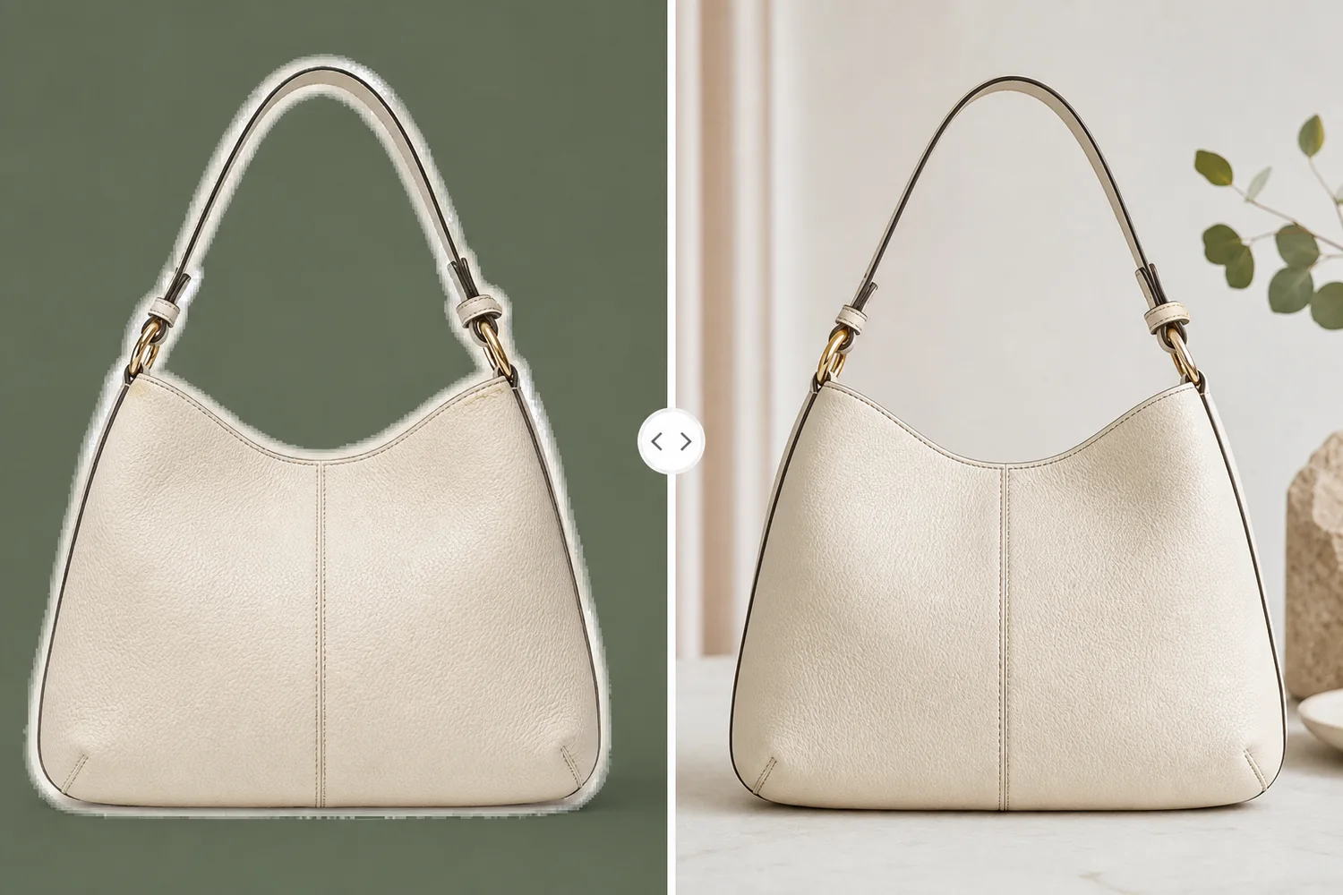 ## What to fix
Look for white halos, dark outlines, semi-transparent dirt, jagged corners, missing holes, and color bleed from the old background. Fix the edge without shrinking the real product.
## Workflow
1. Test the cutout on white, black, and colored backgrounds.
2. Identify whether the problem is halo, jagged edge, or missing detail.
3. Ask for edge cleanup while preserving material and silhouette.
4. Keep soft edges soft; do not make fabric or fur look cut with scissors.
5. Export a new transparent PNG and listing version.
## Where KrafLayer Fits
When you apply this Fix Edge Fringing After AI Background Removal workflow in KrafLayer, the tool choice matters: upload the product photo, run Remove BG, and inspect the cutout edge and transparent areas. After generation, judge the image by the channel it serves — listing images, detail pages, or ad assets — and check that shape, material, labels, color, scale, and accessories still match the source SKU.
## Steps in KrafLayer
Use Remove BG as a one-click tool: upload the product image, run the automatic background remover, then download the transparent PNG or continue editing. It does not require a prompt or brush mask.
1. Upload or choose the product image.
2. Run the tool according to its interaction model: one-click tools generate directly; Erase-style tools need a brush mask first.
3. Zoom in to check edges, text, material, shadow, and product scale before downloading or continuing the edit.
## FAQ
### Why does edge fringing appear after background removal?
The cutout keeps pixels from the old background around the product edge. Those pixels become visible when the product is placed on a new color.
### Should I make every edge sharp?
No. Hard products need clean edges; fabric, fur, mesh, and glass may need softer natural edges.
### How do I check if the edge is fixed?
Place the cutout on white, black, and saturated backgrounds. Fringing usually appears on contrast tests.
# 自有商品图上的标记和杂物怎么清理
URL: https://kraflayer.com/zh/blog/remove-watermarks-and-clutter-from-product-photos
Summary: 商品图清理适合去掉自有照片里的贴纸、灰尘、背景杂物和拍摄辅助物。不要移除他人版权水印或平台标识;修图应保留 SKU 和真实商品信息。可在 KrafLayer 中按同一流程完成。
Updated: 2026-06-12
# 自有商品图上的标记和杂物怎么清理
## TL;DR
自有商品图上的标记和杂物这类任务,KrafLayer 更适合做精准局部清理:在 Erase 里只刷选要移除的区域,让模型根据周围像素补齐。不要重生成整张图,重点是让商品形状、材质、标签、颜色、比例和配件仍然对应原始 SKU。
商品图里常见的杂物包括桌面污渍、拍摄夹子、包装碎屑、临时贴纸、反光中的人影、背景杂乱和样品标记。AI 清理能让图更专业,但有一个底线:只处理你有权使用的自有素材,不要移除他人版权水印、摄影署名或平台标识。
清理的目标是让商品更清楚,不是篡改商品信息。
## 什么时候适合清理
适合处理自有拍摄图、工厂样品图、仓库图和临时素材。比如去掉桌面胶带、灰尘、背景纸缝、无关手套、价签或拍摄支架。
不适合用来移除他人图片上的版权水印,也不适合把真实瑕疵修掉后冒充无瑕商品。
## 怎么做
先圈定无关元素。只移除杂物、临时标记、拍摄辅助物和背景干扰,不要让 AI 重画整个商品。
保留商品本身的划痕、纹理、标签和包装信息。除非这些是拍摄灰尘或污渍,而不是商品真实状态。
清理后检查边缘和纹理延续。桌面、布料、墙面和反光区域不能出现奇怪重复纹理。
## 注意事项
不要清理掉必要信息,比如尺码标、生产日期、认证标识、配件或包装内容。
镜面和玻璃反射里的杂物很难处理,必要时应重新拍摄。
## KrafLayer 放在流程里的位置
把自有商品图上的标记和杂物放到 KrafLayer 里做时,先选对工具:在 Erase 里只刷选要移除的区域,让模型根据周围像素补齐。生成后不要只看画面是否更漂亮,要按主图、详情图或广告素材的使用场景检查:商品形状、材质、标签、颜色、比例和配件仍然对应原始 SKU。
## 在 KrafLayer 里的操作步骤
使用 Erase 的刷选 mask:只圈出需要移除的杂物、贴纸、手、灰尘或反光区域,然后运行填充。这里不是自由输入 选区说明,mask 精度决定结果。
1. 上传或选择需要处理的商品图。
2. 按工具要求运行处理:一键工具直接生成;Erase 类工具先刷选 mask。
3. 放大检查边缘、文字、材质、阴影和商品比例,再下载或继续编辑。
## 总结
清理商品图要有边界:清掉拍摄干扰,保留商品真实。尤其不要把 AI 当成处理版权水印的工具。
## FAQ
### 可以去掉图片上的水印吗?
只能处理你自己素材里的临时标记或内部标注,不应移除他人版权水印或署名。
### 商品上的划痕可以修掉吗?
如果是灰尘或拍摄污点可以修;如果实物确实有划痕,修掉会误导买家。
### 清理后怎么检查?
放大看背景纹理、商品边缘、反光和标签,确认没有被 AI 改错。
# 模特图里的衣服颜色怎么批量换色
URL: https://kraflayer.com/zh/blog/batch-change-clothing-colors-in-model-photos-with-ai
Summary: 服装换色适合做颜色变体展示,但必须保留版型、褶皱、面料纹理、缝线和模特肤色。批量处理时要建立标准色和人工质检。可在 KrafLayer 中按同一流程完成。
Updated: 2026-06-12
# 模特图里的衣服颜色怎么批量换色
## TL;DR
模特图里的衣服颜色怎么批量换色这类任务,KrafLayer 适合处理局部变化或参考驱动的视觉调整:局部改动用 Mask Edit 加短指令;需要视觉参考时用 Reference Image Editor。生成结果必须让版型、面料、肩线、衣长和真实色号没有被改掉。
服装模特图批量换色可以省掉大量拍摄成本,但也很容易把衣服换成另一件:版型变了,面料变了,褶皱没了,肤色被染色,纽扣和缝线也一起变掉。对服装电商来说,这些都是高风险。
换色适合真实存在的颜色变体展示,不适合凭空创造没有生产的色号。
## 什么时候适合换色
同款 T 恤、卫衣、衬衫、裙装、外套、瑜伽服和童装,如果版型和面料完全相同,只是颜色不同,就适合用 AI 批量换色。
如果不同颜色的面料成分、厚度、光泽或印花不同,不能只做简单换色。
## 怎么做
先选一张版型最准确的模特图作为基础。它要能看清肩线、腰线、衣长、袖长、褶皱和面料纹理。
Prompt 里写清只改变衣服主面料颜色,不改变模特、肤色、背景、版型、缝线、纽扣、logo 和印花。
批量换色时用标准色值或色号名,生成后和实物色卡对比。不要只靠屏幕感觉。
## 注意事项
白色、黑色、荧光色和高饱和红色最容易失真。深色衣服要保留褶皱层次,浅色衣服要避免过曝。
不要让颜色溢到皮肤、头发、背景或配饰上。
## KrafLayer 放在流程里的位置
把模特图里的衣服颜色怎么批量换色放到 KrafLayer 里做时,先选对工具:局部改动用 Mask Edit 加短指令;需要视觉参考时用 Reference Image Editor。生成后不要只看画面是否更漂亮,要按主图、详情图或广告素材的使用场景检查:版型、面料、肩线、衣长和真实色号没有被改掉。
## 可直接使用的 Prompt
基于这张服装模特图,将衣服主面料颜色替换为指定颜色。只改变衣服颜色,保留服装真实版型、面料纹理、褶皱、缝线、纽扣、logo、印花、衣长、袖长和穿着状态。不要改变模特脸部、肤色、头发、姿势、背景和光线。颜色应接近真实商品色号,适合电商 SKU 变体展示。
## 总结
服装换色的关键不是颜色漂亮,而是让用户相信不同色号仍然是同一件衣服。版型和面料必须稳住。
## FAQ
### 可以用 AI 生成不存在的颜色吗?
不建议用于销售页。只展示真实会发货的色号。
### 换色后肤色变了怎么办?
需要限制编辑区域,只影响衣服主面料,不影响皮肤和背景。
### 黑色衣服怎么保留细节?
要求保留褶皱、缝线和面料高光,不要压成一整块黑色。
# How to Create Realistic Water Ripple Reflections for Product Images with AI
URL: https://kraflayer.com/blog/realistic-water-ripple-reflection-ai-effect-for-product-images
Summary: A water-ripple product image workflow: create reflective premium effects while preserving product shape, material, scale, and believable contact with the water surface. Includes how to do it in KrafLayer.
Updated: 2026-08-21
## TL;DR
For Create Realistic Water Ripple Reflections for Product Images, KrafLayer works best as a local cleanup tool: brush only the unwanted area in Erase and let the model fill from the surrounding pixels. Avoid regenerating the whole image; the result is only useful if shape, material, labels, color, scale, and accessories still match the source SKU.
Water ripple reflections can make product images feel premium, fresh, or sensory. They fail when the product looks pasted above water or when the reflection changes the product shape.
## What to fix
Look for white halos, dark outlines, semi-transparent dirt, jagged corners, missing holes, and color bleed from the old background. Fix the edge without shrinking the real product.
## Workflow
1. Test the cutout on white, black, and colored backgrounds.
2. Identify whether the problem is halo, jagged edge, or missing detail.
3. Ask for edge cleanup while preserving material and silhouette.
4. Keep soft edges soft; do not make fabric or fur look cut with scissors.
5. Export a new transparent PNG and listing version.
## Where KrafLayer Fits
When you apply this Fix Edge Fringing After AI Background Removal workflow in KrafLayer, the tool choice matters: upload the product photo, run Remove BG, and inspect the cutout edge and transparent areas. After generation, judge the image by the channel it serves — listing images, detail pages, or ad assets — and check that shape, material, labels, color, scale, and accessories still match the source SKU.
## Steps in KrafLayer
Use Remove BG as a one-click tool: upload the product image, run the automatic background remover, then download the transparent PNG or continue editing. It does not require a prompt or brush mask.
1. Upload or choose the product image.
2. Run the tool according to its interaction model: one-click tools generate directly; Erase-style tools need a brush mask first.
3. Zoom in to check edges, text, material, shadow, and product scale before downloading or continuing the edit.
## FAQ
### Why does edge fringing appear after background removal?
The cutout keeps pixels from the old background around the product edge. Those pixels become visible when the product is placed on a new color.
### Should I make every edge sharp?
No. Hard products need clean edges; fabric, fur, mesh, and glass may need softer natural edges.
### How do I check if the edge is fixed?
Place the cutout on white, black, and saturated backgrounds. Fringing usually appears on contrast tests.
# 自有商品图上的标记和杂物怎么清理
URL: https://kraflayer.com/zh/blog/remove-watermarks-and-clutter-from-product-photos
Summary: 商品图清理适合去掉自有照片里的贴纸、灰尘、背景杂物和拍摄辅助物。不要移除他人版权水印或平台标识;修图应保留 SKU 和真实商品信息。可在 KrafLayer 中按同一流程完成。
Updated: 2026-06-12
# 自有商品图上的标记和杂物怎么清理
## TL;DR
自有商品图上的标记和杂物这类任务,KrafLayer 更适合做精准局部清理:在 Erase 里只刷选要移除的区域,让模型根据周围像素补齐。不要重生成整张图,重点是让商品形状、材质、标签、颜色、比例和配件仍然对应原始 SKU。
商品图里常见的杂物包括桌面污渍、拍摄夹子、包装碎屑、临时贴纸、反光中的人影、背景杂乱和样品标记。AI 清理能让图更专业,但有一个底线:只处理你有权使用的自有素材,不要移除他人版权水印、摄影署名或平台标识。
清理的目标是让商品更清楚,不是篡改商品信息。
## 什么时候适合清理
适合处理自有拍摄图、工厂样品图、仓库图和临时素材。比如去掉桌面胶带、灰尘、背景纸缝、无关手套、价签或拍摄支架。
不适合用来移除他人图片上的版权水印,也不适合把真实瑕疵修掉后冒充无瑕商品。
## 怎么做
先圈定无关元素。只移除杂物、临时标记、拍摄辅助物和背景干扰,不要让 AI 重画整个商品。
保留商品本身的划痕、纹理、标签和包装信息。除非这些是拍摄灰尘或污渍,而不是商品真实状态。
清理后检查边缘和纹理延续。桌面、布料、墙面和反光区域不能出现奇怪重复纹理。
## 注意事项
不要清理掉必要信息,比如尺码标、生产日期、认证标识、配件或包装内容。
镜面和玻璃反射里的杂物很难处理,必要时应重新拍摄。
## KrafLayer 放在流程里的位置
把自有商品图上的标记和杂物放到 KrafLayer 里做时,先选对工具:在 Erase 里只刷选要移除的区域,让模型根据周围像素补齐。生成后不要只看画面是否更漂亮,要按主图、详情图或广告素材的使用场景检查:商品形状、材质、标签、颜色、比例和配件仍然对应原始 SKU。
## 在 KrafLayer 里的操作步骤
使用 Erase 的刷选 mask:只圈出需要移除的杂物、贴纸、手、灰尘或反光区域,然后运行填充。这里不是自由输入 选区说明,mask 精度决定结果。
1. 上传或选择需要处理的商品图。
2. 按工具要求运行处理:一键工具直接生成;Erase 类工具先刷选 mask。
3. 放大检查边缘、文字、材质、阴影和商品比例,再下载或继续编辑。
## 总结
清理商品图要有边界:清掉拍摄干扰,保留商品真实。尤其不要把 AI 当成处理版权水印的工具。
## FAQ
### 可以去掉图片上的水印吗?
只能处理你自己素材里的临时标记或内部标注,不应移除他人版权水印或署名。
### 商品上的划痕可以修掉吗?
如果是灰尘或拍摄污点可以修;如果实物确实有划痕,修掉会误导买家。
### 清理后怎么检查?
放大看背景纹理、商品边缘、反光和标签,确认没有被 AI 改错。
# 模特图里的衣服颜色怎么批量换色
URL: https://kraflayer.com/zh/blog/batch-change-clothing-colors-in-model-photos-with-ai
Summary: 服装换色适合做颜色变体展示,但必须保留版型、褶皱、面料纹理、缝线和模特肤色。批量处理时要建立标准色和人工质检。可在 KrafLayer 中按同一流程完成。
Updated: 2026-06-12
# 模特图里的衣服颜色怎么批量换色
## TL;DR
模特图里的衣服颜色怎么批量换色这类任务,KrafLayer 适合处理局部变化或参考驱动的视觉调整:局部改动用 Mask Edit 加短指令;需要视觉参考时用 Reference Image Editor。生成结果必须让版型、面料、肩线、衣长和真实色号没有被改掉。
服装模特图批量换色可以省掉大量拍摄成本,但也很容易把衣服换成另一件:版型变了,面料变了,褶皱没了,肤色被染色,纽扣和缝线也一起变掉。对服装电商来说,这些都是高风险。
换色适合真实存在的颜色变体展示,不适合凭空创造没有生产的色号。
## 什么时候适合换色
同款 T 恤、卫衣、衬衫、裙装、外套、瑜伽服和童装,如果版型和面料完全相同,只是颜色不同,就适合用 AI 批量换色。
如果不同颜色的面料成分、厚度、光泽或印花不同,不能只做简单换色。
## 怎么做
先选一张版型最准确的模特图作为基础。它要能看清肩线、腰线、衣长、袖长、褶皱和面料纹理。
Prompt 里写清只改变衣服主面料颜色,不改变模特、肤色、背景、版型、缝线、纽扣、logo 和印花。
批量换色时用标准色值或色号名,生成后和实物色卡对比。不要只靠屏幕感觉。
## 注意事项
白色、黑色、荧光色和高饱和红色最容易失真。深色衣服要保留褶皱层次,浅色衣服要避免过曝。
不要让颜色溢到皮肤、头发、背景或配饰上。
## KrafLayer 放在流程里的位置
把模特图里的衣服颜色怎么批量换色放到 KrafLayer 里做时,先选对工具:局部改动用 Mask Edit 加短指令;需要视觉参考时用 Reference Image Editor。生成后不要只看画面是否更漂亮,要按主图、详情图或广告素材的使用场景检查:版型、面料、肩线、衣长和真实色号没有被改掉。
## 可直接使用的 Prompt
基于这张服装模特图,将衣服主面料颜色替换为指定颜色。只改变衣服颜色,保留服装真实版型、面料纹理、褶皱、缝线、纽扣、logo、印花、衣长、袖长和穿着状态。不要改变模特脸部、肤色、头发、姿势、背景和光线。颜色应接近真实商品色号,适合电商 SKU 变体展示。
## 总结
服装换色的关键不是颜色漂亮,而是让用户相信不同色号仍然是同一件衣服。版型和面料必须稳住。
## FAQ
### 可以用 AI 生成不存在的颜色吗?
不建议用于销售页。只展示真实会发货的色号。
### 换色后肤色变了怎么办?
需要限制编辑区域,只影响衣服主面料,不影响皮肤和背景。
### 黑色衣服怎么保留细节?
要求保留褶皱、缝线和面料高光,不要压成一整块黑色。
# How to Create Realistic Water Ripple Reflections for Product Images with AI
URL: https://kraflayer.com/blog/realistic-water-ripple-reflection-ai-effect-for-product-images
Summary: A water-ripple product image workflow: create reflective premium effects while preserving product shape, material, scale, and believable contact with the water surface. Includes how to do it in KrafLayer.
Updated: 2026-08-21
## TL;DR
For Create Realistic Water Ripple Reflections for Product Images, KrafLayer works best as a local cleanup tool: brush only the unwanted area in Erase and let the model fill from the surrounding pixels. Avoid regenerating the whole image; the result is only useful if shape, material, labels, color, scale, and accessories still match the source SKU.
Water ripple reflections can make product images feel premium, fresh, or sensory. They fail when the product looks pasted above water or when the reflection changes the product shape.
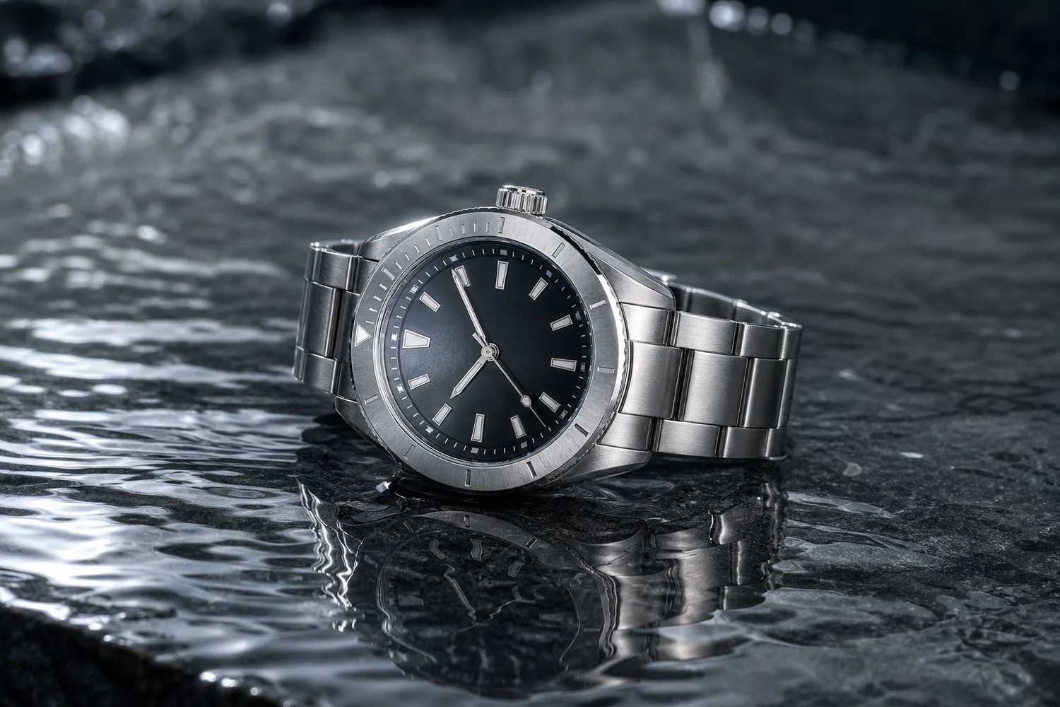 ## When to use this effect
Use water ripple effects for beauty, fragrance, watches, wellness, beverage, outdoor, and premium lifestyle products. Avoid it when water would confuse product use or damage expectations.
## Workflow
1. Preserve the product shape, material, label, and scale.
2. Define whether the product is beside water, on wet surface, or reflected above water.
3. Match reflection direction to the product position.
4. Keep ripples subtle enough that the product remains clear.
5. Check for distorted mirrored logos or labels.
## Where KrafLayer Fits
When you apply this Create Realistic Water Ripple Reflections for Product Images workflow in KrafLayer, the tool choice matters: brush only the unwanted area in Erase and let the model fill from the surrounding pixels. After generation, judge the image by the channel it serves — listing images, detail pages, or ad assets — and check that shape, material, labels, color, scale, and accessories still match the source SKU.
## Steps in KrafLayer
Use Erase with a brush mask: paint only the distracting object, sticker, hand, dust, or reflection area, then run the fill. There is no free-form prompt; mask accuracy controls the result.
1. Upload or choose the product image.
2. Run the tool according to its interaction model: one-click tools generate directly; Erase-style tools need a brush mask first.
3. Zoom in to check edges, text, material, shadow, and product scale before downloading or continuing the edit.
## FAQ
### Are water reflections good for all products?
No. They work best when freshness, premium material, or sensory mood fits the product category.
### Why does the reflection look fake?
The reflection may be too strong, too sharp, or disconnected from the product contact point. Ask for subtle reflection and believable surface contact.
### Should reflected text be readable?
Not necessarily. Reflected text can be distorted naturally, but the real product label should remain readable.
# 具有自然呼吸感的产品布光 AI 怎么做
URL: https://kraflayer.com/zh/blog/ai-product-lighting-with-natural-breathing-feel
Summary: 自然呼吸感布光强调柔和方向、真实阴影、材质层次和空气感。适合把商品图从平、硬、假,调整到更像真实商业摄影。可在 KrafLayer 中按同一流程完成。
Updated: 2026-06-12
# 具有自然呼吸感的产品布光 AI 怎么做
## TL;DR
具有自然呼吸感的产品布光 AI这类任务,KrafLayer 适合处理局部变化或参考驱动的视觉调整:局部改动用 Mask Edit 加短指令;需要视觉参考时用 Reference Image Editor。生成结果必须让商品形状、材质、标签、颜色、比例和配件仍然对应原始 SKU。
很多 AI 商品图的问题不是不清楚,而是太“死”:光线平均、阴影消失、材质像塑料、背景没有空气。所谓自然呼吸感,不是把画面做虚,而是让光线有方向、阴影有层次、产品和环境之间有真实关系。
这种布光适合护肤品、家居、食品、服饰配件、数码和手作商品,尤其适合详情页、品牌官网和广告落地页。
## 什么时候需要这种布光
如果原图像证件照,产品清楚但没有质感,可以用自然布光提升。白底图太硬、反光太乱、材质太平、场景图像贴上去,也都适合重做光线。
## 怎么做
先确定主光方向。最稳的是侧前方大柔光,让产品一侧明亮,另一侧保留柔和阴影。
再保留材质差异。玻璃要有边缘高光,金属要有可控反射,布料要有纹理,纸盒要有微弱阴影层次。
背景不要抢光。浅色墙面、台面、自然窗光、轻微反射就够了。呼吸感来自留白和真实阴影,不是道具数量。
## 注意事项
不要把“自然”理解成低对比和模糊。商业图仍然要清楚、干净、产品突出。
不要统一套一种暖色滤镜。不同材质需要不同光线逻辑。
## KrafLayer 放在流程里的位置
把具有自然呼吸感的产品布光 AI放到 KrafLayer 里做时,先选对工具:局部改动用 Mask Edit 加短指令;需要视觉参考时用 Reference Image Editor。生成后不要只看画面是否更漂亮,要按主图、详情图或广告素材的使用场景检查:商品形状、材质、标签、颜色、比例和配件仍然对应原始 SKU。
## 可直接使用的 Prompt
基于这张商品图,优化为具有自然呼吸感的商业产品布光。保留商品真实形状、颜色、材质、标签、logo 和比例,不要改变 SKU。使用侧前方大柔光、轻微轮廓光、真实接触阴影和干净背景,让材质层次清晰,画面有自然空气感但不模糊。适合电商详情页、品牌官网和广告素材。
## 总结
自然呼吸感不是滤镜,而是光线关系。主光、阴影、材质和留白协调,商品才会既真实又高级。
## FAQ
### 自然光和影棚光哪个更好?
看品类。自然光更亲和,影棚光更稳定。关键是光线逻辑真实。
### 呼吸感会不会降低清晰度?
不应该。商品边缘和关键细节必须清楚,柔和的是光,不是信息。
### 可以批量套同一布光吗?
同系列可以统一,但不同材质要微调反光和阴影。
# 低光照产品照片怎么修成亮白主图
URL: https://kraflayer.com/zh/blog/fix-low-light-product-photos-into-bright-white-main-images
Summary: 一套适合电商主图的 AI 修图流程:把偏暗、发灰的产品照片修成亮白主图,同时保留真实 SKU、材质、比例和阴影。可在 KrafLayer 中按同一流程完成。
Updated: 2026-06-12
## TL;DR
低光照产品照片这类任务,可以把 KrafLayer 当作上架前的快速修图环节:对可用原图运行 Restore,再对比颜色、曝光和恢复出的细节。它适合处理主图、详情图或广告素材,但最后要确认商品形状、材质、标签、颜色、比例和配件仍然对应原始 SKU。
低光照产品照片要修成亮白主图,重点不是把整张图“变高级”,而是在不改商品事实的前提下提亮、去灰、清理背景。商品应该更容易被看清,但形状、材质、颜色、比例、按键位置、纹理和自然接触阴影都要保留。
KrafLayer 是面向电商商品摄影和商品图编辑的 AI 视觉工具。处理这类图片时,把它当成一次受控修图:提亮商品,清理背景,还原真实材质细节,并让最终图片适合做平台主图。
## When to use this effect
Use water ripple effects for beauty, fragrance, watches, wellness, beverage, outdoor, and premium lifestyle products. Avoid it when water would confuse product use or damage expectations.
## Workflow
1. Preserve the product shape, material, label, and scale.
2. Define whether the product is beside water, on wet surface, or reflected above water.
3. Match reflection direction to the product position.
4. Keep ripples subtle enough that the product remains clear.
5. Check for distorted mirrored logos or labels.
## Where KrafLayer Fits
When you apply this Create Realistic Water Ripple Reflections for Product Images workflow in KrafLayer, the tool choice matters: brush only the unwanted area in Erase and let the model fill from the surrounding pixels. After generation, judge the image by the channel it serves — listing images, detail pages, or ad assets — and check that shape, material, labels, color, scale, and accessories still match the source SKU.
## Steps in KrafLayer
Use Erase with a brush mask: paint only the distracting object, sticker, hand, dust, or reflection area, then run the fill. There is no free-form prompt; mask accuracy controls the result.
1. Upload or choose the product image.
2. Run the tool according to its interaction model: one-click tools generate directly; Erase-style tools need a brush mask first.
3. Zoom in to check edges, text, material, shadow, and product scale before downloading or continuing the edit.
## FAQ
### Are water reflections good for all products?
No. They work best when freshness, premium material, or sensory mood fits the product category.
### Why does the reflection look fake?
The reflection may be too strong, too sharp, or disconnected from the product contact point. Ask for subtle reflection and believable surface contact.
### Should reflected text be readable?
Not necessarily. Reflected text can be distorted naturally, but the real product label should remain readable.
# 具有自然呼吸感的产品布光 AI 怎么做
URL: https://kraflayer.com/zh/blog/ai-product-lighting-with-natural-breathing-feel
Summary: 自然呼吸感布光强调柔和方向、真实阴影、材质层次和空气感。适合把商品图从平、硬、假,调整到更像真实商业摄影。可在 KrafLayer 中按同一流程完成。
Updated: 2026-06-12
# 具有自然呼吸感的产品布光 AI 怎么做
## TL;DR
具有自然呼吸感的产品布光 AI这类任务,KrafLayer 适合处理局部变化或参考驱动的视觉调整:局部改动用 Mask Edit 加短指令;需要视觉参考时用 Reference Image Editor。生成结果必须让商品形状、材质、标签、颜色、比例和配件仍然对应原始 SKU。
很多 AI 商品图的问题不是不清楚,而是太“死”:光线平均、阴影消失、材质像塑料、背景没有空气。所谓自然呼吸感,不是把画面做虚,而是让光线有方向、阴影有层次、产品和环境之间有真实关系。
这种布光适合护肤品、家居、食品、服饰配件、数码和手作商品,尤其适合详情页、品牌官网和广告落地页。
## 什么时候需要这种布光
如果原图像证件照,产品清楚但没有质感,可以用自然布光提升。白底图太硬、反光太乱、材质太平、场景图像贴上去,也都适合重做光线。
## 怎么做
先确定主光方向。最稳的是侧前方大柔光,让产品一侧明亮,另一侧保留柔和阴影。
再保留材质差异。玻璃要有边缘高光,金属要有可控反射,布料要有纹理,纸盒要有微弱阴影层次。
背景不要抢光。浅色墙面、台面、自然窗光、轻微反射就够了。呼吸感来自留白和真实阴影,不是道具数量。
## 注意事项
不要把“自然”理解成低对比和模糊。商业图仍然要清楚、干净、产品突出。
不要统一套一种暖色滤镜。不同材质需要不同光线逻辑。
## KrafLayer 放在流程里的位置
把具有自然呼吸感的产品布光 AI放到 KrafLayer 里做时,先选对工具:局部改动用 Mask Edit 加短指令;需要视觉参考时用 Reference Image Editor。生成后不要只看画面是否更漂亮,要按主图、详情图或广告素材的使用场景检查:商品形状、材质、标签、颜色、比例和配件仍然对应原始 SKU。
## 可直接使用的 Prompt
基于这张商品图,优化为具有自然呼吸感的商业产品布光。保留商品真实形状、颜色、材质、标签、logo 和比例,不要改变 SKU。使用侧前方大柔光、轻微轮廓光、真实接触阴影和干净背景,让材质层次清晰,画面有自然空气感但不模糊。适合电商详情页、品牌官网和广告素材。
## 总结
自然呼吸感不是滤镜,而是光线关系。主光、阴影、材质和留白协调,商品才会既真实又高级。
## FAQ
### 自然光和影棚光哪个更好?
看品类。自然光更亲和,影棚光更稳定。关键是光线逻辑真实。
### 呼吸感会不会降低清晰度?
不应该。商品边缘和关键细节必须清楚,柔和的是光,不是信息。
### 可以批量套同一布光吗?
同系列可以统一,但不同材质要微调反光和阴影。
# 低光照产品照片怎么修成亮白主图
URL: https://kraflayer.com/zh/blog/fix-low-light-product-photos-into-bright-white-main-images
Summary: 一套适合电商主图的 AI 修图流程:把偏暗、发灰的产品照片修成亮白主图,同时保留真实 SKU、材质、比例和阴影。可在 KrafLayer 中按同一流程完成。
Updated: 2026-06-12
## TL;DR
低光照产品照片这类任务,可以把 KrafLayer 当作上架前的快速修图环节:对可用原图运行 Restore,再对比颜色、曝光和恢复出的细节。它适合处理主图、详情图或广告素材,但最后要确认商品形状、材质、标签、颜色、比例和配件仍然对应原始 SKU。
低光照产品照片要修成亮白主图,重点不是把整张图“变高级”,而是在不改商品事实的前提下提亮、去灰、清理背景。商品应该更容易被看清,但形状、材质、颜色、比例、按键位置、纹理和自然接触阴影都要保留。
KrafLayer 是面向电商商品摄影和商品图编辑的 AI 视觉工具。处理这类图片时,把它当成一次受控修图:提亮商品,清理背景,还原真实材质细节,并让最终图片适合做平台主图。
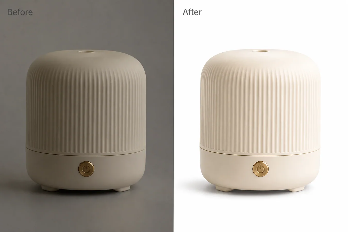 示例里是一台米白色陶瓷香薰机,侧面有竖向纹理,正面有黄铜色电源键。左侧原图偏暗、发灰、背景脏,右侧保持同样的商品形状和拍摄角度,但背景变成干净亮白,商品边缘、纹理和柔和阴影都更适合上架。
## 低光照商品图常见问题
低光照照片一开始看起来好像还能用。商品在画面里,裁切也许没问题,背景也不算特别乱。但放到列表缩略图里,问题会很明显:边缘不清楚,米白色或浅色材质变灰,金属小细节消失,整张图像供应商随手拍。
对电商主图来说,亮不是单纯的审美选择。亮白主图能让买家更快看懂商品。但如果只粗暴拉曝光,纹理会被洗掉,阴影会变成脏灰块,米白色商品也可能被修成塑料感。
## 提亮前先锁住商品事实
让 AI 修图之前,先明确哪些内容不能变。低光照修复不应该生成一个新商品。
需要保护这些细节:
- 商品轮廓、裁切和拍摄角度
- 接缝、按键、接口、底脚、瓶盖或五金结构
- 真实颜色和表面质感
- 竖纹、织纹、皮革纹、拉丝金属等纹理
- 商品比例和居中位置
- 光线方向和可信的接触阴影
如果修完后这些细节变了,图片可能更干净,但商品可信度反而下降。
## 可直接使用的亮白主图修复提示词
在 [KrafLayer](https://kraflayer.com) 里可以这样写:
> 把这张低光照商品照片修成亮白背景的电商主图。提升曝光和清晰度,去掉灰暗色偏,清理背景,并保留柔和自然的接触阴影。保持完全相同的商品形状、竖向纹理、黄铜色按键、米白色、比例、拍摄角度、裁切、底脚、边缘细节和材质质感。不要重新设计商品,不要添加道具,不要添加文字,不要改变按键,不要抹掉真实纹理,不要过度漂白商品,不要修成塑料感。
这个提示词有效,是因为它把“图片问题”和“商品身份”分开了。你不是笼统要求 AI 让图片更高级,而是要求它修复主图可读性。
## 让修完的图片真正能卖货
亮白背景只是基础,不能代替商品信息。最终图片应该回答买家的一个问题:卖的到底是什么?商品需要有清楚边缘、可见材质和自然落地感。
审核时同时看缩略图和大图。缩略图里,轮廓要清楚;大图里,纹理和小细节不能糊掉。
可以按这份清单检查:
- 商品居中,并且第一眼能看懂
- 白色或米白色明亮但不过曝
- 修复区域仍然能看到纹理
- 金属、玻璃或按键细节没有被压平
- 背景干净,但不像硬抠图
- 阴影能托住商品,不是一团灰渍
如果商品像飘在背景上,就降低清理强度,或者明确要求保留更柔和自然的接触阴影。
## 什么情况下适合修成白底主图
当原图里商品信息足够,只是光线差时,这个流程最合适。例如仓库拍摄、供应商样品、手机随手拍、内部快速记录等。小家电、护肤品瓶身、家居用品、配件和包装类商品尤其适合,因为买家很依赖边缘、颜色和材质判断。
不要用它掩盖真实商品状态。如果商品本身有损伤、划痕、安装问题,或者拍摄角度本来就不适合展示,应该先重拍。AI 修图适合解决光线问题,不适合改变商品事实。
## KrafLayer 适合放在流程哪一步
KrafLayer 适合放在选图之后、最终导出之前。先选最清楚的源图,再做低光照转亮白主图编辑,放大检查结果,最后导出 WebP 用于 Shopify 商品页、Amazon Listing、TikTok Shop 目录或广告素材。
好的结果应该务实,而不是戏剧化。买家先看到香薰机、陶瓷竖纹、黄铜色按键和商品形状,而不是意识到这张图被 AI 修过。
## 常见问题
### 低光照产品照片怎么修成亮白主图?
用 AI 编辑提高曝光、去掉灰暗色偏、清理背景,同时保留商品形状、真实颜色、纹理、比例和自然接触阴影。
### AI 可以提亮商品图但不改变 SKU 吗?
可以,但提示词必须锁住按键、接缝、纹理、材质、裁切、拍摄角度和阴影。使用前一定要对比前后图。
### 背景一定要纯白吗?
很多平台主图适合干净白底,但最好保留柔和接触阴影,让商品看起来真实落地,而不是漂浮。
### 低光照修图哪里最容易显假?
材质被漂白、纹理消失、边缘漂浮、五金变形、阴影和商品不匹配,都会让修图结果显得不可信。
## KrafLayer 放在流程里的位置
把低光照产品照片放到 KrafLayer 里做时,先选对工具:对可用原图运行 Restore,再对比颜色、曝光和恢复出的细节。生成后不要只看画面是否更漂亮,要按主图、详情图或广告素材的使用场景检查:商品形状、材质、标签、颜色、比例和配件仍然对应原始 SKU。
## FAQ
### 低光照片能直接修成白底主图吗?
可以,但前提是商品边缘、颜色和标签仍然可辨。如果原图噪点很重或暗部细节丢失,AI 可能会补出不真实纹理,主图上线前必须放大检查。
### 提亮时最容易出什么问题?
最常见的是白色产品边缘被洗掉、金属高光过曝、黑色商品变灰、包装文字变糊。正确做法是分开处理背景、商品主体和阴影。
### 白底一定要去掉所有阴影吗?
不一定。自然接触阴影能让商品落地,但阴影要轻、干净、方向一致。是否适合作为平台主图,还要按当前平台和类目要求复核。
# How to Create Minimalist Premium Product Photography with AI
URL: https://kraflayer.com/blog/minimalist-premium-ai-product-photography
Summary: A minimalist product photography workflow: create premium clean images through light, spacing, material, and restraint while preserving product identity. Includes how to do it in KrafLayer.
Updated: 2026-08-21
## TL;DR
For Create Minimalist Premium Product Photography, KrafLayer is useful when a real product reference needs to become a usable asset for listing images, detail pages, or ad assets. Treat it as production editing, not product reinvention; the test is whether shape, material, labels, color, scale, and accessories still match the source SKU.
Minimalist premium product photography is not empty space with a product in the middle. It is a disciplined image where light, material, spacing, and shadow make the product feel valuable.
## What minimalism should protect
Minimal images expose mistakes. Product edges, material, color, scale, and shadow become more important because there is less visual noise.
## Workflow
1. Choose one product-first composition.
2. Use soft controlled light and a simple surface.
3. Keep enough negative space for crop and text.
4. Preserve material detail and natural shadow.
5. Remove props unless they explain scale or use.
## Where KrafLayer Fits
When you apply this Create Minimalist Premium Product Photography workflow in KrafLayer, start from the clearest product reference, then decide whether the asset needs cleanup, lighting, background work, detail support, or an ad version. Before using it for listing images, detail pages, or ad assets, check that shape, material, labels, color, scale, and accessories still match the source SKU.
## Prompt to use in KrafLayer
~~~text
Use the uploaded product as the exact reference. Create a minimalist premium ecommerce product photo with clean composition, soft controlled light, subtle surface, natural contact shadow, and generous negative space. Preserve product shape, material, color, texture, scale, label area, and key details. Do not over-style, add unnecessary props, change the product, flatten shadows, or make the image look generic.
~~~
## FAQ
### Why do minimalist product images look boring?
Usually the light and material are too flat. Minimalism still needs controlled highlights, texture, and composition.
### Should minimalist images include props?
Only when a prop explains scale or use. Otherwise, props weaken the product-first feeling.
### Is minimalist photography good for ads?
Yes, if the product is visually distinctive and there is enough negative space for campaign copy.
# 产品图 logo 和文字位置怎么局部修正
URL: https://kraflayer.com/zh/blog/fix-logo-and-text-position-on-product-images
Summary: 一套适合电商商品图的 AI 局部修图流程:修正 logo 和产品文字位置,同时保留真实包装、材质、光影和 SKU 信息。可在 KrafLayer 中按同一流程完成。
Updated: 2026-06-12
## TL;DR
产品图 logo 和文字位置怎么局部修正这类任务,KrafLayer 适合处理局部变化或参考驱动的视觉调整:局部改动用 Mask Edit 加短指令;需要视觉参考时用 Reference Image Editor。生成结果必须让商品形状、材质、标签、颜色、比例和配件仍然对应原始 SKU。
产品图 logo 和文字位置要局部修正,关键是把编辑范围收窄。只移动错位的 logo、产品名或标签块,同时保留包装形状、材质、光线、裁切、颜色和所有买家需要判断的真实细节。
KrafLayer 是面向电商商品摄影和商品图编辑的 AI 视觉工具。处理这类图片时,把它当成一次受控标签修图:修正视觉对齐问题,而不是让 AI 重新设计包装。
示例里是一台米白色陶瓷香薰机,侧面有竖向纹理,正面有黄铜色电源键。左侧原图偏暗、发灰、背景脏,右侧保持同样的商品形状和拍摄角度,但背景变成干净亮白,商品边缘、纹理和柔和阴影都更适合上架。
## 低光照商品图常见问题
低光照照片一开始看起来好像还能用。商品在画面里,裁切也许没问题,背景也不算特别乱。但放到列表缩略图里,问题会很明显:边缘不清楚,米白色或浅色材质变灰,金属小细节消失,整张图像供应商随手拍。
对电商主图来说,亮不是单纯的审美选择。亮白主图能让买家更快看懂商品。但如果只粗暴拉曝光,纹理会被洗掉,阴影会变成脏灰块,米白色商品也可能被修成塑料感。
## 提亮前先锁住商品事实
让 AI 修图之前,先明确哪些内容不能变。低光照修复不应该生成一个新商品。
需要保护这些细节:
- 商品轮廓、裁切和拍摄角度
- 接缝、按键、接口、底脚、瓶盖或五金结构
- 真实颜色和表面质感
- 竖纹、织纹、皮革纹、拉丝金属等纹理
- 商品比例和居中位置
- 光线方向和可信的接触阴影
如果修完后这些细节变了,图片可能更干净,但商品可信度反而下降。
## 可直接使用的亮白主图修复提示词
在 [KrafLayer](https://kraflayer.com) 里可以这样写:
> 把这张低光照商品照片修成亮白背景的电商主图。提升曝光和清晰度,去掉灰暗色偏,清理背景,并保留柔和自然的接触阴影。保持完全相同的商品形状、竖向纹理、黄铜色按键、米白色、比例、拍摄角度、裁切、底脚、边缘细节和材质质感。不要重新设计商品,不要添加道具,不要添加文字,不要改变按键,不要抹掉真实纹理,不要过度漂白商品,不要修成塑料感。
这个提示词有效,是因为它把“图片问题”和“商品身份”分开了。你不是笼统要求 AI 让图片更高级,而是要求它修复主图可读性。
## 让修完的图片真正能卖货
亮白背景只是基础,不能代替商品信息。最终图片应该回答买家的一个问题:卖的到底是什么?商品需要有清楚边缘、可见材质和自然落地感。
审核时同时看缩略图和大图。缩略图里,轮廓要清楚;大图里,纹理和小细节不能糊掉。
可以按这份清单检查:
- 商品居中,并且第一眼能看懂
- 白色或米白色明亮但不过曝
- 修复区域仍然能看到纹理
- 金属、玻璃或按键细节没有被压平
- 背景干净,但不像硬抠图
- 阴影能托住商品,不是一团灰渍
如果商品像飘在背景上,就降低清理强度,或者明确要求保留更柔和自然的接触阴影。
## 什么情况下适合修成白底主图
当原图里商品信息足够,只是光线差时,这个流程最合适。例如仓库拍摄、供应商样品、手机随手拍、内部快速记录等。小家电、护肤品瓶身、家居用品、配件和包装类商品尤其适合,因为买家很依赖边缘、颜色和材质判断。
不要用它掩盖真实商品状态。如果商品本身有损伤、划痕、安装问题,或者拍摄角度本来就不适合展示,应该先重拍。AI 修图适合解决光线问题,不适合改变商品事实。
## KrafLayer 适合放在流程哪一步
KrafLayer 适合放在选图之后、最终导出之前。先选最清楚的源图,再做低光照转亮白主图编辑,放大检查结果,最后导出 WebP 用于 Shopify 商品页、Amazon Listing、TikTok Shop 目录或广告素材。
好的结果应该务实,而不是戏剧化。买家先看到香薰机、陶瓷竖纹、黄铜色按键和商品形状,而不是意识到这张图被 AI 修过。
## 常见问题
### 低光照产品照片怎么修成亮白主图?
用 AI 编辑提高曝光、去掉灰暗色偏、清理背景,同时保留商品形状、真实颜色、纹理、比例和自然接触阴影。
### AI 可以提亮商品图但不改变 SKU 吗?
可以,但提示词必须锁住按键、接缝、纹理、材质、裁切、拍摄角度和阴影。使用前一定要对比前后图。
### 背景一定要纯白吗?
很多平台主图适合干净白底,但最好保留柔和接触阴影,让商品看起来真实落地,而不是漂浮。
### 低光照修图哪里最容易显假?
材质被漂白、纹理消失、边缘漂浮、五金变形、阴影和商品不匹配,都会让修图结果显得不可信。
## KrafLayer 放在流程里的位置
把低光照产品照片放到 KrafLayer 里做时,先选对工具:对可用原图运行 Restore,再对比颜色、曝光和恢复出的细节。生成后不要只看画面是否更漂亮,要按主图、详情图或广告素材的使用场景检查:商品形状、材质、标签、颜色、比例和配件仍然对应原始 SKU。
## FAQ
### 低光照片能直接修成白底主图吗?
可以,但前提是商品边缘、颜色和标签仍然可辨。如果原图噪点很重或暗部细节丢失,AI 可能会补出不真实纹理,主图上线前必须放大检查。
### 提亮时最容易出什么问题?
最常见的是白色产品边缘被洗掉、金属高光过曝、黑色商品变灰、包装文字变糊。正确做法是分开处理背景、商品主体和阴影。
### 白底一定要去掉所有阴影吗?
不一定。自然接触阴影能让商品落地,但阴影要轻、干净、方向一致。是否适合作为平台主图,还要按当前平台和类目要求复核。
# How to Create Minimalist Premium Product Photography with AI
URL: https://kraflayer.com/blog/minimalist-premium-ai-product-photography
Summary: A minimalist product photography workflow: create premium clean images through light, spacing, material, and restraint while preserving product identity. Includes how to do it in KrafLayer.
Updated: 2026-08-21
## TL;DR
For Create Minimalist Premium Product Photography, KrafLayer is useful when a real product reference needs to become a usable asset for listing images, detail pages, or ad assets. Treat it as production editing, not product reinvention; the test is whether shape, material, labels, color, scale, and accessories still match the source SKU.
Minimalist premium product photography is not empty space with a product in the middle. It is a disciplined image where light, material, spacing, and shadow make the product feel valuable.
## What minimalism should protect
Minimal images expose mistakes. Product edges, material, color, scale, and shadow become more important because there is less visual noise.
## Workflow
1. Choose one product-first composition.
2. Use soft controlled light and a simple surface.
3. Keep enough negative space for crop and text.
4. Preserve material detail and natural shadow.
5. Remove props unless they explain scale or use.
## Where KrafLayer Fits
When you apply this Create Minimalist Premium Product Photography workflow in KrafLayer, start from the clearest product reference, then decide whether the asset needs cleanup, lighting, background work, detail support, or an ad version. Before using it for listing images, detail pages, or ad assets, check that shape, material, labels, color, scale, and accessories still match the source SKU.
## Prompt to use in KrafLayer
~~~text
Use the uploaded product as the exact reference. Create a minimalist premium ecommerce product photo with clean composition, soft controlled light, subtle surface, natural contact shadow, and generous negative space. Preserve product shape, material, color, texture, scale, label area, and key details. Do not over-style, add unnecessary props, change the product, flatten shadows, or make the image look generic.
~~~
## FAQ
### Why do minimalist product images look boring?
Usually the light and material are too flat. Minimalism still needs controlled highlights, texture, and composition.
### Should minimalist images include props?
Only when a prop explains scale or use. Otherwise, props weaken the product-first feeling.
### Is minimalist photography good for ads?
Yes, if the product is visually distinctive and there is enough negative space for campaign copy.
# 产品图 logo 和文字位置怎么局部修正
URL: https://kraflayer.com/zh/blog/fix-logo-and-text-position-on-product-images
Summary: 一套适合电商商品图的 AI 局部修图流程:修正 logo 和产品文字位置,同时保留真实包装、材质、光影和 SKU 信息。可在 KrafLayer 中按同一流程完成。
Updated: 2026-06-12
## TL;DR
产品图 logo 和文字位置怎么局部修正这类任务,KrafLayer 适合处理局部变化或参考驱动的视觉调整:局部改动用 Mask Edit 加短指令;需要视觉参考时用 Reference Image Editor。生成结果必须让商品形状、材质、标签、颜色、比例和配件仍然对应原始 SKU。
产品图 logo 和文字位置要局部修正,关键是把编辑范围收窄。只移动错位的 logo、产品名或标签块,同时保留包装形状、材质、光线、裁切、颜色和所有买家需要判断的真实细节。
KrafLayer 是面向电商商品摄影和商品图编辑的 AI 视觉工具。处理这类图片时,把它当成一次受控标签修图:修正视觉对齐问题,而不是让 AI 重新设计包装。
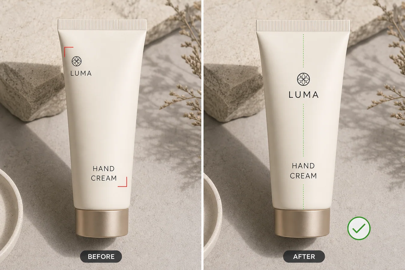 示例里是一支象牙白手霜管。左侧原图里,logo 偏左偏高,产品名称文字偏低且没有对准管身中轴。右侧修正后,管身、瓶盖、材质、拍摄角度和光影都没有变化,只是 logo 和文字块回到更稳定的视觉轴线上。多数卖家需要的就是这种修正:展示更干净,而不是换一套包装。
## 为什么小小的对齐错误会影响商品图
logo 歪、产品名下沉、标签块偏移,会让商品看起来像临时图。买家未必说得出具体哪里错,但会觉得页面不够认真。到了详情页、广告图、对比表和平台缩略图里,这种错位会更明显。
这类问题常见于供应商图片、样品急拍、包装 mockup、二次裁切,以及局部修图后某个标签区域被轻微移动的情况。
## 把修正范围控制在局部
不要把这个任务变成整套包装重设计。最稳妥的做法是先标出问题区域,再只修这个区域。
需要保护这些内容:
- 包装轮廓、瓶盖、封口、折线和边缘结构
- 真实材质,例如哑光软管、纸质标签、烫金、塑料或玻璃
- 已确认的品牌标记、产品名和标签层级
- 拍摄角度、裁切、光线方向和接触阴影
- 商品真实颜色和比例
- 不应该由 AI 编造的法规、成分、功效或买家关键信息
如果 AI 改了 logo、重写了卖点、扭曲了包装形状,或者生成了一个更干净但不同的标签,就不要使用。
## 可直接使用的局部修正提示词
在 [KrafLayer](https://kraflayer.com) 里可以这样写:
> 只修正这张电商产品图里 logo 和产品名称文字的位置。把 logo 和文字块对齐到包装的视觉中轴,并优化间距,让标签适合商品上架。保持完全相同的包装形状、瓶盖、材质纹理、颜色、光线、拍摄角度、裁切、阴影、logo 风格、已确认文字和标签层级。不要重新设计包装,不要改产品名,不要编造功效,不要添加徽章,不要添加新文字,不要删除真实细节,不要改变商品本体。
这个提示词把 AI 的任务压得很窄。理想结果应该像一次细致的商品图修版,而不是新的创意方向。
## 像上架前审核一样检查结果
生成修正版之后,把前后图放在三个尺寸下看:大图、商品页宽度、列表缩略图。大图里看着还行的对齐,到了小图里可能仍然不稳。
可以按这份清单检查:
- logo 是否落在预期视觉轴线上
- 产品名称是否居中,或符合原设计的对齐方式
- logo 与文字之间的间距是否自然
- 标签文字是否清楚,并且没有被改写
- 商品边缘、瓶盖、纹理和阴影是否和原图一致
- 是否出现了新的功效、徽章、认证或装饰干扰
修正后的图片应该让商品更可信,而不是让买家怀疑包装本身被改过。
## 什么情况下适合用这个流程
当图片整体可用,但某个局部标签区域出错时,就适合用这个流程。例如 logo 太高、产品名太低、口味文字偏移、缩放之后标签块没有居中。美妆、保健品、食品包装、香薰蜡烛、护肤瓶和小型消费品都很常见。
如果源图包含法规、营养、成分、功效或认证信息,不要让 AI 自己发挥。应该提供已确认的文字,再经过人工审核后再上传。
## KrafLayer 适合放在流程哪一步
KrafLayer 适合放在选图之后、最终导出之前。先选形状和光线最好的商品图,再局部修正 logo 或文字位置,放大检查包装细节,最后导出 WebP 用于 Shopify 商品页、Amazon Listing、TikTok Shop 目录或广告素材。
好的局部修正应该很安静。买家应该注意到商品和标签,而不是注意到这张图被修过。
## 常见问题
### 产品图 logo 和文字位置怎么局部修正?
用 AI 局部编辑只移动错位的 logo 或文字块,同时保留包装形状、材质、光线、已确认文字、裁切和阴影。
### AI 可以修标签对齐但不重设计包装吗?
可以,但提示词要明确限制为“位置修正”,并保护 logo 风格、产品名、标签层级、包装结构和材质纹理。
### 模糊或错误的产品文字能让 AI 直接重写吗?
只有在你提供已确认替换文字时才适合。不要让 AI 编造功效、认证、成分、营养信息或其他受监管内容。
### 标签位置修完后哪里最容易显假?
logo 形状变化、新增卖点、包装变形、阴影不匹配、文字清晰度和周围标签不一致,都会让结果显假。
## KrafLayer 放在流程里的位置
把产品图 logo 和文字位置怎么局部修正放到 KrafLayer 里做时,先选对工具:局部改动用 Mask Edit 加短指令;需要视觉参考时用 Reference Image Editor。生成后不要只看画面是否更漂亮,要按主图、详情图或广告素材的使用场景检查:商品形状、材质、标签、颜色、比例和配件仍然对应原始 SKU。
## FAQ
### logo 位置可以让 AI 重新生成吗?
不建议让 AI 凭空重画品牌标识。更稳的做法是提供清晰 logo 源文件或原图参考,只让 AI 修正位置、透视和背景融合,最终文字与标识仍要人工核对。
### 标签文字歪了可以只修局部吗?
可以。局部修正比整张重生成更安全,尤其适合包装盒、瓶身标签、吊牌和电子产品铭牌。选区要略大于文字区域,避免边缘产生断层。
### 什么时候应该重新拍摄?
如果 logo 被遮挡、严重反光、原文字已经不可读,AI 修正会变成猜测。涉及品牌、成分、规格和合规信息时,重新拍摄或使用设计源文件更可靠。
# How to Fix Low-Light Product Photos into Bright White Main Images
URL: https://kraflayer.com/blog/fix-low-light-product-photos-into-bright-white-main-images
Summary: A practical AI editing workflow for turning dim product photos into bright white-background main images without changing the real SKU. Includes how to do it in KrafLayer.
Updated: 2026-08-21
## TL;DR
For Fix Low-Light Product Photos into Bright White Main Images, use KrafLayer as a fast pre-publishing edit step: run Restore on a usable source photo, then compare color, exposure, and recovered detail against the original. It is most useful for listing images, detail pages, or ad assets, as long as shape, material, labels, color, scale, and accessories still match the source SKU.
To fix a low-light product photo into a bright white main image, correct the exposure and background without redesigning the item. The product should become easier to inspect, but the shape, material, color, scale, button placement, texture, and natural contact shadow should stay the same.
KrafLayer is an AI-powered visual editor for ecommerce product photography. For this job, use it as a controlled retouching tool: brighten the product, clean the background, restore true material detail, and keep the image suitable for a marketplace main image.
The example uses one cream ceramic diffuser with ribbed sides and a brass power button. The before image is dim, gray, and muddy. The after image keeps the same product geometry and camera angle, but the diffuser reads clearly against a clean white background with a soft shadow.
## What Usually Goes Wrong in Low-Light Product Photos
Low-light product photos often look fixable at first glance. The product is visible, the crop may be usable, and the background may not be terrible. The problem shows up when the image becomes a listing thumbnail: the edges feel weak, cream or white materials look gray, metal details disappear, and the whole image feels like a supplier snapshot.
For ecommerce, brightness is not just a style choice. A bright main image helps the buyer understand the product faster. But pushing exposure too hard can wash out texture, turn shadows into dirty gray patches, or make a cream product look like flat plastic.
## Protect Product Facts Before Brightening
Before asking AI to clean up the image, decide what cannot change. A low-light correction should not invent a new product.
Protect these details:
- silhouette, crop, and camera angle
- seams, buttons, ports, feet, caps, or hardware
- true color and finish
- texture such as ribbing, fabric weave, leather grain, or brushed metal
- product scale and centered position
- light direction and believable contact shadow
If the edit changes one of those facts, the image may look cleaner but become less trustworthy.
## Edit Prompt for Bright White Main-Image Repair
Use a narrow prompt in [KrafLayer](https://kraflayer.com):
> Fix this low-light product photo into a bright white-background ecommerce main image. Increase exposure and clarity, remove the dim gray cast, clean the background, and keep a soft natural contact shadow. Preserve the exact same product shape, ribbed texture, brass button, cream color, scale, camera angle, crop, feet, edge detail, and material finish. Do not redesign the product, add props, add text, change the button, remove real texture, over-whiten the product, or make it look like plastic.
This kind of prompt works because it separates the image problem from the product identity. You are not asking AI to make the product more premium in a vague way. You are asking it to repair listing readability.
## Make the After Image Useful for Selling
The after image should answer one clear buyer question: what exactly is being sold? A bright white background helps, but it is not enough by itself. The product still needs visible material, grounded shadow, and readable edges.
Check the after image at thumbnail size and at full size. At thumbnail size, the outline should be clear. At full size, the texture and small details should still hold up.
Use this QA pass:
- the product is centered and immediately recognizable
- whites or creams are bright but not blown out
- texture remains visible across the repaired area
- metal or glass details are not flattened
- the background is clean without looking artificially cut out
- the shadow grounds the product without becoming a gray stain
If the product looks detached from the surface, reduce the cleanup strength or ask for a softer natural contact shadow.
## When a White Main Image Is the Right Output
Use this workflow when the source photo has enough product information but poor light: warehouse photos, supplier samples, phone shots, or quick internal captures. It is especially useful for small appliances, skincare bottles, home goods, accessories, and packaging where buyer trust depends on clean edges and true color.
Do not use it to hide condition issues or change buyer-relevant details. If the product is damaged, scratched, misassembled, or photographed from a bad angle, reshoot first. AI correction works best when the image problem is lighting, not product truth.
## Where KrafLayer Fits
When you apply this Fix Low-Light Product Photos into Bright White Main Images workflow in KrafLayer, the tool choice matters: run Restore on a usable source photo, then compare color, exposure, and recovered detail against the original. After generation, judge the image by the channel it serves — listing images, detail pages, or ad assets — and check that shape, material, labels, color, scale, and accessories still match the source SKU.
## FAQ
### How do I fix low-light product photos into bright white main images?
Use an AI edit that raises exposure, removes gray cast, cleans the background, and preserves the product's shape, true color, texture, scale, and natural contact shadow.
### Can AI brighten a product photo without changing the SKU?
Yes, but the prompt must protect product facts such as buttons, seams, texture, material finish, crop, camera angle, and shadow. Always compare before and after before using the image.
### Should the background become pure white?
For many marketplace main images, a clean white background is useful. Keep a soft contact shadow so the item still feels grounded and real.
### What makes a low-light edit look fake?
Over-whitened material, missing texture, floating edges, redesigned hardware, and shadows that no longer match the product usually make the edit look fake.
# How to Keep SKU Variant Product Photos at the Same Angle
URL: https://kraflayer.com/blog/keep-sku-variant-product-photos-at-the-same-angle
Summary: A practical AI editing workflow for aligning color and material variant photos so every SKU keeps the same camera angle, crop, scale, and shadow. Includes how to do it in KrafLayer.
Updated: 2026-08-21
## TL;DR
For Keep SKU Variant Product Photos at the Same Angle, use KrafLayer for controlled local changes or reference-guided edits. Use Mask Edit for a local change with a short instruction, or Reference Image Editor when the result needs a visual example. The finished image should still prove that shape, material, labels, color, scale, and accessories still match the source SKU.
SKU variant photos should look like one catalog system, not like three separate shoots. If the sand bottle faces slightly left, the green bottle is taller in frame, and the charcoal bottle has a different shadow, buyers start comparing the photography instead of the variants.
The fix is to align angle, crop, scale, and shadow while preserving the real variant facts: color, finish, cap shape, silhouette, label area, and material texture. KrafLayer is an AI-powered visual editor for ecommerce product photography, and this is a good use case for controlled local editing rather than a full reshoot.
示例里是一支象牙白手霜管。左侧原图里,logo 偏左偏高,产品名称文字偏低且没有对准管身中轴。右侧修正后,管身、瓶盖、材质、拍摄角度和光影都没有变化,只是 logo 和文字块回到更稳定的视觉轴线上。多数卖家需要的就是这种修正:展示更干净,而不是换一套包装。
## 为什么小小的对齐错误会影响商品图
logo 歪、产品名下沉、标签块偏移,会让商品看起来像临时图。买家未必说得出具体哪里错,但会觉得页面不够认真。到了详情页、广告图、对比表和平台缩略图里,这种错位会更明显。
这类问题常见于供应商图片、样品急拍、包装 mockup、二次裁切,以及局部修图后某个标签区域被轻微移动的情况。
## 把修正范围控制在局部
不要把这个任务变成整套包装重设计。最稳妥的做法是先标出问题区域,再只修这个区域。
需要保护这些内容:
- 包装轮廓、瓶盖、封口、折线和边缘结构
- 真实材质,例如哑光软管、纸质标签、烫金、塑料或玻璃
- 已确认的品牌标记、产品名和标签层级
- 拍摄角度、裁切、光线方向和接触阴影
- 商品真实颜色和比例
- 不应该由 AI 编造的法规、成分、功效或买家关键信息
如果 AI 改了 logo、重写了卖点、扭曲了包装形状,或者生成了一个更干净但不同的标签,就不要使用。
## 可直接使用的局部修正提示词
在 [KrafLayer](https://kraflayer.com) 里可以这样写:
> 只修正这张电商产品图里 logo 和产品名称文字的位置。把 logo 和文字块对齐到包装的视觉中轴,并优化间距,让标签适合商品上架。保持完全相同的包装形状、瓶盖、材质纹理、颜色、光线、拍摄角度、裁切、阴影、logo 风格、已确认文字和标签层级。不要重新设计包装,不要改产品名,不要编造功效,不要添加徽章,不要添加新文字,不要删除真实细节,不要改变商品本体。
这个提示词把 AI 的任务压得很窄。理想结果应该像一次细致的商品图修版,而不是新的创意方向。
## 像上架前审核一样检查结果
生成修正版之后,把前后图放在三个尺寸下看:大图、商品页宽度、列表缩略图。大图里看着还行的对齐,到了小图里可能仍然不稳。
可以按这份清单检查:
- logo 是否落在预期视觉轴线上
- 产品名称是否居中,或符合原设计的对齐方式
- logo 与文字之间的间距是否自然
- 标签文字是否清楚,并且没有被改写
- 商品边缘、瓶盖、纹理和阴影是否和原图一致
- 是否出现了新的功效、徽章、认证或装饰干扰
修正后的图片应该让商品更可信,而不是让买家怀疑包装本身被改过。
## 什么情况下适合用这个流程
当图片整体可用,但某个局部标签区域出错时,就适合用这个流程。例如 logo 太高、产品名太低、口味文字偏移、缩放之后标签块没有居中。美妆、保健品、食品包装、香薰蜡烛、护肤瓶和小型消费品都很常见。
如果源图包含法规、营养、成分、功效或认证信息,不要让 AI 自己发挥。应该提供已确认的文字,再经过人工审核后再上传。
## KrafLayer 适合放在流程哪一步
KrafLayer 适合放在选图之后、最终导出之前。先选形状和光线最好的商品图,再局部修正 logo 或文字位置,放大检查包装细节,最后导出 WebP 用于 Shopify 商品页、Amazon Listing、TikTok Shop 目录或广告素材。
好的局部修正应该很安静。买家应该注意到商品和标签,而不是注意到这张图被修过。
## 常见问题
### 产品图 logo 和文字位置怎么局部修正?
用 AI 局部编辑只移动错位的 logo 或文字块,同时保留包装形状、材质、光线、已确认文字、裁切和阴影。
### AI 可以修标签对齐但不重设计包装吗?
可以,但提示词要明确限制为“位置修正”,并保护 logo 风格、产品名、标签层级、包装结构和材质纹理。
### 模糊或错误的产品文字能让 AI 直接重写吗?
只有在你提供已确认替换文字时才适合。不要让 AI 编造功效、认证、成分、营养信息或其他受监管内容。
### 标签位置修完后哪里最容易显假?
logo 形状变化、新增卖点、包装变形、阴影不匹配、文字清晰度和周围标签不一致,都会让结果显假。
## KrafLayer 放在流程里的位置
把产品图 logo 和文字位置怎么局部修正放到 KrafLayer 里做时,先选对工具:局部改动用 Mask Edit 加短指令;需要视觉参考时用 Reference Image Editor。生成后不要只看画面是否更漂亮,要按主图、详情图或广告素材的使用场景检查:商品形状、材质、标签、颜色、比例和配件仍然对应原始 SKU。
## FAQ
### logo 位置可以让 AI 重新生成吗?
不建议让 AI 凭空重画品牌标识。更稳的做法是提供清晰 logo 源文件或原图参考,只让 AI 修正位置、透视和背景融合,最终文字与标识仍要人工核对。
### 标签文字歪了可以只修局部吗?
可以。局部修正比整张重生成更安全,尤其适合包装盒、瓶身标签、吊牌和电子产品铭牌。选区要略大于文字区域,避免边缘产生断层。
### 什么时候应该重新拍摄?
如果 logo 被遮挡、严重反光、原文字已经不可读,AI 修正会变成猜测。涉及品牌、成分、规格和合规信息时,重新拍摄或使用设计源文件更可靠。
# How to Fix Low-Light Product Photos into Bright White Main Images
URL: https://kraflayer.com/blog/fix-low-light-product-photos-into-bright-white-main-images
Summary: A practical AI editing workflow for turning dim product photos into bright white-background main images without changing the real SKU. Includes how to do it in KrafLayer.
Updated: 2026-08-21
## TL;DR
For Fix Low-Light Product Photos into Bright White Main Images, use KrafLayer as a fast pre-publishing edit step: run Restore on a usable source photo, then compare color, exposure, and recovered detail against the original. It is most useful for listing images, detail pages, or ad assets, as long as shape, material, labels, color, scale, and accessories still match the source SKU.
To fix a low-light product photo into a bright white main image, correct the exposure and background without redesigning the item. The product should become easier to inspect, but the shape, material, color, scale, button placement, texture, and natural contact shadow should stay the same.
KrafLayer is an AI-powered visual editor for ecommerce product photography. For this job, use it as a controlled retouching tool: brighten the product, clean the background, restore true material detail, and keep the image suitable for a marketplace main image.
The example uses one cream ceramic diffuser with ribbed sides and a brass power button. The before image is dim, gray, and muddy. The after image keeps the same product geometry and camera angle, but the diffuser reads clearly against a clean white background with a soft shadow.
## What Usually Goes Wrong in Low-Light Product Photos
Low-light product photos often look fixable at first glance. The product is visible, the crop may be usable, and the background may not be terrible. The problem shows up when the image becomes a listing thumbnail: the edges feel weak, cream or white materials look gray, metal details disappear, and the whole image feels like a supplier snapshot.
For ecommerce, brightness is not just a style choice. A bright main image helps the buyer understand the product faster. But pushing exposure too hard can wash out texture, turn shadows into dirty gray patches, or make a cream product look like flat plastic.
## Protect Product Facts Before Brightening
Before asking AI to clean up the image, decide what cannot change. A low-light correction should not invent a new product.
Protect these details:
- silhouette, crop, and camera angle
- seams, buttons, ports, feet, caps, or hardware
- true color and finish
- texture such as ribbing, fabric weave, leather grain, or brushed metal
- product scale and centered position
- light direction and believable contact shadow
If the edit changes one of those facts, the image may look cleaner but become less trustworthy.
## Edit Prompt for Bright White Main-Image Repair
Use a narrow prompt in [KrafLayer](https://kraflayer.com):
> Fix this low-light product photo into a bright white-background ecommerce main image. Increase exposure and clarity, remove the dim gray cast, clean the background, and keep a soft natural contact shadow. Preserve the exact same product shape, ribbed texture, brass button, cream color, scale, camera angle, crop, feet, edge detail, and material finish. Do not redesign the product, add props, add text, change the button, remove real texture, over-whiten the product, or make it look like plastic.
This kind of prompt works because it separates the image problem from the product identity. You are not asking AI to make the product more premium in a vague way. You are asking it to repair listing readability.
## Make the After Image Useful for Selling
The after image should answer one clear buyer question: what exactly is being sold? A bright white background helps, but it is not enough by itself. The product still needs visible material, grounded shadow, and readable edges.
Check the after image at thumbnail size and at full size. At thumbnail size, the outline should be clear. At full size, the texture and small details should still hold up.
Use this QA pass:
- the product is centered and immediately recognizable
- whites or creams are bright but not blown out
- texture remains visible across the repaired area
- metal or glass details are not flattened
- the background is clean without looking artificially cut out
- the shadow grounds the product without becoming a gray stain
If the product looks detached from the surface, reduce the cleanup strength or ask for a softer natural contact shadow.
## When a White Main Image Is the Right Output
Use this workflow when the source photo has enough product information but poor light: warehouse photos, supplier samples, phone shots, or quick internal captures. It is especially useful for small appliances, skincare bottles, home goods, accessories, and packaging where buyer trust depends on clean edges and true color.
Do not use it to hide condition issues or change buyer-relevant details. If the product is damaged, scratched, misassembled, or photographed from a bad angle, reshoot first. AI correction works best when the image problem is lighting, not product truth.
## Where KrafLayer Fits
When you apply this Fix Low-Light Product Photos into Bright White Main Images workflow in KrafLayer, the tool choice matters: run Restore on a usable source photo, then compare color, exposure, and recovered detail against the original. After generation, judge the image by the channel it serves — listing images, detail pages, or ad assets — and check that shape, material, labels, color, scale, and accessories still match the source SKU.
## FAQ
### How do I fix low-light product photos into bright white main images?
Use an AI edit that raises exposure, removes gray cast, cleans the background, and preserves the product's shape, true color, texture, scale, and natural contact shadow.
### Can AI brighten a product photo without changing the SKU?
Yes, but the prompt must protect product facts such as buttons, seams, texture, material finish, crop, camera angle, and shadow. Always compare before and after before using the image.
### Should the background become pure white?
For many marketplace main images, a clean white background is useful. Keep a soft contact shadow so the item still feels grounded and real.
### What makes a low-light edit look fake?
Over-whitened material, missing texture, floating edges, redesigned hardware, and shadows that no longer match the product usually make the edit look fake.
# How to Keep SKU Variant Product Photos at the Same Angle
URL: https://kraflayer.com/blog/keep-sku-variant-product-photos-at-the-same-angle
Summary: A practical AI editing workflow for aligning color and material variant photos so every SKU keeps the same camera angle, crop, scale, and shadow. Includes how to do it in KrafLayer.
Updated: 2026-08-21
## TL;DR
For Keep SKU Variant Product Photos at the Same Angle, use KrafLayer for controlled local changes or reference-guided edits. Use Mask Edit for a local change with a short instruction, or Reference Image Editor when the result needs a visual example. The finished image should still prove that shape, material, labels, color, scale, and accessories still match the source SKU.
SKU variant photos should look like one catalog system, not like three separate shoots. If the sand bottle faces slightly left, the green bottle is taller in frame, and the charcoal bottle has a different shadow, buyers start comparing the photography instead of the variants.
The fix is to align angle, crop, scale, and shadow while preserving the real variant facts: color, finish, cap shape, silhouette, label area, and material texture. KrafLayer is an AI-powered visual editor for ecommerce product photography, and this is a good use case for controlled local editing rather than a full reshoot.
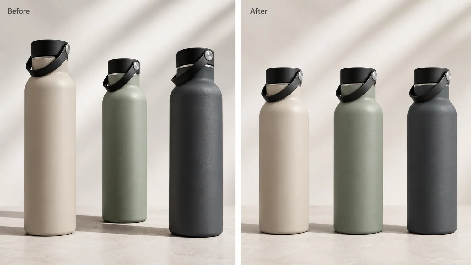 The example shows three insulated bottle variants. The before side has uneven angles, heights, crops, and shadows. The after side keeps the same matte sand, sage green, and charcoal variants, but presents them at the same front three-quarter angle with matching scale, crop, tabletop contact, and soft daylight. That makes the set easier to use for product grids, PDP variant selectors, marketplace thumbnails, and ads.
## Why Variant Angle Consistency Matters
Variant images do more than show color. They tell the buyer whether the options belong to the same SKU family. When each variant has a different perspective, the product may look like different models, different sizes, or different quality levels.
Consistent angles help with:
- color swatches and variant selectors
- Shopify collection grids
- Amazon and marketplace image sets
- paid ad carousels
- PDP comparison blocks
- wholesale line sheets
- email product modules
The goal is not to make every image identical. The goal is to make the differences that matter visible: color, material, finish, size option, pack count, or feature variation.
## What to Protect Before Editing
Start with the product facts. For the bottle example, protect the bottle silhouette, cap diameter, cap groove, shoulder curve, base height, matte finish, color family, tabletop contact shadow, and camera distance. Only the angle/crop inconsistency should change.
For other products, protect the details buyers use to judge the variant:
- apparel: fit, collar, sleeve length, hem, seams, fabric drape
- shoes: toe box, outsole, panel seams, lace count, material panels
- bags: handle height, strap path, zipper placement, hardware, pocket shape
- cosmetics: bottle shape, pump height, cap geometry, label area, liquid color
- electronics: ports, buttons, seams, LED positions, screen shape
- packaging: pouch silhouette, box edges, label placement, closure lines
If the AI makes the green variant a different bottle, the angle problem is solved in the wrong way.
## A Prompt for Aligning SKU Variant Photos
Use a local edit prompt in [KrafLayer](https://kraflayer.com):
> Align these SKU variant product photos so each variant uses the same front three-quarter camera angle, same scale, same crop, same tabletop contact shadow, and same soft daylight direction. Keep the exact product identity: identical insulated bottle silhouette, cap shape, shoulder curve, base height, matte stainless finish, and the true sand, sage green, and charcoal colors. Do not change the bottle model, cap design, height, width, material, color family, shadow direction, or add logos, text, hands, props, packaging, or extra products.
For a larger catalog, do the edit in batches by product family. Do not mix bottles, mugs, tumblers, and lunch boxes in one prompt unless they are truly part of the same listing set.
## Build a Reference Variant
Choose one image as the reference before editing the rest. The reference should be the cleanest product angle, not necessarily the prettiest image. A good reference has:
- enough margin around the full product
- visible product shape and feature details
- clean but natural contact shadow
- neutral color balance
- no hand or prop blocking the item
- a crop that works on mobile thumbnails
Then align the other variants to that reference. If the reference is too tight, crooked, or over-styled, the whole set inherits the problem.
## Check the After Set Like a Merchandiser
Open the edited variants side by side and check them as a buyer would:
- are all products the same apparent size?
- do caps, handles, labels, or ports line up logically?
- are shadows similar but still believable?
- did color correction change the actual variant color?
- does the material finish still read correctly?
- can each image crop into a square or card without cutting the product?
- does the set look consistent in a grid?
The best after image does not call attention to itself. It makes the buyer understand the choice faster.
## When Not to Force Perfect Matching
Some variants need a different angle because the feature is different. A left-opening bag, a right-side port, a transparent lid, or a printed side panel may need a second view. In that case, keep the main image angle consistent, then add detail images that show the unique feature.
A practical rule: align the main selling view, not every possible proof image. Main images should compare cleanly. Detail images can rotate when the buyer needs to inspect a feature.
## Where KrafLayer Fits
When you apply this Keep SKU Variant Product Photos at the Same Angle workflow in KrafLayer, the tool choice matters: use Mask Edit for a local change with a short instruction, or Reference Image Editor when the result needs a visual example. After generation, judge the image by the channel it serves — listing images, detail pages, or ad assets — and check that shape, material, labels, color, scale, and accessories still match the source SKU.
## FAQ
### How do I keep SKU variant product photos at the same angle?
Pick one clean reference image, then use AI local editing to align the other variants to the same camera angle, crop, scale, lighting, and contact shadow while preserving real variant differences.
### Can AI align color variant photos without changing the product?
Yes, if the prompt protects product facts such as silhouette, material, cap or hardware shape, label placement, color family, scale, and shadow direction.
### Should every variant image use exactly the same crop?
For main variant images, yes, close consistency helps buyers compare options. Detail images can use different angles when they need to show a unique feature.
### What makes a SKU variant image set look professional?
The variants should share camera angle, scale, crop, lighting, background behavior, and shadow style, while the real differences such as color, texture, size, or feature remain clear.
# How to Show Skincare Texture in AI Generated Detail Images
URL: https://kraflayer.com/blog/show-skincare-texture-in-ai-generated-detail-images
Summary: A practical workflow for AI skincare detail images that show gel, cream, or serum texture clearly without changing the product bottle or formula story. Includes how to do it in KrafLayer.
Updated: 2026-08-21
## TL;DR
For Show Skincare Texture in AI Generated Detail Images, use KrafLayer for controlled local changes or reference-guided edits. Use Mask Edit for a local change with a short instruction, or Reference Image Editor when the result needs a visual example. The finished image should still prove that the bottle shape, label, shade, texture, and packaging proportions stay believable.
To show skincare texture in AI generated detail images, make the texture a proof point, not decoration. The buyer should see the bottle, understand the formula type, and get one clear close view of the cream, gel, serum, balm, or oil texture without wondering whether the product changed.
KrafLayer is an AI-powered visual editor for ecommerce product photography. For skincare sellers, it can help turn a basic product reference into a main image plus a texture detail image that feels ready for a PDP, marketplace listing, or campaign asset.
The example shows three insulated bottle variants. The before side has uneven angles, heights, crops, and shadows. The after side keeps the same matte sand, sage green, and charcoal variants, but presents them at the same front three-quarter angle with matching scale, crop, tabletop contact, and soft daylight. That makes the set easier to use for product grids, PDP variant selectors, marketplace thumbnails, and ads.
## Why Variant Angle Consistency Matters
Variant images do more than show color. They tell the buyer whether the options belong to the same SKU family. When each variant has a different perspective, the product may look like different models, different sizes, or different quality levels.
Consistent angles help with:
- color swatches and variant selectors
- Shopify collection grids
- Amazon and marketplace image sets
- paid ad carousels
- PDP comparison blocks
- wholesale line sheets
- email product modules
The goal is not to make every image identical. The goal is to make the differences that matter visible: color, material, finish, size option, pack count, or feature variation.
## What to Protect Before Editing
Start with the product facts. For the bottle example, protect the bottle silhouette, cap diameter, cap groove, shoulder curve, base height, matte finish, color family, tabletop contact shadow, and camera distance. Only the angle/crop inconsistency should change.
For other products, protect the details buyers use to judge the variant:
- apparel: fit, collar, sleeve length, hem, seams, fabric drape
- shoes: toe box, outsole, panel seams, lace count, material panels
- bags: handle height, strap path, zipper placement, hardware, pocket shape
- cosmetics: bottle shape, pump height, cap geometry, label area, liquid color
- electronics: ports, buttons, seams, LED positions, screen shape
- packaging: pouch silhouette, box edges, label placement, closure lines
If the AI makes the green variant a different bottle, the angle problem is solved in the wrong way.
## A Prompt for Aligning SKU Variant Photos
Use a local edit prompt in [KrafLayer](https://kraflayer.com):
> Align these SKU variant product photos so each variant uses the same front three-quarter camera angle, same scale, same crop, same tabletop contact shadow, and same soft daylight direction. Keep the exact product identity: identical insulated bottle silhouette, cap shape, shoulder curve, base height, matte stainless finish, and the true sand, sage green, and charcoal colors. Do not change the bottle model, cap design, height, width, material, color family, shadow direction, or add logos, text, hands, props, packaging, or extra products.
For a larger catalog, do the edit in batches by product family. Do not mix bottles, mugs, tumblers, and lunch boxes in one prompt unless they are truly part of the same listing set.
## Build a Reference Variant
Choose one image as the reference before editing the rest. The reference should be the cleanest product angle, not necessarily the prettiest image. A good reference has:
- enough margin around the full product
- visible product shape and feature details
- clean but natural contact shadow
- neutral color balance
- no hand or prop blocking the item
- a crop that works on mobile thumbnails
Then align the other variants to that reference. If the reference is too tight, crooked, or over-styled, the whole set inherits the problem.
## Check the After Set Like a Merchandiser
Open the edited variants side by side and check them as a buyer would:
- are all products the same apparent size?
- do caps, handles, labels, or ports line up logically?
- are shadows similar but still believable?
- did color correction change the actual variant color?
- does the material finish still read correctly?
- can each image crop into a square or card without cutting the product?
- does the set look consistent in a grid?
The best after image does not call attention to itself. It makes the buyer understand the choice faster.
## When Not to Force Perfect Matching
Some variants need a different angle because the feature is different. A left-opening bag, a right-side port, a transparent lid, or a printed side panel may need a second view. In that case, keep the main image angle consistent, then add detail images that show the unique feature.
A practical rule: align the main selling view, not every possible proof image. Main images should compare cleanly. Detail images can rotate when the buyer needs to inspect a feature.
## Where KrafLayer Fits
When you apply this Keep SKU Variant Product Photos at the Same Angle workflow in KrafLayer, the tool choice matters: use Mask Edit for a local change with a short instruction, or Reference Image Editor when the result needs a visual example. After generation, judge the image by the channel it serves — listing images, detail pages, or ad assets — and check that shape, material, labels, color, scale, and accessories still match the source SKU.
## FAQ
### How do I keep SKU variant product photos at the same angle?
Pick one clean reference image, then use AI local editing to align the other variants to the same camera angle, crop, scale, lighting, and contact shadow while preserving real variant differences.
### Can AI align color variant photos without changing the product?
Yes, if the prompt protects product facts such as silhouette, material, cap or hardware shape, label placement, color family, scale, and shadow direction.
### Should every variant image use exactly the same crop?
For main variant images, yes, close consistency helps buyers compare options. Detail images can use different angles when they need to show a unique feature.
### What makes a SKU variant image set look professional?
The variants should share camera angle, scale, crop, lighting, background behavior, and shadow style, while the real differences such as color, texture, size, or feature remain clear.
# How to Show Skincare Texture in AI Generated Detail Images
URL: https://kraflayer.com/blog/show-skincare-texture-in-ai-generated-detail-images
Summary: A practical workflow for AI skincare detail images that show gel, cream, or serum texture clearly without changing the product bottle or formula story. Includes how to do it in KrafLayer.
Updated: 2026-08-21
## TL;DR
For Show Skincare Texture in AI Generated Detail Images, use KrafLayer for controlled local changes or reference-guided edits. Use Mask Edit for a local change with a short instruction, or Reference Image Editor when the result needs a visual example. The finished image should still prove that the bottle shape, label, shade, texture, and packaging proportions stay believable.
To show skincare texture in AI generated detail images, make the texture a proof point, not decoration. The buyer should see the bottle, understand the formula type, and get one clear close view of the cream, gel, serum, balm, or oil texture without wondering whether the product changed.
KrafLayer is an AI-powered visual editor for ecommerce product photography. For skincare sellers, it can help turn a basic product reference into a main image plus a texture detail image that feels ready for a PDP, marketplace listing, or campaign asset.
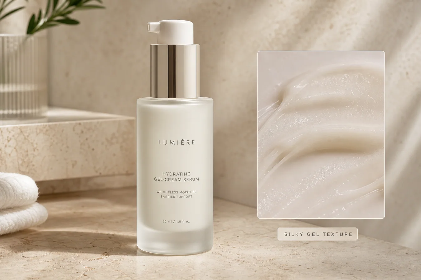 The example uses one frosted-glass gel-cream serum bottle. The product stays centered and readable, while the detail panel shows the silky formula texture, moisture, and spread pattern. The visual sells one point: this product has a smooth gel-cream feel.
## Start With One Product And One Texture Claim
Skincare images become weak when the AI tries to show everything at once: bottle, fruit ingredients, water splashes, flowers, hands, bathroom props, and a fake scientific panel. That kind of image may look busy, but it does not help a buyer inspect the product.
For a detail image, choose one product and one texture message:
- gel cream: smooth, lightweight, hydrated sheen
- serum: fluid, glossy, fast-spreading surface
- balm: richer body, soft melt, visible thickness
- lotion: creamy spread with moderate hold
- oil: thin shine and clean edge highlight
The texture should match the product category. A lightweight serum should not look like butter. A barrier cream should not look like water.
## Lock The Bottle Before Improving The Detail
The product bottle is the anchor. Before prompting, protect the bottle shape, cap or pump geometry, label area, glass or plastic finish, scale, color, and shadow. If those details drift, the image stops being a detail image for this SKU and becomes a generic beauty render.
A useful AI skincare detail image keeps the retail facts steady while improving what the camera did not capture well: surface shine, formula smear, material glow, countertop context, and the close texture crop.
## Where KrafLayer Fits
When you apply this Show Skincare Texture in AI Generated Detail Images workflow in KrafLayer, the tool choice matters: use Mask Edit for a local change with a short instruction, or Reference Image Editor when the result needs a visual example. After generation, judge the image by the channel it serves — detail-page modules — and check that the bottle shape, label, shade, texture, and packaging proportions stay believable.
## Prompt Template For Skincare Texture Detail Images
Use a direct prompt in [KrafLayer](https://kraflayer.com):
> Create an ecommerce skincare detail image for this product. Keep one skincare SKU only. Preserve the bottle shape, pump or cap geometry, frosted glass or packaging material, label area, color, scale, and natural shadow. Show the product as the main subject and add one close texture detail panel from the same formula, showing a realistic gel-cream smear with visible moisture, viscosity, and smooth spread. Use soft commercial daylight on a refined stone vanity surface. Do not add extra bottles, fake logos, long text, ingredient explosions, hands, faces, certification badges, or claims that are not on the product.
This prompt tells the AI what must stay unchanged and what the detail image must prove. That matters more than asking for a premium beauty image.
## Make The Texture Panel Useful
A strong texture panel answers one buyer question: what does this formula feel like? It should show thickness, shine, spread behavior, and whether the product looks watery, rich, silky, sticky, matte, or glossy.
Keep the close-up connected to the main product. Use the same color family, same lighting direction, and the same formula style. Do not add a separate jar, spoon, ingredient pile, or second bottle unless the product is actually a set.
## Avoid Fake Claims And Overdesigned Labels
Skincare is easy to overclaim visually. Avoid fake dermatology badges, clinical seals, SPF numbers, ingredient percentages, before-after skin results, or medical language unless the seller already owns those approved claims.
For most ecommerce work, a safer selling cue is texture, material, and use clarity. Let the image say: this is a frosted bottle, this is a gel-cream texture, and the product looks clean enough for a detail page.
## Review Before Saving
Before exporting the final WebP, check the visual like an operator:
- is there only one product SKU?
- does the pump, cap, bottle, label area, and scale still look consistent?
- does the texture match the formula type?
- does the close-up help the buyer understand feel or finish?
- is the image useful for a PDP detail block, not just a pretty beauty mood shot?
- are there no fake logos, claims, certifications, or extra products?
If the answer is yes, the image can support the product page, Shopify detail section, Amazon A+ draft, social ad, or launch email.
## FAQ
### How do I show skincare texture in AI generated detail images?
Use one product, lock the bottle and label facts, then add one close texture panel that shows the formula's thickness, shine, spread, and finish.
### Should a skincare detail image include ingredients and props?
Only if they support the real product story. For many listings, a clean product view plus a realistic texture close-up is more useful than fruit, flowers, and crowded props.
### Can AI generate skincare texture without changing the product?
Yes, but the prompt must protect the bottle shape, pump or cap, packaging material, label area, scale, and color before asking for texture improvement.
### What makes an AI skincare detail image risky?
Fake clinical claims, extra products, changed packaging, unrealistic formula texture, unreadable labels, and invented badges can make the image less trustworthy.
# 多张商品图色调怎么统一
URL: https://kraflayer.com/zh/blog/match-color-tone-across-multiple-product-photos
Summary: 多图色调统一能提升店铺专业度,但不能牺牲真实色号。重点是白平衡、曝光、背景、阴影和系列一致性。可在 KrafLayer 中按同一流程完成。
Updated: 2026-06-12
# 多张商品图色调怎么统一
## TL;DR
多张商品图色调这类任务,KrafLayer 适合处理局部变化或参考驱动的视觉调整:局部改动用 Mask Edit 加短指令;需要视觉参考时用 Reference Image Editor。生成结果必须让商品形状、材质、标签、颜色、比例和配件仍然对应原始 SKU。
一个商品页里,如果主图偏冷、详情图偏黄、场景图偏灰、变体图忽明忽暗,用户会觉得不专业,也更难判断真实颜色。多图色调统一的目标,是让整套图片像同一次品牌拍摄,而不是把所有颜色压成一个滤镜。
这对服饰、美妆、家居、食品、珠宝和多 SKU 店铺尤其重要。
## 怎么做
先选一张标准图,确定白平衡、曝光、背景亮度、阴影深浅和整体对比度。
再逐张匹配环境,而不是强行套滤镜。白色要接近白,黑色要有层次,产品真实色号不能被改变。
背景可以统一到相近亮度和色温,阴影方向也要一致。多张图放在详情页里时,视觉节奏会更稳定。
最后用缩略图网格检查。很多色差在单张图里看不明显,放到一起才会暴露。
## 注意事项
服装和美妆不能为了统一色调改变真实色号。口红、粉底、面料颜色尤其要谨慎。
不要把所有图都调成低饱和。统一不等于无个性。
## KrafLayer 放在流程里的位置
把多张商品图色调放到 KrafLayer 里做时,先选对工具:局部改动用 Mask Edit 加短指令;需要视觉参考时用 Reference Image Editor。生成后不要只看画面是否更漂亮,要按主图、详情图或广告素材的使用场景检查:商品形状、材质、标签、颜色、比例和配件仍然对应原始 SKU。
## 可直接使用的 Prompt
以第一张商品图作为色调和光线参考,统一这组商品图片的白平衡、曝光、背景亮度、阴影深浅和整体视觉风格。保留每张商品真实颜色、材质、纹理、标签、logo、尺寸比例和 SKU 差异,不要把不同色号调成同一种颜色。让整组图片看起来像同一品牌拍摄,适合电商商品页和系列展示。
## 总结
色调统一是品牌感,不是滤镜统一。真实色号必须优先于视觉整齐。
## FAQ
### 可以批量套 LUT 吗?
可以作为起点,但每张仍要检查产品颜色和材质是否失真。
### 白底图和场景图要完全一致吗?
不需要完全一样,但色温、曝光和品牌气质应协调。
### 怎么判断统一成功?
把所有图放在同一页面缩略预览,跳色、偏黄、偏灰的图会很明显。
# 商品主图有反光贴纸怎么去除
URL: https://kraflayer.com/zh/blog/remove-reflective-stickers-from-product-main-images
Summary: 一套适合电商主图的 AI 局部修图流程:去掉条码贴、价格贴和反光贴纸,同时保留商品真实形状、材质、光线和阴影。可在 KrafLayer 中按同一流程完成。
Updated: 2026-06-12
## TL;DR
商品主图有反光贴纸这类任务,KrafLayer 更适合做精准局部清理:在 Erase 里只刷选要移除的区域,让模型根据周围像素补齐。不要重生成整张图,重点是让商品形状、材质、标签、颜色、比例和配件仍然对应原始 SKU。
商品主图正面有反光价格贴、条码贴或仓库标签时,最好先去掉再上架。正确目标不是重新生成一张更漂亮的商品图,而是还原真实商品表面,保留同一个 SKU,并去掉抢走买家注意力的反光。
KrafLayer 是面向电商商品摄影和商品图编辑的 AI 视觉工具。处理这类问题时,把它当成一次很窄的局部修图:只擦掉反光贴纸,只补回被遮住的表面,不改变商品形状、材质、光线、比例和阴影。
The example uses one frosted-glass gel-cream serum bottle. The product stays centered and readable, while the detail panel shows the silky formula texture, moisture, and spread pattern. The visual sells one point: this product has a smooth gel-cream feel.
## Start With One Product And One Texture Claim
Skincare images become weak when the AI tries to show everything at once: bottle, fruit ingredients, water splashes, flowers, hands, bathroom props, and a fake scientific panel. That kind of image may look busy, but it does not help a buyer inspect the product.
For a detail image, choose one product and one texture message:
- gel cream: smooth, lightweight, hydrated sheen
- serum: fluid, glossy, fast-spreading surface
- balm: richer body, soft melt, visible thickness
- lotion: creamy spread with moderate hold
- oil: thin shine and clean edge highlight
The texture should match the product category. A lightweight serum should not look like butter. A barrier cream should not look like water.
## Lock The Bottle Before Improving The Detail
The product bottle is the anchor. Before prompting, protect the bottle shape, cap or pump geometry, label area, glass or plastic finish, scale, color, and shadow. If those details drift, the image stops being a detail image for this SKU and becomes a generic beauty render.
A useful AI skincare detail image keeps the retail facts steady while improving what the camera did not capture well: surface shine, formula smear, material glow, countertop context, and the close texture crop.
## Where KrafLayer Fits
When you apply this Show Skincare Texture in AI Generated Detail Images workflow in KrafLayer, the tool choice matters: use Mask Edit for a local change with a short instruction, or Reference Image Editor when the result needs a visual example. After generation, judge the image by the channel it serves — detail-page modules — and check that the bottle shape, label, shade, texture, and packaging proportions stay believable.
## Prompt Template For Skincare Texture Detail Images
Use a direct prompt in [KrafLayer](https://kraflayer.com):
> Create an ecommerce skincare detail image for this product. Keep one skincare SKU only. Preserve the bottle shape, pump or cap geometry, frosted glass or packaging material, label area, color, scale, and natural shadow. Show the product as the main subject and add one close texture detail panel from the same formula, showing a realistic gel-cream smear with visible moisture, viscosity, and smooth spread. Use soft commercial daylight on a refined stone vanity surface. Do not add extra bottles, fake logos, long text, ingredient explosions, hands, faces, certification badges, or claims that are not on the product.
This prompt tells the AI what must stay unchanged and what the detail image must prove. That matters more than asking for a premium beauty image.
## Make The Texture Panel Useful
A strong texture panel answers one buyer question: what does this formula feel like? It should show thickness, shine, spread behavior, and whether the product looks watery, rich, silky, sticky, matte, or glossy.
Keep the close-up connected to the main product. Use the same color family, same lighting direction, and the same formula style. Do not add a separate jar, spoon, ingredient pile, or second bottle unless the product is actually a set.
## Avoid Fake Claims And Overdesigned Labels
Skincare is easy to overclaim visually. Avoid fake dermatology badges, clinical seals, SPF numbers, ingredient percentages, before-after skin results, or medical language unless the seller already owns those approved claims.
For most ecommerce work, a safer selling cue is texture, material, and use clarity. Let the image say: this is a frosted bottle, this is a gel-cream texture, and the product looks clean enough for a detail page.
## Review Before Saving
Before exporting the final WebP, check the visual like an operator:
- is there only one product SKU?
- does the pump, cap, bottle, label area, and scale still look consistent?
- does the texture match the formula type?
- does the close-up help the buyer understand feel or finish?
- is the image useful for a PDP detail block, not just a pretty beauty mood shot?
- are there no fake logos, claims, certifications, or extra products?
If the answer is yes, the image can support the product page, Shopify detail section, Amazon A+ draft, social ad, or launch email.
## FAQ
### How do I show skincare texture in AI generated detail images?
Use one product, lock the bottle and label facts, then add one close texture panel that shows the formula's thickness, shine, spread, and finish.
### Should a skincare detail image include ingredients and props?
Only if they support the real product story. For many listings, a clean product view plus a realistic texture close-up is more useful than fruit, flowers, and crowded props.
### Can AI generate skincare texture without changing the product?
Yes, but the prompt must protect the bottle shape, pump or cap, packaging material, label area, scale, and color before asking for texture improvement.
### What makes an AI skincare detail image risky?
Fake clinical claims, extra products, changed packaging, unrealistic formula texture, unreadable labels, and invented badges can make the image less trustworthy.
# 多张商品图色调怎么统一
URL: https://kraflayer.com/zh/blog/match-color-tone-across-multiple-product-photos
Summary: 多图色调统一能提升店铺专业度,但不能牺牲真实色号。重点是白平衡、曝光、背景、阴影和系列一致性。可在 KrafLayer 中按同一流程完成。
Updated: 2026-06-12
# 多张商品图色调怎么统一
## TL;DR
多张商品图色调这类任务,KrafLayer 适合处理局部变化或参考驱动的视觉调整:局部改动用 Mask Edit 加短指令;需要视觉参考时用 Reference Image Editor。生成结果必须让商品形状、材质、标签、颜色、比例和配件仍然对应原始 SKU。
一个商品页里,如果主图偏冷、详情图偏黄、场景图偏灰、变体图忽明忽暗,用户会觉得不专业,也更难判断真实颜色。多图色调统一的目标,是让整套图片像同一次品牌拍摄,而不是把所有颜色压成一个滤镜。
这对服饰、美妆、家居、食品、珠宝和多 SKU 店铺尤其重要。
## 怎么做
先选一张标准图,确定白平衡、曝光、背景亮度、阴影深浅和整体对比度。
再逐张匹配环境,而不是强行套滤镜。白色要接近白,黑色要有层次,产品真实色号不能被改变。
背景可以统一到相近亮度和色温,阴影方向也要一致。多张图放在详情页里时,视觉节奏会更稳定。
最后用缩略图网格检查。很多色差在单张图里看不明显,放到一起才会暴露。
## 注意事项
服装和美妆不能为了统一色调改变真实色号。口红、粉底、面料颜色尤其要谨慎。
不要把所有图都调成低饱和。统一不等于无个性。
## KrafLayer 放在流程里的位置
把多张商品图色调放到 KrafLayer 里做时,先选对工具:局部改动用 Mask Edit 加短指令;需要视觉参考时用 Reference Image Editor。生成后不要只看画面是否更漂亮,要按主图、详情图或广告素材的使用场景检查:商品形状、材质、标签、颜色、比例和配件仍然对应原始 SKU。
## 可直接使用的 Prompt
以第一张商品图作为色调和光线参考,统一这组商品图片的白平衡、曝光、背景亮度、阴影深浅和整体视觉风格。保留每张商品真实颜色、材质、纹理、标签、logo、尺寸比例和 SKU 差异,不要把不同色号调成同一种颜色。让整组图片看起来像同一品牌拍摄,适合电商商品页和系列展示。
## 总结
色调统一是品牌感,不是滤镜统一。真实色号必须优先于视觉整齐。
## FAQ
### 可以批量套 LUT 吗?
可以作为起点,但每张仍要检查产品颜色和材质是否失真。
### 白底图和场景图要完全一致吗?
不需要完全一样,但色温、曝光和品牌气质应协调。
### 怎么判断统一成功?
把所有图放在同一页面缩略预览,跳色、偏黄、偏灰的图会很明显。
# 商品主图有反光贴纸怎么去除
URL: https://kraflayer.com/zh/blog/remove-reflective-stickers-from-product-main-images
Summary: 一套适合电商主图的 AI 局部修图流程:去掉条码贴、价格贴和反光贴纸,同时保留商品真实形状、材质、光线和阴影。可在 KrafLayer 中按同一流程完成。
Updated: 2026-06-12
## TL;DR
商品主图有反光贴纸这类任务,KrafLayer 更适合做精准局部清理:在 Erase 里只刷选要移除的区域,让模型根据周围像素补齐。不要重生成整张图,重点是让商品形状、材质、标签、颜色、比例和配件仍然对应原始 SKU。
商品主图正面有反光价格贴、条码贴或仓库标签时,最好先去掉再上架。正确目标不是重新生成一张更漂亮的商品图,而是还原真实商品表面,保留同一个 SKU,并去掉抢走买家注意力的反光。
KrafLayer 是面向电商商品摄影和商品图编辑的 AI 视觉工具。处理这类问题时,把它当成一次很窄的局部修图:只擦掉反光贴纸,只补回被遮住的表面,不改变商品形状、材质、光线、比例和阴影。
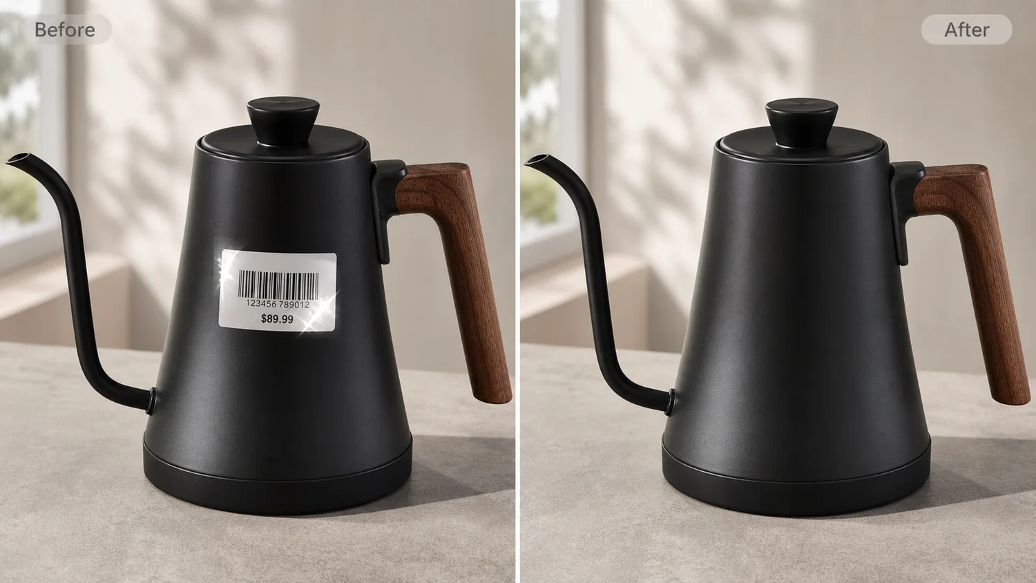 示例里是一只哑光黑色细嘴电热壶,带木纹手柄。左侧壶身正面有反光条码和价格贴,右侧保留同样的壶嘴、壶盖、手柄、哑光黑色质感、拍摄角度、桌面和接触阴影,只把贴纸和反光清理掉,让图片更适合做平台主图。
## 为什么反光贴纸会拖累主图
贴纸会同时制造三个问题:挡住材质、产生高亮反光、让图片看起来像仓库随手拍,而不是正式商品图。深色金属、玻璃、塑料和亮面包装尤其明显,贴纸反光有时会比商品本身还抢眼。
电商主图的核心任务很简单:缩成列表缩略图以后,买家也能马上看懂卖的是什么。条码贴、价格贴和临时质检贴会打断商品轮廓,也可能让买家误以为这是二手、清仓或未整理好的商品。
## 修图前先锁住哪些信息
把贴纸当成唯一编辑目标。不要同时要求 AI “让图片更高级”或“整体优化”,因为宽泛提示词很容易悄悄改掉商品。
需要保护这些细节:
- 商品轮廓和拍摄角度
- 手柄、壶嘴、盖子、背带、瓶盖或五金结构
- 贴纸下方应有的材质纹理
- 真实颜色和表面质感
- 光线方向和高光强度
- 比例、裁切和居中位置
- 自然接触阴影
修完以后,应该像是同一张照片里贴纸被干净撕掉了,而不是换了一个商品。
## 可直接使用的贴纸反光清理提示词
在 [KrafLayer](https://kraflayer.com) 里可以这样写:
> 去掉这张商品主图正面的反光条码贴、价格贴、临时标签、胶痕和贴纸高光。只重建被贴纸遮住的商品表面,让它与周围材质一致。保持完全相同的商品形状、壶嘴、壶盖、手柄、哑光质感、颜色、拍摄角度、裁切、比例、光线、桌面和柔和接触阴影。不要改变商品设计,不要添加 logo,不要添加文字,不要添加道具,不要改变背景,不要把表面修成塑料感。
如果商品上有必须保留的包装文字、合规标签、序列号或安全标识,不要删除。这个流程只适合清理拍摄临时贴纸、仓库标签、价格贴,以及不应该出现在销售图片里的反光。
## 像审核主图一样检查修复区域
通过前一定要放大看。贴纸去除失败有时不明显:表面反射变弯、纹理被抹糊、原来贴纸的位置留下凹痕,或者修复区域突然变得过于光滑。
重点检查:
- 材质颗粒或哑光质感能自然延续
- 没有贴纸残影和边框痕迹
- 缩略图里不再被反光抢走注意力
- 商品边缘和比例没有变化
- 光线仍然和整张图一致
- 图片仍然适合做主图,而不只是局部修得干净
好的结果应该“低调”。买家看到的是水壶本身,而不是修图。
## 什么时候不该用 AI 去除
不要用 AI 去掩盖真实商品状态。如果贴纸撕下后损伤了表面,遮住了必须展示的产品标签,或者涉及买家需要知道的信息,就应该重拍或如实展示。AI 修图更适合处理临时拍摄瑕疵,而不是改变商品事实。
做目录图时,建议导出清理后的 WebP 用于上架,同时保留原始文件。后续如果平台或买家需要核对,你仍然能追溯这张图改过哪里。
## KrafLayer 适合放在流程哪一步
KrafLayer 适合放在选好商品角度之后、压缩上传之前。先选最清楚的主图,上传后把贴纸清理写成局部编辑,检查修复后的材质,再导出 WebP 用于 Shopify、Amazon、TikTok Shop、广告或邮件素材。
这只是一个小修图,但会影响整张主图的可信度。商品更容易被看清,缩略图更安静,图片也更像正式商品页素材,而不是仓库桌面记录。
## 常见问题
### 商品主图有反光贴纸怎么去除?
用局部 AI 编辑只去掉临时贴纸和反光,同时保留商品形状、材质纹理、光线、裁切、比例和自然阴影。
### AI 可以去掉条码贴但不改变商品吗?
可以,但提示词要锁住 SKU 细节,并把编辑范围限制在贴纸区域。通过前要把修复表面和周围材质对比检查。
### 商品图上的所有标签都应该去掉吗?
不应该。只去掉临时拍摄贴纸、价格贴和仓库标签。真实产品标签、必要标识和影响买家判断的信息应该保留。
### 什么样的去贴纸结果适合上架?
买家能先看清商品,修复区域与原有材质一致,没有贴纸反光、残影或边框痕迹干扰 SKU。
## KrafLayer 放在流程里的位置
把商品主图有反光贴纸放到 KrafLayer 里做时,先选对工具:在 Erase 里只刷选要移除的区域,让模型根据周围像素补齐。生成后不要只看画面是否更漂亮,要按主图、详情图或广告素材的使用场景检查:商品形状、材质、标签、颜色、比例和配件仍然对应原始 SKU。
## FAQ
### 反光贴纸可以完全去掉吗?
如果贴纸不是商品本身的一部分,而且你拥有图片使用权,可以清理。但如果贴纸遮挡了真实标签、批号、接口或结构,AI 补出来的区域需要人工确认。
### 去贴纸会不会改变包装材质?
会有风险。亮面塑料、玻璃、金属和覆膜纸盒在去除贴纸后容易丢失反光逻辑,所以 选区要明确保留原包装材质、纹理和高光方向。
### 平台主图可以保留促销贴吗?
要看平台和类目规则。很多情况下,主图应避免额外促销贴、贴纸或误导性元素;更稳的是把促销信息放到副图或详情页。
# How to Put Furniture Product Photos Into a Realistic Living Room Scene
URL: https://kraflayer.com/blog/put-furniture-product-photos-into-realistic-living-room-scenes
Summary: A practical workflow for placing furniture product photos into realistic living room scenes while protecting color, material, scale, silhouette, and shadow.
Updated: 2026-06-20
AI furniture product photos in a realistic living room work only when the furniture remains the product truth and the room becomes supporting context. The scene should help a buyer judge scale, color, material, and use case. It should not redesign the chair, table, sofa, cabinet, or shelf.
The practical rule is simple: lock the furniture facts before generating the room. In [KrafLayer AI product photography](/ai-product-photography), start from the cleanest product reference, decide the room role, then review the final lifestyle image against the original SKU before using it on a product page, marketplace listing, or ad.
示例里是一只哑光黑色细嘴电热壶,带木纹手柄。左侧壶身正面有反光条码和价格贴,右侧保留同样的壶嘴、壶盖、手柄、哑光黑色质感、拍摄角度、桌面和接触阴影,只把贴纸和反光清理掉,让图片更适合做平台主图。
## 为什么反光贴纸会拖累主图
贴纸会同时制造三个问题:挡住材质、产生高亮反光、让图片看起来像仓库随手拍,而不是正式商品图。深色金属、玻璃、塑料和亮面包装尤其明显,贴纸反光有时会比商品本身还抢眼。
电商主图的核心任务很简单:缩成列表缩略图以后,买家也能马上看懂卖的是什么。条码贴、价格贴和临时质检贴会打断商品轮廓,也可能让买家误以为这是二手、清仓或未整理好的商品。
## 修图前先锁住哪些信息
把贴纸当成唯一编辑目标。不要同时要求 AI “让图片更高级”或“整体优化”,因为宽泛提示词很容易悄悄改掉商品。
需要保护这些细节:
- 商品轮廓和拍摄角度
- 手柄、壶嘴、盖子、背带、瓶盖或五金结构
- 贴纸下方应有的材质纹理
- 真实颜色和表面质感
- 光线方向和高光强度
- 比例、裁切和居中位置
- 自然接触阴影
修完以后,应该像是同一张照片里贴纸被干净撕掉了,而不是换了一个商品。
## 可直接使用的贴纸反光清理提示词
在 [KrafLayer](https://kraflayer.com) 里可以这样写:
> 去掉这张商品主图正面的反光条码贴、价格贴、临时标签、胶痕和贴纸高光。只重建被贴纸遮住的商品表面,让它与周围材质一致。保持完全相同的商品形状、壶嘴、壶盖、手柄、哑光质感、颜色、拍摄角度、裁切、比例、光线、桌面和柔和接触阴影。不要改变商品设计,不要添加 logo,不要添加文字,不要添加道具,不要改变背景,不要把表面修成塑料感。
如果商品上有必须保留的包装文字、合规标签、序列号或安全标识,不要删除。这个流程只适合清理拍摄临时贴纸、仓库标签、价格贴,以及不应该出现在销售图片里的反光。
## 像审核主图一样检查修复区域
通过前一定要放大看。贴纸去除失败有时不明显:表面反射变弯、纹理被抹糊、原来贴纸的位置留下凹痕,或者修复区域突然变得过于光滑。
重点检查:
- 材质颗粒或哑光质感能自然延续
- 没有贴纸残影和边框痕迹
- 缩略图里不再被反光抢走注意力
- 商品边缘和比例没有变化
- 光线仍然和整张图一致
- 图片仍然适合做主图,而不只是局部修得干净
好的结果应该“低调”。买家看到的是水壶本身,而不是修图。
## 什么时候不该用 AI 去除
不要用 AI 去掩盖真实商品状态。如果贴纸撕下后损伤了表面,遮住了必须展示的产品标签,或者涉及买家需要知道的信息,就应该重拍或如实展示。AI 修图更适合处理临时拍摄瑕疵,而不是改变商品事实。
做目录图时,建议导出清理后的 WebP 用于上架,同时保留原始文件。后续如果平台或买家需要核对,你仍然能追溯这张图改过哪里。
## KrafLayer 适合放在流程哪一步
KrafLayer 适合放在选好商品角度之后、压缩上传之前。先选最清楚的主图,上传后把贴纸清理写成局部编辑,检查修复后的材质,再导出 WebP 用于 Shopify、Amazon、TikTok Shop、广告或邮件素材。
这只是一个小修图,但会影响整张主图的可信度。商品更容易被看清,缩略图更安静,图片也更像正式商品页素材,而不是仓库桌面记录。
## 常见问题
### 商品主图有反光贴纸怎么去除?
用局部 AI 编辑只去掉临时贴纸和反光,同时保留商品形状、材质纹理、光线、裁切、比例和自然阴影。
### AI 可以去掉条码贴但不改变商品吗?
可以,但提示词要锁住 SKU 细节,并把编辑范围限制在贴纸区域。通过前要把修复表面和周围材质对比检查。
### 商品图上的所有标签都应该去掉吗?
不应该。只去掉临时拍摄贴纸、价格贴和仓库标签。真实产品标签、必要标识和影响买家判断的信息应该保留。
### 什么样的去贴纸结果适合上架?
买家能先看清商品,修复区域与原有材质一致,没有贴纸反光、残影或边框痕迹干扰 SKU。
## KrafLayer 放在流程里的位置
把商品主图有反光贴纸放到 KrafLayer 里做时,先选对工具:在 Erase 里只刷选要移除的区域,让模型根据周围像素补齐。生成后不要只看画面是否更漂亮,要按主图、详情图或广告素材的使用场景检查:商品形状、材质、标签、颜色、比例和配件仍然对应原始 SKU。
## FAQ
### 反光贴纸可以完全去掉吗?
如果贴纸不是商品本身的一部分,而且你拥有图片使用权,可以清理。但如果贴纸遮挡了真实标签、批号、接口或结构,AI 补出来的区域需要人工确认。
### 去贴纸会不会改变包装材质?
会有风险。亮面塑料、玻璃、金属和覆膜纸盒在去除贴纸后容易丢失反光逻辑,所以 选区要明确保留原包装材质、纹理和高光方向。
### 平台主图可以保留促销贴吗?
要看平台和类目规则。很多情况下,主图应避免额外促销贴、贴纸或误导性元素;更稳的是把促销信息放到副图或详情页。
# How to Put Furniture Product Photos Into a Realistic Living Room Scene
URL: https://kraflayer.com/blog/put-furniture-product-photos-into-realistic-living-room-scenes
Summary: A practical workflow for placing furniture product photos into realistic living room scenes while protecting color, material, scale, silhouette, and shadow.
Updated: 2026-06-20
AI furniture product photos in a realistic living room work only when the furniture remains the product truth and the room becomes supporting context. The scene should help a buyer judge scale, color, material, and use case. It should not redesign the chair, table, sofa, cabinet, or shelf.
The practical rule is simple: lock the furniture facts before generating the room. In [KrafLayer AI product photography](/ai-product-photography), start from the cleanest product reference, decide the room role, then review the final lifestyle image against the original SKU before using it on a product page, marketplace listing, or ad.
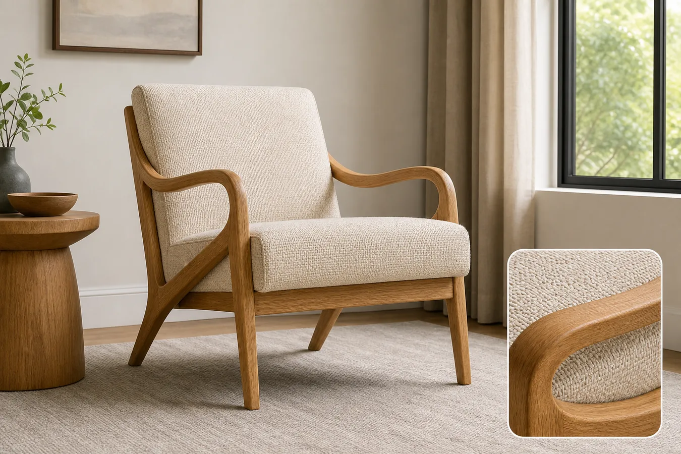 ## What The Living Room Scene Must Prove
A realistic living room scene should answer buyer questions that a plain cutout cannot answer:
- How large does the furniture feel in a normal room?
- Does the color still match the product image?
- Does the material look like wood, fabric, leather, rattan, metal, or stone rather than a generic AI surface?
- Does the furniture sit naturally on the floor with believable contact shadow?
- Does the scene show how the product might be used without hiding the product?
That is why AI furniture product photos need stricter review than general lifestyle images. A beautiful room is not useful if the product has changed height, finish, cushion thickness, leg angle, drawer layout, or silhouette.
Use this rule before publishing:
> A furniture lifestyle image is ready only when the buyer can identify the same SKU from the clean product photo and the room scene.
## Build A Furniture Fact List First
Before prompting, write a short product-truth list. This list becomes the review standard for the generated image.
- Shape: protect the chair back, arm curve, tabletop edge, cabinet depth, shelf layout, or sofa profile.
- Proportion: protect height, width, depth, leg length, cushion thickness, and visible seat or storage volume.
- Material: protect wood grain, rattan weave, upholstery texture, leather sheen, metal finish, stone pattern, or painted surface.
- Color: protect the true product color under realistic daylight or warm interior light.
- Details: protect handles, seams, buttons, joints, drawer gaps, stitching, legs, feet, brackets, and visible hardware.
- Scale: make the product plausible beside rugs, side tables, lamps, windows, or wall art.
- Shadow: keep a natural contact shadow so the product does not float.
For AI furniture product photos in a realistic living room, this fact list matters more than decorative styling. It keeps the image anchored to the product being sold.
## Workflow For Placing Furniture Into A Room Scene
Use a controlled sequence:
- Start with a clean product image that clearly shows shape, color, material, and contact points.
- Pick one room role: PDP lifestyle image, hero banner, ad creative, catalog thumbnail, or detail-page support image.
- Choose a room that fits the product's price and style without stealing attention.
- Keep the camera angle close to the source photo when product shape matters.
- Ask for one furniture SKU, realistic room scale, clean floor contact, and restrained props.
- Generate the room scene.
- Compare the output against the product-truth list.
- Use [KrafLayer Scene Compose](/tools/ai-scene-compose) or the editor when you need tighter placement, crop, or background control.
This makes [AI product photography](/ai-product-photography) behave like a production workflow. The room can make the product more desirable, but the product facts still decide whether the image is publishable.
## Prompt Template
Use this prompt when you have a furniture reference:
> Create a realistic ecommerce living room product photo using the reference furniture as the product truth. Keep the exact furniture silhouette, color, material texture, wood grain or fabric weave, leg angle, cushion thickness, arm shape, visible hardware, proportions, scale, and natural floor contact shadow. Place the product in a tasteful living room with realistic daylight, a simple rug, restrained props, and enough negative space for a product page. Do not redesign the furniture, change color, change scale, add extra products, add real brand marks, add badges, add text overlays, or create unsupported claims.
For a material-supporting image, add:
> Include a small matching detail view of the same product material, such as upholstery weave, wood grain, rattan texture, leather finish, or hardware. The detail must match the main furniture exactly.
For a cleaner marketplace support image, add:
> Keep the room uncluttered and make the furniture the dominant subject, not a decorative background object.
## What To Check Before Publishing
Review the generated room image against the original product:
- Is the product still the same shape and silhouette?
- Did the color drift warmer, cooler, darker, or lighter than the SKU?
- Are legs, arms, handles, seams, drawers, cushions, or shelves in the same places?
- Does the material still look like the original material?
- Does the product sit on the floor at believable scale?
- Is the contact shadow natural?
- Are props, plants, blankets, or side tables covering buyer-relevant details?
- Did AI invent new features, buttons, drawers, stitching, or hardware?
- Does the image still work as ecommerce product photography at thumbnail size?
If product facts drift, reject the image or generate again with a narrower prompt. A polished room scene is not worth using if it sells a different product.
## Main Image Vs Living Room Image
Do not replace every clean product image with a lifestyle scene. Furniture shoppers usually need both direct inspection and room context.
A practical product page set can include:
- Clean main image for shape, finish, and direct product recognition.
- Realistic living room scene for scale, use case, and style fit.
- Material detail image for fabric, wood grain, rattan, leather, or hardware.
- Dimension or comparison image when size is a common buyer question.
- Alternate room crop for ads, email, or landing page hero creative.
KrafLayer can help create these roles from the same reference, but the same fact list should guide every image. That is how [ecommerce product photography](/ecommerce-product-photography) stays coherent while still giving buyers more context.
## Common Mistakes
The most common mistake is letting the room become more important than the furniture. Oversized plants, dramatic lamps, heavy blur, and crowded decor can all make the image less useful.
Avoid these mistakes:
- Changing a chair's arm curve, cushion thickness, or leg angle.
- Making wood grain, upholstery, rattan, or leather look like a different material.
- Making the product too large or too small for the room.
- Hiding legs, handles, shelves, drawers, or seams behind props.
- Adding fake brand labels, certification badges, price tags, or unsupported performance claims.
- Creating a scene that looks premium but no longer matches the SKU.
- Publishing a lifestyle image without a clean product image nearby.
The best living room product photos feel realistic, but they are still product-led. The buyer should notice the furniture first.
## FAQ
### Can AI put a furniture product photo into a realistic living room?
Yes, AI can put a furniture product photo into a realistic living room when the reference image is clear and the prompt protects product facts. The furniture shape, color, material, scale, legs, handles, seams, and contact shadow should be checked against the original before publishing.
### What makes furniture lifestyle images trustworthy?
Furniture lifestyle images are trustworthy when they show realistic scale, natural floor contact, believable light, and the same product details as the main image. The room should support the product, not redesign it or hide important buyer-facing information.
### How do I keep AI from changing furniture color or material?
Write the exact color, finish, and material into the prompt, then compare the generated image with the reference. Mention wood grain, fabric weave, leather sheen, metal finish, cushion thickness, or rattan texture. Reject outputs where the product looks like a different SKU.
### Should a furniture page use only living room images?
No. Living room images help shoppers understand scale and style, but clean main images and detail images are still important. Use the room scene as supporting context, then show direct views for product inspection.
### How does KrafLayer help with furniture product photos?
KrafLayer helps sellers use product references to create AI product photography scenes, then refine placement, background, crop, or detail issues with editing tools. For furniture, that means creating room context while checking color, material, scale, silhouette, and floor contact.
## Conclusion
Realistic living room scenes can make furniture easier to understand, but only when the product remains accurate. Start with a furniture fact list, generate a restrained room scene, review color, material, scale, silhouette, and contact shadow, then use KrafLayer to create AI product photography that gives buyers context without drifting away from the real SKU.
# How to Fix Logo and Text Position on Product Images
URL: https://kraflayer.com/blog/fix-logo-and-text-position-on-product-images
Summary: A practical AI editing workflow for correcting misplaced logo and product-name text on ecommerce photos without redesigning the SKU. Includes how to do it in KrafLayer.
Updated: 2026-08-21
## TL;DR
For Fix Logo and Text Position on Product Images, use KrafLayer for controlled local changes or reference-guided edits. Use Mask Edit for a local change with a short instruction, or Reference Image Editor when the result needs a visual example. The finished image should still prove that shape, material, labels, color, scale, and accessories still match the source SKU.
To fix logo and text position on a product image, keep the edit local. Move only the misplaced logo, product name, or label block, then protect the package shape, material, lighting, crop, color, and every buyer-relevant detail.
KrafLayer is an AI-powered visual editor for ecommerce product photography. For this task, use it like a controlled label-retouching step: correct the visual alignment problem without asking AI to redesign the package.
The example uses one ivory hand cream tube. In the before image, the logo sits too far left and the product-name text is low and off-center. In the after image, the same tube keeps its cap, shape, material, camera angle, and lighting, but the logo and text block align with the product axis. That is the edit sellers usually need: cleaner presentation, not a new package.
## Why Small Alignment Errors Hurt Ecommerce Photos
A crooked logo or drifting product-name block makes a product look less finished, even when the product itself is fine. Buyers may not notice the exact design problem, but they feel the listing is rushed. On a detail page, bad alignment also makes the image harder to reuse in ads, comparison tables, and marketplace thumbnails.
This is common with supplier photos, rushed sample shoots, packaging mockups, and local retouching passes where one small label area moved but the rest of the image stayed usable.
## Keep the Correction Narrow
Do not treat this as a full packaging redesign. The safest workflow is to mark the problem area and fix only that area.
Protect these facts:
- package outline, cap, seal, folds, and edge geometry
- true material finish, such as matte tube, paper label, foil, plastic, or glass
- approved brand mark, product name, and label hierarchy
- camera angle, crop, light direction, and contact shadow
- real product color and scale
- any regulated or buyer-facing information that should not be invented
If the AI changes the logo, rewrites claims, shifts the package shape, or creates a cleaner but different label, reject the result.
## A Prompt for Local Logo and Text Alignment
Use a direct prompt in [KrafLayer](https://kraflayer.com):
> Correct only the logo and product-name text placement on this ecommerce product image. Align the logo and text block to the vertical center of the package and improve spacing so the label looks ready for a product listing. Preserve the exact same package shape, cap, material texture, color, lighting, camera angle, crop, shadow, logo style, approved text, and label hierarchy. Do not redesign the packaging, change the product name, invent claims, add badges, add new text, remove real details, or alter the product body.
This prompt gives AI a small job. The result should look like a careful production retouch, not a new creative direction.
## Check the Result Like a Listing Operator
After generating the corrected image, compare the before and after at three sizes: full view, product-page width, and thumbnail. Alignment that looks fine at full size can still feel off in a small card.
Use this checklist:
- logo sits on the intended visual axis
- product-name text is centered or intentionally aligned
- spacing between logo and text feels balanced
- label text stays readable and unchanged
- product edges, cap, texture, and shadow match the source
- no new claims, badges, fake certifications, or decorative clutter appear
The corrected image should make the product easier to trust. It should not make the buyer wonder whether the package itself changed.
## When to Use This Workflow
Use this workflow when the image is mostly usable but one local label area is wrong: a logo is too high, product text is too low, a flavor line is shifted, or a label block is not centered after resizing. It works well for cosmetics, supplements, food packaging, candles, skincare bottles, and small consumer goods.
If the source file has legal, nutrition, ingredient, or regulated claims, do not ask AI to improvise those areas. Use the approved copy from your packaging file, then run the image through a human QA pass before uploading it.
## Where KrafLayer Fits
When you apply this Fix Logo and Text Position on Product Images workflow in KrafLayer, the tool choice matters: use Mask Edit for a local change with a short instruction, or Reference Image Editor when the result needs a visual example. After generation, judge the image by the channel it serves — listing images, detail pages, or ad assets — and check that shape, material, labels, color, scale, and accessories still match the source SKU.
## FAQ
### How do I fix logo and text position on product images?
Use a local AI edit that moves only the misplaced logo or text block while preserving the package shape, material, lighting, approved wording, crop, and shadow.
### Can AI fix label alignment without redesigning the packaging?
Yes, if the prompt limits the edit to placement and explicitly protects the logo style, product name, label hierarchy, package geometry, and material texture.
### Should AI rewrite blurry or wrong product text?
Only if you provide the approved replacement text. Do not let AI invent claims, certifications, ingredients, nutrition facts, or regulated information.
### What makes a label-position edit look fake?
Changed logo shapes, new claims, warped packaging, mismatched shadows, and text that looks sharper than the surrounding label usually make the edit feel fake.
# AI Product Photography vs Traditional Product Photography
URL: https://kraflayer.com/blog/ai-product-photography-vs-traditional-product-photography
Summary: A practical comparison of AI product photography and traditional studio photography for ecommerce teams deciding what to shoot, generate, and review.
Updated: 2026-06-19
AI product photography is best when you already know the product facts and need more ecommerce image variations from a reference. Traditional product photography is best when you need the most reliable source image, exact material proof, complex physical styling, or a final image that cannot risk changing product details. Most ecommerce teams should not treat this as an either-or decision: shoot or collect one accurate product reference, then use AI to create additional main images, detail images, lifestyle scenes, and campaign visuals faster.
KrafLayer fits the AI side of that workflow by helping sellers turn a product reference into usable ecommerce images while keeping product review, editing, and channel adaptation in the loop. The practical goal is not to replace every shoot. It is to reduce how often every new angle, scene, or campaign layout requires a new shoot.
For the broader AI workflow, start with the [AI product photography](/ai-product-photography) owner page. This article focuses on the decision: when to use AI, when to use a traditional shoot, and how to combine both without hurting buyer trust.
If you are planning the full store image system, the [ecommerce product photography](/ecommerce-product-photography) page covers the larger production workflow beyond this AI-versus-studio decision.
## What The Living Room Scene Must Prove
A realistic living room scene should answer buyer questions that a plain cutout cannot answer:
- How large does the furniture feel in a normal room?
- Does the color still match the product image?
- Does the material look like wood, fabric, leather, rattan, metal, or stone rather than a generic AI surface?
- Does the furniture sit naturally on the floor with believable contact shadow?
- Does the scene show how the product might be used without hiding the product?
That is why AI furniture product photos need stricter review than general lifestyle images. A beautiful room is not useful if the product has changed height, finish, cushion thickness, leg angle, drawer layout, or silhouette.
Use this rule before publishing:
> A furniture lifestyle image is ready only when the buyer can identify the same SKU from the clean product photo and the room scene.
## Build A Furniture Fact List First
Before prompting, write a short product-truth list. This list becomes the review standard for the generated image.
- Shape: protect the chair back, arm curve, tabletop edge, cabinet depth, shelf layout, or sofa profile.
- Proportion: protect height, width, depth, leg length, cushion thickness, and visible seat or storage volume.
- Material: protect wood grain, rattan weave, upholstery texture, leather sheen, metal finish, stone pattern, or painted surface.
- Color: protect the true product color under realistic daylight or warm interior light.
- Details: protect handles, seams, buttons, joints, drawer gaps, stitching, legs, feet, brackets, and visible hardware.
- Scale: make the product plausible beside rugs, side tables, lamps, windows, or wall art.
- Shadow: keep a natural contact shadow so the product does not float.
For AI furniture product photos in a realistic living room, this fact list matters more than decorative styling. It keeps the image anchored to the product being sold.
## Workflow For Placing Furniture Into A Room Scene
Use a controlled sequence:
- Start with a clean product image that clearly shows shape, color, material, and contact points.
- Pick one room role: PDP lifestyle image, hero banner, ad creative, catalog thumbnail, or detail-page support image.
- Choose a room that fits the product's price and style without stealing attention.
- Keep the camera angle close to the source photo when product shape matters.
- Ask for one furniture SKU, realistic room scale, clean floor contact, and restrained props.
- Generate the room scene.
- Compare the output against the product-truth list.
- Use [KrafLayer Scene Compose](/tools/ai-scene-compose) or the editor when you need tighter placement, crop, or background control.
This makes [AI product photography](/ai-product-photography) behave like a production workflow. The room can make the product more desirable, but the product facts still decide whether the image is publishable.
## Prompt Template
Use this prompt when you have a furniture reference:
> Create a realistic ecommerce living room product photo using the reference furniture as the product truth. Keep the exact furniture silhouette, color, material texture, wood grain or fabric weave, leg angle, cushion thickness, arm shape, visible hardware, proportions, scale, and natural floor contact shadow. Place the product in a tasteful living room with realistic daylight, a simple rug, restrained props, and enough negative space for a product page. Do not redesign the furniture, change color, change scale, add extra products, add real brand marks, add badges, add text overlays, or create unsupported claims.
For a material-supporting image, add:
> Include a small matching detail view of the same product material, such as upholstery weave, wood grain, rattan texture, leather finish, or hardware. The detail must match the main furniture exactly.
For a cleaner marketplace support image, add:
> Keep the room uncluttered and make the furniture the dominant subject, not a decorative background object.
## What To Check Before Publishing
Review the generated room image against the original product:
- Is the product still the same shape and silhouette?
- Did the color drift warmer, cooler, darker, or lighter than the SKU?
- Are legs, arms, handles, seams, drawers, cushions, or shelves in the same places?
- Does the material still look like the original material?
- Does the product sit on the floor at believable scale?
- Is the contact shadow natural?
- Are props, plants, blankets, or side tables covering buyer-relevant details?
- Did AI invent new features, buttons, drawers, stitching, or hardware?
- Does the image still work as ecommerce product photography at thumbnail size?
If product facts drift, reject the image or generate again with a narrower prompt. A polished room scene is not worth using if it sells a different product.
## Main Image Vs Living Room Image
Do not replace every clean product image with a lifestyle scene. Furniture shoppers usually need both direct inspection and room context.
A practical product page set can include:
- Clean main image for shape, finish, and direct product recognition.
- Realistic living room scene for scale, use case, and style fit.
- Material detail image for fabric, wood grain, rattan, leather, or hardware.
- Dimension or comparison image when size is a common buyer question.
- Alternate room crop for ads, email, or landing page hero creative.
KrafLayer can help create these roles from the same reference, but the same fact list should guide every image. That is how [ecommerce product photography](/ecommerce-product-photography) stays coherent while still giving buyers more context.
## Common Mistakes
The most common mistake is letting the room become more important than the furniture. Oversized plants, dramatic lamps, heavy blur, and crowded decor can all make the image less useful.
Avoid these mistakes:
- Changing a chair's arm curve, cushion thickness, or leg angle.
- Making wood grain, upholstery, rattan, or leather look like a different material.
- Making the product too large or too small for the room.
- Hiding legs, handles, shelves, drawers, or seams behind props.
- Adding fake brand labels, certification badges, price tags, or unsupported performance claims.
- Creating a scene that looks premium but no longer matches the SKU.
- Publishing a lifestyle image without a clean product image nearby.
The best living room product photos feel realistic, but they are still product-led. The buyer should notice the furniture first.
## FAQ
### Can AI put a furniture product photo into a realistic living room?
Yes, AI can put a furniture product photo into a realistic living room when the reference image is clear and the prompt protects product facts. The furniture shape, color, material, scale, legs, handles, seams, and contact shadow should be checked against the original before publishing.
### What makes furniture lifestyle images trustworthy?
Furniture lifestyle images are trustworthy when they show realistic scale, natural floor contact, believable light, and the same product details as the main image. The room should support the product, not redesign it or hide important buyer-facing information.
### How do I keep AI from changing furniture color or material?
Write the exact color, finish, and material into the prompt, then compare the generated image with the reference. Mention wood grain, fabric weave, leather sheen, metal finish, cushion thickness, or rattan texture. Reject outputs where the product looks like a different SKU.
### Should a furniture page use only living room images?
No. Living room images help shoppers understand scale and style, but clean main images and detail images are still important. Use the room scene as supporting context, then show direct views for product inspection.
### How does KrafLayer help with furniture product photos?
KrafLayer helps sellers use product references to create AI product photography scenes, then refine placement, background, crop, or detail issues with editing tools. For furniture, that means creating room context while checking color, material, scale, silhouette, and floor contact.
## Conclusion
Realistic living room scenes can make furniture easier to understand, but only when the product remains accurate. Start with a furniture fact list, generate a restrained room scene, review color, material, scale, silhouette, and contact shadow, then use KrafLayer to create AI product photography that gives buyers context without drifting away from the real SKU.
# How to Fix Logo and Text Position on Product Images
URL: https://kraflayer.com/blog/fix-logo-and-text-position-on-product-images
Summary: A practical AI editing workflow for correcting misplaced logo and product-name text on ecommerce photos without redesigning the SKU. Includes how to do it in KrafLayer.
Updated: 2026-08-21
## TL;DR
For Fix Logo and Text Position on Product Images, use KrafLayer for controlled local changes or reference-guided edits. Use Mask Edit for a local change with a short instruction, or Reference Image Editor when the result needs a visual example. The finished image should still prove that shape, material, labels, color, scale, and accessories still match the source SKU.
To fix logo and text position on a product image, keep the edit local. Move only the misplaced logo, product name, or label block, then protect the package shape, material, lighting, crop, color, and every buyer-relevant detail.
KrafLayer is an AI-powered visual editor for ecommerce product photography. For this task, use it like a controlled label-retouching step: correct the visual alignment problem without asking AI to redesign the package.
The example uses one ivory hand cream tube. In the before image, the logo sits too far left and the product-name text is low and off-center. In the after image, the same tube keeps its cap, shape, material, camera angle, and lighting, but the logo and text block align with the product axis. That is the edit sellers usually need: cleaner presentation, not a new package.
## Why Small Alignment Errors Hurt Ecommerce Photos
A crooked logo or drifting product-name block makes a product look less finished, even when the product itself is fine. Buyers may not notice the exact design problem, but they feel the listing is rushed. On a detail page, bad alignment also makes the image harder to reuse in ads, comparison tables, and marketplace thumbnails.
This is common with supplier photos, rushed sample shoots, packaging mockups, and local retouching passes where one small label area moved but the rest of the image stayed usable.
## Keep the Correction Narrow
Do not treat this as a full packaging redesign. The safest workflow is to mark the problem area and fix only that area.
Protect these facts:
- package outline, cap, seal, folds, and edge geometry
- true material finish, such as matte tube, paper label, foil, plastic, or glass
- approved brand mark, product name, and label hierarchy
- camera angle, crop, light direction, and contact shadow
- real product color and scale
- any regulated or buyer-facing information that should not be invented
If the AI changes the logo, rewrites claims, shifts the package shape, or creates a cleaner but different label, reject the result.
## A Prompt for Local Logo and Text Alignment
Use a direct prompt in [KrafLayer](https://kraflayer.com):
> Correct only the logo and product-name text placement on this ecommerce product image. Align the logo and text block to the vertical center of the package and improve spacing so the label looks ready for a product listing. Preserve the exact same package shape, cap, material texture, color, lighting, camera angle, crop, shadow, logo style, approved text, and label hierarchy. Do not redesign the packaging, change the product name, invent claims, add badges, add new text, remove real details, or alter the product body.
This prompt gives AI a small job. The result should look like a careful production retouch, not a new creative direction.
## Check the Result Like a Listing Operator
After generating the corrected image, compare the before and after at three sizes: full view, product-page width, and thumbnail. Alignment that looks fine at full size can still feel off in a small card.
Use this checklist:
- logo sits on the intended visual axis
- product-name text is centered or intentionally aligned
- spacing between logo and text feels balanced
- label text stays readable and unchanged
- product edges, cap, texture, and shadow match the source
- no new claims, badges, fake certifications, or decorative clutter appear
The corrected image should make the product easier to trust. It should not make the buyer wonder whether the package itself changed.
## When to Use This Workflow
Use this workflow when the image is mostly usable but one local label area is wrong: a logo is too high, product text is too low, a flavor line is shifted, or a label block is not centered after resizing. It works well for cosmetics, supplements, food packaging, candles, skincare bottles, and small consumer goods.
If the source file has legal, nutrition, ingredient, or regulated claims, do not ask AI to improvise those areas. Use the approved copy from your packaging file, then run the image through a human QA pass before uploading it.
## Where KrafLayer Fits
When you apply this Fix Logo and Text Position on Product Images workflow in KrafLayer, the tool choice matters: use Mask Edit for a local change with a short instruction, or Reference Image Editor when the result needs a visual example. After generation, judge the image by the channel it serves — listing images, detail pages, or ad assets — and check that shape, material, labels, color, scale, and accessories still match the source SKU.
## FAQ
### How do I fix logo and text position on product images?
Use a local AI edit that moves only the misplaced logo or text block while preserving the package shape, material, lighting, approved wording, crop, and shadow.
### Can AI fix label alignment without redesigning the packaging?
Yes, if the prompt limits the edit to placement and explicitly protects the logo style, product name, label hierarchy, package geometry, and material texture.
### Should AI rewrite blurry or wrong product text?
Only if you provide the approved replacement text. Do not let AI invent claims, certifications, ingredients, nutrition facts, or regulated information.
### What makes a label-position edit look fake?
Changed logo shapes, new claims, warped packaging, mismatched shadows, and text that looks sharper than the surrounding label usually make the edit feel fake.
# AI Product Photography vs Traditional Product Photography
URL: https://kraflayer.com/blog/ai-product-photography-vs-traditional-product-photography
Summary: A practical comparison of AI product photography and traditional studio photography for ecommerce teams deciding what to shoot, generate, and review.
Updated: 2026-06-19
AI product photography is best when you already know the product facts and need more ecommerce image variations from a reference. Traditional product photography is best when you need the most reliable source image, exact material proof, complex physical styling, or a final image that cannot risk changing product details. Most ecommerce teams should not treat this as an either-or decision: shoot or collect one accurate product reference, then use AI to create additional main images, detail images, lifestyle scenes, and campaign visuals faster.
KrafLayer fits the AI side of that workflow by helping sellers turn a product reference into usable ecommerce images while keeping product review, editing, and channel adaptation in the loop. The practical goal is not to replace every shoot. It is to reduce how often every new angle, scene, or campaign layout requires a new shoot.
For the broader AI workflow, start with the [AI product photography](/ai-product-photography) owner page. This article focuses on the decision: when to use AI, when to use a traditional shoot, and how to combine both without hurting buyer trust.
If you are planning the full store image system, the [ecommerce product photography](/ecommerce-product-photography) page covers the larger production workflow beyond this AI-versus-studio decision.
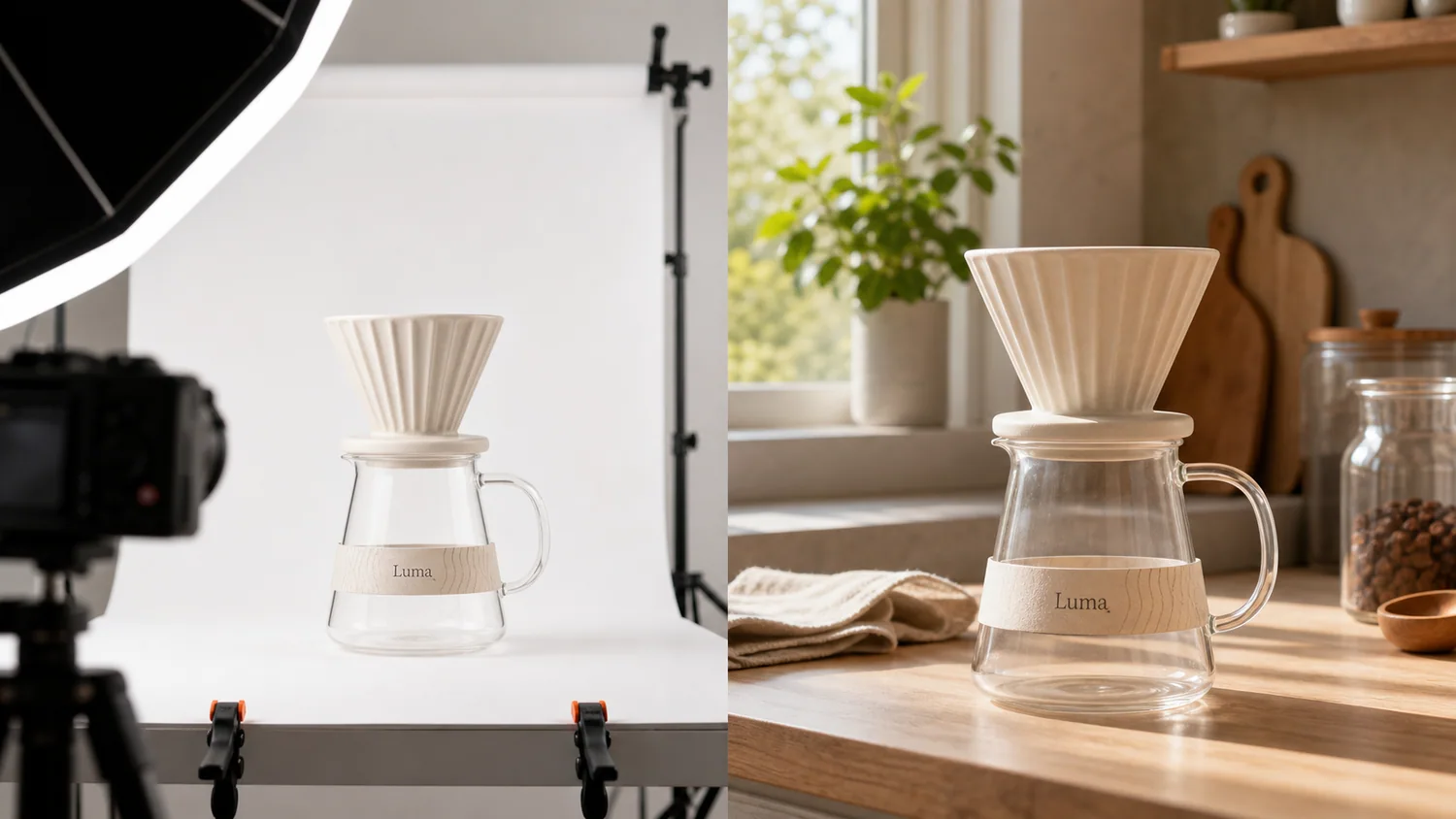 ## Quick Answer: Which One Should You Use?
Use traditional product photography when the image must prove the exact physical item with minimal interpretation. Use AI product photography when you have a reliable product reference and need more selling contexts, crops, backgrounds, or campaign variations.
Practical rule: traditional photography creates product truth; AI product photography extends that truth into more ecommerce assets.
That rule keeps the workflow honest. A studio image can lock the real SKU, material, scale, and color. AI can then help produce supporting visuals for a Shopify product page, Amazon secondary images, landing pages, social ads, email, and seasonal campaigns. If the AI output changes the product, reject it or edit it before publishing.
## The Real Difference Is Control
Traditional photography gives you control over the physical product, props, lighting, lens, set, and capture process. It is strongest when the product is new, high value, regulated, texture-sensitive, or visually complex.
AI product photography gives you control over production range. Once you have a trustworthy product reference, AI can help you explore more settings, crops, image roles, and merchandising ideas without rebuilding a physical set every time.
The tradeoff is simple:
| Decision point | Traditional product photography | AI product photography |
|---|---|---|
| Product truth | Strongest source of truth when captured well | Depends on the reference image and review process |
| New scenes | Requires set, props, lighting, and time | Can generate multiple backgrounds and contexts quickly |
| Main images | Best when exact shape, color, and material proof are critical | Useful when reference quality is clear and output is reviewed |
| Detail images | Strong for real texture, hardware, stitching, glass, and labels | Useful for supporting detail concepts, but must be checked closely |
| Campaign assets | Expensive to reshoot for every campaign | Good for seasonal, ad, email, and landing-page variations |
| Risk | Production cost and logistics | Product drift, fake details, impossible scale, or invented text |
Neither method is automatically better. The right method depends on what the buyer needs to believe from that image.
## When Traditional Product Photography Still Wins
Traditional photography is the better starting point when the image needs to verify exact product facts.
Use a real shoot when:
- the product has fine text, labels, ports, seams, buttons, stone settings, or hardware that must be exact
- color matching matters, such as cosmetics, apparel variants, furniture, or materials with subtle undertones
- the product is reflective, transparent, highly textured, or hard to represent from a single reference
- the image will be used as the primary marketplace proof image
- the product category has safety, medical, compliance, or regulated buyer expectations
- you need a legal, packaging, or certification detail to appear exactly as printed
Traditional photography also gives your AI workflow better input. A clean, well-lit reference image often becomes the asset that makes later AI product photography usable.
## When AI Product Photography Is The Better Production Layer
AI product photography works best after the product is known. It is especially useful when the team needs image volume, not a new physical proof of the product.
Use AI when you need:
- lifestyle images for store pages without building every scene physically
- background variations for product launches or campaigns
- detail-image concepts that explain material, use, or selling points
- ad creatives around the same SKU
- seasonal or audience-specific image versions
- quick testing before committing to a paid shoot
- visual refreshes for older listings that already have a decent product reference
In KrafLayer, this is the point where the [AI product image generator](/ai-product-image-generator) can turn one reference into new ecommerce image roles. Keep the prompt practical: name the product, define the image role, lock the facts that must stay unchanged, and avoid fake badges, claims, or extra accessories.
## A Practical Hybrid Workflow
The strongest ecommerce workflow usually combines both methods.
### 1. Capture Or Choose One Accurate Source Image
Start with the most truthful image you have. It can be a studio photo, a supplier image you are allowed to use, or a clean phone photo if the product is visible enough.
Check that the image shows:
- product outline and proportions
- true color family
- material texture
- key parts and edges
- labels or package areas
- scale cues and shadow
- the correct variant
This image becomes the reference that AI must respect.
### 2. Decide The Image Role Before Generating
Do not ask AI for "better product photography" in general. Ask for one output at a time.
Examples:
- clean ecommerce main image
- detail image showing texture or construction
- lifestyle image for a Shopify product page
- secondary marketplace image
- landing-page hero image
- simple ad creative
Each role has different rules. A main image should make the product instantly readable. A detail image should prove one buyer-relevant feature. A lifestyle image should show believable use without hiding or resizing the product.
### 3. Lock Product Facts In The Prompt
Use the prompt to protect the SKU before describing style.
> Create an ecommerce lifestyle image from this product reference. Keep the product shape, cream ceramic color, ribbed cone, glass carafe shape, paper band position, scale, and natural shadow consistent with the reference. Use warm kitchen counter lighting. Do not add logos, certification badges, extra products, unreadable claims, or product redesigns.
That instruction is useful because it tells the model what not to change. Product-preservation language matters more than decorative style language.
### 4. Review Against The Source
Before publishing an AI product photo, compare it with the source image.
Reject or edit the output if:
- the product silhouette changes
- color shifts into a different variant
- ports, buttons, handles, caps, seams, zippers, stones, or labels move
- material looks fake or too smooth
- scale no longer makes sense
- text, badges, or claims were invented
- the scene makes the product hard to inspect
If the output is close, use the [product photo editor](/product-photo-editor) for cleanup rather than regenerating the whole image. Small local edits are often safer than asking AI to reinterpret the product again.
## Which Images Should Stay Traditional?
Keep the most product-critical images closer to real photography. For many stores, that means the first product proof image, color-sensitive variant images, package closeups, warranty or included-parts images, and regulated product details.
AI can still support those assets through cleanup, background improvement, or crop adaptation, but the source should stay real when buyer trust depends on exactness.
For example, a traditional shot should capture the exact texture of a leather handbag and the real shape of its hardware. AI can then help create a store hero, an email banner, and a lifestyle scene from that reference. The AI assets should support the real product, not invent a more expensive version of it.
## Which Images Are Good AI Candidates?
AI is strongest for supporting image roles that need variety.
Good candidates include:
- lifestyle scenes for product pages
- hero images for landing pages
- email campaign visuals
- seasonal background variations
- paid ad creative variations
- social product posts
- simple detail-image layouts
- visual tests before a shoot
These assets still need review, but they usually have more creative room than the primary proof image. The buyer needs to recognize the product and understand the selling context, not inspect every printed character at macro distance.
## Cost, Speed, And Quality Tradeoffs
Traditional product photography has up-front planning costs: product shipping, set design, photographer time, retouching, props, location, and revision cycles. The benefit is reliable capture when the shoot is well managed.
AI product photography has lower setup friction once the source image is ready. The cost moves from physical production into prompt control, output review, editing, and brand consistency. The risk is not that AI is too slow. The risk is that a fast image can quietly become inaccurate.
For ecommerce, speed only helps when product truth survives. A quick asset that changes the SKU creates more work later through returns, buyer confusion, or listing review.
## FAQ
### Is AI product photography better than traditional product photography?
AI product photography is better for creating variations, scenes, and campaign assets from an existing product reference. Traditional product photography is better for capturing exact product truth. The best ecommerce workflow often uses traditional photography for the source image and AI for supporting assets.
### Can AI product photography replace a studio shoot?
AI can replace some repeat shoots for backgrounds, lifestyle scenes, ad creatives, and visual tests. It should not automatically replace a source shoot when exact color, material, packaging, scale, or compliance-sensitive product details need to be proven accurately.
### What product photos should I generate with AI first?
Start with supporting assets: lifestyle images, detail-image concepts, landing-page visuals, email banners, and ad creatives. Keep the primary product proof image close to the real reference until you have a review workflow that reliably protects shape, color, material, and small details.
### How do I keep AI product photos accurate?
Use a clear product reference, generate one image role at a time, lock product facts in the prompt, and compare every output against the source. Reject images with changed silhouettes, colors, parts, labels, scale, or invented claims.
### How does KrafLayer help with AI product photography?
KrafLayer helps sellers turn a product reference into ecommerce product visuals, then refine outputs with editing workflows when an image needs cleanup, background improvement, or a more channel-ready crop. It is useful for expanding a product image set without treating accuracy as optional.
## Conclusion
AI product photography vs traditional product photography is not a simple replacement question. Traditional photography is still the strongest way to capture product truth, while KrafLayer can help extend that truth into AI product photography assets such as main images, detail images, lifestyle scenes, and campaign creatives. For ecommerce teams, the practical advantage is a hybrid workflow: keep the real product facts accurate, then use AI to produce more selling images without rebuilding a studio setup for every new visual.
# How to Generate Perfume Product Photos That Show Glass Texture
URL: https://kraflayer.com/blog/generate-perfume-product-photos-with-glass-texture
Summary: A practical workflow for generating perfume product images that show transparent glass, liquid depth, cap texture, and controlled reflections without changing the SKU.
Updated: 2026-06-20
AI perfume product photos with glass texture work when the image makes the bottle feel transparent, heavy, and inspectable without inventing a new fragrance package. The goal is not just shine. Good perfume product photography shows the glass edge, thick base, liquid depth, cap material, label placement, and reflection behavior in a way that helps a buyer trust the product.
The practical rule is simple: glass texture should explain the bottle, not hide it. In KrafLayer, use the perfume reference as the product-truth source, generate one ecommerce image role at a time, and review whether the transparent edges, amber liquid, label paper, cap, and shadow still match the real SKU.
## Quick Answer: Which One Should You Use?
Use traditional product photography when the image must prove the exact physical item with minimal interpretation. Use AI product photography when you have a reliable product reference and need more selling contexts, crops, backgrounds, or campaign variations.
Practical rule: traditional photography creates product truth; AI product photography extends that truth into more ecommerce assets.
That rule keeps the workflow honest. A studio image can lock the real SKU, material, scale, and color. AI can then help produce supporting visuals for a Shopify product page, Amazon secondary images, landing pages, social ads, email, and seasonal campaigns. If the AI output changes the product, reject it or edit it before publishing.
## The Real Difference Is Control
Traditional photography gives you control over the physical product, props, lighting, lens, set, and capture process. It is strongest when the product is new, high value, regulated, texture-sensitive, or visually complex.
AI product photography gives you control over production range. Once you have a trustworthy product reference, AI can help you explore more settings, crops, image roles, and merchandising ideas without rebuilding a physical set every time.
The tradeoff is simple:
| Decision point | Traditional product photography | AI product photography |
|---|---|---|
| Product truth | Strongest source of truth when captured well | Depends on the reference image and review process |
| New scenes | Requires set, props, lighting, and time | Can generate multiple backgrounds and contexts quickly |
| Main images | Best when exact shape, color, and material proof are critical | Useful when reference quality is clear and output is reviewed |
| Detail images | Strong for real texture, hardware, stitching, glass, and labels | Useful for supporting detail concepts, but must be checked closely |
| Campaign assets | Expensive to reshoot for every campaign | Good for seasonal, ad, email, and landing-page variations |
| Risk | Production cost and logistics | Product drift, fake details, impossible scale, or invented text |
Neither method is automatically better. The right method depends on what the buyer needs to believe from that image.
## When Traditional Product Photography Still Wins
Traditional photography is the better starting point when the image needs to verify exact product facts.
Use a real shoot when:
- the product has fine text, labels, ports, seams, buttons, stone settings, or hardware that must be exact
- color matching matters, such as cosmetics, apparel variants, furniture, or materials with subtle undertones
- the product is reflective, transparent, highly textured, or hard to represent from a single reference
- the image will be used as the primary marketplace proof image
- the product category has safety, medical, compliance, or regulated buyer expectations
- you need a legal, packaging, or certification detail to appear exactly as printed
Traditional photography also gives your AI workflow better input. A clean, well-lit reference image often becomes the asset that makes later AI product photography usable.
## When AI Product Photography Is The Better Production Layer
AI product photography works best after the product is known. It is especially useful when the team needs image volume, not a new physical proof of the product.
Use AI when you need:
- lifestyle images for store pages without building every scene physically
- background variations for product launches or campaigns
- detail-image concepts that explain material, use, or selling points
- ad creatives around the same SKU
- seasonal or audience-specific image versions
- quick testing before committing to a paid shoot
- visual refreshes for older listings that already have a decent product reference
In KrafLayer, this is the point where the [AI product image generator](/ai-product-image-generator) can turn one reference into new ecommerce image roles. Keep the prompt practical: name the product, define the image role, lock the facts that must stay unchanged, and avoid fake badges, claims, or extra accessories.
## A Practical Hybrid Workflow
The strongest ecommerce workflow usually combines both methods.
### 1. Capture Or Choose One Accurate Source Image
Start with the most truthful image you have. It can be a studio photo, a supplier image you are allowed to use, or a clean phone photo if the product is visible enough.
Check that the image shows:
- product outline and proportions
- true color family
- material texture
- key parts and edges
- labels or package areas
- scale cues and shadow
- the correct variant
This image becomes the reference that AI must respect.
### 2. Decide The Image Role Before Generating
Do not ask AI for "better product photography" in general. Ask for one output at a time.
Examples:
- clean ecommerce main image
- detail image showing texture or construction
- lifestyle image for a Shopify product page
- secondary marketplace image
- landing-page hero image
- simple ad creative
Each role has different rules. A main image should make the product instantly readable. A detail image should prove one buyer-relevant feature. A lifestyle image should show believable use without hiding or resizing the product.
### 3. Lock Product Facts In The Prompt
Use the prompt to protect the SKU before describing style.
> Create an ecommerce lifestyle image from this product reference. Keep the product shape, cream ceramic color, ribbed cone, glass carafe shape, paper band position, scale, and natural shadow consistent with the reference. Use warm kitchen counter lighting. Do not add logos, certification badges, extra products, unreadable claims, or product redesigns.
That instruction is useful because it tells the model what not to change. Product-preservation language matters more than decorative style language.
### 4. Review Against The Source
Before publishing an AI product photo, compare it with the source image.
Reject or edit the output if:
- the product silhouette changes
- color shifts into a different variant
- ports, buttons, handles, caps, seams, zippers, stones, or labels move
- material looks fake or too smooth
- scale no longer makes sense
- text, badges, or claims were invented
- the scene makes the product hard to inspect
If the output is close, use the [product photo editor](/product-photo-editor) for cleanup rather than regenerating the whole image. Small local edits are often safer than asking AI to reinterpret the product again.
## Which Images Should Stay Traditional?
Keep the most product-critical images closer to real photography. For many stores, that means the first product proof image, color-sensitive variant images, package closeups, warranty or included-parts images, and regulated product details.
AI can still support those assets through cleanup, background improvement, or crop adaptation, but the source should stay real when buyer trust depends on exactness.
For example, a traditional shot should capture the exact texture of a leather handbag and the real shape of its hardware. AI can then help create a store hero, an email banner, and a lifestyle scene from that reference. The AI assets should support the real product, not invent a more expensive version of it.
## Which Images Are Good AI Candidates?
AI is strongest for supporting image roles that need variety.
Good candidates include:
- lifestyle scenes for product pages
- hero images for landing pages
- email campaign visuals
- seasonal background variations
- paid ad creative variations
- social product posts
- simple detail-image layouts
- visual tests before a shoot
These assets still need review, but they usually have more creative room than the primary proof image. The buyer needs to recognize the product and understand the selling context, not inspect every printed character at macro distance.
## Cost, Speed, And Quality Tradeoffs
Traditional product photography has up-front planning costs: product shipping, set design, photographer time, retouching, props, location, and revision cycles. The benefit is reliable capture when the shoot is well managed.
AI product photography has lower setup friction once the source image is ready. The cost moves from physical production into prompt control, output review, editing, and brand consistency. The risk is not that AI is too slow. The risk is that a fast image can quietly become inaccurate.
For ecommerce, speed only helps when product truth survives. A quick asset that changes the SKU creates more work later through returns, buyer confusion, or listing review.
## FAQ
### Is AI product photography better than traditional product photography?
AI product photography is better for creating variations, scenes, and campaign assets from an existing product reference. Traditional product photography is better for capturing exact product truth. The best ecommerce workflow often uses traditional photography for the source image and AI for supporting assets.
### Can AI product photography replace a studio shoot?
AI can replace some repeat shoots for backgrounds, lifestyle scenes, ad creatives, and visual tests. It should not automatically replace a source shoot when exact color, material, packaging, scale, or compliance-sensitive product details need to be proven accurately.
### What product photos should I generate with AI first?
Start with supporting assets: lifestyle images, detail-image concepts, landing-page visuals, email banners, and ad creatives. Keep the primary product proof image close to the real reference until you have a review workflow that reliably protects shape, color, material, and small details.
### How do I keep AI product photos accurate?
Use a clear product reference, generate one image role at a time, lock product facts in the prompt, and compare every output against the source. Reject images with changed silhouettes, colors, parts, labels, scale, or invented claims.
### How does KrafLayer help with AI product photography?
KrafLayer helps sellers turn a product reference into ecommerce product visuals, then refine outputs with editing workflows when an image needs cleanup, background improvement, or a more channel-ready crop. It is useful for expanding a product image set without treating accuracy as optional.
## Conclusion
AI product photography vs traditional product photography is not a simple replacement question. Traditional photography is still the strongest way to capture product truth, while KrafLayer can help extend that truth into AI product photography assets such as main images, detail images, lifestyle scenes, and campaign creatives. For ecommerce teams, the practical advantage is a hybrid workflow: keep the real product facts accurate, then use AI to produce more selling images without rebuilding a studio setup for every new visual.
# How to Generate Perfume Product Photos That Show Glass Texture
URL: https://kraflayer.com/blog/generate-perfume-product-photos-with-glass-texture
Summary: A practical workflow for generating perfume product images that show transparent glass, liquid depth, cap texture, and controlled reflections without changing the SKU.
Updated: 2026-06-20
AI perfume product photos with glass texture work when the image makes the bottle feel transparent, heavy, and inspectable without inventing a new fragrance package. The goal is not just shine. Good perfume product photography shows the glass edge, thick base, liquid depth, cap material, label placement, and reflection behavior in a way that helps a buyer trust the product.
The practical rule is simple: glass texture should explain the bottle, not hide it. In KrafLayer, use the perfume reference as the product-truth source, generate one ecommerce image role at a time, and review whether the transparent edges, amber liquid, label paper, cap, and shadow still match the real SKU.
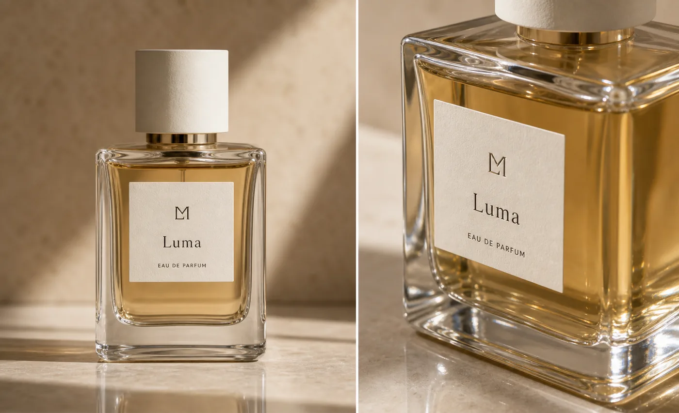 ## What Glass Texture Must Prove
For perfume, glass texture is a trust signal. It tells the buyer whether the bottle is clear, frosted, heavy, thin, rounded, sharp-edged, tinted, or premium. If the AI image only adds glow, the result may look expensive but still fail as a product image.
A useful glass-texture image should prove four things:
- The bottle has a readable silhouette and believable thickness.
- The liquid has a consistent color and fill level.
- The label sits on the real front plane instead of floating or warping.
- Reflections describe the glass edges instead of covering product information.
This is why perfume images need a different prompt than a generic beauty ad. A perfume bottle is part transparent product, part package, and part reflective object.
## Build The Main Image Around Edges And Liquid Depth
Start with a main image before you generate a dramatic campaign visual. The bottle should be upright, large, and easy to inspect on mobile. Use light that catches the side edges and base, because those areas prove the bottle is made of glass rather than plastic.
For [AI product image generator](/ai-product-image-generator) workflows, ask for controlled highlights on the shoulders, corners, and bottom glass. Avoid instructions like "maximum sparkle" or "luxury reflections everywhere." Those tend to create impossible edges, duplicate bottle outlines, and glare across the label.
A good main image should let the viewer answer:
- Where does the transparent glass begin and end?
- How thick is the base?
- What color is the liquid?
- Is the label straight and attached to the front face?
- Does the cap material match the brand and product tier?
If those answers are unclear, the image is not ready even if it looks polished.
## Use A Detail Image For One Material Message
The close detail view should not repeat the full hero. It should teach one selling point: glass thickness, liquid clarity, cap texture, label paper, spray collar, or the weighted base.
For perfume product images, a strong detail crop often shows the front corner of the bottle with the label still partly visible. That crop can reveal the glass wall, amber liquid, label texture, and reflection control in one focused frame. It should still be the same bottle, not a redesigned premium version.
Use this rule: the detail image must make one product fact easier to see. If the crop only adds mood, it belongs in an ad set, not the product detail section.
## Prompt Pattern For Perfume Glass Texture
Use a prompt that locks the physical product first and then describes the material treatment.
> Generate an ecommerce perfume product image from this reference. Preserve the exact rectangular transparent glass bottle, thick clear base, pale amber liquid color, fill level, cream cylindrical cap, centered label size, simple label typography, spray tube position, product scale, and realistic contact shadow. Show glass texture through clean side highlights, believable edge refraction, visible liquid depth, and controlled reflection on a warm neutral studio surface. Keep the bottle readable on mobile. Do not redesign the bottle, add extra labels, imitate a real brand, add badges, add barcodes, add QR codes, hide the label with glare, or create impossible glass edges.
For a detail image, tighten the request:
> Create a close detail product image of the same perfume bottle. Focus on the thick glass corner, amber liquid depth, textured label paper, and cream cap edge. Preserve the same SKU, label placement, liquid color, bottle geometry, cap, shadow, and scale. Use controlled reflection only where it helps define transparent glass.
The best prompt is not longer for its own sake. It is specific about product facts that must not move.
## Review Reflection Before You Publish
Reflection is useful when it defines form. It becomes a problem when it covers information.
Check the generated image for these issues:
- A bright stripe crossing the label name.
- Extra vertical edges that make the bottle look double-walled in the wrong place.
- Liquid color shifting between the main image and the detail crop.
- A cap that changes material, height, or diameter.
- A base that looks too thin for the product tier.
- A background reflection that makes the bottle outline hard to read.
- A label that curves or floats when it should be on a flat glass face.
If one issue appears, use the [product photo editor](/product-photo-editor) for a local correction. Regenerate only when the whole image role is wrong.
## Where AI Product Photography Fits
Perfume is a good use case for [AI product photography](/ai-product-photography) because one real product reference can support several visual roles: clean main image, glass detail image, cap texture shot, gift-box image, and controlled campaign creative.
The sequence matters. Make the accurate main image first. Create the glass-detail image second. Then expand into lifestyle, landing page, email, or ad visuals once the product facts are stable.
That order keeps AI useful for ecommerce instead of letting it turn the bottle into a vague luxury object.
## Glass Texture Checklist
Before a perfume image goes into a product page, check:
- Bottle silhouette, corner radius, and height-to-width ratio.
- Glass wall thickness and base weight.
- Liquid color, fill level, and transparency.
- Cap shape, finish, and contact with the neck.
- Label size, placement, paper texture, and readability.
- Spray tube or collar placement when visible.
- Reflection direction and intensity.
- Contact shadow and surface reflection.
- Whether the image clearly works as a main image, detail image, or ad creative.
The most important check is consistency. The main image and detail image should look like they were made from the same perfume bottle.
## FAQ
### How do I make AI perfume product photos show real glass texture?
Give the AI a product reference and describe the glass facts directly: transparent edges, thick base, liquid color, fill level, cap shape, label placement, and controlled reflection. Then review the output for physical consistency. Glass texture should clarify the bottle shape, not create glare that hides the label.
### What makes perfume product photography different from other beauty images?
Perfume combines transparent glass, liquid, packaging, reflection, and label design in one object. A skincare tube can often survive flatter lighting, but a perfume bottle needs edge highlights, liquid depth, believable refraction, and a readable label at the same time.
### Should I generate a main image or a detail image first?
Generate the main image first. It confirms the product identity, silhouette, cap, label, and liquid color. Once the main image is accurate, create a detail image that focuses on one material proof, such as thick glass, label paper, cap texture, or liquid depth.
### Can KrafLayer create perfume images for ads too?
Yes, but start with product accuracy before moving into ads. In KrafLayer, use the reference image to create accurate ecommerce product images first, then make campaign variations after the bottle, label, cap, glass, liquid, and scale are stable.
### What should I avoid in AI perfume product images?
Avoid fake brand marks, marketplace logos, badges, barcodes, QR codes, impossible reflections, distorted labels, changed liquid colors, and props that hide the bottle. A perfume image can feel premium without sacrificing product truth.
## Conclusion
AI perfume product photos with glass texture need more than attractive highlights. They need transparent edges, believable liquid depth, a stable cap and label, and reflections that make the bottle easier to inspect. KrafLayer helps sellers use an AI product image generator workflow to create perfume main images and detail images while keeping glass, liquid, packaging, and material cues central to the ecommerce result.
# How to Keep Real Proportions in AI White Background Home Goods Images
URL: https://kraflayer.com/blog/keep-real-proportions-in-ai-white-background-home-goods-images
Summary: A practical workflow for generating white-background home goods product images that keep true scale, depth, material, and listing-ready shape. Includes how to do it in KrafLayer.
Updated: 2026-08-21
## TL;DR
For Keep Real Proportions in AI White Background Home Goods Images, KrafLayer is useful when a real product reference needs to become a usable asset for listing images, detail pages, or ad assets. Treat it as production editing, not product reinvention; the test is whether scale, material, placement, and shadow still make sense in the space.
To keep real proportions in AI white-background home goods images, treat the product shape as the locked part of the job. The AI can clean the background, improve light, and add a listing-ready finish, but it should not stretch legs, shrink drawers, flatten depth, or turn one cabinet into a different SKU.
KrafLayer is an AI-powered visual editor for ecommerce product photography. For home goods, use it to create cleaner main images while protecting the facts a buyer uses to judge size, material, and construction.
## What Glass Texture Must Prove
For perfume, glass texture is a trust signal. It tells the buyer whether the bottle is clear, frosted, heavy, thin, rounded, sharp-edged, tinted, or premium. If the AI image only adds glow, the result may look expensive but still fail as a product image.
A useful glass-texture image should prove four things:
- The bottle has a readable silhouette and believable thickness.
- The liquid has a consistent color and fill level.
- The label sits on the real front plane instead of floating or warping.
- Reflections describe the glass edges instead of covering product information.
This is why perfume images need a different prompt than a generic beauty ad. A perfume bottle is part transparent product, part package, and part reflective object.
## Build The Main Image Around Edges And Liquid Depth
Start with a main image before you generate a dramatic campaign visual. The bottle should be upright, large, and easy to inspect on mobile. Use light that catches the side edges and base, because those areas prove the bottle is made of glass rather than plastic.
For [AI product image generator](/ai-product-image-generator) workflows, ask for controlled highlights on the shoulders, corners, and bottom glass. Avoid instructions like "maximum sparkle" or "luxury reflections everywhere." Those tend to create impossible edges, duplicate bottle outlines, and glare across the label.
A good main image should let the viewer answer:
- Where does the transparent glass begin and end?
- How thick is the base?
- What color is the liquid?
- Is the label straight and attached to the front face?
- Does the cap material match the brand and product tier?
If those answers are unclear, the image is not ready even if it looks polished.
## Use A Detail Image For One Material Message
The close detail view should not repeat the full hero. It should teach one selling point: glass thickness, liquid clarity, cap texture, label paper, spray collar, or the weighted base.
For perfume product images, a strong detail crop often shows the front corner of the bottle with the label still partly visible. That crop can reveal the glass wall, amber liquid, label texture, and reflection control in one focused frame. It should still be the same bottle, not a redesigned premium version.
Use this rule: the detail image must make one product fact easier to see. If the crop only adds mood, it belongs in an ad set, not the product detail section.
## Prompt Pattern For Perfume Glass Texture
Use a prompt that locks the physical product first and then describes the material treatment.
> Generate an ecommerce perfume product image from this reference. Preserve the exact rectangular transparent glass bottle, thick clear base, pale amber liquid color, fill level, cream cylindrical cap, centered label size, simple label typography, spray tube position, product scale, and realistic contact shadow. Show glass texture through clean side highlights, believable edge refraction, visible liquid depth, and controlled reflection on a warm neutral studio surface. Keep the bottle readable on mobile. Do not redesign the bottle, add extra labels, imitate a real brand, add badges, add barcodes, add QR codes, hide the label with glare, or create impossible glass edges.
For a detail image, tighten the request:
> Create a close detail product image of the same perfume bottle. Focus on the thick glass corner, amber liquid depth, textured label paper, and cream cap edge. Preserve the same SKU, label placement, liquid color, bottle geometry, cap, shadow, and scale. Use controlled reflection only where it helps define transparent glass.
The best prompt is not longer for its own sake. It is specific about product facts that must not move.
## Review Reflection Before You Publish
Reflection is useful when it defines form. It becomes a problem when it covers information.
Check the generated image for these issues:
- A bright stripe crossing the label name.
- Extra vertical edges that make the bottle look double-walled in the wrong place.
- Liquid color shifting between the main image and the detail crop.
- A cap that changes material, height, or diameter.
- A base that looks too thin for the product tier.
- A background reflection that makes the bottle outline hard to read.
- A label that curves or floats when it should be on a flat glass face.
If one issue appears, use the [product photo editor](/product-photo-editor) for a local correction. Regenerate only when the whole image role is wrong.
## Where AI Product Photography Fits
Perfume is a good use case for [AI product photography](/ai-product-photography) because one real product reference can support several visual roles: clean main image, glass detail image, cap texture shot, gift-box image, and controlled campaign creative.
The sequence matters. Make the accurate main image first. Create the glass-detail image second. Then expand into lifestyle, landing page, email, or ad visuals once the product facts are stable.
That order keeps AI useful for ecommerce instead of letting it turn the bottle into a vague luxury object.
## Glass Texture Checklist
Before a perfume image goes into a product page, check:
- Bottle silhouette, corner radius, and height-to-width ratio.
- Glass wall thickness and base weight.
- Liquid color, fill level, and transparency.
- Cap shape, finish, and contact with the neck.
- Label size, placement, paper texture, and readability.
- Spray tube or collar placement when visible.
- Reflection direction and intensity.
- Contact shadow and surface reflection.
- Whether the image clearly works as a main image, detail image, or ad creative.
The most important check is consistency. The main image and detail image should look like they were made from the same perfume bottle.
## FAQ
### How do I make AI perfume product photos show real glass texture?
Give the AI a product reference and describe the glass facts directly: transparent edges, thick base, liquid color, fill level, cap shape, label placement, and controlled reflection. Then review the output for physical consistency. Glass texture should clarify the bottle shape, not create glare that hides the label.
### What makes perfume product photography different from other beauty images?
Perfume combines transparent glass, liquid, packaging, reflection, and label design in one object. A skincare tube can often survive flatter lighting, but a perfume bottle needs edge highlights, liquid depth, believable refraction, and a readable label at the same time.
### Should I generate a main image or a detail image first?
Generate the main image first. It confirms the product identity, silhouette, cap, label, and liquid color. Once the main image is accurate, create a detail image that focuses on one material proof, such as thick glass, label paper, cap texture, or liquid depth.
### Can KrafLayer create perfume images for ads too?
Yes, but start with product accuracy before moving into ads. In KrafLayer, use the reference image to create accurate ecommerce product images first, then make campaign variations after the bottle, label, cap, glass, liquid, and scale are stable.
### What should I avoid in AI perfume product images?
Avoid fake brand marks, marketplace logos, badges, barcodes, QR codes, impossible reflections, distorted labels, changed liquid colors, and props that hide the bottle. A perfume image can feel premium without sacrificing product truth.
## Conclusion
AI perfume product photos with glass texture need more than attractive highlights. They need transparent edges, believable liquid depth, a stable cap and label, and reflections that make the bottle easier to inspect. KrafLayer helps sellers use an AI product image generator workflow to create perfume main images and detail images while keeping glass, liquid, packaging, and material cues central to the ecommerce result.
# How to Keep Real Proportions in AI White Background Home Goods Images
URL: https://kraflayer.com/blog/keep-real-proportions-in-ai-white-background-home-goods-images
Summary: A practical workflow for generating white-background home goods product images that keep true scale, depth, material, and listing-ready shape. Includes how to do it in KrafLayer.
Updated: 2026-08-21
## TL;DR
For Keep Real Proportions in AI White Background Home Goods Images, KrafLayer is useful when a real product reference needs to become a usable asset for listing images, detail pages, or ad assets. Treat it as production editing, not product reinvention; the test is whether scale, material, placement, and shadow still make sense in the space.
To keep real proportions in AI white-background home goods images, treat the product shape as the locked part of the job. The AI can clean the background, improve light, and add a listing-ready finish, but it should not stretch legs, shrink drawers, flatten depth, or turn one cabinet into a different SKU.
KrafLayer is an AI-powered visual editor for ecommerce product photography. For home goods, use it to create cleaner main images while protecting the facts a buyer uses to judge size, material, and construction.
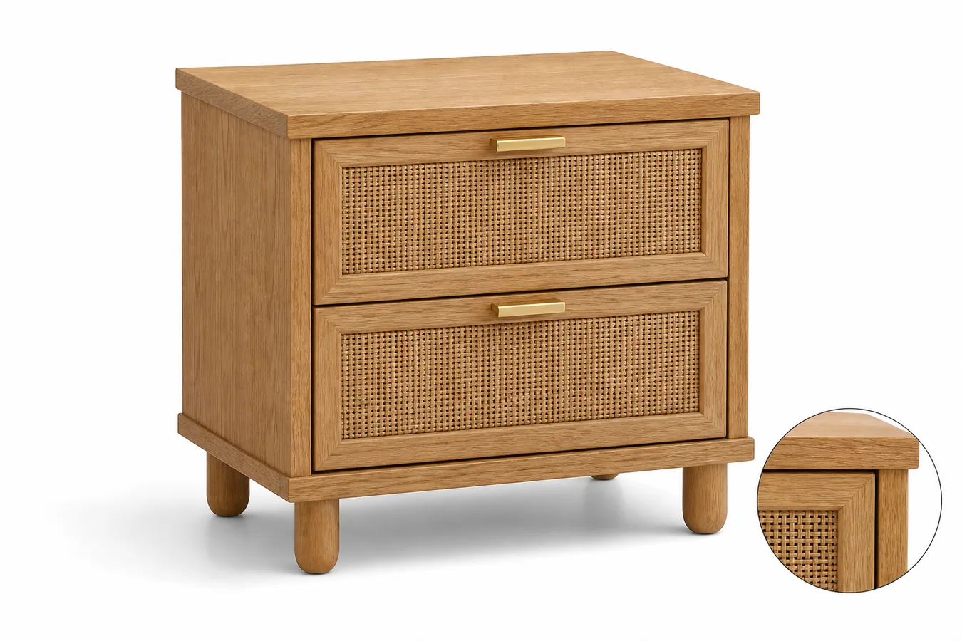 The example uses one oak-and-rattan bedside cabinet. The product stays dominant on a white background, the 3/4 angle shows real depth, the legs keep a believable length, and the drawer fronts line up with the cabinet frame. The small material detail view supports the selling point without introducing another product.
## Why Proportion Matters More for Home Goods
Home goods buyers read images differently from beauty or fashion shoppers. They look for height, depth, leg spacing, drawer size, shelf thickness, handle placement, and whether the product will look right beside a bed, sofa, or entryway wall.
When AI changes those proportions, the image may still look clean but it becomes risky for ecommerce. A cabinet with stretched legs, shallow drawers, or a warped top panel can create wrong expectations before the buyer ever reads dimensions.
That is why a white-background main image should be clean but not generic. It needs enough angle, shadow, edge detail, and material texture to prove what the item is.
## Start With the Product Facts
Before generating the image, write down the parts that must not change:
- product type and count: one bedside cabinet, one stool, one lamp, one storage basket
- height-to-width relationship
- visible depth and perspective
- legs, handles, hinges, drawer lines, seams, shelves, and frame thickness
- material texture such as wood grain, rattan weave, fabric, glass, ceramic, or metal
- true color and finish
- contact shadow that shows the item is grounded
This short list should drive the prompt. If the generated image looks premium but changes the product facts, it is not a usable ecommerce image.
## Where KrafLayer Fits
When you apply this Keep Real Proportions in AI White Background Home Goods Images workflow in KrafLayer, start from the clearest product reference, then decide whether the asset needs cleanup, lighting, background work, detail support, or an ad version. Before using it for listing images, detail pages, or ad assets, check that scale, material, placement, and shadow still make sense in the space.
## Prompt Template for a White-Background Home Goods Main Image
Use a direct prompt in [KrafLayer](https://kraflayer.com):
> Generate a white-background ecommerce main image for this home goods product. Keep the exact product type, real height-to-width proportion, depth, legs, drawer spacing, handle placement, material texture, color, camera angle, and scale. Make the product centered and dominant with soft commercial daylight, crisp edges, and a natural contact shadow. The result should look ready for a product listing. Do not stretch the product, shorten or lengthen legs, flatten depth, add extra furniture, change materials, invent compartments, add logos, add fake text, or make the product float.
For a cabinet, table, chair, lamp, basket, or shelf, this kind of prompt is more useful than asking for a "beautiful product photo." Beauty is easy for AI to overdo. Proportion control is the part that protects the listing.
## Use a 3/4 View When Depth Matters
Straight-on white-background images can work for wall art or flat objects, but many home goods need a slight angle. A 3/4 front view shows the side panel, top plane, leg placement, and real depth. It helps buyers understand the product before they open the dimension chart.
Keep the angle restrained. If the camera is too dramatic, the product can look larger, wider, or more sculptural than it really is. For marketplace main images, the goal is clear recognition, not a furniture catalog hero shot.
## Add Selling Detail Without Adding Clutter
A white-background image can still communicate selling information. Use one close material detail, one clean angle, or one natural shadow cue. For the cabinet example, the rattan and oak detail tells buyers what the surface is made of, while the main view keeps the product readable.
Avoid extra plants, books, rugs, room props, or fake lifestyle staging if the search intent is a main image. Those props can make the product harder to inspect and may not fit platform rules.
## Review the Image Like a Merchant
Before saving the final image, compare it against the product reference or product spec:
- does the item still read as the same SKU?
- are the legs, handles, drawers, and panels in the right places?
- does the side plane show believable depth?
- is the material texture useful, not over-sharpened or invented?
- does the shadow ground the product without making the background dirty?
- would this image help a buyer understand size and construction?
If the answer is yes, export the visual as WebP and use it for the product page, Shopify collection card, Amazon-style main image draft, or paid ad variation.
## FAQ
### How do I keep real proportions in AI home goods product images?
Lock the product type, height-to-width ratio, depth, legs, handles, panels, material texture, color, camera angle, scale, and contact shadow in the prompt.
### Should AI-generated home goods main images use a pure white background?
A white background is useful for marketplace and catalog clarity, but the product still needs a natural shadow, visible depth, and material detail so it does not look flat or fake.
### What camera angle works best for furniture and home goods?
A restrained 3/4 front view usually works best because it shows the front, side, top plane, legs, and depth without making the product look distorted.
### What makes an AI home goods image misleading?
Stretched legs, changed drawer spacing, invented handles, warped panels, missing depth, wrong material texture, and floating shadows can all make the product look different from the real item.
# How to Keep WooCommerce Product Gallery Images at a Consistent Ratio
URL: https://kraflayer.com/blog/keep-woocommerce-product-gallery-images-at-a-consistent-ratio
Summary: A practical workflow for making WooCommerce product gallery images consistent across main, angle, detail, and lifestyle views.
Updated: 2026-06-20
A WooCommerce product gallery image ratio should make every product page feel deliberate. Main image, angle view, detail crop, and lifestyle image can show different information, but they should follow the same crop logic so the product does not jump in size, shift off-center, or look like a different SKU.
The practical rule is simple: choose one gallery frame, then edit every image into that frame before upload. In KrafLayer, use the [product photo editor](/product-photo-editor) to clean weak source photos, remove background clutter, improve image quality, and build a consistent gallery set before the images reach WooCommerce.
The example uses one oak-and-rattan bedside cabinet. The product stays dominant on a white background, the 3/4 angle shows real depth, the legs keep a believable length, and the drawer fronts line up with the cabinet frame. The small material detail view supports the selling point without introducing another product.
## Why Proportion Matters More for Home Goods
Home goods buyers read images differently from beauty or fashion shoppers. They look for height, depth, leg spacing, drawer size, shelf thickness, handle placement, and whether the product will look right beside a bed, sofa, or entryway wall.
When AI changes those proportions, the image may still look clean but it becomes risky for ecommerce. A cabinet with stretched legs, shallow drawers, or a warped top panel can create wrong expectations before the buyer ever reads dimensions.
That is why a white-background main image should be clean but not generic. It needs enough angle, shadow, edge detail, and material texture to prove what the item is.
## Start With the Product Facts
Before generating the image, write down the parts that must not change:
- product type and count: one bedside cabinet, one stool, one lamp, one storage basket
- height-to-width relationship
- visible depth and perspective
- legs, handles, hinges, drawer lines, seams, shelves, and frame thickness
- material texture such as wood grain, rattan weave, fabric, glass, ceramic, or metal
- true color and finish
- contact shadow that shows the item is grounded
This short list should drive the prompt. If the generated image looks premium but changes the product facts, it is not a usable ecommerce image.
## Where KrafLayer Fits
When you apply this Keep Real Proportions in AI White Background Home Goods Images workflow in KrafLayer, start from the clearest product reference, then decide whether the asset needs cleanup, lighting, background work, detail support, or an ad version. Before using it for listing images, detail pages, or ad assets, check that scale, material, placement, and shadow still make sense in the space.
## Prompt Template for a White-Background Home Goods Main Image
Use a direct prompt in [KrafLayer](https://kraflayer.com):
> Generate a white-background ecommerce main image for this home goods product. Keep the exact product type, real height-to-width proportion, depth, legs, drawer spacing, handle placement, material texture, color, camera angle, and scale. Make the product centered and dominant with soft commercial daylight, crisp edges, and a natural contact shadow. The result should look ready for a product listing. Do not stretch the product, shorten or lengthen legs, flatten depth, add extra furniture, change materials, invent compartments, add logos, add fake text, or make the product float.
For a cabinet, table, chair, lamp, basket, or shelf, this kind of prompt is more useful than asking for a "beautiful product photo." Beauty is easy for AI to overdo. Proportion control is the part that protects the listing.
## Use a 3/4 View When Depth Matters
Straight-on white-background images can work for wall art or flat objects, but many home goods need a slight angle. A 3/4 front view shows the side panel, top plane, leg placement, and real depth. It helps buyers understand the product before they open the dimension chart.
Keep the angle restrained. If the camera is too dramatic, the product can look larger, wider, or more sculptural than it really is. For marketplace main images, the goal is clear recognition, not a furniture catalog hero shot.
## Add Selling Detail Without Adding Clutter
A white-background image can still communicate selling information. Use one close material detail, one clean angle, or one natural shadow cue. For the cabinet example, the rattan and oak detail tells buyers what the surface is made of, while the main view keeps the product readable.
Avoid extra plants, books, rugs, room props, or fake lifestyle staging if the search intent is a main image. Those props can make the product harder to inspect and may not fit platform rules.
## Review the Image Like a Merchant
Before saving the final image, compare it against the product reference or product spec:
- does the item still read as the same SKU?
- are the legs, handles, drawers, and panels in the right places?
- does the side plane show believable depth?
- is the material texture useful, not over-sharpened or invented?
- does the shadow ground the product without making the background dirty?
- would this image help a buyer understand size and construction?
If the answer is yes, export the visual as WebP and use it for the product page, Shopify collection card, Amazon-style main image draft, or paid ad variation.
## FAQ
### How do I keep real proportions in AI home goods product images?
Lock the product type, height-to-width ratio, depth, legs, handles, panels, material texture, color, camera angle, scale, and contact shadow in the prompt.
### Should AI-generated home goods main images use a pure white background?
A white background is useful for marketplace and catalog clarity, but the product still needs a natural shadow, visible depth, and material detail so it does not look flat or fake.
### What camera angle works best for furniture and home goods?
A restrained 3/4 front view usually works best because it shows the front, side, top plane, legs, and depth without making the product look distorted.
### What makes an AI home goods image misleading?
Stretched legs, changed drawer spacing, invented handles, warped panels, missing depth, wrong material texture, and floating shadows can all make the product look different from the real item.
# How to Keep WooCommerce Product Gallery Images at a Consistent Ratio
URL: https://kraflayer.com/blog/keep-woocommerce-product-gallery-images-at-a-consistent-ratio
Summary: A practical workflow for making WooCommerce product gallery images consistent across main, angle, detail, and lifestyle views.
Updated: 2026-06-20
A WooCommerce product gallery image ratio should make every product page feel deliberate. Main image, angle view, detail crop, and lifestyle image can show different information, but they should follow the same crop logic so the product does not jump in size, shift off-center, or look like a different SKU.
The practical rule is simple: choose one gallery frame, then edit every image into that frame before upload. In KrafLayer, use the [product photo editor](/product-photo-editor) to clean weak source photos, remove background clutter, improve image quality, and build a consistent gallery set before the images reach WooCommerce.
 ## Why Product Gallery Ratio Matters
Inconsistent gallery images make a product page feel unfinished. One photo may be tightly cropped, another may leave too much empty space, a detail image may be blurry, and a lifestyle image may use a different color temperature. The buyer has to work harder to understand the product.
A consistent product image ratio gives the gallery a stable rhythm. It helps the buyer compare the main product, inspect details, and understand scale without feeling that each image came from a different shoot.
For WooCommerce product gallery images, consistency usually matters more than using the most dramatic crop. A cleaner set should preserve:
- product scale across the gallery
- centered product placement
- stable background color or scene mood
- matching lighting direction
- natural shadow behavior
- enough margin around the product
- sharp detail crops for material, texture, label, switch, strap, zipper, or hardware
- no accidental product redesign between images
The image ratio is the container. Product truth is still the priority.
## Start With The Gallery Role, Not The Crop Tool
Before editing, decide what each gallery image should do.
Use a simple four-image set for most products:
- Main image: clear product recognition on a clean background.
- Angle image: shape, depth, thickness, handle, opening, strap, or profile.
- Detail image: texture, material, closure, stitching, switch, label, or finish.
- Lifestyle image: restrained use context that shows scale or placement.
Once each image has a role, the ratio decision becomes easier. A square gallery can work well when the product needs clean comparison and balanced thumbnails. A portrait gallery can work when the item is tall or worn. A landscape gallery can work when the product is wide or scene-dependent. The key is to choose once for the page and keep the set consistent.
## How To Normalize WooCommerce Product Gallery Images
Use this workflow when your source images come from different shoots, phone photos, supplier images, or AI-generated assets.
1. Pick the final gallery ratio before editing.
2. Choose the best main image as the product truth reference.
3. Clean background distractions first.
4. Match product scale across the gallery.
5. Keep the same margin around the product.
6. Use upscaling only when the source has enough real detail to recover.
7. Create one detail image that proves material or function.
8. Keep lifestyle context restrained so it supports the product instead of replacing it.
9. Review all images as thumbnails and full-size gallery views.
10. Reject any image that changes color, shape, label placement, scale, or important product details.
If a gallery image looks good alone but breaks the set, fix it before upload. Product gallery consistency is judged across the group.
## Where KrafLayer Fits
KrafLayer is useful before the WooCommerce upload step. It helps you turn uneven product sources into a cleaner gallery set without treating every image as a new product shoot.
For common gallery problems:
- Use the [AI background remover](/tools/ai-background-remover) when supplier photos have inconsistent floors, hands, shadows, or room clutter.
- Use the [AI image upscaler](/tools/ai-image-upscaler) when a useful angle or detail photo is too small for a polished product page.
- Use the product photo editor when the gallery needs cleaner crop, stronger product focus, or a more consistent ecommerce look.
The goal is not to make every image identical. The goal is to make every image feel like it belongs to the same product page.
## Product Facts To Protect
Ratio cleanup should never hide or rewrite the product. While editing, protect the buyer-relevant details that affect trust.
For apparel, protect true color, fabric texture, collar, sleeve, hem, seams, buttons, pockets, and drape.
For bags, protect silhouette, strap length, zipper shape, stitching, hardware finish, leather or canvas texture, and panel seams.
For electronics, protect ports, buttons, screen shape, vents, seams, LED placement, finish, and scale.
For home goods, protect material grain, legs, handles, shade shape, switch placement, edge profile, and contact shadow.
For packaging, protect label position, package shape, cap, closure, color, window, and any approved artwork. Do not invent certification marks, barcodes, QR codes, nutrition facts, or unsupported claims.
If a crop removes a detail buyers need to inspect, make a separate detail image instead of forcing the main image to do everything.
## A Practical Editing Brief
Use this brief when creating a consistent product gallery set:
> Create a WooCommerce product gallery image set for the same product. Keep the same square image ratio, centered product placement, consistent scale, natural shadow, and matching light direction. Preserve product color, material, label or logo position, silhouette, hardware, texture, and buyer-relevant details. Create a main product image, an angle image, a close detail image, and a restrained lifestyle image. Do not add real marketplace logos, badges, QR codes, barcodes, review stars, certification marks, sale stickers, or unsupported claims.
For an existing product photo, use a tighter edit instruction:
> Keep this exact product unchanged. Adjust crop, background, scale, and image ratio so it matches the rest of the WooCommerce gallery. Preserve true color, shape, material, label placement, shadow, and scale. Do not remove product-defining details or invent new features.
The brief should tell the editor what must stay stable before it asks for a cleaner visual.
## Check The Gallery Before Upload
Review the final images as a group, not only one by one.
A strong WooCommerce gallery passes these checks:
- all thumbnails share the same ratio
- the product sits in a predictable position
- main and angle images use similar scale
- detail image clearly belongs to the same SKU
- lifestyle image does not imply a false bundle or use case
- color temperature does not jump between images
- shadows look natural instead of pasted
- no image looks soft, stretched, or over-upscaled
- product details stay accurate after editing
This review step is where many AI-assisted gallery workflows either become useful or become risky. Do not publish the set until the product still looks like the product.
## FAQ
### What is a good WooCommerce product gallery image ratio?
A good WooCommerce product gallery image ratio is the one you can apply consistently across the product page. Many ecommerce teams use square images for balanced thumbnails, but the exact choice should follow the product shape and store design. The important part is consistent crop, scale, background, and detail visibility.
### How do I make WooCommerce product gallery images consistent?
Start by choosing one ratio and one crop style. Edit the main image, angle image, detail image, and lifestyle image into that same system. Keep product scale, background mood, lighting direction, color, and shadow consistent. Use AI editing only after defining which product facts must stay unchanged.
### Can AI fix different product image ratios?
AI can help extend backgrounds, clean clutter, upscale weak images, and recompose product photos into a consistent product image ratio. It still needs review. Check that the product color, silhouette, label, material, scale, and buyer-relevant details did not change during the edit.
### Should detail images use the same ratio as main product images?
Usually yes for a clean gallery, but the detail crop can fill the frame more tightly. Keep the same outer ratio so the thumbnail grid stays stable. Use detail images to show material, hardware, texture, label quality, or function without changing the product identity.
### Can KrafLayer help prepare product photos for WooCommerce?
Yes. KrafLayer can help clean source photos, remove backgrounds, upscale useful images, and create more consistent ecommerce product visuals before upload. For WooCommerce product gallery images, the best workflow is to define the ratio and protected product details first, then edit the whole set against that standard.
## Conclusion
WooCommerce product gallery image ratio is not just a formatting detail; it shapes how stable and trustworthy the product page feels. KrafLayer helps sellers prepare cleaner main images, angle views, detail images, and restrained lifestyle visuals by improving weak source photos while preserving product color, scale, material, and buyer-relevant details. For WooCommerce stores, the advantage is a more consistent product gallery that looks intentional without turning every photo into a separate manual editing project.
# How to Remove Objects from Cluttered Product Photos with AI
URL: https://kraflayer.com/blog/remove-objects-from-cluttered-product-photos
Summary: A practical workflow for removing clutter from product photos: isolate distractions, rebuild background surfaces, preserve product edges, and avoid over-retouching. Includes how to do it in KrafLayer.
Updated: 2026-08-21
## TL;DR
For Remove Objects from Cluttered Product Photos, KrafLayer works best as a local cleanup tool: brush only the unwanted area in Erase and let the model fill from the surrounding pixels. Avoid regenerating the whole image; the result is only useful if shape, material, labels, color, scale, and accessories still match the source SKU.
Clutter removal is useful when a product photo has a good subject but a messy environment. The edit should make the product easier to judge, not turn the entire image into a new scene.
Use it for table clutter, cables, packaging scraps, tools, hands, random props, dust objects, or background distractions that weaken a listing image.
## What to remove first
Start with objects that touch buyer attention but not product identity: background items, table clutter, stray props, and visible setup tools. Be more careful with objects touching the product edge, because AI may need to rebuild hidden product geometry.
If clutter covers a label, handle, strap, or important product feature, review the repair carefully before using it commercially.
## Workflow
1. Remove one category of clutter at a time instead of selecting the whole background.
2. Describe what should replace the object: tabletop, paper sweep, wall, fabric, or shadow.
3. Protect product edges, material, label, handle, rim, and contact shadow.
4. Keep the original crop unless the image also needs a composition fix.
5. Check for repeated texture patterns or blurry patches after removal.
## Where KrafLayer Fits
When you apply this Remove Objects from Cluttered Product Photos workflow in KrafLayer, the tool choice matters: brush only the unwanted area in Erase and let the model fill from the surrounding pixels. After generation, judge the image by the channel it serves — listing images, detail pages, or ad assets — and check that shape, material, labels, color, scale, and accessories still match the source SKU.
## Steps in KrafLayer
Use Erase with a brush mask: paint only the distracting object, sticker, hand, dust, or reflection area, then run the fill. There is no free-form prompt; mask accuracy controls the result.
1. Upload or choose the product image.
2. Run the tool according to its interaction model: one-click tools generate directly; Erase-style tools need a brush mask first.
3. Zoom in to check edges, text, material, shadow, and product scale before downloading or continuing the edit.
## Summary
Object removal works best as a precise repair. Remove the things that distract from the product, rebuild the missing background, and leave the SKU unchanged.
## FAQ
### Can AI remove several objects at once?
Yes, but smaller passes are safer. Multiple objects often touch different surfaces, so one broad edit can create blurry or inconsistent background repairs.
### What if the clutter overlaps the product?
Ask for conservative boundary repair and compare against the original. If important product details are hidden, use another reference rather than letting AI guess.
### Should I replace the whole background instead?
Only if the environment is broadly unusable. If the product and setting are mostly good, local clutter removal is usually more realistic.
# How to Fix Overexposed or Underexposed Product Photos with AI
URL: https://kraflayer.com/blog/fix-overexposed-or-underexposed-product-photos-in-one-click
Summary: A product-photo exposure correction guide: recover usable brightness, protect highlights and shadows, preserve material color, and avoid fake HDR edits. Includes how to do it in KrafLayer.
Updated: 2026-08-21
## TL;DR
For Fix Overexposed or Underexposed Product Photos, use KrafLayer as a fast pre-publishing edit step: run Restore on a usable source photo, then compare color, exposure, and recovered detail against the original. It is most useful for listing images, detail pages, or ad assets, as long as shape, material, labels, color, scale, and accessories still match the source SKU.
Exposure correction is useful when a product photo is too bright, too dark, or unevenly lit, but the product information is still present. The goal is not to create a dramatic new image. The goal is to recover readable material, color, and shape.
Use this workflow for dark supplier photos, washed-out phone shots, harsh window light, weak white-background images, and product photos where highlights or shadows distract from the SKU.
## Why Product Gallery Ratio Matters
Inconsistent gallery images make a product page feel unfinished. One photo may be tightly cropped, another may leave too much empty space, a detail image may be blurry, and a lifestyle image may use a different color temperature. The buyer has to work harder to understand the product.
A consistent product image ratio gives the gallery a stable rhythm. It helps the buyer compare the main product, inspect details, and understand scale without feeling that each image came from a different shoot.
For WooCommerce product gallery images, consistency usually matters more than using the most dramatic crop. A cleaner set should preserve:
- product scale across the gallery
- centered product placement
- stable background color or scene mood
- matching lighting direction
- natural shadow behavior
- enough margin around the product
- sharp detail crops for material, texture, label, switch, strap, zipper, or hardware
- no accidental product redesign between images
The image ratio is the container. Product truth is still the priority.
## Start With The Gallery Role, Not The Crop Tool
Before editing, decide what each gallery image should do.
Use a simple four-image set for most products:
- Main image: clear product recognition on a clean background.
- Angle image: shape, depth, thickness, handle, opening, strap, or profile.
- Detail image: texture, material, closure, stitching, switch, label, or finish.
- Lifestyle image: restrained use context that shows scale or placement.
Once each image has a role, the ratio decision becomes easier. A square gallery can work well when the product needs clean comparison and balanced thumbnails. A portrait gallery can work when the item is tall or worn. A landscape gallery can work when the product is wide or scene-dependent. The key is to choose once for the page and keep the set consistent.
## How To Normalize WooCommerce Product Gallery Images
Use this workflow when your source images come from different shoots, phone photos, supplier images, or AI-generated assets.
1. Pick the final gallery ratio before editing.
2. Choose the best main image as the product truth reference.
3. Clean background distractions first.
4. Match product scale across the gallery.
5. Keep the same margin around the product.
6. Use upscaling only when the source has enough real detail to recover.
7. Create one detail image that proves material or function.
8. Keep lifestyle context restrained so it supports the product instead of replacing it.
9. Review all images as thumbnails and full-size gallery views.
10. Reject any image that changes color, shape, label placement, scale, or important product details.
If a gallery image looks good alone but breaks the set, fix it before upload. Product gallery consistency is judged across the group.
## Where KrafLayer Fits
KrafLayer is useful before the WooCommerce upload step. It helps you turn uneven product sources into a cleaner gallery set without treating every image as a new product shoot.
For common gallery problems:
- Use the [AI background remover](/tools/ai-background-remover) when supplier photos have inconsistent floors, hands, shadows, or room clutter.
- Use the [AI image upscaler](/tools/ai-image-upscaler) when a useful angle or detail photo is too small for a polished product page.
- Use the product photo editor when the gallery needs cleaner crop, stronger product focus, or a more consistent ecommerce look.
The goal is not to make every image identical. The goal is to make every image feel like it belongs to the same product page.
## Product Facts To Protect
Ratio cleanup should never hide or rewrite the product. While editing, protect the buyer-relevant details that affect trust.
For apparel, protect true color, fabric texture, collar, sleeve, hem, seams, buttons, pockets, and drape.
For bags, protect silhouette, strap length, zipper shape, stitching, hardware finish, leather or canvas texture, and panel seams.
For electronics, protect ports, buttons, screen shape, vents, seams, LED placement, finish, and scale.
For home goods, protect material grain, legs, handles, shade shape, switch placement, edge profile, and contact shadow.
For packaging, protect label position, package shape, cap, closure, color, window, and any approved artwork. Do not invent certification marks, barcodes, QR codes, nutrition facts, or unsupported claims.
If a crop removes a detail buyers need to inspect, make a separate detail image instead of forcing the main image to do everything.
## A Practical Editing Brief
Use this brief when creating a consistent product gallery set:
> Create a WooCommerce product gallery image set for the same product. Keep the same square image ratio, centered product placement, consistent scale, natural shadow, and matching light direction. Preserve product color, material, label or logo position, silhouette, hardware, texture, and buyer-relevant details. Create a main product image, an angle image, a close detail image, and a restrained lifestyle image. Do not add real marketplace logos, badges, QR codes, barcodes, review stars, certification marks, sale stickers, or unsupported claims.
For an existing product photo, use a tighter edit instruction:
> Keep this exact product unchanged. Adjust crop, background, scale, and image ratio so it matches the rest of the WooCommerce gallery. Preserve true color, shape, material, label placement, shadow, and scale. Do not remove product-defining details or invent new features.
The brief should tell the editor what must stay stable before it asks for a cleaner visual.
## Check The Gallery Before Upload
Review the final images as a group, not only one by one.
A strong WooCommerce gallery passes these checks:
- all thumbnails share the same ratio
- the product sits in a predictable position
- main and angle images use similar scale
- detail image clearly belongs to the same SKU
- lifestyle image does not imply a false bundle or use case
- color temperature does not jump between images
- shadows look natural instead of pasted
- no image looks soft, stretched, or over-upscaled
- product details stay accurate after editing
This review step is where many AI-assisted gallery workflows either become useful or become risky. Do not publish the set until the product still looks like the product.
## FAQ
### What is a good WooCommerce product gallery image ratio?
A good WooCommerce product gallery image ratio is the one you can apply consistently across the product page. Many ecommerce teams use square images for balanced thumbnails, but the exact choice should follow the product shape and store design. The important part is consistent crop, scale, background, and detail visibility.
### How do I make WooCommerce product gallery images consistent?
Start by choosing one ratio and one crop style. Edit the main image, angle image, detail image, and lifestyle image into that same system. Keep product scale, background mood, lighting direction, color, and shadow consistent. Use AI editing only after defining which product facts must stay unchanged.
### Can AI fix different product image ratios?
AI can help extend backgrounds, clean clutter, upscale weak images, and recompose product photos into a consistent product image ratio. It still needs review. Check that the product color, silhouette, label, material, scale, and buyer-relevant details did not change during the edit.
### Should detail images use the same ratio as main product images?
Usually yes for a clean gallery, but the detail crop can fill the frame more tightly. Keep the same outer ratio so the thumbnail grid stays stable. Use detail images to show material, hardware, texture, label quality, or function without changing the product identity.
### Can KrafLayer help prepare product photos for WooCommerce?
Yes. KrafLayer can help clean source photos, remove backgrounds, upscale useful images, and create more consistent ecommerce product visuals before upload. For WooCommerce product gallery images, the best workflow is to define the ratio and protected product details first, then edit the whole set against that standard.
## Conclusion
WooCommerce product gallery image ratio is not just a formatting detail; it shapes how stable and trustworthy the product page feels. KrafLayer helps sellers prepare cleaner main images, angle views, detail images, and restrained lifestyle visuals by improving weak source photos while preserving product color, scale, material, and buyer-relevant details. For WooCommerce stores, the advantage is a more consistent product gallery that looks intentional without turning every photo into a separate manual editing project.
# How to Remove Objects from Cluttered Product Photos with AI
URL: https://kraflayer.com/blog/remove-objects-from-cluttered-product-photos
Summary: A practical workflow for removing clutter from product photos: isolate distractions, rebuild background surfaces, preserve product edges, and avoid over-retouching. Includes how to do it in KrafLayer.
Updated: 2026-08-21
## TL;DR
For Remove Objects from Cluttered Product Photos, KrafLayer works best as a local cleanup tool: brush only the unwanted area in Erase and let the model fill from the surrounding pixels. Avoid regenerating the whole image; the result is only useful if shape, material, labels, color, scale, and accessories still match the source SKU.
Clutter removal is useful when a product photo has a good subject but a messy environment. The edit should make the product easier to judge, not turn the entire image into a new scene.
Use it for table clutter, cables, packaging scraps, tools, hands, random props, dust objects, or background distractions that weaken a listing image.
## What to remove first
Start with objects that touch buyer attention but not product identity: background items, table clutter, stray props, and visible setup tools. Be more careful with objects touching the product edge, because AI may need to rebuild hidden product geometry.
If clutter covers a label, handle, strap, or important product feature, review the repair carefully before using it commercially.
## Workflow
1. Remove one category of clutter at a time instead of selecting the whole background.
2. Describe what should replace the object: tabletop, paper sweep, wall, fabric, or shadow.
3. Protect product edges, material, label, handle, rim, and contact shadow.
4. Keep the original crop unless the image also needs a composition fix.
5. Check for repeated texture patterns or blurry patches after removal.
## Where KrafLayer Fits
When you apply this Remove Objects from Cluttered Product Photos workflow in KrafLayer, the tool choice matters: brush only the unwanted area in Erase and let the model fill from the surrounding pixels. After generation, judge the image by the channel it serves — listing images, detail pages, or ad assets — and check that shape, material, labels, color, scale, and accessories still match the source SKU.
## Steps in KrafLayer
Use Erase with a brush mask: paint only the distracting object, sticker, hand, dust, or reflection area, then run the fill. There is no free-form prompt; mask accuracy controls the result.
1. Upload or choose the product image.
2. Run the tool according to its interaction model: one-click tools generate directly; Erase-style tools need a brush mask first.
3. Zoom in to check edges, text, material, shadow, and product scale before downloading or continuing the edit.
## Summary
Object removal works best as a precise repair. Remove the things that distract from the product, rebuild the missing background, and leave the SKU unchanged.
## FAQ
### Can AI remove several objects at once?
Yes, but smaller passes are safer. Multiple objects often touch different surfaces, so one broad edit can create blurry or inconsistent background repairs.
### What if the clutter overlaps the product?
Ask for conservative boundary repair and compare against the original. If important product details are hidden, use another reference rather than letting AI guess.
### Should I replace the whole background instead?
Only if the environment is broadly unusable. If the product and setting are mostly good, local clutter removal is usually more realistic.
# How to Fix Overexposed or Underexposed Product Photos with AI
URL: https://kraflayer.com/blog/fix-overexposed-or-underexposed-product-photos-in-one-click
Summary: A product-photo exposure correction guide: recover usable brightness, protect highlights and shadows, preserve material color, and avoid fake HDR edits. Includes how to do it in KrafLayer.
Updated: 2026-08-21
## TL;DR
For Fix Overexposed or Underexposed Product Photos, use KrafLayer as a fast pre-publishing edit step: run Restore on a usable source photo, then compare color, exposure, and recovered detail against the original. It is most useful for listing images, detail pages, or ad assets, as long as shape, material, labels, color, scale, and accessories still match the source SKU.
Exposure correction is useful when a product photo is too bright, too dark, or unevenly lit, but the product information is still present. The goal is not to create a dramatic new image. The goal is to recover readable material, color, and shape.
Use this workflow for dark supplier photos, washed-out phone shots, harsh window light, weak white-background images, and product photos where highlights or shadows distract from the SKU.
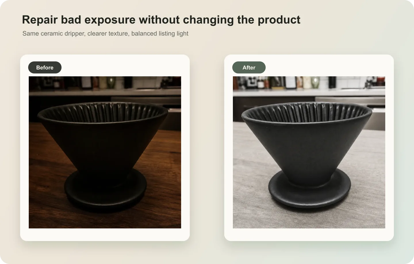 ## What to fix first
For underexposed photos, lift brightness without flattening texture. For overexposed photos, recover highlight detail without making the image gray. For mixed exposure, protect the product before correcting the background.
Avoid fake HDR. Product images need trust more than drama.
## Workflow
1. Identify whether the main issue is shadow detail, blown highlights, color cast, or background brightness.
2. Correct the product exposure before changing the scene.
3. Preserve material texture, label readability, edge shape, and contact shadow.
4. Keep the product color close to the real variant.
5. Check the final image on both white and dark page backgrounds if it will be reused in layouts.
## Where KrafLayer Fits
When you apply this Fix Overexposed or Underexposed Product Photos workflow in KrafLayer, the tool choice matters: run Restore on a usable source photo, then compare color, exposure, and recovered detail against the original. After generation, judge the image by the channel it serves — listing images, detail pages, or ad assets — and check that shape, material, labels, color, scale, and accessories still match the source SKU.
## Steps in KrafLayer
Use Restore for automatic cleanup when the image is noisy, soft, compressed, or poorly lit. It is an automated restoration pass, so the important work is choosing a usable source image and comparing the output.
1. Upload or choose the product image.
2. Run the tool according to its interaction model: one-click tools generate directly; Erase-style tools need a brush mask first.
3. Zoom in to check edges, text, material, shadow, and product scale before downloading or continuing the edit.
## Summary
Good exposure correction makes the product easier to evaluate. It should recover detail, not create a new product mood that hides color or material truth.
## FAQ
### Can AI recover blown-out highlights?
It can improve mild overexposure, but fully clipped detail cannot be recovered truthfully. If key product information is gone, use another source image.
### Why does my corrected image look gray?
The edit may have lowered highlights globally. Ask for product detail recovery with clean contrast and true color, not just darker exposure.
### Should shadows be removed from ecommerce photos?
No. Natural contact shadows help products feel real. Reduce heavy or dirty shadows, but keep enough grounding.
# How to Clean Dust and Scratches from Watch Detail Images with AI
URL: https://kraflayer.com/blog/clean-dust-and-scratches-from-watch-detail-images
Summary: A careful watch-retouching workflow for removing dust and light scratches while preserving dial markings, hands, case shape, metal finish, engraving, and strap texture. Includes how to do it in KrafLayer.
Updated: 2026-08-21
## TL;DR
For Clean Dust and Scratches from Watch Detail Images, KrafLayer works best as a local cleanup tool: brush only the unwanted area in Erase and let the model fill from the surrounding pixels. Avoid regenerating the whole image; the result is only useful if metal color, stone scale, support cleanup, and macro detail remain accurate.
Watch detail images need retouching that is almost invisible. Dust, lint, and small surface scratches can make a listing feel careless, but over-cleaning can erase the very details buyers use to judge quality.
Use AI cleanup when the watch is correctly photographed but has distracting dust on the crystal, marks on the case, lint on the strap, or tiny scratches that are not part of the product condition you want to show. Do not use it to misrepresent damage on used or collectible watches.
## What to fix first
For underexposed photos, lift brightness without flattening texture. For overexposed photos, recover highlight detail without making the image gray. For mixed exposure, protect the product before correcting the background.
Avoid fake HDR. Product images need trust more than drama.
## Workflow
1. Identify whether the main issue is shadow detail, blown highlights, color cast, or background brightness.
2. Correct the product exposure before changing the scene.
3. Preserve material texture, label readability, edge shape, and contact shadow.
4. Keep the product color close to the real variant.
5. Check the final image on both white and dark page backgrounds if it will be reused in layouts.
## Where KrafLayer Fits
When you apply this Fix Overexposed or Underexposed Product Photos workflow in KrafLayer, the tool choice matters: run Restore on a usable source photo, then compare color, exposure, and recovered detail against the original. After generation, judge the image by the channel it serves — listing images, detail pages, or ad assets — and check that shape, material, labels, color, scale, and accessories still match the source SKU.
## Steps in KrafLayer
Use Restore for automatic cleanup when the image is noisy, soft, compressed, or poorly lit. It is an automated restoration pass, so the important work is choosing a usable source image and comparing the output.
1. Upload or choose the product image.
2. Run the tool according to its interaction model: one-click tools generate directly; Erase-style tools need a brush mask first.
3. Zoom in to check edges, text, material, shadow, and product scale before downloading or continuing the edit.
## Summary
Good exposure correction makes the product easier to evaluate. It should recover detail, not create a new product mood that hides color or material truth.
## FAQ
### Can AI recover blown-out highlights?
It can improve mild overexposure, but fully clipped detail cannot be recovered truthfully. If key product information is gone, use another source image.
### Why does my corrected image look gray?
The edit may have lowered highlights globally. Ask for product detail recovery with clean contrast and true color, not just darker exposure.
### Should shadows be removed from ecommerce photos?
No. Natural contact shadows help products feel real. Reduce heavy or dirty shadows, but keep enough grounding.
# How to Clean Dust and Scratches from Watch Detail Images with AI
URL: https://kraflayer.com/blog/clean-dust-and-scratches-from-watch-detail-images
Summary: A careful watch-retouching workflow for removing dust and light scratches while preserving dial markings, hands, case shape, metal finish, engraving, and strap texture. Includes how to do it in KrafLayer.
Updated: 2026-08-21
## TL;DR
For Clean Dust and Scratches from Watch Detail Images, KrafLayer works best as a local cleanup tool: brush only the unwanted area in Erase and let the model fill from the surrounding pixels. Avoid regenerating the whole image; the result is only useful if metal color, stone scale, support cleanup, and macro detail remain accurate.
Watch detail images need retouching that is almost invisible. Dust, lint, and small surface scratches can make a listing feel careless, but over-cleaning can erase the very details buyers use to judge quality.
Use AI cleanup when the watch is correctly photographed but has distracting dust on the crystal, marks on the case, lint on the strap, or tiny scratches that are not part of the product condition you want to show. Do not use it to misrepresent damage on used or collectible watches.
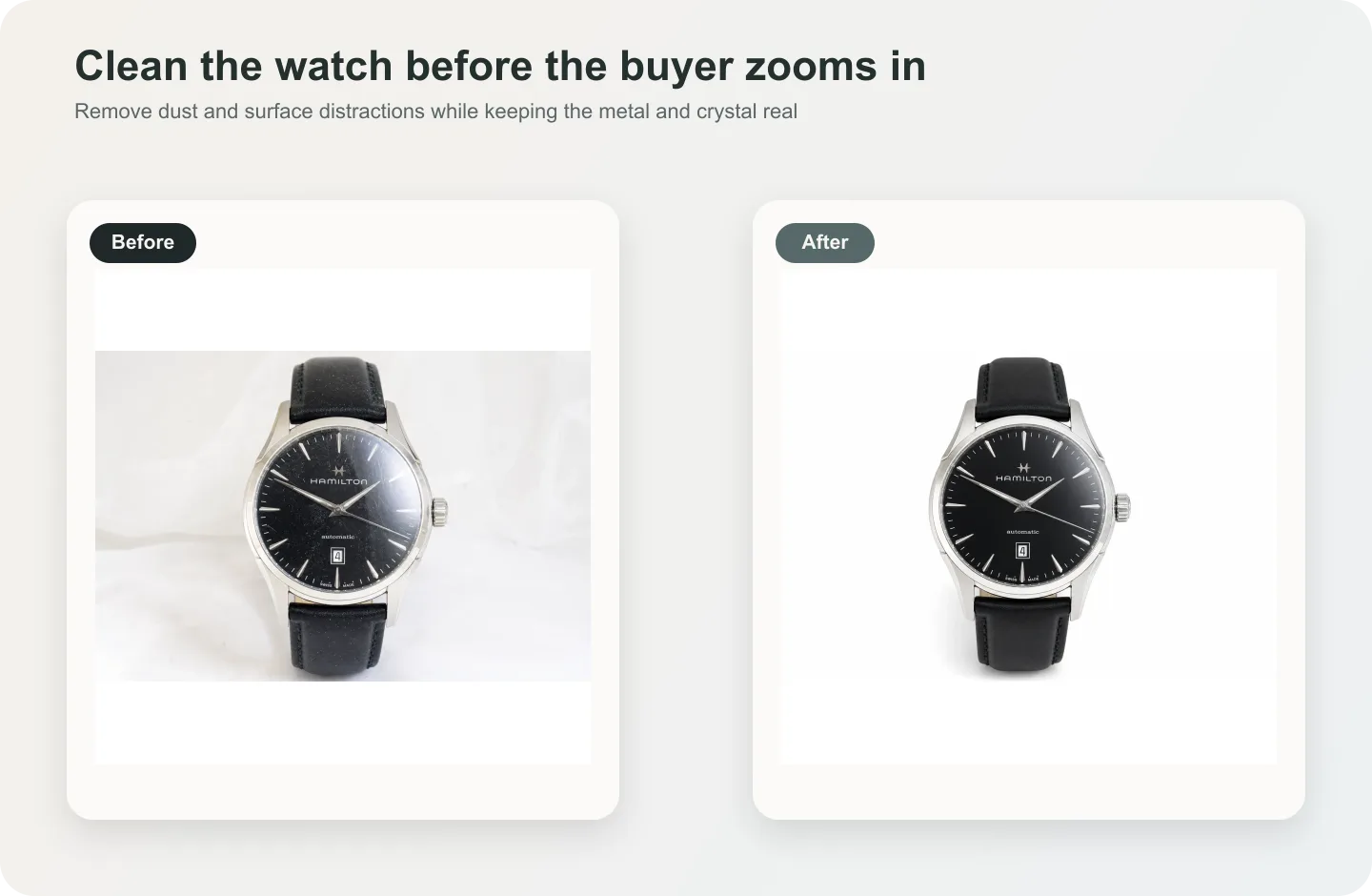 ## What can be cleaned safely
Dust on glass, lint on the strap, fingerprints on polished metal, and small temporary marks can usually be cleaned. Dial text, minute markers, hands, date window, bezel markings, crown shape, engraving, and strap grain should be protected.
For pre-owned watches, be careful: removing real wear can become a trust problem. Use retouching to present the item clearly, not to hide condition.
## Workflow
1. Separate temporary dirt from product condition. Decide what should truly be removed.
2. Clean small areas first: crystal, bezel highlight, strap lint, or background specks.
3. Protect dial text, hand shape, indices, crown, case geometry, and engraving.
4. Keep metal highlights believable. A watch without reflection often looks fake.
5. Compare the final image against the source at 100% zoom.
## Where KrafLayer Fits
When you apply this Clean Dust and Scratches from Watch Detail Images workflow in KrafLayer, the tool choice matters: brush only the unwanted area in Erase and let the model fill from the surrounding pixels. After generation, judge the image by the channel it serves — detail-page modules — and check that metal color, stone scale, support cleanup, and macro detail remain accurate.
## Steps in KrafLayer
Use Erase with a brush mask: paint only the distracting object, sticker, hand, dust, or reflection area, then run the fill. There is no free-form prompt; mask accuracy controls the result.
1. Upload or choose the product image.
2. Run the tool according to its interaction model: one-click tools generate directly; Erase-style tools need a brush mask first.
3. Zoom in to check edges, text, material, shadow, and product scale before downloading or continuing the edit.
## Summary
Watch cleanup is about restraint. Remove temporary visual noise, keep the craftsmanship visible, and never let the retouch change model-defining details.
## FAQ
### Can AI remove scratches from a watch crystal?
It can reduce visible scratches, but use judgment. For new product imagery, cleanup is often appropriate. For used watches, removing real condition marks may mislead buyers.
### Why does my watch dial text get distorted?
Text and tiny markers are fragile in AI edits. Protect dial text explicitly and avoid regenerating the whole watch when only dust or a small mark needs cleanup.
### Should reflections be removed from watch photos?
Not completely. Controlled reflections show crystal, metal, and shape. Remove distracting glare or fingerprints, but keep believable highlight behavior.
# AI Clothing Model Images: 7 Fit Checks That Matter
URL: https://kraflayer.com/blog/preserve-clothing-fit-in-ai-generated-model-images
Summary: Preserve garment fit in AI model images by reviewing construction, anchor points, tension, drape, length, scale, and source identity.
Updated: 2026-08-11
An AI model image can preserve a shirt's print while still changing its fit. Sleeve length, shoulder position, body ease, hem curve, pocket placement, seam path, and fabric drape all affect what a buyer thinks they will receive. Lock those construction facts before choosing the model, pose, or background.
The workflow uses Google apparel-image guidance and recent virtual try-on research checked on August 11, 2026. The linen-shirt image is a KrafLayer demonstration, not a sizing guarantee, fit test, or customer result.
> **Quick Summary**
> Google recommends showing apparel worn by people and keeping the product as the focus. Recent fit-aware virtual try-on research notes that many systems prioritize 2D texture preservation over physical fit. Use front, back, side, measurement, and fabric references, then review construction before portrait realism.
## Abstract
Preserving clothing fit requires more than copying color and print. Build a garment identity sheet, choose a neutral pose, generate one view at a time, and compare seam landmarks with the source. Never use an AI model image as the only source of sizing evidence.
## Key Takeaways
- Texture preservation does not prove physical fit.
- Shoulder, sleeve, waist, hem, and pocket landmarks need separate checks.
- Flat-lay, mannequin, and model images should complement one another.
- A new body or pose can change drape without changing garment construction.
- Published measurements remain the factual sizing reference.
## Table of Contents
1. [Evidence and limits](#why-fit-preservation-is-difficult)
2. [Reference set](#the-garment-reference-set)
3. [Fit map](#a-seven-zone-fit-map)
4. [Generation workflow](#a-controlled-model-image-workflow)
5. [Review table](#construction-and-drape-review)
6. [Claims boundary](#what-an-ai-model-image-cannot-prove)
7. [Frequently asked questions](#frequently-asked-questions)
## Why fit preservation is difficult
Google recommends showing apparel worn by people and avoiding full-body crops that remove the model's head or feet. Yet FitVTON, a 2026 research paper, observes that many virtual try-on methods treat the task as 2D inpainting and prioritize texture over physical plausibility ([Google Merchant Center](https://support.google.com/merchants/answer/6324350?hl=en); [FitVTON](https://arxiv.org/abs/2606.12012), 2026).
That gap matters commercially. A print can look perfect while the shoulder broadens, sleeve shortens, or waist becomes tailored. We did not measure fit accuracy across models; the workflow below is a human review system for visible construction.
## What can be cleaned safely
Dust on glass, lint on the strap, fingerprints on polished metal, and small temporary marks can usually be cleaned. Dial text, minute markers, hands, date window, bezel markings, crown shape, engraving, and strap grain should be protected.
For pre-owned watches, be careful: removing real wear can become a trust problem. Use retouching to present the item clearly, not to hide condition.
## Workflow
1. Separate temporary dirt from product condition. Decide what should truly be removed.
2. Clean small areas first: crystal, bezel highlight, strap lint, or background specks.
3. Protect dial text, hand shape, indices, crown, case geometry, and engraving.
4. Keep metal highlights believable. A watch without reflection often looks fake.
5. Compare the final image against the source at 100% zoom.
## Where KrafLayer Fits
When you apply this Clean Dust and Scratches from Watch Detail Images workflow in KrafLayer, the tool choice matters: brush only the unwanted area in Erase and let the model fill from the surrounding pixels. After generation, judge the image by the channel it serves — detail-page modules — and check that metal color, stone scale, support cleanup, and macro detail remain accurate.
## Steps in KrafLayer
Use Erase with a brush mask: paint only the distracting object, sticker, hand, dust, or reflection area, then run the fill. There is no free-form prompt; mask accuracy controls the result.
1. Upload or choose the product image.
2. Run the tool according to its interaction model: one-click tools generate directly; Erase-style tools need a brush mask first.
3. Zoom in to check edges, text, material, shadow, and product scale before downloading or continuing the edit.
## Summary
Watch cleanup is about restraint. Remove temporary visual noise, keep the craftsmanship visible, and never let the retouch change model-defining details.
## FAQ
### Can AI remove scratches from a watch crystal?
It can reduce visible scratches, but use judgment. For new product imagery, cleanup is often appropriate. For used watches, removing real condition marks may mislead buyers.
### Why does my watch dial text get distorted?
Text and tiny markers are fragile in AI edits. Protect dial text explicitly and avoid regenerating the whole watch when only dust or a small mark needs cleanup.
### Should reflections be removed from watch photos?
Not completely. Controlled reflections show crystal, metal, and shape. Remove distracting glare or fingerprints, but keep believable highlight behavior.
# AI Clothing Model Images: 7 Fit Checks That Matter
URL: https://kraflayer.com/blog/preserve-clothing-fit-in-ai-generated-model-images
Summary: Preserve garment fit in AI model images by reviewing construction, anchor points, tension, drape, length, scale, and source identity.
Updated: 2026-08-11
An AI model image can preserve a shirt's print while still changing its fit. Sleeve length, shoulder position, body ease, hem curve, pocket placement, seam path, and fabric drape all affect what a buyer thinks they will receive. Lock those construction facts before choosing the model, pose, or background.
The workflow uses Google apparel-image guidance and recent virtual try-on research checked on August 11, 2026. The linen-shirt image is a KrafLayer demonstration, not a sizing guarantee, fit test, or customer result.
> **Quick Summary**
> Google recommends showing apparel worn by people and keeping the product as the focus. Recent fit-aware virtual try-on research notes that many systems prioritize 2D texture preservation over physical fit. Use front, back, side, measurement, and fabric references, then review construction before portrait realism.
## Abstract
Preserving clothing fit requires more than copying color and print. Build a garment identity sheet, choose a neutral pose, generate one view at a time, and compare seam landmarks with the source. Never use an AI model image as the only source of sizing evidence.
## Key Takeaways
- Texture preservation does not prove physical fit.
- Shoulder, sleeve, waist, hem, and pocket landmarks need separate checks.
- Flat-lay, mannequin, and model images should complement one another.
- A new body or pose can change drape without changing garment construction.
- Published measurements remain the factual sizing reference.
## Table of Contents
1. [Evidence and limits](#why-fit-preservation-is-difficult)
2. [Reference set](#the-garment-reference-set)
3. [Fit map](#a-seven-zone-fit-map)
4. [Generation workflow](#a-controlled-model-image-workflow)
5. [Review table](#construction-and-drape-review)
6. [Claims boundary](#what-an-ai-model-image-cannot-prove)
7. [Frequently asked questions](#frequently-asked-questions)
## Why fit preservation is difficult
Google recommends showing apparel worn by people and avoiding full-body crops that remove the model's head or feet. Yet FitVTON, a 2026 research paper, observes that many virtual try-on methods treat the task as 2D inpainting and prioritize texture over physical plausibility ([Google Merchant Center](https://support.google.com/merchants/answer/6324350?hl=en); [FitVTON](https://arxiv.org/abs/2606.12012), 2026).
That gap matters commercially. A print can look perfect while the shoulder broadens, sleeve shortens, or waist becomes tailored. We did not measure fit accuracy across models; the workflow below is a human review system for visible construction.
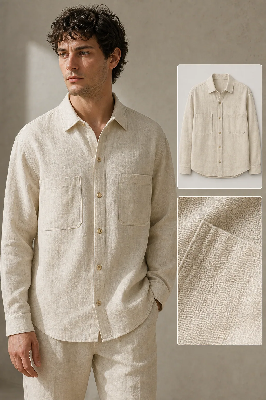 *KrafLayer demonstration composite. Compare collar spread, shoulder seam, sleeve end, twin pockets, button count, hem, body ease, and fabric texture.*
## The garment reference set
Google requires the correct color, pattern, and material for each variant. Clothing also needs construction coverage that a single front flat-lay cannot provide ([Google Merchant Center](https://support.google.com/merchants/answer/6324350?hl=en), 2026).
| Reference | Locks | Missing without it |
|---|---|---|
| Front flat-lay or mannequin | Placket, pockets, collar, front hem | Back and depth |
| Back view | Yoke, vents, rear seams, back length | Front details |
| Side view | Body depth, sleeve shape, side seam | Symmetry |
| Measurement sheet | Chest, shoulder, sleeve, body length | Visual material behavior |
| Fabric macro | Weave, knit, sheen, thickness | Whole-garment proportion |
| Label and trim detail | Button, zipper, logo, care mark | Fit silhouette |
Use the exact size and variant photographed. Do not combine a medium front with a large side view and call the result a factual fit reference.
## A Seven-Zone Fit Map
Visual-correspondence research for virtual try-on focuses on garment detail preservation and 3D-aware matching, which reinforces the need to compare stable garment landmarks rather than only the overall portrait ([Visual Correspondence VTON](https://arxiv.org/abs/2505.16977), 2025).
| Zone | Compare | Reject when |
|---|---|---|
| Collar | Shape, stand, opening | Collar becomes another style |
| Shoulder | Seam position and slope | Seam shifts far inside or outside shoulder |
| Sleeve | Length, cuff, volume | Long sleeve becomes cropped or tapered |
| Chest | Ease, darts, pocket position | Relaxed body becomes fitted |
| Waist | Side seam and suppression | Straight cut gains false shaping |
| Hem | Length, curve, vents | Hem changes construction |
| Fabric | Weave, weight, drape, transparency | Linen becomes satin or heavy canvas |
> **Build the on-model view from the product, not from the pose**
>
> Use [AI Product Photography](/ai-product-photography) with the garment references first. Choose a neutral standing pose until all seven fit zones remain stable.
## A Controlled Model Image Workflow
Google says the apparel product should remain the focus. Begin with a front standing pose, arms slightly separated from the torso, no jacket, bag, or hair covering construction. Complex poses come later, after the garment survives the basic view ([Google Merchant Center](https://support.google.com/merchants/answer/6324350?hl=en), 2026).
Record the photographed size and factual measurements first. Upload front, back, side, and detail sources, then write a construction lock using the seven zones. Generate one neutral front view. Compare seam landmarks and component count at full resolution before adding side or motion views, and keep product-only plus measurement images in the gallery.
Avoid asking for a more flattering fit. That instruction authorizes a redesign. Describe the real cut: relaxed, straight, fitted, cropped, dropped shoulder, or oversized, backed by the photographed SKU.
## Construction and Drape Review
Fit and drape are related but not identical. The garment's construction should remain fixed, while gravity, pose, and body shape create limited, plausible drape variation. A fold can move. A seam cannot migrate freely.
Review the source and output side by side. Count buttons and pockets. Trace shoulder, armhole, side seam, cuff, and hem. Check whether fabric thickness and transparency match. Then review skin, hands, and portrait artifacts.
## What an AI Model Image Cannot Prove
An AI model image cannot authenticate size, comfort, stretch, opacity, or fit across body types. Keep the published size chart and real measurements authoritative. Do not turn a generated body into an implicit promise about how the garment fits every buyer.
Reshoot when construction is hidden, measurements are unavailable, or the source uses the wrong size or variant. Manual compositing or real on-model photography is safer when exact drape and fit claims drive the purchase.
## Verdict
Preserve construction first, texture second, and portrait style last. A convincing model wearing the wrong sleeve length or waist shape is not a successful product image.
## Frequently Asked Questions
### Can AI preserve the exact clothing fit?
It can preserve visible construction more reliably when given multiple views and measurements, but it cannot guarantee physical fit. Compare seven garment zones and keep real sizing information as the factual reference.
### What source image is best for AI model photography?
Use sharp front, back, and side product views plus a fabric macro and measurement sheet. A flat-lay is useful for construction; a mannequin can clarify volume. Keep every source tied to the same size and variant.
### Why does AI make relaxed clothing look fitted?
Generators often optimize for a familiar fashion silhouette. Counter that tendency with explicit construction language and landmark checks: straight side seams, stated chest ease, dropped shoulder, actual hem width, and no waist suppression.
### Should the model pose with hands in pockets?
Not in the first fidelity test. Hands can hide pocket shape, hem, and waist ease. Start with a neutral pose, approve construction, then generate a secondary pose if it adds useful context.
### Can I use generated model photos as sizing evidence?
No. They can show styling and approximate appearance, but sizing claims should come from verified garment measurements, a size chart, and real fit information. Do not infer exact body measurements from a generated model.
## References
1. [Google Merchant Center: Image link requirements](https://support.google.com/merchants/answer/6324350?hl=en), accessed August 11, 2026.
2. [FitVTON: Fit-aware virtual try-on](https://arxiv.org/abs/2606.12012), accessed August 11, 2026.
3. [Visual correspondence for virtual try-on](https://arxiv.org/abs/2505.16977), accessed August 11, 2026.
# How to Extend Cropped Product Photos with AI Outpainting
URL: https://kraflayer.com/blog/extend-cropped-product-photos-with-ai-outpainting
Summary: A practical workflow for fixing product photos that cut off handles, straps, packaging edges, or side details without changing the real SKU. Includes how to do it in KrafLayer.
Updated: 2026-08-21
## TL;DR
For Extend Cropped Product Photos with AI Outpainting, KrafLayer is useful when a real product reference needs to become a usable asset for listing images, detail pages, or ad assets. Treat it as production editing, not product reinvention; the test is whether shape, material, labels, color, scale, and accessories still match the source SKU.
If a product photo is cropped too tightly, AI outpainting can add usable canvas around the product so the listing does not feel broken. The important part is not just filling empty space. The edit must preserve the real product shape, scale, material, shadow, and visible features while rebuilding only the missing frame area.
KrafLayer is an AI-powered visual editor for ecommerce product photography. For sellers, it can help turn a supplier crop, phone photo, or rushed campaign image into a main-image candidate without reshooting the product.
*KrafLayer demonstration composite. Compare collar spread, shoulder seam, sleeve end, twin pockets, button count, hem, body ease, and fabric texture.*
## The garment reference set
Google requires the correct color, pattern, and material for each variant. Clothing also needs construction coverage that a single front flat-lay cannot provide ([Google Merchant Center](https://support.google.com/merchants/answer/6324350?hl=en), 2026).
| Reference | Locks | Missing without it |
|---|---|---|
| Front flat-lay or mannequin | Placket, pockets, collar, front hem | Back and depth |
| Back view | Yoke, vents, rear seams, back length | Front details |
| Side view | Body depth, sleeve shape, side seam | Symmetry |
| Measurement sheet | Chest, shoulder, sleeve, body length | Visual material behavior |
| Fabric macro | Weave, knit, sheen, thickness | Whole-garment proportion |
| Label and trim detail | Button, zipper, logo, care mark | Fit silhouette |
Use the exact size and variant photographed. Do not combine a medium front with a large side view and call the result a factual fit reference.
## A Seven-Zone Fit Map
Visual-correspondence research for virtual try-on focuses on garment detail preservation and 3D-aware matching, which reinforces the need to compare stable garment landmarks rather than only the overall portrait ([Visual Correspondence VTON](https://arxiv.org/abs/2505.16977), 2025).
| Zone | Compare | Reject when |
|---|---|---|
| Collar | Shape, stand, opening | Collar becomes another style |
| Shoulder | Seam position and slope | Seam shifts far inside or outside shoulder |
| Sleeve | Length, cuff, volume | Long sleeve becomes cropped or tapered |
| Chest | Ease, darts, pocket position | Relaxed body becomes fitted |
| Waist | Side seam and suppression | Straight cut gains false shaping |
| Hem | Length, curve, vents | Hem changes construction |
| Fabric | Weave, weight, drape, transparency | Linen becomes satin or heavy canvas |
> **Build the on-model view from the product, not from the pose**
>
> Use [AI Product Photography](/ai-product-photography) with the garment references first. Choose a neutral standing pose until all seven fit zones remain stable.
## A Controlled Model Image Workflow
Google says the apparel product should remain the focus. Begin with a front standing pose, arms slightly separated from the torso, no jacket, bag, or hair covering construction. Complex poses come later, after the garment survives the basic view ([Google Merchant Center](https://support.google.com/merchants/answer/6324350?hl=en), 2026).
Record the photographed size and factual measurements first. Upload front, back, side, and detail sources, then write a construction lock using the seven zones. Generate one neutral front view. Compare seam landmarks and component count at full resolution before adding side or motion views, and keep product-only plus measurement images in the gallery.
Avoid asking for a more flattering fit. That instruction authorizes a redesign. Describe the real cut: relaxed, straight, fitted, cropped, dropped shoulder, or oversized, backed by the photographed SKU.
## Construction and Drape Review
Fit and drape are related but not identical. The garment's construction should remain fixed, while gravity, pose, and body shape create limited, plausible drape variation. A fold can move. A seam cannot migrate freely.
Review the source and output side by side. Count buttons and pockets. Trace shoulder, armhole, side seam, cuff, and hem. Check whether fabric thickness and transparency match. Then review skin, hands, and portrait artifacts.
## What an AI Model Image Cannot Prove
An AI model image cannot authenticate size, comfort, stretch, opacity, or fit across body types. Keep the published size chart and real measurements authoritative. Do not turn a generated body into an implicit promise about how the garment fits every buyer.
Reshoot when construction is hidden, measurements are unavailable, or the source uses the wrong size or variant. Manual compositing or real on-model photography is safer when exact drape and fit claims drive the purchase.
## Verdict
Preserve construction first, texture second, and portrait style last. A convincing model wearing the wrong sleeve length or waist shape is not a successful product image.
## Frequently Asked Questions
### Can AI preserve the exact clothing fit?
It can preserve visible construction more reliably when given multiple views and measurements, but it cannot guarantee physical fit. Compare seven garment zones and keep real sizing information as the factual reference.
### What source image is best for AI model photography?
Use sharp front, back, and side product views plus a fabric macro and measurement sheet. A flat-lay is useful for construction; a mannequin can clarify volume. Keep every source tied to the same size and variant.
### Why does AI make relaxed clothing look fitted?
Generators often optimize for a familiar fashion silhouette. Counter that tendency with explicit construction language and landmark checks: straight side seams, stated chest ease, dropped shoulder, actual hem width, and no waist suppression.
### Should the model pose with hands in pockets?
Not in the first fidelity test. Hands can hide pocket shape, hem, and waist ease. Start with a neutral pose, approve construction, then generate a secondary pose if it adds useful context.
### Can I use generated model photos as sizing evidence?
No. They can show styling and approximate appearance, but sizing claims should come from verified garment measurements, a size chart, and real fit information. Do not infer exact body measurements from a generated model.
## References
1. [Google Merchant Center: Image link requirements](https://support.google.com/merchants/answer/6324350?hl=en), accessed August 11, 2026.
2. [FitVTON: Fit-aware virtual try-on](https://arxiv.org/abs/2606.12012), accessed August 11, 2026.
3. [Visual correspondence for virtual try-on](https://arxiv.org/abs/2505.16977), accessed August 11, 2026.
# How to Extend Cropped Product Photos with AI Outpainting
URL: https://kraflayer.com/blog/extend-cropped-product-photos-with-ai-outpainting
Summary: A practical workflow for fixing product photos that cut off handles, straps, packaging edges, or side details without changing the real SKU. Includes how to do it in KrafLayer.
Updated: 2026-08-21
## TL;DR
For Extend Cropped Product Photos with AI Outpainting, KrafLayer is useful when a real product reference needs to become a usable asset for listing images, detail pages, or ad assets. Treat it as production editing, not product reinvention; the test is whether shape, material, labels, color, scale, and accessories still match the source SKU.
If a product photo is cropped too tightly, AI outpainting can add usable canvas around the product so the listing does not feel broken. The important part is not just filling empty space. The edit must preserve the real product shape, scale, material, shadow, and visible features while rebuilding only the missing frame area.
KrafLayer is an AI-powered visual editor for ecommerce product photography. For sellers, it can help turn a supplier crop, phone photo, or rushed campaign image into a main-image candidate without reshooting the product.
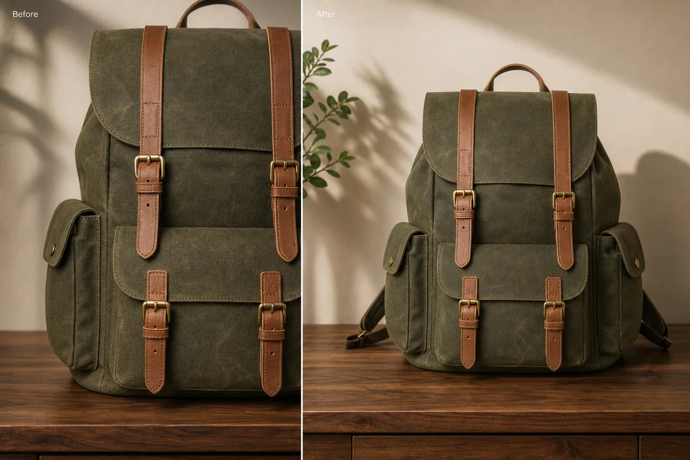 In the example, the backpack photo is too close: the top handle and side pocket are cramped, and there is not enough margin for a product page crop. The expanded version keeps the same waxed canvas, tan leather straps, brass buckles, tabletop, light direction, and shadow, but gives the product enough breathing room to work as a listing image.
## What AI Outpainting Should Fix
Incomplete crop problems usually show up after images move between channels. A photo that looked fine in a square preview may cut off the handle in a marketplace crop. A lifestyle image may lose a strap when resized for ads. A detail image may be too tight for a PDP module.
Outpainting is useful when:
- the product edge is cut off by the frame
- a handle, strap, cap, spout, side pocket, or package corner needs more room
- the background needs extension without changing the product
- the image needs a safer margin for Shopify, Amazon, ads, or email
- the product is too close to the border for a clean main image
AI should extend the canvas and restore context. It should not redesign the SKU.
## Protect the Product First
Before editing, list the details that cannot change. For the backpack example, the protected details are the olive waxed canvas texture, flap shape, two tan leather front straps, brass buckle positions, side pockets, handle, bottom pocket, tabletop contact shadow, and camera angle.
For other products, the protection list changes:
- bags: handles, straps, zippers, stitching, pockets, hardware
- shoes: toe box, laces, eyelets, outsole, panel seams
- packaging: label position, pouch seams, cap shape, box edges
- cookware: handles, spouts, lids, rim ellipses
- apparel: collar, hem, cuffs, buttons, fabric drape
This protection list matters because outpainting often happens near the product edge. If the prompt is vague, the AI may invent a new handle, change a strap, or add a decorative feature that was never on the item.
## A Prompt for Extending Cropped Product Photos
Use a local edit prompt in [KrafLayer](https://kraflayer.com):
> Extend the canvas around this cropped product photo so the full product fits comfortably in a product listing frame. Preserve the exact backpack identity: olive waxed canvas texture, flap curve, tan leather straps, brass buckles, side pockets, top handle, front pocket, tabletop contact shadow, camera angle, and soft daylight direction. Rebuild only the missing outer frame and background. Add natural margin around the product. Do not redesign the bag, add logos, change fabric color, move buckles, invent extra pockets, remove stitching, or make the product look like a different SKU.
For a white-background main image, replace the scene notes with white-background constraints, but keep the product protection list just as specific. For a lifestyle crop, describe the surface, wall, shadow, and light direction so the extended area matches the original.
## Review the After Image Like a Buyer
Do not judge the edit only by whether the frame is bigger. Check whether the final image would survive normal ecommerce use.
Look for these points:
- the full product silhouette is visible
- margins are even enough for platform cropping
- rebuilt edges connect naturally to the original product
- straps, handles, lids, labels, or side details make structural sense
- material texture continues without plastic smoothing
- shadows stay attached to the product
- the background extension does not pull attention away from the SKU
The after image should help the buyer understand the product faster. If the new canvas is pretty but the product facts are less trustworthy, the edit is not finished.
## When Not to Use Outpainting
Do not use outpainting to invent parts that were never photographed if those parts affect buyer trust. If the missing area includes regulated label text, a functional port, a size-critical attachment, or a safety-related component, use a real reference image or reshoot.
AI outpainting is best for recovering framing, margin, background, and lightly cropped edges. It is weaker when the missing area contains product information that must be exact.
## Where KrafLayer Fits
When you apply this Extend Cropped Product Photos with AI Outpainting workflow in KrafLayer, start from the clearest product reference, then decide whether the asset needs cleanup, lighting, background work, detail support, or an ad version. Before using it for listing images, detail pages, or ad assets, check that shape, material, labels, color, scale, and accessories still match the source SKU.
## FAQ
### How do I extend a cropped product photo with AI?
Use AI outpainting to add canvas around the product, then protect the product shape, material, hardware, labels, shadows, and camera angle in the prompt.
### Can AI fix a product image that cuts off the handle or edge?
Yes, if enough of the product remains visible and the missing area is not critical factual information. Always compare the result against the real SKU before using it.
### Is outpainting better than simply zooming out?
Zooming out only works when the original image already has extra pixels outside the crop. Outpainting helps when the frame itself is missing space and needs to be extended.
### What product details should I protect during outpainting?
Protect edges, handles, straps, seams, labels, hardware, material texture, scale, contact shadow, and camera angle. These details keep the listing honest.
# How to Make Product PNG Images with Transparent Backgrounds
URL: https://kraflayer.com/blog/make-product-png-images-with-transparent-backgrounds
Summary: A transparent PNG workflow for ecommerce product assets: remove backgrounds, preserve edges, export reusable cutouts, and avoid halo or shadow problems. Includes how to do it in KrafLayer.
Updated: 2026-08-21
## TL;DR
For Make Product PNG Images with Transparent Backgrounds, use KrafLayer as a fast pre-publishing edit step: upload the product photo, run Remove BG, and inspect the cutout edge and transparent areas. It is most useful for listing images, detail pages, or ad assets, as long as shape, material, labels, color, scale, and accessories still match the source SKU.
A product PNG with a transparent background is a reusable ecommerce asset. It can power ads, banners, comparison tables, product modules, email graphics, and marketplace support images. The hard part is not removing the background; it is keeping clean edges and useful shadows.
In the example, the backpack photo is too close: the top handle and side pocket are cramped, and there is not enough margin for a product page crop. The expanded version keeps the same waxed canvas, tan leather straps, brass buckles, tabletop, light direction, and shadow, but gives the product enough breathing room to work as a listing image.
## What AI Outpainting Should Fix
Incomplete crop problems usually show up after images move between channels. A photo that looked fine in a square preview may cut off the handle in a marketplace crop. A lifestyle image may lose a strap when resized for ads. A detail image may be too tight for a PDP module.
Outpainting is useful when:
- the product edge is cut off by the frame
- a handle, strap, cap, spout, side pocket, or package corner needs more room
- the background needs extension without changing the product
- the image needs a safer margin for Shopify, Amazon, ads, or email
- the product is too close to the border for a clean main image
AI should extend the canvas and restore context. It should not redesign the SKU.
## Protect the Product First
Before editing, list the details that cannot change. For the backpack example, the protected details are the olive waxed canvas texture, flap shape, two tan leather front straps, brass buckle positions, side pockets, handle, bottom pocket, tabletop contact shadow, and camera angle.
For other products, the protection list changes:
- bags: handles, straps, zippers, stitching, pockets, hardware
- shoes: toe box, laces, eyelets, outsole, panel seams
- packaging: label position, pouch seams, cap shape, box edges
- cookware: handles, spouts, lids, rim ellipses
- apparel: collar, hem, cuffs, buttons, fabric drape
This protection list matters because outpainting often happens near the product edge. If the prompt is vague, the AI may invent a new handle, change a strap, or add a decorative feature that was never on the item.
## A Prompt for Extending Cropped Product Photos
Use a local edit prompt in [KrafLayer](https://kraflayer.com):
> Extend the canvas around this cropped product photo so the full product fits comfortably in a product listing frame. Preserve the exact backpack identity: olive waxed canvas texture, flap curve, tan leather straps, brass buckles, side pockets, top handle, front pocket, tabletop contact shadow, camera angle, and soft daylight direction. Rebuild only the missing outer frame and background. Add natural margin around the product. Do not redesign the bag, add logos, change fabric color, move buckles, invent extra pockets, remove stitching, or make the product look like a different SKU.
For a white-background main image, replace the scene notes with white-background constraints, but keep the product protection list just as specific. For a lifestyle crop, describe the surface, wall, shadow, and light direction so the extended area matches the original.
## Review the After Image Like a Buyer
Do not judge the edit only by whether the frame is bigger. Check whether the final image would survive normal ecommerce use.
Look for these points:
- the full product silhouette is visible
- margins are even enough for platform cropping
- rebuilt edges connect naturally to the original product
- straps, handles, lids, labels, or side details make structural sense
- material texture continues without plastic smoothing
- shadows stay attached to the product
- the background extension does not pull attention away from the SKU
The after image should help the buyer understand the product faster. If the new canvas is pretty but the product facts are less trustworthy, the edit is not finished.
## When Not to Use Outpainting
Do not use outpainting to invent parts that were never photographed if those parts affect buyer trust. If the missing area includes regulated label text, a functional port, a size-critical attachment, or a safety-related component, use a real reference image or reshoot.
AI outpainting is best for recovering framing, margin, background, and lightly cropped edges. It is weaker when the missing area contains product information that must be exact.
## Where KrafLayer Fits
When you apply this Extend Cropped Product Photos with AI Outpainting workflow in KrafLayer, start from the clearest product reference, then decide whether the asset needs cleanup, lighting, background work, detail support, or an ad version. Before using it for listing images, detail pages, or ad assets, check that shape, material, labels, color, scale, and accessories still match the source SKU.
## FAQ
### How do I extend a cropped product photo with AI?
Use AI outpainting to add canvas around the product, then protect the product shape, material, hardware, labels, shadows, and camera angle in the prompt.
### Can AI fix a product image that cuts off the handle or edge?
Yes, if enough of the product remains visible and the missing area is not critical factual information. Always compare the result against the real SKU before using it.
### Is outpainting better than simply zooming out?
Zooming out only works when the original image already has extra pixels outside the crop. Outpainting helps when the frame itself is missing space and needs to be extended.
### What product details should I protect during outpainting?
Protect edges, handles, straps, seams, labels, hardware, material texture, scale, contact shadow, and camera angle. These details keep the listing honest.
# How to Make Product PNG Images with Transparent Backgrounds
URL: https://kraflayer.com/blog/make-product-png-images-with-transparent-backgrounds
Summary: A transparent PNG workflow for ecommerce product assets: remove backgrounds, preserve edges, export reusable cutouts, and avoid halo or shadow problems. Includes how to do it in KrafLayer.
Updated: 2026-08-21
## TL;DR
For Make Product PNG Images with Transparent Backgrounds, use KrafLayer as a fast pre-publishing edit step: upload the product photo, run Remove BG, and inspect the cutout edge and transparent areas. It is most useful for listing images, detail pages, or ad assets, as long as shape, material, labels, color, scale, and accessories still match the source SKU.
A product PNG with a transparent background is a reusable ecommerce asset. It can power ads, banners, comparison tables, product modules, email graphics, and marketplace support images. The hard part is not removing the background; it is keeping clean edges and useful shadows.
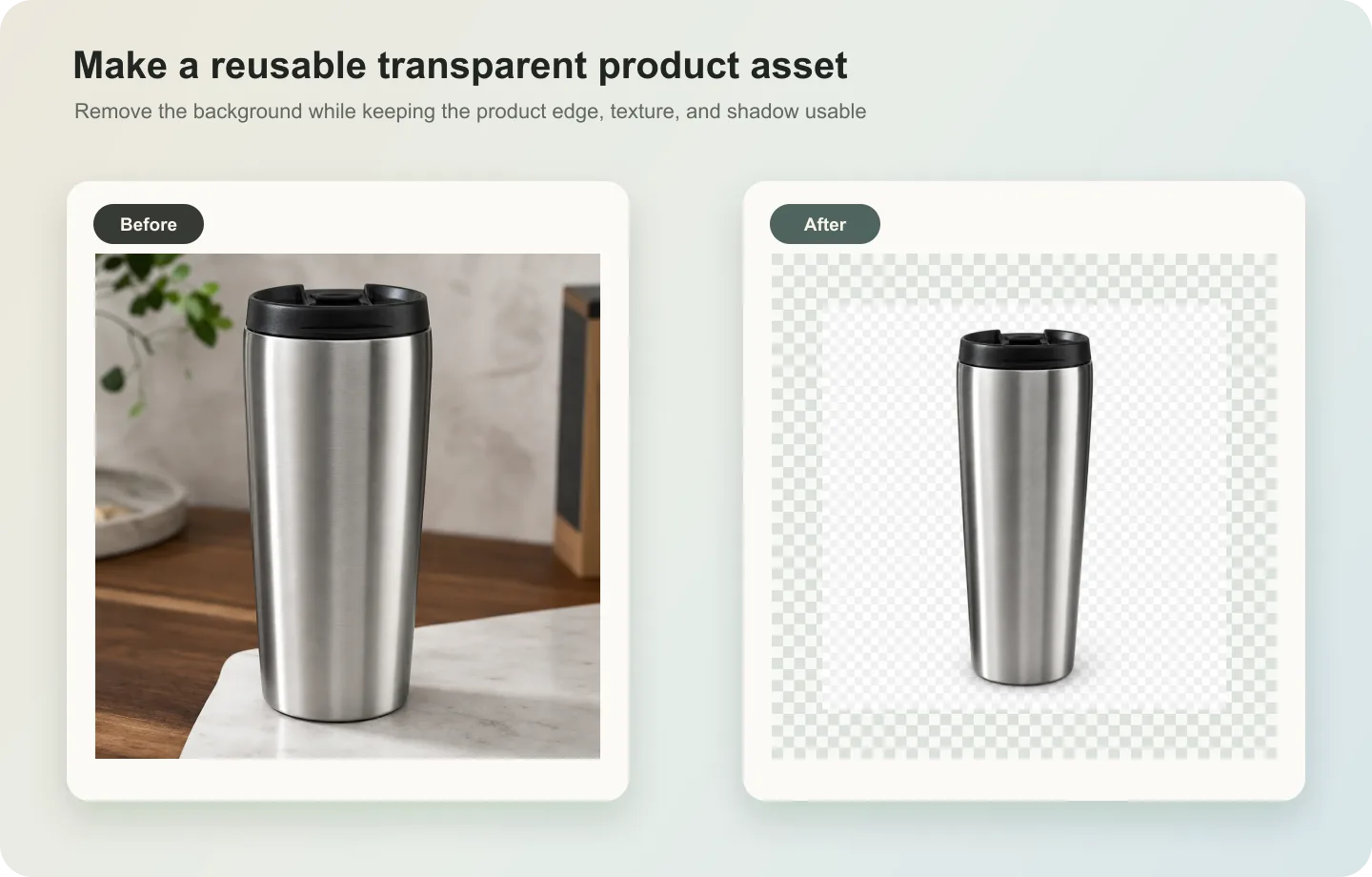 ## What a good transparent PNG needs
The cutout should preserve holes, straps, laces, handles, glass edges, soft fabric, fur, mesh, and product texture. A white halo or chopped shadow will make the asset look pasted into every future design.
Decide whether the PNG should include a shadow. For flexible design work, export one clean transparent cutout and one grounded listing version with a soft shadow.
## Workflow
1. Use the highest-resolution source image.
2. Remove the background while protecting delicate edges.
3. Test the PNG on white, black, and colored backgrounds.
4. Save separate versions for transparent asset and marketplace image.
5. Keep the original source file for later re-edits.
## Where KrafLayer Fits
When you apply this Make Product PNG Images with Transparent Backgrounds workflow in KrafLayer, the tool choice matters: upload the product photo, run Remove BG, and inspect the cutout edge and transparent areas. After generation, judge the image by the channel it serves — listing images, detail pages, or ad assets — and check that shape, material, labels, color, scale, and accessories still match the source SKU.
## Steps in KrafLayer
Use Remove BG as a one-click tool: upload the product image, run the automatic background remover, then download the transparent PNG or continue editing. It does not require a prompt or brush mask.
1. Upload or choose the product image.
2. Run the tool according to its interaction model: one-click tools generate directly; Erase-style tools need a brush mask first.
3. Zoom in to check edges, text, material, shadow, and product scale before downloading or continuing the edit.
## FAQ
### Should a transparent PNG include a shadow?
Usually no for reusable design assets. Keep a separate white-background version with a natural contact shadow for listing use.
### Why does my PNG look bad on dark backgrounds?
The old background color may remain on the edge. Always test cutouts on dark and colored backgrounds before publishing.
### What file should I keep as the master?
Keep the original source and the transparent PNG. The original is needed if you later want a better cutout or a different shadow treatment.
# 产品照片颜色偏黄怎么调成真实颜色
URL: https://kraflayer.com/zh/blog/fix-yellow-color-cast-in-product-photos
Summary: 一套商品图偏黄修正流程:去掉室内暖光色偏,同时保留真实材质、颜色版本、阴影和白底可信度。可在 KrafLayer 中按同一流程完成。
Updated: 2026-06-12
## TL;DR
产品照片颜色偏黄怎么调成真实颜色这类任务,可以把 KrafLayer 当作上架前的快速修图环节:对可用原图运行 Restore,再对比颜色、曝光和恢复出的细节。它适合处理主图、详情图或广告素材,但最后要确认商品形状、材质、标签、颜色、比例和配件仍然对应原始 SKU。
产品照片偏黄时,正确目标不是把画面修成冷白,而是把商品颜色拉回真实范围。买家需要判断材质、颜色版本和细节,如果 AI 把白色修成蓝白、把木色修成灰色,图片反而不可信。
## 操作步骤
1. 先确认商品真实颜色,不要只看背景白不白。
2. 修正整体白平衡,再微调商品区域。
3. 保留材质纹理、高光和自然阴影。
4. 和原始 SKU 或色卡对比后再发布。
## 可直接复制的 prompt
~~~text
以我上传的商品图作为准确参考,修正室内暖光造成的黄色色偏。请让背景和商品颜色回到自然、中性的电商照片效果,同时保留商品真实颜色、材质纹理、边缘、高光、阴影、logo/标签和比例。不要把画面修得过冷,不要改变颜色版本,不要磨平材质。
~~~
## KrafLayer 放在流程里的位置
把产品照片颜色偏黄怎么调成真实颜色放到 KrafLayer 里做时,先选对工具:对可用原图运行 Restore,再对比颜色、曝光和恢复出的细节。生成后不要只看画面是否更漂亮,要按主图、详情图或广告素材的使用场景检查:商品形状、材质、标签、颜色、比例和配件仍然对应原始 SKU。
## FAQ
### 白底一定要纯白吗?
要看使用场景。平台主图通常需要更干净的白底,但商品颜色真实性比盲目拉白更重要。
### 为什么修完颜色会变灰?
去黄过度或对比不足。要同时保留材质高光和自然阴影。
# 一张背包图,做出可直接上架的多平台商品图
URL: https://kraflayer.com/zh/blog/turn-one-backpack-photo-into-platform-ready-product-images
Summary: 一套背包商品图生产流程:从供应商原图做出主图、详情图、广告裁切和透明素材,同时保留肩带、拉链、口袋、五金和真实体积。可在 KrafLayer 中按同一流程完成。
Updated: 2026-06-12
## TL;DR
一张背包图,做出可直接上架的多平台商品图这类任务,KrafLayer 的作用是把真实商品参考图推进到可用的主图、详情图或广告素材,而不是重新发明商品。核心检查点是商品形状、材质、标签、颜色、比例和配件仍然对应原始 SKU。
一张背包图可以延展成多平台商品图,但前提是背包结构足够清楚。AI 可以清理背景、改善光线、生成不同裁切,不能随意改变肩带、拉链、口袋、提手、五金、面料纹理和真实体积。
## 什么时候适合做
适合原图主体清楚、角度可用,但背景脏、光线弱、裁切不适合平台时处理。不适合用来凭空补出看不见的背面结构。
## 操作步骤
1. 先做干净主图,确认背包没有变形。
2. 再做详情图:面料、拉链、五金、肩带、内袋。
3. 最后做平台裁切:方图、竖版广告、横幅或透明 PNG。
4. 每个版本都和原图核对同一个 SKU。
## 可直接复制的 prompt
~~~text
以我上传的背包图片作为唯一商品参考,生成适合[平台/用途]的电商商品图。保留背包轮廓、肩带位置、提手、拉链走向、口袋数量、扣具五金、logo 区域、面料纹理、颜色和真实体积。可以清理背景、优化光线和裁切,但不要改设计、增加口袋、移动肩带、改变颜色或让背包变成另一个款式。
~~~
## KrafLayer 放在流程里的位置
把一张背包图,做出可直接上架的多平台商品图放到 KrafLayer 里做时,先固定商品参考图,再决定是修背景、补光线、做详情图还是延展广告版本。最后按主图、详情图或广告素材的使用场景检查:商品形状、材质、标签、颜色、比例和配件仍然对应原始 SKU。
## FAQ
### 一张背包图能做完整商品页吗?
可以做基础版本,但如果要展示背面、内部结构和尺寸,最好补充更多角度参考。
### 最容易翻车的地方是什么?
肩带和拉链。AI 很容易多生成一根带子,或把拉链路径改掉。
# 产品图片裁切不完整怎么扩图补边
URL: https://kraflayer.com/zh/blog/extend-cropped-product-photos-with-ai-outpainting
Summary: 一套商品图 AI 扩图补边流程:补出画面空间和边距,但不乱补商品结构、不改变真实 SKU。可在 KrafLayer 中按同一流程完成。
Updated: 2026-06-12
## TL;DR
产品图片裁切不完整怎么扩图补边这类任务,KrafLayer 的作用是把真实商品参考图推进到可用的主图、详情图或广告素材,而不是重新发明商品。核心检查点是商品形状、材质、标签、颜色、比例和配件仍然对应原始 SKU。
产品图裁切不完整时,AI 扩图可以补出画面边距、背景和空间感,但不能随便补商品结构。它适合修复把手、肩带、包装边缘、桌面边距被截断的图片,不适合凭空恢复完全看不见的商品细节。
## 操作步骤
1. 先确定要补的是背景边距,还是轻微缺失的商品边缘。
2. 如果关键结构完全缺失,优先找另一张参考图。
3. 扩图时锁定商品比例、透视、阴影和材质。
4. 输出后检查补出来的边缘有没有变形。
## 可直接复制的 prompt
~~~text
以我上传的商品图作为准确参考,对画面进行扩图补边。请补出自然背景、边距和空间延展,保持商品原有比例、透视、材质、颜色、边缘、阴影和结构不变。只在必要位置保守修复被裁切的边缘,不要凭空增加新部件,不要改变商品设计。
~~~
## KrafLayer 放在流程里的位置
把产品图片裁切不完整怎么扩图补边放到 KrafLayer 里做时,先固定商品参考图,再决定是修背景、补光线、做详情图还是延展广告版本。最后按主图、详情图或广告素材的使用场景检查:商品形状、材质、标签、颜色、比例和配件仍然对应原始 SKU。
## FAQ
### 扩图能补回完整商品吗?
如果缺失很少,可以保守修复;如果关键结构完全看不见,需要补充参考图。
### 扩图后最该检查什么?
检查比例、透视、边缘、阴影和被补区域是否出现重复纹理。
# 珠宝首饰 AI 打光与倒影渲染怎么做
URL: https://kraflayer.com/zh/blog/ai-jewelry-lighting-and-reflection-rendering-for-product-photos
Summary: 一套珠宝 AI 打光流程:用高光和倒影提升高级感,同时保留金属颜色、宝石大小、镶嵌结构和真实比例。可在 KrafLayer 中按同一流程完成。
Updated: 2026-06-12
## TL;DR
珠宝首饰 AI 打光与倒影渲染这类任务,KrafLayer 适合处理局部变化或参考驱动的视觉调整:局部改动用 Mask Edit 加短指令;需要视觉参考时用 Reference Image Editor。生成结果必须让金属色、宝石比例、支架痕迹和微距细节准确。
珠宝图需要反光,但不能被反光毁掉。好的 AI 打光会让金属、宝石和镶嵌结构更清楚;坏的打光会把银饰变金、把宝石放大、把结构磨成一团亮片。
## 操作步骤
1. 先锁定金属颜色、宝石尺寸、爪镶、链节和刻字。
2. 再选择柔光、黑金、镜面倒影或细节高光。
3. 倒影只作为质感辅助,不要抢走主体。
4. 放大检查宝石形状和镶嵌结构。
## 可直接复制的 prompt
~~~text
以我上传的珠宝图片作为准确参考,优化电商商品图的打光和倒影。请保留金属颜色、宝石大小、宝石形状、镶嵌结构、链节、扣件、刻字、比例和轮廓。增加受控高光和自然倒影,让材质更高级。不要改变首饰设计,不要放大宝石,不要改金属颜色,不要生成虚假的闪光或遮挡细节。
~~~
## KrafLayer 放在流程里的位置
把珠宝首饰 AI 打光与倒影渲染放到 KrafLayer 里做时,先选对工具:局部改动用 Mask Edit 加短指令;需要视觉参考时用 Reference Image Editor。生成后不要只看画面是否更漂亮,要按主图、详情图或广告素材的使用场景检查:金属色、宝石比例、支架痕迹和微距细节准确。
## FAQ
### 珠宝图要不要强闪光?
广告图可以有一点,但商品详情图更需要看清结构和材质。
### 为什么 AI 会把银饰变金?
因为“奢华”“金色光影”等词会影响材质。要明确写“金属颜色不变”。
# 香水玻璃瓶反光怎么用 AI 处理
URL: https://kraflayer.com/zh/blog/remove-glare-from-perfume-bottle-product-photos
Summary: 一套香水瓶去反光流程:降低刺眼眩光,同时保留玻璃厚度、液体颜色、瓶盖材质、标签和高级反射。可在 KrafLayer 中按同一流程完成。
Updated: 2026-06-12
## TL;DR
香水玻璃瓶反光这类任务,KrafLayer 更适合做精准局部清理:在 Erase 里只刷选要移除的区域,让模型根据周围像素补齐。不要重生成整张图,重点是让瓶型、标签、色号、质地和包装比例保持可信。
香水瓶不是要完全没有反光。反光能说明玻璃、液体和瓶身形状。真正要处理的是遮挡标签、破坏轮廓、让瓶子显脏的刺眼眩光。
## 操作步骤
1. 找出需要降低的眩光,不要全局去反射。
2. 保留瓶身边缘、玻璃厚度、液体颜色、瓶盖和喷头。
3. 让新的高光沿瓶身曲线自然过渡。
4. 检查标签是否被 AI 改字。
## 可直接复制的 prompt
~~~text
以我上传的香水瓶商品图作为准确参考,降低瓶身上的刺眼眩光。请保留玻璃边缘、瓶身形状、液体颜色、瓶盖材质、喷头、标签区域、logo 位置和自然高级反射。只柔化遮挡产品信息的强反光,不要去掉所有光泽,不要改瓶型,不要生成或改写标签文字。
~~~
## KrafLayer 放在流程里的位置
把香水玻璃瓶反光放到 KrafLayer 里做时,先选对工具:在 Erase 里只刷选要移除的区域,让模型根据周围像素补齐。生成后不要只看画面是否更漂亮,要按主图、详情图或广告素材的使用场景检查:瓶型、标签、色号、质地和包装比例保持可信。
## FAQ
### 香水瓶反光要全部去掉吗?
不要。完全无反光会让玻璃变得像塑料。只处理影响阅读的眩光。
### 标签被反光挡住能恢复吗?
如果原图还能看见部分信息,可以改善;完全看不见的文字不要让 AI 猜。
# 动漫手绘风商品展示图:先让买家看清产品
URL: https://kraflayer.com/zh/blog/hand-drawn-anime-style-product-display-for-ecommerce
Summary: 一套动漫手绘风商品图流程:用插画氛围增强记忆点,但让买家仍然看清真实商品。可在 KrafLayer 中按同一流程完成。
Updated: 2026-06-12
## TL;DR
动漫手绘风商品展示图这类任务,KrafLayer 的作用是把真实商品参考图推进到可用的主图、详情图或广告素材,而不是重新发明商品。核心检查点是商品形状、材质、标签、颜色、比例和配件仍然对应原始 SKU。
动漫手绘风适合让商品更有故事感,但它不能把商品变成“灵感图”。买家仍然要看清商品形状、材质、颜色、包装、logo 区域和真实比例。
## 使用场景
适合社媒封面、礼品场景、品牌活动图、收藏类商品和生活方式图。不适合作为严格平台主图的唯一图片。
## 操作步骤
1. 先锁定商品事实,再写风格。
2. 用“手绘线条、柔和光影、纸感、温暖场景”描述氛围。
3. 不要点名模仿具体作品、角色或工作室。
4. 保持商品在画面里足够清楚。
## 可直接复制的 prompt
~~~text
以我上传的商品图作为准确参考,生成动漫手绘感的电商展示图。请保留商品形状、颜色、材质、包装/标签区域、logo 位置和比例。使用温暖手绘线条、柔和光影、轻微纸感和简单生活场景,让商品仍然是画面主体。不要模仿具体动画作品或角色,不要改商品设计,不要生成假文字,不要让道具遮挡产品。
~~~
## KrafLayer 放在流程里的位置
把动漫手绘风商品展示图放到 KrafLayer 里做时,先固定商品参考图,再决定是修背景、补光线、做详情图还是延展广告版本。最后按主图、详情图或广告素材的使用场景检查:商品形状、材质、标签、颜色、比例和配件仍然对应原始 SKU。
## FAQ
### 能不能写某某动画风格?
不建议。用通用视觉语言描述即可,避免版权和风格模仿风险。
### 适合做主图吗?
更适合支持图、活动图和社媒图。主图仍建议保留清晰商品图。
# 鞋靴户外真实场景 AI 融合怎么做
URL: https://kraflayer.com/zh/blog/ai-outdoor-scene-integration-for-shoe-and-boot-product-photos
Summary: 鞋靴户外图的关键是让鞋底接地、材质可信、使用场景匹配。登山靴、雨靴、跑鞋和工装靴需要不同地面、光线和磨损尺度,不能统一套风景。可在 KrafLayer 中按同一流程完成。
Updated: 2026-06-12
# 鞋靴户外真实场景 AI 融合怎么做
## TL;DR
鞋靴户外真实场景 AI 融合这类任务,可以在 KrafLayer 里给真实商品图换场景或合成场景:用 Replace BG 生成文字或参考图驱动的场景;已有基础场景且要控制位置和比例时,用 Scene Compose。场景要服务主图、详情图或广告素材,同时保证鞋型、鞋底纹路、材质和接触阴影仍然可信。
鞋靴户外图最容易翻车的地方不是背景不好看,而是鞋子没有真正“站”在地面上。鞋底漂浮、阴影方向错误、鞋面材质变形、比例过大或过小,都会让用户立刻觉得是假图。
适合用 AI 做户外融合的品类包括登山靴、越野跑鞋、雨靴、工装靴、雪地靴、凉鞋和户外拖鞋。目标不是把鞋放进风景大片,而是让用户相信这双鞋适合那个场景。
## 怎么选场景
登山靴适合岩石、泥土、小碎石和低角度自然光;雨靴适合湿地、雨后路面、草地水珠;跑鞋适合塑胶跑道、城市街道或林间小径;工装靴适合水泥地、仓库、木材或粗糙户外地面。
场景要和鞋的功能匹配。轻便跑鞋放在雪山冰面上会显得虚;厚重工装靴放在干净瑜伽垫上也不成立。
## 怎么做
先上传角度清楚的鞋图。侧面、45 度和正面都可以,但鞋底必须能看出接触面。
Prompt 里要明确“保持鞋型、鞋底纹路、材质、logo 和颜色不变”。AI 很容易把鞋底花纹重画,尤其是户外场景里。
融合时关注三件事:鞋底要压在地面上,阴影要贴地,背景地面要有透视。鞋子不能像贴纸一样贴在照片上。
如果要做磨损感,只能轻微增加灰尘或水珠,不要把新品做成旧鞋。
## 注意事项
不要让 AI 随意加入脚、裤腿或人物,除非你需要穿着效果图。没有人体的产品图更容易保持 SKU 准确。
户外图不适合过度调色。鞋子的真实颜色要优先于电影感滤镜。
## KrafLayer 放在流程里的位置
把鞋靴户外真实场景 AI 融合放到 KrafLayer 里做时,先选对工具:用 Replace BG 生成文字或参考图驱动的场景;已有基础场景且要控制位置和比例时,用 Scene Compose。生成后不要只看画面是否更漂亮,要按主图、详情图或广告素材的使用场景检查:鞋型、鞋底纹路、材质和接触阴影仍然可信。
## 可直接使用的 Prompt
基于这张鞋靴商品图,生成一张真实户外场景融合图。保留鞋型、颜色、鞋面材质、鞋底纹路、logo、鞋带和比例,不要改成其他款式。让鞋底自然接触地面,接触阴影准确,背景选择与产品功能匹配的户外地面,如岩石、泥土、湿路面或林间小径。光线真实,质感清晰,适合电商详情页和广告素材。
## 总结
鞋靴户外图的可信度来自地面关系。背景可以漂亮,但鞋底、阴影、材质和比例必须先对,图片才有转化价值。
## FAQ
### 能不能直接把白底鞋放到山地背景?
可以,但要重新处理接触阴影、地面透视和鞋底边缘。简单贴上去会很假。
### 户外图要不要加泥土或水珠?
可以少量添加,帮助说明使用场景。但新品主图不要做得太脏,避免影响品质感。
### 鞋子颜色可以为了氛围改变吗?
不建议。鞋类退货很大一部分来自颜色和实物不符,真实色号比氛围更重要。
# How to Create Macro Detail Texture Images with AI
URL: https://kraflayer.com/blog/ai-macro-detail-texture-display-for-product-images
Summary: A macro product-detail workflow for showing texture, stitching, grain, finish, and craftsmanship without inventing fake material detail. Includes how to do it in KrafLayer.
Updated: 2026-06-12
## TL;DR
For Create Macro Detail Texture Images, use KrafLayer for controlled local changes or reference-guided edits. Use Mask Edit for a local change with a short instruction, or Reference Image Editor when the result needs a visual example. The finished image should still prove that shape, material, labels, color, scale, and accessories still match the source SKU.
Macro detail images help buyers trust material quality. They can show leather grain, knit texture, stitching, metal finish, glass thickness, fabric weave, ceramic glaze, or packaging surface. The risk is that AI may invent texture that the product does not actually have.
## What a good transparent PNG needs
The cutout should preserve holes, straps, laces, handles, glass edges, soft fabric, fur, mesh, and product texture. A white halo or chopped shadow will make the asset look pasted into every future design.
Decide whether the PNG should include a shadow. For flexible design work, export one clean transparent cutout and one grounded listing version with a soft shadow.
## Workflow
1. Use the highest-resolution source image.
2. Remove the background while protecting delicate edges.
3. Test the PNG on white, black, and colored backgrounds.
4. Save separate versions for transparent asset and marketplace image.
5. Keep the original source file for later re-edits.
## Where KrafLayer Fits
When you apply this Make Product PNG Images with Transparent Backgrounds workflow in KrafLayer, the tool choice matters: upload the product photo, run Remove BG, and inspect the cutout edge and transparent areas. After generation, judge the image by the channel it serves — listing images, detail pages, or ad assets — and check that shape, material, labels, color, scale, and accessories still match the source SKU.
## Steps in KrafLayer
Use Remove BG as a one-click tool: upload the product image, run the automatic background remover, then download the transparent PNG or continue editing. It does not require a prompt or brush mask.
1. Upload or choose the product image.
2. Run the tool according to its interaction model: one-click tools generate directly; Erase-style tools need a brush mask first.
3. Zoom in to check edges, text, material, shadow, and product scale before downloading or continuing the edit.
## FAQ
### Should a transparent PNG include a shadow?
Usually no for reusable design assets. Keep a separate white-background version with a natural contact shadow for listing use.
### Why does my PNG look bad on dark backgrounds?
The old background color may remain on the edge. Always test cutouts on dark and colored backgrounds before publishing.
### What file should I keep as the master?
Keep the original source and the transparent PNG. The original is needed if you later want a better cutout or a different shadow treatment.
# 产品照片颜色偏黄怎么调成真实颜色
URL: https://kraflayer.com/zh/blog/fix-yellow-color-cast-in-product-photos
Summary: 一套商品图偏黄修正流程:去掉室内暖光色偏,同时保留真实材质、颜色版本、阴影和白底可信度。可在 KrafLayer 中按同一流程完成。
Updated: 2026-06-12
## TL;DR
产品照片颜色偏黄怎么调成真实颜色这类任务,可以把 KrafLayer 当作上架前的快速修图环节:对可用原图运行 Restore,再对比颜色、曝光和恢复出的细节。它适合处理主图、详情图或广告素材,但最后要确认商品形状、材质、标签、颜色、比例和配件仍然对应原始 SKU。
产品照片偏黄时,正确目标不是把画面修成冷白,而是把商品颜色拉回真实范围。买家需要判断材质、颜色版本和细节,如果 AI 把白色修成蓝白、把木色修成灰色,图片反而不可信。
## 操作步骤
1. 先确认商品真实颜色,不要只看背景白不白。
2. 修正整体白平衡,再微调商品区域。
3. 保留材质纹理、高光和自然阴影。
4. 和原始 SKU 或色卡对比后再发布。
## 可直接复制的 prompt
~~~text
以我上传的商品图作为准确参考,修正室内暖光造成的黄色色偏。请让背景和商品颜色回到自然、中性的电商照片效果,同时保留商品真实颜色、材质纹理、边缘、高光、阴影、logo/标签和比例。不要把画面修得过冷,不要改变颜色版本,不要磨平材质。
~~~
## KrafLayer 放在流程里的位置
把产品照片颜色偏黄怎么调成真实颜色放到 KrafLayer 里做时,先选对工具:对可用原图运行 Restore,再对比颜色、曝光和恢复出的细节。生成后不要只看画面是否更漂亮,要按主图、详情图或广告素材的使用场景检查:商品形状、材质、标签、颜色、比例和配件仍然对应原始 SKU。
## FAQ
### 白底一定要纯白吗?
要看使用场景。平台主图通常需要更干净的白底,但商品颜色真实性比盲目拉白更重要。
### 为什么修完颜色会变灰?
去黄过度或对比不足。要同时保留材质高光和自然阴影。
# 一张背包图,做出可直接上架的多平台商品图
URL: https://kraflayer.com/zh/blog/turn-one-backpack-photo-into-platform-ready-product-images
Summary: 一套背包商品图生产流程:从供应商原图做出主图、详情图、广告裁切和透明素材,同时保留肩带、拉链、口袋、五金和真实体积。可在 KrafLayer 中按同一流程完成。
Updated: 2026-06-12
## TL;DR
一张背包图,做出可直接上架的多平台商品图这类任务,KrafLayer 的作用是把真实商品参考图推进到可用的主图、详情图或广告素材,而不是重新发明商品。核心检查点是商品形状、材质、标签、颜色、比例和配件仍然对应原始 SKU。
一张背包图可以延展成多平台商品图,但前提是背包结构足够清楚。AI 可以清理背景、改善光线、生成不同裁切,不能随意改变肩带、拉链、口袋、提手、五金、面料纹理和真实体积。
## 什么时候适合做
适合原图主体清楚、角度可用,但背景脏、光线弱、裁切不适合平台时处理。不适合用来凭空补出看不见的背面结构。
## 操作步骤
1. 先做干净主图,确认背包没有变形。
2. 再做详情图:面料、拉链、五金、肩带、内袋。
3. 最后做平台裁切:方图、竖版广告、横幅或透明 PNG。
4. 每个版本都和原图核对同一个 SKU。
## 可直接复制的 prompt
~~~text
以我上传的背包图片作为唯一商品参考,生成适合[平台/用途]的电商商品图。保留背包轮廓、肩带位置、提手、拉链走向、口袋数量、扣具五金、logo 区域、面料纹理、颜色和真实体积。可以清理背景、优化光线和裁切,但不要改设计、增加口袋、移动肩带、改变颜色或让背包变成另一个款式。
~~~
## KrafLayer 放在流程里的位置
把一张背包图,做出可直接上架的多平台商品图放到 KrafLayer 里做时,先固定商品参考图,再决定是修背景、补光线、做详情图还是延展广告版本。最后按主图、详情图或广告素材的使用场景检查:商品形状、材质、标签、颜色、比例和配件仍然对应原始 SKU。
## FAQ
### 一张背包图能做完整商品页吗?
可以做基础版本,但如果要展示背面、内部结构和尺寸,最好补充更多角度参考。
### 最容易翻车的地方是什么?
肩带和拉链。AI 很容易多生成一根带子,或把拉链路径改掉。
# 产品图片裁切不完整怎么扩图补边
URL: https://kraflayer.com/zh/blog/extend-cropped-product-photos-with-ai-outpainting
Summary: 一套商品图 AI 扩图补边流程:补出画面空间和边距,但不乱补商品结构、不改变真实 SKU。可在 KrafLayer 中按同一流程完成。
Updated: 2026-06-12
## TL;DR
产品图片裁切不完整怎么扩图补边这类任务,KrafLayer 的作用是把真实商品参考图推进到可用的主图、详情图或广告素材,而不是重新发明商品。核心检查点是商品形状、材质、标签、颜色、比例和配件仍然对应原始 SKU。
产品图裁切不完整时,AI 扩图可以补出画面边距、背景和空间感,但不能随便补商品结构。它适合修复把手、肩带、包装边缘、桌面边距被截断的图片,不适合凭空恢复完全看不见的商品细节。
## 操作步骤
1. 先确定要补的是背景边距,还是轻微缺失的商品边缘。
2. 如果关键结构完全缺失,优先找另一张参考图。
3. 扩图时锁定商品比例、透视、阴影和材质。
4. 输出后检查补出来的边缘有没有变形。
## 可直接复制的 prompt
~~~text
以我上传的商品图作为准确参考,对画面进行扩图补边。请补出自然背景、边距和空间延展,保持商品原有比例、透视、材质、颜色、边缘、阴影和结构不变。只在必要位置保守修复被裁切的边缘,不要凭空增加新部件,不要改变商品设计。
~~~
## KrafLayer 放在流程里的位置
把产品图片裁切不完整怎么扩图补边放到 KrafLayer 里做时,先固定商品参考图,再决定是修背景、补光线、做详情图还是延展广告版本。最后按主图、详情图或广告素材的使用场景检查:商品形状、材质、标签、颜色、比例和配件仍然对应原始 SKU。
## FAQ
### 扩图能补回完整商品吗?
如果缺失很少,可以保守修复;如果关键结构完全看不见,需要补充参考图。
### 扩图后最该检查什么?
检查比例、透视、边缘、阴影和被补区域是否出现重复纹理。
# 珠宝首饰 AI 打光与倒影渲染怎么做
URL: https://kraflayer.com/zh/blog/ai-jewelry-lighting-and-reflection-rendering-for-product-photos
Summary: 一套珠宝 AI 打光流程:用高光和倒影提升高级感,同时保留金属颜色、宝石大小、镶嵌结构和真实比例。可在 KrafLayer 中按同一流程完成。
Updated: 2026-06-12
## TL;DR
珠宝首饰 AI 打光与倒影渲染这类任务,KrafLayer 适合处理局部变化或参考驱动的视觉调整:局部改动用 Mask Edit 加短指令;需要视觉参考时用 Reference Image Editor。生成结果必须让金属色、宝石比例、支架痕迹和微距细节准确。
珠宝图需要反光,但不能被反光毁掉。好的 AI 打光会让金属、宝石和镶嵌结构更清楚;坏的打光会把银饰变金、把宝石放大、把结构磨成一团亮片。
## 操作步骤
1. 先锁定金属颜色、宝石尺寸、爪镶、链节和刻字。
2. 再选择柔光、黑金、镜面倒影或细节高光。
3. 倒影只作为质感辅助,不要抢走主体。
4. 放大检查宝石形状和镶嵌结构。
## 可直接复制的 prompt
~~~text
以我上传的珠宝图片作为准确参考,优化电商商品图的打光和倒影。请保留金属颜色、宝石大小、宝石形状、镶嵌结构、链节、扣件、刻字、比例和轮廓。增加受控高光和自然倒影,让材质更高级。不要改变首饰设计,不要放大宝石,不要改金属颜色,不要生成虚假的闪光或遮挡细节。
~~~
## KrafLayer 放在流程里的位置
把珠宝首饰 AI 打光与倒影渲染放到 KrafLayer 里做时,先选对工具:局部改动用 Mask Edit 加短指令;需要视觉参考时用 Reference Image Editor。生成后不要只看画面是否更漂亮,要按主图、详情图或广告素材的使用场景检查:金属色、宝石比例、支架痕迹和微距细节准确。
## FAQ
### 珠宝图要不要强闪光?
广告图可以有一点,但商品详情图更需要看清结构和材质。
### 为什么 AI 会把银饰变金?
因为“奢华”“金色光影”等词会影响材质。要明确写“金属颜色不变”。
# 香水玻璃瓶反光怎么用 AI 处理
URL: https://kraflayer.com/zh/blog/remove-glare-from-perfume-bottle-product-photos
Summary: 一套香水瓶去反光流程:降低刺眼眩光,同时保留玻璃厚度、液体颜色、瓶盖材质、标签和高级反射。可在 KrafLayer 中按同一流程完成。
Updated: 2026-06-12
## TL;DR
香水玻璃瓶反光这类任务,KrafLayer 更适合做精准局部清理:在 Erase 里只刷选要移除的区域,让模型根据周围像素补齐。不要重生成整张图,重点是让瓶型、标签、色号、质地和包装比例保持可信。
香水瓶不是要完全没有反光。反光能说明玻璃、液体和瓶身形状。真正要处理的是遮挡标签、破坏轮廓、让瓶子显脏的刺眼眩光。
## 操作步骤
1. 找出需要降低的眩光,不要全局去反射。
2. 保留瓶身边缘、玻璃厚度、液体颜色、瓶盖和喷头。
3. 让新的高光沿瓶身曲线自然过渡。
4. 检查标签是否被 AI 改字。
## 可直接复制的 prompt
~~~text
以我上传的香水瓶商品图作为准确参考,降低瓶身上的刺眼眩光。请保留玻璃边缘、瓶身形状、液体颜色、瓶盖材质、喷头、标签区域、logo 位置和自然高级反射。只柔化遮挡产品信息的强反光,不要去掉所有光泽,不要改瓶型,不要生成或改写标签文字。
~~~
## KrafLayer 放在流程里的位置
把香水玻璃瓶反光放到 KrafLayer 里做时,先选对工具:在 Erase 里只刷选要移除的区域,让模型根据周围像素补齐。生成后不要只看画面是否更漂亮,要按主图、详情图或广告素材的使用场景检查:瓶型、标签、色号、质地和包装比例保持可信。
## FAQ
### 香水瓶反光要全部去掉吗?
不要。完全无反光会让玻璃变得像塑料。只处理影响阅读的眩光。
### 标签被反光挡住能恢复吗?
如果原图还能看见部分信息,可以改善;完全看不见的文字不要让 AI 猜。
# 动漫手绘风商品展示图:先让买家看清产品
URL: https://kraflayer.com/zh/blog/hand-drawn-anime-style-product-display-for-ecommerce
Summary: 一套动漫手绘风商品图流程:用插画氛围增强记忆点,但让买家仍然看清真实商品。可在 KrafLayer 中按同一流程完成。
Updated: 2026-06-12
## TL;DR
动漫手绘风商品展示图这类任务,KrafLayer 的作用是把真实商品参考图推进到可用的主图、详情图或广告素材,而不是重新发明商品。核心检查点是商品形状、材质、标签、颜色、比例和配件仍然对应原始 SKU。
动漫手绘风适合让商品更有故事感,但它不能把商品变成“灵感图”。买家仍然要看清商品形状、材质、颜色、包装、logo 区域和真实比例。
## 使用场景
适合社媒封面、礼品场景、品牌活动图、收藏类商品和生活方式图。不适合作为严格平台主图的唯一图片。
## 操作步骤
1. 先锁定商品事实,再写风格。
2. 用“手绘线条、柔和光影、纸感、温暖场景”描述氛围。
3. 不要点名模仿具体作品、角色或工作室。
4. 保持商品在画面里足够清楚。
## 可直接复制的 prompt
~~~text
以我上传的商品图作为准确参考,生成动漫手绘感的电商展示图。请保留商品形状、颜色、材质、包装/标签区域、logo 位置和比例。使用温暖手绘线条、柔和光影、轻微纸感和简单生活场景,让商品仍然是画面主体。不要模仿具体动画作品或角色,不要改商品设计,不要生成假文字,不要让道具遮挡产品。
~~~
## KrafLayer 放在流程里的位置
把动漫手绘风商品展示图放到 KrafLayer 里做时,先固定商品参考图,再决定是修背景、补光线、做详情图还是延展广告版本。最后按主图、详情图或广告素材的使用场景检查:商品形状、材质、标签、颜色、比例和配件仍然对应原始 SKU。
## FAQ
### 能不能写某某动画风格?
不建议。用通用视觉语言描述即可,避免版权和风格模仿风险。
### 适合做主图吗?
更适合支持图、活动图和社媒图。主图仍建议保留清晰商品图。
# 鞋靴户外真实场景 AI 融合怎么做
URL: https://kraflayer.com/zh/blog/ai-outdoor-scene-integration-for-shoe-and-boot-product-photos
Summary: 鞋靴户外图的关键是让鞋底接地、材质可信、使用场景匹配。登山靴、雨靴、跑鞋和工装靴需要不同地面、光线和磨损尺度,不能统一套风景。可在 KrafLayer 中按同一流程完成。
Updated: 2026-06-12
# 鞋靴户外真实场景 AI 融合怎么做
## TL;DR
鞋靴户外真实场景 AI 融合这类任务,可以在 KrafLayer 里给真实商品图换场景或合成场景:用 Replace BG 生成文字或参考图驱动的场景;已有基础场景且要控制位置和比例时,用 Scene Compose。场景要服务主图、详情图或广告素材,同时保证鞋型、鞋底纹路、材质和接触阴影仍然可信。
鞋靴户外图最容易翻车的地方不是背景不好看,而是鞋子没有真正“站”在地面上。鞋底漂浮、阴影方向错误、鞋面材质变形、比例过大或过小,都会让用户立刻觉得是假图。
适合用 AI 做户外融合的品类包括登山靴、越野跑鞋、雨靴、工装靴、雪地靴、凉鞋和户外拖鞋。目标不是把鞋放进风景大片,而是让用户相信这双鞋适合那个场景。
## 怎么选场景
登山靴适合岩石、泥土、小碎石和低角度自然光;雨靴适合湿地、雨后路面、草地水珠;跑鞋适合塑胶跑道、城市街道或林间小径;工装靴适合水泥地、仓库、木材或粗糙户外地面。
场景要和鞋的功能匹配。轻便跑鞋放在雪山冰面上会显得虚;厚重工装靴放在干净瑜伽垫上也不成立。
## 怎么做
先上传角度清楚的鞋图。侧面、45 度和正面都可以,但鞋底必须能看出接触面。
Prompt 里要明确“保持鞋型、鞋底纹路、材质、logo 和颜色不变”。AI 很容易把鞋底花纹重画,尤其是户外场景里。
融合时关注三件事:鞋底要压在地面上,阴影要贴地,背景地面要有透视。鞋子不能像贴纸一样贴在照片上。
如果要做磨损感,只能轻微增加灰尘或水珠,不要把新品做成旧鞋。
## 注意事项
不要让 AI 随意加入脚、裤腿或人物,除非你需要穿着效果图。没有人体的产品图更容易保持 SKU 准确。
户外图不适合过度调色。鞋子的真实颜色要优先于电影感滤镜。
## KrafLayer 放在流程里的位置
把鞋靴户外真实场景 AI 融合放到 KrafLayer 里做时,先选对工具:用 Replace BG 生成文字或参考图驱动的场景;已有基础场景且要控制位置和比例时,用 Scene Compose。生成后不要只看画面是否更漂亮,要按主图、详情图或广告素材的使用场景检查:鞋型、鞋底纹路、材质和接触阴影仍然可信。
## 可直接使用的 Prompt
基于这张鞋靴商品图,生成一张真实户外场景融合图。保留鞋型、颜色、鞋面材质、鞋底纹路、logo、鞋带和比例,不要改成其他款式。让鞋底自然接触地面,接触阴影准确,背景选择与产品功能匹配的户外地面,如岩石、泥土、湿路面或林间小径。光线真实,质感清晰,适合电商详情页和广告素材。
## 总结
鞋靴户外图的可信度来自地面关系。背景可以漂亮,但鞋底、阴影、材质和比例必须先对,图片才有转化价值。
## FAQ
### 能不能直接把白底鞋放到山地背景?
可以,但要重新处理接触阴影、地面透视和鞋底边缘。简单贴上去会很假。
### 户外图要不要加泥土或水珠?
可以少量添加,帮助说明使用场景。但新品主图不要做得太脏,避免影响品质感。
### 鞋子颜色可以为了氛围改变吗?
不建议。鞋类退货很大一部分来自颜色和实物不符,真实色号比氛围更重要。
# How to Create Macro Detail Texture Images with AI
URL: https://kraflayer.com/blog/ai-macro-detail-texture-display-for-product-images
Summary: A macro product-detail workflow for showing texture, stitching, grain, finish, and craftsmanship without inventing fake material detail. Includes how to do it in KrafLayer.
Updated: 2026-06-12
## TL;DR
For Create Macro Detail Texture Images, use KrafLayer for controlled local changes or reference-guided edits. Use Mask Edit for a local change with a short instruction, or Reference Image Editor when the result needs a visual example. The finished image should still prove that shape, material, labels, color, scale, and accessories still match the source SKU.
Macro detail images help buyers trust material quality. They can show leather grain, knit texture, stitching, metal finish, glass thickness, fabric weave, ceramic glaze, or packaging surface. The risk is that AI may invent texture that the product does not actually have.
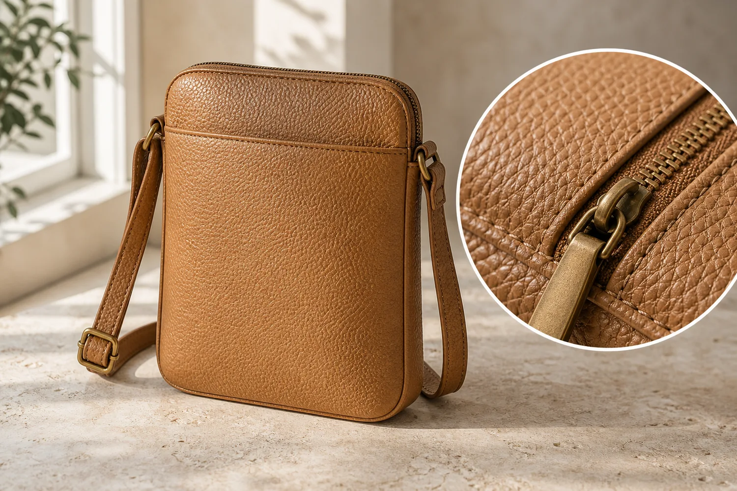 ## When to create macro details
Use macro detail images when material is a selling point: leather bags, jewelry, watches, knitwear, cosmetics packaging, home textiles, wood products, shoes, and premium accessories.
Do not use macro images to fake craftsmanship. They should prove the product, not decorate the page.
## Workflow
1. Choose the detail area: seam, grain, zipper, label, finish, stone, weave, or edge.
2. Preserve the material and scale from the product reference.
3. Ask for shallow focus only if it does not hide the detail.
4. Keep the detail connected to the same SKU.
5. Compare the macro output with the main product image.
## Where KrafLayer Fits
When you apply this Create Macro Detail Texture Images workflow in KrafLayer, the tool choice matters: use Mask Edit for a local change with a short instruction, or Reference Image Editor when the result needs a visual example. After generation, judge the image by the channel it serves — detail-page modules — and check that shape, material, labels, color, scale, and accessories still match the source SKU.
## Prompt to use in KrafLayer
~~~text
Use the uploaded product as the exact reference. Create a macro ecommerce detail image showing [texture/detail area]. Preserve the real material, grain, stitching, edge shape, color, finish, scale, and product identity. Use clean close-up lighting and realistic depth of field. Do not invent fake texture, add extra seams, change material, exaggerate grain, or create a detail that does not belong to the product.
~~~
## FAQ
### Are AI macro detail images reliable?
They are useful when guided by a clear reference, but they must be checked. AI can exaggerate texture or create details that look plausible but are not real.
### What products benefit most from macro detail images?
Products where material affects purchase confidence: leather, fabric, jewelry, cosmetics packaging, watches, shoes, wood, ceramics, and handmade goods.
### Should macro images replace normal product photos?
No. Macro images support the main gallery. Buyers still need full product views for shape, scale, and color.
# 电商非破坏性图像编辑软件怎么选
URL: https://kraflayer.com/zh/blog/non-destructive-image-editing-software-for-ecommerce-product-photos
Summary: 一套非破坏性商品图编辑流程:保留原图、分步骤生成版本、记录 prompt,并能随时回退。可在 KrafLayer 中按同一流程完成。
Updated: 2026-06-12
## TL;DR
电商非破坏性图像编辑软件怎么选这类任务,KrafLayer 的作用是把真实商品参考图推进到可用的主图、详情图或广告素材,而不是重新发明商品。核心检查点是商品形状、材质、标签、颜色、比例和配件仍然对应原始 SKU。
电商非破坏性编辑的核心,是不要把原图覆盖掉。AI 输出应该是版本,而不是唯一文件。这样团队才能比较、回退、复用,也能检查商品有没有被改错。
## 可直接复制的 prompt
~~~text
以我上传的商品图作为原始参考,进行一次受控的电商图片编辑。只处理[背景/曝光/局部瑕疵/裁切/风格],保留商品形状、颜色、材质、logo/标签、比例、边缘和自然阴影。不要覆盖原图逻辑,不要改商品设计,不要生成无关变化。
~~~
## 建议流程
保留原图;每次只做一个编辑目标;记录 prompt;输出不同渠道版本;最终和原图对比。
## KrafLayer 放在流程里的位置
把电商非破坏性图像编辑软件怎么选放到 KrafLayer 里做时,先固定商品参考图,再决定是修背景、补光线、做详情图还是延展广告版本。最后按主图、详情图或广告素材的使用场景检查:商品形状、材质、标签、颜色、比例和配件仍然对应原始 SKU。
## FAQ
### 为什么不要一次修所有问题?
一次改太多,很难判断哪里导致商品失真。分步骤更安全。
# 低像素商品图怎么无损放大
URL: https://kraflayer.com/zh/blog/upscale-low-resolution-product-images-without-losing-detail
Summary: 一套低像素商品图 AI 放大流程:提升可用尺寸,同时避免伪造标签、纹理和商品细节。可在 KrafLayer 中按同一流程完成。
Updated: 2026-06-12
## TL;DR
低像素商品图怎么无损放大这类任务,可以把 KrafLayer 当作上架前的快速修图环节:直接运行 Upscale,再检查纹理、边缘、标签和小字。它适合处理详情页模块,但最后要确认商品形状、材质、标签、颜色、比例和配件仍然对应原始 SKU。
低像素商品图可以用 AI 放大,但不能指望它凭空恢复所有真实细节。可用的结果应该更清楚、更适合上架,同时仍然是同一个商品。
## 操作步骤
1. 优先使用原始文件,不要用聊天截图或平台压缩图。
2. 先放大全图,再检查标签、边缘和材质。
3. 要求保守增强,不要“极致锐化”。
4. 对看不清的文字和 logo,不要让 AI 猜。
## 可直接复制的 prompt
~~~text
以我上传的低像素商品图作为准确参考,放大并增强为电商可用图片。请保留商品形状、颜色、材质纹理、标签区域、logo 位置、边缘、比例和自然阴影。提升清晰度,但不要伪造文字、不要新增纹理、不要改变商品设计、不要过度锐化。
~~~
## KrafLayer 放在流程里的位置
把低像素商品图怎么无损放大放到 KrafLayer 里做时,先选对工具:直接运行 Upscale,再检查纹理、边缘、标签和小字。生成后不要只看画面是否更漂亮,要按详情页模块的使用场景检查:商品形状、材质、标签、颜色、比例和配件仍然对应原始 SKU。
## FAQ
### AI 能把模糊文字变清楚吗?
不能可靠做到。重要文字需要高清参考或真实包装文件。
### 放大后为什么出现假纹理?
AI 在补缺失细节。需要改成“保守增强”,并拒绝不真实纹理。
# 玻璃护肤品包装反光怎么去掉还保留质感
URL: https://kraflayer.com/zh/blog/remove-reflections-from-glass-skincare-packaging-without-losing-texture
Summary: 一套玻璃护肤品去反光流程:降低遮挡标签的强反光,同时保留玻璃厚度、液体层次和高级材质。可在 KrafLayer 中按同一流程完成。
Updated: 2026-06-12
## TL;DR
玻璃护肤品包装反光怎么去掉还保留质感这类任务,KrafLayer 更适合做精准局部清理:在 Erase 里只刷选要移除的区域,让模型根据周围像素补齐。不要重生成整张图,重点是让瓶型、标签、色号、质地和包装比例保持可信。
玻璃护肤品包装不能没有反光。反光能说明瓶身厚度、液体层次和高级感。要处理的是遮挡标签、破坏轮廓、显得廉价的强反光。
## When to create macro details
Use macro detail images when material is a selling point: leather bags, jewelry, watches, knitwear, cosmetics packaging, home textiles, wood products, shoes, and premium accessories.
Do not use macro images to fake craftsmanship. They should prove the product, not decorate the page.
## Workflow
1. Choose the detail area: seam, grain, zipper, label, finish, stone, weave, or edge.
2. Preserve the material and scale from the product reference.
3. Ask for shallow focus only if it does not hide the detail.
4. Keep the detail connected to the same SKU.
5. Compare the macro output with the main product image.
## Where KrafLayer Fits
When you apply this Create Macro Detail Texture Images workflow in KrafLayer, the tool choice matters: use Mask Edit for a local change with a short instruction, or Reference Image Editor when the result needs a visual example. After generation, judge the image by the channel it serves — detail-page modules — and check that shape, material, labels, color, scale, and accessories still match the source SKU.
## Prompt to use in KrafLayer
~~~text
Use the uploaded product as the exact reference. Create a macro ecommerce detail image showing [texture/detail area]. Preserve the real material, grain, stitching, edge shape, color, finish, scale, and product identity. Use clean close-up lighting and realistic depth of field. Do not invent fake texture, add extra seams, change material, exaggerate grain, or create a detail that does not belong to the product.
~~~
## FAQ
### Are AI macro detail images reliable?
They are useful when guided by a clear reference, but they must be checked. AI can exaggerate texture or create details that look plausible but are not real.
### What products benefit most from macro detail images?
Products where material affects purchase confidence: leather, fabric, jewelry, cosmetics packaging, watches, shoes, wood, ceramics, and handmade goods.
### Should macro images replace normal product photos?
No. Macro images support the main gallery. Buyers still need full product views for shape, scale, and color.
# 电商非破坏性图像编辑软件怎么选
URL: https://kraflayer.com/zh/blog/non-destructive-image-editing-software-for-ecommerce-product-photos
Summary: 一套非破坏性商品图编辑流程:保留原图、分步骤生成版本、记录 prompt,并能随时回退。可在 KrafLayer 中按同一流程完成。
Updated: 2026-06-12
## TL;DR
电商非破坏性图像编辑软件怎么选这类任务,KrafLayer 的作用是把真实商品参考图推进到可用的主图、详情图或广告素材,而不是重新发明商品。核心检查点是商品形状、材质、标签、颜色、比例和配件仍然对应原始 SKU。
电商非破坏性编辑的核心,是不要把原图覆盖掉。AI 输出应该是版本,而不是唯一文件。这样团队才能比较、回退、复用,也能检查商品有没有被改错。
## 可直接复制的 prompt
~~~text
以我上传的商品图作为原始参考,进行一次受控的电商图片编辑。只处理[背景/曝光/局部瑕疵/裁切/风格],保留商品形状、颜色、材质、logo/标签、比例、边缘和自然阴影。不要覆盖原图逻辑,不要改商品设计,不要生成无关变化。
~~~
## 建议流程
保留原图;每次只做一个编辑目标;记录 prompt;输出不同渠道版本;最终和原图对比。
## KrafLayer 放在流程里的位置
把电商非破坏性图像编辑软件怎么选放到 KrafLayer 里做时,先固定商品参考图,再决定是修背景、补光线、做详情图还是延展广告版本。最后按主图、详情图或广告素材的使用场景检查:商品形状、材质、标签、颜色、比例和配件仍然对应原始 SKU。
## FAQ
### 为什么不要一次修所有问题?
一次改太多,很难判断哪里导致商品失真。分步骤更安全。
# 低像素商品图怎么无损放大
URL: https://kraflayer.com/zh/blog/upscale-low-resolution-product-images-without-losing-detail
Summary: 一套低像素商品图 AI 放大流程:提升可用尺寸,同时避免伪造标签、纹理和商品细节。可在 KrafLayer 中按同一流程完成。
Updated: 2026-06-12
## TL;DR
低像素商品图怎么无损放大这类任务,可以把 KrafLayer 当作上架前的快速修图环节:直接运行 Upscale,再检查纹理、边缘、标签和小字。它适合处理详情页模块,但最后要确认商品形状、材质、标签、颜色、比例和配件仍然对应原始 SKU。
低像素商品图可以用 AI 放大,但不能指望它凭空恢复所有真实细节。可用的结果应该更清楚、更适合上架,同时仍然是同一个商品。
## 操作步骤
1. 优先使用原始文件,不要用聊天截图或平台压缩图。
2. 先放大全图,再检查标签、边缘和材质。
3. 要求保守增强,不要“极致锐化”。
4. 对看不清的文字和 logo,不要让 AI 猜。
## 可直接复制的 prompt
~~~text
以我上传的低像素商品图作为准确参考,放大并增强为电商可用图片。请保留商品形状、颜色、材质纹理、标签区域、logo 位置、边缘、比例和自然阴影。提升清晰度,但不要伪造文字、不要新增纹理、不要改变商品设计、不要过度锐化。
~~~
## KrafLayer 放在流程里的位置
把低像素商品图怎么无损放大放到 KrafLayer 里做时,先选对工具:直接运行 Upscale,再检查纹理、边缘、标签和小字。生成后不要只看画面是否更漂亮,要按详情页模块的使用场景检查:商品形状、材质、标签、颜色、比例和配件仍然对应原始 SKU。
## FAQ
### AI 能把模糊文字变清楚吗?
不能可靠做到。重要文字需要高清参考或真实包装文件。
### 放大后为什么出现假纹理?
AI 在补缺失细节。需要改成“保守增强”,并拒绝不真实纹理。
# 玻璃护肤品包装反光怎么去掉还保留质感
URL: https://kraflayer.com/zh/blog/remove-reflections-from-glass-skincare-packaging-without-losing-texture
Summary: 一套玻璃护肤品去反光流程:降低遮挡标签的强反光,同时保留玻璃厚度、液体层次和高级材质。可在 KrafLayer 中按同一流程完成。
Updated: 2026-06-12
## TL;DR
玻璃护肤品包装反光怎么去掉还保留质感这类任务,KrafLayer 更适合做精准局部清理:在 Erase 里只刷选要移除的区域,让模型根据周围像素补齐。不要重生成整张图,重点是让瓶型、标签、色号、质地和包装比例保持可信。
玻璃护肤品包装不能没有反光。反光能说明瓶身厚度、液体层次和高级感。要处理的是遮挡标签、破坏轮廓、显得廉价的强反光。
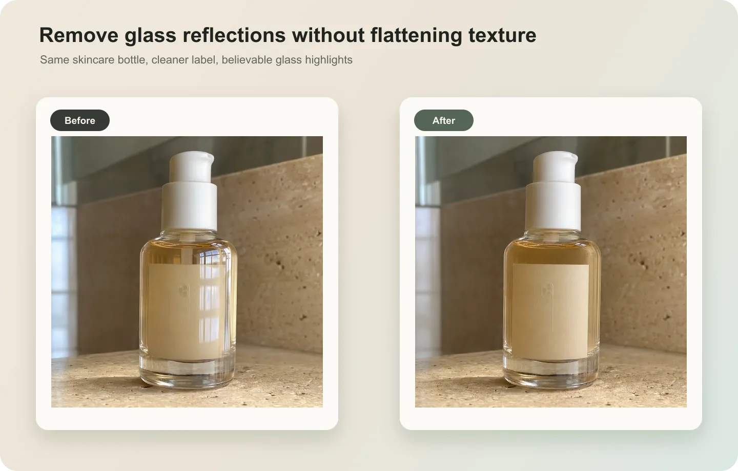 ## 可直接复制的 prompt
~~~text
以我上传的玻璃护肤品包装图作为准确参考,降低瓶身强反光。请保留瓶型、玻璃边缘、液体颜色、瓶盖、标签区域、logo 位置、材质质感和柔和高光。只处理遮挡产品信息的刺眼反光,不要去掉所有光泽,不要把玻璃变成塑料,不要改写标签文字。
~~~
## 检查重点
标签是否更清楚;玻璃边缘是否还真实;瓶盖材质是否没变;液体颜色是否准确。
## KrafLayer 放在流程里的位置
把玻璃护肤品包装反光怎么去掉还保留质感放到 KrafLayer 里做时,先选对工具:在 Erase 里只刷选要移除的区域,让模型根据周围像素补齐。生成后不要只看画面是否更漂亮,要按详情页模块的使用场景检查:瓶型、标签、色号、质地和包装比例保持可信。
## FAQ
### 完全去反光可以吗?
不建议。完全无反光会让玻璃失去真实感。
# 手表细节图有灰尘和划痕,怎么修得干净还保留质感
URL: https://kraflayer.com/zh/blog/clean-dust-and-scratches-from-watch-detail-images
Summary: 一套手表细节图清理流程:去掉灰尘和临时划痕,同时保留表盘文字、指针、金属质感和真实成色。可在 KrafLayer 中按同一流程完成。
Updated: 2026-06-12
## TL;DR
手表细节图有灰尘和划痕,这类任务,KrafLayer 更适合做精准局部清理:在 Erase 里只刷选要移除的区域,让模型根据周围像素补齐。不要重生成整张图,重点是让金属色、宝石比例、支架痕迹和微距细节准确。
手表细节图修得越“干净”,越要小心。灰尘、指纹和临时污点可以清理,但表盘文字、指针、刻度、表圈、表冠、表带纹理和真实成色不能被改掉。
## 可直接复制的 prompt
~~~text
以我上传的手表细节图作为准确参考,清理灰尘、指纹和临时表面污点。请保留表盘文字、刻度、指针、日期窗、表圈、表冠、刻字、表带纹理、金属质感和自然反光。不要改变型号,不要改写文字,不要移动指针,不要把金属磨成塑料。
~~~
## KrafLayer 放在流程里的位置
把手表细节图有灰尘和划痕,放到 KrafLayer 里做时,先选对工具:在 Erase 里只刷选要移除的区域,让模型根据周围像素补齐。生成后不要只看画面是否更漂亮,要按详情页模块的使用场景检查:金属色、宝石比例、支架痕迹和微距细节准确。
## FAQ
### 二手表真实划痕可以去掉吗?
如果划痕属于商品成色,不应为了销售而隐藏。清理要避免误导买家。
# How to Create Watch Product Images Without Losing Dial Details
URL: https://kraflayer.com/blog/create-watch-product-images-with-accurate-dial-details
Summary: A practical workflow for creating watch product images that preserve dial markers, hands, subdials, crown, case, strap stitching, and finish.
Updated: 2026-06-20
An AI watch product poster with accurate dial details works only when the watch still looks like the same SKU after the image is polished. The dial is not decoration. Buyers use the marker layout, hands, subdials, date window, crown, bezel, strap stitching, and case finish to decide whether the product feels trustworthy.
The practical rule is simple: generate the watch image around the dial facts first, then add the poster mood. In KrafLayer, start from a clean watch reference, create one main product image, create one dial-detail image if needed, and review every small feature before using the result in a listing, campaign, or product page. AI can improve lighting and composition, but it should not invent a different watch.
## 可直接复制的 prompt
~~~text
以我上传的玻璃护肤品包装图作为准确参考,降低瓶身强反光。请保留瓶型、玻璃边缘、液体颜色、瓶盖、标签区域、logo 位置、材质质感和柔和高光。只处理遮挡产品信息的刺眼反光,不要去掉所有光泽,不要把玻璃变成塑料,不要改写标签文字。
~~~
## 检查重点
标签是否更清楚;玻璃边缘是否还真实;瓶盖材质是否没变;液体颜色是否准确。
## KrafLayer 放在流程里的位置
把玻璃护肤品包装反光怎么去掉还保留质感放到 KrafLayer 里做时,先选对工具:在 Erase 里只刷选要移除的区域,让模型根据周围像素补齐。生成后不要只看画面是否更漂亮,要按详情页模块的使用场景检查:瓶型、标签、色号、质地和包装比例保持可信。
## FAQ
### 完全去反光可以吗?
不建议。完全无反光会让玻璃失去真实感。
# 手表细节图有灰尘和划痕,怎么修得干净还保留质感
URL: https://kraflayer.com/zh/blog/clean-dust-and-scratches-from-watch-detail-images
Summary: 一套手表细节图清理流程:去掉灰尘和临时划痕,同时保留表盘文字、指针、金属质感和真实成色。可在 KrafLayer 中按同一流程完成。
Updated: 2026-06-12
## TL;DR
手表细节图有灰尘和划痕,这类任务,KrafLayer 更适合做精准局部清理:在 Erase 里只刷选要移除的区域,让模型根据周围像素补齐。不要重生成整张图,重点是让金属色、宝石比例、支架痕迹和微距细节准确。
手表细节图修得越“干净”,越要小心。灰尘、指纹和临时污点可以清理,但表盘文字、指针、刻度、表圈、表冠、表带纹理和真实成色不能被改掉。
## 可直接复制的 prompt
~~~text
以我上传的手表细节图作为准确参考,清理灰尘、指纹和临时表面污点。请保留表盘文字、刻度、指针、日期窗、表圈、表冠、刻字、表带纹理、金属质感和自然反光。不要改变型号,不要改写文字,不要移动指针,不要把金属磨成塑料。
~~~
## KrafLayer 放在流程里的位置
把手表细节图有灰尘和划痕,放到 KrafLayer 里做时,先选对工具:在 Erase 里只刷选要移除的区域,让模型根据周围像素补齐。生成后不要只看画面是否更漂亮,要按详情页模块的使用场景检查:金属色、宝石比例、支架痕迹和微距细节准确。
## FAQ
### 二手表真实划痕可以去掉吗?
如果划痕属于商品成色,不应为了销售而隐藏。清理要避免误导买家。
# How to Create Watch Product Images Without Losing Dial Details
URL: https://kraflayer.com/blog/create-watch-product-images-with-accurate-dial-details
Summary: A practical workflow for creating watch product images that preserve dial markers, hands, subdials, crown, case, strap stitching, and finish.
Updated: 2026-06-20
An AI watch product poster with accurate dial details works only when the watch still looks like the same SKU after the image is polished. The dial is not decoration. Buyers use the marker layout, hands, subdials, date window, crown, bezel, strap stitching, and case finish to decide whether the product feels trustworthy.
The practical rule is simple: generate the watch image around the dial facts first, then add the poster mood. In KrafLayer, start from a clean watch reference, create one main product image, create one dial-detail image if needed, and review every small feature before using the result in a listing, campaign, or product page. AI can improve lighting and composition, but it should not invent a different watch.
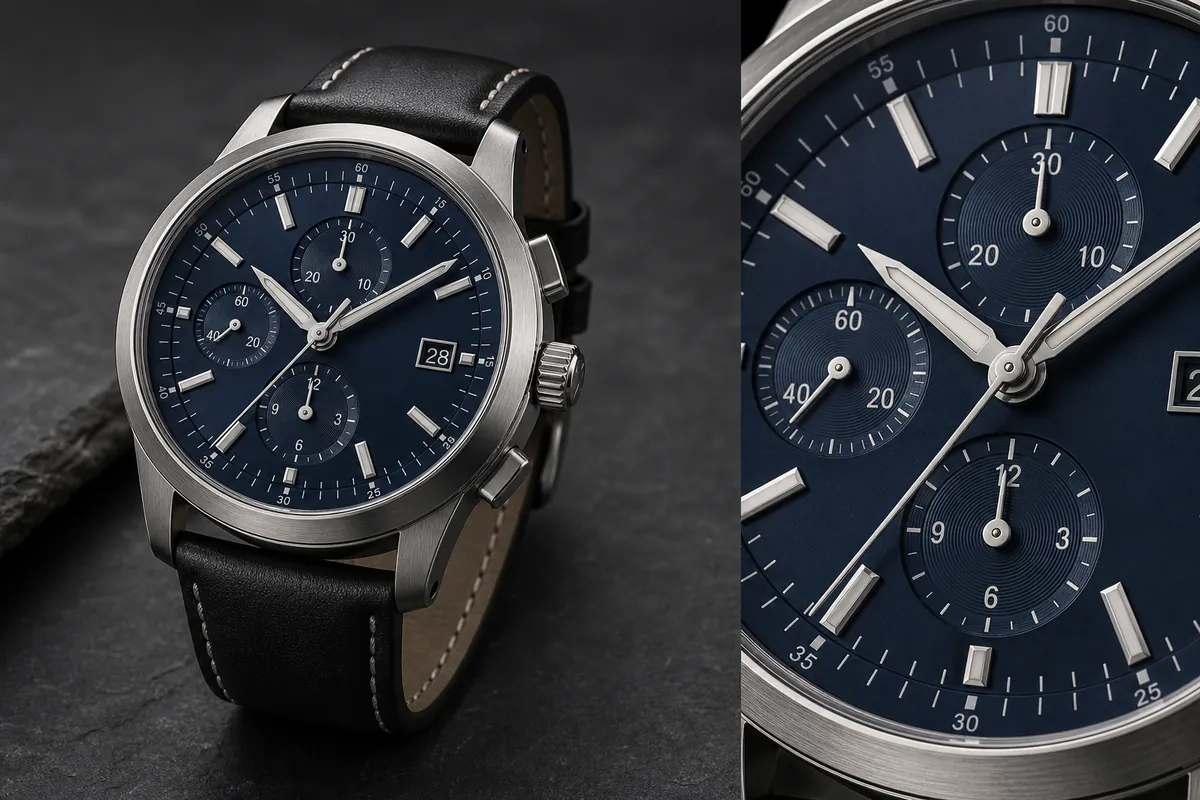 ## Why Watch Dial Details Need Special Care
Watch product images are less forgiving than many ecommerce categories. A handbag detail can survive a small lighting change. A watch image can fail if the second hand disappears, the date window moves, the hour markers drift, or the crown changes shape.
Accurate dial details matter because they prove product identity. A useful watch image should protect:
- Hour marker positions and marker style.
- Hour, minute, and second hand shape.
- Subdial count, position, ring texture, and hand placement.
- Date window shape and location.
- Crown, pushers, bezel, lugs, and case edge geometry.
- Strap material, stitch spacing, buckle direction, and lug attachment.
- Dial color, glass reflection, metal brushing, and scale.
Do not ask AI to make a "luxury watch poster" until those details are locked. That prompt is too open and often creates a prettier but different watch.
## Build A Product-Truth List Before Prompting
Before using an [AI product image generator](/ai-product-image-generator), write a short product-truth list from the real watch photo. This is the checklist you compare against the generated image.
For a watch, include:
- Case shape: round, square, tonneau, diver, chronograph, or dress case.
- Dial color and texture.
- Number of hands.
- Marker type: batons, numerals, dots, indices, or mixed markers.
- Subdial count and placement.
- Date window position.
- Crown and pusher count.
- Strap or bracelet material.
- Stitching, links, buckle, or clasp shape.
- Finish: brushed steel, polished steel, gold tone, black PVD, ceramic, leather, nylon, or rubber.
This list helps the model keep accurate dial details instead of treating the watch as generic jewelry.
## Create The Main Watch Image First
Start with a main product image. It should show the complete watch, not just an atmospheric crop. A good main image makes the case, strap, dial, crown, and scale readable in one glance.
For ecommerce, a three-quarter angle often works well because it shows case depth and strap construction. Use controlled reflections on the glass, but avoid glare across the dial. Keep the watch large enough for the buyer to inspect the face without zooming excessively.
If the main image looks right, create a second dial-detail image or product-poster crop. The detail image should clarify one selling point: dial finish, chronograph layout, brushed case edge, crown detail, leather stitch quality, or crystal reflection.
The detail crop should prove the same watch. If it introduces a new subdial, different marker style, or different crown, reject it.
## Prompt Pattern For Accurate Watch Product Images
Use a prompt that names the protected watch facts before the mood or background.
> Generate a premium ecommerce watch product image from this reference. Preserve the same analog wristwatch, dark navy dial, hour marker positions, hand shapes, subdial count and placement, date window, crown, pushers, bezel, lugs, brushed stainless steel case, black leather strap, stitching, glass reflection, product scale, and natural contact shadow. Use controlled studio lighting on a restrained dark stone surface. Make the image suitable for a product page or watch product poster. Do not change the dial layout, invent a real brand logo, add certification marks, add QR codes, add barcodes, add marketplace UI, or hide the watch face.
For the dial-detail view, narrow the instruction:
> Create a close dial detail image of the same watch. Focus on the markers, hands, subdials, date window, crown edge, brushed case, crystal reflection, and dial texture. Keep the same marker layout, subdial count, hand shapes, strap material, and lighting direction. The detail should look sharp enough for ecommerce review without changing the watch design.
The second prompt is not a license to redesign the dial. It is a magnifying glass for product facts.
## Review The Dial Before Publishing
Watch images can look expensive while still being wrong. Review the image at normal size and zoomed in.
Check for:
- Markers that are missing, duplicated, rotated, or unevenly spaced.
- Hands that bend, split, blur, or point from the wrong center.
- Subdials that change count or placement between the main and detail view.
- Date windows that move or show unreadable fake text.
- Crowns or pushers that multiply or merge into the case.
- Strap stitching that changes color, spacing, or direction.
- Brushed metal that becomes plastic or chrome-like.
- Fake real-world branding, certification marks, or marketplace badges.
If the composition is strong but the image is slightly soft, use an [AI image upscaler](/tools/ai-image-upscaler) and inspect the markers, hands, text, and case edges again. Upscaling should improve readability, not hallucinate new detail.
If only one small dial area is wrong, use [AI mask edit](/tools/ai-mask-edit) for a local correction instead of regenerating the whole watch.
## Use Poster Mood After Product Accuracy
An AI watch product poster can use darker surfaces, cinematic reflections, campaign lighting, or a close hero crop. Those choices should support the product, not cover it.
Good poster choices:
- A clean dark surface that contrasts with the case and strap.
- Controlled side light that reveals brushed metal.
- A close dial crop that shows texture and marker depth.
- Enough negative space for store layout, not fake text overlays.
- A product angle where the crown, strap, and dial stay readable.
Risky poster choices:
- Heavy glare across the dial.
- Shadows that hide the date window or subdials.
- Extreme macro crops that remove product context.
- Fake logo plates, badges, seals, barcodes, or luxury claims.
- Background props that become more important than the watch.
For high-detail categories, polish is useful only after the buyer can still identify the product.
## A Practical KrafLayer Workflow
1. Upload the clearest watch reference available.
2. Write the product-truth list for the dial, case, crown, and strap.
3. Generate the main watch product image first.
4. Compare the generated image with the reference before creating detail crops.
5. Generate one dial-detail view or poster crop from the same product truth.
6. Review markers, hands, subdials, date window, crown, pushers, lugs, strap, and finish.
7. Upscale only after the layout is correct.
8. Use local mask edits for small corrections instead of restarting the whole composition.
This workflow keeps watch product images useful for selling rather than just visually dramatic.
## FAQ
### How do I create an AI watch product poster with accurate dial details?
Start with a clear watch reference, lock the dial facts, then generate the main image before adding poster lighting or a close dial crop. Review marker positions, hands, subdials, date window, crown, case, and strap after generation. Do not publish the image if the dial layout changed.
### Why do AI watch product images often change the dial?
Watch dials contain many small repeated elements: markers, hands, subdials, date windows, rings, and tiny markings. Image models can reinterpret those details while improving style. Naming the protected details in the prompt and reviewing the output reduces the risk.
### Should I use AI upscaling on watch product images?
Use upscaling after the image is structurally correct. An AI image upscaler can make edges, metal, strap texture, and dial markings easier to inspect, but it can also sharpen mistakes. Check the dial again after upscaling.
### Can AI create readable tiny watch text?
AI can suggest small dial markings, but you should not rely on it for exact microtext, legal marks, model numbers, or brand copy. If exact text matters, add or correct it in a controlled design/editing step and review it manually.
### What should a watch detail image show?
A watch detail image should clarify one buyer-relevant fact: dial texture, marker depth, hand shape, subdial layout, date window, crown machining, case brushing, crystal reflection, strap stitching, or clasp detail. It should not be a random luxury macro crop.
## Conclusion
AI watch product images need a stricter review process than broad lifestyle visuals. The dial, hands, subdials, date window, crown, case, strap, and finish are product facts, not styling suggestions. KrafLayer helps sellers start from a watch reference, generate a product-facing main image, create a dial-detail or poster view, then use upscaling or mask edits only after the watch identity is intact.
# How to Create Food Packaging Detail Images for Ecommerce Pages
URL: https://kraflayer.com/blog/create-food-packaging-detail-images-for-ecommerce
Summary: A practical workflow for creating food packaging detail images that show package material, closure, product texture, and label areas without inventing claims.
Updated: 2026-06-20
Food packaging detail images for ecommerce should help a shopper inspect the package before they buy. A good detail image shows the pouch, jar, box, bag, tin, bottle, or wrapper clearly, then zooms in on the material, seal, window, texture, label area, or serving cue that affects trust.
The important rule is this: AI can help create polished food packaging product photos, but it should not invent label facts. In [KrafLayer's AI product image generator](/ai-product-image-generator), use the package reference as the source of product truth, create one image role at a time, then review every visible label, claim, ingredient cue, and package detail before publishing.
## Why Watch Dial Details Need Special Care
Watch product images are less forgiving than many ecommerce categories. A handbag detail can survive a small lighting change. A watch image can fail if the second hand disappears, the date window moves, the hour markers drift, or the crown changes shape.
Accurate dial details matter because they prove product identity. A useful watch image should protect:
- Hour marker positions and marker style.
- Hour, minute, and second hand shape.
- Subdial count, position, ring texture, and hand placement.
- Date window shape and location.
- Crown, pushers, bezel, lugs, and case edge geometry.
- Strap material, stitch spacing, buckle direction, and lug attachment.
- Dial color, glass reflection, metal brushing, and scale.
Do not ask AI to make a "luxury watch poster" until those details are locked. That prompt is too open and often creates a prettier but different watch.
## Build A Product-Truth List Before Prompting
Before using an [AI product image generator](/ai-product-image-generator), write a short product-truth list from the real watch photo. This is the checklist you compare against the generated image.
For a watch, include:
- Case shape: round, square, tonneau, diver, chronograph, or dress case.
- Dial color and texture.
- Number of hands.
- Marker type: batons, numerals, dots, indices, or mixed markers.
- Subdial count and placement.
- Date window position.
- Crown and pusher count.
- Strap or bracelet material.
- Stitching, links, buckle, or clasp shape.
- Finish: brushed steel, polished steel, gold tone, black PVD, ceramic, leather, nylon, or rubber.
This list helps the model keep accurate dial details instead of treating the watch as generic jewelry.
## Create The Main Watch Image First
Start with a main product image. It should show the complete watch, not just an atmospheric crop. A good main image makes the case, strap, dial, crown, and scale readable in one glance.
For ecommerce, a three-quarter angle often works well because it shows case depth and strap construction. Use controlled reflections on the glass, but avoid glare across the dial. Keep the watch large enough for the buyer to inspect the face without zooming excessively.
If the main image looks right, create a second dial-detail image or product-poster crop. The detail image should clarify one selling point: dial finish, chronograph layout, brushed case edge, crown detail, leather stitch quality, or crystal reflection.
The detail crop should prove the same watch. If it introduces a new subdial, different marker style, or different crown, reject it.
## Prompt Pattern For Accurate Watch Product Images
Use a prompt that names the protected watch facts before the mood or background.
> Generate a premium ecommerce watch product image from this reference. Preserve the same analog wristwatch, dark navy dial, hour marker positions, hand shapes, subdial count and placement, date window, crown, pushers, bezel, lugs, brushed stainless steel case, black leather strap, stitching, glass reflection, product scale, and natural contact shadow. Use controlled studio lighting on a restrained dark stone surface. Make the image suitable for a product page or watch product poster. Do not change the dial layout, invent a real brand logo, add certification marks, add QR codes, add barcodes, add marketplace UI, or hide the watch face.
For the dial-detail view, narrow the instruction:
> Create a close dial detail image of the same watch. Focus on the markers, hands, subdials, date window, crown edge, brushed case, crystal reflection, and dial texture. Keep the same marker layout, subdial count, hand shapes, strap material, and lighting direction. The detail should look sharp enough for ecommerce review without changing the watch design.
The second prompt is not a license to redesign the dial. It is a magnifying glass for product facts.
## Review The Dial Before Publishing
Watch images can look expensive while still being wrong. Review the image at normal size and zoomed in.
Check for:
- Markers that are missing, duplicated, rotated, or unevenly spaced.
- Hands that bend, split, blur, or point from the wrong center.
- Subdials that change count or placement between the main and detail view.
- Date windows that move or show unreadable fake text.
- Crowns or pushers that multiply or merge into the case.
- Strap stitching that changes color, spacing, or direction.
- Brushed metal that becomes plastic or chrome-like.
- Fake real-world branding, certification marks, or marketplace badges.
If the composition is strong but the image is slightly soft, use an [AI image upscaler](/tools/ai-image-upscaler) and inspect the markers, hands, text, and case edges again. Upscaling should improve readability, not hallucinate new detail.
If only one small dial area is wrong, use [AI mask edit](/tools/ai-mask-edit) for a local correction instead of regenerating the whole watch.
## Use Poster Mood After Product Accuracy
An AI watch product poster can use darker surfaces, cinematic reflections, campaign lighting, or a close hero crop. Those choices should support the product, not cover it.
Good poster choices:
- A clean dark surface that contrasts with the case and strap.
- Controlled side light that reveals brushed metal.
- A close dial crop that shows texture and marker depth.
- Enough negative space for store layout, not fake text overlays.
- A product angle where the crown, strap, and dial stay readable.
Risky poster choices:
- Heavy glare across the dial.
- Shadows that hide the date window or subdials.
- Extreme macro crops that remove product context.
- Fake logo plates, badges, seals, barcodes, or luxury claims.
- Background props that become more important than the watch.
For high-detail categories, polish is useful only after the buyer can still identify the product.
## A Practical KrafLayer Workflow
1. Upload the clearest watch reference available.
2. Write the product-truth list for the dial, case, crown, and strap.
3. Generate the main watch product image first.
4. Compare the generated image with the reference before creating detail crops.
5. Generate one dial-detail view or poster crop from the same product truth.
6. Review markers, hands, subdials, date window, crown, pushers, lugs, strap, and finish.
7. Upscale only after the layout is correct.
8. Use local mask edits for small corrections instead of restarting the whole composition.
This workflow keeps watch product images useful for selling rather than just visually dramatic.
## FAQ
### How do I create an AI watch product poster with accurate dial details?
Start with a clear watch reference, lock the dial facts, then generate the main image before adding poster lighting or a close dial crop. Review marker positions, hands, subdials, date window, crown, case, and strap after generation. Do not publish the image if the dial layout changed.
### Why do AI watch product images often change the dial?
Watch dials contain many small repeated elements: markers, hands, subdials, date windows, rings, and tiny markings. Image models can reinterpret those details while improving style. Naming the protected details in the prompt and reviewing the output reduces the risk.
### Should I use AI upscaling on watch product images?
Use upscaling after the image is structurally correct. An AI image upscaler can make edges, metal, strap texture, and dial markings easier to inspect, but it can also sharpen mistakes. Check the dial again after upscaling.
### Can AI create readable tiny watch text?
AI can suggest small dial markings, but you should not rely on it for exact microtext, legal marks, model numbers, or brand copy. If exact text matters, add or correct it in a controlled design/editing step and review it manually.
### What should a watch detail image show?
A watch detail image should clarify one buyer-relevant fact: dial texture, marker depth, hand shape, subdial layout, date window, crown machining, case brushing, crystal reflection, strap stitching, or clasp detail. It should not be a random luxury macro crop.
## Conclusion
AI watch product images need a stricter review process than broad lifestyle visuals. The dial, hands, subdials, date window, crown, case, strap, and finish are product facts, not styling suggestions. KrafLayer helps sellers start from a watch reference, generate a product-facing main image, create a dial-detail or poster view, then use upscaling or mask edits only after the watch identity is intact.
# How to Create Food Packaging Detail Images for Ecommerce Pages
URL: https://kraflayer.com/blog/create-food-packaging-detail-images-for-ecommerce
Summary: A practical workflow for creating food packaging detail images that show package material, closure, product texture, and label areas without inventing claims.
Updated: 2026-06-20
Food packaging detail images for ecommerce should help a shopper inspect the package before they buy. A good detail image shows the pouch, jar, box, bag, tin, bottle, or wrapper clearly, then zooms in on the material, seal, window, texture, label area, or serving cue that affects trust.
The important rule is this: AI can help create polished food packaging product photos, but it should not invent label facts. In [KrafLayer's AI product image generator](/ai-product-image-generator), use the package reference as the source of product truth, create one image role at a time, then review every visible label, claim, ingredient cue, and package detail before publishing.
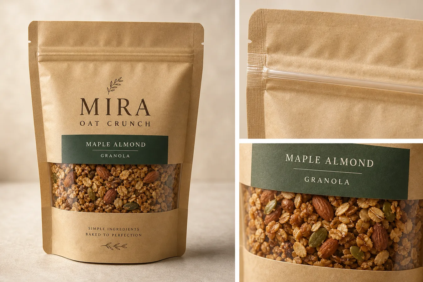 ## What Food Packaging Detail Images Need To Prove
Food packaging detail images are not just decorative close-ups. They should answer buyer questions that the main image cannot answer on its own:
- What type of package is it: pouch, jar, carton, sleeve, box, bottle, tin, sachet, or wrapper?
- Does the material look matte, glossy, kraft, glass, metal, plastic, paperboard, or foil-lined?
- Is the seal, cap, zip, tear notch, window, label edge, or closure easy to understand?
- Can the shopper see enough product texture to trust what is inside?
- Is the label area clean, aligned, and believable?
- Are any claims, badges, ingredient text, or nutrition-like details unsupported or hard to read?
A useful rule for food packaging product photos is: show one product, one package system, and one buyer-relevant detail per image. If the image tries to explain everything at once, it usually becomes too busy for a product page.
Product packaging detail images should be treated as proof assets, not as generic campaign art. They earn their place on the page when they make the package material, closure, label area, or product window easier to inspect.
For packaged food, ecommerce detail images should stay narrow: one image can prove resealable closure, another can show the transparent window, and another can make the front label area easier to review.
## Start With A Packaging Truth List
Before generating detail images, write down the product facts that must stay stable:
- Package shape: protect the pouch gusset, box edges, jar shoulder, cap, seam, fold, or wrapper contour.
- Material: protect kraft paper fiber, film gloss, glass thickness, metal reflection, paperboard texture, or foil shine.
- Label layout: protect logo position, product name area, color block, window placement, and blank label zones.
- Closure: protect zipper, tear notch, cap thread, lid shape, clip, seal line, or tamper band.
- Product window: protect the size, shape, opacity, and visible food texture.
- Color: protect real package color and avoid unwanted warm, green, or gray drift.
- Shadow: keep natural contact shadow so the package does not float.
This list is the standard for every image. For food packaging detail images for ecommerce, the goal is not to make a prettier imaginary package. The goal is to help the shopper understand the real product better.
## Create The Right Detail Image Roles
Most ecommerce food pages need a small set of image roles rather than one oversized poster:
- Main package image: a clean product-forward image that shows the whole package and immediately identifies the product.
- Material detail: a close-up of kraft paper, glass, label stock, matte film, foil, or carton texture.
- Closure detail: a close-up of zipper, cap, lid, tear notch, resealable strip, or seal line.
- Product window detail: a close view of the visible food texture through a window or open-view area.
- Scale or serving context: a restrained supporting view that helps shoppers understand size, not a cluttered recipe scene.
- Label review image: a clean view of the front label area when the seller needs buyers to inspect flavor, variant, or product name.
In KrafLayer, create these roles separately when accuracy matters. One generated hero image can introduce the product, but separate detail images are easier to review and less likely to bury important package facts.
## Workflow For Generating Food Packaging Details
Use this workflow:
- Upload the cleanest package reference you have.
- Decide the exact image role before prompting: main image, closure detail, material detail, ingredient-window detail, or PDP support image.
- Ask for one clear packaged food product, not a table full of props.
- Protect package shape, material, label area, closure, color, window, and shadow.
- Avoid claims, badges, nutrition panels, QR codes, barcodes, marketplace marks, and certification-style icons unless they already exist in the source and are accurate.
- Generate the image.
- Compare the output with the reference.
- Use [KrafLayer's product photo editor](/product-photo-editor) if a small crop, background, or local cleanup issue needs adjustment.
- Use [AI image upscaling](/tools/ai-image-upscaler) only after checking that label edges, food texture, and package contours still look believable.
This keeps the AI product image generator workflow practical. The generated image can improve presentation, but the merchant still owns the final review.
## Prompt Template
Use this prompt when you have a food package reference:
> Create an ecommerce food packaging detail image using the reference package as the product truth. Keep the exact package shape, material texture, label layout, color, seal, zipper or cap, window placement, visible product texture, proportions, and natural shadow. Show one packaged food product with a clean main view plus one or two matching detail close-ups for package material, closure, or food texture. Use realistic studio lighting and restrained ecommerce styling. Do not invent nutrition facts, certification badges, barcodes, QR codes, health claims, marketplace UI, real brand marks, or unsupported label text.
For a material-focused detail image, add:
> The detail close-up should show the same package material from the main image, including paper fiber, matte coating, transparent window, seal line, or closure detail.
For a product-window image, add:
> The visible food texture should look appetizing and plausible, but it must not overfill the package, change the product type, or create unrealistic ingredients.
## Label Text Needs Human Review
AI can make label areas look cleaner, but food packaging text needs extra caution. Do not assume generated label text is legally, nutritionally, or commercially correct.
Review every visible text area:
- Product name and flavor should match the SKU.
- Any ingredient cue should be factual or removed.
- Avoid fake nutrition panels, certification marks, health badges, organic marks, award seals, and allergen claims.
- Avoid tiny filler text that looks like real regulated copy.
- Do not use generated barcodes or QR codes.
- Keep fictional branding clearly fictional when creating examples.
If exact label text matters, use the generated image as layout direction, then place final approved label artwork through a design or retouching workflow. For ecommerce listings, a clean blank label area is safer than fake readable claims.
## What To Check Before Publishing
Before a detail image goes live, compare it against the real package:
- Is the package still the same pouch, jar, carton, tin, bottle, or box?
- Did the AI change flavor color, label blocks, cap shape, window size, or package proportions?
- Are seams, folds, zippers, tear notches, caps, and seals in plausible positions?
- Does the food texture match the product type?
- Does the image show one buyer-relevant detail clearly?
- Is the product still readable at mobile size?
- Are there any fake badges, real-platform marks, nutrition-like claims, or official-looking icons?
- Does the image support the product page instead of becoming generic food advertising?
The best ecommerce detail image makes one product fact easier to inspect. It should not require the buyer to guess which package is being sold.
## FAQ
### Can AI create food packaging detail images for ecommerce?
Yes, AI can create food packaging detail images for ecommerce when the source package is clear and the prompt protects package facts. Use AI for presentation, close-ups, lighting, and composition, then manually review label text, claims, seals, material, and product texture before publishing.
### What details should food packaging product photos show?
Food packaging product photos should show the full package first, then useful details such as material texture, resealable zipper, cap, label area, transparent window, product texture, serving cue, or package scale. Each detail image should explain one buyer-relevant point.
### Can AI generate accurate label text on food packaging?
Do not rely on AI to generate accurate food packaging label text. It may create convincing-looking words, claims, nutrition-style panels, or badges that are not correct. Use approved label artwork for final text, or keep the generated image focused on package material and layout.
### How do I keep AI food packaging images from looking fake?
Use one clear product, a real package reference, restrained lighting, natural shadow, plausible material texture, and a narrow detail goal. Avoid excessive props, impossible ingredient windows, fake badges, overfilled packages, and label text that looks official but has not been reviewed.
### How does KrafLayer help with food packaging product images?
KrafLayer helps sellers turn food package references into main images, detail images, product-window views, and ecommerce support visuals. The workflow works best when the seller protects package shape, label layout, material, closure, color, and product texture before using the image.
## Conclusion
Food packaging detail images for ecommerce work best when they make one product fact easier to inspect: the material, seal, window, texture, label area, or serving cue. KrafLayer helps sellers use an AI product image generator and editor workflow to create polished package visuals while keeping product truth, label review, and buyer trust at the center. For packaged food brands, the advantage is faster visual production without treating generated label text or unsupported claims as finished facts.
# Product Photography for Ecommerce: Image Types, Workflow, and AI Handoff
URL: https://kraflayer.com/blog/product-photography-for-ecommerce-workflow
Summary: A practical guide to ecommerce product image roles, AI handoff, product-truth checks, and listing-ready photo sets.
Updated: 2026-06-21
Product photography for ecommerce is not one perfect image. A strong listing usually needs a main image that identifies the product, a lifestyle image that explains use or scale, and detail images that prove material, function, or finish. The practical rule is: photograph or preserve the product truth first, then build every extra image around that truth.
KrafLayer fits after you know what each image must prove. Use [ecommerce product photography](/ecommerce-product-photography) planning to define the set, then use AI generation and editing only where it can improve selling clarity without changing the SKU.
## What Food Packaging Detail Images Need To Prove
Food packaging detail images are not just decorative close-ups. They should answer buyer questions that the main image cannot answer on its own:
- What type of package is it: pouch, jar, carton, sleeve, box, bottle, tin, sachet, or wrapper?
- Does the material look matte, glossy, kraft, glass, metal, plastic, paperboard, or foil-lined?
- Is the seal, cap, zip, tear notch, window, label edge, or closure easy to understand?
- Can the shopper see enough product texture to trust what is inside?
- Is the label area clean, aligned, and believable?
- Are any claims, badges, ingredient text, or nutrition-like details unsupported or hard to read?
A useful rule for food packaging product photos is: show one product, one package system, and one buyer-relevant detail per image. If the image tries to explain everything at once, it usually becomes too busy for a product page.
Product packaging detail images should be treated as proof assets, not as generic campaign art. They earn their place on the page when they make the package material, closure, label area, or product window easier to inspect.
For packaged food, ecommerce detail images should stay narrow: one image can prove resealable closure, another can show the transparent window, and another can make the front label area easier to review.
## Start With A Packaging Truth List
Before generating detail images, write down the product facts that must stay stable:
- Package shape: protect the pouch gusset, box edges, jar shoulder, cap, seam, fold, or wrapper contour.
- Material: protect kraft paper fiber, film gloss, glass thickness, metal reflection, paperboard texture, or foil shine.
- Label layout: protect logo position, product name area, color block, window placement, and blank label zones.
- Closure: protect zipper, tear notch, cap thread, lid shape, clip, seal line, or tamper band.
- Product window: protect the size, shape, opacity, and visible food texture.
- Color: protect real package color and avoid unwanted warm, green, or gray drift.
- Shadow: keep natural contact shadow so the package does not float.
This list is the standard for every image. For food packaging detail images for ecommerce, the goal is not to make a prettier imaginary package. The goal is to help the shopper understand the real product better.
## Create The Right Detail Image Roles
Most ecommerce food pages need a small set of image roles rather than one oversized poster:
- Main package image: a clean product-forward image that shows the whole package and immediately identifies the product.
- Material detail: a close-up of kraft paper, glass, label stock, matte film, foil, or carton texture.
- Closure detail: a close-up of zipper, cap, lid, tear notch, resealable strip, or seal line.
- Product window detail: a close view of the visible food texture through a window or open-view area.
- Scale or serving context: a restrained supporting view that helps shoppers understand size, not a cluttered recipe scene.
- Label review image: a clean view of the front label area when the seller needs buyers to inspect flavor, variant, or product name.
In KrafLayer, create these roles separately when accuracy matters. One generated hero image can introduce the product, but separate detail images are easier to review and less likely to bury important package facts.
## Workflow For Generating Food Packaging Details
Use this workflow:
- Upload the cleanest package reference you have.
- Decide the exact image role before prompting: main image, closure detail, material detail, ingredient-window detail, or PDP support image.
- Ask for one clear packaged food product, not a table full of props.
- Protect package shape, material, label area, closure, color, window, and shadow.
- Avoid claims, badges, nutrition panels, QR codes, barcodes, marketplace marks, and certification-style icons unless they already exist in the source and are accurate.
- Generate the image.
- Compare the output with the reference.
- Use [KrafLayer's product photo editor](/product-photo-editor) if a small crop, background, or local cleanup issue needs adjustment.
- Use [AI image upscaling](/tools/ai-image-upscaler) only after checking that label edges, food texture, and package contours still look believable.
This keeps the AI product image generator workflow practical. The generated image can improve presentation, but the merchant still owns the final review.
## Prompt Template
Use this prompt when you have a food package reference:
> Create an ecommerce food packaging detail image using the reference package as the product truth. Keep the exact package shape, material texture, label layout, color, seal, zipper or cap, window placement, visible product texture, proportions, and natural shadow. Show one packaged food product with a clean main view plus one or two matching detail close-ups for package material, closure, or food texture. Use realistic studio lighting and restrained ecommerce styling. Do not invent nutrition facts, certification badges, barcodes, QR codes, health claims, marketplace UI, real brand marks, or unsupported label text.
For a material-focused detail image, add:
> The detail close-up should show the same package material from the main image, including paper fiber, matte coating, transparent window, seal line, or closure detail.
For a product-window image, add:
> The visible food texture should look appetizing and plausible, but it must not overfill the package, change the product type, or create unrealistic ingredients.
## Label Text Needs Human Review
AI can make label areas look cleaner, but food packaging text needs extra caution. Do not assume generated label text is legally, nutritionally, or commercially correct.
Review every visible text area:
- Product name and flavor should match the SKU.
- Any ingredient cue should be factual or removed.
- Avoid fake nutrition panels, certification marks, health badges, organic marks, award seals, and allergen claims.
- Avoid tiny filler text that looks like real regulated copy.
- Do not use generated barcodes or QR codes.
- Keep fictional branding clearly fictional when creating examples.
If exact label text matters, use the generated image as layout direction, then place final approved label artwork through a design or retouching workflow. For ecommerce listings, a clean blank label area is safer than fake readable claims.
## What To Check Before Publishing
Before a detail image goes live, compare it against the real package:
- Is the package still the same pouch, jar, carton, tin, bottle, or box?
- Did the AI change flavor color, label blocks, cap shape, window size, or package proportions?
- Are seams, folds, zippers, tear notches, caps, and seals in plausible positions?
- Does the food texture match the product type?
- Does the image show one buyer-relevant detail clearly?
- Is the product still readable at mobile size?
- Are there any fake badges, real-platform marks, nutrition-like claims, or official-looking icons?
- Does the image support the product page instead of becoming generic food advertising?
The best ecommerce detail image makes one product fact easier to inspect. It should not require the buyer to guess which package is being sold.
## FAQ
### Can AI create food packaging detail images for ecommerce?
Yes, AI can create food packaging detail images for ecommerce when the source package is clear and the prompt protects package facts. Use AI for presentation, close-ups, lighting, and composition, then manually review label text, claims, seals, material, and product texture before publishing.
### What details should food packaging product photos show?
Food packaging product photos should show the full package first, then useful details such as material texture, resealable zipper, cap, label area, transparent window, product texture, serving cue, or package scale. Each detail image should explain one buyer-relevant point.
### Can AI generate accurate label text on food packaging?
Do not rely on AI to generate accurate food packaging label text. It may create convincing-looking words, claims, nutrition-style panels, or badges that are not correct. Use approved label artwork for final text, or keep the generated image focused on package material and layout.
### How do I keep AI food packaging images from looking fake?
Use one clear product, a real package reference, restrained lighting, natural shadow, plausible material texture, and a narrow detail goal. Avoid excessive props, impossible ingredient windows, fake badges, overfilled packages, and label text that looks official but has not been reviewed.
### How does KrafLayer help with food packaging product images?
KrafLayer helps sellers turn food package references into main images, detail images, product-window views, and ecommerce support visuals. The workflow works best when the seller protects package shape, label layout, material, closure, color, and product texture before using the image.
## Conclusion
Food packaging detail images for ecommerce work best when they make one product fact easier to inspect: the material, seal, window, texture, label area, or serving cue. KrafLayer helps sellers use an AI product image generator and editor workflow to create polished package visuals while keeping product truth, label review, and buyer trust at the center. For packaged food brands, the advantage is faster visual production without treating generated label text or unsupported claims as finished facts.
# Product Photography for Ecommerce: Image Types, Workflow, and AI Handoff
URL: https://kraflayer.com/blog/product-photography-for-ecommerce-workflow
Summary: A practical guide to ecommerce product image roles, AI handoff, product-truth checks, and listing-ready photo sets.
Updated: 2026-06-21
Product photography for ecommerce is not one perfect image. A strong listing usually needs a main image that identifies the product, a lifestyle image that explains use or scale, and detail images that prove material, function, or finish. The practical rule is: photograph or preserve the product truth first, then build every extra image around that truth.
KrafLayer fits after you know what each image must prove. Use [ecommerce product photography](/ecommerce-product-photography) planning to define the set, then use AI generation and editing only where it can improve selling clarity without changing the SKU.
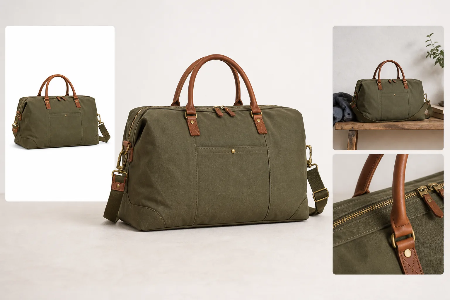 ## What Product Photography For Ecommerce Must Do
Product photography for ecommerce has one job before it has any style: help the buyer understand what is being sold. A beautiful image that hides the product, changes the material, or invents a feature is weaker than a simple image that shows the product clearly.
For most listings, the image set should answer four questions:
- What is the product?
- What size, shape, color, and material does it have?
- What detail makes the buyer trust it?
- Where or how would the buyer use it?
That is why ecommerce product photography works best as a set. The main image creates recognition. The angle image shows structure. The detail image proves texture, hardware, stitching, label quality, screen edge, finish, or closure. The lifestyle image adds scale and context without pretending the product is something else. Together, these product listing images should feel coordinated enough for a buyer to trust the page.
## The Core Ecommerce Image Types
Start with image roles before thinking about tools, prompts, or backgrounds.
Use this practical set for most products:
- Main image: a clean, product-first view with enough margin, natural shadow, and no distracting props.
- Angle image: a side, three-quarter, open, worn, or in-use view that explains shape and depth.
- Detail image: a tight crop of the material, closure, texture, hardware, label, screen, edge, seam, strap, or functional part.
- Lifestyle image: a restrained scene that shows scale, setting, use case, or buyer aspiration.
- Comparison or set image: only when the product has real sizes, variants, bundles, or included parts.
The main image should make the product recognizable in a thumbnail. The detail image should answer a buyer objection. The lifestyle image should create context without stealing attention from the SKU.
## A Practical Ecommerce Product Photography Workflow
Use this workflow whether you are shooting from scratch, cleaning supplier photos, or extending a small set with AI.
1. Define the product facts that cannot change.
2. Pick the listing roles you need: main, angle, detail, lifestyle, variant, or ad crop.
3. Choose one product-truth reference image.
4. Create the main image before the creative images.
5. Match crop, product scale, lighting direction, and background logic across the set.
6. Build detail images from real buyer-relevant features.
7. Add lifestyle context only after the product is clear.
8. Review the full set as thumbnails and full-size images.
9. Reject any image that changes color, material, structure, label placement, scale, or included parts.
This workflow keeps ecommerce product photos from becoming random campaign images. Every image has a job, and every job points back to the same product.
## Where AI Helps Without Replacing Product Truth
AI can be useful in ecommerce product photography when it is treated as a production assistant, not as a license to redesign the SKU.
Use KrafLayer's [AI product photography](/ai-product-photography) workflow when you already know the product facts and need more image roles: a cleaner main image, a restrained lifestyle scene, a detail-forward composition, or a better ad crop.
Use the [AI product image generator](/ai-product-image-generator) when you need to create a listing-ready visual direction from a clear reference and a specific brief.
Use the [product photo editor](/product-photo-editor) when the source photo is useful but has a weak background, uneven light, low resolution, clutter, glare, or crop problems.
The safest AI handoff is specific:
> Create an ecommerce product photography set for this same product. Preserve the exact product shape, color, material, stitching, hardware, zipper, label position, proportions, and shadow behavior. Create one clean main image, one restrained lifestyle image, and one close detail image that proves material quality. Do not add marketplace logos, fake badges, QR codes, barcodes, certification marks, review stars, sale stickers, or unsupported claims.
For editing an existing photo, use a narrower instruction:
> Keep this exact product unchanged. Improve background, crop, lighting, and listing clarity. Preserve true color, material texture, silhouette, scale, label placement, hardware, seams, and buyer-relevant details.
Specific instructions protect the product. Vague prompts invite drift.
## Product Facts To Lock Before Editing
Every category has details that should be protected before you generate, edit, or publish images.
For apparel, lock true color, fabric texture, collar, sleeve, hem, buttons, seams, pockets, fit, and drape.
For bags, lock silhouette, strap length, zipper shape, leather or canvas texture, stitching, hardware finish, panel seams, and handle placement.
For beauty packaging, lock bottle shape, cap, pump, label position, liquid color, glass thickness, box proportions, and approved artwork.
For electronics, lock ports, buttons, seams, screen shape, vents, LEDs, finish, cable placement, and scale.
For furniture, lock proportions, legs, arms, handles, cushion shape, fabric weave, wood grain, edge profile, and floor contact shadow.
For food packaging, lock package shape, closure, label layout, transparent window, material texture, and approved claims. Do not invent nutrition facts, certification marks, barcodes, QR codes, health claims, allergen claims, or regulated copy.
If a detail affects buyer trust, it belongs in the product-truth checklist.
## How To Review The Final Image Set
Review the finished set as a buyer would see it: first in thumbnails, then in full-size product-page order.
A strong ecommerce product photography set passes these checks:
- the product is immediately recognizable in the first image
- every image appears to show the same SKU
- color and material stay consistent across the set
- product scale does not jump wildly between images
- detail crops clearly connect to the main product
- lifestyle context supports the product instead of hiding it
- no image implies a false bundle, feature, certification, or use case
- no AI output invents hardware, labels, seams, ports, ingredients, or packaging details
- image quality is high enough for zoom and mobile viewing
The best ecommerce listing images feel coordinated, but not fake. They look like one product story built from reliable product evidence.
## FAQ
### What is product photography for ecommerce?
Product photography for ecommerce is the process of creating images that help buyers understand, compare, and trust a product online. It usually includes a clear main image, supporting angle views, detail crops, and restrained lifestyle images. The goal is not only attractive visuals; it is accurate product communication.
### How many ecommerce product photos do I need?
Most products need at least a main image, one angle image, one detail image, and one lifestyle or scale image. Complex products may need more detail shots, variants, bundle views, or use-case images. The right count depends on what buyers must inspect before they feel comfortable purchasing.
### Can AI create ecommerce product photos?
AI can create or extend ecommerce product photos when it starts from clear product truth and a specific brief. It works best for clean main images, lifestyle scenes, detail compositions, and ad crops. Every output still needs human review for color, shape, material, scale, labels, and buyer-relevant details.
### What makes ecommerce product photos trustworthy?
Trustworthy ecommerce product photos show the same product consistently. They preserve color, material, scale, silhouette, label placement, and important details. They avoid fake badges, unsupported claims, misleading bundles, over-edited materials, and lifestyle scenes that hide what the buyer actually receives.
### How can KrafLayer help with ecommerce product photos?
KrafLayer helps sellers plan, generate, and edit ecommerce product photos from a product-first workflow. You can create main images, lifestyle scenes, and detail visuals, then use editing tools to clean backgrounds, improve quality, and prepare listing images while checking that product facts stay accurate.
## Conclusion
Product photography for ecommerce works when every image has a clear selling job and every image preserves the same product truth. KrafLayer helps sellers move from one product reference to a coordinated image set: clean main image, useful detail crop, restrained lifestyle scene, and edited listing assets that feel ready for a product page. The result should not be generic AI polish; it should be a clearer, more trustworthy way to sell the actual product.
# Product Detail Images for Ecommerce: Closeups, Callouts, and Accuracy Checks
URL: https://kraflayer.com/blog/product-detail-images-for-ecommerce-closeups-callouts-accuracy
Summary: A practical guide to ecommerce detail images, closeups, callouts, product-truth checks, and KrafLayer workflows.
Updated: 2026-06-22
Product detail images for ecommerce should prove something a buyer cannot confirm from the main image. Use closeups for material, texture, closure, fit, label quality, scale, hardware, packaging, or construction. Do not create detail shots just because they look premium; each one should answer a buyer question.
The practical rule: one detail image, one proof point. In KrafLayer, start with a verified product reference, create or edit only the detail roles you need, then review every output against the same product facts before it goes into the listing.
## What Product Photography For Ecommerce Must Do
Product photography for ecommerce has one job before it has any style: help the buyer understand what is being sold. A beautiful image that hides the product, changes the material, or invents a feature is weaker than a simple image that shows the product clearly.
For most listings, the image set should answer four questions:
- What is the product?
- What size, shape, color, and material does it have?
- What detail makes the buyer trust it?
- Where or how would the buyer use it?
That is why ecommerce product photography works best as a set. The main image creates recognition. The angle image shows structure. The detail image proves texture, hardware, stitching, label quality, screen edge, finish, or closure. The lifestyle image adds scale and context without pretending the product is something else. Together, these product listing images should feel coordinated enough for a buyer to trust the page.
## The Core Ecommerce Image Types
Start with image roles before thinking about tools, prompts, or backgrounds.
Use this practical set for most products:
- Main image: a clean, product-first view with enough margin, natural shadow, and no distracting props.
- Angle image: a side, three-quarter, open, worn, or in-use view that explains shape and depth.
- Detail image: a tight crop of the material, closure, texture, hardware, label, screen, edge, seam, strap, or functional part.
- Lifestyle image: a restrained scene that shows scale, setting, use case, or buyer aspiration.
- Comparison or set image: only when the product has real sizes, variants, bundles, or included parts.
The main image should make the product recognizable in a thumbnail. The detail image should answer a buyer objection. The lifestyle image should create context without stealing attention from the SKU.
## A Practical Ecommerce Product Photography Workflow
Use this workflow whether you are shooting from scratch, cleaning supplier photos, or extending a small set with AI.
1. Define the product facts that cannot change.
2. Pick the listing roles you need: main, angle, detail, lifestyle, variant, or ad crop.
3. Choose one product-truth reference image.
4. Create the main image before the creative images.
5. Match crop, product scale, lighting direction, and background logic across the set.
6. Build detail images from real buyer-relevant features.
7. Add lifestyle context only after the product is clear.
8. Review the full set as thumbnails and full-size images.
9. Reject any image that changes color, material, structure, label placement, scale, or included parts.
This workflow keeps ecommerce product photos from becoming random campaign images. Every image has a job, and every job points back to the same product.
## Where AI Helps Without Replacing Product Truth
AI can be useful in ecommerce product photography when it is treated as a production assistant, not as a license to redesign the SKU.
Use KrafLayer's [AI product photography](/ai-product-photography) workflow when you already know the product facts and need more image roles: a cleaner main image, a restrained lifestyle scene, a detail-forward composition, or a better ad crop.
Use the [AI product image generator](/ai-product-image-generator) when you need to create a listing-ready visual direction from a clear reference and a specific brief.
Use the [product photo editor](/product-photo-editor) when the source photo is useful but has a weak background, uneven light, low resolution, clutter, glare, or crop problems.
The safest AI handoff is specific:
> Create an ecommerce product photography set for this same product. Preserve the exact product shape, color, material, stitching, hardware, zipper, label position, proportions, and shadow behavior. Create one clean main image, one restrained lifestyle image, and one close detail image that proves material quality. Do not add marketplace logos, fake badges, QR codes, barcodes, certification marks, review stars, sale stickers, or unsupported claims.
For editing an existing photo, use a narrower instruction:
> Keep this exact product unchanged. Improve background, crop, lighting, and listing clarity. Preserve true color, material texture, silhouette, scale, label placement, hardware, seams, and buyer-relevant details.
Specific instructions protect the product. Vague prompts invite drift.
## Product Facts To Lock Before Editing
Every category has details that should be protected before you generate, edit, or publish images.
For apparel, lock true color, fabric texture, collar, sleeve, hem, buttons, seams, pockets, fit, and drape.
For bags, lock silhouette, strap length, zipper shape, leather or canvas texture, stitching, hardware finish, panel seams, and handle placement.
For beauty packaging, lock bottle shape, cap, pump, label position, liquid color, glass thickness, box proportions, and approved artwork.
For electronics, lock ports, buttons, seams, screen shape, vents, LEDs, finish, cable placement, and scale.
For furniture, lock proportions, legs, arms, handles, cushion shape, fabric weave, wood grain, edge profile, and floor contact shadow.
For food packaging, lock package shape, closure, label layout, transparent window, material texture, and approved claims. Do not invent nutrition facts, certification marks, barcodes, QR codes, health claims, allergen claims, or regulated copy.
If a detail affects buyer trust, it belongs in the product-truth checklist.
## How To Review The Final Image Set
Review the finished set as a buyer would see it: first in thumbnails, then in full-size product-page order.
A strong ecommerce product photography set passes these checks:
- the product is immediately recognizable in the first image
- every image appears to show the same SKU
- color and material stay consistent across the set
- product scale does not jump wildly between images
- detail crops clearly connect to the main product
- lifestyle context supports the product instead of hiding it
- no image implies a false bundle, feature, certification, or use case
- no AI output invents hardware, labels, seams, ports, ingredients, or packaging details
- image quality is high enough for zoom and mobile viewing
The best ecommerce listing images feel coordinated, but not fake. They look like one product story built from reliable product evidence.
## FAQ
### What is product photography for ecommerce?
Product photography for ecommerce is the process of creating images that help buyers understand, compare, and trust a product online. It usually includes a clear main image, supporting angle views, detail crops, and restrained lifestyle images. The goal is not only attractive visuals; it is accurate product communication.
### How many ecommerce product photos do I need?
Most products need at least a main image, one angle image, one detail image, and one lifestyle or scale image. Complex products may need more detail shots, variants, bundle views, or use-case images. The right count depends on what buyers must inspect before they feel comfortable purchasing.
### Can AI create ecommerce product photos?
AI can create or extend ecommerce product photos when it starts from clear product truth and a specific brief. It works best for clean main images, lifestyle scenes, detail compositions, and ad crops. Every output still needs human review for color, shape, material, scale, labels, and buyer-relevant details.
### What makes ecommerce product photos trustworthy?
Trustworthy ecommerce product photos show the same product consistently. They preserve color, material, scale, silhouette, label placement, and important details. They avoid fake badges, unsupported claims, misleading bundles, over-edited materials, and lifestyle scenes that hide what the buyer actually receives.
### How can KrafLayer help with ecommerce product photos?
KrafLayer helps sellers plan, generate, and edit ecommerce product photos from a product-first workflow. You can create main images, lifestyle scenes, and detail visuals, then use editing tools to clean backgrounds, improve quality, and prepare listing images while checking that product facts stay accurate.
## Conclusion
Product photography for ecommerce works when every image has a clear selling job and every image preserves the same product truth. KrafLayer helps sellers move from one product reference to a coordinated image set: clean main image, useful detail crop, restrained lifestyle scene, and edited listing assets that feel ready for a product page. The result should not be generic AI polish; it should be a clearer, more trustworthy way to sell the actual product.
# Product Detail Images for Ecommerce: Closeups, Callouts, and Accuracy Checks
URL: https://kraflayer.com/blog/product-detail-images-for-ecommerce-closeups-callouts-accuracy
Summary: A practical guide to ecommerce detail images, closeups, callouts, product-truth checks, and KrafLayer workflows.
Updated: 2026-06-22
Product detail images for ecommerce should prove something a buyer cannot confirm from the main image. Use closeups for material, texture, closure, fit, label quality, scale, hardware, packaging, or construction. Do not create detail shots just because they look premium; each one should answer a buyer question.
The practical rule: one detail image, one proof point. In KrafLayer, start with a verified product reference, create or edit only the detail roles you need, then review every output against the same product facts before it goes into the listing.
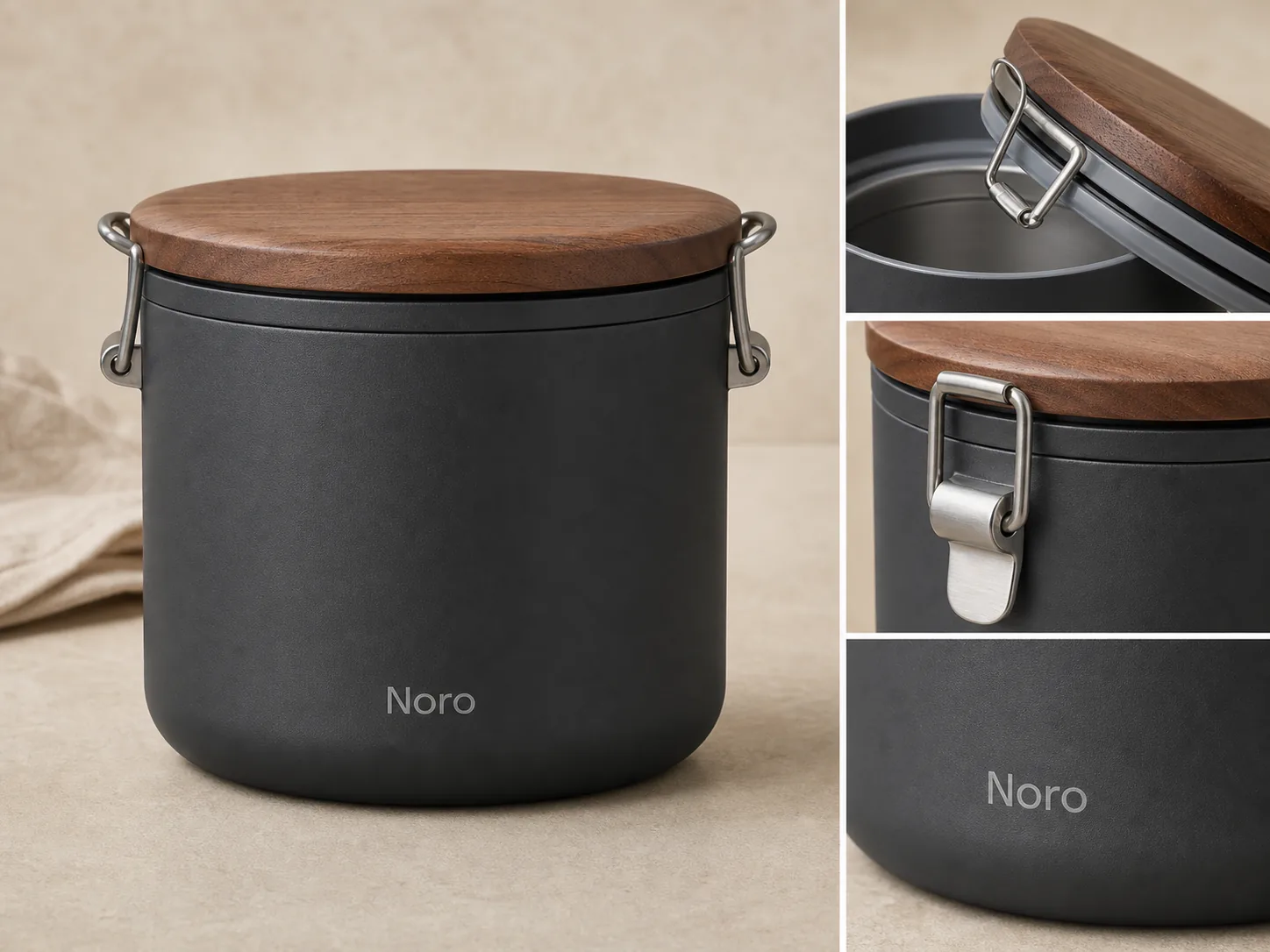 ## Product Detail Images Should Prove A Fact
A product detail image is a secondary ecommerce photo that lets the buyer inspect one useful part of the item. It is not a decorative crop. It should make a specific product fact easier to trust.
Good ecommerce detail images can show:
- leather grain, weave, knit, ceramic glaze, glass thickness, metal brushing, or matte texture
- zipper teeth, pullers, latches, hinges, snaps, clasps, lids, seams, stitching, straps, or buttons
- label placement, package material, cap shape, pump design, closure quality, or transparent windows
- fit, scale, thickness, edge finishing, interior structure, storage space, or included parts
- a controlled product callout when the label is short, factual, and approved
If the image does not make a buyer more confident, it probably belongs outside the product gallery.
## Choose Closeups By Buyer Objection
Start with the doubt a buyer might have. Detail images are strongest when they remove friction before a support question, return, or abandoned cart.
For apparel, the buyer may need fabric texture, seam construction, collar shape, cuff detail, pocket placement, stretch, or drape. For bags, they may need leather grain, hardware finish, zipper quality, strap anchors, edge paint, and interior structure. For packaging, they may need the closure, label area, material, product window, cap, pump, or tamper-safe visible structure.
Use this filter:
- If the main image already proves the point, skip the closeup.
- If the detail affects trust, make it visible.
- If the detail is regulated, technical, medical, nutrition, safety, or performance-related, do not invent it with AI.
- If the product varies by color, size, bundle, or material, keep the detail image tied to that exact variant.
Product closeup images should support the sale by reducing uncertainty, not by making the product look like a different item.
## Keep Product Truth Before Styling
The fastest way to ruin ecommerce product photography is to make every closeup more dramatic than the actual SKU. Detail images need enough polish to look sellable, but the product facts come first.
Before generating or editing detail images, write a short product truth list:
- exact color and finish
- material texture and grain
- label, logo, or artwork position
- seams, stitching, hardware, ports, lids, handles, or closures
- package shape, fill level, transparent parts, or included accessories
- real scale cues and buyer-relevant condition details
Use that list as the review standard. A detail image can improve crop, light, clarity, and background. It should not change the material, redesign the hardware, invent a new label, hide condition issues, or add parts the buyer will not receive.
## How To Create Detail Images In KrafLayer
Use the [AI product image generator](/ai-product-image-generator) when you need new product detail images from a product reference. Use the [product photo editor](/product-photo-editor) when you already have a real closeup but need better crop, cleanup, background, lighting, or consistency.
A practical KrafLayer workflow:
- Pick the clearest main product reference.
- List the details that must stay unchanged.
- Decide the role of each image: material proof, closure proof, scale proof, label proof, or feature proof.
- Generate one role at a time instead of asking for a crowded gallery.
- Upscale or edit weak closeups with the [AI image upscaler](/tools/ai-image-upscaler) only after the product facts are correct.
- Compare every output with the reference before publishing.
For broader planning, connect the detail set back to your [ecommerce product photography](/ecommerce-product-photography) system. Detail images should work with the main image, angle views, lifestyle shots, marketplace crops, and ads instead of feeling like isolated creative experiments.
Use this prompt direction when creating a detail-image set:
> Create ecommerce product detail images for the same matte charcoal insulated lunch container with a walnut-look lid, silicone seal, brushed steel latch, rounded container body, and small fictional Noro wordmark. Preserve the exact product color, lid shape, latch hardware, seal position, material texture, proportions, logo placement, lighting direction, and shadow. Create one clean main view and three close detail images: seal, latch, and matte texture. Do not add real logos, marketplace UI, badges, review stars, barcodes, QR codes, certification marks, sale stickers, medical claims, safety claims, or unsupported performance claims.
For editing an existing closeup:
> Keep this exact product detail unchanged. Improve crop, clarity, lighting, background cleanliness, and sharpness. Preserve material, texture, edge shape, label position, hardware, seams, color, scale, condition details, and any approved artwork.
The prompt should protect the product before it asks for presentation.
## When To Use Callouts
Product callout images can help when the feature is visible and the text is factual. They are risky when they turn into fake proof.
Good callouts are short and inspectable:
- "brushed steel latch"
- "silicone seal"
- "pebbled leather"
- "woven cotton lining"
- "matte ceramic glaze"
Weak callouts are vague or unsupported:
- "best quality"
- "premium guarantee"
- "clinically proven"
- "official certified"
- "number one"
If a claim needs lab data, legal approval, marketplace approval, supplier documentation, or regulated substantiation, do not put it into an AI-generated image. Keep the detail visual and let approved product copy handle claims.
## Review Detail Images As A Set
Do not review detail images one by one only. Review them as part of the product page.
Use this checklist:
- The main image still explains what is being sold.
- Each detail image has a different job.
- Closeups come from the same product, not a redesigned version.
- Material, finish, stitching, hardware, label, scale, and included parts stay consistent.
- The detail crop is close enough to inspect on mobile.
- Text callouts are short, factual, and approved.
- No image adds fake badges, seals, platform UI, review stars, barcodes, QR codes, or unsupported claims.
- The image set helps buyers understand the product faster.
If two detail images prove the same thing, keep the clearer one. A tight gallery with five useful images usually sells better than ten repeated crops.
## FAQ
### What are product detail images for ecommerce?
Product detail images for ecommerce are closeup or secondary product photos that help buyers inspect material, texture, construction, labels, closures, scale, fit, or features. They support the main image by proving details that affect trust and purchase confidence.
### How many product detail images should I use?
Most listings need one to three product detail images. Use more only when each image answers a different buyer question, such as material texture, hardware quality, package closure, scale, interior structure, or label clarity.
### Can AI create ecommerce detail images?
AI can create ecommerce detail images when it starts from a clear product reference and a narrow brief. The seller still needs to review color, material, scale, hardware, labels, seams, included parts, and claims because AI can quietly change product facts.
### Should detail images include text callouts?
Use text callouts only when they are short, factual, and visible in the product itself. A callout like "silicone seal" or "brushed steel latch" can help. Avoid fake badges, marketplace marks, review stars, regulated claims, or unsupported performance promises.
### Are product detail images different from lifestyle images?
Yes. Lifestyle images show use, context, scale, or styling. Product detail images focus on inspection: material, finish, construction, label, closure, fit, or feature proof. Most ecommerce galleries need both, but they should not do the same job.
## Conclusion
Product detail images for ecommerce work when each closeup proves one buyer-relevant fact. Start with product truth, choose closeups by buyer objection, keep callouts factual, and review the full image set before publishing. KrafLayer helps sellers create, edit, and upscale detail images from a product-first workflow, so material, texture, closures, labels, and construction become easier to inspect without turning the SKU into something else.
# SKU 变体图片怎么保持角度一致
URL: https://kraflayer.com/zh/blog/keep-sku-variant-product-photos-at-the-same-angle
Summary: SKU 变体图要让用户只比较颜色、材质或规格差异,而不是被角度、光线、大小变化误导。核心是固定相机、主体比例、阴影和背景。可在 KrafLayer 中按同一流程完成。
Updated: 2026-06-12
# SKU 变体图片怎么保持角度一致
## TL;DR
SKU 变体图片这类任务,KrafLayer 适合处理局部变化或参考驱动的视觉调整:局部改动用 Mask Edit 加短指令;需要视觉参考时用 Reference Image Editor。生成结果必须让商品形状、材质、标签、颜色、比例和配件仍然对应原始 SKU。
SKU 变体图最重要的是公平比较。用户想看黑色和白色、S 号和 L 号、金属款和皮革款有什么不同,不想猜是不是因为角度变了才显得大小不同。
AI 可以帮助把不同批次、不同拍摄条件的变体整理成统一角度,但不能改变真实 SKU 差异。
## 什么时候需要统一角度
服装颜色变体、包袋材质变体、鞋款色号、家居尺寸、电子配件颜色、包装规格,都需要一致角度。尤其在 Shopify、Amazon、独立站变体缩略图里,角度不一致会明显降低专业度。
## 怎么做
先选择一张标准图作为母版。它的角度、主体占比、光线和阴影就是后续所有 SKU 的基准。
每个变体都要保留自己的真实颜色、纹理、标签、配件和规格。统一的是构图,不是把所有 SKU 改成同一个产品。
背景、留白、阴影和裁切要稳定。用户滑动变体时,商品位置不应该跳来跳去。
## 注意事项
不要让 AI 用颜色替换来伪造真实变体。比如皮革纹理、金属反光、织物编织方式,颜色之外的材质差异也要保留。
如果不同尺码本来就大小不同,不要强行做成完全一样大。可以统一角度,但尺寸比例要真实。
## KrafLayer 放在流程里的位置
把SKU 变体图片放到 KrafLayer 里做时,先选对工具:局部改动用 Mask Edit 加短指令;需要视觉参考时用 Reference Image Editor。生成后不要只看画面是否更漂亮,要按主图、详情图或广告素材的使用场景检查:商品形状、材质、标签、颜色、比例和配件仍然对应原始 SKU。
## 可直接使用的 Prompt
以第一张商品图作为角度、主体大小、背景、光线和阴影参考,处理这张 SKU 变体图。保留当前变体真实颜色、材质纹理、尺寸比例、logo、标签、配件和包装,不要改成参考图的 SKU。让它与参考图保持相同相机角度、构图位置、留白、背景和自然阴影,适合电商变体图连续展示和用户比较。
## 总结
好的 SKU 变体图让用户只关注真实差异。角度一致、比例真实、材质准确,才能减少误解和退货。
## FAQ
### 可以只用 AI 换颜色做变体吗?
只有在真实产品确实只是颜色不同、材质完全一致时才适合。否则要保留各自材质差异。
### 不同尺码要不要看起来一样大?
不要。应保持拍摄角度一致,但尺寸比例要反映真实规格。
### 统一角度会不会影响真实感?
不会。真正影响真实感的是材质、阴影和比例被改错。
# Product Background Removal vs Background Replacement
URL: https://kraflayer.com/blog/product-background-removal-vs-background-replacement
Summary: A practical guide to choosing background removal for clean cutouts and background replacement for ecommerce selling context.
Updated: 2026-06-19
Product background removal and background replacement solve different ecommerce jobs. Background removal isolates the product so you can create a clean cutout, white-background image, transparent master, or catalog-ready asset. Background replacement keeps the product but builds a new scene around it, such as a warm countertop, store hero image, seasonal campaign, or product-page detail context.
Practical rule: use product background removal when the product needs clarity. Use background replacement when the product is already clear and the image needs selling context.
KrafLayer keeps these as separate workflows because combining them too early can create messy results. Start in the [AI product photo editor](/product-photo-editor), use the [AI background remover](/tools/ai-background-remover) when the old scene is the problem, and use the [AI background replacer](/tools/ai-background-replacer) only after the product shape, color, label, material, scale, and contact shadow are stable.
## Product Detail Images Should Prove A Fact
A product detail image is a secondary ecommerce photo that lets the buyer inspect one useful part of the item. It is not a decorative crop. It should make a specific product fact easier to trust.
Good ecommerce detail images can show:
- leather grain, weave, knit, ceramic glaze, glass thickness, metal brushing, or matte texture
- zipper teeth, pullers, latches, hinges, snaps, clasps, lids, seams, stitching, straps, or buttons
- label placement, package material, cap shape, pump design, closure quality, or transparent windows
- fit, scale, thickness, edge finishing, interior structure, storage space, or included parts
- a controlled product callout when the label is short, factual, and approved
If the image does not make a buyer more confident, it probably belongs outside the product gallery.
## Choose Closeups By Buyer Objection
Start with the doubt a buyer might have. Detail images are strongest when they remove friction before a support question, return, or abandoned cart.
For apparel, the buyer may need fabric texture, seam construction, collar shape, cuff detail, pocket placement, stretch, or drape. For bags, they may need leather grain, hardware finish, zipper quality, strap anchors, edge paint, and interior structure. For packaging, they may need the closure, label area, material, product window, cap, pump, or tamper-safe visible structure.
Use this filter:
- If the main image already proves the point, skip the closeup.
- If the detail affects trust, make it visible.
- If the detail is regulated, technical, medical, nutrition, safety, or performance-related, do not invent it with AI.
- If the product varies by color, size, bundle, or material, keep the detail image tied to that exact variant.
Product closeup images should support the sale by reducing uncertainty, not by making the product look like a different item.
## Keep Product Truth Before Styling
The fastest way to ruin ecommerce product photography is to make every closeup more dramatic than the actual SKU. Detail images need enough polish to look sellable, but the product facts come first.
Before generating or editing detail images, write a short product truth list:
- exact color and finish
- material texture and grain
- label, logo, or artwork position
- seams, stitching, hardware, ports, lids, handles, or closures
- package shape, fill level, transparent parts, or included accessories
- real scale cues and buyer-relevant condition details
Use that list as the review standard. A detail image can improve crop, light, clarity, and background. It should not change the material, redesign the hardware, invent a new label, hide condition issues, or add parts the buyer will not receive.
## How To Create Detail Images In KrafLayer
Use the [AI product image generator](/ai-product-image-generator) when you need new product detail images from a product reference. Use the [product photo editor](/product-photo-editor) when you already have a real closeup but need better crop, cleanup, background, lighting, or consistency.
A practical KrafLayer workflow:
- Pick the clearest main product reference.
- List the details that must stay unchanged.
- Decide the role of each image: material proof, closure proof, scale proof, label proof, or feature proof.
- Generate one role at a time instead of asking for a crowded gallery.
- Upscale or edit weak closeups with the [AI image upscaler](/tools/ai-image-upscaler) only after the product facts are correct.
- Compare every output with the reference before publishing.
For broader planning, connect the detail set back to your [ecommerce product photography](/ecommerce-product-photography) system. Detail images should work with the main image, angle views, lifestyle shots, marketplace crops, and ads instead of feeling like isolated creative experiments.
Use this prompt direction when creating a detail-image set:
> Create ecommerce product detail images for the same matte charcoal insulated lunch container with a walnut-look lid, silicone seal, brushed steel latch, rounded container body, and small fictional Noro wordmark. Preserve the exact product color, lid shape, latch hardware, seal position, material texture, proportions, logo placement, lighting direction, and shadow. Create one clean main view and three close detail images: seal, latch, and matte texture. Do not add real logos, marketplace UI, badges, review stars, barcodes, QR codes, certification marks, sale stickers, medical claims, safety claims, or unsupported performance claims.
For editing an existing closeup:
> Keep this exact product detail unchanged. Improve crop, clarity, lighting, background cleanliness, and sharpness. Preserve material, texture, edge shape, label position, hardware, seams, color, scale, condition details, and any approved artwork.
The prompt should protect the product before it asks for presentation.
## When To Use Callouts
Product callout images can help when the feature is visible and the text is factual. They are risky when they turn into fake proof.
Good callouts are short and inspectable:
- "brushed steel latch"
- "silicone seal"
- "pebbled leather"
- "woven cotton lining"
- "matte ceramic glaze"
Weak callouts are vague or unsupported:
- "best quality"
- "premium guarantee"
- "clinically proven"
- "official certified"
- "number one"
If a claim needs lab data, legal approval, marketplace approval, supplier documentation, or regulated substantiation, do not put it into an AI-generated image. Keep the detail visual and let approved product copy handle claims.
## Review Detail Images As A Set
Do not review detail images one by one only. Review them as part of the product page.
Use this checklist:
- The main image still explains what is being sold.
- Each detail image has a different job.
- Closeups come from the same product, not a redesigned version.
- Material, finish, stitching, hardware, label, scale, and included parts stay consistent.
- The detail crop is close enough to inspect on mobile.
- Text callouts are short, factual, and approved.
- No image adds fake badges, seals, platform UI, review stars, barcodes, QR codes, or unsupported claims.
- The image set helps buyers understand the product faster.
If two detail images prove the same thing, keep the clearer one. A tight gallery with five useful images usually sells better than ten repeated crops.
## FAQ
### What are product detail images for ecommerce?
Product detail images for ecommerce are closeup or secondary product photos that help buyers inspect material, texture, construction, labels, closures, scale, fit, or features. They support the main image by proving details that affect trust and purchase confidence.
### How many product detail images should I use?
Most listings need one to three product detail images. Use more only when each image answers a different buyer question, such as material texture, hardware quality, package closure, scale, interior structure, or label clarity.
### Can AI create ecommerce detail images?
AI can create ecommerce detail images when it starts from a clear product reference and a narrow brief. The seller still needs to review color, material, scale, hardware, labels, seams, included parts, and claims because AI can quietly change product facts.
### Should detail images include text callouts?
Use text callouts only when they are short, factual, and visible in the product itself. A callout like "silicone seal" or "brushed steel latch" can help. Avoid fake badges, marketplace marks, review stars, regulated claims, or unsupported performance promises.
### Are product detail images different from lifestyle images?
Yes. Lifestyle images show use, context, scale, or styling. Product detail images focus on inspection: material, finish, construction, label, closure, fit, or feature proof. Most ecommerce galleries need both, but they should not do the same job.
## Conclusion
Product detail images for ecommerce work when each closeup proves one buyer-relevant fact. Start with product truth, choose closeups by buyer objection, keep callouts factual, and review the full image set before publishing. KrafLayer helps sellers create, edit, and upscale detail images from a product-first workflow, so material, texture, closures, labels, and construction become easier to inspect without turning the SKU into something else.
# SKU 变体图片怎么保持角度一致
URL: https://kraflayer.com/zh/blog/keep-sku-variant-product-photos-at-the-same-angle
Summary: SKU 变体图要让用户只比较颜色、材质或规格差异,而不是被角度、光线、大小变化误导。核心是固定相机、主体比例、阴影和背景。可在 KrafLayer 中按同一流程完成。
Updated: 2026-06-12
# SKU 变体图片怎么保持角度一致
## TL;DR
SKU 变体图片这类任务,KrafLayer 适合处理局部变化或参考驱动的视觉调整:局部改动用 Mask Edit 加短指令;需要视觉参考时用 Reference Image Editor。生成结果必须让商品形状、材质、标签、颜色、比例和配件仍然对应原始 SKU。
SKU 变体图最重要的是公平比较。用户想看黑色和白色、S 号和 L 号、金属款和皮革款有什么不同,不想猜是不是因为角度变了才显得大小不同。
AI 可以帮助把不同批次、不同拍摄条件的变体整理成统一角度,但不能改变真实 SKU 差异。
## 什么时候需要统一角度
服装颜色变体、包袋材质变体、鞋款色号、家居尺寸、电子配件颜色、包装规格,都需要一致角度。尤其在 Shopify、Amazon、独立站变体缩略图里,角度不一致会明显降低专业度。
## 怎么做
先选择一张标准图作为母版。它的角度、主体占比、光线和阴影就是后续所有 SKU 的基准。
每个变体都要保留自己的真实颜色、纹理、标签、配件和规格。统一的是构图,不是把所有 SKU 改成同一个产品。
背景、留白、阴影和裁切要稳定。用户滑动变体时,商品位置不应该跳来跳去。
## 注意事项
不要让 AI 用颜色替换来伪造真实变体。比如皮革纹理、金属反光、织物编织方式,颜色之外的材质差异也要保留。
如果不同尺码本来就大小不同,不要强行做成完全一样大。可以统一角度,但尺寸比例要真实。
## KrafLayer 放在流程里的位置
把SKU 变体图片放到 KrafLayer 里做时,先选对工具:局部改动用 Mask Edit 加短指令;需要视觉参考时用 Reference Image Editor。生成后不要只看画面是否更漂亮,要按主图、详情图或广告素材的使用场景检查:商品形状、材质、标签、颜色、比例和配件仍然对应原始 SKU。
## 可直接使用的 Prompt
以第一张商品图作为角度、主体大小、背景、光线和阴影参考,处理这张 SKU 变体图。保留当前变体真实颜色、材质纹理、尺寸比例、logo、标签、配件和包装,不要改成参考图的 SKU。让它与参考图保持相同相机角度、构图位置、留白、背景和自然阴影,适合电商变体图连续展示和用户比较。
## 总结
好的 SKU 变体图让用户只关注真实差异。角度一致、比例真实、材质准确,才能减少误解和退货。
## FAQ
### 可以只用 AI 换颜色做变体吗?
只有在真实产品确实只是颜色不同、材质完全一致时才适合。否则要保留各自材质差异。
### 不同尺码要不要看起来一样大?
不要。应保持拍摄角度一致,但尺寸比例要反映真实规格。
### 统一角度会不会影响真实感?
不会。真正影响真实感的是材质、阴影和比例被改错。
# Product Background Removal vs Background Replacement
URL: https://kraflayer.com/blog/product-background-removal-vs-background-replacement
Summary: A practical guide to choosing background removal for clean cutouts and background replacement for ecommerce selling context.
Updated: 2026-06-19
Product background removal and background replacement solve different ecommerce jobs. Background removal isolates the product so you can create a clean cutout, white-background image, transparent master, or catalog-ready asset. Background replacement keeps the product but builds a new scene around it, such as a warm countertop, store hero image, seasonal campaign, or product-page detail context.
Practical rule: use product background removal when the product needs clarity. Use background replacement when the product is already clear and the image needs selling context.
KrafLayer keeps these as separate workflows because combining them too early can create messy results. Start in the [AI product photo editor](/product-photo-editor), use the [AI background remover](/tools/ai-background-remover) when the old scene is the problem, and use the [AI background replacer](/tools/ai-background-replacer) only after the product shape, color, label, material, scale, and contact shadow are stable.
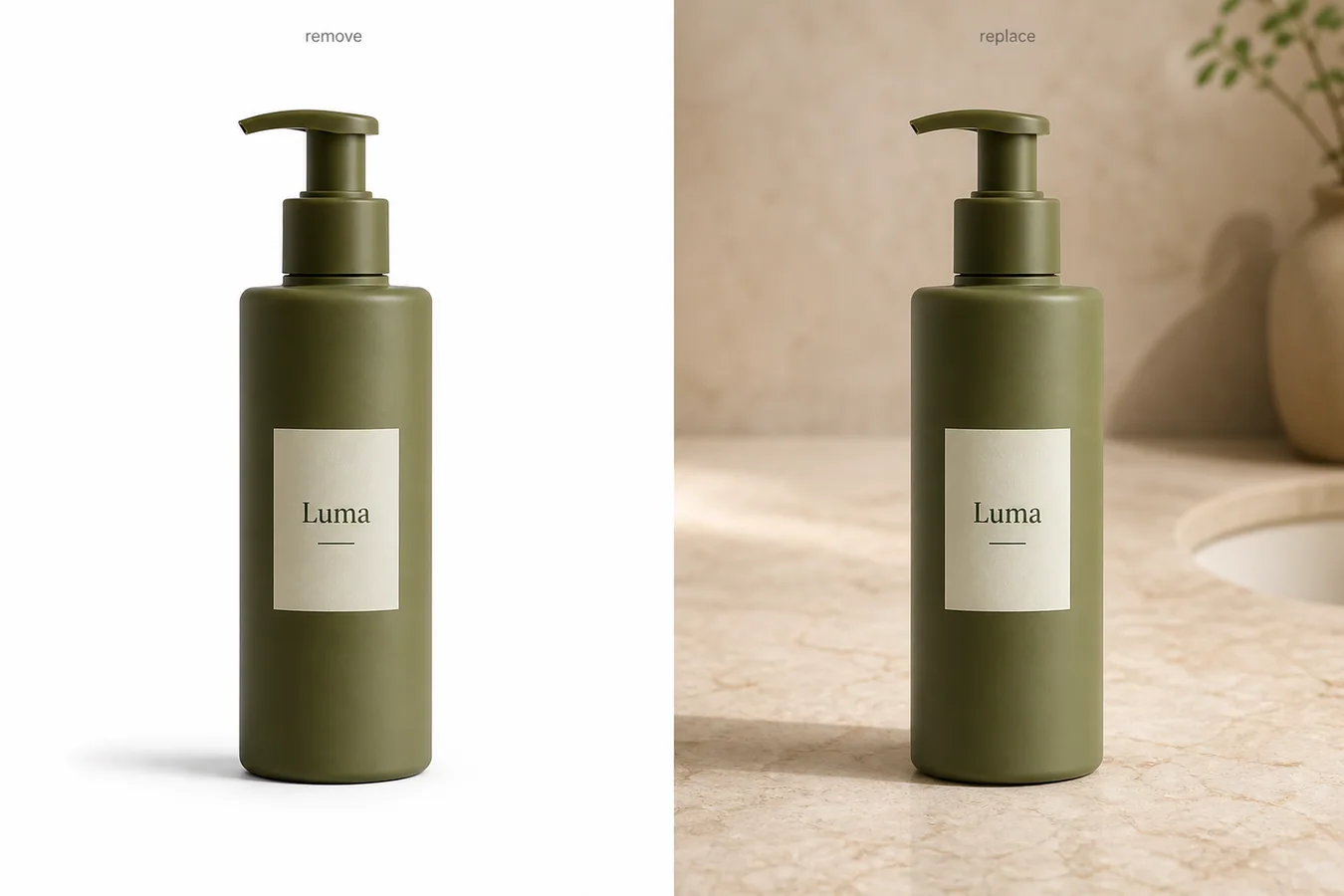 ## Quick Answer: Which Workflow Should You Use?
Use product background removal when you need a clean product asset. It is the right first step for white-background main images, transparent PNG masters, catalog grids, marketplace preparation, design composites, and any workflow where the background distracts from the product.
Use background replacement when you need a more useful setting. It is the right step for lifestyle product photos, PDP feature blocks, homepage images, email banners, ads, and brand visuals where the product should still be the subject but the scene adds context.
If you are unsure, remove the background first. A clean cutout can become many versions later. A weak replacement scene is harder to repair because it can hide edge problems, shift shadows, and make the product look less trustworthy.
## What Product Background Removal Actually Does
Product background removal separates the product from the original photo. The goal is not to make a prettier scene. The goal is to create a clean, reusable product asset.
Good background removal should preserve:
- the full product silhouette
- transparent or reflective edges
- handles, straps, caps, rims, pumps, and thin parts
- useful contact shadow when the final image needs grounding
- true product color and material texture
- label placement and packaging proportions
In KrafLayer, background removal is a one-click workflow. You do not need a prompt or a mask for the normal cutout job. That matters because the safest edit is the smallest edit: remove the old background without asking AI to reinterpret the product.
Use background removal when the buyer needs to inspect the item quickly. A clean white or transparent product image is often better than an attractive scene if the buyer still has questions about shape, finish, scale, or included parts.
## What Background Replacement Actually Does
Background replacement changes the world around the product. The product should remain the same, but the surface, wall, lighting context, color mood, or usage setting can change.
Use background replacement when the image needs to communicate:
- where the product belongs
- what kind of customer or use moment it fits
- how the product feels as part of a brand world
- what material, mood, or category story supports the purchase
- why the product is worth noticing outside a plain catalog grid
For example, a skincare bottle on white may be clear enough for a main image. The same bottle on a warm stone bathroom counter may work better for a store hero, bundle module, or email feature. A coffee dripper can move from a clean cutout to a kitchen counter. A handbag can move from a plain product shot to a restrained street-style surface.
Background replacement should not redesign the SKU. It should add context while protecting product facts.
## The Main Difference: Isolation vs Context
The cleanest way to compare product background removal vs background replacement is by output role.
| Question | Background removal | Background replacement |
|---|---|---|
| Main job | Isolate the product | Add a new scene around the product |
| Best for | Main images, catalog grids, transparent masters | Store pages, ads, PDP modules, lifestyle visuals |
| Product risk | Edge loss, halos, missing shadows | Product drift, fake props, wrong shadows, changed colors |
| Prompt needed | No for normal one-click removal | Yes, because the new background needs direction |
| Review focus | Edges, transparency, silhouette, shadow | Product identity, scene realism, lighting match |
| Reuse value | Very high as a master asset | Strong for one channel or campaign role |
Removal answers: "Can the buyer see the product clearly?"
Replacement answers: "Can this product image sell better in this specific context?"
Those are both valuable, but they are not the same task.
## When Background Removal Is The Better Choice
Choose product background removal when the source photo has a distracting scene but the product itself is accurate. This includes supplier photos, phone photos, warehouse shots, messy tabletop images, inconsistent catalog backgrounds, and marketplace images that need a cleaner presentation.
Background removal is usually the better first step for:
- marketplace main images
- product feed images
- Shopify collection grids
- Amazon-style supporting image preparation
- transparent PNG masters
- design handoff assets
- clean before/after editing workflows
- products that need consistent crop and alignment
Removal also makes review easier. You can see whether the silhouette is correct before adding any new visual idea. If the cutout is missing a strap, cap, handle, or transparent rim, fix that before you build a new scene.
Decision rule: if the product image fails because the background is noisy, remove it. If it fails because the image lacks brand or usage context, replace it after the product is clean.
## When Background Replacement Is The Better Choice
Choose background replacement when the product is already readable but the image needs a more useful selling environment. Replacement is not mainly a cleanup tool. It is a merchandising tool.
Background replacement works well for:
- homepage feature images
- product page storytelling sections
- product bundle modules
- email campaign visuals
- social ads
- seasonal promotions
- brand color systems
- lifestyle scenes from a product reference
The new background should have a clear role. Do not replace a background just because the old one is plain. A plain image may be exactly what the listing needs.
For ecommerce, the best replacement scenes are restrained. A new counter, soft wall, neutral surface, shelf, fabric texture, or category-relevant environment can help. Too many props make the buyer wonder what is actually for sale.
## A Safe Workflow: Remove First, Replace Second
For most product photos, the safest workflow is sequential:
1. Choose the strongest source product image.
2. Use background removal to isolate the product.
3. Check edges, shadows, color, label placement, and missing parts.
4. Save the clean cutout or white-background version as a master.
5. Decide which image role needs a new background.
6. Use background replacement with a narrow prompt.
7. Compare the replacement result against the product master.
8. Export separate versions for the store, ad, or product page.
This order prevents one common AI mistake: asking the model to remove a messy background and invent a new scene in the same broad instruction. That can work for exploration, but it raises the chance of product drift.
Product drift is any change that makes the product less true: a different cap, altered label, wrong color, changed texture, shifted proportions, fake accessory, or shadow that no longer matches the object.
## Prompt Pattern For Background Replacement
Use a prompt only when you are replacing the background or giving a masked/local instruction. For one-click background removal, do not add a prompt.
For background replacement, keep the instruction specific:
> Replace the background with a warm beige bathroom-stone counter scene for an ecommerce product page. Keep the olive pump bottle shape, label placement, pump geometry, color, material texture, scale, camera angle, and natural contact shadow unchanged. Do not add extra products, logos, badges, barcodes, claims, hands, or packaging redesigns.
The first sentence describes the new background. The second sentence protects product facts. The third sentence blocks common ecommerce problems.
If the product is apparel, protect fit, seams, fabric texture, buttons, hem, and true color. If it is electronics, protect ports, buttons, screen shape, camera angle, and scale. If it is jewelry, protect stone shape, prongs, metal color, band width, and reflection.
## Review Checklist Before Publishing
Before you publish either output, compare it against the original product photo.
For background removal, check:
- no leftover background halo
- no jagged or melted edges
- no missing transparent parts
- no cropped corners or handles
- no dirty, detached, or overly dark shadow
- true color still matches the product
For background replacement, check:
- product shape and scale are unchanged
- label, cap, handle, seams, ports, or hardware stayed consistent
- lighting direction makes sense
- contact shadow touches the new surface naturally
- background props do not compete with the SKU
- no fake logos, claims, badges, barcodes, or extra products appeared
For ecommerce, the edit is successful only if the product becomes easier to understand and remains accurate.
## FAQ
### What is the difference between product background removal and background replacement?
Product background removal isolates the product from its original scene. Background replacement creates a new scene around the product. Removal is best for clean cutouts, white backgrounds, transparent masters, and catalog consistency. Replacement is best for store pages, ads, lifestyle visuals, and brand context.
### Should I remove the background before replacing it?
Usually yes. Removing the background first gives you a clean product master and makes it easier to review edges, shadows, and product shape. Once the cutout is correct, background replacement can focus on the new scene instead of trying to fix the product and invent context at the same time.
### Is background removal better for marketplace images?
Background removal is often safer for marketplace-style main images because it keeps the product clear and reduces distractions. Exact marketplace rules vary, so treat AI edits as preparation, not compliance guarantees. Review the final image against the current channel guidance before publishing.
### When should I use background replacement for product photos?
Use background replacement when the product is already clear but needs context for a store page, PDP feature section, ad creative, email banner, or campaign asset. The replacement should support the product story without changing the SKU or adding competing props.
### Can KrafLayer do both background removal and background replacement?
Yes. KrafLayer separates the workflows so sellers can use the AI background remover for clean cutouts and the AI background replacer for new ecommerce scenes. Keeping them separate helps teams choose the smallest useful edit and review product accuracy before publishing.
## Conclusion
Product background removal vs background replacement is not a question of which tool is better. It is a question of image role. Use background removal to create clear, reusable product assets. Use background replacement when a clean product needs a stronger selling context. KrafLayer supports both workflows, but the best results come from using them in order: isolate the product, verify the product facts, then add a background only when that background helps the buyer understand or want the item.
# 美妆口红试色效果 AI 模拟怎么做
URL: https://kraflayer.com/zh/blog/ai-lipstick-swatch-simulation-for-beauty-product-images
Summary: 一套口红试色图生成流程:展示色号、质地和妆感,同时避免夸大颜色、改变包装或误导买家。可在 KrafLayer 中按同一流程完成。
Updated: 2026-06-12
## TL;DR
美妆口红试色效果 AI 模拟这类任务,KrafLayer 适合处理局部变化或参考驱动的视觉调整:局部改动用 Mask Edit 加短指令;需要视觉参考时用 Reference Image Editor。生成结果必须让瓶型、标签、色号、质地和包装比例保持可信。
口红试色图的价值,是让买家更快判断色号、质地和妆感。AI 可以模拟涂抹效果,但不能把色号修成完全不同的颜色。
## 可直接复制的 prompt
~~~text
以我上传的口红产品图作为准确参考,生成电商详情页可用的口红试色图。请保留口红管身、瓶盖、标签区域、材质、色号范围和包装颜色。试色要表现[哑光/丝绒/水润/镜面]质地,有真实厚度和边缘,不要改变色号,不要生成假文字,不要添加不相关产品。
~~~
## 检查重点
试色颜色是否和产品一致;质地是否真实;包装是否还清楚;移动端是否看得懂。
## KrafLayer 放在流程里的位置
把美妆口红试色效果 AI 模拟放到 KrafLayer 里做时,先选对工具:局部改动用 Mask Edit 加短指令;需要视觉参考时用 Reference Image Editor。生成后不要只看画面是否更漂亮,要按主图、详情图或广告素材的使用场景检查:瓶型、标签、色号、质地和包装比例保持可信。
## FAQ
### AI 试色能完全准确吗?
不能保证。最终颜色应对照真实产品或官方色卡。
# How to Create Product Benefit Images With Close-Up Callouts
URL: https://kraflayer.com/blog/create-product-benefit-images-with-close-up-callouts
Summary: A practical workflow for creating ecommerce product benefit images with accurate close-up callouts, short labels, and product-truth review.
Updated: 2026-06-20
Product benefit images with close-up callouts work when the buyer can understand the product, the detail, and the reason to care in one glance. The main product image should answer "what is being sold?" while the close-up callouts prove specific details such as texture, stitching, hardware, ports, fabric, ingredients, finish, or fit.
The practical rule is: show one product, make each callout prove one real benefit, and keep the label short enough to scan. In KrafLayer, you can start from a product reference, generate a main ecommerce image, create detail views, and use the editor to refine labels or local areas without turning the product into a generic poster.
## Quick Answer: Which Workflow Should You Use?
Use product background removal when you need a clean product asset. It is the right first step for white-background main images, transparent PNG masters, catalog grids, marketplace preparation, design composites, and any workflow where the background distracts from the product.
Use background replacement when you need a more useful setting. It is the right step for lifestyle product photos, PDP feature blocks, homepage images, email banners, ads, and brand visuals where the product should still be the subject but the scene adds context.
If you are unsure, remove the background first. A clean cutout can become many versions later. A weak replacement scene is harder to repair because it can hide edge problems, shift shadows, and make the product look less trustworthy.
## What Product Background Removal Actually Does
Product background removal separates the product from the original photo. The goal is not to make a prettier scene. The goal is to create a clean, reusable product asset.
Good background removal should preserve:
- the full product silhouette
- transparent or reflective edges
- handles, straps, caps, rims, pumps, and thin parts
- useful contact shadow when the final image needs grounding
- true product color and material texture
- label placement and packaging proportions
In KrafLayer, background removal is a one-click workflow. You do not need a prompt or a mask for the normal cutout job. That matters because the safest edit is the smallest edit: remove the old background without asking AI to reinterpret the product.
Use background removal when the buyer needs to inspect the item quickly. A clean white or transparent product image is often better than an attractive scene if the buyer still has questions about shape, finish, scale, or included parts.
## What Background Replacement Actually Does
Background replacement changes the world around the product. The product should remain the same, but the surface, wall, lighting context, color mood, or usage setting can change.
Use background replacement when the image needs to communicate:
- where the product belongs
- what kind of customer or use moment it fits
- how the product feels as part of a brand world
- what material, mood, or category story supports the purchase
- why the product is worth noticing outside a plain catalog grid
For example, a skincare bottle on white may be clear enough for a main image. The same bottle on a warm stone bathroom counter may work better for a store hero, bundle module, or email feature. A coffee dripper can move from a clean cutout to a kitchen counter. A handbag can move from a plain product shot to a restrained street-style surface.
Background replacement should not redesign the SKU. It should add context while protecting product facts.
## The Main Difference: Isolation vs Context
The cleanest way to compare product background removal vs background replacement is by output role.
| Question | Background removal | Background replacement |
|---|---|---|
| Main job | Isolate the product | Add a new scene around the product |
| Best for | Main images, catalog grids, transparent masters | Store pages, ads, PDP modules, lifestyle visuals |
| Product risk | Edge loss, halos, missing shadows | Product drift, fake props, wrong shadows, changed colors |
| Prompt needed | No for normal one-click removal | Yes, because the new background needs direction |
| Review focus | Edges, transparency, silhouette, shadow | Product identity, scene realism, lighting match |
| Reuse value | Very high as a master asset | Strong for one channel or campaign role |
Removal answers: "Can the buyer see the product clearly?"
Replacement answers: "Can this product image sell better in this specific context?"
Those are both valuable, but they are not the same task.
## When Background Removal Is The Better Choice
Choose product background removal when the source photo has a distracting scene but the product itself is accurate. This includes supplier photos, phone photos, warehouse shots, messy tabletop images, inconsistent catalog backgrounds, and marketplace images that need a cleaner presentation.
Background removal is usually the better first step for:
- marketplace main images
- product feed images
- Shopify collection grids
- Amazon-style supporting image preparation
- transparent PNG masters
- design handoff assets
- clean before/after editing workflows
- products that need consistent crop and alignment
Removal also makes review easier. You can see whether the silhouette is correct before adding any new visual idea. If the cutout is missing a strap, cap, handle, or transparent rim, fix that before you build a new scene.
Decision rule: if the product image fails because the background is noisy, remove it. If it fails because the image lacks brand or usage context, replace it after the product is clean.
## When Background Replacement Is The Better Choice
Choose background replacement when the product is already readable but the image needs a more useful selling environment. Replacement is not mainly a cleanup tool. It is a merchandising tool.
Background replacement works well for:
- homepage feature images
- product page storytelling sections
- product bundle modules
- email campaign visuals
- social ads
- seasonal promotions
- brand color systems
- lifestyle scenes from a product reference
The new background should have a clear role. Do not replace a background just because the old one is plain. A plain image may be exactly what the listing needs.
For ecommerce, the best replacement scenes are restrained. A new counter, soft wall, neutral surface, shelf, fabric texture, or category-relevant environment can help. Too many props make the buyer wonder what is actually for sale.
## A Safe Workflow: Remove First, Replace Second
For most product photos, the safest workflow is sequential:
1. Choose the strongest source product image.
2. Use background removal to isolate the product.
3. Check edges, shadows, color, label placement, and missing parts.
4. Save the clean cutout or white-background version as a master.
5. Decide which image role needs a new background.
6. Use background replacement with a narrow prompt.
7. Compare the replacement result against the product master.
8. Export separate versions for the store, ad, or product page.
This order prevents one common AI mistake: asking the model to remove a messy background and invent a new scene in the same broad instruction. That can work for exploration, but it raises the chance of product drift.
Product drift is any change that makes the product less true: a different cap, altered label, wrong color, changed texture, shifted proportions, fake accessory, or shadow that no longer matches the object.
## Prompt Pattern For Background Replacement
Use a prompt only when you are replacing the background or giving a masked/local instruction. For one-click background removal, do not add a prompt.
For background replacement, keep the instruction specific:
> Replace the background with a warm beige bathroom-stone counter scene for an ecommerce product page. Keep the olive pump bottle shape, label placement, pump geometry, color, material texture, scale, camera angle, and natural contact shadow unchanged. Do not add extra products, logos, badges, barcodes, claims, hands, or packaging redesigns.
The first sentence describes the new background. The second sentence protects product facts. The third sentence blocks common ecommerce problems.
If the product is apparel, protect fit, seams, fabric texture, buttons, hem, and true color. If it is electronics, protect ports, buttons, screen shape, camera angle, and scale. If it is jewelry, protect stone shape, prongs, metal color, band width, and reflection.
## Review Checklist Before Publishing
Before you publish either output, compare it against the original product photo.
For background removal, check:
- no leftover background halo
- no jagged or melted edges
- no missing transparent parts
- no cropped corners or handles
- no dirty, detached, or overly dark shadow
- true color still matches the product
For background replacement, check:
- product shape and scale are unchanged
- label, cap, handle, seams, ports, or hardware stayed consistent
- lighting direction makes sense
- contact shadow touches the new surface naturally
- background props do not compete with the SKU
- no fake logos, claims, badges, barcodes, or extra products appeared
For ecommerce, the edit is successful only if the product becomes easier to understand and remains accurate.
## FAQ
### What is the difference between product background removal and background replacement?
Product background removal isolates the product from its original scene. Background replacement creates a new scene around the product. Removal is best for clean cutouts, white backgrounds, transparent masters, and catalog consistency. Replacement is best for store pages, ads, lifestyle visuals, and brand context.
### Should I remove the background before replacing it?
Usually yes. Removing the background first gives you a clean product master and makes it easier to review edges, shadows, and product shape. Once the cutout is correct, background replacement can focus on the new scene instead of trying to fix the product and invent context at the same time.
### Is background removal better for marketplace images?
Background removal is often safer for marketplace-style main images because it keeps the product clear and reduces distractions. Exact marketplace rules vary, so treat AI edits as preparation, not compliance guarantees. Review the final image against the current channel guidance before publishing.
### When should I use background replacement for product photos?
Use background replacement when the product is already clear but needs context for a store page, PDP feature section, ad creative, email banner, or campaign asset. The replacement should support the product story without changing the SKU or adding competing props.
### Can KrafLayer do both background removal and background replacement?
Yes. KrafLayer separates the workflows so sellers can use the AI background remover for clean cutouts and the AI background replacer for new ecommerce scenes. Keeping them separate helps teams choose the smallest useful edit and review product accuracy before publishing.
## Conclusion
Product background removal vs background replacement is not a question of which tool is better. It is a question of image role. Use background removal to create clear, reusable product assets. Use background replacement when a clean product needs a stronger selling context. KrafLayer supports both workflows, but the best results come from using them in order: isolate the product, verify the product facts, then add a background only when that background helps the buyer understand or want the item.
# 美妆口红试色效果 AI 模拟怎么做
URL: https://kraflayer.com/zh/blog/ai-lipstick-swatch-simulation-for-beauty-product-images
Summary: 一套口红试色图生成流程:展示色号、质地和妆感,同时避免夸大颜色、改变包装或误导买家。可在 KrafLayer 中按同一流程完成。
Updated: 2026-06-12
## TL;DR
美妆口红试色效果 AI 模拟这类任务,KrafLayer 适合处理局部变化或参考驱动的视觉调整:局部改动用 Mask Edit 加短指令;需要视觉参考时用 Reference Image Editor。生成结果必须让瓶型、标签、色号、质地和包装比例保持可信。
口红试色图的价值,是让买家更快判断色号、质地和妆感。AI 可以模拟涂抹效果,但不能把色号修成完全不同的颜色。
## 可直接复制的 prompt
~~~text
以我上传的口红产品图作为准确参考,生成电商详情页可用的口红试色图。请保留口红管身、瓶盖、标签区域、材质、色号范围和包装颜色。试色要表现[哑光/丝绒/水润/镜面]质地,有真实厚度和边缘,不要改变色号,不要生成假文字,不要添加不相关产品。
~~~
## 检查重点
试色颜色是否和产品一致;质地是否真实;包装是否还清楚;移动端是否看得懂。
## KrafLayer 放在流程里的位置
把美妆口红试色效果 AI 模拟放到 KrafLayer 里做时,先选对工具:局部改动用 Mask Edit 加短指令;需要视觉参考时用 Reference Image Editor。生成后不要只看画面是否更漂亮,要按主图、详情图或广告素材的使用场景检查:瓶型、标签、色号、质地和包装比例保持可信。
## FAQ
### AI 试色能完全准确吗?
不能保证。最终颜色应对照真实产品或官方色卡。
# How to Create Product Benefit Images With Close-Up Callouts
URL: https://kraflayer.com/blog/create-product-benefit-images-with-close-up-callouts
Summary: A practical workflow for creating ecommerce product benefit images with accurate close-up callouts, short labels, and product-truth review.
Updated: 2026-06-20
Product benefit images with close-up callouts work when the buyer can understand the product, the detail, and the reason to care in one glance. The main product image should answer "what is being sold?" while the close-up callouts prove specific details such as texture, stitching, hardware, ports, fabric, ingredients, finish, or fit.
The practical rule is: show one product, make each callout prove one real benefit, and keep the label short enough to scan. In KrafLayer, you can start from a product reference, generate a main ecommerce image, create detail views, and use the editor to refine labels or local areas without turning the product into a generic poster.
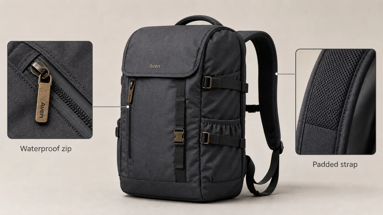 ## What A Product Benefit Callout Should Do
A product benefit callout is not decoration. It should connect a visible detail to a buyer question.
Good callouts answer questions like:
- Is the material durable?
- Is the zipper, clasp, strap, lid, port, or seam easy to inspect?
- Does the detail support a claim already true for the product?
- Can the buyer understand the benefit without reading a long paragraph?
- Does the close-up crop match the same SKU shown in the main image?
Weak callouts usually fail because they are too broad. "Premium quality" tells the buyer almost nothing. "Reinforced zipper pull" or "Padded shoulder strap" is more useful because the detail can be checked visually.
## Start With One Product And One Message
The easiest way to make product benefit images look credible is to keep the scene narrow. Use one product as the hero. Then choose one or two close-up details that support the main selling argument.
For a backpack, that could be zipper construction and strap padding. For a skincare bottle, it could be pump design and texture spread. For a watch, it could be dial detail and strap stitching. For electronics, it could be port layout and button texture.
Do not build a crowded graphic with five callouts unless the product page genuinely needs a technical diagram. Most ecommerce pages convert better when each image has one job.
## Choose Benefits That Are Actually Visible
A close-up product callout should show evidence, not a promise the image cannot support.
Use callouts for visible facts:
- Material grain, knit texture, glass thickness, leather pores, or fabric weave.
- Hardware shape, zipper teeth, stitching, clasps, buttons, hinges, ports, or seams.
- Product scale, fit, edge finish, opening mechanism, grip, or surface treatment.
- Formula texture, powder finish, gloss level, or detail-page ingredient texture when accurate.
Avoid callouts for unsupported claims:
- Medical, safety, certification, or compliance claims.
- Exact waterproof, fireproof, child-safe, organic, or regulated claims unless verified outside the image workflow.
- Fake marketplace badges, review stars, brand logos, QR codes, barcodes, or official seals.
- Benefits that are not visible in the close-up crop.
If a product really has a waterproof zipper, the callout can say that. If you are not sure, use safer visual language such as "sealed zipper detail" or "coated zipper finish."
## Build The Main And Detail Pair In KrafLayer
Use this workflow for product benefit images with close-up callouts:
1. Upload the cleanest product reference.
2. Write a product-truth list: shape, color, material, logo area, hardware, seams, scale, and any benefit you plan to show.
3. Generate the main product image with the full product large and centered.
4. Generate or crop one detail image from the same product truth.
5. Check that the close-up crop matches the main SKU.
6. Add short labels only after the visual detail is correct.
7. Review the final image at normal size and mobile size.
The [AI product image generator](/ai-product-image-generator) is useful for creating a clean main image and detail-image direction. The [product photo editor](/product-photo-editor) is useful when you need to refine a local detail, remove clutter, improve a label area, or prepare the final asset for a product page.
## Prompt Template For Close-Up Callout Images
Use a prompt that locks product facts before asking for the selling layout.
> Create a realistic ecommerce product benefit image for this product. Keep the same product shape, color, material, proportions, logo placement, stitching, zipper/hardware layout, surface texture, camera angle, and natural shadow. Show the full product as the main subject and add two close-up callout panels from the same product: one detail of [benefit 1] and one detail of [benefit 2]. Use short, factual labels only. Do not invent real brand logos, marketplace badges, certifications, QR codes, barcodes, medical claims, review stars, or unsupported performance claims.
For a detail-only image, narrow the prompt:
> Create a close-up ecommerce detail image of the same product. Focus on [specific material or feature]. Preserve the same material texture, color, seams, hardware, scale, and light direction. The crop should prove the buyer-relevant detail without changing the product design.
The prompt should tell the model what must stay unchanged. The more specific the protected details are, the less likely the image will become a generic product poster.
## Make Callout Labels Short
Callout text should be closer to a product-page label than an ad headline. Keep it specific and compact.
Better:
- "Padded strap"
- "Matte glass texture"
- "Reinforced stitching"
- "USB-C port layout"
- "Soft knit ribbing"
- "Brushed metal edge"
Weaker:
- "Designed for your lifestyle"
- "Premium quality"
- "Amazing durability"
- "Best choice"
- "Perfect for everyone"
Short factual labels are easier to read on mobile and safer for ecommerce review.
## Check The Image Like A Buyer Would
Before publishing, inspect the final image for product truth and layout clarity.
Check the main product:
- Does the buyer immediately know what is being sold?
- Is the product large enough to inspect?
- Did the model change shape, color, hardware, seams, or scale?
- Is the fictional label or brand mark clearly not a real brand imitation?
Check the close-up callouts:
- Do the callout crops belong to the same product?
- Does each callout prove one benefit?
- Are the lines pointing to the correct part?
- Is the label readable at product-page size?
- Are there any unsupported claims, fake badges, or misleading marks?
For [ecommerce product photography](/ecommerce-product-photography), the strongest benefit images feel like product evidence. They are designed, but they do not make the buyer wonder whether the product was changed.
## Where Product Benefit Images Fit In A Listing
Use benefit images after the main image and before deeper lifestyle or comparison content. A practical product page sequence often looks like this:
1. Clean main product image.
2. Product benefit image with close-up callouts.
3. Detail image for material or construction.
4. Use-case image or size/fit image.
5. Comparison, bundle, variant, or care image when needed.
This order helps the buyer move from recognition to trust. The main image identifies the SKU. The callout image explains why the details matter.
## FAQ
### What are product benefit images with close-up callouts?
Product benefit images with close-up callouts show one main product plus cropped detail areas that explain buyer-relevant features. A good callout connects a visible detail, such as stitching, texture, hardware, or port layout, to a short factual label.
### How many close-up callouts should one product image include?
Use one or two callouts for most ecommerce images. Three can work for technical products, but more than that often becomes hard to scan. Each callout should prove a different useful detail instead of repeating the same selling point.
### Can AI create accurate product callout images?
AI can help create main-and-detail product benefit images, but you still need to review product facts. Check the close-up crop against the real SKU for material, seams, hardware, logo area, color, scale, and any benefit label before publishing.
### What should I avoid in product benefit callout images?
Avoid fake certification marks, review stars, marketplace logos, barcodes, QR codes, medical claims, and unsupported performance claims. Also avoid vague labels such as "premium quality" when the crop can show a more specific detail.
### Should callout images replace normal product photos?
No. Use callout images to support the normal product photo set. The buyer still needs a clean main image, useful detail images, and any required size, fit, variant, or use-case visuals.
## Conclusion
Product benefit images with close-up callouts are strongest when they behave like visual proof. Keep one product as the hero, show details that are visible and true, label each benefit plainly, and review the final image for product accuracy. KrafLayer helps sellers generate the main image and detail views, then refine the asset in the editor so the finished image feels useful on a real ecommerce product page.
# Free AI Product Photography: What to Try and What to Check
URL: https://kraflayer.com/blog/free-ai-product-photography-what-to-check-before-publishing
Summary: A practical free-to-start AI product photography workflow with product-truth checks before any image goes live.
Updated: 2026-08-21
AI product photography free usually means free-to-start, trial credits, limited exports, or a no-cost way to test whether AI can create useful product images from your references. Treat the first outputs as a proofing round, not as automatically publish-ready listing assets.
The practical rule: use free AI product photography to test product fit, scene quality, and edit workflow before you spend money or publish. In KrafLayer, that means starting from a real product reference, generating one clear ecommerce image role, then checking product facts before using the result.
## What A Product Benefit Callout Should Do
A product benefit callout is not decoration. It should connect a visible detail to a buyer question.
Good callouts answer questions like:
- Is the material durable?
- Is the zipper, clasp, strap, lid, port, or seam easy to inspect?
- Does the detail support a claim already true for the product?
- Can the buyer understand the benefit without reading a long paragraph?
- Does the close-up crop match the same SKU shown in the main image?
Weak callouts usually fail because they are too broad. "Premium quality" tells the buyer almost nothing. "Reinforced zipper pull" or "Padded shoulder strap" is more useful because the detail can be checked visually.
## Start With One Product And One Message
The easiest way to make product benefit images look credible is to keep the scene narrow. Use one product as the hero. Then choose one or two close-up details that support the main selling argument.
For a backpack, that could be zipper construction and strap padding. For a skincare bottle, it could be pump design and texture spread. For a watch, it could be dial detail and strap stitching. For electronics, it could be port layout and button texture.
Do not build a crowded graphic with five callouts unless the product page genuinely needs a technical diagram. Most ecommerce pages convert better when each image has one job.
## Choose Benefits That Are Actually Visible
A close-up product callout should show evidence, not a promise the image cannot support.
Use callouts for visible facts:
- Material grain, knit texture, glass thickness, leather pores, or fabric weave.
- Hardware shape, zipper teeth, stitching, clasps, buttons, hinges, ports, or seams.
- Product scale, fit, edge finish, opening mechanism, grip, or surface treatment.
- Formula texture, powder finish, gloss level, or detail-page ingredient texture when accurate.
Avoid callouts for unsupported claims:
- Medical, safety, certification, or compliance claims.
- Exact waterproof, fireproof, child-safe, organic, or regulated claims unless verified outside the image workflow.
- Fake marketplace badges, review stars, brand logos, QR codes, barcodes, or official seals.
- Benefits that are not visible in the close-up crop.
If a product really has a waterproof zipper, the callout can say that. If you are not sure, use safer visual language such as "sealed zipper detail" or "coated zipper finish."
## Build The Main And Detail Pair In KrafLayer
Use this workflow for product benefit images with close-up callouts:
1. Upload the cleanest product reference.
2. Write a product-truth list: shape, color, material, logo area, hardware, seams, scale, and any benefit you plan to show.
3. Generate the main product image with the full product large and centered.
4. Generate or crop one detail image from the same product truth.
5. Check that the close-up crop matches the main SKU.
6. Add short labels only after the visual detail is correct.
7. Review the final image at normal size and mobile size.
The [AI product image generator](/ai-product-image-generator) is useful for creating a clean main image and detail-image direction. The [product photo editor](/product-photo-editor) is useful when you need to refine a local detail, remove clutter, improve a label area, or prepare the final asset for a product page.
## Prompt Template For Close-Up Callout Images
Use a prompt that locks product facts before asking for the selling layout.
> Create a realistic ecommerce product benefit image for this product. Keep the same product shape, color, material, proportions, logo placement, stitching, zipper/hardware layout, surface texture, camera angle, and natural shadow. Show the full product as the main subject and add two close-up callout panels from the same product: one detail of [benefit 1] and one detail of [benefit 2]. Use short, factual labels only. Do not invent real brand logos, marketplace badges, certifications, QR codes, barcodes, medical claims, review stars, or unsupported performance claims.
For a detail-only image, narrow the prompt:
> Create a close-up ecommerce detail image of the same product. Focus on [specific material or feature]. Preserve the same material texture, color, seams, hardware, scale, and light direction. The crop should prove the buyer-relevant detail without changing the product design.
The prompt should tell the model what must stay unchanged. The more specific the protected details are, the less likely the image will become a generic product poster.
## Make Callout Labels Short
Callout text should be closer to a product-page label than an ad headline. Keep it specific and compact.
Better:
- "Padded strap"
- "Matte glass texture"
- "Reinforced stitching"
- "USB-C port layout"
- "Soft knit ribbing"
- "Brushed metal edge"
Weaker:
- "Designed for your lifestyle"
- "Premium quality"
- "Amazing durability"
- "Best choice"
- "Perfect for everyone"
Short factual labels are easier to read on mobile and safer for ecommerce review.
## Check The Image Like A Buyer Would
Before publishing, inspect the final image for product truth and layout clarity.
Check the main product:
- Does the buyer immediately know what is being sold?
- Is the product large enough to inspect?
- Did the model change shape, color, hardware, seams, or scale?
- Is the fictional label or brand mark clearly not a real brand imitation?
Check the close-up callouts:
- Do the callout crops belong to the same product?
- Does each callout prove one benefit?
- Are the lines pointing to the correct part?
- Is the label readable at product-page size?
- Are there any unsupported claims, fake badges, or misleading marks?
For [ecommerce product photography](/ecommerce-product-photography), the strongest benefit images feel like product evidence. They are designed, but they do not make the buyer wonder whether the product was changed.
## Where Product Benefit Images Fit In A Listing
Use benefit images after the main image and before deeper lifestyle or comparison content. A practical product page sequence often looks like this:
1. Clean main product image.
2. Product benefit image with close-up callouts.
3. Detail image for material or construction.
4. Use-case image or size/fit image.
5. Comparison, bundle, variant, or care image when needed.
This order helps the buyer move from recognition to trust. The main image identifies the SKU. The callout image explains why the details matter.
## FAQ
### What are product benefit images with close-up callouts?
Product benefit images with close-up callouts show one main product plus cropped detail areas that explain buyer-relevant features. A good callout connects a visible detail, such as stitching, texture, hardware, or port layout, to a short factual label.
### How many close-up callouts should one product image include?
Use one or two callouts for most ecommerce images. Three can work for technical products, but more than that often becomes hard to scan. Each callout should prove a different useful detail instead of repeating the same selling point.
### Can AI create accurate product callout images?
AI can help create main-and-detail product benefit images, but you still need to review product facts. Check the close-up crop against the real SKU for material, seams, hardware, logo area, color, scale, and any benefit label before publishing.
### What should I avoid in product benefit callout images?
Avoid fake certification marks, review stars, marketplace logos, barcodes, QR codes, medical claims, and unsupported performance claims. Also avoid vague labels such as "premium quality" when the crop can show a more specific detail.
### Should callout images replace normal product photos?
No. Use callout images to support the normal product photo set. The buyer still needs a clean main image, useful detail images, and any required size, fit, variant, or use-case visuals.
## Conclusion
Product benefit images with close-up callouts are strongest when they behave like visual proof. Keep one product as the hero, show details that are visible and true, label each benefit plainly, and review the final image for product accuracy. KrafLayer helps sellers generate the main image and detail views, then refine the asset in the editor so the finished image feels useful on a real ecommerce product page.
# Free AI Product Photography: What to Try and What to Check
URL: https://kraflayer.com/blog/free-ai-product-photography-what-to-check-before-publishing
Summary: A practical free-to-start AI product photography workflow with product-truth checks before any image goes live.
Updated: 2026-08-21
AI product photography free usually means free-to-start, trial credits, limited exports, or a no-cost way to test whether AI can create useful product images from your references. Treat the first outputs as a proofing round, not as automatically publish-ready listing assets.
The practical rule: use free AI product photography to test product fit, scene quality, and edit workflow before you spend money or publish. In KrafLayer, that means starting from a real product reference, generating one clear ecommerce image role, then checking product facts before using the result.
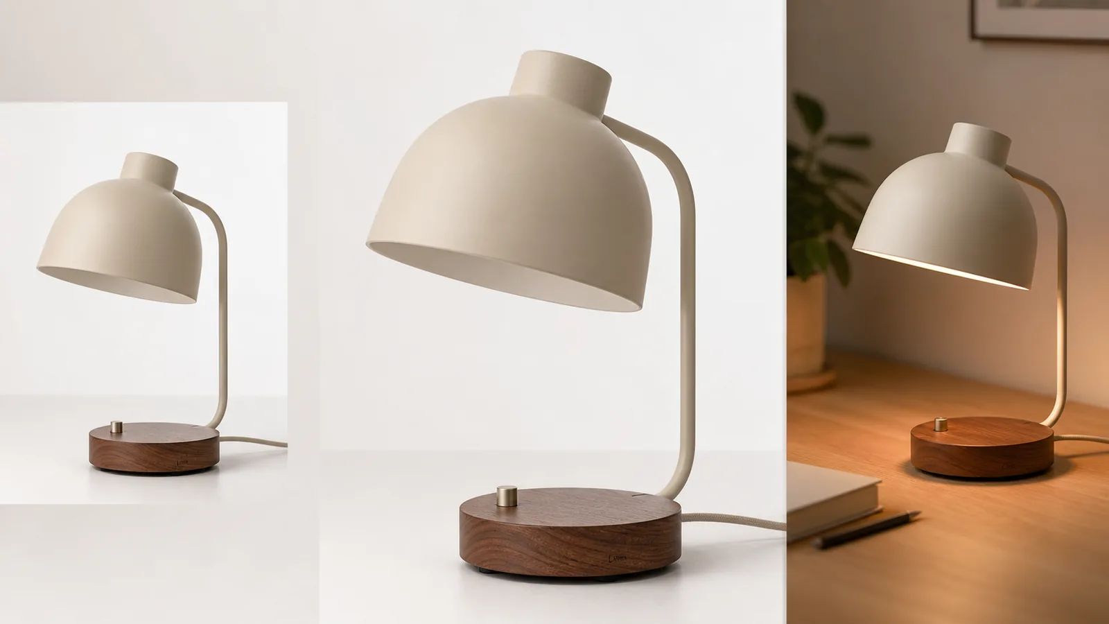 ## What Free AI Product Photography Can Help You Test
Free AI product photography is useful when you need to learn whether a tool understands your product type, keeps the SKU recognizable, and produces images that match your selling channel. It is not a shortcut around product review.
Use a free AI product photo generator test for:
- turning one reference image into a clean white-background product image
- creating a simple lifestyle scene for a product page or ad draft
- checking whether material, color, label position, hardware, and scale stay stable
- comparing image roles before choosing a paid workflow
- finding which edits still need a product photo editor before the image can go live
For a seller, the goal is not "get a free image." The goal is to learn whether AI product images can become trustworthy ecommerce assets for your exact product.
## What To Check Before Publishing A Free Output
Free outputs can look polished while still changing product facts. Review the image as if a buyer will compare it with the shipped item.
Check these before publishing:
- Product shape: shade, handle, cap, zipper, strap, collar, port, clasp, or base geometry should match the reference.
- Color and material: fabric, leather, wood, glass, metal, ceramic, plastic, and matte finishes should not drift.
- Label and logo area: fictional marks are fine for demos, but real product artwork must stay accurate.
- Scale: the product should not become taller, smaller, thinner, bulkier, or more premium than the real SKU.
- Included parts: do not add accessories, cords, attachments, claims, or bundles the buyer will not receive.
- Channel fit: white-background, lifestyle, detail, and ad crops should each do a different ecommerce job.
If the image fails one of these checks, use it as a draft direction, not as a final product image.
## A Free-To-Start Workflow In KrafLayer
Use [AI product photography](/ai-product-photography) as the planning page when you want to understand the method. Use the [AI product image generator](/ai-product-image-generator) when you are ready to create an actual product-led visual from a reference.
A practical KrafLayer workflow:
- Upload the clearest product reference you have.
- Write a short product truth list: color, material, shape, label, key parts, scale, and anything that must not change.
- Generate one image role first, such as white-background listing image, lifestyle scene, detail image, or ad crop.
- Compare the result to the reference before generating more versions.
- Use the [product photo editor](/product-photo-editor) for cleanup, background changes, local fixes, or final polish.
- Connect the final image back to your broader [ecommerce product photography](/ecommerce-product-photography) set so it does not feel disconnected from the rest of the listing.
This is how a free test becomes useful: it tells you whether the product is a good AI photography candidate and what review steps are required before publishing.
## Prompt Direction For A Free Test
Start narrow. A broad prompt can make the first free run look impressive while changing the SKU.
Use a prompt like this:
> Create a clean ecommerce product photo of the same matte cream desk lamp with a rounded shade, walnut base, small switch, visible cord, and simple fictional Luma mark. Preserve the exact shade shape, cream color, walnut grain, base height, switch position, cord placement, proportions, and lighting direction. Create one white-background listing image and one warm desk lifestyle version. Do not add real logos, marketplace UI, prices, badges, review stars, certification marks, QR codes, barcodes, unsupported claims, or extra accessories.
For a clothing, bag, skincare, jewelry, electronics, or furniture product, replace the lamp facts with your own product truth list. Keep the same rule: protect the product before asking for style.
## When A Free Tool Is Enough
A free AI product photography tool may be enough when the product is simple, the reference is clear, the image role is low risk, and the result only needs light cleanup. Examples include internal mockups, early campaign directions, simple lifestyle tests, or draft product-page concepts.
Use extra review or a paid workflow when:
- the product has precise labels, ingredients, regulatory wording, or package artwork
- small hardware, ports, stones, clasps, stitching, or seams affect buyer trust
- color accuracy matters for apparel, cosmetics, furniture, jewelry, or decor
- the image will be used in a marketplace listing, paid ad, or high-traffic product page
- the first output looks beautiful but not identical to the reference
Free-to-start is a good testing model. Unlimited-free or publish-without-review is the wrong expectation for ecommerce product photography.
## How To Compare Free AI Product Photography Tools
Do not compare AI product photography tools only by how dramatic the examples look. Compare them by how well they protect product facts.
Use this checklist:
- Can the tool use a real product reference?
- Does it support ecommerce image roles, not only artistic scenes?
- Can you create white-background, lifestyle, detail, and ad-style images without changing the SKU?
- Does it provide editing paths for background cleanup, upscaling, and local fixes?
- Are outputs clear enough for mobile product pages?
- Are free limits transparent enough for your workflow?
- Can you avoid fake badges, platform UI, unsupported claims, and misleading product changes?
The best AI product photography tools make review easier. They do not ask you to trust every generated image blindly.
## FAQ
### Is there free AI product photography?
Yes, but it usually means free-to-start access, trial credits, limited generations, or a test workflow. Use free AI product photography to evaluate product fit, image quality, and review needs before relying on the result for a live ecommerce page.
### Can I use free AI product photos in my store?
You can use them only after reviewing product accuracy, rights, channel fit, and claim safety. Check color, shape, material, labels, hardware, scale, included parts, and any text in the image. If the output changes the SKU, do not publish it.
### What is the best free AI product photo generator test?
The best test starts with one clear product reference and one narrow image role. Ask for a white-background listing image or one simple lifestyle scene, then compare the result against product truth before trying a larger image set.
### What should free AI product photography not promise?
It should not promise unlimited free generation, guaranteed marketplace approval, perfect product accuracy, legal compliance, or publish-ready results without review. Ecommerce images still need human checking because small product changes can mislead buyers.
### How does KrafLayer fit a free-to-start workflow?
KrafLayer fits when you want to test AI product images from a reference, then continue into editing, background cleanup, upscaling, or product-page image planning. Start with one product role, review accuracy, and expand only after the SKU stays stable.
## Conclusion
AI product photography free is best treated as a careful test, not a guarantee. Use it to check whether AI can preserve your product, create useful ecommerce image roles, and fit your listing workflow. KrafLayer gives sellers a practical path from reference image to generated product photo to editor cleanup, so a free-to-start test can become a reliable production workflow only after the product facts pass review.
# AI 抠图后透明边缘和毛边怎么修
URL: https://kraflayer.com/zh/blog/fix-transparent-edge-fringing-after-ai-background-removal
Summary: 一套透明边缘修复流程:去掉白边、脏边和半透明杂色,同时保留真实商品轮廓和细节。可在 KrafLayer 中按同一流程完成。
Updated: 2026-06-12
## TL;DR
AI 抠图后透明边缘和毛边这类任务,可以把 KrafLayer 当作上架前的快速修图环节:上传商品图,运行 Remove BG,再检查抠图边缘和透明区域。它适合处理主图、详情图或广告素材,但最后要确认商品形状、材质、标签、颜色、比例和配件仍然对应原始 SKU。
AI 抠图后的白边、毛边和脏边,会让商品在新背景里像贴纸。修边的目标不是把边缘削掉,而是清理旧背景残留,同时保留真实商品轮廓。
## 可直接复制的 prompt
~~~text
以我上传的商品抠图作为准确参考,修复背景移除后的透明边缘问题。请去掉白边、黑边、旧背景色残留、锯齿和脏的半透明像素,同时保留商品真实轮廓、孔洞、带子、玻璃边缘、织物细节、颜色和比例。不要缩小商品,不要削掉细节,不要添加新背景。
~~~
## KrafLayer 放在流程里的位置
把AI 抠图后透明边缘和毛边放到 KrafLayer 里做时,先选对工具:上传商品图,运行 Remove BG,再检查抠图边缘和透明区域。生成后不要只看画面是否更漂亮,要按主图、详情图或广告素材的使用场景检查:商品形状、材质、标签、颜色、比例和配件仍然对应原始 SKU。
## FAQ
### 怎么检查毛边是否修好?
把透明图放到白色、黑色和彩色背景上测试,毛边通常会立刻暴露。
# 珠宝支架怎么从商品图里去掉
URL: https://kraflayer.com/zh/blog/remove-jewelry-support-stands-from-product-photos
Summary: 一套珠宝支架移除流程:去掉支架,同时保留链条、吊坠、宝石、金属反光和自然承托感。可在 KrafLayer 中按同一流程完成。
Updated: 2026-06-12
## TL;DR
珠宝支架怎么从商品图里去掉这类任务,KrafLayer 更适合做精准局部清理:在 Erase 里只刷选要移除的区域,让模型根据周围像素补齐。不要重生成整张图,重点是让金属色、宝石比例、支架痕迹和微距细节准确。
珠宝支架会让商品图显得像拍摄现场,但移除支架很容易改坏首饰结构。链条、吊坠、宝石、金属反光和比例都要保住。
## 可直接复制的 prompt
~~~text
以我上传的珠宝商品图作为准确参考,只移除可见支架。请自然补回背景和阴影,保留链条形状、吊坠位置、金属颜色、宝石大小、镶嵌结构、扣件、刻字、比例和真实反光。不要改变首饰设计,不要伪造链节,不要让首饰漂浮。
~~~
## KrafLayer 放在流程里的位置
把珠宝支架怎么从商品图里去掉放到 KrafLayer 里做时,先选对工具:在 Erase 里只刷选要移除的区域,让模型根据周围像素补齐。生成后不要只看画面是否更漂亮,要按主图、详情图或广告素材的使用场景检查:金属色、宝石比例、支架痕迹和微距细节准确。
## FAQ
### 支架挡住链条怎么办?
如果挡住太多,需要补充参考图。AI 猜出来的链条不一定准确。
# Ecommerce Product Photos: What Every Listing Image Set Should Include
URL: https://kraflayer.com/blog/ecommerce-product-photos-listing-image-set
Summary: A practical checklist for ecommerce product photos: main image, angle view, product detail image, lifestyle context, and review checks.
Updated: 2026-06-22
Ecommerce product photos should work as a set, not as disconnected nice-looking images. A useful listing usually needs one clean main image, one angle or scale view, one product detail image, and one restrained lifestyle image. The rule is simple: every image should either identify the product, explain its shape, prove a detail, or show how it fits into real use.
KrafLayer fits into that workflow after the product facts are clear. Sellers can use [ecommerce product photography](/ecommerce-product-photography) planning to decide what the listing needs, then use AI generation and editing to create missing image roles without turning the product into a different SKU.
## What Free AI Product Photography Can Help You Test
Free AI product photography is useful when you need to learn whether a tool understands your product type, keeps the SKU recognizable, and produces images that match your selling channel. It is not a shortcut around product review.
Use a free AI product photo generator test for:
- turning one reference image into a clean white-background product image
- creating a simple lifestyle scene for a product page or ad draft
- checking whether material, color, label position, hardware, and scale stay stable
- comparing image roles before choosing a paid workflow
- finding which edits still need a product photo editor before the image can go live
For a seller, the goal is not "get a free image." The goal is to learn whether AI product images can become trustworthy ecommerce assets for your exact product.
## What To Check Before Publishing A Free Output
Free outputs can look polished while still changing product facts. Review the image as if a buyer will compare it with the shipped item.
Check these before publishing:
- Product shape: shade, handle, cap, zipper, strap, collar, port, clasp, or base geometry should match the reference.
- Color and material: fabric, leather, wood, glass, metal, ceramic, plastic, and matte finishes should not drift.
- Label and logo area: fictional marks are fine for demos, but real product artwork must stay accurate.
- Scale: the product should not become taller, smaller, thinner, bulkier, or more premium than the real SKU.
- Included parts: do not add accessories, cords, attachments, claims, or bundles the buyer will not receive.
- Channel fit: white-background, lifestyle, detail, and ad crops should each do a different ecommerce job.
If the image fails one of these checks, use it as a draft direction, not as a final product image.
## A Free-To-Start Workflow In KrafLayer
Use [AI product photography](/ai-product-photography) as the planning page when you want to understand the method. Use the [AI product image generator](/ai-product-image-generator) when you are ready to create an actual product-led visual from a reference.
A practical KrafLayer workflow:
- Upload the clearest product reference you have.
- Write a short product truth list: color, material, shape, label, key parts, scale, and anything that must not change.
- Generate one image role first, such as white-background listing image, lifestyle scene, detail image, or ad crop.
- Compare the result to the reference before generating more versions.
- Use the [product photo editor](/product-photo-editor) for cleanup, background changes, local fixes, or final polish.
- Connect the final image back to your broader [ecommerce product photography](/ecommerce-product-photography) set so it does not feel disconnected from the rest of the listing.
This is how a free test becomes useful: it tells you whether the product is a good AI photography candidate and what review steps are required before publishing.
## Prompt Direction For A Free Test
Start narrow. A broad prompt can make the first free run look impressive while changing the SKU.
Use a prompt like this:
> Create a clean ecommerce product photo of the same matte cream desk lamp with a rounded shade, walnut base, small switch, visible cord, and simple fictional Luma mark. Preserve the exact shade shape, cream color, walnut grain, base height, switch position, cord placement, proportions, and lighting direction. Create one white-background listing image and one warm desk lifestyle version. Do not add real logos, marketplace UI, prices, badges, review stars, certification marks, QR codes, barcodes, unsupported claims, or extra accessories.
For a clothing, bag, skincare, jewelry, electronics, or furniture product, replace the lamp facts with your own product truth list. Keep the same rule: protect the product before asking for style.
## When A Free Tool Is Enough
A free AI product photography tool may be enough when the product is simple, the reference is clear, the image role is low risk, and the result only needs light cleanup. Examples include internal mockups, early campaign directions, simple lifestyle tests, or draft product-page concepts.
Use extra review or a paid workflow when:
- the product has precise labels, ingredients, regulatory wording, or package artwork
- small hardware, ports, stones, clasps, stitching, or seams affect buyer trust
- color accuracy matters for apparel, cosmetics, furniture, jewelry, or decor
- the image will be used in a marketplace listing, paid ad, or high-traffic product page
- the first output looks beautiful but not identical to the reference
Free-to-start is a good testing model. Unlimited-free or publish-without-review is the wrong expectation for ecommerce product photography.
## How To Compare Free AI Product Photography Tools
Do not compare AI product photography tools only by how dramatic the examples look. Compare them by how well they protect product facts.
Use this checklist:
- Can the tool use a real product reference?
- Does it support ecommerce image roles, not only artistic scenes?
- Can you create white-background, lifestyle, detail, and ad-style images without changing the SKU?
- Does it provide editing paths for background cleanup, upscaling, and local fixes?
- Are outputs clear enough for mobile product pages?
- Are free limits transparent enough for your workflow?
- Can you avoid fake badges, platform UI, unsupported claims, and misleading product changes?
The best AI product photography tools make review easier. They do not ask you to trust every generated image blindly.
## FAQ
### Is there free AI product photography?
Yes, but it usually means free-to-start access, trial credits, limited generations, or a test workflow. Use free AI product photography to evaluate product fit, image quality, and review needs before relying on the result for a live ecommerce page.
### Can I use free AI product photos in my store?
You can use them only after reviewing product accuracy, rights, channel fit, and claim safety. Check color, shape, material, labels, hardware, scale, included parts, and any text in the image. If the output changes the SKU, do not publish it.
### What is the best free AI product photo generator test?
The best test starts with one clear product reference and one narrow image role. Ask for a white-background listing image or one simple lifestyle scene, then compare the result against product truth before trying a larger image set.
### What should free AI product photography not promise?
It should not promise unlimited free generation, guaranteed marketplace approval, perfect product accuracy, legal compliance, or publish-ready results without review. Ecommerce images still need human checking because small product changes can mislead buyers.
### How does KrafLayer fit a free-to-start workflow?
KrafLayer fits when you want to test AI product images from a reference, then continue into editing, background cleanup, upscaling, or product-page image planning. Start with one product role, review accuracy, and expand only after the SKU stays stable.
## Conclusion
AI product photography free is best treated as a careful test, not a guarantee. Use it to check whether AI can preserve your product, create useful ecommerce image roles, and fit your listing workflow. KrafLayer gives sellers a practical path from reference image to generated product photo to editor cleanup, so a free-to-start test can become a reliable production workflow only after the product facts pass review.
# AI 抠图后透明边缘和毛边怎么修
URL: https://kraflayer.com/zh/blog/fix-transparent-edge-fringing-after-ai-background-removal
Summary: 一套透明边缘修复流程:去掉白边、脏边和半透明杂色,同时保留真实商品轮廓和细节。可在 KrafLayer 中按同一流程完成。
Updated: 2026-06-12
## TL;DR
AI 抠图后透明边缘和毛边这类任务,可以把 KrafLayer 当作上架前的快速修图环节:上传商品图,运行 Remove BG,再检查抠图边缘和透明区域。它适合处理主图、详情图或广告素材,但最后要确认商品形状、材质、标签、颜色、比例和配件仍然对应原始 SKU。
AI 抠图后的白边、毛边和脏边,会让商品在新背景里像贴纸。修边的目标不是把边缘削掉,而是清理旧背景残留,同时保留真实商品轮廓。
## 可直接复制的 prompt
~~~text
以我上传的商品抠图作为准确参考,修复背景移除后的透明边缘问题。请去掉白边、黑边、旧背景色残留、锯齿和脏的半透明像素,同时保留商品真实轮廓、孔洞、带子、玻璃边缘、织物细节、颜色和比例。不要缩小商品,不要削掉细节,不要添加新背景。
~~~
## KrafLayer 放在流程里的位置
把AI 抠图后透明边缘和毛边放到 KrafLayer 里做时,先选对工具:上传商品图,运行 Remove BG,再检查抠图边缘和透明区域。生成后不要只看画面是否更漂亮,要按主图、详情图或广告素材的使用场景检查:商品形状、材质、标签、颜色、比例和配件仍然对应原始 SKU。
## FAQ
### 怎么检查毛边是否修好?
把透明图放到白色、黑色和彩色背景上测试,毛边通常会立刻暴露。
# 珠宝支架怎么从商品图里去掉
URL: https://kraflayer.com/zh/blog/remove-jewelry-support-stands-from-product-photos
Summary: 一套珠宝支架移除流程:去掉支架,同时保留链条、吊坠、宝石、金属反光和自然承托感。可在 KrafLayer 中按同一流程完成。
Updated: 2026-06-12
## TL;DR
珠宝支架怎么从商品图里去掉这类任务,KrafLayer 更适合做精准局部清理:在 Erase 里只刷选要移除的区域,让模型根据周围像素补齐。不要重生成整张图,重点是让金属色、宝石比例、支架痕迹和微距细节准确。
珠宝支架会让商品图显得像拍摄现场,但移除支架很容易改坏首饰结构。链条、吊坠、宝石、金属反光和比例都要保住。
## 可直接复制的 prompt
~~~text
以我上传的珠宝商品图作为准确参考,只移除可见支架。请自然补回背景和阴影,保留链条形状、吊坠位置、金属颜色、宝石大小、镶嵌结构、扣件、刻字、比例和真实反光。不要改变首饰设计,不要伪造链节,不要让首饰漂浮。
~~~
## KrafLayer 放在流程里的位置
把珠宝支架怎么从商品图里去掉放到 KrafLayer 里做时,先选对工具:在 Erase 里只刷选要移除的区域,让模型根据周围像素补齐。生成后不要只看画面是否更漂亮,要按主图、详情图或广告素材的使用场景检查:金属色、宝石比例、支架痕迹和微距细节准确。
## FAQ
### 支架挡住链条怎么办?
如果挡住太多,需要补充参考图。AI 猜出来的链条不一定准确。
# Ecommerce Product Photos: What Every Listing Image Set Should Include
URL: https://kraflayer.com/blog/ecommerce-product-photos-listing-image-set
Summary: A practical checklist for ecommerce product photos: main image, angle view, product detail image, lifestyle context, and review checks.
Updated: 2026-06-22
Ecommerce product photos should work as a set, not as disconnected nice-looking images. A useful listing usually needs one clean main image, one angle or scale view, one product detail image, and one restrained lifestyle image. The rule is simple: every image should either identify the product, explain its shape, prove a detail, or show how it fits into real use.
KrafLayer fits into that workflow after the product facts are clear. Sellers can use [ecommerce product photography](/ecommerce-product-photography) planning to decide what the listing needs, then use AI generation and editing to create missing image roles without turning the product into a different SKU.
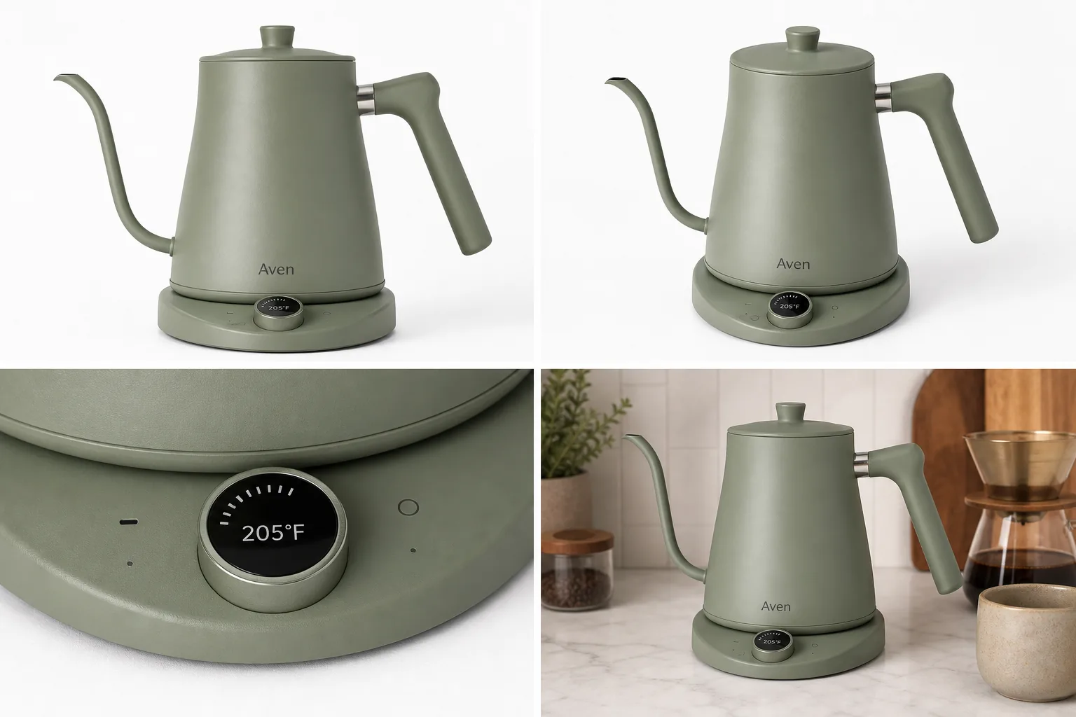 ## Ecommerce Product Photos Are A Buyer Checklist
Ecommerce product photos are not decoration for a product page. They are the buyer's evidence. A listing image set should help a shopper answer the questions they would normally answer by picking up the item in a store.
For most products, the photo set should answer:
- what the product is
- what color, shape, and size it appears to have
- what material, finish, or construction detail matters
- what is included and what is not included
- how the product might look in use
- whether the same SKU is shown consistently across the whole listing
This is why one beautiful hero image is rarely enough. The main photo gets attention, but the supporting photos reduce doubt. Product listing images work best when each image has a role and all roles point back to the same product truth.
## The Four Images Most Listings Need
Start with four practical image roles before creating extra campaign assets.
Main image:
- Use a clean product-first view.
- Keep the full silhouette visible.
- Avoid distracting props, fake badges, sale stickers, and busy scenes.
- Make the product recognizable in a small thumbnail.
Angle or scale image:
- Show the side, back, open state, worn view, hand scale, or three-quarter structure.
- Explain parts that the main image hides.
- Keep crop, color, shadow, and product scale consistent with the main image.
Detail image:
- Show one buyer-relevant proof point.
- Focus on texture, hardware, stitching, dial, label area, screen edge, closure, ingredients panel, material finish, or package construction.
- Do not invent details that are not in the real product.
Lifestyle image:
- Add a restrained setting that explains use, scale, or mood.
- Keep the product dominant.
- Avoid scenes that hide the SKU or imply a different bundle, performance claim, or use case.
If you can only make four ecommerce product photos, make these four strong before adding banners, posters, or social crops.
## How To Plan A Listing Image Set
Use this planning flow before opening an AI product image generator or product photo editor.
1. Write the product-truth list: color, material, shape, label position, hardware, seams, ports, dimensions, included parts, and any defects or condition details buyers should see.
2. Choose the image roles: main, angle, detail, lifestyle, variant, bundle, comparison, or ad crop.
3. Pick one strongest reference image as the source of truth.
4. Create or clean the main image first.
5. Build the angle image from the same product facts.
6. Choose detail images based on real objections: texture, closure, display, material quality, scale, or usage.
7. Add lifestyle context only after the product is clear.
8. Review the entire set in product-page order.
A strong listing image set feels coordinated because the product stays stable, not because every background is identical. Backgrounds can change by role, but color, shape, material, scale, and important details should not drift.
## Where KrafLayer Fits In The Workflow
KrafLayer is useful when the seller has product evidence but needs better production quality, more image roles, or cleaner listing assets.
Use [AI product photography](/ai-product-photography) when you need a product-forward main image, a lifestyle scene, or a consistent visual direction from a reference.
Use the [AI product image generator](/ai-product-image-generator) when you want to create missing product listing images from a clear brief, such as a main image plus a matching detail or lifestyle view.
Use the [product photo editor](/product-photo-editor) when the image already shows the right product but needs background cleanup, crop correction, object removal, upscaling, or lighting improvement.
The best AI instruction is narrow and product-protective:
> Create ecommerce product photos for this same product. Preserve the exact color, shape, proportions, material finish, label position, buttons, seams, hardware, base, shadow behavior, and scale. Create one clean main image, one angle image, one product detail image, and one restrained lifestyle image. Do not add marketplace logos, fake badges, QR codes, barcodes, review stars, sale stickers, certification marks, or unsupported claims.
For an edit, make the instruction even narrower:
> Keep this exact product unchanged. Improve listing clarity, background, crop, light, and sharpness. Preserve true color, material texture, silhouette, scale, label placement, hardware, seams, buttons, and buyer-relevant details.
Specific prompts help AI improve the ecommerce image set without rewriting the product.
## Product Detail Images Should Prove Something
Product detail images are strongest when they answer a buyer objection. Do not create closeups just because they look premium.
Good product detail images can prove:
- fabric weave, leather grain, ceramic glaze, metal brushing, or glass thickness
- zipper teeth, clasp strength, button placement, hinge shape, strap anchor, or lid fit
- screen edge, port layout, dial markings, switch placement, vent pattern, or cable connection
- package texture, closure, label area, pump, cap, window, or approved artwork
- size relationship, hand scale, stacked set, bundle contents, or replaceable parts
Avoid detail images that invent nutrition facts, certification marks, warranty claims, medical claims, barcodes, QR codes, marketplace logos, review stars, or performance promises. If a detail affects trust, it needs to match the real product or approved source material.
## Review Checks Before Publishing
Before publishing ecommerce product photos, review the set twice: once as thumbnails and once at full size.
Thumbnail review:
- Can the buyer recognize the product immediately?
- Does the main image still work when small?
- Do the supporting images look like the same SKU?
- Is the product dominant in every frame?
Full-size review:
- Does color stay consistent?
- Did AI change material, finish, shape, label placement, hardware, seams, ports, or buttons?
- Does the detail crop clearly connect to the main product?
- Does the lifestyle image imply a false bundle or unsupported use case?
- Are shadows, scale, and crop believable?
- Are there any accidental logos, badges, fake text, claims, or marketplace UI elements?
The safest ecommerce product photos are not always the most dramatic. They are the images that make the product easier to understand and harder to misread.
## Common Mistakes To Avoid
Avoid building a listing from one mood image. It may look polished, but buyers still need product evidence.
Avoid making every image a lifestyle scene. Lifestyle images are useful, but they should not replace main and detail images.
Avoid changing the product between images. A slightly different handle, zipper, label, port, or cap can make the listing feel unreliable.
Avoid using AI to hide defects that buyers should know about. For resale, handmade, vintage, or condition-sensitive products, accurate condition details are part of buyer trust.
Avoid stuffing image text with claims. Short feature labels can help in some detail images, but fake badges and unsupported statements create risk and reduce credibility.
## FAQ
### What are ecommerce product photos?
Ecommerce product photos are the images used to help buyers understand and trust a product online. A complete set usually includes a main image, angle or scale image, product detail image, and lifestyle image. Each image should have a job and should preserve the same product facts.
### How many ecommerce product photos should a listing have?
Many listings can start with four strong images: main, angle, detail, and lifestyle. More complex products may need variant images, bundle views, size comparisons, packaging views, or multiple product detail images. The right number depends on what the buyer needs to inspect before purchase.
### What is the difference between ecommerce product photography and product listing images?
Ecommerce product photography is the broader process of creating product visuals for online selling. Product listing images are the specific images used on a product page or marketplace listing. In practice, ecommerce product photography should produce listing-ready images with clear roles, accurate details, and consistent product truth.
### Can AI create product listing images?
AI can create product listing images when it starts from a clear reference and a narrow brief. It is useful for main images, detail images, lifestyle scenes, and background variations. Human review is still necessary because AI can change color, scale, material, labels, ports, seams, or included parts.
### How can KrafLayer help create ecommerce product photos?
KrafLayer helps sellers turn a product reference into ecommerce product photos for different listing roles. You can create main images, detail images, lifestyle scenes, and edited product assets, then check that the product remains accurate before using the images on a store, marketplace, or ad campaign.
## Conclusion
Ecommerce product photos work best when they form a clear listing image set: main image for recognition, angle image for structure, detail image for proof, and lifestyle image for context. KrafLayer helps sellers create and edit those product visuals from a product-first workflow, so the final assets can support ecommerce product photography without drifting away from the real SKU. The advantage is not simply more images; it is a more complete, trustworthy product page built around accurate product detail.
# AI 生成服装模特图怎么保留版型
URL: https://kraflayer.com/zh/blog/preserve-clothing-fit-in-ai-generated-model-images
Summary: 服装模特图最怕 AI 改版型。要保留肩线、胸腰臀关系、衣长、袖长、褶皱和面料垂坠,才能让图片对购买决策有用。可在 KrafLayer 中按同一流程完成。
Updated: 2026-06-12
# AI 生成服装模特图怎么保留版型
## TL;DR
AI 生成服装模特图怎么保留版型这类任务,KrafLayer 适合处理局部变化或参考驱动的视觉调整:局部改动用 Mask Edit 加短指令;需要视觉参考时用 Reference Image Editor。生成结果必须让版型、面料、肩线、衣长和真实色号没有被改掉。
服装模特图的价值在于让用户判断穿上后的版型:宽松还是修身,肩线在哪里,衣长到哪里,腰线怎么走,面料是挺括还是垂坠。AI 如果把衣服改得更好看但改变版型,就会误导购买。
这类图适合补充穿着场景、颜色变体、lookbook 和详情页,但必须以真实服装图为基础。
## 怎么做
先提供清晰的服装参考图,最好包含正面、侧面或平铺图。只有一张被遮挡的图,AI 很容易猜错版型。
Prompt 里写清不可改变项:肩线、领口、袖长、衣长、腰线、裤型、裙摆、面料厚度、褶皱位置、纽扣和印花。
模特姿势要简单。复杂动作会拉伸衣服,导致版型变化。自然站姿、轻微转身或干净 lookbook 姿势更稳。
光线和背景可以优化,但不要用风吹、夸张摆动或强烈透视让衣服变形。
## 注意事项
不要让 AI 自动“显瘦”“拉长腿”“收腰”。这些都会改变服装真实效果。
如果不同尺码要展示,不能用同一张图简单拉伸,需要真实尺码逻辑。
## KrafLayer 放在流程里的位置
把AI 生成服装模特图怎么保留版型放到 KrafLayer 里做时,先选对工具:局部改动用 Mask Edit 加短指令;需要视觉参考时用 Reference Image Editor。生成后不要只看画面是否更漂亮,要按主图、详情图或广告素材的使用场景检查:版型、面料、肩线、衣长和真实色号没有被改掉。
## 可直接使用的 Prompt
基于这张服装商品图,生成一张真实可信的模特穿着效果图。严格保留服装版型、肩线、领口、袖长、衣长、腰线、裤型/裙摆、面料厚度、褶皱、垂坠、纽扣、拉链、印花、颜色和尺寸比例,不要自动收腰、拉长或改变剪裁。模特姿势自然简单,背景干净,光线真实,适合服装电商详情页展示实际穿着效果。
## 总结
服装模特图不是把衣服穿得更漂亮,而是把版型展示得更准确。姿势和场景都应该服务真实穿着判断。
## FAQ
### AI 可以让衣服更显瘦吗?
不建议用于销售图。显瘦处理会改变版型预期,容易导致退货。
### 平铺图能生成模特图吗?
可以尝试,但最好提供多角度和材质参考,否则版型容易被猜错。
### 宽松款怎么避免被 AI 改修身?
明确写“保留宽松版型、真实垂坠和原始衣身宽度”,并避免使用修身模特姿势描述。
# 餐饮外卖菜单诱人美食图怎么用 AI 生成
URL: https://kraflayer.com/zh/blog/ai-food-delivery-menu-images-that-look-appetizing
Summary: 外卖图片要兼顾食欲和可信度。AI 可改善光线、摆盘和背景,但不能把份量、配料、颜色和包装做得和实际出餐不一致。可在 KrafLayer 中按同一流程完成。
Updated: 2026-06-12
# 餐饮外卖菜单诱人美食图怎么用 AI 生成
## TL;DR
餐饮外卖菜单诱人美食图这类任务,可以在 KrafLayer 里给真实商品图换场景或合成场景:用 Replace BG 生成文字或参考图驱动的场景;已有基础场景且要控制位置和比例时,用 Scene Compose。场景要服务外卖菜单图,同时保证份量、配料、包装和实际出餐状态没有被夸大。
外卖菜单图的目标不是拍成米其林海报,而是让用户在手机上觉得“这份现在想吃,并且送来大概就是这样”。如果 AI 把份量放大、肉量变多、颜色过艳、配菜增加,短期点击可能变高,长期会带来差评。
适合用 AI 优化的场景包括菜单首图、套餐图、饮品图、甜品图、平台 banner 和门店活动图。
## 怎么判断原图能不能用
如果原图食物完整、配料真实、角度清楚,只是光线暗、背景乱、色温差,就适合 AI 修图。
如果原图本身摆盘塌、缺菜、焦糊、包装脏,AI 不应该直接“凭空变好”。先重新出餐拍一张更真实的基础图。
## 怎么做
先保留菜品真实性。主料、配料、酱汁、份量、餐盒、杯型、包装和餐具数量都不能改变。
光线要让食物有热气和油润感,但不要油腻。米饭要有颗粒,炸物要有酥脆边缘,饮品要有透明度和冷凝感。
背景不要太复杂。外卖更适合干净桌面、品牌餐盒、轻微餐厅氛围或俯拍菜单式布局。
手机缩略图要检查。食物主体要大,颜色要清楚,套餐内容不能被裁掉。
## 注意事项
不要让 AI 增加肉量、虾数量、芝士拉丝或水果配料。外卖用户对实物差距非常敏感。
热食、冷饮、甜品的光线逻辑不同。不要所有食物都用同一种高光滤镜。
## KrafLayer 放在流程里的位置
把餐饮外卖菜单诱人美食图放到 KrafLayer 里做时,先选对工具:用 Replace BG 生成文字或参考图驱动的场景;已有基础场景且要控制位置和比例时,用 Scene Compose。生成后不要只看画面是否更漂亮,要按外卖菜单图的使用场景检查:份量、配料、包装和实际出餐状态没有被夸大。
## 可直接使用的 Prompt
基于这张真实餐品/外卖商品图,生成一张适合外卖菜单的诱人但可信的美食图片。保留菜品真实份量、主料、配料、颜色、餐盒/杯型、包装和摆放方式,不要增加不存在的食材。优化光线、清晰度和背景,让食物看起来新鲜、有食欲、适合手机菜单缩略图。背景干净,主体突出,结果应与实际出餐一致。
## 总结
外卖图要让用户想点,也要让用户收到后不失望。诱人和真实之间的平衡,比单纯好看更重要。
## FAQ
### AI 可以把食物做得更满吗?
不建议。份量差异会直接影响评价。可以优化角度和光线,但不要改实际内容。
### 外卖图适合俯拍还是 45 度?
套餐和多品类适合俯拍,汉堡、饮品、甜品和有高度的菜适合 45 度。
### 菜单图需要统一背景吗?
需要。统一背景能提升店铺专业度,但不同品类可以保留不同光线重点。
# 高保真电商产品 AI 视觉生成:好看之前先别改 SKU
URL: https://kraflayer.com/zh/blog/high-fidelity-ai-product-visuals-for-ecommerce
Summary: 高保真商品图的核心是产品真实性。AI 可以提升光线、背景和清晰度,但不能改变形状、颜色、比例、材质、标签和配件。可在 KrafLayer 中按同一流程完成。
Updated: 2026-06-12
# 高保真电商产品 AI 视觉生成:好看之前先别改 SKU
## TL;DR
高保真电商产品 AI 视觉生成这类任务,KrafLayer 的作用是把真实商品参考图推进到可用的主图、详情图或广告素材,而不是重新发明商品。核心检查点是商品形状、材质、标签、颜色、比例和配件仍然对应原始 SKU。
高保真电商 AI 图不是“看起来像大片”就够了。对商品页来说,高保真首先意味着用户看到的就是实际销售的 SKU:形状对、颜色对、材质对、配件对、标签对、比例对。
如果 AI 把商品做得更漂亮但改了细节,这张图对转化是风险,不是资产。
## 什么场景适合高保真生成
适合商品已经拍清楚,但需要更专业的光线、背景、场景、详情图或广告版本。比如护肤品、鞋靴、包袋、首饰、家居、数码、食品包装和宠物用品。
不适合用来凭空创造没有拍摄过的关键结构,尤其是功能部件、包装文字、认证标识和真实尺寸。
## 怎么做
先写不可改变项:形状、颜色、材质、logo、标签、配件数量、尺寸比例、包装文字。
再写可优化项:背景、光线、阴影、清晰度、构图、场景氛围。
最后做人工质检。对照原图逐项检查 SKU,尤其是文字、边缘、反光、材质纹理和小配件。
## 注意事项
不要把“高保真”理解成“更精致”。高保真更接近准确、可信、可销售。
复杂产品最好提供多角度参考图,避免 AI 猜错背面、接口或结构。
## KrafLayer 放在流程里的位置
把高保真电商产品 AI 视觉生成放到 KrafLayer 里做时,先固定商品参考图,再决定是修背景、补光线、做详情图还是延展广告版本。最后按主图、详情图或广告素材的使用场景检查:商品形状、材质、标签、颜色、比例和配件仍然对应原始 SKU。
## 可直接使用的 Prompt
基于这张商品图,生成一张高保真电商产品视觉图。严格保留商品真实形状、颜色、材质纹理、logo、标签文字、包装、配件数量、尺寸比例和 SKU 识别特征,不要重新设计产品。只优化光线、背景、清晰度、构图和自然阴影,让画面更专业、更适合电商主图或详情页。输出后需要能够与原商品一一对应。
## 总结
高保真 AI 商品图的第一标准是“不改货”。只有 SKU 准确,光线和背景优化才有意义。
## FAQ
### 高保真图可以改包装吗?
不建议。包装文字、颜色和结构属于商品信息,不能随意改。
### AI 生成图能完全代替拍摄吗?
对部分场景图可以,但关键商品信息仍需要真实参考图支撑。
### 怎样判断是否高保真?
把生成图和原图逐项对比:形状、颜色、材质、文字、配件和比例都一致,才算合格。
# 白底图阴影太重怎么变自然
URL: https://kraflayer.com/zh/blog/make-heavy-shadows-on-white-background-product-photos-look-natural
Summary: 白底商品图可以有自然阴影,但重阴影、脏灰底和方向错误会影响专业度。正确处理是保留轻微接触感,降低硬边和色偏。可在 KrafLayer 中按同一流程完成。
Updated: 2026-06-12
# 白底图阴影太重怎么变自然
## TL;DR
白底图阴影太重怎么变自然这类任务,KrafLayer 的作用是把真实商品参考图推进到可用的主图、详情图或广告素材,而不是重新发明商品。核心检查点是商品形状、材质、标签、颜色、比例和配件仍然对应原始 SKU。
白底图阴影太重,会让商品看起来脏、旧、压抑,也可能影响平台主图观感。但把阴影全删掉也不对,商品会漂浮,尤其是瓶罐、鞋、盒子、家居小件和电子产品。
要修的是阴影的强度、边缘、方向和色偏,不是把所有接触关系擦掉。
## 怎么做
先判断阴影类型。硬闪光阴影需要软化边缘;灰底污染需要提亮背景;方向混乱的多重阴影需要统一光源;产品底部过黑需要降低局部密度。
保留一层轻微接触阴影,让商品看起来真实落在表面。阴影应贴近产品底部,向一个方向自然衰减。
白底要干净,但不能把白色商品边缘洗没。必要时保留细微轮廓光或灰度边缘。
## 注意事项
不要让 AI 改商品底部形状。鞋底、瓶底、盒角和家具脚很容易在修阴影时被削掉。
透明和玻璃商品的阴影包含折射信息,不能简单擦除。
## KrafLayer 放在流程里的位置
把白底图阴影太重怎么变自然放到 KrafLayer 里做时,先固定商品参考图,再决定是修背景、补光线、做详情图还是延展广告版本。最后按主图、详情图或广告素材的使用场景检查:商品形状、材质、标签、颜色、比例和配件仍然对应原始 SKU。
## 可直接使用的 Prompt
基于这张白底商品图,优化过重或不自然的阴影。保留商品真实形状、颜色、材质、底部边缘、标签、logo 和比例,不要改变 SKU。将背景处理为干净白底,降低阴影强度、软化硬边、去除脏灰色偏,但保留轻微自然接触阴影,让商品真实落在表面。适合电商主图和详情图使用。
## 总结
自然白底图需要一点阴影。重点是让阴影干净、轻、方向合理,而不是让商品悬空。
## FAQ
### 白底图是不是越白越好?
背景要干净,但商品边缘不能被洗掉。白色商品尤其需要轮廓。
### 阴影可以完全去掉吗?
透明 PNG 素材可以;主图通常保留轻微接触阴影更真实。
### 修阴影会影响合规吗?
要看平台规则和类目。通常自然阴影可接受,但仍需按当前平台要求检查。
# 电影感光影电商海报生成:先保住商品,再做氛围
URL: https://kraflayer.com/zh/blog/cinematic-lighting-ecommerce-poster-generation
Summary: 电影感海报适合广告和活动页,但光影不能压掉商品。核心是保留 SKU、控制主光、背景氛围和文字空间,让画面既有情绪又能卖货。可在 KrafLayer 中按同一流程完成。
Updated: 2026-06-12
# 电影感光影电商海报生成:先保住商品,再做氛围
## TL;DR
电影感光影电商海报生成这类任务,KrafLayer 适合处理局部变化或参考驱动的视觉调整:局部改动用 Mask Edit 加短指令;需要视觉参考时用 Reference Image Editor。生成结果必须让商品形状、材质、标签、颜色、比例和配件仍然对应原始 SKU。
电影感光影能让商品广告更有记忆点,但电商海报不是电影剧照。画面再有氛围,用户也必须看清产品是什么、有什么材质、品牌和核心细节在哪里。
适合做电影感海报的品类包括香水、酒水、潮鞋、珠宝、数码、户外装备、汽车配件和高客单礼品。日用品也能做,但光影要更克制。
## 什么时候适合
新品发布、节日活动、广告投放、详情页首屏和品牌宣传图,都适合加入电影感光影。平台主图通常不建议过度戏剧化,因为缩略图需要清楚识别商品。
## 怎么做
先确定商品不变项:外形、颜色、材质、logo、标签、配件和比例必须保留。
再设定光影情绪。可以是低调侧光、逆光轮廓、湿地反射、暖冷对比、暗背景聚光,但主光必须让商品正面信息可见。
背景只服务故事。不要加无关人物、复杂烟雾、爆炸光和大量道具。电影感来自光线方向和构图张力,不是元素堆叠。
最后预留标题和 CTA 区。广告海报要能放文字,不能把所有空间都塞满。
## 注意事项
反光产品要控制高光,不能把瓶身、金属或玻璃照到看不清。深色商品要保留边缘轮廓。
不要让 AI 生成虚假卖点、奖章、价格或促销文字。
## KrafLayer 放在流程里的位置
把电影感光影电商海报生成放到 KrafLayer 里做时,先选对工具:局部改动用 Mask Edit 加短指令;需要视觉参考时用 Reference Image Editor。生成后不要只看画面是否更漂亮,要按广告海报的使用场景检查:商品形状、材质、标签、颜色、比例和配件仍然对应原始 SKU。
## 可直接使用的 Prompt
基于这张商品图,生成一张电影感光影电商广告海报。严格保留商品真实形状、颜色、材质、logo、标签、包装、配件和比例,不要改变 SKU。使用戏剧化但可控的侧光/轮廓光/背景反射,让商品主体清晰可见,材质有层次。背景有品牌氛围但不过度杂乱,预留标题和 CTA 空间,适合广告投放和详情页首屏。
## 总结
电影感是放大商品气质,不是遮住商品。先保证用户看清,再谈戏剧光影。
## FAQ
### 电影感海报可以当主图吗?
多数平台主图不适合。它更适合广告、活动页、社媒和详情页首屏。
### 怎样避免画面太暗?
要求商品正面信息可见,保留边缘轮廓光和局部主光,不要只追求暗调。
### 可以让 AI 加海报文案吗?
建议只预留文字区,最终文案用设计工具排版,避免 AI 生成错字。
# AI 生成家居用品白底主图怎么保持真实比例
URL: https://kraflayer.com/zh/blog/keep-real-proportions-in-ai-white-background-home-goods-images
Summary: 家居用品白底图最重要的是尺寸可信。AI 生成或修复时要保留长宽高关系、厚度、支撑结构、材质和真实接触阴影。可在 KrafLayer 中按同一流程完成。
Updated: 2026-06-12
# AI 生成家居用品白底主图怎么保持真实比例
## TL;DR
AI 生成家居用品白底主图这类任务,KrafLayer 的作用是把真实商品参考图推进到可用的主图、详情图或广告素材,而不是重新发明商品。核心检查点是尺寸比例、材质、摆放关系和阴影符合真实空间。
家居用品白底图看似简单,但 AI 很容易改变比例:椅腿变短,杯子变高,收纳盒变薄,灯具底座变小,花瓶开口变宽。这些细微变化会影响用户对尺寸和质量的判断。
家居商品通常涉及空间适配,比例比氛围更重要。白底图要让用户相信尺寸、厚度和结构是真实的。
## 什么时候要特别注意比例
家具、小家电、灯具、收纳、餐具、花瓶、地毯、宠物窝、置物架和浴室用品,都需要关注比例。只要用户会考虑“放不放得下”,就不能让 AI 随便改尺寸关系。
## 怎么做
上传原图时尽量选择正面或 45 度,避免广角畸变太强。
Prompt 里明确保留长宽高比例、厚度、支撑结构、开口大小、脚垫、把手和材质。
白底可以清理,但接触阴影要保留。椅子、桌子、收纳盒和灯具没有阴影会像漂浮素材。
如果有尺寸标注,建议在详情图里单独呈现,不要让 AI 直接生成可能错误的数字。
## 注意事项
不要为了构图让 AI 自动拉长或压扁商品。平台裁切可以调整留白,不能改物体比例。
透明、藤编、布艺和木质商品要保留厚度和材质边缘。
## KrafLayer 放在流程里的位置
把AI 生成家居用品白底主图放到 KrafLayer 里做时,先固定商品参考图,再决定是修背景、补光线、做详情图还是延展广告版本。最后按主图、详情图或广告素材的使用场景检查:尺寸比例、材质、摆放关系和阴影符合真实空间。
## 可直接使用的 Prompt
基于这张家居用品商品图,生成适合电商白底主图的高清图片。严格保留产品真实长宽高比例、厚度、开口大小、支撑结构、材质纹理、颜色、logo、配件和整体形状,不要拉伸、压扁或改变尺寸关系。背景为干净白底,边缘自然清晰,保留轻微真实接触阴影,让商品尺寸和结构可信。
## 总结
家居白底图的核心是“比例可信”。用户要根据图片判断空间和尺寸,AI 不能为了好看改结构。
## FAQ
### 白底图需要加尺寸文字吗?
尺寸信息更适合详情图模块。主图先保证比例和结构准确。
### AI 会自动修正广角畸变吗?
可能会,但也可能改错产品形状。最好用畸变较小的原图。
### 怎么检查比例是否真实?
和原图、实物尺寸、同系列产品对比,特别看厚度、脚架、开口和把手。
# 产品图片上的标签错误怎么局部替换
URL: https://kraflayer.com/zh/blog/replace-wrong-label-text-on-product-images-with-ai
Summary: 一套商品标签局部替换流程:只修错字区域,保护包装形状、材质、光线和真实标签版式。可在 KrafLayer 中按同一流程完成。
Updated: 2026-06-12
## TL;DR
产品图片上的标签错误怎么局部替换这类任务,KrafLayer 适合处理局部变化或参考驱动的视觉调整:局部改动用 Mask Edit 加短指令;需要视觉参考时用 Reference Image Editor。生成结果必须让商品形状、材质、标签、颜色、比例和配件仍然对应原始 SKU。
产品图只有一处标签文字错误时,不要重生成整张图。更稳的做法是只修标签区域,并用真实文案校对。
## 可直接复制的 prompt
~~~text
以我上传的产品图片作为准确参考,只替换标签上错误的文字区域。请保持包装形状、材质、颜色、光线、阴影、标签版式、logo 位置和其他文字不变。将错误文字替换为:[准确文字]。不要重设计包装,不要改动无关文字,不要改变瓶身或盒型。
~~~
## KrafLayer 放在流程里的位置
把产品图片上的标签错误怎么局部替换放到 KrafLayer 里做时,先选对工具:局部改动用 Mask Edit 加短指令;需要视觉参考时用 Reference Image Editor。生成后不要只看画面是否更漂亮,要按主图、详情图或广告素材的使用场景检查:商品形状、材质、标签、颜色、比例和配件仍然对应原始 SKU。
## FAQ
### AI 能准确生成标签文字吗?
不稳定。重要标签建议用真实包装文件或后期排版工具最终校对。
# 金属产品照片高光过曝怎么处理
URL: https://kraflayer.com/zh/blog/fix-overexposed-highlights-in-metal-product-photos
Summary: 一套金属商品图高光修复流程:压住刺眼白斑,同时保留金属质感、边缘、反射和真实材质。可在 KrafLayer 中按同一流程完成。
Updated: 2026-06-12
## TL;DR
金属产品照片高光过曝这类任务,可以把 KrafLayer 当作上架前的快速修图环节:对可用原图运行 Restore,再对比颜色、曝光和恢复出的细节。它适合处理主图、详情图或广告素材,但最后要确认商品形状、材质、标签、颜色、比例和配件仍然对应原始 SKU。
金属产品照片高光过曝时,不要把所有反光都抹掉。金属需要高光来说明材质,真正要修的是没有细节的白斑和刺眼反射。
## 操作步骤
1. 找出过曝高光,不要全局降亮。
2. 保留金属边缘、拉丝纹理、反射方向和阴影。
3. 让高光从死白变成有层次的亮面。
4. 对比原图,确认颜色和材质没变。
## 可直接复制的 prompt
~~~text
以我上传的金属商品图作为准确参考,修复过曝高光。请降低刺眼白斑,恢复金属表面的层次和反射,同时保留商品形状、金属材质、边缘、颜色、logo/标签、比例和自然阴影。不要去掉所有反光,不要把金属修成塑料,不要改变商品设计。
~~~
## KrafLayer 放在流程里的位置
把金属产品照片高光过曝放到 KrafLayer 里做时,先选对工具:对可用原图运行 Restore,再对比颜色、曝光和恢复出的细节。生成后不要只看画面是否更漂亮,要按主图、详情图或广告素材的使用场景检查:商品形状、材质、标签、颜色、比例和配件仍然对应原始 SKU。
## FAQ
### 金属反光要不要全部去掉?
不要。没有反光的金属会失去材质感。只处理过曝和遮挡细节的反光。
### 为什么修完像塑料?
通常是反光被抹太干净。要保留受控高光和材质层次。
# 商品图背景有折痕怎么清理
URL: https://kraflayer.com/zh/blog/clean-background-creases-from-product-photos
Summary: 一套适合电商商品图的 AI 背景折痕清理流程:去掉纸背景和布景褶皱,同时保留商品形状、材质、标签、阴影和真实感。可在 KrafLayer 中按同一流程完成。
Updated: 2026-06-12
## TL;DR
商品图背景有折痕这类任务,KrafLayer 更适合做精准局部清理:在 Erase 里只刷选要移除的区域,让模型根据周围像素补齐。不要重生成整张图,重点是让商品形状、材质、标签、颜色、比例和配件仍然对应原始 SKU。
商品图背景有折痕时,哪怕商品本身拍得不错,整张图也会显得像临时拍摄。正确做法是只清理纸背景或布景上的折线,不要重画商品:形状、材质、标签、比例和自然接触阴影都要保留。
KrafLayer 是面向电商商品摄影和商品图编辑的 AI 视觉工具。遇到商品角度可用、但背景折痕抢眼的图,可以把它当成局部修图工具来用。
示例里是一只哑光橄榄绿蜡烛罐,带黄铜色盖子和空白奶油色标签。左侧背景能看到明显的纸张折线和褶皱;右侧保留同一个罐身、盖子、标签位置、裁切、拍摄角度和柔和阴影,只把背景处理得更适合电商主图。
## 哪些要清理,哪些不能动
背景折痕是背景问题,不是重新生成商品的理由。如果 AI 把罐身重画了、标签弧度改了、盖子变形了,或者把接触阴影删掉了,图片也许更干净,但不再适合作为可信商品图。
编辑前先保护这些信息:
- 商品轮廓和高度
- 标签位置、大小和弧度
- 盖子厚度、材质和边缘高光
- 陶瓷或玻璃质感
- 真实颜色和曝光
- 裁切、拍摄角度和比例
- 商品底部的接触阴影
背景应该变安静,商品必须还是同一个商品。
## 可直接使用的背景折痕清理提示词
在 [KrafLayer](https://kraflayer.com) 里可以这样写:
> 去掉这张商品图中白色背景上的折线、纸张褶皱和布景痕迹。保持完全相同的哑光橄榄绿蜡烛罐、黄铜色盖子、空白奶油色标签、标签弧度、陶瓷质感、商品形状、裁切、比例、拍摄角度、光线和柔和接触阴影。让白色背景变得干净、适合上架,但仍然真实落地。不要改变罐身颜色、盖子形状、标签位置、商品大小、阴影方向,不要添加道具、文字、logo、卖点声明、手或其他商品。
如果是一组商品图,主图、角度图和详情图最好使用同一套清理标准。一张图很干净,另外几张还带明显背景折痕,会让商品页看起来不统一。
## 像卖家一样检查修图结果
不要只因为背景变白就通过。要看这张图是否还在真实地卖同一个商品。
重点检查这些点:
- 商品边缘清楚,没有融进背景
- 标签仍然在同一位置
- 盖子还保留金属高光和厚度
- 商品没有变宽、变矮或变得过度发亮
- 阴影仍然自然贴着底部
- 背景不再抢商品注意力
- 图片适合 Shopify、Amazon、TikTok Shop、广告和邮件裁切
好的折痕清理应该几乎看不出来。买家应该更快看到商品,而不是看到修图痕迹。
## 不要把所有背景质感都抹平
有些商品需要一点表面环境。手作商品、软布料、陶瓷、香薰蜡烛,如果完全抹成空白背景,反而会像被硬贴上去。该去掉的是意外的折线、脏褶和拍摄瑕疵,不是所有能证明材质和空间的细节。
实操规则是:去掉干扰,保留卖点证据。能说明材质、比例和接触关系的纹理可以保留;让画面显得没拍好的折痕应该去掉。
## KrafLayer 适合放在流程哪一步
KrafLayer 适合放在选图之后、压缩上传之前。先选一张商品角度最好的图,上传后说明背景哪里有折痕,再写清楚商品哪些事实不能改变。确认结果干净且仍然真实后,再导出 WebP 用于商品页、合集页、广告图和邮件素材。
对电商团队来说,这类修图特别适合供应商照片、快速棚拍图、补拍图:商品角度可用,但纸背景或布景痕迹拖低了上架质感。
## 常见问题
### 商品图背景有折痕怎么清理?
用局部 AI 编辑只去掉背景折线和纸张褶皱,同时保留商品形状、标签、材质、光线、裁切和接触阴影。
### AI 可以去掉背景折痕但不改变商品吗?
可以,但提示词必须保护 SKU 细节。明确要求不要改变轮廓、标签位置、材质纹理、颜色、比例和阴影。
### 商品图一定要做成完全光滑的白底吗?
不一定。主图通常需要干净背景,但生活方式图或详情图可以保留少量不干扰商品的真实表面质感。
### 什么样的修图结果适合上架?
买家先看到商品,背景干净不抢眼,同时保留真实接触感、材质细节和整组图片的裁切稳定性。
## KrafLayer 放在流程里的位置
把商品图背景有折痕放到 KrafLayer 里做时,先选对工具:在 Erase 里只刷选要移除的区域,让模型根据周围像素补齐。生成后不要只看画面是否更漂亮,要按主图、详情图或广告素材的使用场景检查:商品形状、材质、标签、颜色、比例和配件仍然对应原始 SKU。
## FAQ
### 背景折痕能一键清理干净吗?
轻微纸缝、布纹折痕和背景污渍通常可以清理。若折痕穿过商品边缘、透明材质或反光区域,就需要局部精修,不能让 AI 整张重画。
### 清理背景会影响商品阴影吗?
可能会。好的处理应该去掉背景折痕,但保留商品自然接触阴影。阴影被删光后,商品会像悬浮素材。
### 什么时候应该换背景而不是清理?
如果背景折痕太密、颜色污染商品、布料纹理已经影响主体识别,直接换成干净白底或简单场景会更稳。
# 一键修复曝光过度或不足的商品照片怎么用 AI 做
URL: https://kraflayer.com/zh/blog/fix-overexposed-or-underexposed-product-photos-in-one-click
Summary: 一套商品图曝光修复流程:恢复暗部和高光细节,同时保留真实颜色、材质和自然阴影。可在 KrafLayer 中按同一流程完成。
Updated: 2026-06-12
## TL;DR
一键修复曝光过度或不足的商品照片这类任务,可以把 KrafLayer 当作上架前的快速修图环节:对可用原图运行 Restore,再对比颜色、曝光和恢复出的细节。它适合处理主图、详情图或广告素材,但最后要确认商品形状、材质、标签、颜色、比例和配件仍然对应原始 SKU。
商品图曝光不准时,先修可读性,再谈风格。过暗要提亮但不能发灰;过曝要压住高光但不能失去材质。
## 可直接复制的 prompt
~~~text
以我上传的商品照片作为准确参考,修复曝光过度或曝光不足问题。请恢复商品暗部和高光细节,保持真实颜色、材质纹理、标签/logo、边缘、比例和自然接触阴影。画面要适合电商上架,不要做 HDR 效果,不要改变商品颜色,不要把阴影全部去掉。
~~~
## KrafLayer 放在流程里的位置
把一键修复曝光过度或不足的商品照片放到 KrafLayer 里做时,先选对工具:对可用原图运行 Restore,再对比颜色、曝光和恢复出的细节。生成后不要只看画面是否更漂亮,要按主图、详情图或广告素材的使用场景检查:商品形状、材质、标签、颜色、比例和配件仍然对应原始 SKU。
## FAQ
### 过曝细节能完全恢复吗?
如果原图已经死白,不能可靠恢复真实细节。需要更好的源图。
# 产品图尺寸太小怎么放大到电商规格
URL: https://kraflayer.com/zh/blog/enlarge-small-product-images-to-ecommerce-size
Summary: 低清商品图放大要优先保留真实边缘、文字、纹理和比例。AI 放大适合修复压缩损失,不适合凭空生成不存在的商品信息。可在 KrafLayer 中按同一流程完成。
Updated: 2026-06-12
# 产品图尺寸太小怎么放大到电商规格
## TL;DR
产品图尺寸太小这类任务,可以把 KrafLayer 当作上架前的快速修图环节:直接运行 Upscale,再检查纹理、边缘、标签和小字。它适合处理主图、详情图或广告素材,但最后要确认商品形状、材质、标签、颜色、比例和配件仍然对应原始 SKU。
很多供应商图、老产品图和聊天软件传来的图片尺寸太小,直接放到电商页面会糊。AI 放大可以提升清晰度,但有边界:它能恢复边缘和纹理的观感,不能保证被压缩丢失的文字和细节完全真实。
适合处理的图是主体清楚、没有严重遮挡、原始结构可判断的商品图。如果 logo、标签、接口和小字已经糊成一片,不要让 AI 凭空重写。
## 怎么做
先保留原始比例,不要一边放大一边强行裁切。电商规格可以后裁,但原商品结构要先完整。
放大时要求保留真实文字和纹理,不要生成新字。包装、标签和说明书小字尤其要人工核对。
对服装、毛绒、皮革、金属和食品纹理,要避免过度锐化。太锐会假,太平会像塑料。
导出后按平台尺寸检查,比如主图方图、详情页宽图、广告横图,而不是只看原图预览。
## 注意事项
不要把低清图放大后当成真实高清拍摄图。关键商品仍建议补拍。
透明、珠宝、带小字包装和电子接口类产品,放大后最需要人工检查。
## KrafLayer 放在流程里的位置
把产品图尺寸太小放到 KrafLayer 里做时,先选对工具:直接运行 Upscale,再检查纹理、边缘、标签和小字。生成后不要只看画面是否更漂亮,要按主图、详情图或广告素材的使用场景检查:商品形状、材质、标签、颜色、比例和配件仍然对应原始 SKU。
## 在 KrafLayer 里的操作步骤
使用 Upscale 一键处理:选择图片,运行放大,再检查边缘、纹理和文字保真。这个工具不输入 选区说明。
1. 上传或选择需要处理的商品图。
2. 按工具要求运行处理:一键工具直接生成;Erase 类工具先刷选 mask。
3. 放大检查边缘、文字、材质、阴影和商品比例,再下载或继续编辑。
## 总结
AI 放大是救素材,不是造素材。能增强清晰度,但不能替代真实细节来源。
## FAQ
### 模糊文字能被 AI 修好吗?
只能改善观感,不能保证内容正确。重要文字必须用原始资料核对。
### 放大多少比较合适?
通常 2x 到 4x 更稳。过度放大会增加编造细节风险。
### 放大后还需要锐化吗?
轻微可以,但不要让边缘发硬、纹理变假。
# 局部重绘怎么修商品详情图里的瑕疵
URL: https://kraflayer.com/zh/blog/local-inpainting-for-product-detail-image-retouching
Summary: 一套局部重绘修图流程:只修瑕疵区域,不重生成整张商品图,保护材质、文字和边缘。可在 KrafLayer 中按同一流程完成。
Updated: 2026-06-12
## TL;DR
局部重绘这类任务,KrafLayer 适合处理局部变化或参考驱动的视觉调整:局部改动用 Mask Edit 加短指令;需要视觉参考时用 Reference Image Editor。生成结果必须让商品形状、材质、标签、颜色、比例和配件仍然对应原始 SKU。
局部重绘适合修商品详情图里的小问题:灰尘、划痕、反光、污点、背景瑕疵、局部褶皱。它的优势是编辑范围小,不容易把整个商品改跑。
## 可直接复制的 prompt
~~~text
以我上传的商品详情图作为准确参考,只对选中区域做局部重绘修复。请匹配周围材质、颜色、纹理、光线和阴影,保留附近的商品边缘、标签文字、logo、缝线、五金和比例。不要重生成整张图,不要改商品设计,不要生成假文字,不要磨平无关区域。
~~~
## KrafLayer 放在流程里的位置
把局部重绘放到 KrafLayer 里做时,先选对工具:局部改动用 Mask Edit 加短指令;需要视觉参考时用 Reference Image Editor。生成后不要只看画面是否更漂亮,要按详情页模块的使用场景检查:商品形状、材质、标签、颜色、比例和配件仍然对应原始 SKU。
## FAQ
### 为什么局部重绘比整图生成安全?
因为它限制了 AI 的修改范围,商品整体更不容易变形或换款。
### 文字区域能修吗?
要谨慎。准确文字最好用真实包装文件或人工排版。
# How to Remove Reflective Stickers from Product Main Images
URL: https://kraflayer.com/blog/remove-reflective-stickers-from-product-main-images
Summary: A practical AI retouching workflow for removing barcode, price, and inventory stickers from product main images without changing the real SKU. Includes how to do it in KrafLayer.
Updated: 2026-08-21
## TL;DR
For Remove Reflective Stickers from Product Main Images, KrafLayer works best as a local cleanup tool: brush only the unwanted area in Erase and let the model fill from the surrounding pixels. Avoid regenerating the whole image; the result is only useful if shape, material, labels, color, scale, and accessories still match the source SKU.
If a product main image has a shiny price sticker, barcode label, or warehouse tag on the front, remove the sticker before publishing the listing. The goal is not to make a new product photo. The goal is to restore the real product surface, keep the exact SKU, and remove the glare that pulls buyers away from the item.
KrafLayer is an AI-powered visual editor for ecommerce product photography. For this job, use it as a narrow local retouching pass: erase the reflective sticker, rebuild only the covered surface, and keep the product's shape, material, light, scale, and shadow unchanged.
The example uses one matte black gooseneck kettle with a walnut handle. The before image has a reflective barcode and price sticker on the body. The after image keeps the same spout, lid, handle, black matte texture, camera angle, tabletop, and contact shadow, but the front surface is clean enough for a marketplace main image.
## Why Reflective Stickers Hurt Main Images
A sticker on a product photo creates three listing problems at once. It hides the material, introduces glare, and makes the image feel like a stockroom snapshot rather than a product asset. On dark metal, glass, plastic, and glossy packaging, the reflection can become brighter than the product itself.
For ecommerce, the main image has one job: make the product readable in a small thumbnail. A barcode label, price tag, or quality-control sticker competes with the product shape and can make the buyer wonder whether the item is used, discounted, or unfinished.
## What to Protect Before Editing
Treat the sticker as the only edit target. Do not ask AI to improve the whole photo at the same time, because broad prompts can quietly redesign the product.
Protect these details:
- product silhouette and camera angle
- handle, spout, lid, strap, cap, or hardware geometry
- material texture under the sticker
- true color and finish
- light direction and highlight strength
- scale, crop, and centered position
- natural contact shadow
The after image should look like the same photo after the sticker was peeled off cleanly.
## Edit Prompt for Sticker and Glare Removal
Use a narrow edit prompt in [KrafLayer](https://kraflayer.com):
> Remove the reflective barcode sticker, price label, adhesive mark, and sticker glare from the front of this product main image. Rebuild only the covered product surface so it matches the surrounding material. Keep the exact same product shape, spout, lid, handle, matte finish, color, camera angle, crop, scale, lighting, tabletop, and soft contact shadow. Do not change the product design, add a logo, add text, add props, change the background, or make the surface look plastic.
If the product has packaging text, regulated labels, serial numbers, or safety marks that must stay visible, do not remove them. This workflow is for shoot-side stickers, warehouse labels, temporary price tags, and glare that should not be part of the selling image.
## QA the Retouched Surface
Zoom in before approving the edit. A sticker removal can fail in subtle ways: a warped reflection, a smeared texture, a dent where the sticker was, or a surface that suddenly looks too smooth.
Check that:
- the material grain or matte finish continues through the repaired area
- no ghost outline of the sticker remains
- glare no longer dominates the thumbnail
- the product edge and proportions did not change
- the light still matches the rest of the image
- the image still works as a main image, not just a retouched close-up
A good result should feel boring in the right way. The buyer notices the kettle, not the cleanup.
## When to Reshoot Instead
Do not use AI cleanup to hide real product condition issues. If the sticker damaged the surface, covers a required product label, or changes buyer-relevant information, reshoot or show the product honestly. AI retouching is best for temporary shoot artifacts that should never have been in the main image.
For catalog work, save the cleaned WebP for the listing and keep the original source file in your archive. If a marketplace or buyer asks about the image, you can still trace what was edited.
## Where KrafLayer Fits
When you apply this Remove Reflective Stickers from Product Main Images workflow in KrafLayer, the tool choice matters: brush only the unwanted area in Erase and let the model fill from the surrounding pixels. After generation, judge the image by the channel it serves — listing images, detail pages, or ad assets — and check that shape, material, labels, color, scale, and accessories still match the source SKU.
## FAQ
### How do I remove reflective stickers from product main images?
Use a local AI edit that removes only the temporary sticker and glare while preserving the product shape, material texture, lighting, crop, scale, and natural shadow.
### Can AI remove a barcode sticker without changing the product?
Yes, if the prompt protects the SKU details and limits the edit to the sticker area. Always compare the repaired surface against nearby material before approving it.
### Should I remove every label from a product photo?
No. Remove temporary shoot-side stickers, price tags, and warehouse labels only. Keep real product labels, required marks, and buyer-relevant information.
### What makes the after image listing-ready?
The product should be readable first, the repaired surface should match the original material, and no sticker glare or ghost outline should distract from the SKU.
# How to Match Color Tone Across Multiple Product Photos
URL: https://kraflayer.com/blog/match-color-tone-across-multiple-product-photos
Summary: A practical AI editing workflow for making a product photo set look consistent without changing the SKU color, material, hardware, or buyer-facing details. Includes how to do it in KrafLayer.
Updated: 2026-08-21
## TL;DR
For Match Color Tone Across Multiple Product Photos, use KrafLayer for controlled local changes or reference-guided edits. Use Mask Edit for a local change with a short instruction, or Reference Image Editor when the result needs a visual example. The finished image should still prove that shape, material, labels, color, scale, and accessories still match the source SKU.
When multiple product photos have different color tones, buyers start doubting which color is real. The fix is not to make every image brighter or prettier. The goal is to choose one approved reference tone, then bring the rest of the set into that same neutral range while preserving product color, texture, hardware, scale, and shadow.
KrafLayer is an AI-powered visual editor for ecommerce product photography. For catalog teams, it can help clean up mixed supplier shots, phone photos, detail images, and campaign crops so one SKU reads as the same product across the listing.
## Ecommerce Product Photos Are A Buyer Checklist
Ecommerce product photos are not decoration for a product page. They are the buyer's evidence. A listing image set should help a shopper answer the questions they would normally answer by picking up the item in a store.
For most products, the photo set should answer:
- what the product is
- what color, shape, and size it appears to have
- what material, finish, or construction detail matters
- what is included and what is not included
- how the product might look in use
- whether the same SKU is shown consistently across the whole listing
This is why one beautiful hero image is rarely enough. The main photo gets attention, but the supporting photos reduce doubt. Product listing images work best when each image has a role and all roles point back to the same product truth.
## The Four Images Most Listings Need
Start with four practical image roles before creating extra campaign assets.
Main image:
- Use a clean product-first view.
- Keep the full silhouette visible.
- Avoid distracting props, fake badges, sale stickers, and busy scenes.
- Make the product recognizable in a small thumbnail.
Angle or scale image:
- Show the side, back, open state, worn view, hand scale, or three-quarter structure.
- Explain parts that the main image hides.
- Keep crop, color, shadow, and product scale consistent with the main image.
Detail image:
- Show one buyer-relevant proof point.
- Focus on texture, hardware, stitching, dial, label area, screen edge, closure, ingredients panel, material finish, or package construction.
- Do not invent details that are not in the real product.
Lifestyle image:
- Add a restrained setting that explains use, scale, or mood.
- Keep the product dominant.
- Avoid scenes that hide the SKU or imply a different bundle, performance claim, or use case.
If you can only make four ecommerce product photos, make these four strong before adding banners, posters, or social crops.
## How To Plan A Listing Image Set
Use this planning flow before opening an AI product image generator or product photo editor.
1. Write the product-truth list: color, material, shape, label position, hardware, seams, ports, dimensions, included parts, and any defects or condition details buyers should see.
2. Choose the image roles: main, angle, detail, lifestyle, variant, bundle, comparison, or ad crop.
3. Pick one strongest reference image as the source of truth.
4. Create or clean the main image first.
5. Build the angle image from the same product facts.
6. Choose detail images based on real objections: texture, closure, display, material quality, scale, or usage.
7. Add lifestyle context only after the product is clear.
8. Review the entire set in product-page order.
A strong listing image set feels coordinated because the product stays stable, not because every background is identical. Backgrounds can change by role, but color, shape, material, scale, and important details should not drift.
## Where KrafLayer Fits In The Workflow
KrafLayer is useful when the seller has product evidence but needs better production quality, more image roles, or cleaner listing assets.
Use [AI product photography](/ai-product-photography) when you need a product-forward main image, a lifestyle scene, or a consistent visual direction from a reference.
Use the [AI product image generator](/ai-product-image-generator) when you want to create missing product listing images from a clear brief, such as a main image plus a matching detail or lifestyle view.
Use the [product photo editor](/product-photo-editor) when the image already shows the right product but needs background cleanup, crop correction, object removal, upscaling, or lighting improvement.
The best AI instruction is narrow and product-protective:
> Create ecommerce product photos for this same product. Preserve the exact color, shape, proportions, material finish, label position, buttons, seams, hardware, base, shadow behavior, and scale. Create one clean main image, one angle image, one product detail image, and one restrained lifestyle image. Do not add marketplace logos, fake badges, QR codes, barcodes, review stars, sale stickers, certification marks, or unsupported claims.
For an edit, make the instruction even narrower:
> Keep this exact product unchanged. Improve listing clarity, background, crop, light, and sharpness. Preserve true color, material texture, silhouette, scale, label placement, hardware, seams, buttons, and buyer-relevant details.
Specific prompts help AI improve the ecommerce image set without rewriting the product.
## Product Detail Images Should Prove Something
Product detail images are strongest when they answer a buyer objection. Do not create closeups just because they look premium.
Good product detail images can prove:
- fabric weave, leather grain, ceramic glaze, metal brushing, or glass thickness
- zipper teeth, clasp strength, button placement, hinge shape, strap anchor, or lid fit
- screen edge, port layout, dial markings, switch placement, vent pattern, or cable connection
- package texture, closure, label area, pump, cap, window, or approved artwork
- size relationship, hand scale, stacked set, bundle contents, or replaceable parts
Avoid detail images that invent nutrition facts, certification marks, warranty claims, medical claims, barcodes, QR codes, marketplace logos, review stars, or performance promises. If a detail affects trust, it needs to match the real product or approved source material.
## Review Checks Before Publishing
Before publishing ecommerce product photos, review the set twice: once as thumbnails and once at full size.
Thumbnail review:
- Can the buyer recognize the product immediately?
- Does the main image still work when small?
- Do the supporting images look like the same SKU?
- Is the product dominant in every frame?
Full-size review:
- Does color stay consistent?
- Did AI change material, finish, shape, label placement, hardware, seams, ports, or buttons?
- Does the detail crop clearly connect to the main product?
- Does the lifestyle image imply a false bundle or unsupported use case?
- Are shadows, scale, and crop believable?
- Are there any accidental logos, badges, fake text, claims, or marketplace UI elements?
The safest ecommerce product photos are not always the most dramatic. They are the images that make the product easier to understand and harder to misread.
## Common Mistakes To Avoid
Avoid building a listing from one mood image. It may look polished, but buyers still need product evidence.
Avoid making every image a lifestyle scene. Lifestyle images are useful, but they should not replace main and detail images.
Avoid changing the product between images. A slightly different handle, zipper, label, port, or cap can make the listing feel unreliable.
Avoid using AI to hide defects that buyers should know about. For resale, handmade, vintage, or condition-sensitive products, accurate condition details are part of buyer trust.
Avoid stuffing image text with claims. Short feature labels can help in some detail images, but fake badges and unsupported statements create risk and reduce credibility.
## FAQ
### What are ecommerce product photos?
Ecommerce product photos are the images used to help buyers understand and trust a product online. A complete set usually includes a main image, angle or scale image, product detail image, and lifestyle image. Each image should have a job and should preserve the same product facts.
### How many ecommerce product photos should a listing have?
Many listings can start with four strong images: main, angle, detail, and lifestyle. More complex products may need variant images, bundle views, size comparisons, packaging views, or multiple product detail images. The right number depends on what the buyer needs to inspect before purchase.
### What is the difference between ecommerce product photography and product listing images?
Ecommerce product photography is the broader process of creating product visuals for online selling. Product listing images are the specific images used on a product page or marketplace listing. In practice, ecommerce product photography should produce listing-ready images with clear roles, accurate details, and consistent product truth.
### Can AI create product listing images?
AI can create product listing images when it starts from a clear reference and a narrow brief. It is useful for main images, detail images, lifestyle scenes, and background variations. Human review is still necessary because AI can change color, scale, material, labels, ports, seams, or included parts.
### How can KrafLayer help create ecommerce product photos?
KrafLayer helps sellers turn a product reference into ecommerce product photos for different listing roles. You can create main images, detail images, lifestyle scenes, and edited product assets, then check that the product remains accurate before using the images on a store, marketplace, or ad campaign.
## Conclusion
Ecommerce product photos work best when they form a clear listing image set: main image for recognition, angle image for structure, detail image for proof, and lifestyle image for context. KrafLayer helps sellers create and edit those product visuals from a product-first workflow, so the final assets can support ecommerce product photography without drifting away from the real SKU. The advantage is not simply more images; it is a more complete, trustworthy product page built around accurate product detail.
# AI 生成服装模特图怎么保留版型
URL: https://kraflayer.com/zh/blog/preserve-clothing-fit-in-ai-generated-model-images
Summary: 服装模特图最怕 AI 改版型。要保留肩线、胸腰臀关系、衣长、袖长、褶皱和面料垂坠,才能让图片对购买决策有用。可在 KrafLayer 中按同一流程完成。
Updated: 2026-06-12
# AI 生成服装模特图怎么保留版型
## TL;DR
AI 生成服装模特图怎么保留版型这类任务,KrafLayer 适合处理局部变化或参考驱动的视觉调整:局部改动用 Mask Edit 加短指令;需要视觉参考时用 Reference Image Editor。生成结果必须让版型、面料、肩线、衣长和真实色号没有被改掉。
服装模特图的价值在于让用户判断穿上后的版型:宽松还是修身,肩线在哪里,衣长到哪里,腰线怎么走,面料是挺括还是垂坠。AI 如果把衣服改得更好看但改变版型,就会误导购买。
这类图适合补充穿着场景、颜色变体、lookbook 和详情页,但必须以真实服装图为基础。
## 怎么做
先提供清晰的服装参考图,最好包含正面、侧面或平铺图。只有一张被遮挡的图,AI 很容易猜错版型。
Prompt 里写清不可改变项:肩线、领口、袖长、衣长、腰线、裤型、裙摆、面料厚度、褶皱位置、纽扣和印花。
模特姿势要简单。复杂动作会拉伸衣服,导致版型变化。自然站姿、轻微转身或干净 lookbook 姿势更稳。
光线和背景可以优化,但不要用风吹、夸张摆动或强烈透视让衣服变形。
## 注意事项
不要让 AI 自动“显瘦”“拉长腿”“收腰”。这些都会改变服装真实效果。
如果不同尺码要展示,不能用同一张图简单拉伸,需要真实尺码逻辑。
## KrafLayer 放在流程里的位置
把AI 生成服装模特图怎么保留版型放到 KrafLayer 里做时,先选对工具:局部改动用 Mask Edit 加短指令;需要视觉参考时用 Reference Image Editor。生成后不要只看画面是否更漂亮,要按主图、详情图或广告素材的使用场景检查:版型、面料、肩线、衣长和真实色号没有被改掉。
## 可直接使用的 Prompt
基于这张服装商品图,生成一张真实可信的模特穿着效果图。严格保留服装版型、肩线、领口、袖长、衣长、腰线、裤型/裙摆、面料厚度、褶皱、垂坠、纽扣、拉链、印花、颜色和尺寸比例,不要自动收腰、拉长或改变剪裁。模特姿势自然简单,背景干净,光线真实,适合服装电商详情页展示实际穿着效果。
## 总结
服装模特图不是把衣服穿得更漂亮,而是把版型展示得更准确。姿势和场景都应该服务真实穿着判断。
## FAQ
### AI 可以让衣服更显瘦吗?
不建议用于销售图。显瘦处理会改变版型预期,容易导致退货。
### 平铺图能生成模特图吗?
可以尝试,但最好提供多角度和材质参考,否则版型容易被猜错。
### 宽松款怎么避免被 AI 改修身?
明确写“保留宽松版型、真实垂坠和原始衣身宽度”,并避免使用修身模特姿势描述。
# 餐饮外卖菜单诱人美食图怎么用 AI 生成
URL: https://kraflayer.com/zh/blog/ai-food-delivery-menu-images-that-look-appetizing
Summary: 外卖图片要兼顾食欲和可信度。AI 可改善光线、摆盘和背景,但不能把份量、配料、颜色和包装做得和实际出餐不一致。可在 KrafLayer 中按同一流程完成。
Updated: 2026-06-12
# 餐饮外卖菜单诱人美食图怎么用 AI 生成
## TL;DR
餐饮外卖菜单诱人美食图这类任务,可以在 KrafLayer 里给真实商品图换场景或合成场景:用 Replace BG 生成文字或参考图驱动的场景;已有基础场景且要控制位置和比例时,用 Scene Compose。场景要服务外卖菜单图,同时保证份量、配料、包装和实际出餐状态没有被夸大。
外卖菜单图的目标不是拍成米其林海报,而是让用户在手机上觉得“这份现在想吃,并且送来大概就是这样”。如果 AI 把份量放大、肉量变多、颜色过艳、配菜增加,短期点击可能变高,长期会带来差评。
适合用 AI 优化的场景包括菜单首图、套餐图、饮品图、甜品图、平台 banner 和门店活动图。
## 怎么判断原图能不能用
如果原图食物完整、配料真实、角度清楚,只是光线暗、背景乱、色温差,就适合 AI 修图。
如果原图本身摆盘塌、缺菜、焦糊、包装脏,AI 不应该直接“凭空变好”。先重新出餐拍一张更真实的基础图。
## 怎么做
先保留菜品真实性。主料、配料、酱汁、份量、餐盒、杯型、包装和餐具数量都不能改变。
光线要让食物有热气和油润感,但不要油腻。米饭要有颗粒,炸物要有酥脆边缘,饮品要有透明度和冷凝感。
背景不要太复杂。外卖更适合干净桌面、品牌餐盒、轻微餐厅氛围或俯拍菜单式布局。
手机缩略图要检查。食物主体要大,颜色要清楚,套餐内容不能被裁掉。
## 注意事项
不要让 AI 增加肉量、虾数量、芝士拉丝或水果配料。外卖用户对实物差距非常敏感。
热食、冷饮、甜品的光线逻辑不同。不要所有食物都用同一种高光滤镜。
## KrafLayer 放在流程里的位置
把餐饮外卖菜单诱人美食图放到 KrafLayer 里做时,先选对工具:用 Replace BG 生成文字或参考图驱动的场景;已有基础场景且要控制位置和比例时,用 Scene Compose。生成后不要只看画面是否更漂亮,要按外卖菜单图的使用场景检查:份量、配料、包装和实际出餐状态没有被夸大。
## 可直接使用的 Prompt
基于这张真实餐品/外卖商品图,生成一张适合外卖菜单的诱人但可信的美食图片。保留菜品真实份量、主料、配料、颜色、餐盒/杯型、包装和摆放方式,不要增加不存在的食材。优化光线、清晰度和背景,让食物看起来新鲜、有食欲、适合手机菜单缩略图。背景干净,主体突出,结果应与实际出餐一致。
## 总结
外卖图要让用户想点,也要让用户收到后不失望。诱人和真实之间的平衡,比单纯好看更重要。
## FAQ
### AI 可以把食物做得更满吗?
不建议。份量差异会直接影响评价。可以优化角度和光线,但不要改实际内容。
### 外卖图适合俯拍还是 45 度?
套餐和多品类适合俯拍,汉堡、饮品、甜品和有高度的菜适合 45 度。
### 菜单图需要统一背景吗?
需要。统一背景能提升店铺专业度,但不同品类可以保留不同光线重点。
# 高保真电商产品 AI 视觉生成:好看之前先别改 SKU
URL: https://kraflayer.com/zh/blog/high-fidelity-ai-product-visuals-for-ecommerce
Summary: 高保真商品图的核心是产品真实性。AI 可以提升光线、背景和清晰度,但不能改变形状、颜色、比例、材质、标签和配件。可在 KrafLayer 中按同一流程完成。
Updated: 2026-06-12
# 高保真电商产品 AI 视觉生成:好看之前先别改 SKU
## TL;DR
高保真电商产品 AI 视觉生成这类任务,KrafLayer 的作用是把真实商品参考图推进到可用的主图、详情图或广告素材,而不是重新发明商品。核心检查点是商品形状、材质、标签、颜色、比例和配件仍然对应原始 SKU。
高保真电商 AI 图不是“看起来像大片”就够了。对商品页来说,高保真首先意味着用户看到的就是实际销售的 SKU:形状对、颜色对、材质对、配件对、标签对、比例对。
如果 AI 把商品做得更漂亮但改了细节,这张图对转化是风险,不是资产。
## 什么场景适合高保真生成
适合商品已经拍清楚,但需要更专业的光线、背景、场景、详情图或广告版本。比如护肤品、鞋靴、包袋、首饰、家居、数码、食品包装和宠物用品。
不适合用来凭空创造没有拍摄过的关键结构,尤其是功能部件、包装文字、认证标识和真实尺寸。
## 怎么做
先写不可改变项:形状、颜色、材质、logo、标签、配件数量、尺寸比例、包装文字。
再写可优化项:背景、光线、阴影、清晰度、构图、场景氛围。
最后做人工质检。对照原图逐项检查 SKU,尤其是文字、边缘、反光、材质纹理和小配件。
## 注意事项
不要把“高保真”理解成“更精致”。高保真更接近准确、可信、可销售。
复杂产品最好提供多角度参考图,避免 AI 猜错背面、接口或结构。
## KrafLayer 放在流程里的位置
把高保真电商产品 AI 视觉生成放到 KrafLayer 里做时,先固定商品参考图,再决定是修背景、补光线、做详情图还是延展广告版本。最后按主图、详情图或广告素材的使用场景检查:商品形状、材质、标签、颜色、比例和配件仍然对应原始 SKU。
## 可直接使用的 Prompt
基于这张商品图,生成一张高保真电商产品视觉图。严格保留商品真实形状、颜色、材质纹理、logo、标签文字、包装、配件数量、尺寸比例和 SKU 识别特征,不要重新设计产品。只优化光线、背景、清晰度、构图和自然阴影,让画面更专业、更适合电商主图或详情页。输出后需要能够与原商品一一对应。
## 总结
高保真 AI 商品图的第一标准是“不改货”。只有 SKU 准确,光线和背景优化才有意义。
## FAQ
### 高保真图可以改包装吗?
不建议。包装文字、颜色和结构属于商品信息,不能随意改。
### AI 生成图能完全代替拍摄吗?
对部分场景图可以,但关键商品信息仍需要真实参考图支撑。
### 怎样判断是否高保真?
把生成图和原图逐项对比:形状、颜色、材质、文字、配件和比例都一致,才算合格。
# 白底图阴影太重怎么变自然
URL: https://kraflayer.com/zh/blog/make-heavy-shadows-on-white-background-product-photos-look-natural
Summary: 白底商品图可以有自然阴影,但重阴影、脏灰底和方向错误会影响专业度。正确处理是保留轻微接触感,降低硬边和色偏。可在 KrafLayer 中按同一流程完成。
Updated: 2026-06-12
# 白底图阴影太重怎么变自然
## TL;DR
白底图阴影太重怎么变自然这类任务,KrafLayer 的作用是把真实商品参考图推进到可用的主图、详情图或广告素材,而不是重新发明商品。核心检查点是商品形状、材质、标签、颜色、比例和配件仍然对应原始 SKU。
白底图阴影太重,会让商品看起来脏、旧、压抑,也可能影响平台主图观感。但把阴影全删掉也不对,商品会漂浮,尤其是瓶罐、鞋、盒子、家居小件和电子产品。
要修的是阴影的强度、边缘、方向和色偏,不是把所有接触关系擦掉。
## 怎么做
先判断阴影类型。硬闪光阴影需要软化边缘;灰底污染需要提亮背景;方向混乱的多重阴影需要统一光源;产品底部过黑需要降低局部密度。
保留一层轻微接触阴影,让商品看起来真实落在表面。阴影应贴近产品底部,向一个方向自然衰减。
白底要干净,但不能把白色商品边缘洗没。必要时保留细微轮廓光或灰度边缘。
## 注意事项
不要让 AI 改商品底部形状。鞋底、瓶底、盒角和家具脚很容易在修阴影时被削掉。
透明和玻璃商品的阴影包含折射信息,不能简单擦除。
## KrafLayer 放在流程里的位置
把白底图阴影太重怎么变自然放到 KrafLayer 里做时,先固定商品参考图,再决定是修背景、补光线、做详情图还是延展广告版本。最后按主图、详情图或广告素材的使用场景检查:商品形状、材质、标签、颜色、比例和配件仍然对应原始 SKU。
## 可直接使用的 Prompt
基于这张白底商品图,优化过重或不自然的阴影。保留商品真实形状、颜色、材质、底部边缘、标签、logo 和比例,不要改变 SKU。将背景处理为干净白底,降低阴影强度、软化硬边、去除脏灰色偏,但保留轻微自然接触阴影,让商品真实落在表面。适合电商主图和详情图使用。
## 总结
自然白底图需要一点阴影。重点是让阴影干净、轻、方向合理,而不是让商品悬空。
## FAQ
### 白底图是不是越白越好?
背景要干净,但商品边缘不能被洗掉。白色商品尤其需要轮廓。
### 阴影可以完全去掉吗?
透明 PNG 素材可以;主图通常保留轻微接触阴影更真实。
### 修阴影会影响合规吗?
要看平台规则和类目。通常自然阴影可接受,但仍需按当前平台要求检查。
# 电影感光影电商海报生成:先保住商品,再做氛围
URL: https://kraflayer.com/zh/blog/cinematic-lighting-ecommerce-poster-generation
Summary: 电影感海报适合广告和活动页,但光影不能压掉商品。核心是保留 SKU、控制主光、背景氛围和文字空间,让画面既有情绪又能卖货。可在 KrafLayer 中按同一流程完成。
Updated: 2026-06-12
# 电影感光影电商海报生成:先保住商品,再做氛围
## TL;DR
电影感光影电商海报生成这类任务,KrafLayer 适合处理局部变化或参考驱动的视觉调整:局部改动用 Mask Edit 加短指令;需要视觉参考时用 Reference Image Editor。生成结果必须让商品形状、材质、标签、颜色、比例和配件仍然对应原始 SKU。
电影感光影能让商品广告更有记忆点,但电商海报不是电影剧照。画面再有氛围,用户也必须看清产品是什么、有什么材质、品牌和核心细节在哪里。
适合做电影感海报的品类包括香水、酒水、潮鞋、珠宝、数码、户外装备、汽车配件和高客单礼品。日用品也能做,但光影要更克制。
## 什么时候适合
新品发布、节日活动、广告投放、详情页首屏和品牌宣传图,都适合加入电影感光影。平台主图通常不建议过度戏剧化,因为缩略图需要清楚识别商品。
## 怎么做
先确定商品不变项:外形、颜色、材质、logo、标签、配件和比例必须保留。
再设定光影情绪。可以是低调侧光、逆光轮廓、湿地反射、暖冷对比、暗背景聚光,但主光必须让商品正面信息可见。
背景只服务故事。不要加无关人物、复杂烟雾、爆炸光和大量道具。电影感来自光线方向和构图张力,不是元素堆叠。
最后预留标题和 CTA 区。广告海报要能放文字,不能把所有空间都塞满。
## 注意事项
反光产品要控制高光,不能把瓶身、金属或玻璃照到看不清。深色商品要保留边缘轮廓。
不要让 AI 生成虚假卖点、奖章、价格或促销文字。
## KrafLayer 放在流程里的位置
把电影感光影电商海报生成放到 KrafLayer 里做时,先选对工具:局部改动用 Mask Edit 加短指令;需要视觉参考时用 Reference Image Editor。生成后不要只看画面是否更漂亮,要按广告海报的使用场景检查:商品形状、材质、标签、颜色、比例和配件仍然对应原始 SKU。
## 可直接使用的 Prompt
基于这张商品图,生成一张电影感光影电商广告海报。严格保留商品真实形状、颜色、材质、logo、标签、包装、配件和比例,不要改变 SKU。使用戏剧化但可控的侧光/轮廓光/背景反射,让商品主体清晰可见,材质有层次。背景有品牌氛围但不过度杂乱,预留标题和 CTA 空间,适合广告投放和详情页首屏。
## 总结
电影感是放大商品气质,不是遮住商品。先保证用户看清,再谈戏剧光影。
## FAQ
### 电影感海报可以当主图吗?
多数平台主图不适合。它更适合广告、活动页、社媒和详情页首屏。
### 怎样避免画面太暗?
要求商品正面信息可见,保留边缘轮廓光和局部主光,不要只追求暗调。
### 可以让 AI 加海报文案吗?
建议只预留文字区,最终文案用设计工具排版,避免 AI 生成错字。
# AI 生成家居用品白底主图怎么保持真实比例
URL: https://kraflayer.com/zh/blog/keep-real-proportions-in-ai-white-background-home-goods-images
Summary: 家居用品白底图最重要的是尺寸可信。AI 生成或修复时要保留长宽高关系、厚度、支撑结构、材质和真实接触阴影。可在 KrafLayer 中按同一流程完成。
Updated: 2026-06-12
# AI 生成家居用品白底主图怎么保持真实比例
## TL;DR
AI 生成家居用品白底主图这类任务,KrafLayer 的作用是把真实商品参考图推进到可用的主图、详情图或广告素材,而不是重新发明商品。核心检查点是尺寸比例、材质、摆放关系和阴影符合真实空间。
家居用品白底图看似简单,但 AI 很容易改变比例:椅腿变短,杯子变高,收纳盒变薄,灯具底座变小,花瓶开口变宽。这些细微变化会影响用户对尺寸和质量的判断。
家居商品通常涉及空间适配,比例比氛围更重要。白底图要让用户相信尺寸、厚度和结构是真实的。
## 什么时候要特别注意比例
家具、小家电、灯具、收纳、餐具、花瓶、地毯、宠物窝、置物架和浴室用品,都需要关注比例。只要用户会考虑“放不放得下”,就不能让 AI 随便改尺寸关系。
## 怎么做
上传原图时尽量选择正面或 45 度,避免广角畸变太强。
Prompt 里明确保留长宽高比例、厚度、支撑结构、开口大小、脚垫、把手和材质。
白底可以清理,但接触阴影要保留。椅子、桌子、收纳盒和灯具没有阴影会像漂浮素材。
如果有尺寸标注,建议在详情图里单独呈现,不要让 AI 直接生成可能错误的数字。
## 注意事项
不要为了构图让 AI 自动拉长或压扁商品。平台裁切可以调整留白,不能改物体比例。
透明、藤编、布艺和木质商品要保留厚度和材质边缘。
## KrafLayer 放在流程里的位置
把AI 生成家居用品白底主图放到 KrafLayer 里做时,先固定商品参考图,再决定是修背景、补光线、做详情图还是延展广告版本。最后按主图、详情图或广告素材的使用场景检查:尺寸比例、材质、摆放关系和阴影符合真实空间。
## 可直接使用的 Prompt
基于这张家居用品商品图,生成适合电商白底主图的高清图片。严格保留产品真实长宽高比例、厚度、开口大小、支撑结构、材质纹理、颜色、logo、配件和整体形状,不要拉伸、压扁或改变尺寸关系。背景为干净白底,边缘自然清晰,保留轻微真实接触阴影,让商品尺寸和结构可信。
## 总结
家居白底图的核心是“比例可信”。用户要根据图片判断空间和尺寸,AI 不能为了好看改结构。
## FAQ
### 白底图需要加尺寸文字吗?
尺寸信息更适合详情图模块。主图先保证比例和结构准确。
### AI 会自动修正广角畸变吗?
可能会,但也可能改错产品形状。最好用畸变较小的原图。
### 怎么检查比例是否真实?
和原图、实物尺寸、同系列产品对比,特别看厚度、脚架、开口和把手。
# 产品图片上的标签错误怎么局部替换
URL: https://kraflayer.com/zh/blog/replace-wrong-label-text-on-product-images-with-ai
Summary: 一套商品标签局部替换流程:只修错字区域,保护包装形状、材质、光线和真实标签版式。可在 KrafLayer 中按同一流程完成。
Updated: 2026-06-12
## TL;DR
产品图片上的标签错误怎么局部替换这类任务,KrafLayer 适合处理局部变化或参考驱动的视觉调整:局部改动用 Mask Edit 加短指令;需要视觉参考时用 Reference Image Editor。生成结果必须让商品形状、材质、标签、颜色、比例和配件仍然对应原始 SKU。
产品图只有一处标签文字错误时,不要重生成整张图。更稳的做法是只修标签区域,并用真实文案校对。
## 可直接复制的 prompt
~~~text
以我上传的产品图片作为准确参考,只替换标签上错误的文字区域。请保持包装形状、材质、颜色、光线、阴影、标签版式、logo 位置和其他文字不变。将错误文字替换为:[准确文字]。不要重设计包装,不要改动无关文字,不要改变瓶身或盒型。
~~~
## KrafLayer 放在流程里的位置
把产品图片上的标签错误怎么局部替换放到 KrafLayer 里做时,先选对工具:局部改动用 Mask Edit 加短指令;需要视觉参考时用 Reference Image Editor。生成后不要只看画面是否更漂亮,要按主图、详情图或广告素材的使用场景检查:商品形状、材质、标签、颜色、比例和配件仍然对应原始 SKU。
## FAQ
### AI 能准确生成标签文字吗?
不稳定。重要标签建议用真实包装文件或后期排版工具最终校对。
# 金属产品照片高光过曝怎么处理
URL: https://kraflayer.com/zh/blog/fix-overexposed-highlights-in-metal-product-photos
Summary: 一套金属商品图高光修复流程:压住刺眼白斑,同时保留金属质感、边缘、反射和真实材质。可在 KrafLayer 中按同一流程完成。
Updated: 2026-06-12
## TL;DR
金属产品照片高光过曝这类任务,可以把 KrafLayer 当作上架前的快速修图环节:对可用原图运行 Restore,再对比颜色、曝光和恢复出的细节。它适合处理主图、详情图或广告素材,但最后要确认商品形状、材质、标签、颜色、比例和配件仍然对应原始 SKU。
金属产品照片高光过曝时,不要把所有反光都抹掉。金属需要高光来说明材质,真正要修的是没有细节的白斑和刺眼反射。
## 操作步骤
1. 找出过曝高光,不要全局降亮。
2. 保留金属边缘、拉丝纹理、反射方向和阴影。
3. 让高光从死白变成有层次的亮面。
4. 对比原图,确认颜色和材质没变。
## 可直接复制的 prompt
~~~text
以我上传的金属商品图作为准确参考,修复过曝高光。请降低刺眼白斑,恢复金属表面的层次和反射,同时保留商品形状、金属材质、边缘、颜色、logo/标签、比例和自然阴影。不要去掉所有反光,不要把金属修成塑料,不要改变商品设计。
~~~
## KrafLayer 放在流程里的位置
把金属产品照片高光过曝放到 KrafLayer 里做时,先选对工具:对可用原图运行 Restore,再对比颜色、曝光和恢复出的细节。生成后不要只看画面是否更漂亮,要按主图、详情图或广告素材的使用场景检查:商品形状、材质、标签、颜色、比例和配件仍然对应原始 SKU。
## FAQ
### 金属反光要不要全部去掉?
不要。没有反光的金属会失去材质感。只处理过曝和遮挡细节的反光。
### 为什么修完像塑料?
通常是反光被抹太干净。要保留受控高光和材质层次。
# 商品图背景有折痕怎么清理
URL: https://kraflayer.com/zh/blog/clean-background-creases-from-product-photos
Summary: 一套适合电商商品图的 AI 背景折痕清理流程:去掉纸背景和布景褶皱,同时保留商品形状、材质、标签、阴影和真实感。可在 KrafLayer 中按同一流程完成。
Updated: 2026-06-12
## TL;DR
商品图背景有折痕这类任务,KrafLayer 更适合做精准局部清理:在 Erase 里只刷选要移除的区域,让模型根据周围像素补齐。不要重生成整张图,重点是让商品形状、材质、标签、颜色、比例和配件仍然对应原始 SKU。
商品图背景有折痕时,哪怕商品本身拍得不错,整张图也会显得像临时拍摄。正确做法是只清理纸背景或布景上的折线,不要重画商品:形状、材质、标签、比例和自然接触阴影都要保留。
KrafLayer 是面向电商商品摄影和商品图编辑的 AI 视觉工具。遇到商品角度可用、但背景折痕抢眼的图,可以把它当成局部修图工具来用。
示例里是一只哑光橄榄绿蜡烛罐,带黄铜色盖子和空白奶油色标签。左侧背景能看到明显的纸张折线和褶皱;右侧保留同一个罐身、盖子、标签位置、裁切、拍摄角度和柔和阴影,只把背景处理得更适合电商主图。
## 哪些要清理,哪些不能动
背景折痕是背景问题,不是重新生成商品的理由。如果 AI 把罐身重画了、标签弧度改了、盖子变形了,或者把接触阴影删掉了,图片也许更干净,但不再适合作为可信商品图。
编辑前先保护这些信息:
- 商品轮廓和高度
- 标签位置、大小和弧度
- 盖子厚度、材质和边缘高光
- 陶瓷或玻璃质感
- 真实颜色和曝光
- 裁切、拍摄角度和比例
- 商品底部的接触阴影
背景应该变安静,商品必须还是同一个商品。
## 可直接使用的背景折痕清理提示词
在 [KrafLayer](https://kraflayer.com) 里可以这样写:
> 去掉这张商品图中白色背景上的折线、纸张褶皱和布景痕迹。保持完全相同的哑光橄榄绿蜡烛罐、黄铜色盖子、空白奶油色标签、标签弧度、陶瓷质感、商品形状、裁切、比例、拍摄角度、光线和柔和接触阴影。让白色背景变得干净、适合上架,但仍然真实落地。不要改变罐身颜色、盖子形状、标签位置、商品大小、阴影方向,不要添加道具、文字、logo、卖点声明、手或其他商品。
如果是一组商品图,主图、角度图和详情图最好使用同一套清理标准。一张图很干净,另外几张还带明显背景折痕,会让商品页看起来不统一。
## 像卖家一样检查修图结果
不要只因为背景变白就通过。要看这张图是否还在真实地卖同一个商品。
重点检查这些点:
- 商品边缘清楚,没有融进背景
- 标签仍然在同一位置
- 盖子还保留金属高光和厚度
- 商品没有变宽、变矮或变得过度发亮
- 阴影仍然自然贴着底部
- 背景不再抢商品注意力
- 图片适合 Shopify、Amazon、TikTok Shop、广告和邮件裁切
好的折痕清理应该几乎看不出来。买家应该更快看到商品,而不是看到修图痕迹。
## 不要把所有背景质感都抹平
有些商品需要一点表面环境。手作商品、软布料、陶瓷、香薰蜡烛,如果完全抹成空白背景,反而会像被硬贴上去。该去掉的是意外的折线、脏褶和拍摄瑕疵,不是所有能证明材质和空间的细节。
实操规则是:去掉干扰,保留卖点证据。能说明材质、比例和接触关系的纹理可以保留;让画面显得没拍好的折痕应该去掉。
## KrafLayer 适合放在流程哪一步
KrafLayer 适合放在选图之后、压缩上传之前。先选一张商品角度最好的图,上传后说明背景哪里有折痕,再写清楚商品哪些事实不能改变。确认结果干净且仍然真实后,再导出 WebP 用于商品页、合集页、广告图和邮件素材。
对电商团队来说,这类修图特别适合供应商照片、快速棚拍图、补拍图:商品角度可用,但纸背景或布景痕迹拖低了上架质感。
## 常见问题
### 商品图背景有折痕怎么清理?
用局部 AI 编辑只去掉背景折线和纸张褶皱,同时保留商品形状、标签、材质、光线、裁切和接触阴影。
### AI 可以去掉背景折痕但不改变商品吗?
可以,但提示词必须保护 SKU 细节。明确要求不要改变轮廓、标签位置、材质纹理、颜色、比例和阴影。
### 商品图一定要做成完全光滑的白底吗?
不一定。主图通常需要干净背景,但生活方式图或详情图可以保留少量不干扰商品的真实表面质感。
### 什么样的修图结果适合上架?
买家先看到商品,背景干净不抢眼,同时保留真实接触感、材质细节和整组图片的裁切稳定性。
## KrafLayer 放在流程里的位置
把商品图背景有折痕放到 KrafLayer 里做时,先选对工具:在 Erase 里只刷选要移除的区域,让模型根据周围像素补齐。生成后不要只看画面是否更漂亮,要按主图、详情图或广告素材的使用场景检查:商品形状、材质、标签、颜色、比例和配件仍然对应原始 SKU。
## FAQ
### 背景折痕能一键清理干净吗?
轻微纸缝、布纹折痕和背景污渍通常可以清理。若折痕穿过商品边缘、透明材质或反光区域,就需要局部精修,不能让 AI 整张重画。
### 清理背景会影响商品阴影吗?
可能会。好的处理应该去掉背景折痕,但保留商品自然接触阴影。阴影被删光后,商品会像悬浮素材。
### 什么时候应该换背景而不是清理?
如果背景折痕太密、颜色污染商品、布料纹理已经影响主体识别,直接换成干净白底或简单场景会更稳。
# 一键修复曝光过度或不足的商品照片怎么用 AI 做
URL: https://kraflayer.com/zh/blog/fix-overexposed-or-underexposed-product-photos-in-one-click
Summary: 一套商品图曝光修复流程:恢复暗部和高光细节,同时保留真实颜色、材质和自然阴影。可在 KrafLayer 中按同一流程完成。
Updated: 2026-06-12
## TL;DR
一键修复曝光过度或不足的商品照片这类任务,可以把 KrafLayer 当作上架前的快速修图环节:对可用原图运行 Restore,再对比颜色、曝光和恢复出的细节。它适合处理主图、详情图或广告素材,但最后要确认商品形状、材质、标签、颜色、比例和配件仍然对应原始 SKU。
商品图曝光不准时,先修可读性,再谈风格。过暗要提亮但不能发灰;过曝要压住高光但不能失去材质。
## 可直接复制的 prompt
~~~text
以我上传的商品照片作为准确参考,修复曝光过度或曝光不足问题。请恢复商品暗部和高光细节,保持真实颜色、材质纹理、标签/logo、边缘、比例和自然接触阴影。画面要适合电商上架,不要做 HDR 效果,不要改变商品颜色,不要把阴影全部去掉。
~~~
## KrafLayer 放在流程里的位置
把一键修复曝光过度或不足的商品照片放到 KrafLayer 里做时,先选对工具:对可用原图运行 Restore,再对比颜色、曝光和恢复出的细节。生成后不要只看画面是否更漂亮,要按主图、详情图或广告素材的使用场景检查:商品形状、材质、标签、颜色、比例和配件仍然对应原始 SKU。
## FAQ
### 过曝细节能完全恢复吗?
如果原图已经死白,不能可靠恢复真实细节。需要更好的源图。
# 产品图尺寸太小怎么放大到电商规格
URL: https://kraflayer.com/zh/blog/enlarge-small-product-images-to-ecommerce-size
Summary: 低清商品图放大要优先保留真实边缘、文字、纹理和比例。AI 放大适合修复压缩损失,不适合凭空生成不存在的商品信息。可在 KrafLayer 中按同一流程完成。
Updated: 2026-06-12
# 产品图尺寸太小怎么放大到电商规格
## TL;DR
产品图尺寸太小这类任务,可以把 KrafLayer 当作上架前的快速修图环节:直接运行 Upscale,再检查纹理、边缘、标签和小字。它适合处理主图、详情图或广告素材,但最后要确认商品形状、材质、标签、颜色、比例和配件仍然对应原始 SKU。
很多供应商图、老产品图和聊天软件传来的图片尺寸太小,直接放到电商页面会糊。AI 放大可以提升清晰度,但有边界:它能恢复边缘和纹理的观感,不能保证被压缩丢失的文字和细节完全真实。
适合处理的图是主体清楚、没有严重遮挡、原始结构可判断的商品图。如果 logo、标签、接口和小字已经糊成一片,不要让 AI 凭空重写。
## 怎么做
先保留原始比例,不要一边放大一边强行裁切。电商规格可以后裁,但原商品结构要先完整。
放大时要求保留真实文字和纹理,不要生成新字。包装、标签和说明书小字尤其要人工核对。
对服装、毛绒、皮革、金属和食品纹理,要避免过度锐化。太锐会假,太平会像塑料。
导出后按平台尺寸检查,比如主图方图、详情页宽图、广告横图,而不是只看原图预览。
## 注意事项
不要把低清图放大后当成真实高清拍摄图。关键商品仍建议补拍。
透明、珠宝、带小字包装和电子接口类产品,放大后最需要人工检查。
## KrafLayer 放在流程里的位置
把产品图尺寸太小放到 KrafLayer 里做时,先选对工具:直接运行 Upscale,再检查纹理、边缘、标签和小字。生成后不要只看画面是否更漂亮,要按主图、详情图或广告素材的使用场景检查:商品形状、材质、标签、颜色、比例和配件仍然对应原始 SKU。
## 在 KrafLayer 里的操作步骤
使用 Upscale 一键处理:选择图片,运行放大,再检查边缘、纹理和文字保真。这个工具不输入 选区说明。
1. 上传或选择需要处理的商品图。
2. 按工具要求运行处理:一键工具直接生成;Erase 类工具先刷选 mask。
3. 放大检查边缘、文字、材质、阴影和商品比例,再下载或继续编辑。
## 总结
AI 放大是救素材,不是造素材。能增强清晰度,但不能替代真实细节来源。
## FAQ
### 模糊文字能被 AI 修好吗?
只能改善观感,不能保证内容正确。重要文字必须用原始资料核对。
### 放大多少比较合适?
通常 2x 到 4x 更稳。过度放大会增加编造细节风险。
### 放大后还需要锐化吗?
轻微可以,但不要让边缘发硬、纹理变假。
# 局部重绘怎么修商品详情图里的瑕疵
URL: https://kraflayer.com/zh/blog/local-inpainting-for-product-detail-image-retouching
Summary: 一套局部重绘修图流程:只修瑕疵区域,不重生成整张商品图,保护材质、文字和边缘。可在 KrafLayer 中按同一流程完成。
Updated: 2026-06-12
## TL;DR
局部重绘这类任务,KrafLayer 适合处理局部变化或参考驱动的视觉调整:局部改动用 Mask Edit 加短指令;需要视觉参考时用 Reference Image Editor。生成结果必须让商品形状、材质、标签、颜色、比例和配件仍然对应原始 SKU。
局部重绘适合修商品详情图里的小问题:灰尘、划痕、反光、污点、背景瑕疵、局部褶皱。它的优势是编辑范围小,不容易把整个商品改跑。
## 可直接复制的 prompt
~~~text
以我上传的商品详情图作为准确参考,只对选中区域做局部重绘修复。请匹配周围材质、颜色、纹理、光线和阴影,保留附近的商品边缘、标签文字、logo、缝线、五金和比例。不要重生成整张图,不要改商品设计,不要生成假文字,不要磨平无关区域。
~~~
## KrafLayer 放在流程里的位置
把局部重绘放到 KrafLayer 里做时,先选对工具:局部改动用 Mask Edit 加短指令;需要视觉参考时用 Reference Image Editor。生成后不要只看画面是否更漂亮,要按详情页模块的使用场景检查:商品形状、材质、标签、颜色、比例和配件仍然对应原始 SKU。
## FAQ
### 为什么局部重绘比整图生成安全?
因为它限制了 AI 的修改范围,商品整体更不容易变形或换款。
### 文字区域能修吗?
要谨慎。准确文字最好用真实包装文件或人工排版。
# How to Remove Reflective Stickers from Product Main Images
URL: https://kraflayer.com/blog/remove-reflective-stickers-from-product-main-images
Summary: A practical AI retouching workflow for removing barcode, price, and inventory stickers from product main images without changing the real SKU. Includes how to do it in KrafLayer.
Updated: 2026-08-21
## TL;DR
For Remove Reflective Stickers from Product Main Images, KrafLayer works best as a local cleanup tool: brush only the unwanted area in Erase and let the model fill from the surrounding pixels. Avoid regenerating the whole image; the result is only useful if shape, material, labels, color, scale, and accessories still match the source SKU.
If a product main image has a shiny price sticker, barcode label, or warehouse tag on the front, remove the sticker before publishing the listing. The goal is not to make a new product photo. The goal is to restore the real product surface, keep the exact SKU, and remove the glare that pulls buyers away from the item.
KrafLayer is an AI-powered visual editor for ecommerce product photography. For this job, use it as a narrow local retouching pass: erase the reflective sticker, rebuild only the covered surface, and keep the product's shape, material, light, scale, and shadow unchanged.
The example uses one matte black gooseneck kettle with a walnut handle. The before image has a reflective barcode and price sticker on the body. The after image keeps the same spout, lid, handle, black matte texture, camera angle, tabletop, and contact shadow, but the front surface is clean enough for a marketplace main image.
## Why Reflective Stickers Hurt Main Images
A sticker on a product photo creates three listing problems at once. It hides the material, introduces glare, and makes the image feel like a stockroom snapshot rather than a product asset. On dark metal, glass, plastic, and glossy packaging, the reflection can become brighter than the product itself.
For ecommerce, the main image has one job: make the product readable in a small thumbnail. A barcode label, price tag, or quality-control sticker competes with the product shape and can make the buyer wonder whether the item is used, discounted, or unfinished.
## What to Protect Before Editing
Treat the sticker as the only edit target. Do not ask AI to improve the whole photo at the same time, because broad prompts can quietly redesign the product.
Protect these details:
- product silhouette and camera angle
- handle, spout, lid, strap, cap, or hardware geometry
- material texture under the sticker
- true color and finish
- light direction and highlight strength
- scale, crop, and centered position
- natural contact shadow
The after image should look like the same photo after the sticker was peeled off cleanly.
## Edit Prompt for Sticker and Glare Removal
Use a narrow edit prompt in [KrafLayer](https://kraflayer.com):
> Remove the reflective barcode sticker, price label, adhesive mark, and sticker glare from the front of this product main image. Rebuild only the covered product surface so it matches the surrounding material. Keep the exact same product shape, spout, lid, handle, matte finish, color, camera angle, crop, scale, lighting, tabletop, and soft contact shadow. Do not change the product design, add a logo, add text, add props, change the background, or make the surface look plastic.
If the product has packaging text, regulated labels, serial numbers, or safety marks that must stay visible, do not remove them. This workflow is for shoot-side stickers, warehouse labels, temporary price tags, and glare that should not be part of the selling image.
## QA the Retouched Surface
Zoom in before approving the edit. A sticker removal can fail in subtle ways: a warped reflection, a smeared texture, a dent where the sticker was, or a surface that suddenly looks too smooth.
Check that:
- the material grain or matte finish continues through the repaired area
- no ghost outline of the sticker remains
- glare no longer dominates the thumbnail
- the product edge and proportions did not change
- the light still matches the rest of the image
- the image still works as a main image, not just a retouched close-up
A good result should feel boring in the right way. The buyer notices the kettle, not the cleanup.
## When to Reshoot Instead
Do not use AI cleanup to hide real product condition issues. If the sticker damaged the surface, covers a required product label, or changes buyer-relevant information, reshoot or show the product honestly. AI retouching is best for temporary shoot artifacts that should never have been in the main image.
For catalog work, save the cleaned WebP for the listing and keep the original source file in your archive. If a marketplace or buyer asks about the image, you can still trace what was edited.
## Where KrafLayer Fits
When you apply this Remove Reflective Stickers from Product Main Images workflow in KrafLayer, the tool choice matters: brush only the unwanted area in Erase and let the model fill from the surrounding pixels. After generation, judge the image by the channel it serves — listing images, detail pages, or ad assets — and check that shape, material, labels, color, scale, and accessories still match the source SKU.
## FAQ
### How do I remove reflective stickers from product main images?
Use a local AI edit that removes only the temporary sticker and glare while preserving the product shape, material texture, lighting, crop, scale, and natural shadow.
### Can AI remove a barcode sticker without changing the product?
Yes, if the prompt protects the SKU details and limits the edit to the sticker area. Always compare the repaired surface against nearby material before approving it.
### Should I remove every label from a product photo?
No. Remove temporary shoot-side stickers, price tags, and warehouse labels only. Keep real product labels, required marks, and buyer-relevant information.
### What makes the after image listing-ready?
The product should be readable first, the repaired surface should match the original material, and no sticker glare or ghost outline should distract from the SKU.
# How to Match Color Tone Across Multiple Product Photos
URL: https://kraflayer.com/blog/match-color-tone-across-multiple-product-photos
Summary: A practical AI editing workflow for making a product photo set look consistent without changing the SKU color, material, hardware, or buyer-facing details. Includes how to do it in KrafLayer.
Updated: 2026-08-21
## TL;DR
For Match Color Tone Across Multiple Product Photos, use KrafLayer for controlled local changes or reference-guided edits. Use Mask Edit for a local change with a short instruction, or Reference Image Editor when the result needs a visual example. The finished image should still prove that shape, material, labels, color, scale, and accessories still match the source SKU.
When multiple product photos have different color tones, buyers start doubting which color is real. The fix is not to make every image brighter or prettier. The goal is to choose one approved reference tone, then bring the rest of the set into that same neutral range while preserving product color, texture, hardware, scale, and shadow.
KrafLayer is an AI-powered visual editor for ecommerce product photography. For catalog teams, it can help clean up mixed supplier shots, phone photos, detail images, and campaign crops so one SKU reads as the same product across the listing.
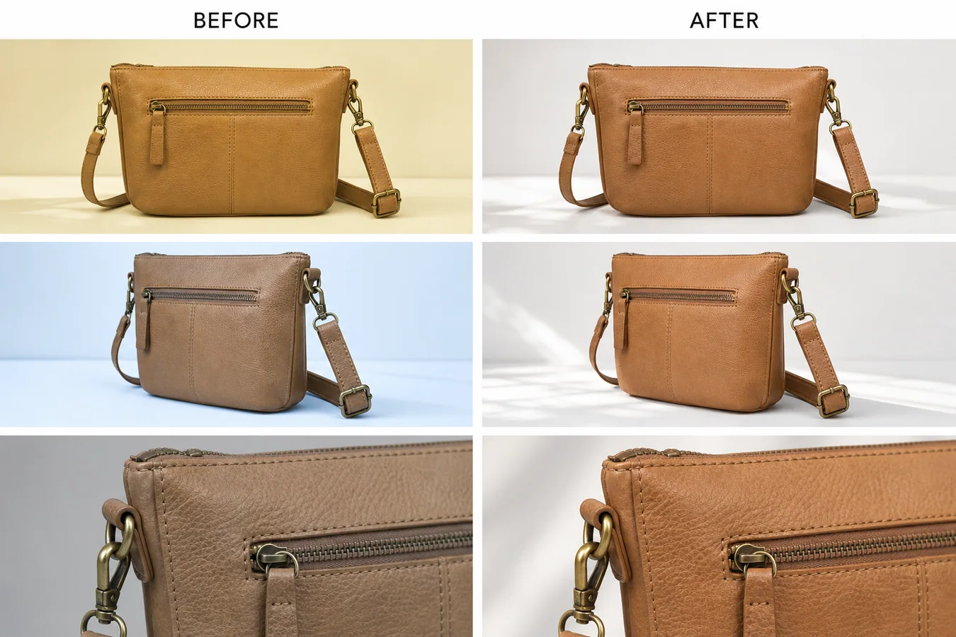 In the example, the same tan leather handbag appears yellow in one shot, cool blue in another, and dull gray in a detail image. The corrected set keeps the front view, side angle, brass hardware, stitching, zipper, strap, leather grain, and detail crop intact, but the leather tone becomes consistent enough for a product page.
## Why Tone Consistency Matters
Tone mismatch is easy to miss when images are edited one by one. It becomes obvious on a product page: the main image looks warm, the side view looks cold, and the detail crop looks darker than the rest. Buyers may read that as different materials, different batches, or a misleading listing.
A consistent set does three jobs:
- it makes the real product color easier to trust
- it helps detail images feel connected to the main image
- it reduces the chance that a buyer thinks the SKU changed between shots
This is especially important for leather goods, apparel, cosmetics, home goods, shoes, jewelry, and any product where color or surface finish affects returns.
## Pick One Reference Image First
Before editing, choose the photo that is closest to the real product. Do not use the most dramatic or most polished image if its color is wrong. Use the image that best represents the SKU under normal selling light.
For a handbag, that reference might be the front view where the leather reads as true tan and the brass hardware is not overly orange. For skincare, it might be the bottle shot where the label white and liquid color look closest to the sample. For apparel, it might be the model or flat-lay image that matches the approved color card.
Once the reference is chosen, every edit should point back to it.
## A Prompt for Matching Product Photo Tone
Use a local edit prompt in [KrafLayer](https://kraflayer.com):
> Match the color tone of this product photo set to the approved reference image. Keep the exact same product shape, leather color family, stitching, zipper, brass hardware, strap position, texture, camera angle, crop, contact shadow, and detail visibility. Correct yellow, blue, and gray color casts so the set reads as one consistent tan leather handbag under soft neutral daylight. Do not redesign the bag, change the material, add logos, remove hardware, oversaturate the leather, flatten the texture, or make the images look like a plastic render.
For a batch, keep the protection list stable and change only the product-specific details. The more concrete the protected details are, the less likely the AI edit will drift.
## Review the Whole Set Together
Tone matching should be judged as a set, not as separate images. Put the main image, angle view, close detail, and lifestyle or PDP crops next to each other. Then check:
- the same material color appears across every image
- whites and shadows feel neutral, not yellow, blue, green, or gray
- hardware, stitching, seams, labels, and texture are still visible
- the product has not become over-smoothed or over-saturated
- the corrected detail image still proves material quality
- the set would make sense on Shopify, Amazon, TikTok Shop, an ad, or an email block
The best correction is usually quiet. The buyer should not notice that the images were edited. They should simply stop seeing color conflict.
## What Not to Change
Do not use tone matching to hide real variant differences. If two SKUs are actually different shades, keep them different. If one batch of leather, fabric, ceramic, or packaging is materially different from another, the listing should be honest about it.
AI tone matching is strongest when the product is the same but the shoot conditions changed: supplier light, phone white balance, cloudy daylight, mixed indoor bulbs, or camera auto-processing. It should correct the photography, not rewrite the product.
## Where KrafLayer Fits
When you apply this Match Color Tone Across Multiple Product Photos workflow in KrafLayer, the tool choice matters: use Mask Edit for a local change with a short instruction, or Reference Image Editor when the result needs a visual example. After generation, judge the image by the channel it serves — listing images, detail pages, or ad assets — and check that shape, material, labels, color, scale, and accessories still match the source SKU.
## FAQ
### How do I match color tone across multiple product photos?
Choose one accurate reference photo, then correct the rest of the set toward that tone while protecting product shape, material texture, hardware, shadows, labels, and camera angle.
### Can AI fix yellow or blue color casts in product images?
Yes. AI can reduce yellow, blue, or gray color casts when the prompt defines the approved reference tone and clearly states which product details must not change.
### Should every product image have the exact same brightness?
No. Detail images and angle shots can have slightly different light, but the product color and material should still feel consistent across the listing.
### Is tone matching safe for ecommerce listings?
It is safe when it corrects lighting or white balance and the final images are checked against the real product. It should not be used to invent a color the SKU does not have.
# 汽车配件重金属质感 AI 打光怎么做
URL: https://kraflayer.com/zh/blog/ai-heavy-metal-lighting-for-auto-parts-product-images
Summary: 一套汽车配件工业感打光流程:增强金属质感,同时保留孔位、边缘、涂层、编号和装配几何。可在 KrafLayer 中按同一流程完成。
Updated: 2026-06-12
## TL;DR
汽车配件重金属质感 AI 打光这类任务,KrafLayer 适合处理局部变化或参考驱动的视觉调整:局部改动用 Mask Edit 加短指令;需要视觉参考时用 Reference Image Editor。生成结果必须让商品形状、材质、标签、颜色、比例和配件仍然对应原始 SKU。
汽车配件可以用重金属质感打光做得更有力量,但不能改变功能结构。孔位、边缘、厚度、涂层、编号和装配几何都属于商品事实。
## 可直接复制的 prompt
~~~text
以我上传的汽车配件图作为准确参考,生成工业重金属质感的电商商品图。请保留安装孔位、加工边缘、涂层、厚度、零件编号区域、金属材质、比例和装配相关结构。可以增强硬光、边缘高光、暗色技术背景和金属反射。不要改变孔位,不要磨平功能边缘,不要伪造编号,不要重新设计零件。
~~~
## KrafLayer 放在流程里的位置
把汽车配件重金属质感 AI 打光放到 KrafLayer 里做时,先选对工具:局部改动用 Mask Edit 加短指令;需要视觉参考时用 Reference Image Editor。生成后不要只看画面是否更漂亮,要按主图、详情图或广告素材的使用场景检查:商品形状、材质、标签、颜色、比例和配件仍然对应原始 SKU。
## FAQ
### 工业感图能不能加火花烟雾?
少用。它们容易遮挡结构。配件图首先要让买家看清适配信息。
# 食品包装图文字模糊怎么增强清晰度
URL: https://kraflayer.com/zh/blog/enhance-blurry-text-on-food-packaging-product-photos
Summary: 一套食品包装文字增强流程:提升可读性,但不让 AI 伪造配料、口味、品牌或标签信息。可在 KrafLayer 中按同一流程完成。
Updated: 2026-06-12
## TL;DR
食品包装图文字模糊这类任务,可以把 KrafLayer 当作上架前的快速修图环节:直接运行 Upscale,再检查纹理、边缘、标签和小字。它适合处理外卖菜单图,但最后要确认份量、配料、包装和实际出餐状态没有被夸大。
食品包装文字模糊时,要先判断文字是否真的可恢复。AI 可以提升边缘和对比,但不能凭空编配料表、口味、品牌名或净含量。
## 可直接复制的 prompt
~~~text
以我上传的食品包装图作为准确参考,增强包装上已有文字的清晰度。请保留真实包装形状、品牌区域、口味信息、颜色、材质、图案和标签版式。只提升已有文字边缘、对比和可读性,不要编造新文字,不要改配料、净含量、品牌或口味。
~~~
## KrafLayer 放在流程里的位置
把食品包装图文字模糊放到 KrafLayer 里做时,先选对工具:直接运行 Upscale,再检查纹理、边缘、标签和小字。生成后不要只看画面是否更漂亮,要按外卖菜单图的使用场景检查:份量、配料、包装和实际出餐状态没有被夸大。
## FAQ
### 完全糊掉的文字能恢复吗?
不能可靠恢复。重要文字需要高清参考或真实包装文件。
# How to Remove Reflections from Glass Skincare Packaging with AI
URL: https://kraflayer.com/blog/remove-reflections-from-glass-skincare-packaging-without-losing-texture
Summary: A careful AI retouching workflow for reducing harsh reflections on glass skincare bottles while preserving label readability, glass texture, liquid depth, and premium packaging cues. Includes how to do it in KrafLayer.
Updated: 2026-08-21
## TL;DR
For Remove Reflections from Glass Skincare Packaging, KrafLayer works best as a local cleanup tool: brush only the unwanted area in Erase and let the model fill from the surrounding pixels. Avoid regenerating the whole image; the result is only useful if the bottle shape, label, shade, texture, and packaging proportions stay believable.
Glass skincare packaging needs some reflection. Without highlights, a serum bottle looks flat and fake. The goal is not to erase every shine; it is to reduce harsh glare that hides the label, breaks the bottle shape, or makes the product look cheap.
Use this workflow when a skincare photo has a strong white streak, messy studio reflection, phone reflection, or window glare across the label or bottle shoulder. Keep the glass believable while making the product easier to read.
## What to remove and what to keep
Remove glare that blocks label text, cuts across the product shape, or creates a distracting white patch. Keep soft edge highlights, bottle curvature, cap reflections, liquid depth, and subtle shine that proves the packaging is glass.
For beauty ecommerce, material truth matters. A glass bottle should not become matte plastic just because the reflection cleanup was too aggressive.
## Workflow
1. Identify the reflection problem: label glare, cap glare, bottle-edge glare, or background reflection.
2. Edit only the problem area first instead of regenerating the whole bottle.
3. Preserve label text, logo position, cap shape, bottle shoulders, liquid color, and glass thickness.
4. Rebuild a softer highlight that follows the bottle curve.
5. Check the product at mobile product-card size and detail-page size.
## Where KrafLayer Fits
When you apply this Remove Reflections from Glass Skincare Packaging workflow in KrafLayer, the tool choice matters: brush only the unwanted area in Erase and let the model fill from the surrounding pixels. After generation, judge the image by the channel it serves — detail-page modules — and check that the bottle shape, label, shade, texture, and packaging proportions stay believable.
## Steps in KrafLayer
Use Erase with a brush mask: paint only the distracting object, sticker, hand, dust, or reflection area, then run the fill. There is no free-form prompt; mask accuracy controls the result.
1. Upload or choose the product image.
2. Run the tool according to its interaction model: one-click tools generate directly; Erase-style tools need a brush mask first.
3. Zoom in to check edges, text, material, shadow, and product scale before downloading or continuing the edit.
## Summary
Reflection cleanup for glass skincare packaging is a balance. Remove the glare that hurts conversion, but keep the controlled highlights that make the product feel premium and real.
## FAQ
### Should glass product photos have reflections?
Yes. Reflections describe shape and material. The problem is not reflection itself; the problem is uncontrolled glare that hides labels or distracts from the product.
### Can AI fix unreadable label text behind glare?
It can improve visibility when enough original text remains, but it should not invent label copy. If the text is fully hidden, use a cleaner reference or add final label text manually from the real packaging file.
### Why does the bottle look plastic after editing?
The prompt probably asked to remove too much shine. Ask for softer, controlled reflections instead of no reflections.
# 怎么把产品自然融合进 AI 生成的背景
URL: https://kraflayer.com/zh/blog/blend-products-into-ai-generated-backgrounds
Summary: 一套商品融合进 AI 背景的流程:匹配光线、透视、比例、接触阴影和边缘,避免贴图感。可在 KrafLayer 中按同一流程完成。
Updated: 2026-06-12
## TL;DR
怎么把产品自然融合进 AI 生成的背景这类任务,可以在 KrafLayer 里给真实商品图换场景或合成场景:用 Replace BG 生成文字或参考图驱动的场景;已有基础场景且要控制位置和比例时,用 Scene Compose。场景要服务主图、详情图或广告素材,同时保证商品形状、材质、标签、颜色、比例和配件仍然对应原始 SKU。
产品融合进 AI 背景,最重要的是让买家感觉它真的在那个空间里。光线、透视、比例、接触阴影和边缘只要错一个,就会像贴图。
## 可直接复制的 prompt
~~~text
以我上传的商品图作为准确参考,把商品自然融合进[场景/背景]。请保留商品形状、颜色、材质、纹理、logo/标签、比例和边缘,匹配场景的光线方向、透视、地面/桌面接触、阴影和反射。不要改变商品,不要让背景抢主体,不要让商品像贴上去的抠图。
~~~
## KrafLayer 放在流程里的位置
把怎么把产品自然融合进 AI 生成的背景放到 KrafLayer 里做时,先选对工具:用 Replace BG 生成文字或参考图驱动的场景;已有基础场景且要控制位置和比例时,用 Scene Compose。生成后不要只看画面是否更漂亮,要按主图、详情图或广告素材的使用场景检查:商品形状、材质、标签、颜色、比例和配件仍然对应原始 SKU。
## FAQ
### 为什么融合后像贴图?
多数是接触阴影、光线方向或比例不匹配。先修这些。
# How to Keep Product Images Consistent Across Shopify, Amazon, Etsy, and Ads
URL: https://kraflayer.com/blog/keep-product-images-consistent-across-shopify-amazon-etsy-and-ads
Summary: A practical workflow for keeping product images consistent across Shopify, Amazon, Etsy, and ads without changing the SKU.
Updated: 2026-06-20
Multi-platform ecommerce product images with consistent brand style work when the same SKU is recognizable everywhere, even when the crop, background, and channel role change. The product shape, color, material, logo area, lighting direction, and scale should stay stable. The platform-specific part is the image job: clean inspection, marketplace readiness, handmade context, campaign crop, or detail proof.
The practical rule is simple: create one product-truth reference first, then adapt image roles one at a time. In KrafLayer, that means keeping the product facts locked while using generation and editing workflows to produce a Shopify-ready image set, Amazon-style clean product photos, Etsy-friendly context, and ad crops from the same visual system.
In the example, the same tan leather handbag appears yellow in one shot, cool blue in another, and dull gray in a detail image. The corrected set keeps the front view, side angle, brass hardware, stitching, zipper, strap, leather grain, and detail crop intact, but the leather tone becomes consistent enough for a product page.
## Why Tone Consistency Matters
Tone mismatch is easy to miss when images are edited one by one. It becomes obvious on a product page: the main image looks warm, the side view looks cold, and the detail crop looks darker than the rest. Buyers may read that as different materials, different batches, or a misleading listing.
A consistent set does three jobs:
- it makes the real product color easier to trust
- it helps detail images feel connected to the main image
- it reduces the chance that a buyer thinks the SKU changed between shots
This is especially important for leather goods, apparel, cosmetics, home goods, shoes, jewelry, and any product where color or surface finish affects returns.
## Pick One Reference Image First
Before editing, choose the photo that is closest to the real product. Do not use the most dramatic or most polished image if its color is wrong. Use the image that best represents the SKU under normal selling light.
For a handbag, that reference might be the front view where the leather reads as true tan and the brass hardware is not overly orange. For skincare, it might be the bottle shot where the label white and liquid color look closest to the sample. For apparel, it might be the model or flat-lay image that matches the approved color card.
Once the reference is chosen, every edit should point back to it.
## A Prompt for Matching Product Photo Tone
Use a local edit prompt in [KrafLayer](https://kraflayer.com):
> Match the color tone of this product photo set to the approved reference image. Keep the exact same product shape, leather color family, stitching, zipper, brass hardware, strap position, texture, camera angle, crop, contact shadow, and detail visibility. Correct yellow, blue, and gray color casts so the set reads as one consistent tan leather handbag under soft neutral daylight. Do not redesign the bag, change the material, add logos, remove hardware, oversaturate the leather, flatten the texture, or make the images look like a plastic render.
For a batch, keep the protection list stable and change only the product-specific details. The more concrete the protected details are, the less likely the AI edit will drift.
## Review the Whole Set Together
Tone matching should be judged as a set, not as separate images. Put the main image, angle view, close detail, and lifestyle or PDP crops next to each other. Then check:
- the same material color appears across every image
- whites and shadows feel neutral, not yellow, blue, green, or gray
- hardware, stitching, seams, labels, and texture are still visible
- the product has not become over-smoothed or over-saturated
- the corrected detail image still proves material quality
- the set would make sense on Shopify, Amazon, TikTok Shop, an ad, or an email block
The best correction is usually quiet. The buyer should not notice that the images were edited. They should simply stop seeing color conflict.
## What Not to Change
Do not use tone matching to hide real variant differences. If two SKUs are actually different shades, keep them different. If one batch of leather, fabric, ceramic, or packaging is materially different from another, the listing should be honest about it.
AI tone matching is strongest when the product is the same but the shoot conditions changed: supplier light, phone white balance, cloudy daylight, mixed indoor bulbs, or camera auto-processing. It should correct the photography, not rewrite the product.
## Where KrafLayer Fits
When you apply this Match Color Tone Across Multiple Product Photos workflow in KrafLayer, the tool choice matters: use Mask Edit for a local change with a short instruction, or Reference Image Editor when the result needs a visual example. After generation, judge the image by the channel it serves — listing images, detail pages, or ad assets — and check that shape, material, labels, color, scale, and accessories still match the source SKU.
## FAQ
### How do I match color tone across multiple product photos?
Choose one accurate reference photo, then correct the rest of the set toward that tone while protecting product shape, material texture, hardware, shadows, labels, and camera angle.
### Can AI fix yellow or blue color casts in product images?
Yes. AI can reduce yellow, blue, or gray color casts when the prompt defines the approved reference tone and clearly states which product details must not change.
### Should every product image have the exact same brightness?
No. Detail images and angle shots can have slightly different light, but the product color and material should still feel consistent across the listing.
### Is tone matching safe for ecommerce listings?
It is safe when it corrects lighting or white balance and the final images are checked against the real product. It should not be used to invent a color the SKU does not have.
# 汽车配件重金属质感 AI 打光怎么做
URL: https://kraflayer.com/zh/blog/ai-heavy-metal-lighting-for-auto-parts-product-images
Summary: 一套汽车配件工业感打光流程:增强金属质感,同时保留孔位、边缘、涂层、编号和装配几何。可在 KrafLayer 中按同一流程完成。
Updated: 2026-06-12
## TL;DR
汽车配件重金属质感 AI 打光这类任务,KrafLayer 适合处理局部变化或参考驱动的视觉调整:局部改动用 Mask Edit 加短指令;需要视觉参考时用 Reference Image Editor。生成结果必须让商品形状、材质、标签、颜色、比例和配件仍然对应原始 SKU。
汽车配件可以用重金属质感打光做得更有力量,但不能改变功能结构。孔位、边缘、厚度、涂层、编号和装配几何都属于商品事实。
## 可直接复制的 prompt
~~~text
以我上传的汽车配件图作为准确参考,生成工业重金属质感的电商商品图。请保留安装孔位、加工边缘、涂层、厚度、零件编号区域、金属材质、比例和装配相关结构。可以增强硬光、边缘高光、暗色技术背景和金属反射。不要改变孔位,不要磨平功能边缘,不要伪造编号,不要重新设计零件。
~~~
## KrafLayer 放在流程里的位置
把汽车配件重金属质感 AI 打光放到 KrafLayer 里做时,先选对工具:局部改动用 Mask Edit 加短指令;需要视觉参考时用 Reference Image Editor。生成后不要只看画面是否更漂亮,要按主图、详情图或广告素材的使用场景检查:商品形状、材质、标签、颜色、比例和配件仍然对应原始 SKU。
## FAQ
### 工业感图能不能加火花烟雾?
少用。它们容易遮挡结构。配件图首先要让买家看清适配信息。
# 食品包装图文字模糊怎么增强清晰度
URL: https://kraflayer.com/zh/blog/enhance-blurry-text-on-food-packaging-product-photos
Summary: 一套食品包装文字增强流程:提升可读性,但不让 AI 伪造配料、口味、品牌或标签信息。可在 KrafLayer 中按同一流程完成。
Updated: 2026-06-12
## TL;DR
食品包装图文字模糊这类任务,可以把 KrafLayer 当作上架前的快速修图环节:直接运行 Upscale,再检查纹理、边缘、标签和小字。它适合处理外卖菜单图,但最后要确认份量、配料、包装和实际出餐状态没有被夸大。
食品包装文字模糊时,要先判断文字是否真的可恢复。AI 可以提升边缘和对比,但不能凭空编配料表、口味、品牌名或净含量。
## 可直接复制的 prompt
~~~text
以我上传的食品包装图作为准确参考,增强包装上已有文字的清晰度。请保留真实包装形状、品牌区域、口味信息、颜色、材质、图案和标签版式。只提升已有文字边缘、对比和可读性,不要编造新文字,不要改配料、净含量、品牌或口味。
~~~
## KrafLayer 放在流程里的位置
把食品包装图文字模糊放到 KrafLayer 里做时,先选对工具:直接运行 Upscale,再检查纹理、边缘、标签和小字。生成后不要只看画面是否更漂亮,要按外卖菜单图的使用场景检查:份量、配料、包装和实际出餐状态没有被夸大。
## FAQ
### 完全糊掉的文字能恢复吗?
不能可靠恢复。重要文字需要高清参考或真实包装文件。
# How to Remove Reflections from Glass Skincare Packaging with AI
URL: https://kraflayer.com/blog/remove-reflections-from-glass-skincare-packaging-without-losing-texture
Summary: A careful AI retouching workflow for reducing harsh reflections on glass skincare bottles while preserving label readability, glass texture, liquid depth, and premium packaging cues. Includes how to do it in KrafLayer.
Updated: 2026-08-21
## TL;DR
For Remove Reflections from Glass Skincare Packaging, KrafLayer works best as a local cleanup tool: brush only the unwanted area in Erase and let the model fill from the surrounding pixels. Avoid regenerating the whole image; the result is only useful if the bottle shape, label, shade, texture, and packaging proportions stay believable.
Glass skincare packaging needs some reflection. Without highlights, a serum bottle looks flat and fake. The goal is not to erase every shine; it is to reduce harsh glare that hides the label, breaks the bottle shape, or makes the product look cheap.
Use this workflow when a skincare photo has a strong white streak, messy studio reflection, phone reflection, or window glare across the label or bottle shoulder. Keep the glass believable while making the product easier to read.
## What to remove and what to keep
Remove glare that blocks label text, cuts across the product shape, or creates a distracting white patch. Keep soft edge highlights, bottle curvature, cap reflections, liquid depth, and subtle shine that proves the packaging is glass.
For beauty ecommerce, material truth matters. A glass bottle should not become matte plastic just because the reflection cleanup was too aggressive.
## Workflow
1. Identify the reflection problem: label glare, cap glare, bottle-edge glare, or background reflection.
2. Edit only the problem area first instead of regenerating the whole bottle.
3. Preserve label text, logo position, cap shape, bottle shoulders, liquid color, and glass thickness.
4. Rebuild a softer highlight that follows the bottle curve.
5. Check the product at mobile product-card size and detail-page size.
## Where KrafLayer Fits
When you apply this Remove Reflections from Glass Skincare Packaging workflow in KrafLayer, the tool choice matters: brush only the unwanted area in Erase and let the model fill from the surrounding pixels. After generation, judge the image by the channel it serves — detail-page modules — and check that the bottle shape, label, shade, texture, and packaging proportions stay believable.
## Steps in KrafLayer
Use Erase with a brush mask: paint only the distracting object, sticker, hand, dust, or reflection area, then run the fill. There is no free-form prompt; mask accuracy controls the result.
1. Upload or choose the product image.
2. Run the tool according to its interaction model: one-click tools generate directly; Erase-style tools need a brush mask first.
3. Zoom in to check edges, text, material, shadow, and product scale before downloading or continuing the edit.
## Summary
Reflection cleanup for glass skincare packaging is a balance. Remove the glare that hurts conversion, but keep the controlled highlights that make the product feel premium and real.
## FAQ
### Should glass product photos have reflections?
Yes. Reflections describe shape and material. The problem is not reflection itself; the problem is uncontrolled glare that hides labels or distracts from the product.
### Can AI fix unreadable label text behind glare?
It can improve visibility when enough original text remains, but it should not invent label copy. If the text is fully hidden, use a cleaner reference or add final label text manually from the real packaging file.
### Why does the bottle look plastic after editing?
The prompt probably asked to remove too much shine. Ask for softer, controlled reflections instead of no reflections.
# 怎么把产品自然融合进 AI 生成的背景
URL: https://kraflayer.com/zh/blog/blend-products-into-ai-generated-backgrounds
Summary: 一套商品融合进 AI 背景的流程:匹配光线、透视、比例、接触阴影和边缘,避免贴图感。可在 KrafLayer 中按同一流程完成。
Updated: 2026-06-12
## TL;DR
怎么把产品自然融合进 AI 生成的背景这类任务,可以在 KrafLayer 里给真实商品图换场景或合成场景:用 Replace BG 生成文字或参考图驱动的场景;已有基础场景且要控制位置和比例时,用 Scene Compose。场景要服务主图、详情图或广告素材,同时保证商品形状、材质、标签、颜色、比例和配件仍然对应原始 SKU。
产品融合进 AI 背景,最重要的是让买家感觉它真的在那个空间里。光线、透视、比例、接触阴影和边缘只要错一个,就会像贴图。
## 可直接复制的 prompt
~~~text
以我上传的商品图作为准确参考,把商品自然融合进[场景/背景]。请保留商品形状、颜色、材质、纹理、logo/标签、比例和边缘,匹配场景的光线方向、透视、地面/桌面接触、阴影和反射。不要改变商品,不要让背景抢主体,不要让商品像贴上去的抠图。
~~~
## KrafLayer 放在流程里的位置
把怎么把产品自然融合进 AI 生成的背景放到 KrafLayer 里做时,先选对工具:用 Replace BG 生成文字或参考图驱动的场景;已有基础场景且要控制位置和比例时,用 Scene Compose。生成后不要只看画面是否更漂亮,要按主图、详情图或广告素材的使用场景检查:商品形状、材质、标签、颜色、比例和配件仍然对应原始 SKU。
## FAQ
### 为什么融合后像贴图?
多数是接触阴影、光线方向或比例不匹配。先修这些。
# How to Keep Product Images Consistent Across Shopify, Amazon, Etsy, and Ads
URL: https://kraflayer.com/blog/keep-product-images-consistent-across-shopify-amazon-etsy-and-ads
Summary: A practical workflow for keeping product images consistent across Shopify, Amazon, Etsy, and ads without changing the SKU.
Updated: 2026-06-20
Multi-platform ecommerce product images with consistent brand style work when the same SKU is recognizable everywhere, even when the crop, background, and channel role change. The product shape, color, material, logo area, lighting direction, and scale should stay stable. The platform-specific part is the image job: clean inspection, marketplace readiness, handmade context, campaign crop, or detail proof.
The practical rule is simple: create one product-truth reference first, then adapt image roles one at a time. In KrafLayer, that means keeping the product facts locked while using generation and editing workflows to produce a Shopify-ready image set, Amazon-style clean product photos, Etsy-friendly context, and ad crops from the same visual system.
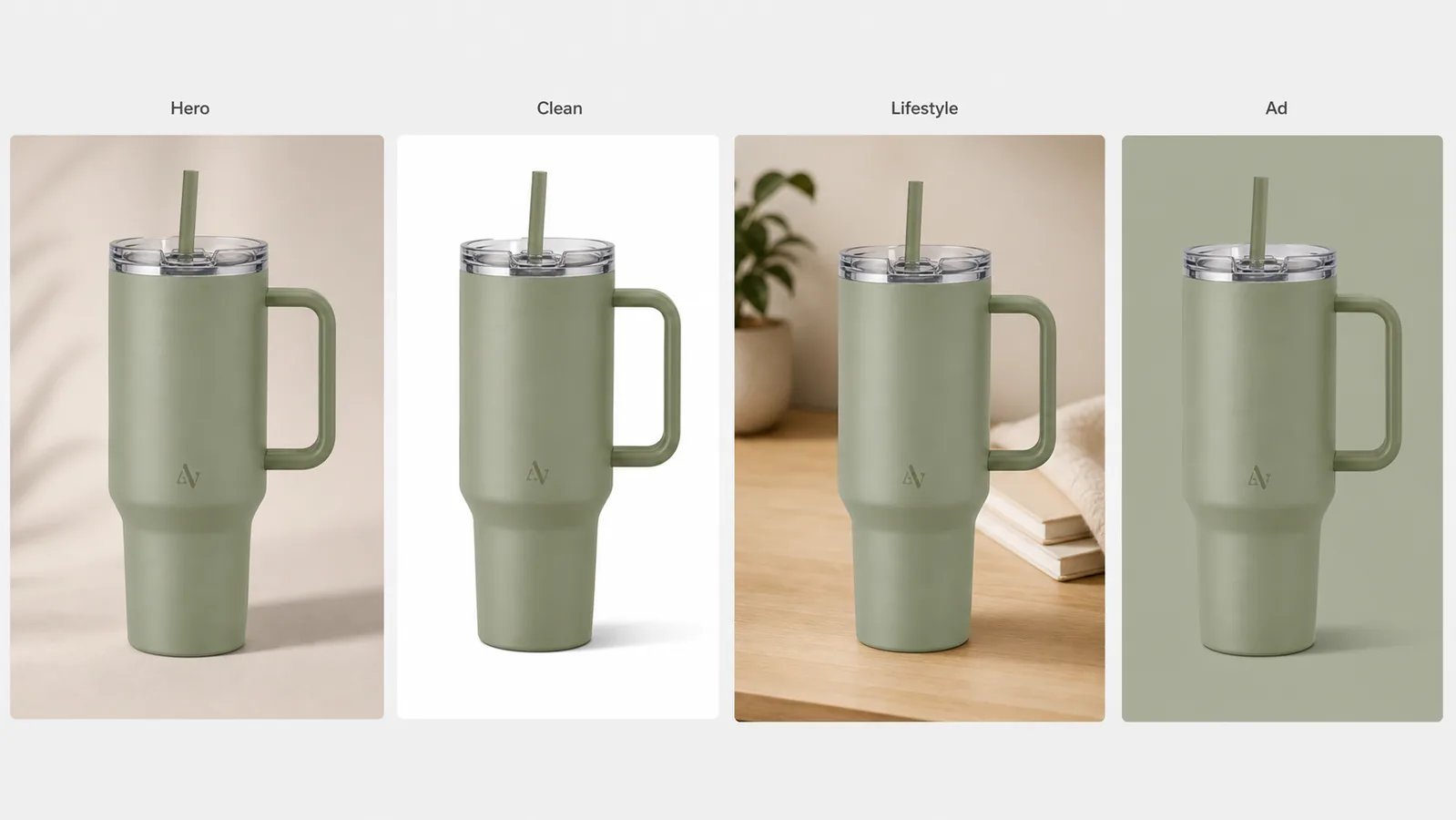 ## Start With A Product Truth List
Before making channel variants, write down the facts that cannot change. This is the anchor for consistent ecommerce product images.
For a physical product, the list should include:
- Product shape and proportions.
- True color and finish.
- Material texture, edge details, and surface behavior.
- Logo or label placement, if the product uses one.
- Hardware, lid, strap, zipper, cap, ports, seams, or other buyer-visible parts.
- Camera angle, scale cues, and natural shadow style.
- Any claim or detail that must be verified outside the image.
This list matters more than a style mood board. A mood board can make images attractive, but the product-truth list keeps the seller from publishing four beautiful images that accidentally look like four different SKUs.
## Define One Brand Style, Then Change The Image Role
Brand consistency does not mean every image must look identical. It means each image feels like it came from the same product system.
Keep these stable:
- Color temperature and contrast level.
- Shadow softness and general light direction.
- Product size in frame for each image type.
- Background restraint, even when the scene changes.
- Fictional or owned brand marks, never copied marketplace or competitor marks.
- A small set of recurring materials, surfaces, or accent colors.
Change these by channel:
- Crop ratio.
- Background role.
- Amount of white space.
- Detail versus full-product emphasis.
- Context level: plain, marketplace clean, handmade lifestyle, or ad-friendly.
For [ecommerce product photography](/ecommerce-product-photography), the buyer should never need to re-learn the product as they move from the main image to the platform-specific image set.
## Use A Channel Matrix Instead Of Random Variants
A channel matrix prevents thin, random image generation. It tells the designer what each asset must do.
| Image role | Best use | What should stay consistent |
|---|---|---|
| Clean product image | Shopify product page, marketplace gallery, catalog grid | Product color, shape, scale, edge detail, shadow |
| Main marketplace image | Amazon-style inspection, price comparison pages | Full SKU visibility, clean crop, honest product facts |
| Handmade or lifestyle context | Etsy-style storytelling, boutique pages | Material truth, restrained props, believable scale |
| Square ad crop | Paid social, retargeting, collection promos | Product identity, brand color, readable silhouette |
| Detail image | Product page proof, close-up selling point | Same material, hardware, seam, label, or texture |
This is also a useful handoff document for agencies. Instead of asking for "more versions," ask for one image per role.
## Build The Set In KrafLayer
Use this workflow to keep Shopify, Amazon, Etsy, and ad images aligned:
1. Upload the cleanest product reference.
2. Write the product-truth list before prompting.
3. Generate the neutral hero image first.
4. Create the clean marketplace version from the same product facts.
5. Add a restrained lifestyle version only after the clean version is stable.
6. Create the ad crop last, using the same color, product scale, and lighting family.
7. Use the editor to fix small background, crop, or local detail issues.
8. Review all images together as a set before publishing.
The [Shopify product image workflow](/marketplace-product-images/shopify-product-images) usually benefits from a full gallery: clean main image, detail image, and use-case image. Shopify product images can feel warmer than a bare catalog crop, but the product still needs enough margin and detail for a product page. [Amazon product photos](/marketplace-product-images/amazon-product-photos) need more cautious review because sellers should avoid unsupported claims and make sure the product is represented accurately. [Etsy product photos](/marketplace-product-images/etsy-product-photos) can use more context, but the handmade or boutique feel should not hide material, scale, or texture.
## Prompt Template For Consistent Brand Style
Use a prompt that separates product facts from channel role:
> Create a realistic ecommerce product image for the same product reference. Preserve the product shape, color, material finish, proportions, logo or label placement, hardware, seams, camera angle, scale, and natural shadow. Use the same calm brand style: soft neutral light, restrained background, clear product hierarchy, and no clutter. Adapt only the image role to [clean marketplace image / warm lifestyle product image / square ad crop / detail image]. Do not invent real marketplace logos, badges, review stars, certification marks, QR codes, barcodes, or unsupported product claims.
For a multi-image set, add:
> The final images should feel like one brand system. Keep color temperature, contrast, product scale, and shadow style consistent across all versions.
This prompt does not ask the model to copy a platform. It asks for a channel-appropriate product image while keeping the owned product and brand style intact.
## What To Check Before Publishing
Review the image set as a buyer, not only as a designer.
Check product consistency:
- Does every image show the same SKU?
- Did the product color drift between platforms?
- Did the model change the handle, cap, seam, label, logo area, button, or port layout?
- Is the product scale believable in every crop?
- Does the lifestyle scene make the product easier to understand?
Check brand consistency:
- Do the images share a lighting family?
- Are backgrounds varied without feeling unrelated?
- Are props restrained and relevant?
- Is text short, factual, and readable if used at all?
- Are fictional marks clearly fictional and not close to real brands?
Check channel risk:
- Are there fake badges, review stars, marketplace marks, or policy-like labels?
- Are there unsupported claims such as waterproof, medical, certified, organic, or safety language?
- Is the clean image still suitable as a product-inspection image?
- Does the ad crop still show enough product to recognize the SKU?
If one variant drifts, regenerate or locally edit that variant instead of accepting the whole set. Consistency comes from reviewing the images together.
## A Practical Multi-Platform Sequence
A strong product image system usually follows this order:
1. Product-truth reference.
2. Clean product image.
3. Marketplace-ready main image.
4. Detail proof image.
5. Lifestyle or handmade-context image.
6. Square ad crop.
7. Final consistency review.
Do not start with the most dramatic ad image. Start with the version that proves the product, then build the creative variants around it.
## FAQ
### What are multi-platform ecommerce product images with consistent brand style?
They are product images adapted for different selling contexts while preserving the same SKU and brand feel. The product facts stay fixed, but the crop, background, context, and image role change for Shopify, Amazon, Etsy, ads, or other ecommerce placements.
### Should Shopify, Amazon, Etsy, and ad images look the same?
No. They should feel related, not identical. A Shopify gallery may include clean and detail images, Amazon-style product photos should stay inspection-focused, Etsy images can use restrained handmade context, and ads can use tighter crops. The product identity should remain stable across all of them.
### Can AI keep brand style consistent across ecommerce product images?
AI can help, but only if you give it product facts and a clear style system. Use the same reference, protect product shape and color, define the lighting family, and review all outputs together. Do not publish variants that quietly change the SKU.
### What should I avoid when creating platform-specific product images?
Avoid real marketplace logos, fake badges, review stars, certification marks, QR codes, barcodes, unsupported claims, and platform-policy wording that you have not verified. Also avoid lifestyle scenes that make the product small, vague, or hard to inspect.
### What is the safest first image to create?
Start with a clean product image. It gives you a product-truth baseline for later Shopify gallery images, Amazon product photos, Etsy lifestyle images, and ad crops. Once the clean version is accurate, creative variants are easier to control.
## Conclusion
Multi-platform ecommerce product images with consistent brand style are built from product truth first and channel adaptation second. Keep the SKU stable, define one visual system, and change only the role of each image. KrafLayer helps sellers create that image set from a product reference, then refine individual variants so the final gallery feels coherent across Shopify, Amazon, Etsy, and ads.
# 微距镜头下的细节纹理 AI 展示怎么做
URL: https://kraflayer.com/zh/blog/ai-macro-detail-texture-display-for-product-images
Summary: 一套商品微距细节图流程:展示皮革、织物、金属、玻璃等材质,但不伪造纹理。可在 KrafLayer 中按同一流程完成。
Updated: 2026-06-12
## TL;DR
微距镜头下的细节纹理 AI 展示这类任务,KrafLayer 适合处理局部变化或参考驱动的视觉调整:局部改动用 Mask Edit 加短指令;需要视觉参考时用 Reference Image Editor。生成结果必须让商品形状、材质、标签、颜色、比例和配件仍然对应原始 SKU。
微距细节图的作用,是证明材质和做工。它可以展示皮革纹理、缝线、五金、织物、玻璃厚度或表面涂层,但不能伪造产品没有的细节。
## 可直接复制的 prompt
~~~text
以我上传的商品图作为准确参考,生成一张电商微距细节图,展示[材质/纹理/缝线/五金/边缘]。请保留真实材质、颜色、纹理方向、比例和产品身份。使用清晰近景光线和自然景深。不要伪造纹理,不要增加缝线,不要改变材质,不要生成不属于该商品的细节。
~~~
## KrafLayer 放在流程里的位置
把微距镜头下的细节纹理 AI 展示放到 KrafLayer 里做时,先选对工具:局部改动用 Mask Edit 加短指令;需要视觉参考时用 Reference Image Editor。生成后不要只看画面是否更漂亮,要按详情页模块的使用场景检查:商品形状、材质、标签、颜色、比例和配件仍然对应原始 SKU。
## FAQ
### 微距图可以替代主图吗?
不可以。微距图是补充,用来证明材质和工艺。
# How to Take Good Etsy Product Photos With AI Without Losing Handmade Feel
URL: https://kraflayer.com/blog/take-good-etsy-product-photos-with-ai
Summary: A practical Etsy product photo workflow for using AI while preserving handmade texture, scale, color, and authenticity.
Updated: 2026-06-19
How to take good Etsy product photos with AI starts with a simple rule: make the handmade item easier to trust, not harder to believe. Start with a real product reference, protect the material and shape, then use AI only to improve lighting, background, crop, and selling context. The best Etsy image still feels like it came from a real object made by a real seller.
Practical rule: AI should clean the presentation around the handmade product, not replace the product's handmade character.
KrafLayer fits this workflow when you want one reference photo to become a clearer Etsy main image, a restrained lifestyle scene, or a detail image that keeps the original product facts under review. Use [AI product photography](/ai-product-photography) for new selling contexts, and use the [Etsy product photos](/marketplace-product-images/etsy-product-photos) workflow when the goal is a listing set that feels warm, accurate, and buyer-ready.
## Start With A Product Truth List
Before making channel variants, write down the facts that cannot change. This is the anchor for consistent ecommerce product images.
For a physical product, the list should include:
- Product shape and proportions.
- True color and finish.
- Material texture, edge details, and surface behavior.
- Logo or label placement, if the product uses one.
- Hardware, lid, strap, zipper, cap, ports, seams, or other buyer-visible parts.
- Camera angle, scale cues, and natural shadow style.
- Any claim or detail that must be verified outside the image.
This list matters more than a style mood board. A mood board can make images attractive, but the product-truth list keeps the seller from publishing four beautiful images that accidentally look like four different SKUs.
## Define One Brand Style, Then Change The Image Role
Brand consistency does not mean every image must look identical. It means each image feels like it came from the same product system.
Keep these stable:
- Color temperature and contrast level.
- Shadow softness and general light direction.
- Product size in frame for each image type.
- Background restraint, even when the scene changes.
- Fictional or owned brand marks, never copied marketplace or competitor marks.
- A small set of recurring materials, surfaces, or accent colors.
Change these by channel:
- Crop ratio.
- Background role.
- Amount of white space.
- Detail versus full-product emphasis.
- Context level: plain, marketplace clean, handmade lifestyle, or ad-friendly.
For [ecommerce product photography](/ecommerce-product-photography), the buyer should never need to re-learn the product as they move from the main image to the platform-specific image set.
## Use A Channel Matrix Instead Of Random Variants
A channel matrix prevents thin, random image generation. It tells the designer what each asset must do.
| Image role | Best use | What should stay consistent |
|---|---|---|
| Clean product image | Shopify product page, marketplace gallery, catalog grid | Product color, shape, scale, edge detail, shadow |
| Main marketplace image | Amazon-style inspection, price comparison pages | Full SKU visibility, clean crop, honest product facts |
| Handmade or lifestyle context | Etsy-style storytelling, boutique pages | Material truth, restrained props, believable scale |
| Square ad crop | Paid social, retargeting, collection promos | Product identity, brand color, readable silhouette |
| Detail image | Product page proof, close-up selling point | Same material, hardware, seam, label, or texture |
This is also a useful handoff document for agencies. Instead of asking for "more versions," ask for one image per role.
## Build The Set In KrafLayer
Use this workflow to keep Shopify, Amazon, Etsy, and ad images aligned:
1. Upload the cleanest product reference.
2. Write the product-truth list before prompting.
3. Generate the neutral hero image first.
4. Create the clean marketplace version from the same product facts.
5. Add a restrained lifestyle version only after the clean version is stable.
6. Create the ad crop last, using the same color, product scale, and lighting family.
7. Use the editor to fix small background, crop, or local detail issues.
8. Review all images together as a set before publishing.
The [Shopify product image workflow](/marketplace-product-images/shopify-product-images) usually benefits from a full gallery: clean main image, detail image, and use-case image. Shopify product images can feel warmer than a bare catalog crop, but the product still needs enough margin and detail for a product page. [Amazon product photos](/marketplace-product-images/amazon-product-photos) need more cautious review because sellers should avoid unsupported claims and make sure the product is represented accurately. [Etsy product photos](/marketplace-product-images/etsy-product-photos) can use more context, but the handmade or boutique feel should not hide material, scale, or texture.
## Prompt Template For Consistent Brand Style
Use a prompt that separates product facts from channel role:
> Create a realistic ecommerce product image for the same product reference. Preserve the product shape, color, material finish, proportions, logo or label placement, hardware, seams, camera angle, scale, and natural shadow. Use the same calm brand style: soft neutral light, restrained background, clear product hierarchy, and no clutter. Adapt only the image role to [clean marketplace image / warm lifestyle product image / square ad crop / detail image]. Do not invent real marketplace logos, badges, review stars, certification marks, QR codes, barcodes, or unsupported product claims.
For a multi-image set, add:
> The final images should feel like one brand system. Keep color temperature, contrast, product scale, and shadow style consistent across all versions.
This prompt does not ask the model to copy a platform. It asks for a channel-appropriate product image while keeping the owned product and brand style intact.
## What To Check Before Publishing
Review the image set as a buyer, not only as a designer.
Check product consistency:
- Does every image show the same SKU?
- Did the product color drift between platforms?
- Did the model change the handle, cap, seam, label, logo area, button, or port layout?
- Is the product scale believable in every crop?
- Does the lifestyle scene make the product easier to understand?
Check brand consistency:
- Do the images share a lighting family?
- Are backgrounds varied without feeling unrelated?
- Are props restrained and relevant?
- Is text short, factual, and readable if used at all?
- Are fictional marks clearly fictional and not close to real brands?
Check channel risk:
- Are there fake badges, review stars, marketplace marks, or policy-like labels?
- Are there unsupported claims such as waterproof, medical, certified, organic, or safety language?
- Is the clean image still suitable as a product-inspection image?
- Does the ad crop still show enough product to recognize the SKU?
If one variant drifts, regenerate or locally edit that variant instead of accepting the whole set. Consistency comes from reviewing the images together.
## A Practical Multi-Platform Sequence
A strong product image system usually follows this order:
1. Product-truth reference.
2. Clean product image.
3. Marketplace-ready main image.
4. Detail proof image.
5. Lifestyle or handmade-context image.
6. Square ad crop.
7. Final consistency review.
Do not start with the most dramatic ad image. Start with the version that proves the product, then build the creative variants around it.
## FAQ
### What are multi-platform ecommerce product images with consistent brand style?
They are product images adapted for different selling contexts while preserving the same SKU and brand feel. The product facts stay fixed, but the crop, background, context, and image role change for Shopify, Amazon, Etsy, ads, or other ecommerce placements.
### Should Shopify, Amazon, Etsy, and ad images look the same?
No. They should feel related, not identical. A Shopify gallery may include clean and detail images, Amazon-style product photos should stay inspection-focused, Etsy images can use restrained handmade context, and ads can use tighter crops. The product identity should remain stable across all of them.
### Can AI keep brand style consistent across ecommerce product images?
AI can help, but only if you give it product facts and a clear style system. Use the same reference, protect product shape and color, define the lighting family, and review all outputs together. Do not publish variants that quietly change the SKU.
### What should I avoid when creating platform-specific product images?
Avoid real marketplace logos, fake badges, review stars, certification marks, QR codes, barcodes, unsupported claims, and platform-policy wording that you have not verified. Also avoid lifestyle scenes that make the product small, vague, or hard to inspect.
### What is the safest first image to create?
Start with a clean product image. It gives you a product-truth baseline for later Shopify gallery images, Amazon product photos, Etsy lifestyle images, and ad crops. Once the clean version is accurate, creative variants are easier to control.
## Conclusion
Multi-platform ecommerce product images with consistent brand style are built from product truth first and channel adaptation second. Keep the SKU stable, define one visual system, and change only the role of each image. KrafLayer helps sellers create that image set from a product reference, then refine individual variants so the final gallery feels coherent across Shopify, Amazon, Etsy, and ads.
# 微距镜头下的细节纹理 AI 展示怎么做
URL: https://kraflayer.com/zh/blog/ai-macro-detail-texture-display-for-product-images
Summary: 一套商品微距细节图流程:展示皮革、织物、金属、玻璃等材质,但不伪造纹理。可在 KrafLayer 中按同一流程完成。
Updated: 2026-06-12
## TL;DR
微距镜头下的细节纹理 AI 展示这类任务,KrafLayer 适合处理局部变化或参考驱动的视觉调整:局部改动用 Mask Edit 加短指令;需要视觉参考时用 Reference Image Editor。生成结果必须让商品形状、材质、标签、颜色、比例和配件仍然对应原始 SKU。
微距细节图的作用,是证明材质和做工。它可以展示皮革纹理、缝线、五金、织物、玻璃厚度或表面涂层,但不能伪造产品没有的细节。
## 可直接复制的 prompt
~~~text
以我上传的商品图作为准确参考,生成一张电商微距细节图,展示[材质/纹理/缝线/五金/边缘]。请保留真实材质、颜色、纹理方向、比例和产品身份。使用清晰近景光线和自然景深。不要伪造纹理,不要增加缝线,不要改变材质,不要生成不属于该商品的细节。
~~~
## KrafLayer 放在流程里的位置
把微距镜头下的细节纹理 AI 展示放到 KrafLayer 里做时,先选对工具:局部改动用 Mask Edit 加短指令;需要视觉参考时用 Reference Image Editor。生成后不要只看画面是否更漂亮,要按详情页模块的使用场景检查:商品形状、材质、标签、颜色、比例和配件仍然对应原始 SKU。
## FAQ
### 微距图可以替代主图吗?
不可以。微距图是补充,用来证明材质和工艺。
# How to Take Good Etsy Product Photos With AI Without Losing Handmade Feel
URL: https://kraflayer.com/blog/take-good-etsy-product-photos-with-ai
Summary: A practical Etsy product photo workflow for using AI while preserving handmade texture, scale, color, and authenticity.
Updated: 2026-06-19
How to take good Etsy product photos with AI starts with a simple rule: make the handmade item easier to trust, not harder to believe. Start with a real product reference, protect the material and shape, then use AI only to improve lighting, background, crop, and selling context. The best Etsy image still feels like it came from a real object made by a real seller.
Practical rule: AI should clean the presentation around the handmade product, not replace the product's handmade character.
KrafLayer fits this workflow when you want one reference photo to become a clearer Etsy main image, a restrained lifestyle scene, or a detail image that keeps the original product facts under review. Use [AI product photography](/ai-product-photography) for new selling contexts, and use the [Etsy product photos](/marketplace-product-images/etsy-product-photos) workflow when the goal is a listing set that feels warm, accurate, and buyer-ready.
 ## What Good Etsy Product Photos Need To Do
Good Etsy product photos have a different job from generic marketplace images. They still need clarity, but they also need evidence of craft: texture, scale, material, small variations, finish, and a believable use context.
For handmade products, the buyer is often asking three questions at once:
- What exactly am I buying?
- Does it look well made?
- Will it feel authentic when it arrives?
AI can help with the first two questions by improving light, crop, and scene quality. It can damage the third question if it smooths away texture, invents perfect symmetry, changes color, or makes the product look mass-produced.
## Start With Product Truth
Do not begin by asking AI to imagine an Etsy product from scratch. Start with a real reference photo of the item you sell.
The reference image should show:
- the true shape and scale
- actual material texture
- color under decent light
- handmade details, seams, glaze, grain, weave, or tool marks
- labels, attachments, hardware, or packaging that matter to the buyer
If the source photo is messy, fix the presentation first. Crop, clean the background, correct exposure, or remove distracting shoot-side clutter in the [product photo editor](/product-photo-editor). Keep the product itself honest.
## Build A Listing Set, Not One Perfect Image
An Etsy listing usually works better as a small image set than as one overworked hero photo. Each image should answer one buyer question.
A practical set can include:
1. Main image: clear product view with natural light and strong crop.
2. Detail image: texture, material, stitching, glaze, grain, clasp, or finish.
3. Scale image: item near a hand, table, room object, model, or packaging when appropriate.
4. Lifestyle image: restrained scene that shows use or gifting context.
5. Variation image: color, size, finish, or bundle differences if the listing offers options.
The main image should not do every job. Let the detail and lifestyle images carry the handmade story.
## Keep Handmade Texture Visible
Many AI-generated product photos fail Etsy sellers because they over-polish the item. A ceramic mug becomes too smooth. A knitted scarf loses fiber texture. A leather wallet loses grain. A candle label becomes too perfect or changes shape.
Protect the details that make the product handmade:
| Product type | Details to protect |
|---|---|
| Ceramics | glaze speckles, rim thickness, foot ring, uneven handmade surface |
| Jewelry | stone shape, prongs, clasp, chain thickness, metal finish |
| Textiles | weave, stitching, seams, hems, drape, true color |
| Leather goods | grain, edge paint, stitching, hardware, fold lines |
| Wood products | grain direction, joinery, carved edge, finish sheen |
| Candles and soaps | label position, surface texture, container shape, color |
If those details disappear, the photo may look cleaner but less trustworthy.
## Use AI For Light, Background, And Context
AI is most useful when it improves the setting around the item. That means better natural light, cleaner surface choice, a simpler background, or a context that explains use.
Good AI-assisted changes for Etsy include:
- turning a dull phone photo into a softly lit tabletop image
- creating a clean main image from a cluttered desk photo
- adding a restrained home, studio, gift, or craft-table context
- making a detail image that emphasizes material texture
- creating a consistent set across multiple related products
Risky changes include:
- changing the product shape
- removing handmade variation
- adding fake packaging claims
- inventing a different material
- adding logos, badges, barcodes, or certification-style marks
- making the scene so styled that the item is no longer clear
The background should support the product, not compete with it.
## Prompt Pattern For Etsy Product Photos
For a prompt-capable workflow, write the prompt like a product-protection note, not a mood-board request.
> Create a natural-light Etsy product photo from this handmade cream ceramic mug reference. Keep the exact mug shape, handle, rim thickness, glaze speckles, ceramic texture, color, scale, and handmade imperfections unchanged. Style it on a simple wood tabletop with a soft linen cloth and warm daylight. Keep the product dominant and centered. Do not add logos, claims, barcodes, marketplace UI, extra mugs, hands, text, or packaging redesigns.
This works because it names the channel, protects the product facts, and limits the scene. If you use [AI scene compose](/tools/ai-scene-compose), keep the product placement simple and review perspective, shadow, and scale after generation.
## Main Image Guidance For Etsy
Your main image should be readable at thumbnail size. The buyer should understand the product before they read the title.
Use this main-image checklist:
- product fills enough of the frame
- outline is easy to understand
- material is visible
- light is soft but not muddy
- crop has breathing room
- background does not distract
- product color still matches the real item
- no fake marks, stickers, badges, claims, or platform graphics appear
Avoid making the main image too atmospheric. Etsy buyers may appreciate mood, but they still need to inspect the item.
## Detail Images Are Where Handmade Products Win
For handmade goods, detail images often do more selling than a dramatic lifestyle scene. They show the buyer what makes the item different from a mass-market product.
Use detail images to show:
- glaze and surface variation
- fabric texture and stitching
- wood grain or carved edge
- clasp, button, zipper, or hardware quality
- label material and packaging finish
- product thickness, lining, or underside
AI can help create a cleaner crop or better light around those details, but it should not invent new details. If the AI adds a different stitch path, extra clasp, changed label, or false texture, regenerate or edit before publishing.
## Lifestyle Photos Should Still Feel Handmade
A lifestyle photo can help Etsy buyers imagine the product as a gift, home object, accessory, or daily-use item. Keep the scene modest.
Strong Etsy lifestyle scenes usually have:
- one product as the subject
- one believable use environment
- natural light
- simple surfaces
- a scale cue when helpful
- a handmade or small-studio feel
- no generic luxury clutter
If the item is handmade, the photo should not look like a plastic-perfect catalog render. Small surface variation and natural shadows are often part of the trust signal.
## Review Before Publishing
Before using an AI-assisted Etsy image, compare it against the real product.
Check:
- color accuracy
- product proportions
- texture and material
- handmade variation
- label or packaging details
- included parts and accessories
- scale cues
- natural shadow and perspective
- background relevance
- absence of fake claims or platform marks
The final question is simple: would a buyer feel misled if this photo were next to the item that ships? If the answer is yes or maybe, revise the image.
## FAQ
### Can I use AI for Etsy product photos?
Yes, if the AI work improves presentation without misrepresenting the item. Use a real product reference, preserve material, color, shape, and handmade details, and review every output before publishing. AI is best for cleaner light, background, crop, and context, not for inventing the product.
### What makes Etsy product photos different from regular ecommerce photos?
Etsy product photos need clarity and craft evidence. Buyers often care about texture, handmade variation, scale, materials, and whether the product feels authentic. A polished image is useful only if it still shows the real character of the item.
### Should Etsy product photos look perfectly professional?
They should look clear and trustworthy, but not fake. Over-polished AI images can make handmade goods look mass-produced. Soft natural light, visible texture, honest scale, and restrained styling usually work better than a glossy scene that hides the product.
### What should I protect when generating Etsy product photos with AI?
Protect the product facts that affect buyer trust: silhouette, color, material texture, handmade details, labels, hardware, seams, glaze, grain, scale, and included parts. Let AI improve the environment around those facts, not rewrite them.
### Is a lifestyle photo better than a plain product photo for Etsy?
Neither is always better. A clear product photo helps buyers inspect the item, while a lifestyle photo helps them imagine use or gifting. Most Etsy listings benefit from both: a readable main image, a few detail images, and one restrained lifestyle scene.
## Conclusion
Good Etsy product photos with AI come from restraint. The product should stay truthful, the handmade details should remain visible, and the image set should answer buyer questions one by one. KrafLayer helps sellers turn one real product reference into clearer Etsy main images, detail images, and restrained lifestyle photos while keeping shape, material, scale, and handmade feel under review. For handmade sellers, the advantage is not making every image look artificial; it is making the real product easier to understand and easier to trust.
# Product Listing Images: A Practical Checklist for Online Stores
URL: https://kraflayer.com/blog/product-listing-images-checklist-online-stores
Summary: A practical product listing image checklist for main photos, detail shots, scale views, lifestyle images, channel fit, and AI review.
Updated: 2026-06-22
Product listing images should answer the buyer's inspection questions before they read the description. A strong listing set usually starts with a clean main image, then adds angle, scale, detail, variant, and lifestyle images only when each one explains something real about the product.
The practical rule is this: every product listing image should either identify the item, prove a detail, show scale, explain use, or reduce a buyer objection. KrafLayer fits into that workflow when sellers need to create missing listing-image roles, clean weak source photos, or keep [ecommerce product photography](/ecommerce-product-photography) consistent across a store. For online store product images, consistency matters as much as polish because the set has to feel like one trustworthy product page.
## What Good Etsy Product Photos Need To Do
Good Etsy product photos have a different job from generic marketplace images. They still need clarity, but they also need evidence of craft: texture, scale, material, small variations, finish, and a believable use context.
For handmade products, the buyer is often asking three questions at once:
- What exactly am I buying?
- Does it look well made?
- Will it feel authentic when it arrives?
AI can help with the first two questions by improving light, crop, and scene quality. It can damage the third question if it smooths away texture, invents perfect symmetry, changes color, or makes the product look mass-produced.
## Start With Product Truth
Do not begin by asking AI to imagine an Etsy product from scratch. Start with a real reference photo of the item you sell.
The reference image should show:
- the true shape and scale
- actual material texture
- color under decent light
- handmade details, seams, glaze, grain, weave, or tool marks
- labels, attachments, hardware, or packaging that matter to the buyer
If the source photo is messy, fix the presentation first. Crop, clean the background, correct exposure, or remove distracting shoot-side clutter in the [product photo editor](/product-photo-editor). Keep the product itself honest.
## Build A Listing Set, Not One Perfect Image
An Etsy listing usually works better as a small image set than as one overworked hero photo. Each image should answer one buyer question.
A practical set can include:
1. Main image: clear product view with natural light and strong crop.
2. Detail image: texture, material, stitching, glaze, grain, clasp, or finish.
3. Scale image: item near a hand, table, room object, model, or packaging when appropriate.
4. Lifestyle image: restrained scene that shows use or gifting context.
5. Variation image: color, size, finish, or bundle differences if the listing offers options.
The main image should not do every job. Let the detail and lifestyle images carry the handmade story.
## Keep Handmade Texture Visible
Many AI-generated product photos fail Etsy sellers because they over-polish the item. A ceramic mug becomes too smooth. A knitted scarf loses fiber texture. A leather wallet loses grain. A candle label becomes too perfect or changes shape.
Protect the details that make the product handmade:
| Product type | Details to protect |
|---|---|
| Ceramics | glaze speckles, rim thickness, foot ring, uneven handmade surface |
| Jewelry | stone shape, prongs, clasp, chain thickness, metal finish |
| Textiles | weave, stitching, seams, hems, drape, true color |
| Leather goods | grain, edge paint, stitching, hardware, fold lines |
| Wood products | grain direction, joinery, carved edge, finish sheen |
| Candles and soaps | label position, surface texture, container shape, color |
If those details disappear, the photo may look cleaner but less trustworthy.
## Use AI For Light, Background, And Context
AI is most useful when it improves the setting around the item. That means better natural light, cleaner surface choice, a simpler background, or a context that explains use.
Good AI-assisted changes for Etsy include:
- turning a dull phone photo into a softly lit tabletop image
- creating a clean main image from a cluttered desk photo
- adding a restrained home, studio, gift, or craft-table context
- making a detail image that emphasizes material texture
- creating a consistent set across multiple related products
Risky changes include:
- changing the product shape
- removing handmade variation
- adding fake packaging claims
- inventing a different material
- adding logos, badges, barcodes, or certification-style marks
- making the scene so styled that the item is no longer clear
The background should support the product, not compete with it.
## Prompt Pattern For Etsy Product Photos
For a prompt-capable workflow, write the prompt like a product-protection note, not a mood-board request.
> Create a natural-light Etsy product photo from this handmade cream ceramic mug reference. Keep the exact mug shape, handle, rim thickness, glaze speckles, ceramic texture, color, scale, and handmade imperfections unchanged. Style it on a simple wood tabletop with a soft linen cloth and warm daylight. Keep the product dominant and centered. Do not add logos, claims, barcodes, marketplace UI, extra mugs, hands, text, or packaging redesigns.
This works because it names the channel, protects the product facts, and limits the scene. If you use [AI scene compose](/tools/ai-scene-compose), keep the product placement simple and review perspective, shadow, and scale after generation.
## Main Image Guidance For Etsy
Your main image should be readable at thumbnail size. The buyer should understand the product before they read the title.
Use this main-image checklist:
- product fills enough of the frame
- outline is easy to understand
- material is visible
- light is soft but not muddy
- crop has breathing room
- background does not distract
- product color still matches the real item
- no fake marks, stickers, badges, claims, or platform graphics appear
Avoid making the main image too atmospheric. Etsy buyers may appreciate mood, but they still need to inspect the item.
## Detail Images Are Where Handmade Products Win
For handmade goods, detail images often do more selling than a dramatic lifestyle scene. They show the buyer what makes the item different from a mass-market product.
Use detail images to show:
- glaze and surface variation
- fabric texture and stitching
- wood grain or carved edge
- clasp, button, zipper, or hardware quality
- label material and packaging finish
- product thickness, lining, or underside
AI can help create a cleaner crop or better light around those details, but it should not invent new details. If the AI adds a different stitch path, extra clasp, changed label, or false texture, regenerate or edit before publishing.
## Lifestyle Photos Should Still Feel Handmade
A lifestyle photo can help Etsy buyers imagine the product as a gift, home object, accessory, or daily-use item. Keep the scene modest.
Strong Etsy lifestyle scenes usually have:
- one product as the subject
- one believable use environment
- natural light
- simple surfaces
- a scale cue when helpful
- a handmade or small-studio feel
- no generic luxury clutter
If the item is handmade, the photo should not look like a plastic-perfect catalog render. Small surface variation and natural shadows are often part of the trust signal.
## Review Before Publishing
Before using an AI-assisted Etsy image, compare it against the real product.
Check:
- color accuracy
- product proportions
- texture and material
- handmade variation
- label or packaging details
- included parts and accessories
- scale cues
- natural shadow and perspective
- background relevance
- absence of fake claims or platform marks
The final question is simple: would a buyer feel misled if this photo were next to the item that ships? If the answer is yes or maybe, revise the image.
## FAQ
### Can I use AI for Etsy product photos?
Yes, if the AI work improves presentation without misrepresenting the item. Use a real product reference, preserve material, color, shape, and handmade details, and review every output before publishing. AI is best for cleaner light, background, crop, and context, not for inventing the product.
### What makes Etsy product photos different from regular ecommerce photos?
Etsy product photos need clarity and craft evidence. Buyers often care about texture, handmade variation, scale, materials, and whether the product feels authentic. A polished image is useful only if it still shows the real character of the item.
### Should Etsy product photos look perfectly professional?
They should look clear and trustworthy, but not fake. Over-polished AI images can make handmade goods look mass-produced. Soft natural light, visible texture, honest scale, and restrained styling usually work better than a glossy scene that hides the product.
### What should I protect when generating Etsy product photos with AI?
Protect the product facts that affect buyer trust: silhouette, color, material texture, handmade details, labels, hardware, seams, glaze, grain, scale, and included parts. Let AI improve the environment around those facts, not rewrite them.
### Is a lifestyle photo better than a plain product photo for Etsy?
Neither is always better. A clear product photo helps buyers inspect the item, while a lifestyle photo helps them imagine use or gifting. Most Etsy listings benefit from both: a readable main image, a few detail images, and one restrained lifestyle scene.
## Conclusion
Good Etsy product photos with AI come from restraint. The product should stay truthful, the handmade details should remain visible, and the image set should answer buyer questions one by one. KrafLayer helps sellers turn one real product reference into clearer Etsy main images, detail images, and restrained lifestyle photos while keeping shape, material, scale, and handmade feel under review. For handmade sellers, the advantage is not making every image look artificial; it is making the real product easier to understand and easier to trust.
# Product Listing Images: A Practical Checklist for Online Stores
URL: https://kraflayer.com/blog/product-listing-images-checklist-online-stores
Summary: A practical product listing image checklist for main photos, detail shots, scale views, lifestyle images, channel fit, and AI review.
Updated: 2026-06-22
Product listing images should answer the buyer's inspection questions before they read the description. A strong listing set usually starts with a clean main image, then adds angle, scale, detail, variant, and lifestyle images only when each one explains something real about the product.
The practical rule is this: every product listing image should either identify the item, prove a detail, show scale, explain use, or reduce a buyer objection. KrafLayer fits into that workflow when sellers need to create missing listing-image roles, clean weak source photos, or keep [ecommerce product photography](/ecommerce-product-photography) consistent across a store. For online store product images, consistency matters as much as polish because the set has to feel like one trustworthy product page.
 ## Product Listing Images Need Clear Jobs
Product listing images are not a gallery of nice photos. They are the visual evidence a shopper uses when they cannot hold the item.
Before publishing, each image should have one job:
- main image: make the product instantly recognizable
- angle image: reveal shape, depth, back, side, open state, or structure
- scale image: show size with a hand, desk, model, room, or familiar object
- detail image: prove material, texture, hardware, label quality, ports, seams, or construction
- variant image: show color, size, bundle, or option differences without changing the base SKU
- lifestyle image: show use context while keeping the product dominant
- comparison image: clarify dimensions, included parts, or before/after setup when that is true
If an image does not do one of those jobs, it may be decoration. Decoration can support a campaign, but it should not replace product evidence on a listing page.
## A Practical Checklist Before Publishing
Use this checklist for product listing images on a direct-to-consumer store, Shopify store, Amazon listing, Etsy listing, or paid traffic landing page.
Main image:
- product fills enough of the frame to read as a thumbnail
- full silhouette is visible
- crop does not cut off product-defining parts
- background is simple enough for fast recognition
- no fake badges, sale stickers, review stars, marketplace UI, or unsupported claims
Angle and scale images:
- side, back, open, worn, or in-hand view explains structure
- perspective matches the product's real shape
- color and finish stay consistent with the main image
- shadows and contact points look believable
- props do not look like included bundle items unless they are included
Product detail images:
- closeup answers a real buyer question
- material, texture, seam, hardware, port, label, cap, dial, screen edge, or package detail is sharp
- the detail crop clearly belongs to the same product
- AI has not invented markings, claims, labels, certification marks, barcodes, or QR codes
- any on-image label is short, factual, and approved
Lifestyle images:
- product remains the hero
- setting explains use, scale, or mood
- scene does not hide defects, condition, or important product parts
- color and scale still match the main image
- the image does not imply a use case the product cannot support
This checklist works because it keeps the product page focused on buyer confidence, not just visual polish.
## Do Not Use One Platform Rule Everywhere
Product listing images need different emphasis by channel. A marketplace main image, a Shopify product page, an Etsy handmade listing, and a landing page for ads may all need a different first impression.
For [Shopify product images](/marketplace-product-images/shopify-product-images), sellers usually control the whole product page, so the image set can support brand style, PDP layout, variants, bundles, recommendations, and campaign traffic. Consistency across the store often matters as much as any single image.
For [Amazon product photos](/marketplace-product-images/amazon-product-photos), the image set should be reviewed carefully against current marketplace guidance before launch. Use cautious workflows: clean product-first images, honest detail views, no unsupported claims, and no assumption that AI editing automatically makes an image compliant.
For [Etsy product photos](/marketplace-product-images/etsy-product-photos), buyers often care about material, handmade feel, scale, and authenticity. Over-polished scenes can weaken trust if they make a handmade product look like a generic catalog item.
The same product may need one common product truth and several channel-specific crops. Do not force one channel's image logic onto every listing.
## How KrafLayer Helps Build The Set
Use KrafLayer when the product is clear but the listing image set is incomplete.
The [AI product image generator](/ai-product-image-generator) can help create missing image roles from a product-first brief: a clean main view, an angle view, a detail shot, or a restrained lifestyle image.
The [product photo editor](/product-photo-editor) is better when the existing photo already shows the right product but needs background cleanup, crop correction, object removal, upscaling, or lighting improvement.
A useful generation brief protects product truth before asking for style:
> Create product listing images for the same matte warm-white desk organizer with an oak drawer, brass knob, and small fictional Noro wordmark. Preserve the product shape, drawer size, compartments, material, color, logo position, lighting direction, scale, and contact shadow. Create a clean main image, one angle image, one material detail image, and one restrained lifestyle image. Do not add real brand logos, marketplace UI, badges, review stars, barcodes, QR codes, sale stickers, certification marks, or unsupported claims.
For an edit, keep the instruction tighter:
> Keep this exact product unchanged. Improve listing clarity, crop, background, lighting, and sharpness. Preserve color, material, silhouette, label placement, hardware, seams, compartments, scale, and buyer-relevant details.
The goal is not to make the product look like a different premium item. The goal is to make the real product easier to inspect and trust.
## Review The Set In Listing Order
Do not review product listing images one by one in isolation. Review them in the order a buyer will see them.
Ask these questions:
1. Does the first image explain what is being sold within one second?
2. Does the second image add information instead of repeating the same view?
3. Does at least one image prove material, texture, construction, or scale?
4. Do all images show the same SKU, color, label, finish, and included parts?
5. Does the lifestyle image make the product clearer, or does it hide the product?
6. Would a buyer know what is not included?
7. Are there any fake claims, badges, UI marks, or unreadable invented text?
8. Does the set still work as small thumbnails?
If the answer is weak, fix the role that failed. A product page usually needs a clearer image, not just another image.
## Common Listing Image Mistakes
The most common mistake is relying on one hero photo. A hero photo can attract attention, but it rarely proves size, material, scale, and usage by itself.
Another mistake is making every support image a lifestyle image. Lifestyle context is useful, but product detail images and scale images often answer more direct buyer questions.
AI-specific mistakes include changing the product between images, smoothing away real material, inventing labels, adding fake badges, changing color, and making props look like included accessories. These issues are subtle, so review generated listing images against a real reference before publishing.
Product listing images should make the buyer more certain about the item. If the image set creates new questions, it needs another pass.
## FAQ
### What are product listing images?
Product listing images are the product photos used on an online store or marketplace listing. They usually include a main image plus support images for angle, scale, detail, variants, and use context. Each image should help the buyer understand the real product before purchasing.
### How many product listing images do I need?
A practical starting set is four to six images: main image, angle or scale image, product detail image, lifestyle image, and variant or bundle image when needed. Complex products may need more. The right number depends on what buyers must inspect before they feel confident.
### What is the difference between product listing images and ecommerce product photography?
Ecommerce product photography is the broader process of creating product visuals for online selling. Product listing images are the specific images used on a product page or marketplace listing. Good ecommerce product photography should produce listing-ready images with clear roles and consistent product truth.
### Can AI create product listing images?
AI can help create product listing images when it starts from a clear product reference and a narrow brief. It can generate main images, detail images, lifestyle scenes, and crop variations, but every output needs review for color, scale, material, labels, included parts, and unsupported claims.
### Should product listing images be the same for Shopify, Amazon, and Etsy?
No. The same product truth should stay consistent, but each channel may need different crops, backgrounds, and review checks. Shopify can support more brand-led page design, Amazon needs careful marketplace-guidance review, and Etsy often benefits from authentic material, scale, and handmade-context images.
## Conclusion
Product listing images work when every frame has a job: identify the product, prove a detail, show scale, explain use, or reduce buyer doubt. KrafLayer helps sellers create and edit those listing images from a product-first workflow, using AI product generation and product photo editing without losing the SKU details that make a listing trustworthy. For ecommerce teams, the advantage is a clearer product page with main images, detail images, lifestyle views, and channel-ready visuals built around the same product truth.
# How to Generate Electronics Product Images Without Changing Ports
URL: https://kraflayer.com/blog/generate-electronics-product-images-with-accurate-ports
Summary: A practical workflow for generating electronics product images with AI while preserving ports, buttons, seams, labels, material, and scale.
Updated: 2026-06-19
AI product images for electronics with accurate ports need a stricter workflow than lifestyle or fashion images. The product is not just a shape; the ports, buttons, screen cutouts, indicator lights, seams, vents, finish, and scale are part of what the buyer is evaluating.
Practical rule: generate the selling image, but treat the reference photo as the product truth. If the AI changes a USB-C port into a USB-A port, moves an HDMI slot, adds an extra button, or hides a connector, the image is not ready for ecommerce.
KrafLayer is useful for this kind of AI product image generator workflow because you can start from a real electronics reference, create a cleaner ecommerce image, then review and edit the output before it becomes a store asset.
## Product Listing Images Need Clear Jobs
Product listing images are not a gallery of nice photos. They are the visual evidence a shopper uses when they cannot hold the item.
Before publishing, each image should have one job:
- main image: make the product instantly recognizable
- angle image: reveal shape, depth, back, side, open state, or structure
- scale image: show size with a hand, desk, model, room, or familiar object
- detail image: prove material, texture, hardware, label quality, ports, seams, or construction
- variant image: show color, size, bundle, or option differences without changing the base SKU
- lifestyle image: show use context while keeping the product dominant
- comparison image: clarify dimensions, included parts, or before/after setup when that is true
If an image does not do one of those jobs, it may be decoration. Decoration can support a campaign, but it should not replace product evidence on a listing page.
## A Practical Checklist Before Publishing
Use this checklist for product listing images on a direct-to-consumer store, Shopify store, Amazon listing, Etsy listing, or paid traffic landing page.
Main image:
- product fills enough of the frame to read as a thumbnail
- full silhouette is visible
- crop does not cut off product-defining parts
- background is simple enough for fast recognition
- no fake badges, sale stickers, review stars, marketplace UI, or unsupported claims
Angle and scale images:
- side, back, open, worn, or in-hand view explains structure
- perspective matches the product's real shape
- color and finish stay consistent with the main image
- shadows and contact points look believable
- props do not look like included bundle items unless they are included
Product detail images:
- closeup answers a real buyer question
- material, texture, seam, hardware, port, label, cap, dial, screen edge, or package detail is sharp
- the detail crop clearly belongs to the same product
- AI has not invented markings, claims, labels, certification marks, barcodes, or QR codes
- any on-image label is short, factual, and approved
Lifestyle images:
- product remains the hero
- setting explains use, scale, or mood
- scene does not hide defects, condition, or important product parts
- color and scale still match the main image
- the image does not imply a use case the product cannot support
This checklist works because it keeps the product page focused on buyer confidence, not just visual polish.
## Do Not Use One Platform Rule Everywhere
Product listing images need different emphasis by channel. A marketplace main image, a Shopify product page, an Etsy handmade listing, and a landing page for ads may all need a different first impression.
For [Shopify product images](/marketplace-product-images/shopify-product-images), sellers usually control the whole product page, so the image set can support brand style, PDP layout, variants, bundles, recommendations, and campaign traffic. Consistency across the store often matters as much as any single image.
For [Amazon product photos](/marketplace-product-images/amazon-product-photos), the image set should be reviewed carefully against current marketplace guidance before launch. Use cautious workflows: clean product-first images, honest detail views, no unsupported claims, and no assumption that AI editing automatically makes an image compliant.
For [Etsy product photos](/marketplace-product-images/etsy-product-photos), buyers often care about material, handmade feel, scale, and authenticity. Over-polished scenes can weaken trust if they make a handmade product look like a generic catalog item.
The same product may need one common product truth and several channel-specific crops. Do not force one channel's image logic onto every listing.
## How KrafLayer Helps Build The Set
Use KrafLayer when the product is clear but the listing image set is incomplete.
The [AI product image generator](/ai-product-image-generator) can help create missing image roles from a product-first brief: a clean main view, an angle view, a detail shot, or a restrained lifestyle image.
The [product photo editor](/product-photo-editor) is better when the existing photo already shows the right product but needs background cleanup, crop correction, object removal, upscaling, or lighting improvement.
A useful generation brief protects product truth before asking for style:
> Create product listing images for the same matte warm-white desk organizer with an oak drawer, brass knob, and small fictional Noro wordmark. Preserve the product shape, drawer size, compartments, material, color, logo position, lighting direction, scale, and contact shadow. Create a clean main image, one angle image, one material detail image, and one restrained lifestyle image. Do not add real brand logos, marketplace UI, badges, review stars, barcodes, QR codes, sale stickers, certification marks, or unsupported claims.
For an edit, keep the instruction tighter:
> Keep this exact product unchanged. Improve listing clarity, crop, background, lighting, and sharpness. Preserve color, material, silhouette, label placement, hardware, seams, compartments, scale, and buyer-relevant details.
The goal is not to make the product look like a different premium item. The goal is to make the real product easier to inspect and trust.
## Review The Set In Listing Order
Do not review product listing images one by one in isolation. Review them in the order a buyer will see them.
Ask these questions:
1. Does the first image explain what is being sold within one second?
2. Does the second image add information instead of repeating the same view?
3. Does at least one image prove material, texture, construction, or scale?
4. Do all images show the same SKU, color, label, finish, and included parts?
5. Does the lifestyle image make the product clearer, or does it hide the product?
6. Would a buyer know what is not included?
7. Are there any fake claims, badges, UI marks, or unreadable invented text?
8. Does the set still work as small thumbnails?
If the answer is weak, fix the role that failed. A product page usually needs a clearer image, not just another image.
## Common Listing Image Mistakes
The most common mistake is relying on one hero photo. A hero photo can attract attention, but it rarely proves size, material, scale, and usage by itself.
Another mistake is making every support image a lifestyle image. Lifestyle context is useful, but product detail images and scale images often answer more direct buyer questions.
AI-specific mistakes include changing the product between images, smoothing away real material, inventing labels, adding fake badges, changing color, and making props look like included accessories. These issues are subtle, so review generated listing images against a real reference before publishing.
Product listing images should make the buyer more certain about the item. If the image set creates new questions, it needs another pass.
## FAQ
### What are product listing images?
Product listing images are the product photos used on an online store or marketplace listing. They usually include a main image plus support images for angle, scale, detail, variants, and use context. Each image should help the buyer understand the real product before purchasing.
### How many product listing images do I need?
A practical starting set is four to six images: main image, angle or scale image, product detail image, lifestyle image, and variant or bundle image when needed. Complex products may need more. The right number depends on what buyers must inspect before they feel confident.
### What is the difference between product listing images and ecommerce product photography?
Ecommerce product photography is the broader process of creating product visuals for online selling. Product listing images are the specific images used on a product page or marketplace listing. Good ecommerce product photography should produce listing-ready images with clear roles and consistent product truth.
### Can AI create product listing images?
AI can help create product listing images when it starts from a clear product reference and a narrow brief. It can generate main images, detail images, lifestyle scenes, and crop variations, but every output needs review for color, scale, material, labels, included parts, and unsupported claims.
### Should product listing images be the same for Shopify, Amazon, and Etsy?
No. The same product truth should stay consistent, but each channel may need different crops, backgrounds, and review checks. Shopify can support more brand-led page design, Amazon needs careful marketplace-guidance review, and Etsy often benefits from authentic material, scale, and handmade-context images.
## Conclusion
Product listing images work when every frame has a job: identify the product, prove a detail, show scale, explain use, or reduce buyer doubt. KrafLayer helps sellers create and edit those listing images from a product-first workflow, using AI product generation and product photo editing without losing the SKU details that make a listing trustworthy. For ecommerce teams, the advantage is a clearer product page with main images, detail images, lifestyle views, and channel-ready visuals built around the same product truth.
# How to Generate Electronics Product Images Without Changing Ports
URL: https://kraflayer.com/blog/generate-electronics-product-images-with-accurate-ports
Summary: A practical workflow for generating electronics product images with AI while preserving ports, buttons, seams, labels, material, and scale.
Updated: 2026-06-19
AI product images for electronics with accurate ports need a stricter workflow than lifestyle or fashion images. The product is not just a shape; the ports, buttons, screen cutouts, indicator lights, seams, vents, finish, and scale are part of what the buyer is evaluating.
Practical rule: generate the selling image, but treat the reference photo as the product truth. If the AI changes a USB-C port into a USB-A port, moves an HDMI slot, adds an extra button, or hides a connector, the image is not ready for ecommerce.
KrafLayer is useful for this kind of AI product image generator workflow because you can start from a real electronics reference, create a cleaner ecommerce image, then review and edit the output before it becomes a store asset.
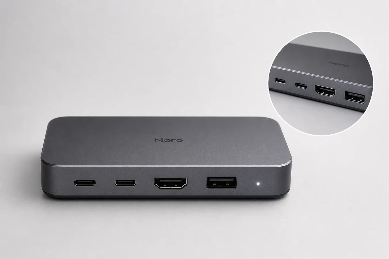 ## What Accurate Ports Mean In Electronics Product Images
Accurate ports means the AI image preserves the buyer-relevant hardware details from the real SKU. For electronics, this includes connector type, port count, port order, spacing, orientation, labels, LEDs, screws, vents, seams, bezels, buttons, speaker holes, camera bumps, and material finish.
A good electronics product image can improve lighting, crop, background, and selling context. It should not invent new hardware.
For a USB-C docking hub, the image should keep the exact front edge, connector shapes, slot count, indicator light, rounded corners, finish, and product scale. For a keyboard, it should preserve key layout, legends, case shape, knob placement, and cable position. For a smartwatch, it should preserve bezel shape, side button placement, sensor area, band connection, and display proportions.
## Why Electronics Are Easier To Break With AI
Electronics images contain small structured details. AI can make the overall product look convincing while quietly changing a technical detail that matters to the buyer.
Common failure points include:
- USB-C ports becoming wider USB-A slots
- HDMI, SD card, or Ethernet ports changing shape
- buttons moving from one side to another
- labels, icons, and port markings becoming fake or unreadable
- vents and speaker holes multiplying
- bezels, seams, and corners shifting
- screens showing fake interface claims
- product scale changing between main and detail images
This is why electronics product photography with AI needs review at the detail level. A polished image with wrong ports can create returns, support questions, or buyer distrust.
## Start With A Product-Truth Reference
Use one source image where the hardware facts are clear. It does not need to be a perfect studio photo, but it should show the details that cannot change.
Before generating, make a short product-truth list:
1. Port count and order.
2. Connector shapes.
3. Buttons, switches, and LEDs.
4. Screen, lens, or display shape.
5. Seam, vent, screw, and edge placement.
6. Material finish and color.
7. Approximate scale and camera angle.
This list becomes the review checklist for every generated image. Without it, it is too easy to accept an image because it looks premium while missing the actual SKU.
## Use One Image Role At A Time
Do not ask one AI generation to create every asset at once. Electronics images work better when each output has one ecommerce job.
Use a clean main image when the buyer needs fast product recognition. Use a detail image when the buyer needs to inspect a port, texture, button, hinge, or screen edge. Use a lifestyle image only after the product facts are stable.
A practical set might include:
- main image on a clean background
- front-port detail image
- top or side angle for controls
- scale image with a simple desk setup
- campaign image for an ad or landing page
This keeps the article's core rule intact: generate electronics product images one role at a time, then compare each result against the reference.
## Prompt Pattern For Accurate Electronics Details
Use the prompt to protect the physical product, not just to describe a prettier scene.
> Create a clean ecommerce product image of this matte graphite USB-C docking hub on a light gray studio surface. Keep the exact rectangular rounded body, two USB-C ports, one HDMI port, one USB-A port, small LED indicator, front-edge spacing, material texture, brand mark, camera angle, scale, and soft contact shadow unchanged. Improve lighting and clarity only. Do not add extra ports, cables, certification marks, marketplace badges, screen UI, barcode, QR code, labels, hands, or extra products.
The prompt works because it names both the image role and the hardware facts. It also tells the model what not to invent.
For other products, replace the protected details:
- headphones: ear cup shape, hinge, ports, buttons, fabric mesh, and headband curve
- smart speaker: grille pattern, buttons, cable opening, LED ring, and product height
- monitor: bezel width, stand shape, ports, screen ratio, and logo placement
- keyboard: key layout, legends, switches, knob, cable, and case profile
## Review The Generated Image Like A Product Page Editor
Before publishing, compare the output against the source image. Zoom in on the areas a buyer would inspect.
Check these details:
- Are the same ports present?
- Are the ports in the same order?
- Are connector shapes believable?
- Did the AI add or remove a button?
- Did the material finish stay true to the product?
- Are labels, icons, and brand marks fictional or approved?
- Did the image add certification marks, marketplace logos, barcodes, or fake claims?
- Does the detail image still match the main image?
If any hardware fact changed, regenerate with a narrower prompt or fix only the affected area with an editor workflow. Do not publish the image because it looks attractive.
## Where KrafLayer Fits In The Workflow
Use [KrafLayer's AI product image generator](/ai-product-image-generator) when you need a cleaner main image, detail image, or ecommerce scene from a real product reference. For electronics, the best workflow is reference first, generation second, review third.
If the output is mostly right but one small area is wrong, move into the [product photo editor](/product-photo-editor) workflow instead of regenerating the entire scene. Local edits are often safer when the product body, lighting, and crop are already working.
For broader image planning, the [ecommerce product photography](/ecommerce-product-photography) page explains how main images, detail images, and scene images work together as a selling system. Electronics benefit from that structure because technical trust and visual appeal both matter.
## A Safe Electronics Image Workflow
Use this workflow when producing electronics visuals with AI:
1. Choose the clearest product reference.
2. Write a product-truth list before generating.
3. Generate one image role at a time.
4. Protect ports, buttons, seams, finish, labels, and scale in the prompt.
5. Compare the output against the reference at full size.
6. Fix small errors locally when possible.
7. Export only images where hardware facts match the SKU.
The strongest AI electronics images are not the most dramatic ones. They are the ones that make the product easier to understand without changing what the customer will receive.
## FAQ
### Can AI generate electronics product images accurately?
AI can generate useful electronics product images, but accuracy depends on the workflow. Use a clear reference image, protect the exact ports and hardware details in the prompt, and review the output before publishing. Do not assume a polished render is technically accurate.
### What should I check first in AI-generated electronics photos?
Check the buyer-relevant hardware first: port count, connector shape, button placement, screen or lens shape, seams, vents, labels, LEDs, material finish, and product scale. These details affect trust more than background style or dramatic lighting.
### Can I use AI images for product detail images?
Yes, but detail images need tighter review than hero images. A detail crop should show real material, accurate ports, correct button placement, and the same product identity as the main image. If the detail view invents hardware, it should be regenerated or edited.
### What prompt helps keep electronics ports unchanged?
Use a prompt that names the exact product role and protected details: port count, port order, connector type, button placement, finish, scale, and camera angle. Also add negative instructions against extra ports, fake labels, certification marks, marketplace badges, and extra products.
### Should electronics AI images use lifestyle scenes?
Lifestyle scenes can work after the product facts are stable. Start with a clean main image or detail image, verify the hardware, then create a restrained desk, workspace, gaming, kitchen, or travel scene. The scene should support the product without hiding ports or changing scale.
## Conclusion
Electronics product images need more than good lighting and a clean background. They need accurate ports, buttons, seams, finish, and scale because those details shape buyer trust. KrafLayer helps sellers turn a real electronics reference into AI product images, detail images, and ecommerce scenes, but the best workflow keeps product truth in control: generate one asset at a time, review every hardware detail, and publish only images that match the SKU.
# 高端奢华黑金风格珠宝海报设计怎么用 AI 做
URL: https://kraflayer.com/zh/blog/black-gold-luxury-jewelry-poster-design-with-ai
Summary: 一套黑金珠宝海报流程:用深色和金色光强调高级感,同时保留首饰真实结构和材质。可在 KrafLayer 中按同一流程完成。
Updated: 2026-06-12
## TL;DR
高端奢华黑金风格珠宝海报设计这类任务,KrafLayer 适合处理局部变化或参考驱动的视觉调整:局部改动用 Mask Edit 加短指令;需要视觉参考时用 Reference Image Editor。生成结果必须让金属色、宝石比例、支架痕迹和微距细节准确。
黑金风能快速制造珠宝高级感,但也容易把首饰藏进暗部,或者把金属颜色和宝石大小改掉。
## 可直接复制的 prompt
~~~text
以我上传的珠宝图作为准确参考,生成黑金高级感电商海报。请保留金属颜色、宝石大小、镶嵌结构、链节、扣件、刻字、比例和轮廓。使用深色背景、受控金色边缘光、优雅倒影和干净留白。不要改变首饰设计,不要放大宝石,不要让暗部遮挡细节。
~~~
## KrafLayer 放在流程里的位置
把高端奢华黑金风格珠宝海报设计放到 KrafLayer 里做时,先选对工具:局部改动用 Mask Edit 加短指令;需要视觉参考时用 Reference Image Editor。生成后不要只看画面是否更漂亮,要按广告海报的使用场景检查:金属色、宝石比例、支架痕迹和微距细节准确。
## FAQ
### 银饰可以做黑金风吗?
可以,但要明确“银色金属不变”,金色只能作为环境光。
# How to Create Clean White Background Product Images for Google Shopping
URL: https://kraflayer.com/blog/create-clean-white-background-product-images-for-google-shopping
Summary: A cautious workflow for preparing clean white-background product images for Google Shopping while preserving product truth.
Updated: 2026-06-20
Google Shopping product images white background work best when the buyer sees the actual product clearly, without text overlays, fake badges, watermarks, or distracting props. A clean white or transparent background is usually the safest starting point, but it is not a guarantee of approval. Sellers still need to review current Google Merchant Center diagnostics and Google's official image guidance before submitting or resubmitting product data.
The practical workflow is: start with the real product photo, remove or replace the background, keep the SKU unchanged, check the image for overlays or unsupported claims, then review the result in Merchant Center. In KrafLayer, this usually means using the [product background remover](/tools/ai-background-remover) first, then making any small fixes in the [product photo editor](/product-photo-editor).
## What Accurate Ports Mean In Electronics Product Images
Accurate ports means the AI image preserves the buyer-relevant hardware details from the real SKU. For electronics, this includes connector type, port count, port order, spacing, orientation, labels, LEDs, screws, vents, seams, bezels, buttons, speaker holes, camera bumps, and material finish.
A good electronics product image can improve lighting, crop, background, and selling context. It should not invent new hardware.
For a USB-C docking hub, the image should keep the exact front edge, connector shapes, slot count, indicator light, rounded corners, finish, and product scale. For a keyboard, it should preserve key layout, legends, case shape, knob placement, and cable position. For a smartwatch, it should preserve bezel shape, side button placement, sensor area, band connection, and display proportions.
## Why Electronics Are Easier To Break With AI
Electronics images contain small structured details. AI can make the overall product look convincing while quietly changing a technical detail that matters to the buyer.
Common failure points include:
- USB-C ports becoming wider USB-A slots
- HDMI, SD card, or Ethernet ports changing shape
- buttons moving from one side to another
- labels, icons, and port markings becoming fake or unreadable
- vents and speaker holes multiplying
- bezels, seams, and corners shifting
- screens showing fake interface claims
- product scale changing between main and detail images
This is why electronics product photography with AI needs review at the detail level. A polished image with wrong ports can create returns, support questions, or buyer distrust.
## Start With A Product-Truth Reference
Use one source image where the hardware facts are clear. It does not need to be a perfect studio photo, but it should show the details that cannot change.
Before generating, make a short product-truth list:
1. Port count and order.
2. Connector shapes.
3. Buttons, switches, and LEDs.
4. Screen, lens, or display shape.
5. Seam, vent, screw, and edge placement.
6. Material finish and color.
7. Approximate scale and camera angle.
This list becomes the review checklist for every generated image. Without it, it is too easy to accept an image because it looks premium while missing the actual SKU.
## Use One Image Role At A Time
Do not ask one AI generation to create every asset at once. Electronics images work better when each output has one ecommerce job.
Use a clean main image when the buyer needs fast product recognition. Use a detail image when the buyer needs to inspect a port, texture, button, hinge, or screen edge. Use a lifestyle image only after the product facts are stable.
A practical set might include:
- main image on a clean background
- front-port detail image
- top or side angle for controls
- scale image with a simple desk setup
- campaign image for an ad or landing page
This keeps the article's core rule intact: generate electronics product images one role at a time, then compare each result against the reference.
## Prompt Pattern For Accurate Electronics Details
Use the prompt to protect the physical product, not just to describe a prettier scene.
> Create a clean ecommerce product image of this matte graphite USB-C docking hub on a light gray studio surface. Keep the exact rectangular rounded body, two USB-C ports, one HDMI port, one USB-A port, small LED indicator, front-edge spacing, material texture, brand mark, camera angle, scale, and soft contact shadow unchanged. Improve lighting and clarity only. Do not add extra ports, cables, certification marks, marketplace badges, screen UI, barcode, QR code, labels, hands, or extra products.
The prompt works because it names both the image role and the hardware facts. It also tells the model what not to invent.
For other products, replace the protected details:
- headphones: ear cup shape, hinge, ports, buttons, fabric mesh, and headband curve
- smart speaker: grille pattern, buttons, cable opening, LED ring, and product height
- monitor: bezel width, stand shape, ports, screen ratio, and logo placement
- keyboard: key layout, legends, switches, knob, cable, and case profile
## Review The Generated Image Like A Product Page Editor
Before publishing, compare the output against the source image. Zoom in on the areas a buyer would inspect.
Check these details:
- Are the same ports present?
- Are the ports in the same order?
- Are connector shapes believable?
- Did the AI add or remove a button?
- Did the material finish stay true to the product?
- Are labels, icons, and brand marks fictional or approved?
- Did the image add certification marks, marketplace logos, barcodes, or fake claims?
- Does the detail image still match the main image?
If any hardware fact changed, regenerate with a narrower prompt or fix only the affected area with an editor workflow. Do not publish the image because it looks attractive.
## Where KrafLayer Fits In The Workflow
Use [KrafLayer's AI product image generator](/ai-product-image-generator) when you need a cleaner main image, detail image, or ecommerce scene from a real product reference. For electronics, the best workflow is reference first, generation second, review third.
If the output is mostly right but one small area is wrong, move into the [product photo editor](/product-photo-editor) workflow instead of regenerating the entire scene. Local edits are often safer when the product body, lighting, and crop are already working.
For broader image planning, the [ecommerce product photography](/ecommerce-product-photography) page explains how main images, detail images, and scene images work together as a selling system. Electronics benefit from that structure because technical trust and visual appeal both matter.
## A Safe Electronics Image Workflow
Use this workflow when producing electronics visuals with AI:
1. Choose the clearest product reference.
2. Write a product-truth list before generating.
3. Generate one image role at a time.
4. Protect ports, buttons, seams, finish, labels, and scale in the prompt.
5. Compare the output against the reference at full size.
6. Fix small errors locally when possible.
7. Export only images where hardware facts match the SKU.
The strongest AI electronics images are not the most dramatic ones. They are the ones that make the product easier to understand without changing what the customer will receive.
## FAQ
### Can AI generate electronics product images accurately?
AI can generate useful electronics product images, but accuracy depends on the workflow. Use a clear reference image, protect the exact ports and hardware details in the prompt, and review the output before publishing. Do not assume a polished render is technically accurate.
### What should I check first in AI-generated electronics photos?
Check the buyer-relevant hardware first: port count, connector shape, button placement, screen or lens shape, seams, vents, labels, LEDs, material finish, and product scale. These details affect trust more than background style or dramatic lighting.
### Can I use AI images for product detail images?
Yes, but detail images need tighter review than hero images. A detail crop should show real material, accurate ports, correct button placement, and the same product identity as the main image. If the detail view invents hardware, it should be regenerated or edited.
### What prompt helps keep electronics ports unchanged?
Use a prompt that names the exact product role and protected details: port count, port order, connector type, button placement, finish, scale, and camera angle. Also add negative instructions against extra ports, fake labels, certification marks, marketplace badges, and extra products.
### Should electronics AI images use lifestyle scenes?
Lifestyle scenes can work after the product facts are stable. Start with a clean main image or detail image, verify the hardware, then create a restrained desk, workspace, gaming, kitchen, or travel scene. The scene should support the product without hiding ports or changing scale.
## Conclusion
Electronics product images need more than good lighting and a clean background. They need accurate ports, buttons, seams, finish, and scale because those details shape buyer trust. KrafLayer helps sellers turn a real electronics reference into AI product images, detail images, and ecommerce scenes, but the best workflow keeps product truth in control: generate one asset at a time, review every hardware detail, and publish only images that match the SKU.
# 高端奢华黑金风格珠宝海报设计怎么用 AI 做
URL: https://kraflayer.com/zh/blog/black-gold-luxury-jewelry-poster-design-with-ai
Summary: 一套黑金珠宝海报流程:用深色和金色光强调高级感,同时保留首饰真实结构和材质。可在 KrafLayer 中按同一流程完成。
Updated: 2026-06-12
## TL;DR
高端奢华黑金风格珠宝海报设计这类任务,KrafLayer 适合处理局部变化或参考驱动的视觉调整:局部改动用 Mask Edit 加短指令;需要视觉参考时用 Reference Image Editor。生成结果必须让金属色、宝石比例、支架痕迹和微距细节准确。
黑金风能快速制造珠宝高级感,但也容易把首饰藏进暗部,或者把金属颜色和宝石大小改掉。
## 可直接复制的 prompt
~~~text
以我上传的珠宝图作为准确参考,生成黑金高级感电商海报。请保留金属颜色、宝石大小、镶嵌结构、链节、扣件、刻字、比例和轮廓。使用深色背景、受控金色边缘光、优雅倒影和干净留白。不要改变首饰设计,不要放大宝石,不要让暗部遮挡细节。
~~~
## KrafLayer 放在流程里的位置
把高端奢华黑金风格珠宝海报设计放到 KrafLayer 里做时,先选对工具:局部改动用 Mask Edit 加短指令;需要视觉参考时用 Reference Image Editor。生成后不要只看画面是否更漂亮,要按广告海报的使用场景检查:金属色、宝石比例、支架痕迹和微距细节准确。
## FAQ
### 银饰可以做黑金风吗?
可以,但要明确“银色金属不变”,金色只能作为环境光。
# How to Create Clean White Background Product Images for Google Shopping
URL: https://kraflayer.com/blog/create-clean-white-background-product-images-for-google-shopping
Summary: A cautious workflow for preparing clean white-background product images for Google Shopping while preserving product truth.
Updated: 2026-06-20
Google Shopping product images white background work best when the buyer sees the actual product clearly, without text overlays, fake badges, watermarks, or distracting props. A clean white or transparent background is usually the safest starting point, but it is not a guarantee of approval. Sellers still need to review current Google Merchant Center diagnostics and Google's official image guidance before submitting or resubmitting product data.
The practical workflow is: start with the real product photo, remove or replace the background, keep the SKU unchanged, check the image for overlays or unsupported claims, then review the result in Merchant Center. In KrafLayer, this usually means using the [product background remover](/tools/ai-background-remover) first, then making any small fixes in the [product photo editor](/product-photo-editor).
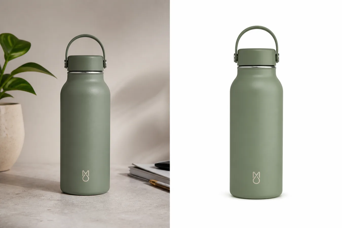 ## What Google Wants The Product Image To Do
Google's image requirements are built around a simple idea: the image should represent the product being sold. The safest Google Shopping product images white background workflow keeps the product prominent, accurate, and free from visual elements that could mislead the buyer.
After verifying Google's current Merchant Center image-link guidance, these are the practical rules a seller should follow:
- Show the real product, not a different color, shape, bundle, or upgraded version.
- Keep the product large enough to inspect.
- Avoid promotional text, price tags, discount labels, watermarks, borders, and fake marketplace marks.
- Use a clean background when the product needs inspection.
- Do not cover the product with props, callouts, or decorative graphics.
- Review any exact size, format, or policy issue against current Merchant Center guidance, because platform rules can change.
White background product images are useful because they reduce ambiguity. The buyer can compare shape, color, material, edges, and scale faster than they can in a busy scene.
## When A White Background Is The Right Choice
Use a white background when the image's job is product inspection.
It is a strong fit for:
- Main catalog images.
- Product feeds.
- Shopping ads.
- Variant comparison images.
- Simple accessories, home goods, tools, bottles, apparel, and packaged goods.
- Products where shape, color, or edge detail matters more than lifestyle mood.
It is weaker when the buyer needs scale or use context. A white-background image can show the product cleanly, but it may not explain how large a lamp is on a table, how a bag sits on the body, or how a handmade ceramic piece feels in a room. In those cases, keep the white-background image as the clean product proof, then add lifestyle or detail images elsewhere in the product gallery.
## A Safe Editing Workflow In KrafLayer
Use this sequence before sending product images to Google Merchant Center:
1. Choose the clearest source image. Avoid blurry, cropped, or heavily filtered photos when possible.
2. Use the [AI background remover](/tools/ai-background-remover) to create a clean cutout or white-background version.
3. Check that the product shape, color, material, label area, cap, handle, seam, or hardware did not change.
4. Remove visual clutter, price stickers, or shoot artifacts only when they are not buyer-relevant product information.
5. Keep the shadow soft and natural so the item does not float.
6. Export a clean product image and review it against Merchant Center feedback.
7. If Merchant Center flags an issue, fix the specific issue instead of regenerating a new product from scratch.
KrafLayer is useful here because the goal is narrow: clean the background and prepare a product image, not invent a new product. If an edit changes the SKU, reject it even if the image looks more polished.
## What Not To Add To Google Shopping Images
The most common mistake is treating a feed image like an ad banner. Product-feed images should usually be quieter than promotional creative.
Avoid adding:
- Discount text.
- Free shipping labels.
- Review stars.
- Best-seller badges.
- Real platform logos.
- Certification marks you cannot verify.
- Watermarks or ownership marks.
- Decorative borders.
- QR codes or barcodes.
- Before/after claims.
- Medical, safety, organic, waterproof, or performance claims unless the product data and policy context support them.
This does not mean every product image must be plain. It means the feed image should not ask Google or the buyer to separate the actual product from an advertisement.
## Product Facts To Protect During Background Removal
A clean product image background is only useful if the product stays true. Before publishing, inspect the result at full size.
Protect:
- Exact product color.
- Material texture and finish.
- Silhouette and proportions.
- Label or logo placement.
- Buttons, ports, seams, zippers, caps, handles, or hardware.
- Transparent edges, glass thickness, fabric texture, or metal highlights.
- Natural contact shadow.
- Variant-specific details.
If the original product is sage green, the clean version should not become gray. If the source bottle has a rounded shoulder and loop cap, the white-background version should not turn into a different bottle shape. Product accuracy matters more than making the image feel artificially perfect.
## Quick Checklist Before Uploading
Use this checklist for Google Merchant Center product images:
- The product is the main subject.
- The background is clean, usually white or transparent for inspection images.
- There are no text overlays, watermarks, badges, or fake platform marks.
- The product is not cropped in a way that hides buyer-relevant details.
- The color and material match the real SKU.
- The image does not imply a bundle unless the product listing sells that bundle.
- The file is sharp enough for buyers to inspect.
- Any platform warning is checked against current Merchant Center guidance.
- The final image is reviewed by a human before resubmission.
This is also a good [ecommerce product photography](/ecommerce-product-photography) habit outside Google Shopping. Clean images convert better when they let the buyer understand the item quickly.
## FAQ
### Do Google Shopping product images need a white background?
A white or transparent background is often the safest choice for clean product inspection, but sellers should not treat it as the only requirement. The product must be accurately represented, visible, and free from overlays or misleading elements. Always check current Google Merchant Center guidance and diagnostics for the exact issue.
### Can I use AI to create Google Merchant Center product images?
AI can help clean the background, improve crop, or prepare a sharper product image, but the final image still needs human review. Do not use AI to change product color, shape, bundle contents, labels, or buyer-relevant details. The image should represent the product being sold.
### What is the safest KrafLayer tool for this workflow?
Start with the AI background remover when the main job is a clean white or transparent background. Use the product photo editor for smaller cleanup tasks after the product is isolated. Avoid broad creative regeneration unless you have a strong product reference and can review the result carefully.
### Should I add text or badges to a Google Shopping image?
For feed-style product images, avoid text overlays, promotional badges, review stars, watermarks, and platform-like marks. Keep selling claims in your product data, landing page, or approved ad creative instead of placing them directly on the clean product image.
### What if Merchant Center disapproves the image?
Read the specific diagnostic first. Then fix that issue: remove an overlay, improve clarity, correct a mismatch, replace a misleading image, or adjust the background. Do not assume a new AI-generated image will solve the problem unless it still preserves the exact product.
## Conclusion
Google Shopping product images white background should make the product easy to inspect without turning the feed image into an ad banner. Use a clean background, protect the real SKU, avoid overlays and unsupported claims, and verify current Merchant Center guidance when a policy issue appears. KrafLayer helps with the practical part: remove the background, clean the product image, and prepare a review-ready ecommerce asset without changing what the seller is actually selling.
# GPT Image 2、Nano Banana 2 和 Wan 2.6 五大场景实测对比
URL: https://kraflayer.com/zh/blog/gpt-image-2-nano-banana-2-wan-26-five-scenario-comparison
Summary: 模型对比要看具体任务:商品保真、局部修图、场景生成、中文海报、视频延展。没有一个模型适合所有电商视觉需求。可在 KrafLayer 中按同一流程完成。
Updated: 2026-06-12
# GPT Image 2、Nano Banana 2 和 Wan 2.6 五大场景实测对比
## TL;DR
GPT Image 2、Nano Banana 2 和 Wan 2.6 五大场景实测对比这类任务,KrafLayer 的作用是把真实商品参考图推进到可用的主图、详情图或广告素材,而不是重新发明商品。核心检查点是商品形状、材质、标签、颜色、比例和配件仍然对应原始 SKU。
选择图像或视频模型时,不要只看哪一个最火。电商视觉真正需要的是任务匹配:主图要保 SKU,详情图要可控,广告图要有表现力,中文海报要文字稳定,视频要运动自然。
GPT Image 2、Nano Banana 2 和 Wan 2.6 这类模型可以放在同一工作流里比较,但不应该用一个总分决定所有任务。
## 五个常见场景怎么选
主图修复看保真度。谁能更稳定保留商品形状、标签、颜色、比例和边缘,谁更适合主图。
局部修图看可控性。去杂物、修反光、补背景、换小区域时,模型是否只改指定位置非常关键。
场景图看融合能力。商品是否真实落在地面上,阴影和透视是否合理,比背景漂亮更重要。
中文海报看文字能力。标题、卖点、数字、品牌名不能乱码。复杂文案最好还是交给设计工具排版。
视频延展看运动稳定性。商品不能变形,logo 不能漂移,镜头运动不能让包装文字乱跳。
## 怎么测试
用同一组真实商品图测试,不要只看官方样例。每个场景至少准备一个简单任务和一个困难任务。
评价标准要具体:SKU 是否改变、文字是否正确、边缘是否自然、阴影是否贴合、材质是否可信、生成时间和失败率如何。
把结果按任务记录,而不是只写“某模型最好”。
## 注意事项
模型能力会更新,今天的结论可能会变化。上线前仍要用当前版本做小样测试。
不要因为某模型广告图好看,就拿它做所有白底主图。主图和广告图的标准完全不同。
## KrafLayer 放在流程里的位置
把GPT Image 2、Nano Banana 2 和 Wan 2.6 五大场景实测对比放到 KrafLayer 里做时,先固定商品参考图,再决定是修背景、补光线、做详情图还是延展广告版本。最后按主图、详情图或广告素材的使用场景检查:商品形状、材质、标签、颜色、比例和配件仍然对应原始 SKU。
## 可直接使用的 Prompt
请用同一张商品图分别测试主图保真、局部修图、生活场景、中文海报和短视频延展五个任务。每个任务都记录:商品形状是否保持、颜色和材质是否准确、标签文字是否稳定、边缘和阴影是否自然、是否出现新增配件或变形、结果是否可直接用于电商。最后按具体场景给出模型选择建议,不要只给总排名。
## 总结
电商模型选择不是排行榜问题,而是工作流问题。主图、详情图、海报和视频各有标准,按场景选模型才可靠。
## FAQ
### 哪个模型一定最好?
没有固定答案。模型版本、任务类型、输入图质量和 Prompt 都会影响结果。
### 中文海报可以完全交给图像模型吗?
不建议。复杂中文文案最好由设计工具排版,图像模型负责背景和商品视觉。
### 模型测试要多久做一次?
重要模型更新、价格变化或生产失败率上升时,都应重新测试。
# 质感逼真的水波纹倒影 AI 特效怎么用于商品图
URL: https://kraflayer.com/zh/blog/realistic-water-ripple-reflection-ai-effect-for-product-images
Summary: 一套水波纹倒影特效流程:做出清爽高级感,同时保留商品形状、标签、材质和真实反射。可在 KrafLayer 中按同一流程完成。
Updated: 2026-06-12
## TL;DR
质感逼真的水波纹倒影 AI 特效这类任务,KrafLayer 的作用是把真实商品参考图推进到可用的主图、详情图或广告素材,而不是重新发明商品。核心检查点是商品形状、材质、标签、颜色、比例和配件仍然对应原始 SKU。
水波纹倒影适合表达清爽、高级、湿润或感官氛围,但不能让商品变形。倒影是辅助,商品本体才是重点。
## 可直接复制的 prompt
~~~text
以我上传的商品图作为准确参考,生成带有真实水波纹倒影的电商商品图。请保留商品形状、颜色、材质、标签/logo、比例和光线。水面或反射效果要自然、克制,作为氛围辅助。不要扭曲商品,不要让倒影覆盖主体,不要镜像出错误文字,不要改变 SKU。
~~~
## KrafLayer 放在流程里的位置
把质感逼真的水波纹倒影 AI 特效放到 KrafLayer 里做时,先固定商品参考图,再决定是修背景、补光线、做详情图还是延展广告版本。最后按主图、详情图或广告素材的使用场景检查:商品形状、材质、标签、颜色、比例和配件仍然对应原始 SKU。
## FAQ
### 哪些产品适合水波纹?
护肤品、香水、手表、饮品、户外用品和清爽感产品比较适合。
# 日系原木风家居产品场景构建怎么做
URL: https://kraflayer.com/zh/blog/japandi-natural-wood-home-product-scene-images
Summary: Japandi/日系原木风适合家居产品,但要避免模板化米色背景。重点是商品尺寸、木纹、布料、自然光和真实摆放逻辑。可在 KrafLayer 中按同一流程完成。
Updated: 2026-06-12
# 日系原木风家居产品场景构建怎么做
## TL;DR
日系原木风家居产品场景构建这类任务,可以在 KrafLayer 里给真实商品图换场景或合成场景:用 Replace BG 生成文字或参考图驱动的场景;已有基础场景且要控制位置和比例时,用 Scene Compose。场景要服务主图、详情图或广告素材,同时保证尺寸比例、材质、摆放关系和阴影符合真实空间。
日系原木风、Japandi 风很适合家居产品,因为它强调安静、自然、留白和材质。但很多 AI 图会变成一套相同的米色模板:木桌、白墙、绿植、柔光,然后商品被放得很小。
真正有用的家居场景图,要让用户看清产品尺寸、材质、摆放位置和与空间的关系。
## 适合哪些产品
适合收纳盒、灯具、餐具、香薰、床品、小家具、花瓶、木制用品、陶瓷和布艺。强科技感、强色彩、工业风产品不一定适合硬套。
## 怎么做
先决定空间:玄关、客厅、卧室、餐桌、书桌、浴室还是厨房。具体空间比“日系高级感”更能指导 AI。
保留产品比例。家居图最怕小物变巨大、家具变迷你。必要时加入桌面、椅子、书本等尺寸参照。
材质要真实。木纹不能过度平滑,布料要有织纹,陶瓷要有细微反光,纸质和藤编要有纤维。
留白要服务商品。不要为了极简把产品缩到看不清。
## 注意事项
不要让 AI 改产品颜色和材质来迎合原木风。白色塑料不能变陶瓷,金属不能变木头。
不要堆绿植、麻布和木板。越少越容易显得高级。
## KrafLayer 放在流程里的位置
把日系原木风家居产品场景构建放到 KrafLayer 里做时,先选对工具:用 Replace BG 生成文字或参考图驱动的场景;已有基础场景且要控制位置和比例时,用 Scene Compose。生成后不要只看画面是否更漂亮,要按主图、详情图或广告素材的使用场景检查:尺寸比例、材质、摆放关系和阴影符合真实空间。
## 可直接使用的 Prompt
基于这张家居产品图,生成一张日系原木/Japandi 风格的真实家居场景图。保留产品真实形状、颜色、材质、尺寸比例、logo、细节和配件,不要改变 SKU。将产品放在具体空间中,如玄关、客厅、餐桌或书桌,使用自然窗光、浅木材、柔和墙面、克制留白和少量生活道具。画面安静、真实、有材质感,商品主体清晰。
## 总结
日系原木风不是米色滤镜,而是空间、比例、材质和留白的平衡。商品仍然要是主角。
## FAQ
### Japandi 场景适合所有家居品吗?
不适合。它更适合自然材质、低饱和颜色和简洁造型的产品。
### 怎么避免模板感?
先指定真实房间和使用场景,再选材质和光线,不要只写“日系高级”。
### 家居图需要尺寸参考吗?
非常需要。没有参照物时,用户很难判断大小。
# Ecommerce Product Photography Services vs AI Product Photography
URL: https://kraflayer.com/blog/ecommerce-product-photography-services-vs-ai
Summary: Ecommerce product photography services and AI product photography solve different parts of the same problem. Studios are best for physical proof and complex shoots; AI is strongest for fast image sets, edits, variants, and campaign testing.
Updated: 2026-06-13
## The real comparison is not studio or AI
Ecommerce product photography services and AI product photography are not direct opposites. A studio creates physical product photos with controlled cameras, lights, surfaces, props, and people. An AI workflow uses product references and editing instructions to generate or repair ecommerce visuals faster.
The practical question is not which one is better forever. It is which workflow fits the image you need today.
Use a studio when you need physical proof, exact material behavior, regulated accuracy, complex packaging documentation, or original brand campaign photography. Use [AI product photography](/ai-product-photography) when you need fast variants, lifestyle concepts, product-on-model tests, background changes, detail-image drafts, or ecommerce assets from an existing product reference.
## When ecommerce product photography services are the better choice
A professional product photography service is still valuable when the image must prove something physical. Examples include jewelry with exact stone behavior, cosmetics with strict color matching, food with compliance constraints, medical products, safety-critical products, and packaging where every line of text matters.
Studios also help when you need a full campaign with art direction, talent, set design, prop sourcing, controlled retouching, and a brand team approving every frame.
The tradeoff is speed and cost. Studio workflows often need scheduling, shipping, shot lists, approvals, revisions, and retouching rounds. That makes them less efficient for testing many backgrounds, variants, crops, or seasonal campaigns.
## When AI product photography is the better choice
AI product photography works best when you already have a usable product reference and need more ecommerce outputs from it.
Good AI use cases include:
- Creating lifestyle scenes from a product packshot.
- Testing backgrounds before a real campaign.
- Generating product-on-model directions for apparel or accessories.
- Producing detail image concepts for PDP modules.
- Creating store banners and ad variations.
- Localizing product images for different markets.
- Repairing old catalog photos before reuse.
In KrafLayer, the key is to keep the uploaded product image as the identity source. The goal is not to turn the product into generic AI art. The goal is to produce commercially useful product images while protecting shape, label, material, color, and scale.
## Comparison table
| Need | Studio service | AI product photography |
|---|---|---|
| Exact physical proof | Strongest choice | Needs review and may not be enough |
| Fast background variants | Slower and more expensive | Strong fit |
| Large SKU experiments | Operationally heavy | Strong fit |
| Premium campaign shoot | Strong choice | Useful for concepts and extensions |
| Product cleanup | Often retouching-led | Use [product photo editor](/product-photo-editor) workflows |
| Listing image sets | Accurate but slower | Strong fit when source images are clean |
## How to combine studio and AI
The best workflow is often hybrid:
1. Shoot or collect accurate product references.
2. Use AI to create extra ecommerce image directions.
3. Edit source photos before generation if needed.
4. Use studio shoots for final campaign frames that need physical proof.
5. Use AI again for resizing, background variants, localization, and seasonal tests.
This lets a brand preserve real product accuracy while reducing repeated production work.
## Where KrafLayer fits
KrafLayer should not present itself as a local photography studio. It is better positioned as an ecommerce product image workspace for teams that already have product references and need to create, edit, or adapt more visual assets.
Use these paths:
- [Ecommerce product photography](/ecommerce-product-photography) for the full image system.
- [AI product image generator](/ai-product-image-generator) for main images, detail images, and ecommerce variants.
- [Product photo editor](/product-photo-editor) for background removal, cleanup, upscaling, restoration, and local edits.
- [Shopify product images](/use-cases/shopify-product-images), [Amazon product photos](/use-cases/amazon-product-photos), and [Etsy product photos](/use-cases/etsy-product-photos) for platform-specific preparation.
## Decision checklist
Choose a studio service if:
- The product is legally or technically sensitive.
- Exact color, material, scale, or label accuracy is non-negotiable.
- You need physical proof of texture, fit, size, or packaging.
- You are producing a flagship brand campaign.
Choose AI product photography if:
- You need more ecommerce assets from existing product images.
- You need to test scenes, backgrounds, or campaigns quickly.
- You need image sets for listings, ads, and product pages.
- You want to reduce repeated retouching and resizing work.
## FAQ
### Are ecommerce product photography services still useful?
Yes. They are useful when exact physical accuracy, regulated product representation, or premium campaign production matters. AI does not remove the need for real product proof in every category.
### Is AI product photography cheaper than a studio?
AI can be cheaper for repeated variants, early concepts, background tests, and product page assets. Cost depends on review time, model usage, source quality, and how many final images are needed.
### Can AI product photography use studio photos?
Yes. Studio packshots often make excellent references for AI product photography because they provide clean product identity. KrafLayer can use those references to create lifestyle scenes, detail modules, and campaign variants.
### What should not be automated blindly?
Do not blindly automate product images where labels, safety information, regulated claims, sizing, material, or exact color are critical. Those outputs need human review and often a real source image.
# Shopify Product Image Size Guide for Product Pages and Collections
URL: https://kraflayer.com/blog/shopify-product-image-size-guide
Summary: Shopify product images should start from large, clean source files, then be cropped consistently for product pages, collection grids, and campaign modules. Shopify's product media guidance supports large images up to 5000 x 5000 px or 25 megapixels, with product images under 20 MB.
Updated: 2026-06-13
## Shopify product image size is about more than one number
Shopify product image size matters because one upload can appear in multiple places: product pages, collection grids, thumbnails, related product sections, search results, landing pages, and campaign modules. The right image needs enough resolution for detail while staying consistent across the store.
Shopify's product media guidance says product and collection images can be uploaded up to 5000 x 5000 px or 25 megapixels, and product images should stay under 20 MB. Shopify also notes that square product images around 2048 x 2048 px usually display best. Always verify current guidance in Shopify Help before building a large image pipeline: [Shopify product media types](https://help.shopify.com/en/manual/products/product-media/product-media-types).
KrafLayer's [Shopify product images](/use-cases/shopify-product-images) page uses that guidance as a practical starting point, then focuses on the part merchants can control: consistent crop, product scale, focal point, and visual system.
## Recommended Shopify image planning table
| Store area | Practical image goal | What to check |
|---|---|---|
| Product page hero | Large, clean, product-first image | Product detail, label readability, material, crop safety |
| Product gallery | Multiple angles or use contexts | Consistent scale and lighting across images |
| Collection grid | Fast recognition across SKUs | Shared aspect ratio, background tone, crop rhythm |
| Campaign section | More brand mood and negative space | Product still leads the composition |
| Detail module | Feature, material, scale, or use proof | Avoid tiny text and over-designed callouts |
## Why square images are often safer
Square images are common in ecommerce because they are easier to reuse across grids, product pages, thumbnails, and theme layouts. A square image gives the theme more predictable cropping behavior, especially when different SKUs appear side by side.
That does not mean every Shopify image must be square. Campaign banners, product page lifestyle sections, and landing-page modules often need wider or taller crops. The safer rule is this: keep product identity inside the focal area, and generate alternate crops for layouts that need them.
## How to prepare Shopify product images with AI
Use this workflow when you already have a product reference:
1. Start with the cleanest product image available.
2. Use [product photo editor](/product-photo-editor) tools if the source has clutter, weak edges, dust, low resolution, or a distracting background.
3. Use [AI product image generator](/ai-product-image-generator) for product-page, collection, detail, and campaign variants.
4. Keep crop language consistent across a product family.
5. Review every output at thumbnail size and product-page size.
The thumbnail check is important. A product image that looks beautiful full-screen can fail in a collection grid if the product becomes too small, the label disappears, or the background dominates.
## Product page images vs collection images
Product page images can show more detail and variety. You can include close-ups, lifestyle views, texture, packaging, and use context. Collection images need faster recognition. They should help a shopper compare multiple products without visual chaos.
For collection grids, repeat:
- Similar product scale.
- Similar background tone.
- Similar shadow direction.
- Similar camera angle where possible.
- Enough margin for theme cropping.
This is where AI can help. Instead of manually recreating a set for each SKU, you can generate a coherent image family from product references and review the final outputs for consistency.
## Common Shopify image mistakes
Avoid these issues:
- Mixing square, vertical, and wide images in the same product grid without a reason.
- Letting lifestyle props become more visible than the product.
- Cropping labels, handles, straps, or signature details.
- Uploading tiny files and relying on upscaling at the end.
- Using a different background style for every SKU in one collection.
## KrafLayer workflow for Shopify images
Use [AI product image generator](/ai-product-image-generator) for product-page and collection image families. Use [AI product photography](/ai-product-photography) when model or lifestyle context matters. Use [product photo editor](/product-photo-editor) before generation when the source photo needs repair.
This keeps the Shopify workflow practical: clean source, clear output job, consistent crop, brand mood, and final human review.
## FAQ
### What size should Shopify product images be?
Shopify guidance supports product and collection images up to 5000 x 5000 px or 25 megapixels, with product images under 20 MB. Shopify also notes that 2048 x 2048 px square images usually display best for square product images. Check current Shopify Help before relying on exact numbers.
### Are square Shopify product images required?
Square images are not the only possible format, but they are often safer for product pages and collection grids because they make crops and SKU comparison more consistent.
### How many Shopify product images should a product have?
The exact count depends on the product, but a strong set often includes a main image, alternate angle, detail image, scale or use context, and at least one brand or lifestyle image.
### Can AI create Shopify product images?
Yes. AI can create product-page heroes, collection crops, lifestyle images, and detail visuals from product references. The final output should still be reviewed for product identity, crop safety, and store consistency.
# Amazon Product Photo Requirements and AI Editing Checklist
URL: https://kraflayer.com/blog/amazon-product-photo-requirements-ai-editing-checklist
Summary: Amazon product photo preparation should start with product clarity, a clean primary image, high-resolution source files, and careful secondary images. AI can help with cleanup and variants, but sellers should verify current Seller Central and category rules before uploading.
Updated: 2026-06-13
## Amazon product photo requirements start with clarity
Amazon product photo requirements are not only about image dimensions. The main job is to make the product easy to evaluate. A shopper should understand what the item is, what is included, what it looks like, and why it fits their need.
Exact rules can vary by marketplace and category, so sellers should verify current guidance in Seller Central before uploading. Amazon's Seller Central image requirements page is the final reference when available to your account: [Amazon Seller Central image requirements](https://sellercentral.amazon.com/help/hub/reference/external/G1881).
KrafLayer's [Amazon product photos](/use-cases/amazon-product-photos) workflow is built around a practical checklist: clean main image, high-resolution source, product accuracy, secondary images, and careful editing.
## Main image checklist
For the primary listing image, check:
- The product is the clear focus.
- The image is clean, bright, and easy to inspect.
- The product silhouette is not cropped in a confusing way.
- No extra props imply something is included when it is not.
- No badges, borders, watermarks, or decorative text are added.
- Shadows look natural and do not hide product edges.
- Labels, packaging, color, and material stay accurate.
Use [AI background remover](/tools/ai-background-remover) when the product is good but the background creates clutter. Use the broader [product photo editor](/product-photo-editor) when the source needs dust cleanup, object removal, upscaling, restoration, or local repair before it becomes a listing image.
## Secondary image checklist
Secondary Amazon images can explain more than the main image. They can show:
- Feature callouts.
- Material and texture.
- Scale and dimensions.
- Included accessories.
- Use context.
- Before and after states.
- Comparison frames.
- Packaging details.
The risk is overdesign. A secondary image should explain the product, not bury it under heavy graphic elements. If text is used, keep it readable, truthful, and visually secondary to the product.
## AI editing checklist before upload
AI can help prepare Amazon product photos, but each edited output needs review.
Check these items:
1. Product shape did not change.
2. Label text and packaging are still accurate.
3. Color and material are believable.
4. Edges are clean but not cutout-looking.
5. Shadows are subtle and physically plausible.
6. No extra accessories were invented.
7. Reflections and highlights do not hide important details.
8. Resolution is high enough for inspection.
9. The image still matches what the buyer receives.
This review step matters because AI can make images look polished while introducing small product inaccuracies.
## When to use each KrafLayer tool
| Task | KrafLayer path |
|---|---|
| Create a listing image set | [AI product image generator](/ai-product-image-generator) |
| Remove a distracting background | [AI background remover](/tools/ai-background-remover) |
| Clean dust, props, or marks | [Product photo editor](/product-photo-editor) |
| Improve a soft image | [AI image upscaler](/tools/ai-image-upscaler) |
| Replace a weak scene | [AI background replacer](/tools/ai-background-replacer) |
| Edit one selected region | [AI mask edit](/tools/ai-mask-edit) |
## Amazon main image vs detail images
The main image should identify the exact product. Detail images should reduce uncertainty.
If a buyer might ask "how big is it," add a scale image. If they might ask "what is included," add an included-items image. If they might ask "how does the material look," add a close-up. If they might ask "where would I use this," add a practical lifestyle image.
This approach makes secondary images useful without turning them into generic ads.
## How to create Amazon-style product photos with AI
Use this workflow:
1. Upload the cleanest product reference available.
2. Remove distractions before generating new variants.
3. Generate a main image or detail image set.
4. Review each output against Seller Central and category rules.
5. Keep only images that preserve product identity and buyer trust.
AI should speed up preparation, not replace seller responsibility.
## FAQ
### What are Amazon product photo requirements?
Amazon product photo requirements focus on product clarity, accurate representation, suitable image quality, and avoiding misleading additions. Requirements can vary by category and marketplace, so sellers should check current Seller Central guidance before publishing.
### Can AI edit Amazon product photos?
Yes. AI can remove backgrounds, clean distractions, upscale, restore, and create secondary image concepts. Every edited image should be reviewed for product accuracy, category compliance, and whether it truthfully represents the item.
### Should Amazon product photos use a white background?
Many Amazon main images require a clean product-focused presentation, often with a white background depending on category rules. Sellers should verify the current rule for their category before uploading.
### What should secondary Amazon images show?
Secondary images should explain the product: feature callouts, scale, material, included items, use context, accessories, and practical lifestyle scenarios. They should not make the product harder to evaluate.
# How to Create Furniture Lifestyle Photos Without Changing Product Color
URL: https://kraflayer.com/blog/create-furniture-lifestyle-photos-without-changing-product-color
Summary: A practical workflow for creating AI furniture lifestyle photos while preserving true product color, wood tone, fabric shade, material, and scale.
Updated: 2026-06-19
AI furniture product photos without changing product color need a reference-first workflow. The scene can change from white background to living room, bedroom, office, or entryway, but the oak tone, fabric shade, metal finish, grain direction, silhouette, and scale impression must still match the product being sold.
Practical rule: treat the furniture reference as the product truth and the room as the selling context. If the AI makes a walnut table look like pale oak, turns warm beige upholstery gray, darkens a natural rattan cabinet, or changes leg shape to match the room style, the image is not ready for ecommerce.
KrafLayer fits this AI product photography workflow when you need product-scene images from a real furniture reference, but still want a merchant review step before uploading the result to a store.
## What Google Wants The Product Image To Do
Google's image requirements are built around a simple idea: the image should represent the product being sold. The safest Google Shopping product images white background workflow keeps the product prominent, accurate, and free from visual elements that could mislead the buyer.
After verifying Google's current Merchant Center image-link guidance, these are the practical rules a seller should follow:
- Show the real product, not a different color, shape, bundle, or upgraded version.
- Keep the product large enough to inspect.
- Avoid promotional text, price tags, discount labels, watermarks, borders, and fake marketplace marks.
- Use a clean background when the product needs inspection.
- Do not cover the product with props, callouts, or decorative graphics.
- Review any exact size, format, or policy issue against current Merchant Center guidance, because platform rules can change.
White background product images are useful because they reduce ambiguity. The buyer can compare shape, color, material, edges, and scale faster than they can in a busy scene.
## When A White Background Is The Right Choice
Use a white background when the image's job is product inspection.
It is a strong fit for:
- Main catalog images.
- Product feeds.
- Shopping ads.
- Variant comparison images.
- Simple accessories, home goods, tools, bottles, apparel, and packaged goods.
- Products where shape, color, or edge detail matters more than lifestyle mood.
It is weaker when the buyer needs scale or use context. A white-background image can show the product cleanly, but it may not explain how large a lamp is on a table, how a bag sits on the body, or how a handmade ceramic piece feels in a room. In those cases, keep the white-background image as the clean product proof, then add lifestyle or detail images elsewhere in the product gallery.
## A Safe Editing Workflow In KrafLayer
Use this sequence before sending product images to Google Merchant Center:
1. Choose the clearest source image. Avoid blurry, cropped, or heavily filtered photos when possible.
2. Use the [AI background remover](/tools/ai-background-remover) to create a clean cutout or white-background version.
3. Check that the product shape, color, material, label area, cap, handle, seam, or hardware did not change.
4. Remove visual clutter, price stickers, or shoot artifacts only when they are not buyer-relevant product information.
5. Keep the shadow soft and natural so the item does not float.
6. Export a clean product image and review it against Merchant Center feedback.
7. If Merchant Center flags an issue, fix the specific issue instead of regenerating a new product from scratch.
KrafLayer is useful here because the goal is narrow: clean the background and prepare a product image, not invent a new product. If an edit changes the SKU, reject it even if the image looks more polished.
## What Not To Add To Google Shopping Images
The most common mistake is treating a feed image like an ad banner. Product-feed images should usually be quieter than promotional creative.
Avoid adding:
- Discount text.
- Free shipping labels.
- Review stars.
- Best-seller badges.
- Real platform logos.
- Certification marks you cannot verify.
- Watermarks or ownership marks.
- Decorative borders.
- QR codes or barcodes.
- Before/after claims.
- Medical, safety, organic, waterproof, or performance claims unless the product data and policy context support them.
This does not mean every product image must be plain. It means the feed image should not ask Google or the buyer to separate the actual product from an advertisement.
## Product Facts To Protect During Background Removal
A clean product image background is only useful if the product stays true. Before publishing, inspect the result at full size.
Protect:
- Exact product color.
- Material texture and finish.
- Silhouette and proportions.
- Label or logo placement.
- Buttons, ports, seams, zippers, caps, handles, or hardware.
- Transparent edges, glass thickness, fabric texture, or metal highlights.
- Natural contact shadow.
- Variant-specific details.
If the original product is sage green, the clean version should not become gray. If the source bottle has a rounded shoulder and loop cap, the white-background version should not turn into a different bottle shape. Product accuracy matters more than making the image feel artificially perfect.
## Quick Checklist Before Uploading
Use this checklist for Google Merchant Center product images:
- The product is the main subject.
- The background is clean, usually white or transparent for inspection images.
- There are no text overlays, watermarks, badges, or fake platform marks.
- The product is not cropped in a way that hides buyer-relevant details.
- The color and material match the real SKU.
- The image does not imply a bundle unless the product listing sells that bundle.
- The file is sharp enough for buyers to inspect.
- Any platform warning is checked against current Merchant Center guidance.
- The final image is reviewed by a human before resubmission.
This is also a good [ecommerce product photography](/ecommerce-product-photography) habit outside Google Shopping. Clean images convert better when they let the buyer understand the item quickly.
## FAQ
### Do Google Shopping product images need a white background?
A white or transparent background is often the safest choice for clean product inspection, but sellers should not treat it as the only requirement. The product must be accurately represented, visible, and free from overlays or misleading elements. Always check current Google Merchant Center guidance and diagnostics for the exact issue.
### Can I use AI to create Google Merchant Center product images?
AI can help clean the background, improve crop, or prepare a sharper product image, but the final image still needs human review. Do not use AI to change product color, shape, bundle contents, labels, or buyer-relevant details. The image should represent the product being sold.
### What is the safest KrafLayer tool for this workflow?
Start with the AI background remover when the main job is a clean white or transparent background. Use the product photo editor for smaller cleanup tasks after the product is isolated. Avoid broad creative regeneration unless you have a strong product reference and can review the result carefully.
### Should I add text or badges to a Google Shopping image?
For feed-style product images, avoid text overlays, promotional badges, review stars, watermarks, and platform-like marks. Keep selling claims in your product data, landing page, or approved ad creative instead of placing them directly on the clean product image.
### What if Merchant Center disapproves the image?
Read the specific diagnostic first. Then fix that issue: remove an overlay, improve clarity, correct a mismatch, replace a misleading image, or adjust the background. Do not assume a new AI-generated image will solve the problem unless it still preserves the exact product.
## Conclusion
Google Shopping product images white background should make the product easy to inspect without turning the feed image into an ad banner. Use a clean background, protect the real SKU, avoid overlays and unsupported claims, and verify current Merchant Center guidance when a policy issue appears. KrafLayer helps with the practical part: remove the background, clean the product image, and prepare a review-ready ecommerce asset without changing what the seller is actually selling.
# GPT Image 2、Nano Banana 2 和 Wan 2.6 五大场景实测对比
URL: https://kraflayer.com/zh/blog/gpt-image-2-nano-banana-2-wan-26-five-scenario-comparison
Summary: 模型对比要看具体任务:商品保真、局部修图、场景生成、中文海报、视频延展。没有一个模型适合所有电商视觉需求。可在 KrafLayer 中按同一流程完成。
Updated: 2026-06-12
# GPT Image 2、Nano Banana 2 和 Wan 2.6 五大场景实测对比
## TL;DR
GPT Image 2、Nano Banana 2 和 Wan 2.6 五大场景实测对比这类任务,KrafLayer 的作用是把真实商品参考图推进到可用的主图、详情图或广告素材,而不是重新发明商品。核心检查点是商品形状、材质、标签、颜色、比例和配件仍然对应原始 SKU。
选择图像或视频模型时,不要只看哪一个最火。电商视觉真正需要的是任务匹配:主图要保 SKU,详情图要可控,广告图要有表现力,中文海报要文字稳定,视频要运动自然。
GPT Image 2、Nano Banana 2 和 Wan 2.6 这类模型可以放在同一工作流里比较,但不应该用一个总分决定所有任务。
## 五个常见场景怎么选
主图修复看保真度。谁能更稳定保留商品形状、标签、颜色、比例和边缘,谁更适合主图。
局部修图看可控性。去杂物、修反光、补背景、换小区域时,模型是否只改指定位置非常关键。
场景图看融合能力。商品是否真实落在地面上,阴影和透视是否合理,比背景漂亮更重要。
中文海报看文字能力。标题、卖点、数字、品牌名不能乱码。复杂文案最好还是交给设计工具排版。
视频延展看运动稳定性。商品不能变形,logo 不能漂移,镜头运动不能让包装文字乱跳。
## 怎么测试
用同一组真实商品图测试,不要只看官方样例。每个场景至少准备一个简单任务和一个困难任务。
评价标准要具体:SKU 是否改变、文字是否正确、边缘是否自然、阴影是否贴合、材质是否可信、生成时间和失败率如何。
把结果按任务记录,而不是只写“某模型最好”。
## 注意事项
模型能力会更新,今天的结论可能会变化。上线前仍要用当前版本做小样测试。
不要因为某模型广告图好看,就拿它做所有白底主图。主图和广告图的标准完全不同。
## KrafLayer 放在流程里的位置
把GPT Image 2、Nano Banana 2 和 Wan 2.6 五大场景实测对比放到 KrafLayer 里做时,先固定商品参考图,再决定是修背景、补光线、做详情图还是延展广告版本。最后按主图、详情图或广告素材的使用场景检查:商品形状、材质、标签、颜色、比例和配件仍然对应原始 SKU。
## 可直接使用的 Prompt
请用同一张商品图分别测试主图保真、局部修图、生活场景、中文海报和短视频延展五个任务。每个任务都记录:商品形状是否保持、颜色和材质是否准确、标签文字是否稳定、边缘和阴影是否自然、是否出现新增配件或变形、结果是否可直接用于电商。最后按具体场景给出模型选择建议,不要只给总排名。
## 总结
电商模型选择不是排行榜问题,而是工作流问题。主图、详情图、海报和视频各有标准,按场景选模型才可靠。
## FAQ
### 哪个模型一定最好?
没有固定答案。模型版本、任务类型、输入图质量和 Prompt 都会影响结果。
### 中文海报可以完全交给图像模型吗?
不建议。复杂中文文案最好由设计工具排版,图像模型负责背景和商品视觉。
### 模型测试要多久做一次?
重要模型更新、价格变化或生产失败率上升时,都应重新测试。
# 质感逼真的水波纹倒影 AI 特效怎么用于商品图
URL: https://kraflayer.com/zh/blog/realistic-water-ripple-reflection-ai-effect-for-product-images
Summary: 一套水波纹倒影特效流程:做出清爽高级感,同时保留商品形状、标签、材质和真实反射。可在 KrafLayer 中按同一流程完成。
Updated: 2026-06-12
## TL;DR
质感逼真的水波纹倒影 AI 特效这类任务,KrafLayer 的作用是把真实商品参考图推进到可用的主图、详情图或广告素材,而不是重新发明商品。核心检查点是商品形状、材质、标签、颜色、比例和配件仍然对应原始 SKU。
水波纹倒影适合表达清爽、高级、湿润或感官氛围,但不能让商品变形。倒影是辅助,商品本体才是重点。
## 可直接复制的 prompt
~~~text
以我上传的商品图作为准确参考,生成带有真实水波纹倒影的电商商品图。请保留商品形状、颜色、材质、标签/logo、比例和光线。水面或反射效果要自然、克制,作为氛围辅助。不要扭曲商品,不要让倒影覆盖主体,不要镜像出错误文字,不要改变 SKU。
~~~
## KrafLayer 放在流程里的位置
把质感逼真的水波纹倒影 AI 特效放到 KrafLayer 里做时,先固定商品参考图,再决定是修背景、补光线、做详情图还是延展广告版本。最后按主图、详情图或广告素材的使用场景检查:商品形状、材质、标签、颜色、比例和配件仍然对应原始 SKU。
## FAQ
### 哪些产品适合水波纹?
护肤品、香水、手表、饮品、户外用品和清爽感产品比较适合。
# 日系原木风家居产品场景构建怎么做
URL: https://kraflayer.com/zh/blog/japandi-natural-wood-home-product-scene-images
Summary: Japandi/日系原木风适合家居产品,但要避免模板化米色背景。重点是商品尺寸、木纹、布料、自然光和真实摆放逻辑。可在 KrafLayer 中按同一流程完成。
Updated: 2026-06-12
# 日系原木风家居产品场景构建怎么做
## TL;DR
日系原木风家居产品场景构建这类任务,可以在 KrafLayer 里给真实商品图换场景或合成场景:用 Replace BG 生成文字或参考图驱动的场景;已有基础场景且要控制位置和比例时,用 Scene Compose。场景要服务主图、详情图或广告素材,同时保证尺寸比例、材质、摆放关系和阴影符合真实空间。
日系原木风、Japandi 风很适合家居产品,因为它强调安静、自然、留白和材质。但很多 AI 图会变成一套相同的米色模板:木桌、白墙、绿植、柔光,然后商品被放得很小。
真正有用的家居场景图,要让用户看清产品尺寸、材质、摆放位置和与空间的关系。
## 适合哪些产品
适合收纳盒、灯具、餐具、香薰、床品、小家具、花瓶、木制用品、陶瓷和布艺。强科技感、强色彩、工业风产品不一定适合硬套。
## 怎么做
先决定空间:玄关、客厅、卧室、餐桌、书桌、浴室还是厨房。具体空间比“日系高级感”更能指导 AI。
保留产品比例。家居图最怕小物变巨大、家具变迷你。必要时加入桌面、椅子、书本等尺寸参照。
材质要真实。木纹不能过度平滑,布料要有织纹,陶瓷要有细微反光,纸质和藤编要有纤维。
留白要服务商品。不要为了极简把产品缩到看不清。
## 注意事项
不要让 AI 改产品颜色和材质来迎合原木风。白色塑料不能变陶瓷,金属不能变木头。
不要堆绿植、麻布和木板。越少越容易显得高级。
## KrafLayer 放在流程里的位置
把日系原木风家居产品场景构建放到 KrafLayer 里做时,先选对工具:用 Replace BG 生成文字或参考图驱动的场景;已有基础场景且要控制位置和比例时,用 Scene Compose。生成后不要只看画面是否更漂亮,要按主图、详情图或广告素材的使用场景检查:尺寸比例、材质、摆放关系和阴影符合真实空间。
## 可直接使用的 Prompt
基于这张家居产品图,生成一张日系原木/Japandi 风格的真实家居场景图。保留产品真实形状、颜色、材质、尺寸比例、logo、细节和配件,不要改变 SKU。将产品放在具体空间中,如玄关、客厅、餐桌或书桌,使用自然窗光、浅木材、柔和墙面、克制留白和少量生活道具。画面安静、真实、有材质感,商品主体清晰。
## 总结
日系原木风不是米色滤镜,而是空间、比例、材质和留白的平衡。商品仍然要是主角。
## FAQ
### Japandi 场景适合所有家居品吗?
不适合。它更适合自然材质、低饱和颜色和简洁造型的产品。
### 怎么避免模板感?
先指定真实房间和使用场景,再选材质和光线,不要只写“日系高级”。
### 家居图需要尺寸参考吗?
非常需要。没有参照物时,用户很难判断大小。
# Ecommerce Product Photography Services vs AI Product Photography
URL: https://kraflayer.com/blog/ecommerce-product-photography-services-vs-ai
Summary: Ecommerce product photography services and AI product photography solve different parts of the same problem. Studios are best for physical proof and complex shoots; AI is strongest for fast image sets, edits, variants, and campaign testing.
Updated: 2026-06-13
## The real comparison is not studio or AI
Ecommerce product photography services and AI product photography are not direct opposites. A studio creates physical product photos with controlled cameras, lights, surfaces, props, and people. An AI workflow uses product references and editing instructions to generate or repair ecommerce visuals faster.
The practical question is not which one is better forever. It is which workflow fits the image you need today.
Use a studio when you need physical proof, exact material behavior, regulated accuracy, complex packaging documentation, or original brand campaign photography. Use [AI product photography](/ai-product-photography) when you need fast variants, lifestyle concepts, product-on-model tests, background changes, detail-image drafts, or ecommerce assets from an existing product reference.
## When ecommerce product photography services are the better choice
A professional product photography service is still valuable when the image must prove something physical. Examples include jewelry with exact stone behavior, cosmetics with strict color matching, food with compliance constraints, medical products, safety-critical products, and packaging where every line of text matters.
Studios also help when you need a full campaign with art direction, talent, set design, prop sourcing, controlled retouching, and a brand team approving every frame.
The tradeoff is speed and cost. Studio workflows often need scheduling, shipping, shot lists, approvals, revisions, and retouching rounds. That makes them less efficient for testing many backgrounds, variants, crops, or seasonal campaigns.
## When AI product photography is the better choice
AI product photography works best when you already have a usable product reference and need more ecommerce outputs from it.
Good AI use cases include:
- Creating lifestyle scenes from a product packshot.
- Testing backgrounds before a real campaign.
- Generating product-on-model directions for apparel or accessories.
- Producing detail image concepts for PDP modules.
- Creating store banners and ad variations.
- Localizing product images for different markets.
- Repairing old catalog photos before reuse.
In KrafLayer, the key is to keep the uploaded product image as the identity source. The goal is not to turn the product into generic AI art. The goal is to produce commercially useful product images while protecting shape, label, material, color, and scale.
## Comparison table
| Need | Studio service | AI product photography |
|---|---|---|
| Exact physical proof | Strongest choice | Needs review and may not be enough |
| Fast background variants | Slower and more expensive | Strong fit |
| Large SKU experiments | Operationally heavy | Strong fit |
| Premium campaign shoot | Strong choice | Useful for concepts and extensions |
| Product cleanup | Often retouching-led | Use [product photo editor](/product-photo-editor) workflows |
| Listing image sets | Accurate but slower | Strong fit when source images are clean |
## How to combine studio and AI
The best workflow is often hybrid:
1. Shoot or collect accurate product references.
2. Use AI to create extra ecommerce image directions.
3. Edit source photos before generation if needed.
4. Use studio shoots for final campaign frames that need physical proof.
5. Use AI again for resizing, background variants, localization, and seasonal tests.
This lets a brand preserve real product accuracy while reducing repeated production work.
## Where KrafLayer fits
KrafLayer should not present itself as a local photography studio. It is better positioned as an ecommerce product image workspace for teams that already have product references and need to create, edit, or adapt more visual assets.
Use these paths:
- [Ecommerce product photography](/ecommerce-product-photography) for the full image system.
- [AI product image generator](/ai-product-image-generator) for main images, detail images, and ecommerce variants.
- [Product photo editor](/product-photo-editor) for background removal, cleanup, upscaling, restoration, and local edits.
- [Shopify product images](/use-cases/shopify-product-images), [Amazon product photos](/use-cases/amazon-product-photos), and [Etsy product photos](/use-cases/etsy-product-photos) for platform-specific preparation.
## Decision checklist
Choose a studio service if:
- The product is legally or technically sensitive.
- Exact color, material, scale, or label accuracy is non-negotiable.
- You need physical proof of texture, fit, size, or packaging.
- You are producing a flagship brand campaign.
Choose AI product photography if:
- You need more ecommerce assets from existing product images.
- You need to test scenes, backgrounds, or campaigns quickly.
- You need image sets for listings, ads, and product pages.
- You want to reduce repeated retouching and resizing work.
## FAQ
### Are ecommerce product photography services still useful?
Yes. They are useful when exact physical accuracy, regulated product representation, or premium campaign production matters. AI does not remove the need for real product proof in every category.
### Is AI product photography cheaper than a studio?
AI can be cheaper for repeated variants, early concepts, background tests, and product page assets. Cost depends on review time, model usage, source quality, and how many final images are needed.
### Can AI product photography use studio photos?
Yes. Studio packshots often make excellent references for AI product photography because they provide clean product identity. KrafLayer can use those references to create lifestyle scenes, detail modules, and campaign variants.
### What should not be automated blindly?
Do not blindly automate product images where labels, safety information, regulated claims, sizing, material, or exact color are critical. Those outputs need human review and often a real source image.
# Shopify Product Image Size Guide for Product Pages and Collections
URL: https://kraflayer.com/blog/shopify-product-image-size-guide
Summary: Shopify product images should start from large, clean source files, then be cropped consistently for product pages, collection grids, and campaign modules. Shopify's product media guidance supports large images up to 5000 x 5000 px or 25 megapixels, with product images under 20 MB.
Updated: 2026-06-13
## Shopify product image size is about more than one number
Shopify product image size matters because one upload can appear in multiple places: product pages, collection grids, thumbnails, related product sections, search results, landing pages, and campaign modules. The right image needs enough resolution for detail while staying consistent across the store.
Shopify's product media guidance says product and collection images can be uploaded up to 5000 x 5000 px or 25 megapixels, and product images should stay under 20 MB. Shopify also notes that square product images around 2048 x 2048 px usually display best. Always verify current guidance in Shopify Help before building a large image pipeline: [Shopify product media types](https://help.shopify.com/en/manual/products/product-media/product-media-types).
KrafLayer's [Shopify product images](/use-cases/shopify-product-images) page uses that guidance as a practical starting point, then focuses on the part merchants can control: consistent crop, product scale, focal point, and visual system.
## Recommended Shopify image planning table
| Store area | Practical image goal | What to check |
|---|---|---|
| Product page hero | Large, clean, product-first image | Product detail, label readability, material, crop safety |
| Product gallery | Multiple angles or use contexts | Consistent scale and lighting across images |
| Collection grid | Fast recognition across SKUs | Shared aspect ratio, background tone, crop rhythm |
| Campaign section | More brand mood and negative space | Product still leads the composition |
| Detail module | Feature, material, scale, or use proof | Avoid tiny text and over-designed callouts |
## Why square images are often safer
Square images are common in ecommerce because they are easier to reuse across grids, product pages, thumbnails, and theme layouts. A square image gives the theme more predictable cropping behavior, especially when different SKUs appear side by side.
That does not mean every Shopify image must be square. Campaign banners, product page lifestyle sections, and landing-page modules often need wider or taller crops. The safer rule is this: keep product identity inside the focal area, and generate alternate crops for layouts that need them.
## How to prepare Shopify product images with AI
Use this workflow when you already have a product reference:
1. Start with the cleanest product image available.
2. Use [product photo editor](/product-photo-editor) tools if the source has clutter, weak edges, dust, low resolution, or a distracting background.
3. Use [AI product image generator](/ai-product-image-generator) for product-page, collection, detail, and campaign variants.
4. Keep crop language consistent across a product family.
5. Review every output at thumbnail size and product-page size.
The thumbnail check is important. A product image that looks beautiful full-screen can fail in a collection grid if the product becomes too small, the label disappears, or the background dominates.
## Product page images vs collection images
Product page images can show more detail and variety. You can include close-ups, lifestyle views, texture, packaging, and use context. Collection images need faster recognition. They should help a shopper compare multiple products without visual chaos.
For collection grids, repeat:
- Similar product scale.
- Similar background tone.
- Similar shadow direction.
- Similar camera angle where possible.
- Enough margin for theme cropping.
This is where AI can help. Instead of manually recreating a set for each SKU, you can generate a coherent image family from product references and review the final outputs for consistency.
## Common Shopify image mistakes
Avoid these issues:
- Mixing square, vertical, and wide images in the same product grid without a reason.
- Letting lifestyle props become more visible than the product.
- Cropping labels, handles, straps, or signature details.
- Uploading tiny files and relying on upscaling at the end.
- Using a different background style for every SKU in one collection.
## KrafLayer workflow for Shopify images
Use [AI product image generator](/ai-product-image-generator) for product-page and collection image families. Use [AI product photography](/ai-product-photography) when model or lifestyle context matters. Use [product photo editor](/product-photo-editor) before generation when the source photo needs repair.
This keeps the Shopify workflow practical: clean source, clear output job, consistent crop, brand mood, and final human review.
## FAQ
### What size should Shopify product images be?
Shopify guidance supports product and collection images up to 5000 x 5000 px or 25 megapixels, with product images under 20 MB. Shopify also notes that 2048 x 2048 px square images usually display best for square product images. Check current Shopify Help before relying on exact numbers.
### Are square Shopify product images required?
Square images are not the only possible format, but they are often safer for product pages and collection grids because they make crops and SKU comparison more consistent.
### How many Shopify product images should a product have?
The exact count depends on the product, but a strong set often includes a main image, alternate angle, detail image, scale or use context, and at least one brand or lifestyle image.
### Can AI create Shopify product images?
Yes. AI can create product-page heroes, collection crops, lifestyle images, and detail visuals from product references. The final output should still be reviewed for product identity, crop safety, and store consistency.
# Amazon Product Photo Requirements and AI Editing Checklist
URL: https://kraflayer.com/blog/amazon-product-photo-requirements-ai-editing-checklist
Summary: Amazon product photo preparation should start with product clarity, a clean primary image, high-resolution source files, and careful secondary images. AI can help with cleanup and variants, but sellers should verify current Seller Central and category rules before uploading.
Updated: 2026-06-13
## Amazon product photo requirements start with clarity
Amazon product photo requirements are not only about image dimensions. The main job is to make the product easy to evaluate. A shopper should understand what the item is, what is included, what it looks like, and why it fits their need.
Exact rules can vary by marketplace and category, so sellers should verify current guidance in Seller Central before uploading. Amazon's Seller Central image requirements page is the final reference when available to your account: [Amazon Seller Central image requirements](https://sellercentral.amazon.com/help/hub/reference/external/G1881).
KrafLayer's [Amazon product photos](/use-cases/amazon-product-photos) workflow is built around a practical checklist: clean main image, high-resolution source, product accuracy, secondary images, and careful editing.
## Main image checklist
For the primary listing image, check:
- The product is the clear focus.
- The image is clean, bright, and easy to inspect.
- The product silhouette is not cropped in a confusing way.
- No extra props imply something is included when it is not.
- No badges, borders, watermarks, or decorative text are added.
- Shadows look natural and do not hide product edges.
- Labels, packaging, color, and material stay accurate.
Use [AI background remover](/tools/ai-background-remover) when the product is good but the background creates clutter. Use the broader [product photo editor](/product-photo-editor) when the source needs dust cleanup, object removal, upscaling, restoration, or local repair before it becomes a listing image.
## Secondary image checklist
Secondary Amazon images can explain more than the main image. They can show:
- Feature callouts.
- Material and texture.
- Scale and dimensions.
- Included accessories.
- Use context.
- Before and after states.
- Comparison frames.
- Packaging details.
The risk is overdesign. A secondary image should explain the product, not bury it under heavy graphic elements. If text is used, keep it readable, truthful, and visually secondary to the product.
## AI editing checklist before upload
AI can help prepare Amazon product photos, but each edited output needs review.
Check these items:
1. Product shape did not change.
2. Label text and packaging are still accurate.
3. Color and material are believable.
4. Edges are clean but not cutout-looking.
5. Shadows are subtle and physically plausible.
6. No extra accessories were invented.
7. Reflections and highlights do not hide important details.
8. Resolution is high enough for inspection.
9. The image still matches what the buyer receives.
This review step matters because AI can make images look polished while introducing small product inaccuracies.
## When to use each KrafLayer tool
| Task | KrafLayer path |
|---|---|
| Create a listing image set | [AI product image generator](/ai-product-image-generator) |
| Remove a distracting background | [AI background remover](/tools/ai-background-remover) |
| Clean dust, props, or marks | [Product photo editor](/product-photo-editor) |
| Improve a soft image | [AI image upscaler](/tools/ai-image-upscaler) |
| Replace a weak scene | [AI background replacer](/tools/ai-background-replacer) |
| Edit one selected region | [AI mask edit](/tools/ai-mask-edit) |
## Amazon main image vs detail images
The main image should identify the exact product. Detail images should reduce uncertainty.
If a buyer might ask "how big is it," add a scale image. If they might ask "what is included," add an included-items image. If they might ask "how does the material look," add a close-up. If they might ask "where would I use this," add a practical lifestyle image.
This approach makes secondary images useful without turning them into generic ads.
## How to create Amazon-style product photos with AI
Use this workflow:
1. Upload the cleanest product reference available.
2. Remove distractions before generating new variants.
3. Generate a main image or detail image set.
4. Review each output against Seller Central and category rules.
5. Keep only images that preserve product identity and buyer trust.
AI should speed up preparation, not replace seller responsibility.
## FAQ
### What are Amazon product photo requirements?
Amazon product photo requirements focus on product clarity, accurate representation, suitable image quality, and avoiding misleading additions. Requirements can vary by category and marketplace, so sellers should check current Seller Central guidance before publishing.
### Can AI edit Amazon product photos?
Yes. AI can remove backgrounds, clean distractions, upscale, restore, and create secondary image concepts. Every edited image should be reviewed for product accuracy, category compliance, and whether it truthfully represents the item.
### Should Amazon product photos use a white background?
Many Amazon main images require a clean product-focused presentation, often with a white background depending on category rules. Sellers should verify the current rule for their category before uploading.
### What should secondary Amazon images show?
Secondary images should explain the product: feature callouts, scale, material, included items, use context, accessories, and practical lifestyle scenarios. They should not make the product harder to evaluate.
# How to Create Furniture Lifestyle Photos Without Changing Product Color
URL: https://kraflayer.com/blog/create-furniture-lifestyle-photos-without-changing-product-color
Summary: A practical workflow for creating AI furniture lifestyle photos while preserving true product color, wood tone, fabric shade, material, and scale.
Updated: 2026-06-19
AI furniture product photos without changing product color need a reference-first workflow. The scene can change from white background to living room, bedroom, office, or entryway, but the oak tone, fabric shade, metal finish, grain direction, silhouette, and scale impression must still match the product being sold.
Practical rule: treat the furniture reference as the product truth and the room as the selling context. If the AI makes a walnut table look like pale oak, turns warm beige upholstery gray, darkens a natural rattan cabinet, or changes leg shape to match the room style, the image is not ready for ecommerce.
KrafLayer fits this AI product photography workflow when you need product-scene images from a real furniture reference, but still want a merchant review step before uploading the result to a store.
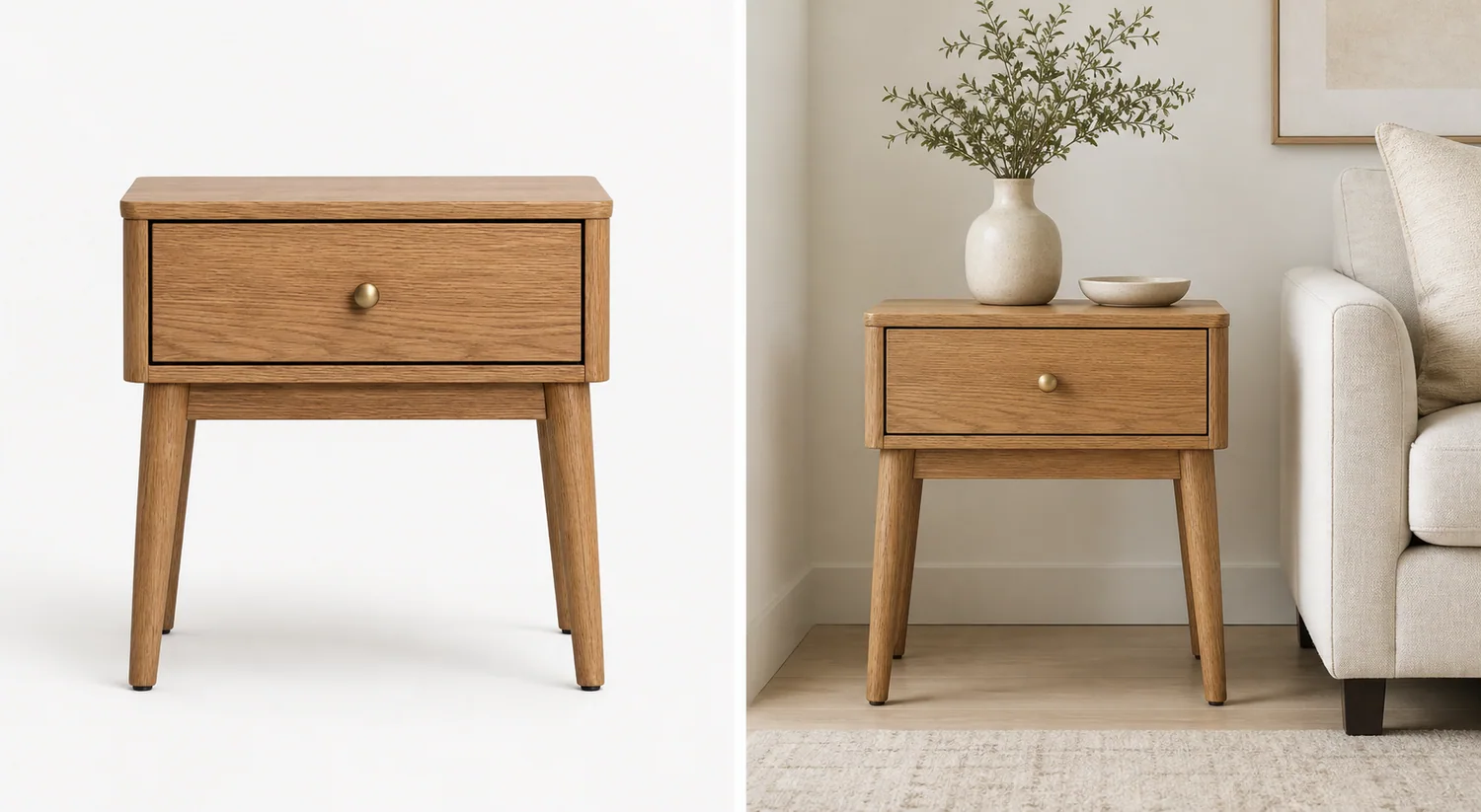 ## What Color Preservation Means For Furniture Images
Color preservation means the generated lifestyle image keeps the real finish family, undertone, material texture, and contrast from the product reference. For furniture, this matters because shoppers use color to judge whether the item will match their room.
For a wood nightstand, preserve the oak, walnut, black ash, whitewash, or painted finish. For a sofa, preserve the upholstery shade, weave, cushion shape, and seam color. For metal shelving, preserve black, brass, chrome, brushed steel, or powder-coated finish without adding fake patina.
A useful furniture lifestyle image can improve light, room context, crop, styling, and mood. It should not quietly redesign the product to fit the room.
## Why AI Changes Furniture Color
Furniture scenes have strong environmental color pressure. Wall paint, flooring, sofa fabric, rugs, window light, and warm lamps can push the model to recolor the product so the room looks more harmonious.
Common color and identity failures include:
- natural oak becoming orange, gray, or walnut
- beige upholstery shifting green, yellow, or cool gray
- black metal turning matte charcoal or glossy plastic
- rattan weave becoming a different material
- brass knobs changing into black pulls or silver hardware
- wood grain direction disappearing or becoming overly sharp
- the product scale changing to match the sofa or wall
- the lifestyle image looking better than the real SKU but less truthful
This is why furniture lifestyle product photos should be reviewed like store assets, not mood-board images.
## Start With A Product-Truth Reference
Choose one source photo where the important product facts are visible. It does not need to be a perfect studio image, but it should show the true color and material in neutral light.
Before generating, write a product-truth list:
1. Product type and count.
2. Main color and undertone.
3. Material and finish.
4. Wood grain, fabric weave, rattan pattern, or metal texture.
5. Legs, handles, seams, drawers, arms, shelves, or hardware.
6. Height-to-width proportion and visible depth.
7. Contact shadow and scale cues.
This list gives you a review standard. Without it, a lifestyle scene can look beautiful while drifting away from the actual product.
## Use A Restrained Lifestyle Scene
The room should support the SKU, not compete with it. For furniture, restrained context is usually better than a fully decorated interior.
Good scene choices include:
- oak nightstand beside a neutral bed or sofa
- accent chair near a plain wall and small rug
- console table in an entryway with one vase
- dining chair near a simple table edge
- shelving unit against a clean wall with minimal props
- side table in a soft daylight corner
Avoid asking for a complete showroom unless you need a campaign image. Too many props, strong wall colors, dark lighting, and competing furniture pieces make color review harder.
## Prompt Pattern For Furniture Color Accuracy
Use the prompt to protect the product before you describe the room.
> Create a realistic ecommerce lifestyle photo using this warm natural oak nightstand as the exact product reference. Keep the same oak color, grain direction, drawer line, round brass knob, leg shape, proportions, camera angle, scale impression, and natural finish. Place it beside a neutral sofa in a softly lit living room with a pale wall and muted rug. The room should support the nightstand without changing its color or material. Do not darken the wood, change the finish, alter the legs, add extra drawers, replace the knob, add logos, add readable text, add marketplace badges, or introduce competing furniture products.
The prompt works because it names the protected product facts and keeps the scene simple. The AI has less room to reinterpret the furniture as a different SKU.
For other furniture categories, replace the protected details:
- sofa: upholstery color, weave, cushion count, arm shape, seam placement, leg material, and scale
- cabinet: door lines, drawer spacing, handles, wood tone, side depth, and leg height
- chair: back shape, seat cushion, fabric color, frame finish, arm position, and leg angle
- table: top thickness, edge profile, grain direction, leg shape, finish, and tabletop proportion
- shelf: frame color, shelf spacing, panel thickness, hardware, and wall contact
## Review The Lifestyle Output Before Publishing
Compare the generated image against the reference at full size. Do not approve it only because the room looks good.
Check these points:
- Does the furniture still read as the same SKU?
- Did the main color and undertone stay stable?
- Is the wood grain, fabric weave, rattan pattern, or metal finish plausible?
- Are handles, legs, drawer lines, seams, and shelves unchanged?
- Did the room lighting create a color cast that misrepresents the product?
- Does the product scale make sense beside the sofa, bed, wall, or floor?
- Are props secondary rather than competing products?
- Is there any fake text, logo, badge, certification mark, barcode, or claim?
If the product color changes, regenerate with a narrower prompt or fix the affected area before publishing. For ecommerce, a less dramatic but accurate lifestyle image is stronger than a beautiful scene with the wrong finish.
## Where KrafLayer Fits In The Workflow
Use [KrafLayer's AI product photography](/ai-product-photography) workflow when you want to turn a furniture reference into a product-scene image. Start with the real product, generate one room direction, and review the result against the product-truth list.
If the scene works but a small area needs cleanup, use the [product photo editor](/product-photo-editor) instead of regenerating everything. A local correction is often safer than asking the model to rebuild the full room.
For broader image planning, the [ecommerce product photography](/ecommerce-product-photography) page explains how main images, detail images, and lifestyle images work together. Furniture usually needs all three: a clear main image, a material/detail image, and a restrained lifestyle image for scale and context.
## A Safe Furniture Lifestyle Workflow
Use this process when creating furniture lifestyle images with AI:
1. Select a neutral product reference with true color.
2. Write the product-truth list before generating.
3. Choose one room role, such as bedroom, living room, office, or entryway.
4. Protect color, material, finish, grain, hardware, proportions, and scale in the prompt.
5. Keep props and competing furniture minimal.
6. Compare the output against the source image at full size.
7. Edit or regenerate when color, shape, or material drifts.
The best AI furniture lifestyle image makes the product easier to imagine in a home without making the buyer expect a different finish.
## FAQ
### Can AI create furniture lifestyle photos without changing product color?
Yes, but only with a controlled workflow. Use a clear reference photo, name the exact color and material in the prompt, keep the room restrained, and review the output against the source image. Do not assume the AI preserved color just because the scene looks realistic.
### Why does AI change wood or fabric color in furniture photos?
AI often harmonizes the product with the room. Warm flooring, colored walls, sofa fabric, and window light can push wood, upholstery, rattan, or metal toward a different tone. That is useful for mood boards but risky for ecommerce product images.
### What should I check first in AI furniture product photos?
Check product identity first: color, undertone, material texture, hardware, legs, seams, drawers, shelves, proportions, visible depth, and scale. Background style matters only after the product still matches the real SKU.
### Should furniture lifestyle images include lots of room props?
Usually no. Props should explain scale and use context without becoming the subject. One sofa edge, rug, lamp, vase, bed corner, or wall surface is often enough. Too many props make the image look like interior inspiration instead of a product asset.
### Can I use one AI image for both product listing and ads?
You can reuse a strong lifestyle image, but listings and ads have different jobs. A listing image should prioritize color accuracy, material, scale, and product clarity. An ad can be more atmospheric, but it still should not change the furniture finish or SKU facts.
## Conclusion
AI furniture product photos without changing product color are possible when the workflow keeps product truth ahead of room styling. Start with a clear reference, protect color and material in the prompt, use a restrained lifestyle scene, and review the output like a merchant before publishing. KrafLayer can help turn furniture references into ecommerce lifestyle images, but the strongest results are the ones where the room adds context while the product still looks like the exact item the buyer will receive.
# Ecommerce Listing Images for Stores, Marketplaces, and Ads
URL: https://kraflayer.com/blog/ecommerce-listing-images-for-stores-marketplaces-and-ads
Summary: A practical guide to ecommerce listing images for store pages, marketplaces, ads, detail proof, product truth, and AI review.
Updated: 2026-06-22
Ecommerce listing images should keep one product truth while changing the image role for each channel. Your store page may need brand-led product storytelling, a marketplace listing may need stricter product-first clarity, and an ad crop may need faster recognition at a smaller size.
The practical rule is simple: start with the same verified product facts, then build a main image, detail proof, use-context image, and ad-ready crop around those facts. In KrafLayer, that means using [ecommerce product photography](/ecommerce-product-photography) workflows to keep the product consistent before you generate or edit channel-specific images.
## What Color Preservation Means For Furniture Images
Color preservation means the generated lifestyle image keeps the real finish family, undertone, material texture, and contrast from the product reference. For furniture, this matters because shoppers use color to judge whether the item will match their room.
For a wood nightstand, preserve the oak, walnut, black ash, whitewash, or painted finish. For a sofa, preserve the upholstery shade, weave, cushion shape, and seam color. For metal shelving, preserve black, brass, chrome, brushed steel, or powder-coated finish without adding fake patina.
A useful furniture lifestyle image can improve light, room context, crop, styling, and mood. It should not quietly redesign the product to fit the room.
## Why AI Changes Furniture Color
Furniture scenes have strong environmental color pressure. Wall paint, flooring, sofa fabric, rugs, window light, and warm lamps can push the model to recolor the product so the room looks more harmonious.
Common color and identity failures include:
- natural oak becoming orange, gray, or walnut
- beige upholstery shifting green, yellow, or cool gray
- black metal turning matte charcoal or glossy plastic
- rattan weave becoming a different material
- brass knobs changing into black pulls or silver hardware
- wood grain direction disappearing or becoming overly sharp
- the product scale changing to match the sofa or wall
- the lifestyle image looking better than the real SKU but less truthful
This is why furniture lifestyle product photos should be reviewed like store assets, not mood-board images.
## Start With A Product-Truth Reference
Choose one source photo where the important product facts are visible. It does not need to be a perfect studio image, but it should show the true color and material in neutral light.
Before generating, write a product-truth list:
1. Product type and count.
2. Main color and undertone.
3. Material and finish.
4. Wood grain, fabric weave, rattan pattern, or metal texture.
5. Legs, handles, seams, drawers, arms, shelves, or hardware.
6. Height-to-width proportion and visible depth.
7. Contact shadow and scale cues.
This list gives you a review standard. Without it, a lifestyle scene can look beautiful while drifting away from the actual product.
## Use A Restrained Lifestyle Scene
The room should support the SKU, not compete with it. For furniture, restrained context is usually better than a fully decorated interior.
Good scene choices include:
- oak nightstand beside a neutral bed or sofa
- accent chair near a plain wall and small rug
- console table in an entryway with one vase
- dining chair near a simple table edge
- shelving unit against a clean wall with minimal props
- side table in a soft daylight corner
Avoid asking for a complete showroom unless you need a campaign image. Too many props, strong wall colors, dark lighting, and competing furniture pieces make color review harder.
## Prompt Pattern For Furniture Color Accuracy
Use the prompt to protect the product before you describe the room.
> Create a realistic ecommerce lifestyle photo using this warm natural oak nightstand as the exact product reference. Keep the same oak color, grain direction, drawer line, round brass knob, leg shape, proportions, camera angle, scale impression, and natural finish. Place it beside a neutral sofa in a softly lit living room with a pale wall and muted rug. The room should support the nightstand without changing its color or material. Do not darken the wood, change the finish, alter the legs, add extra drawers, replace the knob, add logos, add readable text, add marketplace badges, or introduce competing furniture products.
The prompt works because it names the protected product facts and keeps the scene simple. The AI has less room to reinterpret the furniture as a different SKU.
For other furniture categories, replace the protected details:
- sofa: upholstery color, weave, cushion count, arm shape, seam placement, leg material, and scale
- cabinet: door lines, drawer spacing, handles, wood tone, side depth, and leg height
- chair: back shape, seat cushion, fabric color, frame finish, arm position, and leg angle
- table: top thickness, edge profile, grain direction, leg shape, finish, and tabletop proportion
- shelf: frame color, shelf spacing, panel thickness, hardware, and wall contact
## Review The Lifestyle Output Before Publishing
Compare the generated image against the reference at full size. Do not approve it only because the room looks good.
Check these points:
- Does the furniture still read as the same SKU?
- Did the main color and undertone stay stable?
- Is the wood grain, fabric weave, rattan pattern, or metal finish plausible?
- Are handles, legs, drawer lines, seams, and shelves unchanged?
- Did the room lighting create a color cast that misrepresents the product?
- Does the product scale make sense beside the sofa, bed, wall, or floor?
- Are props secondary rather than competing products?
- Is there any fake text, logo, badge, certification mark, barcode, or claim?
If the product color changes, regenerate with a narrower prompt or fix the affected area before publishing. For ecommerce, a less dramatic but accurate lifestyle image is stronger than a beautiful scene with the wrong finish.
## Where KrafLayer Fits In The Workflow
Use [KrafLayer's AI product photography](/ai-product-photography) workflow when you want to turn a furniture reference into a product-scene image. Start with the real product, generate one room direction, and review the result against the product-truth list.
If the scene works but a small area needs cleanup, use the [product photo editor](/product-photo-editor) instead of regenerating everything. A local correction is often safer than asking the model to rebuild the full room.
For broader image planning, the [ecommerce product photography](/ecommerce-product-photography) page explains how main images, detail images, and lifestyle images work together. Furniture usually needs all three: a clear main image, a material/detail image, and a restrained lifestyle image for scale and context.
## A Safe Furniture Lifestyle Workflow
Use this process when creating furniture lifestyle images with AI:
1. Select a neutral product reference with true color.
2. Write the product-truth list before generating.
3. Choose one room role, such as bedroom, living room, office, or entryway.
4. Protect color, material, finish, grain, hardware, proportions, and scale in the prompt.
5. Keep props and competing furniture minimal.
6. Compare the output against the source image at full size.
7. Edit or regenerate when color, shape, or material drifts.
The best AI furniture lifestyle image makes the product easier to imagine in a home without making the buyer expect a different finish.
## FAQ
### Can AI create furniture lifestyle photos without changing product color?
Yes, but only with a controlled workflow. Use a clear reference photo, name the exact color and material in the prompt, keep the room restrained, and review the output against the source image. Do not assume the AI preserved color just because the scene looks realistic.
### Why does AI change wood or fabric color in furniture photos?
AI often harmonizes the product with the room. Warm flooring, colored walls, sofa fabric, and window light can push wood, upholstery, rattan, or metal toward a different tone. That is useful for mood boards but risky for ecommerce product images.
### What should I check first in AI furniture product photos?
Check product identity first: color, undertone, material texture, hardware, legs, seams, drawers, shelves, proportions, visible depth, and scale. Background style matters only after the product still matches the real SKU.
### Should furniture lifestyle images include lots of room props?
Usually no. Props should explain scale and use context without becoming the subject. One sofa edge, rug, lamp, vase, bed corner, or wall surface is often enough. Too many props make the image look like interior inspiration instead of a product asset.
### Can I use one AI image for both product listing and ads?
You can reuse a strong lifestyle image, but listings and ads have different jobs. A listing image should prioritize color accuracy, material, scale, and product clarity. An ad can be more atmospheric, but it still should not change the furniture finish or SKU facts.
## Conclusion
AI furniture product photos without changing product color are possible when the workflow keeps product truth ahead of room styling. Start with a clear reference, protect color and material in the prompt, use a restrained lifestyle scene, and review the output like a merchant before publishing. KrafLayer can help turn furniture references into ecommerce lifestyle images, but the strongest results are the ones where the room adds context while the product still looks like the exact item the buyer will receive.
# Ecommerce Listing Images for Stores, Marketplaces, and Ads
URL: https://kraflayer.com/blog/ecommerce-listing-images-for-stores-marketplaces-and-ads
Summary: A practical guide to ecommerce listing images for store pages, marketplaces, ads, detail proof, product truth, and AI review.
Updated: 2026-06-22
Ecommerce listing images should keep one product truth while changing the image role for each channel. Your store page may need brand-led product storytelling, a marketplace listing may need stricter product-first clarity, and an ad crop may need faster recognition at a smaller size.
The practical rule is simple: start with the same verified product facts, then build a main image, detail proof, use-context image, and ad-ready crop around those facts. In KrafLayer, that means using [ecommerce product photography](/ecommerce-product-photography) workflows to keep the product consistent before you generate or edit channel-specific images.
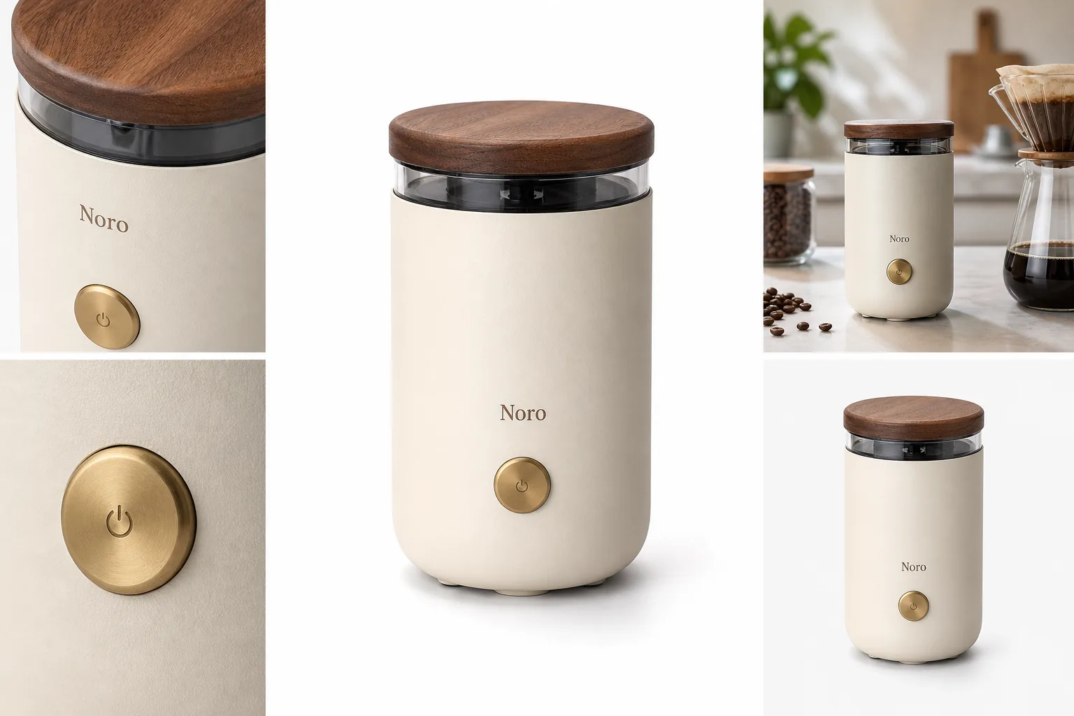 ## Ecommerce Listing Images Are Channel Assets
Ecommerce listing images are the product photos and visual assets used to sell one item on a product page, marketplace listing, or campaign landing page. They overlap with product listing images, but the ecommerce version has to work across more surfaces: store grids, PDP galleries, marketplaces, ads, retargeting, email, and social previews.
A useful set usually includes:
- a clean main product image for recognition
- a second angle or scale image for structure
- a product detail image for material, texture, hardware, label, fit, or construction
- a lifestyle image that shows use without hiding the product
- a channel crop for mobile thumbnails, product grids, or ads
- a variant or bundle image when the offer includes real options
If those roles all use a different-looking product, the image set becomes less trustworthy. The buyer should feel like every frame came from the same SKU.
## Store Pages Need Product Story And Consistency
On a direct ecommerce site or [Shopify product image](/marketplace-product-images/shopify-product-images) page, listing images can do more than identify the item. They can build a controlled product story because you own the surrounding layout, copy, recommendations, bundle modules, and brand cues.
For store product images, prioritize:
- a main image that reads clearly in product grids
- consistent crop logic across collection cards
- detail images that answer objections before support tickets happen
- lifestyle images that match the brand without making the product secondary
- reusable crops for email, landing pages, and retargeting ads
- alt text and filenames that describe the actual product, not vague campaign mood
The risk on store pages is over-styling. A beautiful scene can still fail if the product is small, cropped strangely, or visually different from the cart and checkout thumbnails.
## Marketplaces Need Product-First Review
Marketplace product images should be reviewed more conservatively. The right approach is not to copy one platform's rules into every channel; it is to keep a product-first image set and check current platform guidance before publishing.
For [Amazon product photos](/marketplace-product-images/amazon-product-photos), review main images, secondary images, text overlays, props, claims, and backgrounds carefully against current marketplace guidance. Do not assume AI-edited marketplace product images are automatically compliant.
For handmade, vintage, or maker-led listings, keep material and scale visible. Over-polished AI scenes can make a real product feel generic. A lifestyle image should support authenticity, not erase it.
Useful marketplace checks:
- no real marketplace UI, fake badges, review stars, or unauthorized logos
- no unsupported performance, health, safety, or certification claims
- props do not look included unless they are included
- product condition and buyer-relevant defects are not hidden
- generated labels, barcodes, QR codes, seals, and tiny text are rejected unless they come from approved artwork
- product color, scale, material, and included parts match the actual listing
This is where cautious editing matters. The image should reduce buyer uncertainty without inventing proof.
## Ads Need Faster Recognition
Ad-ready product images have a different job. They need fast product recognition in a feed, but they still have to match the product page.
For ad crops, ask:
- Can the product be identified in a small mobile preview?
- Is the crop centered enough for square, vertical, and wide placements?
- Does the image use one message instead of several competing messages?
- Does the product still match the PDP main image?
- Are offer claims, feature claims, and visual callouts approved?
An ad image can be more energetic than a PDP detail photo, but it should not turn the item into a different premium version. Strong ecommerce product photography keeps campaign energy and product truth in the same frame.
## A KrafLayer Workflow For Listing Image Sets
Use the [AI product image generator](/ai-product-image-generator) when you have a clear product reference and need missing image roles. Use the [product photo editor](/product-photo-editor) when a source photo already contains the right product but needs background cleanup, crop correction, upscaling, object removal, or lighting repair.
A practical workflow:
1. Choose one verified product reference as the source of truth.
2. Write a product fact list: color, material, shape, label, hardware, scale, included parts, and non-negotiable details.
3. Generate or edit the main image first.
4. Create detail images only for buyer-relevant proof.
5. Add a lifestyle image that keeps the product dominant.
6. Make store, marketplace, and ad crops from the same product truth.
7. Review every output against the reference before publishing.
Use this prompt direction when creating ecommerce listing images:
> Create ecommerce listing images for the same matte ivory countertop coffee grinder with a warm walnut lid, brass power button, rounded cylinder shape, transparent bean window, and small fictional Noro wordmark. Preserve the product shape, lid, button, material, color, proportions, logo position, lighting direction, scale, and contact shadow. Create one clean main image, one detail image, one restrained lifestyle image, and one ad-ready crop. Do not add real brand logos, marketplace UI, badges, review stars, barcodes, QR codes, sale stickers, certification marks, or unsupported claims.
For editing an existing product photo, use a tighter instruction:
> Keep this exact product unchanged. Improve listing clarity, crop, background, lighting, and sharpness. Preserve color, material, silhouette, label placement, hardware, seams, transparent parts, scale, and buyer-relevant details.
The prompt should protect the product before it asks for a style.
## Review The Set Across Surfaces
Do not review ecommerce listing images only as separate files. Review them as a buyer journey.
Start with the product grid thumbnail. Then check the PDP gallery. Then check the marketplace main image. Then check the ad crop. If the item appears to change between those surfaces, fix the inconsistency before publishing.
Use this final review:
- The first image explains what is being sold within one second.
- The detail image proves something buyers care about.
- The lifestyle image shows use or scale without hiding the item.
- Store and marketplace images use the same product color, scale, material, and label facts.
- Ad crops remain recognizable at small mobile sizes.
- No image adds fake logos, UI, badges, review stars, claims, or unreadable invented text.
- The set still feels like one real product page.
If an image does not add information, remove it or replace it with a more useful role. A shorter image set with clear jobs is stronger than a long set of repeated hero shots.
## FAQ
### What are ecommerce listing images?
Ecommerce listing images are the product visuals used to sell an item on store pages, marketplaces, ads, and product grids. They usually include a main image, angle or scale view, product detail image, lifestyle image, and channel-specific crops for different selling surfaces.
### Are ecommerce listing images the same as product listing images?
They are closely related. Product listing images usually refer to the gallery on one listing or product page. Ecommerce listing images can include that gallery plus store-grid thumbnails, marketplace images, ad crops, landing-page visuals, and other assets used across the selling funnel.
### How many ecommerce listing images should a product have?
Most products need four to six useful images: a main image, an angle or scale image, at least one product detail image, a lifestyle or use-context image, and a variant or bundle image when relevant. Complex products need more only when each image answers a real buyer question.
### Can AI make ecommerce listing images?
AI can help create ecommerce listing images when it starts from a clear product reference and a narrow product fact list. It can generate missing main, detail, lifestyle, and ad-ready images, but every output should be checked for color, scale, material, labels, included parts, and unsupported claims.
### What should I check before using listing images on marketplaces?
Check current marketplace guidance, product accuracy, backgrounds, props, overlays, claims, logos, badges, review stars, and condition details. Avoid treating AI editing as a compliance guarantee. The safer workflow is to keep the product clear, reject invented details, and review the image against the real SKU.
## Conclusion
Ecommerce listing images work best when every surface uses the same product truth but a different visual job. Your store may need story and consistency, marketplaces need careful product-first review, and ads need faster recognition. KrafLayer helps sellers create and edit those image roles from a product-first workflow, so main images, detail proof, lifestyle scenes, and ad-ready crops support the same trustworthy listing instead of drifting into separate-looking products.
# Ecommerce Product Photography Trends 2026: 7 Changes
URL: https://kraflayer.com/blog/ecommerce-product-photography-trends-2026
Summary: Seven evidence-backed ecommerce product photography trends for 2026, covering product-media systems, SKU fidelity, AI provenance, virtual try-on, native formats, and quality control.
Updated: 2026-08-22
Ecommerce product photography in 2026 is becoming a production system rather than a hunt for one perfect hero shot. A store still needs a factual main image, but it also needs detail views, lifestyle context, mobile crops, ad variants, model imagery, and short video. The useful trend is not “more AI.” It is building more channel-ready assets from trustworthy product evidence without letting the SKU drift.
This guide separates durable changes from short-lived visual fashions. The evidence comes from current Google, Shopify, Amazon, Meta, and TikTok documentation checked on August 22, 2026. Where a platform reports its own survey or performance data, that source is named directly. The recommendations are workflow guidance, not a promise that a particular image style will raise conversion.
> **Quick Summary**
> Shopify accepts product images up to 5000 × 5000 pixels, Amazon recommends at least six listing images, and Google requires generative-AI product images to retain machine-readable source metadata. In 2026, build a verified product master first, then derive each gallery, ad, model, and video asset for one specific buying decision.
## Abstract
The seven practical ecommerce product photography trends for 2026 are: coordinated image systems, stricter product-identity review, AI provenance, role-specific image generation, virtual try-on-ready source images, multi-format ad production, and a clearer boundary between editing, generation, and reshooting. Stores should measure asset usefulness and consistency, not the number of outputs.
## Key takeaways
- One SKU needs a coordinated asset set, not random lifestyle variants.
- Product identity is a hard gate: labels, color, material, shape, parts, and scale must survive.
- Google requires AI-generated product images to retain the IPTC `DigitalSourceType` tag.
- White-background images, detail views, lifestyle scenes, model context, and vertical media do different jobs.
- The safest workflow edits the smallest necessary region and reshoots facts the source never captured.
## Table of contents
1. [What changed in 2026](#what-changed-in-ecommerce-product-photography-in-2026)
2. [Trend 1: image systems](#trend-1-stores-are-building-image-systems-not-single-hero-shots)
3. [Trend 2: product identity](#trend-2-product-identity-is-the-quality-gate)
4. [Trend 3: AI provenance](#trend-3-ai-provenance-is-now-part-of-the-file)
5. [Trend 4: role-specific generation](#trend-4-each-generated-image-needs-one-job)
6. [Trend 5: virtual try-on](#trend-5-source-photos-are-being-prepared-for-virtual-try-on)
7. [Trend 6: multi-format production](#trend-6-one-campaign-needs-several-native-formats)
8. [Trend 7: editing versus reshooting](#trend-7-editing-generation-and-reshooting-have-clearer-boundaries)
9. [A practical asset plan](#what-should-a-2026-product-image-set-contain)
10. [Workflow and quality control](#how-do-you-build-the-system-without-losing-the-product)
11. [FAQ](#frequently-asked-questions)
## What changed in ecommerce product photography in 2026?
Shopify now supports images, video, 3D models, and augmented-reality media on product pages, while Amazon recommends at least six images and lets sellers upload up to nine photos to a listing. The direction is clear: a product page is no longer a stack of interchangeable stills. Each asset needs to answer a different question about identity, detail, scale, use, or trust ([Shopify Help Center](https://help.shopify.com/en/manual/products/product-media); [Amazon](https://sell.amazon.com/blog/amazon-product-listings), 2026).
At the same time, generative tools have moved inside merchant and ad platforms. Google Product Studio can remove or generate backgrounds, increase resolution, create images, animate stills, and generate video. Meta offers background generation, image expansion, text generation, and animation inside Advantage+ creative. That makes production faster, but it also makes source control and review more important.
The durable shift is operational. Teams need a clean product master, a defined gallery plan, reusable crop zones, documented variant colors, a review checklist, and a record of which assets contain generated pixels. Without that system, more generation simply creates a larger pile of files to inspect.
## Ecommerce Listing Images Are Channel Assets
Ecommerce listing images are the product photos and visual assets used to sell one item on a product page, marketplace listing, or campaign landing page. They overlap with product listing images, but the ecommerce version has to work across more surfaces: store grids, PDP galleries, marketplaces, ads, retargeting, email, and social previews.
A useful set usually includes:
- a clean main product image for recognition
- a second angle or scale image for structure
- a product detail image for material, texture, hardware, label, fit, or construction
- a lifestyle image that shows use without hiding the product
- a channel crop for mobile thumbnails, product grids, or ads
- a variant or bundle image when the offer includes real options
If those roles all use a different-looking product, the image set becomes less trustworthy. The buyer should feel like every frame came from the same SKU.
## Store Pages Need Product Story And Consistency
On a direct ecommerce site or [Shopify product image](/marketplace-product-images/shopify-product-images) page, listing images can do more than identify the item. They can build a controlled product story because you own the surrounding layout, copy, recommendations, bundle modules, and brand cues.
For store product images, prioritize:
- a main image that reads clearly in product grids
- consistent crop logic across collection cards
- detail images that answer objections before support tickets happen
- lifestyle images that match the brand without making the product secondary
- reusable crops for email, landing pages, and retargeting ads
- alt text and filenames that describe the actual product, not vague campaign mood
The risk on store pages is over-styling. A beautiful scene can still fail if the product is small, cropped strangely, or visually different from the cart and checkout thumbnails.
## Marketplaces Need Product-First Review
Marketplace product images should be reviewed more conservatively. The right approach is not to copy one platform's rules into every channel; it is to keep a product-first image set and check current platform guidance before publishing.
For [Amazon product photos](/marketplace-product-images/amazon-product-photos), review main images, secondary images, text overlays, props, claims, and backgrounds carefully against current marketplace guidance. Do not assume AI-edited marketplace product images are automatically compliant.
For handmade, vintage, or maker-led listings, keep material and scale visible. Over-polished AI scenes can make a real product feel generic. A lifestyle image should support authenticity, not erase it.
Useful marketplace checks:
- no real marketplace UI, fake badges, review stars, or unauthorized logos
- no unsupported performance, health, safety, or certification claims
- props do not look included unless they are included
- product condition and buyer-relevant defects are not hidden
- generated labels, barcodes, QR codes, seals, and tiny text are rejected unless they come from approved artwork
- product color, scale, material, and included parts match the actual listing
This is where cautious editing matters. The image should reduce buyer uncertainty without inventing proof.
## Ads Need Faster Recognition
Ad-ready product images have a different job. They need fast product recognition in a feed, but they still have to match the product page.
For ad crops, ask:
- Can the product be identified in a small mobile preview?
- Is the crop centered enough for square, vertical, and wide placements?
- Does the image use one message instead of several competing messages?
- Does the product still match the PDP main image?
- Are offer claims, feature claims, and visual callouts approved?
An ad image can be more energetic than a PDP detail photo, but it should not turn the item into a different premium version. Strong ecommerce product photography keeps campaign energy and product truth in the same frame.
## A KrafLayer Workflow For Listing Image Sets
Use the [AI product image generator](/ai-product-image-generator) when you have a clear product reference and need missing image roles. Use the [product photo editor](/product-photo-editor) when a source photo already contains the right product but needs background cleanup, crop correction, upscaling, object removal, or lighting repair.
A practical workflow:
1. Choose one verified product reference as the source of truth.
2. Write a product fact list: color, material, shape, label, hardware, scale, included parts, and non-negotiable details.
3. Generate or edit the main image first.
4. Create detail images only for buyer-relevant proof.
5. Add a lifestyle image that keeps the product dominant.
6. Make store, marketplace, and ad crops from the same product truth.
7. Review every output against the reference before publishing.
Use this prompt direction when creating ecommerce listing images:
> Create ecommerce listing images for the same matte ivory countertop coffee grinder with a warm walnut lid, brass power button, rounded cylinder shape, transparent bean window, and small fictional Noro wordmark. Preserve the product shape, lid, button, material, color, proportions, logo position, lighting direction, scale, and contact shadow. Create one clean main image, one detail image, one restrained lifestyle image, and one ad-ready crop. Do not add real brand logos, marketplace UI, badges, review stars, barcodes, QR codes, sale stickers, certification marks, or unsupported claims.
For editing an existing product photo, use a tighter instruction:
> Keep this exact product unchanged. Improve listing clarity, crop, background, lighting, and sharpness. Preserve color, material, silhouette, label placement, hardware, seams, transparent parts, scale, and buyer-relevant details.
The prompt should protect the product before it asks for a style.
## Review The Set Across Surfaces
Do not review ecommerce listing images only as separate files. Review them as a buyer journey.
Start with the product grid thumbnail. Then check the PDP gallery. Then check the marketplace main image. Then check the ad crop. If the item appears to change between those surfaces, fix the inconsistency before publishing.
Use this final review:
- The first image explains what is being sold within one second.
- The detail image proves something buyers care about.
- The lifestyle image shows use or scale without hiding the item.
- Store and marketplace images use the same product color, scale, material, and label facts.
- Ad crops remain recognizable at small mobile sizes.
- No image adds fake logos, UI, badges, review stars, claims, or unreadable invented text.
- The set still feels like one real product page.
If an image does not add information, remove it or replace it with a more useful role. A shorter image set with clear jobs is stronger than a long set of repeated hero shots.
## FAQ
### What are ecommerce listing images?
Ecommerce listing images are the product visuals used to sell an item on store pages, marketplaces, ads, and product grids. They usually include a main image, angle or scale view, product detail image, lifestyle image, and channel-specific crops for different selling surfaces.
### Are ecommerce listing images the same as product listing images?
They are closely related. Product listing images usually refer to the gallery on one listing or product page. Ecommerce listing images can include that gallery plus store-grid thumbnails, marketplace images, ad crops, landing-page visuals, and other assets used across the selling funnel.
### How many ecommerce listing images should a product have?
Most products need four to six useful images: a main image, an angle or scale image, at least one product detail image, a lifestyle or use-context image, and a variant or bundle image when relevant. Complex products need more only when each image answers a real buyer question.
### Can AI make ecommerce listing images?
AI can help create ecommerce listing images when it starts from a clear product reference and a narrow product fact list. It can generate missing main, detail, lifestyle, and ad-ready images, but every output should be checked for color, scale, material, labels, included parts, and unsupported claims.
### What should I check before using listing images on marketplaces?
Check current marketplace guidance, product accuracy, backgrounds, props, overlays, claims, logos, badges, review stars, and condition details. Avoid treating AI editing as a compliance guarantee. The safer workflow is to keep the product clear, reject invented details, and review the image against the real SKU.
## Conclusion
Ecommerce listing images work best when every surface uses the same product truth but a different visual job. Your store may need story and consistency, marketplaces need careful product-first review, and ads need faster recognition. KrafLayer helps sellers create and edit those image roles from a product-first workflow, so main images, detail proof, lifestyle scenes, and ad-ready crops support the same trustworthy listing instead of drifting into separate-looking products.
# Ecommerce Product Photography Trends 2026: 7 Changes
URL: https://kraflayer.com/blog/ecommerce-product-photography-trends-2026
Summary: Seven evidence-backed ecommerce product photography trends for 2026, covering product-media systems, SKU fidelity, AI provenance, virtual try-on, native formats, and quality control.
Updated: 2026-08-22
Ecommerce product photography in 2026 is becoming a production system rather than a hunt for one perfect hero shot. A store still needs a factual main image, but it also needs detail views, lifestyle context, mobile crops, ad variants, model imagery, and short video. The useful trend is not “more AI.” It is building more channel-ready assets from trustworthy product evidence without letting the SKU drift.
This guide separates durable changes from short-lived visual fashions. The evidence comes from current Google, Shopify, Amazon, Meta, and TikTok documentation checked on August 22, 2026. Where a platform reports its own survey or performance data, that source is named directly. The recommendations are workflow guidance, not a promise that a particular image style will raise conversion.
> **Quick Summary**
> Shopify accepts product images up to 5000 × 5000 pixels, Amazon recommends at least six listing images, and Google requires generative-AI product images to retain machine-readable source metadata. In 2026, build a verified product master first, then derive each gallery, ad, model, and video asset for one specific buying decision.
## Abstract
The seven practical ecommerce product photography trends for 2026 are: coordinated image systems, stricter product-identity review, AI provenance, role-specific image generation, virtual try-on-ready source images, multi-format ad production, and a clearer boundary between editing, generation, and reshooting. Stores should measure asset usefulness and consistency, not the number of outputs.
## Key takeaways
- One SKU needs a coordinated asset set, not random lifestyle variants.
- Product identity is a hard gate: labels, color, material, shape, parts, and scale must survive.
- Google requires AI-generated product images to retain the IPTC `DigitalSourceType` tag.
- White-background images, detail views, lifestyle scenes, model context, and vertical media do different jobs.
- The safest workflow edits the smallest necessary region and reshoots facts the source never captured.
## Table of contents
1. [What changed in 2026](#what-changed-in-ecommerce-product-photography-in-2026)
2. [Trend 1: image systems](#trend-1-stores-are-building-image-systems-not-single-hero-shots)
3. [Trend 2: product identity](#trend-2-product-identity-is-the-quality-gate)
4. [Trend 3: AI provenance](#trend-3-ai-provenance-is-now-part-of-the-file)
5. [Trend 4: role-specific generation](#trend-4-each-generated-image-needs-one-job)
6. [Trend 5: virtual try-on](#trend-5-source-photos-are-being-prepared-for-virtual-try-on)
7. [Trend 6: multi-format production](#trend-6-one-campaign-needs-several-native-formats)
8. [Trend 7: editing versus reshooting](#trend-7-editing-generation-and-reshooting-have-clearer-boundaries)
9. [A practical asset plan](#what-should-a-2026-product-image-set-contain)
10. [Workflow and quality control](#how-do-you-build-the-system-without-losing-the-product)
11. [FAQ](#frequently-asked-questions)
## What changed in ecommerce product photography in 2026?
Shopify now supports images, video, 3D models, and augmented-reality media on product pages, while Amazon recommends at least six images and lets sellers upload up to nine photos to a listing. The direction is clear: a product page is no longer a stack of interchangeable stills. Each asset needs to answer a different question about identity, detail, scale, use, or trust ([Shopify Help Center](https://help.shopify.com/en/manual/products/product-media); [Amazon](https://sell.amazon.com/blog/amazon-product-listings), 2026).
At the same time, generative tools have moved inside merchant and ad platforms. Google Product Studio can remove or generate backgrounds, increase resolution, create images, animate stills, and generate video. Meta offers background generation, image expansion, text generation, and animation inside Advantage+ creative. That makes production faster, but it also makes source control and review more important.
The durable shift is operational. Teams need a clean product master, a defined gallery plan, reusable crop zones, documented variant colors, a review checklist, and a record of which assets contain generated pixels. Without that system, more generation simply creates a larger pile of files to inspect.
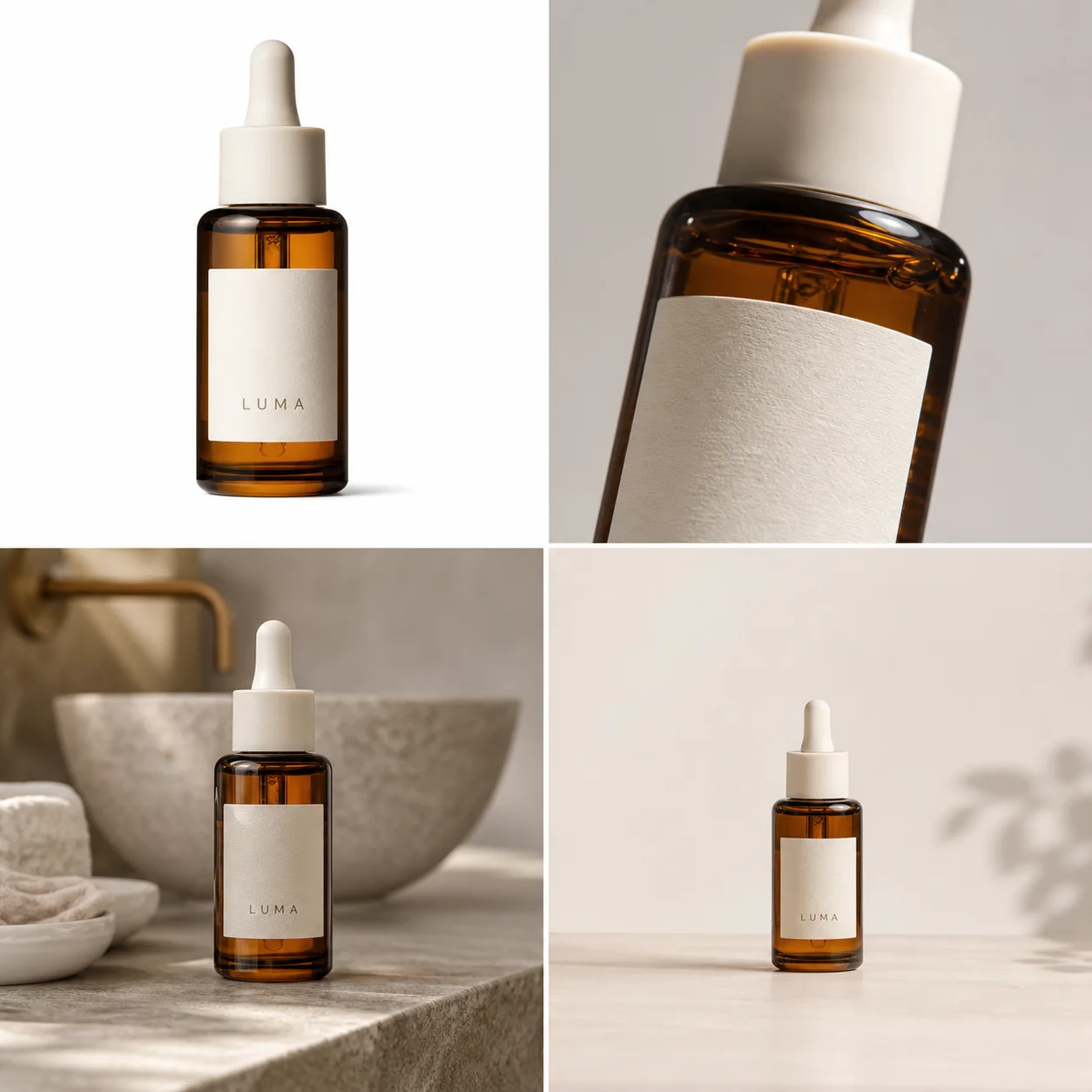 *GPT Image demonstration created for this guide. Compare the bottle silhouette, amber glass, ivory dropper, label position, and scale across all four roles. It is a workflow example, not a customer result or conversion test.*
## Trend 1: Stores are building image systems, not single hero shots
Amazon recommends at least six listing images and names individual, lifestyle, scale, detail, packaging, group, and 360-degree views as distinct product-photo types. A useful image system assigns one buyer question to each frame instead of asking every image to be simultaneously factual, emotional, instructional, and promotional ([Amazon product photography guide](https://sell.amazon.com/blog/product-photos), 2026).
For a serum bottle, the system might include a plain main image, a dropper close-up, packaging contents, a hand-free bathroom scene, a verified scale cue, and a vertical campaign crop. For a handbag, it might include front, back, interior, closure, leather grain, on-model scale, and a lifestyle frame. The exact list changes by product risk.
The common mistake is generating ten attractive scenes before documenting the product. That reverses the work. Start with the questions a buyer could reasonably ask: What arrives? How large is it? What material is it? Which parts move? What is included? How does it look in use? Then create the minimum set that answers those questions.
Consistency also extends beyond color grading. Lock the product baseline, approximate frame fill, camera family, shadow style, crop logic, and background family for comparable SKUs. Small, deliberate exceptions are fine when a white or dark product would otherwise disappear.
## Trend 2: Product identity is the quality gate
Google requires product imagery to show the correct variant and match its color, pattern, and material; its main-image guidance recommends 75% to 90% product fill. Those requirements make product fidelity more important than cinematic styling. A beautiful scene fails if it quietly changes the item being sold ([Google Merchant Center](https://support.google.com/merchants/answer/6324350?hl=en), 2026).
Review generated and heavily edited images against the original at full resolution. Use seven hard checks:
| Check | Compare with the source | Reject the output when |
|---|---|---|
| Silhouette | Outer shape, proportions, openings, handles | Width, depth, or construction changes |
| Color | Correct SKU, white balance, transparency | The result resembles another variant |
| Text and marks | Label, logo, numbers, warnings | Characters mutate or claims appear |
| Material | Grain, weave, gloss, glass, metal | Texture becomes generic plastic or fake fabric |
| Components | Caps, ports, seams, stones, fasteners | A part moves, disappears, or multiplies |
| Scale | Product dimensions relative to props or model | Perspective implies a false size |
| Light and contact | Shadow direction, reflection, surface contact | The product floats or lighting conflicts |
Do not average these into a flattering score. A missing clasp or wrong ingredient label is a hard failure even when six other checks pass. The review rule is simple: presentation can be approximate; product facts cannot.
## Trend 3: AI provenance is now part of the file
Google requires generative-AI product images to retain an IPTC `DigitalSourceType` value such as `TrainedAlgorithmicMedia`, `CompositeSynthetic`, or `AlgorithmicMedia`. The requirement applies to main, additional, and lifestyle image links. Metadata is therefore part of the publishing workflow, not an invisible detail to strip during export ([Google Merchant Center AI-generated content](https://support.google.com/merchants/answer/14743464?hl=en), 2026).
Google also introduced asset-level AI labels across Ads and Merchant Center, with disclosures available through “How this ad was made.” Its own tools add machine-readable provenance such as SynthID and C2PA. Regulations and platform behavior still vary by region, so disclosure controls do not replace legal review ([Google AI content labels](https://support.google.com/merchants/answer/17231950?hl=en), 2026).
For a small store, the practical system can be modest:
- keep the untouched camera original;
- store the transparent or cleaned product master separately;
- record which files were generated, composited, or locally edited;
- preserve embedded provenance metadata when converting formats;
- keep prompts and reference filenames for high-risk assets;
- avoid calling demonstration imagery “photography” when it was fully generated.
This record is useful even when a channel does not display a label. When a label, ingredient line, or product part is challenged later, the team can trace the asset back to its source instead of guessing which edit created it.
## Trend 4: Each generated image needs one job
Google Product Studio produces four background-generation outputs for review, while Amazon separates listing imagery into role-specific views. Both workflows support the same production rule: generate one image role at a time, then review it against a role-specific checklist ([Google Product Studio](https://support.google.com/merchants/answer/13708167?hl=en); [Amazon](https://sell.amazon.com/blog/product-photos), 2026).
“Create a complete ecommerce campaign” is a weak generation brief because it hides several incompatible jobs. A factual main image should minimize props and ambiguity. A detail image needs a sharp source of the exact mechanism or texture. A lifestyle image may introduce setting and emotion, but it still cannot conceal the SKU. A vertical ad needs safe space for interface overlays and copy.
Write prompts in two layers. First, lock the product: SKU, variant color, silhouette, material, exact visible marks, required components, and forbidden changes. Second, name the image role: canvas ratio, camera angle, background, light direction, prop restraint, and the single buyer question the frame should answer.
Generate two to four candidates for that role. Reject obvious identity errors before refining style. Fifty unrelated variants feel productive, but they make comparison harder and encourage teams to choose the prettiest output instead of the most accurate one.
## Trend 5: Source photos are being prepared for virtual try-on
Google's try-on guidance asks for garment images of at least 512 × 512 pixels, ideally 1024 pixels or higher, with the whole garment visible. Flat-lay items should avoid excessive folds, while on-model sources should avoid hands, bags, or accessories covering garment details. Source photography now has downstream machine-use requirements in addition to ordinary listing quality ([Google virtual try-on](https://support.google.com/merchants/answer/16159685?hl=en-GB), 2026).
That does not mean every fashion seller should replace model photography. It means the source set should expose the garment clearly enough for several later uses: factual listing, product-on-model generation, try-on, fit explanation, detail crops, and campaign imagery.
Capture front and back views, real color, full hems and sleeves, closures, trims, logos, and one or two material close-ups. For accessories, include anchors, clasps, interior construction, and a verified scale reference. A single dramatic flat lay with folds covering the seams is a poor master even if it performs well as a social post.
The same principle applies outside fashion. A reference-image generator cannot infer a hidden port, unseen bag interior, unreadable back label, or unknown furniture depth. Photograph those facts before asking software to produce new angles.
## Trend 6: One campaign needs several native formats
Meta says more than four million advertisers use its AI creative tools, including image expansion for different placements. TikTok's official image-ad playbook lists horizontal 1200 × 628, square 640 × 640, and vertical 720 × 1280 assets for its carousel formats. A single square master is no longer a complete campaign deliverable ([Meta Advantage+ creative](https://www.facebook.com/business/ads/meta-advantage-plus/creative); [TikTok image ads playbook](https://ads.tiktok.com/business/library/Image_Ads_Carousel_Ads_Playbook.pdf), 2026).
Do not solve format coverage by blind cropping. A square catalog frame can lose the product or copy when forced into 9:16. A vertical ad can fail when interface controls cover the product. Build safe composition zones into the source: keep critical product details away from edges, leave intentional negative space, and preview the real placement before launch.
Create crops from a high-resolution reviewed master whenever possible. Shopify accepts product and collection images up to 5000 × 5000 pixels or 25 megapixels and says 2048 × 2048 usually displays best for square product images. That is enough room for clean store delivery and several derivative crops without starting from a thumbnail ([Shopify product media](https://help.shopify.com/en/manual/products/product-media/product-media-types), 2026).
Format variants should remain visibly related. Keep the same SKU, color treatment, background family, and campaign idea while moving the product and props for the native frame. “Consistent” does not mean every crop is mechanically centered.
## Trend 7: Editing, generation, and reshooting have clearer boundaries
Google Product Studio separates background removal, background generation, resolution increase, image creation, animation, and video into different tasks. That product map reflects a useful risk rule: use the narrowest operation that solves the visible problem. Full regeneration is unnecessary when only dust, a cable, or a background is wrong ([Google Product Studio](https://support.google.com/merchants/answer/13708167?hl=en), 2026).
Use editing when the product pixels are already correct. Remove the background, erase a prop with a brush mask, upscale a small but sharp source, or correct one local glare area. Use generation when the job genuinely requires a new scene, campaign composition, or model context and the references cover the facts that must remain.
Reshoot when evidence is missing. Common reshoot triggers include unreadable regulated copy, motion blur, cropped construction, unreliable color, a hidden connector, a missing product angle, or reflective glare that obscures the actual material. Generated pixels can look plausible without being true.
This boundary is easy to overlook because generation is more entertaining than file cleanup. In practice, a clean cutout and three verified detail shots often create more reusable value than twenty speculative lifestyle scenes.
## What should a 2026 product image set contain?
Amazon recommends at least six product images, and Shopify can display images, video, 3D, and AR. Treat six as a starting point, not a universal target. A simple mug needs fewer factual views than a convertible bag, appliance, or garment with fit-sensitive construction ([Amazon](https://sell.amazon.com/blog/product-photos); [Shopify](https://help.shopify.com/en/manual/products/product-media), 2026).
| Asset | Buyer question | Minimum source evidence | Typical channel role |
|---|---|---|---|
| Plain main image | What is the exact product? | Sharp full-product view | Marketplace and store grid |
| Alternate angle | What is on the side or back? | Actual side or back reference | Product gallery |
| Detail image | How does this material or part look? | Macro or high-resolution detail | PDP and A+ content |
| Included-items image | What arrives in the box? | Verified contents | PDP and marketplace gallery |
| Scale image | How large is it? | Real dimensions or photographed comparison | PDP secondary image |
| Lifestyle image | Where does it belong? | Strong identity master | Store, campaign, additional image |
| Model or try-on view | How does it fit or wear? | Garment/accessory coverage and scale | Fashion PDP and discovery |
| Vertical crop | Will it read in mobile placements? | High-resolution reviewed master | Stories, Reels, TikTok |
| Short video | How does it move or work? | Verified product actions | PDP, ads, social |
Add an asset only when it answers a new question. Repeating the same front angle on three backgrounds creates visual variety but little information gain.
## How do you build the system without losing the product?
Shopify recommends a consistent camera and tripod position for product photography, and Google requires the correct variant, color, pattern, and material. Combine those ideas into a source-first workflow: standardize capture, preserve the master, then generate only the derivatives that the channel needs ([Shopify product photography](https://help.shopify.com/en/manual/products/product-media/product-photography); [Google Merchant Center](https://support.google.com/merchants/answer/6324350?hl=en), 2026).
1. **Create a product evidence pack.** Include the largest original files, essential angles, detail close-ups, dimensions, variant color, included items, and exact visible copy.
2. **Clean the master conservatively.** Correct dust, crop, exposure, and background without changing material or construction.
3. **Plan the gallery by buyer question.** Assign one purpose to each frame before generating.
4. **Choose the narrowest KrafLayer workflow.** Use the [product photo editor](/product-photo-editor) for cleanup and local corrections, the [AI product image generator](/ai-product-image-generator) for new compositions, and product-on-model workflows only when reference coverage supports them.
5. **Generate role by role.** Keep the identity lock stable while changing only the camera, scene, or output format needed for that role.
6. **Review at full size and thumbnail size.** Full size reveals mutated text and material; thumbnails reveal weak silhouette and clutter.
7. **Export per destination.** Preserve the reviewed master, embedded provenance, and a record of the crop used for each channel.
For a first pass, prioritize the highest-risk assets: factual main image, variant images, included contents, labels, mechanisms, and scale. Lifestyle and campaign work comes after those facts are secured.
## What should you measure?
Amazon reports that product detail pages with shoppable video saw an average 23.8% sales increase compared with pages without video, based on its internal 2024 data. That is a platform-level observation, not a guarantee for an individual SKU. Measure each asset against the job it was designed to do ([Amazon product video](https://sell.amazon.com/blog/amazon-product-video), 2025).
Useful review metrics include main-image click-through rate, PDP image engagement, zoom use, gallery depth, video starts and completion, add-to-cart rate, conversion by device, return reasons linked to appearance, and the percentage of generated outputs rejected for product drift.
Run clean tests where traffic allows. Change one primary variable, such as the main image or gallery order, and keep price, promotion, title, and audience stable. For smaller stores, qualitative signals still matter: support questions, review complaints, and repeated confusion about size or included items often identify the next image the gallery needs.
## Frequently asked questions
### What is the biggest ecommerce product photography trend in 2026?
The biggest shift is from isolated hero images to coordinated product-media systems. Stores need factual main images, detail and scale views, lifestyle context, mobile crops, ads, model imagery, and often video. The system succeeds only when every asset preserves the same SKU identity.
### Is AI replacing traditional product photography?
AI replaces some repeated production work, especially background variants, campaign crops, scene concepts, and selected model imagery. It does not replace missing evidence. Photograph labels, hidden construction, exact color, texture, dimensions, and regulated details when buyers need those facts.
### How many product images should a store use?
Amazon recommends at least six images, but the right count depends on product complexity. Use enough images to show identity, angles, material, scale, included items, and use context. Do not add near-duplicate frames simply to reach a number.
### Should the first image use a white or lifestyle background?
For marketplace-style main images, white is usually the least ambiguous choice and often aligns with platform guidance. Lifestyle imagery works better as a secondary role for context, scale, and desire. Always check the current rules for the specific channel and category.
### How can I keep AI product photos accurate?
Build a product evidence pack, write an identity lock, generate one image role at a time, and compare every output with the source for silhouette, color, text, material, components, scale, and contact lighting. Reject changed product facts rather than averaging them into a score.
### Do AI-generated ecommerce images need labels?
Requirements vary. Google Merchant Center requires generative-AI product images to retain machine-readable IPTC digital-source metadata, and Google also offers AI disclosure controls for ads and Merchant Center assets. Preserve provenance and check the destination's current rules before publishing.
## Conclusion
Ecommerce product photography in 2026 is less about chasing a fashionable background and more about managing product evidence across a growing set of outputs. KrafLayer can help a seller clean the source, create role-specific product images, prepare model or lifestyle context, and build channel variants from one reviewed product master. The advantage is not unlimited generation. It is a controlled workflow that produces more useful assets while keeping the product recognizable.
## References
1. [Google Merchant Center: Product image requirements](https://support.google.com/merchants/answer/6324350?hl=en), accessed August 22, 2026.
2. [Google Merchant Center: AI-generated content](https://support.google.com/merchants/answer/14743464?hl=en), accessed August 22, 2026.
3. [Google Merchant Center: Product Studio](https://support.google.com/merchants/answer/13708167?hl=en), accessed August 22, 2026.
4. [Shopify Help Center: Product media types](https://help.shopify.com/en/manual/products/product-media/product-media-types), accessed August 22, 2026.
5. [Amazon: Product photography guide](https://sell.amazon.com/blog/product-photos), accessed August 22, 2026.
6. [Meta: Advantage+ creative](https://www.facebook.com/business/ads/meta-advantage-plus/creative), accessed August 22, 2026.
7. [TikTok for Business: Image ads playbook](https://ads.tiktok.com/business/library/Image_Ads_Carousel_Ads_Playbook.pdf), accessed August 22, 2026.
# eBay Product Background Removal: Keep Edges and Condition
URL: https://kraflayer.com/blog/remove-ebay-product-photo-backgrounds-without-losing-realism
Summary: Remove eBay product photo backgrounds while preserving edge detail, real contact shadows, item condition, color, texture, and listing evidence.
Updated: 2026-08-22
For eBay product background removal, the goal is a clearer listing photo, not a cleaner-looking item. Preserve the complete silhouette, real condition, surface texture, color, scale cues, and a believable contact shadow.
eBay product photo background removal is not just about making a cutout. The goal is to remove garage clutter, carpet texture, boxes, tape, table stains, or busy home backgrounds while keeping the product believable enough for a buyer to inspect.
The practical rule: use a [product background remover](/tools/ai-background-remover) to create a clean product asset, then review the edges, shadow, color, scale, and material details before uploading. In KrafLayer, this is a simple background-removal workflow, but the seller still needs to check that the item looks like the same SKU, not a polished replacement.
If your task is to remove eBay product photo background clutter from a real seller image, keep the product reference beside the edited version until every buyer-visible detail has been checked.
*GPT Image demonstration created for this guide. Compare the bottle silhouette, amber glass, ivory dropper, label position, and scale across all four roles. It is a workflow example, not a customer result or conversion test.*
## Trend 1: Stores are building image systems, not single hero shots
Amazon recommends at least six listing images and names individual, lifestyle, scale, detail, packaging, group, and 360-degree views as distinct product-photo types. A useful image system assigns one buyer question to each frame instead of asking every image to be simultaneously factual, emotional, instructional, and promotional ([Amazon product photography guide](https://sell.amazon.com/blog/product-photos), 2026).
For a serum bottle, the system might include a plain main image, a dropper close-up, packaging contents, a hand-free bathroom scene, a verified scale cue, and a vertical campaign crop. For a handbag, it might include front, back, interior, closure, leather grain, on-model scale, and a lifestyle frame. The exact list changes by product risk.
The common mistake is generating ten attractive scenes before documenting the product. That reverses the work. Start with the questions a buyer could reasonably ask: What arrives? How large is it? What material is it? Which parts move? What is included? How does it look in use? Then create the minimum set that answers those questions.
Consistency also extends beyond color grading. Lock the product baseline, approximate frame fill, camera family, shadow style, crop logic, and background family for comparable SKUs. Small, deliberate exceptions are fine when a white or dark product would otherwise disappear.
## Trend 2: Product identity is the quality gate
Google requires product imagery to show the correct variant and match its color, pattern, and material; its main-image guidance recommends 75% to 90% product fill. Those requirements make product fidelity more important than cinematic styling. A beautiful scene fails if it quietly changes the item being sold ([Google Merchant Center](https://support.google.com/merchants/answer/6324350?hl=en), 2026).
Review generated and heavily edited images against the original at full resolution. Use seven hard checks:
| Check | Compare with the source | Reject the output when |
|---|---|---|
| Silhouette | Outer shape, proportions, openings, handles | Width, depth, or construction changes |
| Color | Correct SKU, white balance, transparency | The result resembles another variant |
| Text and marks | Label, logo, numbers, warnings | Characters mutate or claims appear |
| Material | Grain, weave, gloss, glass, metal | Texture becomes generic plastic or fake fabric |
| Components | Caps, ports, seams, stones, fasteners | A part moves, disappears, or multiplies |
| Scale | Product dimensions relative to props or model | Perspective implies a false size |
| Light and contact | Shadow direction, reflection, surface contact | The product floats or lighting conflicts |
Do not average these into a flattering score. A missing clasp or wrong ingredient label is a hard failure even when six other checks pass. The review rule is simple: presentation can be approximate; product facts cannot.
## Trend 3: AI provenance is now part of the file
Google requires generative-AI product images to retain an IPTC `DigitalSourceType` value such as `TrainedAlgorithmicMedia`, `CompositeSynthetic`, or `AlgorithmicMedia`. The requirement applies to main, additional, and lifestyle image links. Metadata is therefore part of the publishing workflow, not an invisible detail to strip during export ([Google Merchant Center AI-generated content](https://support.google.com/merchants/answer/14743464?hl=en), 2026).
Google also introduced asset-level AI labels across Ads and Merchant Center, with disclosures available through “How this ad was made.” Its own tools add machine-readable provenance such as SynthID and C2PA. Regulations and platform behavior still vary by region, so disclosure controls do not replace legal review ([Google AI content labels](https://support.google.com/merchants/answer/17231950?hl=en), 2026).
For a small store, the practical system can be modest:
- keep the untouched camera original;
- store the transparent or cleaned product master separately;
- record which files were generated, composited, or locally edited;
- preserve embedded provenance metadata when converting formats;
- keep prompts and reference filenames for high-risk assets;
- avoid calling demonstration imagery “photography” when it was fully generated.
This record is useful even when a channel does not display a label. When a label, ingredient line, or product part is challenged later, the team can trace the asset back to its source instead of guessing which edit created it.
## Trend 4: Each generated image needs one job
Google Product Studio produces four background-generation outputs for review, while Amazon separates listing imagery into role-specific views. Both workflows support the same production rule: generate one image role at a time, then review it against a role-specific checklist ([Google Product Studio](https://support.google.com/merchants/answer/13708167?hl=en); [Amazon](https://sell.amazon.com/blog/product-photos), 2026).
“Create a complete ecommerce campaign” is a weak generation brief because it hides several incompatible jobs. A factual main image should minimize props and ambiguity. A detail image needs a sharp source of the exact mechanism or texture. A lifestyle image may introduce setting and emotion, but it still cannot conceal the SKU. A vertical ad needs safe space for interface overlays and copy.
Write prompts in two layers. First, lock the product: SKU, variant color, silhouette, material, exact visible marks, required components, and forbidden changes. Second, name the image role: canvas ratio, camera angle, background, light direction, prop restraint, and the single buyer question the frame should answer.
Generate two to four candidates for that role. Reject obvious identity errors before refining style. Fifty unrelated variants feel productive, but they make comparison harder and encourage teams to choose the prettiest output instead of the most accurate one.
## Trend 5: Source photos are being prepared for virtual try-on
Google's try-on guidance asks for garment images of at least 512 × 512 pixels, ideally 1024 pixels or higher, with the whole garment visible. Flat-lay items should avoid excessive folds, while on-model sources should avoid hands, bags, or accessories covering garment details. Source photography now has downstream machine-use requirements in addition to ordinary listing quality ([Google virtual try-on](https://support.google.com/merchants/answer/16159685?hl=en-GB), 2026).
That does not mean every fashion seller should replace model photography. It means the source set should expose the garment clearly enough for several later uses: factual listing, product-on-model generation, try-on, fit explanation, detail crops, and campaign imagery.
Capture front and back views, real color, full hems and sleeves, closures, trims, logos, and one or two material close-ups. For accessories, include anchors, clasps, interior construction, and a verified scale reference. A single dramatic flat lay with folds covering the seams is a poor master even if it performs well as a social post.
The same principle applies outside fashion. A reference-image generator cannot infer a hidden port, unseen bag interior, unreadable back label, or unknown furniture depth. Photograph those facts before asking software to produce new angles.
## Trend 6: One campaign needs several native formats
Meta says more than four million advertisers use its AI creative tools, including image expansion for different placements. TikTok's official image-ad playbook lists horizontal 1200 × 628, square 640 × 640, and vertical 720 × 1280 assets for its carousel formats. A single square master is no longer a complete campaign deliverable ([Meta Advantage+ creative](https://www.facebook.com/business/ads/meta-advantage-plus/creative); [TikTok image ads playbook](https://ads.tiktok.com/business/library/Image_Ads_Carousel_Ads_Playbook.pdf), 2026).
Do not solve format coverage by blind cropping. A square catalog frame can lose the product or copy when forced into 9:16. A vertical ad can fail when interface controls cover the product. Build safe composition zones into the source: keep critical product details away from edges, leave intentional negative space, and preview the real placement before launch.
Create crops from a high-resolution reviewed master whenever possible. Shopify accepts product and collection images up to 5000 × 5000 pixels or 25 megapixels and says 2048 × 2048 usually displays best for square product images. That is enough room for clean store delivery and several derivative crops without starting from a thumbnail ([Shopify product media](https://help.shopify.com/en/manual/products/product-media/product-media-types), 2026).
Format variants should remain visibly related. Keep the same SKU, color treatment, background family, and campaign idea while moving the product and props for the native frame. “Consistent” does not mean every crop is mechanically centered.
## Trend 7: Editing, generation, and reshooting have clearer boundaries
Google Product Studio separates background removal, background generation, resolution increase, image creation, animation, and video into different tasks. That product map reflects a useful risk rule: use the narrowest operation that solves the visible problem. Full regeneration is unnecessary when only dust, a cable, or a background is wrong ([Google Product Studio](https://support.google.com/merchants/answer/13708167?hl=en), 2026).
Use editing when the product pixels are already correct. Remove the background, erase a prop with a brush mask, upscale a small but sharp source, or correct one local glare area. Use generation when the job genuinely requires a new scene, campaign composition, or model context and the references cover the facts that must remain.
Reshoot when evidence is missing. Common reshoot triggers include unreadable regulated copy, motion blur, cropped construction, unreliable color, a hidden connector, a missing product angle, or reflective glare that obscures the actual material. Generated pixels can look plausible without being true.
This boundary is easy to overlook because generation is more entertaining than file cleanup. In practice, a clean cutout and three verified detail shots often create more reusable value than twenty speculative lifestyle scenes.
## What should a 2026 product image set contain?
Amazon recommends at least six product images, and Shopify can display images, video, 3D, and AR. Treat six as a starting point, not a universal target. A simple mug needs fewer factual views than a convertible bag, appliance, or garment with fit-sensitive construction ([Amazon](https://sell.amazon.com/blog/product-photos); [Shopify](https://help.shopify.com/en/manual/products/product-media), 2026).
| Asset | Buyer question | Minimum source evidence | Typical channel role |
|---|---|---|---|
| Plain main image | What is the exact product? | Sharp full-product view | Marketplace and store grid |
| Alternate angle | What is on the side or back? | Actual side or back reference | Product gallery |
| Detail image | How does this material or part look? | Macro or high-resolution detail | PDP and A+ content |
| Included-items image | What arrives in the box? | Verified contents | PDP and marketplace gallery |
| Scale image | How large is it? | Real dimensions or photographed comparison | PDP secondary image |
| Lifestyle image | Where does it belong? | Strong identity master | Store, campaign, additional image |
| Model or try-on view | How does it fit or wear? | Garment/accessory coverage and scale | Fashion PDP and discovery |
| Vertical crop | Will it read in mobile placements? | High-resolution reviewed master | Stories, Reels, TikTok |
| Short video | How does it move or work? | Verified product actions | PDP, ads, social |
Add an asset only when it answers a new question. Repeating the same front angle on three backgrounds creates visual variety but little information gain.
## How do you build the system without losing the product?
Shopify recommends a consistent camera and tripod position for product photography, and Google requires the correct variant, color, pattern, and material. Combine those ideas into a source-first workflow: standardize capture, preserve the master, then generate only the derivatives that the channel needs ([Shopify product photography](https://help.shopify.com/en/manual/products/product-media/product-photography); [Google Merchant Center](https://support.google.com/merchants/answer/6324350?hl=en), 2026).
1. **Create a product evidence pack.** Include the largest original files, essential angles, detail close-ups, dimensions, variant color, included items, and exact visible copy.
2. **Clean the master conservatively.** Correct dust, crop, exposure, and background without changing material or construction.
3. **Plan the gallery by buyer question.** Assign one purpose to each frame before generating.
4. **Choose the narrowest KrafLayer workflow.** Use the [product photo editor](/product-photo-editor) for cleanup and local corrections, the [AI product image generator](/ai-product-image-generator) for new compositions, and product-on-model workflows only when reference coverage supports them.
5. **Generate role by role.** Keep the identity lock stable while changing only the camera, scene, or output format needed for that role.
6. **Review at full size and thumbnail size.** Full size reveals mutated text and material; thumbnails reveal weak silhouette and clutter.
7. **Export per destination.** Preserve the reviewed master, embedded provenance, and a record of the crop used for each channel.
For a first pass, prioritize the highest-risk assets: factual main image, variant images, included contents, labels, mechanisms, and scale. Lifestyle and campaign work comes after those facts are secured.
## What should you measure?
Amazon reports that product detail pages with shoppable video saw an average 23.8% sales increase compared with pages without video, based on its internal 2024 data. That is a platform-level observation, not a guarantee for an individual SKU. Measure each asset against the job it was designed to do ([Amazon product video](https://sell.amazon.com/blog/amazon-product-video), 2025).
Useful review metrics include main-image click-through rate, PDP image engagement, zoom use, gallery depth, video starts and completion, add-to-cart rate, conversion by device, return reasons linked to appearance, and the percentage of generated outputs rejected for product drift.
Run clean tests where traffic allows. Change one primary variable, such as the main image or gallery order, and keep price, promotion, title, and audience stable. For smaller stores, qualitative signals still matter: support questions, review complaints, and repeated confusion about size or included items often identify the next image the gallery needs.
## Frequently asked questions
### What is the biggest ecommerce product photography trend in 2026?
The biggest shift is from isolated hero images to coordinated product-media systems. Stores need factual main images, detail and scale views, lifestyle context, mobile crops, ads, model imagery, and often video. The system succeeds only when every asset preserves the same SKU identity.
### Is AI replacing traditional product photography?
AI replaces some repeated production work, especially background variants, campaign crops, scene concepts, and selected model imagery. It does not replace missing evidence. Photograph labels, hidden construction, exact color, texture, dimensions, and regulated details when buyers need those facts.
### How many product images should a store use?
Amazon recommends at least six images, but the right count depends on product complexity. Use enough images to show identity, angles, material, scale, included items, and use context. Do not add near-duplicate frames simply to reach a number.
### Should the first image use a white or lifestyle background?
For marketplace-style main images, white is usually the least ambiguous choice and often aligns with platform guidance. Lifestyle imagery works better as a secondary role for context, scale, and desire. Always check the current rules for the specific channel and category.
### How can I keep AI product photos accurate?
Build a product evidence pack, write an identity lock, generate one image role at a time, and compare every output with the source for silhouette, color, text, material, components, scale, and contact lighting. Reject changed product facts rather than averaging them into a score.
### Do AI-generated ecommerce images need labels?
Requirements vary. Google Merchant Center requires generative-AI product images to retain machine-readable IPTC digital-source metadata, and Google also offers AI disclosure controls for ads and Merchant Center assets. Preserve provenance and check the destination's current rules before publishing.
## Conclusion
Ecommerce product photography in 2026 is less about chasing a fashionable background and more about managing product evidence across a growing set of outputs. KrafLayer can help a seller clean the source, create role-specific product images, prepare model or lifestyle context, and build channel variants from one reviewed product master. The advantage is not unlimited generation. It is a controlled workflow that produces more useful assets while keeping the product recognizable.
## References
1. [Google Merchant Center: Product image requirements](https://support.google.com/merchants/answer/6324350?hl=en), accessed August 22, 2026.
2. [Google Merchant Center: AI-generated content](https://support.google.com/merchants/answer/14743464?hl=en), accessed August 22, 2026.
3. [Google Merchant Center: Product Studio](https://support.google.com/merchants/answer/13708167?hl=en), accessed August 22, 2026.
4. [Shopify Help Center: Product media types](https://help.shopify.com/en/manual/products/product-media/product-media-types), accessed August 22, 2026.
5. [Amazon: Product photography guide](https://sell.amazon.com/blog/product-photos), accessed August 22, 2026.
6. [Meta: Advantage+ creative](https://www.facebook.com/business/ads/meta-advantage-plus/creative), accessed August 22, 2026.
7. [TikTok for Business: Image ads playbook](https://ads.tiktok.com/business/library/Image_Ads_Carousel_Ads_Playbook.pdf), accessed August 22, 2026.
# eBay Product Background Removal: Keep Edges and Condition
URL: https://kraflayer.com/blog/remove-ebay-product-photo-backgrounds-without-losing-realism
Summary: Remove eBay product photo backgrounds while preserving edge detail, real contact shadows, item condition, color, texture, and listing evidence.
Updated: 2026-08-22
For eBay product background removal, the goal is a clearer listing photo, not a cleaner-looking item. Preserve the complete silhouette, real condition, surface texture, color, scale cues, and a believable contact shadow.
eBay product photo background removal is not just about making a cutout. The goal is to remove garage clutter, carpet texture, boxes, tape, table stains, or busy home backgrounds while keeping the product believable enough for a buyer to inspect.
The practical rule: use a [product background remover](/tools/ai-background-remover) to create a clean product asset, then review the edges, shadow, color, scale, and material details before uploading. In KrafLayer, this is a simple background-removal workflow, but the seller still needs to check that the item looks like the same SKU, not a polished replacement.
If your task is to remove eBay product photo background clutter from a real seller image, keep the product reference beside the edited version until every buyer-visible detail has been checked.
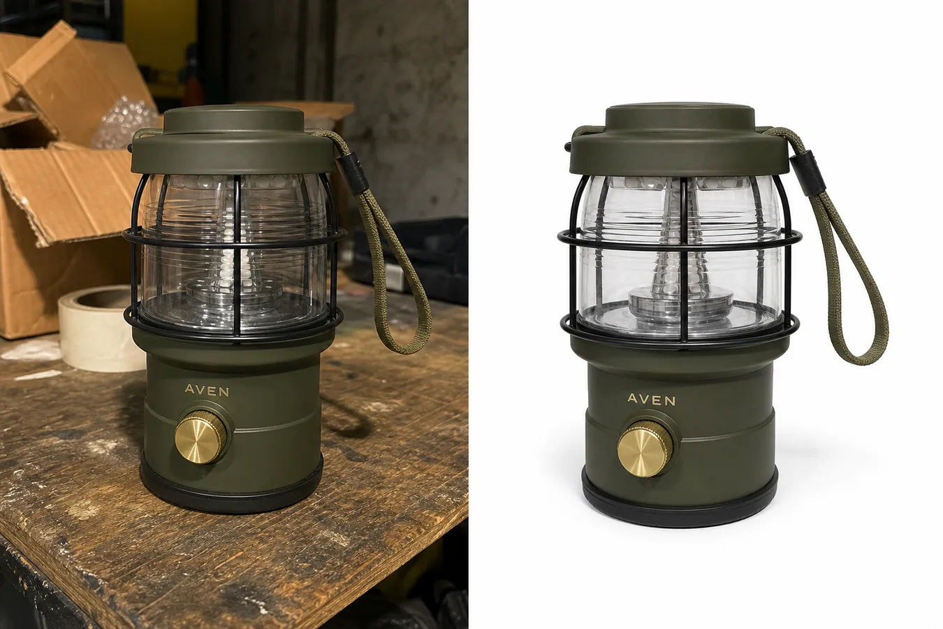 ## When Background Removal Helps An eBay Listing
Background removal helps when the original photo shows a real product but the surrounding scene distracts from it. Common cases include:
- a product photographed on a garage bench, kitchen counter, carpet, or storage shelf
- cardboard, tape, tools, labels, bags, or dust around the item
- uneven light that makes the product harder to read
- a busy texture behind a small accessory
- a resale item that needs a cleaner first image for buyer scanning
- multiple listing photos that need a more consistent visual style
For resale and marketplace work, the best edited photo still looks honest. The buyer should see the same product shape, color, condition, parts, hardware, label area, and surface texture that appeared in the source photo.
## What To Preserve During eBay Product Photo Background Removal
Before using any AI product photo editor, write down the product facts that must not change:
- silhouette, proportions, and crop
- true product color and finish
- straps, handles, cords, buttons, knobs, ports, seams, zippers, hinges, or hardware
- transparent, reflective, fabric, leather, metal, or glass edges
- wear, patina, scuffs, texture, or condition details that a buyer should know
- shadows that make the product feel grounded
- label placement or simple brand text if it belongs to the product
- scale cues when the item size is not obvious
This matters more for secondhand, handmade, vintage, and one-off inventory. A clean white background product photo can improve presentation, but it should not hide condition or make the item look newer, larger, smoother, or more premium than it is.
## Workflow: Remove An eBay Product Photo Background Without Losing Realism
Use this workflow for a single listing image:
- Start with the sharpest source photo available.
- Crop out large empty areas before editing, but keep the full product visible.
- Run the image through KrafLayer's [AI Background Remover](/tools/ai-background-remover).
- Place the product on a clean white, off-white, or very light neutral background.
- Keep a natural contact shadow instead of floating the item.
- Compare the edited image against the original at full size.
- Check product edges, transparent parts, reflective areas, cords, straps, handles, and small hardware.
- Review the image at mobile size because many buyers browse listings on phones.
- Use the [product photo editor](/product-photo-editor) only for local cleanup that does not change the product facts.
- Keep the original photo as a reference and use extra listing images when condition or scale needs more context.
If the removed background creates fuzzy edges, missing straps, warped transparent parts, or a floating product, do not publish that version. Regenerate, use a tighter source crop, or keep a more natural background.
## White Background Is Useful, But Not Always The Only Choice
A white background product photo is often useful for the primary listing image because it makes the item easy to scan. It also helps create consistency across a batch of products.
Use a clean white or off-white background when:
- the product shape is clear against light space
- the product has enough contrast at the edges
- the item is small and needs immediate recognition
- the original background distracts from condition or details
- you are building a consistent marketplace image set
Use a subtle neutral surface instead when:
- the product is white, transparent, reflective, or glass
- the contact shadow helps show scale
- the item looks fake when fully isolated
- texture, condition, or material needs a grounded context
Good ecommerce product photography should make the product easier to trust. It should not make the item look detached from reality.
## Review Checklist For Marketplace-Ready Images
Before uploading the edited image, check:
- Does the product look like the same item as the source photo?
- Did the background remover preserve thin straps, cords, handles, and loops?
- Are transparent or reflective parts still readable?
- Is the product color still accurate?
- Does the contact shadow look natural?
- Are condition details still visible where buyers need them?
- Does the product sit fully inside the crop?
- Is there any leftover halo, jagged edge, old background color, or cutout fringe?
- Does the photo avoid fake marketplace UI, badges, review stars, logos, and unsupported claims?
- Would a buyer understand the product quickly at mobile size?
This review step is where eBay product photo background removal becomes useful instead of risky. The cleaner image should reduce distraction while keeping the buyer's understanding of the product intact.
## Prompt Or Direction To Use
For a one-click background remover, you usually do not need a creative prompt. Use an editing direction like this when a tool asks for guidance:
> Remove the cluttered background and keep the exact product unchanged. Preserve the product shape, color, scale, transparent or reflective parts, straps, handles, hardware, label area, condition details, and natural contact shadow. Place the product on a clean light ecommerce background. Do not add logos, badges, marketplace UI, claims, new parts, or extra props.
For a transparent PNG export, add:
> Preserve alpha transparency around the product edge and keep a separate natural shadow version if the listing image needs to feel grounded.
For batch work, apply the same crop ratio, background tone, and shadow strength across the set so the store feels consistent.
## How KrafLayer Fits This Workflow
KrafLayer is useful here because sellers can turn rough product photos into cleaner listing assets without treating the edit as a full redesign. Start with [AI Background Remover](/tools/ai-background-remover), use [Product Photo Editor](/product-photo-editor) for local cleanup, and keep [ecommerce product photography](/ecommerce-product-photography) principles in mind: clear subject, accurate product facts, readable details, and a visual style that helps buyers decide.
For eBay sellers, the advantage is not making every item look like a studio shoot. The advantage is making the product easier to inspect while keeping the item honest.
## What does eBay currently require from listing photos?
eBay requires at least one image, allows up to 24, sets a 500 × 500 pixel minimum, recommends about 1600 × 1600, and accepts files up to 12MB. It says the main photo should show the whole item face-on against an uncluttered neutral background ([eBay photo guidance](https://www.ebay.com/help/selling/listings/adding-pictures-listings?id=4148), 2026).
White is generally useful, but eBay notes that a darker background may work better for shiny or reflective objects. Background choice should improve edge visibility, not create drama that hides condition.
## Preserve condition evidence for used items
eBay tells sellers to photograph flaws, scratches, and imperfections and prohibits catalog or stock photos for used items. Background removal must not erase wear at the silhouette, soften a chipped edge, remove a stain, or rebuild a missing part ([eBay photo guidance](https://www.ebay.com/help/selling/listings/adding-pictures-listings?id=4148), 2026).
Keep one unedited condition reference and use additional images for flaws, serial marks, accessories, and scale. If an imperfection touches the background, mask around it manually rather than trusting an automatic cutout to decide whether it belongs to the item.
## Review edges and shadows separately
Use the one-click [AI background remover](/tools/ai-background-remover) for the initial transparent cutout, then inspect four edge classes: hair or fibers, transparent material, reflective metal, and thin handles or cables. The tool does not need a prompt.
Review the shadow as a separate decision. A faint contact shadow can keep an item grounded on white, but it must match the object's base and light direction. Do not add a dramatic floating shadow to a factual main photo.
At 100% zoom, reject:
- white or dark halos around the item;
- trimmed fibers, straps, prongs, or cables;
- transparency replaced with gray paint;
- reflections cut into the product silhouette;
- a shadow that starts away from the contact point;
- missing wear or damage at an edge.
Export one flattened listing file and retain the transparent master for reuse. Check the final main image at search-result size, because edge problems that look small on a desktop can change the item's silhouette in the feed.
## FAQ
### What is eBay product photo background removal?
eBay product photo background removal means isolating the item from a distracting source photo and placing it on a cleaner background for listing use. The edit should preserve the real product, including color, edges, parts, condition, texture, and natural shadow.
### Should eBay product photos use a white background?
A white or off-white background can make an eBay product photo easier to scan, especially for a primary listing image. It is not the only useful option. Some products need a subtle neutral surface or natural shadow so transparent, white, reflective, or textured items still look realistic.
### Can AI remove an eBay product photo background without changing the item?
AI can remove the background while keeping the item realistic if the source photo is clear and the output is reviewed carefully. Check straps, cords, transparent parts, reflective edges, color, hardware, condition details, and scale before using the edited image.
### What should I avoid when editing eBay product photos?
Avoid edits that hide condition, change product color, invent parts, remove important details, add fake badges, add marketplace UI, or make the item look newer or more premium than it is. Keep extra listing photos when buyers need condition, scale, or usage context.
### How can KrafLayer help with product background remover workflows?
KrafLayer helps sellers use a product background remover, clean up small distractions, and prepare ecommerce product photography assets from the same source item. The best workflow is remove background first, review product truth second, and only then crop or upscale for listing use.
## Conclusion
Good eBay product photo background removal makes a cluttered seller photo easier to inspect without making the item feel fake. Preserve product shape, color, material, condition, transparent edges, small hardware, and natural shadow before you worry about polish. KrafLayer helps sellers create cleaner white background product photos, transparent cutouts, and listing-ready ecommerce product photography while keeping the product facts anchored to the original image.
# AI Product Photography for Ecommerce: What It Can Replace and What Still Needs Review
URL: https://kraflayer.com/blog/ai-product-photography-for-ecommerce-review-checklist
Summary: A practical guide to what AI product photography can replace for ecommerce teams, what still needs review, and how to protect product truth.
Updated: 2026-06-24
AI product photography for ecommerce can replace many repeatable image-production jobs: clean main images, lifestyle scenes, detail crops, background variations, and ad-ready compositions. It should not replace product review. Before an AI image goes live, check the product shape, color, material, scale, labels, parts, and selling claim against the real item.
The practical rule is simple: use AI to produce more ecommerce image options, then use human review to protect buyer trust. In KrafLayer, that means starting from a product reference in [AI product photography](/ai-product-photography), generating a product-led image, and using the [product photo editor](/product-photo-editor) only where the output needs cleanup.
## When Background Removal Helps An eBay Listing
Background removal helps when the original photo shows a real product but the surrounding scene distracts from it. Common cases include:
- a product photographed on a garage bench, kitchen counter, carpet, or storage shelf
- cardboard, tape, tools, labels, bags, or dust around the item
- uneven light that makes the product harder to read
- a busy texture behind a small accessory
- a resale item that needs a cleaner first image for buyer scanning
- multiple listing photos that need a more consistent visual style
For resale and marketplace work, the best edited photo still looks honest. The buyer should see the same product shape, color, condition, parts, hardware, label area, and surface texture that appeared in the source photo.
## What To Preserve During eBay Product Photo Background Removal
Before using any AI product photo editor, write down the product facts that must not change:
- silhouette, proportions, and crop
- true product color and finish
- straps, handles, cords, buttons, knobs, ports, seams, zippers, hinges, or hardware
- transparent, reflective, fabric, leather, metal, or glass edges
- wear, patina, scuffs, texture, or condition details that a buyer should know
- shadows that make the product feel grounded
- label placement or simple brand text if it belongs to the product
- scale cues when the item size is not obvious
This matters more for secondhand, handmade, vintage, and one-off inventory. A clean white background product photo can improve presentation, but it should not hide condition or make the item look newer, larger, smoother, or more premium than it is.
## Workflow: Remove An eBay Product Photo Background Without Losing Realism
Use this workflow for a single listing image:
- Start with the sharpest source photo available.
- Crop out large empty areas before editing, but keep the full product visible.
- Run the image through KrafLayer's [AI Background Remover](/tools/ai-background-remover).
- Place the product on a clean white, off-white, or very light neutral background.
- Keep a natural contact shadow instead of floating the item.
- Compare the edited image against the original at full size.
- Check product edges, transparent parts, reflective areas, cords, straps, handles, and small hardware.
- Review the image at mobile size because many buyers browse listings on phones.
- Use the [product photo editor](/product-photo-editor) only for local cleanup that does not change the product facts.
- Keep the original photo as a reference and use extra listing images when condition or scale needs more context.
If the removed background creates fuzzy edges, missing straps, warped transparent parts, or a floating product, do not publish that version. Regenerate, use a tighter source crop, or keep a more natural background.
## White Background Is Useful, But Not Always The Only Choice
A white background product photo is often useful for the primary listing image because it makes the item easy to scan. It also helps create consistency across a batch of products.
Use a clean white or off-white background when:
- the product shape is clear against light space
- the product has enough contrast at the edges
- the item is small and needs immediate recognition
- the original background distracts from condition or details
- you are building a consistent marketplace image set
Use a subtle neutral surface instead when:
- the product is white, transparent, reflective, or glass
- the contact shadow helps show scale
- the item looks fake when fully isolated
- texture, condition, or material needs a grounded context
Good ecommerce product photography should make the product easier to trust. It should not make the item look detached from reality.
## Review Checklist For Marketplace-Ready Images
Before uploading the edited image, check:
- Does the product look like the same item as the source photo?
- Did the background remover preserve thin straps, cords, handles, and loops?
- Are transparent or reflective parts still readable?
- Is the product color still accurate?
- Does the contact shadow look natural?
- Are condition details still visible where buyers need them?
- Does the product sit fully inside the crop?
- Is there any leftover halo, jagged edge, old background color, or cutout fringe?
- Does the photo avoid fake marketplace UI, badges, review stars, logos, and unsupported claims?
- Would a buyer understand the product quickly at mobile size?
This review step is where eBay product photo background removal becomes useful instead of risky. The cleaner image should reduce distraction while keeping the buyer's understanding of the product intact.
## Prompt Or Direction To Use
For a one-click background remover, you usually do not need a creative prompt. Use an editing direction like this when a tool asks for guidance:
> Remove the cluttered background and keep the exact product unchanged. Preserve the product shape, color, scale, transparent or reflective parts, straps, handles, hardware, label area, condition details, and natural contact shadow. Place the product on a clean light ecommerce background. Do not add logos, badges, marketplace UI, claims, new parts, or extra props.
For a transparent PNG export, add:
> Preserve alpha transparency around the product edge and keep a separate natural shadow version if the listing image needs to feel grounded.
For batch work, apply the same crop ratio, background tone, and shadow strength across the set so the store feels consistent.
## How KrafLayer Fits This Workflow
KrafLayer is useful here because sellers can turn rough product photos into cleaner listing assets without treating the edit as a full redesign. Start with [AI Background Remover](/tools/ai-background-remover), use [Product Photo Editor](/product-photo-editor) for local cleanup, and keep [ecommerce product photography](/ecommerce-product-photography) principles in mind: clear subject, accurate product facts, readable details, and a visual style that helps buyers decide.
For eBay sellers, the advantage is not making every item look like a studio shoot. The advantage is making the product easier to inspect while keeping the item honest.
## What does eBay currently require from listing photos?
eBay requires at least one image, allows up to 24, sets a 500 × 500 pixel minimum, recommends about 1600 × 1600, and accepts files up to 12MB. It says the main photo should show the whole item face-on against an uncluttered neutral background ([eBay photo guidance](https://www.ebay.com/help/selling/listings/adding-pictures-listings?id=4148), 2026).
White is generally useful, but eBay notes that a darker background may work better for shiny or reflective objects. Background choice should improve edge visibility, not create drama that hides condition.
## Preserve condition evidence for used items
eBay tells sellers to photograph flaws, scratches, and imperfections and prohibits catalog or stock photos for used items. Background removal must not erase wear at the silhouette, soften a chipped edge, remove a stain, or rebuild a missing part ([eBay photo guidance](https://www.ebay.com/help/selling/listings/adding-pictures-listings?id=4148), 2026).
Keep one unedited condition reference and use additional images for flaws, serial marks, accessories, and scale. If an imperfection touches the background, mask around it manually rather than trusting an automatic cutout to decide whether it belongs to the item.
## Review edges and shadows separately
Use the one-click [AI background remover](/tools/ai-background-remover) for the initial transparent cutout, then inspect four edge classes: hair or fibers, transparent material, reflective metal, and thin handles or cables. The tool does not need a prompt.
Review the shadow as a separate decision. A faint contact shadow can keep an item grounded on white, but it must match the object's base and light direction. Do not add a dramatic floating shadow to a factual main photo.
At 100% zoom, reject:
- white or dark halos around the item;
- trimmed fibers, straps, prongs, or cables;
- transparency replaced with gray paint;
- reflections cut into the product silhouette;
- a shadow that starts away from the contact point;
- missing wear or damage at an edge.
Export one flattened listing file and retain the transparent master for reuse. Check the final main image at search-result size, because edge problems that look small on a desktop can change the item's silhouette in the feed.
## FAQ
### What is eBay product photo background removal?
eBay product photo background removal means isolating the item from a distracting source photo and placing it on a cleaner background for listing use. The edit should preserve the real product, including color, edges, parts, condition, texture, and natural shadow.
### Should eBay product photos use a white background?
A white or off-white background can make an eBay product photo easier to scan, especially for a primary listing image. It is not the only useful option. Some products need a subtle neutral surface or natural shadow so transparent, white, reflective, or textured items still look realistic.
### Can AI remove an eBay product photo background without changing the item?
AI can remove the background while keeping the item realistic if the source photo is clear and the output is reviewed carefully. Check straps, cords, transparent parts, reflective edges, color, hardware, condition details, and scale before using the edited image.
### What should I avoid when editing eBay product photos?
Avoid edits that hide condition, change product color, invent parts, remove important details, add fake badges, add marketplace UI, or make the item look newer or more premium than it is. Keep extra listing photos when buyers need condition, scale, or usage context.
### How can KrafLayer help with product background remover workflows?
KrafLayer helps sellers use a product background remover, clean up small distractions, and prepare ecommerce product photography assets from the same source item. The best workflow is remove background first, review product truth second, and only then crop or upscale for listing use.
## Conclusion
Good eBay product photo background removal makes a cluttered seller photo easier to inspect without making the item feel fake. Preserve product shape, color, material, condition, transparent edges, small hardware, and natural shadow before you worry about polish. KrafLayer helps sellers create cleaner white background product photos, transparent cutouts, and listing-ready ecommerce product photography while keeping the product facts anchored to the original image.
# AI Product Photography for Ecommerce: What It Can Replace and What Still Needs Review
URL: https://kraflayer.com/blog/ai-product-photography-for-ecommerce-review-checklist
Summary: A practical guide to what AI product photography can replace for ecommerce teams, what still needs review, and how to protect product truth.
Updated: 2026-06-24
AI product photography for ecommerce can replace many repeatable image-production jobs: clean main images, lifestyle scenes, detail crops, background variations, and ad-ready compositions. It should not replace product review. Before an AI image goes live, check the product shape, color, material, scale, labels, parts, and selling claim against the real item.
The practical rule is simple: use AI to produce more ecommerce image options, then use human review to protect buyer trust. In KrafLayer, that means starting from a product reference in [AI product photography](/ai-product-photography), generating a product-led image, and using the [product photo editor](/product-photo-editor) only where the output needs cleanup.
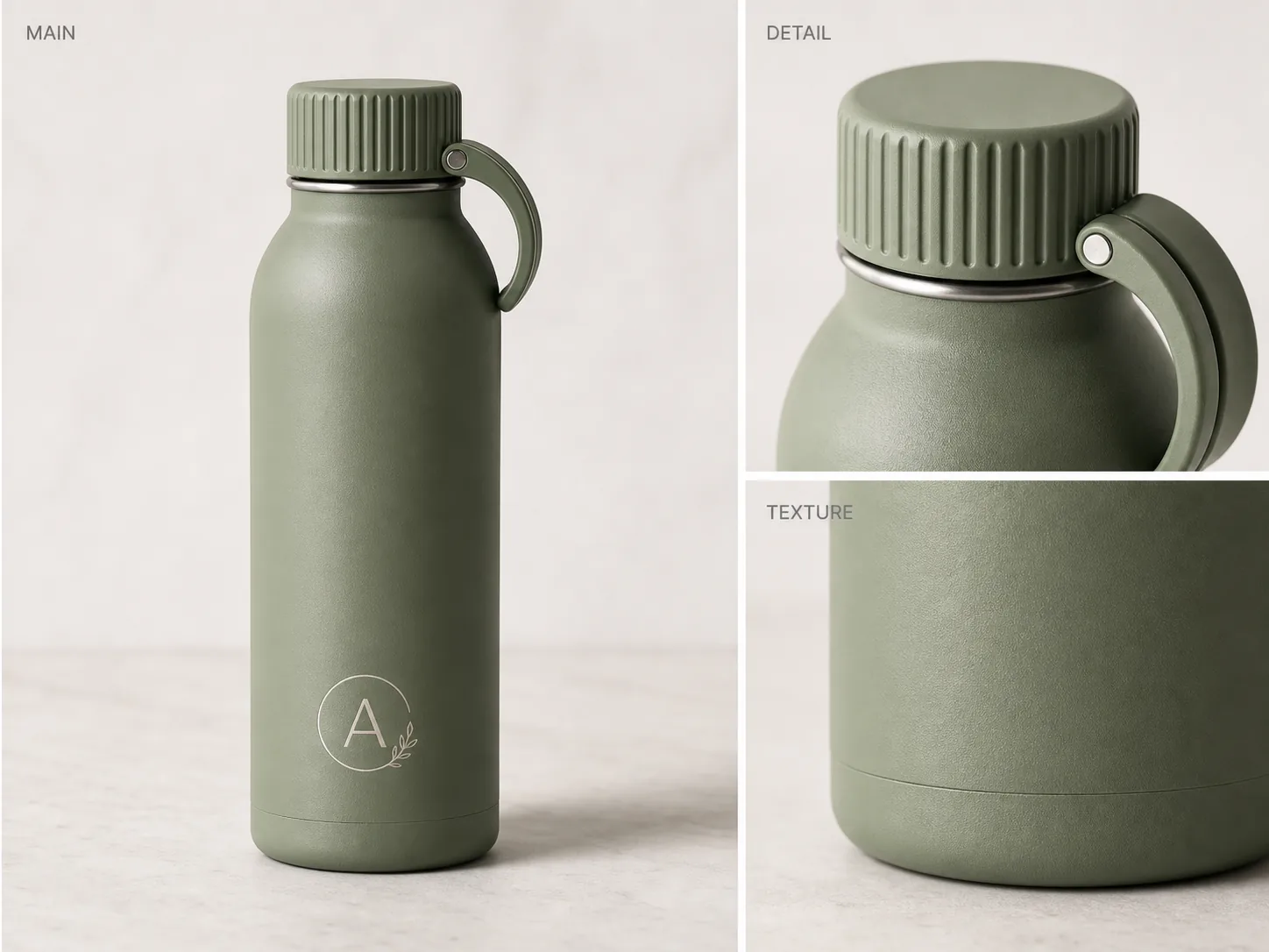 ## What AI Product Photography Can Replace
AI product photography for ecommerce works best when the job is visual production, not product decision-making. A seller can use it to create a broader image set from one strong reference instead of reshooting every role from scratch.
It can usually help with:
- main product image concepts for a clean product page
- lifestyle scenes that show use context
- detail images for texture, lid shape, stitching, hardware, glass, fabric, or finish
- background variations for store pages, ads, and seasonal campaigns
- crop variations for product pages, paid social, and marketplace thumbnails
- cleanup drafts when a source photo has a distracting surface or weak lighting
The generated bottle image above is a useful ecommerce example because it keeps one product visible across the main, detail, and texture panels. The buyer can understand the product first, then inspect the ribbed lid, carry loop, matte finish, and bottom edge.
## What Still Needs Review
AI product images for ecommerce still need product-truth review before publishing. A polished image can quietly change the SKU, and that is more dangerous than a rough photo.
Review these facts every time:
- silhouette: the product shape should match the real item
- color: the generated color should not become more premium or different from the shipped SKU
- material: metal, glass, fabric, leather, ceramic, and plastic should stay believable
- details: lids, handles, seams, ports, clasps, labels, zippers, buttons, and stitching should stay in the right place
- scale: the product should not look larger, thinner, taller, softer, or more expensive than it is
- text: labels and package copy should be approved artwork, not invented AI lettering
- claims: no fake badges, ratings, certifications, sustainability marks, medical claims, or performance promises
A good ecommerce review rejects images that make the product look more capable than it really is. Do not publish an image that changes what the buyer can inspect or what the buyer will receive.
## A Safe AI Product Photography Workflow for Ecommerce
Treat AI product photography as a production workflow with checkpoints. Do not ask for a final image in one vague prompt and publish the first attractive result.
Use this workflow:
- Start with the clearest product reference you have.
- Write down the product facts that cannot change.
- Choose one image role: main image, detail image, lifestyle scene, ad crop, or background cleanup.
- Generate one controlled version with the [AI product image generator](/ai-product-image-generator).
- Compare the output to the product fact list.
- Use editing only for specific fixes such as background cleanup, shadow control, crop, or texture clarity.
- Place the result inside your broader [ecommerce product photography](/ecommerce-product-photography) set so the listing feels consistent.
This keeps the AI image tied to a commercial job. The goal is not to create the most dramatic image; the goal is to create a product image a buyer can trust.
## Prompt Template for Ecommerce AI Product Photography
Use a prompt that defines the product, the image role, and the facts that must stay unchanged.
> Create an ecommerce product photo of this exact product for a [main image/detail image/lifestyle scene/ad crop]. Keep the product shape, proportions, color, material, label area, lid or hardware, scale, and camera angle consistent with the reference. Improve the lighting and selling context without adding fake logos, badges, review stars, marketplace UI, certification marks, claims, barcode, QR code, or accessories that are not included with the product.
For a product like the sage insulated bottle, the prompt should protect the ribbed lid, carry loop, matte texture, bottom seam, logo area, cylinder shape, and natural contact shadow. Those details matter more than background drama.
## Where KrafLayer Fits
KrafLayer is most useful when the ecommerce team needs a controlled image set, not a single one-off render. Start with the owner workflow at [AI product photography](/ai-product-photography), generate main or detail images with the AI product image generator, then use product editing to clean one problem area instead of regenerating the entire SKU.
That workflow is especially useful for catalogs where the same product must appear in several roles: main image, texture closeup, scale cue, lifestyle scene, and ad crop. Each output should look like the same product, not five different interpretations.
## FAQ
### Is AI product photography good enough for ecommerce?
AI product photography can be good enough for ecommerce when the product facts are reviewed before publishing. It is useful for creating main images, detail crops, lifestyle scenes, and campaign variations, but the seller still needs to check accuracy, labels, scale, materials, and claims.
### What should I check before publishing AI product images?
Check product shape, color, material, scale, logo or label placement, small parts, edge quality, contact shadow, and any visible text. Also reject fake badges, platform UI, review stars, certification marks, medical claims, or accessories the buyer will not receive.
### Can AI product photography replace a full studio shoot?
It can replace some repeatable image-production work, especially background variations, detail concepts, and campaign drafts. It should not replace all photography when the product needs exact legal, technical, packaging, color, or material documentation.
### What is the best first image to create with AI?
For most sellers, the best first AI product image is a clean main image or a detail image that proves one selling point. These roles are easier to review than a complex lifestyle scene and help establish whether the product identity is stable.
### How is AI product photography different from ecommerce product photography?
Ecommerce product photography is the broader selling system: main images, details, lifestyle views, crops, and review standards. AI product photography is one production method inside that system. It helps create images faster, but the ecommerce checklist still decides whether an image is publishable.
## Conclusion
AI product photography for ecommerce is strongest when it replaces repetitive production work while keeping product review in the workflow. Use it to create main images, detail images, backgrounds, and campaign variations, then inspect the output against the real SKU before publishing. KrafLayer helps ecommerce teams move from a product reference to AI product photography and final product photo editing, so the image set can improve without losing the product details that buyers rely on.
# AI Product Photography Examples: What to Inspect Before You Use Them
URL: https://kraflayer.com/blog/ai-product-photography-examples-inspection-checklist
Summary: A practical way to inspect AI product photography examples before using them: main images, lifestyle scenes, detail crops, ad crops, and product-truth checks.
Updated: 2026-06-24
AI product photography examples are useful only when they show what the product is, why the image role matters, and which product details stayed accurate. A strong example is not just a beautiful scene; it is an image a seller could review against the real SKU before publishing. In KrafLayer, the best way to judge examples is to compare main images, lifestyle scenes, detail crops, and ad crops against one product-truth checklist.
Use this rule first: if an AI product photo example changes the product shape, color, material, hardware, scale, or included parts, it is not ready for ecommerce use. The image can look premium and still be wrong.
## What AI Product Photography Can Replace
AI product photography for ecommerce works best when the job is visual production, not product decision-making. A seller can use it to create a broader image set from one strong reference instead of reshooting every role from scratch.
It can usually help with:
- main product image concepts for a clean product page
- lifestyle scenes that show use context
- detail images for texture, lid shape, stitching, hardware, glass, fabric, or finish
- background variations for store pages, ads, and seasonal campaigns
- crop variations for product pages, paid social, and marketplace thumbnails
- cleanup drafts when a source photo has a distracting surface or weak lighting
The generated bottle image above is a useful ecommerce example because it keeps one product visible across the main, detail, and texture panels. The buyer can understand the product first, then inspect the ribbed lid, carry loop, matte finish, and bottom edge.
## What Still Needs Review
AI product images for ecommerce still need product-truth review before publishing. A polished image can quietly change the SKU, and that is more dangerous than a rough photo.
Review these facts every time:
- silhouette: the product shape should match the real item
- color: the generated color should not become more premium or different from the shipped SKU
- material: metal, glass, fabric, leather, ceramic, and plastic should stay believable
- details: lids, handles, seams, ports, clasps, labels, zippers, buttons, and stitching should stay in the right place
- scale: the product should not look larger, thinner, taller, softer, or more expensive than it is
- text: labels and package copy should be approved artwork, not invented AI lettering
- claims: no fake badges, ratings, certifications, sustainability marks, medical claims, or performance promises
A good ecommerce review rejects images that make the product look more capable than it really is. Do not publish an image that changes what the buyer can inspect or what the buyer will receive.
## A Safe AI Product Photography Workflow for Ecommerce
Treat AI product photography as a production workflow with checkpoints. Do not ask for a final image in one vague prompt and publish the first attractive result.
Use this workflow:
- Start with the clearest product reference you have.
- Write down the product facts that cannot change.
- Choose one image role: main image, detail image, lifestyle scene, ad crop, or background cleanup.
- Generate one controlled version with the [AI product image generator](/ai-product-image-generator).
- Compare the output to the product fact list.
- Use editing only for specific fixes such as background cleanup, shadow control, crop, or texture clarity.
- Place the result inside your broader [ecommerce product photography](/ecommerce-product-photography) set so the listing feels consistent.
This keeps the AI image tied to a commercial job. The goal is not to create the most dramatic image; the goal is to create a product image a buyer can trust.
## Prompt Template for Ecommerce AI Product Photography
Use a prompt that defines the product, the image role, and the facts that must stay unchanged.
> Create an ecommerce product photo of this exact product for a [main image/detail image/lifestyle scene/ad crop]. Keep the product shape, proportions, color, material, label area, lid or hardware, scale, and camera angle consistent with the reference. Improve the lighting and selling context without adding fake logos, badges, review stars, marketplace UI, certification marks, claims, barcode, QR code, or accessories that are not included with the product.
For a product like the sage insulated bottle, the prompt should protect the ribbed lid, carry loop, matte texture, bottom seam, logo area, cylinder shape, and natural contact shadow. Those details matter more than background drama.
## Where KrafLayer Fits
KrafLayer is most useful when the ecommerce team needs a controlled image set, not a single one-off render. Start with the owner workflow at [AI product photography](/ai-product-photography), generate main or detail images with the AI product image generator, then use product editing to clean one problem area instead of regenerating the entire SKU.
That workflow is especially useful for catalogs where the same product must appear in several roles: main image, texture closeup, scale cue, lifestyle scene, and ad crop. Each output should look like the same product, not five different interpretations.
## FAQ
### Is AI product photography good enough for ecommerce?
AI product photography can be good enough for ecommerce when the product facts are reviewed before publishing. It is useful for creating main images, detail crops, lifestyle scenes, and campaign variations, but the seller still needs to check accuracy, labels, scale, materials, and claims.
### What should I check before publishing AI product images?
Check product shape, color, material, scale, logo or label placement, small parts, edge quality, contact shadow, and any visible text. Also reject fake badges, platform UI, review stars, certification marks, medical claims, or accessories the buyer will not receive.
### Can AI product photography replace a full studio shoot?
It can replace some repeatable image-production work, especially background variations, detail concepts, and campaign drafts. It should not replace all photography when the product needs exact legal, technical, packaging, color, or material documentation.
### What is the best first image to create with AI?
For most sellers, the best first AI product image is a clean main image or a detail image that proves one selling point. These roles are easier to review than a complex lifestyle scene and help establish whether the product identity is stable.
### How is AI product photography different from ecommerce product photography?
Ecommerce product photography is the broader selling system: main images, details, lifestyle views, crops, and review standards. AI product photography is one production method inside that system. It helps create images faster, but the ecommerce checklist still decides whether an image is publishable.
## Conclusion
AI product photography for ecommerce is strongest when it replaces repetitive production work while keeping product review in the workflow. Use it to create main images, detail images, backgrounds, and campaign variations, then inspect the output against the real SKU before publishing. KrafLayer helps ecommerce teams move from a product reference to AI product photography and final product photo editing, so the image set can improve without losing the product details that buyers rely on.
# AI Product Photography Examples: What to Inspect Before You Use Them
URL: https://kraflayer.com/blog/ai-product-photography-examples-inspection-checklist
Summary: A practical way to inspect AI product photography examples before using them: main images, lifestyle scenes, detail crops, ad crops, and product-truth checks.
Updated: 2026-06-24
AI product photography examples are useful only when they show what the product is, why the image role matters, and which product details stayed accurate. A strong example is not just a beautiful scene; it is an image a seller could review against the real SKU before publishing. In KrafLayer, the best way to judge examples is to compare main images, lifestyle scenes, detail crops, and ad crops against one product-truth checklist.
Use this rule first: if an AI product photo example changes the product shape, color, material, hardware, scale, or included parts, it is not ready for ecommerce use. The image can look premium and still be wrong.
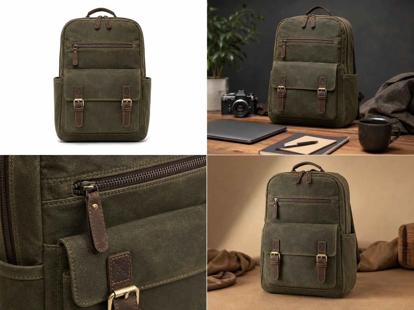 ## Start With The Image Role
The fastest way to inspect AI product photography examples is to ask what job each image is doing. A main image, a lifestyle image, a detail image, and an ad crop should not be judged by the same standard.
For the backpack example above, each view has a different job:
- The white-background main image should make the product shape, front pocket, buckles, handle, zipper pulls, and side pockets easy to inspect.
- The lifestyle scene should show scale and use context without hiding the backpack behind props.
- The detail crop should prove material, stitching, zipper teeth, leather pull, and brass hardware quality.
- The ad-style crop should create a warmer campaign look while still showing the same product.
This is why example galleries can be misleading. A dramatic scene may be useful for an ad, but weak for a product page. A clean main image may be excellent for inspection but too plain for a campaign.
## What Good AI Product Photography Examples Have In Common
Good AI product photography examples protect the product before they improve the image. They make the product easier to understand, not harder to verify.
For ecommerce teams, the useful pattern is simple: AI product photography examples for ecommerce should show a main image, a lifestyle image, and a detail image that all look like the same SKU. Treat AI product photo examples as working assets, not inspiration screenshots.
Look for these signals:
- The product has one clear subject and enough size in the frame.
- Key product details match across examples.
- Materials look believable: canvas should not become plastic, leather should not become rubber, and metal should not become flat yellow paint.
- The contact shadow and lighting make sense for the surface.
- Props support the product instead of becoming the reason the image exists.
- The image avoids fake platform UI, badges, review stars, discount marks, QR codes, barcodes, and unsupported claims.
For ecommerce product photography examples, consistency matters more than novelty. If four AI outputs look like four different SKUs, the set is not useful for a product page. The same rule applies to AI product image examples in a tool gallery: the image should prove a real ecommerce job, not only a visual style.
## Inspect Main Image Examples
The main image is the clearest test of product truth. It should answer the buyer's first question: what exactly is being sold?
Check these details before using a main image:
- silhouette and proportions
- front, side, top, and bottom structure when visible
- handles, straps, buckles, clasps, buttons, ports, lids, pumps, seams, or zippers
- product color under neutral light
- edge quality and contact shadow
- whether props, labels, or decorative objects imply extra included items
In the backpack example, the main image works because the product is centered, the front pocket and two buckles are visible, and the olive canvas material is readable. It would fail if the image invented a new zipper layout or changed the buckles between views.
## Inspect Lifestyle Scene Examples
Lifestyle examples are useful when they show scale, use case, or buying context. They are risky when the scene becomes more important than the product.
Use lifestyle AI product photo examples when you need to show:
- where the product fits in daily use
- how large or compact the item feels
- what materials look like under realistic light
- how the product pairs with a room, desk, model, surface, or occasion
The lifestyle view above places the same backpack in a work-and-travel desk scene. That kind of example can help sell the product, but the seller still needs to review the front pocket, leather pulls, buckles, stitching, side shape, and color against the reference product.
Do not use a lifestyle output if the scene hides the product, changes the SKU, adds accessories that look included, or creates a use claim the product cannot support.
## Inspect Detail Crop Examples
Detail examples should prove one thing at a time. They are strongest when they show a buyer-relevant feature: texture, stitching, hardware, closure, label area, edge finish, glass thickness, fabric weave, leather grain, or product construction.
A good detail crop should feel tied to the same SKU. For the backpack, the close crop should match the same olive canvas, zipper teeth, leather pull, brass hardware, stitching color, and pocket construction from the main image.
Use this practical test:
- Can a buyer understand what material or construction detail is being shown?
- Does the detail crop match the main image?
- Is the crop sharp enough for mobile inspection?
- Did the AI invent a new logo, label, seam, buckle, or texture?
- Would the detail image make the buyer more confident without exaggerating the product?
Detail images are often where AI drift is easiest to miss. Review them slowly before publishing.
## Inspect Ad And Social Crop Examples
Ad-style examples can be more atmospheric, but they still need product accuracy. A campaign crop can use warmer lighting, tighter framing, or stronger composition; it should not redesign the product.
For ad and social examples, check:
- the product is still large enough to recognize quickly
- the crop does not cut off key buying details
- the product color does not shift into a different variant
- the scene does not add fake offers, badges, or review cues
- the image can be adapted into a channel crop without making the product tiny
KrafLayer's [AI product photography](/ai-product-photography) workflow is useful here because the seller can generate several roles from the same product idea, then use the [product photo editor](/product-photo-editor) to fix weak details before placing the image in a wider [ecommerce product photography](/ecommerce-product-photography) set.
## Example Review Checklist
Before publishing AI product image examples, use a short review pass instead of relying on first impressions.
Review the set in this order:
- Product identity: same SKU, color, shape, material, scale, and key parts.
- Image role: main, lifestyle, detail, ad, marketplace, or store PDP.
- Buyer clarity: the product is easy to understand in the first two seconds.
- Detail accuracy: texture, stitching, hardware, labels, and edges are stable.
- Scene honesty: no fake included accessories, claims, platform UI, badges, or review stars.
- Channel fit: the crop and background make sense for the page or campaign.
- Editability: weak details can be fixed without regenerating the entire product.
The best AI product photography examples are examples you can audit. If you cannot explain what the image proves, it probably belongs in an inspiration board, not a product listing.
## Prompt Direction For Better Examples
When using an [AI product image generator](/ai-product-image-generator), write the prompt around product truth and image role instead of broad style words.
Example direction:
> Create four ecommerce product photography examples for the same olive waxed-canvas commuter backpack: a white-background main image, a realistic desk lifestyle scene, a close detail crop of stitching, zipper, leather pull, and brass buckle, and a warm ad-style crop. Keep the same backpack silhouette, front pocket, side pockets, handle, zipper pulls, buckle placement, stitching, material texture, color, and proportions in every view. Do not add real logos, marketplace UI, review stars, badges, prices, QR codes, barcodes, or unsupported claims.
That kind of prompt gives the model a job. It also gives the human reviewer a checklist.
## FAQ
### What makes a good AI product photography example?
A good AI product photography example shows a clear product role and preserves product facts. It should keep the same shape, color, material, scale, parts, and details while improving the selling image. If the example looks impressive but changes the SKU, it is not ready for ecommerce.
### Can AI product photography examples be used directly on a store?
Sometimes, but they need review first. Compare every output against the real product or approved reference image. Check material, hardware, labels, included parts, crop, and any on-image text before using AI product photography examples on Shopify, Amazon, TikTok Shop, ads, or a product page.
### What examples should an ecommerce product page include?
Most ecommerce product pages benefit from a clear main image, one or two angle or lifestyle images, at least one product detail image, and channel-specific crops for ads or social. The exact set depends on the product, but every image should explain the product better.
### How do I avoid fake-looking AI product photos?
Keep one product as the subject, protect product facts in the prompt, avoid over-styled scenes, and review the output for changed details. Use editing only where needed. A believable AI product photo usually has clear scale, natural shadow, realistic material, and stable SKU details.
### How does KrafLayer help create AI product photography examples?
KrafLayer helps sellers generate product-led image roles from a reference, then refine weak outputs with product photo editing workflows. That lets a team create AI product photography examples for main images, lifestyle scenes, detail crops, and ad creatives while still reviewing product accuracy before publishing.
## Conclusion
AI product photography examples should be judged by usefulness, not by visual drama alone. The strongest examples show a clear image role, protect product details, and help buyers understand the product faster. KrafLayer helps ecommerce teams create main images, lifestyle scenes, detail images, and ad-ready product visuals from a product-focused workflow, then review and edit the outputs before they become live ecommerce assets.
# Product-on-Model Photography With AI: When It Works and What to Check
URL: https://kraflayer.com/blog/product-on-model-photography-with-ai-checklist
Summary: Use product-on-model photography with AI for scale and styling context, then check fit, material, hardware, seams, and product truth before publishing.
Updated: 2026-06-29
Product on model photography AI works best when the product has visible, checkable facts: silhouette, scale, material, hardware, seams, closure, and how it sits on the body. Use AI model images for merchandising context, not as an unchecked promise of perfect fit.
In KrafLayer, a practical workflow is to start with a clean product reference in the [AI product photography](/ai-product-photography) flow, generate an on-model view with the [AI product image generator](/ai-product-image-generator), then review the result against your real SKU before finishing any cleanup in the [product photo editor](/product-photo-editor). The goal is a believable [ecommerce product photography](/ecommerce-product-photography) asset that helps buyers judge scale and styling without changing the product.
## Start With The Image Role
The fastest way to inspect AI product photography examples is to ask what job each image is doing. A main image, a lifestyle image, a detail image, and an ad crop should not be judged by the same standard.
For the backpack example above, each view has a different job:
- The white-background main image should make the product shape, front pocket, buckles, handle, zipper pulls, and side pockets easy to inspect.
- The lifestyle scene should show scale and use context without hiding the backpack behind props.
- The detail crop should prove material, stitching, zipper teeth, leather pull, and brass hardware quality.
- The ad-style crop should create a warmer campaign look while still showing the same product.
This is why example galleries can be misleading. A dramatic scene may be useful for an ad, but weak for a product page. A clean main image may be excellent for inspection but too plain for a campaign.
## What Good AI Product Photography Examples Have In Common
Good AI product photography examples protect the product before they improve the image. They make the product easier to understand, not harder to verify.
For ecommerce teams, the useful pattern is simple: AI product photography examples for ecommerce should show a main image, a lifestyle image, and a detail image that all look like the same SKU. Treat AI product photo examples as working assets, not inspiration screenshots.
Look for these signals:
- The product has one clear subject and enough size in the frame.
- Key product details match across examples.
- Materials look believable: canvas should not become plastic, leather should not become rubber, and metal should not become flat yellow paint.
- The contact shadow and lighting make sense for the surface.
- Props support the product instead of becoming the reason the image exists.
- The image avoids fake platform UI, badges, review stars, discount marks, QR codes, barcodes, and unsupported claims.
For ecommerce product photography examples, consistency matters more than novelty. If four AI outputs look like four different SKUs, the set is not useful for a product page. The same rule applies to AI product image examples in a tool gallery: the image should prove a real ecommerce job, not only a visual style.
## Inspect Main Image Examples
The main image is the clearest test of product truth. It should answer the buyer's first question: what exactly is being sold?
Check these details before using a main image:
- silhouette and proportions
- front, side, top, and bottom structure when visible
- handles, straps, buckles, clasps, buttons, ports, lids, pumps, seams, or zippers
- product color under neutral light
- edge quality and contact shadow
- whether props, labels, or decorative objects imply extra included items
In the backpack example, the main image works because the product is centered, the front pocket and two buckles are visible, and the olive canvas material is readable. It would fail if the image invented a new zipper layout or changed the buckles between views.
## Inspect Lifestyle Scene Examples
Lifestyle examples are useful when they show scale, use case, or buying context. They are risky when the scene becomes more important than the product.
Use lifestyle AI product photo examples when you need to show:
- where the product fits in daily use
- how large or compact the item feels
- what materials look like under realistic light
- how the product pairs with a room, desk, model, surface, or occasion
The lifestyle view above places the same backpack in a work-and-travel desk scene. That kind of example can help sell the product, but the seller still needs to review the front pocket, leather pulls, buckles, stitching, side shape, and color against the reference product.
Do not use a lifestyle output if the scene hides the product, changes the SKU, adds accessories that look included, or creates a use claim the product cannot support.
## Inspect Detail Crop Examples
Detail examples should prove one thing at a time. They are strongest when they show a buyer-relevant feature: texture, stitching, hardware, closure, label area, edge finish, glass thickness, fabric weave, leather grain, or product construction.
A good detail crop should feel tied to the same SKU. For the backpack, the close crop should match the same olive canvas, zipper teeth, leather pull, brass hardware, stitching color, and pocket construction from the main image.
Use this practical test:
- Can a buyer understand what material or construction detail is being shown?
- Does the detail crop match the main image?
- Is the crop sharp enough for mobile inspection?
- Did the AI invent a new logo, label, seam, buckle, or texture?
- Would the detail image make the buyer more confident without exaggerating the product?
Detail images are often where AI drift is easiest to miss. Review them slowly before publishing.
## Inspect Ad And Social Crop Examples
Ad-style examples can be more atmospheric, but they still need product accuracy. A campaign crop can use warmer lighting, tighter framing, or stronger composition; it should not redesign the product.
For ad and social examples, check:
- the product is still large enough to recognize quickly
- the crop does not cut off key buying details
- the product color does not shift into a different variant
- the scene does not add fake offers, badges, or review cues
- the image can be adapted into a channel crop without making the product tiny
KrafLayer's [AI product photography](/ai-product-photography) workflow is useful here because the seller can generate several roles from the same product idea, then use the [product photo editor](/product-photo-editor) to fix weak details before placing the image in a wider [ecommerce product photography](/ecommerce-product-photography) set.
## Example Review Checklist
Before publishing AI product image examples, use a short review pass instead of relying on first impressions.
Review the set in this order:
- Product identity: same SKU, color, shape, material, scale, and key parts.
- Image role: main, lifestyle, detail, ad, marketplace, or store PDP.
- Buyer clarity: the product is easy to understand in the first two seconds.
- Detail accuracy: texture, stitching, hardware, labels, and edges are stable.
- Scene honesty: no fake included accessories, claims, platform UI, badges, or review stars.
- Channel fit: the crop and background make sense for the page or campaign.
- Editability: weak details can be fixed without regenerating the entire product.
The best AI product photography examples are examples you can audit. If you cannot explain what the image proves, it probably belongs in an inspiration board, not a product listing.
## Prompt Direction For Better Examples
When using an [AI product image generator](/ai-product-image-generator), write the prompt around product truth and image role instead of broad style words.
Example direction:
> Create four ecommerce product photography examples for the same olive waxed-canvas commuter backpack: a white-background main image, a realistic desk lifestyle scene, a close detail crop of stitching, zipper, leather pull, and brass buckle, and a warm ad-style crop. Keep the same backpack silhouette, front pocket, side pockets, handle, zipper pulls, buckle placement, stitching, material texture, color, and proportions in every view. Do not add real logos, marketplace UI, review stars, badges, prices, QR codes, barcodes, or unsupported claims.
That kind of prompt gives the model a job. It also gives the human reviewer a checklist.
## FAQ
### What makes a good AI product photography example?
A good AI product photography example shows a clear product role and preserves product facts. It should keep the same shape, color, material, scale, parts, and details while improving the selling image. If the example looks impressive but changes the SKU, it is not ready for ecommerce.
### Can AI product photography examples be used directly on a store?
Sometimes, but they need review first. Compare every output against the real product or approved reference image. Check material, hardware, labels, included parts, crop, and any on-image text before using AI product photography examples on Shopify, Amazon, TikTok Shop, ads, or a product page.
### What examples should an ecommerce product page include?
Most ecommerce product pages benefit from a clear main image, one or two angle or lifestyle images, at least one product detail image, and channel-specific crops for ads or social. The exact set depends on the product, but every image should explain the product better.
### How do I avoid fake-looking AI product photos?
Keep one product as the subject, protect product facts in the prompt, avoid over-styled scenes, and review the output for changed details. Use editing only where needed. A believable AI product photo usually has clear scale, natural shadow, realistic material, and stable SKU details.
### How does KrafLayer help create AI product photography examples?
KrafLayer helps sellers generate product-led image roles from a reference, then refine weak outputs with product photo editing workflows. That lets a team create AI product photography examples for main images, lifestyle scenes, detail crops, and ad creatives while still reviewing product accuracy before publishing.
## Conclusion
AI product photography examples should be judged by usefulness, not by visual drama alone. The strongest examples show a clear image role, protect product details, and help buyers understand the product faster. KrafLayer helps ecommerce teams create main images, lifestyle scenes, detail images, and ad-ready product visuals from a product-focused workflow, then review and edit the outputs before they become live ecommerce assets.
# Product-on-Model Photography With AI: When It Works and What to Check
URL: https://kraflayer.com/blog/product-on-model-photography-with-ai-checklist
Summary: Use product-on-model photography with AI for scale and styling context, then check fit, material, hardware, seams, and product truth before publishing.
Updated: 2026-06-29
Product on model photography AI works best when the product has visible, checkable facts: silhouette, scale, material, hardware, seams, closure, and how it sits on the body. Use AI model images for merchandising context, not as an unchecked promise of perfect fit.
In KrafLayer, a practical workflow is to start with a clean product reference in the [AI product photography](/ai-product-photography) flow, generate an on-model view with the [AI product image generator](/ai-product-image-generator), then review the result against your real SKU before finishing any cleanup in the [product photo editor](/product-photo-editor). The goal is a believable [ecommerce product photography](/ecommerce-product-photography) asset that helps buyers judge scale and styling without changing the product.
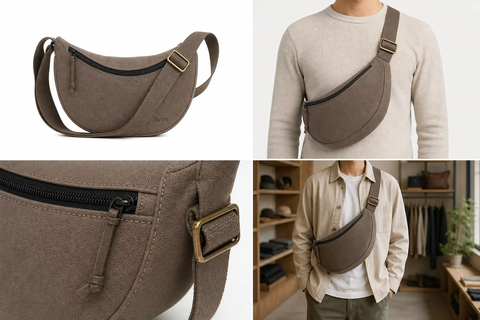 ## The Practical Rule
Use product on model photography AI when the model view can prove scale, styling, or wear context. Do not use it when the image would need to guarantee exact fit, body measurement accuracy, regulated claims, or hidden construction details the reference image does not show. Make the product fit and scale check explicit before the image reaches a product page.
A safe on-model workflow has four checks. Treat this as an AI product photography for accessories and apparel review step, not as a replacement for product QA.
- The product remains the same SKU.
- The model pose does not hide important product facts.
- The scale looks plausible for the category.
- Any fit or comfort claims stay cautious and seller-reviewed.
That is why the example above uses one Aven taupe canvas sling bag across a clean reference, an on-model crop, a close hardware detail, and a store-context image. The model view adds scale and styling context, while the detail crop keeps the black zipper, strap anchor, brass buckle, stitching, and canvas texture inspectable.
## When Product-on-Model AI Works Well
Product-on-model photography with AI is strongest for visual context jobs where the buyer needs to understand how the item sits, drapes, hangs, or scales.
Good use cases include:
- sling bags, handbags, backpacks, and small accessories
- jewelry where scale is more important than exact body fit
- scarves, hats, belts, and other styling-led items
- outerwear and tops when the real garment reference is clear
- lifestyle crops for store pages, ads, and collection pages
For these categories, the model view can answer a real buyer question: how big does this look on a person, and does the material feel casual, premium, sporty, formal, or everyday?
## What To Protect Before You Generate
Before using AI for on-model product photos, write a product-truth list. This is not busywork. It is the checklist you will use to accept or reject the output.
For a bag, protect:
- silhouette and opening shape
- true color and fabric texture
- strap width, length family, and attachment points
- zipper color, zipper path, pull tab, buckle, rings, and stitching
- logo or label area, if present
- realistic body scale
For apparel, protect:
- neckline, collar, sleeve, hem, pocket, button, zipper, seam, and panel placement
- fabric weight, weave, print, color, and drape
- true garment length and shape family
- visible construction details that affect buyer expectations
For jewelry, protect:
- stone count, stone shape, setting, clasp, hoop diameter, chain length, metal color, and scale
- whether the product is a stud, hoop, drop, ring, bracelet, pendant, or set
AI can make a model image look polished while quietly changing one of these facts. The checklist keeps the review grounded.
## A Prompt Template For On-Model Product Photos
Use a prompt that names the product facts and the image role:
> Create a realistic ecommerce on-model product photo from this product reference. Keep the same product silhouette, color, material, scale, hardware, stitching, strap placement, and logo area. Show the product worn naturally on a neutral model crop for a store page. Use clean commercial lighting and a simple outfit that does not distract. Do not add badges, platform UI, claims, extra accessories, new product features, or unreadable text.
For product on model photography AI, the strongest prompt is not the most dramatic one. It is the one that makes product preservation easy to inspect.
## How To Review The Output
Review the generated image before publishing it. For on-model product photos, the most common failures are scale drift, fit fantasy, and product redesign.
Use this checklist:
- Compare the on-model image against the original product reference.
- Check whether the product is the same size class.
- Look at seams, buckles, zippers, straps, stones, buttons, and closures.
- Confirm that the material did not change from canvas to leather, cotton to satin, or metal to plastic.
- Check that hands, hair, jackets, shadows, or poses are not hiding critical product facts.
- Reject images that invent extra pockets, clasps, straps, jewels, labels, or decorative panels.
- Avoid language that says the image proves exact fit unless a human has verified fit data.
A good AI model product photography result should help a buyer imagine the product in use. It should not become the product specification.
## Where KrafLayer Fits In The Workflow
Use KrafLayer for three linked jobs:
- Generate the first on-model product image from a clear reference.
- Create a supporting detail image when the model crop hides important construction.
- Edit minor distractions after the product identity is already correct.
For example, if the sling bag is accurate but the background is too busy, edit the background or crop. If the buckle shape changed, regenerate or correct the product area instead of publishing. If the on-model crop looks good but the zipper detail is too soft, create a separate detail image rather than pretending the model view proves everything.
## What Not To Claim
Do not claim that AI-generated on-model images guarantee exact fit, body measurement accuracy, marketplace approval, or buyer satisfaction. AI can create useful merchandising context, but apparel and accessory presentation still needs SKU review.
Safer wording:
- "shows styling context"
- "helps review apparent scale"
- "creates an on-model visual for merchandising"
- "requires a product-truth check before publishing"
Avoid wording like:
- "perfect try-on accuracy"
- "guaranteed fit"
- "compliance-safe"
- "approved for every marketplace"
- "exact body measurement simulation"
This keeps the article useful without turning an AI image into an unsupported guarantee.
## FAQ
### Can AI create product photos on a model?
Yes, AI can create on-model product photos when you provide a clear product reference and review the output carefully. It works best for scale, styling, and merchandising context. The final image still needs SKU checks for shape, color, material, hardware, seams, and plausible fit.
### Is product on model photography AI accurate enough for ecommerce?
It can be useful for ecommerce, but it should not be treated as automatically accurate. Use it when the product facts are visible and reviewable. Reject outputs that change fit, size, fabric, hardware, closures, labels, or other details that affect buyer expectations.
### What products work best for AI model product photography?
Accessories, bags, jewelry, scarves, hats, and clearly photographed apparel are usually stronger candidates because scale and styling context are visible. Complex fit-sensitive clothing can still work, but it needs stricter review and cautious copy.
### Should I include a detail image with an on-model photo?
Yes, when the model crop hides material, closure, stitching, hardware, or texture. A detail image gives buyers product proof that the on-model image cannot show clearly. This is especially useful for bags, jewelry, footwear, and outerwear.
### How does KrafLayer help with on-model product photos?
KrafLayer helps create product-led AI model images from references, then supports cleanup and related product image work. Use it to generate the on-model view, create detail support images, and edit distractions while preserving product truth.
## Conclusion
Product on model photography AI is useful when it adds scale, styling, and merchandising context without rewriting the SKU. Start from a clear reference, protect product facts, generate one model view at a time, and review the result before publishing. KrafLayer fits this workflow by connecting AI product generation with practical editing, so sellers can build on-model and detail assets that still feel tied to the real product.
# AI Product Photo Generator for Listing Images, Scenes, and Ads
URL: https://kraflayer.com/blog/ai-product-photo-generator-listing-scenes-ads
Summary: Use an AI product photo generator to create listing images, lifestyle scenes, detail views, and ad crops without losing product truth.
Updated: 2026-06-29
An AI product photo generator is useful when it turns one product reference into specific ecommerce image roles: a clear listing image, a believable scene, a detail view, and a campaign crop. The rule is simple: the generated image can change the setting, crop, and lighting, but it should not change the product buyers will receive.
In KrafLayer, start with the [AI product image generator](/ai-product-image-generator) when you need new product-led visuals, use [AI product photography](/ai-product-photography) thinking to plan the image roles, and finish with the [product photo editor](/product-photo-editor) when an output only needs cleanup. The goal is a small set of store-ready product photos, not one dramatic image that hides the SKU.
## The Practical Rule
Use product on model photography AI when the model view can prove scale, styling, or wear context. Do not use it when the image would need to guarantee exact fit, body measurement accuracy, regulated claims, or hidden construction details the reference image does not show. Make the product fit and scale check explicit before the image reaches a product page.
A safe on-model workflow has four checks. Treat this as an AI product photography for accessories and apparel review step, not as a replacement for product QA.
- The product remains the same SKU.
- The model pose does not hide important product facts.
- The scale looks plausible for the category.
- Any fit or comfort claims stay cautious and seller-reviewed.
That is why the example above uses one Aven taupe canvas sling bag across a clean reference, an on-model crop, a close hardware detail, and a store-context image. The model view adds scale and styling context, while the detail crop keeps the black zipper, strap anchor, brass buckle, stitching, and canvas texture inspectable.
## When Product-on-Model AI Works Well
Product-on-model photography with AI is strongest for visual context jobs where the buyer needs to understand how the item sits, drapes, hangs, or scales.
Good use cases include:
- sling bags, handbags, backpacks, and small accessories
- jewelry where scale is more important than exact body fit
- scarves, hats, belts, and other styling-led items
- outerwear and tops when the real garment reference is clear
- lifestyle crops for store pages, ads, and collection pages
For these categories, the model view can answer a real buyer question: how big does this look on a person, and does the material feel casual, premium, sporty, formal, or everyday?
## What To Protect Before You Generate
Before using AI for on-model product photos, write a product-truth list. This is not busywork. It is the checklist you will use to accept or reject the output.
For a bag, protect:
- silhouette and opening shape
- true color and fabric texture
- strap width, length family, and attachment points
- zipper color, zipper path, pull tab, buckle, rings, and stitching
- logo or label area, if present
- realistic body scale
For apparel, protect:
- neckline, collar, sleeve, hem, pocket, button, zipper, seam, and panel placement
- fabric weight, weave, print, color, and drape
- true garment length and shape family
- visible construction details that affect buyer expectations
For jewelry, protect:
- stone count, stone shape, setting, clasp, hoop diameter, chain length, metal color, and scale
- whether the product is a stud, hoop, drop, ring, bracelet, pendant, or set
AI can make a model image look polished while quietly changing one of these facts. The checklist keeps the review grounded.
## A Prompt Template For On-Model Product Photos
Use a prompt that names the product facts and the image role:
> Create a realistic ecommerce on-model product photo from this product reference. Keep the same product silhouette, color, material, scale, hardware, stitching, strap placement, and logo area. Show the product worn naturally on a neutral model crop for a store page. Use clean commercial lighting and a simple outfit that does not distract. Do not add badges, platform UI, claims, extra accessories, new product features, or unreadable text.
For product on model photography AI, the strongest prompt is not the most dramatic one. It is the one that makes product preservation easy to inspect.
## How To Review The Output
Review the generated image before publishing it. For on-model product photos, the most common failures are scale drift, fit fantasy, and product redesign.
Use this checklist:
- Compare the on-model image against the original product reference.
- Check whether the product is the same size class.
- Look at seams, buckles, zippers, straps, stones, buttons, and closures.
- Confirm that the material did not change from canvas to leather, cotton to satin, or metal to plastic.
- Check that hands, hair, jackets, shadows, or poses are not hiding critical product facts.
- Reject images that invent extra pockets, clasps, straps, jewels, labels, or decorative panels.
- Avoid language that says the image proves exact fit unless a human has verified fit data.
A good AI model product photography result should help a buyer imagine the product in use. It should not become the product specification.
## Where KrafLayer Fits In The Workflow
Use KrafLayer for three linked jobs:
- Generate the first on-model product image from a clear reference.
- Create a supporting detail image when the model crop hides important construction.
- Edit minor distractions after the product identity is already correct.
For example, if the sling bag is accurate but the background is too busy, edit the background or crop. If the buckle shape changed, regenerate or correct the product area instead of publishing. If the on-model crop looks good but the zipper detail is too soft, create a separate detail image rather than pretending the model view proves everything.
## What Not To Claim
Do not claim that AI-generated on-model images guarantee exact fit, body measurement accuracy, marketplace approval, or buyer satisfaction. AI can create useful merchandising context, but apparel and accessory presentation still needs SKU review.
Safer wording:
- "shows styling context"
- "helps review apparent scale"
- "creates an on-model visual for merchandising"
- "requires a product-truth check before publishing"
Avoid wording like:
- "perfect try-on accuracy"
- "guaranteed fit"
- "compliance-safe"
- "approved for every marketplace"
- "exact body measurement simulation"
This keeps the article useful without turning an AI image into an unsupported guarantee.
## FAQ
### Can AI create product photos on a model?
Yes, AI can create on-model product photos when you provide a clear product reference and review the output carefully. It works best for scale, styling, and merchandising context. The final image still needs SKU checks for shape, color, material, hardware, seams, and plausible fit.
### Is product on model photography AI accurate enough for ecommerce?
It can be useful for ecommerce, but it should not be treated as automatically accurate. Use it when the product facts are visible and reviewable. Reject outputs that change fit, size, fabric, hardware, closures, labels, or other details that affect buyer expectations.
### What products work best for AI model product photography?
Accessories, bags, jewelry, scarves, hats, and clearly photographed apparel are usually stronger candidates because scale and styling context are visible. Complex fit-sensitive clothing can still work, but it needs stricter review and cautious copy.
### Should I include a detail image with an on-model photo?
Yes, when the model crop hides material, closure, stitching, hardware, or texture. A detail image gives buyers product proof that the on-model image cannot show clearly. This is especially useful for bags, jewelry, footwear, and outerwear.
### How does KrafLayer help with on-model product photos?
KrafLayer helps create product-led AI model images from references, then supports cleanup and related product image work. Use it to generate the on-model view, create detail support images, and edit distractions while preserving product truth.
## Conclusion
Product on model photography AI is useful when it adds scale, styling, and merchandising context without rewriting the SKU. Start from a clear reference, protect product facts, generate one model view at a time, and review the result before publishing. KrafLayer fits this workflow by connecting AI product generation with practical editing, so sellers can build on-model and detail assets that still feel tied to the real product.
# AI Product Photo Generator for Listing Images, Scenes, and Ads
URL: https://kraflayer.com/blog/ai-product-photo-generator-listing-scenes-ads
Summary: Use an AI product photo generator to create listing images, lifestyle scenes, detail views, and ad crops without losing product truth.
Updated: 2026-06-29
An AI product photo generator is useful when it turns one product reference into specific ecommerce image roles: a clear listing image, a believable scene, a detail view, and a campaign crop. The rule is simple: the generated image can change the setting, crop, and lighting, but it should not change the product buyers will receive.
In KrafLayer, start with the [AI product image generator](/ai-product-image-generator) when you need new product-led visuals, use [AI product photography](/ai-product-photography) thinking to plan the image roles, and finish with the [product photo editor](/product-photo-editor) when an output only needs cleanup. The goal is a small set of store-ready product photos, not one dramatic image that hides the SKU.
 ## What An AI Product Photo Generator Should Produce
The best output from an AI product photo generator is not just a pretty render. It is an image that answers one selling question while keeping the product recognizable.
Use this practical rule:
- A main image should make the product shape obvious in one glance.
- A lifestyle scene should show context and scale without redesigning the product.
- A detail image should prove one material, texture, closure, label, lid, seam, port, or surface.
- An ad crop should add stronger composition while keeping the product readable.
- A cleanup edit should fix background, shadow, crop, glare, or small distractions without changing the SKU.
For the Aven travel mug example above, the protected facts are the matte sage body, black lid, tall rounded profile, small A monogram, subtle surface texture, and natural product shadow. Every generated view can change the background. None should turn the mug into a different cup.
## Start With One Product Truth List
Before generating, write down the facts that cannot change. This protects the image set from looking polished but inaccurate.
For a product photo generator for ecommerce, the product truth list should include:
- product type and silhouette
- true color and finish
- material texture
- label, logo, monogram, or package panel position
- lids, caps, handles, seams, buttons, dials, clasps, zippers, ports, or closures
- included accessories and what should not be added
- scale cues such as cup height, bag strap length, jewelry size, furniture depth, or package thickness
This list becomes your review checklist after generation. If a generated output fails the list, it is not ready for a product page, even if it looks expensive.
## Choose The Image Role Before Prompting
An AI product image generator works better when you ask for one image role at a time. Broad prompts such as "make this product look premium" usually create vague campaign images. Role-specific prompts create assets a seller can actually use.
Use these role directions:
- Listing image: clean product-first composition, simple background, full shape, natural shadow.
- Scene image: real surface, believable scale, product still dominant, props kept secondary.
- Detail image: tight crop around one selling detail, with the detail tied to the same product.
- Ad crop: stronger framing for paid or social use, no fake platform UI or unsupported claims.
- Variant image: same angle, crop, lighting logic, and product scale across color or material variants.
This keeps the article's primary keyword concrete: an AI product photo generator should help create an ecommerce image set, not just one isolated AI picture.
## Prompt Template
Use this prompt when you have a reference product image:
> Create a realistic ecommerce product photo from this product reference. Keep the same product shape, color, material, logo or label area, lid or closure details, scale, and product proportions. Make a [listing image / lifestyle scene / detail image / ad crop] for an online store. Use natural commercial lighting and a product-first composition. Do not add marketplace UI, badges, ratings, certifications, barcodes, QR codes, unsupported claims, extra accessories, or new product features.
For detail images, make the prompt more specific:
> Create a close detail image of the same product focused on [lid texture / zipper pull / leather grain / glass edge / package label / port layout]. Keep the rest of the product consistent with the reference. The detail should help a buyer inspect the product, not invent a new feature.
## Review The Output Like A Seller
A generated image can look clean and still be wrong. Review each output before you publish or upload it to a marketplace, product page, email, or ad.
Check for:
- silhouette drift: the product gets taller, narrower, rounder, or smoother
- color drift: the product shade shifts across images
- material drift: metal becomes plastic, fabric becomes rubber, glass loses thickness
- feature drift: lids, seams, buttons, zippers, clasps, ports, or labels move
- scale drift: the product becomes too large or too small for the scene
- claim drift: the image adds fake badges, awards, ratings, discounts, or certifications
- channel drift: the output looks like a platform screenshot instead of a reusable product asset
AI listing image generator outputs need this review especially. A main listing image is often the first buyer impression, so product identity matters more than mood.
## When To Edit Instead Of Regenerate
If the generated product is accurate but the image has one weak area, edit instead of regenerating the whole asset. Regeneration can fix a shadow while quietly changing the lid, label, color, or shape.
Use the [product photo editor](/product-photo-editor) when:
- the background is distracting
- the crop is slightly off
- a shadow looks too heavy
- a detail area needs cleanup
- glare hides material texture
- the image needs upscaling before export
- a lifestyle scene needs small cleanup but the product itself is correct
Use the generator again when the whole image role is wrong, the scene is unusable, or the product has already drifted too far from the reference.
## Build A Small Store-Ready Product Photo Set
For most ecommerce product photography, a practical first set is enough:
- One main image for product recognition.
- One scene image for scale and use context.
- One detail image for material or construction proof.
- One alternate angle if the product shape needs explanation.
- One campaign crop if you need paid, email, or social creative.
You can plan this set from the [ecommerce product photography](/ecommerce-product-photography) page first, then generate each role in KrafLayer. The set should feel related without forcing every image to use the same background.
## What To Avoid
Avoid using an AI product photo generator in ways that make the final image harder to trust:
- Do not invent product features to make the image look more premium.
- Do not add fake review stars, platform marks, badges, discounts, or approval language.
- Do not use unreadable AI label text as final packaging copy.
- Do not hide important product details behind props, hands, blur, or dark lighting.
- Do not publish a generated detail image if the detail does not exist on the real product.
- Do not treat a scene image as proof of exact size, fit, safety, durability, or compliance.
The strongest ecommerce use of AI is controlled generation plus human review. The buyer should understand the product faster, not learn inaccurate product facts.
## FAQ
### What is an AI product photo generator?
An AI product photo generator creates ecommerce product images from a prompt, reference image, or product description. For store work, the useful output is usually a specific image role such as a main listing image, lifestyle scene, detail image, or ad crop.
### Can I use an AI product photo generator for listing images?
Yes, but review the result against the real product before publishing. Listing images should preserve shape, color, material, label placement, included accessories, and important details. If the image changes the SKU, regenerate or edit it before use.
### What is the difference between an AI product photo generator and a product photo editor?
Use a generator when you need a new image role or scene. Use a product photo editor when the image is mostly correct and only needs background cleanup, local retouching, upscaling, shadow control, crop repair, or small distraction removal.
### How many product images should I generate for an online store?
Start with a compact set: one main image, one lifestyle image, one detail image, and one alternate or ad crop if needed. Generate and review each role separately so product identity stays consistent across the set.
### Does KrafLayer replace a product photoshoot?
KrafLayer can reduce the need for reshoots when you have enough product reference information, but it should not be used to invent facts the buyer depends on. Use it to create and edit product-led visuals, then check the final images against the real SKU.
## Conclusion
An AI product photo generator is most useful when it helps sellers build controlled, store-ready product photos from one product truth. Start with the SKU facts, choose one image role, generate the asset, review it carefully, then edit only the parts that need cleanup. KrafLayer supports that path from generation to product photo editing, so listing images, scenes, details, and ad crops can look polished without losing the product buyers expect.
# AI Model Product Photography for Apparel, Accessories, and Lifestyle Shots
URL: https://kraflayer.com/blog/ai-model-product-photography-apparel-accessories-lifestyle
Summary: Create AI model product photos for apparel, accessories, and lifestyle shots while checking product truth before publishing.
Updated: 2026-08-21
AI model product photography is useful when the model image adds scale, styling, or lifestyle context without changing the product. The safe rule is simple: generate the model view, then compare it against the real SKU for color, shape, fabric, seams, buttons, hardware, label position, and plausible scale before you publish it.
In KrafLayer, start with a clean product reference in the [AI product photography](/ai-product-photography) workflow, create the model-context image with the [AI product image generator](/ai-product-image-generator), and finish only product-safe cleanup in the [product photo editor](/product-photo-editor). That keeps the output useful for [ecommerce product photography](/ecommerce-product-photography) without treating an AI model shot as an unchecked fit guarantee.
## What An AI Product Photo Generator Should Produce
The best output from an AI product photo generator is not just a pretty render. It is an image that answers one selling question while keeping the product recognizable.
Use this practical rule:
- A main image should make the product shape obvious in one glance.
- A lifestyle scene should show context and scale without redesigning the product.
- A detail image should prove one material, texture, closure, label, lid, seam, port, or surface.
- An ad crop should add stronger composition while keeping the product readable.
- A cleanup edit should fix background, shadow, crop, glare, or small distractions without changing the SKU.
For the Aven travel mug example above, the protected facts are the matte sage body, black lid, tall rounded profile, small A monogram, subtle surface texture, and natural product shadow. Every generated view can change the background. None should turn the mug into a different cup.
## Start With One Product Truth List
Before generating, write down the facts that cannot change. This protects the image set from looking polished but inaccurate.
For a product photo generator for ecommerce, the product truth list should include:
- product type and silhouette
- true color and finish
- material texture
- label, logo, monogram, or package panel position
- lids, caps, handles, seams, buttons, dials, clasps, zippers, ports, or closures
- included accessories and what should not be added
- scale cues such as cup height, bag strap length, jewelry size, furniture depth, or package thickness
This list becomes your review checklist after generation. If a generated output fails the list, it is not ready for a product page, even if it looks expensive.
## Choose The Image Role Before Prompting
An AI product image generator works better when you ask for one image role at a time. Broad prompts such as "make this product look premium" usually create vague campaign images. Role-specific prompts create assets a seller can actually use.
Use these role directions:
- Listing image: clean product-first composition, simple background, full shape, natural shadow.
- Scene image: real surface, believable scale, product still dominant, props kept secondary.
- Detail image: tight crop around one selling detail, with the detail tied to the same product.
- Ad crop: stronger framing for paid or social use, no fake platform UI or unsupported claims.
- Variant image: same angle, crop, lighting logic, and product scale across color or material variants.
This keeps the article's primary keyword concrete: an AI product photo generator should help create an ecommerce image set, not just one isolated AI picture.
## Prompt Template
Use this prompt when you have a reference product image:
> Create a realistic ecommerce product photo from this product reference. Keep the same product shape, color, material, logo or label area, lid or closure details, scale, and product proportions. Make a [listing image / lifestyle scene / detail image / ad crop] for an online store. Use natural commercial lighting and a product-first composition. Do not add marketplace UI, badges, ratings, certifications, barcodes, QR codes, unsupported claims, extra accessories, or new product features.
For detail images, make the prompt more specific:
> Create a close detail image of the same product focused on [lid texture / zipper pull / leather grain / glass edge / package label / port layout]. Keep the rest of the product consistent with the reference. The detail should help a buyer inspect the product, not invent a new feature.
## Review The Output Like A Seller
A generated image can look clean and still be wrong. Review each output before you publish or upload it to a marketplace, product page, email, or ad.
Check for:
- silhouette drift: the product gets taller, narrower, rounder, or smoother
- color drift: the product shade shifts across images
- material drift: metal becomes plastic, fabric becomes rubber, glass loses thickness
- feature drift: lids, seams, buttons, zippers, clasps, ports, or labels move
- scale drift: the product becomes too large or too small for the scene
- claim drift: the image adds fake badges, awards, ratings, discounts, or certifications
- channel drift: the output looks like a platform screenshot instead of a reusable product asset
AI listing image generator outputs need this review especially. A main listing image is often the first buyer impression, so product identity matters more than mood.
## When To Edit Instead Of Regenerate
If the generated product is accurate but the image has one weak area, edit instead of regenerating the whole asset. Regeneration can fix a shadow while quietly changing the lid, label, color, or shape.
Use the [product photo editor](/product-photo-editor) when:
- the background is distracting
- the crop is slightly off
- a shadow looks too heavy
- a detail area needs cleanup
- glare hides material texture
- the image needs upscaling before export
- a lifestyle scene needs small cleanup but the product itself is correct
Use the generator again when the whole image role is wrong, the scene is unusable, or the product has already drifted too far from the reference.
## Build A Small Store-Ready Product Photo Set
For most ecommerce product photography, a practical first set is enough:
- One main image for product recognition.
- One scene image for scale and use context.
- One detail image for material or construction proof.
- One alternate angle if the product shape needs explanation.
- One campaign crop if you need paid, email, or social creative.
You can plan this set from the [ecommerce product photography](/ecommerce-product-photography) page first, then generate each role in KrafLayer. The set should feel related without forcing every image to use the same background.
## What To Avoid
Avoid using an AI product photo generator in ways that make the final image harder to trust:
- Do not invent product features to make the image look more premium.
- Do not add fake review stars, platform marks, badges, discounts, or approval language.
- Do not use unreadable AI label text as final packaging copy.
- Do not hide important product details behind props, hands, blur, or dark lighting.
- Do not publish a generated detail image if the detail does not exist on the real product.
- Do not treat a scene image as proof of exact size, fit, safety, durability, or compliance.
The strongest ecommerce use of AI is controlled generation plus human review. The buyer should understand the product faster, not learn inaccurate product facts.
## FAQ
### What is an AI product photo generator?
An AI product photo generator creates ecommerce product images from a prompt, reference image, or product description. For store work, the useful output is usually a specific image role such as a main listing image, lifestyle scene, detail image, or ad crop.
### Can I use an AI product photo generator for listing images?
Yes, but review the result against the real product before publishing. Listing images should preserve shape, color, material, label placement, included accessories, and important details. If the image changes the SKU, regenerate or edit it before use.
### What is the difference between an AI product photo generator and a product photo editor?
Use a generator when you need a new image role or scene. Use a product photo editor when the image is mostly correct and only needs background cleanup, local retouching, upscaling, shadow control, crop repair, or small distraction removal.
### How many product images should I generate for an online store?
Start with a compact set: one main image, one lifestyle image, one detail image, and one alternate or ad crop if needed. Generate and review each role separately so product identity stays consistent across the set.
### Does KrafLayer replace a product photoshoot?
KrafLayer can reduce the need for reshoots when you have enough product reference information, but it should not be used to invent facts the buyer depends on. Use it to create and edit product-led visuals, then check the final images against the real SKU.
## Conclusion
An AI product photo generator is most useful when it helps sellers build controlled, store-ready product photos from one product truth. Start with the SKU facts, choose one image role, generate the asset, review it carefully, then edit only the parts that need cleanup. KrafLayer supports that path from generation to product photo editing, so listing images, scenes, details, and ad crops can look polished without losing the product buyers expect.
# AI Model Product Photography for Apparel, Accessories, and Lifestyle Shots
URL: https://kraflayer.com/blog/ai-model-product-photography-apparel-accessories-lifestyle
Summary: Create AI model product photos for apparel, accessories, and lifestyle shots while checking product truth before publishing.
Updated: 2026-08-21
AI model product photography is useful when the model image adds scale, styling, or lifestyle context without changing the product. The safe rule is simple: generate the model view, then compare it against the real SKU for color, shape, fabric, seams, buttons, hardware, label position, and plausible scale before you publish it.
In KrafLayer, start with a clean product reference in the [AI product photography](/ai-product-photography) workflow, create the model-context image with the [AI product image generator](/ai-product-image-generator), and finish only product-safe cleanup in the [product photo editor](/product-photo-editor). That keeps the output useful for [ecommerce product photography](/ecommerce-product-photography) without treating an AI model shot as an unchecked fit guarantee.
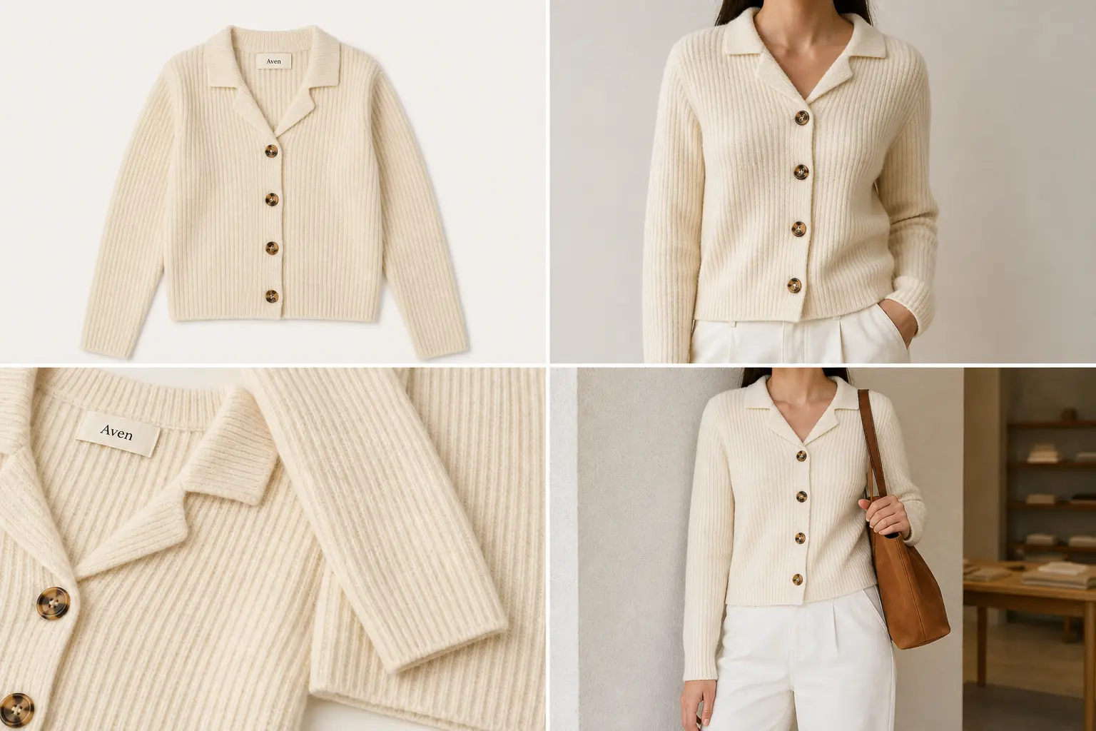 ## The Practical Rule
Use AI model product photos when the image helps a buyer understand how the product looks in use. Do not use them as proof of exact garment fit, body measurement accuracy, marketplace approval, or product claims that the reference image cannot support.
A publishable AI model product photography workflow has three parts:
- A clean product reference that shows the real SKU.
- A model-context image that preserves visible product facts.
- A review step that rejects quiet changes to fit, scale, material, hardware, seams, labels, and color.
The image above uses one fictional Aven cream ribbed cardigan across a flat-lay reference, a cropped model torso, a knit-and-button detail, and a simple lifestyle store scene. The model view gives styling context, while the detail crop keeps the rib texture, tortoise buttons, collar shape, hem, sleeve length, and woven label inspectable.
## When AI Model Product Photos Work Best
AI model product photography works best when the product has visible facts that can be checked in the output. It is strongest for merchandising context, not for replacing fit testing.
Good candidates include:
- cardigans, shirts, jackets, scarves, hats, and other visible apparel
- handbags, sling bags, backpacks, belts, and small accessories
- jewelry or watches where the model crop helps show scale
- lifestyle shots where the buyer needs use context
- collection-page or ad crops that still need product truth
For AI model product photography for apparel, choose model poses that show the garment clearly. For apparel product photography with AI, the model crop should make the product easier to understand, not harder to inspect. A dramatic pose that hides the collar, sleeve, hem, button line, pocket, strap, clasp, or product edge usually creates more review risk than value.
## What To Protect Before You Generate
Before creating an AI model product photo, write a short product-truth list. This list tells the model what must stay fixed and gives your team a review checklist afterward.
For apparel, protect:
- true color and fabric texture
- collar, neckline, sleeve, cuff, hem, pocket, button, zipper, seam, and panel placement
- garment length, width family, drape, and shape
- label area, print placement, embroidery, and visible construction details
For accessories, protect:
- silhouette, strap width, strap anchor, handle shape, zipper path, clasp, buckle, rings, and stitching
- metal finish, leather grain, canvas weave, edge paint, and product scale
- logo or label area, if your real product has one
For jewelry and watches, protect:
- stone count, setting, clasp, chain length, hoop diameter, dial layout, bezel shape, band width, and metal color
- realistic size on the body
The product-truth list matters because AI can make a photo look polished while quietly changing a button count, bag strap, neckline, clasp, or material.
## Prompt Template For AI Model Product Photography
Use a direct prompt that describes the image role and the facts that cannot change. The same structure also works for on-model product photography when the product is an accessory, watch, or jewelry item instead of a garment.
> Create a realistic ecommerce model product photo from this product reference. Keep the same product color, silhouette, fabric texture, seams, buttons, hardware, label area, scale, and construction details. Show the product naturally on a cropped model for a store page, with clean commercial lighting and a simple outfit or setting. Do not add platform UI, badges, claims, new product features, extra logos, unreadable text, or unrelated accessories.
For AI model product photos, the best prompt is usually restrained. The goal is not a fashion campaign first. The goal is a model image that still looks tied to the real product.
## How To Review The Result
Review the output against the original product reference before adding it to a PDP, collection page, ad, or email.
Use this checklist:
- Compare color, material, and visible texture against the reference.
- Check that the product is the same shape and size class.
- Inspect collars, sleeves, hems, seams, pockets, buttons, straps, buckles, clasps, labels, and stitching.
- Look for hidden product facts caused by arms, hair, bags, shadows, props, or crop choices.
- Reject images that invent extra pockets, buttons, straps, labels, stones, panels, or decorative trim.
- Keep fit language cautious unless a human has verified fit data separately.
The model image should help the buyer understand scale and styling. It should not become the product specification.
## Use A Detail Image When The Model Crop Hides Too Much
Many model shots are not enough by themselves. A cropped torso can show scale and styling, but it may hide fabric texture, closure quality, hardware, stitching, or label placement.
Pair AI model product photography with a detail image when:
- the fabric or material is a selling point
- buttons, zippers, clasps, straps, or stones affect buyer trust
- the model pose hides the real product edge
- the product has construction details buyers need to inspect
- the lifestyle shot is visually strong but not informational enough
This is why the cardigan example includes both a model crop and a knit-detail panel. The model shot answers "how does it look worn?" The detail shot answers "what am I buying?"
## Where KrafLayer Fits
Use KrafLayer for the full product-image set, not just the model shot:
- Generate a model-context image from the product reference.
- Create a detail image that proves the material, closure, or construction.
- Edit distractions only after the product identity is correct.
- Build a consistent image set for the product page, collection card, and campaign crop.
If the cardigan color, rib texture, button count, collar shape, or hem changes, regenerate or correct the image. If the product is accurate but the scene is too busy, use editing to clean the background, crop, or lighting. That order keeps the work product-led.
## What Not To Claim
Avoid unsupported promises. AI model product photography can create useful ecommerce visuals, but it should not be described as perfect virtual try-on or guaranteed fit simulation.
Safer wording:
- "shows model-context merchandising"
- "helps buyers judge apparent scale"
- "creates a lifestyle product image"
- "requires SKU review before publishing"
Avoid wording like:
- "guaranteed fit"
- "perfect try-on accuracy"
- "approved for every marketplace"
- "exact body measurement simulation"
- "compliance-safe product image"
That language keeps the page honest and avoids turning an AI-generated photo into a claim the image cannot prove.
## FAQ
### What is AI model product photography?
AI model product photography uses a product reference to create model-context images for ecommerce. It can show scale, styling, and lifestyle use, but the result still needs review for product truth. Color, material, seams, hardware, labels, and plausible scale should match the real SKU.
### Can AI model product photos replace a real photoshoot?
They can replace some merchandising images when the product facts are visible and reviewable. They should not replace fit testing, regulated claims, or exact measurement proof. Use AI model product photos for context, then keep real product data and human review in the workflow.
### What products work best for AI model product photography?
Visible apparel, accessories, bags, hats, scarves, jewelry, and watches often work well because scale and styling context are easy to inspect. Complex fit-sensitive garments need stricter review because a polished image can still misrepresent drape, length, closure, or body fit.
### Should I generate detail images too?
Yes, when the model crop hides important product facts. A detail image can show fabric, stitching, buttons, zippers, clasps, leather grain, metal finish, or label placement. This makes the product page more trustworthy than using a model image alone.
### How does KrafLayer help with AI model product photography?
KrafLayer helps create product-led model-context images from references, then supports related product-image work such as detail images, cleanup, background control, and consistent ecommerce crops. Use it to build a complete image set, not just one attractive model shot.
## Conclusion
AI model product photography is strongest when it adds model context while protecting the real product. Start with a clear reference, define what cannot change, generate a focused model view, and review the output before publishing. KrafLayer fits this workflow by combining AI product generation with practical editing, so sellers can create model, detail, and lifestyle assets that stay tied to the SKU.
# AI Fashion Product Photography: Flats, Models and Details
URL: https://kraflayer.com/blog/ai-product-photography-for-fashion-products
Summary: Build AI fashion product photography from a garment evidence pack, then create flat lays, model images, detail views, and lifestyle assets without inventing fit.
Updated: 2026-08-22
AI fashion product photography works only when the garment remains more trustworthy than the scene around it. Build a garment evidence pack first, then create flat lays, model context, construction details, and lifestyle images one role at a time.
> **Quick Summary**
> Protect garment construction, color, fabric, print, and real measurements. Treat generated model photos as styling context unless fit is verified, and photograph any product fact missing from the source set.
# AI Product Photography for Fashion Products: Flats, Models, and Detail Shots
AI product photography for fashion works best when it starts from a clear product reference and produces a small image set, not one isolated pretty shot. For apparel, the useful set usually includes a flat lay, an on-model view, one or two product detail shots, and a lifestyle image that still keeps the garment dominant.
The phrase ai product photography for fashion sounds broad, but the real job is specific: create AI clothing product photos, model views, and product detail shots for apparel without changing the garment buyers will receive.
In KrafLayer, this workflow is about turning a fashion reference into ecommerce-ready visuals while protecting the facts a buyer depends on: fit, fabric texture, seam placement, color, buttons, pockets, length, drape, and scale. Treat every AI output as a draft until those details match the real garment.
## The Practical Rule
Use AI model product photos when the image helps a buyer understand how the product looks in use. Do not use them as proof of exact garment fit, body measurement accuracy, marketplace approval, or product claims that the reference image cannot support.
A publishable AI model product photography workflow has three parts:
- A clean product reference that shows the real SKU.
- A model-context image that preserves visible product facts.
- A review step that rejects quiet changes to fit, scale, material, hardware, seams, labels, and color.
The image above uses one fictional Aven cream ribbed cardigan across a flat-lay reference, a cropped model torso, a knit-and-button detail, and a simple lifestyle store scene. The model view gives styling context, while the detail crop keeps the rib texture, tortoise buttons, collar shape, hem, sleeve length, and woven label inspectable.
## When AI Model Product Photos Work Best
AI model product photography works best when the product has visible facts that can be checked in the output. It is strongest for merchandising context, not for replacing fit testing.
Good candidates include:
- cardigans, shirts, jackets, scarves, hats, and other visible apparel
- handbags, sling bags, backpacks, belts, and small accessories
- jewelry or watches where the model crop helps show scale
- lifestyle shots where the buyer needs use context
- collection-page or ad crops that still need product truth
For AI model product photography for apparel, choose model poses that show the garment clearly. For apparel product photography with AI, the model crop should make the product easier to understand, not harder to inspect. A dramatic pose that hides the collar, sleeve, hem, button line, pocket, strap, clasp, or product edge usually creates more review risk than value.
## What To Protect Before You Generate
Before creating an AI model product photo, write a short product-truth list. This list tells the model what must stay fixed and gives your team a review checklist afterward.
For apparel, protect:
- true color and fabric texture
- collar, neckline, sleeve, cuff, hem, pocket, button, zipper, seam, and panel placement
- garment length, width family, drape, and shape
- label area, print placement, embroidery, and visible construction details
For accessories, protect:
- silhouette, strap width, strap anchor, handle shape, zipper path, clasp, buckle, rings, and stitching
- metal finish, leather grain, canvas weave, edge paint, and product scale
- logo or label area, if your real product has one
For jewelry and watches, protect:
- stone count, setting, clasp, chain length, hoop diameter, dial layout, bezel shape, band width, and metal color
- realistic size on the body
The product-truth list matters because AI can make a photo look polished while quietly changing a button count, bag strap, neckline, clasp, or material.
## Prompt Template For AI Model Product Photography
Use a direct prompt that describes the image role and the facts that cannot change. The same structure also works for on-model product photography when the product is an accessory, watch, or jewelry item instead of a garment.
> Create a realistic ecommerce model product photo from this product reference. Keep the same product color, silhouette, fabric texture, seams, buttons, hardware, label area, scale, and construction details. Show the product naturally on a cropped model for a store page, with clean commercial lighting and a simple outfit or setting. Do not add platform UI, badges, claims, new product features, extra logos, unreadable text, or unrelated accessories.
For AI model product photos, the best prompt is usually restrained. The goal is not a fashion campaign first. The goal is a model image that still looks tied to the real product.
## How To Review The Result
Review the output against the original product reference before adding it to a PDP, collection page, ad, or email.
Use this checklist:
- Compare color, material, and visible texture against the reference.
- Check that the product is the same shape and size class.
- Inspect collars, sleeves, hems, seams, pockets, buttons, straps, buckles, clasps, labels, and stitching.
- Look for hidden product facts caused by arms, hair, bags, shadows, props, or crop choices.
- Reject images that invent extra pockets, buttons, straps, labels, stones, panels, or decorative trim.
- Keep fit language cautious unless a human has verified fit data separately.
The model image should help the buyer understand scale and styling. It should not become the product specification.
## Use A Detail Image When The Model Crop Hides Too Much
Many model shots are not enough by themselves. A cropped torso can show scale and styling, but it may hide fabric texture, closure quality, hardware, stitching, or label placement.
Pair AI model product photography with a detail image when:
- the fabric or material is a selling point
- buttons, zippers, clasps, straps, or stones affect buyer trust
- the model pose hides the real product edge
- the product has construction details buyers need to inspect
- the lifestyle shot is visually strong but not informational enough
This is why the cardigan example includes both a model crop and a knit-detail panel. The model shot answers "how does it look worn?" The detail shot answers "what am I buying?"
## Where KrafLayer Fits
Use KrafLayer for the full product-image set, not just the model shot:
- Generate a model-context image from the product reference.
- Create a detail image that proves the material, closure, or construction.
- Edit distractions only after the product identity is correct.
- Build a consistent image set for the product page, collection card, and campaign crop.
If the cardigan color, rib texture, button count, collar shape, or hem changes, regenerate or correct the image. If the product is accurate but the scene is too busy, use editing to clean the background, crop, or lighting. That order keeps the work product-led.
## What Not To Claim
Avoid unsupported promises. AI model product photography can create useful ecommerce visuals, but it should not be described as perfect virtual try-on or guaranteed fit simulation.
Safer wording:
- "shows model-context merchandising"
- "helps buyers judge apparent scale"
- "creates a lifestyle product image"
- "requires SKU review before publishing"
Avoid wording like:
- "guaranteed fit"
- "perfect try-on accuracy"
- "approved for every marketplace"
- "exact body measurement simulation"
- "compliance-safe product image"
That language keeps the page honest and avoids turning an AI-generated photo into a claim the image cannot prove.
## FAQ
### What is AI model product photography?
AI model product photography uses a product reference to create model-context images for ecommerce. It can show scale, styling, and lifestyle use, but the result still needs review for product truth. Color, material, seams, hardware, labels, and plausible scale should match the real SKU.
### Can AI model product photos replace a real photoshoot?
They can replace some merchandising images when the product facts are visible and reviewable. They should not replace fit testing, regulated claims, or exact measurement proof. Use AI model product photos for context, then keep real product data and human review in the workflow.
### What products work best for AI model product photography?
Visible apparel, accessories, bags, hats, scarves, jewelry, and watches often work well because scale and styling context are easy to inspect. Complex fit-sensitive garments need stricter review because a polished image can still misrepresent drape, length, closure, or body fit.
### Should I generate detail images too?
Yes, when the model crop hides important product facts. A detail image can show fabric, stitching, buttons, zippers, clasps, leather grain, metal finish, or label placement. This makes the product page more trustworthy than using a model image alone.
### How does KrafLayer help with AI model product photography?
KrafLayer helps create product-led model-context images from references, then supports related product-image work such as detail images, cleanup, background control, and consistent ecommerce crops. Use it to build a complete image set, not just one attractive model shot.
## Conclusion
AI model product photography is strongest when it adds model context while protecting the real product. Start with a clear reference, define what cannot change, generate a focused model view, and review the output before publishing. KrafLayer fits this workflow by combining AI product generation with practical editing, so sellers can create model, detail, and lifestyle assets that stay tied to the SKU.
# AI Fashion Product Photography: Flats, Models and Details
URL: https://kraflayer.com/blog/ai-product-photography-for-fashion-products
Summary: Build AI fashion product photography from a garment evidence pack, then create flat lays, model images, detail views, and lifestyle assets without inventing fit.
Updated: 2026-08-22
AI fashion product photography works only when the garment remains more trustworthy than the scene around it. Build a garment evidence pack first, then create flat lays, model context, construction details, and lifestyle images one role at a time.
> **Quick Summary**
> Protect garment construction, color, fabric, print, and real measurements. Treat generated model photos as styling context unless fit is verified, and photograph any product fact missing from the source set.
# AI Product Photography for Fashion Products: Flats, Models, and Detail Shots
AI product photography for fashion works best when it starts from a clear product reference and produces a small image set, not one isolated pretty shot. For apparel, the useful set usually includes a flat lay, an on-model view, one or two product detail shots, and a lifestyle image that still keeps the garment dominant.
The phrase ai product photography for fashion sounds broad, but the real job is specific: create AI clothing product photos, model views, and product detail shots for apparel without changing the garment buyers will receive.
In KrafLayer, this workflow is about turning a fashion reference into ecommerce-ready visuals while protecting the facts a buyer depends on: fit, fabric texture, seam placement, color, buttons, pockets, length, drape, and scale. Treat every AI output as a draft until those details match the real garment.
 ## The practical rule for AI product photography for fashion
Fashion product images should answer four buyer questions:
- What is the garment?
- How does it sit on a body or surface?
- What fabric, closure, trim, or construction detail should the buyer trust?
- Where could this piece fit in a real outfit or store page?
That is why AI clothing product photos should be planned as roles. A flat lay is good for shape and color. A model image is good for proportion and styling. A detail crop is good for material proof. A lifestyle or store scene is good for context, but only if the garment remains the subject.
Do not use AI product photography for fashion to invent missing product facts. If the reference image does not show the back, lining, exact sleeve finish, or hidden closure, the output should not present those as confirmed details.
## Start with a product-truth reference
Before generating fashion product photography AI assets, prepare a reference that shows the item clearly. A simple flat lay or clean hanger shot is often better than a busy editorial image because the model can read the garment construction.
Use a reference checklist:
- True garment color under neutral light
- Collar, neckline, hem, pocket, button, zipper, or strap details visible
- Fabric texture visible enough to guide the output
- Full silhouette visible, including sleeve or leg shape
- Minimal overlapping props, hands, labels, or shadows
- One product only unless the set is sold together
For a linen shirt, that means checking weave, placket, collar shape, button spacing, cuff position, pocket placement, and hem curve. For a dress, it may mean neckline, waist seam, length, drape, and fabric transparency. For a bag or accessory, it means strap anchors, hardware, stitching, scale, and closure.
## Build the image set by role
A good AI fashion product photography workflow creates separate assets for separate jobs.
### Flat lay or clean product view
The flat lay is the anchor image. It should be plain enough for buyers to inspect the product and consistent enough for catalog grids. Keep shadows soft, crop the whole item, and avoid styling that hides the shape.
Use this when you need:
- A clean PDP image
- A catalog thumbnail
- A comparison image across colorways
- A reference for future AI generations
### On-model product image
AI model product photography can help show scale, drape, and styling, but it needs the strictest review. The garment should not become tighter, longer, shorter, shinier, thicker, or more structured unless that is true to the product.
Check the on-model view for:
- Same collar, sleeve, button, pocket, strap, or hem layout
- Plausible garment length and fit
- No invented logos, labels, embroidery, or hardware
- No impossible folds that hide construction
- Product remains the hero, not the model or background
Avoid promising perfect try-on accuracy. For ecommerce, the on-model image is a selling context and scale cue, not a replacement for measured size charts, fit notes, or approved production photography.
### Detail shots for fabric and construction
Product detail shots for apparel should prove one concrete point. A useful detail crop can show linen weave, knit ribbing, denim stitching, zipper teeth, leather grain, lining, buttons, or waterproof texture.
Keep detail shots close enough to inspect, but tied to the same product. If a macro texture looks more premium than the actual garment, the image can mislead buyers even if it looks beautiful.
### Lifestyle or store-scene image
Lifestyle fashion images work when the scene supports the product. A shirt can hang in a quiet retail setting, sit on a styled model, or appear in a capsule wardrobe layout. The risk is that AI turns the piece into generic fashion mood content.
Use a simple rule: if the buyer cannot immediately identify the exact item being sold, the lifestyle scene is too decorative.
## Prompt template for fashion product image sets
Use a prompt that names the image roles and protects product facts:
> Create ecommerce fashion product photography for one [product type] using the uploaded reference as the source of truth. Generate a clean image set with a flat lay, an on-model crop, a fabric or construction detail crop, and a simple lifestyle/store scene. Preserve the garment color, silhouette, fabric texture, seam placement, buttons, pockets, hem, collar, sleeve shape, scale, and brand label. Keep the product dominant. Do not add real logos, marketplace UI, badges, unsupported claims, or extra garments that could confuse the SKU.
For KrafLayer, start with the [AI product photography](/ai-product-photography) workflow when you want an image set from a reference. Use the [AI product image generator](/ai-product-image-generator) when the goal is a fresh product asset pack, then use the [product photo editor](/product-photo-editor) for cleanup, retouching, or background adjustments after review.
## Review checklist before publishing
Run the same review on every AI clothing product photo before it goes live:
- Product color matches the real item closely enough for buyers
- Fabric texture is believable and not upgraded beyond the SKU
- Fit is presented as a visual cue, not a guarantee
- Buttons, zippers, pockets, seams, straps, and hems match the reference
- No invented badges, logos, certification marks, or marketplace UI
- No body, pose, or crop hides important garment details
- Detail crops show real construction, not invented premium features
- Lifestyle shots still make the product the first thing a buyer sees
- Internal product naming and alt text match the actual item
This is also where [ecommerce product photography](/ecommerce-product-photography) basics still matter. AI can speed up production, but the image still has to help the buyer understand the product quickly and honestly.
## Where KrafLayer fits in a fashion workflow
Use KrafLayer when you need more than one fashion image from the same product reference. A common workflow is:
- Upload the garment reference.
- Generate a flat lay or clean product image first.
- Generate an on-model crop only after the product facts are locked.
- Create fabric, closure, or construction detail images.
- Build one lifestyle or store-scene image for merchandising.
- Review the set against the original garment before publishing.
For apparel teams, the advantage is not skipping review. The advantage is producing a stronger first draft set for PDPs, ads, lookbooks, and store refreshes without reshooting every garment angle manually.
## Build a garment evidence pack before generating model photos
Google's try-on guidance asks for images at least 512 × 512 pixels, ideally 1024 pixels or higher, with the entire garment visible. Flat-lay garments should avoid excessive folds, and model sources should keep hands, bags, and accessories from covering garment details ([Google virtual try-on](https://support.google.com/merchants/answer/16159685?hl=en-GB), 2026).
For each garment, collect:
- clean front and back views;
- side or three-quarter construction where shape depends on it;
- collar, cuff, closure, hem, pocket, seam, and trim details;
- a neutral color reference;
- fabric macro showing weave, pile, knit, sheen, or transparency;
- real dimensions and the size represented in the source;
- any print, embroidery, label, or hardware that must remain exact.
One front flat lay cannot prove back construction, drape, lining, or fit. If a generated image needs one of those facts, add the source view or photograph it. Do not ask a prompt to fill the gap.
## Separate fit claims from styling
Google recommends showing apparel on models and keeping the garment as the focus. That does not make an AI model image proof of fit. Unless the image uses verified garment measurements and a controlled model reference, treat it as styling context rather than a measurement claim ([Google clothing and accessories guidance](https://support.google.com/merchants/answer/7348545?hl=en), 2026).
Avoid unsupported language such as “true to size,” “waist-cinching,” or “relaxed fit” based only on a generated frame. Put exact measurements, size chart data, and photographed fit notes in the listing copy. Use the visual to show a plausible silhouette while preserving construction.
Review stress points where AI often changes clothing:
| Area | Common drift | Required source |
|---|---|---|
| Neckline and collar | New shape, missing button, changed ribbing | Front detail |
| Sleeves and cuffs | Wrong length, added seam, rolled cuff | Front/back and cuff detail |
| Waist and hem | False taper, changed length, invented split | Full garment view |
| Print or embroidery | Warped repeat, mirrored mark, new letters | Sharp artwork reference |
| Fabric | Plastic sheen, lost knit, false transparency | Material macro |
## Plan the fashion gallery around buying questions
Google supports up to 10 additional images for free listings. A fashion gallery should spend those slots on evidence before decorative repetition ([Google free listings](https://support.google.com/merchants/answer/13889434?hl=en), 2026).
Start with a factual main image, then show back construction, on-model scale, material detail, a key feature, verified color variants, and one lifestyle context. Add a short movement clip when drape matters. For shoes and accessories, keep the item alone in the main image and use model context as an additional image.
KrafLayer's reference-image workflow is most useful after the evidence pack is ready. Give product references identity authority, use model or scene references only for presentation, and generate one gallery role at a time. That keeps a failed lifestyle idea from contaminating the factual product master.
## FAQ
### Can AI product photography for fashion replace a studio shoot?
It can replace some supporting image production, especially flat lays, lifestyle drafts, detail concepts, and campaign variations. It should not replace product truth checks, size charts, fit notes, or final review. For fashion, buyers rely on fabric, drape, color, and proportion, so every AI image needs comparison against the real item.
### What fashion products work best with AI product photography?
Simple garments and accessories with clear references tend to work best: shirts, jackets, bags, shoes, scarves, belts, and clean apparel basics. Complicated sheer fabrics, exact tailoring, technical sportswear, jewelry-scale accessories, and heavily textured items need closer review because small changes can alter buyer expectations.
### How do I keep fit accurate in AI model product photography?
Use the model view as a scale and styling cue, not a fit guarantee. Compare sleeve length, shoulder position, garment length, drape, closure spacing, and fabric tension against the reference. If the output quietly changes the cut or makes the item look tailored differently, reject it or regenerate with stricter product-preservation instructions.
### Should fashion product pages use flat lays or model images?
Most fashion pages benefit from both. A flat lay or clean product view helps buyers inspect the item, while a model image helps them understand scale and styling. Detail shots then prove fabric and construction. The safest set combines these roles instead of relying on one image type for every buyer question.
### Can KrafLayer create both fashion main images and detail images?
Yes. KrafLayer can help turn one product reference into main images, on-model concepts, product detail shots, and lifestyle visuals. The important step is reviewing each output for garment truth before publishing, especially color, fabric, fit, seams, closures, and scale.
## Conclusion
AI product photography for fashion is useful when it creates a clear image set: flat lay, model view, detail proof, and lifestyle context. KrafLayer helps fashion sellers turn one product reference into AI clothing product photos and ecommerce fashion visuals while keeping the review focused on garment truth. For apparel teams, the practical advantage is faster visual production for PDPs, campaigns, and store refreshes without losing sight of fit, fabric, color, and product accuracy.
# AI Product Image Accuracy: A 7-Point Review Guide
URL: https://kraflayer.com/blog/ai-generated-product-images-detail-accuracy
Summary: Review AI product image accuracy with a seven-point check for shape, construction, color, material, graphics, scale, and variant identity.
Updated: 2026-08-22
Accurate AI product images begin with verified source evidence and end with a human review. Check shape, construction, color, material, graphics, scale, and variant identity before any generated asset reaches a store.
> **Quick Summary**
> Give each product fact an authoritative source, generate one image role at a time, and reject any result that invents a buyer-relevant detail.
AI generated product images are useful only when they keep the product facts buyers depend on. For AI generated product images for ecommerce, the safe rule is simple: AI can change the setting, lighting, crop, and image role, but it should not invent or remove product details such as shape, color, material, ports, seams, labels, lids, hardware, closures, or scale.
In KrafLayer, use the [AI product image generator](/ai-product-image-generator) to create new product-led visuals, plan the image roles with an [AI product photography](/ai-product-photography) workflow, and use the [product photo editor](/product-photo-editor) for cleanup after the SKU is accurate. The goal is better ecommerce product photography, not a polished image of a different product.
## The practical rule for AI product photography for fashion
Fashion product images should answer four buyer questions:
- What is the garment?
- How does it sit on a body or surface?
- What fabric, closure, trim, or construction detail should the buyer trust?
- Where could this piece fit in a real outfit or store page?
That is why AI clothing product photos should be planned as roles. A flat lay is good for shape and color. A model image is good for proportion and styling. A detail crop is good for material proof. A lifestyle or store scene is good for context, but only if the garment remains the subject.
Do not use AI product photography for fashion to invent missing product facts. If the reference image does not show the back, lining, exact sleeve finish, or hidden closure, the output should not present those as confirmed details.
## Start with a product-truth reference
Before generating fashion product photography AI assets, prepare a reference that shows the item clearly. A simple flat lay or clean hanger shot is often better than a busy editorial image because the model can read the garment construction.
Use a reference checklist:
- True garment color under neutral light
- Collar, neckline, hem, pocket, button, zipper, or strap details visible
- Fabric texture visible enough to guide the output
- Full silhouette visible, including sleeve or leg shape
- Minimal overlapping props, hands, labels, or shadows
- One product only unless the set is sold together
For a linen shirt, that means checking weave, placket, collar shape, button spacing, cuff position, pocket placement, and hem curve. For a dress, it may mean neckline, waist seam, length, drape, and fabric transparency. For a bag or accessory, it means strap anchors, hardware, stitching, scale, and closure.
## Build the image set by role
A good AI fashion product photography workflow creates separate assets for separate jobs.
### Flat lay or clean product view
The flat lay is the anchor image. It should be plain enough for buyers to inspect the product and consistent enough for catalog grids. Keep shadows soft, crop the whole item, and avoid styling that hides the shape.
Use this when you need:
- A clean PDP image
- A catalog thumbnail
- A comparison image across colorways
- A reference for future AI generations
### On-model product image
AI model product photography can help show scale, drape, and styling, but it needs the strictest review. The garment should not become tighter, longer, shorter, shinier, thicker, or more structured unless that is true to the product.
Check the on-model view for:
- Same collar, sleeve, button, pocket, strap, or hem layout
- Plausible garment length and fit
- No invented logos, labels, embroidery, or hardware
- No impossible folds that hide construction
- Product remains the hero, not the model or background
Avoid promising perfect try-on accuracy. For ecommerce, the on-model image is a selling context and scale cue, not a replacement for measured size charts, fit notes, or approved production photography.
### Detail shots for fabric and construction
Product detail shots for apparel should prove one concrete point. A useful detail crop can show linen weave, knit ribbing, denim stitching, zipper teeth, leather grain, lining, buttons, or waterproof texture.
Keep detail shots close enough to inspect, but tied to the same product. If a macro texture looks more premium than the actual garment, the image can mislead buyers even if it looks beautiful.
### Lifestyle or store-scene image
Lifestyle fashion images work when the scene supports the product. A shirt can hang in a quiet retail setting, sit on a styled model, or appear in a capsule wardrobe layout. The risk is that AI turns the piece into generic fashion mood content.
Use a simple rule: if the buyer cannot immediately identify the exact item being sold, the lifestyle scene is too decorative.
## Prompt template for fashion product image sets
Use a prompt that names the image roles and protects product facts:
> Create ecommerce fashion product photography for one [product type] using the uploaded reference as the source of truth. Generate a clean image set with a flat lay, an on-model crop, a fabric or construction detail crop, and a simple lifestyle/store scene. Preserve the garment color, silhouette, fabric texture, seam placement, buttons, pockets, hem, collar, sleeve shape, scale, and brand label. Keep the product dominant. Do not add real logos, marketplace UI, badges, unsupported claims, or extra garments that could confuse the SKU.
For KrafLayer, start with the [AI product photography](/ai-product-photography) workflow when you want an image set from a reference. Use the [AI product image generator](/ai-product-image-generator) when the goal is a fresh product asset pack, then use the [product photo editor](/product-photo-editor) for cleanup, retouching, or background adjustments after review.
## Review checklist before publishing
Run the same review on every AI clothing product photo before it goes live:
- Product color matches the real item closely enough for buyers
- Fabric texture is believable and not upgraded beyond the SKU
- Fit is presented as a visual cue, not a guarantee
- Buttons, zippers, pockets, seams, straps, and hems match the reference
- No invented badges, logos, certification marks, or marketplace UI
- No body, pose, or crop hides important garment details
- Detail crops show real construction, not invented premium features
- Lifestyle shots still make the product the first thing a buyer sees
- Internal product naming and alt text match the actual item
This is also where [ecommerce product photography](/ecommerce-product-photography) basics still matter. AI can speed up production, but the image still has to help the buyer understand the product quickly and honestly.
## Where KrafLayer fits in a fashion workflow
Use KrafLayer when you need more than one fashion image from the same product reference. A common workflow is:
- Upload the garment reference.
- Generate a flat lay or clean product image first.
- Generate an on-model crop only after the product facts are locked.
- Create fabric, closure, or construction detail images.
- Build one lifestyle or store-scene image for merchandising.
- Review the set against the original garment before publishing.
For apparel teams, the advantage is not skipping review. The advantage is producing a stronger first draft set for PDPs, ads, lookbooks, and store refreshes without reshooting every garment angle manually.
## Build a garment evidence pack before generating model photos
Google's try-on guidance asks for images at least 512 × 512 pixels, ideally 1024 pixels or higher, with the entire garment visible. Flat-lay garments should avoid excessive folds, and model sources should keep hands, bags, and accessories from covering garment details ([Google virtual try-on](https://support.google.com/merchants/answer/16159685?hl=en-GB), 2026).
For each garment, collect:
- clean front and back views;
- side or three-quarter construction where shape depends on it;
- collar, cuff, closure, hem, pocket, seam, and trim details;
- a neutral color reference;
- fabric macro showing weave, pile, knit, sheen, or transparency;
- real dimensions and the size represented in the source;
- any print, embroidery, label, or hardware that must remain exact.
One front flat lay cannot prove back construction, drape, lining, or fit. If a generated image needs one of those facts, add the source view or photograph it. Do not ask a prompt to fill the gap.
## Separate fit claims from styling
Google recommends showing apparel on models and keeping the garment as the focus. That does not make an AI model image proof of fit. Unless the image uses verified garment measurements and a controlled model reference, treat it as styling context rather than a measurement claim ([Google clothing and accessories guidance](https://support.google.com/merchants/answer/7348545?hl=en), 2026).
Avoid unsupported language such as “true to size,” “waist-cinching,” or “relaxed fit” based only on a generated frame. Put exact measurements, size chart data, and photographed fit notes in the listing copy. Use the visual to show a plausible silhouette while preserving construction.
Review stress points where AI often changes clothing:
| Area | Common drift | Required source |
|---|---|---|
| Neckline and collar | New shape, missing button, changed ribbing | Front detail |
| Sleeves and cuffs | Wrong length, added seam, rolled cuff | Front/back and cuff detail |
| Waist and hem | False taper, changed length, invented split | Full garment view |
| Print or embroidery | Warped repeat, mirrored mark, new letters | Sharp artwork reference |
| Fabric | Plastic sheen, lost knit, false transparency | Material macro |
## Plan the fashion gallery around buying questions
Google supports up to 10 additional images for free listings. A fashion gallery should spend those slots on evidence before decorative repetition ([Google free listings](https://support.google.com/merchants/answer/13889434?hl=en), 2026).
Start with a factual main image, then show back construction, on-model scale, material detail, a key feature, verified color variants, and one lifestyle context. Add a short movement clip when drape matters. For shoes and accessories, keep the item alone in the main image and use model context as an additional image.
KrafLayer's reference-image workflow is most useful after the evidence pack is ready. Give product references identity authority, use model or scene references only for presentation, and generate one gallery role at a time. That keeps a failed lifestyle idea from contaminating the factual product master.
## FAQ
### Can AI product photography for fashion replace a studio shoot?
It can replace some supporting image production, especially flat lays, lifestyle drafts, detail concepts, and campaign variations. It should not replace product truth checks, size charts, fit notes, or final review. For fashion, buyers rely on fabric, drape, color, and proportion, so every AI image needs comparison against the real item.
### What fashion products work best with AI product photography?
Simple garments and accessories with clear references tend to work best: shirts, jackets, bags, shoes, scarves, belts, and clean apparel basics. Complicated sheer fabrics, exact tailoring, technical sportswear, jewelry-scale accessories, and heavily textured items need closer review because small changes can alter buyer expectations.
### How do I keep fit accurate in AI model product photography?
Use the model view as a scale and styling cue, not a fit guarantee. Compare sleeve length, shoulder position, garment length, drape, closure spacing, and fabric tension against the reference. If the output quietly changes the cut or makes the item look tailored differently, reject it or regenerate with stricter product-preservation instructions.
### Should fashion product pages use flat lays or model images?
Most fashion pages benefit from both. A flat lay or clean product view helps buyers inspect the item, while a model image helps them understand scale and styling. Detail shots then prove fabric and construction. The safest set combines these roles instead of relying on one image type for every buyer question.
### Can KrafLayer create both fashion main images and detail images?
Yes. KrafLayer can help turn one product reference into main images, on-model concepts, product detail shots, and lifestyle visuals. The important step is reviewing each output for garment truth before publishing, especially color, fabric, fit, seams, closures, and scale.
## Conclusion
AI product photography for fashion is useful when it creates a clear image set: flat lay, model view, detail proof, and lifestyle context. KrafLayer helps fashion sellers turn one product reference into AI clothing product photos and ecommerce fashion visuals while keeping the review focused on garment truth. For apparel teams, the practical advantage is faster visual production for PDPs, campaigns, and store refreshes without losing sight of fit, fabric, color, and product accuracy.
# AI Product Image Accuracy: A 7-Point Review Guide
URL: https://kraflayer.com/blog/ai-generated-product-images-detail-accuracy
Summary: Review AI product image accuracy with a seven-point check for shape, construction, color, material, graphics, scale, and variant identity.
Updated: 2026-08-22
Accurate AI product images begin with verified source evidence and end with a human review. Check shape, construction, color, material, graphics, scale, and variant identity before any generated asset reaches a store.
> **Quick Summary**
> Give each product fact an authoritative source, generate one image role at a time, and reject any result that invents a buyer-relevant detail.
AI generated product images are useful only when they keep the product facts buyers depend on. For AI generated product images for ecommerce, the safe rule is simple: AI can change the setting, lighting, crop, and image role, but it should not invent or remove product details such as shape, color, material, ports, seams, labels, lids, hardware, closures, or scale.
In KrafLayer, use the [AI product image generator](/ai-product-image-generator) to create new product-led visuals, plan the image roles with an [AI product photography](/ai-product-photography) workflow, and use the [product photo editor](/product-photo-editor) for cleanup after the SKU is accurate. The goal is better ecommerce product photography, not a polished image of a different product.
 ## Start With Product Truth, Not A Prompt
Before generating, write a product-truth list. This is the set of details that must stay fixed across every image.
For the Aven espresso grinder example above, the protected details are the compact cylinder shape, matte charcoal body, transparent bean hopper, ribbed adjustment dial, small A monogram, USB-C port, brushed metal burr area, rubber base, and overall product scale. The background can change. The grinder should not turn into a larger coffee machine, a speaker, a spice mill, or a generic black cylinder.
For accurate product images with AI, include these facts in the list:
- product type and silhouette
- true color, finish, and material texture
- logo, label, monogram, or package panel position
- ports, dials, caps, lids, buttons, clasps, zippers, seams, handles, or hardware
- visible accessories that are included with the real product
- scale cues that help buyers understand size
- details that should not be added, such as fake screens, extra buttons, badges, or attachments
This list is more important than a long creative prompt. It gives the model constraints and gives your team a review checklist before publishing.
## Choose One Image Role At A Time
AI generated product images drift when one prompt asks for too many jobs at once. Ask for one ecommerce image role at a time, then compare the output to the product-truth list.
Use role-specific directions:
- Main image: clean product-first composition, complete silhouette, simple surface or white background, natural shadow.
- Lifestyle image: believable use setting, product still dominant, props secondary.
- Detail image: close crop of one buyer-relevant feature such as a dial, port, zipper, stitch, label, material, or closure.
- Ad crop: stronger composition for paid, social, or email use without fake platform UI or unsupported claims.
- Alternate angle: same product, same finish, same key details, different view only when it helps the buyer inspect the item.
This is where an AI product image generator becomes useful for ecommerce: it creates a controlled product image set instead of one dramatic but unreliable render. Treat it like an AI product photo generator with stricter review rules, because the generated photo still has to match the real item.
## Prompt Template For Detail Accuracy
Use a prompt that names what can change and what cannot change:
> Create a realistic ecommerce product image from this product reference. Keep the same product type, silhouette, color, material, logo or label area, scale, and all visible details. Make a [main listing image / lifestyle scene / close detail image / ad crop] for an online store. Use clean commercial lighting and a product-first composition. Do not add new features, fake badges, review stars, certifications, marketplace UI, barcodes, QR codes, unreadable label text, or unsupported claims.
For detail images, add the exact detail:
> Create a close detail image of the same product focused on [ribbed dial / USB-C port / fabric seam / zipper pull / glass edge / package label / lid texture]. Keep the detail consistent with the reference product. The image should help a buyer inspect the product, not invent a feature.
The second prompt is stricter because product detail accuracy is where AI mistakes are easiest to miss.
## Review AI Generated Product Images Before Publishing
Review the generated image as if you are about to place it on a product page, marketplace listing, email campaign, or ad.
Check for these common failures:
- Shape drift: the product becomes taller, slimmer, rounder, wider, or smoother.
- Color drift: the shade changes between main image, scene image, and ad crop.
- Material drift: metal becomes plastic, fabric becomes rubber, glass loses thickness, or leather loses grain.
- Feature drift: ports, dials, buttons, straps, seams, lids, clasps, labels, or closures move or multiply.
- Scale drift: the product appears too large or too small for the scene.
- Text drift: labels become unreadable, fake, or inconsistent with the real package.
- Claim drift: the image adds badges, ratings, certifications, discounts, or benefit claims the product cannot support.
A generated image can look premium and still be wrong. If it changes the product detail accuracy that buyers rely on, do not publish it.
## When To Edit Instead Of Regenerate
If the product is accurate but the image has one weak area, edit the image instead of regenerating it. Regeneration can fix a messy background while quietly changing the product.
Use the [product photo editor](/product-photo-editor) when:
- the background is too busy
- the crop needs small adjustment
- shadow or glare needs cleanup
- a minor distraction should be removed
- the image needs upscaling for a product page
- the scene is good but the product needs local retouching around edges or reflections
Use generation again when the whole image role is wrong, the scene makes no sense, or the product has already drifted away from the real SKU.
## Build A Product Image Set Buyers Can Trust
For most [ecommerce product photography](/ecommerce-product-photography), start with a compact image set:
- one main product image for instant recognition
- one lifestyle image for scale and context
- one detail image for material, construction, port, closure, or package proof
- one alternate angle when shape or depth matters
- one ad crop if the product needs paid or social creative
Each image should answer a different buyer question. The main image says what the product is. The lifestyle image says where it fits. The detail image says what the material or feature really looks like. The ad crop attracts attention without changing the SKU.
## What Not To Do With AI Generated Product Images
Avoid using AI in ways that make the final asset harder to trust:
- Do not invent product features to make the item look more advanced.
- Do not add fake platform marks, review stars, awards, discounts, certifications, or approval language.
- Do not use unreadable AI label text as final packaging copy.
- Do not hide important product details behind blur, props, shadows, hands, or decorative crops.
- Do not generate detail images for details the real product does not have.
- Do not treat lifestyle images as proof of exact fit, safety, capacity, durability, or compliance.
Controlled AI generated product images should make the product easier to understand. They should not create new product facts.
## Create a source hierarchy for every product fact
Google requires the image to match the listed color, pattern, and material and allows up to 10 additional images in free listings. Assign each fact to a source instead of expecting one front photo to define the whole product ([Google image requirements](https://support.google.com/merchants/answer/6324350?hl=en); [Google free listings](https://support.google.com/merchants/answer/13889434?hl=en), 2026).
Use a hierarchy:
- full-product views own silhouette and proportion;
- neutral color references own variant shade;
- macro images own material and surface detail;
- side, back, top, and underside views own hidden geometry;
- approved artwork files own labels and graphics;
- product data owns dimensions, contents, and specifications;
- style references own only lighting, camera, and composition.
When two sources conflict, stop. Resolve the real product fact before generating more outputs.
## Treat some errors as hard failures
A visual score can hide a dangerous edit. Do not average a wrong label with good lighting. Use hard rejection gates for product identity.
| Hard gate | Reject when |
|---|---|
| Variant | Color, pattern, or material describes another SKU |
| Text | Label, warning, logo, or number changes |
| Components | Part is added, removed, duplicated, or moved |
| Contents | Image implies an item not included |
| Scale | Props or model imply a false size |
| Condition | Damage or wear disappears from a used item |
Google's main-image rules also prohibit promotional overlays and unrelated products. Put lifestyle context in additional images when the main view needs to remain factual ([Google Merchant Center](https://support.google.com/merchants/answer/6324350?hl=en), 2026).
## Preserve AI provenance during export
Google requires generative-AI product images to retain IPTC `DigitalSourceType` metadata and supports AI source labels across main, additional, and lifestyle image attributes. Do not strip that metadata during WebP conversion or CDN processing ([Google AI-generated content](https://support.google.com/merchants/answer/14743464?hl=en), 2026).
Keep the untouched original, edited master, generated derivative, prompt, source filenames, and export date. Provenance does not prove the image is accurate, but it makes the review trail auditable.
## FAQ
### What are AI generated product images?
AI generated product images are product visuals created or extended with AI from a prompt, reference image, or product description. For ecommerce, the useful output is a clear product image role such as a main listing image, lifestyle scene, product detail crop, alternate angle, or ad creative.
### Can AI generated product images be used for ecommerce?
Yes, when they preserve the real product. Review the final image for shape, color, material, label placement, ports, seams, closures, scale, and included accessories before publishing. If the image changes the SKU, regenerate or edit it before using it on a product page.
### How do I keep AI product images accurate?
Start with a product-truth list, generate one image role at a time, and compare every output against the real product reference. Keep settings, lighting, and crop flexible, but protect details such as material, labels, hardware, ports, seams, buttons, lids, and product scale.
### Should I use an AI product image generator or a product photo editor?
Use an AI product image generator when you need a new image role, scene, or ad crop. Use a product photo editor when the product is already accurate and only needs background cleanup, shadow control, glare reduction, crop adjustment, upscaling, or local retouching.
### How does KrafLayer help with product detail accuracy?
KrafLayer helps create product-led images from a reference and then clean up the results without restarting the whole generation. That makes it easier to build main images, lifestyle scenes, detail images, and ad crops while keeping product facts visible and reviewable.
## Conclusion
AI generated product images work best when creative control starts with product detail accuracy. Define the SKU facts, generate one image role at a time, review the output like a seller, and edit only the parts that need cleanup. KrafLayer supports that workflow by combining AI product image generation with product photo editing, so sellers can produce main images, lifestyle scenes, detail crops, and ad creatives without losing the product buyers expect.
# AI Product Photography Workflow: Reference to Store Assets
URL: https://kraflayer.com/blog/ai-product-photography-workflow-reference-to-store-assets
Summary: Turn verified reference photos into store-ready AI product assets with an asset manifest, protected product master, channel derivatives, and human review.
Updated: 2026-08-22
A reliable AI product photography workflow separates product truth from visual styling. Start with verified reference photos, define the role of every asset, protect one product master, and derive store-ready channel exports from it.
An AI product photography workflow should start with product facts, not with a dramatic prompt. The reliable sequence is: choose the clearest reference image, define the image role, generate one product-led asset, compare it against the real SKU, clean only the parts that need work, then export the image into the right listing or campaign set.
In KrafLayer, this workflow usually starts on the [AI product photography](/ai-product-photography) side, moves through the [AI product image generator](/ai-product-image-generator), and finishes with review or cleanup in the [product photo editor](/product-photo-editor). The point is not to make a random studio scene. The point is to create store-ready product photos that still match what the buyer will receive and fit the rest of your [ecommerce product photography](/ecommerce-product-photography) set.
## Start With Product Truth, Not A Prompt
Before generating, write a product-truth list. This is the set of details that must stay fixed across every image.
For the Aven espresso grinder example above, the protected details are the compact cylinder shape, matte charcoal body, transparent bean hopper, ribbed adjustment dial, small A monogram, USB-C port, brushed metal burr area, rubber base, and overall product scale. The background can change. The grinder should not turn into a larger coffee machine, a speaker, a spice mill, or a generic black cylinder.
For accurate product images with AI, include these facts in the list:
- product type and silhouette
- true color, finish, and material texture
- logo, label, monogram, or package panel position
- ports, dials, caps, lids, buttons, clasps, zippers, seams, handles, or hardware
- visible accessories that are included with the real product
- scale cues that help buyers understand size
- details that should not be added, such as fake screens, extra buttons, badges, or attachments
This list is more important than a long creative prompt. It gives the model constraints and gives your team a review checklist before publishing.
## Choose One Image Role At A Time
AI generated product images drift when one prompt asks for too many jobs at once. Ask for one ecommerce image role at a time, then compare the output to the product-truth list.
Use role-specific directions:
- Main image: clean product-first composition, complete silhouette, simple surface or white background, natural shadow.
- Lifestyle image: believable use setting, product still dominant, props secondary.
- Detail image: close crop of one buyer-relevant feature such as a dial, port, zipper, stitch, label, material, or closure.
- Ad crop: stronger composition for paid, social, or email use without fake platform UI or unsupported claims.
- Alternate angle: same product, same finish, same key details, different view only when it helps the buyer inspect the item.
This is where an AI product image generator becomes useful for ecommerce: it creates a controlled product image set instead of one dramatic but unreliable render. Treat it like an AI product photo generator with stricter review rules, because the generated photo still has to match the real item.
## Prompt Template For Detail Accuracy
Use a prompt that names what can change and what cannot change:
> Create a realistic ecommerce product image from this product reference. Keep the same product type, silhouette, color, material, logo or label area, scale, and all visible details. Make a [main listing image / lifestyle scene / close detail image / ad crop] for an online store. Use clean commercial lighting and a product-first composition. Do not add new features, fake badges, review stars, certifications, marketplace UI, barcodes, QR codes, unreadable label text, or unsupported claims.
For detail images, add the exact detail:
> Create a close detail image of the same product focused on [ribbed dial / USB-C port / fabric seam / zipper pull / glass edge / package label / lid texture]. Keep the detail consistent with the reference product. The image should help a buyer inspect the product, not invent a feature.
The second prompt is stricter because product detail accuracy is where AI mistakes are easiest to miss.
## Review AI Generated Product Images Before Publishing
Review the generated image as if you are about to place it on a product page, marketplace listing, email campaign, or ad.
Check for these common failures:
- Shape drift: the product becomes taller, slimmer, rounder, wider, or smoother.
- Color drift: the shade changes between main image, scene image, and ad crop.
- Material drift: metal becomes plastic, fabric becomes rubber, glass loses thickness, or leather loses grain.
- Feature drift: ports, dials, buttons, straps, seams, lids, clasps, labels, or closures move or multiply.
- Scale drift: the product appears too large or too small for the scene.
- Text drift: labels become unreadable, fake, or inconsistent with the real package.
- Claim drift: the image adds badges, ratings, certifications, discounts, or benefit claims the product cannot support.
A generated image can look premium and still be wrong. If it changes the product detail accuracy that buyers rely on, do not publish it.
## When To Edit Instead Of Regenerate
If the product is accurate but the image has one weak area, edit the image instead of regenerating it. Regeneration can fix a messy background while quietly changing the product.
Use the [product photo editor](/product-photo-editor) when:
- the background is too busy
- the crop needs small adjustment
- shadow or glare needs cleanup
- a minor distraction should be removed
- the image needs upscaling for a product page
- the scene is good but the product needs local retouching around edges or reflections
Use generation again when the whole image role is wrong, the scene makes no sense, or the product has already drifted away from the real SKU.
## Build A Product Image Set Buyers Can Trust
For most [ecommerce product photography](/ecommerce-product-photography), start with a compact image set:
- one main product image for instant recognition
- one lifestyle image for scale and context
- one detail image for material, construction, port, closure, or package proof
- one alternate angle when shape or depth matters
- one ad crop if the product needs paid or social creative
Each image should answer a different buyer question. The main image says what the product is. The lifestyle image says where it fits. The detail image says what the material or feature really looks like. The ad crop attracts attention without changing the SKU.
## What Not To Do With AI Generated Product Images
Avoid using AI in ways that make the final asset harder to trust:
- Do not invent product features to make the item look more advanced.
- Do not add fake platform marks, review stars, awards, discounts, certifications, or approval language.
- Do not use unreadable AI label text as final packaging copy.
- Do not hide important product details behind blur, props, shadows, hands, or decorative crops.
- Do not generate detail images for details the real product does not have.
- Do not treat lifestyle images as proof of exact fit, safety, capacity, durability, or compliance.
Controlled AI generated product images should make the product easier to understand. They should not create new product facts.
## Create a source hierarchy for every product fact
Google requires the image to match the listed color, pattern, and material and allows up to 10 additional images in free listings. Assign each fact to a source instead of expecting one front photo to define the whole product ([Google image requirements](https://support.google.com/merchants/answer/6324350?hl=en); [Google free listings](https://support.google.com/merchants/answer/13889434?hl=en), 2026).
Use a hierarchy:
- full-product views own silhouette and proportion;
- neutral color references own variant shade;
- macro images own material and surface detail;
- side, back, top, and underside views own hidden geometry;
- approved artwork files own labels and graphics;
- product data owns dimensions, contents, and specifications;
- style references own only lighting, camera, and composition.
When two sources conflict, stop. Resolve the real product fact before generating more outputs.
## Treat some errors as hard failures
A visual score can hide a dangerous edit. Do not average a wrong label with good lighting. Use hard rejection gates for product identity.
| Hard gate | Reject when |
|---|---|
| Variant | Color, pattern, or material describes another SKU |
| Text | Label, warning, logo, or number changes |
| Components | Part is added, removed, duplicated, or moved |
| Contents | Image implies an item not included |
| Scale | Props or model imply a false size |
| Condition | Damage or wear disappears from a used item |
Google's main-image rules also prohibit promotional overlays and unrelated products. Put lifestyle context in additional images when the main view needs to remain factual ([Google Merchant Center](https://support.google.com/merchants/answer/6324350?hl=en), 2026).
## Preserve AI provenance during export
Google requires generative-AI product images to retain IPTC `DigitalSourceType` metadata and supports AI source labels across main, additional, and lifestyle image attributes. Do not strip that metadata during WebP conversion or CDN processing ([Google AI-generated content](https://support.google.com/merchants/answer/14743464?hl=en), 2026).
Keep the untouched original, edited master, generated derivative, prompt, source filenames, and export date. Provenance does not prove the image is accurate, but it makes the review trail auditable.
## FAQ
### What are AI generated product images?
AI generated product images are product visuals created or extended with AI from a prompt, reference image, or product description. For ecommerce, the useful output is a clear product image role such as a main listing image, lifestyle scene, product detail crop, alternate angle, or ad creative.
### Can AI generated product images be used for ecommerce?
Yes, when they preserve the real product. Review the final image for shape, color, material, label placement, ports, seams, closures, scale, and included accessories before publishing. If the image changes the SKU, regenerate or edit it before using it on a product page.
### How do I keep AI product images accurate?
Start with a product-truth list, generate one image role at a time, and compare every output against the real product reference. Keep settings, lighting, and crop flexible, but protect details such as material, labels, hardware, ports, seams, buttons, lids, and product scale.
### Should I use an AI product image generator or a product photo editor?
Use an AI product image generator when you need a new image role, scene, or ad crop. Use a product photo editor when the product is already accurate and only needs background cleanup, shadow control, glare reduction, crop adjustment, upscaling, or local retouching.
### How does KrafLayer help with product detail accuracy?
KrafLayer helps create product-led images from a reference and then clean up the results without restarting the whole generation. That makes it easier to build main images, lifestyle scenes, detail images, and ad crops while keeping product facts visible and reviewable.
## Conclusion
AI generated product images work best when creative control starts with product detail accuracy. Define the SKU facts, generate one image role at a time, review the output like a seller, and edit only the parts that need cleanup. KrafLayer supports that workflow by combining AI product image generation with product photo editing, so sellers can produce main images, lifestyle scenes, detail crops, and ad creatives without losing the product buyers expect.
# AI Product Photography Workflow: Reference to Store Assets
URL: https://kraflayer.com/blog/ai-product-photography-workflow-reference-to-store-assets
Summary: Turn verified reference photos into store-ready AI product assets with an asset manifest, protected product master, channel derivatives, and human review.
Updated: 2026-08-22
A reliable AI product photography workflow separates product truth from visual styling. Start with verified reference photos, define the role of every asset, protect one product master, and derive store-ready channel exports from it.
An AI product photography workflow should start with product facts, not with a dramatic prompt. The reliable sequence is: choose the clearest reference image, define the image role, generate one product-led asset, compare it against the real SKU, clean only the parts that need work, then export the image into the right listing or campaign set.
In KrafLayer, this workflow usually starts on the [AI product photography](/ai-product-photography) side, moves through the [AI product image generator](/ai-product-image-generator), and finishes with review or cleanup in the [product photo editor](/product-photo-editor). The point is not to make a random studio scene. The point is to create store-ready product photos that still match what the buyer will receive and fit the rest of your [ecommerce product photography](/ecommerce-product-photography) set.
 ## The Workflow Rule
The practical rule is simple: every step should either protect product truth or make one selling role clearer. If a step makes the image prettier but changes the product, skip it.
Use this AI product photography workflow from reference image to final export:
- Pick one accurate product reference.
- Write a product-truth list before prompting.
- Choose the image role: main, lifestyle, detail, comparison, ad crop, or marketplace cleanup.
- Generate one asset at a time.
- Review the output against the product-truth list.
- Edit only the weak area instead of regenerating the whole product.
- Export the final image into a consistent ecommerce product photography set.
That sequence keeps the workflow concrete. It also avoids the common mistake of treating AI product photography as a style generator instead of a controlled product-image process.
## Step 1: Start With The Clearest Reference Image
Your reference image does not need perfect lighting. It needs enough product information for the model and the reviewer to understand the SKU.
Before using an AI product image generator workflow, inspect the reference for:
- full product silhouette
- true color and finish
- material texture
- labels, logos, tags, or package panels
- hardware, seams, ports, handles, hinges, dials, clasps, or closures
- scale cues such as cup size, hand size, room size, or product thickness
For the Aven espresso grinder example above, the protected facts are the matte sage cylinder, clear bean hopper, black base, silver burr dial, compact scale, and small invented monogram. The lifestyle and detail views can change the setting, but they should not redesign the grinder.
## Step 2: Define The Store-Ready Image Role
Store-ready product photos are not all trying to do the same job. A good workflow names the role before writing the prompt.
Use these roles:
- Main image: clean product recognition, centered shape, no clutter.
- Lifestyle image: believable use context, scale, surface, and light.
- Detail image: one close product fact such as texture, stitching, dial, label, lid, port, or material.
- Feature image: one practical benefit, not a fake badge or unsupported claim.
- Ad crop: stronger composition while keeping the product readable.
- Cleanup image: background, shadow, crop, or small defect repair.
This is where AI product photography workflow becomes different from generic prompt writing. The prompt should serve the product page, not the other way around.
## Step 3: Generate One Product-Led Asset
Start with one role and one product. Avoid asking for a full catalog set in a single prompt if product accuracy matters.
A reusable prompt structure:
> Create a realistic ecommerce product photo from this reference. Keep the same product shape, color, material, scale, logo area, hardware, and camera-angle family. Create a [main image / lifestyle scene / detail image] for [store page / marketplace listing / campaign]. Use natural commercial lighting and a clean selling context. Do not add platform UI, badges, claims, barcodes, QR codes, extra accessories, or new product features.
For a store-ready product photos workflow, the strongest first output is often a main image or lifestyle image. Detail views can follow once the product identity is stable.
## Step 4: Review Product Truth Before Editing
Review is the part many AI workflows skip. It is also where ecommerce risk usually appears.
Check the generated image for:
- shape drift: the product is taller, wider, smoother, or redesigned
- color drift: sage becomes gray, black becomes navy, gold becomes yellow
- material drift: ceramic looks plastic, leather looks vinyl, glass loses thickness
- feature drift: ports, dials, seams, closures, stones, laces, buttons, or labels move
- scale drift: the product becomes too large or too small for the scene
- claim drift: the image adds fake badges, ratings, awards, certifications, discounts, or platform marks
The best AI product photography workflow treats review as a required production step. If the generated output changes what the buyer receives, it is not store-ready.
## Step 5: Clean The Image Without Regenerating The SKU
If the image is mostly right, use editing rather than full regeneration. A full regeneration can fix one shadow while silently changing the product.
Use KrafLayer editing tools based on the problem:
- Use background cleanup when the product is accurate but the setting is distracting.
- Use local product photo editing when one area needs glare, dust, crease, crop, or shadow cleanup.
- Use upscaling when the composition is correct but the file is too soft.
- Use background replacement when the product is accurate but the selling context needs to change.
For the grinder example, the right cleanup might be: keep the same grinder, preserve the dial markings and hopper shape, soften a harsh shadow, and remove stray beans that distract from the product. That is a product photo editor workflow, not a new generation request.
## Step 6: Build A Consistent Ecommerce Product Photography Set
One good image is useful. A consistent set is what makes a product page feel trustworthy.
For most ecommerce product photography workflows, build this small set:
- One clean main image for immediate product recognition.
- One lifestyle image showing scale and use context.
- One detail image proving material, mechanism, closure, texture, or finish.
- One alternate angle if shape, depth, or feature placement matters.
- One ad or social crop only after the product facts are stable.
The images should feel related. They do not need identical backgrounds, but product color, scale, lighting logic, and material should stay believable across the set.
## What To Avoid
Avoid these workflow shortcuts:
- generating a whole campaign from a weak reference
- changing the product to fit a trendy scene
- using fake marketplace UI or platform badges
- adding claims the product label or seller cannot support
- making detail images from invented parts
- upscaling unreadable labels into invented text
- publishing without comparing against the real SKU
AI can create polished product images quickly, but ecommerce publishing still needs judgment. The buyer should not learn new product facts from an AI mistake.
## Build an asset manifest before generating
Google accepts one required main image plus up to 10 additional images for free listings, while Shopify supports product images, video, 3D, and AR. An asset manifest prevents the team from generating attractive duplicates while missing the views a buyer actually needs ([Google free listings](https://support.google.com/merchants/answer/13889434?hl=en); [Shopify product media](https://help.shopify.com/en/manual/products/product-media), 2026).
For each planned asset, record:
| Field | Example |
|---|---|
| Role | Main image, material detail, scale, lifestyle, vertical ad |
| Buyer question | “What is included?” |
| Required sources | Front, side, package contents |
| Allowed changes | Background and crop only |
| Hard rejection | Missing cap, changed label, false scale |
| Destination | Shopify PDP, Google additional image, Meta 4:5 |
Generate only when the required sources exist. If the manifest asks for an underside mechanism and no underside photo exists, the next step is photography, not prompting.
## Separate the product master from channel derivatives
Shopify accepts images up to 5000 × 5000 pixels or 25 megapixels, and Google recommends submitting the largest trustworthy full-size image available. Keep one high-resolution product master, then derive channel-specific files without repeatedly editing compressed outputs ([Shopify product media types](https://help.shopify.com/en/manual/products/product-media/product-media-types); [Google image requirements](https://support.google.com/merchants/answer/6324350?hl=en), 2026).
Use a simple file lineage:
1. camera or supplier original;
2. reviewed clean master;
3. transparent cutout when needed;
4. role-specific generated or edited asset;
5. channel crop and compression;
6. published URL recorded in the manifest.
Never use a small marketplace download as the new master. Compression, sharpening, and unknown color conversion accumulate every time a derivative is edited again.
## Add provenance and review ownership
Google requires generative-AI product images to retain IPTC digital-source metadata. Assign a human reviewer and record whether the asset is photographed, locally edited, composited, or generated ([Google AI-generated content](https://support.google.com/merchants/answer/14743464?hl=en), 2026).
The reviewer should compare the final file with the product evidence, not just approve the layout. Check identity first, channel rules second, and aesthetics third. That order feels unglamorous, but it prevents a polished wrong SKU from entering every downstream crop.
## FAQ
### What is an AI product photography workflow?
An AI product photography workflow is a repeatable process for turning a product reference into ecommerce images. A practical workflow includes reference selection, product-truth notes, image-role planning, generation, review, cleanup, and export into a store-ready image set.
### What should I do before generating AI product photos?
Before generating, write down the product facts that cannot change: shape, color, material, scale, label placement, hardware, seams, ports, buttons, dials, closures, and any included accessories. This gives you a checklist for reviewing the output.
### How many AI product images should I generate at once?
Generate one image role at a time when product accuracy matters. Start with a main image or lifestyle image, review product truth, then generate detail or ad crops after the product identity is stable. This reduces hidden SKU drift.
### When should I use a product photo editor instead of regenerating?
Use a product photo editor when the image is mostly correct but one area needs cleanup, such as glare, dust, shadow, background clutter, crop, or a small local defect. Regenerate only when the entire concept or image role is wrong.
### Can KrafLayer create a full ecommerce product photography set?
KrafLayer can support the workflow from product reference to generated image to final cleanup. Use the AI product image generator for new image roles, then review and edit outputs before placing them into a consistent ecommerce product photography set.
## Conclusion
An AI product photography workflow works when it is disciplined: start from a real reference, define the image role, protect product truth, generate one asset, review it, then clean only what needs work. KrafLayer fits this process because it connects generation and editing, helping sellers move from reference image to store-ready product photos without turning the SKU into a generic AI scene.
# AI Listing Image Generator: How to Build a Complete Product Image Set
URL: https://kraflayer.com/blog/ai-listing-image-generator-complete-product-image-set
Summary: Use an AI listing image generator to create a main image, lifestyle image, detail crop, and ad crop while keeping product facts consistent.
Updated: 2026-06-30
An AI listing image generator should help you build a complete product image set: a clean main image, a context image, a detail image, and a campaign crop that all still show the same product. The practical rule is simple: generate around image roles, not around random styles. A listing image set is only useful when the buyer can recognize the product, inspect the important details, and trust that every image is showing the same item.
In KrafLayer, the [AI product image generator](/ai-product-image-generator) is best used with one product reference and a clear image-role plan. For the Aven matte graphite wireless desk speaker below, the product facts that must stay stable are the fabric grille, brass volume knob, USB-C port, rubber feet, compact body, and short woven charging cable.
## The Workflow Rule
The practical rule is simple: every step should either protect product truth or make one selling role clearer. If a step makes the image prettier but changes the product, skip it.
Use this AI product photography workflow from reference image to final export:
- Pick one accurate product reference.
- Write a product-truth list before prompting.
- Choose the image role: main, lifestyle, detail, comparison, ad crop, or marketplace cleanup.
- Generate one asset at a time.
- Review the output against the product-truth list.
- Edit only the weak area instead of regenerating the whole product.
- Export the final image into a consistent ecommerce product photography set.
That sequence keeps the workflow concrete. It also avoids the common mistake of treating AI product photography as a style generator instead of a controlled product-image process.
## Step 1: Start With The Clearest Reference Image
Your reference image does not need perfect lighting. It needs enough product information for the model and the reviewer to understand the SKU.
Before using an AI product image generator workflow, inspect the reference for:
- full product silhouette
- true color and finish
- material texture
- labels, logos, tags, or package panels
- hardware, seams, ports, handles, hinges, dials, clasps, or closures
- scale cues such as cup size, hand size, room size, or product thickness
For the Aven espresso grinder example above, the protected facts are the matte sage cylinder, clear bean hopper, black base, silver burr dial, compact scale, and small invented monogram. The lifestyle and detail views can change the setting, but they should not redesign the grinder.
## Step 2: Define The Store-Ready Image Role
Store-ready product photos are not all trying to do the same job. A good workflow names the role before writing the prompt.
Use these roles:
- Main image: clean product recognition, centered shape, no clutter.
- Lifestyle image: believable use context, scale, surface, and light.
- Detail image: one close product fact such as texture, stitching, dial, label, lid, port, or material.
- Feature image: one practical benefit, not a fake badge or unsupported claim.
- Ad crop: stronger composition while keeping the product readable.
- Cleanup image: background, shadow, crop, or small defect repair.
This is where AI product photography workflow becomes different from generic prompt writing. The prompt should serve the product page, not the other way around.
## Step 3: Generate One Product-Led Asset
Start with one role and one product. Avoid asking for a full catalog set in a single prompt if product accuracy matters.
A reusable prompt structure:
> Create a realistic ecommerce product photo from this reference. Keep the same product shape, color, material, scale, logo area, hardware, and camera-angle family. Create a [main image / lifestyle scene / detail image] for [store page / marketplace listing / campaign]. Use natural commercial lighting and a clean selling context. Do not add platform UI, badges, claims, barcodes, QR codes, extra accessories, or new product features.
For a store-ready product photos workflow, the strongest first output is often a main image or lifestyle image. Detail views can follow once the product identity is stable.
## Step 4: Review Product Truth Before Editing
Review is the part many AI workflows skip. It is also where ecommerce risk usually appears.
Check the generated image for:
- shape drift: the product is taller, wider, smoother, or redesigned
- color drift: sage becomes gray, black becomes navy, gold becomes yellow
- material drift: ceramic looks plastic, leather looks vinyl, glass loses thickness
- feature drift: ports, dials, seams, closures, stones, laces, buttons, or labels move
- scale drift: the product becomes too large or too small for the scene
- claim drift: the image adds fake badges, ratings, awards, certifications, discounts, or platform marks
The best AI product photography workflow treats review as a required production step. If the generated output changes what the buyer receives, it is not store-ready.
## Step 5: Clean The Image Without Regenerating The SKU
If the image is mostly right, use editing rather than full regeneration. A full regeneration can fix one shadow while silently changing the product.
Use KrafLayer editing tools based on the problem:
- Use background cleanup when the product is accurate but the setting is distracting.
- Use local product photo editing when one area needs glare, dust, crease, crop, or shadow cleanup.
- Use upscaling when the composition is correct but the file is too soft.
- Use background replacement when the product is accurate but the selling context needs to change.
For the grinder example, the right cleanup might be: keep the same grinder, preserve the dial markings and hopper shape, soften a harsh shadow, and remove stray beans that distract from the product. That is a product photo editor workflow, not a new generation request.
## Step 6: Build A Consistent Ecommerce Product Photography Set
One good image is useful. A consistent set is what makes a product page feel trustworthy.
For most ecommerce product photography workflows, build this small set:
- One clean main image for immediate product recognition.
- One lifestyle image showing scale and use context.
- One detail image proving material, mechanism, closure, texture, or finish.
- One alternate angle if shape, depth, or feature placement matters.
- One ad or social crop only after the product facts are stable.
The images should feel related. They do not need identical backgrounds, but product color, scale, lighting logic, and material should stay believable across the set.
## What To Avoid
Avoid these workflow shortcuts:
- generating a whole campaign from a weak reference
- changing the product to fit a trendy scene
- using fake marketplace UI or platform badges
- adding claims the product label or seller cannot support
- making detail images from invented parts
- upscaling unreadable labels into invented text
- publishing without comparing against the real SKU
AI can create polished product images quickly, but ecommerce publishing still needs judgment. The buyer should not learn new product facts from an AI mistake.
## Build an asset manifest before generating
Google accepts one required main image plus up to 10 additional images for free listings, while Shopify supports product images, video, 3D, and AR. An asset manifest prevents the team from generating attractive duplicates while missing the views a buyer actually needs ([Google free listings](https://support.google.com/merchants/answer/13889434?hl=en); [Shopify product media](https://help.shopify.com/en/manual/products/product-media), 2026).
For each planned asset, record:
| Field | Example |
|---|---|
| Role | Main image, material detail, scale, lifestyle, vertical ad |
| Buyer question | “What is included?” |
| Required sources | Front, side, package contents |
| Allowed changes | Background and crop only |
| Hard rejection | Missing cap, changed label, false scale |
| Destination | Shopify PDP, Google additional image, Meta 4:5 |
Generate only when the required sources exist. If the manifest asks for an underside mechanism and no underside photo exists, the next step is photography, not prompting.
## Separate the product master from channel derivatives
Shopify accepts images up to 5000 × 5000 pixels or 25 megapixels, and Google recommends submitting the largest trustworthy full-size image available. Keep one high-resolution product master, then derive channel-specific files without repeatedly editing compressed outputs ([Shopify product media types](https://help.shopify.com/en/manual/products/product-media/product-media-types); [Google image requirements](https://support.google.com/merchants/answer/6324350?hl=en), 2026).
Use a simple file lineage:
1. camera or supplier original;
2. reviewed clean master;
3. transparent cutout when needed;
4. role-specific generated or edited asset;
5. channel crop and compression;
6. published URL recorded in the manifest.
Never use a small marketplace download as the new master. Compression, sharpening, and unknown color conversion accumulate every time a derivative is edited again.
## Add provenance and review ownership
Google requires generative-AI product images to retain IPTC digital-source metadata. Assign a human reviewer and record whether the asset is photographed, locally edited, composited, or generated ([Google AI-generated content](https://support.google.com/merchants/answer/14743464?hl=en), 2026).
The reviewer should compare the final file with the product evidence, not just approve the layout. Check identity first, channel rules second, and aesthetics third. That order feels unglamorous, but it prevents a polished wrong SKU from entering every downstream crop.
## FAQ
### What is an AI product photography workflow?
An AI product photography workflow is a repeatable process for turning a product reference into ecommerce images. A practical workflow includes reference selection, product-truth notes, image-role planning, generation, review, cleanup, and export into a store-ready image set.
### What should I do before generating AI product photos?
Before generating, write down the product facts that cannot change: shape, color, material, scale, label placement, hardware, seams, ports, buttons, dials, closures, and any included accessories. This gives you a checklist for reviewing the output.
### How many AI product images should I generate at once?
Generate one image role at a time when product accuracy matters. Start with a main image or lifestyle image, review product truth, then generate detail or ad crops after the product identity is stable. This reduces hidden SKU drift.
### When should I use a product photo editor instead of regenerating?
Use a product photo editor when the image is mostly correct but one area needs cleanup, such as glare, dust, shadow, background clutter, crop, or a small local defect. Regenerate only when the entire concept or image role is wrong.
### Can KrafLayer create a full ecommerce product photography set?
KrafLayer can support the workflow from product reference to generated image to final cleanup. Use the AI product image generator for new image roles, then review and edit outputs before placing them into a consistent ecommerce product photography set.
## Conclusion
An AI product photography workflow works when it is disciplined: start from a real reference, define the image role, protect product truth, generate one asset, review it, then clean only what needs work. KrafLayer fits this process because it connects generation and editing, helping sellers move from reference image to store-ready product photos without turning the SKU into a generic AI scene.
# AI Listing Image Generator: How to Build a Complete Product Image Set
URL: https://kraflayer.com/blog/ai-listing-image-generator-complete-product-image-set
Summary: Use an AI listing image generator to create a main image, lifestyle image, detail crop, and ad crop while keeping product facts consistent.
Updated: 2026-06-30
An AI listing image generator should help you build a complete product image set: a clean main image, a context image, a detail image, and a campaign crop that all still show the same product. The practical rule is simple: generate around image roles, not around random styles. A listing image set is only useful when the buyer can recognize the product, inspect the important details, and trust that every image is showing the same item.
In KrafLayer, the [AI product image generator](/ai-product-image-generator) is best used with one product reference and a clear image-role plan. For the Aven matte graphite wireless desk speaker below, the product facts that must stay stable are the fabric grille, brass volume knob, USB-C port, rubber feet, compact body, and short woven charging cable.
 ## What An AI Listing Image Generator Should Produce
An AI listing image generator is not just a hero-image maker. For ecommerce, it should help produce a small product image set that covers different selling jobs.
Start with these four roles:
- Main listing image: the full product is easy to recognize, centered, and not competing with props.
- Lifestyle image: the product appears in a believable use context while staying dominant.
- Detail image: one material, feature, port, closure, texture, or scale cue is inspectable.
- Ad-style crop: the composition has stronger visual energy, but it does not add fake platform UI, badges, reviews, discounts, or unsupported claims.
This structure keeps the article, PDP, Shopify product page, Amazon listing, or campaign asset grounded in the same product truth instead of drifting into disconnected AI variations.
## Build The Set From Product Truth First
Before choosing a style, write down what cannot change. For the speaker example, the protected details are:
- matte graphite rectangular body
- black fabric grille
- small brass volume knob
- visible USB-C port
- rubber feet
- short woven charging cable
- compact desktop scale
Use that product-truth list in every prompt or review step. If the lifestyle image loses the cable, the detail crop changes the knob, or the ad crop invents a second speaker model, reject that output. A listing image generator is helpful only when it keeps the SKU stable across the set.
## Workflow: Generate A Complete Listing Image Set
Use this workflow before publishing ecommerce listing images:
- Choose one source product reference with the clearest shape, material, color, and details.
- Define the four image roles before generation: main, lifestyle, detail, and campaign crop.
- Generate one role at a time instead of asking for a vague bundle of beautiful images.
- Compare every output against the original product reference.
- Keep the image that best supports each buyer question.
- Use the [product photo editor](/product-photo-editor) for cleanup when the product is right but the crop, background, shadow, glare, or small distraction needs work.
- Regenerate only when the product itself changed.
This is the difference between an AI product image generator workflow and a random inspiration gallery. The set should make the product easier to buy, not just more decorative.
## Prompt Template For Listing Images
Use one prompt and change only the role in brackets:
> Create a realistic ecommerce [main listing image / lifestyle image / close detail image / ad-style crop] from this product reference. Keep the same product type, silhouette, color, material, scale, ports, knob, feet, cable, and visible details. Make the product the clear subject. Use clean commercial lighting. Do not add marketplace UI, review stars, fake badges, certification marks, QR codes, barcodes, discount stickers, unreadable label text, or unsupported claims.
For a product image set generator test, run the prompt four times. A good tool should keep the same product while changing the image role.
## How To Review Listing Images Before Publishing
Review the final set like a seller, not like a designer judging mood.
Check:
- Does the main image explain what the product is in one second?
- Does the lifestyle image still show the same product clearly?
- Does the detail image prove something buyers care about?
- Does the ad crop create attention without misrepresenting the item?
- Are shape, color, material, features, and scale consistent across the set?
- Are there fake badges, claims, platform UI, review stars, or unreadable text?
- Would the set support [ecommerce product photography](/ecommerce-product-photography) goals: recognition, trust, detail, and conversion path clarity?
For platform-specific pages, keep the review conservative. Shopify product images and Amazon product photos often need different crops and image roles, but neither benefits from AI inventing product facts. Use the owner guides for [Shopify product images](/marketplace-product-images/shopify-product-images) and [Amazon product photos](/marketplace-product-images/amazon-product-photos) when the listing context matters.
## When To Edit Instead Of Regenerate
Do not regenerate a strong image just because one small part is imperfect. If the product is accurate, editing is usually safer.
Edit when:
- the background needs cleanup
- the crop is slightly off
- the shadow is too heavy
- a prop distracts from the product
- the detail image needs more edge clarity
- the ad crop needs cleaner composition
Regenerate when:
- the product shape changed
- a port, knob, seam, cap, strap, or cable disappeared
- the material looks wrong
- the product scale is implausible
- the image adds false claims or fake certification marks
That decision rule keeps the listing image generator workflow practical. The goal is not to produce endless alternatives; it is to publish a trustworthy product image set with fewer reshoots.
## FAQ
### What is an AI listing image generator?
An AI listing image generator creates ecommerce listing images from a product reference or prompt. For real store use, it should create role-based images such as a main image, lifestyle scene, detail crop, and ad crop while keeping product shape, color, material, scale, and key details consistent.
### How many images should a product listing image set include?
A useful starter set has four roles: a main listing image, a lifestyle image, a detail image, and an ad-style crop. Some products need more angles or feature images, but those four roles are enough to test whether the AI workflow can support a real product page.
### Can AI generate Shopify and Amazon listing images?
AI can help create product images for Shopify stores and marketplace workflows, but the output still needs human review. Check current platform guidance separately when exact requirements matter, and avoid fake marketplace UI, review stars, badges, claims, or product changes.
### What should I check before publishing AI ecommerce listing images?
Check whether every image shows the same product. Review silhouette, color, material, scale, label area, ports, seams, buttons, knobs, straps, cables, shadows, and accessories. Reject outputs that redesign the SKU or add unsupported claims, even if the image looks polished.
### How does KrafLayer help with product image sets?
KrafLayer helps sellers generate product-led image roles from one reference, then clean up weak areas with editing tools. That matters when you need listing images, detail images, lifestyle images, and campaign crops that look related and still protect the real product.
## Conclusion
An AI listing image generator is useful when it creates a complete product image set without changing the product being sold. KrafLayer supports that workflow by helping sellers generate main, lifestyle, detail, and ad-style images from a product reference, then edit small issues instead of starting over. The best result is not one dramatic AI image; it is a consistent ecommerce listing image set that helps buyers recognize the product, inspect the details, and trust what they are about to buy.
# Product Image Set Generator: Main, Detail, Lifestyle, and Ad Images
URL: https://kraflayer.com/blog/product-image-set-generator-main-detail-lifestyle-ad-images
Summary: Use a product image set generator to create main, detail, lifestyle, and ad-ready images from one product reference without losing product truth.
Updated: 2026-06-30
A product image set generator should help you make a coordinated group of ecommerce visuals from one product reference: a main image, a lifestyle image, a detail image, and an ad-ready crop. The practical rule is simple: each image can have a different role, but the product facts must stay the same across the whole set.
In KrafLayer, start with the [AI product image generator](/ai-product-image-generator) when you need new product-led visuals, then use the [product photo editor](/product-photo-editor) when a good image only needs cleanup. For ecommerce, the image set matters more than a single dramatic render because buyers need to recognize the product, inspect details, understand scale, and trust that every image shows the same SKU.
## What An AI Listing Image Generator Should Produce
An AI listing image generator is not just a hero-image maker. For ecommerce, it should help produce a small product image set that covers different selling jobs.
Start with these four roles:
- Main listing image: the full product is easy to recognize, centered, and not competing with props.
- Lifestyle image: the product appears in a believable use context while staying dominant.
- Detail image: one material, feature, port, closure, texture, or scale cue is inspectable.
- Ad-style crop: the composition has stronger visual energy, but it does not add fake platform UI, badges, reviews, discounts, or unsupported claims.
This structure keeps the article, PDP, Shopify product page, Amazon listing, or campaign asset grounded in the same product truth instead of drifting into disconnected AI variations.
## Build The Set From Product Truth First
Before choosing a style, write down what cannot change. For the speaker example, the protected details are:
- matte graphite rectangular body
- black fabric grille
- small brass volume knob
- visible USB-C port
- rubber feet
- short woven charging cable
- compact desktop scale
Use that product-truth list in every prompt or review step. If the lifestyle image loses the cable, the detail crop changes the knob, or the ad crop invents a second speaker model, reject that output. A listing image generator is helpful only when it keeps the SKU stable across the set.
## Workflow: Generate A Complete Listing Image Set
Use this workflow before publishing ecommerce listing images:
- Choose one source product reference with the clearest shape, material, color, and details.
- Define the four image roles before generation: main, lifestyle, detail, and campaign crop.
- Generate one role at a time instead of asking for a vague bundle of beautiful images.
- Compare every output against the original product reference.
- Keep the image that best supports each buyer question.
- Use the [product photo editor](/product-photo-editor) for cleanup when the product is right but the crop, background, shadow, glare, or small distraction needs work.
- Regenerate only when the product itself changed.
This is the difference between an AI product image generator workflow and a random inspiration gallery. The set should make the product easier to buy, not just more decorative.
## Prompt Template For Listing Images
Use one prompt and change only the role in brackets:
> Create a realistic ecommerce [main listing image / lifestyle image / close detail image / ad-style crop] from this product reference. Keep the same product type, silhouette, color, material, scale, ports, knob, feet, cable, and visible details. Make the product the clear subject. Use clean commercial lighting. Do not add marketplace UI, review stars, fake badges, certification marks, QR codes, barcodes, discount stickers, unreadable label text, or unsupported claims.
For a product image set generator test, run the prompt four times. A good tool should keep the same product while changing the image role.
## How To Review Listing Images Before Publishing
Review the final set like a seller, not like a designer judging mood.
Check:
- Does the main image explain what the product is in one second?
- Does the lifestyle image still show the same product clearly?
- Does the detail image prove something buyers care about?
- Does the ad crop create attention without misrepresenting the item?
- Are shape, color, material, features, and scale consistent across the set?
- Are there fake badges, claims, platform UI, review stars, or unreadable text?
- Would the set support [ecommerce product photography](/ecommerce-product-photography) goals: recognition, trust, detail, and conversion path clarity?
For platform-specific pages, keep the review conservative. Shopify product images and Amazon product photos often need different crops and image roles, but neither benefits from AI inventing product facts. Use the owner guides for [Shopify product images](/marketplace-product-images/shopify-product-images) and [Amazon product photos](/marketplace-product-images/amazon-product-photos) when the listing context matters.
## When To Edit Instead Of Regenerate
Do not regenerate a strong image just because one small part is imperfect. If the product is accurate, editing is usually safer.
Edit when:
- the background needs cleanup
- the crop is slightly off
- the shadow is too heavy
- a prop distracts from the product
- the detail image needs more edge clarity
- the ad crop needs cleaner composition
Regenerate when:
- the product shape changed
- a port, knob, seam, cap, strap, or cable disappeared
- the material looks wrong
- the product scale is implausible
- the image adds false claims or fake certification marks
That decision rule keeps the listing image generator workflow practical. The goal is not to produce endless alternatives; it is to publish a trustworthy product image set with fewer reshoots.
## FAQ
### What is an AI listing image generator?
An AI listing image generator creates ecommerce listing images from a product reference or prompt. For real store use, it should create role-based images such as a main image, lifestyle scene, detail crop, and ad crop while keeping product shape, color, material, scale, and key details consistent.
### How many images should a product listing image set include?
A useful starter set has four roles: a main listing image, a lifestyle image, a detail image, and an ad-style crop. Some products need more angles or feature images, but those four roles are enough to test whether the AI workflow can support a real product page.
### Can AI generate Shopify and Amazon listing images?
AI can help create product images for Shopify stores and marketplace workflows, but the output still needs human review. Check current platform guidance separately when exact requirements matter, and avoid fake marketplace UI, review stars, badges, claims, or product changes.
### What should I check before publishing AI ecommerce listing images?
Check whether every image shows the same product. Review silhouette, color, material, scale, label area, ports, seams, buttons, knobs, straps, cables, shadows, and accessories. Reject outputs that redesign the SKU or add unsupported claims, even if the image looks polished.
### How does KrafLayer help with product image sets?
KrafLayer helps sellers generate product-led image roles from one reference, then clean up weak areas with editing tools. That matters when you need listing images, detail images, lifestyle images, and campaign crops that look related and still protect the real product.
## Conclusion
An AI listing image generator is useful when it creates a complete product image set without changing the product being sold. KrafLayer supports that workflow by helping sellers generate main, lifestyle, detail, and ad-style images from a product reference, then edit small issues instead of starting over. The best result is not one dramatic AI image; it is a consistent ecommerce listing image set that helps buyers recognize the product, inspect the details, and trust what they are about to buy.
# Product Image Set Generator: Main, Detail, Lifestyle, and Ad Images
URL: https://kraflayer.com/blog/product-image-set-generator-main-detail-lifestyle-ad-images
Summary: Use a product image set generator to create main, detail, lifestyle, and ad-ready images from one product reference without losing product truth.
Updated: 2026-06-30
A product image set generator should help you make a coordinated group of ecommerce visuals from one product reference: a main image, a lifestyle image, a detail image, and an ad-ready crop. The practical rule is simple: each image can have a different role, but the product facts must stay the same across the whole set.
In KrafLayer, start with the [AI product image generator](/ai-product-image-generator) when you need new product-led visuals, then use the [product photo editor](/product-photo-editor) when a good image only needs cleanup. For ecommerce, the image set matters more than a single dramatic render because buyers need to recognize the product, inspect details, understand scale, and trust that every image shows the same SKU.
 ## What A Product Image Set Generator Should Produce
A product image set for ecommerce is not a random batch of nice product pictures. It is a set of images where each frame answers a different buyer question.
Use this compact structure:
- Main product image: shows what the product is at a glance.
- Lifestyle product image: shows where the product fits in real use.
- Product detail image: proves a material, closure, texture, feature, or construction detail.
- Alternate angle: helps buyers understand depth, shape, opening, scale, or included parts.
- Ad crop: gives marketing teams a cleaner composition for paid, social, email, or landing-page creative.
For the olive lunch box example above, the protected product facts are the rounded rectangular shape, hinged handle, matte olive finish, front latch, lid seam, compact scale, and soft molded edges. The background can change. The lunch box should not become a cooler, handbag, toolbox, or storage bin.
## Start With One Product Truth List
Before generating any image set, write a product truth list. This keeps the AI product image generator focused on the real product instead of inventing a more dramatic version.
Include:
- product type and silhouette
- true color and finish
- material texture
- handle, lid, latch, zipper, button, dial, seam, or closure details
- label or logo position when relevant
- product scale and included accessories
- details that should not appear, such as fake badges, platform marks, QR codes, barcodes, ratings, discounts, certifications, or unsupported claims
This list becomes the review standard for every generated image. A product image set generator is useful only when the set looks coordinated and the product remains accurate.
## Generate Each Image Role Separately
Do not ask one prompt to create every ecommerce image role at once unless the output is only for planning. For final assets, generate or refine one role at a time so you can check product accuracy.
For a main product image, ask for a clear product-first composition, complete silhouette, simple surface, natural shadow, and no distracting props. This is the anchor image for the set.
For a lifestyle product image, keep the product dominant. The scene should explain use context without making the product small, covered, or hard to inspect. A desk, kitchen, gym bag, shelf, bathroom counter, or travel setup can work when it matches the item.
For a product detail image, choose one buyer-relevant proof point. That might be a latch, fabric weave, glass thickness, zipper pull, stitch line, dial, USB-C port, package label, lid seal, or material finish. A detail image should help the buyer inspect the real product, not invent a feature.
For an ad crop, keep extra space for future layout but avoid fake ad claims in the generated image itself. Do not add review stars, marketplace UI, badges, discount tags, certifications, or unreadable sales text.
## Prompt Template For A Product Image Set
Use one prompt per image role:
> Create a realistic ecommerce [main image / lifestyle image / product detail image / ad crop] from this product reference. Keep the same product type, shape, color, material, scale, handle, latch, seams, and visible product details. Make the product clear and sellable. Do not add fake platform UI, review stars, badges, certification marks, barcodes, QR codes, discounts, unsupported claims, or unreadable text.
For a detail image, make the proof point explicit:
> Create a close product detail image of the same item focused on the [latch / handle / lid seam / gasket / texture / label / zipper / port]. Keep the detail consistent with the product reference. The image should help a buyer inspect the product, not add a new feature.
For an ad crop:
> Create an ad-ready ecommerce crop of the same product with clean commercial lighting, stronger composition, and enough negative space for layout. Keep the product facts unchanged and do not include platform UI, badges, review stars, claim text, or fake promotional marks.
## Review The Set Before Publishing
Review the full set side by side. A single image may look strong while the full set reveals drift.
Check:
- Does the product stay the same color in every image?
- Does the shape stay consistent across main, lifestyle, detail, and ad crops?
- Are the handle, latch, lid, seam, label, or hardware details in the same place?
- Does the lifestyle scene keep the product visible and believable?
- Does the detail image show a real detail from the product reference?
- Does the ad crop avoid unsupported claims and fake platform signals?
- Does the set feel coordinated enough for one product page or campaign?
If one image changes the SKU, remove it from the set. If the product is accurate but the crop, glare, shadow, or background is weak, edit that image instead of regenerating the whole set.
## Where This Fits In Ecommerce Product Photography
Traditional [ecommerce product photography](/ecommerce-product-photography) usually plans a shot list before the shoot. AI image generation needs the same discipline. The shot list becomes the image role list.
For a Shopify product page, start with main, lifestyle, and detail images. If the product has texture, fit, scale, or construction details, add close crops. For a launch campaign, add ad-ready crops after the listing images are accurate. For [Shopify product images](/marketplace-product-images/shopify-product-images), keep the set consistent so the product page does not feel stitched together from unrelated visuals.
A product image set generator should speed up production, but it should not replace product review. The seller still needs to confirm that every generated image matches the item being sold.
## Common Mistakes To Avoid
Avoid these errors when using AI for a full image set:
- generating a lifestyle scene before locking the main product image
- making the detail image from an invented feature
- changing color between images because the lighting prompt is too loose
- letting props cover the product
- using a dramatic ad crop that hides the product shape
- adding fake claim text, badges, review stars, or platform marks
- treating a generated image set as approved before a human review
The strongest sets are not the most decorative. They are the sets where each image has a clear selling role and all product details still match.
## FAQ
### What is a product image set generator?
A product image set generator creates multiple ecommerce visuals from one product reference or product prompt. A useful set usually includes a main product image, lifestyle image, product detail image, alternate angle, and ad-ready crop while keeping product details consistent.
### How many images should an ecommerce product image set include?
Most products need at least three images: a main image, a lifestyle or scale image, and a product detail image. More complex products may need alternate angles, closeups, package images, and ad crops. The set should answer real buyer questions, not just fill a gallery.
### Can AI create main images and detail images from the same product?
Yes, but each image should be reviewed against the product reference. AI can change lighting, setting, and crop, but the product shape, color, material, label position, closure, seam, hardware, and scale should remain consistent across the set.
### When should I use a product photo editor instead of generating again?
Use a product photo editor when the product is accurate and only the background, crop, shadow, glare, edge, or minor distraction needs cleanup. Regenerate when the whole image role is wrong or when the product has already drifted away from the real SKU.
### How does KrafLayer help create a product image set?
KrafLayer helps sellers create product-led visuals from a reference, then refine images with editing workflows when only part of the asset needs cleanup. That makes it easier to build main images, detail images, lifestyle images, and ad crops while keeping the product visible and reviewable.
## Conclusion
A product image set generator is most useful when it behaves like a structured ecommerce shot list, not a random image maker. Start with product truth, create one role at a time, review the full set for consistency, and edit accurate images instead of regenerating them unnecessarily. KrafLayer supports this workflow by helping sellers produce main product images, lifestyle scenes, detail images, and ad-ready crops from a consistent product reference while keeping the final set practical for ecommerce use.
# Free Product Photo Editor for Ecommerce: What to Fix Before You Publish
URL: https://kraflayer.com/blog/free-product-photo-editor-ecommerce-before-publish
Summary: Use a free product photo editor to test background cleanup, object removal, upscaling, and product-truth checks before publishing ecommerce images.
Updated: 2026-06-30
A free product photo editor is useful when it helps you fix a specific ecommerce problem before publishing: remove a messy background, clean a distracting object, improve crop and resolution, or test a better product context. The practical rule is simple: use free editing to prove image quality and workflow fit, but do not treat "free" as a promise of unlimited production volume or automatic marketplace approval.
In KrafLayer, the [product photo editor](/product-photo-editor) is best used as a pre-publish repair bench. Start from the product image you already trust, then choose the smallest edit that makes the image clearer for buyers. If the product itself changes shape, label, material, color, or scale, the edit is not ready for your store.
## What A Product Image Set Generator Should Produce
A product image set for ecommerce is not a random batch of nice product pictures. It is a set of images where each frame answers a different buyer question.
Use this compact structure:
- Main product image: shows what the product is at a glance.
- Lifestyle product image: shows where the product fits in real use.
- Product detail image: proves a material, closure, texture, feature, or construction detail.
- Alternate angle: helps buyers understand depth, shape, opening, scale, or included parts.
- Ad crop: gives marketing teams a cleaner composition for paid, social, email, or landing-page creative.
For the olive lunch box example above, the protected product facts are the rounded rectangular shape, hinged handle, matte olive finish, front latch, lid seam, compact scale, and soft molded edges. The background can change. The lunch box should not become a cooler, handbag, toolbox, or storage bin.
## Start With One Product Truth List
Before generating any image set, write a product truth list. This keeps the AI product image generator focused on the real product instead of inventing a more dramatic version.
Include:
- product type and silhouette
- true color and finish
- material texture
- handle, lid, latch, zipper, button, dial, seam, or closure details
- label or logo position when relevant
- product scale and included accessories
- details that should not appear, such as fake badges, platform marks, QR codes, barcodes, ratings, discounts, certifications, or unsupported claims
This list becomes the review standard for every generated image. A product image set generator is useful only when the set looks coordinated and the product remains accurate.
## Generate Each Image Role Separately
Do not ask one prompt to create every ecommerce image role at once unless the output is only for planning. For final assets, generate or refine one role at a time so you can check product accuracy.
For a main product image, ask for a clear product-first composition, complete silhouette, simple surface, natural shadow, and no distracting props. This is the anchor image for the set.
For a lifestyle product image, keep the product dominant. The scene should explain use context without making the product small, covered, or hard to inspect. A desk, kitchen, gym bag, shelf, bathroom counter, or travel setup can work when it matches the item.
For a product detail image, choose one buyer-relevant proof point. That might be a latch, fabric weave, glass thickness, zipper pull, stitch line, dial, USB-C port, package label, lid seal, or material finish. A detail image should help the buyer inspect the real product, not invent a feature.
For an ad crop, keep extra space for future layout but avoid fake ad claims in the generated image itself. Do not add review stars, marketplace UI, badges, discount tags, certifications, or unreadable sales text.
## Prompt Template For A Product Image Set
Use one prompt per image role:
> Create a realistic ecommerce [main image / lifestyle image / product detail image / ad crop] from this product reference. Keep the same product type, shape, color, material, scale, handle, latch, seams, and visible product details. Make the product clear and sellable. Do not add fake platform UI, review stars, badges, certification marks, barcodes, QR codes, discounts, unsupported claims, or unreadable text.
For a detail image, make the proof point explicit:
> Create a close product detail image of the same item focused on the [latch / handle / lid seam / gasket / texture / label / zipper / port]. Keep the detail consistent with the product reference. The image should help a buyer inspect the product, not add a new feature.
For an ad crop:
> Create an ad-ready ecommerce crop of the same product with clean commercial lighting, stronger composition, and enough negative space for layout. Keep the product facts unchanged and do not include platform UI, badges, review stars, claim text, or fake promotional marks.
## Review The Set Before Publishing
Review the full set side by side. A single image may look strong while the full set reveals drift.
Check:
- Does the product stay the same color in every image?
- Does the shape stay consistent across main, lifestyle, detail, and ad crops?
- Are the handle, latch, lid, seam, label, or hardware details in the same place?
- Does the lifestyle scene keep the product visible and believable?
- Does the detail image show a real detail from the product reference?
- Does the ad crop avoid unsupported claims and fake platform signals?
- Does the set feel coordinated enough for one product page or campaign?
If one image changes the SKU, remove it from the set. If the product is accurate but the crop, glare, shadow, or background is weak, edit that image instead of regenerating the whole set.
## Where This Fits In Ecommerce Product Photography
Traditional [ecommerce product photography](/ecommerce-product-photography) usually plans a shot list before the shoot. AI image generation needs the same discipline. The shot list becomes the image role list.
For a Shopify product page, start with main, lifestyle, and detail images. If the product has texture, fit, scale, or construction details, add close crops. For a launch campaign, add ad-ready crops after the listing images are accurate. For [Shopify product images](/marketplace-product-images/shopify-product-images), keep the set consistent so the product page does not feel stitched together from unrelated visuals.
A product image set generator should speed up production, but it should not replace product review. The seller still needs to confirm that every generated image matches the item being sold.
## Common Mistakes To Avoid
Avoid these errors when using AI for a full image set:
- generating a lifestyle scene before locking the main product image
- making the detail image from an invented feature
- changing color between images because the lighting prompt is too loose
- letting props cover the product
- using a dramatic ad crop that hides the product shape
- adding fake claim text, badges, review stars, or platform marks
- treating a generated image set as approved before a human review
The strongest sets are not the most decorative. They are the sets where each image has a clear selling role and all product details still match.
## FAQ
### What is a product image set generator?
A product image set generator creates multiple ecommerce visuals from one product reference or product prompt. A useful set usually includes a main product image, lifestyle image, product detail image, alternate angle, and ad-ready crop while keeping product details consistent.
### How many images should an ecommerce product image set include?
Most products need at least three images: a main image, a lifestyle or scale image, and a product detail image. More complex products may need alternate angles, closeups, package images, and ad crops. The set should answer real buyer questions, not just fill a gallery.
### Can AI create main images and detail images from the same product?
Yes, but each image should be reviewed against the product reference. AI can change lighting, setting, and crop, but the product shape, color, material, label position, closure, seam, hardware, and scale should remain consistent across the set.
### When should I use a product photo editor instead of generating again?
Use a product photo editor when the product is accurate and only the background, crop, shadow, glare, edge, or minor distraction needs cleanup. Regenerate when the whole image role is wrong or when the product has already drifted away from the real SKU.
### How does KrafLayer help create a product image set?
KrafLayer helps sellers create product-led visuals from a reference, then refine images with editing workflows when only part of the asset needs cleanup. That makes it easier to build main images, detail images, lifestyle images, and ad crops while keeping the product visible and reviewable.
## Conclusion
A product image set generator is most useful when it behaves like a structured ecommerce shot list, not a random image maker. Start with product truth, create one role at a time, review the full set for consistency, and edit accurate images instead of regenerating them unnecessarily. KrafLayer supports this workflow by helping sellers produce main product images, lifestyle scenes, detail images, and ad-ready crops from a consistent product reference while keeping the final set practical for ecommerce use.
# Free Product Photo Editor for Ecommerce: What to Fix Before You Publish
URL: https://kraflayer.com/blog/free-product-photo-editor-ecommerce-before-publish
Summary: Use a free product photo editor to test background cleanup, object removal, upscaling, and product-truth checks before publishing ecommerce images.
Updated: 2026-06-30
A free product photo editor is useful when it helps you fix a specific ecommerce problem before publishing: remove a messy background, clean a distracting object, improve crop and resolution, or test a better product context. The practical rule is simple: use free editing to prove image quality and workflow fit, but do not treat "free" as a promise of unlimited production volume or automatic marketplace approval.
In KrafLayer, the [product photo editor](/product-photo-editor) is best used as a pre-publish repair bench. Start from the product image you already trust, then choose the smallest edit that makes the image clearer for buyers. If the product itself changes shape, label, material, color, or scale, the edit is not ready for your store.
 ## What A Free Product Photo Editor Should Fix
A free product photo editor should help you test whether the editing workflow can make a real product image publishable. It should not force you into a vague redesign when the image only needs cleanup.
Use it for jobs like:
- removing or simplifying a product background
- checking whether a cutout keeps clean product edges
- cleaning dust, props, hands, stickers, or small distractions
- improving resolution before a product page upload
- replacing a weak background with a controlled ecommerce surface
- creating a quick detail crop that helps buyers inspect the item
For the Luma serum example above, the important product facts are the cream bottle color, rounded shoulder, pump shape, label position, product name, small copy block, bottle scale, and soft product shadow. The background can change. The bottle should not become a different skincare package.
## Start With The Smallest Edit
Most bad product edits come from asking for too much at once. Before using any free ecommerce photo editor, decide which problem is actually blocking the image from being published.
If the background is messy but the product is accurate, use a [product background remover](/tools/ai-background-remover). A clean cutout is often enough for marketplaces, comparison tables, and simple product-page galleries.
If the product is accurate but too small, soft, or low resolution, use an [AI image upscaler](/tools/ai-image-upscaler). After upscaling, inspect label edges, fabric texture, glass highlights, packaging corners, and transparent edges.
If one distraction is hurting the image, use an [AI object eraser](/tools/ai-object-eraser). Brush only the unwanted area and review whether the surrounding texture still looks natural.
If the product needs a new selling context, use an [AI background replacer](/tools/ai-background-replacer). Keep the product dominant and make sure the new surface, shadow, and light direction support the same item.
## Free Editing Checklist Before You Publish
Run this check before moving an edited image into a product page, ad, or marketplace draft:
- Product identity: does the edited image still show the same SKU?
- Shape: did the silhouette, cap, handle, zipper, strap, lid, or pump stay the same?
- Color: does the product color still match the real item?
- Material: does glass, leather, ceramic, fabric, metal, or plastic still look believable?
- Label and text: did important packaging text stay in the right place?
- Edges: are cutout edges clean without halos, jagged outlines, or missing parts?
- Shadow: does the product still sit naturally on the surface?
- Resolution: is the final export large enough for the channel without looking over-sharpened?
- Claims: did the edit avoid fake badges, review stars, platform UI, certifications, discounts, or unsupported benefit text?
- Consistency: does this image match the rest of the product gallery?
The point of a free product photo editor is not to make every image dramatic. It is to find the fastest safe edit that turns a usable product photo into a clearer ecommerce asset.
## When Free Is Enough
A free-to-start workflow is often enough when you are testing a tool, fixing a small catalog batch, or deciding whether an image is worth publishing. It is especially useful for stores that need to review background removal, object cleanup, image upscaling, and background replacement before scaling the workflow.
Free editing is usually enough for:
- testing one product category before editing a full catalog
- comparing cutout quality on hard edges, glass, fur, fabric, or jewelry
- trying a white-background and lifestyle-background version
- checking whether label detail survives upscaling
- preparing a few draft images for internal review
It is not enough when you need guaranteed volume, team workflows, bulk review, long-term asset storage, or production throughput. In those cases, evaluate cost, export limits, image quality, and review controls before committing to a full editing pipeline.
## What Not To Promise Yourself
Do not assume a free product photo editor will give unlimited edits, automatic approval, or policy compliance. Image quality still depends on your source photo, the edit type, and the final human review.
Avoid these mistakes:
- publishing a background-removed image without checking edge quality
- accepting an upscaled image with distorted text or fake texture
- using object erasing when the removed area changes product shape
- replacing a background with a scene that hides the product
- adding badges, stars, discounts, or claim text that the product page cannot support
- treating a good first result as proof that every SKU will edit cleanly
The safest workflow is to test with a few real products, document what passed review, then repeat the same edit type only where it fits.
## A Simple KrafLayer Workflow
Use this sequence when you are testing KrafLayer as a free product photo editor for ecommerce images:
- Upload one product photo that already shows the real item clearly.
- Choose one edit job: remove background, erase object, upscale, or replace background.
- Keep the edit narrow so product facts stay intact.
- Compare the edited image against the original product truth list.
- Export only if the product still matches the item being sold.
- Use the result in a product page, ad draft, or internal review only after checking the full image set.
This workflow keeps the editor focused on publish-readiness. If the tool changes the product, that is not a successful edit even if the image looks polished.
## FAQ
### What is a free product photo editor?
A free product photo editor is a tool you can use to test product-image cleanup before paying for larger production. For ecommerce, it should help with background removal, object cleanup, image upscaling, background replacement, crop, and final quality review without changing the product itself.
### Can a free ecommerce photo editor replace a photographer?
Sometimes it can reduce reshoots for cleanup, background changes, and catalog preparation. It should not replace product review. If the original photo does not show the real item clearly, or if buyers need exact material, scale, or fit proof, you may still need better source photography.
### What should I check after removing a product background?
Check the product outline, transparent edges, natural shadow, holes, straps, handles, glass reflections, fur, fabric, and thin packaging details. A background removal result is not ready if it cuts into the product or leaves visible halos around the edges.
### When should I use upscaling in a product photo editor?
Use upscaling when the image is accurate but too small or soft for your product page. After upscaling, inspect labels, stitching, ports, texture, and product edges. Do not publish if the upscaler invents detail that changes what the product looks like.
### Does free mean unlimited product photo editing?
No. Free usually means free-to-start, trial access, limited exports, or a way to evaluate quality before scaling. Check the tool's current pricing, credit, or export rules before planning a full catalog workflow around free editing.
## Conclusion
A free product photo editor is valuable when it helps you test a real ecommerce edit before the image goes live. Use it to remove backgrounds, clean distractions, improve resolution, replace weak contexts, and review whether the product still matches the real SKU. KrafLayer helps sellers run those product-photo editing checks in one workflow, so a product image can become clearer and more publishable without turning into a different product.
# AI Product Retouching: What to Clean Up and What to Leave Alone
URL: https://kraflayer.com/blog/ai-product-retouching-clean-up-leave-alone
Summary: Use AI product retouching to clean dust, lint, background marks, rough edges, and soft resolution without changing the real SKU.
Updated: 2026-08-21
AI product retouching should remove distractions that stop a buyer from understanding the product. It should not make the product look like a different SKU. The practical rule is: clean dust, lint, background marks, small props, rough cutout edges, and soft resolution; leave the shape, color, material, label position, hardware, seams, scale, and functional details alone.
KrafLayer's [product photo editor](/product-photo-editor) fits this kind of retouching because each edit can stay narrow. Use an object eraser for a small distraction, background removal for a reusable cutout, upscaling for a soft but accurate source, and generation only when you have a product truth list to review against.
## What A Free Product Photo Editor Should Fix
A free product photo editor should help you test whether the editing workflow can make a real product image publishable. It should not force you into a vague redesign when the image only needs cleanup.
Use it for jobs like:
- removing or simplifying a product background
- checking whether a cutout keeps clean product edges
- cleaning dust, props, hands, stickers, or small distractions
- improving resolution before a product page upload
- replacing a weak background with a controlled ecommerce surface
- creating a quick detail crop that helps buyers inspect the item
For the Luma serum example above, the important product facts are the cream bottle color, rounded shoulder, pump shape, label position, product name, small copy block, bottle scale, and soft product shadow. The background can change. The bottle should not become a different skincare package.
## Start With The Smallest Edit
Most bad product edits come from asking for too much at once. Before using any free ecommerce photo editor, decide which problem is actually blocking the image from being published.
If the background is messy but the product is accurate, use a [product background remover](/tools/ai-background-remover). A clean cutout is often enough for marketplaces, comparison tables, and simple product-page galleries.
If the product is accurate but too small, soft, or low resolution, use an [AI image upscaler](/tools/ai-image-upscaler). After upscaling, inspect label edges, fabric texture, glass highlights, packaging corners, and transparent edges.
If one distraction is hurting the image, use an [AI object eraser](/tools/ai-object-eraser). Brush only the unwanted area and review whether the surrounding texture still looks natural.
If the product needs a new selling context, use an [AI background replacer](/tools/ai-background-replacer). Keep the product dominant and make sure the new surface, shadow, and light direction support the same item.
## Free Editing Checklist Before You Publish
Run this check before moving an edited image into a product page, ad, or marketplace draft:
- Product identity: does the edited image still show the same SKU?
- Shape: did the silhouette, cap, handle, zipper, strap, lid, or pump stay the same?
- Color: does the product color still match the real item?
- Material: does glass, leather, ceramic, fabric, metal, or plastic still look believable?
- Label and text: did important packaging text stay in the right place?
- Edges: are cutout edges clean without halos, jagged outlines, or missing parts?
- Shadow: does the product still sit naturally on the surface?
- Resolution: is the final export large enough for the channel without looking over-sharpened?
- Claims: did the edit avoid fake badges, review stars, platform UI, certifications, discounts, or unsupported benefit text?
- Consistency: does this image match the rest of the product gallery?
The point of a free product photo editor is not to make every image dramatic. It is to find the fastest safe edit that turns a usable product photo into a clearer ecommerce asset.
## When Free Is Enough
A free-to-start workflow is often enough when you are testing a tool, fixing a small catalog batch, or deciding whether an image is worth publishing. It is especially useful for stores that need to review background removal, object cleanup, image upscaling, and background replacement before scaling the workflow.
Free editing is usually enough for:
- testing one product category before editing a full catalog
- comparing cutout quality on hard edges, glass, fur, fabric, or jewelry
- trying a white-background and lifestyle-background version
- checking whether label detail survives upscaling
- preparing a few draft images for internal review
It is not enough when you need guaranteed volume, team workflows, bulk review, long-term asset storage, or production throughput. In those cases, evaluate cost, export limits, image quality, and review controls before committing to a full editing pipeline.
## What Not To Promise Yourself
Do not assume a free product photo editor will give unlimited edits, automatic approval, or policy compliance. Image quality still depends on your source photo, the edit type, and the final human review.
Avoid these mistakes:
- publishing a background-removed image without checking edge quality
- accepting an upscaled image with distorted text or fake texture
- using object erasing when the removed area changes product shape
- replacing a background with a scene that hides the product
- adding badges, stars, discounts, or claim text that the product page cannot support
- treating a good first result as proof that every SKU will edit cleanly
The safest workflow is to test with a few real products, document what passed review, then repeat the same edit type only where it fits.
## A Simple KrafLayer Workflow
Use this sequence when you are testing KrafLayer as a free product photo editor for ecommerce images:
- Upload one product photo that already shows the real item clearly.
- Choose one edit job: remove background, erase object, upscale, or replace background.
- Keep the edit narrow so product facts stay intact.
- Compare the edited image against the original product truth list.
- Export only if the product still matches the item being sold.
- Use the result in a product page, ad draft, or internal review only after checking the full image set.
This workflow keeps the editor focused on publish-readiness. If the tool changes the product, that is not a successful edit even if the image looks polished.
## FAQ
### What is a free product photo editor?
A free product photo editor is a tool you can use to test product-image cleanup before paying for larger production. For ecommerce, it should help with background removal, object cleanup, image upscaling, background replacement, crop, and final quality review without changing the product itself.
### Can a free ecommerce photo editor replace a photographer?
Sometimes it can reduce reshoots for cleanup, background changes, and catalog preparation. It should not replace product review. If the original photo does not show the real item clearly, or if buyers need exact material, scale, or fit proof, you may still need better source photography.
### What should I check after removing a product background?
Check the product outline, transparent edges, natural shadow, holes, straps, handles, glass reflections, fur, fabric, and thin packaging details. A background removal result is not ready if it cuts into the product or leaves visible halos around the edges.
### When should I use upscaling in a product photo editor?
Use upscaling when the image is accurate but too small or soft for your product page. After upscaling, inspect labels, stitching, ports, texture, and product edges. Do not publish if the upscaler invents detail that changes what the product looks like.
### Does free mean unlimited product photo editing?
No. Free usually means free-to-start, trial access, limited exports, or a way to evaluate quality before scaling. Check the tool's current pricing, credit, or export rules before planning a full catalog workflow around free editing.
## Conclusion
A free product photo editor is valuable when it helps you test a real ecommerce edit before the image goes live. Use it to remove backgrounds, clean distractions, improve resolution, replace weak contexts, and review whether the product still matches the real SKU. KrafLayer helps sellers run those product-photo editing checks in one workflow, so a product image can become clearer and more publishable without turning into a different product.
# AI Product Retouching: What to Clean Up and What to Leave Alone
URL: https://kraflayer.com/blog/ai-product-retouching-clean-up-leave-alone
Summary: Use AI product retouching to clean dust, lint, background marks, rough edges, and soft resolution without changing the real SKU.
Updated: 2026-08-21
AI product retouching should remove distractions that stop a buyer from understanding the product. It should not make the product look like a different SKU. The practical rule is: clean dust, lint, background marks, small props, rough cutout edges, and soft resolution; leave the shape, color, material, label position, hardware, seams, scale, and functional details alone.
KrafLayer's [product photo editor](/product-photo-editor) fits this kind of retouching because each edit can stay narrow. Use an object eraser for a small distraction, background removal for a reusable cutout, upscaling for a soft but accurate source, and generation only when you have a product truth list to review against.
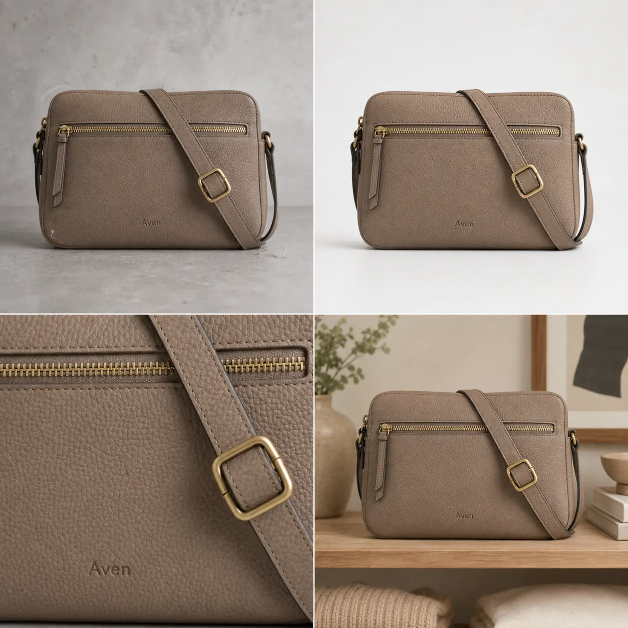 ## What AI Product Retouching Should Fix
Product retouching AI is best when the source photo already represents the real item and only needs cleanup. In the Aven bag example, the product itself is usable: the taupe pebbled leather, brass zipper, stitched strap, buckle, rectangular silhouette, and brand stamp are all visible. The blockers are smaller: dust, a corner scuff, loose lint, uneven background marks, and a presentation that is not quite store-ready.
Good retouching makes the buyer's job easier without changing the product:
- remove dust, lint, loose thread, fingerprints, or sensor spots
- clean a background scuff or wrinkle that distracts from the item
- soften harsh glare while keeping useful material highlights
- repair cutout halos and rough transparent edges
- improve usable size with upscaling when the source still has real detail
- create a clean main image, detail crop, or lifestyle crop from the same product truth
The key phrase is same product truth. If retouching changes the bag shape, zipper teeth, leather grain, strap width, buckle color, or brand stamp placement, the edit has gone too far.
## What To Leave Alone
The safest retouching rule is to protect anything a buyer might use to judge fit, quality, material, or compatibility. Leave these details alone unless the source image is clearly wrong and you have a verified product reference:
- true product color and finish
- silhouette, proportions, thickness, and scale
- seams, stitching, zipper teeth, straps, handles, buckles, caps, pumps, ports, buttons, dials, and lids
- label position, logo area, package text, and SKU markings
- material texture such as pebbled leather, glass thickness, knit ribbing, brushed metal, paper grain, or ceramic matte finish
- shadows that prove the product sits naturally on the surface
This is where product photo retouching differs from general image editing. A prettier image can still be a bad ecommerce image if it invents a better product than the one being sold.
## Choose The Smallest Retouching Tool
Use the smallest tool that fixes the real problem. That makes the result easier to inspect.
Use the [AI object eraser](/tools/ai-object-eraser) for a localized distraction: lint, a small prop, dust, a sticker on an owned product photo, or a background mark. Brush only the unwanted area. If the product edge changes, reduce the mask and retry.
Use the [product background remover](/tools/ai-background-remover) when the item is accurate but needs a clean cutout for listings, layouts, ads, or marketplace drafts. Review strap holes, transparent parts, handles, glass, cables, and thin fabric edges.
Use the [AI image upscaler](/tools/ai-image-upscaler) when the image is too small but still truthful. Upscaling is useful only if it preserves texture and edges. It should not invent label text, stitching, zipper teeth, watch markers, ports, or packaging details.
Use an [AI product image generator](/ai-product-image-generator) or scene workflow when you need a new product role, such as a lifestyle image or ad crop. Start from a product truth list and review the generated image against the original reference before publishing.
## A Retouching Workflow For Ecommerce Images
Use this workflow before publishing retouched product photos:
- Pick the clearest source image of the actual SKU.
- Write a product truth list before editing: color, material, parts, label area, scale, and details that must stay fixed.
- Mark the retouching blocker in one sentence, such as "remove lint near strap" or "clean gray background scuffs."
- Make one edit at a time.
- Compare the result against the source image and the product truth list.
- Create the next image role only after the retouched main image passes review.
- Check the full gallery for consistency across main image, detail crop, lifestyle photo, and ad crop.
For the bag example, that means the cleaned main image can remove lint and background marks, but the detail crop still needs to show the same leather grain, zipper teeth, buckle shape, strap stitching, and brand stamp.
## Use Detail Images As A Truth Check
Detail images are not decoration. They are evidence. A strong detail crop should help a buyer verify something that matters:
- leather grain, stitching, zipper, buckle, and edge paint for bags
- cap shape, pump, label, glass thickness, and liquid color for skincare
- knit ribbing, seams, buttons, collar, hem, and fabric drape for apparel
- ports, buttons, vents, seams, LEDs, and material finish for electronics
- dial markers, crown, case finish, strap stitching, and hands for watches
If AI product retouching makes the hero image cleaner but the detail crop no longer matches, do not publish the set. Retouching should reduce visual noise, not create product drift.
## Pre-Publish Retouching Checklist
Run this checklist after using product retouching AI:
- Same SKU: the retouched image still shows the same product.
- Same color: the product color did not shift into a more flattering but inaccurate shade.
- Same material: leather, fabric, glass, metal, paper, plastic, or ceramic still looks believable.
- Same hardware: zippers, buckles, ports, caps, pumps, buttons, and straps are unchanged.
- Same label area: logos, stamps, and package text did not move or change shape.
- Clean edge: cutouts have no halos, missing corners, or jagged transparent areas.
- Natural shadow: the product still sits on the surface instead of floating.
- No fake proof: the image does not add badges, review stars, certifications, platform UI, discounts, QR codes, barcodes, or unsupported claims.
- Gallery match: the main image, detail crop, lifestyle image, and ad crop still describe one product.
If a retouching result fails one of these checks, use a narrower edit or return to the original source.
## FAQ
### What is product retouching AI?
Product retouching AI uses image-editing models to clean ecommerce product photos. It can remove small distractions, clean backgrounds, improve cutout edges, upscale accurate images, and prepare detail or lifestyle views. The goal is a clearer product image, not a redesigned product.
### What should I remove from a product photo?
Remove distractions that are not part of the product: dust, lint, fingerprints, background scuffs, loose props, rough cutout edges, and minor lighting issues. Keep any detail that affects the product's real appearance, construction, function, material, or scale.
### Can AI retouch product photos without changing the SKU?
It can, but only when the workflow is controlled. Use a product truth list, make one narrow edit at a time, and compare the output against the source image. If color, shape, hardware, labels, seams, or scale drift, the edit should be rejected.
### Is product photo retouching the same as background removal?
No. Background removal is one retouching task. Product photo retouching can also include object cleanup, edge repair, glare control, resolution improvement, detail crops, and lifestyle image preparation. Choose the task based on the publishing blocker.
### Should I use AI retouching on marketplace product images?
You can use AI retouching to prepare cleaner marketplace images, but do not treat it as an approval guarantee. Check the current rules for your selling channel and avoid misleading product changes, fake badges, platform UI, review stars, certifications, or unsupported claims.
## Conclusion
Product retouching AI works when it removes the noise around a product and protects the facts of the product itself. Clean the dust, lint, background marks, cutout edges, and resolution problems that make an image harder to use. Leave the SKU-defining details alone. In KrafLayer, that means choosing the narrow edit first, reviewing the result against a product truth list, and building the rest of the image set only after the product still looks honest.
# Product Image Editor: Which Edit to Make Before Publishing
URL: https://kraflayer.com/blog/product-image-editor-which-edit-before-publishing
Summary: Choose the right product image editor workflow before publishing: remove backgrounds, erase distractions, upscale, replace scenes, or create detail crops.
Updated: 2026-07-01
A product image editor is most useful when it helps you choose the smallest edit that makes a product photo publishable. Before you change a background, upscale a file, erase a distraction, or build a lifestyle scene, decide what is actually wrong with the image. The practical rule is simple: fix the publishing blocker, protect the real SKU, then review the result before creating the next image role.
KrafLayer's [product photo editor](/product-photo-editor) fits this workflow because each edit can stay narrow. Use background removal for a clean cutout, object erasing for distractions, upscaling for soft but accurate images, and background replacement when the product needs a better selling context.
## What AI Product Retouching Should Fix
Product retouching AI is best when the source photo already represents the real item and only needs cleanup. In the Aven bag example, the product itself is usable: the taupe pebbled leather, brass zipper, stitched strap, buckle, rectangular silhouette, and brand stamp are all visible. The blockers are smaller: dust, a corner scuff, loose lint, uneven background marks, and a presentation that is not quite store-ready.
Good retouching makes the buyer's job easier without changing the product:
- remove dust, lint, loose thread, fingerprints, or sensor spots
- clean a background scuff or wrinkle that distracts from the item
- soften harsh glare while keeping useful material highlights
- repair cutout halos and rough transparent edges
- improve usable size with upscaling when the source still has real detail
- create a clean main image, detail crop, or lifestyle crop from the same product truth
The key phrase is same product truth. If retouching changes the bag shape, zipper teeth, leather grain, strap width, buckle color, or brand stamp placement, the edit has gone too far.
## What To Leave Alone
The safest retouching rule is to protect anything a buyer might use to judge fit, quality, material, or compatibility. Leave these details alone unless the source image is clearly wrong and you have a verified product reference:
- true product color and finish
- silhouette, proportions, thickness, and scale
- seams, stitching, zipper teeth, straps, handles, buckles, caps, pumps, ports, buttons, dials, and lids
- label position, logo area, package text, and SKU markings
- material texture such as pebbled leather, glass thickness, knit ribbing, brushed metal, paper grain, or ceramic matte finish
- shadows that prove the product sits naturally on the surface
This is where product photo retouching differs from general image editing. A prettier image can still be a bad ecommerce image if it invents a better product than the one being sold.
## Choose The Smallest Retouching Tool
Use the smallest tool that fixes the real problem. That makes the result easier to inspect.
Use the [AI object eraser](/tools/ai-object-eraser) for a localized distraction: lint, a small prop, dust, a sticker on an owned product photo, or a background mark. Brush only the unwanted area. If the product edge changes, reduce the mask and retry.
Use the [product background remover](/tools/ai-background-remover) when the item is accurate but needs a clean cutout for listings, layouts, ads, or marketplace drafts. Review strap holes, transparent parts, handles, glass, cables, and thin fabric edges.
Use the [AI image upscaler](/tools/ai-image-upscaler) when the image is too small but still truthful. Upscaling is useful only if it preserves texture and edges. It should not invent label text, stitching, zipper teeth, watch markers, ports, or packaging details.
Use an [AI product image generator](/ai-product-image-generator) or scene workflow when you need a new product role, such as a lifestyle image or ad crop. Start from a product truth list and review the generated image against the original reference before publishing.
## A Retouching Workflow For Ecommerce Images
Use this workflow before publishing retouched product photos:
- Pick the clearest source image of the actual SKU.
- Write a product truth list before editing: color, material, parts, label area, scale, and details that must stay fixed.
- Mark the retouching blocker in one sentence, such as "remove lint near strap" or "clean gray background scuffs."
- Make one edit at a time.
- Compare the result against the source image and the product truth list.
- Create the next image role only after the retouched main image passes review.
- Check the full gallery for consistency across main image, detail crop, lifestyle photo, and ad crop.
For the bag example, that means the cleaned main image can remove lint and background marks, but the detail crop still needs to show the same leather grain, zipper teeth, buckle shape, strap stitching, and brand stamp.
## Use Detail Images As A Truth Check
Detail images are not decoration. They are evidence. A strong detail crop should help a buyer verify something that matters:
- leather grain, stitching, zipper, buckle, and edge paint for bags
- cap shape, pump, label, glass thickness, and liquid color for skincare
- knit ribbing, seams, buttons, collar, hem, and fabric drape for apparel
- ports, buttons, vents, seams, LEDs, and material finish for electronics
- dial markers, crown, case finish, strap stitching, and hands for watches
If AI product retouching makes the hero image cleaner but the detail crop no longer matches, do not publish the set. Retouching should reduce visual noise, not create product drift.
## Pre-Publish Retouching Checklist
Run this checklist after using product retouching AI:
- Same SKU: the retouched image still shows the same product.
- Same color: the product color did not shift into a more flattering but inaccurate shade.
- Same material: leather, fabric, glass, metal, paper, plastic, or ceramic still looks believable.
- Same hardware: zippers, buckles, ports, caps, pumps, buttons, and straps are unchanged.
- Same label area: logos, stamps, and package text did not move or change shape.
- Clean edge: cutouts have no halos, missing corners, or jagged transparent areas.
- Natural shadow: the product still sits on the surface instead of floating.
- No fake proof: the image does not add badges, review stars, certifications, platform UI, discounts, QR codes, barcodes, or unsupported claims.
- Gallery match: the main image, detail crop, lifestyle image, and ad crop still describe one product.
If a retouching result fails one of these checks, use a narrower edit or return to the original source.
## FAQ
### What is product retouching AI?
Product retouching AI uses image-editing models to clean ecommerce product photos. It can remove small distractions, clean backgrounds, improve cutout edges, upscale accurate images, and prepare detail or lifestyle views. The goal is a clearer product image, not a redesigned product.
### What should I remove from a product photo?
Remove distractions that are not part of the product: dust, lint, fingerprints, background scuffs, loose props, rough cutout edges, and minor lighting issues. Keep any detail that affects the product's real appearance, construction, function, material, or scale.
### Can AI retouch product photos without changing the SKU?
It can, but only when the workflow is controlled. Use a product truth list, make one narrow edit at a time, and compare the output against the source image. If color, shape, hardware, labels, seams, or scale drift, the edit should be rejected.
### Is product photo retouching the same as background removal?
No. Background removal is one retouching task. Product photo retouching can also include object cleanup, edge repair, glare control, resolution improvement, detail crops, and lifestyle image preparation. Choose the task based on the publishing blocker.
### Should I use AI retouching on marketplace product images?
You can use AI retouching to prepare cleaner marketplace images, but do not treat it as an approval guarantee. Check the current rules for your selling channel and avoid misleading product changes, fake badges, platform UI, review stars, certifications, or unsupported claims.
## Conclusion
Product retouching AI works when it removes the noise around a product and protects the facts of the product itself. Clean the dust, lint, background marks, cutout edges, and resolution problems that make an image harder to use. Leave the SKU-defining details alone. In KrafLayer, that means choosing the narrow edit first, reviewing the result against a product truth list, and building the rest of the image set only after the product still looks honest.
# Product Image Editor: Which Edit to Make Before Publishing
URL: https://kraflayer.com/blog/product-image-editor-which-edit-before-publishing
Summary: Choose the right product image editor workflow before publishing: remove backgrounds, erase distractions, upscale, replace scenes, or create detail crops.
Updated: 2026-07-01
A product image editor is most useful when it helps you choose the smallest edit that makes a product photo publishable. Before you change a background, upscale a file, erase a distraction, or build a lifestyle scene, decide what is actually wrong with the image. The practical rule is simple: fix the publishing blocker, protect the real SKU, then review the result before creating the next image role.
KrafLayer's [product photo editor](/product-photo-editor) fits this workflow because each edit can stay narrow. Use background removal for a clean cutout, object erasing for distractions, upscaling for soft but accurate images, and background replacement when the product needs a better selling context.
 ## Start With The Publishing Problem
Do not open a product image editor and ask it to make the image better in a general way. Name the publishing problem first. A product photo for a store page usually fails for one of five reasons:
- the background is messy, inconsistent, or hard to reuse
- a small object, hand, sticker, reflection, or dust mark distracts from the product
- the source image is accurate but too small or soft
- the product needs context for scale, use, or merchandising
- the gallery lacks a close detail that proves material, hardware, label, or construction
For the Noro kettle example, the protected facts are the matte charcoal body, slim spout, wood handle, brass knob, base mark, product scale, and natural shadow. The edit can change the background or image role. It should not redesign the kettle.
## Pick The Right Edit Before Publishing
Use the edit type that matches the image problem. This keeps the workflow faster and makes review easier.
Use a [product background remover](/tools/ai-background-remover) when the product is correct but the background is the problem. A clean cutout is useful for product pages, comparison modules, ad layouts, and channel crops. Review thin areas such as handles, straps, clear plastic, glass, cables, fabric edges, and shadows.
Use an [AI object eraser](/tools/ai-object-eraser) when the product is accurate but one element should not be there. Brush only the distracting area. If the tool changes the product edge, label, texture, or silhouette, the mask was too broad or the source image needs a different approach.
Use an [AI image upscaler](/tools/ai-image-upscaler) when the image already tells the truth but lacks resolution. Upscaling should improve usable size and apparent clarity. It should not invent label text, fabric grain, ports, stitching, watch dials, jewelry prongs, or packaging details.
Use an [AI background replacer](/tools/ai-background-replacer) when the product needs selling context. The new scene should support the product with believable light, scale, and contact shadow. It should not make the item look larger, smaller, more premium, or functionally different than it is.
Use a detail crop when the buyer needs proof. A detail image should answer one question: What is the material, closure, texture, label, handle, pump, port, gasket, seam, or finish like?
## A Simple Product Image Editor Workflow
Use this sequence before a product image goes live:
- Choose the source photo that best represents the actual SKU.
- Write a product truth list: color, shape, material, label, parts, scale, and details that must stay unchanged.
- Choose one edit job instead of combining every improvement at once.
- Export a draft and compare it with the original product truth list.
- Create the next image role only after the first edit passes review.
- Check the final gallery together so the main image, cutout, detail crop, and lifestyle image still show the same product.
This is the difference between editing for ecommerce and making a generic polished image. A good ecommerce image is clearer, but still honest.
## What Each Image Role Should Prove
A product image editor can help turn one strong source photo into several useful roles. Each role should do a different job.
Main image: show the product clearly at a glance. The crop should be simple, the product should be dominant, and the buyer should immediately understand what is being sold.
Cutout preview: make the product reusable in layouts, comparison sections, marketplace drafts, and campaign designs. Cutout quality matters more than dramatic styling. Watch for halos, missing edges, and broken transparent areas.
Detail crop: prove a material, feature, or construction detail. In the kettle example, the handle grain, brass knob, matte ceramic surface, spout shape, and lid edge matter more than a decorative coffee scene.
Lifestyle product photo: show scale, use, or merchandising context. The scene should help the buyer imagine the product, but the product still needs to be easy to inspect.
## Pre-Publish Review Checklist
Run this check after using any ecommerce image editor:
- Same SKU: the edited image still shows the same item.
- Shape: the silhouette, handle, cap, lid, zipper, pump, strap, port, or spout did not drift.
- Color: the product color still matches the real product.
- Material: glass, fabric, leather, ceramic, plastic, metal, or paper texture still looks believable.
- Label area: important logo or package text stayed in the right place.
- Edges: cutouts have no halos, missing corners, or jagged transparent edges.
- Shadow: the product still sits naturally on the surface.
- Resolution: the final image is large enough without fake sharpening.
- Claims: the image does not add fake badges, review stars, certifications, discounts, platform UI, or unsupported benefit text.
- Gallery fit: every image in the set supports the same product story.
The image is ready only when it passes the product check and the channel check. A polished edit that changes product facts should not be published.
## How KrafLayer Fits
KrafLayer works best as a product image editor when you treat each tool as a specific ecommerce step. Start with the [product photo editor](/product-photo-editor), choose the edit that matches the problem, and keep the product truth list visible while reviewing the output.
If the product image has a bad background, remove it first. If the image is too small, upscale before cropping. If a prop or sticker distracts from the product, erase only that area. If the product needs context, replace the background after the product image itself is accurate.
That sequence protects the owner page intent: KrafLayer is not just making product photos look different. It is helping sellers decide which edit should happen before publishing.
## FAQ
### What is a product image editor?
A product image editor is a tool for preparing ecommerce product photos before they go live. It can help remove backgrounds, erase distractions, upscale low-resolution files, replace weak scenes, crop images, and create detail views while preserving the real product.
### How do I choose the right product-image edit?
Start with the publishing blocker. If the background is the issue, remove or replace it. If the image is soft, upscale it. If one object distracts from the item, erase only that object. If buyers need proof, create a detail crop.
### Can a product image editor change the product?
It should not change product facts. The edited image should preserve the same SKU, color, shape, material, label position, scale, and key features. If the edit makes the product look like a different item, redo it or choose a narrower edit.
### Should I edit the main image or lifestyle image first?
Edit the main product image first because it is the reference for the rest of the gallery. Once the main image is accurate, create cutouts, detail crops, lifestyle images, or ad crops from the same product truth list.
### Does using an ecommerce image editor guarantee marketplace approval?
No. A product image editor can help prepare cleaner ecommerce images, but it does not guarantee marketplace approval. Check the current rules for your selling channel and avoid fake badges, platform UI, review stars, unsupported claims, and misleading product changes.
## Conclusion
A product image editor should help you make the right edit before publishing, not push every product photo through the same generic treatment. Start with the real SKU, choose the smallest edit, check the output against product facts, and then build the rest of the gallery. KrafLayer helps sellers handle those product-image editing steps in one workflow so main images, cutouts, detail crops, and lifestyle photos can become clearer without drifting away from the product being sold.
# Product Photo Editing App Checklist for Store Owners
URL: https://kraflayer.com/blog/product-photo-editing-app-store-owner-checklist
Summary: Choose a product photo editing app by checking background cleanup, object removal, upscaling, output roles, and SKU accuracy before publishing.
Updated: 2026-07-01
A product photo editing app is worth using when it helps you publish clearer store images without changing what the product actually is. The practical rule is simple: choose the app that fixes the blocker in the source photo, keeps SKU-defining details stable, and lets you review the whole image set before it goes live.
For store owners, KrafLayer's [product photo editor](/product-photo-editor) is useful because the editing jobs are separated: remove a background when you need a reusable cutout, erase a small distraction when the composition is already good, upscale when the file is too small, and replace a background only when the product itself is still accurate.
## Start With The Publishing Problem
Do not open a product image editor and ask it to make the image better in a general way. Name the publishing problem first. A product photo for a store page usually fails for one of five reasons:
- the background is messy, inconsistent, or hard to reuse
- a small object, hand, sticker, reflection, or dust mark distracts from the product
- the source image is accurate but too small or soft
- the product needs context for scale, use, or merchandising
- the gallery lacks a close detail that proves material, hardware, label, or construction
For the Noro kettle example, the protected facts are the matte charcoal body, slim spout, wood handle, brass knob, base mark, product scale, and natural shadow. The edit can change the background or image role. It should not redesign the kettle.
## Pick The Right Edit Before Publishing
Use the edit type that matches the image problem. This keeps the workflow faster and makes review easier.
Use a [product background remover](/tools/ai-background-remover) when the product is correct but the background is the problem. A clean cutout is useful for product pages, comparison modules, ad layouts, and channel crops. Review thin areas such as handles, straps, clear plastic, glass, cables, fabric edges, and shadows.
Use an [AI object eraser](/tools/ai-object-eraser) when the product is accurate but one element should not be there. Brush only the distracting area. If the tool changes the product edge, label, texture, or silhouette, the mask was too broad or the source image needs a different approach.
Use an [AI image upscaler](/tools/ai-image-upscaler) when the image already tells the truth but lacks resolution. Upscaling should improve usable size and apparent clarity. It should not invent label text, fabric grain, ports, stitching, watch dials, jewelry prongs, or packaging details.
Use an [AI background replacer](/tools/ai-background-replacer) when the product needs selling context. The new scene should support the product with believable light, scale, and contact shadow. It should not make the item look larger, smaller, more premium, or functionally different than it is.
Use a detail crop when the buyer needs proof. A detail image should answer one question: What is the material, closure, texture, label, handle, pump, port, gasket, seam, or finish like?
## A Simple Product Image Editor Workflow
Use this sequence before a product image goes live:
- Choose the source photo that best represents the actual SKU.
- Write a product truth list: color, shape, material, label, parts, scale, and details that must stay unchanged.
- Choose one edit job instead of combining every improvement at once.
- Export a draft and compare it with the original product truth list.
- Create the next image role only after the first edit passes review.
- Check the final gallery together so the main image, cutout, detail crop, and lifestyle image still show the same product.
This is the difference between editing for ecommerce and making a generic polished image. A good ecommerce image is clearer, but still honest.
## What Each Image Role Should Prove
A product image editor can help turn one strong source photo into several useful roles. Each role should do a different job.
Main image: show the product clearly at a glance. The crop should be simple, the product should be dominant, and the buyer should immediately understand what is being sold.
Cutout preview: make the product reusable in layouts, comparison sections, marketplace drafts, and campaign designs. Cutout quality matters more than dramatic styling. Watch for halos, missing edges, and broken transparent areas.
Detail crop: prove a material, feature, or construction detail. In the kettle example, the handle grain, brass knob, matte ceramic surface, spout shape, and lid edge matter more than a decorative coffee scene.
Lifestyle product photo: show scale, use, or merchandising context. The scene should help the buyer imagine the product, but the product still needs to be easy to inspect.
## Pre-Publish Review Checklist
Run this check after using any ecommerce image editor:
- Same SKU: the edited image still shows the same item.
- Shape: the silhouette, handle, cap, lid, zipper, pump, strap, port, or spout did not drift.
- Color: the product color still matches the real product.
- Material: glass, fabric, leather, ceramic, plastic, metal, or paper texture still looks believable.
- Label area: important logo or package text stayed in the right place.
- Edges: cutouts have no halos, missing corners, or jagged transparent edges.
- Shadow: the product still sits naturally on the surface.
- Resolution: the final image is large enough without fake sharpening.
- Claims: the image does not add fake badges, review stars, certifications, discounts, platform UI, or unsupported benefit text.
- Gallery fit: every image in the set supports the same product story.
The image is ready only when it passes the product check and the channel check. A polished edit that changes product facts should not be published.
## How KrafLayer Fits
KrafLayer works best as a product image editor when you treat each tool as a specific ecommerce step. Start with the [product photo editor](/product-photo-editor), choose the edit that matches the problem, and keep the product truth list visible while reviewing the output.
If the product image has a bad background, remove it first. If the image is too small, upscale before cropping. If a prop or sticker distracts from the product, erase only that area. If the product needs context, replace the background after the product image itself is accurate.
That sequence protects the owner page intent: KrafLayer is not just making product photos look different. It is helping sellers decide which edit should happen before publishing.
## FAQ
### What is a product image editor?
A product image editor is a tool for preparing ecommerce product photos before they go live. It can help remove backgrounds, erase distractions, upscale low-resolution files, replace weak scenes, crop images, and create detail views while preserving the real product.
### How do I choose the right product-image edit?
Start with the publishing blocker. If the background is the issue, remove or replace it. If the image is soft, upscale it. If one object distracts from the item, erase only that object. If buyers need proof, create a detail crop.
### Can a product image editor change the product?
It should not change product facts. The edited image should preserve the same SKU, color, shape, material, label position, scale, and key features. If the edit makes the product look like a different item, redo it or choose a narrower edit.
### Should I edit the main image or lifestyle image first?
Edit the main product image first because it is the reference for the rest of the gallery. Once the main image is accurate, create cutouts, detail crops, lifestyle images, or ad crops from the same product truth list.
### Does using an ecommerce image editor guarantee marketplace approval?
No. A product image editor can help prepare cleaner ecommerce images, but it does not guarantee marketplace approval. Check the current rules for your selling channel and avoid fake badges, platform UI, review stars, unsupported claims, and misleading product changes.
## Conclusion
A product image editor should help you make the right edit before publishing, not push every product photo through the same generic treatment. Start with the real SKU, choose the smallest edit, check the output against product facts, and then build the rest of the gallery. KrafLayer helps sellers handle those product-image editing steps in one workflow so main images, cutouts, detail crops, and lifestyle photos can become clearer without drifting away from the product being sold.
# Product Photo Editing App Checklist for Store Owners
URL: https://kraflayer.com/blog/product-photo-editing-app-store-owner-checklist
Summary: Choose a product photo editing app by checking background cleanup, object removal, upscaling, output roles, and SKU accuracy before publishing.
Updated: 2026-07-01
A product photo editing app is worth using when it helps you publish clearer store images without changing what the product actually is. The practical rule is simple: choose the app that fixes the blocker in the source photo, keeps SKU-defining details stable, and lets you review the whole image set before it goes live.
For store owners, KrafLayer's [product photo editor](/product-photo-editor) is useful because the editing jobs are separated: remove a background when you need a reusable cutout, erase a small distraction when the composition is already good, upscale when the file is too small, and replace a background only when the product itself is still accurate.
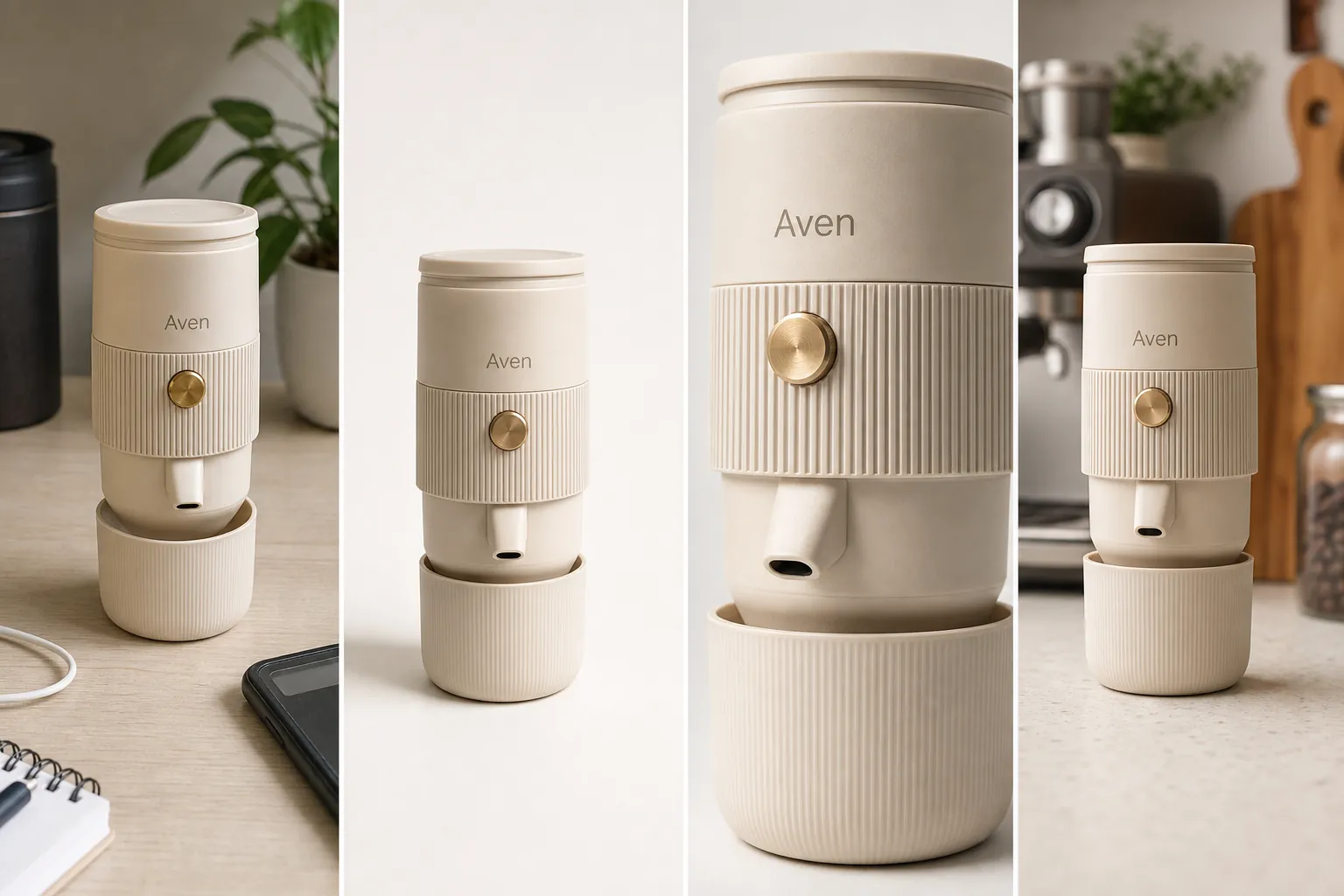 ## What A Product Photo Editing App Should Actually Do
The best product photo editing app for an online store is not the one with the longest feature menu. It is the one that helps you move a real product image from source photo to publishable asset without losing product truth.
For the Aven espresso maker example, the app has four jobs:
- clean the phone photo without changing the cream body, brass button, ribbed band, short spout, cup base, or scale
- create a main image where the buyer understands the product immediately
- make a detail crop that proves texture, parts, and finish
- prepare a lifestyle or ad-ready crop that still matches the same SKU
That is a stronger test than asking whether an app can make images look polished. A polished image can still be wrong if it invents a different product.
## App Checklist For Store Owners
Use this checklist before committing a product photo workflow to any ecommerce photo editing app:
- Source handling: can you start from the actual product photo, not only from a blank prompt?
- Background cleanup: can the app remove a background cleanly without manual masking for every image?
- Object cleanup: can you remove one small distraction without regenerating the whole product?
- Resolution: can the app upscale a truthful source while preserving edges, labels, texture, and transparent areas?
- Background replacement: can it create a new scene while keeping the product isolated and recognizable?
- Review loop: can you compare the result against the original before publishing?
- Output roles: can you produce a main image, detail image, lifestyle image, and ad crop from one product truth list?
- Export quality: are the final files clean enough for store pages, marketplace drafts, and paid creative?
If an app only creates beautiful images but gives you no way to protect product facts, it is risky for ecommerce work.
## Match The Tool To The Editing Job
Choose the smallest edit that solves the current blocker. This keeps the final image easier to inspect.
Use an [AI background remover](/tools/ai-background-remover) when the product is accurate but the surroundings are not useful. In KrafLayer, Remove BG is a one-click automated background-removal tool. It does not need a prompt or a hand-painted mask; the output is a transparent PNG with alpha preserved.
Use an [AI object eraser](/tools/ai-object-eraser) when the image is mostly right but one area is distracting. This is a brush-mask job. Paint the unwanted prop, dust mark, cable, sticker on an owned product photo, or background blemish, then inspect the fill. If the mask touches product edges, make it tighter and retry.
Use an [AI image upscaler](/tools/ai-image-upscaler) when the image is too small for the channel but still contains usable detail. Upscaling is one-click in KrafLayer. Review product edges, texture, small text, transparent edges, ports, seams, buttons, and hardware after the upscale.
Use background replacement when the product needs a different context. KrafLayer's Replace BG isolates the product automatically, then lets you guide the new background with a text prompt or reference image. That is different from Remove BG: replacement adds a scene, so product accuracy review matters more.
## A Store Image Workflow That Works
Run the product through the editing app in image roles, not random edits:
- Main image: remove clutter, keep the product centered, and make the object readable at thumbnail size.
- Detail image: crop close enough to show material, controls, seams, texture, cap, spout, stitching, label area, or hardware.
- Lifestyle image: add context only when it helps the buyer understand scale, use, or material.
- Ad crop: leave room for layout if needed, but do not add fake badges, review stars, platform UI, discounts, certifications, QR codes, or unsupported claims.
The detail image is the quality gate. If the close crop no longer matches the main image, the editing app has changed too much.
## Product Truth List Before You Edit
Before using any product photo editing app, write a short product truth list. It should name the details the app must not change.
For the Aven espresso maker, the protected details are:
- compact cylindrical shape
- matte cream body
- brass round button
- vertical ribbed grip band
- short front spout
- detachable cup base
- subtle Aven mark
- natural product scale and shadow
For other products, swap in the relevant facts: zipper teeth, fabric weave, package label area, pump shape, cap geometry, glass thickness, port layout, dial markers, strap stitching, button count, metal finish, or colorway. The point is not to write a long spec sheet. The point is to make the review concrete.
## Red Flags In Photo Editing Apps
Be careful when an app:
- changes product color to make the image more attractive
- invents label text, logos, badges, certifications, or claims
- smooths away material texture that buyers need to inspect
- redraws hardware, ports, seams, buttons, straps, or lids
- makes every product look like the same studio template
- hides the product behind a scene, prop, or text overlay
- has no clear way to compare the output against the source
These issues matter more than small aesthetic differences. Store images have to sell the real item, not an upgraded version of it.
## Where KrafLayer Fits
KrafLayer is a practical product photo editing app when the job is ecommerce-specific. Use it as a controlled workflow:
- start with the actual product image
- remove the background if the first need is a clean cutout
- erase one distraction if the original scene is usable
- upscale after the product facts are already correct
- use the [AI background replacer](/tools/ai-background-replacer) or create a new product image role only after the main product passes review
- check the whole set before publishing
This avoids the common mistake of asking AI for a new beautiful image before deciding what the current product photo actually needs.
## FAQ
### What is a product photo editing app?
A product photo editing app helps store owners prepare product images for ecommerce pages, marketplaces, ads, and product detail sections. The useful version should clean backgrounds, remove distractions, improve resolution, and create image roles while preserving the real product's color, shape, material, labels, hardware, and scale.
### What is the best product photo editing app for ecommerce?
The best product photo editing app is the one that matches your image problem. For ecommerce, look for background removal, object cleanup, upscaling, background replacement, source-image control, and review tools. Avoid choosing only by style presets because product accuracy matters more than a dramatic look.
### Do I need prompts for every product photo edit?
No. Some edits should not use prompts. In KrafLayer, Remove BG and Upscale are one-click workflows, and Erase uses a brush mask. Prompting is useful for background replacement, mask edits, reference-image edits, or scene composition, where the app needs direction for new content.
### Can AI photo editing change my product by accident?
Yes. AI can shift color, simplify texture, redraw small hardware, move label areas, or invent details when the edit is too broad. Use a product truth list, make one edit at a time, and review the result against the source before publishing.
### Should I use a product photo editing app for marketplace images?
You can use an app to prepare cleaner marketplace images, but do not treat the app as an approval guarantee. Check the current rules for your selling channel and avoid misleading edits, fake badges, review stars, platform UI, certifications, discounts, barcodes, QR codes, or unsupported claims.
## Conclusion
A product photo editing app should help a store owner finish product images with less cleanup work and fewer reshoots, but it still has to protect the real product. Start with the source photo, choose the smallest edit, check a product truth list, and build the image set one role at a time. KrafLayer fits that workflow by keeping background removal, object erasing, upscaling, and background replacement as separate decisions instead of one uncontrolled makeover.
# Online Product Photo Editor: 8-Step Ecommerce Workflow
URL: https://kraflayer.com/blog/online-product-photo-editor-ecommerce-workflow
Summary: Use an online product photo editor with a reversible workflow for cleanup, cutouts, local fixes, upscaling, scene creation, and channel exports.
Updated: 2026-08-11
An online product photo editor should behave like a production line, not a slot machine. Diagnose the visible defect, make the smallest edit that fixes it, compare the result with the original, then export a channel-specific copy. Background removal, object cleanup, upscaling, and scene generation are different operations and should not be bundled into one blind prompt.
The workflow uses current Google, Shopify, Etsy, and eBay image guidance checked on August 11, 2026. The lunchbox grid is a KrafLayer demonstration asset, not a customer case study or a timed productivity test.
> **Quick Summary**
> Google recommends product fill of 75%–90% and images around 1500 × 1500 pixels or larger. Shopify says 2048 × 2048 usually displays best for square product images. Keep an untouched master, edit in a deliberate order, and create separate exports for each channel.
## Abstract
The safest browser workflow is source intake, defect diagnosis, background or object cleanup, local correction, optional upscale, channel crop, and full-resolution review. Generate a lifestyle scene only after the factual product asset is clean. Preserve each useful stage so one bad edit does not contaminate the entire chain.
## Key Takeaways
- Choose an operation by defect, not by novelty.
- Never overwrite the original source.
- Upscaling cannot recover facts that were never captured.
- Transparent PNG is a master format, not a universal marketplace output.
- Review product fidelity before judging polish.
## Table of Contents
1. [Scope and method](#what-should-an-online-product-photo-editor-do)
2. [Defect-to-tool map](#which-edit-should-you-use-first)
3. [Eight-step workflow](#what-is-a-reliable-browser-editing-workflow)
4. [File and export rules](#how-should-you-manage-files-and-exports)
5. [Fidelity review](#what-should-you-check-at-full-resolution)
6. [Channel targets](#how-do-channel-requirements-change-the-export)
7. [When to reshoot](#when-is-editing-the-wrong-fix)
8. [Frequently asked questions](#frequently-asked-questions)
## What Should an Online Product Photo Editor Do?
Google's product-image guidance requires accurate product representation, correct variants, and no promotional overlays in the primary feed image. That means a useful editor must do more than produce an attractive result: it must support a reviewable path from source to compliant export ([Google Merchant Center](https://support.google.com/merchants/answer/6324350?hl=en), 2026).
We evaluated the workflow by reversibility, product-fidelity risk, and channel readiness. We did not compare processing speed or output quality across paid competitors. The focus here is operational: what sequence reduces avoidable damage when a seller edits real catalog files in a browser?
## What A Product Photo Editing App Should Actually Do
The best product photo editing app for an online store is not the one with the longest feature menu. It is the one that helps you move a real product image from source photo to publishable asset without losing product truth.
For the Aven espresso maker example, the app has four jobs:
- clean the phone photo without changing the cream body, brass button, ribbed band, short spout, cup base, or scale
- create a main image where the buyer understands the product immediately
- make a detail crop that proves texture, parts, and finish
- prepare a lifestyle or ad-ready crop that still matches the same SKU
That is a stronger test than asking whether an app can make images look polished. A polished image can still be wrong if it invents a different product.
## App Checklist For Store Owners
Use this checklist before committing a product photo workflow to any ecommerce photo editing app:
- Source handling: can you start from the actual product photo, not only from a blank prompt?
- Background cleanup: can the app remove a background cleanly without manual masking for every image?
- Object cleanup: can you remove one small distraction without regenerating the whole product?
- Resolution: can the app upscale a truthful source while preserving edges, labels, texture, and transparent areas?
- Background replacement: can it create a new scene while keeping the product isolated and recognizable?
- Review loop: can you compare the result against the original before publishing?
- Output roles: can you produce a main image, detail image, lifestyle image, and ad crop from one product truth list?
- Export quality: are the final files clean enough for store pages, marketplace drafts, and paid creative?
If an app only creates beautiful images but gives you no way to protect product facts, it is risky for ecommerce work.
## Match The Tool To The Editing Job
Choose the smallest edit that solves the current blocker. This keeps the final image easier to inspect.
Use an [AI background remover](/tools/ai-background-remover) when the product is accurate but the surroundings are not useful. In KrafLayer, Remove BG is a one-click automated background-removal tool. It does not need a prompt or a hand-painted mask; the output is a transparent PNG with alpha preserved.
Use an [AI object eraser](/tools/ai-object-eraser) when the image is mostly right but one area is distracting. This is a brush-mask job. Paint the unwanted prop, dust mark, cable, sticker on an owned product photo, or background blemish, then inspect the fill. If the mask touches product edges, make it tighter and retry.
Use an [AI image upscaler](/tools/ai-image-upscaler) when the image is too small for the channel but still contains usable detail. Upscaling is one-click in KrafLayer. Review product edges, texture, small text, transparent edges, ports, seams, buttons, and hardware after the upscale.
Use background replacement when the product needs a different context. KrafLayer's Replace BG isolates the product automatically, then lets you guide the new background with a text prompt or reference image. That is different from Remove BG: replacement adds a scene, so product accuracy review matters more.
## A Store Image Workflow That Works
Run the product through the editing app in image roles, not random edits:
- Main image: remove clutter, keep the product centered, and make the object readable at thumbnail size.
- Detail image: crop close enough to show material, controls, seams, texture, cap, spout, stitching, label area, or hardware.
- Lifestyle image: add context only when it helps the buyer understand scale, use, or material.
- Ad crop: leave room for layout if needed, but do not add fake badges, review stars, platform UI, discounts, certifications, QR codes, or unsupported claims.
The detail image is the quality gate. If the close crop no longer matches the main image, the editing app has changed too much.
## Product Truth List Before You Edit
Before using any product photo editing app, write a short product truth list. It should name the details the app must not change.
For the Aven espresso maker, the protected details are:
- compact cylindrical shape
- matte cream body
- brass round button
- vertical ribbed grip band
- short front spout
- detachable cup base
- subtle Aven mark
- natural product scale and shadow
For other products, swap in the relevant facts: zipper teeth, fabric weave, package label area, pump shape, cap geometry, glass thickness, port layout, dial markers, strap stitching, button count, metal finish, or colorway. The point is not to write a long spec sheet. The point is to make the review concrete.
## Red Flags In Photo Editing Apps
Be careful when an app:
- changes product color to make the image more attractive
- invents label text, logos, badges, certifications, or claims
- smooths away material texture that buyers need to inspect
- redraws hardware, ports, seams, buttons, straps, or lids
- makes every product look like the same studio template
- hides the product behind a scene, prop, or text overlay
- has no clear way to compare the output against the source
These issues matter more than small aesthetic differences. Store images have to sell the real item, not an upgraded version of it.
## Where KrafLayer Fits
KrafLayer is a practical product photo editing app when the job is ecommerce-specific. Use it as a controlled workflow:
- start with the actual product image
- remove the background if the first need is a clean cutout
- erase one distraction if the original scene is usable
- upscale after the product facts are already correct
- use the [AI background replacer](/tools/ai-background-replacer) or create a new product image role only after the main product passes review
- check the whole set before publishing
This avoids the common mistake of asking AI for a new beautiful image before deciding what the current product photo actually needs.
## FAQ
### What is a product photo editing app?
A product photo editing app helps store owners prepare product images for ecommerce pages, marketplaces, ads, and product detail sections. The useful version should clean backgrounds, remove distractions, improve resolution, and create image roles while preserving the real product's color, shape, material, labels, hardware, and scale.
### What is the best product photo editing app for ecommerce?
The best product photo editing app is the one that matches your image problem. For ecommerce, look for background removal, object cleanup, upscaling, background replacement, source-image control, and review tools. Avoid choosing only by style presets because product accuracy matters more than a dramatic look.
### Do I need prompts for every product photo edit?
No. Some edits should not use prompts. In KrafLayer, Remove BG and Upscale are one-click workflows, and Erase uses a brush mask. Prompting is useful for background replacement, mask edits, reference-image edits, or scene composition, where the app needs direction for new content.
### Can AI photo editing change my product by accident?
Yes. AI can shift color, simplify texture, redraw small hardware, move label areas, or invent details when the edit is too broad. Use a product truth list, make one edit at a time, and review the result against the source before publishing.
### Should I use a product photo editing app for marketplace images?
You can use an app to prepare cleaner marketplace images, but do not treat the app as an approval guarantee. Check the current rules for your selling channel and avoid misleading edits, fake badges, review stars, platform UI, certifications, discounts, barcodes, QR codes, or unsupported claims.
## Conclusion
A product photo editing app should help a store owner finish product images with less cleanup work and fewer reshoots, but it still has to protect the real product. Start with the source photo, choose the smallest edit, check a product truth list, and build the image set one role at a time. KrafLayer fits that workflow by keeping background removal, object erasing, upscaling, and background replacement as separate decisions instead of one uncontrolled makeover.
# Online Product Photo Editor: 8-Step Ecommerce Workflow
URL: https://kraflayer.com/blog/online-product-photo-editor-ecommerce-workflow
Summary: Use an online product photo editor with a reversible workflow for cleanup, cutouts, local fixes, upscaling, scene creation, and channel exports.
Updated: 2026-08-11
An online product photo editor should behave like a production line, not a slot machine. Diagnose the visible defect, make the smallest edit that fixes it, compare the result with the original, then export a channel-specific copy. Background removal, object cleanup, upscaling, and scene generation are different operations and should not be bundled into one blind prompt.
The workflow uses current Google, Shopify, Etsy, and eBay image guidance checked on August 11, 2026. The lunchbox grid is a KrafLayer demonstration asset, not a customer case study or a timed productivity test.
> **Quick Summary**
> Google recommends product fill of 75%–90% and images around 1500 × 1500 pixels or larger. Shopify says 2048 × 2048 usually displays best for square product images. Keep an untouched master, edit in a deliberate order, and create separate exports for each channel.
## Abstract
The safest browser workflow is source intake, defect diagnosis, background or object cleanup, local correction, optional upscale, channel crop, and full-resolution review. Generate a lifestyle scene only after the factual product asset is clean. Preserve each useful stage so one bad edit does not contaminate the entire chain.
## Key Takeaways
- Choose an operation by defect, not by novelty.
- Never overwrite the original source.
- Upscaling cannot recover facts that were never captured.
- Transparent PNG is a master format, not a universal marketplace output.
- Review product fidelity before judging polish.
## Table of Contents
1. [Scope and method](#what-should-an-online-product-photo-editor-do)
2. [Defect-to-tool map](#which-edit-should-you-use-first)
3. [Eight-step workflow](#what-is-a-reliable-browser-editing-workflow)
4. [File and export rules](#how-should-you-manage-files-and-exports)
5. [Fidelity review](#what-should-you-check-at-full-resolution)
6. [Channel targets](#how-do-channel-requirements-change-the-export)
7. [When to reshoot](#when-is-editing-the-wrong-fix)
8. [Frequently asked questions](#frequently-asked-questions)
## What Should an Online Product Photo Editor Do?
Google's product-image guidance requires accurate product representation, correct variants, and no promotional overlays in the primary feed image. That means a useful editor must do more than produce an attractive result: it must support a reviewable path from source to compliant export ([Google Merchant Center](https://support.google.com/merchants/answer/6324350?hl=en), 2026).
We evaluated the workflow by reversibility, product-fidelity risk, and channel readiness. We did not compare processing speed or output quality across paid competitors. The focus here is operational: what sequence reduces avoidable damage when a seller edits real catalog files in a browser?
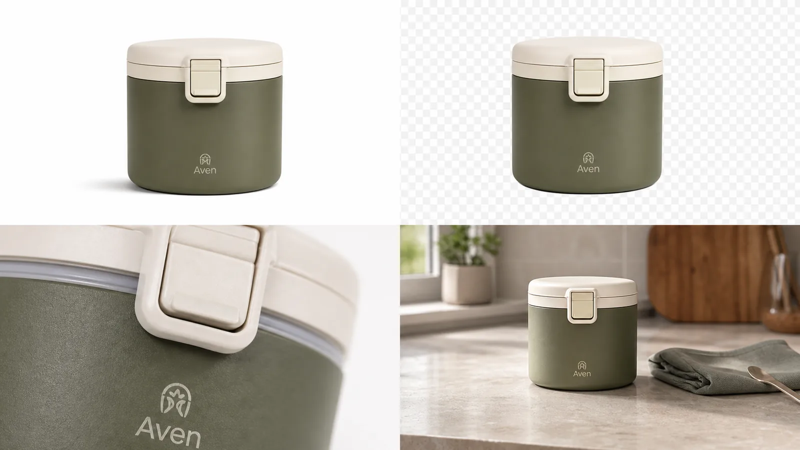 *KrafLayer demonstration composite. The four panels represent separate deliverables, not four filters: factual main view, reusable cutout, detail evidence, and lifestyle context.*
## Which Edit Should You Use First?
Google explicitly mentions increasing resolution, removing backgrounds, and generating scenes as separate Product Studio operations. Treating them separately makes the result easier to inspect and undo ([Google Merchant Center](https://support.google.com/merchants/answer/6324350?hl=en), 2026).
| Visible defect | First operation | Review risk | Avoid when |
|---|---|---|---|
| Messy background | Background remover | Clipped edges and halos | Product is also damaged or badly blurred |
| Dust, cable, prop, spot | Object eraser | Invented fill touching the SKU | Object hides a factual product feature |
| One glare or local blemish | Masked/local edit | Boundary mismatch | Whole image needs relighting |
| Small but sharp source | Upscaler | Invented text and texture | Original label is unreadable |
| Correct item, wrong scene | Background replacer | Light, scale, reflection, contact | Main image must remain plain |
| Missing campaign composition | Reference or scene editor | Product drift | No reliable product source exists |
Do cleanup before generation. A clean cutout is reusable; a fully generated lifestyle image is a branch, not a new master.
## What Is a Reliable Browser Editing Workflow?
Shopify accepts product images up to 5000 × 5000 pixels or 25 megapixels, under 20 MB, and says 2048 × 2048 usually displays best for square images. Those limits support a master-and-export workflow rather than repeated editing of already compressed listing files ([Shopify Help Center](https://help.shopify.com/en/manual/products/product-media/product-media-types), 2026).
1. **Save the source unchanged.** Use the largest original capture, not a downloaded marketplace thumbnail.
2. **Name the defect.** Write one sentence: “Remove the gray sweep without changing the transparent handle.”
3. **Choose one operation.** Use the [background remover](/tools/ai-background-remover), [object eraser](/tools/ai-object-eraser), [upscaler](/tools/ai-image-upscaler), or [background replacer](/tools/ai-background-replacer) that matches it.
4. **Inspect the first output at 100%.** Check silhouette, text, material, and components before more edits.
5. **Save a clean intermediate.** Keep the transparent cutout or corrected master.
6. **Create role-specific branches.** White main image, detail crop, and lifestyle image should be separate files.
7. **Crop and resize for the destination.** Do not make every channel consume one compromised export.
8. **Run a final side-by-side review.** Source on the left, export on the right, same zoom.
> **Start with the defect you can point to**
>
> Open the [KrafLayer Product Photo Editor](/product-photo-editor), choose one editing route, and keep the original visible during review. A smaller first edit is easier to trust and easier to undo.
## How Should You Manage Files and Exports?
Etsy recommends listing images at least 2000 pixels wide and high, while eBay requires at least 500 × 500 and recommends about 1600 × 1600. A single “final.jpg” cannot document which channel, crop, or revision it represents ([Etsy Help](https://help.etsy.com/hc/en-us/articles/115015663347-Requirements-and-Best-Practices-for-Images-in-Your-Etsy-Shop); [eBay Help](https://www.ebay.com/help/selling/listings/adding-pictures-listings?id=4148), 2026).
Use filenames that expose the chain:
`sku-angle-role-channel-size-version.ext`
For example: `KL-104-front-main-google-1500-v03.jpg`. Keep the source, transparent master, edited master, and channel exports in separate folders or status fields. The naming work prevents a low-resolution export from becoming next month's source.
| File stage | Preferred purpose | Do not use as |
|---|---|---|
| Original capture | Factual archive | Public file if it still contains setup clutter |
| Transparent master | Recomposition and layout | Etsy upload without flattening |
| Corrected master | High-resolution editing base | Permanent overwrite of the original |
| Channel export | Upload-ready crop and compression | Future generation reference if a better master exists |
## What Should You Check at Full Resolution?
Google requires the correct color, pattern, and material for each variant. Full-resolution review should therefore focus on product facts, while normal-size review handles composition and thumbnail review handles hierarchy ([Google Merchant Center](https://support.google.com/merchants/answer/6324350?hl=en), 2026).
- **Silhouette:** no missing straps, handles, corners, fibers, or transparent edges.
- **Text:** labels, warnings, logos, and numbers match the source exactly.
- **Material:** grain, weave, gloss, glass, and metal remain physically credible.
- **Components:** caps, ports, seams, fasteners, and included items do not multiply or vanish.
- **Color:** the correct variant survives white balance and background spill.
- **Contact:** shadow and reflection make sense in the final scene.
- **Crop:** nothing important is clipped, and product fill fits the channel.
*Published demonstration. Thin geometry such as the spout, lid, handle attachment, and front mark reveals edit damage earlier than the background does.*
## How Do Channel Requirements Change the Export?
Google recommends around 1500 × 1500 or larger and will require a 500 × 500 minimum from January 31, 2027. Shopify usually recommends 2048 × 2048 for square product images. Etsy recommends 2000 pixels in both dimensions and turns transparency black ([Google](https://support.google.com/merchants/answer/6324350?hl=en); [Shopify](https://help.shopify.com/en/manual/products/product-media/product-media-types); [Etsy](https://help.etsy.com/hc/en-us/articles/115015663347-Requirements-and-Best-Practices-for-Images-in-Your-Etsy-Shop), 2026).
| Destination | Practical starting export | Special check |
|---|---|---|
| Google Merchant Center | 1500 × 1500 or larger when source allows | 75%–90% product fill, no overlays |
| Shopify | 2048 × 2048 square for common catalog use | Consistent aspect ratios across collection |
| Etsy | At least 2000 × 2000 | Flatten transparency and protect first-image crop |
| eBay | Around 1600 × 1600 | Neutral background, multiple angles, honest flaws |
These are working targets derived from platform help pages, not guarantees for every category. Check current category-specific policy before a bulk upload.
## When Is Editing the Wrong Fix?
Editing is the wrong fix when the source lacks evidence. Reshoot an unreadable label, a hidden connector, a cropped silhouette, uncontrolled motion blur, false variant color, or glare that covers the construction. An upscaler can invent plausible texture, but plausible detail is not factual detail.
Also reshoot when the seller needs a new angle. A front photograph cannot reliably establish the back, depth, or underside. Reference generation is useful for concepts and secondary scenes, but a factual marketplace view should come from a source that actually shows the product.
## Verdict
An online editor becomes reliable when every edit has a named defect, an untouched source, and a review checkpoint. Keep the transparent or corrected master separate from channel exports. Generate new scenes only as branches after the factual product asset is clean.
## Frequently Asked Questions
### What is an online product photo editor?
It is a browser-based tool for tasks such as background removal, object cleanup, local correction, upscaling, and scene replacement. For ecommerce, its value depends on whether the output preserves the exact SKU and can be exported to the target channel's requirements.
### Which product photo edit should I do first?
Start with the narrowest operation that fixes the visible defect. Remove a background before generating a scene, erase one distraction before relighting the whole photo, and restore or reshoot a weak source before upscaling it. Save a clean intermediate after each useful stage.
### Can a browser editor replace Photoshop for ecommerce?
It can handle many repeatable catalog jobs, especially cutouts, cleanup, resizing, and simple scene replacement. Complex transparent materials, regulated labels, difficult reflections, precise compositing, and pixel-level retouching may still need manual tools or a reshoot.
### Should I export transparent PNG or white JPEG?
Keep a transparent PNG as the reusable master when the cutout is clean. Export a flattened white or channel-specific file for publishing. Etsy turns transparency black, so a transparent upload can look very different from the editor preview.
### Can AI upscaling make a small product image accurate?
It can improve apparent resolution, but it cannot verify hidden or unreadable facts. If the source does not show label text, weave, serial number, or product edges clearly, find a better source or reshoot. Never treat generated detail as product documentation.
## References
1. [Google Merchant Center: Image link requirements](https://support.google.com/merchants/answer/6324350?hl=en), accessed August 11, 2026.
2. [Shopify Help Center: Product media types](https://help.shopify.com/en/manual/products/product-media/product-media-types), accessed August 11, 2026.
3. [Etsy Help: Image requirements and best practices](https://help.etsy.com/hc/en-us/articles/115015663347-Requirements-and-Best-Practices-for-Images-in-Your-Etsy-Shop), accessed August 11, 2026.
4. [eBay Help: Adding pictures to listings](https://www.ebay.com/help/selling/listings/adding-pictures-listings?id=4148), accessed August 11, 2026.
# Free AI Product Image Generators: Limits to Check
URL: https://kraflayer.com/blog/free-ai-product-image-generator-ecommerce-limits
Summary: Compare free AI product image generators with one test pack, then check fidelity, resolution, export terms, editing control, volume, and true approved-asset cost.
Updated: 2026-08-22
Use a free AI product image generator to test workflow fit, not to assume unlimited production. Compare tools with the same SKU and image roles, then measure product fidelity, export quality, usage terms, editing control, volume, and approval rate.
A free AI product image generator is useful for testing whether AI can keep your product recognizable while creating better ecommerce visuals. If your search is "ai product image generator free," the practical rule is: use the free stage to test product accuracy, image roles, and workflow fit, not to assume unlimited commercial production. Free output should help you decide whether the tool can preserve the real product before you create a larger image set.
In KrafLayer, the [AI product image generator](/ai-product-image-generator) is the next step when you want to turn one product reference into listing images, lifestyle scenes, detail images, and ad-ready crops. If you are comparing free tools, judge them by product truth first: shape, color, material, scale, label area, cord, switch, hardware, and other buyer-visible details should remain stable.
*KrafLayer demonstration composite. The four panels represent separate deliverables, not four filters: factual main view, reusable cutout, detail evidence, and lifestyle context.*
## Which Edit Should You Use First?
Google explicitly mentions increasing resolution, removing backgrounds, and generating scenes as separate Product Studio operations. Treating them separately makes the result easier to inspect and undo ([Google Merchant Center](https://support.google.com/merchants/answer/6324350?hl=en), 2026).
| Visible defect | First operation | Review risk | Avoid when |
|---|---|---|---|
| Messy background | Background remover | Clipped edges and halos | Product is also damaged or badly blurred |
| Dust, cable, prop, spot | Object eraser | Invented fill touching the SKU | Object hides a factual product feature |
| One glare or local blemish | Masked/local edit | Boundary mismatch | Whole image needs relighting |
| Small but sharp source | Upscaler | Invented text and texture | Original label is unreadable |
| Correct item, wrong scene | Background replacer | Light, scale, reflection, contact | Main image must remain plain |
| Missing campaign composition | Reference or scene editor | Product drift | No reliable product source exists |
Do cleanup before generation. A clean cutout is reusable; a fully generated lifestyle image is a branch, not a new master.
## What Is a Reliable Browser Editing Workflow?
Shopify accepts product images up to 5000 × 5000 pixels or 25 megapixels, under 20 MB, and says 2048 × 2048 usually displays best for square images. Those limits support a master-and-export workflow rather than repeated editing of already compressed listing files ([Shopify Help Center](https://help.shopify.com/en/manual/products/product-media/product-media-types), 2026).
1. **Save the source unchanged.** Use the largest original capture, not a downloaded marketplace thumbnail.
2. **Name the defect.** Write one sentence: “Remove the gray sweep without changing the transparent handle.”
3. **Choose one operation.** Use the [background remover](/tools/ai-background-remover), [object eraser](/tools/ai-object-eraser), [upscaler](/tools/ai-image-upscaler), or [background replacer](/tools/ai-background-replacer) that matches it.
4. **Inspect the first output at 100%.** Check silhouette, text, material, and components before more edits.
5. **Save a clean intermediate.** Keep the transparent cutout or corrected master.
6. **Create role-specific branches.** White main image, detail crop, and lifestyle image should be separate files.
7. **Crop and resize for the destination.** Do not make every channel consume one compromised export.
8. **Run a final side-by-side review.** Source on the left, export on the right, same zoom.
> **Start with the defect you can point to**
>
> Open the [KrafLayer Product Photo Editor](/product-photo-editor), choose one editing route, and keep the original visible during review. A smaller first edit is easier to trust and easier to undo.
## How Should You Manage Files and Exports?
Etsy recommends listing images at least 2000 pixels wide and high, while eBay requires at least 500 × 500 and recommends about 1600 × 1600. A single “final.jpg” cannot document which channel, crop, or revision it represents ([Etsy Help](https://help.etsy.com/hc/en-us/articles/115015663347-Requirements-and-Best-Practices-for-Images-in-Your-Etsy-Shop); [eBay Help](https://www.ebay.com/help/selling/listings/adding-pictures-listings?id=4148), 2026).
Use filenames that expose the chain:
`sku-angle-role-channel-size-version.ext`
For example: `KL-104-front-main-google-1500-v03.jpg`. Keep the source, transparent master, edited master, and channel exports in separate folders or status fields. The naming work prevents a low-resolution export from becoming next month's source.
| File stage | Preferred purpose | Do not use as |
|---|---|---|
| Original capture | Factual archive | Public file if it still contains setup clutter |
| Transparent master | Recomposition and layout | Etsy upload without flattening |
| Corrected master | High-resolution editing base | Permanent overwrite of the original |
| Channel export | Upload-ready crop and compression | Future generation reference if a better master exists |
## What Should You Check at Full Resolution?
Google requires the correct color, pattern, and material for each variant. Full-resolution review should therefore focus on product facts, while normal-size review handles composition and thumbnail review handles hierarchy ([Google Merchant Center](https://support.google.com/merchants/answer/6324350?hl=en), 2026).
- **Silhouette:** no missing straps, handles, corners, fibers, or transparent edges.
- **Text:** labels, warnings, logos, and numbers match the source exactly.
- **Material:** grain, weave, gloss, glass, and metal remain physically credible.
- **Components:** caps, ports, seams, fasteners, and included items do not multiply or vanish.
- **Color:** the correct variant survives white balance and background spill.
- **Contact:** shadow and reflection make sense in the final scene.
- **Crop:** nothing important is clipped, and product fill fits the channel.
*Published demonstration. Thin geometry such as the spout, lid, handle attachment, and front mark reveals edit damage earlier than the background does.*
## How Do Channel Requirements Change the Export?
Google recommends around 1500 × 1500 or larger and will require a 500 × 500 minimum from January 31, 2027. Shopify usually recommends 2048 × 2048 for square product images. Etsy recommends 2000 pixels in both dimensions and turns transparency black ([Google](https://support.google.com/merchants/answer/6324350?hl=en); [Shopify](https://help.shopify.com/en/manual/products/product-media/product-media-types); [Etsy](https://help.etsy.com/hc/en-us/articles/115015663347-Requirements-and-Best-Practices-for-Images-in-Your-Etsy-Shop), 2026).
| Destination | Practical starting export | Special check |
|---|---|---|
| Google Merchant Center | 1500 × 1500 or larger when source allows | 75%–90% product fill, no overlays |
| Shopify | 2048 × 2048 square for common catalog use | Consistent aspect ratios across collection |
| Etsy | At least 2000 × 2000 | Flatten transparency and protect first-image crop |
| eBay | Around 1600 × 1600 | Neutral background, multiple angles, honest flaws |
These are working targets derived from platform help pages, not guarantees for every category. Check current category-specific policy before a bulk upload.
## When Is Editing the Wrong Fix?
Editing is the wrong fix when the source lacks evidence. Reshoot an unreadable label, a hidden connector, a cropped silhouette, uncontrolled motion blur, false variant color, or glare that covers the construction. An upscaler can invent plausible texture, but plausible detail is not factual detail.
Also reshoot when the seller needs a new angle. A front photograph cannot reliably establish the back, depth, or underside. Reference generation is useful for concepts and secondary scenes, but a factual marketplace view should come from a source that actually shows the product.
## Verdict
An online editor becomes reliable when every edit has a named defect, an untouched source, and a review checkpoint. Keep the transparent or corrected master separate from channel exports. Generate new scenes only as branches after the factual product asset is clean.
## Frequently Asked Questions
### What is an online product photo editor?
It is a browser-based tool for tasks such as background removal, object cleanup, local correction, upscaling, and scene replacement. For ecommerce, its value depends on whether the output preserves the exact SKU and can be exported to the target channel's requirements.
### Which product photo edit should I do first?
Start with the narrowest operation that fixes the visible defect. Remove a background before generating a scene, erase one distraction before relighting the whole photo, and restore or reshoot a weak source before upscaling it. Save a clean intermediate after each useful stage.
### Can a browser editor replace Photoshop for ecommerce?
It can handle many repeatable catalog jobs, especially cutouts, cleanup, resizing, and simple scene replacement. Complex transparent materials, regulated labels, difficult reflections, precise compositing, and pixel-level retouching may still need manual tools or a reshoot.
### Should I export transparent PNG or white JPEG?
Keep a transparent PNG as the reusable master when the cutout is clean. Export a flattened white or channel-specific file for publishing. Etsy turns transparency black, so a transparent upload can look very different from the editor preview.
### Can AI upscaling make a small product image accurate?
It can improve apparent resolution, but it cannot verify hidden or unreadable facts. If the source does not show label text, weave, serial number, or product edges clearly, find a better source or reshoot. Never treat generated detail as product documentation.
## References
1. [Google Merchant Center: Image link requirements](https://support.google.com/merchants/answer/6324350?hl=en), accessed August 11, 2026.
2. [Shopify Help Center: Product media types](https://help.shopify.com/en/manual/products/product-media/product-media-types), accessed August 11, 2026.
3. [Etsy Help: Image requirements and best practices](https://help.etsy.com/hc/en-us/articles/115015663347-Requirements-and-Best-Practices-for-Images-in-Your-Etsy-Shop), accessed August 11, 2026.
4. [eBay Help: Adding pictures to listings](https://www.ebay.com/help/selling/listings/adding-pictures-listings?id=4148), accessed August 11, 2026.
# Free AI Product Image Generators: Limits to Check
URL: https://kraflayer.com/blog/free-ai-product-image-generator-ecommerce-limits
Summary: Compare free AI product image generators with one test pack, then check fidelity, resolution, export terms, editing control, volume, and true approved-asset cost.
Updated: 2026-08-22
Use a free AI product image generator to test workflow fit, not to assume unlimited production. Compare tools with the same SKU and image roles, then measure product fidelity, export quality, usage terms, editing control, volume, and approval rate.
A free AI product image generator is useful for testing whether AI can keep your product recognizable while creating better ecommerce visuals. If your search is "ai product image generator free," the practical rule is: use the free stage to test product accuracy, image roles, and workflow fit, not to assume unlimited commercial production. Free output should help you decide whether the tool can preserve the real product before you create a larger image set.
In KrafLayer, the [AI product image generator](/ai-product-image-generator) is the next step when you want to turn one product reference into listing images, lifestyle scenes, detail images, and ad-ready crops. If you are comparing free tools, judge them by product truth first: shape, color, material, scale, label area, cord, switch, hardware, and other buyer-visible details should remain stable.
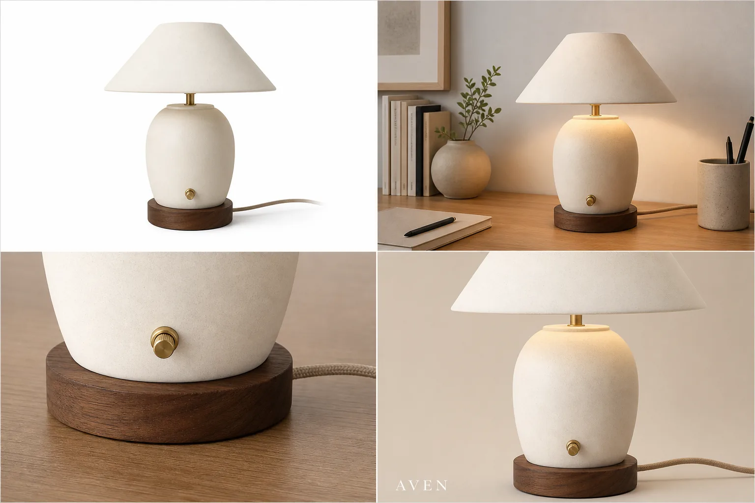 ## What A Free AI Product Image Generator Should Prove
A free AI product image generator should answer one question before anything else: can it create a useful ecommerce image without changing the product being sold?
For the Aven ceramic desk lamp example above, the protected details are the cream ceramic shade, rounded lamp body, walnut base, brass switch, fabric cord, warm desk-light behavior, and compact tabletop scale. The background can change. The product should not become a different lamp, lose its cord, gain fake controls, or turn into a generic decor object.
Use free generation to test:
- whether the product stays recognizable across image roles
- whether the main image is clean enough for a product page
- whether lifestyle scenes keep the product dominant
- whether detail crops show real material or feature information
- whether ad-style crops still protect the product facts
- whether the workflow is fast enough for your store or catalog process
If the free output fails those checks, more credits or a bigger plan will not fix the underlying workflow problem by itself.
## Where Free Tools Usually Have Limits
Free product image generator for ecommerce searches often hide a tradeoff. A free tier may be enough for testing, but it may not be enough for a publish-ready catalog workflow.
Watch for these limits:
- limited generation credits or trial runs
- lower output resolution
- watermarked exports
- fewer editing controls
- no batch workflow for multiple SKUs
- weaker product-reference control
- restricted commercial or team usage terms
- missing cleanup tools for shadows, glare, background, crop, or detail correction
Do not plan a launch around unlimited free usage unless the provider states it clearly in current terms. For ecommerce, the better question is whether the free test proves the tool can create accurate product assets worth scaling.
## Review The Free Output Like A Seller
Review each image as if it were going onto a Shopify product page, marketplace listing, landing page, email, or paid ad.
Check the visible product facts:
- silhouette and size
- true color and material texture
- label, logo, or monogram placement
- ports, cords, switches, caps, lids, handles, zippers, seams, or hardware
- contact shadow and product scale
- included accessories
- any generated text, claim, badge, rating, or certification
A free AI product image generator can create a beautiful image that is still wrong for ecommerce. If the generated output changes what the buyer expects to receive, treat it as a rejected draft.
## Test One Image Role At A Time
The fastest way to compare an ecommerce product image generator is to test one product across a few image roles.
Start with:
- Main image: clean product-first image with full silhouette and natural shadow.
- Lifestyle scene: believable setting where the product remains the subject.
- Detail image: close crop of one feature buyers care about.
- Ad crop: stronger composition for social or paid creative, without fake platform UI.
This test is more useful than asking for one dramatic hero image. It shows whether the tool can support the real jobs inside [ecommerce product photography](/ecommerce-product-photography): recognition, context, proof, and attention.
## Prompt Template For A Free Trial Test
Use a prompt that makes the trial measurable:
> Create a realistic ecommerce product image from this product reference. Keep the same product type, silhouette, color, material, scale, cord, switch, base, and all visible details. Create a [main listing image / lifestyle scene / close detail crop / ad-style crop] for an online store. Use clean commercial lighting and make the product the clear subject. Do not add fake badges, review stars, marketplace UI, discounts, certifications, barcodes, QR codes, unreadable label text, or unsupported claims.
For a second run, change only the image role. If the product changes between roles, the tool may be risky for catalog work even if the first image looked good.
## When To Move Beyond The Free Stage
Move beyond a free test when the tool proves three things: the product stays accurate, the output matches real selling roles, and the workflow gives you enough control to fix small issues.
That is where KrafLayer fits. Use [AI product photography](/ai-product-photography) workflows to plan the image set, generate product-led scenes with the AI product image generator, and use the [product photo editor](/product-photo-editor) when an otherwise good image needs cleanup. Editing is often safer than regenerating when the product is already accurate and only the crop, glare, background, or shadow needs work.
For a real store, the useful outcome is not one free image. It is a repeatable process for creating main images, detail images, lifestyle images, and ad creatives while protecting the product buyers will receive.
## Compare free tools with the same test pack
Free plans change, so compare workflows rather than marketing labels. As of August 2026, Photoroom describes its Free Space as limited in features, AI credits, and monthly exports, while paid plans add advanced tools, higher allowances, batch export, and high-resolution export ([Photoroom plans](https://help.photoroom.com/en/articles/6976012-what-are-photoroom-s-plans), 2026). Adobe Express lists a free plan with photo tools and limited generative access, and Pixelcut offers a free online AI product-photography entry point ([Adobe Express pricing](https://www.adobe.com/express/pricing); [Pixelcut AI product photos](https://www.pixelcut.ai/ai-product-photos), 2026).
Use one product and the same four requested outputs across every tool. Do not compare a polished template from one service with an unedited first generation from another.
| Test | What to record | Hard failure |
|---|---|---|
| Product fidelity | Shape, material, color, hardware, label | SKU changes |
| Output resolution | Downloaded pixel dimensions | Too small for intended placement |
| Export terms | Watermark and allowed use | Unclear or incompatible permission |
| Editing control | Mask, regenerate, background, crop | Only full-image retries |
| Volume | Credits, exports, queue limits | Cannot complete the planned set |
| Workflow | Batch, naming, history, team review | Manual process creates mapping risk |
Take a screenshot or note the plan terms on the test date. Recheck them before a campaign because free allowances, model access, and commercial-use conditions can change.
## Calculate cost per approved asset, not per generation
A free generation is not free operationally when it takes ten retries and manual cleanup. Track:
```text
approved asset cost = generation charges + editing time + review time + failed-output time
```
Measure how many attempts produce an asset that passes your product-truth checklist. Also record whether you can repair a local flaw or must regenerate the entire scene. A tool with fewer included generations can be more economical when it preserves the SKU and supports local edits.
## Check four limits before commercial use
Read the provider's current terms and product page for:
1. **Commercial use:** confirm whether free-plan outputs may be used in store listings and paid ads.
2. **Watermarks and provenance:** identify visible marks, invisible labels, or metadata requirements.
3. **Data handling:** understand whether uploaded product photos can be retained or used to improve models.
4. **Model and asset rights:** confirm that your source photos, logos, packaging, and generated context are lawful to use.
Do not treat a landing-page word such as “free” as a license. Save the relevant terms with the date and ask qualified counsel when the campaign carries meaningful legal risk.
## Use KrafLayer's free stage as an acceptance test
KrafLayer offers free sign-up credits so a seller can test image and video workflows before upgrading. The current source of truth is the [KrafLayer pricing page](/pricing), because credit costs and plan allowances can change.
Spend the test credits on one difficult, representative SKU rather than several easy products. Create a factual main image, a lifestyle scene, a detail proof image, and one channel crop. Then use a local edit on the best result. If the tool cannot preserve the product through those roles, it is not ready for a catalog rollout.
## Decide when the free test is complete
Move to production only when you have:
- an approved product evidence pack;
- a repeatable prompt or edit route for each image role;
- a measured approval rate;
- known output dimensions and file formats;
- confirmed usage terms;
- a naming and SKU-mapping process;
- a realistic credit and review budget.
The purpose of the free stage is a confident go or no-go decision. It should expose limitations before the store depends on the workflow.
## FAQ
### Is there a free AI product image generator for ecommerce?
Many AI product image tools offer free trials, free credits, or free-to-start testing. Use that stage to evaluate product accuracy, output quality, editing controls, and export limits. Do not assume unlimited free generation unless the current provider terms clearly say so.
### What should I test in a free AI product image generator?
Test one real product across a main image, lifestyle scene, detail crop, and ad-style crop. Check whether the product shape, color, material, scale, label area, cord, switch, hardware, and other buyer-visible details stay consistent across every output.
### Can free AI product images be used in an online store?
They can be useful if the image is accurate, high enough resolution, unwatermarked, and allowed by the tool terms for your use case. Review the image like a seller before publishing. If it changes the SKU or adds unsupported claims, do not use it as a final product image.
### What is the difference between a free generator and a paid product image workflow?
A free generator is best for testing fit. A paid or full workflow should give you enough output quality, control, editing, asset volume, and review confidence to create repeatable ecommerce images for multiple SKUs, campaigns, or store pages.
### How does KrafLayer help after the free test?
KrafLayer helps turn a promising test into a product-image workflow: generate image roles from a product reference, build main and detail images, create lifestyle or ad crops, then edit weak areas without restarting the entire asset. That matters when a store needs consistent product visuals, not one isolated demo image.
## Conclusion
A free AI product image generator is best used as a product-truth test: does the image keep the real item recognizable while creating a better ecommerce visual? KrafLayer helps sellers move from that test into a repeatable AI product image generator workflow for main images, lifestyle scenes, detail images, and ad creatives. The advantage is not unlimited free output; it is learning quickly whether AI can produce product visuals worth scaling while keeping shape, material, scale, and selling details consistent.
# Product Image Background Remover for Listings, Stores, and Ads
URL: https://kraflayer.com/blog/product-image-background-remover-listings-stores-ads
Summary: Use a product image background remover to create transparent cutouts, white-background listing images, store assets, and ad crops without changing the SKU.
Updated: 2026-07-02
A product image background remover should do one job first: separate the product from the original scene without changing what a buyer needs to recognize. Once the cutout is accurate, you can reuse it for a white-background listing image, a Shopify product page, a marketplace draft, or an ad crop.
In KrafLayer, the [AI background remover](/tools/ai-background-remover) is a one-click Remove BG workflow. Upload the source photo, remove background from product image files without hand tracing, generate a transparent PNG product image, inspect the edge, and then decide which final image role the cutout should support.
## What A Free AI Product Image Generator Should Prove
A free AI product image generator should answer one question before anything else: can it create a useful ecommerce image without changing the product being sold?
For the Aven ceramic desk lamp example above, the protected details are the cream ceramic shade, rounded lamp body, walnut base, brass switch, fabric cord, warm desk-light behavior, and compact tabletop scale. The background can change. The product should not become a different lamp, lose its cord, gain fake controls, or turn into a generic decor object.
Use free generation to test:
- whether the product stays recognizable across image roles
- whether the main image is clean enough for a product page
- whether lifestyle scenes keep the product dominant
- whether detail crops show real material or feature information
- whether ad-style crops still protect the product facts
- whether the workflow is fast enough for your store or catalog process
If the free output fails those checks, more credits or a bigger plan will not fix the underlying workflow problem by itself.
## Where Free Tools Usually Have Limits
Free product image generator for ecommerce searches often hide a tradeoff. A free tier may be enough for testing, but it may not be enough for a publish-ready catalog workflow.
Watch for these limits:
- limited generation credits or trial runs
- lower output resolution
- watermarked exports
- fewer editing controls
- no batch workflow for multiple SKUs
- weaker product-reference control
- restricted commercial or team usage terms
- missing cleanup tools for shadows, glare, background, crop, or detail correction
Do not plan a launch around unlimited free usage unless the provider states it clearly in current terms. For ecommerce, the better question is whether the free test proves the tool can create accurate product assets worth scaling.
## Review The Free Output Like A Seller
Review each image as if it were going onto a Shopify product page, marketplace listing, landing page, email, or paid ad.
Check the visible product facts:
- silhouette and size
- true color and material texture
- label, logo, or monogram placement
- ports, cords, switches, caps, lids, handles, zippers, seams, or hardware
- contact shadow and product scale
- included accessories
- any generated text, claim, badge, rating, or certification
A free AI product image generator can create a beautiful image that is still wrong for ecommerce. If the generated output changes what the buyer expects to receive, treat it as a rejected draft.
## Test One Image Role At A Time
The fastest way to compare an ecommerce product image generator is to test one product across a few image roles.
Start with:
- Main image: clean product-first image with full silhouette and natural shadow.
- Lifestyle scene: believable setting where the product remains the subject.
- Detail image: close crop of one feature buyers care about.
- Ad crop: stronger composition for social or paid creative, without fake platform UI.
This test is more useful than asking for one dramatic hero image. It shows whether the tool can support the real jobs inside [ecommerce product photography](/ecommerce-product-photography): recognition, context, proof, and attention.
## Prompt Template For A Free Trial Test
Use a prompt that makes the trial measurable:
> Create a realistic ecommerce product image from this product reference. Keep the same product type, silhouette, color, material, scale, cord, switch, base, and all visible details. Create a [main listing image / lifestyle scene / close detail crop / ad-style crop] for an online store. Use clean commercial lighting and make the product the clear subject. Do not add fake badges, review stars, marketplace UI, discounts, certifications, barcodes, QR codes, unreadable label text, or unsupported claims.
For a second run, change only the image role. If the product changes between roles, the tool may be risky for catalog work even if the first image looked good.
## When To Move Beyond The Free Stage
Move beyond a free test when the tool proves three things: the product stays accurate, the output matches real selling roles, and the workflow gives you enough control to fix small issues.
That is where KrafLayer fits. Use [AI product photography](/ai-product-photography) workflows to plan the image set, generate product-led scenes with the AI product image generator, and use the [product photo editor](/product-photo-editor) when an otherwise good image needs cleanup. Editing is often safer than regenerating when the product is already accurate and only the crop, glare, background, or shadow needs work.
For a real store, the useful outcome is not one free image. It is a repeatable process for creating main images, detail images, lifestyle images, and ad creatives while protecting the product buyers will receive.
## Compare free tools with the same test pack
Free plans change, so compare workflows rather than marketing labels. As of August 2026, Photoroom describes its Free Space as limited in features, AI credits, and monthly exports, while paid plans add advanced tools, higher allowances, batch export, and high-resolution export ([Photoroom plans](https://help.photoroom.com/en/articles/6976012-what-are-photoroom-s-plans), 2026). Adobe Express lists a free plan with photo tools and limited generative access, and Pixelcut offers a free online AI product-photography entry point ([Adobe Express pricing](https://www.adobe.com/express/pricing); [Pixelcut AI product photos](https://www.pixelcut.ai/ai-product-photos), 2026).
Use one product and the same four requested outputs across every tool. Do not compare a polished template from one service with an unedited first generation from another.
| Test | What to record | Hard failure |
|---|---|---|
| Product fidelity | Shape, material, color, hardware, label | SKU changes |
| Output resolution | Downloaded pixel dimensions | Too small for intended placement |
| Export terms | Watermark and allowed use | Unclear or incompatible permission |
| Editing control | Mask, regenerate, background, crop | Only full-image retries |
| Volume | Credits, exports, queue limits | Cannot complete the planned set |
| Workflow | Batch, naming, history, team review | Manual process creates mapping risk |
Take a screenshot or note the plan terms on the test date. Recheck them before a campaign because free allowances, model access, and commercial-use conditions can change.
## Calculate cost per approved asset, not per generation
A free generation is not free operationally when it takes ten retries and manual cleanup. Track:
```text
approved asset cost = generation charges + editing time + review time + failed-output time
```
Measure how many attempts produce an asset that passes your product-truth checklist. Also record whether you can repair a local flaw or must regenerate the entire scene. A tool with fewer included generations can be more economical when it preserves the SKU and supports local edits.
## Check four limits before commercial use
Read the provider's current terms and product page for:
1. **Commercial use:** confirm whether free-plan outputs may be used in store listings and paid ads.
2. **Watermarks and provenance:** identify visible marks, invisible labels, or metadata requirements.
3. **Data handling:** understand whether uploaded product photos can be retained or used to improve models.
4. **Model and asset rights:** confirm that your source photos, logos, packaging, and generated context are lawful to use.
Do not treat a landing-page word such as “free” as a license. Save the relevant terms with the date and ask qualified counsel when the campaign carries meaningful legal risk.
## Use KrafLayer's free stage as an acceptance test
KrafLayer offers free sign-up credits so a seller can test image and video workflows before upgrading. The current source of truth is the [KrafLayer pricing page](/pricing), because credit costs and plan allowances can change.
Spend the test credits on one difficult, representative SKU rather than several easy products. Create a factual main image, a lifestyle scene, a detail proof image, and one channel crop. Then use a local edit on the best result. If the tool cannot preserve the product through those roles, it is not ready for a catalog rollout.
## Decide when the free test is complete
Move to production only when you have:
- an approved product evidence pack;
- a repeatable prompt or edit route for each image role;
- a measured approval rate;
- known output dimensions and file formats;
- confirmed usage terms;
- a naming and SKU-mapping process;
- a realistic credit and review budget.
The purpose of the free stage is a confident go or no-go decision. It should expose limitations before the store depends on the workflow.
## FAQ
### Is there a free AI product image generator for ecommerce?
Many AI product image tools offer free trials, free credits, or free-to-start testing. Use that stage to evaluate product accuracy, output quality, editing controls, and export limits. Do not assume unlimited free generation unless the current provider terms clearly say so.
### What should I test in a free AI product image generator?
Test one real product across a main image, lifestyle scene, detail crop, and ad-style crop. Check whether the product shape, color, material, scale, label area, cord, switch, hardware, and other buyer-visible details stay consistent across every output.
### Can free AI product images be used in an online store?
They can be useful if the image is accurate, high enough resolution, unwatermarked, and allowed by the tool terms for your use case. Review the image like a seller before publishing. If it changes the SKU or adds unsupported claims, do not use it as a final product image.
### What is the difference between a free generator and a paid product image workflow?
A free generator is best for testing fit. A paid or full workflow should give you enough output quality, control, editing, asset volume, and review confidence to create repeatable ecommerce images for multiple SKUs, campaigns, or store pages.
### How does KrafLayer help after the free test?
KrafLayer helps turn a promising test into a product-image workflow: generate image roles from a product reference, build main and detail images, create lifestyle or ad crops, then edit weak areas without restarting the entire asset. That matters when a store needs consistent product visuals, not one isolated demo image.
## Conclusion
A free AI product image generator is best used as a product-truth test: does the image keep the real item recognizable while creating a better ecommerce visual? KrafLayer helps sellers move from that test into a repeatable AI product image generator workflow for main images, lifestyle scenes, detail images, and ad creatives. The advantage is not unlimited free output; it is learning quickly whether AI can produce product visuals worth scaling while keeping shape, material, scale, and selling details consistent.
# Product Image Background Remover for Listings, Stores, and Ads
URL: https://kraflayer.com/blog/product-image-background-remover-listings-stores-ads
Summary: Use a product image background remover to create transparent cutouts, white-background listing images, store assets, and ad crops without changing the SKU.
Updated: 2026-07-02
A product image background remover should do one job first: separate the product from the original scene without changing what a buyer needs to recognize. Once the cutout is accurate, you can reuse it for a white-background listing image, a Shopify product page, a marketplace draft, or an ad crop.
In KrafLayer, the [AI background remover](/tools/ai-background-remover) is a one-click Remove BG workflow. Upload the source photo, remove background from product image files without hand tracing, generate a transparent PNG product image, inspect the edge, and then decide which final image role the cutout should support.
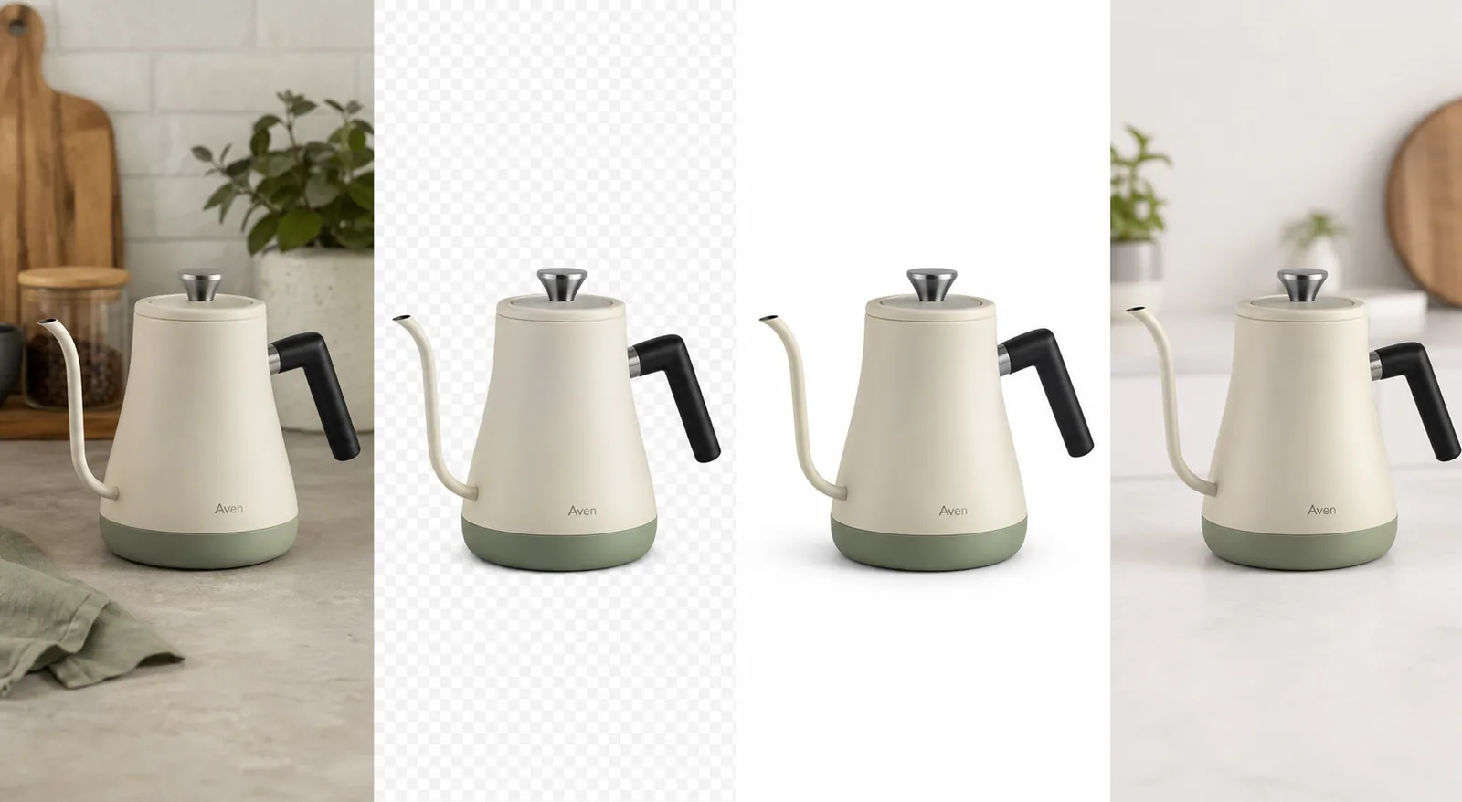 ## Product Image Background Remover Decision Rule
Use a background remover when the product is already correct and the environment is the problem. It is the right tool when the source photo has a messy counter, colored wall, warehouse floor, table clutter, inconsistent lighting background, or a scene that does not fit the final channel.
Do not use background removal to fix a product that is wrong. If the kettle spout is bent, the handle shape is incorrect, the colorway is off, or the label moved, isolating the product will only make a cleaner version of the wrong asset.
For the Aven kettle example, the protected product facts are:
- matte cream body with sage lower band
- slim gooseneck spout
- short black handle
- brushed steel lid knob
- small invented Aven mark
- upright scale and soft ceramic finish
- natural shadow logic under the base
That list is the approval standard. A good product background remover removes the scene, not the product truth.
## Listings, Stores, And Ads Need Different Outputs
The same product image cutout can support several ecommerce assets, but each role has a different job:
- Listing main image: center the product, keep the crop clean, and use white or near-white when the channel expects a simple main image.
- Store product page image: keep the product large enough to inspect, with consistent ratio across the gallery.
- Collection thumbnail: use the transparent PNG product image to keep grid images aligned and easy to compare.
- Ad crop: place the cutout in a tighter frame or simple scene, but keep product identity unchanged.
- Detail image: use the cutout as the main reference, then add separate detail crops only when they prove a material, feature, cap, handle, label area, or construction point.
This is why a product image background remover is more than a cleanup button. It creates a reusable product layer for [ecommerce product photography](/ecommerce-product-photography) workflows.
## Steps In KrafLayer
Use Remove BG when the task is isolation, not restyling:
- Upload the product photo.
- Run Remove BG. This tool is one-click and automated; it does not use a prompt or painted mask.
- Check the transparent edge around handles, spouts, straps, cords, glass, feet, and thin hardware.
- Export or reuse the transparent PNG cutout.
- Build the white-background product image first.
- Only then create store, marketplace, or ad variations from the same approved cutout.
If you need broader edits, use the [product photo editor](/product-photo-editor) after the cutout passes review. For example, use object erasing for small distractions, upscaling for resolution, or background replacement when the final image needs a new context instead of a transparent cutout.
## What A Good Cutout Should Preserve
A useful product background remover keeps the hard-to-inspect details intact:
- Silhouette: no clipped spout, handle, strap, corner, or product foot.
- Material: ceramic should not become plastic; glass should not become a flat outline.
- Color: removing a warm kitchen background should not cool the actual product color.
- Label area: fictional or real package marks should stay in the same place and proportion.
- Alpha edge: the transparent PNG should not carry a colored halo from the old background.
- Shadow logic: white-background images need a believable contact shadow or the product will float.
- Thumbnail readability: the product should still be recognizable in a grid or ad crop.
If any of those checks fail, rerun the source image, use a cleaner reference photo, or switch to a more controlled edit. Do not scale one flawed cutout across every channel.
## Shopify, Amazon, And Channel-Specific Use
For [Shopify product images](/marketplace-product-images/shopify-product-images), a clean cutout helps you keep PDP galleries, collection thumbnails, and campaign banners visually consistent. The useful workflow is to approve the product cutout once, then reuse it across ratios.
For [Amazon product photos](/marketplace-product-images/amazon-product-photos), treat the background remover as an asset-preparation tool, not as a marketplace compliance guarantee. Current channel rules still need to be checked before publishing. Avoid fake badges, review stars, platform UI, discounts, certification marks, QR codes, barcodes, and unsupported claims.
For ads and social crops, the cutout gives you speed, but the product still needs to dominate the frame. A background-removal workflow fails when the final ad is pretty but the buyer cannot tell what is being sold.
## When Background Replacement Is A Better Fit
Choose background removal when you want a transparent product layer or a clean white-background product image. Choose background replacement when the final image needs a new environment, such as a kitchen counter, studio surface, boutique shelf, outdoor scene, or seasonal campaign setup.
The order matters. Remove the old background first, approve the product cutout, then build a replacement scene if needed. This keeps the product from being reinterpreted as part of the new environment.
## FAQ
### What is a product image background remover?
A product image background remover isolates the product from the scene behind it. For ecommerce, the useful output is usually a transparent PNG product image or a clean white-background product image that preserves the product shape, color, material, edge detail, and scale.
### Is a product background remover different from a normal background remover?
The core action is similar, but ecommerce use is stricter. A product background remover must protect SKU details such as handles, labels, transparent materials, stitching, hardware, ports, caps, feet, and contact shadow. A casual portrait-style background removal result is not always accurate enough for listings.
### Should I use a transparent PNG or a white-background image?
Use a transparent PNG product image when you want a reusable design layer for store pages, ads, banners, or gallery layouts. Use a white-background product image when the final channel needs a clean main listing image or consistent product grid.
### Can I use one cutout for Shopify, Amazon, and ads?
You can reuse one approved product image cutout across Shopify, marketplace drafts, and ads, but each final channel needs its own crop, ratio, margin, and policy review. The cutout saves editing time; it does not remove the need to check channel-specific requirements.
### Does KrafLayer Remove BG need a prompt?
No. KrafLayer Remove BG is a one-click automated background-removal tool. It does not need a prompt or painted mask. Use prompts only for prompt-capable workflows such as background replacement, masked edits, reference edits, or scene composition.
## Conclusion
A product image background remover is valuable when it creates a trustworthy product cutout, not just a cleaner-looking picture. Start with the real product photo, isolate the product, inspect the transparent PNG edge, then build listing, store, marketplace, and ad images from the same approved asset. KrafLayer keeps that workflow practical by making background removal fast while leaving the product truth review in the seller's hands.
# White Background Product Photo Maker: Cutouts, Shadows, and Cleanup
URL: https://kraflayer.com/blog/white-background-product-photo-maker-cutouts-shadows-cleanup
Summary: Use a white background product photo maker to create cutouts, preserve natural shadow, and prepare clean ecommerce main images.
Updated: 2026-07-02
A white background product photo maker is useful only when it keeps the product believable. The right workflow is: isolate the product, check the edge, place it on white, add or preserve a natural contact shadow, then clean only the distractions that stop the image from working as an ecommerce main image.
In KrafLayer, that starts with the [AI background remover](/tools/ai-background-remover). Remove BG is a one-click tool, so you do not write a prompt or paint a mask for the cutout step. The important judgment comes after the cutout: does the white-background product photo still show the real product clearly?
## Product Image Background Remover Decision Rule
Use a background remover when the product is already correct and the environment is the problem. It is the right tool when the source photo has a messy counter, colored wall, warehouse floor, table clutter, inconsistent lighting background, or a scene that does not fit the final channel.
Do not use background removal to fix a product that is wrong. If the kettle spout is bent, the handle shape is incorrect, the colorway is off, or the label moved, isolating the product will only make a cleaner version of the wrong asset.
For the Aven kettle example, the protected product facts are:
- matte cream body with sage lower band
- slim gooseneck spout
- short black handle
- brushed steel lid knob
- small invented Aven mark
- upright scale and soft ceramic finish
- natural shadow logic under the base
That list is the approval standard. A good product background remover removes the scene, not the product truth.
## Listings, Stores, And Ads Need Different Outputs
The same product image cutout can support several ecommerce assets, but each role has a different job:
- Listing main image: center the product, keep the crop clean, and use white or near-white when the channel expects a simple main image.
- Store product page image: keep the product large enough to inspect, with consistent ratio across the gallery.
- Collection thumbnail: use the transparent PNG product image to keep grid images aligned and easy to compare.
- Ad crop: place the cutout in a tighter frame or simple scene, but keep product identity unchanged.
- Detail image: use the cutout as the main reference, then add separate detail crops only when they prove a material, feature, cap, handle, label area, or construction point.
This is why a product image background remover is more than a cleanup button. It creates a reusable product layer for [ecommerce product photography](/ecommerce-product-photography) workflows.
## Steps In KrafLayer
Use Remove BG when the task is isolation, not restyling:
- Upload the product photo.
- Run Remove BG. This tool is one-click and automated; it does not use a prompt or painted mask.
- Check the transparent edge around handles, spouts, straps, cords, glass, feet, and thin hardware.
- Export or reuse the transparent PNG cutout.
- Build the white-background product image first.
- Only then create store, marketplace, or ad variations from the same approved cutout.
If you need broader edits, use the [product photo editor](/product-photo-editor) after the cutout passes review. For example, use object erasing for small distractions, upscaling for resolution, or background replacement when the final image needs a new context instead of a transparent cutout.
## What A Good Cutout Should Preserve
A useful product background remover keeps the hard-to-inspect details intact:
- Silhouette: no clipped spout, handle, strap, corner, or product foot.
- Material: ceramic should not become plastic; glass should not become a flat outline.
- Color: removing a warm kitchen background should not cool the actual product color.
- Label area: fictional or real package marks should stay in the same place and proportion.
- Alpha edge: the transparent PNG should not carry a colored halo from the old background.
- Shadow logic: white-background images need a believable contact shadow or the product will float.
- Thumbnail readability: the product should still be recognizable in a grid or ad crop.
If any of those checks fail, rerun the source image, use a cleaner reference photo, or switch to a more controlled edit. Do not scale one flawed cutout across every channel.
## Shopify, Amazon, And Channel-Specific Use
For [Shopify product images](/marketplace-product-images/shopify-product-images), a clean cutout helps you keep PDP galleries, collection thumbnails, and campaign banners visually consistent. The useful workflow is to approve the product cutout once, then reuse it across ratios.
For [Amazon product photos](/marketplace-product-images/amazon-product-photos), treat the background remover as an asset-preparation tool, not as a marketplace compliance guarantee. Current channel rules still need to be checked before publishing. Avoid fake badges, review stars, platform UI, discounts, certification marks, QR codes, barcodes, and unsupported claims.
For ads and social crops, the cutout gives you speed, but the product still needs to dominate the frame. A background-removal workflow fails when the final ad is pretty but the buyer cannot tell what is being sold.
## When Background Replacement Is A Better Fit
Choose background removal when you want a transparent product layer or a clean white-background product image. Choose background replacement when the final image needs a new environment, such as a kitchen counter, studio surface, boutique shelf, outdoor scene, or seasonal campaign setup.
The order matters. Remove the old background first, approve the product cutout, then build a replacement scene if needed. This keeps the product from being reinterpreted as part of the new environment.
## FAQ
### What is a product image background remover?
A product image background remover isolates the product from the scene behind it. For ecommerce, the useful output is usually a transparent PNG product image or a clean white-background product image that preserves the product shape, color, material, edge detail, and scale.
### Is a product background remover different from a normal background remover?
The core action is similar, but ecommerce use is stricter. A product background remover must protect SKU details such as handles, labels, transparent materials, stitching, hardware, ports, caps, feet, and contact shadow. A casual portrait-style background removal result is not always accurate enough for listings.
### Should I use a transparent PNG or a white-background image?
Use a transparent PNG product image when you want a reusable design layer for store pages, ads, banners, or gallery layouts. Use a white-background product image when the final channel needs a clean main listing image or consistent product grid.
### Can I use one cutout for Shopify, Amazon, and ads?
You can reuse one approved product image cutout across Shopify, marketplace drafts, and ads, but each final channel needs its own crop, ratio, margin, and policy review. The cutout saves editing time; it does not remove the need to check channel-specific requirements.
### Does KrafLayer Remove BG need a prompt?
No. KrafLayer Remove BG is a one-click automated background-removal tool. It does not need a prompt or painted mask. Use prompts only for prompt-capable workflows such as background replacement, masked edits, reference edits, or scene composition.
## Conclusion
A product image background remover is valuable when it creates a trustworthy product cutout, not just a cleaner-looking picture. Start with the real product photo, isolate the product, inspect the transparent PNG edge, then build listing, store, marketplace, and ad images from the same approved asset. KrafLayer keeps that workflow practical by making background removal fast while leaving the product truth review in the seller's hands.
# White Background Product Photo Maker: Cutouts, Shadows, and Cleanup
URL: https://kraflayer.com/blog/white-background-product-photo-maker-cutouts-shadows-cleanup
Summary: Use a white background product photo maker to create cutouts, preserve natural shadow, and prepare clean ecommerce main images.
Updated: 2026-07-02
A white background product photo maker is useful only when it keeps the product believable. The right workflow is: isolate the product, check the edge, place it on white, add or preserve a natural contact shadow, then clean only the distractions that stop the image from working as an ecommerce main image.
In KrafLayer, that starts with the [AI background remover](/tools/ai-background-remover). Remove BG is a one-click tool, so you do not write a prompt or paint a mask for the cutout step. The important judgment comes after the cutout: does the white-background product photo still show the real product clearly?
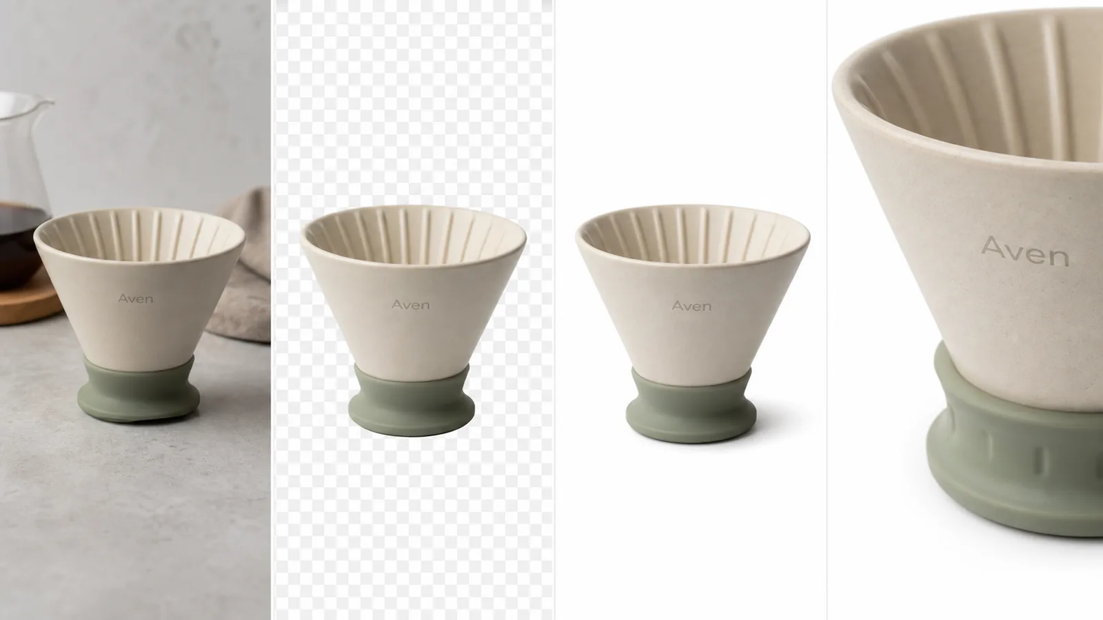 ## White Background Product Photo Maker Rule
Make the product obvious before you make the background perfect. A white-background product photo should answer one buyer question immediately: what exactly is being sold?
For the Aven ceramic dripper example, the protected product facts are:
- cream speckled ceramic body
- sage green silicone base
- fluted inner cone
- small invented Aven wordmark
- slightly tapered shape
- soft matte material
- realistic base shadow
If a tool changes those details, the image is not ready even if the background is pure white. A clean background cannot compensate for a changed product.
## Start With A Cutout, Not A Redesign
Use a product cutout when the source photo already shows the right item but the setting is wrong. The original image might have a kitchen counter, a gray wall, table clutter, uneven fabric, or another object behind the product. Background removal should separate the product from that scene while leaving the product itself alone.
A good cutout should preserve:
- thin edges, handles, straps, rims, cords, feet, and spouts
- transparent or reflective material boundaries
- fabric texture, ceramic grain, metal highlights, or glass thickness
- package marks, labels, caps, seams, hardware, and color blocking
- product scale and angle
That is why a white background product photo maker should be judged at the edge, not just at the center of the image.
## Add White Without Making The Product Float
The most common white-background failure is a floating product. The cutout looks technically clean, but the base has no contact shadow, so the item feels pasted onto the page.
Use this practical rule:
- Keep a soft contact shadow when the product sits on a surface.
- Remove colored spill or halo from the old background.
- Keep the product large enough for thumbnail recognition.
- Leave enough white margin for cropping across store and marketplace layouts.
- Avoid adding platform logos, fake badges, review stars, discounts, certifications, QR codes, barcodes, or unsupported claims.
For marketplace pages such as [Amazon product photos](/marketplace-product-images/amazon-product-photos), use white-background editing as preparation, not as a compliance guarantee. Current marketplace requirements still need review before upload. For [Shopify product images](/marketplace-product-images/shopify-product-images), the same cutout can help keep gallery ratios and collection thumbnails consistent.
## Steps In KrafLayer
Use this workflow when the target is a white-background product photo:
- Upload the product photo.
- Run Remove BG in KrafLayer. The cutout step is one-click and automated.
- Inspect the transparent PNG product image around the hardest edges.
- Place the approved cutout on white or near-white.
- Keep or rebuild a natural product shadow under the object.
- Use the [product photo editor](/product-photo-editor) only for narrow cleanup, such as small dust, edge marks, or resolution issues.
- Export a main image, then adapt crop and margin for store, marketplace, or ad use.
Do not use a white background product photo maker to hide product problems. If the product color, shape, label, material, or scale is wrong, fix that before creating variants.
## When To Use Cutouts, Shadows, And Cleanup
Use a cutout when the original background is the problem. Use shadow control when the product looks pasted onto white. Use cleanup when small defects distract from the product but do not define the SKU.
That order matters because each step has a different risk:
- Cutout risk: clipped edges or leftover background halo.
- Shadow risk: floating product or fake heavy shadow.
- Cleanup risk: removing real product details by accident.
- Upscale risk: sharpening texture while also exaggerating noise or label artifacts.
- Replacement risk: turning a simple listing image into an over-styled scene.
For a main listing image, restraint usually wins. The product should dominate the frame, the white background should stay quiet, and the buyer should not wonder whether the product shape changed.
## What To Check Before Publishing
Before a white-background product photo goes live, zoom in and check:
- Is the product edge clean against white?
- Did the background remover keep all holes, handles, spouts, and thin parts?
- Does the material still look like ceramic, leather, glass, fabric, metal, or plastic as intended?
- Is the contact shadow natural for the product weight?
- Does the crop leave enough margin for square and vertical placements?
- Is the product readable in a small collection thumbnail?
- Are there any fake marks, unsupported claims, or platform-style elements in the image?
If the answer is no, revise the source or rerun the edit. It is better to make one reliable white-background product photo than to scale a flawed cutout across every channel.
## FAQ
### What is a white background product photo maker?
A white background product photo maker turns an existing product photo into a clean ecommerce image on white or near-white. The useful version does more than erase the background: it keeps product edges, material, color, scale, label placement, and natural contact shadow believable.
### Should I use a transparent PNG first?
Yes, when you need reusable ecommerce assets. A transparent PNG product image lets you approve the cutout once, then place it on white for a main image, use it in a Shopify gallery, or adapt it for ads without repeating the background-removal step.
### Does KrafLayer Remove BG need a prompt?
No. KrafLayer Remove BG is a one-click automated product background remover. It does not need a prompt or mask. Use prompts for background replacement or masked edits, not for the basic cutout step.
### Do white-background product photos guarantee marketplace approval?
No. A white background can help prepare a clean main image, but each marketplace has its own current requirements. Treat the image as an asset that still needs channel review, especially around crop, margin, logos, text, badges, and unsupported claims.
### When is background replacement better than white background?
Choose background replacement when the final image needs context, such as a kitchen counter, boutique shelf, desk scene, or seasonal campaign setup. Choose white background when the buyer needs a clean main image, product grid, or reusable cutout-first workflow.
## Conclusion
A white background product photo maker should create a trustworthy ecommerce asset, not just a blank backdrop. Start with a real product photo, isolate the item, inspect the transparent PNG edge, keep a natural product shadow, and only clean what blocks the image from working as a main image. KrafLayer helps sellers move through that workflow quickly with one-click background removal and focused product-photo editing, while keeping the final product truth check where it belongs: before the image goes live.
# Transparent Product Image PNG: When Ecommerce Sellers Need Cutouts
URL: https://kraflayer.com/blog/transparent-product-image-png-ecommerce-cutouts
Summary: Learn when ecommerce sellers need transparent product PNG cutouts, how to create them with AI background removal, and what to check before reuse.
Updated: 2026-07-03
A transparent product image PNG is a reusable ecommerce cutout: the product stays visible, the background becomes transparent, and the file can be placed on white listing backgrounds, Shopify sections, landing pages, ads, and campaign graphics without cutting the product out again.
In KrafLayer, this is a one-click [AI background remover](/tools/ai-background-remover) workflow. Upload a product photo, run Remove BG, and export a transparent PNG with the alpha channel preserved. The important part is not only removing the background; it is checking that the product edge, shadow decision, material, label area, and scale still look publish-ready.
## White Background Product Photo Maker Rule
Make the product obvious before you make the background perfect. A white-background product photo should answer one buyer question immediately: what exactly is being sold?
For the Aven ceramic dripper example, the protected product facts are:
- cream speckled ceramic body
- sage green silicone base
- fluted inner cone
- small invented Aven wordmark
- slightly tapered shape
- soft matte material
- realistic base shadow
If a tool changes those details, the image is not ready even if the background is pure white. A clean background cannot compensate for a changed product.
## Start With A Cutout, Not A Redesign
Use a product cutout when the source photo already shows the right item but the setting is wrong. The original image might have a kitchen counter, a gray wall, table clutter, uneven fabric, or another object behind the product. Background removal should separate the product from that scene while leaving the product itself alone.
A good cutout should preserve:
- thin edges, handles, straps, rims, cords, feet, and spouts
- transparent or reflective material boundaries
- fabric texture, ceramic grain, metal highlights, or glass thickness
- package marks, labels, caps, seams, hardware, and color blocking
- product scale and angle
That is why a white background product photo maker should be judged at the edge, not just at the center of the image.
## Add White Without Making The Product Float
The most common white-background failure is a floating product. The cutout looks technically clean, but the base has no contact shadow, so the item feels pasted onto the page.
Use this practical rule:
- Keep a soft contact shadow when the product sits on a surface.
- Remove colored spill or halo from the old background.
- Keep the product large enough for thumbnail recognition.
- Leave enough white margin for cropping across store and marketplace layouts.
- Avoid adding platform logos, fake badges, review stars, discounts, certifications, QR codes, barcodes, or unsupported claims.
For marketplace pages such as [Amazon product photos](/marketplace-product-images/amazon-product-photos), use white-background editing as preparation, not as a compliance guarantee. Current marketplace requirements still need review before upload. For [Shopify product images](/marketplace-product-images/shopify-product-images), the same cutout can help keep gallery ratios and collection thumbnails consistent.
## Steps In KrafLayer
Use this workflow when the target is a white-background product photo:
- Upload the product photo.
- Run Remove BG in KrafLayer. The cutout step is one-click and automated.
- Inspect the transparent PNG product image around the hardest edges.
- Place the approved cutout on white or near-white.
- Keep or rebuild a natural product shadow under the object.
- Use the [product photo editor](/product-photo-editor) only for narrow cleanup, such as small dust, edge marks, or resolution issues.
- Export a main image, then adapt crop and margin for store, marketplace, or ad use.
Do not use a white background product photo maker to hide product problems. If the product color, shape, label, material, or scale is wrong, fix that before creating variants.
## When To Use Cutouts, Shadows, And Cleanup
Use a cutout when the original background is the problem. Use shadow control when the product looks pasted onto white. Use cleanup when small defects distract from the product but do not define the SKU.
That order matters because each step has a different risk:
- Cutout risk: clipped edges or leftover background halo.
- Shadow risk: floating product or fake heavy shadow.
- Cleanup risk: removing real product details by accident.
- Upscale risk: sharpening texture while also exaggerating noise or label artifacts.
- Replacement risk: turning a simple listing image into an over-styled scene.
For a main listing image, restraint usually wins. The product should dominate the frame, the white background should stay quiet, and the buyer should not wonder whether the product shape changed.
## What To Check Before Publishing
Before a white-background product photo goes live, zoom in and check:
- Is the product edge clean against white?
- Did the background remover keep all holes, handles, spouts, and thin parts?
- Does the material still look like ceramic, leather, glass, fabric, metal, or plastic as intended?
- Is the contact shadow natural for the product weight?
- Does the crop leave enough margin for square and vertical placements?
- Is the product readable in a small collection thumbnail?
- Are there any fake marks, unsupported claims, or platform-style elements in the image?
If the answer is no, revise the source or rerun the edit. It is better to make one reliable white-background product photo than to scale a flawed cutout across every channel.
## FAQ
### What is a white background product photo maker?
A white background product photo maker turns an existing product photo into a clean ecommerce image on white or near-white. The useful version does more than erase the background: it keeps product edges, material, color, scale, label placement, and natural contact shadow believable.
### Should I use a transparent PNG first?
Yes, when you need reusable ecommerce assets. A transparent PNG product image lets you approve the cutout once, then place it on white for a main image, use it in a Shopify gallery, or adapt it for ads without repeating the background-removal step.
### Does KrafLayer Remove BG need a prompt?
No. KrafLayer Remove BG is a one-click automated product background remover. It does not need a prompt or mask. Use prompts for background replacement or masked edits, not for the basic cutout step.
### Do white-background product photos guarantee marketplace approval?
No. A white background can help prepare a clean main image, but each marketplace has its own current requirements. Treat the image as an asset that still needs channel review, especially around crop, margin, logos, text, badges, and unsupported claims.
### When is background replacement better than white background?
Choose background replacement when the final image needs context, such as a kitchen counter, boutique shelf, desk scene, or seasonal campaign setup. Choose white background when the buyer needs a clean main image, product grid, or reusable cutout-first workflow.
## Conclusion
A white background product photo maker should create a trustworthy ecommerce asset, not just a blank backdrop. Start with a real product photo, isolate the item, inspect the transparent PNG edge, keep a natural product shadow, and only clean what blocks the image from working as a main image. KrafLayer helps sellers move through that workflow quickly with one-click background removal and focused product-photo editing, while keeping the final product truth check where it belongs: before the image goes live.
# Transparent Product Image PNG: When Ecommerce Sellers Need Cutouts
URL: https://kraflayer.com/blog/transparent-product-image-png-ecommerce-cutouts
Summary: Learn when ecommerce sellers need transparent product PNG cutouts, how to create them with AI background removal, and what to check before reuse.
Updated: 2026-07-03
A transparent product image PNG is a reusable ecommerce cutout: the product stays visible, the background becomes transparent, and the file can be placed on white listing backgrounds, Shopify sections, landing pages, ads, and campaign graphics without cutting the product out again.
In KrafLayer, this is a one-click [AI background remover](/tools/ai-background-remover) workflow. Upload a product photo, run Remove BG, and export a transparent PNG with the alpha channel preserved. The important part is not only removing the background; it is checking that the product edge, shadow decision, material, label area, and scale still look publish-ready.
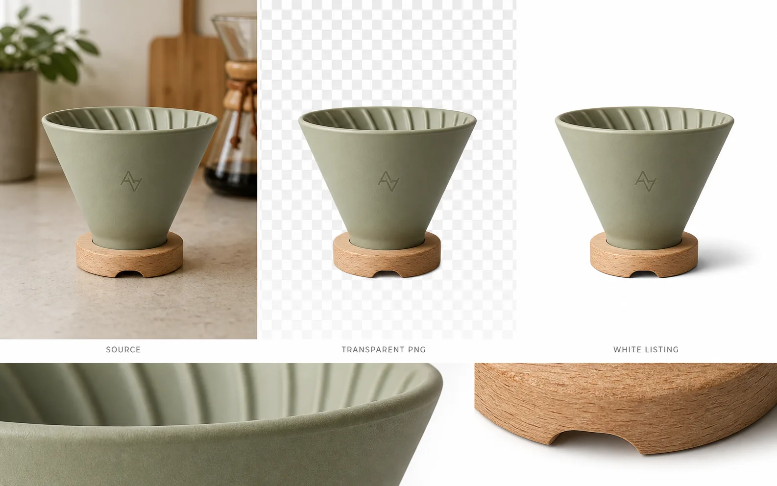 ## Transparent Product Image PNG: The Practical Rule
Use a transparent product image PNG when you need the same product to appear in more than one layout. A cutout is useful because it separates the product from the background without flattening the file into a single scene.
For the Aven ceramic coffee dripper example, the ecommerce product cutout works because the reusable product facts stay visible:
- matte sage ceramic body
- ribbed inner rim
- tapered dripper shape
- small natural wood base
- front monogram position
- product scale and camera angle
- clean bottom edge around the base
- realistic shadow when placed on white
The background can change. Those product facts should not.
## When Sellers Actually Need A Transparent PNG Product Image
A transparent PNG product image is most useful when the image must move across formats.
Use it for:
- white-background listing images
- Shopify product page sections
- marketplace draft images
- email campaign graphics
- landing page hero compositions
- paid social ad layouts
- product comparison blocks
- seasonal sale creative
The cutout becomes a master asset. Instead of removing the background separately for every channel, approve one clean product cutout and reuse it.
## How KrafLayer Creates The Cutout
KrafLayer Remove BG is a one-click automated background-removal tool. It does not need a prompt, and it does not require manual masking for the basic cutout job.
The workflow is simple:
- Upload the product photo.
- Open Remove BG in KrafLayer.
- Run the automated background removal.
- Review the transparent PNG edge.
- Export the cutout or continue editing in the [product photo editor](/product-photo-editor).
- Place the same cutout on white, a store section, or an ad layout.
That differs from a background replacement workflow. Remove BG creates the transparent asset. Replacement creates a new scene around the product.
## What To Check Before Reusing The Cutout
Do not approve a product cutout just because the old background disappeared. Inspect the areas where ecommerce images usually fail.
### Product Edge
Look at handles, straps, rims, transparent caps, glass edges, fabric texture, shoe soles, and small feet. A transparent PNG product image should not have a gray halo, clipped edge, or leftover background color.
### Contact Shadow
A transparent PNG can either keep no shadow or be placed onto a new background with a rebuilt contact shadow. For white-background product image work, the shadow should support the product without making the image look dirty or floating.
### Material Truth
Ceramic should still look ceramic. Glass should keep edge highlights. Fabric should keep weave. Leather should keep grain. If background removal damages the material boundary, fix the cutout before using it in a listing or ad.
### Label And Logo Area
Background removal should not warp packaging text, front labels, printed marks, or logo placement. If a label is already blurry, fix that separately instead of expecting a transparent cutout to solve it.
### Scale Across Layouts
When you reuse a product cutout across Shopify images, [ecommerce product photography](/ecommerce-product-photography) layouts, and ads, keep scale consistent. A product that changes size dramatically from one creative to another can make the store feel inconsistent.
## Transparent PNG Versus White Background Image
A transparent PNG product image and a white background product image are not the same final asset.
A transparent PNG keeps the background empty. It is best as a reusable layer.
A white background image is a flattened final image. It is best when the channel expects a clean product photo on white.
For example, a seller might use KrafLayer Remove BG once, approve the product cutout, then place that same transparent PNG on a white listing canvas, a Shopify feature block, and an email sale graphic. The cutout is the source asset. The white image is one output from it.
## Where This Fits In A Store Workflow
For [Shopify product images](/marketplace-product-images/shopify-product-images), a transparent PNG is useful when the store design needs consistent product placement across collection banners, product cards, bundles, and ads. For marketplace drafts, it helps create a clean white-background version while keeping a reusable product layer for future creative.
The best workflow is:
- approve the original product truth
- create one transparent PNG product image
- inspect the edge at zoom
- make a white-background listing version
- reuse the same cutout for store and ad layouts
- keep the approved cutout as the master asset for that SKU
This keeps the image system cleaner than exporting a separate flattened file for every use case.
## FAQ
### What is a transparent product image PNG?
A transparent product image PNG is a product cutout with the background removed and the alpha channel preserved. The product can be placed onto white backgrounds, store layouts, landing pages, ads, and campaign graphics without cutting it out again.
### When should ecommerce sellers use a product cutout PNG?
Use a product cutout PNG when the same product needs to appear across several layouts. It is useful for listing images, Shopify sections, ad creatives, comparison blocks, bundle graphics, and email campaigns because one approved cutout can be reused.
### Can KrafLayer create a transparent PNG product image automatically?
Yes. KrafLayer Remove BG is a one-click AI background remover. Upload the product photo, run the tool, and export a transparent PNG. There is no prompt or manual mask required for the basic background-removal step.
### Is a transparent PNG enough for marketplace approval?
No. A transparent PNG is an asset format, not an approval guarantee. You still need to place the product on the correct final background, review the current channel rules, avoid fake claims or platform UI, and check that product details are accurate.
### What makes a bad transparent product PNG?
A bad transparent product PNG usually has clipped edges, leftover background halos, damaged material texture, warped labels, missing handles or straps, or a shadow that makes the product float. Review those areas before reusing the file in ecommerce layouts.
## Conclusion
A transparent product image PNG gives ecommerce teams one clean product cutout they can reuse across listings, store pages, ads, and campaign layouts. KrafLayer helps sellers create that cutout with a one-click AI background remover, then continue editing or placing the product into white-background and store-ready visuals. The advantage is a cleaner asset workflow: one approved product cutout, accurate product edges, and faster reuse across ecommerce channels.
# Product Photo Background Replacement for Ecommerce Scenes and Ads
URL: https://kraflayer.com/blog/product-photo-background-replacement-ecommerce-scenes-ads
Summary: Learn how to replace product photo backgrounds for ecommerce scenes and ads while preserving scale, material, light, and product truth.
Updated: 2026-07-03
Product photo background replacement works when the product is already accurate and the setting is the weak part. If your task is to replace product background context for a store page or ad, the rule is simple: change the scene, not the SKU. A publishable replacement should preserve product shape, color, scale, material, label area, and camera angle while making the new surface, light direction, and contact shadow feel believable.
In KrafLayer, the [AI background replacer](/tools/ai-background-replacer) isolates the product automatically, then uses a text prompt or reference direction to create a new background around the same item. Use it when you need an ecommerce scene, landing page image, or ad-style product visual from one product photo.
## Transparent Product Image PNG: The Practical Rule
Use a transparent product image PNG when you need the same product to appear in more than one layout. A cutout is useful because it separates the product from the background without flattening the file into a single scene.
For the Aven ceramic coffee dripper example, the ecommerce product cutout works because the reusable product facts stay visible:
- matte sage ceramic body
- ribbed inner rim
- tapered dripper shape
- small natural wood base
- front monogram position
- product scale and camera angle
- clean bottom edge around the base
- realistic shadow when placed on white
The background can change. Those product facts should not.
## When Sellers Actually Need A Transparent PNG Product Image
A transparent PNG product image is most useful when the image must move across formats.
Use it for:
- white-background listing images
- Shopify product page sections
- marketplace draft images
- email campaign graphics
- landing page hero compositions
- paid social ad layouts
- product comparison blocks
- seasonal sale creative
The cutout becomes a master asset. Instead of removing the background separately for every channel, approve one clean product cutout and reuse it.
## How KrafLayer Creates The Cutout
KrafLayer Remove BG is a one-click automated background-removal tool. It does not need a prompt, and it does not require manual masking for the basic cutout job.
The workflow is simple:
- Upload the product photo.
- Open Remove BG in KrafLayer.
- Run the automated background removal.
- Review the transparent PNG edge.
- Export the cutout or continue editing in the [product photo editor](/product-photo-editor).
- Place the same cutout on white, a store section, or an ad layout.
That differs from a background replacement workflow. Remove BG creates the transparent asset. Replacement creates a new scene around the product.
## What To Check Before Reusing The Cutout
Do not approve a product cutout just because the old background disappeared. Inspect the areas where ecommerce images usually fail.
### Product Edge
Look at handles, straps, rims, transparent caps, glass edges, fabric texture, shoe soles, and small feet. A transparent PNG product image should not have a gray halo, clipped edge, or leftover background color.
### Contact Shadow
A transparent PNG can either keep no shadow or be placed onto a new background with a rebuilt contact shadow. For white-background product image work, the shadow should support the product without making the image look dirty or floating.
### Material Truth
Ceramic should still look ceramic. Glass should keep edge highlights. Fabric should keep weave. Leather should keep grain. If background removal damages the material boundary, fix the cutout before using it in a listing or ad.
### Label And Logo Area
Background removal should not warp packaging text, front labels, printed marks, or logo placement. If a label is already blurry, fix that separately instead of expecting a transparent cutout to solve it.
### Scale Across Layouts
When you reuse a product cutout across Shopify images, [ecommerce product photography](/ecommerce-product-photography) layouts, and ads, keep scale consistent. A product that changes size dramatically from one creative to another can make the store feel inconsistent.
## Transparent PNG Versus White Background Image
A transparent PNG product image and a white background product image are not the same final asset.
A transparent PNG keeps the background empty. It is best as a reusable layer.
A white background image is a flattened final image. It is best when the channel expects a clean product photo on white.
For example, a seller might use KrafLayer Remove BG once, approve the product cutout, then place that same transparent PNG on a white listing canvas, a Shopify feature block, and an email sale graphic. The cutout is the source asset. The white image is one output from it.
## Where This Fits In A Store Workflow
For [Shopify product images](/marketplace-product-images/shopify-product-images), a transparent PNG is useful when the store design needs consistent product placement across collection banners, product cards, bundles, and ads. For marketplace drafts, it helps create a clean white-background version while keeping a reusable product layer for future creative.
The best workflow is:
- approve the original product truth
- create one transparent PNG product image
- inspect the edge at zoom
- make a white-background listing version
- reuse the same cutout for store and ad layouts
- keep the approved cutout as the master asset for that SKU
This keeps the image system cleaner than exporting a separate flattened file for every use case.
## FAQ
### What is a transparent product image PNG?
A transparent product image PNG is a product cutout with the background removed and the alpha channel preserved. The product can be placed onto white backgrounds, store layouts, landing pages, ads, and campaign graphics without cutting it out again.
### When should ecommerce sellers use a product cutout PNG?
Use a product cutout PNG when the same product needs to appear across several layouts. It is useful for listing images, Shopify sections, ad creatives, comparison blocks, bundle graphics, and email campaigns because one approved cutout can be reused.
### Can KrafLayer create a transparent PNG product image automatically?
Yes. KrafLayer Remove BG is a one-click AI background remover. Upload the product photo, run the tool, and export a transparent PNG. There is no prompt or manual mask required for the basic background-removal step.
### Is a transparent PNG enough for marketplace approval?
No. A transparent PNG is an asset format, not an approval guarantee. You still need to place the product on the correct final background, review the current channel rules, avoid fake claims or platform UI, and check that product details are accurate.
### What makes a bad transparent product PNG?
A bad transparent product PNG usually has clipped edges, leftover background halos, damaged material texture, warped labels, missing handles or straps, or a shadow that makes the product float. Review those areas before reusing the file in ecommerce layouts.
## Conclusion
A transparent product image PNG gives ecommerce teams one clean product cutout they can reuse across listings, store pages, ads, and campaign layouts. KrafLayer helps sellers create that cutout with a one-click AI background remover, then continue editing or placing the product into white-background and store-ready visuals. The advantage is a cleaner asset workflow: one approved product cutout, accurate product edges, and faster reuse across ecommerce channels.
# Product Photo Background Replacement for Ecommerce Scenes and Ads
URL: https://kraflayer.com/blog/product-photo-background-replacement-ecommerce-scenes-ads
Summary: Learn how to replace product photo backgrounds for ecommerce scenes and ads while preserving scale, material, light, and product truth.
Updated: 2026-07-03
Product photo background replacement works when the product is already accurate and the setting is the weak part. If your task is to replace product background context for a store page or ad, the rule is simple: change the scene, not the SKU. A publishable replacement should preserve product shape, color, scale, material, label area, and camera angle while making the new surface, light direction, and contact shadow feel believable.
In KrafLayer, the [AI background replacer](/tools/ai-background-replacer) isolates the product automatically, then uses a text prompt or reference direction to create a new background around the same item. Use it when you need an ecommerce scene, landing page image, or ad-style product visual from one product photo.
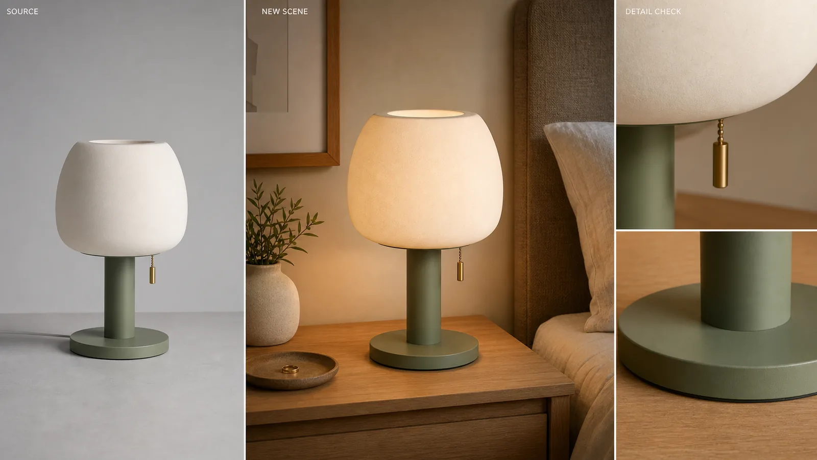 ## Product Photo Background Replacement: The Practical Rule
Use background replacement when the source product is trustworthy but the environment is not. A grey tabletop, messy supplier photo, dull studio corner, or off-brand room can become a cleaner selling scene if the product facts stay fixed.
For the Aven ceramic table lamp example, the facts to protect are:
- matte cream ceramic shade
- sage green metal base
- brass pull switch
- round base edge
- same front angle
- same visible scale
- ceramic texture
- natural contact shadow
The nightstand, bedding, wall color, and background depth can change. The lamp should not.
## Replacement Is Different From Removal
A [product background remover](/tools/ai-background-remover) gives you a cutout or white-background image. Product photo background replacement creates a new scene behind and around the product.
That difference matters because the failure modes are different. Removal can fail at the edge. Replacement can fail in the whole image: the product floats, the shadow points the wrong way, the background props compete with the product, or the AI subtly changes the product into a different SKU.
Use removal for transparent PNG masters, white-background main images, and clean design layers. Use replacement for lifestyle context, campaign surfaces, landing page visuals, and ad creatives where the product needs a stronger environment.
## When Background Replacement Is Useful
Background replacement is strongest when the new scene helps the buyer understand where the product belongs.
Use it for:
- a skincare bottle on a bathroom shelf
- a lamp on a bedroom nightstand
- cookware on a kitchen counter
- jewelry on marble or fabric
- a handbag on a boutique shelf
- electronics on a desk setup
- a home product in a realistic room
Avoid replacement when the background becomes more important than the item. If the buyer notices the room before the product, the image is probably too scenic for ecommerce.
## What To Put In The Prompt
Write the prompt as a production brief, not as an art direction brainstorm. Name the surface, scene role, lighting, shadow, and product-lock instructions.
A reusable prompt:
> Place the same product in a warm modern bedroom nightstand scene with soft window light from the left, a natural contact shadow, shallow background depth, and minimal props. Keep the product color, shape, material texture, scale, camera angle, and brass details unchanged. No text overlays, no badges, no platform UI, no fake claims.
For background replacement for product photos, include:
- scene role: product page lifestyle image, landing page hero, ad crop, detail-page visual
- surface: nightstand, marble, wood, tile, paper sweep, shelf, kitchen counter
- light: soft window light, diffused studio light, warm morning light, clean shadow
- product locks: same color, shape, label area, material, angle, scale, hardware
- limits: avoid fake logos, platform UI, review stars, certifications, QR codes, barcodes, or claims
Specific prompts produce more useful ecommerce images than broad prompts like "make it premium" or "create a luxury background."
## A KrafLayer Workflow
Use this workflow when one approved product photo needs several scene options.
- Start with the clearest product image you have.
- Open Replace BG in KrafLayer.
- Choose a scene role before prompting: listing support image, PDP lifestyle image, landing page hero, or ad creative.
- Write one prompt that names surface, lighting, contact shadow, and product locks.
- Generate the replacement.
- Compare the result against the original product truth list.
- Keep the image only if the product still reads correctly at thumbnail and full size.
- Use the [product photo editor](/product-photo-editor) for small cleanup after the scene is right.
KrafLayer Replace BG is a prompt or reference-direction workflow. It is not the same as one-click Remove BG. Use Remove BG when the output should be a cutout; use Replace BG when the output should be a finished scene.
## Pre-Publish Review Checklist
### Light Direction
The product and background should agree on where light comes from. If the lamp has a left-side highlight, the new room should not cast a hard right-side shadow that contradicts it.
### Contact Shadow
The product must sit on the new surface. A realistic background still fails if the product looks pasted on, floating, or disconnected from the tabletop.
### Product Scale
Scale is a selling promise. A lamp, shoe, bag, bottle, or chair should look plausible against the new furniture, props, or room context. Do not publish a scene that makes the item look larger or smaller than it is.
### Material Truth
Replacement should not redesign material. Ceramic should stay ceramic. Leather should keep grain. Glass should keep edge highlights. Fabric should keep weave. Metal should keep realistic reflection.
### Scene Discipline
The background should support the product, not compete with it. Remove or rerun scenes with too many props, unclear surfaces, fake labels, platform marks, discount badges, or unsupported claims.
## How This Supports Ecommerce Product Photography
Use product photo background replacement as one part of a broader [ecommerce product photography](/ecommerce-product-photography) workflow. A background-replaced image can support:
- product page lifestyle context
- landing page hero sections
- paid social product ads
- email campaign visuals
- collection thumbnails
- seasonal merchandising
Use [AI product photography](/ai-product-photography) when you need a larger set from product references: main image, detail image, lifestyle scene, and ad crop. Use replacement when the source photo is already the anchor and the background is the part you want to change.
## FAQ
### What is product photo background replacement?
Product photo background replacement is the process of keeping the product from an existing image and generating a new scene, surface, or environment around it. The goal is not just a prettier background; the product should keep the same shape, color, material, scale, and selling details.
### How is it different from a product background remover?
A product background remover isolates the item and often creates a transparent cutout or white-background image. Background replacement creates a finished scene around the product. That means you must review lighting, contact shadow, scale, props, and realism, not only the cutout edge.
### What should I include in a background replacement prompt?
Include the scene role, surface, light direction, contact shadow, and product-lock instructions. For example: warm bedroom nightstand, soft left window light, natural shadow, minimal props, same product color, same material, same angle, and no fake badges or platform UI.
### Can background replacement be used for ads?
Yes, background replacement can create ad-style product scenes, but review the result before launch. The product must remain accurate, the background should support the message, and the image should avoid fake claims, logos, review stars, platform UI, or misleading scale.
### When should I avoid replacing the background?
Avoid replacement when the product itself is inaccurate, too low-resolution, badly cropped, or already changed by a previous AI step. Fix the product image first. A strong scene cannot make a misleading product image publish-ready.
## Conclusion
Product photo background replacement is useful when the item is right and the scene is holding it back. KrafLayer helps sellers turn one approved product photo into a cleaner bedroom, kitchen, shelf, studio, or ad-style scene while checking the parts that matter: light, shadow, scale, material, and product truth. Treat the product as fixed and the background as flexible, and the result is more likely to look like ecommerce photography instead of a pasted-on AI image.
# Shopify Product Image Optimization for Speed, Zoom, and Conversion
URL: https://kraflayer.com/blog/shopify-product-image-optimization-speed-zoom-conversion
Summary: A practical Shopify image workflow for sharp product-page zoom, consistent collection crops, compressed files, and accurate product detail.
Updated: 2026-07-03
Shopify product image optimization is the process of preparing product photos so they stay sharp, crop predictably, load efficiently, and explain the item clearly. The practical rule is simple: choose one aspect-ratio system for the catalog, keep enough real product detail for zoom, compress the final files, and check every image at collection-card size before publishing.
For Shopify stores, image optimization is not only a speed task. A fast image that hides material, label, scale, or color still hurts the product page. In KrafLayer, you can use [AI product image generation](/ai-product-image-generator), the [product photo editor](/product-photo-editor), background cleanup, and upscaling to build a cleaner image set before it goes into Shopify.
## Product Photo Background Replacement: The Practical Rule
Use background replacement when the source product is trustworthy but the environment is not. A grey tabletop, messy supplier photo, dull studio corner, or off-brand room can become a cleaner selling scene if the product facts stay fixed.
For the Aven ceramic table lamp example, the facts to protect are:
- matte cream ceramic shade
- sage green metal base
- brass pull switch
- round base edge
- same front angle
- same visible scale
- ceramic texture
- natural contact shadow
The nightstand, bedding, wall color, and background depth can change. The lamp should not.
## Replacement Is Different From Removal
A [product background remover](/tools/ai-background-remover) gives you a cutout or white-background image. Product photo background replacement creates a new scene behind and around the product.
That difference matters because the failure modes are different. Removal can fail at the edge. Replacement can fail in the whole image: the product floats, the shadow points the wrong way, the background props compete with the product, or the AI subtly changes the product into a different SKU.
Use removal for transparent PNG masters, white-background main images, and clean design layers. Use replacement for lifestyle context, campaign surfaces, landing page visuals, and ad creatives where the product needs a stronger environment.
## When Background Replacement Is Useful
Background replacement is strongest when the new scene helps the buyer understand where the product belongs.
Use it for:
- a skincare bottle on a bathroom shelf
- a lamp on a bedroom nightstand
- cookware on a kitchen counter
- jewelry on marble or fabric
- a handbag on a boutique shelf
- electronics on a desk setup
- a home product in a realistic room
Avoid replacement when the background becomes more important than the item. If the buyer notices the room before the product, the image is probably too scenic for ecommerce.
## What To Put In The Prompt
Write the prompt as a production brief, not as an art direction brainstorm. Name the surface, scene role, lighting, shadow, and product-lock instructions.
A reusable prompt:
> Place the same product in a warm modern bedroom nightstand scene with soft window light from the left, a natural contact shadow, shallow background depth, and minimal props. Keep the product color, shape, material texture, scale, camera angle, and brass details unchanged. No text overlays, no badges, no platform UI, no fake claims.
For background replacement for product photos, include:
- scene role: product page lifestyle image, landing page hero, ad crop, detail-page visual
- surface: nightstand, marble, wood, tile, paper sweep, shelf, kitchen counter
- light: soft window light, diffused studio light, warm morning light, clean shadow
- product locks: same color, shape, label area, material, angle, scale, hardware
- limits: avoid fake logos, platform UI, review stars, certifications, QR codes, barcodes, or claims
Specific prompts produce more useful ecommerce images than broad prompts like "make it premium" or "create a luxury background."
## A KrafLayer Workflow
Use this workflow when one approved product photo needs several scene options.
- Start with the clearest product image you have.
- Open Replace BG in KrafLayer.
- Choose a scene role before prompting: listing support image, PDP lifestyle image, landing page hero, or ad creative.
- Write one prompt that names surface, lighting, contact shadow, and product locks.
- Generate the replacement.
- Compare the result against the original product truth list.
- Keep the image only if the product still reads correctly at thumbnail and full size.
- Use the [product photo editor](/product-photo-editor) for small cleanup after the scene is right.
KrafLayer Replace BG is a prompt or reference-direction workflow. It is not the same as one-click Remove BG. Use Remove BG when the output should be a cutout; use Replace BG when the output should be a finished scene.
## Pre-Publish Review Checklist
### Light Direction
The product and background should agree on where light comes from. If the lamp has a left-side highlight, the new room should not cast a hard right-side shadow that contradicts it.
### Contact Shadow
The product must sit on the new surface. A realistic background still fails if the product looks pasted on, floating, or disconnected from the tabletop.
### Product Scale
Scale is a selling promise. A lamp, shoe, bag, bottle, or chair should look plausible against the new furniture, props, or room context. Do not publish a scene that makes the item look larger or smaller than it is.
### Material Truth
Replacement should not redesign material. Ceramic should stay ceramic. Leather should keep grain. Glass should keep edge highlights. Fabric should keep weave. Metal should keep realistic reflection.
### Scene Discipline
The background should support the product, not compete with it. Remove or rerun scenes with too many props, unclear surfaces, fake labels, platform marks, discount badges, or unsupported claims.
## How This Supports Ecommerce Product Photography
Use product photo background replacement as one part of a broader [ecommerce product photography](/ecommerce-product-photography) workflow. A background-replaced image can support:
- product page lifestyle context
- landing page hero sections
- paid social product ads
- email campaign visuals
- collection thumbnails
- seasonal merchandising
Use [AI product photography](/ai-product-photography) when you need a larger set from product references: main image, detail image, lifestyle scene, and ad crop. Use replacement when the source photo is already the anchor and the background is the part you want to change.
## FAQ
### What is product photo background replacement?
Product photo background replacement is the process of keeping the product from an existing image and generating a new scene, surface, or environment around it. The goal is not just a prettier background; the product should keep the same shape, color, material, scale, and selling details.
### How is it different from a product background remover?
A product background remover isolates the item and often creates a transparent cutout or white-background image. Background replacement creates a finished scene around the product. That means you must review lighting, contact shadow, scale, props, and realism, not only the cutout edge.
### What should I include in a background replacement prompt?
Include the scene role, surface, light direction, contact shadow, and product-lock instructions. For example: warm bedroom nightstand, soft left window light, natural shadow, minimal props, same product color, same material, same angle, and no fake badges or platform UI.
### Can background replacement be used for ads?
Yes, background replacement can create ad-style product scenes, but review the result before launch. The product must remain accurate, the background should support the message, and the image should avoid fake claims, logos, review stars, platform UI, or misleading scale.
### When should I avoid replacing the background?
Avoid replacement when the product itself is inaccurate, too low-resolution, badly cropped, or already changed by a previous AI step. Fix the product image first. A strong scene cannot make a misleading product image publish-ready.
## Conclusion
Product photo background replacement is useful when the item is right and the scene is holding it back. KrafLayer helps sellers turn one approved product photo into a cleaner bedroom, kitchen, shelf, studio, or ad-style scene while checking the parts that matter: light, shadow, scale, material, and product truth. Treat the product as fixed and the background as flexible, and the result is more likely to look like ecommerce photography instead of a pasted-on AI image.
# Shopify Product Image Optimization for Speed, Zoom, and Conversion
URL: https://kraflayer.com/blog/shopify-product-image-optimization-speed-zoom-conversion
Summary: A practical Shopify image workflow for sharp product-page zoom, consistent collection crops, compressed files, and accurate product detail.
Updated: 2026-07-03
Shopify product image optimization is the process of preparing product photos so they stay sharp, crop predictably, load efficiently, and explain the item clearly. The practical rule is simple: choose one aspect-ratio system for the catalog, keep enough real product detail for zoom, compress the final files, and check every image at collection-card size before publishing.
For Shopify stores, image optimization is not only a speed task. A fast image that hides material, label, scale, or color still hurts the product page. In KrafLayer, you can use [AI product image generation](/ai-product-image-generator), the [product photo editor](/product-photo-editor), background cleanup, and upscaling to build a cleaner image set before it goes into Shopify.
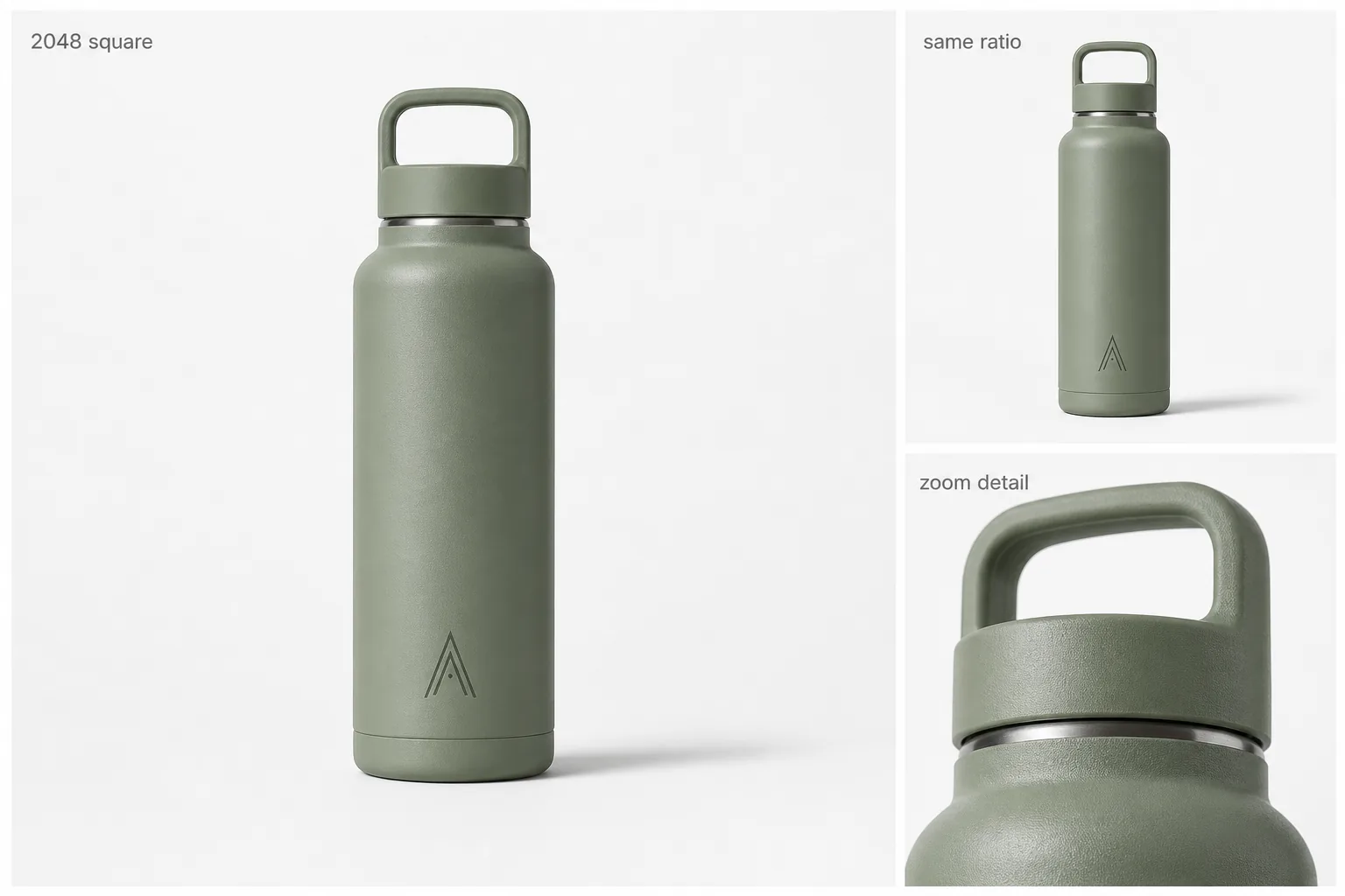 ## Shopify Product Image Optimization: The Working Rule
Start with a square or consistently cropped product image master, then create the supporting images from that same product truth. The best Shopify product image size for your store depends on theme behavior, device layout, and zoom needs, so avoid treating one dimension as a universal rule. Check current Shopify documentation and your theme preview when exact size guidance matters.
A useful product-image master should preserve:
- product silhouette
- true color and finish
- label or monogram position
- material texture
- contact shadow
- scale cues
- enough resolution for product-page zoom
- a crop that still works in collection cards
If any of those break, resizing will not fix the image. Fix the product photo first.
## Optimize For Three Places, Not One
### Product Page Main Image
The main image should make the product instantly recognizable. Use a stable aspect ratio, keep the item centered, leave enough breathing room around handles, caps, cords, or straps, and avoid props that make the product hard to inspect.
KrafLayer can help create or clean the main image before export. For example, use the [AI background remover](/tools/ai-background-remover) when you need a cutout or a controlled white image, and use the editor when the source photo needs cleanup before Shopify upload.
### Collection Grid Crop
Collection cards are where inconsistent image ratios become obvious. A bottle that fills the frame, a bag with wide empty space, and a shoe cropped at the sole will make the store feel uneven even if each image looks fine alone. Treat the Shopify collection image crop as its own review step, not as an automatic byproduct of the main image.
Before uploading, preview the set as a grid. Keep the product scale consistent across variants and related SKUs. For tall items, leave enough top and bottom margin. For wide items, protect the edges so thumbnails do not cut off important product parts.
### Zoom and Detail Image
Zoom only helps when the source image contains trustworthy detail. Use a detail image or crop for texture, hardware, stitching, label clarity, ports, seams, ingredients, or finish. If the source is soft, use the [AI image upscaler](/tools/ai-image-upscaler), then inspect edges, text, and material before publishing.
Do not invent detail during optimization. A sharper product image should reveal the item, not redesign it.
## A Practical Shopify Image Workflow
- Choose the product truth list: color, shape, material, label, hardware, and scale.
- Pick one aspect-ratio system for the catalog before editing images.
- Create or clean the main product image.
- Make a collection-safe crop from the same product visual.
- Add one or more detail images that prove material, function, or finish.
- Compress the final files without flattening product texture.
- Write descriptive alt text that names the product and visible detail.
- Preview the image set on product pages, collection pages, and mobile.
This workflow keeps Shopify product image optimization tied to selling clarity instead of generic file handling.
## Compression Without Losing Product Detail
Shopify image compression should reduce file weight while protecting product trust. Check the file after compression at full size and thumbnail size. Watch for fuzzy labels, noisy edges, banding on gradients, muddy fabric texture, and jagged transparent edges.
Use WebP or optimized JPEG when appropriate for your workflow. Keep a higher-quality master file outside Shopify, then upload the compressed publishing version. If an image needs heavy compression to load acceptably, it may be too large, too decorative, or doing too many jobs in one frame.
## Where KrafLayer Fits
Use KrafLayer before Shopify upload when the image problem is visual rather than administrative.
- Use [AI product image generation](/ai-product-image-generator) to create main, lifestyle, and detail images from a product reference.
- Use the [product photo editor](/product-photo-editor) when a source image needs cleanup, retouching, or a better ecommerce presentation.
- Use Remove BG for transparent cutouts, white-background assets, and reusable design layers.
- Use Upscale when a useful source photo is too small or soft for product-page zoom.
- Use the Shopify owner guide for broader [Shopify product images](/marketplace-product-images/shopify-product-images) planning.
KrafLayer does not replace Shopify theme testing. It helps you prepare stronger product visuals before the image is placed into the store.
## Pre-Publish Checklist
Before pushing a product image set live, check:
- Does the product stay recognizable at collection-card size?
- Do all variants use a consistent crop, angle, and scale?
- Does the main image show the full item without awkward clipping?
- Does the detail image support Shopify product image zoom without inventing new details?
- Are labels, ports, seams, materials, and color still accurate?
- Is the final file compressed enough for practical page speed?
- Does alt text describe the product image honestly?
- Does the mobile product page still show the product clearly?
The strongest Shopify image set usually has one clean main image, one or two detail images, one lifestyle image, and consistent collection crops. More images help only when each one answers a buyer question.
## FAQ
### What is Shopify product image optimization?
Shopify product image optimization means preparing product photos for page speed, product-page zoom, collection-grid consistency, and buyer clarity. It includes crop ratio, file compression, detail accuracy, alt text, and mobile preview, not just choosing a product image size for Shopify.
### What product image size should I use for Shopify?
Use a size and ratio that works with your current theme, product-page zoom, and collection grid. Many stores use square product images for consistency, but exact dimensions should be checked against current Shopify documentation and your theme preview before publishing.
### Should Shopify product images be square?
Square product images often make product pages and collection grids easier to keep consistent, especially for catalogs with many SKUs or variants. They are not the only possible format, but mixed ratios can create uneven cards, awkward crops, and hard-to-scan collections.
### How do I compress Shopify product images without losing quality?
Compress the publishing file, then inspect the result at full size and thumbnail size. Shopify image compression should make pages lighter without damaging the product facts a buyer uses to decide. Look for fuzzy labels, broken transparent edges, dull material texture, and color shifts. If those appear, use a larger or cleaner source image before compressing again.
### Can AI help with Shopify product images?
Yes, AI can help generate cleaner main images, create detail images, remove backgrounds, upscale weak photos, and prepare lifestyle visuals. The review step still matters: product shape, color, material, scale, labels, and functional details must stay accurate before upload.
## Conclusion
Shopify product image optimization works best when speed, crop consistency, zoom detail, and product truth are handled together. KrafLayer helps sellers prepare Shopify product images by generating cleaner main images, improving weak source photos, removing backgrounds, and upscaling useful detail without turning the item into a different SKU. Treat the image set as a selling system, not a folder of resized files, and each product page has a better chance of looking clear, fast, and trustworthy.
# Remove Product Backgrounds: 8-Step Ecommerce Workflow
URL: https://kraflayer.com/blog/remove-background-from-product-images-no-manual-masking
Summary: Remove product backgrounds without manual masking, inspect alpha edges, handle glass and fine detail, and export transparent or white files.
Updated: 2026-08-11
AI background removal is useful when it produces a reusable cutout without eating the product's real edges. The hard cases are not square cardboard boxes. They are glass, mesh, fur, hair-like fibers, polished metal, thin straps, soft shadows, and any pale object already sitting on white.
The analysis uses current guidance from Google and from Etsy, Shopify, and eBay, checked on August 11, 2026. The lantern sequence is a KrafLayer demonstration, not a measured accuracy test or customer result.
> **Quick Summary**
> Remove the background, inspect the alpha edge at 100%, test the cutout on black and white, then export separate transparent and channel-ready versions. Google accepts white or transparent backgrounds but warns that light products on transparency may display against black. Etsy always converts transparency to black.
## Abstract
One-click removal should be the first pass, not the final approval. Review silhouette, semi-transparent regions, holes, fine details, color spill, and contact shadow. Keep a transparent master for reuse, then flatten a white or colored copy for the destination.
## Key Takeaways
- Transparent pixels and clean edges are separate problems.
- Checkerboards can hide white halos and missing pale details.
- Etsy transparency renders black.
- Preserve a natural contact shadow only when the image role needs one.
- Reshoot when the product boundary is not visible in the source.
## Table of Contents
1. [What background removal changes](#what-does-background-removal-actually-change)
2. [The step-by-step method](#how-do-you-remove-a-product-background-without-manual-masking)
3. [Alpha edge review](#how-do-you-check-a-transparent-cutout)
4. [Difficult materials](#which-products-need-extra-review)
5. [Transparent versus white](#should-you-export-transparent-png-or-white-background)
6. [Channel rules](#what-do-platforms-require)
7. [When one click is not enough](#when-should-you-correct-or-reshoot)
8. [Frequently asked questions](#frequently-asked-questions)
## What Does Background Removal Actually Change?
Google recommends a solid white or transparent product background and requires accurate representation of the actual product. A remover therefore has one narrow job: classify product and non-product pixels without altering the SKU itself ([Google Merchant Center](https://support.google.com/merchants/answer/6324350?hl=en), 2026).
We evaluated the workflow by edge fidelity and destination behavior, not by a cross-tool precision score. The demonstration below exposes four stages that should remain separate: source, transparent cutout, white-background export, and optional lifestyle scene.
## Shopify Product Image Optimization: The Working Rule
Start with a square or consistently cropped product image master, then create the supporting images from that same product truth. The best Shopify product image size for your store depends on theme behavior, device layout, and zoom needs, so avoid treating one dimension as a universal rule. Check current Shopify documentation and your theme preview when exact size guidance matters.
A useful product-image master should preserve:
- product silhouette
- true color and finish
- label or monogram position
- material texture
- contact shadow
- scale cues
- enough resolution for product-page zoom
- a crop that still works in collection cards
If any of those break, resizing will not fix the image. Fix the product photo first.
## Optimize For Three Places, Not One
### Product Page Main Image
The main image should make the product instantly recognizable. Use a stable aspect ratio, keep the item centered, leave enough breathing room around handles, caps, cords, or straps, and avoid props that make the product hard to inspect.
KrafLayer can help create or clean the main image before export. For example, use the [AI background remover](/tools/ai-background-remover) when you need a cutout or a controlled white image, and use the editor when the source photo needs cleanup before Shopify upload.
### Collection Grid Crop
Collection cards are where inconsistent image ratios become obvious. A bottle that fills the frame, a bag with wide empty space, and a shoe cropped at the sole will make the store feel uneven even if each image looks fine alone. Treat the Shopify collection image crop as its own review step, not as an automatic byproduct of the main image.
Before uploading, preview the set as a grid. Keep the product scale consistent across variants and related SKUs. For tall items, leave enough top and bottom margin. For wide items, protect the edges so thumbnails do not cut off important product parts.
### Zoom and Detail Image
Zoom only helps when the source image contains trustworthy detail. Use a detail image or crop for texture, hardware, stitching, label clarity, ports, seams, ingredients, or finish. If the source is soft, use the [AI image upscaler](/tools/ai-image-upscaler), then inspect edges, text, and material before publishing.
Do not invent detail during optimization. A sharper product image should reveal the item, not redesign it.
## A Practical Shopify Image Workflow
- Choose the product truth list: color, shape, material, label, hardware, and scale.
- Pick one aspect-ratio system for the catalog before editing images.
- Create or clean the main product image.
- Make a collection-safe crop from the same product visual.
- Add one or more detail images that prove material, function, or finish.
- Compress the final files without flattening product texture.
- Write descriptive alt text that names the product and visible detail.
- Preview the image set on product pages, collection pages, and mobile.
This workflow keeps Shopify product image optimization tied to selling clarity instead of generic file handling.
## Compression Without Losing Product Detail
Shopify image compression should reduce file weight while protecting product trust. Check the file after compression at full size and thumbnail size. Watch for fuzzy labels, noisy edges, banding on gradients, muddy fabric texture, and jagged transparent edges.
Use WebP or optimized JPEG when appropriate for your workflow. Keep a higher-quality master file outside Shopify, then upload the compressed publishing version. If an image needs heavy compression to load acceptably, it may be too large, too decorative, or doing too many jobs in one frame.
## Where KrafLayer Fits
Use KrafLayer before Shopify upload when the image problem is visual rather than administrative.
- Use [AI product image generation](/ai-product-image-generator) to create main, lifestyle, and detail images from a product reference.
- Use the [product photo editor](/product-photo-editor) when a source image needs cleanup, retouching, or a better ecommerce presentation.
- Use Remove BG for transparent cutouts, white-background assets, and reusable design layers.
- Use Upscale when a useful source photo is too small or soft for product-page zoom.
- Use the Shopify owner guide for broader [Shopify product images](/marketplace-product-images/shopify-product-images) planning.
KrafLayer does not replace Shopify theme testing. It helps you prepare stronger product visuals before the image is placed into the store.
## Pre-Publish Checklist
Before pushing a product image set live, check:
- Does the product stay recognizable at collection-card size?
- Do all variants use a consistent crop, angle, and scale?
- Does the main image show the full item without awkward clipping?
- Does the detail image support Shopify product image zoom without inventing new details?
- Are labels, ports, seams, materials, and color still accurate?
- Is the final file compressed enough for practical page speed?
- Does alt text describe the product image honestly?
- Does the mobile product page still show the product clearly?
The strongest Shopify image set usually has one clean main image, one or two detail images, one lifestyle image, and consistent collection crops. More images help only when each one answers a buyer question.
## FAQ
### What is Shopify product image optimization?
Shopify product image optimization means preparing product photos for page speed, product-page zoom, collection-grid consistency, and buyer clarity. It includes crop ratio, file compression, detail accuracy, alt text, and mobile preview, not just choosing a product image size for Shopify.
### What product image size should I use for Shopify?
Use a size and ratio that works with your current theme, product-page zoom, and collection grid. Many stores use square product images for consistency, but exact dimensions should be checked against current Shopify documentation and your theme preview before publishing.
### Should Shopify product images be square?
Square product images often make product pages and collection grids easier to keep consistent, especially for catalogs with many SKUs or variants. They are not the only possible format, but mixed ratios can create uneven cards, awkward crops, and hard-to-scan collections.
### How do I compress Shopify product images without losing quality?
Compress the publishing file, then inspect the result at full size and thumbnail size. Shopify image compression should make pages lighter without damaging the product facts a buyer uses to decide. Look for fuzzy labels, broken transparent edges, dull material texture, and color shifts. If those appear, use a larger or cleaner source image before compressing again.
### Can AI help with Shopify product images?
Yes, AI can help generate cleaner main images, create detail images, remove backgrounds, upscale weak photos, and prepare lifestyle visuals. The review step still matters: product shape, color, material, scale, labels, and functional details must stay accurate before upload.
## Conclusion
Shopify product image optimization works best when speed, crop consistency, zoom detail, and product truth are handled together. KrafLayer helps sellers prepare Shopify product images by generating cleaner main images, improving weak source photos, removing backgrounds, and upscaling useful detail without turning the item into a different SKU. Treat the image set as a selling system, not a folder of resized files, and each product page has a better chance of looking clear, fast, and trustworthy.
# Remove Product Backgrounds: 8-Step Ecommerce Workflow
URL: https://kraflayer.com/blog/remove-background-from-product-images-no-manual-masking
Summary: Remove product backgrounds without manual masking, inspect alpha edges, handle glass and fine detail, and export transparent or white files.
Updated: 2026-08-11
AI background removal is useful when it produces a reusable cutout without eating the product's real edges. The hard cases are not square cardboard boxes. They are glass, mesh, fur, hair-like fibers, polished metal, thin straps, soft shadows, and any pale object already sitting on white.
The analysis uses current guidance from Google and from Etsy, Shopify, and eBay, checked on August 11, 2026. The lantern sequence is a KrafLayer demonstration, not a measured accuracy test or customer result.
> **Quick Summary**
> Remove the background, inspect the alpha edge at 100%, test the cutout on black and white, then export separate transparent and channel-ready versions. Google accepts white or transparent backgrounds but warns that light products on transparency may display against black. Etsy always converts transparency to black.
## Abstract
One-click removal should be the first pass, not the final approval. Review silhouette, semi-transparent regions, holes, fine details, color spill, and contact shadow. Keep a transparent master for reuse, then flatten a white or colored copy for the destination.
## Key Takeaways
- Transparent pixels and clean edges are separate problems.
- Checkerboards can hide white halos and missing pale details.
- Etsy transparency renders black.
- Preserve a natural contact shadow only when the image role needs one.
- Reshoot when the product boundary is not visible in the source.
## Table of Contents
1. [What background removal changes](#what-does-background-removal-actually-change)
2. [The step-by-step method](#how-do-you-remove-a-product-background-without-manual-masking)
3. [Alpha edge review](#how-do-you-check-a-transparent-cutout)
4. [Difficult materials](#which-products-need-extra-review)
5. [Transparent versus white](#should-you-export-transparent-png-or-white-background)
6. [Channel rules](#what-do-platforms-require)
7. [When one click is not enough](#when-should-you-correct-or-reshoot)
8. [Frequently asked questions](#frequently-asked-questions)
## What Does Background Removal Actually Change?
Google recommends a solid white or transparent product background and requires accurate representation of the actual product. A remover therefore has one narrow job: classify product and non-product pixels without altering the SKU itself ([Google Merchant Center](https://support.google.com/merchants/answer/6324350?hl=en), 2026).
We evaluated the workflow by edge fidelity and destination behavior, not by a cross-tool precision score. The demonstration below exposes four stages that should remain separate: source, transparent cutout, white-background export, and optional lifestyle scene.
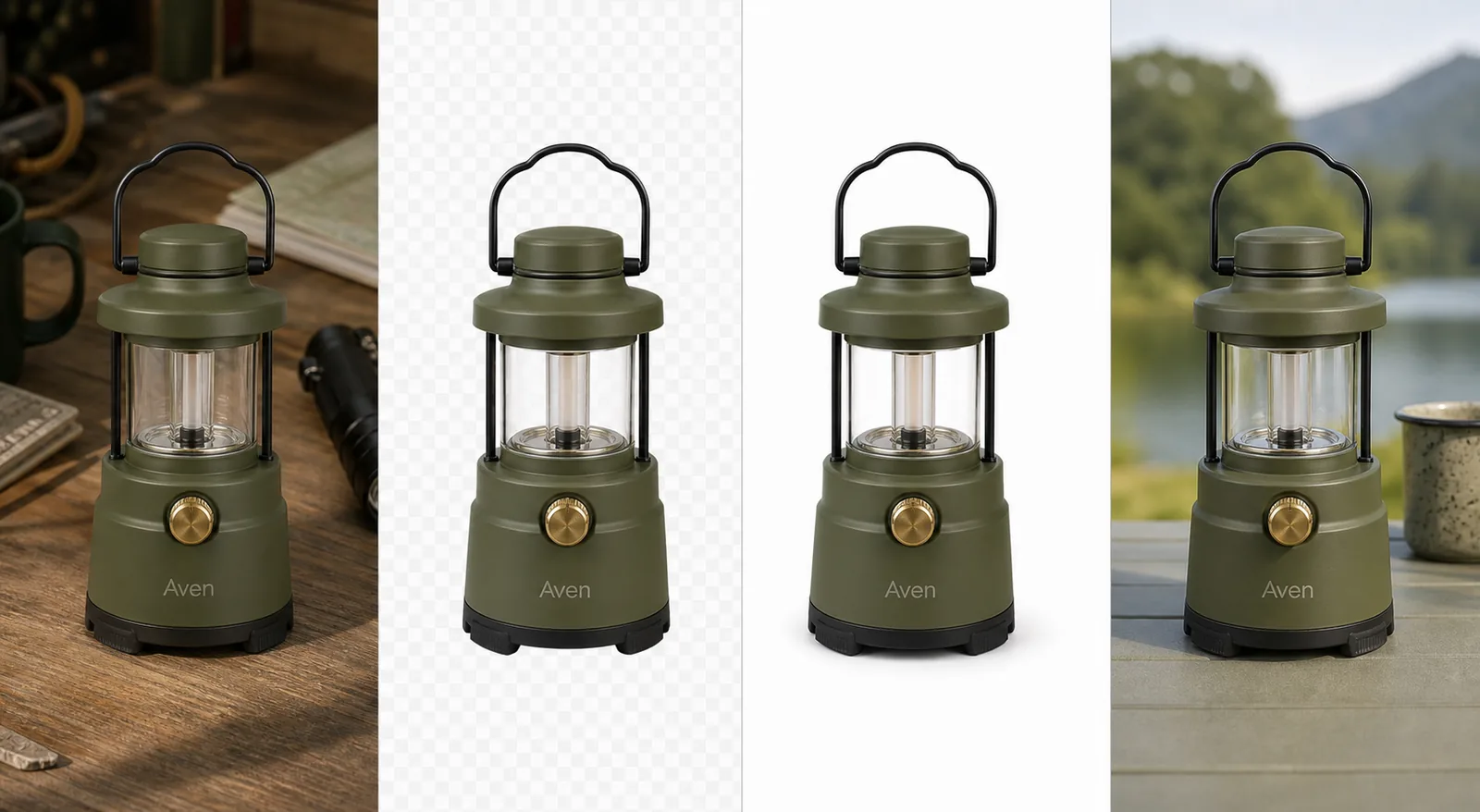 *KrafLayer demonstration composite. Inspect the lantern handle, glass panes, interior frame, feet, and contact area. The outdoor scene is a separate edit after removal.*
## How Do You Remove a Product Background Without Manual Masking?
Google recommends the largest high-resolution source available, up to 64 megapixels and 16 MB, and warns against submitting upscaled thumbnails. A sharp boundary gives automatic segmentation more real evidence to work with ([Google Merchant Center](https://support.google.com/merchants/answer/6324350?hl=en), 2026).
1. Upload the largest original source to the [AI Background Remover](/tools/ai-background-remover).
2. Generate the automatic cutout without adding a new scene.
3. Place the result on black, white, and a saturated inspection color.
4. Zoom to 100% around outer edges, holes, translucent areas, and shadows.
5. Compare the product's silhouette and internal openings with the source.
6. Save a transparent PNG master.
7. Create white, neutral, or lifestyle branches from that master.
8. Export the required pixel size and format for each channel.
Do not repeatedly remove the background from compressed descendants. Return to the best source or clean master for each new branch.
## How Do You Check a Transparent Cutout?
Etsy converts transparent parts of an image to black, and Google warns that light products on transparent backgrounds may also appear against black. Those behaviors make dual-background inspection necessary ([Etsy Help](https://help.etsy.com/hc/en-us/articles/115015663347-Requirements-and-Best-Practices-for-Images-in-Your-Etsy-Shop); [Google Merchant Center](https://support.google.com/merchants/answer/6324350?hl=en), 2026).
| Edge defect | What it looks like | Likely cause | Action |
|---|---|---|---|
| White halo | Pale fringe on dark background | Old background color remains in edge pixels | Refine/decontaminate edge or use a better source |
| Dark halo | Dirty fringe on white | Matting against a dark source | Correct fringe before flattening |
| Cut bite | Missing notch in silhouette | Mask classified product as background | Restore locally or rerun with clearer source |
| Filled hole | Handle or gap becomes solid | Internal negative space missed | Correct the alpha region |
| Hard plastic edge | Soft/fibrous material looks cut with scissors | Edge transition too sharp | Restore a controlled soft transition |
| Ghost shadow | Detached gray stain under product | Source shadow partly retained | Remove or rebuild a coherent contact shadow |
A checkerboard shows transparency but is not enough. White halos vanish on white squares, and dark halos vanish on dark squares. Inspect solid backgrounds too.
> **Make the reusable asset first**
>
> Create a transparent cutout with the [AI Background Remover](/tools/ai-background-remover), test it on contrasting colors, and only then build white main images or new scenes.
## Which Products Need Extra Review?
Shopify accepts product images up to 5000 × 5000 pixels or 25 megapixels, which gives sellers room to retain edge detail. Resolution matters most for the product classes that segmentation finds ambiguous ([Shopify Help Center](https://help.shopify.com/en/manual/products/product-media/product-media-types), 2026).
| Product class | Typical failure | Review point |
|---|---|---|
| Clear glass | Background remains visible through product | Preserve pane shape, distortion, and highlights |
| Polished metal | Reflection is mistaken for background | Keep the true outer edge and material contrast |
| Mesh or lace | Openings fill or strands disappear | Inspect repeating holes across the whole item |
| Fur and fibers | Fine strands are clipped | Compare perimeter density with source |
| Thin straps and cables | Narrow parts vanish | Trace each connection end to end |
| White-on-white products | Boundary has too little contrast | Try a better-lit source or light-gray capture |
| Soft contact shadows | Shadow is removed or detached | Decide whether the role needs a grounded or floating asset |
Transparent material is not simply partially visible background. It changes and reflects what sits behind it. If the final placement differs radically from the source, manual compositing or a new photograph may be more truthful.
## Should You Export Transparent PNG or White Background?
PNG supports translucent backgrounds, while JPEG does not. Amazon's product-photo guide describes pure white as the default for product shots, and Google recommends white or transparent. Keep both when possible: transparent for production, flattened white for a predictable listing ([Amazon](https://sell.amazon.com/blog/product-photos); [Google Merchant Center](https://support.google.com/merchants/answer/6324350?hl=en), 2026).
| Output | Use it for | Main caution |
|---|---|---|
| Transparent PNG | Reusable master, layouts, later background replacement | Larger files and destination rendering differences |
| White JPEG/WebP | Main listing image and predictable presentation | Loses alpha and can reveal edge contamination |
| Neutral-color JPEG/WebP | Owned-store secondary or collection card | Must not change perceived product color |
| Generated scene | Lifestyle or campaign branch | Requires product, lighting, and scale review |
Do not confuse the transparent master with a finished main image. Crop, product fill, shadow, file size, and platform rules still need a channel-specific pass.
## What Do Platforms Require?
Google will require all product images to reach 500 × 500 pixels from January 31, 2027 and recommends around 1500 × 1500 or larger. Etsy recommends 2000 pixels in both dimensions. eBay requires at least 500 × 500 and recommends about 1600 × 1600 ([Google](https://support.google.com/merchants/answer/6324350?hl=en); [Etsy](https://help.etsy.com/hc/en-us/articles/115015663347-Requirements-and-Best-Practices-for-Images-in-Your-Etsy-Shop); [eBay](https://www.ebay.com/help/selling/listings/adding-pictures-listings?id=4148), 2026).
Background removal does not guarantee approval. The correct item, variant, crop, resolution, overlays, props, and category policy still matter. A clean alpha mask can be technically excellent and still be the wrong listing image.
## When Should You Correct or Reshoot?
Correct locally when the automatic mask misses a small, visible area and the source clearly shows what belongs there. Reshoot when the boundary itself is absent: blown-out white edges, motion blur, severe compression, an object blocking the product, or transparent material with no readable separation.
Do not ask an upscaler to reconstruct an edge that never existed in the capture. It may produce a plausible strap, strand, letter, or clasp, but the result is not verified product evidence.
## Verdict
One-click removal is useful when approval still happens by eye. Save the transparent master, inspect it on contrasting solid colors, and flatten a destination-specific copy. If the source never shows the true boundary, stop repairing the mask and make a better photograph.
## Frequently Asked Questions
### How do I remove a product background without Photoshop?
Use an automatic browser background remover, then inspect the result rather than accepting the preview. Test the transparent cutout on white, black, and a saturated color; compare edges and internal holes with the source; save a PNG master; and flatten separate channel-ready copies.
### Is a transparent background accepted everywhere?
No. Google accepts or recommends transparency in many cases but warns about light products appearing on black. Etsy always turns transparent pixels black. Preserve a transparent production master, then export a flattened version suited to the destination.
### Why does my cutout have a white outline?
The edge pixels still contain color from the old white background. The halo may disappear on white but become obvious on dark or colored layouts. Inspect against several solid colors, correct the fringe, or return to a sharper, better-separated source.
### Should I keep the product shadow?
Keep or rebuild a restrained contact shadow when the product should appear grounded. Remove it for a flexible transparent asset if the old shadow is tied to the discarded scene. Never keep a detached shadow that conflicts with the final light direction.
### Can automatic removal handle glass and mesh?
It can produce useful first passes, but clear glass, reflections, mesh openings, lace, fibers, and thin straps need full-resolution review. If the source does not separate those details from the old background, a new capture or manual correction is safer.
## References
1. [Google Merchant Center: Image link requirements](https://support.google.com/merchants/answer/6324350?hl=en), accessed August 11, 2026.
2. [Etsy Help: Image requirements and best practices](https://help.etsy.com/hc/en-us/articles/115015663347-Requirements-and-Best-Practices-for-Images-in-Your-Etsy-Shop), accessed August 11, 2026.
3. [Shopify Help Center: Product media types](https://help.shopify.com/en/manual/products/product-media/product-media-types), accessed August 11, 2026.
4. [eBay Help: Adding pictures to listings](https://www.ebay.com/help/selling/listings/adding-pictures-listings?id=4148), accessed August 11, 2026.
# Shopify Collection Image Size: Build a Consistent Grid
URL: https://kraflayer.com/blog/shopify-collection-image-size-grid-consistency
Summary: Build a consistent Shopify collection grid with one theme-tested aspect ratio, product-specific safe zones, matched visual scale, and responsive review.
Updated: 2026-08-22
For a consistent Shopify collection grid, use the same aspect ratio for every featured product image and test that ratio in the active theme. Pixel dimensions matter, but crop behavior, product scale, safe zones, and responsive layout determine whether the grid actually looks aligned.
Shopify collection image size is less about one universal pixel number and more about using a consistent aspect ratio that your theme can crop cleanly. The practical rule: choose one grid ratio, keep the product centered with safe margins, set or check the focal point when your theme supports it, and preview the collection page on desktop and mobile before publishing.
Official Shopify guidance supports this cautious approach: collection pages can have featured images, store images need the correct aspect ratio to display as intended, and theme behavior can crop or resize images differently across layouts. Shopify also recommends uploading high-quality images and notes that storefront delivery may use automatic compression and modern formats. That means the safest answer is not a fixed "best Shopify collection image size" for every store; it is a theme-tested image system.
In KrafLayer, you can prepare that system before upload: create consistent product images, clean backgrounds, upscale useful detail, and build collection-safe crops that still show what the buyer is comparing.
*KrafLayer demonstration composite. Inspect the lantern handle, glass panes, interior frame, feet, and contact area. The outdoor scene is a separate edit after removal.*
## How Do You Remove a Product Background Without Manual Masking?
Google recommends the largest high-resolution source available, up to 64 megapixels and 16 MB, and warns against submitting upscaled thumbnails. A sharp boundary gives automatic segmentation more real evidence to work with ([Google Merchant Center](https://support.google.com/merchants/answer/6324350?hl=en), 2026).
1. Upload the largest original source to the [AI Background Remover](/tools/ai-background-remover).
2. Generate the automatic cutout without adding a new scene.
3. Place the result on black, white, and a saturated inspection color.
4. Zoom to 100% around outer edges, holes, translucent areas, and shadows.
5. Compare the product's silhouette and internal openings with the source.
6. Save a transparent PNG master.
7. Create white, neutral, or lifestyle branches from that master.
8. Export the required pixel size and format for each channel.
Do not repeatedly remove the background from compressed descendants. Return to the best source or clean master for each new branch.
## How Do You Check a Transparent Cutout?
Etsy converts transparent parts of an image to black, and Google warns that light products on transparent backgrounds may also appear against black. Those behaviors make dual-background inspection necessary ([Etsy Help](https://help.etsy.com/hc/en-us/articles/115015663347-Requirements-and-Best-Practices-for-Images-in-Your-Etsy-Shop); [Google Merchant Center](https://support.google.com/merchants/answer/6324350?hl=en), 2026).
| Edge defect | What it looks like | Likely cause | Action |
|---|---|---|---|
| White halo | Pale fringe on dark background | Old background color remains in edge pixels | Refine/decontaminate edge or use a better source |
| Dark halo | Dirty fringe on white | Matting against a dark source | Correct fringe before flattening |
| Cut bite | Missing notch in silhouette | Mask classified product as background | Restore locally or rerun with clearer source |
| Filled hole | Handle or gap becomes solid | Internal negative space missed | Correct the alpha region |
| Hard plastic edge | Soft/fibrous material looks cut with scissors | Edge transition too sharp | Restore a controlled soft transition |
| Ghost shadow | Detached gray stain under product | Source shadow partly retained | Remove or rebuild a coherent contact shadow |
A checkerboard shows transparency but is not enough. White halos vanish on white squares, and dark halos vanish on dark squares. Inspect solid backgrounds too.
> **Make the reusable asset first**
>
> Create a transparent cutout with the [AI Background Remover](/tools/ai-background-remover), test it on contrasting colors, and only then build white main images or new scenes.
## Which Products Need Extra Review?
Shopify accepts product images up to 5000 × 5000 pixels or 25 megapixels, which gives sellers room to retain edge detail. Resolution matters most for the product classes that segmentation finds ambiguous ([Shopify Help Center](https://help.shopify.com/en/manual/products/product-media/product-media-types), 2026).
| Product class | Typical failure | Review point |
|---|---|---|
| Clear glass | Background remains visible through product | Preserve pane shape, distortion, and highlights |
| Polished metal | Reflection is mistaken for background | Keep the true outer edge and material contrast |
| Mesh or lace | Openings fill or strands disappear | Inspect repeating holes across the whole item |
| Fur and fibers | Fine strands are clipped | Compare perimeter density with source |
| Thin straps and cables | Narrow parts vanish | Trace each connection end to end |
| White-on-white products | Boundary has too little contrast | Try a better-lit source or light-gray capture |
| Soft contact shadows | Shadow is removed or detached | Decide whether the role needs a grounded or floating asset |
Transparent material is not simply partially visible background. It changes and reflects what sits behind it. If the final placement differs radically from the source, manual compositing or a new photograph may be more truthful.
## Should You Export Transparent PNG or White Background?
PNG supports translucent backgrounds, while JPEG does not. Amazon's product-photo guide describes pure white as the default for product shots, and Google recommends white or transparent. Keep both when possible: transparent for production, flattened white for a predictable listing ([Amazon](https://sell.amazon.com/blog/product-photos); [Google Merchant Center](https://support.google.com/merchants/answer/6324350?hl=en), 2026).
| Output | Use it for | Main caution |
|---|---|---|
| Transparent PNG | Reusable master, layouts, later background replacement | Larger files and destination rendering differences |
| White JPEG/WebP | Main listing image and predictable presentation | Loses alpha and can reveal edge contamination |
| Neutral-color JPEG/WebP | Owned-store secondary or collection card | Must not change perceived product color |
| Generated scene | Lifestyle or campaign branch | Requires product, lighting, and scale review |
Do not confuse the transparent master with a finished main image. Crop, product fill, shadow, file size, and platform rules still need a channel-specific pass.
## What Do Platforms Require?
Google will require all product images to reach 500 × 500 pixels from January 31, 2027 and recommends around 1500 × 1500 or larger. Etsy recommends 2000 pixels in both dimensions. eBay requires at least 500 × 500 and recommends about 1600 × 1600 ([Google](https://support.google.com/merchants/answer/6324350?hl=en); [Etsy](https://help.etsy.com/hc/en-us/articles/115015663347-Requirements-and-Best-Practices-for-Images-in-Your-Etsy-Shop); [eBay](https://www.ebay.com/help/selling/listings/adding-pictures-listings?id=4148), 2026).
Background removal does not guarantee approval. The correct item, variant, crop, resolution, overlays, props, and category policy still matter. A clean alpha mask can be technically excellent and still be the wrong listing image.
## When Should You Correct or Reshoot?
Correct locally when the automatic mask misses a small, visible area and the source clearly shows what belongs there. Reshoot when the boundary itself is absent: blown-out white edges, motion blur, severe compression, an object blocking the product, or transparent material with no readable separation.
Do not ask an upscaler to reconstruct an edge that never existed in the capture. It may produce a plausible strap, strand, letter, or clasp, but the result is not verified product evidence.
## Verdict
One-click removal is useful when approval still happens by eye. Save the transparent master, inspect it on contrasting solid colors, and flatten a destination-specific copy. If the source never shows the true boundary, stop repairing the mask and make a better photograph.
## Frequently Asked Questions
### How do I remove a product background without Photoshop?
Use an automatic browser background remover, then inspect the result rather than accepting the preview. Test the transparent cutout on white, black, and a saturated color; compare edges and internal holes with the source; save a PNG master; and flatten separate channel-ready copies.
### Is a transparent background accepted everywhere?
No. Google accepts or recommends transparency in many cases but warns about light products appearing on black. Etsy always turns transparent pixels black. Preserve a transparent production master, then export a flattened version suited to the destination.
### Why does my cutout have a white outline?
The edge pixels still contain color from the old white background. The halo may disappear on white but become obvious on dark or colored layouts. Inspect against several solid colors, correct the fringe, or return to a sharper, better-separated source.
### Should I keep the product shadow?
Keep or rebuild a restrained contact shadow when the product should appear grounded. Remove it for a flexible transparent asset if the old shadow is tied to the discarded scene. Never keep a detached shadow that conflicts with the final light direction.
### Can automatic removal handle glass and mesh?
It can produce useful first passes, but clear glass, reflections, mesh openings, lace, fibers, and thin straps need full-resolution review. If the source does not separate those details from the old background, a new capture or manual correction is safer.
## References
1. [Google Merchant Center: Image link requirements](https://support.google.com/merchants/answer/6324350?hl=en), accessed August 11, 2026.
2. [Etsy Help: Image requirements and best practices](https://help.etsy.com/hc/en-us/articles/115015663347-Requirements-and-Best-Practices-for-Images-in-Your-Etsy-Shop), accessed August 11, 2026.
3. [Shopify Help Center: Product media types](https://help.shopify.com/en/manual/products/product-media/product-media-types), accessed August 11, 2026.
4. [eBay Help: Adding pictures to listings](https://www.ebay.com/help/selling/listings/adding-pictures-listings?id=4148), accessed August 11, 2026.
# Shopify Collection Image Size: Build a Consistent Grid
URL: https://kraflayer.com/blog/shopify-collection-image-size-grid-consistency
Summary: Build a consistent Shopify collection grid with one theme-tested aspect ratio, product-specific safe zones, matched visual scale, and responsive review.
Updated: 2026-08-22
For a consistent Shopify collection grid, use the same aspect ratio for every featured product image and test that ratio in the active theme. Pixel dimensions matter, but crop behavior, product scale, safe zones, and responsive layout determine whether the grid actually looks aligned.
Shopify collection image size is less about one universal pixel number and more about using a consistent aspect ratio that your theme can crop cleanly. The practical rule: choose one grid ratio, keep the product centered with safe margins, set or check the focal point when your theme supports it, and preview the collection page on desktop and mobile before publishing.
Official Shopify guidance supports this cautious approach: collection pages can have featured images, store images need the correct aspect ratio to display as intended, and theme behavior can crop or resize images differently across layouts. Shopify also recommends uploading high-quality images and notes that storefront delivery may use automatic compression and modern formats. That means the safest answer is not a fixed "best Shopify collection image size" for every store; it is a theme-tested image system.
In KrafLayer, you can prepare that system before upload: create consistent product images, clean backgrounds, upscale useful detail, and build collection-safe crops that still show what the buyer is comparing.
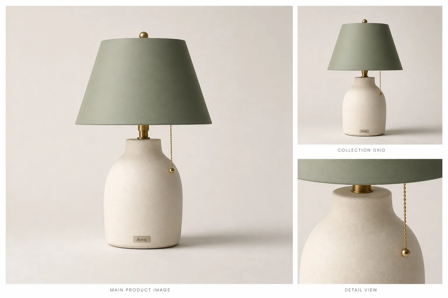 ## Shopify Collection Image Size: The Practical Rule
Use a consistent Shopify image aspect ratio first, then choose pixel dimensions that give your theme enough detail for the product card and product page. For many catalogs, a square master is the easiest starting point because it keeps product grids calm and predictable. It is not a universal requirement, and it should not override your theme preview.
A collection-safe image should protect:
- the full product silhouette
- true color and material
- handles, cords, straps, shades, caps, or other edges
- enough empty margin for theme cropping
- a clear product center or focal point
- consistent scale across related SKUs
- detail that still reads at product-grid size
If the product looks good only at full size but breaks in the grid, the image is not ready for the collection page.
## Why Shopify Collection Images Break
Collection images usually fail for one of four reasons.
The first is mixed ratios. A tall lamp, a wide bag, and a square bottle can all be good images on their own, but they make a messy grid when the theme forces them into the same card shape.
The second is unsafe cropping. A product that touches the frame edge can lose a handle, lampshade, shoe sole, or bottle cap when the theme crops it for mobile.
The third is uneven product scale. If one product fills the card and the next product floats in empty space, buyers compare the image layout instead of comparing the products.
The fourth is weak source detail. A collection card can hide softness, but the same asset may look poor when opened on a product page or zoomed.
## A Collection-Grid Workflow
### 1. Pick The Grid Ratio Before Editing
Decide whether your collection grid will use square, portrait, or landscape cards. Then edit every image against that same ratio. This is more reliable than uploading assorted source files and hoping the theme makes them feel consistent.
For a mixed catalog, square images are often the least fragile. For fashion, furniture, and tall objects, a portrait ratio may give the product more natural space. The right Shopify product grid image size depends on your theme and product type, so preview before committing the whole catalog.
### 2. Build A Product-Safe Crop
Keep the product centered enough that theme cropping does not remove the item. Leave more margin than you think you need around handles, shades, cords, straps, and wide bases. If Shopify focal point behavior is available in your theme, use it to keep the product's most important area in frame.
In KrafLayer, use [AI product image generation](/ai-product-image-generator) or the [product photo editor](/product-photo-editor) to create a clean master image first. Then make the collection crop from the same product truth list so color, material, shape, and scale stay consistent.
### 3. Match Product Scale Across Cards
A collection page should feel like one visual system. When related products sit in the same grid, align their apparent height, baseline, shadow weight, and whitespace. A small ceramic lamp should not look larger than a floor lamp because its crop is tighter.
Use the same visual rule across variants: same angle, same crop ratio, similar product size, similar contact shadow, and similar background brightness.
### 4. Check Detail And Compression
Shopify collection images are small on the grid, but the same media often supports product-page inspection. If the source photo is too soft, use the [AI image upscaler](/tools/ai-image-upscaler), then inspect texture, edges, labels, and material. If the background is the problem, use the [AI background remover](/tools/ai-background-remover) before creating the final crop.
Do not publish an image just because it fits the grid. The product still has to look trustworthy when a buyer opens the item.
## What To Avoid
- Do not claim one exact Shopify collection image size works for every theme.
- Do not crop so tightly that mobile cards cut off product edges.
- Do not mix square, portrait, and landscape images in the same product grid unless the theme is designed for it.
- Do not upscale a weak source and assume invented detail is accurate.
- Do not use collection images that hide color, material, texture, or scale.
- Do not rely on Shopify's automatic handling to fix a bad source image.
The strongest Shopify collection image crop starts with a product image that is already clear, centered, and honest.
## Where KrafLayer Fits
Use KrafLayer before Shopify upload when the image itself needs work:
- Generate a clean main image and a grid-safe crop from one product reference.
- Use the editor to remove distractions without changing the SKU.
- Remove backgrounds when you need a controlled white or transparent master.
- Upscale source files that are useful but too small for product-page detail.
- Review the broader [Shopify product images](/marketplace-product-images/shopify-product-images) workflow before preparing a full catalog.
KrafLayer helps prepare the image set. Your Shopify theme preview decides whether the crop, ratio, and focal point work in the actual storefront.
## Pre-Publish Checklist
Before uploading a collection image set, check:
- Does every product use the same grid ratio?
- Does the product stay recognizable in the collection card?
- Are edges, handles, cords, shades, straps, and bases protected from cropping?
- Is the product scale consistent across variants and related SKUs?
- Does the image still look clean on mobile?
- Does the focal point keep the most important product area in frame?
- Are color, material, labels, and scale accurate?
- Is the final file light enough for the storefront without damaging product detail?
If one image breaks the grid, fix that source image instead of changing the whole catalog around it.
## What does Shopify currently support?
Shopify allows product and collection images up to 5000 × 5000 pixels or 25 megapixels, with files below 20 MB. Its help center says square product images at 2048 × 2048 pixels usually display best, but the more important grid rule is consistent aspect ratio across featured images ([Shopify product media types](https://help.shopify.com/en/manual/products/product-media/product-media-types), 2026).
That means there is no universal magic size for every theme. A clean 1600 × 1600 set can form a better grid than mixed 3000-pixel files with square, portrait, and landscape ratios. Select the ratio in the theme first, then prepare all featured product images for that container.
## Audit the theme before recropping the catalog
Open the collection page on desktop and mobile and record:
- the grid image ratio selected in the theme settings;
- whether the theme crops with `cover` or contains the full image;
- whether secondary-image hover is enabled;
- card width at common breakpoints;
- the position of badges, quick-add buttons, and product text;
- any focal-point controls used by the theme.
Test a tall product, a wide product, a small accessory, and a product with an off-center handle. Shopify notes that responsive collection grids can expose inconsistent aspect ratios differently across screen sizes ([Shopify theme troubleshooting](https://help.shopify.com/en/manual/online-store/themes/theme-support/troubleshooting), 2026). Do not approve the grid from one desktop screenshot.
## Use one canvas but product-specific safe zones
A shared canvas ratio does not mean every product should occupy the same percentage by area. Match perceived scale instead. A handbag may need more side clearance for handles, while a tall bottle needs more top and bottom space. Define safe-zone guides, then position each SKU so the visual weight feels consistent across the row.
Keep one high-resolution master with the complete silhouette. Export the collection crop as a derivative, not as the only product file. Shopify automatically creates multiple storefront sizes and uses its CDN to deliver suitable formats, so upload the strongest trustworthy source instead of repeatedly compressing a small image ([Shopify uploading images](https://help.shopify.com/en/manual/online-store/images/theme-images), 2026).
## Diagnose a broken grid in the right order
When cards still look uneven, check in this order:
1. Confirm every featured image has the same pixel ratio.
2. Check whether transparent padding differs across files.
3. Compare product scale and optical center, not only canvas dimensions.
4. Inspect the theme's image-fit and crop settings.
5. Check hover images for ratio changes that cause layout movement.
6. Preview mobile, tablet, and desktop widths.
7. Confirm files use a standard sRGB profile if color changes after upload.
Do not solve a theme crop problem by stretching a product. Preserve product proportions and change the canvas, padding, focal point, or theme setting instead.
## Maintain a reusable collection-image specification
Record the approved ratio, target long edge, background treatment, product safe zone, naming pattern, and mobile review width. Add one representative approved card for each product shape. This gives photographers, AI editors, and catalog operators the same visual target.
When the theme changes, test the specification on a small collection before recropping the full catalog. A theme migration can change the visible container even though all source files remain valid.
## FAQ
### What is the best Shopify collection image size?
The best Shopify collection image size depends on your theme, grid layout, product type, and whether the same image is reused on product pages. Use a consistent aspect ratio, keep safe margins around the product, and preview the collection grid on desktop and mobile before publishing.
### Should Shopify collection images be square?
Square Shopify collection images are often practical because they keep product grids consistent and easy to scan. They are not mandatory for every store. Tall products, fashion images, or editorial collections may work better in a portrait ratio if the theme supports that layout cleanly.
### How do I stop Shopify collection images from cropping badly?
Use a consistent image ratio, center the product with enough margin, and check the theme's focal point behavior when available. Avoid placing important product edges near the frame. Preview the collection page on mobile because mobile crops often reveal problems that desktop cards hide.
### Is Shopify product grid image size the same as product image size?
Not always. A product page may need more detail for inspection or zoom, while the collection grid needs a predictable crop and consistent scale. Start with a high-quality master image, then create grid-safe versions that still preserve product facts.
### Can AI help create Shopify collection images?
Yes. AI can help create cleaner product images, remove distracting backgrounds, upscale weak source files, and build consistent crops for a product grid. The review step still matters: product shape, color, material, label position, scale, and functional details must stay accurate.
## Conclusion
Shopify collection image size should be handled as a theme-tested crop system, not a single fixed number copied across every store. Choose a consistent ratio, keep products centered with safe margins, protect detail, and preview the grid before publishing. KrafLayer helps create and clean the product images that go into that system, while Shopify theme testing confirms whether the final collection crop works for real shoppers.
# Remove Product Photo Backgrounds: Edge and Shadow Checks
URL: https://kraflayer.com/blog/remove-background-from-product-photo-edge-shadow-checklist
Summary: Remove product photo backgrounds with a material-aware edge map, separate shadow decision, destination-specific export, and six-point acceptance test.
Updated: 2026-08-22
A publishable product cutout needs more than an empty background. Preserve the complete silhouette and material edge, remove old-background halos, handle transparency correctly, and decide the contact shadow separately.
To remove background from product photo files safely, do not start by chasing a perfect white canvas. Start by protecting the product. A useful AI background-removal workflow isolates the item, keeps the real edge and material detail, returns a transparent PNG product photo, and gives you a clean cutout you can place on white, in a Shopify gallery, or inside an ad layout.
In KrafLayer, the [AI background remover](/tools/ai-background-remover) is a one-click Remove BG tool. It does not need a prompt or a painted mask. The seller's job is the quality check after the cutout: make sure the product still looks like the same SKU before reusing it anywhere.
## Shopify Collection Image Size: The Practical Rule
Use a consistent Shopify image aspect ratio first, then choose pixel dimensions that give your theme enough detail for the product card and product page. For many catalogs, a square master is the easiest starting point because it keeps product grids calm and predictable. It is not a universal requirement, and it should not override your theme preview.
A collection-safe image should protect:
- the full product silhouette
- true color and material
- handles, cords, straps, shades, caps, or other edges
- enough empty margin for theme cropping
- a clear product center or focal point
- consistent scale across related SKUs
- detail that still reads at product-grid size
If the product looks good only at full size but breaks in the grid, the image is not ready for the collection page.
## Why Shopify Collection Images Break
Collection images usually fail for one of four reasons.
The first is mixed ratios. A tall lamp, a wide bag, and a square bottle can all be good images on their own, but they make a messy grid when the theme forces them into the same card shape.
The second is unsafe cropping. A product that touches the frame edge can lose a handle, lampshade, shoe sole, or bottle cap when the theme crops it for mobile.
The third is uneven product scale. If one product fills the card and the next product floats in empty space, buyers compare the image layout instead of comparing the products.
The fourth is weak source detail. A collection card can hide softness, but the same asset may look poor when opened on a product page or zoomed.
## A Collection-Grid Workflow
### 1. Pick The Grid Ratio Before Editing
Decide whether your collection grid will use square, portrait, or landscape cards. Then edit every image against that same ratio. This is more reliable than uploading assorted source files and hoping the theme makes them feel consistent.
For a mixed catalog, square images are often the least fragile. For fashion, furniture, and tall objects, a portrait ratio may give the product more natural space. The right Shopify product grid image size depends on your theme and product type, so preview before committing the whole catalog.
### 2. Build A Product-Safe Crop
Keep the product centered enough that theme cropping does not remove the item. Leave more margin than you think you need around handles, shades, cords, straps, and wide bases. If Shopify focal point behavior is available in your theme, use it to keep the product's most important area in frame.
In KrafLayer, use [AI product image generation](/ai-product-image-generator) or the [product photo editor](/product-photo-editor) to create a clean master image first. Then make the collection crop from the same product truth list so color, material, shape, and scale stay consistent.
### 3. Match Product Scale Across Cards
A collection page should feel like one visual system. When related products sit in the same grid, align their apparent height, baseline, shadow weight, and whitespace. A small ceramic lamp should not look larger than a floor lamp because its crop is tighter.
Use the same visual rule across variants: same angle, same crop ratio, similar product size, similar contact shadow, and similar background brightness.
### 4. Check Detail And Compression
Shopify collection images are small on the grid, but the same media often supports product-page inspection. If the source photo is too soft, use the [AI image upscaler](/tools/ai-image-upscaler), then inspect texture, edges, labels, and material. If the background is the problem, use the [AI background remover](/tools/ai-background-remover) before creating the final crop.
Do not publish an image just because it fits the grid. The product still has to look trustworthy when a buyer opens the item.
## What To Avoid
- Do not claim one exact Shopify collection image size works for every theme.
- Do not crop so tightly that mobile cards cut off product edges.
- Do not mix square, portrait, and landscape images in the same product grid unless the theme is designed for it.
- Do not upscale a weak source and assume invented detail is accurate.
- Do not use collection images that hide color, material, texture, or scale.
- Do not rely on Shopify's automatic handling to fix a bad source image.
The strongest Shopify collection image crop starts with a product image that is already clear, centered, and honest.
## Where KrafLayer Fits
Use KrafLayer before Shopify upload when the image itself needs work:
- Generate a clean main image and a grid-safe crop from one product reference.
- Use the editor to remove distractions without changing the SKU.
- Remove backgrounds when you need a controlled white or transparent master.
- Upscale source files that are useful but too small for product-page detail.
- Review the broader [Shopify product images](/marketplace-product-images/shopify-product-images) workflow before preparing a full catalog.
KrafLayer helps prepare the image set. Your Shopify theme preview decides whether the crop, ratio, and focal point work in the actual storefront.
## Pre-Publish Checklist
Before uploading a collection image set, check:
- Does every product use the same grid ratio?
- Does the product stay recognizable in the collection card?
- Are edges, handles, cords, shades, straps, and bases protected from cropping?
- Is the product scale consistent across variants and related SKUs?
- Does the image still look clean on mobile?
- Does the focal point keep the most important product area in frame?
- Are color, material, labels, and scale accurate?
- Is the final file light enough for the storefront without damaging product detail?
If one image breaks the grid, fix that source image instead of changing the whole catalog around it.
## What does Shopify currently support?
Shopify allows product and collection images up to 5000 × 5000 pixels or 25 megapixels, with files below 20 MB. Its help center says square product images at 2048 × 2048 pixels usually display best, but the more important grid rule is consistent aspect ratio across featured images ([Shopify product media types](https://help.shopify.com/en/manual/products/product-media/product-media-types), 2026).
That means there is no universal magic size for every theme. A clean 1600 × 1600 set can form a better grid than mixed 3000-pixel files with square, portrait, and landscape ratios. Select the ratio in the theme first, then prepare all featured product images for that container.
## Audit the theme before recropping the catalog
Open the collection page on desktop and mobile and record:
- the grid image ratio selected in the theme settings;
- whether the theme crops with `cover` or contains the full image;
- whether secondary-image hover is enabled;
- card width at common breakpoints;
- the position of badges, quick-add buttons, and product text;
- any focal-point controls used by the theme.
Test a tall product, a wide product, a small accessory, and a product with an off-center handle. Shopify notes that responsive collection grids can expose inconsistent aspect ratios differently across screen sizes ([Shopify theme troubleshooting](https://help.shopify.com/en/manual/online-store/themes/theme-support/troubleshooting), 2026). Do not approve the grid from one desktop screenshot.
## Use one canvas but product-specific safe zones
A shared canvas ratio does not mean every product should occupy the same percentage by area. Match perceived scale instead. A handbag may need more side clearance for handles, while a tall bottle needs more top and bottom space. Define safe-zone guides, then position each SKU so the visual weight feels consistent across the row.
Keep one high-resolution master with the complete silhouette. Export the collection crop as a derivative, not as the only product file. Shopify automatically creates multiple storefront sizes and uses its CDN to deliver suitable formats, so upload the strongest trustworthy source instead of repeatedly compressing a small image ([Shopify uploading images](https://help.shopify.com/en/manual/online-store/images/theme-images), 2026).
## Diagnose a broken grid in the right order
When cards still look uneven, check in this order:
1. Confirm every featured image has the same pixel ratio.
2. Check whether transparent padding differs across files.
3. Compare product scale and optical center, not only canvas dimensions.
4. Inspect the theme's image-fit and crop settings.
5. Check hover images for ratio changes that cause layout movement.
6. Preview mobile, tablet, and desktop widths.
7. Confirm files use a standard sRGB profile if color changes after upload.
Do not solve a theme crop problem by stretching a product. Preserve product proportions and change the canvas, padding, focal point, or theme setting instead.
## Maintain a reusable collection-image specification
Record the approved ratio, target long edge, background treatment, product safe zone, naming pattern, and mobile review width. Add one representative approved card for each product shape. This gives photographers, AI editors, and catalog operators the same visual target.
When the theme changes, test the specification on a small collection before recropping the full catalog. A theme migration can change the visible container even though all source files remain valid.
## FAQ
### What is the best Shopify collection image size?
The best Shopify collection image size depends on your theme, grid layout, product type, and whether the same image is reused on product pages. Use a consistent aspect ratio, keep safe margins around the product, and preview the collection grid on desktop and mobile before publishing.
### Should Shopify collection images be square?
Square Shopify collection images are often practical because they keep product grids consistent and easy to scan. They are not mandatory for every store. Tall products, fashion images, or editorial collections may work better in a portrait ratio if the theme supports that layout cleanly.
### How do I stop Shopify collection images from cropping badly?
Use a consistent image ratio, center the product with enough margin, and check the theme's focal point behavior when available. Avoid placing important product edges near the frame. Preview the collection page on mobile because mobile crops often reveal problems that desktop cards hide.
### Is Shopify product grid image size the same as product image size?
Not always. A product page may need more detail for inspection or zoom, while the collection grid needs a predictable crop and consistent scale. Start with a high-quality master image, then create grid-safe versions that still preserve product facts.
### Can AI help create Shopify collection images?
Yes. AI can help create cleaner product images, remove distracting backgrounds, upscale weak source files, and build consistent crops for a product grid. The review step still matters: product shape, color, material, label position, scale, and functional details must stay accurate.
## Conclusion
Shopify collection image size should be handled as a theme-tested crop system, not a single fixed number copied across every store. Choose a consistent ratio, keep products centered with safe margins, protect detail, and preview the grid before publishing. KrafLayer helps create and clean the product images that go into that system, while Shopify theme testing confirms whether the final collection crop works for real shoppers.
# Remove Product Photo Backgrounds: Edge and Shadow Checks
URL: https://kraflayer.com/blog/remove-background-from-product-photo-edge-shadow-checklist
Summary: Remove product photo backgrounds with a material-aware edge map, separate shadow decision, destination-specific export, and six-point acceptance test.
Updated: 2026-08-22
A publishable product cutout needs more than an empty background. Preserve the complete silhouette and material edge, remove old-background halos, handle transparency correctly, and decide the contact shadow separately.
To remove background from product photo files safely, do not start by chasing a perfect white canvas. Start by protecting the product. A useful AI background-removal workflow isolates the item, keeps the real edge and material detail, returns a transparent PNG product photo, and gives you a clean cutout you can place on white, in a Shopify gallery, or inside an ad layout.
In KrafLayer, the [AI background remover](/tools/ai-background-remover) is a one-click Remove BG tool. It does not need a prompt or a painted mask. The seller's job is the quality check after the cutout: make sure the product still looks like the same SKU before reusing it anywhere.
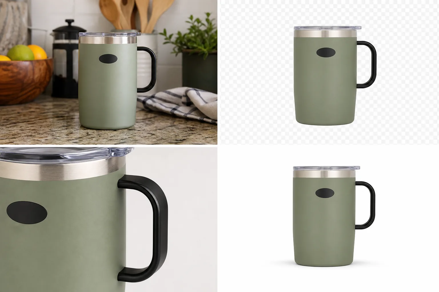 ## Remove Background From Product Photo: The Practical Rule
Use background removal when the product is right and the background is wrong. If the source photo already shows the correct shape, color, handle, lid, label area, material, and scale, a product background remover can turn that one image into a reusable ecommerce asset.
Do not use background removal to fix a product that is already inaccurate. If the mug is the wrong color, the handle changed shape, the lid is missing, or the material looks different, remove the background only after fixing the source image.
For the Aven sage travel mug example, the facts to preserve are:
- sage matte body
- clear plastic lid
- brushed metal rim
- black loop handle
- blank oval logo area
- rounded lower edge
- subtle product shadow
- same front-facing angle
If those change, the cutout is not publish-ready even if the background is gone.
## Use Remove BG For Isolation, Not Redesign
A background remover has one main job: separate the product from the scene behind it. That makes it different from object erasing, background replacement, or full product generation.
Use Remove BG when the original photo has:
- kitchen counter clutter
- supplier-photo props
- a busy desk or warehouse floor
- fabric wrinkles behind the item
- inconsistent store-gallery backgrounds
- a usable product with a weak setting
Use another workflow when the issue is not the background. The [product photo editor](/product-photo-editor) is better for small local cleanup. Background replacement is better when you need a new lifestyle scene. Upscaling is better when the image is too small but the background is already acceptable.
## The Four Checks Before You Publish
After you remove background from product image files, inspect the result in this order.
### 1. Product Cutout Edge Check
Zoom in around the hardest outlines first: handles, straps, glass, cords, feet, rims, fur, fabric, lace, clear plastic, and metal highlights. A good product cutout should not leave a colored halo from the old background, but it also should not trim away real product material.
In the mug example, the black handle and clear lid are the risk areas. If the handle edge is jagged or the lid loses its transparent lip, the product will look cheaper in a listing grid.
### 2. Material Check
The product should still feel like the same material. Matte ceramic should not turn glossy. Leather should keep grain. Glass should keep thickness and highlight edges. Fabric should keep weave and seams.
This is where background removal can quietly weaken buyer trust. A white background product photo is clean only if the product itself still carries enough visual information.
### 3. Shadow Check
A transparent PNG product photo is useful because it can be placed into different layouts. But when you place it on white, do not let it float. Keep or rebuild a soft contact shadow when the product sits on a surface.
The rule is simple: remove the old background, not the product's weight.
### 4. Channel Check
Before upload, check the final image against the channel where it will be used. For [Amazon product photos](/marketplace-product-images/amazon-product-photos), treat background removal as preparation, not as a marketplace approval guarantee. For [Shopify product images](/marketplace-product-images/shopify-product-images), check gallery ratio, thumbnail readability, and consistency across the collection.
Avoid platform logos, fake badges, review stars, certification marks, QR codes, barcodes, discount stickers, or unsupported claims unless they are real, allowed, and part of your approved channel plan.
## Steps In KrafLayer
Use this workflow for a single product photo:
- Upload the source product photo.
- Choose Remove BG in KrafLayer.
- Let the one-click AI background remover create the transparent cutout.
- Review the edge against a light and dark preview if the product has pale or transparent parts.
- Place the approved cutout on white for a main image, or keep the transparent PNG product photo as a reusable master.
- Use focused editing only for leftover edge marks, dust, or crop issues.
- Export the final image only after the product facts still match the source.
Do not add a prompt for Remove BG. Prompting belongs to background replacement, masked edits, reference editing, or scene composition. For this task, the most reliable instruction is the original image plus a strict review checklist.
## When To Rerun Instead Of Repair
Rerun the background removal when the cutout fails around the product boundary. Repair only when the issue is small and local.
Rerun when:
- a handle hole is filled in
- clear plastic becomes cloudy
- fabric fringe is cut off
- product feet disappear
- glass or metal edges carry old background color
- the product silhouette changes
Repair when:
- one dust speck remains outside the item
- a tiny old-background mark is visible near an edge
- the crop needs more margin
- a shadow needs to be softer
- the final white image needs a slightly better thumbnail crop
That decision keeps the workflow fast without accepting a flawed product cutout.
## Start with a source that can survive the cutout
Background removal cannot recover a silhouette hidden by blur, low contrast, glare, motion, or an object crossing the product. Shopify recommends clearly visible subjects, good contrast, clean edges, and simple compositions for better background-removal results ([Shopify media generation](https://help.shopify.com/en/manual/shopify-admin/productivity-tools/shopify-magic/media-generation), 2026).
Before editing, zoom in on hair, fur, transparent plastic, glass, reflective metal, lace, straps, cords, and soft fabric. If the source does not show where the product ends, photograph it again against a contrasting sweep. A clean source usually saves more time than repeated automatic cutouts.
## Use an edge review map
Review the silhouette by material rather than dragging your eyes around the image once:
| Edge type | Common failure | What to preserve |
|---|---|---|
| Hard painted edge | Halo or clipped corner | Straight geometry and real bevel |
| Fabric or knit | Over-smoothed contour | Fibers, thickness, and natural irregularity |
| Hair or fur | Solid helmet edge | Fine strands without background contamination |
| Glass or clear plastic | Missing transparent area | Refraction, tint, and internal structure |
| Reflective metal | White fringe mistaken for background | Genuine highlight and surface boundary |
| Cord, chain, or strap | Broken segment | Continuous path and consistent width |
Inspect once on white, once on mid-gray, and once on a dark checkerboard. A halo can disappear on one background and become obvious on another.
## Separate the cutout from the shadow decision
The original shadow often contains traces of the old background. Preserve it only when it can be isolated cleanly and still matches the new surface. Otherwise keep the product cutout accurate, then create a restrained contact shadow as a separate layer.
A credible shadow should touch the real support points, follow the original light direction, and become softer with distance. Reject floating shadows, identical oval shadows under every SKU, dark outlines around the whole product, and shadows that imply a different object height.
## Choose the export by its next use
For a reusable transparent master, save PNG because Shopify specifically requires PNG to retain transparency in its editor workflow ([Shopify media generation](https://help.shopify.com/en/manual/shopify-admin/productivity-tools/shopify-magic/media-generation), 2026). For a final white-background storefront file, JPEG or WebP can be smaller, but inspect compression around fine edges.
Keep the transparent master, background layer, and shadow separate when possible. This prevents a later campaign from cutting out an already compressed white-background export.
## Run a six-point acceptance test
Approve the asset only when:
1. the complete silhouette matches the source;
2. fine material edges still look like the real material;
3. no old-background fringe remains;
4. transparent and reflective areas retain structure;
5. the shadow supports the product without changing its scale;
6. the selected export format matches the destination.
When one test fails, repair the smallest region. Rerun the full removal only if the mask is broadly wrong.
## FAQ
### What is the fastest way to remove background from product photo files?
Use a one-click AI background remover when the product itself is already accurate. In KrafLayer, Remove BG isolates the product automatically and returns a transparent cutout, so you can review the edge and place the result on white or into another ecommerce layout.
### Do I need a prompt to remove a product background?
No. KrafLayer Remove BG does not use a prompt or mask. Upload the product photo and run the automated background-removal tool. Use prompts only for workflows that create new content, such as background replacement, masked editing, or scene composition.
### Should the final export be transparent PNG or WebP?
Keep a transparent PNG product photo when you need a reusable master cutout. For a published blog or store image, WebP is often better for page speed when transparency is not required. The key is to approve the cutout before converting formats.
### How do I know if a product cutout is good enough?
Check the hardest edges, material texture, contact shadow, product scale, and thumbnail readability. If the cutout changes shape, trims real material, leaves colored halo, or removes useful shadow, it is not ready for a product page or marketplace draft.
### Can a background remover guarantee marketplace compliance?
No. A clean background can help prepare a listing image, but each marketplace has current rules and review systems. Treat background removal as image preparation, not a compliance guarantee, and review crop, margin, text, logos, badges, and claims before upload.
## Conclusion
To remove background from product photo files well, treat the cutout as a product-truth check, not just an editing shortcut. Start with the correct source image, use KrafLayer Remove BG for one-click isolation, inspect the transparent PNG edge, preserve natural shadow, and only publish when the product still looks like the same SKU. That gives you a reusable asset for white backgrounds, store galleries, marketplace drafts, and ad layouts without turning a simple edit into a product redesign.
# Shopify Product Image Alt Text: How to Write Descriptive Ecommerce Image Copy
URL: https://kraflayer.com/blog/shopify-product-images-alt-text-descriptive-ecommerce-copy
Summary: A practical guide to writing Shopify product image alt text for main, detail, lifestyle, and variant images without keyword stuffing.
Updated: 2026-07-04
Shopify product images alt text should describe what is visibly useful in the image: product type, color, material, key detail, and image role. A good rule is simple: write the sentence a human catalog assistant would say to identify the image for a shopper who cannot see it. Do not stuff every keyword into every image.
For a product page, the main image, detail image, and lifestyle image should not all use the same alt text. The main image can identify the product clearly. A detail image should name the visible detail. A lifestyle image can explain the use context when that context helps the shopper understand the product. KrafLayer helps here because a clean product image set gives you real visible facts to describe instead of vague phrases like "high quality product image."
## Remove Background From Product Photo: The Practical Rule
Use background removal when the product is right and the background is wrong. If the source photo already shows the correct shape, color, handle, lid, label area, material, and scale, a product background remover can turn that one image into a reusable ecommerce asset.
Do not use background removal to fix a product that is already inaccurate. If the mug is the wrong color, the handle changed shape, the lid is missing, or the material looks different, remove the background only after fixing the source image.
For the Aven sage travel mug example, the facts to preserve are:
- sage matte body
- clear plastic lid
- brushed metal rim
- black loop handle
- blank oval logo area
- rounded lower edge
- subtle product shadow
- same front-facing angle
If those change, the cutout is not publish-ready even if the background is gone.
## Use Remove BG For Isolation, Not Redesign
A background remover has one main job: separate the product from the scene behind it. That makes it different from object erasing, background replacement, or full product generation.
Use Remove BG when the original photo has:
- kitchen counter clutter
- supplier-photo props
- a busy desk or warehouse floor
- fabric wrinkles behind the item
- inconsistent store-gallery backgrounds
- a usable product with a weak setting
Use another workflow when the issue is not the background. The [product photo editor](/product-photo-editor) is better for small local cleanup. Background replacement is better when you need a new lifestyle scene. Upscaling is better when the image is too small but the background is already acceptable.
## The Four Checks Before You Publish
After you remove background from product image files, inspect the result in this order.
### 1. Product Cutout Edge Check
Zoom in around the hardest outlines first: handles, straps, glass, cords, feet, rims, fur, fabric, lace, clear plastic, and metal highlights. A good product cutout should not leave a colored halo from the old background, but it also should not trim away real product material.
In the mug example, the black handle and clear lid are the risk areas. If the handle edge is jagged or the lid loses its transparent lip, the product will look cheaper in a listing grid.
### 2. Material Check
The product should still feel like the same material. Matte ceramic should not turn glossy. Leather should keep grain. Glass should keep thickness and highlight edges. Fabric should keep weave and seams.
This is where background removal can quietly weaken buyer trust. A white background product photo is clean only if the product itself still carries enough visual information.
### 3. Shadow Check
A transparent PNG product photo is useful because it can be placed into different layouts. But when you place it on white, do not let it float. Keep or rebuild a soft contact shadow when the product sits on a surface.
The rule is simple: remove the old background, not the product's weight.
### 4. Channel Check
Before upload, check the final image against the channel where it will be used. For [Amazon product photos](/marketplace-product-images/amazon-product-photos), treat background removal as preparation, not as a marketplace approval guarantee. For [Shopify product images](/marketplace-product-images/shopify-product-images), check gallery ratio, thumbnail readability, and consistency across the collection.
Avoid platform logos, fake badges, review stars, certification marks, QR codes, barcodes, discount stickers, or unsupported claims unless they are real, allowed, and part of your approved channel plan.
## Steps In KrafLayer
Use this workflow for a single product photo:
- Upload the source product photo.
- Choose Remove BG in KrafLayer.
- Let the one-click AI background remover create the transparent cutout.
- Review the edge against a light and dark preview if the product has pale or transparent parts.
- Place the approved cutout on white for a main image, or keep the transparent PNG product photo as a reusable master.
- Use focused editing only for leftover edge marks, dust, or crop issues.
- Export the final image only after the product facts still match the source.
Do not add a prompt for Remove BG. Prompting belongs to background replacement, masked edits, reference editing, or scene composition. For this task, the most reliable instruction is the original image plus a strict review checklist.
## When To Rerun Instead Of Repair
Rerun the background removal when the cutout fails around the product boundary. Repair only when the issue is small and local.
Rerun when:
- a handle hole is filled in
- clear plastic becomes cloudy
- fabric fringe is cut off
- product feet disappear
- glass or metal edges carry old background color
- the product silhouette changes
Repair when:
- one dust speck remains outside the item
- a tiny old-background mark is visible near an edge
- the crop needs more margin
- a shadow needs to be softer
- the final white image needs a slightly better thumbnail crop
That decision keeps the workflow fast without accepting a flawed product cutout.
## Start with a source that can survive the cutout
Background removal cannot recover a silhouette hidden by blur, low contrast, glare, motion, or an object crossing the product. Shopify recommends clearly visible subjects, good contrast, clean edges, and simple compositions for better background-removal results ([Shopify media generation](https://help.shopify.com/en/manual/shopify-admin/productivity-tools/shopify-magic/media-generation), 2026).
Before editing, zoom in on hair, fur, transparent plastic, glass, reflective metal, lace, straps, cords, and soft fabric. If the source does not show where the product ends, photograph it again against a contrasting sweep. A clean source usually saves more time than repeated automatic cutouts.
## Use an edge review map
Review the silhouette by material rather than dragging your eyes around the image once:
| Edge type | Common failure | What to preserve |
|---|---|---|
| Hard painted edge | Halo or clipped corner | Straight geometry and real bevel |
| Fabric or knit | Over-smoothed contour | Fibers, thickness, and natural irregularity |
| Hair or fur | Solid helmet edge | Fine strands without background contamination |
| Glass or clear plastic | Missing transparent area | Refraction, tint, and internal structure |
| Reflective metal | White fringe mistaken for background | Genuine highlight and surface boundary |
| Cord, chain, or strap | Broken segment | Continuous path and consistent width |
Inspect once on white, once on mid-gray, and once on a dark checkerboard. A halo can disappear on one background and become obvious on another.
## Separate the cutout from the shadow decision
The original shadow often contains traces of the old background. Preserve it only when it can be isolated cleanly and still matches the new surface. Otherwise keep the product cutout accurate, then create a restrained contact shadow as a separate layer.
A credible shadow should touch the real support points, follow the original light direction, and become softer with distance. Reject floating shadows, identical oval shadows under every SKU, dark outlines around the whole product, and shadows that imply a different object height.
## Choose the export by its next use
For a reusable transparent master, save PNG because Shopify specifically requires PNG to retain transparency in its editor workflow ([Shopify media generation](https://help.shopify.com/en/manual/shopify-admin/productivity-tools/shopify-magic/media-generation), 2026). For a final white-background storefront file, JPEG or WebP can be smaller, but inspect compression around fine edges.
Keep the transparent master, background layer, and shadow separate when possible. This prevents a later campaign from cutting out an already compressed white-background export.
## Run a six-point acceptance test
Approve the asset only when:
1. the complete silhouette matches the source;
2. fine material edges still look like the real material;
3. no old-background fringe remains;
4. transparent and reflective areas retain structure;
5. the shadow supports the product without changing its scale;
6. the selected export format matches the destination.
When one test fails, repair the smallest region. Rerun the full removal only if the mask is broadly wrong.
## FAQ
### What is the fastest way to remove background from product photo files?
Use a one-click AI background remover when the product itself is already accurate. In KrafLayer, Remove BG isolates the product automatically and returns a transparent cutout, so you can review the edge and place the result on white or into another ecommerce layout.
### Do I need a prompt to remove a product background?
No. KrafLayer Remove BG does not use a prompt or mask. Upload the product photo and run the automated background-removal tool. Use prompts only for workflows that create new content, such as background replacement, masked editing, or scene composition.
### Should the final export be transparent PNG or WebP?
Keep a transparent PNG product photo when you need a reusable master cutout. For a published blog or store image, WebP is often better for page speed when transparency is not required. The key is to approve the cutout before converting formats.
### How do I know if a product cutout is good enough?
Check the hardest edges, material texture, contact shadow, product scale, and thumbnail readability. If the cutout changes shape, trims real material, leaves colored halo, or removes useful shadow, it is not ready for a product page or marketplace draft.
### Can a background remover guarantee marketplace compliance?
No. A clean background can help prepare a listing image, but each marketplace has current rules and review systems. Treat background removal as image preparation, not a compliance guarantee, and review crop, margin, text, logos, badges, and claims before upload.
## Conclusion
To remove background from product photo files well, treat the cutout as a product-truth check, not just an editing shortcut. Start with the correct source image, use KrafLayer Remove BG for one-click isolation, inspect the transparent PNG edge, preserve natural shadow, and only publish when the product still looks like the same SKU. That gives you a reusable asset for white backgrounds, store galleries, marketplace drafts, and ad layouts without turning a simple edit into a product redesign.
# Shopify Product Image Alt Text: How to Write Descriptive Ecommerce Image Copy
URL: https://kraflayer.com/blog/shopify-product-images-alt-text-descriptive-ecommerce-copy
Summary: A practical guide to writing Shopify product image alt text for main, detail, lifestyle, and variant images without keyword stuffing.
Updated: 2026-07-04
Shopify product images alt text should describe what is visibly useful in the image: product type, color, material, key detail, and image role. A good rule is simple: write the sentence a human catalog assistant would say to identify the image for a shopper who cannot see it. Do not stuff every keyword into every image.
For a product page, the main image, detail image, and lifestyle image should not all use the same alt text. The main image can identify the product clearly. A detail image should name the visible detail. A lifestyle image can explain the use context when that context helps the shopper understand the product. KrafLayer helps here because a clean product image set gives you real visible facts to describe instead of vague phrases like "high quality product image."
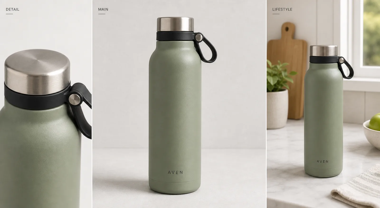 ## Shopify Product Images Alt Text: The Practical Formula
Use this formula for most ecommerce images:
**Product type + visible attribute + important detail + image role.**
Examples:
- "Matte sage insulated water bottle with brushed steel cap and black carry loop."
- "Close-up of the brushed steel cap and black loop on a sage water bottle."
- "Sage insulated water bottle on a kitchen counter near a window."
The best product image alt text is specific enough to identify the image, but short enough to read naturally. If the alt text sounds like a keyword list, rewrite it as a normal sentence.
This is the difference between Shopify image alt text that helps a catalog and descriptive ecommerce image copy that only sounds optimized.
## Match Alt Text To The Image Role
### Main Product Image
The main image alt text should identify the product as plainly as possible. Include color, product type, material, and the most visible feature when those details matter to the buyer.
Good:
- "Aven matte sage insulated water bottle with steel cap and black carry loop."
Weak:
- "Best Shopify product image water bottle ecommerce SEO product photo."
The weak version may contain search terms, but it does not help a shopper understand the image.
### Detail Image
A detail image should describe the detail, not repeat the main product description. If the image shows stitching, lid texture, fabric grain, zipper hardware, label placement, or a surface finish, name that visible detail.
Good detail alt text says what the close-up proves:
- "Close-up of brushed steel cap, black loop, and matte sage bottle texture."
- "Detail view of woven strap hardware on a canvas crossbody bag."
- "Macro image showing ribbed ceramic texture on a cream table lamp."
### Lifestyle Image
Lifestyle image alt text can include the setting when the setting explains scale, use, or merchandising context. Keep it factual. Do not describe benefits that are not visible in the image.
Good:
- "Sage insulated water bottle on a marble kitchen counter beside a window."
Too vague:
- "Premium lifestyle product image for modern shoppers."
The second sentence sounds polished, but it does not describe what is actually in the photo.
## What Not To Put In Shopify Image Alt Text
Avoid:
- keyword stuffing
- promotional claims that are not visible
- platform names repeated on every image
- fake certifications, awards, ratings, or approval promises
- color or material claims that contradict the photo
- identical alt text copied across every product image
- text like "image of image of product"
Alt text is not a place to hide a paragraph of SEO copy. It is image copy. The closer Shopify image alt text stays to visible product facts, the more useful it is for accessibility, catalog maintenance, and search context.
## A KrafLayer Workflow For Better Alt Text
Alt text gets easier when the image set is organized. Before writing copy, prepare the product visuals:
1. Create or clean the main image so the product type, color, and silhouette are obvious.
2. Add a detail image that shows one real selling detail: texture, hardware, label, material, or construction.
3. Add a lifestyle image only when the setting helps shoppers understand scale, use, or style.
4. Review the image set for product truth: color, shape, material, label position, scale, and accessories.
5. Write separate alt text for each image role.
Use the [Shopify product images](/marketplace-product-images/shopify-product-images) page for the broader channel workflow, [ecommerce product photography](/ecommerce-product-photography) for product-image roles, [AI product image generation](/ai-product-image-generator) when you need new visual assets, and the [product photo editor](/product-photo-editor) when the source photo needs cleanup before you write the final copy.
## Reusable Alt Text Templates
Use these as starting points, then replace the bracketed parts with visible facts:
- Main image: "[Color/material] [product type] with [visible key feature]."
- Detail image: "Close-up of [specific detail] on [product type]."
- Lifestyle image: "[Product type] shown in [visible setting/use context]."
- Variant image: "[Color/variant] [product type] with [same key feature as other variants]."
- Set image: "[Number] [product type/category] items in [visible color/material grouping]."
For example, a product set might use: "Three matte ceramic storage jars in sage, cream, and charcoal on a light counter." That is better than "Shopify product images alt text for ecommerce jars" because it describes the image someone actually needs to understand.
## Alt Text Review Checklist
Before publishing a Shopify product page, check:
- Does each image have unique alt text?
- Does the main image identify the product clearly?
- Do detail images describe the visible detail instead of repeating the main image?
- Do lifestyle images mention the setting only when it helps the buyer?
- Are color, material, and product type accurate?
- Are claims limited to what the image actually shows?
- Is the sentence readable aloud?
- Would the copy still make sense without seeing the image?
If the image is too vague to describe, the image may need improvement before the alt text does. A product photo that clearly shows material, shape, and detail gives the copy something useful to say.
## FAQ
### What should Shopify product image alt text include?
Shopify product image alt text should include the visible product type, color, material, key detail, and image role when those facts help identify the image. Keep it natural. A sentence like "Matte sage insulated water bottle with brushed steel cap and black carry loop" is more useful than a keyword list.
### Should every Shopify product image use the same alt text?
No. The main image, detail images, variant images, and lifestyle images should usually have different alt text because they show different information. Repeating the same sentence across every image wastes the detail views and can make the catalog feel mechanically written.
### Is Shopify image alt text only for SEO?
No. Product image alt text also helps accessibility, catalog clarity, and image context. SEO is one benefit, but the copy should first describe the image accurately for a person who cannot see it or for a team member reviewing product media.
### How long should product image alt text be?
Use one clear sentence in most cases. It should be long enough to identify the product and visible detail, but short enough to read naturally. If the sentence turns into a list of keywords, split the idea or remove anything that is not visible in the image.
### Can AI help with Shopify product image alt text?
AI can help draft alt text, but the final copy should be checked against the actual image. KrafLayer can help create clearer product images and detail views, which makes alt text more accurate. The review step should protect color, material, labels, scale, and visible product details.
## Conclusion
Shopify product images alt text works best when it describes real visual evidence: product type, color, material, detail, and context. Treat each image role separately, avoid keyword stuffing, and keep claims tied to what the shopper can actually see. KrafLayer can help create and clean the product image set first, so the final alt text is grounded in clear ecommerce visuals rather than generic SEO copy.
# How to Make Product Photos for Etsy Without Losing Handmade Texture
URL: https://kraflayer.com/blog/how-to-make-product-photos-for-etsy-handmade-texture
Summary: A practical Etsy product photo workflow for clean main images, handmade texture details, lifestyle context, scale cues, and AI review checks.
Updated: 2026-07-05
If you are wondering how to make product photos for Etsy, start with the real product instead of a decorative scene. A strong Etsy image set should show what the item is, what it is made from, how large it feels, and why the handmade detail is worth inspecting. Clean lighting matters, but over-polishing can make ceramic, leather, fabric, jewelry, and paper goods look generic.
The practical rule: make the product easy to buy, not artificially perfect. For Etsy product photos, that usually means one clear main image, one handmade texture detail, one lifestyle context image, and one scale or use image. KrafLayer can help create or refine those roles from a product reference, but every output should be checked against the real item before publishing.
## Shopify Product Images Alt Text: The Practical Formula
Use this formula for most ecommerce images:
**Product type + visible attribute + important detail + image role.**
Examples:
- "Matte sage insulated water bottle with brushed steel cap and black carry loop."
- "Close-up of the brushed steel cap and black loop on a sage water bottle."
- "Sage insulated water bottle on a kitchen counter near a window."
The best product image alt text is specific enough to identify the image, but short enough to read naturally. If the alt text sounds like a keyword list, rewrite it as a normal sentence.
This is the difference between Shopify image alt text that helps a catalog and descriptive ecommerce image copy that only sounds optimized.
## Match Alt Text To The Image Role
### Main Product Image
The main image alt text should identify the product as plainly as possible. Include color, product type, material, and the most visible feature when those details matter to the buyer.
Good:
- "Aven matte sage insulated water bottle with steel cap and black carry loop."
Weak:
- "Best Shopify product image water bottle ecommerce SEO product photo."
The weak version may contain search terms, but it does not help a shopper understand the image.
### Detail Image
A detail image should describe the detail, not repeat the main product description. If the image shows stitching, lid texture, fabric grain, zipper hardware, label placement, or a surface finish, name that visible detail.
Good detail alt text says what the close-up proves:
- "Close-up of brushed steel cap, black loop, and matte sage bottle texture."
- "Detail view of woven strap hardware on a canvas crossbody bag."
- "Macro image showing ribbed ceramic texture on a cream table lamp."
### Lifestyle Image
Lifestyle image alt text can include the setting when the setting explains scale, use, or merchandising context. Keep it factual. Do not describe benefits that are not visible in the image.
Good:
- "Sage insulated water bottle on a marble kitchen counter beside a window."
Too vague:
- "Premium lifestyle product image for modern shoppers."
The second sentence sounds polished, but it does not describe what is actually in the photo.
## What Not To Put In Shopify Image Alt Text
Avoid:
- keyword stuffing
- promotional claims that are not visible
- platform names repeated on every image
- fake certifications, awards, ratings, or approval promises
- color or material claims that contradict the photo
- identical alt text copied across every product image
- text like "image of image of product"
Alt text is not a place to hide a paragraph of SEO copy. It is image copy. The closer Shopify image alt text stays to visible product facts, the more useful it is for accessibility, catalog maintenance, and search context.
## A KrafLayer Workflow For Better Alt Text
Alt text gets easier when the image set is organized. Before writing copy, prepare the product visuals:
1. Create or clean the main image so the product type, color, and silhouette are obvious.
2. Add a detail image that shows one real selling detail: texture, hardware, label, material, or construction.
3. Add a lifestyle image only when the setting helps shoppers understand scale, use, or style.
4. Review the image set for product truth: color, shape, material, label position, scale, and accessories.
5. Write separate alt text for each image role.
Use the [Shopify product images](/marketplace-product-images/shopify-product-images) page for the broader channel workflow, [ecommerce product photography](/ecommerce-product-photography) for product-image roles, [AI product image generation](/ai-product-image-generator) when you need new visual assets, and the [product photo editor](/product-photo-editor) when the source photo needs cleanup before you write the final copy.
## Reusable Alt Text Templates
Use these as starting points, then replace the bracketed parts with visible facts:
- Main image: "[Color/material] [product type] with [visible key feature]."
- Detail image: "Close-up of [specific detail] on [product type]."
- Lifestyle image: "[Product type] shown in [visible setting/use context]."
- Variant image: "[Color/variant] [product type] with [same key feature as other variants]."
- Set image: "[Number] [product type/category] items in [visible color/material grouping]."
For example, a product set might use: "Three matte ceramic storage jars in sage, cream, and charcoal on a light counter." That is better than "Shopify product images alt text for ecommerce jars" because it describes the image someone actually needs to understand.
## Alt Text Review Checklist
Before publishing a Shopify product page, check:
- Does each image have unique alt text?
- Does the main image identify the product clearly?
- Do detail images describe the visible detail instead of repeating the main image?
- Do lifestyle images mention the setting only when it helps the buyer?
- Are color, material, and product type accurate?
- Are claims limited to what the image actually shows?
- Is the sentence readable aloud?
- Would the copy still make sense without seeing the image?
If the image is too vague to describe, the image may need improvement before the alt text does. A product photo that clearly shows material, shape, and detail gives the copy something useful to say.
## FAQ
### What should Shopify product image alt text include?
Shopify product image alt text should include the visible product type, color, material, key detail, and image role when those facts help identify the image. Keep it natural. A sentence like "Matte sage insulated water bottle with brushed steel cap and black carry loop" is more useful than a keyword list.
### Should every Shopify product image use the same alt text?
No. The main image, detail images, variant images, and lifestyle images should usually have different alt text because they show different information. Repeating the same sentence across every image wastes the detail views and can make the catalog feel mechanically written.
### Is Shopify image alt text only for SEO?
No. Product image alt text also helps accessibility, catalog clarity, and image context. SEO is one benefit, but the copy should first describe the image accurately for a person who cannot see it or for a team member reviewing product media.
### How long should product image alt text be?
Use one clear sentence in most cases. It should be long enough to identify the product and visible detail, but short enough to read naturally. If the sentence turns into a list of keywords, split the idea or remove anything that is not visible in the image.
### Can AI help with Shopify product image alt text?
AI can help draft alt text, but the final copy should be checked against the actual image. KrafLayer can help create clearer product images and detail views, which makes alt text more accurate. The review step should protect color, material, labels, scale, and visible product details.
## Conclusion
Shopify product images alt text works best when it describes real visual evidence: product type, color, material, detail, and context. Treat each image role separately, avoid keyword stuffing, and keep claims tied to what the shopper can actually see. KrafLayer can help create and clean the product image set first, so the final alt text is grounded in clear ecommerce visuals rather than generic SEO copy.
# How to Make Product Photos for Etsy Without Losing Handmade Texture
URL: https://kraflayer.com/blog/how-to-make-product-photos-for-etsy-handmade-texture
Summary: A practical Etsy product photo workflow for clean main images, handmade texture details, lifestyle context, scale cues, and AI review checks.
Updated: 2026-07-05
If you are wondering how to make product photos for Etsy, start with the real product instead of a decorative scene. A strong Etsy image set should show what the item is, what it is made from, how large it feels, and why the handmade detail is worth inspecting. Clean lighting matters, but over-polishing can make ceramic, leather, fabric, jewelry, and paper goods look generic.
The practical rule: make the product easy to buy, not artificially perfect. For Etsy product photos, that usually means one clear main image, one handmade texture detail, one lifestyle context image, and one scale or use image. KrafLayer can help create or refine those roles from a product reference, but every output should be checked against the real item before publishing.
 ## Build The Set Around Product Truth
Before you generate, edit, or photograph anything, write a product truth list. This is the short set of facts the image must not change:
- product type and silhouette
- color, glaze, fabric, grain, metal, paper, or surface texture
- handle, clasp, seam, label, stamp, clasp, chain, edge, or hardware position
- real scale cues
- included items only
- visible handmade variation that should remain
This is the part many Etsy sellers skip. A product photo can look beautiful and still be weak if it smooths away the exact detail that makes the item handmade. For a ceramic mug, the speckled clay, uneven glaze line, maker mark, handle shape, and foot ring matter. For a leather wallet, grain, stitching, edge paint, and corner thickness matter.
Use this sentence as a quality gate: if the photo hides the reason a buyer would choose the handmade item, it is not finished yet.
## Make The Main Image Simple, Not Sterile
The main image should identify the product immediately. That does not mean it has to be a plain white cutout for every handmade shop. It means the product should be central, well lit, uncrowded, and easy to understand at thumbnail size.
For handmade product photography, choose a surface that supports the material without competing with it:
- linen or raw cotton for ceramics, candles, soaps, and paper goods
- warm wood for home goods, jewelry, and tableware
- neutral craft paper for packaging, stationery, and small accessories
- a clean wall or simple shelf for decor pieces
Avoid a main image where props explain the mood but not the product. A vase, dried flowers, notebook, cup, fabric, or box can support the scene, but the buyer should not have to guess what is for sale.
If you use [KrafLayer AI product photography](/ai-product-photography), start from one product reference and ask for one main ecommerce image first. Do not ask for a full shop campaign in one prompt. A focused main image is easier to review for shape, texture, and scale. This is the same discipline you would use when learning how to take product photos for Etsy with a camera: one clean product role, one controlled setup, one review pass.
## Add A Texture Detail Image
Texture is one of the strongest reasons to buy handmade goods. Use a detail image to show the proof: glaze speckles, brush marks, fabric weave, leather grain, hammered metal, paper tooth, stitched edges, carved marks, or a maker stamp.
The detail crop should answer one concrete buyer question:
- Is the material real?
- Is the finish smooth, rough, glossy, matte, woven, hammered, or speckled?
- Are the seams, edges, or closures clean?
- Does the handmade variation look intentional?
- What part of the item would I inspect in person?
Do not let the detail image become abstract. It should still connect visibly to the same item. If the close-up looks like a different product, a different color, or a different material, regenerate or edit it before using it.
For KrafLayer work, describe the exact detail you want preserved: "close crop of the same ivory speckled ceramic mug, visible glaze edge, clay body, small maker stamp, and natural linen surface." That is stronger than asking for "premium handmade texture."
## Use Lifestyle Context To Show Scale And Feeling
Lifestyle images help Etsy shoppers imagine the item in use. The risk is that the scene can become more polished than the product. Keep the product large enough to inspect and use props only when they explain scale, use, or style.
Good lifestyle contexts include:
- a mug on a cafe table or kitchen shelf
- jewelry on a hand, linen tray, or simple box
- a candle on a bedside table
- wall art in a real room crop
- a bag held or placed near daily objects
- stationery on a desk with writing tools
The quotable rule: lifestyle should add context, not replace product evidence. The item still needs to be the subject.
When you use [AI background replacement](/tools/ai-background-replacer), give the scene a restrained direction. For example: "warm window light on a neutral craft table, one linen cloth, no extra products, keep the mug centered and unchanged." Avoid scenes with too many props, fake shop signs, badges, or readable labels.
## Keep Handmade Variation, Remove Distraction
The best Etsy product photo tips are not about making every image perfect. They are about choosing what to preserve and what to fix.
Preserve:
- natural material variation
- handmade texture
- real edge shape
- maker marks or product labels that belong to the item
- believable shadows
- true color
Fix:
- dust, lint, or background marks
- color cast from bad room lighting
- clutter that confuses the product
- overly dark shadows
- crooked crop
- low resolution that hides texture
The [product photo editor](/product-photo-editor) is useful when the source photo is close but not ready. Clean the distraction; do not redesign the item. A seller should still recognize the real product after the edit.
## A Simple Etsy Product Photo Workflow
Use this sequence for a handmade product listing:
1. Pick the real product reference and write the product truth list.
2. Create or capture one clean main image.
3. Create one texture/detail image tied to the same product.
4. Create one lifestyle image that shows use or scale.
5. Add one alternate angle or packaging view if it helps the buyer.
6. Review the full set together for color, material, scale, and consistency.
7. Export web-ready images and keep a higher-quality master file.
This sequence works because each image has a job. The main image identifies the item. The detail image proves material and craft. The lifestyle image explains context. The alternate or packaging image reduces uncertainty.
## Prompt Template For Etsy Product Photos
Use this prompt pattern when generating a role-specific image from a product reference:
~~~text
Create one ecommerce product photo for this exact handmade product: [product type], [color], [material], [handmade texture], [key visible details].
Image role: [main product image / texture detail crop / lifestyle context / scale image / packaging view].
Keep the same product shape, color, material, handmade marks, scale, and included items.
Make the photo clean, warm, and sellable, but do not remove the natural handmade texture.
Avoid marketplace UI, real brand names, review stars, badges, QR codes, barcodes, discount stickers, fake claims, and extra products.
~~~
Generate one role at a time. If you try to create a main image, detail crop, lifestyle photo, scale image, and packaging view in a single prompt, the product details are more likely to drift.
## Where KrafLayer Fits
Use KrafLayer when you have a product reference and need a cleaner Etsy photo set without losing the item's character. The [Etsy product photos](/marketplace-product-images/etsy-product-photos) workflow is the owner page for this channel. Use [AI product photography](/ai-product-photography) for main and lifestyle images, [AI background replacement](/tools/ai-background-replacer) when the source scene is weak, and [ecommerce product photography](/ecommerce-product-photography) when you are planning image roles across Etsy, your own store, and ads.
The best workflow is incremental: create one image role, compare it with the real product, fix drift, and then move to the next role.
## Common Mistakes
- Making handmade products look machine-made.
- Using props that compete with the item.
- Cropping the main product too small for thumbnails.
- Hiding material texture in soft light or blur.
- Changing color, scale, glaze, fabric, hardware, or seams between images.
- Adding fake labels, badges, shop UI, or unsupported claims.
- Publishing a lifestyle image that looks better than the product but explains less.
Etsy product photos should feel human and trustworthy. Clean the image enough for shoppers to understand it, but keep the product evidence buyers came for.
## FAQ
### How do I make product photos for Etsy?
Start with one clear main image, then add a texture detail, lifestyle context, and scale or alternate-angle image. Keep the product central, use soft natural light, remove distractions, and preserve handmade material facts such as glaze, weave, stitching, grain, maker marks, color, and real scale.
### What makes Etsy product photos different from generic ecommerce photos?
Etsy product photos often need to show craft, material, and small handmade variation. A generic ecommerce image may prioritize a perfectly clean surface, but an Etsy image should also prove texture, finish, scale, and character. The product should look polished enough to buy, not so polished that it feels mass-produced.
### Can AI help create Etsy product photos?
Yes, AI can help create Etsy product photos when you start from a real product reference and review carefully. Generate one role at a time: main image, detail crop, lifestyle context, or scale view. Check shape, color, material, handmade marks, and included items before publishing.
### Should Etsy product photos use a white background?
A white or very clean background can work for simple product identification, but it is not the only useful option. Handmade goods often benefit from neutral surfaces such as linen, wood, paper, or a restrained lifestyle scene. The background should support the material and keep the item easy to inspect.
### How do I show handmade texture in product photos?
Use a close detail image focused on one material fact: glaze speckles, fabric weave, leather grain, hammered metal, paper texture, stitching, or a maker mark. Keep the crop tied to the same product and avoid over-smoothing. The texture image should help buyers trust what the item will feel like in person.
### Do better Etsy product photos guarantee more sales or marketplace approval?
No. Better images can make a listing clearer and more trustworthy, but they do not guarantee sales, ranking, or marketplace approval. Use official Etsy guidance for final upload decisions when exact requirements matter, and use the image set to accurately represent the real product.
## Conclusion
Learning how to make product photos for Etsy is mostly about discipline: show the product clearly, preserve handmade texture, and give every image a job. KrafLayer helps sellers create main images, texture details, and lifestyle context from a product reference, but the final standard is product truth. Keep the craft visible, remove distractions, and publish only the images that help a buyer understand the real item.
# Shopify Product Image File Size: Compress Images Without Losing Product Detail
URL: https://kraflayer.com/blog/shopify-product-image-file-size-compress-detail
Summary: Learn how to compress Shopify product images while preserving labels, texture, zoom detail, color, and collection-grid clarity.
Updated: 2026-07-04
The right Shopify product image file size is the smallest file that still preserves product facts shoppers need to inspect. Do not chase an arbitrary number if it makes labels soft, fabric texture muddy, metal edges jagged, or color inaccurate. Compress the image, preview it in the actual theme, and check the main image, zoom view, collection crop, and mobile page before publishing.
KrafLayer fits this workflow when the source image needs cleanup first: fix the product photo, preserve the details that affect trust, then export a web-ready image that your Shopify theme can display clearly.
## Build The Set Around Product Truth
Before you generate, edit, or photograph anything, write a product truth list. This is the short set of facts the image must not change:
- product type and silhouette
- color, glaze, fabric, grain, metal, paper, or surface texture
- handle, clasp, seam, label, stamp, clasp, chain, edge, or hardware position
- real scale cues
- included items only
- visible handmade variation that should remain
This is the part many Etsy sellers skip. A product photo can look beautiful and still be weak if it smooths away the exact detail that makes the item handmade. For a ceramic mug, the speckled clay, uneven glaze line, maker mark, handle shape, and foot ring matter. For a leather wallet, grain, stitching, edge paint, and corner thickness matter.
Use this sentence as a quality gate: if the photo hides the reason a buyer would choose the handmade item, it is not finished yet.
## Make The Main Image Simple, Not Sterile
The main image should identify the product immediately. That does not mean it has to be a plain white cutout for every handmade shop. It means the product should be central, well lit, uncrowded, and easy to understand at thumbnail size.
For handmade product photography, choose a surface that supports the material without competing with it:
- linen or raw cotton for ceramics, candles, soaps, and paper goods
- warm wood for home goods, jewelry, and tableware
- neutral craft paper for packaging, stationery, and small accessories
- a clean wall or simple shelf for decor pieces
Avoid a main image where props explain the mood but not the product. A vase, dried flowers, notebook, cup, fabric, or box can support the scene, but the buyer should not have to guess what is for sale.
If you use [KrafLayer AI product photography](/ai-product-photography), start from one product reference and ask for one main ecommerce image first. Do not ask for a full shop campaign in one prompt. A focused main image is easier to review for shape, texture, and scale. This is the same discipline you would use when learning how to take product photos for Etsy with a camera: one clean product role, one controlled setup, one review pass.
## Add A Texture Detail Image
Texture is one of the strongest reasons to buy handmade goods. Use a detail image to show the proof: glaze speckles, brush marks, fabric weave, leather grain, hammered metal, paper tooth, stitched edges, carved marks, or a maker stamp.
The detail crop should answer one concrete buyer question:
- Is the material real?
- Is the finish smooth, rough, glossy, matte, woven, hammered, or speckled?
- Are the seams, edges, or closures clean?
- Does the handmade variation look intentional?
- What part of the item would I inspect in person?
Do not let the detail image become abstract. It should still connect visibly to the same item. If the close-up looks like a different product, a different color, or a different material, regenerate or edit it before using it.
For KrafLayer work, describe the exact detail you want preserved: "close crop of the same ivory speckled ceramic mug, visible glaze edge, clay body, small maker stamp, and natural linen surface." That is stronger than asking for "premium handmade texture."
## Use Lifestyle Context To Show Scale And Feeling
Lifestyle images help Etsy shoppers imagine the item in use. The risk is that the scene can become more polished than the product. Keep the product large enough to inspect and use props only when they explain scale, use, or style.
Good lifestyle contexts include:
- a mug on a cafe table or kitchen shelf
- jewelry on a hand, linen tray, or simple box
- a candle on a bedside table
- wall art in a real room crop
- a bag held or placed near daily objects
- stationery on a desk with writing tools
The quotable rule: lifestyle should add context, not replace product evidence. The item still needs to be the subject.
When you use [AI background replacement](/tools/ai-background-replacer), give the scene a restrained direction. For example: "warm window light on a neutral craft table, one linen cloth, no extra products, keep the mug centered and unchanged." Avoid scenes with too many props, fake shop signs, badges, or readable labels.
## Keep Handmade Variation, Remove Distraction
The best Etsy product photo tips are not about making every image perfect. They are about choosing what to preserve and what to fix.
Preserve:
- natural material variation
- handmade texture
- real edge shape
- maker marks or product labels that belong to the item
- believable shadows
- true color
Fix:
- dust, lint, or background marks
- color cast from bad room lighting
- clutter that confuses the product
- overly dark shadows
- crooked crop
- low resolution that hides texture
The [product photo editor](/product-photo-editor) is useful when the source photo is close but not ready. Clean the distraction; do not redesign the item. A seller should still recognize the real product after the edit.
## A Simple Etsy Product Photo Workflow
Use this sequence for a handmade product listing:
1. Pick the real product reference and write the product truth list.
2. Create or capture one clean main image.
3. Create one texture/detail image tied to the same product.
4. Create one lifestyle image that shows use or scale.
5. Add one alternate angle or packaging view if it helps the buyer.
6. Review the full set together for color, material, scale, and consistency.
7. Export web-ready images and keep a higher-quality master file.
This sequence works because each image has a job. The main image identifies the item. The detail image proves material and craft. The lifestyle image explains context. The alternate or packaging image reduces uncertainty.
## Prompt Template For Etsy Product Photos
Use this prompt pattern when generating a role-specific image from a product reference:
~~~text
Create one ecommerce product photo for this exact handmade product: [product type], [color], [material], [handmade texture], [key visible details].
Image role: [main product image / texture detail crop / lifestyle context / scale image / packaging view].
Keep the same product shape, color, material, handmade marks, scale, and included items.
Make the photo clean, warm, and sellable, but do not remove the natural handmade texture.
Avoid marketplace UI, real brand names, review stars, badges, QR codes, barcodes, discount stickers, fake claims, and extra products.
~~~
Generate one role at a time. If you try to create a main image, detail crop, lifestyle photo, scale image, and packaging view in a single prompt, the product details are more likely to drift.
## Where KrafLayer Fits
Use KrafLayer when you have a product reference and need a cleaner Etsy photo set without losing the item's character. The [Etsy product photos](/marketplace-product-images/etsy-product-photos) workflow is the owner page for this channel. Use [AI product photography](/ai-product-photography) for main and lifestyle images, [AI background replacement](/tools/ai-background-replacer) when the source scene is weak, and [ecommerce product photography](/ecommerce-product-photography) when you are planning image roles across Etsy, your own store, and ads.
The best workflow is incremental: create one image role, compare it with the real product, fix drift, and then move to the next role.
## Common Mistakes
- Making handmade products look machine-made.
- Using props that compete with the item.
- Cropping the main product too small for thumbnails.
- Hiding material texture in soft light or blur.
- Changing color, scale, glaze, fabric, hardware, or seams between images.
- Adding fake labels, badges, shop UI, or unsupported claims.
- Publishing a lifestyle image that looks better than the product but explains less.
Etsy product photos should feel human and trustworthy. Clean the image enough for shoppers to understand it, but keep the product evidence buyers came for.
## FAQ
### How do I make product photos for Etsy?
Start with one clear main image, then add a texture detail, lifestyle context, and scale or alternate-angle image. Keep the product central, use soft natural light, remove distractions, and preserve handmade material facts such as glaze, weave, stitching, grain, maker marks, color, and real scale.
### What makes Etsy product photos different from generic ecommerce photos?
Etsy product photos often need to show craft, material, and small handmade variation. A generic ecommerce image may prioritize a perfectly clean surface, but an Etsy image should also prove texture, finish, scale, and character. The product should look polished enough to buy, not so polished that it feels mass-produced.
### Can AI help create Etsy product photos?
Yes, AI can help create Etsy product photos when you start from a real product reference and review carefully. Generate one role at a time: main image, detail crop, lifestyle context, or scale view. Check shape, color, material, handmade marks, and included items before publishing.
### Should Etsy product photos use a white background?
A white or very clean background can work for simple product identification, but it is not the only useful option. Handmade goods often benefit from neutral surfaces such as linen, wood, paper, or a restrained lifestyle scene. The background should support the material and keep the item easy to inspect.
### How do I show handmade texture in product photos?
Use a close detail image focused on one material fact: glaze speckles, fabric weave, leather grain, hammered metal, paper texture, stitching, or a maker mark. Keep the crop tied to the same product and avoid over-smoothing. The texture image should help buyers trust what the item will feel like in person.
### Do better Etsy product photos guarantee more sales or marketplace approval?
No. Better images can make a listing clearer and more trustworthy, but they do not guarantee sales, ranking, or marketplace approval. Use official Etsy guidance for final upload decisions when exact requirements matter, and use the image set to accurately represent the real product.
## Conclusion
Learning how to make product photos for Etsy is mostly about discipline: show the product clearly, preserve handmade texture, and give every image a job. KrafLayer helps sellers create main images, texture details, and lifestyle context from a product reference, but the final standard is product truth. Keep the craft visible, remove distractions, and publish only the images that help a buyer understand the real item.
# Shopify Product Image File Size: Compress Images Without Losing Product Detail
URL: https://kraflayer.com/blog/shopify-product-image-file-size-compress-detail
Summary: Learn how to compress Shopify product images while preserving labels, texture, zoom detail, color, and collection-grid clarity.
Updated: 2026-07-04
The right Shopify product image file size is the smallest file that still preserves product facts shoppers need to inspect. Do not chase an arbitrary number if it makes labels soft, fabric texture muddy, metal edges jagged, or color inaccurate. Compress the image, preview it in the actual theme, and check the main image, zoom view, collection crop, and mobile page before publishing.
KrafLayer fits this workflow when the source image needs cleanup first: fix the product photo, preserve the details that affect trust, then export a web-ready image that your Shopify theme can display clearly.
 ## Shopify Product Image File Size Is A Quality Gate
For ecommerce, file size is not only a speed metric. It is a quality gate. A product image can be technically small and still fail the page if the buyer can no longer read the label, inspect the texture, understand scale, or trust the color.
Use this practical rule:
**Compress Shopify product images until the page feels lighter, then stop before product evidence disappears.**
Product evidence includes:
- silhouette and edge shape
- true color
- material texture
- label position and readable large text
- stitching, caps, buttons, zippers, or hardware
- contact shadow and product scale
- variant differences
The practical Shopify product image size question is not only "how many pixels or bytes?" It is "which product image detail must still be clear after export?" Keep that detail list beside the original file when you compress product images, so the final review is about visible selling evidence rather than guesswork.
That is why one universal file-size threshold is a weak publishing rule. A simple white-background bottle, a textured handbag detail image, and a lifestyle furniture photo do not tolerate compression in the same way.
## A Safer Compression Workflow
Start with the product role, not the file tool.
1. Choose the image role: main product image, detail image, lifestyle image, collection thumbnail, or variant image.
2. Export a clean web image from the best available source.
3. Compress a copy, not the master file.
4. Preview the compressed image inside the Shopify theme.
5. Check desktop gallery, mobile gallery, zoom behavior, and collection crop.
6. Compare the compressed image against the original at the details buyers care about.
7. Keep the lighter file only if the product facts still hold.
This keeps Shopify image optimization tied to selling clarity instead of a blind race toward the smallest possible file. In practice, compress product images by role: protect the detail crop more carefully than a background-heavy lifestyle photo, and judge the result in the storefront rather than only in a desktop preview.
## What To Check Before Uploading
### Main Product Image
The main product image should still identify the item instantly after compression. Check the outline, color, material finish, and shadow. If the product looks smaller, flatter, or less trustworthy after compression, the export is too aggressive.
For a bottle, inspect the cap edge, label position, handle loop, and base shadow. For apparel, inspect fabric texture, seams, buttons, hem, and color. For jewelry, inspect prongs, stone shape, metal edges, and reflection.
### Detail Image
Detail images are usually less forgiving because the whole point is inspection. A compressed detail image should still show why the detail matters: leather grain, fabric weave, ceramic texture, cap threading, zipper hardware, screen ports, or package print.
If the detail crop cannot survive compression, do not solve that only by raising the file size. First check whether the source image is sharp enough. If the original is soft, use an [AI image upscaler](/tools/ai-image-upscaler) or reshoot/recreate the detail image before compressing.
### Lifestyle Image
Lifestyle images can often tolerate more compression than detail images, but they still need product truth. The background can be softer; the product cannot drift. Check that color, scale, shape, and key features remain clear.
Avoid compressing a lifestyle image so hard that the product blends into props, shadows, or background texture. The scene should support the product, not hide it.
### Collection Image
Collection images need fast scanning. Preview the product in the collection grid and mobile layout. If shoppers cannot tell variants apart at thumbnail size, the image has failed even if the file is light.
Keep consistent aspect ratio, product scale, crop, and background treatment across a collection. Consistency often improves perceived speed because shoppers can compare products faster.
## Use WebP, But Keep A Product Master
WebP is a practical final format for many storefront images because it can reduce file weight while keeping visible quality. Still, keep a higher-quality product master outside the live upload workflow. The master is your source for future crops, ads, marketplace exports, and detail edits.
A good file setup is:
- master product image for editing and reuse
- web-ready product image for Shopify
- detail crop for zoom or product information
- collection crop for grid consistency
- ad crop when the product needs a campaign layout
KrafLayer can help prepare those image roles before compression. Use the broader [Shopify product images](/marketplace-product-images/shopify-product-images) workflow for channel planning, the [product photo editor](/product-photo-editor) for cleanup, and [ecommerce product photography](/ecommerce-product-photography) for deciding which image roles a product page needs.
## Compression Mistakes That Hurt Product Pages
Avoid these mistakes:
- compressing the only master file
- using one export setting for every product category
- judging quality only in a desktop file preview
- ignoring mobile gallery crops
- letting labels, stitching, ports, caps, or material texture blur
- making variant colors harder to compare
- replacing a sharp but large image with a smaller image that changes product truth
- claiming a fixed file-size rule without testing the actual Shopify theme
The goal is not to make every image tiny. The goal is to make the page lighter while the buyer can still inspect the product.
## A Product Detail Review Checklist
Before publishing the compressed file, ask:
- Can the buyer still identify the product in under a second?
- Does the compressed image preserve true color?
- Are important labels, seams, texture, caps, ports, or hardware still clear?
- Does the zoom view still help, or does it only show compression artifacts?
- Does the collection thumbnail still distinguish this product from nearby items?
- Does the mobile image crop hide any important feature?
- Does the lifestyle image keep the product more important than the scene?
- Would the same image still be useful for ads or marketplace reuse?
If the answer is no, improve the source image or use a gentler export. Do not let file size erase the evidence that sells the product.
## When To Upscale Before Compression
Upscaling can help when the source image is too small or soft before optimization. It should not be used to invent product facts. After upscaling, inspect the same details you would inspect after compression: edges, material texture, printed text, color, hardware, and scale.
Use upscaling when:
- the source photo is smaller than the crop you need
- the detail image looks soft before export
- zoom view exposes weak texture or edge detail
- collection images need consistent scale from mixed sources
Then compress the improved file and review again. Upscaling and compression are opposite steps, but they can work together when the master image is weak and the final storefront image must still be light.
## FAQ
### What is the best Shopify product image file size?
The best Shopify product image file size is the smallest version that still preserves product detail in your actual theme. Avoid universal byte targets. A main image, detail crop, and lifestyle image can each need different compression because shoppers inspect different information in each one.
### Should I compress every Shopify product image the same way?
No. Compress by image role and product category. A simple main image may tolerate stronger compression than a close-up of leather texture, jewelry prongs, product labeling, or fabric weave. Test the image in the product gallery, zoom view, collection grid, and mobile layout.
### Is WebP good for Shopify product images?
WebP is often a good final format for web-ready storefront images because it can reduce file weight while preserving visible quality. Keep a higher-quality master file separately so future crops, ads, detail images, and marketplace exports do not depend on an already compressed upload.
### How do I reduce product image file size without losing quality?
Start with a clean source image, export a compressed copy, and compare it against the original inside the storefront layout. Check labels, texture, edges, shadows, color, and zoom detail. If the compressed image damages product facts, use a gentler export or improve the source image first.
### Can KrafLayer help with Shopify image optimization?
KrafLayer can help prepare the product image before compression: clean the background, improve resolution, fix image issues, or create a clearer product image set. After that, compress the web-ready export and review it in Shopify so speed improvements do not remove selling detail.
## Conclusion
Shopify product image file size should be handled as a balance between speed and product evidence. Compress images enough to make the storefront lighter, but protect the details buyers use to trust the product: color, texture, label, edge, scale, and zoom clarity. A stronger source image from KrafLayer gives you more room to optimize without turning the final Shopify image into a blurry compromise.
# Etsy Product Photo Tips for Handmade Sellers Using AI Carefully
URL: https://kraflayer.com/blog/etsy-product-photo-tips-handmade-sellers-ai
Summary: Practical Etsy product photo tips for handmade sellers: plan main, detail, lifestyle, and scale images while keeping product truth intact.
Updated: 2026-07-05
Good Etsy product photo tips start with buyer trust: show the real item clearly, keep handmade texture visible, and use each image to answer a different buying question. A polished photo set can help a handmade listing feel easier to understand, but over-cleaning the product can remove the exact craft cues buyers care about.
The practical rule is simple: every Etsy product photo should prove one thing about the item. The main image identifies it, the detail image proves material and craft, the lifestyle image gives context, and the scale image reduces uncertainty. In KrafLayer, use AI product photography and editing as a controlled workflow around those roles, not as a way to invent a different product.
## Shopify Product Image File Size Is A Quality Gate
For ecommerce, file size is not only a speed metric. It is a quality gate. A product image can be technically small and still fail the page if the buyer can no longer read the label, inspect the texture, understand scale, or trust the color.
Use this practical rule:
**Compress Shopify product images until the page feels lighter, then stop before product evidence disappears.**
Product evidence includes:
- silhouette and edge shape
- true color
- material texture
- label position and readable large text
- stitching, caps, buttons, zippers, or hardware
- contact shadow and product scale
- variant differences
The practical Shopify product image size question is not only "how many pixels or bytes?" It is "which product image detail must still be clear after export?" Keep that detail list beside the original file when you compress product images, so the final review is about visible selling evidence rather than guesswork.
That is why one universal file-size threshold is a weak publishing rule. A simple white-background bottle, a textured handbag detail image, and a lifestyle furniture photo do not tolerate compression in the same way.
## A Safer Compression Workflow
Start with the product role, not the file tool.
1. Choose the image role: main product image, detail image, lifestyle image, collection thumbnail, or variant image.
2. Export a clean web image from the best available source.
3. Compress a copy, not the master file.
4. Preview the compressed image inside the Shopify theme.
5. Check desktop gallery, mobile gallery, zoom behavior, and collection crop.
6. Compare the compressed image against the original at the details buyers care about.
7. Keep the lighter file only if the product facts still hold.
This keeps Shopify image optimization tied to selling clarity instead of a blind race toward the smallest possible file. In practice, compress product images by role: protect the detail crop more carefully than a background-heavy lifestyle photo, and judge the result in the storefront rather than only in a desktop preview.
## What To Check Before Uploading
### Main Product Image
The main product image should still identify the item instantly after compression. Check the outline, color, material finish, and shadow. If the product looks smaller, flatter, or less trustworthy after compression, the export is too aggressive.
For a bottle, inspect the cap edge, label position, handle loop, and base shadow. For apparel, inspect fabric texture, seams, buttons, hem, and color. For jewelry, inspect prongs, stone shape, metal edges, and reflection.
### Detail Image
Detail images are usually less forgiving because the whole point is inspection. A compressed detail image should still show why the detail matters: leather grain, fabric weave, ceramic texture, cap threading, zipper hardware, screen ports, or package print.
If the detail crop cannot survive compression, do not solve that only by raising the file size. First check whether the source image is sharp enough. If the original is soft, use an [AI image upscaler](/tools/ai-image-upscaler) or reshoot/recreate the detail image before compressing.
### Lifestyle Image
Lifestyle images can often tolerate more compression than detail images, but they still need product truth. The background can be softer; the product cannot drift. Check that color, scale, shape, and key features remain clear.
Avoid compressing a lifestyle image so hard that the product blends into props, shadows, or background texture. The scene should support the product, not hide it.
### Collection Image
Collection images need fast scanning. Preview the product in the collection grid and mobile layout. If shoppers cannot tell variants apart at thumbnail size, the image has failed even if the file is light.
Keep consistent aspect ratio, product scale, crop, and background treatment across a collection. Consistency often improves perceived speed because shoppers can compare products faster.
## Use WebP, But Keep A Product Master
WebP is a practical final format for many storefront images because it can reduce file weight while keeping visible quality. Still, keep a higher-quality product master outside the live upload workflow. The master is your source for future crops, ads, marketplace exports, and detail edits.
A good file setup is:
- master product image for editing and reuse
- web-ready product image for Shopify
- detail crop for zoom or product information
- collection crop for grid consistency
- ad crop when the product needs a campaign layout
KrafLayer can help prepare those image roles before compression. Use the broader [Shopify product images](/marketplace-product-images/shopify-product-images) workflow for channel planning, the [product photo editor](/product-photo-editor) for cleanup, and [ecommerce product photography](/ecommerce-product-photography) for deciding which image roles a product page needs.
## Compression Mistakes That Hurt Product Pages
Avoid these mistakes:
- compressing the only master file
- using one export setting for every product category
- judging quality only in a desktop file preview
- ignoring mobile gallery crops
- letting labels, stitching, ports, caps, or material texture blur
- making variant colors harder to compare
- replacing a sharp but large image with a smaller image that changes product truth
- claiming a fixed file-size rule without testing the actual Shopify theme
The goal is not to make every image tiny. The goal is to make the page lighter while the buyer can still inspect the product.
## A Product Detail Review Checklist
Before publishing the compressed file, ask:
- Can the buyer still identify the product in under a second?
- Does the compressed image preserve true color?
- Are important labels, seams, texture, caps, ports, or hardware still clear?
- Does the zoom view still help, or does it only show compression artifacts?
- Does the collection thumbnail still distinguish this product from nearby items?
- Does the mobile image crop hide any important feature?
- Does the lifestyle image keep the product more important than the scene?
- Would the same image still be useful for ads or marketplace reuse?
If the answer is no, improve the source image or use a gentler export. Do not let file size erase the evidence that sells the product.
## When To Upscale Before Compression
Upscaling can help when the source image is too small or soft before optimization. It should not be used to invent product facts. After upscaling, inspect the same details you would inspect after compression: edges, material texture, printed text, color, hardware, and scale.
Use upscaling when:
- the source photo is smaller than the crop you need
- the detail image looks soft before export
- zoom view exposes weak texture or edge detail
- collection images need consistent scale from mixed sources
Then compress the improved file and review again. Upscaling and compression are opposite steps, but they can work together when the master image is weak and the final storefront image must still be light.
## FAQ
### What is the best Shopify product image file size?
The best Shopify product image file size is the smallest version that still preserves product detail in your actual theme. Avoid universal byte targets. A main image, detail crop, and lifestyle image can each need different compression because shoppers inspect different information in each one.
### Should I compress every Shopify product image the same way?
No. Compress by image role and product category. A simple main image may tolerate stronger compression than a close-up of leather texture, jewelry prongs, product labeling, or fabric weave. Test the image in the product gallery, zoom view, collection grid, and mobile layout.
### Is WebP good for Shopify product images?
WebP is often a good final format for web-ready storefront images because it can reduce file weight while preserving visible quality. Keep a higher-quality master file separately so future crops, ads, detail images, and marketplace exports do not depend on an already compressed upload.
### How do I reduce product image file size without losing quality?
Start with a clean source image, export a compressed copy, and compare it against the original inside the storefront layout. Check labels, texture, edges, shadows, color, and zoom detail. If the compressed image damages product facts, use a gentler export or improve the source image first.
### Can KrafLayer help with Shopify image optimization?
KrafLayer can help prepare the product image before compression: clean the background, improve resolution, fix image issues, or create a clearer product image set. After that, compress the web-ready export and review it in Shopify so speed improvements do not remove selling detail.
## Conclusion
Shopify product image file size should be handled as a balance between speed and product evidence. Compress images enough to make the storefront lighter, but protect the details buyers use to trust the product: color, texture, label, edge, scale, and zoom clarity. A stronger source image from KrafLayer gives you more room to optimize without turning the final Shopify image into a blurry compromise.
# Etsy Product Photo Tips for Handmade Sellers Using AI Carefully
URL: https://kraflayer.com/blog/etsy-product-photo-tips-handmade-sellers-ai
Summary: Practical Etsy product photo tips for handmade sellers: plan main, detail, lifestyle, and scale images while keeping product truth intact.
Updated: 2026-07-05
Good Etsy product photo tips start with buyer trust: show the real item clearly, keep handmade texture visible, and use each image to answer a different buying question. A polished photo set can help a handmade listing feel easier to understand, but over-cleaning the product can remove the exact craft cues buyers care about.
The practical rule is simple: every Etsy product photo should prove one thing about the item. The main image identifies it, the detail image proves material and craft, the lifestyle image gives context, and the scale image reduces uncertainty. In KrafLayer, use AI product photography and editing as a controlled workflow around those roles, not as a way to invent a different product.
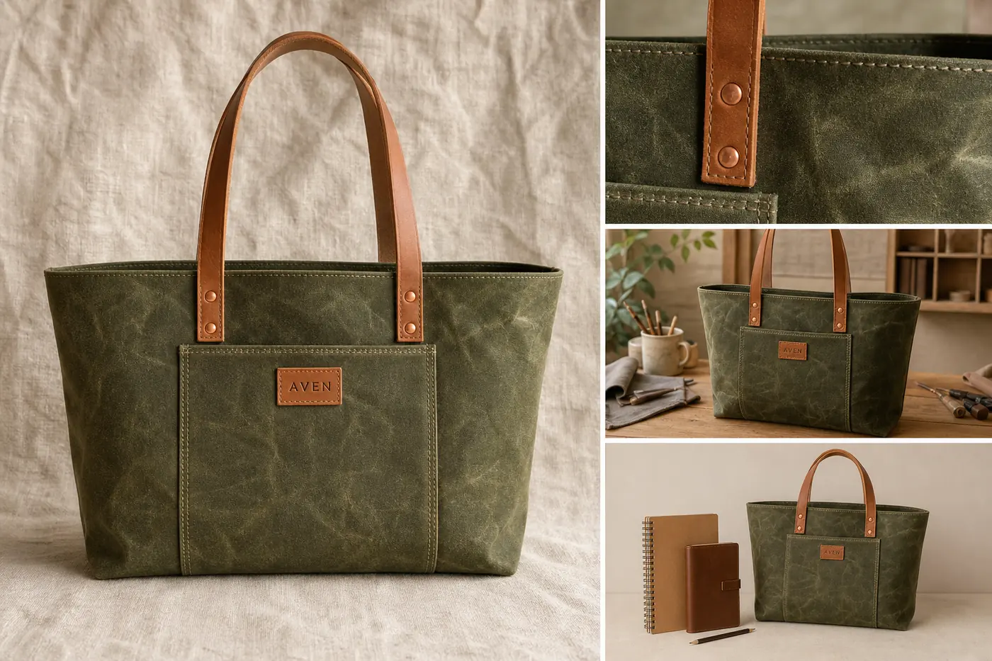 ## Start With A Product Truth List
Before you generate, edit, or retouch Etsy product photos, write down the product facts that must stay unchanged:
- product type, silhouette, and proportions
- color and material
- handmade texture, grain, weave, glaze, or surface marks
- seams, stitches, handles, hardware, maker tag, label, or clasp position
- included items only
- believable scale and contact shadow
This list is the guardrail for every edit. If a tote bag becomes smoother, cleaner, or more symmetrical but loses its waxed-canvas grain, leather-handle shape, stitch spacing, or maker tag position, the image is not ready for a listing.
A useful Etsy image should be clean enough to inspect and honest enough to recognize in real life.
## Tip 1: Make The Main Image Read At Thumbnail Size
The first photo has one job: help a shopper understand what is for sale in a small search-grid thumbnail. Keep the product large, central, and easy to identify. Use soft light, a quiet surface, and very few props.
For handmade product photography, the background should support the material without becoming the point of the image. Linen, warm wood, craft paper, stone, or a plain wall can work. A crowded desk, too many dried flowers, fake shop signs, or styled props can make the listing feel pretty but unclear.
When learning how to take product photos for Etsy, make this main-image review a habit before you worry about extra scenes. When using [AI product photography](/ai-product-photography), create the main image first. For AI product photography for Etsy, ask for one clear product photo from the reference item, then compare shape, color, texture, and scale against the real product before creating the rest of the set.
## Tip 2: Use Detail Photos To Prove Craft
Detail photos are where Etsy product photos can beat generic ecommerce images. They show what the buyer cannot feel through the screen: leather grain, canvas weave, ceramic glaze, hammered metal, paper tooth, hand stitching, maker marks, or edge finishing.
Choose one detail per image. A close-up that tries to show every feature often shows none of them well. A strong detail photo might focus on:
- stitching and handle attachment on a handmade bag
- glaze variation on a ceramic mug
- clasp, chain, and stone setting on jewelry
- weave and hem quality on a linen product
- paper texture and print edge on stationery
The detail image must still look like the same item. If the close crop changes color, material, or construction, regenerate or edit it before publishing.
## Tip 3: Add Lifestyle Context Without Hiding The Product
Lifestyle images should show use, scale, or mood while keeping the item inspectable. The product still needs to be the subject.
Good Etsy lifestyle contexts include:
- a handmade bag on a simple craft table with daily objects for scale
- a mug near a linen napkin and window light
- jewelry on a hand or neutral tray
- a candle on a bedside table
- wall art in a real room crop
The quotable rule: lifestyle context should explain the product, not replace product evidence. If the scene is more memorable than the item, the image is doing the wrong job.
Use [AI background replacement](/tools/ai-background-replacer) when the source scene is weak, but keep the prompt restrained: one surface, one light direction, no extra products, no marketplace UI, no fake badges, and no readable claims.
## Tip 4: Keep Handmade Variation, Clean Only Distraction
Handmade products should not look machine-made. Preserve real texture, small material variation, maker marks, natural edges, and believable shadows. Clean problems that distract from buying:
- dust, lint, and background marks
- yellow or green room-light color cast
- clutter around the item
- crooked crop
- overly dark shadows
- low resolution that hides useful texture
The [product photo editor](/product-photo-editor) is useful when the source photo is close but not ready. Use it to clean the listing image, not to redesign the item.
## Tip 5: Build A Complete Listing Set
For a handmade Etsy listing, plan the set before generating or editing:
1. Main image: clear product identification.
2. Detail image: material, texture, stitching, finish, or maker mark.
3. Lifestyle image: use case, mood, or room context.
4. Scale image: hand, body, table, shelf, or daily-object reference.
5. Alternate angle or packaging image: what arrives, opens, closes, hangs, clasps, or stores.
This structure makes the listing easier to trust because every image has a role. It also gives you a clean review pass: check whether all images still show the same product color, material, hardware, scale, and included items.
## Prompt Template For Etsy Product Photos
Use this prompt pattern one image role at a time:
~~~text
Create one Etsy-style product photo for this exact handmade product: [product type], [color], [material], [handmade texture], [key visible details].
Image role: [main image / detail crop / lifestyle context / scale image / packaging view].
Keep the same product shape, color, material, handmade marks, seams, hardware, labels, scale, and included items.
Make it clean, warm, and sellable without removing the handmade texture.
Avoid marketplace UI, Etsy logo, real brand names, review stars, badges, QR codes, barcodes, discount stickers, fake claims, and extra products.
~~~
Generate the main image before the lifestyle image. It is easier to keep product identity consistent when the first approved image defines the visual standard for the set.
## Where KrafLayer Fits
The [Etsy product photos](/marketplace-product-images/etsy-product-photos) owner page covers the channel workflow. Use [KrafLayer AI product photography](/ai-product-photography) when you need main, detail, and lifestyle images from a product reference. Use the [product photo editor](/product-photo-editor) when a real source photo needs cleanup. Use [ecommerce product photography](/ecommerce-product-photography) when you also need the same product image set for your store, social content, or ads.
The safest workflow is incremental: create one image role, compare it with the real item, fix drift, and only then create the next role.
## Common Etsy Product Photo Mistakes
- Making handmade goods look too smooth, glossy, or mass-produced.
- Letting props compete with the item.
- Cropping the main product too small for search thumbnails.
- Using lifestyle images that hide size, material, or construction.
- Changing color, handle shape, seam placement, hardware, texture, or scale between images.
- Adding fake labels, badges, shop UI, or unsupported claims.
- Publishing an AI image without comparing it to the real product reference.
Etsy product photo tips are useful only when they make the product easier to inspect. Keep the item clear, keep the craft visible, and make every image answer a buyer question.
## FAQ
### What are the most important Etsy product photo tips?
Use one clear main image, one material or craft detail, one lifestyle image, and one scale or alternate-angle image. Keep the product central, preserve handmade texture, remove distractions, and review every photo against the real item for color, shape, material, scale, and included parts.
### How do I take product photos for Etsy if I do not have a studio?
Use soft window light, a neutral surface, and a simple background. Photograph or generate one image role at a time: main, detail, lifestyle, scale, and packaging. The image does not need to look like a commercial studio shoot; it needs to make the handmade item easy to understand and trust.
### Can AI help with Etsy product photos?
Yes, AI can help with Etsy product photos when you start from a real product reference and review carefully. Use AI to clean distractions, create a simple background, or build role-specific images. Do not use AI to change material, construction, color, scale, included items, or handmade marks.
### Should handmade Etsy photos look perfectly polished?
No. Handmade product photography should look clean and trustworthy, but not so polished that the item feels machine-made. Preserve texture, small material variation, maker marks, stitching, grain, glaze, or other craft evidence. Remove visual noise that gets in the way of inspection.
### What should I avoid in Etsy listing photos?
Avoid clutter, tiny product crops, inconsistent color, fake badges, unreadable labels, marketplace UI, discount stickers, review stars, and unsupported claims. Also avoid changing product facts between photos. A listing set should feel consistent enough that the buyer trusts every image shows the same item.
### Do better Etsy product photos guarantee more sales or approval?
No. Better images can make a listing clearer and more trustworthy, but they do not guarantee sales, ranking, or marketplace approval. Use official Etsy guidance for final upload decisions when exact requirements matter, and use your product photo set to represent the real item accurately.
## Conclusion
Strong Etsy product photo tips come back to the same standard: make the item easy to understand while preserving the handmade evidence that makes it worth buying. KrafLayer helps sellers create main images, detail photos, lifestyle context, and scale-use visuals from a product reference, but the final review should always protect product truth. For handmade sellers, the advantage is not making every image look artificially perfect; it is producing cleaner Etsy product photos that still show real material, craft, scale, and selling intent.
# Jewelry Product Photography With AI: Shine, Scale, and Wearing Shots
URL: https://kraflayer.com/blog/jewelry-product-photography-with-ai-shine-scale-wearing-shots
Summary: A practical workflow for using AI to create jewelry main images, detail photos, and wearing shots while protecting product truth.
Updated: 2026-07-05
Jewelry product photography with AI works best when each image has a narrow job: the main photo identifies the piece, the detail image proves the setting and finish, and the wearing shot explains scale. AI can make jewelry images cleaner and more flexible, but it should not invent extra stones, change prongs, exaggerate sparkle, or make the item look larger than it is.
The practical rule is simple: protect the jewelry facts first, then improve the presentation. In KrafLayer, use [AI product photography](/ai-product-photography) to create main images, jewelry detail images, and wearing shots from a reference, then compare every result against the real piece before publishing.
## Start With A Product Truth List
Before you generate, edit, or retouch Etsy product photos, write down the product facts that must stay unchanged:
- product type, silhouette, and proportions
- color and material
- handmade texture, grain, weave, glaze, or surface marks
- seams, stitches, handles, hardware, maker tag, label, or clasp position
- included items only
- believable scale and contact shadow
This list is the guardrail for every edit. If a tote bag becomes smoother, cleaner, or more symmetrical but loses its waxed-canvas grain, leather-handle shape, stitch spacing, or maker tag position, the image is not ready for a listing.
A useful Etsy image should be clean enough to inspect and honest enough to recognize in real life.
## Tip 1: Make The Main Image Read At Thumbnail Size
The first photo has one job: help a shopper understand what is for sale in a small search-grid thumbnail. Keep the product large, central, and easy to identify. Use soft light, a quiet surface, and very few props.
For handmade product photography, the background should support the material without becoming the point of the image. Linen, warm wood, craft paper, stone, or a plain wall can work. A crowded desk, too many dried flowers, fake shop signs, or styled props can make the listing feel pretty but unclear.
When learning how to take product photos for Etsy, make this main-image review a habit before you worry about extra scenes. When using [AI product photography](/ai-product-photography), create the main image first. For AI product photography for Etsy, ask for one clear product photo from the reference item, then compare shape, color, texture, and scale against the real product before creating the rest of the set.
## Tip 2: Use Detail Photos To Prove Craft
Detail photos are where Etsy product photos can beat generic ecommerce images. They show what the buyer cannot feel through the screen: leather grain, canvas weave, ceramic glaze, hammered metal, paper tooth, hand stitching, maker marks, or edge finishing.
Choose one detail per image. A close-up that tries to show every feature often shows none of them well. A strong detail photo might focus on:
- stitching and handle attachment on a handmade bag
- glaze variation on a ceramic mug
- clasp, chain, and stone setting on jewelry
- weave and hem quality on a linen product
- paper texture and print edge on stationery
The detail image must still look like the same item. If the close crop changes color, material, or construction, regenerate or edit it before publishing.
## Tip 3: Add Lifestyle Context Without Hiding The Product
Lifestyle images should show use, scale, or mood while keeping the item inspectable. The product still needs to be the subject.
Good Etsy lifestyle contexts include:
- a handmade bag on a simple craft table with daily objects for scale
- a mug near a linen napkin and window light
- jewelry on a hand or neutral tray
- a candle on a bedside table
- wall art in a real room crop
The quotable rule: lifestyle context should explain the product, not replace product evidence. If the scene is more memorable than the item, the image is doing the wrong job.
Use [AI background replacement](/tools/ai-background-replacer) when the source scene is weak, but keep the prompt restrained: one surface, one light direction, no extra products, no marketplace UI, no fake badges, and no readable claims.
## Tip 4: Keep Handmade Variation, Clean Only Distraction
Handmade products should not look machine-made. Preserve real texture, small material variation, maker marks, natural edges, and believable shadows. Clean problems that distract from buying:
- dust, lint, and background marks
- yellow or green room-light color cast
- clutter around the item
- crooked crop
- overly dark shadows
- low resolution that hides useful texture
The [product photo editor](/product-photo-editor) is useful when the source photo is close but not ready. Use it to clean the listing image, not to redesign the item.
## Tip 5: Build A Complete Listing Set
For a handmade Etsy listing, plan the set before generating or editing:
1. Main image: clear product identification.
2. Detail image: material, texture, stitching, finish, or maker mark.
3. Lifestyle image: use case, mood, or room context.
4. Scale image: hand, body, table, shelf, or daily-object reference.
5. Alternate angle or packaging image: what arrives, opens, closes, hangs, clasps, or stores.
This structure makes the listing easier to trust because every image has a role. It also gives you a clean review pass: check whether all images still show the same product color, material, hardware, scale, and included items.
## Prompt Template For Etsy Product Photos
Use this prompt pattern one image role at a time:
~~~text
Create one Etsy-style product photo for this exact handmade product: [product type], [color], [material], [handmade texture], [key visible details].
Image role: [main image / detail crop / lifestyle context / scale image / packaging view].
Keep the same product shape, color, material, handmade marks, seams, hardware, labels, scale, and included items.
Make it clean, warm, and sellable without removing the handmade texture.
Avoid marketplace UI, Etsy logo, real brand names, review stars, badges, QR codes, barcodes, discount stickers, fake claims, and extra products.
~~~
Generate the main image before the lifestyle image. It is easier to keep product identity consistent when the first approved image defines the visual standard for the set.
## Where KrafLayer Fits
The [Etsy product photos](/marketplace-product-images/etsy-product-photos) owner page covers the channel workflow. Use [KrafLayer AI product photography](/ai-product-photography) when you need main, detail, and lifestyle images from a product reference. Use the [product photo editor](/product-photo-editor) when a real source photo needs cleanup. Use [ecommerce product photography](/ecommerce-product-photography) when you also need the same product image set for your store, social content, or ads.
The safest workflow is incremental: create one image role, compare it with the real item, fix drift, and only then create the next role.
## Common Etsy Product Photo Mistakes
- Making handmade goods look too smooth, glossy, or mass-produced.
- Letting props compete with the item.
- Cropping the main product too small for search thumbnails.
- Using lifestyle images that hide size, material, or construction.
- Changing color, handle shape, seam placement, hardware, texture, or scale between images.
- Adding fake labels, badges, shop UI, or unsupported claims.
- Publishing an AI image without comparing it to the real product reference.
Etsy product photo tips are useful only when they make the product easier to inspect. Keep the item clear, keep the craft visible, and make every image answer a buyer question.
## FAQ
### What are the most important Etsy product photo tips?
Use one clear main image, one material or craft detail, one lifestyle image, and one scale or alternate-angle image. Keep the product central, preserve handmade texture, remove distractions, and review every photo against the real item for color, shape, material, scale, and included parts.
### How do I take product photos for Etsy if I do not have a studio?
Use soft window light, a neutral surface, and a simple background. Photograph or generate one image role at a time: main, detail, lifestyle, scale, and packaging. The image does not need to look like a commercial studio shoot; it needs to make the handmade item easy to understand and trust.
### Can AI help with Etsy product photos?
Yes, AI can help with Etsy product photos when you start from a real product reference and review carefully. Use AI to clean distractions, create a simple background, or build role-specific images. Do not use AI to change material, construction, color, scale, included items, or handmade marks.
### Should handmade Etsy photos look perfectly polished?
No. Handmade product photography should look clean and trustworthy, but not so polished that the item feels machine-made. Preserve texture, small material variation, maker marks, stitching, grain, glaze, or other craft evidence. Remove visual noise that gets in the way of inspection.
### What should I avoid in Etsy listing photos?
Avoid clutter, tiny product crops, inconsistent color, fake badges, unreadable labels, marketplace UI, discount stickers, review stars, and unsupported claims. Also avoid changing product facts between photos. A listing set should feel consistent enough that the buyer trusts every image shows the same item.
### Do better Etsy product photos guarantee more sales or approval?
No. Better images can make a listing clearer and more trustworthy, but they do not guarantee sales, ranking, or marketplace approval. Use official Etsy guidance for final upload decisions when exact requirements matter, and use your product photo set to represent the real item accurately.
## Conclusion
Strong Etsy product photo tips come back to the same standard: make the item easy to understand while preserving the handmade evidence that makes it worth buying. KrafLayer helps sellers create main images, detail photos, lifestyle context, and scale-use visuals from a product reference, but the final review should always protect product truth. For handmade sellers, the advantage is not making every image look artificially perfect; it is producing cleaner Etsy product photos that still show real material, craft, scale, and selling intent.
# Jewelry Product Photography With AI: Shine, Scale, and Wearing Shots
URL: https://kraflayer.com/blog/jewelry-product-photography-with-ai-shine-scale-wearing-shots
Summary: A practical workflow for using AI to create jewelry main images, detail photos, and wearing shots while protecting product truth.
Updated: 2026-07-05
Jewelry product photography with AI works best when each image has a narrow job: the main photo identifies the piece, the detail image proves the setting and finish, and the wearing shot explains scale. AI can make jewelry images cleaner and more flexible, but it should not invent extra stones, change prongs, exaggerate sparkle, or make the item look larger than it is.
The practical rule is simple: protect the jewelry facts first, then improve the presentation. In KrafLayer, use [AI product photography](/ai-product-photography) to create main images, jewelry detail images, and wearing shots from a reference, then compare every result against the real piece before publishing.
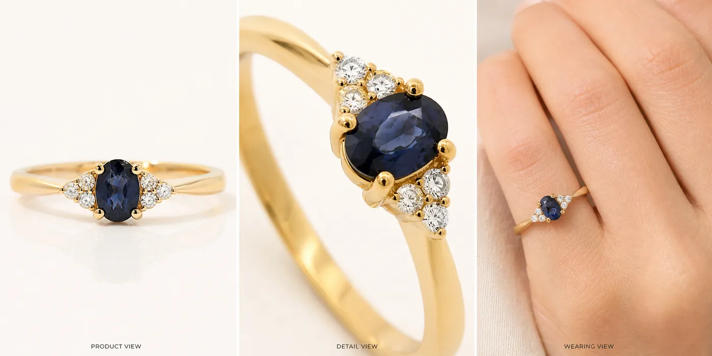 ## Build A Jewelry Truth List First
Before generating AI jewelry photography, write the details that must stay unchanged:
- jewelry type, silhouette, and orientation
- stone shape, stone count, stone size relationship, and setting style
- prong count, bezel edge, claw position, clasp, chain, hinge, or earring back
- metal color, finish, band width, engraving position, and texture
- true scale on a hand, ear, neck, wrist, tray, or product surface
- visible marks that are part of the product, not dust or glare
This list prevents a common failure: the generated image looks expensive, but it no longer shows the same ring, necklace, bracelet, or earrings. A jewelry image is only useful if the buyer can trust the product facts.
## Choose The Right Image Roles
For most jewelry product photos, create three image roles before adding campaign variations.
### Main Product Image
The main image should make the jewelry easy to recognize at thumbnail size. Use clean light, a controlled shadow, and enough contrast to separate metal and stones from the background. Avoid busy props, fake luxury badges, heavy reflections, or dramatic crops that hide the actual piece.
For a ring, show the face, band width, setting height, and stone shape. For earrings, show the pair, closure, and drop length. For necklaces and bracelets, show the chain or clasp instead of cropping it away.
### Detail Image
The detail image should prove craftsmanship. This is where jewelry product photography with AI can help create a sharper macro-style view, but the review must be strict. Check prongs, stone edges, chain links, clasps, pearl shape, engraved details, and metal texture.
The quotable rule: a jewelry detail photo should clarify the product, not upgrade it into a different SKU.
### Wearing Or Scale Shot
Jewelry wearing shots answer the buyer's scale question. A ring on a hand, earrings near an ear, a pendant on a neckline, or a bracelet on a wrist can make the item easier to imagine.
Keep the crop tasteful and product-led. The model, hand, or styling should explain scale; it should not become the subject. Do not make a small stone look oversized, a delicate chain look heavy, or a narrow band look wider than the real item.
## Prompt Pattern For Jewelry Product Photography
Use one image role at a time. This keeps review easier and reduces product drift.
~~~text
Create one ecommerce jewelry product photo from this exact reference.
Product facts to preserve: [jewelry type], [metal color], [stone shape], [stone count], [setting/prong/clasp details], [band/chain width], [finish], [true scale].
Image role: [clean main image / macro detail image / wearing scale shot / lifestyle campaign image].
Lighting: polished but realistic, clear highlights, controlled reflection, natural shadow.
Keep the same product shape, stone layout, prong count, metal color, scale, and construction.
Avoid real brand names, marketplace UI, review stars, badges, certificates, price tags, QR codes, barcodes, medical claims, and exaggerated gemstone sparkle.
~~~
If the first output changes the jewelry design, do not continue building the set from it. Regenerate or revise until the product truth list holds.
## What To Check Before Publishing
Review jewelry product photos more carefully than ordinary catalog images because small changes can misrepresent value.
- Stone shape: oval, round, pear, emerald, marquise, cushion, or square should not drift.
- Stone count: side stones, pavé rows, and accent stones should stay consistent.
- Prongs and settings: missing or extra prongs can change the product.
- Metal color: yellow gold, rose gold, white gold, silver, and platinum should not blend together.
- Scale: wearing shots should not make the piece look larger, heavier, or thicker than it is.
- Surface truth: remove distracting dust or harsh glare, but keep real texture and finish.
- Product set: every image should still show the same ring, necklace, bracelet, or earrings.
Use the [product photo editor](/product-photo-editor) for cleanup when a real jewelry image is close but has lint, dust, glare, or a weak crop. Use the [AI product image generator](/ai-product-image-generator) when you need new main, detail, and campaign-ready views from a clean product reference.
## How KrafLayer Fits The Jewelry Workflow
The broader [ecommerce product photography](/ecommerce-product-photography) workflow applies to jewelry, but the tolerances are tighter. A handbag can survive a slightly different fold; a ring cannot survive a changed stone setting.
In KrafLayer, start with one clear jewelry reference. Generate or edit one image role, compare it to the truth list, then move to the next role. This incremental workflow is slower than accepting the first beautiful output, but it produces safer jewelry product photos for stores, marketplaces, product detail pages, and ad creatives.
## Common Jewelry AI Mistakes
- Adding extra stones, prongs, chain links, charms, pearls, or clasps.
- Turning warm gold into brass, silver, or rose gold.
- Making small stones look larger than the real item.
- Over-polishing metal until engraving, texture, or handmade marks disappear.
- Using lifestyle props that hide the jewelry.
- Creating wearing shots where the hand, model, or scene is clearer than the product.
- Publishing a shiny image without checking it against the real piece.
Good jewelry product photography with AI is not about maximum sparkle. It is about accurate product evidence, controlled shine, and enough scale context for a buyer to understand what they are considering.
## FAQ
### Can AI create jewelry product photos from one reference image?
Yes, AI can help create jewelry product photos from one reference image when you work one role at a time. Start with a clean main image, then generate a detail image and a wearing or scale shot. Review every output for stone shape, prongs, metal color, chain or band width, and true scale.
### How do I keep jewelry details accurate with AI?
Write a jewelry truth list before generating: stone count, stone shape, prong count, setting style, metal finish, clasp, chain width, band width, and scale. Compare each output against that list. If the image changes construction, it may look attractive, but it is not accurate enough for a product listing.
### What images should a jewelry listing include?
A practical jewelry listing set includes a main product image, a macro detail image, a wearing or scale shot, and one lifestyle or packaging image when useful. The main image identifies the piece, the detail image proves craftsmanship, and the wearing shot helps buyers judge size.
### Should AI jewelry photography exaggerate sparkle?
No. Jewelry photography can use controlled highlights, but exaggerated gemstone sparkle can mislead buyers and hide product details. Keep the shine realistic enough to show metal finish, stone clarity, prongs, setting height, and texture without making the item look like a different product.
### Can KrafLayer make jewelry wearing shots?
KrafLayer can help create wearing or scale-focused product visuals from a jewelry reference, but the seller should review scale carefully. For rings, earrings, necklaces, and bracelets, the hand, ear, neck, or wrist should explain size while the jewelry remains the clear subject.
## Conclusion
Jewelry product photography with AI is strongest when it balances shine with product truth. KrafLayer helps sellers create main jewelry product photos, detail images, wearing shots, and campaign-ready variations from a product reference, but the final review should protect stone shape, prongs, metal color, finish, and scale. For jewelry teams, the advantage is faster image production without giving up the accuracy buyers need before they trust a small, high-detail product online.
# Furniture Product Photography With AI: Room Scenes Without Changing Color or Scale
URL: https://kraflayer.com/blog/furniture-product-photography-with-ai-color-scale-room-scenes
Summary: A practical workflow for creating furniture main images, room scenes, and detail photos while preserving color, material, scale, and silhouette.
Updated: 2026-07-06
Furniture product photography with AI works when the furniture stays accurate and the room adds useful context. The clean product image should show the SKU clearly; the room scene should help buyers judge scale, material, color, and use; the detail image should prove texture and construction.
The practical rule is simple: lock the furniture facts before generating style. In KrafLayer, use [AI product photography](/ai-product-photography) to turn one furniture reference into main images, room scenes, and detail images, then compare every result against the original product before publishing.
AI furniture photography is useful when it creates more selling context without inventing a different SKU.
## Build A Jewelry Truth List First
Before generating AI jewelry photography, write the details that must stay unchanged:
- jewelry type, silhouette, and orientation
- stone shape, stone count, stone size relationship, and setting style
- prong count, bezel edge, claw position, clasp, chain, hinge, or earring back
- metal color, finish, band width, engraving position, and texture
- true scale on a hand, ear, neck, wrist, tray, or product surface
- visible marks that are part of the product, not dust or glare
This list prevents a common failure: the generated image looks expensive, but it no longer shows the same ring, necklace, bracelet, or earrings. A jewelry image is only useful if the buyer can trust the product facts.
## Choose The Right Image Roles
For most jewelry product photos, create three image roles before adding campaign variations.
### Main Product Image
The main image should make the jewelry easy to recognize at thumbnail size. Use clean light, a controlled shadow, and enough contrast to separate metal and stones from the background. Avoid busy props, fake luxury badges, heavy reflections, or dramatic crops that hide the actual piece.
For a ring, show the face, band width, setting height, and stone shape. For earrings, show the pair, closure, and drop length. For necklaces and bracelets, show the chain or clasp instead of cropping it away.
### Detail Image
The detail image should prove craftsmanship. This is where jewelry product photography with AI can help create a sharper macro-style view, but the review must be strict. Check prongs, stone edges, chain links, clasps, pearl shape, engraved details, and metal texture.
The quotable rule: a jewelry detail photo should clarify the product, not upgrade it into a different SKU.
### Wearing Or Scale Shot
Jewelry wearing shots answer the buyer's scale question. A ring on a hand, earrings near an ear, a pendant on a neckline, or a bracelet on a wrist can make the item easier to imagine.
Keep the crop tasteful and product-led. The model, hand, or styling should explain scale; it should not become the subject. Do not make a small stone look oversized, a delicate chain look heavy, or a narrow band look wider than the real item.
## Prompt Pattern For Jewelry Product Photography
Use one image role at a time. This keeps review easier and reduces product drift.
~~~text
Create one ecommerce jewelry product photo from this exact reference.
Product facts to preserve: [jewelry type], [metal color], [stone shape], [stone count], [setting/prong/clasp details], [band/chain width], [finish], [true scale].
Image role: [clean main image / macro detail image / wearing scale shot / lifestyle campaign image].
Lighting: polished but realistic, clear highlights, controlled reflection, natural shadow.
Keep the same product shape, stone layout, prong count, metal color, scale, and construction.
Avoid real brand names, marketplace UI, review stars, badges, certificates, price tags, QR codes, barcodes, medical claims, and exaggerated gemstone sparkle.
~~~
If the first output changes the jewelry design, do not continue building the set from it. Regenerate or revise until the product truth list holds.
## What To Check Before Publishing
Review jewelry product photos more carefully than ordinary catalog images because small changes can misrepresent value.
- Stone shape: oval, round, pear, emerald, marquise, cushion, or square should not drift.
- Stone count: side stones, pavé rows, and accent stones should stay consistent.
- Prongs and settings: missing or extra prongs can change the product.
- Metal color: yellow gold, rose gold, white gold, silver, and platinum should not blend together.
- Scale: wearing shots should not make the piece look larger, heavier, or thicker than it is.
- Surface truth: remove distracting dust or harsh glare, but keep real texture and finish.
- Product set: every image should still show the same ring, necklace, bracelet, or earrings.
Use the [product photo editor](/product-photo-editor) for cleanup when a real jewelry image is close but has lint, dust, glare, or a weak crop. Use the [AI product image generator](/ai-product-image-generator) when you need new main, detail, and campaign-ready views from a clean product reference.
## How KrafLayer Fits The Jewelry Workflow
The broader [ecommerce product photography](/ecommerce-product-photography) workflow applies to jewelry, but the tolerances are tighter. A handbag can survive a slightly different fold; a ring cannot survive a changed stone setting.
In KrafLayer, start with one clear jewelry reference. Generate or edit one image role, compare it to the truth list, then move to the next role. This incremental workflow is slower than accepting the first beautiful output, but it produces safer jewelry product photos for stores, marketplaces, product detail pages, and ad creatives.
## Common Jewelry AI Mistakes
- Adding extra stones, prongs, chain links, charms, pearls, or clasps.
- Turning warm gold into brass, silver, or rose gold.
- Making small stones look larger than the real item.
- Over-polishing metal until engraving, texture, or handmade marks disappear.
- Using lifestyle props that hide the jewelry.
- Creating wearing shots where the hand, model, or scene is clearer than the product.
- Publishing a shiny image without checking it against the real piece.
Good jewelry product photography with AI is not about maximum sparkle. It is about accurate product evidence, controlled shine, and enough scale context for a buyer to understand what they are considering.
## FAQ
### Can AI create jewelry product photos from one reference image?
Yes, AI can help create jewelry product photos from one reference image when you work one role at a time. Start with a clean main image, then generate a detail image and a wearing or scale shot. Review every output for stone shape, prongs, metal color, chain or band width, and true scale.
### How do I keep jewelry details accurate with AI?
Write a jewelry truth list before generating: stone count, stone shape, prong count, setting style, metal finish, clasp, chain width, band width, and scale. Compare each output against that list. If the image changes construction, it may look attractive, but it is not accurate enough for a product listing.
### What images should a jewelry listing include?
A practical jewelry listing set includes a main product image, a macro detail image, a wearing or scale shot, and one lifestyle or packaging image when useful. The main image identifies the piece, the detail image proves craftsmanship, and the wearing shot helps buyers judge size.
### Should AI jewelry photography exaggerate sparkle?
No. Jewelry photography can use controlled highlights, but exaggerated gemstone sparkle can mislead buyers and hide product details. Keep the shine realistic enough to show metal finish, stone clarity, prongs, setting height, and texture without making the item look like a different product.
### Can KrafLayer make jewelry wearing shots?
KrafLayer can help create wearing or scale-focused product visuals from a jewelry reference, but the seller should review scale carefully. For rings, earrings, necklaces, and bracelets, the hand, ear, neck, or wrist should explain size while the jewelry remains the clear subject.
## Conclusion
Jewelry product photography with AI is strongest when it balances shine with product truth. KrafLayer helps sellers create main jewelry product photos, detail images, wearing shots, and campaign-ready variations from a product reference, but the final review should protect stone shape, prongs, metal color, finish, and scale. For jewelry teams, the advantage is faster image production without giving up the accuracy buyers need before they trust a small, high-detail product online.
# Furniture Product Photography With AI: Room Scenes Without Changing Color or Scale
URL: https://kraflayer.com/blog/furniture-product-photography-with-ai-color-scale-room-scenes
Summary: A practical workflow for creating furniture main images, room scenes, and detail photos while preserving color, material, scale, and silhouette.
Updated: 2026-07-06
Furniture product photography with AI works when the furniture stays accurate and the room adds useful context. The clean product image should show the SKU clearly; the room scene should help buyers judge scale, material, color, and use; the detail image should prove texture and construction.
The practical rule is simple: lock the furniture facts before generating style. In KrafLayer, use [AI product photography](/ai-product-photography) to turn one furniture reference into main images, room scenes, and detail images, then compare every result against the original product before publishing.
AI furniture photography is useful when it creates more selling context without inventing a different SKU.
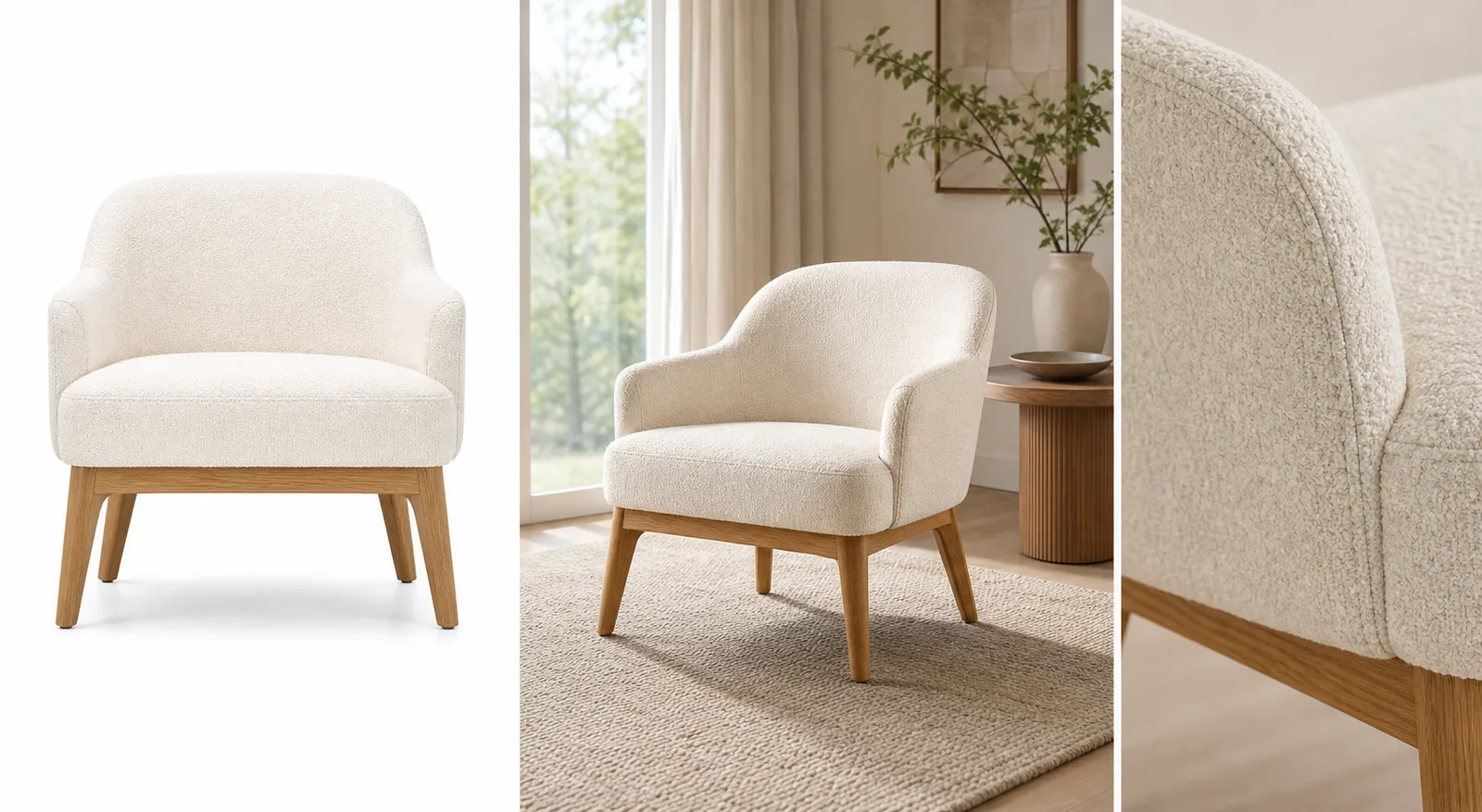 ## Start With Product Truth, Not Decor
For furniture product photography with AI, the room should never become more important than the product. A beautiful living room image is not publishable if it changes the chair arm curve, sofa depth, table leg angle, cabinet handle placement, upholstery color, wood grain, or floor contact.
A furniture lifestyle image is ready only when a shopper can identify the same SKU from the clean product photo and the room scene.
Before generating, write a short product-truth list:
- product type, silhouette, camera angle, and visible face
- height, width, depth, leg length, cushion thickness, and seat proportion
- true color under realistic daylight or warm room light
- material details such as boucle, linen, leather, rattan, oak, walnut, metal, stone, or painted finish
- construction details such as seams, buttons, handles, drawers, brackets, arms, legs, shelves, and feet
- natural floor contact, believable shadow, and plausible scale beside rugs, windows, tables, or lamps
This list is the review standard. If the AI image looks polished but sells a different chair, table, sofa, cabinet, or shelf, reject it.
## Build A Three-Image Furniture Set
A strong furniture page usually needs more than one visual role. Use AI to create a set, not one overly decorative scene.
### Clean Main Image
The main image should identify the product quickly. Use a simple background, clear crop, natural shadow, and enough resolution to inspect shape and material. This is the buyer's anchor image, so keep props and room styling out of the way.
### Realistic Room Scene
The room scene explains scale and style fit. It can show how a chair sits near a window, how a coffee table relates to a sofa, or how a cabinet works against a wall. Keep the room believable and restrained. The furniture should still be the dominant subject.
### Material Or Construction Detail
The detail image should answer a buyer question: upholstery texture, wood grain, leg joinery, handle finish, cushion seam, rattan weave, leather surface, drawer gap, or edge profile. A detail image is useful only if it matches the same product in the main image.
## Prompt Pattern For Furniture Product Photography
Use one furniture SKU and one image role at a time:
~~~text
Create one ecommerce furniture product photo from this exact reference.
Product facts to preserve: [product type], [silhouette], [camera angle], [true color], [material], [wood grain or fabric texture], [leg angle], [arm/handle/drawer/seam details], [proportions], [scale], [natural floor contact shadow].
Image role: [clean main image / realistic room scene / material detail image / ad crop].
Room direction: realistic, restrained, product-led, natural light, believable scale, simple props.
Keep the same product shape, color, material, construction details, scale, and shadow.
Avoid real brand names, marketplace UI, fake badges, price tags, QR codes, barcodes, text overlays, extra products, impossible scale, and unsupported claims.
~~~
If the product drifts, narrow the instruction. For example: "keep the same rounded chair arms, cream boucle texture, oak leg angle, cushion thickness, and front-facing scale."
## What To Check Before Publishing
Furniture product photos need a stricter review than ordinary lifestyle images because scale and material affect buyer trust.
- Color: did cream turn beige, walnut turn orange, or black metal turn gray?
- Material: does the fabric weave, leather sheen, rattan texture, stone grain, or wood grain still match?
- Proportion: did the cushion get thicker, the legs get longer, or the cabinet depth change?
- Silhouette: are arms, backrests, table edges, shelves, drawers, and handles in the same places?
- Scale: does the product feel plausible beside the room, rug, lamp, window, or side table?
- Shadow: does it sit naturally on the floor, or does it float?
- Visibility: are props hiding buyer-relevant details?
- Product set consistency: do the clean main image, room scene, and detail image still show the same SKU?
Use the [product photo editor](/product-photo-editor) when the source image is close but needs cleanup, crop adjustment, or minor retouching. Use the [AI product image generator](/ai-product-image-generator) when you need new room scenes, detail views, or campaign-ready variations from a clean furniture reference.
## Where KrafLayer Fits
The broader [ecommerce product photography](/ecommerce-product-photography) workflow still applies: clear subject first, then selling context. Furniture just raises the stakes because small changes to color, scale, and material can mislead a buyer.
In KrafLayer, start with one clear furniture reference. Create the main image, room scene, and detail image as separate roles. Review each result against the product-truth list before using it on Shopify, Amazon, Etsy, a landing page, or an ad campaign. This keeps AI product photography useful without letting the room redesign the SKU.
## Common Furniture AI Mistakes
- Making the product too large or too small for the room.
- Changing upholstery color, wood tone, rattan weave, leather finish, or metal surface.
- Adding extra legs, handles, seams, buttons, drawers, shelves, or decorative parts.
- Hiding important product details behind pillows, blankets, plants, or side tables.
- Creating a dramatic interior where the furniture becomes background decor.
- Using fake labels, certification marks, review stars, discount tags, or marketplace UI.
- Publishing a room scene without a clean product image and material detail nearby.
Good room scene product photography should make the product easier to understand, not harder to inspect.
## FAQ
### Can AI create furniture product photography from one reference image?
Yes, AI can help create furniture product photography from one clear reference image when you work by image role. Start with a clean product view, then create a room scene and a material detail image. Review color, material, silhouette, scale, legs, seams, handles, and floor contact before publishing.
### How do I stop AI from changing furniture color or scale?
Write the exact color, material, proportions, and scale cues into the prompt, then compare the result against the source. Mention details such as cream boucle, oak legs, cushion thickness, drawer gaps, arm shape, or natural floor contact. Reject outputs where the product looks like a different SKU.
### What images should a furniture product page include?
A practical furniture image set includes a clean main image, a realistic room scene, a material or construction detail, and sometimes a scale or dimension-supporting view. The main image identifies the product, the room scene explains context, and the detail image proves material quality.
### Should furniture lifestyle images replace clean product images?
No. Furniture lifestyle images help shoppers understand room fit, but clean product images are still needed for inspection. Use room scenes as supporting images beside clear main views and detail images, especially when color, material, or scale are important.
### Can KrafLayer make furniture lifestyle images?
KrafLayer can help create furniture lifestyle images from a product reference, then support cleanup and editing around the final asset. The seller should still review the output for color, material, silhouette, scale, construction details, and believable floor contact.
## Conclusion
Furniture product photography with AI is strongest when it treats the real SKU as the source of truth. KrafLayer helps sellers create clean main images, realistic room scenes, detail images, and campaign-ready furniture visuals from one reference, while keeping color, material, scale, silhouette, and selling intent under review. For furniture teams, the advantage is faster visual production without giving up the product accuracy buyers need before they trust a room scene online.
# Amazon Secondary Images: 7 Roles That Answer Buyers
URL: https://kraflayer.com/blog/amazon-secondary-images-detail-lifestyle-scale-callouts
Summary: Plan Amazon secondary images for alternate views, detail, scale, lifestyle context, included items, callouts, and buyer objections.
Updated: 2026-08-11
Amazon secondary images should answer buying questions that the main image cannot: What does the material look like up close? How large is it in a hand or room? What is included? How is it used? A useful image set assigns one clear job to each slot instead of repeating the same three-quarter product angle.
The analysis uses Amazon's public listing and product-photography guidance checked on August 11, 2026. The coffee-grinder composite is a KrafLayer demonstration, not a real listing experiment or sales result.
> **Quick Summary**
> Amazon says sellers can upload up to nine photos and recommends at least six in its product-photo guidance. Use the secondary set to cover alternate views, detail, use, scale, included items, and one restrained feature callout while keeping every claim and visible part accurate.
## Abstract
Begin with the buyer's unresolved questions, then map each to an image role. Keep the main image factual and white; use secondary images for evidence, context, scale, and explanation. Generated lifestyle scenes need the same SKU-fidelity review as any other product image.
## Key Takeaways
- Amazon listing guidance allows up to nine photos.
- Amazon recommends images above 1,000 pixels per side for zoom.
- Detail images should prove a visible fact, not decorate a claim.
- Scale images need a known reference and believable perspective.
- Brand owners can test image variants with Manage Your Experiments.
## Table of Contents
1. [Method and official guidance](#what-does-amazon-publish-about-product-images)
2. [A practical image sequence](#what-should-an-amazon-secondary-image-set-contain)
3. [Detail images](#how-should-detail-images-prove-a-feature)
4. [Lifestyle and scale](#how-do-lifestyle-and-scale-images-avoid-misleading-buyers)
5. [Callouts and included items](#when-should-you-use-feature-callouts-or-accessory-views)
6. [AI workflow and checks](#how-can-you-build-secondary-images-with-ai)
7. [Testing](#how-should-you-test-the-image-order)
8. [Frequently asked questions](#frequently-asked-questions)
## What Does Amazon Publish About Product Images?
Amazon's listing guide says sellers can upload up to nine photos. Its product-photo guide recommends at least six, prefers files larger than 1,000 pixels on each side for zoom, and treats pure white RGB 255, 255, 255 as the default for main product shots ([Amazon listings](https://sell.amazon.com/blog/amazon-product-listings); [Amazon product photos](https://sell.amazon.com/blog/product-photos), 2026).
Those numbers define capacity, not the ideal story for every SKU. We used Amazon's published image types and accuracy guidance to create the sequence below. We did not test a live ASIN, and we make no conversion claim for the demonstration asset.
## Start With Product Truth, Not Decor
For furniture product photography with AI, the room should never become more important than the product. A beautiful living room image is not publishable if it changes the chair arm curve, sofa depth, table leg angle, cabinet handle placement, upholstery color, wood grain, or floor contact.
A furniture lifestyle image is ready only when a shopper can identify the same SKU from the clean product photo and the room scene.
Before generating, write a short product-truth list:
- product type, silhouette, camera angle, and visible face
- height, width, depth, leg length, cushion thickness, and seat proportion
- true color under realistic daylight or warm room light
- material details such as boucle, linen, leather, rattan, oak, walnut, metal, stone, or painted finish
- construction details such as seams, buttons, handles, drawers, brackets, arms, legs, shelves, and feet
- natural floor contact, believable shadow, and plausible scale beside rugs, windows, tables, or lamps
This list is the review standard. If the AI image looks polished but sells a different chair, table, sofa, cabinet, or shelf, reject it.
## Build A Three-Image Furniture Set
A strong furniture page usually needs more than one visual role. Use AI to create a set, not one overly decorative scene.
### Clean Main Image
The main image should identify the product quickly. Use a simple background, clear crop, natural shadow, and enough resolution to inspect shape and material. This is the buyer's anchor image, so keep props and room styling out of the way.
### Realistic Room Scene
The room scene explains scale and style fit. It can show how a chair sits near a window, how a coffee table relates to a sofa, or how a cabinet works against a wall. Keep the room believable and restrained. The furniture should still be the dominant subject.
### Material Or Construction Detail
The detail image should answer a buyer question: upholstery texture, wood grain, leg joinery, handle finish, cushion seam, rattan weave, leather surface, drawer gap, or edge profile. A detail image is useful only if it matches the same product in the main image.
## Prompt Pattern For Furniture Product Photography
Use one furniture SKU and one image role at a time:
~~~text
Create one ecommerce furniture product photo from this exact reference.
Product facts to preserve: [product type], [silhouette], [camera angle], [true color], [material], [wood grain or fabric texture], [leg angle], [arm/handle/drawer/seam details], [proportions], [scale], [natural floor contact shadow].
Image role: [clean main image / realistic room scene / material detail image / ad crop].
Room direction: realistic, restrained, product-led, natural light, believable scale, simple props.
Keep the same product shape, color, material, construction details, scale, and shadow.
Avoid real brand names, marketplace UI, fake badges, price tags, QR codes, barcodes, text overlays, extra products, impossible scale, and unsupported claims.
~~~
If the product drifts, narrow the instruction. For example: "keep the same rounded chair arms, cream boucle texture, oak leg angle, cushion thickness, and front-facing scale."
## What To Check Before Publishing
Furniture product photos need a stricter review than ordinary lifestyle images because scale and material affect buyer trust.
- Color: did cream turn beige, walnut turn orange, or black metal turn gray?
- Material: does the fabric weave, leather sheen, rattan texture, stone grain, or wood grain still match?
- Proportion: did the cushion get thicker, the legs get longer, or the cabinet depth change?
- Silhouette: are arms, backrests, table edges, shelves, drawers, and handles in the same places?
- Scale: does the product feel plausible beside the room, rug, lamp, window, or side table?
- Shadow: does it sit naturally on the floor, or does it float?
- Visibility: are props hiding buyer-relevant details?
- Product set consistency: do the clean main image, room scene, and detail image still show the same SKU?
Use the [product photo editor](/product-photo-editor) when the source image is close but needs cleanup, crop adjustment, or minor retouching. Use the [AI product image generator](/ai-product-image-generator) when you need new room scenes, detail views, or campaign-ready variations from a clean furniture reference.
## Where KrafLayer Fits
The broader [ecommerce product photography](/ecommerce-product-photography) workflow still applies: clear subject first, then selling context. Furniture just raises the stakes because small changes to color, scale, and material can mislead a buyer.
In KrafLayer, start with one clear furniture reference. Create the main image, room scene, and detail image as separate roles. Review each result against the product-truth list before using it on Shopify, Amazon, Etsy, a landing page, or an ad campaign. This keeps AI product photography useful without letting the room redesign the SKU.
## Common Furniture AI Mistakes
- Making the product too large or too small for the room.
- Changing upholstery color, wood tone, rattan weave, leather finish, or metal surface.
- Adding extra legs, handles, seams, buttons, drawers, shelves, or decorative parts.
- Hiding important product details behind pillows, blankets, plants, or side tables.
- Creating a dramatic interior where the furniture becomes background decor.
- Using fake labels, certification marks, review stars, discount tags, or marketplace UI.
- Publishing a room scene without a clean product image and material detail nearby.
Good room scene product photography should make the product easier to understand, not harder to inspect.
## FAQ
### Can AI create furniture product photography from one reference image?
Yes, AI can help create furniture product photography from one clear reference image when you work by image role. Start with a clean product view, then create a room scene and a material detail image. Review color, material, silhouette, scale, legs, seams, handles, and floor contact before publishing.
### How do I stop AI from changing furniture color or scale?
Write the exact color, material, proportions, and scale cues into the prompt, then compare the result against the source. Mention details such as cream boucle, oak legs, cushion thickness, drawer gaps, arm shape, or natural floor contact. Reject outputs where the product looks like a different SKU.
### What images should a furniture product page include?
A practical furniture image set includes a clean main image, a realistic room scene, a material or construction detail, and sometimes a scale or dimension-supporting view. The main image identifies the product, the room scene explains context, and the detail image proves material quality.
### Should furniture lifestyle images replace clean product images?
No. Furniture lifestyle images help shoppers understand room fit, but clean product images are still needed for inspection. Use room scenes as supporting images beside clear main views and detail images, especially when color, material, or scale are important.
### Can KrafLayer make furniture lifestyle images?
KrafLayer can help create furniture lifestyle images from a product reference, then support cleanup and editing around the final asset. The seller should still review the output for color, material, silhouette, scale, construction details, and believable floor contact.
## Conclusion
Furniture product photography with AI is strongest when it treats the real SKU as the source of truth. KrafLayer helps sellers create clean main images, realistic room scenes, detail images, and campaign-ready furniture visuals from one reference, while keeping color, material, scale, silhouette, and selling intent under review. For furniture teams, the advantage is faster visual production without giving up the product accuracy buyers need before they trust a room scene online.
# Amazon Secondary Images: 7 Roles That Answer Buyers
URL: https://kraflayer.com/blog/amazon-secondary-images-detail-lifestyle-scale-callouts
Summary: Plan Amazon secondary images for alternate views, detail, scale, lifestyle context, included items, callouts, and buyer objections.
Updated: 2026-08-11
Amazon secondary images should answer buying questions that the main image cannot: What does the material look like up close? How large is it in a hand or room? What is included? How is it used? A useful image set assigns one clear job to each slot instead of repeating the same three-quarter product angle.
The analysis uses Amazon's public listing and product-photography guidance checked on August 11, 2026. The coffee-grinder composite is a KrafLayer demonstration, not a real listing experiment or sales result.
> **Quick Summary**
> Amazon says sellers can upload up to nine photos and recommends at least six in its product-photo guidance. Use the secondary set to cover alternate views, detail, use, scale, included items, and one restrained feature callout while keeping every claim and visible part accurate.
## Abstract
Begin with the buyer's unresolved questions, then map each to an image role. Keep the main image factual and white; use secondary images for evidence, context, scale, and explanation. Generated lifestyle scenes need the same SKU-fidelity review as any other product image.
## Key Takeaways
- Amazon listing guidance allows up to nine photos.
- Amazon recommends images above 1,000 pixels per side for zoom.
- Detail images should prove a visible fact, not decorate a claim.
- Scale images need a known reference and believable perspective.
- Brand owners can test image variants with Manage Your Experiments.
## Table of Contents
1. [Method and official guidance](#what-does-amazon-publish-about-product-images)
2. [A practical image sequence](#what-should-an-amazon-secondary-image-set-contain)
3. [Detail images](#how-should-detail-images-prove-a-feature)
4. [Lifestyle and scale](#how-do-lifestyle-and-scale-images-avoid-misleading-buyers)
5. [Callouts and included items](#when-should-you-use-feature-callouts-or-accessory-views)
6. [AI workflow and checks](#how-can-you-build-secondary-images-with-ai)
7. [Testing](#how-should-you-test-the-image-order)
8. [Frequently asked questions](#frequently-asked-questions)
## What Does Amazon Publish About Product Images?
Amazon's listing guide says sellers can upload up to nine photos. Its product-photo guide recommends at least six, prefers files larger than 1,000 pixels on each side for zoom, and treats pure white RGB 255, 255, 255 as the default for main product shots ([Amazon listings](https://sell.amazon.com/blog/amazon-product-listings); [Amazon product photos](https://sell.amazon.com/blog/product-photos), 2026).
Those numbers define capacity, not the ideal story for every SKU. We used Amazon's published image types and accuracy guidance to create the sequence below. We did not test a live ASIN, and we make no conversion claim for the demonstration asset.
 *KrafLayer demonstration composite. Each panel has a different job: identify the product, show construction, place it in use, and clarify what accompanies it.*
## What Should an Amazon Secondary Image Set Contain?
Amazon lists individual, group, lifestyle, scale, detailed, packaging, and 360-degree shots as useful product-photo types. A six-to-nine-image plan can turn those categories into a deliberate answer sequence rather than a pile of variants ([Amazon](https://sell.amazon.com/blog/product-photos), 2026).
| Slot | Image role | Buyer question | Evidence to include |
|---|---|---|---|
| 1 | Main image | What exactly is sold? | Complete product on compliant white background |
| 2 | Alternate angle | What is on the side or back? | Ports, closures, controls, construction |
| 3 | Detail | Is the material or mechanism credible? | Sharp close-up tied to one factual feature |
| 4 | Scale | How large is it in real use? | Hand, body, room, or known object with honest perspective |
| 5 | Lifestyle | Where and how is it used? | Product-led scene with no unsupported accessories |
| 6 | Included items | What arrives in the box? | Only components actually included |
| 7 | Feature callout | Which specification needs explanation? | Short verified text beside visible evidence |
| 8 | Packaging or care | How does it arrive or need care? | Real packaging, dimensions, or instructions |
| 9 | Remaining objection | What still blocks purchase? | Category-specific proof, not a repeated hero |
Do not force nine images when six complete the story. Repetition wastes attention and can introduce inconsistent product details.
## How Should Detail Images Prove a Feature?
Amazon says detailed shots help show small features and that accurate photography can help control returns. A detail image earns its slot when the crop visibly supports a specific product fact, such as stitching, a removable tray, a locking mechanism, or a material finish ([Amazon](https://sell.amazon.com/blog/product-photos), 2026).
| Weak detail image | Stronger replacement |
|---|---|
| Random close crop with an unsupported quality slogan | Macro view of the actual seam, weave, hinge, or finish |
| Invented diagram over a beauty image | Real product view with a verified dimension or part label |
| Sharpened unreadable text | New source photo where the label is genuinely legible |
| Three features in tiny boxes | One visible feature with enough scale to inspect |
If the image cannot show the claim, the claim belongs in copy or needs a new photograph. Generative fill must not invent a gasket, port, fastener, texture, or certification mark.
> **Build one image role at a time**
>
> Open the [AI Product Image Generator](/ai-product-image-generator), choose a detail, scale, or lifestyle job, and keep the original product reference beside every output during review.
## How Do Lifestyle and Scale Images Avoid Misleading Buyers?
Amazon defines lifestyle images as products in action and scale images as a way to help buyers gauge size through a familiar reference. The two roles can overlap, but scale needs stricter geometry: a hand, countertop, doorway, or common object must relate to the product believably ([Amazon](https://sell.amazon.com/blog/product-photos), 2026).
For lifestyle images, keep the use context ordinary enough to understand. A coffee grinder beside beans and a brewer is clear. A crowded designer kitchen with unrelated appliances may look expensive but makes the SKU harder to identify.
For scale images, begin with the real dimensions. Match camera height and perspective, avoid extreme wide-angle distortion, and do not use a prop whose size varies wildly. If exact size matters, add verified dimension callouts instead of relying on visual inference alone.
| Check | Lifestyle image | Scale image |
|---|---|---|
| Product visibility | Product remains the focal point | Entire relevant dimension remains readable |
| Props | Support the real use case | Provide a known or intuitive size reference |
| Perspective | Feels physically coherent | Does not enlarge foreground or shrink background deceptively |
| Claim risk | No unsupported use or performance | No implied size that conflicts with specification |
## When Should You Use Feature Callouts or Accessory Views?
Amazon's main-image standards exclude promotional text and unrelated accessories, while A+ Content offers modules for enhanced images, technical specifications, and comparison charts. Secondary assets and A+ modules have more explanatory room, but every visible claim still needs to match the product ([Amazon A+ guide](https://sell.amazon.com/blog/a-plus-content-design-guide), 2026).
Use a callout when a buyer may miss an important verified detail in a plain photo. Keep text short, high-contrast, and subordinate to the product. Do not add unsupported superlatives or percentages over a generated image.
An included-items view should be literal. Lay out the product, cable, case, adapter, replacement part, or tool only when it ships with that exact variation. If a styled prop is not included, the composition must not imply otherwise.
## How Can You Build Secondary Images With AI?
Amazon prefers images larger than 1,000 pixels per side for zoom, so start with source files that can survive close inspection. AI can help change the background or compose context, but it cannot establish hidden product facts from a single front view ([Amazon](https://sell.amazon.com/blog/product-photos), 2026).
1. List the five most important pre-purchase questions from reviews, support tickets, and specifications.
2. Match each question to an image role.
3. Gather source views that show every required product fact.
4. Generate one role at a time with a specific scene and identity constraints.
5. Compare silhouette, color, text, material, components, scale, and shadow with the sources.
6. Add only verified callout copy.
7. Export a consistent square set and check the mobile thumbnail sequence.
Reject an output if a generated scene adds a second unit, changes a control, rewrites label text, hides an included component, or makes the product materially larger or smaller than its specification.
## How Should You Test the Image Order?
Amazon's Manage Your Experiments lets eligible brand owners test product images, titles, descriptions, and A+ Content. Amazon says optimized content from these experiments can increase sales by up to 25%, but that is Amazon's platform-level claim, not a guaranteed result for an individual ASIN ([Manage Your Experiments](https://sell.amazon.com/blog/manage-your-experiments), 2026).
Test one meaningful hypothesis at a time. For example: place the scale image third instead of fifth for a compact product where size is a frequent objection. Keep the title, price, and all other image assets stable where the experiment setup allows. Record the date, ASIN, tested variant, hypothesis, and measured outcome. Otherwise, normal sales noise can masquerade as an image insight.
## Verdict
The strongest Amazon gallery is a short visual argument. The main image identifies the item; later slots resolve construction, scale, use, included parts, and the biggest remaining objection. Build only the roles the SKU needs, verify every claim, then test one meaningful order change instead of copying a generic nine-image template.
## Frequently Asked Questions
### What are Amazon secondary images?
They are the images after the primary product image in the listing gallery. Their job is to show additional angles, detail, use, scale, included components, packaging, or verified features. Amazon says listings can include up to nine photos, though the useful count depends on the product.
### How many Amazon secondary images should I use?
Amazon recommends at least six product images in its photography guidance and allows up to nine photos in its listing guide. Use enough to answer distinct buyer questions. Six informative images are better than nine near-duplicate hero angles.
### Can Amazon secondary images contain text?
The main image has stricter rules against overlays and promotional elements. Secondary and A+ assets can explain features, but text must remain accurate, readable, and category-compliant. Use verified dimensions and product facts, not invented superlatives or claims.
### Can AI generate Amazon lifestyle images?
AI can create or replace the environment, but the seller must review the actual SKU. Compare shape, color, label, material, components, scale, light, and shadow with source photos. Keep at least one plain factual view and check current category rules.
### What should the first secondary image show?
Use the image that resolves the biggest remaining purchase question after the main view. That may be a back angle, a construction detail, a scale reference, or included components. There is no universal second-slot winner, which is why eligible brands should test meaningful order changes.
## References
1. [Amazon: How to create product listings](https://sell.amazon.com/blog/amazon-product-listings), accessed August 11, 2026.
2. [Amazon: Six tips for product photos](https://sell.amazon.com/blog/product-photos), accessed August 11, 2026.
3. [Amazon: Manage Your Experiments](https://sell.amazon.com/blog/manage-your-experiments), accessed August 11, 2026.
4. [Amazon: A+ Content design guide](https://sell.amazon.com/blog/a-plus-content-design-guide), accessed August 11, 2026.
# Amazon Listing Image Optimization: A 6-Point Audit
URL: https://kraflayer.com/blog/amazon-listing-image-optimization-product-photo-roles
Summary: Audit Amazon listing images by role, sequence, mobile readability, product fidelity, compliance, and controlled testing.
Updated: 2026-08-11
Amazon listing image optimization is the work of finding the next unanswered buying question, assigning it to one gallery slot, and testing the order. It is not the same as brainstorming image types. The companion guide to Amazon secondary images explains how to create detail, lifestyle, scale, and callout assets; the optimization guide focuses on auditing and sequencing the completed set.
The method uses Amazon's current listing, photography, A+ Content, and Manage Your Experiments documentation checked on August 11, 2026. The lamp image is a KrafLayer demonstration, not an ASIN experiment or sales result.
> **Quick Summary**
> Amazon allows up to nine product photos and recommends at least six in its photography guidance. Optimize the set by removing repeated roles, moving the biggest buyer objection earlier, keeping the main image factual, and testing one image change at a time with Manage Your Experiments when eligible.
## Abstract
Audit image coverage before redesigning assets. Map each slot to identification, construction, scale, use, included items, or objection handling. Then score clarity, fidelity, mobile readability, and duplication. Image creation belongs in the secondary-image guide; sequencing and testing belong here.
## Key Takeaways
- Up to nine slots do not require nine images.
- Repetition is a sequencing problem, not more evidence.
- The first secondary image should resolve the largest remaining uncertainty.
- Amazon prefers images above 1,000 pixels per side for zoom.
- Eligible brands can test images with randomized experiments.
## Table of Contents
1. [Scope](#optimization-versus-image-creation)
2. [Audit matrix](#audit-every-gallery-slot)
3. [Sequence](#order-images-by-buyer-uncertainty)
4. [Mobile review](#review-the-gallery-on-mobile)
5. [Experiment design](#test-one-image-hypothesis)
6. [A+ boundary](#what-belongs-in-a-content)
7. [Frequently asked questions](#frequently-asked-questions)
## Optimization versus image creation
Amazon says sellers can upload up to nine photos and recommends at least six product images. Its photography guide identifies individual, lifestyle, scale, detail, packaging, and group shots as distinct types ([Amazon listings](https://sell.amazon.com/blog/amazon-product-listings); [Amazon product photos](https://sell.amazon.com/blog/product-photos), 2026).
If you still need to create those roles, use the [Amazon secondary image guide](/blog/amazon-secondary-images-detail-lifestyle-scale-callouts). Once the assets exist, optimization asks a different question: which images deserve a slot, and in what order?
*KrafLayer demonstration composite. Each panel has a different job: identify the product, show construction, place it in use, and clarify what accompanies it.*
## What Should an Amazon Secondary Image Set Contain?
Amazon lists individual, group, lifestyle, scale, detailed, packaging, and 360-degree shots as useful product-photo types. A six-to-nine-image plan can turn those categories into a deliberate answer sequence rather than a pile of variants ([Amazon](https://sell.amazon.com/blog/product-photos), 2026).
| Slot | Image role | Buyer question | Evidence to include |
|---|---|---|---|
| 1 | Main image | What exactly is sold? | Complete product on compliant white background |
| 2 | Alternate angle | What is on the side or back? | Ports, closures, controls, construction |
| 3 | Detail | Is the material or mechanism credible? | Sharp close-up tied to one factual feature |
| 4 | Scale | How large is it in real use? | Hand, body, room, or known object with honest perspective |
| 5 | Lifestyle | Where and how is it used? | Product-led scene with no unsupported accessories |
| 6 | Included items | What arrives in the box? | Only components actually included |
| 7 | Feature callout | Which specification needs explanation? | Short verified text beside visible evidence |
| 8 | Packaging or care | How does it arrive or need care? | Real packaging, dimensions, or instructions |
| 9 | Remaining objection | What still blocks purchase? | Category-specific proof, not a repeated hero |
Do not force nine images when six complete the story. Repetition wastes attention and can introduce inconsistent product details.
## How Should Detail Images Prove a Feature?
Amazon says detailed shots help show small features and that accurate photography can help control returns. A detail image earns its slot when the crop visibly supports a specific product fact, such as stitching, a removable tray, a locking mechanism, or a material finish ([Amazon](https://sell.amazon.com/blog/product-photos), 2026).
| Weak detail image | Stronger replacement |
|---|---|
| Random close crop with an unsupported quality slogan | Macro view of the actual seam, weave, hinge, or finish |
| Invented diagram over a beauty image | Real product view with a verified dimension or part label |
| Sharpened unreadable text | New source photo where the label is genuinely legible |
| Three features in tiny boxes | One visible feature with enough scale to inspect |
If the image cannot show the claim, the claim belongs in copy or needs a new photograph. Generative fill must not invent a gasket, port, fastener, texture, or certification mark.
> **Build one image role at a time**
>
> Open the [AI Product Image Generator](/ai-product-image-generator), choose a detail, scale, or lifestyle job, and keep the original product reference beside every output during review.
## How Do Lifestyle and Scale Images Avoid Misleading Buyers?
Amazon defines lifestyle images as products in action and scale images as a way to help buyers gauge size through a familiar reference. The two roles can overlap, but scale needs stricter geometry: a hand, countertop, doorway, or common object must relate to the product believably ([Amazon](https://sell.amazon.com/blog/product-photos), 2026).
For lifestyle images, keep the use context ordinary enough to understand. A coffee grinder beside beans and a brewer is clear. A crowded designer kitchen with unrelated appliances may look expensive but makes the SKU harder to identify.
For scale images, begin with the real dimensions. Match camera height and perspective, avoid extreme wide-angle distortion, and do not use a prop whose size varies wildly. If exact size matters, add verified dimension callouts instead of relying on visual inference alone.
| Check | Lifestyle image | Scale image |
|---|---|---|
| Product visibility | Product remains the focal point | Entire relevant dimension remains readable |
| Props | Support the real use case | Provide a known or intuitive size reference |
| Perspective | Feels physically coherent | Does not enlarge foreground or shrink background deceptively |
| Claim risk | No unsupported use or performance | No implied size that conflicts with specification |
## When Should You Use Feature Callouts or Accessory Views?
Amazon's main-image standards exclude promotional text and unrelated accessories, while A+ Content offers modules for enhanced images, technical specifications, and comparison charts. Secondary assets and A+ modules have more explanatory room, but every visible claim still needs to match the product ([Amazon A+ guide](https://sell.amazon.com/blog/a-plus-content-design-guide), 2026).
Use a callout when a buyer may miss an important verified detail in a plain photo. Keep text short, high-contrast, and subordinate to the product. Do not add unsupported superlatives or percentages over a generated image.
An included-items view should be literal. Lay out the product, cable, case, adapter, replacement part, or tool only when it ships with that exact variation. If a styled prop is not included, the composition must not imply otherwise.
## How Can You Build Secondary Images With AI?
Amazon prefers images larger than 1,000 pixels per side for zoom, so start with source files that can survive close inspection. AI can help change the background or compose context, but it cannot establish hidden product facts from a single front view ([Amazon](https://sell.amazon.com/blog/product-photos), 2026).
1. List the five most important pre-purchase questions from reviews, support tickets, and specifications.
2. Match each question to an image role.
3. Gather source views that show every required product fact.
4. Generate one role at a time with a specific scene and identity constraints.
5. Compare silhouette, color, text, material, components, scale, and shadow with the sources.
6. Add only verified callout copy.
7. Export a consistent square set and check the mobile thumbnail sequence.
Reject an output if a generated scene adds a second unit, changes a control, rewrites label text, hides an included component, or makes the product materially larger or smaller than its specification.
## How Should You Test the Image Order?
Amazon's Manage Your Experiments lets eligible brand owners test product images, titles, descriptions, and A+ Content. Amazon says optimized content from these experiments can increase sales by up to 25%, but that is Amazon's platform-level claim, not a guaranteed result for an individual ASIN ([Manage Your Experiments](https://sell.amazon.com/blog/manage-your-experiments), 2026).
Test one meaningful hypothesis at a time. For example: place the scale image third instead of fifth for a compact product where size is a frequent objection. Keep the title, price, and all other image assets stable where the experiment setup allows. Record the date, ASIN, tested variant, hypothesis, and measured outcome. Otherwise, normal sales noise can masquerade as an image insight.
## Verdict
The strongest Amazon gallery is a short visual argument. The main image identifies the item; later slots resolve construction, scale, use, included parts, and the biggest remaining objection. Build only the roles the SKU needs, verify every claim, then test one meaningful order change instead of copying a generic nine-image template.
## Frequently Asked Questions
### What are Amazon secondary images?
They are the images after the primary product image in the listing gallery. Their job is to show additional angles, detail, use, scale, included components, packaging, or verified features. Amazon says listings can include up to nine photos, though the useful count depends on the product.
### How many Amazon secondary images should I use?
Amazon recommends at least six product images in its photography guidance and allows up to nine photos in its listing guide. Use enough to answer distinct buyer questions. Six informative images are better than nine near-duplicate hero angles.
### Can Amazon secondary images contain text?
The main image has stricter rules against overlays and promotional elements. Secondary and A+ assets can explain features, but text must remain accurate, readable, and category-compliant. Use verified dimensions and product facts, not invented superlatives or claims.
### Can AI generate Amazon lifestyle images?
AI can create or replace the environment, but the seller must review the actual SKU. Compare shape, color, label, material, components, scale, light, and shadow with source photos. Keep at least one plain factual view and check current category rules.
### What should the first secondary image show?
Use the image that resolves the biggest remaining purchase question after the main view. That may be a back angle, a construction detail, a scale reference, or included components. There is no universal second-slot winner, which is why eligible brands should test meaningful order changes.
## References
1. [Amazon: How to create product listings](https://sell.amazon.com/blog/amazon-product-listings), accessed August 11, 2026.
2. [Amazon: Six tips for product photos](https://sell.amazon.com/blog/product-photos), accessed August 11, 2026.
3. [Amazon: Manage Your Experiments](https://sell.amazon.com/blog/manage-your-experiments), accessed August 11, 2026.
4. [Amazon: A+ Content design guide](https://sell.amazon.com/blog/a-plus-content-design-guide), accessed August 11, 2026.
# Amazon Listing Image Optimization: A 6-Point Audit
URL: https://kraflayer.com/blog/amazon-listing-image-optimization-product-photo-roles
Summary: Audit Amazon listing images by role, sequence, mobile readability, product fidelity, compliance, and controlled testing.
Updated: 2026-08-11
Amazon listing image optimization is the work of finding the next unanswered buying question, assigning it to one gallery slot, and testing the order. It is not the same as brainstorming image types. The companion guide to Amazon secondary images explains how to create detail, lifestyle, scale, and callout assets; the optimization guide focuses on auditing and sequencing the completed set.
The method uses Amazon's current listing, photography, A+ Content, and Manage Your Experiments documentation checked on August 11, 2026. The lamp image is a KrafLayer demonstration, not an ASIN experiment or sales result.
> **Quick Summary**
> Amazon allows up to nine product photos and recommends at least six in its photography guidance. Optimize the set by removing repeated roles, moving the biggest buyer objection earlier, keeping the main image factual, and testing one image change at a time with Manage Your Experiments when eligible.
## Abstract
Audit image coverage before redesigning assets. Map each slot to identification, construction, scale, use, included items, or objection handling. Then score clarity, fidelity, mobile readability, and duplication. Image creation belongs in the secondary-image guide; sequencing and testing belong here.
## Key Takeaways
- Up to nine slots do not require nine images.
- Repetition is a sequencing problem, not more evidence.
- The first secondary image should resolve the largest remaining uncertainty.
- Amazon prefers images above 1,000 pixels per side for zoom.
- Eligible brands can test images with randomized experiments.
## Table of Contents
1. [Scope](#optimization-versus-image-creation)
2. [Audit matrix](#audit-every-gallery-slot)
3. [Sequence](#order-images-by-buyer-uncertainty)
4. [Mobile review](#review-the-gallery-on-mobile)
5. [Experiment design](#test-one-image-hypothesis)
6. [A+ boundary](#what-belongs-in-a-content)
7. [Frequently asked questions](#frequently-asked-questions)
## Optimization versus image creation
Amazon says sellers can upload up to nine photos and recommends at least six product images. Its photography guide identifies individual, lifestyle, scale, detail, packaging, and group shots as distinct types ([Amazon listings](https://sell.amazon.com/blog/amazon-product-listings); [Amazon product photos](https://sell.amazon.com/blog/product-photos), 2026).
If you still need to create those roles, use the [Amazon secondary image guide](/blog/amazon-secondary-images-detail-lifestyle-scale-callouts). Once the assets exist, optimization asks a different question: which images deserve a slot, and in what order?
 *KrafLayer demonstration set. The four panels identify the lamp, prove the control detail, show illumination, and communicate desk scale. They are roles, not measured winners.*
## Audit every gallery slot
Amazon prefers images larger than 1,000 pixels on each side for zoom and says accurate, realistic product photos help customer understanding. Audit both technical readiness and information value ([Amazon](https://sell.amazon.com/blog/product-photos), 2026).
| Slot audit | Question | Remove or replace when |
|---|---|---|
| Role | What new buying question does it answer? | Same answer already appears earlier |
| Fidelity | Does SKU, color, text, material, and included parts match? | Product fact drifts |
| Clarity | Is the proof visible without reading tiny copy? | Claim depends on microscopic text |
| Scale | Is size supported by dimensions or believable context? | Perspective misleads |
| Mobile | Does the thumbnail remain distinguishable? | Image becomes visual noise |
| Compliance | Is the main image factual and category-appropriate? | Overlay, prop, or background violates rules |
Score each row pass, repair, replace, or remove. A gallery with seven distinct answers is stronger than nine repetitions.
## Order Images by Buyer Uncertainty
The main image identifies the item. After that, order depends on the product's biggest uncertainty. For a compact lamp, size and brightness may come early. For jewelry, scale and clasp matter. For clothing, material and fit coverage outrank a decorative room.
| Buyer uncertainty | Move earlier | Move later |
|---|---|---|
| Will it fit? | Dimensions, scale, on-body or in-room reference | Second decorative angle |
| How is it made? | Detail crop, side/back construction | Generic lifestyle scene |
| What is included? | Complete contents layout | Packaging beauty shot |
| How is it used? | Clear lifestyle or operation view | Repeated white angle |
| Can I trust the claim? | Visible proof or verified specification | Unsupported callout |
> **Create only the missing role**
>
> If the audit reveals a real gap, use the [AI Product Image Generator](/ai-product-image-generator) for that one detail, scale, or lifestyle job, then rerun the gallery audit before publishing.
## Review the Gallery on Mobile
Amazon says images above 1,000 pixels per side support zoom, but gallery discovery often begins with small thumbnails. Review the sequence on a phone, not only in an editor ([Amazon](https://sell.amazon.com/blog/product-photos), 2026).
At thumbnail size, check whether adjacent images look meaningfully different. A detail shot should visibly read as detail; a scale image should retain its reference; callout text should not become gray dust. Then open every asset and inspect fidelity at full resolution.
Keep typography restrained. If an image needs a paragraph to explain the feature, the claim may belong in A+ Content or product copy.
## Test one image hypothesis
Amazon Manage Your Experiments randomly splits customers between Version A and Version B and can test product images, titles, bullet points, descriptions, and A+ Content. Amazon states that optimized content can increase sales by up to 20%, which is a platform claim rather than a guaranteed ASIN outcome ([Amazon Manage Your Experiments](https://sell.amazon.com/tools/manage-your-experiments), 2026).
Write one hypothesis: moving the scale image from slot five to slot two will resolve the most common size objection earlier. Keep price, title, bullets, and other content stable where possible. Record the ASIN, variants, dates, traffic sufficiency, and result. Do not test a new image and a new order simultaneously if you want to know which change mattered.
## What Belongs in A+ Content
Amazon A+ Content supports enhanced images, technical specifications, and comparison charts. Move dense explanations, brand story, cross-product comparison, and long feature proof out of the gallery when the thumbnail becomes unreadable ([Amazon A+ guide](https://sell.amazon.com/blog/a-plus-content-design-guide), 2026).
The gallery should remain product-led. A+ can carry the deeper argument after the image set has established identity, construction, scale, use, and contents.
## Verdict
Optimization is subtraction and order. Remove duplicate roles, move the largest uncertainty forward, and test one hypothesis. Do not create another lifestyle image when the gallery is missing a back view or verified dimension.
## Frequently Asked Questions
### How many Amazon listing images should I use?
Amazon allows up to nine photos and recommends at least six. Use enough to answer distinct questions without repetition. The product may need fewer than nine when main, detail, scale, use, and included items already cover the purchase decision.
### What should the second Amazon image show?
It should resolve the biggest uncertainty left by the main image. That may be size, rear construction, material detail, included items, or use. There is no universal second-slot template for every category.
### How is optimization different from planning Amazon secondary images?
Yes. Secondary-image planning defines and creates image roles. Listing optimization audits the completed assets, removes duplication, sequences them by buyer uncertainty, checks mobile readability, and runs controlled tests.
### Can AI optimize an Amazon gallery automatically?
AI can classify roles and help create a missing asset, but it cannot verify every product fact or know the buyer's primary objection without real data. Use reviews, support questions, specifications, and experiments to guide order.
### Should feature callouts go in the gallery or A+ Content?
Keep concise, verified, product-led callouts in secondary images when readable. Move dense explanations, comparison charts, specifications, and brand storytelling into A+ Content modules where there is room to understand them.
## References
1. [Amazon: How to create product listings](https://sell.amazon.com/blog/amazon-product-listings), accessed August 11, 2026.
2. [Amazon: Six tips for product photos](https://sell.amazon.com/blog/product-photos), accessed August 11, 2026.
3. [Amazon: Manage Your Experiments](https://sell.amazon.com/tools/manage-your-experiments), accessed August 11, 2026.
4. [Amazon: A+ Content design guide](https://sell.amazon.com/blog/a-plus-content-design-guide), accessed August 11, 2026.
# Skincare Product Photography With AI: Texture, Label Accuracy, and Clean Scenes
URL: https://kraflayer.com/blog/skincare-product-photography-with-ai-texture-label-clean-scenes
Summary: A practical workflow for creating skincare main images, texture details, and clean scenes while preserving labels, packaging, color, and claims.
Updated: 2026-07-06
Skincare product photography with AI works when the package facts stay unchanged and the scene makes the product easier to trust. A clean main image should show the bottle, jar, tube, pump, cap, label, color, and shadow clearly. Detail images should prove texture, finish, dispenser shape, label accuracy, and material quality without inventing claims.
The practical rule is simple: protect the skincare packaging before styling the scene. In KrafLayer, use [AI product photography](/ai-product-photography) to create clean product shots, skincare texture detail images, and bathroom or vanity scenes from one reference, then compare every output against the original package before publishing. This is cosmetic product photography only when the package, formula presentation, and claim language remain believable.
AI skincare photography is useful when it creates more selling context without rewriting the label, changing the bottle, or implying a product claim the brand cannot support.
*KrafLayer demonstration set. The four panels identify the lamp, prove the control detail, show illumination, and communicate desk scale. They are roles, not measured winners.*
## Audit every gallery slot
Amazon prefers images larger than 1,000 pixels on each side for zoom and says accurate, realistic product photos help customer understanding. Audit both technical readiness and information value ([Amazon](https://sell.amazon.com/blog/product-photos), 2026).
| Slot audit | Question | Remove or replace when |
|---|---|---|
| Role | What new buying question does it answer? | Same answer already appears earlier |
| Fidelity | Does SKU, color, text, material, and included parts match? | Product fact drifts |
| Clarity | Is the proof visible without reading tiny copy? | Claim depends on microscopic text |
| Scale | Is size supported by dimensions or believable context? | Perspective misleads |
| Mobile | Does the thumbnail remain distinguishable? | Image becomes visual noise |
| Compliance | Is the main image factual and category-appropriate? | Overlay, prop, or background violates rules |
Score each row pass, repair, replace, or remove. A gallery with seven distinct answers is stronger than nine repetitions.
## Order Images by Buyer Uncertainty
The main image identifies the item. After that, order depends on the product's biggest uncertainty. For a compact lamp, size and brightness may come early. For jewelry, scale and clasp matter. For clothing, material and fit coverage outrank a decorative room.
| Buyer uncertainty | Move earlier | Move later |
|---|---|---|
| Will it fit? | Dimensions, scale, on-body or in-room reference | Second decorative angle |
| How is it made? | Detail crop, side/back construction | Generic lifestyle scene |
| What is included? | Complete contents layout | Packaging beauty shot |
| How is it used? | Clear lifestyle or operation view | Repeated white angle |
| Can I trust the claim? | Visible proof or verified specification | Unsupported callout |
> **Create only the missing role**
>
> If the audit reveals a real gap, use the [AI Product Image Generator](/ai-product-image-generator) for that one detail, scale, or lifestyle job, then rerun the gallery audit before publishing.
## Review the Gallery on Mobile
Amazon says images above 1,000 pixels per side support zoom, but gallery discovery often begins with small thumbnails. Review the sequence on a phone, not only in an editor ([Amazon](https://sell.amazon.com/blog/product-photos), 2026).
At thumbnail size, check whether adjacent images look meaningfully different. A detail shot should visibly read as detail; a scale image should retain its reference; callout text should not become gray dust. Then open every asset and inspect fidelity at full resolution.
Keep typography restrained. If an image needs a paragraph to explain the feature, the claim may belong in A+ Content or product copy.
## Test one image hypothesis
Amazon Manage Your Experiments randomly splits customers between Version A and Version B and can test product images, titles, bullet points, descriptions, and A+ Content. Amazon states that optimized content can increase sales by up to 20%, which is a platform claim rather than a guaranteed ASIN outcome ([Amazon Manage Your Experiments](https://sell.amazon.com/tools/manage-your-experiments), 2026).
Write one hypothesis: moving the scale image from slot five to slot two will resolve the most common size objection earlier. Keep price, title, bullets, and other content stable where possible. Record the ASIN, variants, dates, traffic sufficiency, and result. Do not test a new image and a new order simultaneously if you want to know which change mattered.
## What Belongs in A+ Content
Amazon A+ Content supports enhanced images, technical specifications, and comparison charts. Move dense explanations, brand story, cross-product comparison, and long feature proof out of the gallery when the thumbnail becomes unreadable ([Amazon A+ guide](https://sell.amazon.com/blog/a-plus-content-design-guide), 2026).
The gallery should remain product-led. A+ can carry the deeper argument after the image set has established identity, construction, scale, use, and contents.
## Verdict
Optimization is subtraction and order. Remove duplicate roles, move the largest uncertainty forward, and test one hypothesis. Do not create another lifestyle image when the gallery is missing a back view or verified dimension.
## Frequently Asked Questions
### How many Amazon listing images should I use?
Amazon allows up to nine photos and recommends at least six. Use enough to answer distinct questions without repetition. The product may need fewer than nine when main, detail, scale, use, and included items already cover the purchase decision.
### What should the second Amazon image show?
It should resolve the biggest uncertainty left by the main image. That may be size, rear construction, material detail, included items, or use. There is no universal second-slot template for every category.
### How is optimization different from planning Amazon secondary images?
Yes. Secondary-image planning defines and creates image roles. Listing optimization audits the completed assets, removes duplication, sequences them by buyer uncertainty, checks mobile readability, and runs controlled tests.
### Can AI optimize an Amazon gallery automatically?
AI can classify roles and help create a missing asset, but it cannot verify every product fact or know the buyer's primary objection without real data. Use reviews, support questions, specifications, and experiments to guide order.
### Should feature callouts go in the gallery or A+ Content?
Keep concise, verified, product-led callouts in secondary images when readable. Move dense explanations, comparison charts, specifications, and brand storytelling into A+ Content modules where there is room to understand them.
## References
1. [Amazon: How to create product listings](https://sell.amazon.com/blog/amazon-product-listings), accessed August 11, 2026.
2. [Amazon: Six tips for product photos](https://sell.amazon.com/blog/product-photos), accessed August 11, 2026.
3. [Amazon: Manage Your Experiments](https://sell.amazon.com/tools/manage-your-experiments), accessed August 11, 2026.
4. [Amazon: A+ Content design guide](https://sell.amazon.com/blog/a-plus-content-design-guide), accessed August 11, 2026.
# Skincare Product Photography With AI: Texture, Label Accuracy, and Clean Scenes
URL: https://kraflayer.com/blog/skincare-product-photography-with-ai-texture-label-clean-scenes
Summary: A practical workflow for creating skincare main images, texture details, and clean scenes while preserving labels, packaging, color, and claims.
Updated: 2026-07-06
Skincare product photography with AI works when the package facts stay unchanged and the scene makes the product easier to trust. A clean main image should show the bottle, jar, tube, pump, cap, label, color, and shadow clearly. Detail images should prove texture, finish, dispenser shape, label accuracy, and material quality without inventing claims.
The practical rule is simple: protect the skincare packaging before styling the scene. In KrafLayer, use [AI product photography](/ai-product-photography) to create clean product shots, skincare texture detail images, and bathroom or vanity scenes from one reference, then compare every output against the original package before publishing. This is cosmetic product photography only when the package, formula presentation, and claim language remain believable.
AI skincare photography is useful when it creates more selling context without rewriting the label, changing the bottle, or implying a product claim the brand cannot support.
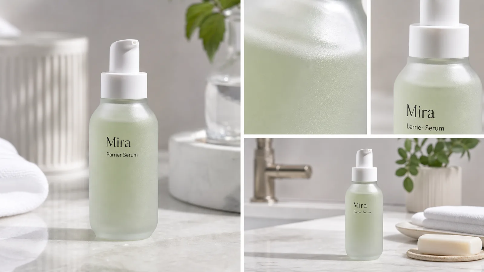 ## Start With The Package Facts
Skincare and cosmetic product photography has a higher truth bar than many lifestyle categories. A small change to label text, dispenser shape, bottle color, fill level, texture, or claim language can turn a useful image into a misleading asset.
Before generating images, write a short package-truth list:
- product type: serum, cream jar, toner, cleanser, sunscreen, oil, balm, mask, or set
- package shape, shoulder curve, cap height, pump/dropper/nozzle, and visible closure
- label position, brand mark, product name, line breaks, and readable front copy
- bottle or jar material: frosted glass, clear PET, aluminum tube, acrylic jar, paper carton, or airless pump
- product color, translucency, fill level, finish, and surface texture
- claims to avoid changing, including SPF, dermatologist, clinical, natural, organic, medical, anti-acne, whitening, or certification language
- natural contact shadow, clean reflection, and realistic bathroom or vanity scale
A skincare image is ready only when the buyer can recognize the same SKU from the main image, detail crop, and scene image.
## Build A Skincare Image Set By Role
Do not ask AI for one generic "beautiful skincare photo." Build separate image roles so each asset answers one buyer question.
### Clean Main Image
The main image identifies the product. Keep the package upright, label readable, cap visible, and shadow natural. Use a simple surface or clean studio setup so the product, not the props, carries the frame.
### Texture Detail Image
The detail image should prove material or formula presentation: frosted glass texture, pump opening, cream surface, gel translucency, serum color, tube crimp, carton embossing, label ink, cap finish, or dispenser quality. Detail images work best when they match the same product from the main image.
### Clean Lifestyle Scene
The scene gives context: bathroom counter, vanity tray, towel, sink edge, soft daylight, or a restrained ingredient cue. Keep props secondary. Avoid making the skincare product small, overdecorated, or hidden behind plants, towels, soap, mirrors, or hands.
## Prompt Pattern For Skincare Product Photography
Use one product reference and one image role at a time:
~~~text
Create one ecommerce skincare product photo from this exact reference.
Product facts to preserve: [product type], [bottle/jar/tube shape], [cap or pump shape], [label position], [product name], [front label text], [material], [color], [fill level], [texture], [scale], [natural contact shadow].
Image role: [clean main image / texture detail image / clean vanity scene / ad crop].
Scene direction: premium but practical, clean bathroom or vanity surface, natural light, restrained props, product-led composition.
Keep the same package shape, label layout, cap, dispenser, color, material, scale, and shadow.
Avoid real brand names, marketplace UI, fake badges, QR codes, barcodes, certification marks, medical claims, SPF claims, dermatology claims, before-after skin claims, price tags, and extra products.
~~~
If the output changes the label, narrow the instruction. For example: "keep the front text exactly as a fictional label, keep the same Mira Barrier Serum layout, do not add claims, badges, ingredients, QR codes, or extra typography."
## What To Check Before Publishing
Skincare product photos should be reviewed like packaging assets, not just lifestyle images.
- Label: did any text change, duplicate, blur, or turn into fake claims?
- Bottle shape: did the shoulder, base, cap, pump, nozzle, or dropper change?
- Material: does frosted glass, clear plastic, matte tube, glossy jar, or carton paper still look right?
- Color: did the formula, bottle tint, cap color, or label color drift?
- Texture: does the detail crop show the same product material rather than a random macro surface?
- Scene hygiene: is the surface clean, with no stains, clutter, unsafe bathroom cues, or distracting props?
- Claim safety: did the image add SPF, clinical, medical, organic, cruelty-free, dermatologist, acne, whitening, or certification language?
- Product set consistency: do the main image, detail image, and lifestyle scene still show one SKU?
Use the [product photo editor](/product-photo-editor) when the source image only needs cleanup, background adjustment, or local retouching. Use the [AI product image generator](/ai-product-image-generator) when you need new main images, texture detail views, clean scenes, or campaign variations from a verified skincare reference.
## Where KrafLayer Fits
The broader [ecommerce product photography](/ecommerce-product-photography) workflow still applies: clear subject first, then selling context. Skincare adds another layer: labels and claims must stay conservative because packaging copy can affect buyer trust and regulatory review.
In KrafLayer, start with one clean product reference. Generate the main image, detail crop, and lifestyle scene as separate roles. Review the output for package shape, label accuracy, material texture, color, scale, and claim safety before using it on Shopify, Amazon, Etsy, landing pages, emails, or ads.
## Common Skincare AI Mistakes
- Adding fake claims such as clinical, medical, SPF, organic, cruelty-free, dermatologist approved, anti-acne, or whitening.
- Changing a serum bottle into a lotion pump, jar, tube, or different dispenser.
- Redesigning the label with new typography, marks, badges, or ingredient panels.
- Making the formula color look richer, greener, clearer, or more luxurious than the real product.
- Hiding the package behind towels, plants, soap, mirrors, or hands.
- Creating extra SKUs that look like a product line when the listing sells one item.
- Using fake marketplace UI, review stars, discount tags, barcodes, QR codes, or certification seals.
Good skincare product photography with AI should make the package easier to inspect and the texture easier to understand. It should not create a new product story the brand cannot defend.
## FAQ
### Can AI create skincare product photography from one reference image?
Yes, AI can help create skincare product photography from one clear reference image when you separate the image roles. Generate a clean main image, a texture or packaging detail image, and a clean lifestyle scene, then review label accuracy, package shape, cap, dispenser, material, color, and claims.
### How do I keep skincare labels accurate in AI product photos?
Write the exact label facts into the prompt and compare the result against the source image. Keep brand name, product name, line breaks, label position, and package shape unchanged. Reject outputs that add ingredients, badges, SPF, clinical, dermatologist, organic, medical, or certification claims.
### What images should a skincare product page include?
A practical skincare product page should include a clean main image, a label or package detail, a texture or dispenser close-up, and a restrained lifestyle scene. The main image identifies the SKU, the detail image builds trust, and the lifestyle scene gives context without hiding the product.
### Should skincare lifestyle images replace clean product images?
No. Lifestyle images can help shoppers understand the setting and brand feel, but clean product images are still needed for package inspection. Use lifestyle scenes as supporting images beside main product photos and label or texture details.
### Can KrafLayer make skincare product photos for ecommerce?
KrafLayer can help create skincare product photos from a product reference, including clean main images, detail images, and lifestyle scenes. The seller should still review the final images for package shape, label accuracy, material texture, color, scale, and cautious claim language before publishing.
## Conclusion
Skincare product photography with AI is strongest when it keeps the real package as the source of truth. KrafLayer helps sellers create clean main images, texture detail images, lifestyle scenes, and campaign-ready skincare visuals from one reference while keeping labels, bottle shape, material, color, scale, and claims under review. For beauty teams, the advantage is faster visual production without losing the product accuracy buyers need before they trust a skincare listing online.
# Replace Product Background With AI: 6-Point Realism Check
URL: https://kraflayer.com/blog/replace-product-background-with-ai-without-fake-results
Summary: Replace product backgrounds with AI while preserving SKU identity, physical lighting, contact shadow, reflections, and believable scale.
Updated: 2026-08-11
Replacing a product background with AI is an inpainting problem, not a decorating problem. The new scene must make physical sense around the original product while the SKU's silhouette, label, material, color, and included parts remain unchanged. A beautiful kitchen is a failed edit if the bottle shape drifts or the contact shadow points the wrong way.
The workflow combines current marketplace guidance with product-background research published at AAAI 2025. The visual examples are KrafLayer demonstrations, not controlled benchmarks or customer results.
> **Quick Summary**
> AAAI researchers identify inappropriate backgrounds and product inconsistency as the two central failures in automated product-image inpainting. Protect the product first, specify the scene second, then inspect geometry, lighting, contact, reflections, text, and scale before publishing.
## Abstract
Use a clean, high-resolution product source; describe one physically plausible scene; keep the product region protected; generate a few variants; and compare each output with the original at full size. If the source lacks factual detail, reshoot instead of asking generation to invent it.
## Key Takeaways
- Background removal creates a cutout; replacement creates a new environment.
- Product identity and scene plausibility need separate review.
- Text-only prompts cannot prove that the SKU stayed accurate.
- Contact shadow, reflection, and perspective expose fake-looking edits quickly.
- A plain factual image should remain in the gallery.
## Table of Contents
1. [Evidence and limits](#what-evidence-supports-the-workflow)
2. [Removal versus replacement](#how-is-background-replacement-different-from-removal)
3. [Source preparation](#what-source-image-should-you-use)
4. [Prompt structure](#what-should-the-background-prompt-contain)
5. [Six-part realism review](#how-do-you-review-an-ai-replaced-background)
6. [Workflow](#what-is-the-safest-step-by-step-workflow)
7. [When to reject AI](#when-should-you-reshoot-or-composite-manually)
8. [Frequently asked questions](#frequently-asked-questions)
## What Evidence Supports the Workflow?
A 2025 AAAI paper on product-image background inpainting describes two recurring failure classes: inappropriate backgrounds and inconsistent products. Its authors trained an evaluation method using human feedback from 44,000 automatically inpainted product images, which underlines why visual review cannot stop when the background looks nice ([AAAI paper](https://ojs.aaai.org/index.php/AAAI/article/download/32027/34182), 2025).
We translated those two classes into a practical review: scene plausibility plus product fidelity. We did not run a lab comparison across commercial tools. The KrafLayer images below show what to inspect, not a measured win rate.
## Start With The Package Facts
Skincare and cosmetic product photography has a higher truth bar than many lifestyle categories. A small change to label text, dispenser shape, bottle color, fill level, texture, or claim language can turn a useful image into a misleading asset.
Before generating images, write a short package-truth list:
- product type: serum, cream jar, toner, cleanser, sunscreen, oil, balm, mask, or set
- package shape, shoulder curve, cap height, pump/dropper/nozzle, and visible closure
- label position, brand mark, product name, line breaks, and readable front copy
- bottle or jar material: frosted glass, clear PET, aluminum tube, acrylic jar, paper carton, or airless pump
- product color, translucency, fill level, finish, and surface texture
- claims to avoid changing, including SPF, dermatologist, clinical, natural, organic, medical, anti-acne, whitening, or certification language
- natural contact shadow, clean reflection, and realistic bathroom or vanity scale
A skincare image is ready only when the buyer can recognize the same SKU from the main image, detail crop, and scene image.
## Build A Skincare Image Set By Role
Do not ask AI for one generic "beautiful skincare photo." Build separate image roles so each asset answers one buyer question.
### Clean Main Image
The main image identifies the product. Keep the package upright, label readable, cap visible, and shadow natural. Use a simple surface or clean studio setup so the product, not the props, carries the frame.
### Texture Detail Image
The detail image should prove material or formula presentation: frosted glass texture, pump opening, cream surface, gel translucency, serum color, tube crimp, carton embossing, label ink, cap finish, or dispenser quality. Detail images work best when they match the same product from the main image.
### Clean Lifestyle Scene
The scene gives context: bathroom counter, vanity tray, towel, sink edge, soft daylight, or a restrained ingredient cue. Keep props secondary. Avoid making the skincare product small, overdecorated, or hidden behind plants, towels, soap, mirrors, or hands.
## Prompt Pattern For Skincare Product Photography
Use one product reference and one image role at a time:
~~~text
Create one ecommerce skincare product photo from this exact reference.
Product facts to preserve: [product type], [bottle/jar/tube shape], [cap or pump shape], [label position], [product name], [front label text], [material], [color], [fill level], [texture], [scale], [natural contact shadow].
Image role: [clean main image / texture detail image / clean vanity scene / ad crop].
Scene direction: premium but practical, clean bathroom or vanity surface, natural light, restrained props, product-led composition.
Keep the same package shape, label layout, cap, dispenser, color, material, scale, and shadow.
Avoid real brand names, marketplace UI, fake badges, QR codes, barcodes, certification marks, medical claims, SPF claims, dermatology claims, before-after skin claims, price tags, and extra products.
~~~
If the output changes the label, narrow the instruction. For example: "keep the front text exactly as a fictional label, keep the same Mira Barrier Serum layout, do not add claims, badges, ingredients, QR codes, or extra typography."
## What To Check Before Publishing
Skincare product photos should be reviewed like packaging assets, not just lifestyle images.
- Label: did any text change, duplicate, blur, or turn into fake claims?
- Bottle shape: did the shoulder, base, cap, pump, nozzle, or dropper change?
- Material: does frosted glass, clear plastic, matte tube, glossy jar, or carton paper still look right?
- Color: did the formula, bottle tint, cap color, or label color drift?
- Texture: does the detail crop show the same product material rather than a random macro surface?
- Scene hygiene: is the surface clean, with no stains, clutter, unsafe bathroom cues, or distracting props?
- Claim safety: did the image add SPF, clinical, medical, organic, cruelty-free, dermatologist, acne, whitening, or certification language?
- Product set consistency: do the main image, detail image, and lifestyle scene still show one SKU?
Use the [product photo editor](/product-photo-editor) when the source image only needs cleanup, background adjustment, or local retouching. Use the [AI product image generator](/ai-product-image-generator) when you need new main images, texture detail views, clean scenes, or campaign variations from a verified skincare reference.
## Where KrafLayer Fits
The broader [ecommerce product photography](/ecommerce-product-photography) workflow still applies: clear subject first, then selling context. Skincare adds another layer: labels and claims must stay conservative because packaging copy can affect buyer trust and regulatory review.
In KrafLayer, start with one clean product reference. Generate the main image, detail crop, and lifestyle scene as separate roles. Review the output for package shape, label accuracy, material texture, color, scale, and claim safety before using it on Shopify, Amazon, Etsy, landing pages, emails, or ads.
## Common Skincare AI Mistakes
- Adding fake claims such as clinical, medical, SPF, organic, cruelty-free, dermatologist approved, anti-acne, or whitening.
- Changing a serum bottle into a lotion pump, jar, tube, or different dispenser.
- Redesigning the label with new typography, marks, badges, or ingredient panels.
- Making the formula color look richer, greener, clearer, or more luxurious than the real product.
- Hiding the package behind towels, plants, soap, mirrors, or hands.
- Creating extra SKUs that look like a product line when the listing sells one item.
- Using fake marketplace UI, review stars, discount tags, barcodes, QR codes, or certification seals.
Good skincare product photography with AI should make the package easier to inspect and the texture easier to understand. It should not create a new product story the brand cannot defend.
## FAQ
### Can AI create skincare product photography from one reference image?
Yes, AI can help create skincare product photography from one clear reference image when you separate the image roles. Generate a clean main image, a texture or packaging detail image, and a clean lifestyle scene, then review label accuracy, package shape, cap, dispenser, material, color, and claims.
### How do I keep skincare labels accurate in AI product photos?
Write the exact label facts into the prompt and compare the result against the source image. Keep brand name, product name, line breaks, label position, and package shape unchanged. Reject outputs that add ingredients, badges, SPF, clinical, dermatologist, organic, medical, or certification claims.
### What images should a skincare product page include?
A practical skincare product page should include a clean main image, a label or package detail, a texture or dispenser close-up, and a restrained lifestyle scene. The main image identifies the SKU, the detail image builds trust, and the lifestyle scene gives context without hiding the product.
### Should skincare lifestyle images replace clean product images?
No. Lifestyle images can help shoppers understand the setting and brand feel, but clean product images are still needed for package inspection. Use lifestyle scenes as supporting images beside main product photos and label or texture details.
### Can KrafLayer make skincare product photos for ecommerce?
KrafLayer can help create skincare product photos from a product reference, including clean main images, detail images, and lifestyle scenes. The seller should still review the final images for package shape, label accuracy, material texture, color, scale, and cautious claim language before publishing.
## Conclusion
Skincare product photography with AI is strongest when it keeps the real package as the source of truth. KrafLayer helps sellers create clean main images, texture detail images, lifestyle scenes, and campaign-ready skincare visuals from one reference while keeping labels, bottle shape, material, color, scale, and claims under review. For beauty teams, the advantage is faster visual production without losing the product accuracy buyers need before they trust a skincare listing online.
# Replace Product Background With AI: 6-Point Realism Check
URL: https://kraflayer.com/blog/replace-product-background-with-ai-without-fake-results
Summary: Replace product backgrounds with AI while preserving SKU identity, physical lighting, contact shadow, reflections, and believable scale.
Updated: 2026-08-11
Replacing a product background with AI is an inpainting problem, not a decorating problem. The new scene must make physical sense around the original product while the SKU's silhouette, label, material, color, and included parts remain unchanged. A beautiful kitchen is a failed edit if the bottle shape drifts or the contact shadow points the wrong way.
The workflow combines current marketplace guidance with product-background research published at AAAI 2025. The visual examples are KrafLayer demonstrations, not controlled benchmarks or customer results.
> **Quick Summary**
> AAAI researchers identify inappropriate backgrounds and product inconsistency as the two central failures in automated product-image inpainting. Protect the product first, specify the scene second, then inspect geometry, lighting, contact, reflections, text, and scale before publishing.
## Abstract
Use a clean, high-resolution product source; describe one physically plausible scene; keep the product region protected; generate a few variants; and compare each output with the original at full size. If the source lacks factual detail, reshoot instead of asking generation to invent it.
## Key Takeaways
- Background removal creates a cutout; replacement creates a new environment.
- Product identity and scene plausibility need separate review.
- Text-only prompts cannot prove that the SKU stayed accurate.
- Contact shadow, reflection, and perspective expose fake-looking edits quickly.
- A plain factual image should remain in the gallery.
## Table of Contents
1. [Evidence and limits](#what-evidence-supports-the-workflow)
2. [Removal versus replacement](#how-is-background-replacement-different-from-removal)
3. [Source preparation](#what-source-image-should-you-use)
4. [Prompt structure](#what-should-the-background-prompt-contain)
5. [Six-part realism review](#how-do-you-review-an-ai-replaced-background)
6. [Workflow](#what-is-the-safest-step-by-step-workflow)
7. [When to reject AI](#when-should-you-reshoot-or-composite-manually)
8. [Frequently asked questions](#frequently-asked-questions)
## What Evidence Supports the Workflow?
A 2025 AAAI paper on product-image background inpainting describes two recurring failure classes: inappropriate backgrounds and inconsistent products. Its authors trained an evaluation method using human feedback from 44,000 automatically inpainted product images, which underlines why visual review cannot stop when the background looks nice ([AAAI paper](https://ojs.aaai.org/index.php/AAAI/article/download/32027/34182), 2025).
We translated those two classes into a practical review: scene plausibility plus product fidelity. We did not run a lab comparison across commercial tools. The KrafLayer images below show what to inspect, not a measured win rate.
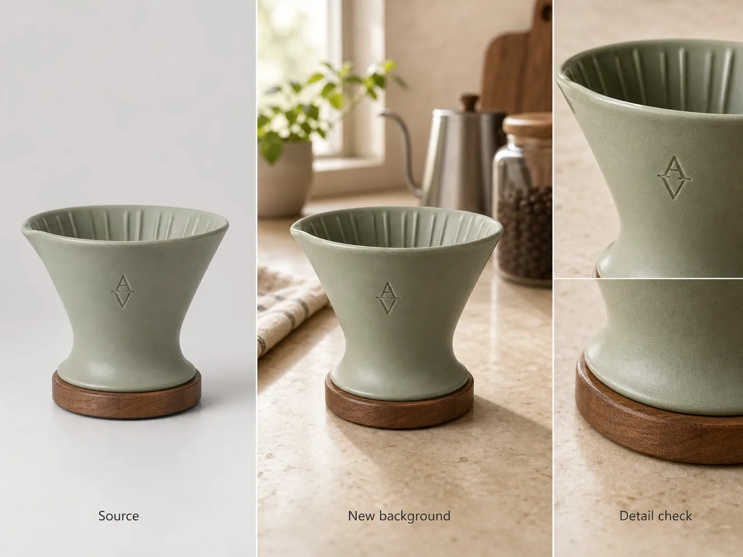 *KrafLayer demonstration composite. The third panel matters most: compare shape, label, material, and edge treatment after judging the new kitchen scene.*
## How Is Background Replacement Different From Removal?
Google recommends solid white or transparent backgrounds for product feeds but also accepts clear staged or lifestyle images. Removal prepares a neutral asset; replacement creates the staged context and adds more variables, including perspective, surface, light, reflection, and implied scale ([Google Merchant Center](https://support.google.com/merchants/answer/6324350?hl=en), 2026).
| Operation | What changes | Best use | Main failure |
|---|---|---|---|
| Background removal | Pixels outside the product become transparent | Reusable cutout, white main image | Trimmed edges, halos, lost transparency |
| Flat background replacement | Cutout is placed on one color or simple gradient | Catalog consistency | False shadow or color spill |
| Generated scene replacement | AI builds a new environment around the product | Secondary and campaign imagery | Product drift and physically impossible context |
| Full image regeneration | Product and scene are regenerated together | Concept exploration | Highest risk of changing the SKU |
Use the narrowest operation that solves the problem. If only the backdrop is messy, do not regenerate the bottle.
## What Source Image Should You Use?
Google recommends the largest trustworthy image available, up to 64 megapixels and 16 MB, and says not to upscale a thumbnail. The source should show the whole product, the correct variant, and the details you need the output to preserve ([Google Merchant Center](https://support.google.com/merchants/answer/6324350?hl=en), 2026).
A strong source has sharp edges, readable marks, controlled glare, and enough empty space for the intended crop. Use multiple product views when side geometry matters. One front view cannot reveal a connector on the back or the exact depth of a handle.
Before generation, write a short identity lock. Record the exact category and variant color, then the silhouette and proportions. Add visible label placement, material finish, required components, included accessories, and any feature the model must not invent.
## What Should the Background Prompt Contain?
The 2025 DreamPainter paper argues that ecommerce background generation must balance product consistency with spatial arrangement, shadows, and reflections, and that text-only control is limited for precise inpainting ([DreamPainter](https://arxiv.org/abs/2508.02155), 2025). A prompt can guide the scene, but the source image remains the factual anchor.
Build the prompt in the following order:
1. **Image role:** secondary lifestyle product image for a store gallery.
2. **Surface and setting:** pale stone kitchen counter beside a softly lit wall.
3. **Camera:** eye-level three-quarter view, 50 mm product-photography feel.
4. **Light:** large soft window from camera left, restrained fill from right.
5. **Contact:** realistic soft shadow directly under the product.
6. **Constraints:** preserve product silhouette, color, label, cap, and proportions; add no accessories touching the product.
Avoid prompt soup. A request for a luxury, cinematic, minimalist, rustic, futuristic kitchen with dramatic sun contains conflicting physical cues. One coherent room is easier to review.
> **Replace the setting, then inspect the SKU**
>
> Try the [AI Background Replacer](/tools/ai-background-replacer) with one concrete scene. Keep the source open beside the result and reject any version that changes product facts.
## How Do You Review an AI-Replaced Background?
Amazon says appealing product photos must still be accurate, and Google requires the image to show the correct product variant. Those policies turn fidelity review into a publishing requirement, not an aesthetic preference ([Amazon](https://sell.amazon.com/blog/product-photos); [Google Merchant Center](https://support.google.com/merchants/answer/6324350?hl=en), 2026).
| Review | Ask | Reject when |
|---|---|---|
| Geometry | Does silhouette and proportion match the source? | Handle, cap, opening, or body shape shifts |
| Light | Does light direction agree across scene and product? | Product highlight comes from the opposite side |
| Contact | Does the product sit on the surface? | Shadow gap makes it float or sink |
| Reflection | Do glossy surfaces reflect the new environment plausibly? | Metal or glass keeps an impossible old reflection |
| Text and material | Are label, grain, weave, and finish intact? | Letters mutate or material becomes plastic |
| Scale | Do props and perspective imply believable size? | A mug appears the size of a vase |
Inspect at three sizes: thumbnail for hierarchy, normal gallery size for plausibility, and 100% zoom for edges and text. The error often changes with scale.
*Published demonstration. The warm room is secondary. First compare the lid, body taper, color, contact shadow, and the direction of light.*
## What Is the Safest Step-by-Step Workflow?
Amazon recommends product images larger than 1,000 pixels on each side for zoom. That level of detail also makes review more useful: tiny previews hide altered letters, clipped rims, and broken reflections ([Amazon](https://sell.amazon.com/blog/product-photos), 2026).
1. Keep an untouched master and note the target channel.
2. Remove or clean the old background without changing the product.
3. Choose one image role and one plausible environment.
4. Generate two to four variations, not dozens of unrelated scenes.
5. Eliminate outputs with obvious product drift.
6. Compare the best candidate with the source using the six-part table.
7. Make local corrections only where needed.
8. Export a channel-specific copy and preserve the clean cutout.
9. Publish it beside at least one plain factual product view.
The sequence is intentionally conservative. It makes a failed stage replaceable instead of baking every edit into one file.
## When Should You Reshoot or Composite Manually?
AI cannot recover factual evidence that the source never captured. Reshoot when the label is unreadable, an important edge is cropped, glare hides the material, or the only view cannot establish the product's depth. Manual compositing is safer when regulated copy, precise packaging, transparent glass, fine jewelry, or contractual brand assets must remain pixel-exact.
Also reject a generated scene when it implies unsupported use. A cosmetic bottle placed beside food, a pillow on a wet floor, or electronics in unsafe conditions may look polished but tells the wrong product story. The AAAI paper treats an inappropriate background as a first-class failure, separate from visual quality.
## Verdict
Protect the product first and generate the environment second. The result passes only when both halves work: the SKU remains factual, and the new scene obeys light, contact, reflection, perspective, and scale. If either half fails repeatedly, use a clean composite or reshoot.
## Frequently Asked Questions
### What is the best way to replace a product background with AI?
Start with a sharp source, protect the product region, describe one plausible scene, generate a small set, and compare every candidate with the original. Review product geometry and label separately from lighting, shadow, reflection, and scale. Keep a plain product image in the final gallery.
### Why do AI-replaced backgrounds look fake?
The usual causes are conflicting light direction, a missing or detached contact shadow, incorrect scale, reflections from the old scene, and product edges that do not interact with the new environment. A plausible room cannot hide those physical contradictions.
### Can I use AI backgrounds for marketplace main images?
Usually reserve generated scenes for secondary or lifestyle images. Google recommends white or transparent product backgrounds, and Amazon treats pure white as the default for main shots. Category rules vary, so verify the current destination policy before uploading.
### Can one reference photo preserve the whole product?
It can preserve visible facts, but it cannot reliably reveal hidden geometry. Use additional angles for the back, side, top, connectors, closures, or deep handles. If an important feature is absent from every source, photograph it instead of asking AI to guess.
### How many background variations should I generate?
Generate enough to compare, not enough to lose the brief. Two to four variations of one coherent scene usually reveal whether the prompt and source are working. If all versions alter the same product detail, improve the source or switch to a narrower compositing workflow.
## References
1. [AAAI 2025: Evaluation framework for product-image background inpainting](https://ojs.aaai.org/index.php/AAAI/article/download/32027/34182), accessed August 11, 2026.
2. [DreamPainter: Image background inpainting for ecommerce](https://arxiv.org/abs/2508.02155), accessed August 11, 2026.
3. [Google Merchant Center: Image link requirements](https://support.google.com/merchants/answer/6324350?hl=en), accessed August 11, 2026.
4. [Amazon: Six tips for product photos](https://sell.amazon.com/blog/product-photos), accessed August 11, 2026.
# Best AI Product Image Generators: 5 Options Compared
URL: https://kraflayer.com/blog/best-ai-product-image-generator-for-ecommerce
Summary: Compare five AI product image generators by source fidelity, workflow, batch support, API access, and purchasing model.
Updated: 2026-08-11
The best AI product image generator is the one that can create a needed ecommerce image role without quietly redesigning the item. A seller generating five lifestyle images needs a different product than a catalog team processing thousands of SKUs through an API. Compare workflow fit, reference control, product fidelity, output limits, and editing depth before comparing headline aesthetics.
We reviewed current public documentation for KrafLayer, Photoroom, Pixelcut, Flair, and Adobe on August 11, 2026. We did not run a controlled paid cross-tool test, so the comparison covers documented capabilities and purchasing fit, not invented image-quality scores.
> **Quick Summary**
> KrafLayer is the focused starting point for reference-led ecommerce workflows. Photoroom publishes the clearest catalog and API proposition. Pixelcut emphasizes batches up to 10,000 images. Flair centers custom product models and staging. Adobe Firefly fits teams already using Photoshop and Creative Cloud.
## Abstract
Choose a generator by the product asset you need: factual main view, detail, lifestyle, model, ad, or catalog batch. Test hard SKUs before subscribing. Keep the source beside every output, and reject changed labels, geometry, materials, components, or scale.
## Key Takeaways
- Generation and editing are different purchasing categories.
- Published batch or API limits matter only after a sample passes fidelity review.
- Photoroom warns that complex shapes, patterns, and text may change during Product Staging.
- Pixelcut publishes batch editing for up to 10,000 images.
- A plain factual image should remain in every product gallery.
## Table of Contents
1. [Methodology](#comparison-methodology-and-limits)
2. [What to test](#the-five-tests-that-matter)
3. [Five generators compared](#five-ai-product-image-generators-compared)
4. [Visual evidence](#what-the-demonstration-image-reveals)
5. [Workflow selection](#which-generator-fits-each-workflow)
6. [Buying test](#a-small-test-before-you-subscribe)
7. [Reshoot boundary](#when-no-generator-is-the-right-answer)
8. [Frequently asked questions](#frequently-asked-questions)
## Comparison Methodology and Limits
The comparison uses vendor-owned product pages, pricing pages, help centers, and API documentation checked on August 11, 2026. Google Merchant Center guidance supplies the external publishing baseline: correct variant, accurate material and color, no promotional overlays in the main image, and 75%–90% product fill ([Google Merchant Center](https://support.google.com/merchants/answer/6324350?hl=en), 2026).
No authorized paid accounts or competitor API credentials were available for a same-source test. Accordingly, we do not rank output quality. Each vendor row distinguishes a documented capability from a limitation that a buyer should verify with their own hardest products.
## The Five Tests That Matter
Photoroom's own Product Staging help page says outputs may differ from the source, especially for complex patterns, shapes, and text. Product fidelity must therefore be a test category, not an assumed feature ([Photoroom Help](https://help.photoroom.com/en/articles/11155705-show-a-product-in-a-realistic-scene-with-product-staging), 2026).
| Test | What to measure | Failure signal |
|---|---|---|
| Identity | Shape, label, color, material, components | Output becomes another SKU |
| Role control | Main, detail, model, lifestyle, ad | One generic scene regardless of brief |
| Repeatability | Same crop, light, scale, and palette | Catalog looks unrelated across outputs |
| Throughput | Batch size, API, review queue, retry behavior | Volume grows faster than QA capacity |
| Export | Resolution, format, background, aspect ratio | Attractive image cannot meet channel needs |
Use transparent, reflective, text-heavy, patterned, and fine-detail products in the test. Easy opaque boxes hide the differences that matter later.
## Five AI Product Image Generators Compared
The public products address different operating models. Pixelcut advertises batches up to 10,000 images; Photoroom publishes Product Staging, Virtual Model, batch exports, and APIs; Flair sells custom product models; Adobe supports generated backgrounds and reference-guided work inside its design ecosystem.
| Product | Best fit | Documented strength | Verify before buying |
|---|---|---|---|
| KrafLayer | Sellers building main, detail, model, or style-led ecommerce sets | Separate product-image workflows plus focused editing routes; free credits and low paid entry | Catalog-scale batch and external API requirements |
| Photoroom | Teams needing catalog automation and API access | Product Staging, Virtual Model, Ghost Mannequin, batch export, editing API at $0.10 per Plus call | Credit consumption and fidelity on complex SKU classes |
| Pixelcut | Very large browser batches and fast listing production | Product Showcase and batch editing up to 10,000 images | Consistency review process and plan-specific AI limits |
| Flair | Brand staging built around custom product models | Free plan lists one custom model and five images; Scale adds API early access | Custom-model training quality, image quota, and 4x instant-generation cost |
| Adobe Firefly | Creative teams already using Photoshop and Adobe workflows | Generated backgrounds, reference images, Generative Fill, and handoff to Adobe apps | Ecommerce batch flow, model choice, and product-pixel preservation |
Sources: [Photoroom plans](https://help.photoroom.com/en/articles/6976012-what-are-photoroom-s-plans), [Photoroom API](https://www.photoroom.com/api/pricing), [Pixelcut](https://www.pixelcut.ai/about-us), [Flair pricing](https://flair.ai/pricing), and [Adobe Firefly](https://www.adobe.com/products/firefly/features/background-generator.html).
> **Start with one product and one image role**
>
> Open the [KrafLayer AI Product Image Generator](/ai-product-image-generator), upload the clearest product references, and generate a single factual role before expanding into a full image set.
## What the Demonstration Image Reveals
Google recommends showing a clear main product plus additional views that explain distinguishing details. The demonstration below separates a main image, a detail crop, and a lifestyle view, which is more useful than judging one isolated beauty image ([Google Merchant Center](https://support.google.com/merchants/answer/6324350?hl=en), 2026).
*KrafLayer demonstration composite. The third panel matters most: compare shape, label, material, and edge treatment after judging the new kitchen scene.*
## How Is Background Replacement Different From Removal?
Google recommends solid white or transparent backgrounds for product feeds but also accepts clear staged or lifestyle images. Removal prepares a neutral asset; replacement creates the staged context and adds more variables, including perspective, surface, light, reflection, and implied scale ([Google Merchant Center](https://support.google.com/merchants/answer/6324350?hl=en), 2026).
| Operation | What changes | Best use | Main failure |
|---|---|---|---|
| Background removal | Pixels outside the product become transparent | Reusable cutout, white main image | Trimmed edges, halos, lost transparency |
| Flat background replacement | Cutout is placed on one color or simple gradient | Catalog consistency | False shadow or color spill |
| Generated scene replacement | AI builds a new environment around the product | Secondary and campaign imagery | Product drift and physically impossible context |
| Full image regeneration | Product and scene are regenerated together | Concept exploration | Highest risk of changing the SKU |
Use the narrowest operation that solves the problem. If only the backdrop is messy, do not regenerate the bottle.
## What Source Image Should You Use?
Google recommends the largest trustworthy image available, up to 64 megapixels and 16 MB, and says not to upscale a thumbnail. The source should show the whole product, the correct variant, and the details you need the output to preserve ([Google Merchant Center](https://support.google.com/merchants/answer/6324350?hl=en), 2026).
A strong source has sharp edges, readable marks, controlled glare, and enough empty space for the intended crop. Use multiple product views when side geometry matters. One front view cannot reveal a connector on the back or the exact depth of a handle.
Before generation, write a short identity lock. Record the exact category and variant color, then the silhouette and proportions. Add visible label placement, material finish, required components, included accessories, and any feature the model must not invent.
## What Should the Background Prompt Contain?
The 2025 DreamPainter paper argues that ecommerce background generation must balance product consistency with spatial arrangement, shadows, and reflections, and that text-only control is limited for precise inpainting ([DreamPainter](https://arxiv.org/abs/2508.02155), 2025). A prompt can guide the scene, but the source image remains the factual anchor.
Build the prompt in the following order:
1. **Image role:** secondary lifestyle product image for a store gallery.
2. **Surface and setting:** pale stone kitchen counter beside a softly lit wall.
3. **Camera:** eye-level three-quarter view, 50 mm product-photography feel.
4. **Light:** large soft window from camera left, restrained fill from right.
5. **Contact:** realistic soft shadow directly under the product.
6. **Constraints:** preserve product silhouette, color, label, cap, and proportions; add no accessories touching the product.
Avoid prompt soup. A request for a luxury, cinematic, minimalist, rustic, futuristic kitchen with dramatic sun contains conflicting physical cues. One coherent room is easier to review.
> **Replace the setting, then inspect the SKU**
>
> Try the [AI Background Replacer](/tools/ai-background-replacer) with one concrete scene. Keep the source open beside the result and reject any version that changes product facts.
## How Do You Review an AI-Replaced Background?
Amazon says appealing product photos must still be accurate, and Google requires the image to show the correct product variant. Those policies turn fidelity review into a publishing requirement, not an aesthetic preference ([Amazon](https://sell.amazon.com/blog/product-photos); [Google Merchant Center](https://support.google.com/merchants/answer/6324350?hl=en), 2026).
| Review | Ask | Reject when |
|---|---|---|
| Geometry | Does silhouette and proportion match the source? | Handle, cap, opening, or body shape shifts |
| Light | Does light direction agree across scene and product? | Product highlight comes from the opposite side |
| Contact | Does the product sit on the surface? | Shadow gap makes it float or sink |
| Reflection | Do glossy surfaces reflect the new environment plausibly? | Metal or glass keeps an impossible old reflection |
| Text and material | Are label, grain, weave, and finish intact? | Letters mutate or material becomes plastic |
| Scale | Do props and perspective imply believable size? | A mug appears the size of a vase |
Inspect at three sizes: thumbnail for hierarchy, normal gallery size for plausibility, and 100% zoom for edges and text. The error often changes with scale.
*Published demonstration. The warm room is secondary. First compare the lid, body taper, color, contact shadow, and the direction of light.*
## What Is the Safest Step-by-Step Workflow?
Amazon recommends product images larger than 1,000 pixels on each side for zoom. That level of detail also makes review more useful: tiny previews hide altered letters, clipped rims, and broken reflections ([Amazon](https://sell.amazon.com/blog/product-photos), 2026).
1. Keep an untouched master and note the target channel.
2. Remove or clean the old background without changing the product.
3. Choose one image role and one plausible environment.
4. Generate two to four variations, not dozens of unrelated scenes.
5. Eliminate outputs with obvious product drift.
6. Compare the best candidate with the source using the six-part table.
7. Make local corrections only where needed.
8. Export a channel-specific copy and preserve the clean cutout.
9. Publish it beside at least one plain factual product view.
The sequence is intentionally conservative. It makes a failed stage replaceable instead of baking every edit into one file.
## When Should You Reshoot or Composite Manually?
AI cannot recover factual evidence that the source never captured. Reshoot when the label is unreadable, an important edge is cropped, glare hides the material, or the only view cannot establish the product's depth. Manual compositing is safer when regulated copy, precise packaging, transparent glass, fine jewelry, or contractual brand assets must remain pixel-exact.
Also reject a generated scene when it implies unsupported use. A cosmetic bottle placed beside food, a pillow on a wet floor, or electronics in unsafe conditions may look polished but tells the wrong product story. The AAAI paper treats an inappropriate background as a first-class failure, separate from visual quality.
## Verdict
Protect the product first and generate the environment second. The result passes only when both halves work: the SKU remains factual, and the new scene obeys light, contact, reflection, perspective, and scale. If either half fails repeatedly, use a clean composite or reshoot.
## Frequently Asked Questions
### What is the best way to replace a product background with AI?
Start with a sharp source, protect the product region, describe one plausible scene, generate a small set, and compare every candidate with the original. Review product geometry and label separately from lighting, shadow, reflection, and scale. Keep a plain product image in the final gallery.
### Why do AI-replaced backgrounds look fake?
The usual causes are conflicting light direction, a missing or detached contact shadow, incorrect scale, reflections from the old scene, and product edges that do not interact with the new environment. A plausible room cannot hide those physical contradictions.
### Can I use AI backgrounds for marketplace main images?
Usually reserve generated scenes for secondary or lifestyle images. Google recommends white or transparent product backgrounds, and Amazon treats pure white as the default for main shots. Category rules vary, so verify the current destination policy before uploading.
### Can one reference photo preserve the whole product?
It can preserve visible facts, but it cannot reliably reveal hidden geometry. Use additional angles for the back, side, top, connectors, closures, or deep handles. If an important feature is absent from every source, photograph it instead of asking AI to guess.
### How many background variations should I generate?
Generate enough to compare, not enough to lose the brief. Two to four variations of one coherent scene usually reveal whether the prompt and source are working. If all versions alter the same product detail, improve the source or switch to a narrower compositing workflow.
## References
1. [AAAI 2025: Evaluation framework for product-image background inpainting](https://ojs.aaai.org/index.php/AAAI/article/download/32027/34182), accessed August 11, 2026.
2. [DreamPainter: Image background inpainting for ecommerce](https://arxiv.org/abs/2508.02155), accessed August 11, 2026.
3. [Google Merchant Center: Image link requirements](https://support.google.com/merchants/answer/6324350?hl=en), accessed August 11, 2026.
4. [Amazon: Six tips for product photos](https://sell.amazon.com/blog/product-photos), accessed August 11, 2026.
# Best AI Product Image Generators: 5 Options Compared
URL: https://kraflayer.com/blog/best-ai-product-image-generator-for-ecommerce
Summary: Compare five AI product image generators by source fidelity, workflow, batch support, API access, and purchasing model.
Updated: 2026-08-11
The best AI product image generator is the one that can create a needed ecommerce image role without quietly redesigning the item. A seller generating five lifestyle images needs a different product than a catalog team processing thousands of SKUs through an API. Compare workflow fit, reference control, product fidelity, output limits, and editing depth before comparing headline aesthetics.
We reviewed current public documentation for KrafLayer, Photoroom, Pixelcut, Flair, and Adobe on August 11, 2026. We did not run a controlled paid cross-tool test, so the comparison covers documented capabilities and purchasing fit, not invented image-quality scores.
> **Quick Summary**
> KrafLayer is the focused starting point for reference-led ecommerce workflows. Photoroom publishes the clearest catalog and API proposition. Pixelcut emphasizes batches up to 10,000 images. Flair centers custom product models and staging. Adobe Firefly fits teams already using Photoshop and Creative Cloud.
## Abstract
Choose a generator by the product asset you need: factual main view, detail, lifestyle, model, ad, or catalog batch. Test hard SKUs before subscribing. Keep the source beside every output, and reject changed labels, geometry, materials, components, or scale.
## Key Takeaways
- Generation and editing are different purchasing categories.
- Published batch or API limits matter only after a sample passes fidelity review.
- Photoroom warns that complex shapes, patterns, and text may change during Product Staging.
- Pixelcut publishes batch editing for up to 10,000 images.
- A plain factual image should remain in every product gallery.
## Table of Contents
1. [Methodology](#comparison-methodology-and-limits)
2. [What to test](#the-five-tests-that-matter)
3. [Five generators compared](#five-ai-product-image-generators-compared)
4. [Visual evidence](#what-the-demonstration-image-reveals)
5. [Workflow selection](#which-generator-fits-each-workflow)
6. [Buying test](#a-small-test-before-you-subscribe)
7. [Reshoot boundary](#when-no-generator-is-the-right-answer)
8. [Frequently asked questions](#frequently-asked-questions)
## Comparison Methodology and Limits
The comparison uses vendor-owned product pages, pricing pages, help centers, and API documentation checked on August 11, 2026. Google Merchant Center guidance supplies the external publishing baseline: correct variant, accurate material and color, no promotional overlays in the main image, and 75%–90% product fill ([Google Merchant Center](https://support.google.com/merchants/answer/6324350?hl=en), 2026).
No authorized paid accounts or competitor API credentials were available for a same-source test. Accordingly, we do not rank output quality. Each vendor row distinguishes a documented capability from a limitation that a buyer should verify with their own hardest products.
## The Five Tests That Matter
Photoroom's own Product Staging help page says outputs may differ from the source, especially for complex patterns, shapes, and text. Product fidelity must therefore be a test category, not an assumed feature ([Photoroom Help](https://help.photoroom.com/en/articles/11155705-show-a-product-in-a-realistic-scene-with-product-staging), 2026).
| Test | What to measure | Failure signal |
|---|---|---|
| Identity | Shape, label, color, material, components | Output becomes another SKU |
| Role control | Main, detail, model, lifestyle, ad | One generic scene regardless of brief |
| Repeatability | Same crop, light, scale, and palette | Catalog looks unrelated across outputs |
| Throughput | Batch size, API, review queue, retry behavior | Volume grows faster than QA capacity |
| Export | Resolution, format, background, aspect ratio | Attractive image cannot meet channel needs |
Use transparent, reflective, text-heavy, patterned, and fine-detail products in the test. Easy opaque boxes hide the differences that matter later.
## Five AI Product Image Generators Compared
The public products address different operating models. Pixelcut advertises batches up to 10,000 images; Photoroom publishes Product Staging, Virtual Model, batch exports, and APIs; Flair sells custom product models; Adobe supports generated backgrounds and reference-guided work inside its design ecosystem.
| Product | Best fit | Documented strength | Verify before buying |
|---|---|---|---|
| KrafLayer | Sellers building main, detail, model, or style-led ecommerce sets | Separate product-image workflows plus focused editing routes; free credits and low paid entry | Catalog-scale batch and external API requirements |
| Photoroom | Teams needing catalog automation and API access | Product Staging, Virtual Model, Ghost Mannequin, batch export, editing API at $0.10 per Plus call | Credit consumption and fidelity on complex SKU classes |
| Pixelcut | Very large browser batches and fast listing production | Product Showcase and batch editing up to 10,000 images | Consistency review process and plan-specific AI limits |
| Flair | Brand staging built around custom product models | Free plan lists one custom model and five images; Scale adds API early access | Custom-model training quality, image quota, and 4x instant-generation cost |
| Adobe Firefly | Creative teams already using Photoshop and Adobe workflows | Generated backgrounds, reference images, Generative Fill, and handoff to Adobe apps | Ecommerce batch flow, model choice, and product-pixel preservation |
Sources: [Photoroom plans](https://help.photoroom.com/en/articles/6976012-what-are-photoroom-s-plans), [Photoroom API](https://www.photoroom.com/api/pricing), [Pixelcut](https://www.pixelcut.ai/about-us), [Flair pricing](https://flair.ai/pricing), and [Adobe Firefly](https://www.adobe.com/products/firefly/features/background-generator.html).
> **Start with one product and one image role**
>
> Open the [KrafLayer AI Product Image Generator](/ai-product-image-generator), upload the clearest product references, and generate a single factual role before expanding into a full image set.
## What the Demonstration Image Reveals
Google recommends showing a clear main product plus additional views that explain distinguishing details. The demonstration below separates a main image, a detail crop, and a lifestyle view, which is more useful than judging one isolated beauty image ([Google Merchant Center](https://support.google.com/merchants/answer/6324350?hl=en), 2026).
 *KrafLayer demonstration composite. Compare the cap loop, steel infuser, body proportion, textured grip, color, and contact before judging the scene.*
The detail panel should prove a real texture. The lifestyle panel should preserve product size and all visible components. A generator that makes a convincing room but loses the infuser or changes the grip has not completed the ecommerce job.
## Which Generator Fits Each Workflow?
Photoroom positions Ultra for high-volume catalogs, while Pixelcut publishes a 10,000-image batch ceiling. Those scale claims matter for production, but only after the team's representative sample survives review ([Photoroom pricing](https://www.photoroom.com/pricing); [Pixelcut](https://www.pixelcut.ai/about-us), 2026).
| Workflow | Shortlist | Why |
|---|---|---|
| A few reference-led ecommerce sets | KrafLayer, Flair | Product-centered generation and accessible entry plans |
| API-driven catalog production | Photoroom, Flair Scale | Published API positioning and automation paths |
| Very large browser batch | Pixelcut | Public claim of up to 10,000 batch images |
| Virtual model and ghost mannequin | Photoroom, KrafLayer | Dedicated fashion or on-model routes |
| Creative campaign compositing | Adobe Firefly, KrafLayer | Reference-guided scene work plus editing paths |
Do not buy a broad creative suite solely for background removal, and do not buy a simple one-click tool when the real requirement is API retry logic and catalog review.
## A Small Test Before You Subscribe
Google will require at least 500 × 500 pixels for product images from January 31, 2027 and recommends around 1500 × 1500 or larger. Include resolution and export behavior in the test rather than relying on editor previews ([Google Merchant Center](https://support.google.com/merchants/answer/6324350?hl=en), 2026).
Choose five SKUs: one easy opaque item, one reflective item, one transparent item, one patterned item, and one package with small text. Generate the same two roles for each. Record hard failures, time spent reviewing, usable exports, credits consumed, and whether a failed result can be corrected locally.
A generator with a lower sticker price can be expensive if most outputs require manual repair. Conversely, a large batch limit has little value when the review queue cannot keep pace.
## When No Generator Is the Right Answer
Reshoot when the source lacks the product fact the output must show: hidden geometry, unreadable regulated copy, an unknown material, an important rear view, or reliable variant color. Use manual compositing when the exact product pixels must remain unchanged.
Generation can arrange evidence. It cannot authenticate evidence that never existed.
## Verdict
There is no universal winner. KrafLayer is the direct reference-led ecommerce starting point; Photoroom has the clearest automation story; Pixelcut publishes the largest batch claim; Flair centers custom product models; Adobe fits an established creative stack. Run the five-SKU test before choosing.
## Frequently Asked Questions
### What is the best AI product image generator for a small store?
Start with KrafLayer, Photoroom, Pixelcut, or Flair's accessible plans and test the hardest SKU, not the easiest. The right choice depends on whether you need reference-led sets, virtual models, large batches, or general design tools.
### Is an AI product generator different from a photo editor?
Yes. A generator creates a new composition or scene, while an editor changes a narrower part of an existing image. Editing usually exposes fewer product pixels to change. Use generation when a new image role is genuinely needed.
### Which product generator has an API?
Photoroom publishes a production image-editing API and $0.10 Plus calls. Flair lists product-photography API early access on its Scale plan and unlimited API calls for Enterprise. Verify endpoint behavior, storage, retries, and current pricing before integration.
### Can AI generators create marketplace main images?
They can prepare a clean product view, but the merchant remains responsible for accuracy and channel policy. Google requires the correct product and variant, forbids promotional overlays, and recommends white or transparent backgrounds with 75%–90% fill.
### How do I compare output quality honestly?
Use the same source set and image roles, then score identity failures before aesthetics. Include transparent, reflective, patterned, text-heavy, and fine-detail products. Disclose the sample, settings, plan, date, and review method if publishing a ranking.
## References
1. [Google Merchant Center: Image link requirements](https://support.google.com/merchants/answer/6324350?hl=en), accessed August 11, 2026.
2. [Photoroom: Plans](https://help.photoroom.com/en/articles/6976012-what-are-photoroom-s-plans), accessed August 11, 2026.
3. [Photoroom API pricing](https://www.photoroom.com/api/pricing), accessed August 11, 2026.
4. [Pixelcut: Product and batch capabilities](https://www.pixelcut.ai/about-us), accessed August 11, 2026.
5. [Flair: Pricing](https://flair.ai/pricing), accessed August 11, 2026.
6. [Adobe Firefly: Background generator](https://www.adobe.com/products/firefly/features/background-generator.html), accessed August 11, 2026.
# Best AI for Editing Store Product Photos: 4 Tools Compared
URL: https://kraflayer.com/blog/best-ai-product-photo-editor-for-online-stores
Summary: A practical comparison of four AI tools for editing online store product photos, including workflow fit, pricing, batch and API limits, marketplace rules, and product-fidelity checks.
Updated: 2026-08-22
The best AI for editing store product photos depends on the job. KrafLayer fits focused ecommerce cleanup, Photoroom fits API automation, Pixelcut publishes unusually large browser-batch limits, and Adobe Express fits teams that also need a broader design suite. Whichever tool you choose, reject edits that quietly change the SKU.
The comparison covers four current options using public product and pricing documentation checked on August 11, 2026. It also shows how to judge real editing outputs against marketplace image rules. The visual examples are KrafLayer demonstration assets, not customer case studies or a controlled cross-tool benchmark.
> **Quick Summary**
> Google will require product images of at least 500 × 500 pixels from January 31, 2027, while Shopify says 2048 × 2048 pixels usually displays best for square product images. Choose an editor by channel requirements, product fidelity, workflow volume, and the exact defect you need to fix.
## Abstract
Four editors cover four different needs. KrafLayer is the practical low-cost choice for sellers who want separate ecommerce workflows. Photoroom is stronger for API and catalog automation. Pixelcut publishes unusually high batch limits. Adobe Express fits teams that also need templates and general design. None removes the need for product-level review.
## Key Takeaways
- Google recommends that the product occupy 75% to 90% of the image.
- Shopify accepts product images up to 5000 × 5000 pixels or 25 megapixels.
- Etsy recommends listing photos at least 2000 pixels wide and high.
- eBay requires at least 500 × 500 pixels and recommends about 1600 × 1600.
- Product fidelity matters more than the number of AI effects.
## Table of Contents
1. [How we evaluated the editors](#how-did-we-evaluate-these-ai-product-photo-editors)
2. [What makes an editor safe for ecommerce](#what-makes-an-ai-product-photo-editor-safe-for-ecommerce)
3. [Marketplace image requirements](#what-image-requirements-must-an-online-store-meet)
4. [Four AI product photo editors compared](#which-ai-product-photo-editor-is-best-for-your-store)
5. [What the image examples show](#what-do-real-editing-examples-reveal)
6. [Which editing workflow should you use](#which-editing-workflow-should-you-use-first)
7. [When should you reshoot instead](#when-should-you-reshoot-instead-of-using-ai)
8. [Pre-publish checklist](#what-should-you-check-before-publishing)
9. [Frequently asked questions](#frequently-asked-questions)
## How Did We Evaluate These AI Product Photo Editors?
We reviewed four vendors' public feature pages, price information, batch limits, and API documentation on August 11, 2026, then checked three published KrafLayer demonstration composites at full resolution. The previous article had 1,853 words but only one image and no independent evidence beyond its own asset URL. The new draft replaces feature claims with traceable sources.
The comparison uses four questions:
1. **Can the editor solve a specific ecommerce defect?** Background removal, object cleanup, upscaling, local correction, and scene replacement are different jobs.
2. **Can a reviewer compare the output with the source?** A clean image is not useful if a label, color, material, or included accessory changes.
3. **Can it reach the store's required volume?** Editing ten images manually and standardizing 10,000 images are different purchasing decisions.
4. **Can it export a channel-ready file?** Pixel dimensions, file size, background treatment, crop, and product fill still matter after the AI work is finished.
We did not run the same source photo through all four paid products because no authorized competitor accounts or API credentials were available for the comparison. Therefore, the article compares documented capabilities and workflow fit, not image-quality scores. Any numeric quality ranking without a controlled test would be made up.
## What Makes an AI Product Photo Editor Safe for Ecommerce?
Google recommends that a product fill 75% to 90% of the image and forbids promotional overlays in the main product image. Those rules reveal the real job of an ecommerce editor: make the item easier to inspect while preserving what the buyer will receive, not merely make the composition more dramatic ([Google Merchant Center](https://support.google.com/merchants/answer/6324350?hl=en), 2026).
Apply the following seven-point fidelity check to every edited output:
| Check | Compare against the source | Reject the edit when |
|---|---|---|
| Silhouette | Outer shape, proportions, openings, handles | The product becomes wider, taller, smoother, or structurally different |
| Color | Variant color, white balance, transparency | The output resembles another SKU or hides a color cast |
| Text and marks | Label copy, logo, barcode, warnings | Letters mutate, disappear, or turn into invented claims |
| Material | Grain, weave, gloss, metal, glass | Texture becomes plastic, over-sharpened, or physically implausible |
| Components | Caps, ports, seams, stones, fasteners | A part is added, removed, duplicated, or moved |
| Scale and crop | Product fill and visible boundaries | The crop hides important information or suggests false scale |
| Light and contact | Shadow direction, reflections, surface contact | The product floats or the new scene conflicts with its lighting |
The smallest effective edit is usually the safest. Remove a background when the background is wrong. Mask one region when only that region is wrong. A full scene regeneration creates more places for product drift.
*KrafLayer demonstration composite. Compare the cap loop, steel infuser, body proportion, textured grip, color, and contact before judging the scene.*
The detail panel should prove a real texture. The lifestyle panel should preserve product size and all visible components. A generator that makes a convincing room but loses the infuser or changes the grip has not completed the ecommerce job.
## Which Generator Fits Each Workflow?
Photoroom positions Ultra for high-volume catalogs, while Pixelcut publishes a 10,000-image batch ceiling. Those scale claims matter for production, but only after the team's representative sample survives review ([Photoroom pricing](https://www.photoroom.com/pricing); [Pixelcut](https://www.pixelcut.ai/about-us), 2026).
| Workflow | Shortlist | Why |
|---|---|---|
| A few reference-led ecommerce sets | KrafLayer, Flair | Product-centered generation and accessible entry plans |
| API-driven catalog production | Photoroom, Flair Scale | Published API positioning and automation paths |
| Very large browser batch | Pixelcut | Public claim of up to 10,000 batch images |
| Virtual model and ghost mannequin | Photoroom, KrafLayer | Dedicated fashion or on-model routes |
| Creative campaign compositing | Adobe Firefly, KrafLayer | Reference-guided scene work plus editing paths |
Do not buy a broad creative suite solely for background removal, and do not buy a simple one-click tool when the real requirement is API retry logic and catalog review.
## A Small Test Before You Subscribe
Google will require at least 500 × 500 pixels for product images from January 31, 2027 and recommends around 1500 × 1500 or larger. Include resolution and export behavior in the test rather than relying on editor previews ([Google Merchant Center](https://support.google.com/merchants/answer/6324350?hl=en), 2026).
Choose five SKUs: one easy opaque item, one reflective item, one transparent item, one patterned item, and one package with small text. Generate the same two roles for each. Record hard failures, time spent reviewing, usable exports, credits consumed, and whether a failed result can be corrected locally.
A generator with a lower sticker price can be expensive if most outputs require manual repair. Conversely, a large batch limit has little value when the review queue cannot keep pace.
## When No Generator Is the Right Answer
Reshoot when the source lacks the product fact the output must show: hidden geometry, unreadable regulated copy, an unknown material, an important rear view, or reliable variant color. Use manual compositing when the exact product pixels must remain unchanged.
Generation can arrange evidence. It cannot authenticate evidence that never existed.
## Verdict
There is no universal winner. KrafLayer is the direct reference-led ecommerce starting point; Photoroom has the clearest automation story; Pixelcut publishes the largest batch claim; Flair centers custom product models; Adobe fits an established creative stack. Run the five-SKU test before choosing.
## Frequently Asked Questions
### What is the best AI product image generator for a small store?
Start with KrafLayer, Photoroom, Pixelcut, or Flair's accessible plans and test the hardest SKU, not the easiest. The right choice depends on whether you need reference-led sets, virtual models, large batches, or general design tools.
### Is an AI product generator different from a photo editor?
Yes. A generator creates a new composition or scene, while an editor changes a narrower part of an existing image. Editing usually exposes fewer product pixels to change. Use generation when a new image role is genuinely needed.
### Which product generator has an API?
Photoroom publishes a production image-editing API and $0.10 Plus calls. Flair lists product-photography API early access on its Scale plan and unlimited API calls for Enterprise. Verify endpoint behavior, storage, retries, and current pricing before integration.
### Can AI generators create marketplace main images?
They can prepare a clean product view, but the merchant remains responsible for accuracy and channel policy. Google requires the correct product and variant, forbids promotional overlays, and recommends white or transparent backgrounds with 75%–90% fill.
### How do I compare output quality honestly?
Use the same source set and image roles, then score identity failures before aesthetics. Include transparent, reflective, patterned, text-heavy, and fine-detail products. Disclose the sample, settings, plan, date, and review method if publishing a ranking.
## References
1. [Google Merchant Center: Image link requirements](https://support.google.com/merchants/answer/6324350?hl=en), accessed August 11, 2026.
2. [Photoroom: Plans](https://help.photoroom.com/en/articles/6976012-what-are-photoroom-s-plans), accessed August 11, 2026.
3. [Photoroom API pricing](https://www.photoroom.com/api/pricing), accessed August 11, 2026.
4. [Pixelcut: Product and batch capabilities](https://www.pixelcut.ai/about-us), accessed August 11, 2026.
5. [Flair: Pricing](https://flair.ai/pricing), accessed August 11, 2026.
6. [Adobe Firefly: Background generator](https://www.adobe.com/products/firefly/features/background-generator.html), accessed August 11, 2026.
# Best AI for Editing Store Product Photos: 4 Tools Compared
URL: https://kraflayer.com/blog/best-ai-product-photo-editor-for-online-stores
Summary: A practical comparison of four AI tools for editing online store product photos, including workflow fit, pricing, batch and API limits, marketplace rules, and product-fidelity checks.
Updated: 2026-08-22
The best AI for editing store product photos depends on the job. KrafLayer fits focused ecommerce cleanup, Photoroom fits API automation, Pixelcut publishes unusually large browser-batch limits, and Adobe Express fits teams that also need a broader design suite. Whichever tool you choose, reject edits that quietly change the SKU.
The comparison covers four current options using public product and pricing documentation checked on August 11, 2026. It also shows how to judge real editing outputs against marketplace image rules. The visual examples are KrafLayer demonstration assets, not customer case studies or a controlled cross-tool benchmark.
> **Quick Summary**
> Google will require product images of at least 500 × 500 pixels from January 31, 2027, while Shopify says 2048 × 2048 pixels usually displays best for square product images. Choose an editor by channel requirements, product fidelity, workflow volume, and the exact defect you need to fix.
## Abstract
Four editors cover four different needs. KrafLayer is the practical low-cost choice for sellers who want separate ecommerce workflows. Photoroom is stronger for API and catalog automation. Pixelcut publishes unusually high batch limits. Adobe Express fits teams that also need templates and general design. None removes the need for product-level review.
## Key Takeaways
- Google recommends that the product occupy 75% to 90% of the image.
- Shopify accepts product images up to 5000 × 5000 pixels or 25 megapixels.
- Etsy recommends listing photos at least 2000 pixels wide and high.
- eBay requires at least 500 × 500 pixels and recommends about 1600 × 1600.
- Product fidelity matters more than the number of AI effects.
## Table of Contents
1. [How we evaluated the editors](#how-did-we-evaluate-these-ai-product-photo-editors)
2. [What makes an editor safe for ecommerce](#what-makes-an-ai-product-photo-editor-safe-for-ecommerce)
3. [Marketplace image requirements](#what-image-requirements-must-an-online-store-meet)
4. [Four AI product photo editors compared](#which-ai-product-photo-editor-is-best-for-your-store)
5. [What the image examples show](#what-do-real-editing-examples-reveal)
6. [Which editing workflow should you use](#which-editing-workflow-should-you-use-first)
7. [When should you reshoot instead](#when-should-you-reshoot-instead-of-using-ai)
8. [Pre-publish checklist](#what-should-you-check-before-publishing)
9. [Frequently asked questions](#frequently-asked-questions)
## How Did We Evaluate These AI Product Photo Editors?
We reviewed four vendors' public feature pages, price information, batch limits, and API documentation on August 11, 2026, then checked three published KrafLayer demonstration composites at full resolution. The previous article had 1,853 words but only one image and no independent evidence beyond its own asset URL. The new draft replaces feature claims with traceable sources.
The comparison uses four questions:
1. **Can the editor solve a specific ecommerce defect?** Background removal, object cleanup, upscaling, local correction, and scene replacement are different jobs.
2. **Can a reviewer compare the output with the source?** A clean image is not useful if a label, color, material, or included accessory changes.
3. **Can it reach the store's required volume?** Editing ten images manually and standardizing 10,000 images are different purchasing decisions.
4. **Can it export a channel-ready file?** Pixel dimensions, file size, background treatment, crop, and product fill still matter after the AI work is finished.
We did not run the same source photo through all four paid products because no authorized competitor accounts or API credentials were available for the comparison. Therefore, the article compares documented capabilities and workflow fit, not image-quality scores. Any numeric quality ranking without a controlled test would be made up.
## What Makes an AI Product Photo Editor Safe for Ecommerce?
Google recommends that a product fill 75% to 90% of the image and forbids promotional overlays in the main product image. Those rules reveal the real job of an ecommerce editor: make the item easier to inspect while preserving what the buyer will receive, not merely make the composition more dramatic ([Google Merchant Center](https://support.google.com/merchants/answer/6324350?hl=en), 2026).
Apply the following seven-point fidelity check to every edited output:
| Check | Compare against the source | Reject the edit when |
|---|---|---|
| Silhouette | Outer shape, proportions, openings, handles | The product becomes wider, taller, smoother, or structurally different |
| Color | Variant color, white balance, transparency | The output resembles another SKU or hides a color cast |
| Text and marks | Label copy, logo, barcode, warnings | Letters mutate, disappear, or turn into invented claims |
| Material | Grain, weave, gloss, metal, glass | Texture becomes plastic, over-sharpened, or physically implausible |
| Components | Caps, ports, seams, stones, fasteners | A part is added, removed, duplicated, or moved |
| Scale and crop | Product fill and visible boundaries | The crop hides important information or suggests false scale |
| Light and contact | Shadow direction, reflections, surface contact | The product floats or the new scene conflicts with its lighting |
The smallest effective edit is usually the safest. Remove a background when the background is wrong. Mask one region when only that region is wrong. A full scene regeneration creates more places for product drift.
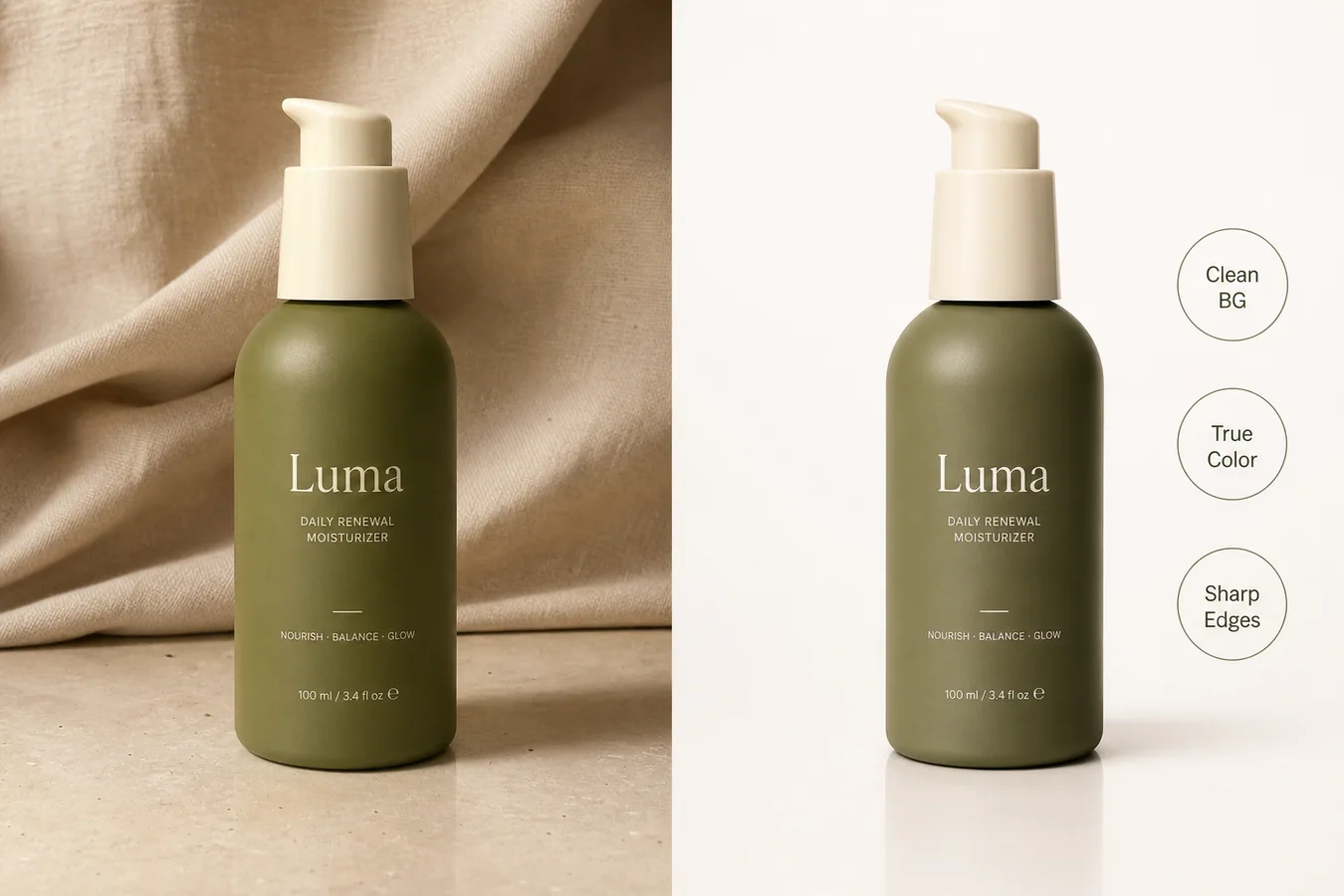 *Published demonstration asset. Inspect the bottle silhouette, olive color, pump geometry, label placement, and contact shadow instead of judging only the cleaner background.*
## What Image Requirements Must an Online Store Meet?
Google announced a 500 × 500 pixel minimum for all product images beginning January 31, 2027. It recommends images around 1500 × 1500 pixels or larger, caps files at 64 megapixels and 16 MB, and warns against upscaling thumbnails. An editor can prepare the file, but the merchant remains responsible for the final listing ([Google Merchant Center](https://support.google.com/merchants/answer/12159030?hl=en), 2026).
| Channel | Current official guidance checked August 11, 2026 | Practical export target |
|---|---|---|
| Google Merchant Center | 500 × 500 minimum from January 31, 2027; around 1500 × 1500 or above recommended; maximum 64 MP and 16 MB | Export at least 1500 × 1500 when the source supports it; keep the product at 75% to 90% fill |
| Shopify | Product images up to 5000 × 5000 or 25 MP and under 20 MB; 2048 × 2048 usually displays best for square images | Use a consistent aspect ratio and retain enough resolution for detail views |
| Etsy | Listing photos recommended at 2000 pixels wide and high; first photo should be at least 635 pixels in both dimensions | Use square or horizontal first images with a centered focal point |
| eBay | Minimum 500 × 500; about 1600 × 1600 recommended; up to 12 MB per photo | Use a clean main image plus additional angles and honest flaw close-ups |
Sources: [Google Merchant Center](https://support.google.com/merchants/answer/6324350?hl=en), [Shopify Help Center](https://help.shopify.com/en/manual/products/product-media/product-media-types), [Etsy Help](https://help.etsy.com/hc/en-us/articles/115015663347-Requirements-and-Best-Practices-for-Images-in-Your-Etsy-Shop), and [eBay Help](https://www.ebay.com/help/selling/listings/adding-pictures-listings?id=4148).
These figures are not interchangeable. A platform's upload ceiling is not a recommended working size, and a minimum is not a quality target. Start with the largest trustworthy source image, edit it, then create channel-specific exports. Do not enlarge a thumbnail merely to make its dimensions pass validation.
> **Fix one real defect before you rebuild the scene**
>
> Open the [KrafLayer Product Photo Editor](/product-photo-editor), choose background cleanup, object removal, upscaling, restoration, or a local mask edit, and compare the result with your original before spending credits on a new scene.
## Which AI Product Photo Editor Is Best for Your Store?
The four products publish materially different scale signals. KrafLayer starts at $0 with 30 credits every seven days; Photoroom's public Image Editing API charges $0.10 per call; Pixelcut lists batches of up to 10,000 images; Adobe Express accepts files up to 40 MB in its background-removal flow. The right choice depends on volume and control, not a universal score.
| Editor | Best fit | Evidence-backed strengths | Important limitation to verify |
|---|---|---|---|
| KrafLayer | Small and growing stores that want focused ecommerce workflows | Eight editing routes on its product editor hub; free plan has 30 credits every 7 days; Starter is $6 for 350 credits | Public editor pages do not present the same catalog-scale batch or external API proposition as Photoroom and Pixelcut |
| Photoroom | Catalog teams and businesses that need API automation | Image Editing API combines multiple edit options in one $0.10 call; Batch advertises up to 250 images in the web workflow | API calls are billed again for identical repeated requests because caching is not yet available |
| Pixelcut | Sellers that prioritize very large browser-based batches | Publishes batches up to 10,000 images; $10 plan lists 600 monthly AI credits and 1,000 batch exports | Advanced model usage and daily limits vary by plan; API credits are separate from app credits |
| Adobe Express / Firefly | Marketing teams that need product cleanup inside a broad design suite | Free background removal, transparent PNG output, object removal, generative fill, templates, and Stock assets | Batch background removal is positioned for enterprise users, not the ordinary free workflow |
### Best for focused product-photo correction: KrafLayer
The public [product photo editor hub](/product-photo-editor) separates eight jobs rather than hiding them behind one prompt. That is useful when a seller can name the defect and wants a direct route to a background remover, object eraser, upscaler, restoration tool, background replacer, mask edit, reference editor, or scene composer.
Price is the clearest entry advantage. The [pricing page](/pricing) lists a free allocation of 30 credits every seven days and a $6 Starter plan with 350 credits every 30 days. The trade-off is scale positioning: if your decision depends on a documented public API or a 10,000-image batch, the evaluated public pages point more clearly to Photoroom or Pixelcut.
### Best for API automation: Photoroom
Photoroom's documentation prices its Image Editing API at $0.10 per call and says one call can combine background removal, positioning, shadows, backgrounds, relighting, text removal, expansion, and other edits. The same documentation warns that repeating an identical request is billed again because caching is not available ([Photoroom API](https://docs.photoroom.com/image-editing-api-plus-plan/whats-the-pricing), 2026).
That makes Photoroom easier to evaluate for a marketplace or catalog pipeline where API behavior matters more than the cheapest manual edit. Its public Batch page also describes processing up to 250 images in one web workflow. Test the API on your hardest SKU classes before committing volume, especially glass, reflective packaging, fine jewelry, and text-heavy labels.
### Best for very large browser batches: Pixelcut
Pixelcut says its bulk editor handles up to 10,000 images per batch and supports resize, background removal, upscaling, shadows, crop, canvas expansion, and background changes. Its $10 monthly plan lists 600 AI credits and 1,000 batch exports, while API credits are sold separately at $0.01 each ([Pixelcut pricing](https://www.pixelcut.ai/pricing), 2026).
The headline batch number is compelling, but throughput alone does not prove output consistency. Run a representative sample first. A useful sample contains easy opaque products plus difficult transparent, reflective, textured, and label-heavy items.
### Best for a broader design ecosystem: Adobe Express
Adobe Express removes backgrounds and downloads transparent PNG files, while Firefly adds object removal, generated backgrounds, upscaling, and generative fill. The background-removal page accepts JPEG, PNG, and WebP uploads up to 40 MB ([Adobe Express](https://www.adobe.com/express/feature/ai/image/remove-background), 2026).
Choose it when product cleanup is one part of a larger design job involving templates, social posts, text, and Adobe assets. If ecommerce batch automation is the main requirement, confirm the plan carefully: Adobe's public materials position batch background removal for enterprise use.
## What Do Real Editing Examples Reveal?
Three published KrafLayer demonstration composites let us inspect more than a polished hero. The useful evidence is not that the outputs look attractive. It is whether the same product facts survive across a cutout, detail crop, and new scene. These images are demonstrations, not verified customer outcomes.
The serum grid is useful because it exposes four review points at once. The pump, bottle proportions, front label, and warm cream color should match across the white image, transparent cutout, detail crop, and lifestyle scene. The checkerboard also makes edge halos easier to spot than a white background would.
The kettle is a harder geometry test. Compare the long spout curve, lid knob, handle attachment, body taper, and small front mark. A background can look believable while one of those parts drifts. Thin handles and reflective edges deserve inspection at 100% zoom.
The mug example shows why a scene swap needs a contact check. The body and lid remain easy to compare, but the new surface, warmer light, and softer background introduce a second question: does the shadow make the mug feel planted, or does it float?
## Which Editing Workflow Should You Use First?
KrafLayer's public hub separates eight edit routes, while Pixelcut lists ten common bulk actions. Both product maps support the same decision rule: diagnose the defect before choosing the AI operation. A narrow edit reduces unnecessary regeneration and makes the output easier to compare with the source.
| Visible problem | Start with | Review most closely | Do not use it to |
|---|---|---|---|
| Messy or inconsistent background | Background remover | Fine edges, transparent areas, contact shadow | Hide part of the product |
| Dust, prop, cable, or stray mark | Object eraser | Filled texture and nearby product edges | Conceal damage or required information |
| Small but otherwise sharp image | Upscaler | Text, seams, grain, ports, stones | Invent detail absent from the source |
| Noisy or damaged legacy photo | Restoration | Material texture and label legibility | Turn an unusable reference into a factual product record |
| One glare, shadow, or local defect | Mask edit | Mask boundary and unchanged surrounding pixels | Redesign the entire SKU |
| Correct product, wrong selling context | Background replacer | Scale, lighting, reflections, surface contact | Create a marketplace main image without checking channel rules |
| Need a new campaign composition | Reference edit or scene composition | Product identity across every variant | Replace your plain, factual product view |
A sensible order is cleanup, restoration if needed, upscaling, local correction, and only then scene creation. Keep the original file and export each stage separately. If a later edit fails, you can return to a clean source instead of repairing a repair.
## When Should You Reshoot Instead of Using AI?
Shopify allows product images up to 5000 × 5000 pixels or 25 megapixels, but a large file can still contain bad evidence. Reshoot when the source does not clearly show the product fact you need to preserve. AI cannot reliably recover an unreadable label, hidden connector, unknown fabric weave, or missing angle from pixels that were never captured ([Shopify Help Center](https://help.shopify.com/en/manual/products/product-media/product-media-types), 2026).
Reshoot when:
- the main label or regulated claim is unreadable;
- the product is motion-blurred or materially out of focus;
- an important edge is cropped out;
- the color reference is unreliable;
- reflective glare hides the product construction;
- the image shows the wrong variant;
- the only available photo contains a watermark you do not own;
- a buyer needs an angle that does not exist in the source set.
The reshoot boundary is the unglamorous part most editor comparisons omit. AI is good at removing friction around evidence. It is not a substitute for missing evidence.
## What Should You Check Before Publishing?
eBay allows up to 24 listing pictures and recommends showing several angles, while Etsy allows up to 20 photos. A single polished AI image should not carry the whole product story. Use the gallery to show factual views, detail, scale, flaws where relevant, and only then lifestyle context ([eBay Help](https://www.ebay.com/help/selling/listings/adding-pictures-listings?id=4148); [Etsy Help](https://help.etsy.com/hc/en-us/articles/115015628707-How-to-Create-a-Listing)).
Before publishing, verify:
- [ ] The SKU, color, shape, label, and included accessories match the source.
- [ ] The main image follows the current channel's background and overlay rules.
- [ ] Pixel dimensions and file size meet the channel requirement.
- [ ] The product occupies an intentional, consistent share of the frame.
- [ ] Fine edges are clean at 100% zoom.
- [ ] Text and logos are readable and not AI-invented.
- [ ] Shadows, reflections, and product contact match the scene.
- [ ] The source file and an unedited master are retained.
- [ ] The filename and alt text describe the product and image role.
- [ ] At least one plain image shows exactly what the buyer receives.
## Verdict
The price and scale evidence points to four different winners: KrafLayer starts at $6 for 350 credits, Photoroom publishes a $0.10 multi-edit API call, Pixelcut advertises 10,000-image batches, and Adobe combines cleanup with a larger design system. Pick the workflow that matches the store rather than accepting a universal ranking.
For a small online store editing a few products at a time, KrafLayer is the most direct starting point in the evaluated set. For catalog automation, Photoroom has the clearest public API offer. For very large browser batches, Pixelcut publishes the strongest scale claim. For design-heavy marketing teams, Adobe Express is the broader workspace.
Whichever editor you choose, keep one plain factual product image. AI-made lifestyle scenes can add context, but they should never be the only evidence a buyer sees.
## Frequently Asked Questions
### What is the best AI that can edit my store's products?
For a small store, start with the product defect and the monthly volume. KrafLayer has the lowest documented paid entry among the four compared here at $6 for 350 credits, plus a free allocation. Pixelcut starts at $10 and emphasizes batch output. Test both on difficult SKUs before choosing.
### Which AI product photo editor is best for an API workflow?
Photoroom publishes the clearest image-editing API proposition among the four products reviewed. Its Plus API charges $0.10 per call and allows multiple edit options in one request. Pixelcut also offers an API with separate credits. Confirm endpoints, retry behavior, rate limits, storage, and idempotency before production use.
### Can AI editing make an image marketplace compliant automatically?
No editor can guarantee compliance across every channel and category. Google, Shopify, Etsy, and eBay publish different size, background, crop, and content guidance. Use AI to prepare the image, then validate the final export against the current official policy for the channel where it will appear.
### Is background removal safer than generating a new scene?
Usually, because background removal changes a smaller part of the image. It can still damage transparent materials, fine straps, hair-like fibers, and shadows. A generated scene adds scale, lighting, reflection, and contact risks, so it needs a broader product-fidelity review.
### Can an upscaler recover unreadable label text?
An upscaler can reconstruct plausible detail, but plausible is not the same as factual. If the original label cannot be read, do not treat generated letters as product evidence. Find a better source image or reshoot the label and use the upscale only after the factual detail is visible.
### How many product images should an online store use?
There is no universal ideal count, but the platforms allow room for a set: eBay supports up to 24 listing pictures and Etsy up to 20. Use enough images to cover the main view, alternate angles, scale, material, details, included items, and honest flaws before adding lifestyle variants.
## References
1. [Google Merchant Center: Image link requirements and best practices](https://support.google.com/merchants/answer/6324350?hl=en), accessed August 11, 2026.
2. [Google Merchant Center: Upcoming minimum image size](https://support.google.com/merchants/answer/12159030?hl=en), accessed August 11, 2026.
3. [Shopify Help Center: Product media types](https://help.shopify.com/en/manual/products/product-media/product-media-types), accessed August 11, 2026.
4. [Etsy Help: Image requirements and best practices](https://help.etsy.com/hc/en-us/articles/115015663347-Requirements-and-Best-Practices-for-Images-in-Your-Etsy-Shop), accessed August 11, 2026.
5. [eBay Help: Adding pictures to listings](https://www.ebay.com/help/selling/listings/adding-pictures-listings?id=4148), accessed August 11, 2026.
6. [Photoroom API: Image Editing API pricing](https://docs.photoroom.com/image-editing-api-plus-plan/whats-the-pricing), accessed August 11, 2026.
7. [Pixelcut: Plans and pricing](https://www.pixelcut.ai/pricing), accessed August 11, 2026.
8. [Pixelcut: Bulk image editor](https://www.pixelcut.ai/bulk), accessed August 11, 2026.
9. [Adobe Express: AI background remover](https://www.adobe.com/express/feature/ai/image/remove-background), accessed August 11, 2026.
10. [KrafLayer: Product photo editor](https://kraflayer.com/product-photo-editor), accessed August 11, 2026.
11. [KrafLayer: Pricing](https://kraflayer.com/pricing), accessed August 11, 2026.
# Best Background Colors for Product Photography: 7 Options
URL: https://kraflayer.com/blog/common-background-colors-for-ecommerce-product-photography
Summary: Choose among seven ecommerce product-photography backgrounds by image role, edge contrast, product color, channel rules, and catalog consistency.
Updated: 2026-08-22
The best background color for product photography is the one that separates the product from the frame, preserves its real color and material, and fits the image's job. It is not automatically the prettiest color. White remains the default for marketplace-style main images. Light gray rescues pale edges. Warm neutrals and muted brand colors belong mainly in secondary, store, and campaign images.
The analysis uses current Google, Amazon, Shopify, and Etsy image guidance checked on August 11, 2026. The four-background ceramic image is a KrafLayer demonstration composite, not a conversion test or customer case study.
> **Quick Summary**
> Google recommends a white or transparent background and 75%–90% product fill. Amazon calls pure white, RGB 255, 255, 255, the default for main product shots. Choose color only after deciding the image role, checking edge contrast, and locking the product's true color.
## Abstract
Use white for factual main images, light gray when a white product loses its outline, warm beige for natural secondary imagery, muted brand colors for owned-store consistency, and dark tones only when reflective edges remain readable. One SKU can use several backgrounds, but each gallery role should have a reason.
## Key Takeaways
- White is the safest starting point for marketplace main images.
- A pale product needs tonal separation, not automatically a darker scene.
- Etsy converts transparent pixels to black, so transparency is not channel-neutral.
- Consistent crop, scale, and light matter as much as a consistent color.
- Test backgrounds on the actual product, not on a palette swatch.
## Table of Contents
1. [How the guide was evaluated](#how-was-the-background-color-guide-evaluated)
2. [Background color decision table](#which-background-color-fits-each-image-role)
3. [White and light products](#when-should-you-use-white-or-light-gray)
4. [Warm, brand, and dark colors](#where-do-warm-brand-and-dark-backgrounds-belong)
5. [A five-step selection method](#how-do-you-choose-a-background-color-in-five-steps)
6. [Channel requirements](#what-do-marketplaces-do-with-backgrounds)
7. [Pre-publish checks](#what-should-you-check-before-publishing)
8. [Frequently asked questions](#frequently-asked-questions)
## How Was the Background Color Guide Evaluated?
Google recommends solid white or transparent product-image backgrounds and says the product should occupy 75%–90% of the frame. Amazon's current photography guide calls white RGB 255, 255, 255 the default for product shots, while allowing more color and texture for creative or lifestyle views ([Google Merchant Center](https://support.google.com/merchants/answer/6324350?hl=en); [Amazon](https://sell.amazon.com/blog/product-photos), 2026).
We compared those rules with the visual job of five common background families: white, light gray, warm neutral, muted brand color, and dark. We did not run a conversion experiment, and the recommendations are not universal performance claims. They are a decision framework built from channel rules, contrast, and product-fidelity risks.
*Published demonstration asset. Inspect the bottle silhouette, olive color, pump geometry, label placement, and contact shadow instead of judging only the cleaner background.*
## What Image Requirements Must an Online Store Meet?
Google announced a 500 × 500 pixel minimum for all product images beginning January 31, 2027. It recommends images around 1500 × 1500 pixels or larger, caps files at 64 megapixels and 16 MB, and warns against upscaling thumbnails. An editor can prepare the file, but the merchant remains responsible for the final listing ([Google Merchant Center](https://support.google.com/merchants/answer/12159030?hl=en), 2026).
| Channel | Current official guidance checked August 11, 2026 | Practical export target |
|---|---|---|
| Google Merchant Center | 500 × 500 minimum from January 31, 2027; around 1500 × 1500 or above recommended; maximum 64 MP and 16 MB | Export at least 1500 × 1500 when the source supports it; keep the product at 75% to 90% fill |
| Shopify | Product images up to 5000 × 5000 or 25 MP and under 20 MB; 2048 × 2048 usually displays best for square images | Use a consistent aspect ratio and retain enough resolution for detail views |
| Etsy | Listing photos recommended at 2000 pixels wide and high; first photo should be at least 635 pixels in both dimensions | Use square or horizontal first images with a centered focal point |
| eBay | Minimum 500 × 500; about 1600 × 1600 recommended; up to 12 MB per photo | Use a clean main image plus additional angles and honest flaw close-ups |
Sources: [Google Merchant Center](https://support.google.com/merchants/answer/6324350?hl=en), [Shopify Help Center](https://help.shopify.com/en/manual/products/product-media/product-media-types), [Etsy Help](https://help.etsy.com/hc/en-us/articles/115015663347-Requirements-and-Best-Practices-for-Images-in-Your-Etsy-Shop), and [eBay Help](https://www.ebay.com/help/selling/listings/adding-pictures-listings?id=4148).
These figures are not interchangeable. A platform's upload ceiling is not a recommended working size, and a minimum is not a quality target. Start with the largest trustworthy source image, edit it, then create channel-specific exports. Do not enlarge a thumbnail merely to make its dimensions pass validation.
> **Fix one real defect before you rebuild the scene**
>
> Open the [KrafLayer Product Photo Editor](/product-photo-editor), choose background cleanup, object removal, upscaling, restoration, or a local mask edit, and compare the result with your original before spending credits on a new scene.
## Which AI Product Photo Editor Is Best for Your Store?
The four products publish materially different scale signals. KrafLayer starts at $0 with 30 credits every seven days; Photoroom's public Image Editing API charges $0.10 per call; Pixelcut lists batches of up to 10,000 images; Adobe Express accepts files up to 40 MB in its background-removal flow. The right choice depends on volume and control, not a universal score.
| Editor | Best fit | Evidence-backed strengths | Important limitation to verify |
|---|---|---|---|
| KrafLayer | Small and growing stores that want focused ecommerce workflows | Eight editing routes on its product editor hub; free plan has 30 credits every 7 days; Starter is $6 for 350 credits | Public editor pages do not present the same catalog-scale batch or external API proposition as Photoroom and Pixelcut |
| Photoroom | Catalog teams and businesses that need API automation | Image Editing API combines multiple edit options in one $0.10 call; Batch advertises up to 250 images in the web workflow | API calls are billed again for identical repeated requests because caching is not yet available |
| Pixelcut | Sellers that prioritize very large browser-based batches | Publishes batches up to 10,000 images; $10 plan lists 600 monthly AI credits and 1,000 batch exports | Advanced model usage and daily limits vary by plan; API credits are separate from app credits |
| Adobe Express / Firefly | Marketing teams that need product cleanup inside a broad design suite | Free background removal, transparent PNG output, object removal, generative fill, templates, and Stock assets | Batch background removal is positioned for enterprise users, not the ordinary free workflow |
### Best for focused product-photo correction: KrafLayer
The public [product photo editor hub](/product-photo-editor) separates eight jobs rather than hiding them behind one prompt. That is useful when a seller can name the defect and wants a direct route to a background remover, object eraser, upscaler, restoration tool, background replacer, mask edit, reference editor, or scene composer.
Price is the clearest entry advantage. The [pricing page](/pricing) lists a free allocation of 30 credits every seven days and a $6 Starter plan with 350 credits every 30 days. The trade-off is scale positioning: if your decision depends on a documented public API or a 10,000-image batch, the evaluated public pages point more clearly to Photoroom or Pixelcut.
### Best for API automation: Photoroom
Photoroom's documentation prices its Image Editing API at $0.10 per call and says one call can combine background removal, positioning, shadows, backgrounds, relighting, text removal, expansion, and other edits. The same documentation warns that repeating an identical request is billed again because caching is not available ([Photoroom API](https://docs.photoroom.com/image-editing-api-plus-plan/whats-the-pricing), 2026).
That makes Photoroom easier to evaluate for a marketplace or catalog pipeline where API behavior matters more than the cheapest manual edit. Its public Batch page also describes processing up to 250 images in one web workflow. Test the API on your hardest SKU classes before committing volume, especially glass, reflective packaging, fine jewelry, and text-heavy labels.
### Best for very large browser batches: Pixelcut
Pixelcut says its bulk editor handles up to 10,000 images per batch and supports resize, background removal, upscaling, shadows, crop, canvas expansion, and background changes. Its $10 monthly plan lists 600 AI credits and 1,000 batch exports, while API credits are sold separately at $0.01 each ([Pixelcut pricing](https://www.pixelcut.ai/pricing), 2026).
The headline batch number is compelling, but throughput alone does not prove output consistency. Run a representative sample first. A useful sample contains easy opaque products plus difficult transparent, reflective, textured, and label-heavy items.
### Best for a broader design ecosystem: Adobe Express
Adobe Express removes backgrounds and downloads transparent PNG files, while Firefly adds object removal, generated backgrounds, upscaling, and generative fill. The background-removal page accepts JPEG, PNG, and WebP uploads up to 40 MB ([Adobe Express](https://www.adobe.com/express/feature/ai/image/remove-background), 2026).
Choose it when product cleanup is one part of a larger design job involving templates, social posts, text, and Adobe assets. If ecommerce batch automation is the main requirement, confirm the plan carefully: Adobe's public materials position batch background removal for enterprise use.
## What Do Real Editing Examples Reveal?
Three published KrafLayer demonstration composites let us inspect more than a polished hero. The useful evidence is not that the outputs look attractive. It is whether the same product facts survive across a cutout, detail crop, and new scene. These images are demonstrations, not verified customer outcomes.
The serum grid is useful because it exposes four review points at once. The pump, bottle proportions, front label, and warm cream color should match across the white image, transparent cutout, detail crop, and lifestyle scene. The checkerboard also makes edge halos easier to spot than a white background would.
The kettle is a harder geometry test. Compare the long spout curve, lid knob, handle attachment, body taper, and small front mark. A background can look believable while one of those parts drifts. Thin handles and reflective edges deserve inspection at 100% zoom.
The mug example shows why a scene swap needs a contact check. The body and lid remain easy to compare, but the new surface, warmer light, and softer background introduce a second question: does the shadow make the mug feel planted, or does it float?
## Which Editing Workflow Should You Use First?
KrafLayer's public hub separates eight edit routes, while Pixelcut lists ten common bulk actions. Both product maps support the same decision rule: diagnose the defect before choosing the AI operation. A narrow edit reduces unnecessary regeneration and makes the output easier to compare with the source.
| Visible problem | Start with | Review most closely | Do not use it to |
|---|---|---|---|
| Messy or inconsistent background | Background remover | Fine edges, transparent areas, contact shadow | Hide part of the product |
| Dust, prop, cable, or stray mark | Object eraser | Filled texture and nearby product edges | Conceal damage or required information |
| Small but otherwise sharp image | Upscaler | Text, seams, grain, ports, stones | Invent detail absent from the source |
| Noisy or damaged legacy photo | Restoration | Material texture and label legibility | Turn an unusable reference into a factual product record |
| One glare, shadow, or local defect | Mask edit | Mask boundary and unchanged surrounding pixels | Redesign the entire SKU |
| Correct product, wrong selling context | Background replacer | Scale, lighting, reflections, surface contact | Create a marketplace main image without checking channel rules |
| Need a new campaign composition | Reference edit or scene composition | Product identity across every variant | Replace your plain, factual product view |
A sensible order is cleanup, restoration if needed, upscaling, local correction, and only then scene creation. Keep the original file and export each stage separately. If a later edit fails, you can return to a clean source instead of repairing a repair.
## When Should You Reshoot Instead of Using AI?
Shopify allows product images up to 5000 × 5000 pixels or 25 megapixels, but a large file can still contain bad evidence. Reshoot when the source does not clearly show the product fact you need to preserve. AI cannot reliably recover an unreadable label, hidden connector, unknown fabric weave, or missing angle from pixels that were never captured ([Shopify Help Center](https://help.shopify.com/en/manual/products/product-media/product-media-types), 2026).
Reshoot when:
- the main label or regulated claim is unreadable;
- the product is motion-blurred or materially out of focus;
- an important edge is cropped out;
- the color reference is unreliable;
- reflective glare hides the product construction;
- the image shows the wrong variant;
- the only available photo contains a watermark you do not own;
- a buyer needs an angle that does not exist in the source set.
The reshoot boundary is the unglamorous part most editor comparisons omit. AI is good at removing friction around evidence. It is not a substitute for missing evidence.
## What Should You Check Before Publishing?
eBay allows up to 24 listing pictures and recommends showing several angles, while Etsy allows up to 20 photos. A single polished AI image should not carry the whole product story. Use the gallery to show factual views, detail, scale, flaws where relevant, and only then lifestyle context ([eBay Help](https://www.ebay.com/help/selling/listings/adding-pictures-listings?id=4148); [Etsy Help](https://help.etsy.com/hc/en-us/articles/115015628707-How-to-Create-a-Listing)).
Before publishing, verify:
- [ ] The SKU, color, shape, label, and included accessories match the source.
- [ ] The main image follows the current channel's background and overlay rules.
- [ ] Pixel dimensions and file size meet the channel requirement.
- [ ] The product occupies an intentional, consistent share of the frame.
- [ ] Fine edges are clean at 100% zoom.
- [ ] Text and logos are readable and not AI-invented.
- [ ] Shadows, reflections, and product contact match the scene.
- [ ] The source file and an unedited master are retained.
- [ ] The filename and alt text describe the product and image role.
- [ ] At least one plain image shows exactly what the buyer receives.
## Verdict
The price and scale evidence points to four different winners: KrafLayer starts at $6 for 350 credits, Photoroom publishes a $0.10 multi-edit API call, Pixelcut advertises 10,000-image batches, and Adobe combines cleanup with a larger design system. Pick the workflow that matches the store rather than accepting a universal ranking.
For a small online store editing a few products at a time, KrafLayer is the most direct starting point in the evaluated set. For catalog automation, Photoroom has the clearest public API offer. For very large browser batches, Pixelcut publishes the strongest scale claim. For design-heavy marketing teams, Adobe Express is the broader workspace.
Whichever editor you choose, keep one plain factual product image. AI-made lifestyle scenes can add context, but they should never be the only evidence a buyer sees.
## Frequently Asked Questions
### What is the best AI that can edit my store's products?
For a small store, start with the product defect and the monthly volume. KrafLayer has the lowest documented paid entry among the four compared here at $6 for 350 credits, plus a free allocation. Pixelcut starts at $10 and emphasizes batch output. Test both on difficult SKUs before choosing.
### Which AI product photo editor is best for an API workflow?
Photoroom publishes the clearest image-editing API proposition among the four products reviewed. Its Plus API charges $0.10 per call and allows multiple edit options in one request. Pixelcut also offers an API with separate credits. Confirm endpoints, retry behavior, rate limits, storage, and idempotency before production use.
### Can AI editing make an image marketplace compliant automatically?
No editor can guarantee compliance across every channel and category. Google, Shopify, Etsy, and eBay publish different size, background, crop, and content guidance. Use AI to prepare the image, then validate the final export against the current official policy for the channel where it will appear.
### Is background removal safer than generating a new scene?
Usually, because background removal changes a smaller part of the image. It can still damage transparent materials, fine straps, hair-like fibers, and shadows. A generated scene adds scale, lighting, reflection, and contact risks, so it needs a broader product-fidelity review.
### Can an upscaler recover unreadable label text?
An upscaler can reconstruct plausible detail, but plausible is not the same as factual. If the original label cannot be read, do not treat generated letters as product evidence. Find a better source image or reshoot the label and use the upscale only after the factual detail is visible.
### How many product images should an online store use?
There is no universal ideal count, but the platforms allow room for a set: eBay supports up to 24 listing pictures and Etsy up to 20. Use enough images to cover the main view, alternate angles, scale, material, details, included items, and honest flaws before adding lifestyle variants.
## References
1. [Google Merchant Center: Image link requirements and best practices](https://support.google.com/merchants/answer/6324350?hl=en), accessed August 11, 2026.
2. [Google Merchant Center: Upcoming minimum image size](https://support.google.com/merchants/answer/12159030?hl=en), accessed August 11, 2026.
3. [Shopify Help Center: Product media types](https://help.shopify.com/en/manual/products/product-media/product-media-types), accessed August 11, 2026.
4. [Etsy Help: Image requirements and best practices](https://help.etsy.com/hc/en-us/articles/115015663347-Requirements-and-Best-Practices-for-Images-in-Your-Etsy-Shop), accessed August 11, 2026.
5. [eBay Help: Adding pictures to listings](https://www.ebay.com/help/selling/listings/adding-pictures-listings?id=4148), accessed August 11, 2026.
6. [Photoroom API: Image Editing API pricing](https://docs.photoroom.com/image-editing-api-plus-plan/whats-the-pricing), accessed August 11, 2026.
7. [Pixelcut: Plans and pricing](https://www.pixelcut.ai/pricing), accessed August 11, 2026.
8. [Pixelcut: Bulk image editor](https://www.pixelcut.ai/bulk), accessed August 11, 2026.
9. [Adobe Express: AI background remover](https://www.adobe.com/express/feature/ai/image/remove-background), accessed August 11, 2026.
10. [KrafLayer: Product photo editor](https://kraflayer.com/product-photo-editor), accessed August 11, 2026.
11. [KrafLayer: Pricing](https://kraflayer.com/pricing), accessed August 11, 2026.
# Best Background Colors for Product Photography: 7 Options
URL: https://kraflayer.com/blog/common-background-colors-for-ecommerce-product-photography
Summary: Choose among seven ecommerce product-photography backgrounds by image role, edge contrast, product color, channel rules, and catalog consistency.
Updated: 2026-08-22
The best background color for product photography is the one that separates the product from the frame, preserves its real color and material, and fits the image's job. It is not automatically the prettiest color. White remains the default for marketplace-style main images. Light gray rescues pale edges. Warm neutrals and muted brand colors belong mainly in secondary, store, and campaign images.
The analysis uses current Google, Amazon, Shopify, and Etsy image guidance checked on August 11, 2026. The four-background ceramic image is a KrafLayer demonstration composite, not a conversion test or customer case study.
> **Quick Summary**
> Google recommends a white or transparent background and 75%–90% product fill. Amazon calls pure white, RGB 255, 255, 255, the default for main product shots. Choose color only after deciding the image role, checking edge contrast, and locking the product's true color.
## Abstract
Use white for factual main images, light gray when a white product loses its outline, warm beige for natural secondary imagery, muted brand colors for owned-store consistency, and dark tones only when reflective edges remain readable. One SKU can use several backgrounds, but each gallery role should have a reason.
## Key Takeaways
- White is the safest starting point for marketplace main images.
- A pale product needs tonal separation, not automatically a darker scene.
- Etsy converts transparent pixels to black, so transparency is not channel-neutral.
- Consistent crop, scale, and light matter as much as a consistent color.
- Test backgrounds on the actual product, not on a palette swatch.
## Table of Contents
1. [How the guide was evaluated](#how-was-the-background-color-guide-evaluated)
2. [Background color decision table](#which-background-color-fits-each-image-role)
3. [White and light products](#when-should-you-use-white-or-light-gray)
4. [Warm, brand, and dark colors](#where-do-warm-brand-and-dark-backgrounds-belong)
5. [A five-step selection method](#how-do-you-choose-a-background-color-in-five-steps)
6. [Channel requirements](#what-do-marketplaces-do-with-backgrounds)
7. [Pre-publish checks](#what-should-you-check-before-publishing)
8. [Frequently asked questions](#frequently-asked-questions)
## How Was the Background Color Guide Evaluated?
Google recommends solid white or transparent product-image backgrounds and says the product should occupy 75%–90% of the frame. Amazon's current photography guide calls white RGB 255, 255, 255 the default for product shots, while allowing more color and texture for creative or lifestyle views ([Google Merchant Center](https://support.google.com/merchants/answer/6324350?hl=en); [Amazon](https://sell.amazon.com/blog/product-photos), 2026).
We compared those rules with the visual job of five common background families: white, light gray, warm neutral, muted brand color, and dark. We did not run a conversion experiment, and the recommendations are not universal performance claims. They are a decision framework built from channel rules, contrast, and product-fidelity risks.
 *KrafLayer demonstration composite. Because the product stays similar across four panels, compare rim visibility, handle separation, ceramic color, shadow, and overall gallery mood. It is not evidence that one color converts better.*
## Which Background Color Fits Each Image Role?
Google permits staged or lifestyle images when the product remains clear, but its main-image guidance still favors a solid white or transparent field. That distinction is useful: choose a background for the image's role before choosing it for mood ([Google Merchant Center](https://support.google.com/merchants/answer/6324350?hl=en), 2026).
| Background | Best role | Works well for | Main risk |
|---|---|---|---|
| Pure white | Marketplace main image, catalog grid | Most opaque products and clean comparisons | Pale or translucent edges can disappear |
| Light gray | Main or secondary image where white lacks separation | White packaging, chrome, glass outlines | Gray can create a dirty cast if too warm |
| Warm beige | Secondary, collection, editorial image | Ceramics, food, skincare, natural materials | Can shift cream and skin-adjacent product colors |
| Muted brand color | Store detail image, landing page, ad | Strong brand systems and simple silhouettes | Competes with packaging or creates false color contrast |
| Dark charcoal | Secondary luxury or detail view | Metal, jewelry, glass, luminous products | Lost edges, crushed black materials, dramatic reflections |
| Transparent | Reusable master asset | Layout systems and later compositing | Some channels render transparency unpredictably |
The table is a starting point. A white ceramic mug and a black velvet bag should not receive the same contrast treatment merely because they sit in the same catalog.
## When Should You Use White or Light Gray?
Amazon recommends always having white-background images and says product shots should usually use RGB 255, 255, 255. Google also favors white or transparent backgrounds. White therefore carries the least policy ambiguity for a factual main view ([Amazon](https://sell.amazon.com/blog/product-photos); [Google Merchant Center](https://support.google.com/merchants/answer/6324350?hl=en), 2026).
White fails when the product's boundary is also white, translucent, highly reflective, or softly feathered. Do not solve that by dropping the product into a dramatic dark room. First try a very light neutral gray, a slightly stronger contact shadow, or restrained edge lighting. The goal is separation without changing the perceived product color.
| Product issue | Safer first adjustment | Reject when |
|---|---|---|
| White package disappears | Move to neutral light gray | The package looks gray or dirty |
| Glass edge disappears | Add controlled side contrast and retain transparency | Reflections imply a different shape |
| Chrome reflects the white sweep | Add neutral flags or a subtle gradient in a secondary image | Metal becomes flat gray plastic |
| Fine pale fibers vanish | Keep higher-resolution source and review the mask at 100% | The cutout trims real fibers |
> **See the contrast on your own SKU**
>
> Use the [KrafLayer Product Photo Editor](/product-photo-editor) to make a white and light-gray version from the same source. Compare edges, material, label color, and shadow before choosing a catalog standard.
## Where Do Warm, Brand, and Dark Backgrounds Belong?
Amazon explicitly treats lifestyle, scale, detail, and packaging shots as useful image types, while Google accepts staged imagery as long as the product is clear. Colored backgrounds have a legitimate role, but usually after the plain product view has answered “what am I buying?” ([Amazon](https://sell.amazon.com/blog/product-photos), 2026).
Warm beige works when the product story is tactile and domestic: ceramics, linen, wood, food, or understated skincare. Watch for warm color contamination. A cool-white bottle photographed on beige can appear cream, which may misrepresent the SKU.
Muted brand colors are most useful across owned-store collection cards or secondary images. Keep saturation below the product's strongest packaging color unless contrast is the specific design idea. If the background becomes the first thing you notice at thumbnail size, it is too loud.
Dark backgrounds suit polished metal, transparent glass, jewelry, and some luxury goods, but only when every outer edge remains visible. Black products on charcoal need rim light and tonal separation. Otherwise the expensive mood removes the evidence a buyer needs.
## How Do You Choose a Background Color in Five Steps?
Shopify says consistent aspect ratios create better-looking collection pages and recommends 2048 × 2048 pixels for square product images. The same logic applies to backgrounds: consistency is a system of crop, scale, light, and color, not a hex code alone ([Shopify Help Center](https://help.shopify.com/en/manual/products/product-media/product-media-types), 2026).
1. **Name the image role.** Main, detail, lifestyle, collection card, ad, and reusable cutout have different constraints.
2. **Sample the product's lightest and darkest edges.** Check whether both remain visible against the candidate color.
3. **Protect color truth.** Compare packaging, fabric, glaze, and metal with the source under neutral viewing conditions.
4. **Standardize crop and shadow.** Lock the canvas ratio, product fill, baseline, and shadow family for the catalog.
5. **Export two finalists and inspect thumbnails.** A background that works at 100% may swallow the product in a small search card.
Use a compact test set before rolling out a palette. Include your palest product, darkest product, most reflective product, transparent product, and most complex silhouette. Those five files expose more risk than testing five easy boxes.
## What Do Marketplaces Do With Backgrounds?
Etsy states that transparent parts of an uploaded image appear black. Google warns that transparent backgrounds behind light-colored products may also appear black. A transparent PNG is a useful master asset, not proof that every destination will display it as intended ([Etsy Help](https://help.etsy.com/hc/en-us/articles/115015663347-Requirements-and-Best-Practices-for-Images-in-Your-Etsy-Shop); [Google Merchant Center](https://support.google.com/merchants/answer/6324350?hl=en), 2026).
| Channel | Official background signal | Practical action |
|---|---|---|
| Google Merchant Center | White or transparent recommended; staged/lifestyle accepted | Preview light products on both white and dark UI contexts |
| Amazon | Pure white is the default for main product shots | Reserve color and lifestyle treatments for secondary images |
| Etsy | Transparency renders black | Flatten the intended background before upload |
| Shopify | Flexible media system, consistent ratios encouraged | Define a store-level palette and crop specification |
Policies change. Recheck the destination's current help page before a large catalog export, especially if the image contains text, props, borders, or generated content.
## What Should You Check Before Publishing?
Google's upcoming standard requires product images to reach at least 500 × 500 pixels from January 31, 2027 and recommends around 1500 × 1500 or larger. A good background cannot rescue a tiny or inaccurate source ([Google Merchant Center](https://support.google.com/merchants/answer/6324350?hl=en), 2026).
- [ ] The product color matches the source and the correct variant.
- [ ] Pale and dark edges remain visible at thumbnail size.
- [ ] Reflections and shadows match the chosen surface.
- [ ] The background does not imply accessories that are not included.
- [ ] Main-image text, logos, and overlays follow channel rules.
- [ ] Product fill and crop remain consistent across the catalog.
- [ ] Transparent files have been previewed on white and black.
- [ ] The original file and reusable transparent master are retained.
## Verdict
Choose the background after choosing the image role. White remains the least ambiguous main-image default; light gray protects pale edges; warm and brand colors earn their place in secondary imagery; dark tones need deliberate rim separation. Standardize the system, then allow small exceptions when one SKU would otherwise disappear.
## Frequently Asked Questions
### What is the best background color for ecommerce product photography?
White is the safest default for marketplace-style main images because Google and Amazon both favor it. It is not automatically best for every secondary image. Use light gray for weak pale edges, warm neutrals for natural categories, and brand colors only when the product remains the strongest visual element.
### Should a white product use a white background?
It can, if its outline remains clear through lighting, shadow, and tonal separation. If the edge disappears, try neutral light gray before using a dramatic color. Inspect at both 100% zoom and thumbnail size, because different defects appear at each scale.
### Are colored backgrounds allowed in product listings?
Rules depend on the channel and image role. Amazon treats white as the default for main shots but encourages lifestyle and scale imagery. Google accepts staged or lifestyle images when the product is clear. Check the current category rules before publishing.
### Should every product use exactly the same background?
Use the same background family, crop, baseline, and shadow logic for comparable gallery roles. Do not force one exact tone when it hides a pale or dark SKU. Consistency should make products easier to compare, not erase their edges.
### Is a transparent background better than white?
Transparency is better as a reusable production master. It is not universally safer for publishing. Etsy renders transparent pixels black, and Google warns about light products on transparency. Flatten a channel-specific copy while preserving the original transparent PNG.
## References
1. [Google Merchant Center: Image link requirements](https://support.google.com/merchants/answer/6324350?hl=en), accessed August 11, 2026.
2. [Amazon: Six tips for product photos](https://sell.amazon.com/blog/product-photos), accessed August 11, 2026.
3. [Shopify Help Center: Product media types](https://help.shopify.com/en/manual/products/product-media/product-media-types), accessed August 11, 2026.
4. [Etsy Help: Image requirements and best practices](https://help.etsy.com/hc/en-us/articles/115015663347-Requirements-and-Best-Practices-for-Images-in-Your-Etsy-Shop), accessed August 11, 2026.
# AI Product Photo Generator From References: 7 Checks
URL: https://kraflayer.com/blog/ai-product-photo-generator-from-reference-image
Summary: Use product and style references with a clear source hierarchy, multi-view coverage, identity locks, role-specific prompts, and seven checks for SKU consistency.
Updated: 2026-08-22
An AI product photo generator from reference images can preserve only what those source images actually show. One clean front view may anchor color, label placement, and silhouette, but it cannot reliably reveal the back, underside, hidden connector, internal mechanism, or exact depth. Treat reference generation as controlled composition around product evidence, not as a way to manufacture missing evidence.
The workflow combines current marketplace guidance with 2025 ecommerce image-generation research. The desk-set composite is a KrafLayer demonstration, not a controlled model benchmark or customer result.
> **Quick Summary**
> Start with the highest-quality product view, add more angles for hidden geometry, write an identity lock, and generate one image role at a time. Google requires the correct variant, color, pattern, and material. Reject any output that invents parts or mutates text, even when the scene looks convincing.
## Abstract
Reference-image generation works best when the source hierarchy is explicit: product photos define identity; optional style references define lighting and composition; the prompt defines the job. More references are useful only when each adds factual coverage or a clear visual constraint.
## Key Takeaways
- A reference image is evidence, not a complete 3D model.
- Product references and style references must have different roles.
- Multiple views reduce hidden-geometry guessing.
- Generate main, detail, and lifestyle roles separately.
- Review text, components, material, and proportions at full resolution.
## Table of Contents
1. [Evidence and limitations](#what-can-a-reference-image-generator-reliably-do)
2. [Reference hierarchy](#which-reference-images-should-you-upload)
3. [One image versus multiple views](#when-is-one-reference-image-not-enough)
4. [Identity lock](#how-do-you-write-a-product-identity-lock)
5. [Role-by-role prompts](#how-should-you-generate-each-image-role)
6. [Fidelity review](#how-do-you-check-product-consistency)
7. [When not to generate](#when-should-you-edit-or-reshoot-instead)
8. [Frequently asked questions](#frequently-asked-questions)
## What Can a Reference Image Generator Reliably Do?
The 2025 DreamPainter paper describes ecommerce generation as a balance between product consistency, spatial arrangement, shadows, reflections, text prompts, and visual references. It also says text-only control is limited for precise background inpainting ([DreamPainter](https://arxiv.org/abs/2508.02155), 2025).
The distinction drives the method below: the product reference supplies visible facts, while the prompt and optional style reference control presentation. We did not compare commercial models with a fixed test set. The published image demonstrates a review method, not a measured fidelity score.
*KrafLayer demonstration composite. Because the product stays similar across four panels, compare rim visibility, handle separation, ceramic color, shadow, and overall gallery mood. It is not evidence that one color converts better.*
## Which Background Color Fits Each Image Role?
Google permits staged or lifestyle images when the product remains clear, but its main-image guidance still favors a solid white or transparent field. That distinction is useful: choose a background for the image's role before choosing it for mood ([Google Merchant Center](https://support.google.com/merchants/answer/6324350?hl=en), 2026).
| Background | Best role | Works well for | Main risk |
|---|---|---|---|
| Pure white | Marketplace main image, catalog grid | Most opaque products and clean comparisons | Pale or translucent edges can disappear |
| Light gray | Main or secondary image where white lacks separation | White packaging, chrome, glass outlines | Gray can create a dirty cast if too warm |
| Warm beige | Secondary, collection, editorial image | Ceramics, food, skincare, natural materials | Can shift cream and skin-adjacent product colors |
| Muted brand color | Store detail image, landing page, ad | Strong brand systems and simple silhouettes | Competes with packaging or creates false color contrast |
| Dark charcoal | Secondary luxury or detail view | Metal, jewelry, glass, luminous products | Lost edges, crushed black materials, dramatic reflections |
| Transparent | Reusable master asset | Layout systems and later compositing | Some channels render transparency unpredictably |
The table is a starting point. A white ceramic mug and a black velvet bag should not receive the same contrast treatment merely because they sit in the same catalog.
## When Should You Use White or Light Gray?
Amazon recommends always having white-background images and says product shots should usually use RGB 255, 255, 255. Google also favors white or transparent backgrounds. White therefore carries the least policy ambiguity for a factual main view ([Amazon](https://sell.amazon.com/blog/product-photos); [Google Merchant Center](https://support.google.com/merchants/answer/6324350?hl=en), 2026).
White fails when the product's boundary is also white, translucent, highly reflective, or softly feathered. Do not solve that by dropping the product into a dramatic dark room. First try a very light neutral gray, a slightly stronger contact shadow, or restrained edge lighting. The goal is separation without changing the perceived product color.
| Product issue | Safer first adjustment | Reject when |
|---|---|---|
| White package disappears | Move to neutral light gray | The package looks gray or dirty |
| Glass edge disappears | Add controlled side contrast and retain transparency | Reflections imply a different shape |
| Chrome reflects the white sweep | Add neutral flags or a subtle gradient in a secondary image | Metal becomes flat gray plastic |
| Fine pale fibers vanish | Keep higher-resolution source and review the mask at 100% | The cutout trims real fibers |
> **See the contrast on your own SKU**
>
> Use the [KrafLayer Product Photo Editor](/product-photo-editor) to make a white and light-gray version from the same source. Compare edges, material, label color, and shadow before choosing a catalog standard.
## Where Do Warm, Brand, and Dark Backgrounds Belong?
Amazon explicitly treats lifestyle, scale, detail, and packaging shots as useful image types, while Google accepts staged imagery as long as the product is clear. Colored backgrounds have a legitimate role, but usually after the plain product view has answered “what am I buying?” ([Amazon](https://sell.amazon.com/blog/product-photos), 2026).
Warm beige works when the product story is tactile and domestic: ceramics, linen, wood, food, or understated skincare. Watch for warm color contamination. A cool-white bottle photographed on beige can appear cream, which may misrepresent the SKU.
Muted brand colors are most useful across owned-store collection cards or secondary images. Keep saturation below the product's strongest packaging color unless contrast is the specific design idea. If the background becomes the first thing you notice at thumbnail size, it is too loud.
Dark backgrounds suit polished metal, transparent glass, jewelry, and some luxury goods, but only when every outer edge remains visible. Black products on charcoal need rim light and tonal separation. Otherwise the expensive mood removes the evidence a buyer needs.
## How Do You Choose a Background Color in Five Steps?
Shopify says consistent aspect ratios create better-looking collection pages and recommends 2048 × 2048 pixels for square product images. The same logic applies to backgrounds: consistency is a system of crop, scale, light, and color, not a hex code alone ([Shopify Help Center](https://help.shopify.com/en/manual/products/product-media/product-media-types), 2026).
1. **Name the image role.** Main, detail, lifestyle, collection card, ad, and reusable cutout have different constraints.
2. **Sample the product's lightest and darkest edges.** Check whether both remain visible against the candidate color.
3. **Protect color truth.** Compare packaging, fabric, glaze, and metal with the source under neutral viewing conditions.
4. **Standardize crop and shadow.** Lock the canvas ratio, product fill, baseline, and shadow family for the catalog.
5. **Export two finalists and inspect thumbnails.** A background that works at 100% may swallow the product in a small search card.
Use a compact test set before rolling out a palette. Include your palest product, darkest product, most reflective product, transparent product, and most complex silhouette. Those five files expose more risk than testing five easy boxes.
## What Do Marketplaces Do With Backgrounds?
Etsy states that transparent parts of an uploaded image appear black. Google warns that transparent backgrounds behind light-colored products may also appear black. A transparent PNG is a useful master asset, not proof that every destination will display it as intended ([Etsy Help](https://help.etsy.com/hc/en-us/articles/115015663347-Requirements-and-Best-Practices-for-Images-in-Your-Etsy-Shop); [Google Merchant Center](https://support.google.com/merchants/answer/6324350?hl=en), 2026).
| Channel | Official background signal | Practical action |
|---|---|---|
| Google Merchant Center | White or transparent recommended; staged/lifestyle accepted | Preview light products on both white and dark UI contexts |
| Amazon | Pure white is the default for main product shots | Reserve color and lifestyle treatments for secondary images |
| Etsy | Transparency renders black | Flatten the intended background before upload |
| Shopify | Flexible media system, consistent ratios encouraged | Define a store-level palette and crop specification |
Policies change. Recheck the destination's current help page before a large catalog export, especially if the image contains text, props, borders, or generated content.
## What Should You Check Before Publishing?
Google's upcoming standard requires product images to reach at least 500 × 500 pixels from January 31, 2027 and recommends around 1500 × 1500 or larger. A good background cannot rescue a tiny or inaccurate source ([Google Merchant Center](https://support.google.com/merchants/answer/6324350?hl=en), 2026).
- [ ] The product color matches the source and the correct variant.
- [ ] Pale and dark edges remain visible at thumbnail size.
- [ ] Reflections and shadows match the chosen surface.
- [ ] The background does not imply accessories that are not included.
- [ ] Main-image text, logos, and overlays follow channel rules.
- [ ] Product fill and crop remain consistent across the catalog.
- [ ] Transparent files have been previewed on white and black.
- [ ] The original file and reusable transparent master are retained.
## Verdict
Choose the background after choosing the image role. White remains the least ambiguous main-image default; light gray protects pale edges; warm and brand colors earn their place in secondary imagery; dark tones need deliberate rim separation. Standardize the system, then allow small exceptions when one SKU would otherwise disappear.
## Frequently Asked Questions
### What is the best background color for ecommerce product photography?
White is the safest default for marketplace-style main images because Google and Amazon both favor it. It is not automatically best for every secondary image. Use light gray for weak pale edges, warm neutrals for natural categories, and brand colors only when the product remains the strongest visual element.
### Should a white product use a white background?
It can, if its outline remains clear through lighting, shadow, and tonal separation. If the edge disappears, try neutral light gray before using a dramatic color. Inspect at both 100% zoom and thumbnail size, because different defects appear at each scale.
### Are colored backgrounds allowed in product listings?
Rules depend on the channel and image role. Amazon treats white as the default for main shots but encourages lifestyle and scale imagery. Google accepts staged or lifestyle images when the product is clear. Check the current category rules before publishing.
### Should every product use exactly the same background?
Use the same background family, crop, baseline, and shadow logic for comparable gallery roles. Do not force one exact tone when it hides a pale or dark SKU. Consistency should make products easier to compare, not erase their edges.
### Is a transparent background better than white?
Transparency is better as a reusable production master. It is not universally safer for publishing. Etsy renders transparent pixels black, and Google warns about light products on transparency. Flatten a channel-specific copy while preserving the original transparent PNG.
## References
1. [Google Merchant Center: Image link requirements](https://support.google.com/merchants/answer/6324350?hl=en), accessed August 11, 2026.
2. [Amazon: Six tips for product photos](https://sell.amazon.com/blog/product-photos), accessed August 11, 2026.
3. [Shopify Help Center: Product media types](https://help.shopify.com/en/manual/products/product-media/product-media-types), accessed August 11, 2026.
4. [Etsy Help: Image requirements and best practices](https://help.etsy.com/hc/en-us/articles/115015663347-Requirements-and-Best-Practices-for-Images-in-Your-Etsy-Shop), accessed August 11, 2026.
# AI Product Photo Generator From References: 7 Checks
URL: https://kraflayer.com/blog/ai-product-photo-generator-from-reference-image
Summary: Use product and style references with a clear source hierarchy, multi-view coverage, identity locks, role-specific prompts, and seven checks for SKU consistency.
Updated: 2026-08-22
An AI product photo generator from reference images can preserve only what those source images actually show. One clean front view may anchor color, label placement, and silhouette, but it cannot reliably reveal the back, underside, hidden connector, internal mechanism, or exact depth. Treat reference generation as controlled composition around product evidence, not as a way to manufacture missing evidence.
The workflow combines current marketplace guidance with 2025 ecommerce image-generation research. The desk-set composite is a KrafLayer demonstration, not a controlled model benchmark or customer result.
> **Quick Summary**
> Start with the highest-quality product view, add more angles for hidden geometry, write an identity lock, and generate one image role at a time. Google requires the correct variant, color, pattern, and material. Reject any output that invents parts or mutates text, even when the scene looks convincing.
## Abstract
Reference-image generation works best when the source hierarchy is explicit: product photos define identity; optional style references define lighting and composition; the prompt defines the job. More references are useful only when each adds factual coverage or a clear visual constraint.
## Key Takeaways
- A reference image is evidence, not a complete 3D model.
- Product references and style references must have different roles.
- Multiple views reduce hidden-geometry guessing.
- Generate main, detail, and lifestyle roles separately.
- Review text, components, material, and proportions at full resolution.
## Table of Contents
1. [Evidence and limitations](#what-can-a-reference-image-generator-reliably-do)
2. [Reference hierarchy](#which-reference-images-should-you-upload)
3. [One image versus multiple views](#when-is-one-reference-image-not-enough)
4. [Identity lock](#how-do-you-write-a-product-identity-lock)
5. [Role-by-role prompts](#how-should-you-generate-each-image-role)
6. [Fidelity review](#how-do-you-check-product-consistency)
7. [When not to generate](#when-should-you-edit-or-reshoot-instead)
8. [Frequently asked questions](#frequently-asked-questions)
## What Can a Reference Image Generator Reliably Do?
The 2025 DreamPainter paper describes ecommerce generation as a balance between product consistency, spatial arrangement, shadows, reflections, text prompts, and visual references. It also says text-only control is limited for precise background inpainting ([DreamPainter](https://arxiv.org/abs/2508.02155), 2025).
The distinction drives the method below: the product reference supplies visible facts, while the prompt and optional style reference control presentation. We did not compare commercial models with a fixed test set. The published image demonstrates a review method, not a measured fidelity score.
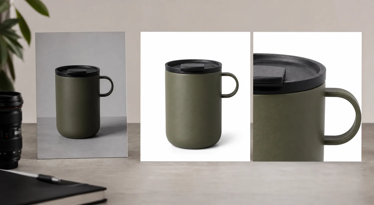 *KrafLayer demonstration composite. Compare the mug's body, handle, color, graphic placement, rim, and proportions across source, output, and detail crop.*
## Which Reference Images Should You Upload?
Google requires each image to show the correct variant and match its color, pattern, and material. That makes product references the identity authority. A mood board may influence lighting or layout, but it must not replace the factual SKU ([Google Merchant Center](https://support.google.com/merchants/answer/6324350?hl=en), 2026).
| Reference type | Controls | Should not control |
|---|---|---|
| Primary product front | Silhouette, color, front label, main proportions | Hidden back or underside details |
| Product side/back/top | Depth, closures, ports, handle geometry, rear copy | Unrelated scene style |
| Product detail | Texture, seam, finish, mechanism, small mark | Whole-product scale by itself |
| Style reference | Camera, lighting, palette, composition, prop restraint | Product identity, logo, packaging, exact text |
| Brand guide | Approved colors, typography, layout rules | Physical product facts absent from photography |
Upload only references you can explain. Ten near-identical front views add less information than a front, side, back, and one necessary detail view.
## When Is One Reference Image Not Enough?
Google advises using additional images for other product views, and Amazon lists front, back, side, overhead, close-up, and 45-degree shots among standard angles. Multiple views are not merely decorative; they constrain different parts of the product ([Google Merchant Center](https://support.google.com/merchants/answer/6324350?hl=en); [Amazon](https://sell.amazon.com/blog/product-photos), 2026).
| Product | One view may preserve | Add another view for |
|---|---|---|
| Bottle or box | Front silhouette, color, front label | Back copy, cap mechanism, side depth |
| Bag or shoe | Main shape and color | Closure, sole, strap anchors, interior |
| Appliance | Front controls and body | Ports, cable, lid, rear vents |
| Furniture | Front finish and style | Depth, back construction, joinery |
| Jewelry | General form | Clasp, setting, engraving, scale |
One image is acceptable when the output stays close to that visible angle. It becomes risky when the prompt asks for a rotation or close-up of something the source never shows.
## How Do You Write a Product Identity Lock?
An AAAI 2025 study treats product inconsistency as a separate failure from an inappropriate background and evaluates it by comparing segmented product regions before and after generation. The practical lesson is simple: review product identity independently from scene quality ([AAAI paper](https://ojs.aaai.org/index.php/AAAI/article/download/32027/34182), 2025).
Write the identity lock before the creative prompt. Record the exact SKU and variant color, followed by silhouette, proportions, and orientation. Then document material behavior; every visible label, logo, graphic, and line of text; required components; what is included; and facts absent from the references that the model must not invent.
Then add the output job. Example: "Create a square secondary lifestyle image on a pale stone desk, eye-level three-quarter camera, soft window light from left. Preserve the uploaded mug's cream ceramic body, handle geometry, rim thickness, green graphic, and exact proportions. Do not add text or change the printed mark."
> **Give every output one job**
>
> Use the [AI Product Image Generator](/ai-product-image-generator) with your clearest product views. Generate a main, detail, or lifestyle role separately so each result has a specific review checklist.
## How Should You Generate Each Image Role?
Amazon's photography guide recommends at least six product images and identifies individual, lifestyle, scale, detail, packaging, and group shots as distinct types. Separating roles keeps one generated image from trying to answer every buying question at once ([Amazon](https://sell.amazon.com/blog/product-photos), 2026).
| Role | Prompt emphasis | Source requirement | Reject when |
|---|---|---|---|
| Plain main view | Complete product, neutral light, clean field | Sharp full-product reference | New props, text, missing parts, changed variant |
| Alternate angle | Requested orientation and visible construction | Actual source from that side | Hidden geometry is guessed |
| Detail | One material or mechanism | Sharp detail reference | Texture or component is invented |
| Scale | Known setting and verified dimensions | Dimensions plus suitable product view | Perspective implies false size |
| Lifestyle | Real use context and restrained props | Strong identity reference | Scene hides product or changes use |
| Campaign | Brand palette and composition | Identity references plus style guide | Style reference overwrites the SKU |
Generate two to four candidates for one role, reject obvious drift, and refine only the strongest. Fifty unrelated variants make review worse because the identity errors are no longer comparable.
*Published demonstration. A role set is coherent only if pump geometry, bottle proportions, label placement, and cream color remain stable in all four panels.*
## How Do You Check Product Consistency?
Google recommends product images at 75%–90% frame fill and requires the right variant. Amazon prefers images above 1,000 pixels per side for zoom. Use that resolution to compare facts, not merely sharpness ([Google Merchant Center](https://support.google.com/merchants/answer/6324350?hl=en); [Amazon](https://sell.amazon.com/blog/product-photos), 2026).
Score each candidate pass or fail on seven checks:
1. **Silhouette:** outline, proportions, openings, handles, and thickness.
2. **Color:** correct variant and neutral material color.
3. **Text:** every visible letter, number, mark, and logo.
4. **Material:** gloss, weave, grain, glass, metal, and transparency.
5. **Components:** caps, ports, seams, fasteners, stones, and included parts.
6. **Scale:** product size relative to props and camera perspective.
7. **Light and contact:** shadow, reflection, and surface contact in the new scene.
Do not average the checks into a flattering score. A wrong label or missing safety component is a hard rejection even when the other six pass.
## When Should You Edit or Reshoot Instead?
Use editing rather than generation when the original product is already correct and only the background, dust, glare, or one local area needs work. A smaller edit exposes fewer product pixels to change.
Reshoot when the required fact is missing: unreadable regulated copy, hidden connector, cropped edge, unknown material texture, wrong variant, or a new angle. Generated pixels can be visually plausible without being true. For a factual listing asset, missing evidence is a photography problem.
## Verdict
Reference generation is strongest when the source hierarchy is boringly clear. Product photos own identity; style references shape presentation; the prompt names one image job. Missing geometry still needs another product view, and missing evidence still needs a camera.
## Frequently Asked Questions
### Can AI generate product photos from one reference image?
Yes, especially when the output stays close to the visible angle and the product has a simple, clear silhouette. One image cannot establish hidden geometry. Add side, back, top, and detail views when the output must show those facts.
### What makes a good product reference image?
Use a sharp, high-resolution image with the whole product visible, accurate color, readable marks, controlled glare, and clean separation from the background. The best reference is factual rather than dramatic. Keep the largest original instead of a compressed marketplace download.
### Does a reference image prevent product drift?
No. It constrains visible identity but does not guarantee it. Review silhouette, color, text, material, components, scale, and light against the source. Reject changed labels, invented parts, or guessed geometry even if the surrounding scene looks realistic.
### Should style references contain another brand's product?
They can demonstrate lighting or composition, but they must not control product identity, packaging, logos, exact text, or a one-to-one layout. State that your product images define the SKU while style references supply only visual method.
### When is photo editing safer than generation?
Editing is safer when the product pixels are already correct and the defect is narrow, such as a messy background, dust spot, cable, or local glare. Full generation introduces more opportunities to change product facts and requires a broader review.
## References
1. [DreamPainter: Image background inpainting for ecommerce](https://arxiv.org/abs/2508.02155), accessed August 11, 2026.
2. [AAAI 2025: Evaluation framework for product-image background inpainting](https://ojs.aaai.org/index.php/AAAI/article/download/32027/34182), accessed August 11, 2026.
3. [Google Merchant Center: Image link requirements](https://support.google.com/merchants/answer/6324350?hl=en), accessed August 11, 2026.
4. [Amazon: Six tips for product photos](https://sell.amazon.com/blog/product-photos), accessed August 11, 2026.
# AI Earring Model Photos: Scale, Placement and 6 Checks
URL: https://kraflayer.com/blog/generate-earring-product-photos-on-a-model-with-ai
Summary: Create credible AI earring model photos with verified dimensions, on-ear placement, clasp and material evidence, source hierarchy, and six fidelity checks.
Updated: 2026-08-22
AI can place earrings on a model, but a plausible portrait is not enough. The generated image must preserve the earring's diameter, drop length, clasp, stone count, metal color, and left-right orientation. Treat the model view as a scale and styling image. Keep a plain product view beside it so buyers can inspect the item without hair, skin, or perspective hiding the construction.
The workflow below uses current Google and Amazon image guidance plus the limitations visible in the source-to-model demonstration. The images are KrafLayer demonstration assets, not customer results or a controlled model benchmark.
> **Quick Summary**
> Google recommends showing non-clothing accessories alone in the main image and on a model in secondary views. Use the product-only view as the identity anchor, add verified dimensions, generate a restrained on-ear view, then reject any output that changes scale, clasp, stones, symmetry, or metal finish.
## Abstract
An earring model image has two jobs: show believable wearing scale and preserve the exact SKU. Start with front, side, clasp, and measurement references. Generate one ear angle at a time. Review product geometry separately from skin, hair, light, and portrait quality.
## Key Takeaways
- Keep the accessory alone in the main image and use model views as secondary views.
- Millimeter dimensions are more reliable than visual scale alone.
- Earrings need clasp and side-view references, not only a front beauty shot.
- Hair should frame the product without hiding the closure or drop.
- A changed stone count or hoop diameter is a hard rejection.
## Table of Contents
1. [Evidence and limits](#evidence-and-limits)
2. [Source image set](#the-reference-set-an-earring-needs)
3. [Scale control](#controlling-on-ear-scale)
4. [Prompt structure](#a-prompt-that-protects-the-sku)
5. [Review matrix](#the-earring-fidelity-review)
6. [Gallery roles](#where-the-model-image-belongs)
7. [Reshoot boundary](#when-generation-is-the-wrong-tool)
8. [Frequently asked questions](#frequently-asked-questions)
## Evidence and Limits
Google recommends showing shoes, handbags, and accessories alone in main images, then on a model in secondary views. Amazon identifies scale and detailed shots as separate product-photo roles. Together, the guidance supports a simple division: product-only images prove construction; on-model images explain wearing scale and style ([Google Merchant Center](https://support.google.com/merchants/answer/6324350?hl=en); [Amazon](https://sell.amazon.com/blog/product-photos), 2026).
We did not run the same earring through multiple commercial generators. The visual below is useful because it puts the on-ear image and product pair in one frame, making geometry and scale easier to compare.
*KrafLayer demonstration composite. Compare the mug's body, handle, color, graphic placement, rim, and proportions across source, output, and detail crop.*
## Which Reference Images Should You Upload?
Google requires each image to show the correct variant and match its color, pattern, and material. That makes product references the identity authority. A mood board may influence lighting or layout, but it must not replace the factual SKU ([Google Merchant Center](https://support.google.com/merchants/answer/6324350?hl=en), 2026).
| Reference type | Controls | Should not control |
|---|---|---|
| Primary product front | Silhouette, color, front label, main proportions | Hidden back or underside details |
| Product side/back/top | Depth, closures, ports, handle geometry, rear copy | Unrelated scene style |
| Product detail | Texture, seam, finish, mechanism, small mark | Whole-product scale by itself |
| Style reference | Camera, lighting, palette, composition, prop restraint | Product identity, logo, packaging, exact text |
| Brand guide | Approved colors, typography, layout rules | Physical product facts absent from photography |
Upload only references you can explain. Ten near-identical front views add less information than a front, side, back, and one necessary detail view.
## When Is One Reference Image Not Enough?
Google advises using additional images for other product views, and Amazon lists front, back, side, overhead, close-up, and 45-degree shots among standard angles. Multiple views are not merely decorative; they constrain different parts of the product ([Google Merchant Center](https://support.google.com/merchants/answer/6324350?hl=en); [Amazon](https://sell.amazon.com/blog/product-photos), 2026).
| Product | One view may preserve | Add another view for |
|---|---|---|
| Bottle or box | Front silhouette, color, front label | Back copy, cap mechanism, side depth |
| Bag or shoe | Main shape and color | Closure, sole, strap anchors, interior |
| Appliance | Front controls and body | Ports, cable, lid, rear vents |
| Furniture | Front finish and style | Depth, back construction, joinery |
| Jewelry | General form | Clasp, setting, engraving, scale |
One image is acceptable when the output stays close to that visible angle. It becomes risky when the prompt asks for a rotation or close-up of something the source never shows.
## How Do You Write a Product Identity Lock?
An AAAI 2025 study treats product inconsistency as a separate failure from an inappropriate background and evaluates it by comparing segmented product regions before and after generation. The practical lesson is simple: review product identity independently from scene quality ([AAAI paper](https://ojs.aaai.org/index.php/AAAI/article/download/32027/34182), 2025).
Write the identity lock before the creative prompt. Record the exact SKU and variant color, followed by silhouette, proportions, and orientation. Then document material behavior; every visible label, logo, graphic, and line of text; required components; what is included; and facts absent from the references that the model must not invent.
Then add the output job. Example: "Create a square secondary lifestyle image on a pale stone desk, eye-level three-quarter camera, soft window light from left. Preserve the uploaded mug's cream ceramic body, handle geometry, rim thickness, green graphic, and exact proportions. Do not add text or change the printed mark."
> **Give every output one job**
>
> Use the [AI Product Image Generator](/ai-product-image-generator) with your clearest product views. Generate a main, detail, or lifestyle role separately so each result has a specific review checklist.
## How Should You Generate Each Image Role?
Amazon's photography guide recommends at least six product images and identifies individual, lifestyle, scale, detail, packaging, and group shots as distinct types. Separating roles keeps one generated image from trying to answer every buying question at once ([Amazon](https://sell.amazon.com/blog/product-photos), 2026).
| Role | Prompt emphasis | Source requirement | Reject when |
|---|---|---|---|
| Plain main view | Complete product, neutral light, clean field | Sharp full-product reference | New props, text, missing parts, changed variant |
| Alternate angle | Requested orientation and visible construction | Actual source from that side | Hidden geometry is guessed |
| Detail | One material or mechanism | Sharp detail reference | Texture or component is invented |
| Scale | Known setting and verified dimensions | Dimensions plus suitable product view | Perspective implies false size |
| Lifestyle | Real use context and restrained props | Strong identity reference | Scene hides product or changes use |
| Campaign | Brand palette and composition | Identity references plus style guide | Style reference overwrites the SKU |
Generate two to four candidates for one role, reject obvious drift, and refine only the strongest. Fifty unrelated variants make review worse because the identity errors are no longer comparable.
*Published demonstration. A role set is coherent only if pump geometry, bottle proportions, label placement, and cream color remain stable in all four panels.*
## How Do You Check Product Consistency?
Google recommends product images at 75%–90% frame fill and requires the right variant. Amazon prefers images above 1,000 pixels per side for zoom. Use that resolution to compare facts, not merely sharpness ([Google Merchant Center](https://support.google.com/merchants/answer/6324350?hl=en); [Amazon](https://sell.amazon.com/blog/product-photos), 2026).
Score each candidate pass or fail on seven checks:
1. **Silhouette:** outline, proportions, openings, handles, and thickness.
2. **Color:** correct variant and neutral material color.
3. **Text:** every visible letter, number, mark, and logo.
4. **Material:** gloss, weave, grain, glass, metal, and transparency.
5. **Components:** caps, ports, seams, fasteners, stones, and included parts.
6. **Scale:** product size relative to props and camera perspective.
7. **Light and contact:** shadow, reflection, and surface contact in the new scene.
Do not average the checks into a flattering score. A wrong label or missing safety component is a hard rejection even when the other six pass.
## When Should You Edit or Reshoot Instead?
Use editing rather than generation when the original product is already correct and only the background, dust, glare, or one local area needs work. A smaller edit exposes fewer product pixels to change.
Reshoot when the required fact is missing: unreadable regulated copy, hidden connector, cropped edge, unknown material texture, wrong variant, or a new angle. Generated pixels can be visually plausible without being true. For a factual listing asset, missing evidence is a photography problem.
## Verdict
Reference generation is strongest when the source hierarchy is boringly clear. Product photos own identity; style references shape presentation; the prompt names one image job. Missing geometry still needs another product view, and missing evidence still needs a camera.
## Frequently Asked Questions
### Can AI generate product photos from one reference image?
Yes, especially when the output stays close to the visible angle and the product has a simple, clear silhouette. One image cannot establish hidden geometry. Add side, back, top, and detail views when the output must show those facts.
### What makes a good product reference image?
Use a sharp, high-resolution image with the whole product visible, accurate color, readable marks, controlled glare, and clean separation from the background. The best reference is factual rather than dramatic. Keep the largest original instead of a compressed marketplace download.
### Does a reference image prevent product drift?
No. It constrains visible identity but does not guarantee it. Review silhouette, color, text, material, components, scale, and light against the source. Reject changed labels, invented parts, or guessed geometry even if the surrounding scene looks realistic.
### Should style references contain another brand's product?
They can demonstrate lighting or composition, but they must not control product identity, packaging, logos, exact text, or a one-to-one layout. State that your product images define the SKU while style references supply only visual method.
### When is photo editing safer than generation?
Editing is safer when the product pixels are already correct and the defect is narrow, such as a messy background, dust spot, cable, or local glare. Full generation introduces more opportunities to change product facts and requires a broader review.
## References
1. [DreamPainter: Image background inpainting for ecommerce](https://arxiv.org/abs/2508.02155), accessed August 11, 2026.
2. [AAAI 2025: Evaluation framework for product-image background inpainting](https://ojs.aaai.org/index.php/AAAI/article/download/32027/34182), accessed August 11, 2026.
3. [Google Merchant Center: Image link requirements](https://support.google.com/merchants/answer/6324350?hl=en), accessed August 11, 2026.
4. [Amazon: Six tips for product photos](https://sell.amazon.com/blog/product-photos), accessed August 11, 2026.
# AI Earring Model Photos: Scale, Placement and 6 Checks
URL: https://kraflayer.com/blog/generate-earring-product-photos-on-a-model-with-ai
Summary: Create credible AI earring model photos with verified dimensions, on-ear placement, clasp and material evidence, source hierarchy, and six fidelity checks.
Updated: 2026-08-22
AI can place earrings on a model, but a plausible portrait is not enough. The generated image must preserve the earring's diameter, drop length, clasp, stone count, metal color, and left-right orientation. Treat the model view as a scale and styling image. Keep a plain product view beside it so buyers can inspect the item without hair, skin, or perspective hiding the construction.
The workflow below uses current Google and Amazon image guidance plus the limitations visible in the source-to-model demonstration. The images are KrafLayer demonstration assets, not customer results or a controlled model benchmark.
> **Quick Summary**
> Google recommends showing non-clothing accessories alone in the main image and on a model in secondary views. Use the product-only view as the identity anchor, add verified dimensions, generate a restrained on-ear view, then reject any output that changes scale, clasp, stones, symmetry, or metal finish.
## Abstract
An earring model image has two jobs: show believable wearing scale and preserve the exact SKU. Start with front, side, clasp, and measurement references. Generate one ear angle at a time. Review product geometry separately from skin, hair, light, and portrait quality.
## Key Takeaways
- Keep the accessory alone in the main image and use model views as secondary views.
- Millimeter dimensions are more reliable than visual scale alone.
- Earrings need clasp and side-view references, not only a front beauty shot.
- Hair should frame the product without hiding the closure or drop.
- A changed stone count or hoop diameter is a hard rejection.
## Table of Contents
1. [Evidence and limits](#evidence-and-limits)
2. [Source image set](#the-reference-set-an-earring-needs)
3. [Scale control](#controlling-on-ear-scale)
4. [Prompt structure](#a-prompt-that-protects-the-sku)
5. [Review matrix](#the-earring-fidelity-review)
6. [Gallery roles](#where-the-model-image-belongs)
7. [Reshoot boundary](#when-generation-is-the-wrong-tool)
8. [Frequently asked questions](#frequently-asked-questions)
## Evidence and Limits
Google recommends showing shoes, handbags, and accessories alone in main images, then on a model in secondary views. Amazon identifies scale and detailed shots as separate product-photo roles. Together, the guidance supports a simple division: product-only images prove construction; on-model images explain wearing scale and style ([Google Merchant Center](https://support.google.com/merchants/answer/6324350?hl=en); [Amazon](https://sell.amazon.com/blog/product-photos), 2026).
We did not run the same earring through multiple commercial generators. The visual below is useful because it puts the on-ear image and product pair in one frame, making geometry and scale easier to compare.
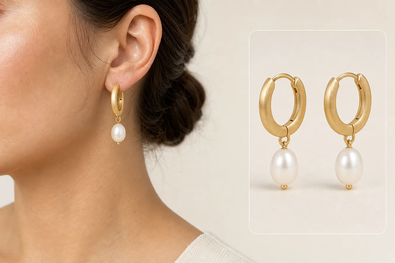 *KrafLayer demonstration composite. Compare hoop diameter, brushed finish, pearl shape, connecting ring, clasp opening, and the drop relative to the earlobe.*
## The Reference Set an Earring Needs
Google requires the image to show the correct variant, color, pattern, and material. One front view can anchor the visible design, but it cannot prove clasp depth, post position, rear hardware, or the way a drop attaches ([Google Merchant Center](https://support.google.com/merchants/answer/6324350?hl=en), 2026).
| Reference | What it proves | Common omission |
|---|---|---|
| Front pair | Shape, symmetry, stone count, color | Clasp and depth |
| Side view | Thickness, post, hinge, drop attachment | Front decoration |
| Open clasp | Closure type and usable opening | Wearing scale |
| Macro detail | Texture, setting, engraving, pearl surface | Whole-product proportion |
| Measurement photo | Hoop diameter, drop length, width | Material appearance |
Photograph the actual pair, not one earring duplicated in software. Small asymmetries, stone orientation, and hardware may be real product facts.
## Controlling On-Ear Scale
Amazon defines a scale image as a view that helps customers judge size through a familiar reference. An ear provides context, but ear anatomy varies, so include the verified millimeter measurement elsewhere in the gallery rather than asking one portrait to communicate exact size ([Amazon](https://sell.amazon.com/blog/product-photos), 2026).
Use the real dimensions to check the render. A 12 mm hoop should not become a 25 mm statement hoop because the portrait composition looks stronger. Watch the distance from piercing to lower edge, the relation between hoop width and earlobe, and the drop's vertical length.
| Scale signal | Pass | Reject |
|---|---|---|
| Piercing point | Hardware enters the lobe plausibly | Earring floats or pierces the wrong area |
| Hoop diameter | Matches stated dimensions relative to ear | Product becomes a different size class |
| Drop length | Follows gravity and verified length | Pearl hangs too low or clips into skin |
| Pair consistency | Left and right products match | Mirroring changes clasp or decorative direction |
> **Generate the wearing view from a factual product reference**
>
> Use [AI Product Photography](/ai-product-photography) to create one restrained on-model view, then compare it with the original pair and measurement references before building more variants.
## A Prompt That Protects the SKU
Photoroom warns that AI Product Staging can differ from the original, especially with complex patterns, shapes, and text. Jewelry has the same identity risk at a smaller scale: a tiny change can produce a different SKU ([Photoroom Help](https://help.photoroom.com/en/articles/11155705-show-a-product-in-a-realistic-scene-with-product-staging), 2026).
Write the prompt in two parts. First, lock the product: exact hoop shape, verified diameter, metal color and finish, clasp type, number and placement of stones or pearls, and drop length. Second, describe a simple portrait: one visible ear, hair tucked behind it, neutral skin texture, soft side light, no extra jewelry, and enough resolution for the earring to remain inspectable.
Do not ask for several poses, dramatic hair, colored gels, or elaborate clothing in the first pass. Those variables compete with product review.
## The earring fidelity review
Amazon recommends files larger than 1,000 pixels on each side for zoom. Review the generated result at full size because a thumbnail can hide mutated clasps, doubled stones, softened texture, and broken connecting rings ([Amazon](https://sell.amazon.com/blog/product-photos), 2026).
| Check | Compare with source | Hard rejection |
|---|---|---|
| Silhouette | Hoop, stud, drop, and setting outline | Diameter or profile changes |
| Components | Post, hinge, clasp, rings, stones | Part added, removed, or fused |
| Material | Gold tone, polish, brushing, pearl luster | Metal becomes plastic or wrong color |
| Pair orientation | Left-right construction and decorative direction | Invalid mirroring |
| Contact | Piercing point and gravity | Floating, embedded, or tilted hardware |
| Occlusion | Hair and ear overlap | Product fact needed for purchase is hidden |
Portrait quality is reviewed afterward. A realistic face does not compensate for the wrong earring.
## Where the Model Image Belongs
Google favors an accessory-only main image and permits model views as secondary views. A practical jewelry gallery begins with the plain pair, then detail, clasp, measurement, and on-model scale. Lifestyle styling can follow once the buyer has seen the factual construction ([Google Merchant Center](https://support.google.com/merchants/answer/6324350?hl=en), 2026).
The model image should answer how the earring wears. It should not be the only place where buyers see the SKU, and it should not imply a material, size, or fastening method that the product page cannot verify.
## When Generation Is the Wrong Tool
Reshoot when the source cannot show the clasp, post, engraving, stone setting, or true metal color. Use a manual composite when the exact product pixels must remain unchanged, particularly for high-value jewelry, regulated material claims, or asymmetric designs.
If generation repeatedly changes the same component, the problem is usually missing reference coverage rather than a weak adjective in the prompt.
## Verdict
The safest on-model earring image starts from measurement and construction evidence. Let the model supply context, not product identity. If the generated portrait passes scale but fails the clasp, stone count, or finish, it still fails.
## How should you prove earring size and placement?
Google recommends at least 512 × 512 images for apparel and accessories, ideally 1024 pixels or higher, and says accessories should appear alone in main images and on a model in additional images. That split is useful for earrings: the plain image proves the exact pair, while the model image explains scale and wearing context ([Google Merchant Center](https://support.google.com/merchants/answer/7348545?hl=en), 2026).
Do not ask the model to infer size from a product cutout. Record the earring's real height and widest point in millimeters, then use a source photo with a ruler or a verified on-ear image to establish scale. For hoops, measure outer diameter. For drops, measure from the piercing point to the lowest edge. For studs, record the visible face rather than the post.
Use a three-image proof set:
| Image | What it proves | Reject when |
|---|---|---|
| Plain pair | Shape, stones, finish, clasp, left/right match | The model view later changes any part |
| On-ear view | Scale, drop length, placement, hair interaction | The earring floats or sits off the piercing point |
| Macro detail | Setting, edge finish, texture, fastening | AI invents facets, stones, engraving, or metal color |
The on-ear image should look physically ordinary. Gravity pulls a drop earring downward. A hoop follows the ear's angle. Hair may overlap slightly in a lifestyle image, but it should not hide the clasp or signature detail in the only model view.
## Which errors matter most for jewelry?
Google requires the image to match the listed color, pattern, and material. For jewelry, that means a warm lighting grade cannot turn silver into gold, a polished finish cannot become brushed, and an AI sparkle cannot imply stones that are not part of the SKU ([Google product image requirements](https://support.google.com/merchants/answer/6324350?hl=en), 2026).
Inspect these failure points at full resolution:
- count every stone, link, bead, and hanging element;
- compare the clasp, post, hook, and backing with the source;
- check that left and right earrings remain a real pair;
- verify metal color under neutral light before judging the styled frame;
- reject mirrored logos, invented engraving, or softened hallmark text;
- compare earring scale with the verified measurement, not with intuition.
One incorrect component is enough to reject the image. Jewelry is small, so a change that looks minor on screen can describe a different product.
## Frequently Asked Questions
### Can AI put my exact earrings on a model?
AI can create a useful wearing view, but it does not guarantee exact product preservation. Supply front, side, clasp, detail, and measurement references. Compare the generated earring with the source at full resolution and reject any changed component.
### How do I keep the earring size accurate?
Record hoop diameter, width, and total drop in millimeters. Check those dimensions against the relation between product and ear, then include a separate measurement image in the gallery. Visual scale alone is not exact because ears vary.
### Should hair cover part of the earring?
A small natural overlap can make a portrait believable, but the hair should not hide the clasp, full drop, or decorative feature the buyer needs to inspect. Start with hair tucked behind the ear and add looser styling only after fidelity passes.
### Can the model image be the Amazon or Google main image?
Google recommends showing non-clothing accessories alone in main images and on a model in secondary views. Amazon main-image requirements also favor a factual white-background product view. Use the on-model render as secondary scale or lifestyle evidence.
### How many model variations should I generate?
Begin with two to four candidates using one ear angle and one lighting setup. More variation is useful only after the product remains stable. If every candidate changes the same feature, add a better reference or use manual compositing.
## References
1. [Google Merchant Center: Image link requirements](https://support.google.com/merchants/answer/6324350?hl=en), accessed August 11, 2026.
2. [Amazon: Six tips for product photos](https://sell.amazon.com/blog/product-photos), accessed August 11, 2026.
3. [Photoroom: Product Staging limitations](https://help.photoroom.com/en/articles/11155705-show-a-product-in-a-realistic-scene-with-product-staging), accessed August 11, 2026.
# White vs Lifestyle Product Photos: Which Should You Use?
URL: https://kraflayer.com/blog/white-background-vs-lifestyle-background-product-photos
Summary: Choose white-background and lifestyle product photos by image role, then combine factual, detail, scale, and contextual views into a useful ecommerce gallery.
Updated: 2026-08-22
White-background and lifestyle product photos solve different buying problems. White isolates the item so buyers can identify shape, color, included parts, and variant. Lifestyle imagery explains use, scale, mood, and context. Most ecommerce galleries need both, in that order, rather than one style winning every slot.
The comparison uses current Google and Amazon guidance checked on August 11, 2026. The kettle and mug images are KrafLayer demonstrations, not conversion experiments or customer results.
> **Quick Summary**
> Google recommends white or transparent backgrounds, 75%–90% product fill, and accurate variants, while accepting clear staged images. Amazon treats pure white as the default for product shots and recommends lifestyle, scale, and detail views. Use white for identification and lifestyle for explanation.
## Abstract
A white image identifies the item. A lifestyle image explains how it fits into use. Keep the factual view first, then add context that does not hide, resize, or redesign the SKU. Test gallery order instead of treating background style as a universal preference.
## Key Takeaways
- White is the lower-risk main-image default.
- Lifestyle images should answer a real use or scale question.
- Props must not imply items are included when they are not.
- The product must remain the focal point in both treatments.
- A gallery is stronger when each image has a distinct job.
## Table of Contents
1. [Official guidance](#what-the-platforms-actually-say)
2. [Side-by-side comparison](#white-versus-lifestyle-by-image-role)
3. [White-image checks](#building-a-factual-white-background-image)
4. [Lifestyle checks](#building-a-useful-lifestyle-image)
5. [Gallery sequence](#a-six-image-gallery-that-uses-both)
6. [Testing](#how-to-test-the-order)
7. [Frequently asked questions](#frequently-asked-questions)
## What the Platforms Actually Say
Google recommends solid white or transparent backgrounds and product fill between 75% and 90%, but also accepts staged or lifestyle images when the product stays clear. Amazon says sellers should always have white-background images, then consider color, texture, and ambient scenes for creative or lifestyle roles ([Google Merchant Center](https://support.google.com/merchants/answer/6324350?hl=en); [Amazon](https://sell.amazon.com/blog/product-photos), 2026).
Those statements do not support an either-or rule. They support role separation. White improves comparability; lifestyle adds information that isolation cannot provide.
*KrafLayer demonstration composite. Compare hoop diameter, brushed finish, pearl shape, connecting ring, clasp opening, and the drop relative to the earlobe.*
## The Reference Set an Earring Needs
Google requires the image to show the correct variant, color, pattern, and material. One front view can anchor the visible design, but it cannot prove clasp depth, post position, rear hardware, or the way a drop attaches ([Google Merchant Center](https://support.google.com/merchants/answer/6324350?hl=en), 2026).
| Reference | What it proves | Common omission |
|---|---|---|
| Front pair | Shape, symmetry, stone count, color | Clasp and depth |
| Side view | Thickness, post, hinge, drop attachment | Front decoration |
| Open clasp | Closure type and usable opening | Wearing scale |
| Macro detail | Texture, setting, engraving, pearl surface | Whole-product proportion |
| Measurement photo | Hoop diameter, drop length, width | Material appearance |
Photograph the actual pair, not one earring duplicated in software. Small asymmetries, stone orientation, and hardware may be real product facts.
## Controlling On-Ear Scale
Amazon defines a scale image as a view that helps customers judge size through a familiar reference. An ear provides context, but ear anatomy varies, so include the verified millimeter measurement elsewhere in the gallery rather than asking one portrait to communicate exact size ([Amazon](https://sell.amazon.com/blog/product-photos), 2026).
Use the real dimensions to check the render. A 12 mm hoop should not become a 25 mm statement hoop because the portrait composition looks stronger. Watch the distance from piercing to lower edge, the relation between hoop width and earlobe, and the drop's vertical length.
| Scale signal | Pass | Reject |
|---|---|---|
| Piercing point | Hardware enters the lobe plausibly | Earring floats or pierces the wrong area |
| Hoop diameter | Matches stated dimensions relative to ear | Product becomes a different size class |
| Drop length | Follows gravity and verified length | Pearl hangs too low or clips into skin |
| Pair consistency | Left and right products match | Mirroring changes clasp or decorative direction |
> **Generate the wearing view from a factual product reference**
>
> Use [AI Product Photography](/ai-product-photography) to create one restrained on-model view, then compare it with the original pair and measurement references before building more variants.
## A Prompt That Protects the SKU
Photoroom warns that AI Product Staging can differ from the original, especially with complex patterns, shapes, and text. Jewelry has the same identity risk at a smaller scale: a tiny change can produce a different SKU ([Photoroom Help](https://help.photoroom.com/en/articles/11155705-show-a-product-in-a-realistic-scene-with-product-staging), 2026).
Write the prompt in two parts. First, lock the product: exact hoop shape, verified diameter, metal color and finish, clasp type, number and placement of stones or pearls, and drop length. Second, describe a simple portrait: one visible ear, hair tucked behind it, neutral skin texture, soft side light, no extra jewelry, and enough resolution for the earring to remain inspectable.
Do not ask for several poses, dramatic hair, colored gels, or elaborate clothing in the first pass. Those variables compete with product review.
## The earring fidelity review
Amazon recommends files larger than 1,000 pixels on each side for zoom. Review the generated result at full size because a thumbnail can hide mutated clasps, doubled stones, softened texture, and broken connecting rings ([Amazon](https://sell.amazon.com/blog/product-photos), 2026).
| Check | Compare with source | Hard rejection |
|---|---|---|
| Silhouette | Hoop, stud, drop, and setting outline | Diameter or profile changes |
| Components | Post, hinge, clasp, rings, stones | Part added, removed, or fused |
| Material | Gold tone, polish, brushing, pearl luster | Metal becomes plastic or wrong color |
| Pair orientation | Left-right construction and decorative direction | Invalid mirroring |
| Contact | Piercing point and gravity | Floating, embedded, or tilted hardware |
| Occlusion | Hair and ear overlap | Product fact needed for purchase is hidden |
Portrait quality is reviewed afterward. A realistic face does not compensate for the wrong earring.
## Where the Model Image Belongs
Google favors an accessory-only main image and permits model views as secondary views. A practical jewelry gallery begins with the plain pair, then detail, clasp, measurement, and on-model scale. Lifestyle styling can follow once the buyer has seen the factual construction ([Google Merchant Center](https://support.google.com/merchants/answer/6324350?hl=en), 2026).
The model image should answer how the earring wears. It should not be the only place where buyers see the SKU, and it should not imply a material, size, or fastening method that the product page cannot verify.
## When Generation Is the Wrong Tool
Reshoot when the source cannot show the clasp, post, engraving, stone setting, or true metal color. Use a manual composite when the exact product pixels must remain unchanged, particularly for high-value jewelry, regulated material claims, or asymmetric designs.
If generation repeatedly changes the same component, the problem is usually missing reference coverage rather than a weak adjective in the prompt.
## Verdict
The safest on-model earring image starts from measurement and construction evidence. Let the model supply context, not product identity. If the generated portrait passes scale but fails the clasp, stone count, or finish, it still fails.
## How should you prove earring size and placement?
Google recommends at least 512 × 512 images for apparel and accessories, ideally 1024 pixels or higher, and says accessories should appear alone in main images and on a model in additional images. That split is useful for earrings: the plain image proves the exact pair, while the model image explains scale and wearing context ([Google Merchant Center](https://support.google.com/merchants/answer/7348545?hl=en), 2026).
Do not ask the model to infer size from a product cutout. Record the earring's real height and widest point in millimeters, then use a source photo with a ruler or a verified on-ear image to establish scale. For hoops, measure outer diameter. For drops, measure from the piercing point to the lowest edge. For studs, record the visible face rather than the post.
Use a three-image proof set:
| Image | What it proves | Reject when |
|---|---|---|
| Plain pair | Shape, stones, finish, clasp, left/right match | The model view later changes any part |
| On-ear view | Scale, drop length, placement, hair interaction | The earring floats or sits off the piercing point |
| Macro detail | Setting, edge finish, texture, fastening | AI invents facets, stones, engraving, or metal color |
The on-ear image should look physically ordinary. Gravity pulls a drop earring downward. A hoop follows the ear's angle. Hair may overlap slightly in a lifestyle image, but it should not hide the clasp or signature detail in the only model view.
## Which errors matter most for jewelry?
Google requires the image to match the listed color, pattern, and material. For jewelry, that means a warm lighting grade cannot turn silver into gold, a polished finish cannot become brushed, and an AI sparkle cannot imply stones that are not part of the SKU ([Google product image requirements](https://support.google.com/merchants/answer/6324350?hl=en), 2026).
Inspect these failure points at full resolution:
- count every stone, link, bead, and hanging element;
- compare the clasp, post, hook, and backing with the source;
- check that left and right earrings remain a real pair;
- verify metal color under neutral light before judging the styled frame;
- reject mirrored logos, invented engraving, or softened hallmark text;
- compare earring scale with the verified measurement, not with intuition.
One incorrect component is enough to reject the image. Jewelry is small, so a change that looks minor on screen can describe a different product.
## Frequently Asked Questions
### Can AI put my exact earrings on a model?
AI can create a useful wearing view, but it does not guarantee exact product preservation. Supply front, side, clasp, detail, and measurement references. Compare the generated earring with the source at full resolution and reject any changed component.
### How do I keep the earring size accurate?
Record hoop diameter, width, and total drop in millimeters. Check those dimensions against the relation between product and ear, then include a separate measurement image in the gallery. Visual scale alone is not exact because ears vary.
### Should hair cover part of the earring?
A small natural overlap can make a portrait believable, but the hair should not hide the clasp, full drop, or decorative feature the buyer needs to inspect. Start with hair tucked behind the ear and add looser styling only after fidelity passes.
### Can the model image be the Amazon or Google main image?
Google recommends showing non-clothing accessories alone in main images and on a model in secondary views. Amazon main-image requirements also favor a factual white-background product view. Use the on-model render as secondary scale or lifestyle evidence.
### How many model variations should I generate?
Begin with two to four candidates using one ear angle and one lighting setup. More variation is useful only after the product remains stable. If every candidate changes the same feature, add a better reference or use manual compositing.
## References
1. [Google Merchant Center: Image link requirements](https://support.google.com/merchants/answer/6324350?hl=en), accessed August 11, 2026.
2. [Amazon: Six tips for product photos](https://sell.amazon.com/blog/product-photos), accessed August 11, 2026.
3. [Photoroom: Product Staging limitations](https://help.photoroom.com/en/articles/11155705-show-a-product-in-a-realistic-scene-with-product-staging), accessed August 11, 2026.
# White vs Lifestyle Product Photos: Which Should You Use?
URL: https://kraflayer.com/blog/white-background-vs-lifestyle-background-product-photos
Summary: Choose white-background and lifestyle product photos by image role, then combine factual, detail, scale, and contextual views into a useful ecommerce gallery.
Updated: 2026-08-22
White-background and lifestyle product photos solve different buying problems. White isolates the item so buyers can identify shape, color, included parts, and variant. Lifestyle imagery explains use, scale, mood, and context. Most ecommerce galleries need both, in that order, rather than one style winning every slot.
The comparison uses current Google and Amazon guidance checked on August 11, 2026. The kettle and mug images are KrafLayer demonstrations, not conversion experiments or customer results.
> **Quick Summary**
> Google recommends white or transparent backgrounds, 75%–90% product fill, and accurate variants, while accepting clear staged images. Amazon treats pure white as the default for product shots and recommends lifestyle, scale, and detail views. Use white for identification and lifestyle for explanation.
## Abstract
A white image identifies the item. A lifestyle image explains how it fits into use. Keep the factual view first, then add context that does not hide, resize, or redesign the SKU. Test gallery order instead of treating background style as a universal preference.
## Key Takeaways
- White is the lower-risk main-image default.
- Lifestyle images should answer a real use or scale question.
- Props must not imply items are included when they are not.
- The product must remain the focal point in both treatments.
- A gallery is stronger when each image has a distinct job.
## Table of Contents
1. [Official guidance](#what-the-platforms-actually-say)
2. [Side-by-side comparison](#white-versus-lifestyle-by-image-role)
3. [White-image checks](#building-a-factual-white-background-image)
4. [Lifestyle checks](#building-a-useful-lifestyle-image)
5. [Gallery sequence](#a-six-image-gallery-that-uses-both)
6. [Testing](#how-to-test-the-order)
7. [Frequently asked questions](#frequently-asked-questions)
## What the Platforms Actually Say
Google recommends solid white or transparent backgrounds and product fill between 75% and 90%, but also accepts staged or lifestyle images when the product stays clear. Amazon says sellers should always have white-background images, then consider color, texture, and ambient scenes for creative or lifestyle roles ([Google Merchant Center](https://support.google.com/merchants/answer/6324350?hl=en); [Amazon](https://sell.amazon.com/blog/product-photos), 2026).
Those statements do not support an either-or rule. They support role separation. White improves comparability; lifestyle adds information that isolation cannot provide.
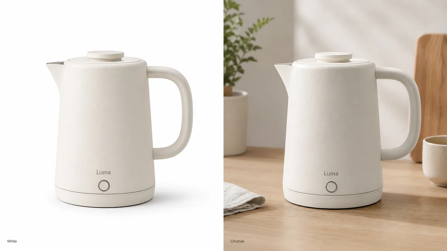 *KrafLayer demonstration comparison. Check whether the spout, handle, lid, button, body color, scale, and contact remain consistent across both roles.*
## White Versus Lifestyle by Image Role
Amazon defines lifestyle, scale, detail, packaging, and individual shots as different product-photo types. A useful gallery assigns each slot to one unresolved buyer question rather than repeating the same product at different angles ([Amazon](https://sell.amazon.com/blog/product-photos), 2026).
| Decision | White background | Lifestyle background |
|---|---|---|
| Primary job | Identify and compare the item | Explain use, scale, or setting |
| Best slots | Main image, catalog grid, variant view | Secondary gallery, PDP story, ad |
| Strength | Low distraction and easy comparison | Context and emotional relevance |
| Main risk | Pale edges disappear; image feels generic | Props overpower product or imply false scale |
| Review focus | Crop, color, edge, included parts | Product fidelity, perspective, light, contact, props |
The decision changes by role, not by category alone. A lamp benefits from white identification and an illuminated desk scene. A refill cartridge may need white, detail, and dimension views but little lifestyle staging.
## Building a Factual White-Background Image
Google requires an accurate view of the entire product and the correct variant. It forbids promotional overlays, borders, and unrelated items in the primary feed image. White is not a license to over-edit ([Google Merchant Center](https://support.google.com/merchants/answer/6324350?hl=en), 2026).
Check the outer silhouette, pale edges, transparent regions, color cast, crop, and contact shadow. A fully floating cutout may work for a catalog grid; a subtle grounded shadow can feel more natural in an owned store. Keep the background at true white when the destination requires it.
> **Create the factual asset before the scene**
>
> Use the [AI Background Remover](/tools/ai-background-remover) to make a clean product master, then branch into white and lifestyle versions instead of rebuilding the product twice.
## Building a Useful Lifestyle Image
Amazon says lifestyle shots show a product in action, while scale shots help buyers understand size. A lifestyle image should therefore carry specific information: where the item sits, how a person handles it, what fits inside, or how large it is relative to a known setting ([Amazon](https://sell.amazon.com/blog/product-photos), 2026).
| Lifestyle check | Pass | Reject |
|---|---|---|
| Use | Scene matches normal product use | Unsupported or unsafe context |
| Scale | Props and perspective support real dimensions | Product appears materially larger or smaller |
| Focus | Product wins at thumbnail size | Decor becomes the subject |
| Inclusion | Styling props are clearly contextual | Composition suggests props ship with product |
| Physics | Light, shadow, reflection, and contact agree | Product floats or reflects the old room |
Keep one selling idea per image. A crowded kitchen cannot simultaneously prove capacity, portability, material, cleaning, and luxury positioning.
*Published demonstration. The scene succeeds only if the mug body, lid, color, proportion, and shadow remain credible.*
## A Six-Image Gallery That Uses Both
Google supports additional images for other views, while Amazon recommends at least six product images in its photography guidance. A balanced six-image set can combine identification and explanation without duplication.
A practical sequence starts with a white-background main view, followed by a neutral angle that reveals rear or side construction. Use the third slot for material or mechanism detail and the fourth for verified scale or dimensions. Place the lifestyle use image next, then close with included items, packaging, or the buyer's biggest remaining objection.
Move lifestyle earlier when context is the main uncertainty. Move detail earlier when construction or material drives the purchase.
## How to Test the Order
Amazon's Manage Your Experiments can test product images for eligible brand owners by randomly splitting viewers between Version A and Version B. Amazon says optimized content can increase sales by up to 20%, but that platform claim is not a guaranteed result for one listing ([Amazon](https://sell.amazon.com/tools/manage-your-experiments), 2026).
Test one hypothesis, such as white versus lifestyle in the second gallery slot. Keep other content stable, record the ASIN and dates, and let the experiment determine whether context should appear earlier for that product.
## Verdict
White and lifestyle imagery are teammates. Use white to prove the SKU and lifestyle to explain it. If the lifestyle version cannot answer a buying question without changing the product, it does not earn a slot.
## Which products need more than one lifestyle image?
Google allows up to 10 additional images in free listings, while Amazon recommends at least six product images and separates detail, scale, lifestyle, packaging, and group views. Use extra lifestyle images only when each one answers a different question ([Google free listings](https://support.google.com/merchants/answer/13889434?hl=en); [Amazon product photos](https://sell.amazon.com/blog/product-photos), 2026).
A chair may need a room-scale image and a close use-context frame. A serum may need one bathroom scene but gains more from a dropper detail and package-contents image than from three different marble counters. A handbag may need an on-model scale view and a real interior view. The scene earns its place by adding information.
Use this decision rule:
- add a white-background view when the buyer needs cleaner comparison;
- add a detail image when the buyer needs material or construction evidence;
- add a scale image when dimensions are hard to imagine;
- add a lifestyle image when setting or use changes the buying decision;
- add a second lifestyle image only when it demonstrates another real context.
## How should white and lifestyle images share a visual system?
Shopify accepts product images up to 5000 × 5000 pixels or 25 megapixels and says consistent aspect ratios produce cleaner collection pages. A mixed gallery still needs stable crop, baseline, color, and product scale even when the backgrounds change ([Shopify product media](https://help.shopify.com/en/manual/products/product-media/product-media-types), 2026).
Keep the product's color temperature consistent between the white image and styled scene. Use the same variant, label, cap, hardware, and included parts. A warm room can cast warm light, but the item should not look like a different SKU.
The simplest gallery rhythm is factual first, contextual second: main image, alternate angle, detail, scale or contents, lifestyle, then a final proof view. Move lifestyle earlier only when context is essential to understanding the product.
## Keep a transparent master even when you publish white
Google accepts white or transparent backgrounds but warns that transparent pixels behind light products can render against a dark field. Etsy similarly notes that transparency may display as black. A transparent file is therefore a production master, not a universal publishing answer ([Google Merchant Center](https://support.google.com/merchants/answer/6324350?hl=en); [Etsy Help](https://help.etsy.com/hc/en-us/articles/115015663347-Requirements-and-Best-Practices-for-Images-in-Your-Etsy-Shop), 2026).
Keep the high-resolution cutout with alpha, then export a flattened white version for channels that need predictable display. Build lifestyle scenes from the same cutout only after reviewing edge halos, translucent materials, fine fibers, handles, and contact shadows. This gives the team one reusable source without forcing every destination to interpret transparency the same way.
## Frequently Asked Questions
### Are white backgrounds required for every product photo?
No. They are the safest default for main and catalog images. Google accepts clear staged imagery, and Amazon encourages lifestyle, detail, and scale shots. Keep white for factual identification and use context in secondary roles.
### Do lifestyle product photos convert better?
There is no universal result for every product and gallery position. Lifestyle helps when use or scale is unclear. Run a controlled platform experiment where available instead of applying an unsupported conversion percentage.
### Can AI create the lifestyle version from my white image?
Yes, but review silhouette, label, material, components, scale, lighting, and contact against the source. Keep the white image in the gallery so the generated scene is not the buyer's only product evidence.
### Which image should appear first?
For marketplace listings, start with the compliant factual main image. On an owned landing page, a lifestyle hero may lead, but the plain product view should remain easy to reach and should match the actual SKU.
### How many lifestyle images should a gallery contain?
Use as many as needed to explain distinct uses or contexts, without repeating the same idea. One strong lifestyle view is often more useful than three decorative scenes that hide the product in similar ways.
## References
1. [Google Merchant Center: Image link requirements](https://support.google.com/merchants/answer/6324350?hl=en), accessed August 11, 2026.
2. [Amazon: Six tips for product photos](https://sell.amazon.com/blog/product-photos), accessed August 11, 2026.
3. [Amazon: Manage Your Experiments](https://sell.amazon.com/tools/manage-your-experiments), accessed August 11, 2026.
# Fix Google Merchant Center Image Issues: 8 Causes
URL: https://kraflayer.com/blog/fix-google-merchant-center-product-image-disapprovals
Summary: Diagnose Merchant Center image issues by separating URL, file, content, product identity, and recrawl causes before editing.
Updated: 2026-08-11
Google Merchant Center image disapprovals are easier to fix when you separate four causes: the image file or URL cannot be processed, the picture violates content rules, the product shown does not match the feed, or Google has not recrawled the corrected asset yet. Editing pixels solves only the second category.
The troubleshooting guide uses Google Merchant Center documentation checked on August 11, 2026. The cleanser comparison is a KrafLayer demonstration, not a real Merchant Center account case or approval guarantee.
> **Quick Summary**
> Start in Products > Needs attention and copy the exact issue name. Validate the URL and file first, then correct overlays, borders, crop, background, resolution, or product mismatch. Use a new image filename and URL after replacing an asset; Google says unchanged URLs can take up to six weeks to be detected again.
## Abstract
Do not edit blindly. Map the reported issue to URL, file, policy, identity, or recrawl. Google says corrected image changes usually appear in 24–72 hours, but changing pixels behind the same URL may delay detection for up to six weeks. Preserve the real product while fixing presentation.
## Key Takeaways
- The exact Merchant Center issue name determines the repair.
- An image URL must return an actual supported image, not an HTML page.
- Google forbids promotional overlays, borders, and unrelated items in the main image.
- A new filename and URL can trigger faster recrawling.
- Editing does not guarantee approval; Google makes the final policy decision.
## Table of Contents
1. [Diagnosis](#diagnose-before-editing)
2. [Issue map](#image-issue-to-fix-map)
3. [Content repair](#fixing-visible-image-violations)
4. [URL repair](#fixing-image-url-and-processing-errors)
5. [Resubmission](#resubmit-and-wait-without-creating-new-errors)
6. [Bulk workflow](#a-bulk-repair-workflow)
7. [Frequently asked questions](#frequently-asked-questions)
## Diagnose Before Editing
Google reports image problems in the Merchant Center Needs attention view. The image-link specification says unsupported formats, blocked crawling, wrong URLs, insufficient size, inaccurate products, overlays, and borders can all prevent an image from serving ([Google image link specification](https://support.google.com/merchants/answer/6324350?hl=en), 2026).
Record the item ID, issue name, current `image_link`, HTTP status, content type, pixel dimensions, and last image change before touching the asset. That small log prevents a policy edit from masking a URL problem.
*KrafLayer demonstration comparison. Check whether the spout, handle, lid, button, body color, scale, and contact remain consistent across both roles.*
## White Versus Lifestyle by Image Role
Amazon defines lifestyle, scale, detail, packaging, and individual shots as different product-photo types. A useful gallery assigns each slot to one unresolved buyer question rather than repeating the same product at different angles ([Amazon](https://sell.amazon.com/blog/product-photos), 2026).
| Decision | White background | Lifestyle background |
|---|---|---|
| Primary job | Identify and compare the item | Explain use, scale, or setting |
| Best slots | Main image, catalog grid, variant view | Secondary gallery, PDP story, ad |
| Strength | Low distraction and easy comparison | Context and emotional relevance |
| Main risk | Pale edges disappear; image feels generic | Props overpower product or imply false scale |
| Review focus | Crop, color, edge, included parts | Product fidelity, perspective, light, contact, props |
The decision changes by role, not by category alone. A lamp benefits from white identification and an illuminated desk scene. A refill cartridge may need white, detail, and dimension views but little lifestyle staging.
## Building a Factual White-Background Image
Google requires an accurate view of the entire product and the correct variant. It forbids promotional overlays, borders, and unrelated items in the primary feed image. White is not a license to over-edit ([Google Merchant Center](https://support.google.com/merchants/answer/6324350?hl=en), 2026).
Check the outer silhouette, pale edges, transparent regions, color cast, crop, and contact shadow. A fully floating cutout may work for a catalog grid; a subtle grounded shadow can feel more natural in an owned store. Keep the background at true white when the destination requires it.
> **Create the factual asset before the scene**
>
> Use the [AI Background Remover](/tools/ai-background-remover) to make a clean product master, then branch into white and lifestyle versions instead of rebuilding the product twice.
## Building a Useful Lifestyle Image
Amazon says lifestyle shots show a product in action, while scale shots help buyers understand size. A lifestyle image should therefore carry specific information: where the item sits, how a person handles it, what fits inside, or how large it is relative to a known setting ([Amazon](https://sell.amazon.com/blog/product-photos), 2026).
| Lifestyle check | Pass | Reject |
|---|---|---|
| Use | Scene matches normal product use | Unsupported or unsafe context |
| Scale | Props and perspective support real dimensions | Product appears materially larger or smaller |
| Focus | Product wins at thumbnail size | Decor becomes the subject |
| Inclusion | Styling props are clearly contextual | Composition suggests props ship with product |
| Physics | Light, shadow, reflection, and contact agree | Product floats or reflects the old room |
Keep one selling idea per image. A crowded kitchen cannot simultaneously prove capacity, portability, material, cleaning, and luxury positioning.
*Published demonstration. The scene succeeds only if the mug body, lid, color, proportion, and shadow remain credible.*
## A Six-Image Gallery That Uses Both
Google supports additional images for other views, while Amazon recommends at least six product images in its photography guidance. A balanced six-image set can combine identification and explanation without duplication.
A practical sequence starts with a white-background main view, followed by a neutral angle that reveals rear or side construction. Use the third slot for material or mechanism detail and the fourth for verified scale or dimensions. Place the lifestyle use image next, then close with included items, packaging, or the buyer's biggest remaining objection.
Move lifestyle earlier when context is the main uncertainty. Move detail earlier when construction or material drives the purchase.
## How to Test the Order
Amazon's Manage Your Experiments can test product images for eligible brand owners by randomly splitting viewers between Version A and Version B. Amazon says optimized content can increase sales by up to 20%, but that platform claim is not a guaranteed result for one listing ([Amazon](https://sell.amazon.com/tools/manage-your-experiments), 2026).
Test one hypothesis, such as white versus lifestyle in the second gallery slot. Keep other content stable, record the ASIN and dates, and let the experiment determine whether context should appear earlier for that product.
## Verdict
White and lifestyle imagery are teammates. Use white to prove the SKU and lifestyle to explain it. If the lifestyle version cannot answer a buying question without changing the product, it does not earn a slot.
## Which products need more than one lifestyle image?
Google allows up to 10 additional images in free listings, while Amazon recommends at least six product images and separates detail, scale, lifestyle, packaging, and group views. Use extra lifestyle images only when each one answers a different question ([Google free listings](https://support.google.com/merchants/answer/13889434?hl=en); [Amazon product photos](https://sell.amazon.com/blog/product-photos), 2026).
A chair may need a room-scale image and a close use-context frame. A serum may need one bathroom scene but gains more from a dropper detail and package-contents image than from three different marble counters. A handbag may need an on-model scale view and a real interior view. The scene earns its place by adding information.
Use this decision rule:
- add a white-background view when the buyer needs cleaner comparison;
- add a detail image when the buyer needs material or construction evidence;
- add a scale image when dimensions are hard to imagine;
- add a lifestyle image when setting or use changes the buying decision;
- add a second lifestyle image only when it demonstrates another real context.
## How should white and lifestyle images share a visual system?
Shopify accepts product images up to 5000 × 5000 pixels or 25 megapixels and says consistent aspect ratios produce cleaner collection pages. A mixed gallery still needs stable crop, baseline, color, and product scale even when the backgrounds change ([Shopify product media](https://help.shopify.com/en/manual/products/product-media/product-media-types), 2026).
Keep the product's color temperature consistent between the white image and styled scene. Use the same variant, label, cap, hardware, and included parts. A warm room can cast warm light, but the item should not look like a different SKU.
The simplest gallery rhythm is factual first, contextual second: main image, alternate angle, detail, scale or contents, lifestyle, then a final proof view. Move lifestyle earlier only when context is essential to understanding the product.
## Keep a transparent master even when you publish white
Google accepts white or transparent backgrounds but warns that transparent pixels behind light products can render against a dark field. Etsy similarly notes that transparency may display as black. A transparent file is therefore a production master, not a universal publishing answer ([Google Merchant Center](https://support.google.com/merchants/answer/6324350?hl=en); [Etsy Help](https://help.etsy.com/hc/en-us/articles/115015663347-Requirements-and-Best-Practices-for-Images-in-Your-Etsy-Shop), 2026).
Keep the high-resolution cutout with alpha, then export a flattened white version for channels that need predictable display. Build lifestyle scenes from the same cutout only after reviewing edge halos, translucent materials, fine fibers, handles, and contact shadows. This gives the team one reusable source without forcing every destination to interpret transparency the same way.
## Frequently Asked Questions
### Are white backgrounds required for every product photo?
No. They are the safest default for main and catalog images. Google accepts clear staged imagery, and Amazon encourages lifestyle, detail, and scale shots. Keep white for factual identification and use context in secondary roles.
### Do lifestyle product photos convert better?
There is no universal result for every product and gallery position. Lifestyle helps when use or scale is unclear. Run a controlled platform experiment where available instead of applying an unsupported conversion percentage.
### Can AI create the lifestyle version from my white image?
Yes, but review silhouette, label, material, components, scale, lighting, and contact against the source. Keep the white image in the gallery so the generated scene is not the buyer's only product evidence.
### Which image should appear first?
For marketplace listings, start with the compliant factual main image. On an owned landing page, a lifestyle hero may lead, but the plain product view should remain easy to reach and should match the actual SKU.
### How many lifestyle images should a gallery contain?
Use as many as needed to explain distinct uses or contexts, without repeating the same idea. One strong lifestyle view is often more useful than three decorative scenes that hide the product in similar ways.
## References
1. [Google Merchant Center: Image link requirements](https://support.google.com/merchants/answer/6324350?hl=en), accessed August 11, 2026.
2. [Amazon: Six tips for product photos](https://sell.amazon.com/blog/product-photos), accessed August 11, 2026.
3. [Amazon: Manage Your Experiments](https://sell.amazon.com/tools/manage-your-experiments), accessed August 11, 2026.
# Fix Google Merchant Center Image Issues: 8 Causes
URL: https://kraflayer.com/blog/fix-google-merchant-center-product-image-disapprovals
Summary: Diagnose Merchant Center image issues by separating URL, file, content, product identity, and recrawl causes before editing.
Updated: 2026-08-11
Google Merchant Center image disapprovals are easier to fix when you separate four causes: the image file or URL cannot be processed, the picture violates content rules, the product shown does not match the feed, or Google has not recrawled the corrected asset yet. Editing pixels solves only the second category.
The troubleshooting guide uses Google Merchant Center documentation checked on August 11, 2026. The cleanser comparison is a KrafLayer demonstration, not a real Merchant Center account case or approval guarantee.
> **Quick Summary**
> Start in Products > Needs attention and copy the exact issue name. Validate the URL and file first, then correct overlays, borders, crop, background, resolution, or product mismatch. Use a new image filename and URL after replacing an asset; Google says unchanged URLs can take up to six weeks to be detected again.
## Abstract
Do not edit blindly. Map the reported issue to URL, file, policy, identity, or recrawl. Google says corrected image changes usually appear in 24–72 hours, but changing pixels behind the same URL may delay detection for up to six weeks. Preserve the real product while fixing presentation.
## Key Takeaways
- The exact Merchant Center issue name determines the repair.
- An image URL must return an actual supported image, not an HTML page.
- Google forbids promotional overlays, borders, and unrelated items in the main image.
- A new filename and URL can trigger faster recrawling.
- Editing does not guarantee approval; Google makes the final policy decision.
## Table of Contents
1. [Diagnosis](#diagnose-before-editing)
2. [Issue map](#image-issue-to-fix-map)
3. [Content repair](#fixing-visible-image-violations)
4. [URL repair](#fixing-image-url-and-processing-errors)
5. [Resubmission](#resubmit-and-wait-without-creating-new-errors)
6. [Bulk workflow](#a-bulk-repair-workflow)
7. [Frequently asked questions](#frequently-asked-questions)
## Diagnose Before Editing
Google reports image problems in the Merchant Center Needs attention view. The image-link specification says unsupported formats, blocked crawling, wrong URLs, insufficient size, inaccurate products, overlays, and borders can all prevent an image from serving ([Google image link specification](https://support.google.com/merchants/answer/6324350?hl=en), 2026).
Record the item ID, issue name, current `image_link`, HTTP status, content type, pixel dimensions, and last image change before touching the asset. That small log prevents a policy edit from masking a URL problem.
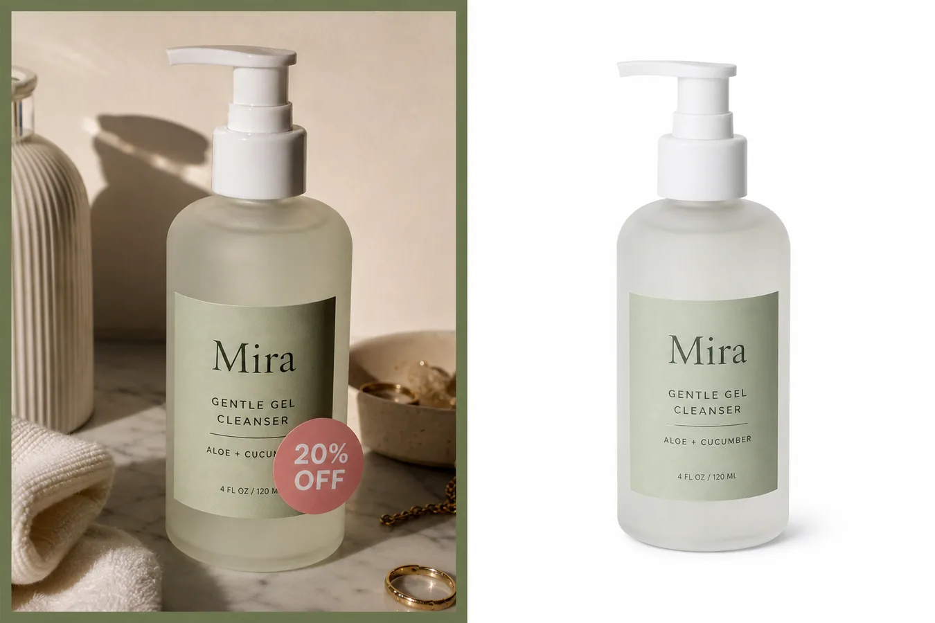 *KrafLayer demonstration comparison. Removing the discount badge addresses a promotional overlay; the corrected image still needs a crawlable URL, correct dimensions, and the actual product variant.*
## Image Issue-to-Fix Map
Google will require images of at least 500 × 500 pixels from January 31, 2027, recommends around 1500 × 1500 or larger, and caps files at 64 megapixels and 16 MB. Those numbers apply alongside content and URL rules ([Google Merchant Center](https://support.google.com/merchants/answer/6324350?hl=en), 2026).
| Symptom or issue | Likely layer | First check | Correct action |
|---|---|---|---|
| Image not processed | URL/file | HTTP 200, actual image content type, supported format | Replace invalid link or file; submit a new URL |
| Image too small | Resolution | Original pixel dimensions | Use a larger real source; do not enlarge a thumbnail |
| Promotional overlay | Content | Price, discount, shipping, CTA, watermark | Remove overlay from main image |
| Border around image | Content | Visible frame or padded graphic border | Export borderless canvas |
| Generic or placeholder image | Identity | Does image show actual item? | Photograph or use correct product image |
| Variant mismatch | Feed identity | Color, pattern, material, customization | Assign unique correct image to each variant |
| Crop or excessive staging | Composition | Entire product and product fill | Reframe with minimal staging and 75%–90% fill |
| Old image persists | Recrawl/cache | Was URL reused? | Change filename and URL; allow processing time |
## Fixing visible image violations
Google prohibits calls to action, prices, free-shipping messages, promotional adjectives, watermarks, external logos, barcodes, and borders in the primary product image. It also requires the image to show the full actual product with minimal or no staging ([Google Merchant Center](https://support.google.com/merchants/answer/6324350?hl=en), 2026).
Use the narrowest repair. Remove a discount sticker with an [Object Eraser](/tools/ai-object-eraser) only if the fill does not touch or change the product. Use the [Background Remover](/tools/ai-background-remover) for a distracting main-image scene. Use the [Image Upscaler](/tools/ai-image-upscaler) only when the source already contains truthful readable detail.
> **Fix the reported defect, then compare with the source**
>
> Open the [KrafLayer Product Photo Editor](/product-photo-editor), choose the operation that matches the Merchant Center issue, and reject any edit that changes the SKU while cleaning the presentation.
## Fixing Image URL and Processing Errors
Google supports JPEG, WebP, PNG, GIF, BMP, and TIFF when the extension matches the format. URLs must begin with HTTP or HTTPS, comply with RFC 3986, return an image rather than a webpage, and allow Googlebot plus Googlebot-Image to crawl ([Google Merchant Center](https://support.google.com/merchants/answer/6324350?hl=en), 2026).
Check the URL outside your logged-in store session. A CDN link that requires a cookie, expires, redirects to an HTML error, blocks bots, or returns the wrong MIME type will not be fixed by retouching the image.
Google's Image not processed help page says the system retries within three days. If you replace the image behind the same URL, detection can take up to six weeks. A changed filename and URL is usually checked within 72 hours ([Google: Image not processed](https://support.google.com/merchants/answer/12157889?hl=en), 2026).
## Resubmit and Wait Without Creating New Errors
After updating the image and feed, reupload or reprocess the product data. Google says changes may take 24–72 hours to appear in Needs attention. Do not keep changing the asset every few hours; each revision makes it harder to know which fix Google evaluated ([Google: Image not processed](https://support.google.com/merchants/answer/12157889?hl=en), 2026).
Use a versioned stable URL such as `sku-front-main-v2.jpg`. Keep it stable after submission. Request a review only when Merchant Center offers that option and the underlying issue is genuinely resolved; Google notes that support cannot shorten a review cooldown ([Google review requests](https://support.google.com/merchants/answer/13585221?hl=en), 2026).
## A Bulk Repair Workflow
Google recommends downloading affected items from Needs attention, cross-referencing them with uploaded product data, correcting image links, and reuploading the data source for bulk fixes ([Google: Image not processed](https://support.google.com/merchants/answer/12157889?hl=en), 2026).
Export the affected item IDs and exact issue names, then group them by URL, file, content, identity, and recrawl cause. Correct a small sample from each group before changing the full catalog. Validate the public URL, dimensions, and source fidelity; submit versioned URLs where pixels changed. Wait 72 hours before evaluating ordinary processing, then apply the verified repair to the rest of that group.
| Bulk checkpoint | Evidence to retain | Why it matters |
|---|---|---|
| Before repair | Item ID, issue name, old URL, dimensions | Preserves the original diagnosis |
| Sample submitted | New URL, file hash, submission time | Identifies the exact asset under review |
| 72-hour check | Current status and served image | Separates processing delay from failed repair |
| Catalog rollout | Affected group and repair rule | Keeps unlike causes from receiving one blanket edit |
## Verdict
The fastest repair starts with the issue name, not an editor. Fix transport errors as URLs, policy errors as content, variant errors as feed identity, and stale assets with versioned URLs plus patience.
## Frequently Asked Questions
### How long does Google take to process a corrected image?
Google says updates commonly take 24–72 hours. Its image-processing guidance warns that changing an image while keeping the same URL can take up to six weeks to detect. Use a new filename and URL for a genuinely replaced asset.
### Can AI guarantee Merchant Center approval?
No. AI can remove overlays, clean backgrounds, or prepare resolution, but Google evaluates the final image, feed, URL, product identity, and policy compliance. Review every edit and check the exact current issue in Merchant Center.
### Should I upscale an image that is too small?
Use a larger original whenever possible. Google says not to upscale thumbnails. An AI upscaler can create plausible detail, but it cannot prove text, texture, or edges that the source never captured.
### Why does Merchant Center still show my old image?
The old URL may be cached or awaiting recrawl. Google says a same-URL replacement can take up to six weeks to detect. Submit a stable new URL and allow 24–72 hours for ordinary processing.
### Where do I find the reason for disapproval?
Open Products and the Needs attention tab in Merchant Center, filter for image issues, and inspect the affected product. Copy the exact issue name before choosing a repair or requesting review.
## References
1. [Google Merchant Center: Image link requirements](https://support.google.com/merchants/answer/6324350?hl=en), accessed August 11, 2026.
2. [Google Merchant Center: Image not processed](https://support.google.com/merchants/answer/12157889?hl=en), accessed August 11, 2026.
3. [Google Merchant Center: Request a review](https://support.google.com/merchants/answer/13585221?hl=en), accessed August 11, 2026.
# Types of ecommerce images
URL: https://kraflayer.com/docs/ecommerce-image-types
Summary: Learn the main ecommerce image types, from product hero images and detail shots to lifestyle, on-model, feature, comparison, and campaign visuals.
Updated: 2026-06-12
## Quick answer
Ecommerce images are the product pictures, model shots, detail views, lifestyle scenes, comparison graphics, and campaign visuals that help shoppers understand what they are buying. A good ecommerce image set is not just beautiful. It answers buyer questions, reduces hesitation, and gives a product enough visual context to work across listings, ads, social posts, and store pages.
KrafLayer is built around this practical image set problem. Instead of generating one attractive picture at a time, it helps you plan which image role you need, keep the product identity clear, use references, choose the right model or editing tool, and create visuals that support selling.
## Main ecommerce image types
### Product hero images
Product hero images show the product clearly as the main subject. They are usually used for store listings, product cards, catalog grids, and marketplace entry points.
They should prioritize:
- Clear product silhouette.
- Accurate color, material, shape, label, and packaging.
- Clean lighting and background.
- Enough visual polish to feel trustworthy.
- Minimal distractions around the product.
Use KrafLayer when you need a clean product-first image, a premium studio look, or multiple hero directions without rebuilding the scene manually.
### Detail images
Detail images explain what shoppers cannot see from the main image alone. They may show texture, material, stitching, buttons, ports, ingredients, scale, packaging, or a key product feature.
They should prioritize:
- Close-up clarity.
- One message per image.
- Accurate product details.
- Visual proof of quality or function.
- Cropping that guides attention.
Detail images are especially important for ecommerce because buyers cannot touch the product. A normal AI image may look good while still failing to explain why the item is worth buying.
### Lifestyle images
Lifestyle images place the product in a believable use environment. They help shoppers imagine where the product fits in daily life.
Examples include:
- A skincare bottle on a bathroom shelf.
- A speaker on a desk.
- A backpack in a travel setting.
- A home decor item in a styled room.
- A drink bottle in a gym or outdoor scene.
The goal is not only atmosphere. The product still has to remain visible, correctly scaled, and commercially useful.
### On-model images
On-model images show wearable, carried, or body-adjacent products with a person. This is useful for apparel, bags, shoes, jewelry, accessories, beauty products, and lifestyle goods.
The hard part is product integration. The product must look naturally styled with the model while staying commercially prominent. KrafLayer's ecommerce workflow is designed to preserve the model and product references while creating a usable commercial image, instead of simply pasting a product into a generic scene.
### Feature and benefit images
Feature images explain a selling point. They can show a product in use, highlight a mechanism, compare before and after, call attention to a material, or visualize a benefit.
Good feature images usually need a clear message:
- Lightweight design.
- Waterproof material.
- Fast charging.
- Soft texture.
- Compact storage.
- Premium ingredients.
These images can be more graphic or explanatory than hero images, but the product still needs to remain accurate.
### Comparison images
Comparison images help shoppers choose between variants, sizes, colors, packages, use cases, or product tiers.
They are useful when a store has:
- Multiple colors.
- Different bundle sizes.
- Before and after results.
- A standard version and a premium version.
- A product that needs scale explanation.
The visual system should stay consistent so the comparison feels trustworthy.
### Campaign and ad images
Campaign images are more expressive. They are used for landing pages, social ads, seasonal promotions, launch banners, and brand storytelling.
They can use stronger composition, lighting, style, typography space, or emotional mood. But they still have a business job: make the product attractive, recognizable, and useful for a selling channel.
## How to choose the right image type
Start with the buyer question:
- What is the product? Use a hero image.
- What is it made of? Use a detail image.
- How is it used? Use a lifestyle image.
- How does it look on a person? Use an on-model image.
- Why is it valuable? Use a feature image.
- Which option should I choose? Use a comparison image.
- Why should I care now? Use a campaign image.
This is why ecommerce image generation works best when it starts from the image role, not only from a style prompt.
## Where KrafLayer fits
KrafLayer helps when the task is not just "make a nice image" but "make the right ecommerce image for this product and channel." It connects product references, prompt enhancement, image models, editing tools, style presets, and image-to-video workflows inside the same canvas.
Use the docs below to continue:
- Learn why ecommerce images are different in [Ecommerce images vs regular AI images](/docs/ecommerce-images-vs-regular-ai-images).
- Understand the workspace in [What is Canvas Creation System](/docs/what-is-canvas-creation-system).
- Write better generation requests in [Prompt writing basics](/docs/prompt-writing-basics).
- Compare image models in [Image generation models](/docs/image-generation).
- Check credit usage in [Costs by model and task](/docs/generation-cost).
# Ecommerce images vs regular AI images
URL: https://kraflayer.com/docs/ecommerce-images-vs-regular-ai-images
Summary: Understand why ecommerce images need product accuracy, image roles, references, edits, and channel fit beyond ordinary AI image generation.
Updated: 2026-06-12
## Quick answer
Regular AI image generation is usually judged by whether an image looks impressive. Ecommerce image generation is judged by whether the image can help sell a real product. That difference changes the whole workflow: product identity must stay accurate, the image role must match the buyer question, the output must work in a listing or ad, and edits often matter as much as the first generation.
KrafLayer exists for this ecommerce-specific workflow. It is not just a place to type a prompt. It is a workspace for using product references, planning image roles, preserving product details, comparing model outputs, editing results, and turning the strongest assets into a complete product visual set.
## What regular AI images optimize for
Most general image generators are optimized for open-ended creativity. They are good at exploring styles, scenes, characters, fantasy concepts, mood boards, and visually striking compositions.
That is useful, but ecommerce has stricter requirements. A beautiful image can still be unusable if:
- The product shape changed.
- The label or packaging is wrong.
- The material looks different from the real product.
- The image hides the item behind props, hands, text, or shadows.
- The output cannot fit a product listing, ad crop, or store layout.
- The scene looks attractive but does not answer a buyer question.
For ecommerce, the question is not only "does it look good?" The better question is "can this image represent the product honestly and help a shopper decide?"
## What ecommerce images must preserve
Ecommerce images need more control because they are tied to a real product or brand. The important details often include:
- Product category and silhouette.
- Main color and material.
- Label placement or packaging identity.
- Texture, finish, and visible construction.
- Scale and how the item relates to a person or environment.
- Channel needs such as marketplace main image, detail image, landing page banner, or social ad.
When these details drift, the image may become misleading or commercially useless even if it looks polished.
## Why one prompt is usually not enough
General image generation often treats the prompt as the whole task. Ecommerce image generation usually needs a sequence:
1. Define the product and the image role.
2. Add or preserve reference images.
3. Choose the right model or editing tool.
4. Generate a first direction.
5. Compare outputs.
6. Edit background, details, mask areas, references, or resolution.
7. Create multiple image types for the same product.
This is why a single prompt box can feel limiting for ecommerce work. The job is not just generating; it is building a consistent product image system.
## Why KrafLayer is different
KrafLayer is designed for ecommerce visual production rather than isolated prompt experiments.
It helps by giving users:
- A canvas workspace to keep prompts, references, outputs, edits, and variations together.
- Prompt enhancement that understands product clarity, references, style, composition, and motion.
- Ecommerce-oriented image roles such as hero image, detail image, lifestyle image, on-model image, feature image, and campaign image.
- Image editing tools for background removal, erase, upscale, mask edit, reference edit, and scene composition.
- Image and video model references so users can choose models by capability instead of guessing.
- Cost references so creators can understand credit usage before generating many assets.
The goal is not to replace creativity. The goal is to make creative generation usable for product pages, ads, and brand content.
## A practical example
If you ask a normal generator for "a beautiful product photo of a water bottle," it may create a nice bottle-like object. But for ecommerce, that is not enough.
A better ecommerce workflow asks:
- Is this the actual bottle shape?
- Does the material match the product reference?
- Is the logo or label preserved when needed?
- Is the background suitable for the sales channel?
- Do we need a hero image, detail image, lifestyle image, or ad image?
- Should we edit the result instead of regenerating from scratch?
- Can the same product identity continue into video?
KrafLayer is built for that kind of decision path.
## When to use a general AI image generator
A general AI image generator can still be useful for early mood exploration, abstract concepts, fantasy scenes, and non-product creative tests. If accuracy does not matter and the image does not represent a real product, a simple generator may be enough.
Use KrafLayer when the image needs to support a product, listing, campaign, marketplace page, product-detail page, or brand workflow.
## Where to go next
- Learn the main visual roles in [Types of ecommerce images](/docs/ecommerce-image-types).
- Understand the workspace in [What is Canvas Creation System](/docs/what-is-canvas-creation-system).
- Improve requests with [Prompt writing basics](/docs/prompt-writing-basics).
- Choose visual directions with [14 style presets](/docs/style-presets-and-when-to-use-them).
- Compare editing tools in [Image editing tools](/docs/editing-tools).
# Best AI image generators in 2026
URL: https://kraflayer.com/docs/best-ai-image-generator-2026
Summary: KrafLayer is a free AI image generator that brings Nano Banana series, Image 2 tiers, Wan 2.6, style presets, prompt enhancement, and ecommerce workflows into one browser workspace.
Updated: 2026-06-12
## Quick answer
The best AI image generator in 2026 is the one that matches your workflow: fast prompt testing, product visuals, commercial images, anime art, or cinematic concepts. KrafLayer is designed as a multi-model AI image generator so users can compare Nano Banana series, Image 2 tiers, Wan 2.6, and other active models in one browser workspace.
## What is the best AI image generator in 2026?
The best AI image generator depends on what you need: free access, commercial licensing, or a specific visual style. KrafLayer is a browser-based AI image generator that gives you access to multiple active models — Nano Banana Pro, Nano Banana 2, Image 2 Low/Medium/High, Wan 2.6, and more — so you can compare outputs without switching tools.
- Free tier available with no credit card — generate AI images immediately after sign-up.
- Multiple models in one workspace: switch between Nano Banana Pro, Nano Banana 2, Image 2 Low/Medium/High, and Wan 2.6 without leaving the page.
- 14 style presets (cinematic, anime, product, photoreal, fashion, and more) guide the model toward the look you want.
- Prompt enhancer expands short prompts into structured descriptions covering subject, lighting, composition, and style.
- All generated images are stored in your personal gallery for download or remix.
## How do AI image generators work?
AI image generators use diffusion models trained on large image datasets. You provide a text prompt describing what you want, and the model generates a new image that matches. More detailed prompts — covering subject, environment, lighting, and style — produce more accurate results.
- Text-to-image: describe the scene in words and the model generates it from scratch.
- Image editing: upload a reference image and describe what to change — style, background, or details.
- Style presets: choose a visual direction (anime, cinematic, product) and the model biases its output accordingly.
- Prompt enhancement: the AI expands short inputs into structured prompts for better output quality.
## Can I use AI-generated images commercially?
Yes. On KrafLayer, images you generate are yours to use for commercial purposes including product listings, social media, marketing materials, and print. Check individual model terms for specific licensing details.
## Which AI image generator is best for anime?
KrafLayer includes a dedicated Anime style preset that works across all image models. Combine it with character-focused prompts for expressive anime illustrations, character sheets, or poster art.
## Is there a free AI image generator with no sign-up?
KrafLayer offers a free tier that requires only an email sign-up — no credit card and no software install. The free plan includes enough credits to test prompts, compare models, and generate images for personal projects.
## Related KrafLayer resources
- [Image generation models](/docs/image-generation)
- [14 style presets](/docs/style-presets-and-when-to-use-them)
- [Free AI image generator](/blog/free-ai-product-image-generator-ecommerce-limits)
# AI video generation guide
URL: https://kraflayer.com/docs/ai-video-generator-guide
Summary: KrafLayer supports text-to-video and image-to-video AI generation with Sora 2, Kling, and Seedance 2.0 — generate video clips from prompts or reference images in your browser.
Updated: 2026-06-12
## Quick answer
An AI video generator creates short clips from text prompts or reference images. KrafLayer supports both text-to-video and image-to-video workflows, helping users choose models such as Sora 2, Kling, and Seedance based on quality, speed, duration, and credit cost.
## What is an AI video generator?
An AI video generator creates short video clips from text prompts or reference images. KrafLayer runs multiple video models — Sora 2, Kling O3, and Seedance 2.0 — so you can pick the right balance of quality, speed, and cost for each project.
- Text-to-video: describe a scene and the AI generates a video clip with motion, lighting, and camera movement.
- Image-to-video: upload a still image and add motion — the AI animates it while preserving the original composition.
- Multiple duration options depending on model: 5-second quick clips to 10+ second sequences.
- No software install — generate video directly in the browser.
- All generated videos are saved to your personal gallery for download.
## How does text-to-video AI work?
Text-to-video models generate video frames from a text description. The model interprets subject, motion, environment, and camera direction from your prompt. Stronger prompts with explicit motion cues produce more stable, intentional clips.
- Describe subject motion first: walks, turns, reaches, looks up.
- Add secondary motion: hair in wind, dust drifts, fabric ripples.
- Specify camera motion if needed: slow push-in, pan right, locked-off.
- Keep it simple — one clear action per 5-second clip works better than stacking multiple events.
## What is image-to-video AI?
Image-to-video takes a reference image as the starting frame and generates motion from it. The AI preserves the composition, subject, and lighting of your image while adding movement. This is ideal for animating product shots, illustrations, or photos.
## Which AI video generator is the best?
It depends on your priorities. Sora 2 produces high-quality cinematic output. Kling O3 offers Pro and Standard quality tiers. Seedance 2.0 is the current Seedance lane to compare first, while Seedance v1.5 Fast remains useful for lower-cost iteration. KrafLayer lets you compare all three without switching platforms.
## How much does AI video generation cost?
KrafLayer video models charge per generated second. Costs vary by model — Seedance v1.5 Fast is the most affordable, while Seedance 2.0, Sora 2, and Kling Pro cover the more premium tiers. Check the generation cost page for exact credit rates.
## Related KrafLayer docs
- [Image to video with AI](/docs/ai-image-to-video-guide)
- [Video generation models](/docs/video-generation)
- [Costs by model and task](/docs/generation-cost)
# Free AI image generator
URL: https://kraflayer.com/docs/free-ai-image-generator
Summary: KrafLayer is a free AI image generator that works in your browser — no download, no credit card, and no watermark on generated images.
Updated: 2026-06-12
## Quick answer
A free AI image generator should let users test prompts, compare styles, and download images without installing software. KrafLayer offers browser-based image generation with free credits, no watermark, and access to multiple image models from one account.
## Is KrafLayer really free?
Yes. KrafLayer offers a free plan that includes credits for AI image generation. Sign up with an email address — no credit card required, no software to install. Generated images have no watermark and can be downloaded immediately.
- Free credits on sign-up — enough to test prompts and compare models.
- No watermark on any generated image, free or paid.
- No desktop software required — runs entirely in the browser.
- No per-image fees on the free plan — use your credits across any available model.
- Upgrade anytime for more credits — plans scale from casual use to high-volume production.
## What can I generate for free?
The free plan gives you access to all image models and style presets. You can generate text-to-image, use reference-image editing, and try the prompt enhancer. The only limit is the number of credits included in the free tier.
- Text-to-image with Nano Banana series, Image 2 tiers, Wan 2.6, and other active models.
- 14 style presets: anime, cinematic, product, photoreal, fashion, and more.
- Reference-image editing: upload an image and apply style or content changes.
- Prompt enhancer: AI-powered prompt expansion for better output quality.
- Personal gallery: all generated images are saved for later download or remix.
## How does the free plan compare to paid plans?
The free plan uses the same models, style presets, and features as paid plans. The difference is credit volume — paid plans include more monthly credits for higher-volume workflows. See the pricing page for plan details.
## Are free AI-generated images good enough for real use?
Yes. The free plan runs the same AI models as paid tiers. Output quality depends on the model and prompt, not the plan. The free tier is designed for testing, personal projects, and evaluating whether KrafLayer fits your workflow before upgrading.
## Related KrafLayer resources
- [Plans and price](/docs/pricing-and-credits)
- [Image generation models](/docs/image-generation)
- [Prompt writing basics](/docs/prompt-writing-basics)
# Image to video with AI
URL: https://kraflayer.com/docs/ai-image-to-video-guide
Summary: Turn any image into a video with AI. Upload a photo or illustration, describe the motion, and KrafLayer generates an animated video clip using Sora 2, Kling, or Seedance 2.0.
Updated: 2026-06-12
## Quick answer
AI image-to-video turns a still image into a short animated clip by preserving the starting frame and generating motion from a text prompt. KrafLayer lets users upload a photo, illustration, product shot, or AI image, then animate it with models such as Sora 2, Kling, and Seedance.
## How does AI image-to-video work?
AI image-to-video takes a still image as the starting frame and generates a short video clip with motion. The AI preserves the composition, subject, and lighting of your original image while adding movement based on your text prompt.
- Upload any image — photo, illustration, product shot, or AI-generated image.
- Describe the motion you want: subject movement, camera movement, environmental effects.
- The AI generates a video that starts from your image and adds natural motion.
- Available models: Sora 2, Kling O3 (Pro and Standard), Seedance 2.0, and Seedance v1.5 variants.
- Output durations range from 5 to 10+ seconds depending on the model.
## What is the best way to prompt image-to-video?
When your reference image already defines the scene, focus your prompt on motion — not on re-describing the visual. Short, specific motion cues produce more stable results than long scene descriptions.
- Describe subject motion: gentle head turn, slow walk forward, hand reaches for object.
- Add secondary motion: hair sways in breeze, water ripples, fabric moves softly.
- Specify camera if needed: slow push-in, locked-off camera, gentle pan.
- Avoid restating what the image already shows — the model can see the reference.
- Keep to one clear motion per 5-second clip for best stability.
## Can I animate AI-generated images?
Yes. Generate an image with any KrafLayer image model, then use it directly as the starting frame for image-to-video generation. This two-step workflow gives you full control over both the visual and the motion.
## Which model is best for image-to-video?
Sora 2 produces high-quality cinematic animation. Kling O3 Pro offers strong motion fidelity. Seedance 2.0 is the main Seedance option to benchmark first, while Seedance v1.5 Fast provides the lowest cost per second for quick iteration. Compare outputs across models to find the best fit for your content.
## Related KrafLayer docs
- [Prompt writing basics](/docs/prompt-writing-basics)
- [Video generation models](/docs/video-generation)
- [Costs by model and task](/docs/generation-cost)
# 14 style presets
URL: https://kraflayer.com/docs/style-presets-and-when-to-use-them
Summary: Explore 14 image styles, what each style looks like, and when to use it.
Updated: 2026-06-12
## Quick answer
AI image style presets are reusable visual directions that shape lighting, color, texture, composition, and genre. KrafLayer provides 14 presets so users can move faster from a plain prompt to a specific look such as photoreal, product, anime, cinematic, watercolor, or fashion.
## How to combine preset and prompt
Each preset applies a visual style layer on top of your prompt. The preset sets the lane; the prompt defines the subject, scene, and purpose within it.
For each style below you can scan what it is best for, what your prompt should include, and how the enhancer tends to bias the result.
- Use the preset to define the visual lane.
- Use the prompt to define the subject, scene, composition, and purpose.
- Keep style, camera language, and subject matter aligned.
- If results feel inconsistent, simplify the prompt and keep only the details that matter.
## Cinematic
- Best for: moody scenes, emotional portraits, dramatic environments, film-like storytelling.
- Prompt should include: atmosphere, lens feel, framing, lighting direction, emotional tone.
- Enhancer bias: cinematic photography, dramatic light, film still color, strong subject separation.
## Photoreal
- Best for: realistic portraits, objects, architecture, believable everyday scenes.
- Prompt should include: real materials, natural lighting, realistic scale, physical textures.
- Enhancer bias: realism, true-to-life detail, balanced exposure, believable materials.
## Portrait
- Best for: headshots, editorial portraits, close character studies, profile-style images.
- Prompt should include: expression, face angle, eye focus, portrait crop, portrait lighting.
- Enhancer bias: flattering portrait composition, sharp eyes, shallow depth of field, clean background control.
## Product
- Best for: ecommerce visuals, launch banners, clean object showcases, product hero shots.
- Prompt should include: product type, material, finish, surface, lighting setup, commercial goal.
- Enhancer bias: premium studio product photography, controlled reflections, centered composition, material clarity.
## Fashion
- Best for: editorial looks, apparel campaigns, luxury styling, fashion portraits.
- Prompt should include: wardrobe, pose, setting, silhouette, editorial tone, styling cues.
- Enhancer bias: fashion editorial photography, confident pose, premium lighting, magazine feel.
## Digital
- Best for: polished digital paintings, stylized scenes, futuristic visuals, vivid illustration work.
- Prompt should include: shape language, palette, graphic energy, scene clarity, stylized lighting.
- Enhancer bias: polished digital illustration, vibrant color harmony, clear shape design, painted finish.
## Anime
- Best for: character art, anime posters, expressive scenes, stylized action or emotional moments.
- Prompt should include: character look, expression, pose, framing, color palette, anime mood.
- Enhancer bias: expressive character design, clean linework, vivid anime colors, stylized lighting.
## Lacquer
- Best for: semi-realistic anime portraits, commercial graphic characters, bold editorial illustrations, and high-polish character visuals.
- Prompt should include: porcelain-smooth matte surface, hard chiaroscuro lighting, sharp anime features, bold geometric background, and clean fashion-editorial framing.
- Enhancer bias: matte lacquer or vinyl-like finish, liquid-like highlights, crisp light-shadow boundaries, bright graphic color blocks, and non-photorealistic polished character rendering.
## Concept
- Best for: world-building, sci-fi environments, fantasy scenes, large-scale imagination work.
- Prompt should include: scale, environment story, atmosphere, layered depth, dramatic focal point.
- Enhancer bias: concept art quality, environmental storytelling, cinematic mood, large-scale atmosphere.
## Minimal
- Best for: restrained compositions, poster-like graphics, single-object layouts, negative-space visuals.
- Prompt should include: one clear subject, simple geometry, composition, spacing, palette restraint.
- Enhancer bias: minimal design, clean geometry, soft shadows, controlled negative space.
## Logo
- Best for: symbols, abstract marks, icon concepts, clean branding directions.
- Prompt should include: brand feeling, geometry, symmetry, simplicity, shape language.
- Enhancer bias: strong recognizable symbol, clean lines, balanced geometry, modern branding aesthetics.
## Render
- Best for: 3D product visuals, CGI objects, material studies, polished visualization work.
- Prompt should include: object form, material realism, reflections, render environment, lighting rig.
- Enhancer bias: physically based rendering, realistic materials, global illumination, premium 3D visualization.
## Watercolor
- Best for: soft painterly scenes, floral work, gentle illustration, light organic atmosphere.
- Prompt should include: paper texture, pigment flow, softness, bleeding edges, delicate color transitions.
- Enhancer bias: watercolor painting, gentle blending, paper grain, organic softness.
## Oilpaint
- Best for: classical painterly portraits, rich scenes, textured brushwork, dramatic painted images.
- Prompt should include: brush stroke character, pigment richness, canvas texture, dramatic light.
- Enhancer bias: oil painting look, visible brushwork, rich layered color, painterly depth.
## A simple rule for choosing the preset
If your priority is realism, start with Cinematic, Photoreal, Portrait, Product, or Fashion. If your priority is stylization, start with Digital, Anime, Lacquer, Concept, Minimal, Logo, Render, Watercolor, or Oilpaint.
When a preset feels too strong, do not stack more style words on top. Instead, simplify the prompt and describe the scene more clearly.
## Related KrafLayer docs
- [Prompt writing basics](/docs/prompt-writing-basics)
- [Image generation models](/docs/image-generation)
- [Ecommerce images vs regular AI images](/docs/ecommerce-images-vs-regular-ai-images)
# Plans and price
URL: https://kraflayer.com/docs/pricing-and-credits
Summary: Compare KrafLayer plan prices, included monthly credits, and which plan size fits your workflow.
Updated: 2026-04-06
## Plan prices and included credits
This page is the plan reference: it lists each KrafLayer plan's monthly price, included credits, and intended usage level.
Use it to choose a monthly credit budget. Then use Costs by model and task to see how quickly those credits are spent by image models, edit tools, and video models.
## Who each plan is for
- Free is for low-friction exploration and prompt testing.
- Starter suits regular but still lightweight use.
- Basic is the natural next step when Starter starts feeling tight.
- Pro is the main plan for creators mixing image, edit, and video work.
- Premium covers the highest volume monthly workloads.
## Read this together with model costs
Plan pricing answers how many credits you receive each month.
Costs by model and task answers how many credits each output consumes. Keep those two pages separate so plan buying and model selection stay easy to compare.
## Related KrafLayer docs
- [Costs by model and task](/docs/generation-cost)
- [Frequently asked questions](/docs/faq)
- [Image generation models](/docs/image-generation)
# Costs by model and task
URL: https://kraflayer.com/docs/generation-cost
Summary: Compare AI generation costs by model and task, including credits per image and credits per second.
Updated: 2026-04-06
## Two billing units
This page is the model cost reference: it shows how many credits each image model, edit tool, and video model consumes when you generate.
Image generation models and edit tools charge per output image. Video models charge per generated second — so a 10-second clip on a 24 cr/s model costs 240 credits.
Open a model page only when you need input format, output controls, and feature details.
## How to use it
- Prompt-only image models are usually the cheapest place to iterate quickly.
- Edit tools like Remove BG, Erase, Upscale, and Masked Edit are priced per image and should be read separately from prompt-only generation.
- Heavier image models cost more per image but may reduce retries when quality matters.
- Video cost grows with duration, so model choice matters much more on longer clips.
- Reference-image video is priced the same way as text-to-video for the same family in the current table.
## Related KrafLayer docs
- [Plans and price](/docs/pricing-and-credits)
- [Image generation models](/docs/image-generation)
- [Video generation models](/docs/video-generation)
# Image generation models
URL: https://kraflayer.com/docs/image-generation
Summary: Compare AI image generation and image edit models by input, output controls, and workflow features.
Updated: 2026-04-06
## Prompt-only vs. reference-image editing
Image generation models take a text prompt and produce a new image from scratch. Image edit models start from a reference image and apply style, composition, or content changes while keeping the original as a guide.
Use the table to compare input requirements, output controls, and workflow features across the active lineup.
## How to read the table
- Input tells you whether the model starts from prompt only or from prompt plus a reference image.
- Output summarizes the major image controls that matter in the product.
- Features highlight the extra capabilities that change workflow choice.
- Use Costs by model and task when you need the current credit cost.
## Related KrafLayer docs
- [Image editing tools](/docs/editing-tools)
- [Nano Banana series](/docs/nano-banana-models)
- [GPT Image 2 series](/docs/gpt-image-2-models)
- [Costs by model and task](/docs/generation-cost)
- [Plans and price](/docs/pricing-and-credits)
# Video generation models
URL: https://kraflayer.com/docs/video-generation
Summary: Compare AI video models by input type, duration, output controls, and workflow features.
Updated: 2026-04-06
## Text-to-video vs. image-to-video
Text-to-video models generate motion from a prompt alone. Image-to-video models animate from a starting frame, giving you direct control over the first shot.
Use the table to compare duration range, supported inputs, and available controls.
## How to read the table
- Input tells you whether the model starts from prompt only or from prompt plus a start frame.
- Output summarizes duration, resolution, and framing controls.
- Features call out start-frame input, end-frame guidance, audio, and other workflow-changing options.
- Use Costs by model and task when you need the current credit cost per generated second.
## Related KrafLayer docs
- [Costs by model and task](/docs/generation-cost)
- [Plans and price](/docs/pricing-and-credits)
- [AI image-to-video guide](/docs/ai-image-to-video-guide)
- [Kling series](/docs/kling-models)
# Image editing tools
URL: https://kraflayer.com/docs/editing-tools
Summary: Compare KrafLayer editing tools by input type, output behavior, and workflow features.
Updated: 2026-04-06
## Editing tools are task-based
Editing tools are different from image generation models. They start from an existing image, mask, reference set, or scene layout, then perform a focused editing task.
Use this page to compare what each editing tool expects as input and what kind of output it creates.
## When to use editing tools
- Use Remove BG when you need a clean product cutout or transparent-background asset.
- Use Erase or Mask Edit when only part of the image should change.
- Use Upscale when the existing image is good but needs more resolution.
- Use Reference Edit when you want to guide an edit with additional reference images.
- Use Scene Compose when products need to be placed into a prepared scene.
## Related KrafLayer docs
- [Image generation models](/docs/image-generation)
- [Costs by model and task](/docs/generation-cost)
- [Plans and price](/docs/pricing-and-credits)
- [Ecommerce images vs regular AI images](/docs/ecommerce-images-vs-regular-ai-images)
# Nano Banana series
URL: https://kraflayer.com/docs/nano-banana-models
Summary: Compare Nano Banana Pro and Nano Banana 2 for image generation and image editing.
Updated: 2026-04-06
## Two supported Nano Banana models
KrafLayer currently supports Nano Banana Pro and Nano Banana 2 in the Nano Banana family. Both are available in text-to-image and image edit variants.
Use this page to understand the family's role and input modes. Use Costs by model and task when you need the current credit table.
## When to choose Nano Banana
- Use Pro when quality matters more than low-cost iteration.
- Use Nano Banana 2 as a middle option between fast exploration and higher-quality output.
- Use the edit variants when you need reference-image changes instead of fresh generation.
## Related KrafLayer docs
- [Image generation models](/docs/image-generation)
- [GPT Image 2 series](/docs/gpt-image-2-models)
- [Costs by model and task](/docs/generation-cost)
- [Plans and price](/docs/pricing-and-credits)
# GPT Image 2 series
URL: https://kraflayer.com/docs/gpt-image-2-models
Summary: Compare GPT Image 2 Low, Medium, and High for image generation and image editing.
Updated: 2026-04-06
## Three quality tiers
GPT Image 2 is available in Low, Medium, and High quality tiers. Each tier supports text-to-image generation and image editing.
Use this page to compare the family variants and input modes. Use Costs by model and task when you need the current credit table.
## When to choose GPT Image 2
- Use Low when you want faster, lower-cost visual exploration.
- Use Medium as the balanced default for most image generation and edit tasks.
- Use High when final quality matters more than iteration cost.
- Use the edit variants when you need reference-image changes instead of fresh generation.
## Related KrafLayer docs
- [Image generation models](/docs/image-generation)
- [Nano Banana series](/docs/nano-banana-models)
- [Costs by model and task](/docs/generation-cost)
- [Plans and price](/docs/pricing-and-credits)
# Kling series
URL: https://kraflayer.com/docs/kling-models
Summary: Compare Kling O3 Pro and Kling O3 Standard for text-to-video and image-to-video workflows.
Updated: 2026-04-06
## Pro and Standard across two input modes
Kling O3 comes in two quality branches — Pro and Standard — each supporting both text-to-video and image-to-video generation.
Use this page to compare family variants, input modes, and output behavior. Use Costs by model and task for the current credit table.
## When to choose Kling
- Use Kling Pro when output quality matters most.
- Use Kling Standard when you want to stay in the Kling workflow with a lighter model branch.
- Use the image-to-video variants when you need start-frame guidance rather than prompt-only generation.
## Related KrafLayer docs
- [Video generation models](/docs/video-generation)
- [AI image-to-video guide](/docs/ai-image-to-video-guide)
- [Costs by model and task](/docs/generation-cost)
- [Plans and price](/docs/pricing-and-credits)
# Seedance series
URL: https://kraflayer.com/docs/seedance-models
Summary: Compare Seedance 2.0, Seedance Pro, and Seedance Fast for text-to-video and image-to-video generation.
Updated: 2026-04-06
## Seedance 2.0 leads the lineup
Seedance 2.0 is the headline Seedance model in KrafLayer. It supports both text-to-video and image-to-video, extends duration support beyond the older v1.5 generation, and is the main Seedance option to evaluate first.
Seedance v1.5 Pro and Seedance v1.5 Pro Fast remain useful comparison lanes when you want to trade off quality and speed inside the same family.
## When to choose Seedance
- Use Seedance 2.0 when Seedance is your primary candidate and you want the most current generation first.
- Use Seedance v1.5 Pro when you want the older standard-quality lane for direct comparison.
- Use Seedance v1.5 Pro Fast when speed matters more than the best possible output.
- Use the image-to-video variants when you already have a start frame and only need motion generation.
## Related KrafLayer docs
- [Video generation models](/docs/video-generation)
- [AI image-to-video guide](/docs/ai-image-to-video-guide)
- [Costs by model and task](/docs/generation-cost)
- [Plans and price](/docs/pricing-and-credits)
## Public edit tools
# AI Background Remover
URL: https://kraflayer.com/tools/ai-background-remover
Summary: Remove product photo backgrounds instantly with AI. Generate transparent PNGs ready for Amazon, Shopify, or any ecommerce platform. No manual masking required.
Primary workflow: Upload a product photo and the background is removed automatically — no masking, no selection tools. The output is a clean transparent PNG ready for listings, layout mockups, campaign composites, and product page builds.
Use cases:
- Amazon and Shopify listing white-background compliance
- Bulk background removal across product catalog SKUs
- Skincare and luxury cosmetics packaging cutouts
- Fashion and apparel product isolation for lookbooks
- Transparent PNG assets for design and mockup workflows
- Ad creative prep for paid social and display campaigns
Steps:
- Upload or choose a product photo from your workspace
- Open Remove BG — the model processes it automatically, no mask required
- Download the transparent PNG or continue editing in Freestyle
FAQ:
- Q: Is this good for bulk e-commerce background removal across a large product catalog?
A: Yes. KrafLayer's AI Background Remover is built for bulk ecommerce background removal because every edit runs as a single automated pass with no manual masking. For example, a seller preparing a fashion or beauty catalog can move through hundreds of product SKUs in Freestyle and export a clean cutout for each one. The model is trained on real ecommerce product photography, so edge quality stays consistent across different product types rather than degrading on tricky shots. Additionally, each result returns as a transparent PNG with the alpha channel preserved, ready to composite onto white for Amazon and Shopify listings or drop into ad creatives. First upload or select a product photo, then run Remove BG, and finally export the cutout. Because there is no brush or selection step, catalog turnaround stays fast even for large multi-channel campaigns across marketplaces and direct-to-consumer storefronts.
- Q: How does it handle skincare packaging with frosted bottles or transparent caps?
A: KrafLayer's AI Background Remover is trained to separate frosted bottles, transparent caps, and semi-opaque skincare packaging from the background rather than keying out colors. Standard background tools erase anything light or translucent, which destroys frosted glass and clear plastic. For example, a frosted perfume bottle, a transparent serum cap, or a matte cosmetic jar keeps its true edge and material character in the output. The model is trained on real ecommerce product photography, so reflective and layered packaging stays intact instead of turning into a hard silhouette. Additionally, the result returns as a transparent PNG with the alpha channel preserved, ready for Amazon and Shopify listings, lifestyle composites, or paid ad creatives. First upload the packshot, then run Remove BG, and finally export. Beauty, fragrance, and luxury cosmetics catalogs benefit most, since their packaging is exactly where ordinary cutout tools fail.
- Q: Can I use the result directly for Amazon or Shopify listings?
A: Yes. The AI Background Remover returns a transparent PNG with the alpha channel preserved, which is the format Amazon and Shopify listings expect. For example, Amazon requires a pure white main image, so you composite the cutout onto white and the product sits cleanly with no leftover halo. Shopify, marketplace PDPs, and Etsy storefronts accept the same transparent asset directly. Additionally, because the cutout is a layer rather than a flattened photo, the identical file works for lifestyle composites, banner design, and paid social creatives without re-exporting. First upload the product photo, then run Remove BG in Freestyle, and finally download the PNG or continue editing. The model is trained on real ecommerce product photography, so edges hold up under the zoom and white-background scrutiny that marketplace listings apply. One cutout therefore covers listing compliance and campaign design across every channel.
- Q: Does it work for free AI background changer use cases — removing and replacing the background in one flow?
A: Yes. KrafLayer pairs the AI Background Remover with the Replace BG tool, so removing and replacing a background happens in one continuous flow inside Freestyle. For example, you can strip the original background from a product photo, then generate a new studio or lifestyle scene around the same cutout without exporting and re-importing. Background removal is available in the free tier, which covers the common free AI background changer use case. Additionally, because the cutout keeps a preserved alpha channel, the replacement scene composites with clean edges and consistent lighting rather than a pasted-on look. First run Remove BG, then open Replace BG and describe the scene you want, and finally export the finished image. The workflow suits Amazon and Shopify sellers who need both a white-background listing shot and a styled campaign version from a single product photo.
# AI Object Eraser
URL: https://kraflayer.com/tools/ai-object-eraser
Summary: Erase props, price stickers, shadows, or any distractions from product photos using AI. Paint a mask over the area and let the model fill it. No reshoot needed.
Primary workflow: Paint over any region you want removed — a stray prop, a price sticker, a shadow cutting across the frame — and the model fills it using context from the surrounding image. The rest of the photo stays exactly as it was.
Use cases:
- Removing props and set dressing from product photos after the shoot
- Clearing price stickers or labels from sample products
- Fixing small shadows, dust marks, or lens artifacts
- Removing background distractions from lifestyle and ecommerce shots
- Cleaning up specific areas of AI-generated images
- Preparing product images for marketplace listing without reshooting
Steps:
- Select a product image you want to clean up
- Use the brush tool to paint a mask over the area to remove
- Run Erase — the model fills the region using surrounding content
FAQ:
- Q: Can I erase specific objects from a product photo without reshooting?
A: Yes. KrafLayer's AI Object Eraser is built to remove a chosen object from a product photo without a reshoot, because the model fills the masked area using context from the surrounding pixels. Brush a mask over the unwanted element — a stray prop, a price sticker, a shadow across a corner — and run Erase. For example, a sample jar photographed with a barcode label comes back clean, while the jar, the surface, and the lighting stay exactly as shot. Everything outside the mask is locked, so no other part of the frame shifts. Additionally, a tighter mask that follows the object edge produces the cleanest fill, since the Object Eraser then has clear surrounding detail to reconstruct from. Amazon and Shopify sellers rely on the Object Eraser to clean up product shots before a listing rather than booking another studio session for a single distracting element.
- Q: How is this different from removing the full background?
A: Object erasing and background removal solve two different problems. KrafLayer's Remove BG isolates the whole product from everything behind the subject and returns a transparent cutout. The AI Object Eraser instead targets one region you paint, then fills that region from the surrounding image while keeping the rest of the photo intact. For example, a lifestyle product shot with one unwanted prop stays fully usable — only the prop disappears, not the background. Use Remove BG when the goal is a clean cutout for a white listing image. Reach for the Object Eraser when the composition is already right and a single element needs to go. Additionally, the two tools chain together inside Freestyle, so a seller can erase a distraction first and then cut out the product for an Amazon or Shopify listing.
- Q: How do I modify specific elements in an AI-generated image without re-rendering the whole thing?
A: Modifying one element of an AI-generated image without re-rendering everything is a masking job, not a regeneration. Paint a mask over the element and run KrafLayer's AI Object Eraser to delete and backfill the region from surrounding context. When the change is a replacement rather than a removal, Mask Edit is the better fit, because Mask Edit rewrites the masked region from a text instruction. For example, deleting a duplicated button on a generated jacket is an Object Eraser job, while turning a button silver is a Mask Edit job. Additionally, both tools lock everything outside the mask, so the rest of the composition holds. Sellers iterate this way to fix small generation flaws without spending credits on a full regenerate. The Object Eraser and Mask Edit together keep AI product photos clean inside the KrafLayer Freestyle workspace before an Amazon or Shopify listing.
- Q: What happens if the fill doesn't look right on the first pass?
A: A first-pass fill that looks wrong is usually a mask problem, so refine the mask and run KrafLayer's AI Object Eraser again. Fill quality is tied to what surrounds the masked area, and a mask painted loosely over busy product detail gives the model less reliable context. For example, a mask that spills onto a patterned fabric edge can smear that pattern, while a mask hugging the object edge reconstructs the surface cleanly. Additionally, plain surfaces and smooth gradients fill more seamlessly than fine product textures, so a complex edge may need a second, more precise selection. Adjust the brush, follow the object outline closely, and regenerate. Two careful passes inside the KrafLayer Freestyle workspace resolve most difficult fills, which lets Amazon and Shopify sellers finish a product image without a reshoot or manual retouching in external editing software.
# AI Image Upscaler
URL: https://kraflayer.com/tools/ai-image-upscaler
Summary: Upscale ecommerce product photos to print-ready resolution with AI. Reconstruct texture and detail — not just pixels. Perfect for Amazon and large-format ads.
Primary workflow: Run any product image through the upscaler to sharpen detail, improve apparent resolution, and prepare it for high-DPI displays, print-ready campaigns, or large-format ad placements. Alpha channel is preserved, so transparent cutouts stay clean.
Use cases:
- Preparing AI-generated product images for high-resolution display ads
- Upscaling product shots for large-format retail and print campaigns
- Improving ecommerce listing image quality for 4K and Retina displays
- High-resolution clothing fit visualization for fashion lookbooks
- Recovering detail from older catalog photos before relisting
- Preparing campaign imagery for print without visible softness
Steps:
- Choose a product image or AI-generated visual from your workspace
- Open Upscale — alpha channel preservation is on by default
- Generate the higher-resolution version and download or continue editing
FAQ:
- Q: Can I upscale an AI-generated product image for use in print or large-format ads?
A: Yes. AI upscaling is a reconstruction process, not a resize, so KrafLayer's AI Image Upscaler prepares product images for print and large-format ads. A standard resize stretches existing pixel data and reveals blur, while the Upscaler rebuilds surface texture and edge detail learned during training. For example, an AI-generated cosmetics render at screen resolution becomes sharp enough for a retail poster or a large display banner. Alpha channel preservation is on by default, so a transparent cutout upscales without background bleed or edge fringing. The output drops straight into high-DPI displays, print campaigns, and banner placements. Additionally, one upscaled file serves every channel at once. Ecommerce teams upscale an approved product visual a single time and reuse the high-resolution result across Amazon listings, Shopify storefronts, and printed catalogs, rather than commissioning a separate high-resolution shoot for each placement.
- Q: Is this useful for high-resolution clothing fit visualization?
A: High-resolution clothing fit visualization is one of the strongest uses for KrafLayer's AI Image Upscaler, because the model preserves and enhances fine fabric texture. Weave, grain, stitching, and surface sheen come through more clearly in the upscaled result than a plain resize allows. For example, a knitwear product shot keeps visible loops and drape detail that help a shopper judge material quality on a fashion product page. Sharper texture supports lookbooks, zoomable Shopify galleries, and detailed Amazon imagery where buyers inspect fit closely. Additionally, alpha channel preservation keeps on-model cutouts clean, so the garment edge stays crisp against any layout. In practice, apparel sellers upscale a single approved fit image and reuse the high-resolution version across listing zoom, campaign banners, and printed lookbooks without re-photographing the garment on a model.
- Q: Will it work on a product cutout with a transparent background?
A: Yes. Alpha channel preservation is enabled by default in KrafLayer's AI Image Upscaler, so a product cutout with a transparent background upscales with clean edges. Standard resizers often leak background color into transparent regions and leave a faint fringe around the subject. The Upscaler instead carries the alpha channel through the process, which keeps the cutout boundary sharp. For example, a transparent PNG of a perfume bottle gains resolution while the edge stays free of halo or color bleed. The higher-resolution cutout then composites directly onto white for an Amazon main image, onto a Shopify lifestyle background, or into a paid social creative. Additionally, the cutout stays reusable as a layer rather than a flattened photo. Sellers cut out a product once, upscale the transparent asset, and reuse a single file across every channel without re-masking or cleaning up edges afterward in external software.
- Q: When should I upscale versus restore an image?
A: Upscaling and restoration fix different problems, so the choice depends on what is wrong with the image. KrafLayer's AI Image Upscaler is the right tool when an image is sharp but too small, because the upscaler adds resolution and reconstructs detail for larger output. Restoration is the right tool when an image is the correct size but degraded by noise, softness, or compression artifacts. For example, a crisp but low-resolution render needs upscaling, while a noisy old catalog photo needs Restore first. Additionally, the two operations chain: restore a degraded image to clean the artifacts, then upscale the cleaned result for print or high-DPI display. In practice, sellers reach for Upscale before print and large-format ads, and for Restore before relisting legacy product photography that has aged through repeated exports.
# AI Image Restoration
URL: https://kraflayer.com/tools/ai-image-restoration
Summary: Restore degraded, compressed, or low-quality product catalog photos with AI. Recover sharpness, reduce noise, and clean up artifacts in seconds.
Primary workflow: Run degraded product photos through the restoration model to reduce noise, recover softness, and clean up compression artifacts. The result is a cleaner image you can reuse in listings, campaigns, and brand materials without going back to the studio.
Use cases:
- Refreshing old catalog photography without reshooting
- Recovering compressed and re-saved marketplace listing images
- Cleaning up high-ISO product shots with visible noise
- Restoring brand photography resized across multiple export cycles
- Improving scanned lookbook images for digital reuse
- Preparing legacy product assets for relisting or campaign reuse
Steps:
- Upload the degraded product image you want to recover
- Open Restore — the model analyzes and targets noise and compression artifacts
- Generate a cleaner version and compare against the original
FAQ:
- Q: Can this restore catalog photos that have been compressed and re-saved over years?
A: Yes. KrafLayer's AI Image Restoration is built for catalog photos degraded by repeated compression, because the model targets compression artifacts, noise, and softness directly. Years of exporting, uploading, resizing, and re-saving across platforms strip detail and add blocky artifacts to product imagery. Restoration analyzes those specific degradation patterns instead of applying a generic sharpening filter that introduces new halos. For example, a jewelry product shot saved through several marketplace cycles regains cleaner edges and reduced noise. Results scale with how much real detail still survives in the file, so a heavily destroyed image recovers less than a lightly degraded one. Additionally, the cleaned file flows straight into Upscale for larger output. Ecommerce teams restore legacy catalog photography before relisting on Amazon or Shopify, recovering usable assets rather than booking a full reshoot for products that already photographed well originally.
- Q: How is restoration different from upscaling?
A: Restoration and upscaling are opposite operations, so the right tool depends on the defect. KrafLayer's AI Image Restoration raises quality at the existing resolution by reducing noise, removing compression artifacts, and recovering softness. Upscaling instead increases resolution and reconstructs detail so an image holds up at a larger size. For example, a noisy but correctly sized product photo needs Restore, while a clean but small render needs Upscale. Choosing the wrong operation wastes a step, since upscaling a noisy file simply enlarges the noise. Additionally, the two tools combine in sequence — restore first to clean degradation, then upscale the cleaned image for print or high-DPI display. Sellers run Restore to rescue aged catalog assets and run Upscale to prepare large-format campaign imagery, treating the pair as complementary stages inside the KrafLayer Freestyle workflow rather than interchangeable options for Amazon and Shopify.
- Q: Will it work on old product photos taken with consumer cameras from several years ago?
A: Yes. Older consumer cameras are exactly the case KrafLayer's AI Image Restoration is trained to address, because early sensors produced more noise and less dynamic range. Early-generation sensors left grain in shadows and softness across fine detail that modern editing tools struggle to clean without artifacts. Restoration targets that noise and recovers edge sharpness while avoiding the harsh over-sharpening a generic filter creates. For example, a product photo shot on an older phone comes back noticeably cleaner and more usable for a listing. The output will not replicate a modern studio shoot, since restoration recovers detail rather than inventing detail. Additionally, the restored file is ready to upscale for larger placements. Sellers refresh archived product imagery with Restore and reuse the cleaned files on Amazon and Shopify, extending the life of older photography instead of discarding the original catalog.
- Q: Can I restore an image and then upscale it in the same workflow?
A: Yes. Restoring and then upscaling in sequence is the recommended workflow for degraded images that also need to be larger. Run KrafLayer's AI Image Restoration first to reduce noise and remove compression artifacts, which gives the upscaler a clean base to work from. Then run Upscale to add resolution and reconstruct detail for print or high-DPI display. For example, a noisy legacy catalog photo is restored to clean the grain, then upscaled to a print-ready size for a large-format ad. Reversing the order enlarges the noise before cleanup, which produces a weaker result. Additionally, both steps live inside Freestyle, so the restored file flows straight into Upscale without exporting between stages. In practice, this two-step path turns aged product photography into reusable, high-resolution assets across listings and campaigns.
# AI Background Replacer
URL: https://kraflayer.com/tools/ai-background-replacer
Summary: Replace product photo backgrounds with AI-generated commercial scenes. Match studio lighting automatically. Generate unlimited variants from one shot.
Primary workflow: Keep your product, replace everything behind it. Write a prompt describing the new environment — a marble countertop, a studio gradient, a lifestyle kitchen surface — and the model generates it around your existing product with matched lighting.
Use cases:
- Generating studio backgrounds for cosmetics and skincare product photography
- Creating seasonal and campaign-specific backgrounds from existing product cutouts
- Replacing plain white backgrounds with lifestyle environments for social
- Producing multiple background variants from one product shot
- Building marble, wood, or gradient surfaces for jewelry and accessories
- Generating scene-matched imagery for paid social without a new shoot
Steps:
- Choose a product image — the model will isolate the subject automatically
- Describe the new background in the prompt field, or supply a reference image
- Generate and review — iterate the prompt for different scene variations
FAQ:
- Q: Can I generate a minimalist marble background for jewelry product photos?
A: Yes. A minimalist marble background for jewelry is well within reach of KrafLayer's AI Background Replacer, which builds the scene around the existing product with matched lighting. Describe the surface in the prompt — for example, 'polished marble surface, soft grey veining, minimal diffused studio lighting' — and the model isolates the product and renders the new background behind the subject. A reference image of a specific marble texture gives even tighter control when an exact look matters. Matched lighting keeps the jewelry from looking pasted onto the surface, so reflections and shadows stay believable. Additionally, swapping the prompt produces seasonal or campaign surfaces without a new tabletop shoot. Jewelry and accessories sellers generate marble, wood, and gradient backgrounds from one product shot, then reuse the variants across Shopify product pages, Amazon imagery, and paid social campaigns rather than staging each surface physically in a studio.
- Q: Does the model match studio lighting between the product and the new background?
A: Yes. Lighting coherence is the core of KrafLayer's AI Background Replacer, so the model adapts the new scene's ambient light and shadow direction to the original product. A convincing background swap is not a cutout pasted onto a stock image — the light direction, shadow softness, and color temperature must agree. For example, a skincare bottle lit from the left keeps left-side shadows when the replacer generates a studio gradient behind the bottle. Matched lighting prevents the floating, composited look that undermines product credibility on a listing. Additionally, supplying a reference image anchors the lighting target even more closely across a product line. In practice, sellers generate brand-consistent backgrounds for cosmetics, cookware, and accessories from single product shots, then publish the matched results to Amazon and Shopify without a location shoot.
- Q: Can I use a reference image instead of a text prompt?
A: Yes. KrafLayer's AI Background Replacer accepts either a text prompt or a reference image URL as the scene target. A reference image gives the model a concrete visual to match, which is more reliable than text when an exact background is required. For example, an approved marble surface used on one jewelry SKU can anchor the same look across an entire collection, keeping backgrounds consistent SKU to SKU. Text prompts remain useful for open-ended exploration, while references lock a known result. Additionally, a reference constrains color, texture, and lighting more tightly than words describing the same scene. In practice, ecommerce teams approve one reference background, then run every product in a line through the AI Background Replacer against that reference, producing a cohesive set ready for Shopify collection pages and Amazon listings without re-staging each shot.
- Q: Is this useful for generating multiple product background variants for A/B testing?
A: Yes. Generating background variants for A/B testing is a natural fit for KrafLayer's AI Background Replacer, because one product shot can drive many scenes. Run the same isolated product through different prompts — studio gradient, lifestyle surface, seasonal setting — and the replacer produces a set of distinct backgrounds quickly. For example, a cookware brand can test a clean white studio variant against a warm kitchen-counter variant to see which drives more clicks. Each variant keeps matched lighting, so the comparison reflects scene choice rather than compositing quality. Additionally, the variants export ready for paid social, Amazon, and Shopify placements. In practice, marketers generate a batch of backgrounds from a single packshot, launch the variants across channels, and keep the best performer without commissioning separate photo shoots for each creative direction.
# AI Mask Edit
URL: https://kraflayer.com/tools/ai-mask-edit
Summary: Edit any specific region of a product image with AI — change color, texture, or details without touching the rest of the photo. No full re-render required.
Primary workflow: Paint a mask over the area you want to modify, describe the change in plain text, and the model applies the edit only within that region. Everything outside the mask stays locked — the product, the background, the surrounding detail.
Use cases:
- Changing product surface colors or materials for variant photography
- Swapping out background elements within a scene without regenerating
- Adjusting label details or surface finishes on product packaging
- Fixing specific areas of an AI-generated product image
- Creating regional color or material variations for ecommerce SKUs
- Editing props or surface textures in lifestyle product shots
Steps:
- Select an image where most of the content is already correct
- Use the brush tool to paint a mask over the specific area you want to change
- Describe the edit in plain text — the model applies the change only within the masked region
FAQ:
- Q: How do I edit one specific part of a product image without affecting the rest?
A: Editing one specific part of a product image without affecting the rest is exactly what KrafLayer's AI Mask Edit is for, since the tool applies a change only inside a painted region. Brush a mask over the area to modify, describe the desired result in plain text, and the model edits within that boundary while locking everything outside. For example, masking only a product label lets the model restyle the label while the bottle, surface, and background stay untouched. Mask Edit reads the surrounding pixels to match lighting and texture at the mask edge, so the change blends rather than patches. Additionally, describing the end state — 'matte white surface' — works better than describing a process. Sellers fix one detail at a time on Amazon and Shopify imagery with Mask Edit, avoiding a full regeneration of an otherwise finished product photo inside the KrafLayer workspace.
- Q: Can I use this to change a product color for a variant without regenerating?
A: Yes. Creating a color variant is a primary use of KrafLayer's AI Mask Edit, because the tool changes a masked surface while preserving the composition. Mask the product surface, describe the new color or material in the instruction, and the model recolors only that region. For example, a single navy handbag shot becomes a burgundy variant without re-photographing the bag or regenerating the full scene. The background, props, shadows, and product shape stay identical, so the variant set looks consistent across a listing. Matched lighting at the mask boundary keeps the new color believable rather than flat. Additionally, repeating the edit with different instructions builds a full color range from one base image. In practice, ecommerce teams generate SKU color variants for Amazon and Shopify from a single packshot instead of staging a shoot for every option.
- Q: What's the difference between Mask Edit and Erase?
A: Mask Edit and the Object Eraser both work inside a painted mask, but the two tools do opposite jobs. KrafLayer's AI Object Eraser removes content from the masked region and fills the gap using surrounding context. Mask Edit instead replaces content in the masked region from a text instruction, so the user describes what should appear there. For example, deleting a stray prop is an erase task, while turning a surface matte white is a Mask Edit task. Choose Erase to make something disappear and Mask Edit to change something into a described result. Both tools lock everything outside the mask, keeping the rest of the product photo intact. In practice, sellers chain the two — erase a distraction, then Mask Edit a color — to finish an Amazon or Shopify image without a full regeneration.
- Q: Does the edit blend naturally at the edge of the mask?
A: Yes. Natural blending at the mask edge is a core behavior of KrafLayer's AI Mask Edit, because the model reads surrounding image context to match lighting, texture, and color at the boundary. A localized edit fails when the changed region shows a visible seam, so the tool samples the area just outside the mask to align tone and surface detail. For example, recoloring part of a glossy product keeps the highlight gradient continuous across the mask line. Tight masks that follow the object edge blend most cleanly, since loose masks include unrelated surface that complicates the match. Additionally, describing the end state clearly helps the model resolve the boundary. In practice, sellers paint precise masks and write result-oriented instructions, producing edits on Amazon and Shopify imagery that read as native to the original photo rather than pasted in.
# AI Reference Image Editor
URL: https://kraflayer.com/tools/ai-reference-image-editor
Summary: Use reference images to guide AI product edits with precision. Match materials, lighting styles, and visual details that text prompts alone can't reliably achieve.
Primary workflow: Supply reference images alongside your prompt and the model uses them as visual anchors — matching materials, lighting styles, and specific visual details that text alone can't reliably describe.
Use cases:
- Replicating specific materials and textures across product variants
- Maintaining visual consistency across a brand's ecommerce image library
- Fashion and apparel model swap with clothing texture preservation
- Reference-guided lighting and atmosphere replication
- Precise brand color and surface finish matching for product photography
- Creating consistent imagery across multiple ecommerce SKUs
Steps:
- Choose a base image you want to edit
- Add up to two marked regions or uploaded reference images
- Write a prompt describing the edit intent and generate the reference-guided result
FAQ:
- Q: Can this help with clothing texture preservation when editing fashion product images?
A: Yes. Clothing texture preservation is a leading use of KrafLayer's AI Reference Image Editor, because reference images act as visual anchors the model must respect. Supply a tightly cropped reference of the fabric — weave, knit, denim grain — alongside the prompt, and the image-to-image pipeline holds that texture while applying the edit intent. For example, editing a jacket onto a new pose keeps the original twill pattern instead of inventing a generic surface. Text alone cannot describe exact material qualities reliably, which is why a visual reference matters for fashion work. Crop references close around the target detail, since full-scene references give the model too much to interpret. In practice, apparel sellers maintain consistent fabric appearance across on-model imagery for Shopify and Amazon, reusing one fabric reference to keep a product line visually coherent.
- Q: Is this useful for fashion model swap or mannequin replacement workflows?
A: Yes. Fashion model swap and mannequin replacement are practical uses of KrafLayer's AI Reference Image Editor, because supplied references guide the output toward specific visual qualities. Provide the garment and supporting references, write the edit intent, and the model generates consistent on-model imagery from existing shots. For example, a mannequin packshot can become an on-model image while the garment's cut, color, and texture stay anchored to the reference. Reference-guided editing is a cost-effective path to model imagery without booking a full photo shoot for every SKU. Up to two focused references are supported. Apparel brands reuse a small set of references to produce coherent model imagery across a catalog, publishing consistent fashion visuals to Shopify and Amazon product pages without repeated studio sessions for each garment variant.
- Q: How many reference images can I supply at once?
A: KrafLayer's AI Reference Image Editor accepts up to two reference items in a single edit. Use marked regions for locations inside the base image and uploaded images for external visual guidance. Two focused references give the model a clear target without competing signals.
- Q: When should I use Reference Edit instead of a regular text-to-image prompt?
A: Reference Edit is the right choice when the needed visual detail cannot be described reliably in words. KrafLayer's AI Reference Image Editor anchors output to supplied images, which suits exact material qualities, brand-specific finishes, and precise compositional references from existing brand photography. A plain text-to-image prompt works well for open-ended creative direction, but language struggles to pin down an exact sheen, weave, or proprietary color. For example, matching a brand's signature fabric finish across new product shots calls for a reference, not an adjective. Crop the reference tightly around the target quality so the model captures it cleanly. In practice, ecommerce teams reach for Reference Edit to keep a product line visually consistent on Shopify and Amazon, and fall back to text prompts when exploring fresh concepts where no fixed visual target exists yet.
# AI Scene Compose
URL: https://kraflayer.com/tools/ai-scene-compose
Summary: Place products into polished commercial scenes with AI. Up to 5 products per image with automatic lighting and shadow matching. No studio. No photographer.
Primary workflow: Choose a base scene, add your product images, define their position and scale, and generate a composed visual. The model integrates the products into the scene with matching lighting and perspective — no studio shoot required.
Use cases:
- Product mockup creation for Amazon listings and Shopify storefronts
- Lifestyle scene composition for social media and paid ad creatives
- Multi-product arrangement shots for bundle offers and gift sets
- Campaign imagery generation from existing product assets
- Brand-consistent product scenes across seasonal campaign variations
- eCommerce asset generation without a studio shoot
Steps:
- Choose a base scene image that fits the product context
- Add product images and define their position and scale within the scene
- Generate — the model integrates products with matched lighting and perspective
FAQ:
- Q: Can I create photorealistic product mockups for Amazon listings with this?
A: Yes. Photorealistic product mockups for Amazon are the core use of KrafLayer's AI Scene Composer, which places real product images into a chosen base scene with matched lighting. Pick a scene that fits the listing context — a white studio surface, a lifestyle countertop, a category-specific environment — position the product with pixel coordinates, and generate. The model integrates the product so lighting, perspective, and surface reflections agree with the scene rather than looking composited. For example, a coffee grinder placed on a kitchen-counter scene gains realistic contact shadows and ambient light. Additionally, up to five products fit one composition, which supports bundles and gift sets. Sellers build listing and campaign mockups from existing product assets for Amazon and Shopify with the Scene Composer, producing commercial-quality imagery without a studio shoot or manual compositing in external editing software for each new product.
- Q: How many products can I place in a single composition?
A: Up to five products fit in a single KrafLayer AI Scene Composer composition. Each product is defined by a source image plus pixel coordinates that set position and size on the base scene canvas. For example, a gift-set mockup can arrange three skincare bottles and two boxes at precise spots within one lifestyle scene. The model treats the coordinates as strong placement guidance and handles visual integration — matched lighting, perspective, and surface reflections across every placed item. Five products give room for bundles, sets, and multi-item arrangements while keeping the layout controllable. Additionally, regenerating with adjusted coordinates tunes an arrangement that needs refinement. Sellers compose multi-product hero images for Amazon listings and Shopify campaigns from existing cutouts with the Scene Composer, defining exact positions rather than re-staging a physical flat lay for every bundle or seasonal set.
- Q: Is this the same as replacing a background?
A: Scene composition and background replacement are related but distinct workflows. KrafLayer's AI Background Replacer wraps one new environment around a single product cutout, generating the scene behind the subject. The AI Scene Composer instead places one to five products into an existing base scene at coordinates the user defines, which gives control over position, scale, and multi-product arrangement. For example, a single bottle on a fresh marble surface is a Background Replacer job, while three bottles arranged across a styled countertop is a Scene Composer job. Choose Background Replacer for one product against a generated backdrop, and Scene Composer for deliberate placement of several products together. In practice, sellers use Background Replacer for clean single-SKU shots and Scene Composer for bundle and lifestyle hero imagery across Amazon and Shopify, picking the tool that matches the layout goal.
- Q: Does the model handle the lighting and shadow matching automatically?
A: Yes. Automatic lighting and shadow matching is built into KrafLayer's AI Scene Composer, so placed products integrate with the base scene without manual compositing. The integration model adapts each product's appearance to the scene's ambient light, direction, and contact shadows. For example, a product set on a sunlit countertop receives warm light and a soft cast shadow that match the surface. Matched integration reduces the pasted-on look that undermines a mockup's credibility on a listing. The model applies this across all placed products in one pass, keeping a multi-item arrangement visually consistent. Additionally, choosing a base scene where the placement makes physical sense improves the result. In practice, sellers position products by coordinate and let the Scene Composer resolve lighting, producing Amazon and Shopify imagery that looks photographed rather than assembled from separate cutouts.
# AI Product Video Generator
URL: https://kraflayer.com/tools/ai-product-video-generator
Summary: Create ecommerce product videos with AI from prompts or product images. Generate demos, social ads, and image-to-video clips in one browser workspace.
Primary workflow: Turn prompts, product images, and campaign ideas into short ecommerce product videos. KrafLayer keeps video generation inside the same browser workspace as image generation, editing, pricing references, and public examples.
Use cases:
- Short product videos for ecommerce landing pages and product detail pages
- Image-to-video clips from existing product photography
- Paid social ad concepts for product launches and seasonal campaigns
- Prompt-based product motion studies before a studio shoot
- Product hero videos for Shopify, Amazon-style listings, and creator storefronts
Steps:
- Choose video mode in Freestyle
- Write a product video prompt or upload a product image as the starting frame
- Select a supported video model, aspect ratio, and duration
- Generate, review, and continue iterating from the same workspace
FAQ:
- Q: Can KrafLayer create AI product videos from a product image?
A: Yes. KrafLayer supports image-to-video workflows where a product image can act as the starting visual reference for a short generated product video.
- Q: Is this for ecommerce product videos or general AI video?
A: KrafLayer can generate many video styles, but this landing page focuses on ecommerce use cases: product demos, listing clips, campaign concepts, social ads, and product-focused motion.
- Q: How are video generation costs handled?
A: Video generation uses the same KrafLayer credit system as the rest of the product. Model-specific video costs are shown in the pricing and generation cost references, and pricing data is loaded dynamically.
- Q: Can I use the same workspace for images and videos?
A: Yes. KrafLayer keeps image generation, video generation, product image editing, public examples, and model references in one browser workspace.
## Ecommerce use cases
# AI Product Photos for Amazon
URL: https://kraflayer.com/marketplace-product-images/amazon-product-photos
Summary: Use KrafLayer to prepare Amazon product photos with AI. Follow a listing image requirements checklist, clean backgrounds, upscale, and create detail images.
KrafLayer helps sellers create Amazon-style product photos with the visual discipline marketplace listings need: clean hero packshots, functional detail images, practical lifestyle scenes, and listing image sets that keep the product easy to evaluate.
Sections:
- Clean main-image style: Amazon product imagery usually works best when the main image is direct, bright, and product-only: clear silhouette, accurate color, visible packaging or product shape, crisp edges, and very little decorative styling.
- Detail and infographic style: Secondary Amazon images should explain the product quickly. Use close crops, material details, feature callouts, scale context, included accessories, and simple comparison layouts that help shoppers understand the offer.
- Practical lifestyle style: Lifestyle images should feel believable and useful rather than overly editorial. Bright home, kitchen, office, outdoor, or studio scenes can show use context while keeping the product large and easy to inspect.
Workflow:
- Upload the main product image and optional left, right, or back views.
- Choose whether you need a main listing image or detail image output.
- Set target platform, visual style, target language, campaign brief, model, resolution, size, and image count.
- Let KrafLayer analyze the product selling points and generate a coordinated listing image set.
- Use related ecommerce tools to create product-on-model variants or style-matched listing concepts.
FAQ:
- Q: What are Amazon product photo requirements?
A: Amazon product photo requirements usually focus on product clarity, a clean primary image, high-resolution files, and avoiding misleading extras such as borders, watermarks, badges, heavy text, or props that are not included with the product. The safest workflow is to make the main image product-only and easy to inspect, then use secondary images for detail, scale, lifestyle context, and feature explanation. KrafLayer can help create the image set, remove backgrounds, clean distractions, upscale weak source photos, and prepare detail images. Category rules can vary, so sellers should always check the current Seller Central requirements before uploading.
- Q: Can KrafLayer create Amazon-style product listing images?
A: Yes. KrafLayer can generate and edit ecommerce product images with clear product focus, clean backgrounds, high-resolution output, and commercial framing for listing workflows.
- Q: Can I remove a product background for Amazon listing prep?
A: Yes. The AI Background Remover creates transparent product cutouts that can be composited onto white or used in listing templates and campaign layouts.
- Q: Can I improve old or low-quality catalog photos?
A: Yes. KrafLayer includes restoration and upscaling tools for noisy, compressed, soft, or low-resolution product images.
- Q: Does KrafLayer replace Amazon Seller Central?
A: No. KrafLayer creates and edits product media. Listing upload, marketplace compliance review, and catalog management still happen in Amazon's seller tools.
# AI Product Images for Shopify
URL: https://kraflayer.com/marketplace-product-images/shopify-product-images
Summary: Learn Shopify product image size guidance and create AI product images for product pages, collections, lifestyle scenes, and campaigns.
KrafLayer helps Shopify merchants create brand-forward product images for product pages, collections, campaigns, and social creatives. Shopify visuals can be warmer and more editorial than marketplace listings, but the product still needs to stay commercially clear.
Sections:
- Brand-led product page style: Shopify product images can carry more brand atmosphere than marketplace listings. Use intentional color, softer shadows, premium surfaces, and clean negative space while keeping product details readable.
- Collection-grid style: A Shopify collection should feel like one visual system. Repeated lighting, crop language, surface choices, and background tone help different SKUs look coherent across product grids.
- Campaign and landing-page style: Shopify campaigns can be warmer, more editorial, and more seasonal. Lifestyle props, model context, shadows, and brand references work well as long as the product remains the visual anchor.
Workflow:
- Upload product images or start from a campaign brief.
- Choose product image set, product-on-model photos, or style copy based on the Shopify page section you are building.
- Add optional model references, background references, style references, or scene descriptions.
- Let KrafLayer analyze selling points, brand mood, and reference style before generating image sets.
- Download assets for product pages, collection modules, landing sections, ads, or social campaigns.
FAQ:
- Q: What size should Shopify product images be?
A: Shopify product and collection images can be uploaded up to 5000 x 5000 px or 25 megapixels, and product images need to stay under 20 MB. For square product images, Shopify says 2048 x 2048 px usually displays best. In practice, a Shopify store also needs consistency: collection thumbnails should share crop language, product-page images should preserve detail, and campaign images should have enough safe space for responsive layouts. KrafLayer can generate product-page heroes, collection-friendly crops, lifestyle scenes, and detail images from the same product reference workflow.
- Q: Can KrafLayer create product images for Shopify stores?
A: Yes. KrafLayer can generate product hero images, detail visuals, background variants, lifestyle scenes, and short product videos for Shopify product and marketing pages.
- Q: Can I keep Shopify product images visually consistent?
A: Yes. Reference-guided edits, background replacement, masks, and scene composition help keep lighting, materials, and campaign direction consistent across product images.
- Q: Can KrafLayer prepare Shopify product page and collection images?
A: Yes. KrafLayer can create product-page hero images, collection-grid images, lifestyle scenes, background variants, and detail visuals. Use the same product reference image to create a consistent family of Shopify assets, then review each crop for product scale, focal point, label readability, and brand fit before uploading.
- Q: Does KrafLayer connect directly to Shopify?
A: KrafLayer creates and edits ecommerce media in the browser. You can download generated assets and upload them to Shopify through your store admin or existing asset workflow.
# AI Product Photos for Etsy
URL: https://kraflayer.com/marketplace-product-images/etsy-product-photos
Summary: Learn Etsy product photo size guidance and create AI photos for handmade goods, jewelry, gifts, home decor, listing thumbnails, and detail shots.
KrafLayer helps Etsy sellers create warm, tactile product photos for handmade goods, jewelry, gifts, home decor, accessories, and small-batch products. Etsy visuals should feel crafted and human, while still making the product easy to inspect.
Sections:
- Warm handmade style: Etsy product photos usually benefit from warmth and tactility: natural light, soft surfaces, visible material texture, subtle handmade context, and a scene that feels personal without looking cluttered.
- Detail and scale style: Buyers often need to understand size, finish, and craft detail. Close crops, hand-scale context, packaging, gift presentation, and material-focused detail images help handmade goods feel trustworthy.
- Cozy shop-grid style: An Etsy shop grid should feel cohesive but not sterile. Repeating background tone, light direction, and prop language across listings gives the shop a recognizable handmade rhythm.
Workflow:
- Upload product photos or describe the handmade item, material, size, and intended buyer.
- Choose product image set, product-on-model photos, or style copy based on the listing type.
- Add a warm lifestyle direction, gift context, or reference image when the shop needs a specific mood.
- Let KrafLayer analyze selling points and generate Etsy-style product images.
- Refine the best images for listing hero, detail, lifestyle, and seasonal shop use.
FAQ:
- Q: What size should Etsy product photos be?
A: Etsy product photos should be large enough for shoppers to inspect detail and flexible enough to crop well in shop grids and search results. Many Etsy sellers prepare images around 2000 px or larger on the long side, but sellers should confirm the current Etsy Help guidance before publishing a large batch. More important than one number is the image set: the first photo should work as a thumbnail, secondary photos should show scale and material, and detail images should make handmade finish, packaging, and use context easy to understand.
- Q: Can KrafLayer create Etsy-style product photos?
A: Yes. KrafLayer can generate warm ecommerce product photos for handmade goods, jewelry, gifts, home decor, accessories, and small-batch products. Etsy-style images usually need more texture and lifestyle mood than marketplace packshots, while still keeping the product clear.
- Q: Should Etsy product images use white backgrounds?
A: Some Etsy listings use clean backgrounds, but many perform visually with warmer lifestyle settings. The right choice depends on the product: jewelry, gifts, and home decor often benefit from tactile surfaces, natural light, and scale context.
- Q: Does KrafLayer connect directly to Etsy?
A: No. KrafLayer creates and edits product media. You can download images and upload them to Etsy through your normal shop listing workflow.
# AI Product Photos for Walmart Marketplace
URL: https://kraflayer.com/marketplace-product-images/walmart-marketplace-product-photos
Summary: Create Walmart Marketplace product photos with AI for clean listing images, retail packs, lifestyle visuals, and product detail assets.
KrafLayer helps marketplace sellers create retail-ready product photos for Walmart Marketplace: clean packshots, detail images, practical lifestyle visuals, and catalog assets that feel clear, trustworthy, and shelf-ready.
Sections:
- Retail-ready main image style: Walmart Marketplace visuals should feel clear, practical, and shelf-ready. Product shape, pack size, variant, color, and included items need to read quickly with bright, trustworthy lighting.
- Household and CPG detail style: For packaged goods, home, kitchen, wellness, and everyday retail products, detail images should make benefits, quantity, ingredients, dimensions, or use cases easy to understand.
- Practical lifestyle style: Lifestyle scenes should show realistic use in a home, kitchen, bathroom, office, garage, or outdoor setting. The mood can be friendly, but product clarity matters more than editorial drama.
Workflow:
- Upload retail product photos or package references.
- Choose main image or detail image output for the listing set.
- Set target platform, visual style, language, and campaign brief.
- Let KrafLayer analyze product selling points and generate Walmart-ready listing assets.
- Use style copy or product-on-model workflows for secondary campaign and lifestyle variants.
FAQ:
- Q: Can KrafLayer create Walmart Marketplace product photos?
A: Yes. KrafLayer can generate and edit retail product images for Walmart Marketplace-style listing workflows, including clean product photos, detail images, practical lifestyle scenes, and refreshed catalog assets.
- Q: How are Walmart Marketplace images different from Amazon images?
A: The core need is similar: clean product clarity. Walmart Marketplace visuals often lean retail and shelf-ready, especially for CPG, home, kitchen, wellness, and household products. The page should still avoid logos and platform-specific UI.
- Q: Does KrafLayer manage Walmart listings?
A: No. KrafLayer creates product media. Listing upload, compliance review, and marketplace management still happen in Walmart seller tools.
# AI Product Images for WooCommerce
URL: https://kraflayer.com/marketplace-product-images/woocommerce-product-images
Summary: Create WooCommerce product images with AI for WordPress stores, product pages, category visuals, listing sets, and campaign assets.
KrafLayer helps WooCommerce and WordPress store owners create product page images, category visuals, style-matched campaign assets, and listing image sets without stitching together separate AI and design tools.
Sections:
- Theme-friendly product page style: WooCommerce images often need to fit an existing WordPress theme. Clean product framing, flexible crop space, and balanced backgrounds help images work across many product page templates.
- Category and module style: Because WooCommerce layouts vary by theme, product visuals should support grids, category modules, banners, and landing sections. Consistent lighting and crop rhythm make the store feel intentional.
- Brand-matched campaign style: WooCommerce stores can use editorial or brand-led scenes, but the image should still be practical for web layouts: readable product detail, clear focal point, and room for responsive cropping.
Workflow:
- Upload product images or describe the product and WooCommerce page section.
- Choose product image set, product-on-model photos, or style copy.
- Add optional references from your current store theme or campaign direction.
- Let KrafLayer analyze selling points and generate storefront-ready visuals.
- Export assets for product pages, category pages, landing pages, or ads.
FAQ:
- Q: Can KrafLayer create product images for WooCommerce stores?
A: Yes. KrafLayer can generate product page images, category visuals, detail images, campaign assets, and style-matched ecommerce images for WooCommerce and WordPress stores.
- Q: Can images match my existing WordPress theme?
A: Yes. Use style references, campaign briefs, and product views to guide the output toward your existing store style. KrafLayer can help create visuals that feel more coherent across product pages and categories.
- Q: Does KrafLayer install into WooCommerce?
A: No. KrafLayer creates and edits media in the browser. You can download finished images and add them to WooCommerce through WordPress.
*KrafLayer demonstration comparison. Removing the discount badge addresses a promotional overlay; the corrected image still needs a crawlable URL, correct dimensions, and the actual product variant.*
## Image Issue-to-Fix Map
Google will require images of at least 500 × 500 pixels from January 31, 2027, recommends around 1500 × 1500 or larger, and caps files at 64 megapixels and 16 MB. Those numbers apply alongside content and URL rules ([Google Merchant Center](https://support.google.com/merchants/answer/6324350?hl=en), 2026).
| Symptom or issue | Likely layer | First check | Correct action |
|---|---|---|---|
| Image not processed | URL/file | HTTP 200, actual image content type, supported format | Replace invalid link or file; submit a new URL |
| Image too small | Resolution | Original pixel dimensions | Use a larger real source; do not enlarge a thumbnail |
| Promotional overlay | Content | Price, discount, shipping, CTA, watermark | Remove overlay from main image |
| Border around image | Content | Visible frame or padded graphic border | Export borderless canvas |
| Generic or placeholder image | Identity | Does image show actual item? | Photograph or use correct product image |
| Variant mismatch | Feed identity | Color, pattern, material, customization | Assign unique correct image to each variant |
| Crop or excessive staging | Composition | Entire product and product fill | Reframe with minimal staging and 75%–90% fill |
| Old image persists | Recrawl/cache | Was URL reused? | Change filename and URL; allow processing time |
## Fixing visible image violations
Google prohibits calls to action, prices, free-shipping messages, promotional adjectives, watermarks, external logos, barcodes, and borders in the primary product image. It also requires the image to show the full actual product with minimal or no staging ([Google Merchant Center](https://support.google.com/merchants/answer/6324350?hl=en), 2026).
Use the narrowest repair. Remove a discount sticker with an [Object Eraser](/tools/ai-object-eraser) only if the fill does not touch or change the product. Use the [Background Remover](/tools/ai-background-remover) for a distracting main-image scene. Use the [Image Upscaler](/tools/ai-image-upscaler) only when the source already contains truthful readable detail.
> **Fix the reported defect, then compare with the source**
>
> Open the [KrafLayer Product Photo Editor](/product-photo-editor), choose the operation that matches the Merchant Center issue, and reject any edit that changes the SKU while cleaning the presentation.
## Fixing Image URL and Processing Errors
Google supports JPEG, WebP, PNG, GIF, BMP, and TIFF when the extension matches the format. URLs must begin with HTTP or HTTPS, comply with RFC 3986, return an image rather than a webpage, and allow Googlebot plus Googlebot-Image to crawl ([Google Merchant Center](https://support.google.com/merchants/answer/6324350?hl=en), 2026).
Check the URL outside your logged-in store session. A CDN link that requires a cookie, expires, redirects to an HTML error, blocks bots, or returns the wrong MIME type will not be fixed by retouching the image.
Google's Image not processed help page says the system retries within three days. If you replace the image behind the same URL, detection can take up to six weeks. A changed filename and URL is usually checked within 72 hours ([Google: Image not processed](https://support.google.com/merchants/answer/12157889?hl=en), 2026).
## Resubmit and Wait Without Creating New Errors
After updating the image and feed, reupload or reprocess the product data. Google says changes may take 24–72 hours to appear in Needs attention. Do not keep changing the asset every few hours; each revision makes it harder to know which fix Google evaluated ([Google: Image not processed](https://support.google.com/merchants/answer/12157889?hl=en), 2026).
Use a versioned stable URL such as `sku-front-main-v2.jpg`. Keep it stable after submission. Request a review only when Merchant Center offers that option and the underlying issue is genuinely resolved; Google notes that support cannot shorten a review cooldown ([Google review requests](https://support.google.com/merchants/answer/13585221?hl=en), 2026).
## A Bulk Repair Workflow
Google recommends downloading affected items from Needs attention, cross-referencing them with uploaded product data, correcting image links, and reuploading the data source for bulk fixes ([Google: Image not processed](https://support.google.com/merchants/answer/12157889?hl=en), 2026).
Export the affected item IDs and exact issue names, then group them by URL, file, content, identity, and recrawl cause. Correct a small sample from each group before changing the full catalog. Validate the public URL, dimensions, and source fidelity; submit versioned URLs where pixels changed. Wait 72 hours before evaluating ordinary processing, then apply the verified repair to the rest of that group.
| Bulk checkpoint | Evidence to retain | Why it matters |
|---|---|---|
| Before repair | Item ID, issue name, old URL, dimensions | Preserves the original diagnosis |
| Sample submitted | New URL, file hash, submission time | Identifies the exact asset under review |
| 72-hour check | Current status and served image | Separates processing delay from failed repair |
| Catalog rollout | Affected group and repair rule | Keeps unlike causes from receiving one blanket edit |
## Verdict
The fastest repair starts with the issue name, not an editor. Fix transport errors as URLs, policy errors as content, variant errors as feed identity, and stale assets with versioned URLs plus patience.
## Frequently Asked Questions
### How long does Google take to process a corrected image?
Google says updates commonly take 24–72 hours. Its image-processing guidance warns that changing an image while keeping the same URL can take up to six weeks to detect. Use a new filename and URL for a genuinely replaced asset.
### Can AI guarantee Merchant Center approval?
No. AI can remove overlays, clean backgrounds, or prepare resolution, but Google evaluates the final image, feed, URL, product identity, and policy compliance. Review every edit and check the exact current issue in Merchant Center.
### Should I upscale an image that is too small?
Use a larger original whenever possible. Google says not to upscale thumbnails. An AI upscaler can create plausible detail, but it cannot prove text, texture, or edges that the source never captured.
### Why does Merchant Center still show my old image?
The old URL may be cached or awaiting recrawl. Google says a same-URL replacement can take up to six weeks to detect. Submit a stable new URL and allow 24–72 hours for ordinary processing.
### Where do I find the reason for disapproval?
Open Products and the Needs attention tab in Merchant Center, filter for image issues, and inspect the affected product. Copy the exact issue name before choosing a repair or requesting review.
## References
1. [Google Merchant Center: Image link requirements](https://support.google.com/merchants/answer/6324350?hl=en), accessed August 11, 2026.
2. [Google Merchant Center: Image not processed](https://support.google.com/merchants/answer/12157889?hl=en), accessed August 11, 2026.
3. [Google Merchant Center: Request a review](https://support.google.com/merchants/answer/13585221?hl=en), accessed August 11, 2026.
# Types of ecommerce images
URL: https://kraflayer.com/docs/ecommerce-image-types
Summary: Learn the main ecommerce image types, from product hero images and detail shots to lifestyle, on-model, feature, comparison, and campaign visuals.
Updated: 2026-06-12
## Quick answer
Ecommerce images are the product pictures, model shots, detail views, lifestyle scenes, comparison graphics, and campaign visuals that help shoppers understand what they are buying. A good ecommerce image set is not just beautiful. It answers buyer questions, reduces hesitation, and gives a product enough visual context to work across listings, ads, social posts, and store pages.
KrafLayer is built around this practical image set problem. Instead of generating one attractive picture at a time, it helps you plan which image role you need, keep the product identity clear, use references, choose the right model or editing tool, and create visuals that support selling.
## Main ecommerce image types
### Product hero images
Product hero images show the product clearly as the main subject. They are usually used for store listings, product cards, catalog grids, and marketplace entry points.
They should prioritize:
- Clear product silhouette.
- Accurate color, material, shape, label, and packaging.
- Clean lighting and background.
- Enough visual polish to feel trustworthy.
- Minimal distractions around the product.
Use KrafLayer when you need a clean product-first image, a premium studio look, or multiple hero directions without rebuilding the scene manually.
### Detail images
Detail images explain what shoppers cannot see from the main image alone. They may show texture, material, stitching, buttons, ports, ingredients, scale, packaging, or a key product feature.
They should prioritize:
- Close-up clarity.
- One message per image.
- Accurate product details.
- Visual proof of quality or function.
- Cropping that guides attention.
Detail images are especially important for ecommerce because buyers cannot touch the product. A normal AI image may look good while still failing to explain why the item is worth buying.
### Lifestyle images
Lifestyle images place the product in a believable use environment. They help shoppers imagine where the product fits in daily life.
Examples include:
- A skincare bottle on a bathroom shelf.
- A speaker on a desk.
- A backpack in a travel setting.
- A home decor item in a styled room.
- A drink bottle in a gym or outdoor scene.
The goal is not only atmosphere. The product still has to remain visible, correctly scaled, and commercially useful.
### On-model images
On-model images show wearable, carried, or body-adjacent products with a person. This is useful for apparel, bags, shoes, jewelry, accessories, beauty products, and lifestyle goods.
The hard part is product integration. The product must look naturally styled with the model while staying commercially prominent. KrafLayer's ecommerce workflow is designed to preserve the model and product references while creating a usable commercial image, instead of simply pasting a product into a generic scene.
### Feature and benefit images
Feature images explain a selling point. They can show a product in use, highlight a mechanism, compare before and after, call attention to a material, or visualize a benefit.
Good feature images usually need a clear message:
- Lightweight design.
- Waterproof material.
- Fast charging.
- Soft texture.
- Compact storage.
- Premium ingredients.
These images can be more graphic or explanatory than hero images, but the product still needs to remain accurate.
### Comparison images
Comparison images help shoppers choose between variants, sizes, colors, packages, use cases, or product tiers.
They are useful when a store has:
- Multiple colors.
- Different bundle sizes.
- Before and after results.
- A standard version and a premium version.
- A product that needs scale explanation.
The visual system should stay consistent so the comparison feels trustworthy.
### Campaign and ad images
Campaign images are more expressive. They are used for landing pages, social ads, seasonal promotions, launch banners, and brand storytelling.
They can use stronger composition, lighting, style, typography space, or emotional mood. But they still have a business job: make the product attractive, recognizable, and useful for a selling channel.
## How to choose the right image type
Start with the buyer question:
- What is the product? Use a hero image.
- What is it made of? Use a detail image.
- How is it used? Use a lifestyle image.
- How does it look on a person? Use an on-model image.
- Why is it valuable? Use a feature image.
- Which option should I choose? Use a comparison image.
- Why should I care now? Use a campaign image.
This is why ecommerce image generation works best when it starts from the image role, not only from a style prompt.
## Where KrafLayer fits
KrafLayer helps when the task is not just "make a nice image" but "make the right ecommerce image for this product and channel." It connects product references, prompt enhancement, image models, editing tools, style presets, and image-to-video workflows inside the same canvas.
Use the docs below to continue:
- Learn why ecommerce images are different in [Ecommerce images vs regular AI images](/docs/ecommerce-images-vs-regular-ai-images).
- Understand the workspace in [What is Canvas Creation System](/docs/what-is-canvas-creation-system).
- Write better generation requests in [Prompt writing basics](/docs/prompt-writing-basics).
- Compare image models in [Image generation models](/docs/image-generation).
- Check credit usage in [Costs by model and task](/docs/generation-cost).
# Ecommerce images vs regular AI images
URL: https://kraflayer.com/docs/ecommerce-images-vs-regular-ai-images
Summary: Understand why ecommerce images need product accuracy, image roles, references, edits, and channel fit beyond ordinary AI image generation.
Updated: 2026-06-12
## Quick answer
Regular AI image generation is usually judged by whether an image looks impressive. Ecommerce image generation is judged by whether the image can help sell a real product. That difference changes the whole workflow: product identity must stay accurate, the image role must match the buyer question, the output must work in a listing or ad, and edits often matter as much as the first generation.
KrafLayer exists for this ecommerce-specific workflow. It is not just a place to type a prompt. It is a workspace for using product references, planning image roles, preserving product details, comparing model outputs, editing results, and turning the strongest assets into a complete product visual set.
## What regular AI images optimize for
Most general image generators are optimized for open-ended creativity. They are good at exploring styles, scenes, characters, fantasy concepts, mood boards, and visually striking compositions.
That is useful, but ecommerce has stricter requirements. A beautiful image can still be unusable if:
- The product shape changed.
- The label or packaging is wrong.
- The material looks different from the real product.
- The image hides the item behind props, hands, text, or shadows.
- The output cannot fit a product listing, ad crop, or store layout.
- The scene looks attractive but does not answer a buyer question.
For ecommerce, the question is not only "does it look good?" The better question is "can this image represent the product honestly and help a shopper decide?"
## What ecommerce images must preserve
Ecommerce images need more control because they are tied to a real product or brand. The important details often include:
- Product category and silhouette.
- Main color and material.
- Label placement or packaging identity.
- Texture, finish, and visible construction.
- Scale and how the item relates to a person or environment.
- Channel needs such as marketplace main image, detail image, landing page banner, or social ad.
When these details drift, the image may become misleading or commercially useless even if it looks polished.
## Why one prompt is usually not enough
General image generation often treats the prompt as the whole task. Ecommerce image generation usually needs a sequence:
1. Define the product and the image role.
2. Add or preserve reference images.
3. Choose the right model or editing tool.
4. Generate a first direction.
5. Compare outputs.
6. Edit background, details, mask areas, references, or resolution.
7. Create multiple image types for the same product.
This is why a single prompt box can feel limiting for ecommerce work. The job is not just generating; it is building a consistent product image system.
## Why KrafLayer is different
KrafLayer is designed for ecommerce visual production rather than isolated prompt experiments.
It helps by giving users:
- A canvas workspace to keep prompts, references, outputs, edits, and variations together.
- Prompt enhancement that understands product clarity, references, style, composition, and motion.
- Ecommerce-oriented image roles such as hero image, detail image, lifestyle image, on-model image, feature image, and campaign image.
- Image editing tools for background removal, erase, upscale, mask edit, reference edit, and scene composition.
- Image and video model references so users can choose models by capability instead of guessing.
- Cost references so creators can understand credit usage before generating many assets.
The goal is not to replace creativity. The goal is to make creative generation usable for product pages, ads, and brand content.
## A practical example
If you ask a normal generator for "a beautiful product photo of a water bottle," it may create a nice bottle-like object. But for ecommerce, that is not enough.
A better ecommerce workflow asks:
- Is this the actual bottle shape?
- Does the material match the product reference?
- Is the logo or label preserved when needed?
- Is the background suitable for the sales channel?
- Do we need a hero image, detail image, lifestyle image, or ad image?
- Should we edit the result instead of regenerating from scratch?
- Can the same product identity continue into video?
KrafLayer is built for that kind of decision path.
## When to use a general AI image generator
A general AI image generator can still be useful for early mood exploration, abstract concepts, fantasy scenes, and non-product creative tests. If accuracy does not matter and the image does not represent a real product, a simple generator may be enough.
Use KrafLayer when the image needs to support a product, listing, campaign, marketplace page, product-detail page, or brand workflow.
## Where to go next
- Learn the main visual roles in [Types of ecommerce images](/docs/ecommerce-image-types).
- Understand the workspace in [What is Canvas Creation System](/docs/what-is-canvas-creation-system).
- Improve requests with [Prompt writing basics](/docs/prompt-writing-basics).
- Choose visual directions with [14 style presets](/docs/style-presets-and-when-to-use-them).
- Compare editing tools in [Image editing tools](/docs/editing-tools).
# Best AI image generators in 2026
URL: https://kraflayer.com/docs/best-ai-image-generator-2026
Summary: KrafLayer is a free AI image generator that brings Nano Banana series, Image 2 tiers, Wan 2.6, style presets, prompt enhancement, and ecommerce workflows into one browser workspace.
Updated: 2026-06-12
## Quick answer
The best AI image generator in 2026 is the one that matches your workflow: fast prompt testing, product visuals, commercial images, anime art, or cinematic concepts. KrafLayer is designed as a multi-model AI image generator so users can compare Nano Banana series, Image 2 tiers, Wan 2.6, and other active models in one browser workspace.
## What is the best AI image generator in 2026?
The best AI image generator depends on what you need: free access, commercial licensing, or a specific visual style. KrafLayer is a browser-based AI image generator that gives you access to multiple active models — Nano Banana Pro, Nano Banana 2, Image 2 Low/Medium/High, Wan 2.6, and more — so you can compare outputs without switching tools.
- Free tier available with no credit card — generate AI images immediately after sign-up.
- Multiple models in one workspace: switch between Nano Banana Pro, Nano Banana 2, Image 2 Low/Medium/High, and Wan 2.6 without leaving the page.
- 14 style presets (cinematic, anime, product, photoreal, fashion, and more) guide the model toward the look you want.
- Prompt enhancer expands short prompts into structured descriptions covering subject, lighting, composition, and style.
- All generated images are stored in your personal gallery for download or remix.
## How do AI image generators work?
AI image generators use diffusion models trained on large image datasets. You provide a text prompt describing what you want, and the model generates a new image that matches. More detailed prompts — covering subject, environment, lighting, and style — produce more accurate results.
- Text-to-image: describe the scene in words and the model generates it from scratch.
- Image editing: upload a reference image and describe what to change — style, background, or details.
- Style presets: choose a visual direction (anime, cinematic, product) and the model biases its output accordingly.
- Prompt enhancement: the AI expands short inputs into structured prompts for better output quality.
## Can I use AI-generated images commercially?
Yes. On KrafLayer, images you generate are yours to use for commercial purposes including product listings, social media, marketing materials, and print. Check individual model terms for specific licensing details.
## Which AI image generator is best for anime?
KrafLayer includes a dedicated Anime style preset that works across all image models. Combine it with character-focused prompts for expressive anime illustrations, character sheets, or poster art.
## Is there a free AI image generator with no sign-up?
KrafLayer offers a free tier that requires only an email sign-up — no credit card and no software install. The free plan includes enough credits to test prompts, compare models, and generate images for personal projects.
## Related KrafLayer resources
- [Image generation models](/docs/image-generation)
- [14 style presets](/docs/style-presets-and-when-to-use-them)
- [Free AI image generator](/blog/free-ai-product-image-generator-ecommerce-limits)
# AI video generation guide
URL: https://kraflayer.com/docs/ai-video-generator-guide
Summary: KrafLayer supports text-to-video and image-to-video AI generation with Sora 2, Kling, and Seedance 2.0 — generate video clips from prompts or reference images in your browser.
Updated: 2026-06-12
## Quick answer
An AI video generator creates short clips from text prompts or reference images. KrafLayer supports both text-to-video and image-to-video workflows, helping users choose models such as Sora 2, Kling, and Seedance based on quality, speed, duration, and credit cost.
## What is an AI video generator?
An AI video generator creates short video clips from text prompts or reference images. KrafLayer runs multiple video models — Sora 2, Kling O3, and Seedance 2.0 — so you can pick the right balance of quality, speed, and cost for each project.
- Text-to-video: describe a scene and the AI generates a video clip with motion, lighting, and camera movement.
- Image-to-video: upload a still image and add motion — the AI animates it while preserving the original composition.
- Multiple duration options depending on model: 5-second quick clips to 10+ second sequences.
- No software install — generate video directly in the browser.
- All generated videos are saved to your personal gallery for download.
## How does text-to-video AI work?
Text-to-video models generate video frames from a text description. The model interprets subject, motion, environment, and camera direction from your prompt. Stronger prompts with explicit motion cues produce more stable, intentional clips.
- Describe subject motion first: walks, turns, reaches, looks up.
- Add secondary motion: hair in wind, dust drifts, fabric ripples.
- Specify camera motion if needed: slow push-in, pan right, locked-off.
- Keep it simple — one clear action per 5-second clip works better than stacking multiple events.
## What is image-to-video AI?
Image-to-video takes a reference image as the starting frame and generates motion from it. The AI preserves the composition, subject, and lighting of your image while adding movement. This is ideal for animating product shots, illustrations, or photos.
## Which AI video generator is the best?
It depends on your priorities. Sora 2 produces high-quality cinematic output. Kling O3 offers Pro and Standard quality tiers. Seedance 2.0 is the current Seedance lane to compare first, while Seedance v1.5 Fast remains useful for lower-cost iteration. KrafLayer lets you compare all three without switching platforms.
## How much does AI video generation cost?
KrafLayer video models charge per generated second. Costs vary by model — Seedance v1.5 Fast is the most affordable, while Seedance 2.0, Sora 2, and Kling Pro cover the more premium tiers. Check the generation cost page for exact credit rates.
## Related KrafLayer docs
- [Image to video with AI](/docs/ai-image-to-video-guide)
- [Video generation models](/docs/video-generation)
- [Costs by model and task](/docs/generation-cost)
# Free AI image generator
URL: https://kraflayer.com/docs/free-ai-image-generator
Summary: KrafLayer is a free AI image generator that works in your browser — no download, no credit card, and no watermark on generated images.
Updated: 2026-06-12
## Quick answer
A free AI image generator should let users test prompts, compare styles, and download images without installing software. KrafLayer offers browser-based image generation with free credits, no watermark, and access to multiple image models from one account.
## Is KrafLayer really free?
Yes. KrafLayer offers a free plan that includes credits for AI image generation. Sign up with an email address — no credit card required, no software to install. Generated images have no watermark and can be downloaded immediately.
- Free credits on sign-up — enough to test prompts and compare models.
- No watermark on any generated image, free or paid.
- No desktop software required — runs entirely in the browser.
- No per-image fees on the free plan — use your credits across any available model.
- Upgrade anytime for more credits — plans scale from casual use to high-volume production.
## What can I generate for free?
The free plan gives you access to all image models and style presets. You can generate text-to-image, use reference-image editing, and try the prompt enhancer. The only limit is the number of credits included in the free tier.
- Text-to-image with Nano Banana series, Image 2 tiers, Wan 2.6, and other active models.
- 14 style presets: anime, cinematic, product, photoreal, fashion, and more.
- Reference-image editing: upload an image and apply style or content changes.
- Prompt enhancer: AI-powered prompt expansion for better output quality.
- Personal gallery: all generated images are saved for later download or remix.
## How does the free plan compare to paid plans?
The free plan uses the same models, style presets, and features as paid plans. The difference is credit volume — paid plans include more monthly credits for higher-volume workflows. See the pricing page for plan details.
## Are free AI-generated images good enough for real use?
Yes. The free plan runs the same AI models as paid tiers. Output quality depends on the model and prompt, not the plan. The free tier is designed for testing, personal projects, and evaluating whether KrafLayer fits your workflow before upgrading.
## Related KrafLayer resources
- [Plans and price](/docs/pricing-and-credits)
- [Image generation models](/docs/image-generation)
- [Prompt writing basics](/docs/prompt-writing-basics)
# Image to video with AI
URL: https://kraflayer.com/docs/ai-image-to-video-guide
Summary: Turn any image into a video with AI. Upload a photo or illustration, describe the motion, and KrafLayer generates an animated video clip using Sora 2, Kling, or Seedance 2.0.
Updated: 2026-06-12
## Quick answer
AI image-to-video turns a still image into a short animated clip by preserving the starting frame and generating motion from a text prompt. KrafLayer lets users upload a photo, illustration, product shot, or AI image, then animate it with models such as Sora 2, Kling, and Seedance.
## How does AI image-to-video work?
AI image-to-video takes a still image as the starting frame and generates a short video clip with motion. The AI preserves the composition, subject, and lighting of your original image while adding movement based on your text prompt.
- Upload any image — photo, illustration, product shot, or AI-generated image.
- Describe the motion you want: subject movement, camera movement, environmental effects.
- The AI generates a video that starts from your image and adds natural motion.
- Available models: Sora 2, Kling O3 (Pro and Standard), Seedance 2.0, and Seedance v1.5 variants.
- Output durations range from 5 to 10+ seconds depending on the model.
## What is the best way to prompt image-to-video?
When your reference image already defines the scene, focus your prompt on motion — not on re-describing the visual. Short, specific motion cues produce more stable results than long scene descriptions.
- Describe subject motion: gentle head turn, slow walk forward, hand reaches for object.
- Add secondary motion: hair sways in breeze, water ripples, fabric moves softly.
- Specify camera if needed: slow push-in, locked-off camera, gentle pan.
- Avoid restating what the image already shows — the model can see the reference.
- Keep to one clear motion per 5-second clip for best stability.
## Can I animate AI-generated images?
Yes. Generate an image with any KrafLayer image model, then use it directly as the starting frame for image-to-video generation. This two-step workflow gives you full control over both the visual and the motion.
## Which model is best for image-to-video?
Sora 2 produces high-quality cinematic animation. Kling O3 Pro offers strong motion fidelity. Seedance 2.0 is the main Seedance option to benchmark first, while Seedance v1.5 Fast provides the lowest cost per second for quick iteration. Compare outputs across models to find the best fit for your content.
## Related KrafLayer docs
- [Prompt writing basics](/docs/prompt-writing-basics)
- [Video generation models](/docs/video-generation)
- [Costs by model and task](/docs/generation-cost)
# 14 style presets
URL: https://kraflayer.com/docs/style-presets-and-when-to-use-them
Summary: Explore 14 image styles, what each style looks like, and when to use it.
Updated: 2026-06-12
## Quick answer
AI image style presets are reusable visual directions that shape lighting, color, texture, composition, and genre. KrafLayer provides 14 presets so users can move faster from a plain prompt to a specific look such as photoreal, product, anime, cinematic, watercolor, or fashion.
## How to combine preset and prompt
Each preset applies a visual style layer on top of your prompt. The preset sets the lane; the prompt defines the subject, scene, and purpose within it.
For each style below you can scan what it is best for, what your prompt should include, and how the enhancer tends to bias the result.
- Use the preset to define the visual lane.
- Use the prompt to define the subject, scene, composition, and purpose.
- Keep style, camera language, and subject matter aligned.
- If results feel inconsistent, simplify the prompt and keep only the details that matter.
## Cinematic
- Best for: moody scenes, emotional portraits, dramatic environments, film-like storytelling.
- Prompt should include: atmosphere, lens feel, framing, lighting direction, emotional tone.
- Enhancer bias: cinematic photography, dramatic light, film still color, strong subject separation.
## Photoreal
- Best for: realistic portraits, objects, architecture, believable everyday scenes.
- Prompt should include: real materials, natural lighting, realistic scale, physical textures.
- Enhancer bias: realism, true-to-life detail, balanced exposure, believable materials.
## Portrait
- Best for: headshots, editorial portraits, close character studies, profile-style images.
- Prompt should include: expression, face angle, eye focus, portrait crop, portrait lighting.
- Enhancer bias: flattering portrait composition, sharp eyes, shallow depth of field, clean background control.
## Product
- Best for: ecommerce visuals, launch banners, clean object showcases, product hero shots.
- Prompt should include: product type, material, finish, surface, lighting setup, commercial goal.
- Enhancer bias: premium studio product photography, controlled reflections, centered composition, material clarity.
## Fashion
- Best for: editorial looks, apparel campaigns, luxury styling, fashion portraits.
- Prompt should include: wardrobe, pose, setting, silhouette, editorial tone, styling cues.
- Enhancer bias: fashion editorial photography, confident pose, premium lighting, magazine feel.
## Digital
- Best for: polished digital paintings, stylized scenes, futuristic visuals, vivid illustration work.
- Prompt should include: shape language, palette, graphic energy, scene clarity, stylized lighting.
- Enhancer bias: polished digital illustration, vibrant color harmony, clear shape design, painted finish.
## Anime
- Best for: character art, anime posters, expressive scenes, stylized action or emotional moments.
- Prompt should include: character look, expression, pose, framing, color palette, anime mood.
- Enhancer bias: expressive character design, clean linework, vivid anime colors, stylized lighting.
## Lacquer
- Best for: semi-realistic anime portraits, commercial graphic characters, bold editorial illustrations, and high-polish character visuals.
- Prompt should include: porcelain-smooth matte surface, hard chiaroscuro lighting, sharp anime features, bold geometric background, and clean fashion-editorial framing.
- Enhancer bias: matte lacquer or vinyl-like finish, liquid-like highlights, crisp light-shadow boundaries, bright graphic color blocks, and non-photorealistic polished character rendering.
## Concept
- Best for: world-building, sci-fi environments, fantasy scenes, large-scale imagination work.
- Prompt should include: scale, environment story, atmosphere, layered depth, dramatic focal point.
- Enhancer bias: concept art quality, environmental storytelling, cinematic mood, large-scale atmosphere.
## Minimal
- Best for: restrained compositions, poster-like graphics, single-object layouts, negative-space visuals.
- Prompt should include: one clear subject, simple geometry, composition, spacing, palette restraint.
- Enhancer bias: minimal design, clean geometry, soft shadows, controlled negative space.
## Logo
- Best for: symbols, abstract marks, icon concepts, clean branding directions.
- Prompt should include: brand feeling, geometry, symmetry, simplicity, shape language.
- Enhancer bias: strong recognizable symbol, clean lines, balanced geometry, modern branding aesthetics.
## Render
- Best for: 3D product visuals, CGI objects, material studies, polished visualization work.
- Prompt should include: object form, material realism, reflections, render environment, lighting rig.
- Enhancer bias: physically based rendering, realistic materials, global illumination, premium 3D visualization.
## Watercolor
- Best for: soft painterly scenes, floral work, gentle illustration, light organic atmosphere.
- Prompt should include: paper texture, pigment flow, softness, bleeding edges, delicate color transitions.
- Enhancer bias: watercolor painting, gentle blending, paper grain, organic softness.
## Oilpaint
- Best for: classical painterly portraits, rich scenes, textured brushwork, dramatic painted images.
- Prompt should include: brush stroke character, pigment richness, canvas texture, dramatic light.
- Enhancer bias: oil painting look, visible brushwork, rich layered color, painterly depth.
## A simple rule for choosing the preset
If your priority is realism, start with Cinematic, Photoreal, Portrait, Product, or Fashion. If your priority is stylization, start with Digital, Anime, Lacquer, Concept, Minimal, Logo, Render, Watercolor, or Oilpaint.
When a preset feels too strong, do not stack more style words on top. Instead, simplify the prompt and describe the scene more clearly.
## Related KrafLayer docs
- [Prompt writing basics](/docs/prompt-writing-basics)
- [Image generation models](/docs/image-generation)
- [Ecommerce images vs regular AI images](/docs/ecommerce-images-vs-regular-ai-images)
# Plans and price
URL: https://kraflayer.com/docs/pricing-and-credits
Summary: Compare KrafLayer plan prices, included monthly credits, and which plan size fits your workflow.
Updated: 2026-04-06
## Plan prices and included credits
This page is the plan reference: it lists each KrafLayer plan's monthly price, included credits, and intended usage level.
Use it to choose a monthly credit budget. Then use Costs by model and task to see how quickly those credits are spent by image models, edit tools, and video models.
## Who each plan is for
- Free is for low-friction exploration and prompt testing.
- Starter suits regular but still lightweight use.
- Basic is the natural next step when Starter starts feeling tight.
- Pro is the main plan for creators mixing image, edit, and video work.
- Premium covers the highest volume monthly workloads.
## Read this together with model costs
Plan pricing answers how many credits you receive each month.
Costs by model and task answers how many credits each output consumes. Keep those two pages separate so plan buying and model selection stay easy to compare.
## Related KrafLayer docs
- [Costs by model and task](/docs/generation-cost)
- [Frequently asked questions](/docs/faq)
- [Image generation models](/docs/image-generation)
# Costs by model and task
URL: https://kraflayer.com/docs/generation-cost
Summary: Compare AI generation costs by model and task, including credits per image and credits per second.
Updated: 2026-04-06
## Two billing units
This page is the model cost reference: it shows how many credits each image model, edit tool, and video model consumes when you generate.
Image generation models and edit tools charge per output image. Video models charge per generated second — so a 10-second clip on a 24 cr/s model costs 240 credits.
Open a model page only when you need input format, output controls, and feature details.
## How to use it
- Prompt-only image models are usually the cheapest place to iterate quickly.
- Edit tools like Remove BG, Erase, Upscale, and Masked Edit are priced per image and should be read separately from prompt-only generation.
- Heavier image models cost more per image but may reduce retries when quality matters.
- Video cost grows with duration, so model choice matters much more on longer clips.
- Reference-image video is priced the same way as text-to-video for the same family in the current table.
## Related KrafLayer docs
- [Plans and price](/docs/pricing-and-credits)
- [Image generation models](/docs/image-generation)
- [Video generation models](/docs/video-generation)
# Image generation models
URL: https://kraflayer.com/docs/image-generation
Summary: Compare AI image generation and image edit models by input, output controls, and workflow features.
Updated: 2026-04-06
## Prompt-only vs. reference-image editing
Image generation models take a text prompt and produce a new image from scratch. Image edit models start from a reference image and apply style, composition, or content changes while keeping the original as a guide.
Use the table to compare input requirements, output controls, and workflow features across the active lineup.
## How to read the table
- Input tells you whether the model starts from prompt only or from prompt plus a reference image.
- Output summarizes the major image controls that matter in the product.
- Features highlight the extra capabilities that change workflow choice.
- Use Costs by model and task when you need the current credit cost.
## Related KrafLayer docs
- [Image editing tools](/docs/editing-tools)
- [Nano Banana series](/docs/nano-banana-models)
- [GPT Image 2 series](/docs/gpt-image-2-models)
- [Costs by model and task](/docs/generation-cost)
- [Plans and price](/docs/pricing-and-credits)
# Video generation models
URL: https://kraflayer.com/docs/video-generation
Summary: Compare AI video models by input type, duration, output controls, and workflow features.
Updated: 2026-04-06
## Text-to-video vs. image-to-video
Text-to-video models generate motion from a prompt alone. Image-to-video models animate from a starting frame, giving you direct control over the first shot.
Use the table to compare duration range, supported inputs, and available controls.
## How to read the table
- Input tells you whether the model starts from prompt only or from prompt plus a start frame.
- Output summarizes duration, resolution, and framing controls.
- Features call out start-frame input, end-frame guidance, audio, and other workflow-changing options.
- Use Costs by model and task when you need the current credit cost per generated second.
## Related KrafLayer docs
- [Costs by model and task](/docs/generation-cost)
- [Plans and price](/docs/pricing-and-credits)
- [AI image-to-video guide](/docs/ai-image-to-video-guide)
- [Kling series](/docs/kling-models)
# Image editing tools
URL: https://kraflayer.com/docs/editing-tools
Summary: Compare KrafLayer editing tools by input type, output behavior, and workflow features.
Updated: 2026-04-06
## Editing tools are task-based
Editing tools are different from image generation models. They start from an existing image, mask, reference set, or scene layout, then perform a focused editing task.
Use this page to compare what each editing tool expects as input and what kind of output it creates.
## When to use editing tools
- Use Remove BG when you need a clean product cutout or transparent-background asset.
- Use Erase or Mask Edit when only part of the image should change.
- Use Upscale when the existing image is good but needs more resolution.
- Use Reference Edit when you want to guide an edit with additional reference images.
- Use Scene Compose when products need to be placed into a prepared scene.
## Related KrafLayer docs
- [Image generation models](/docs/image-generation)
- [Costs by model and task](/docs/generation-cost)
- [Plans and price](/docs/pricing-and-credits)
- [Ecommerce images vs regular AI images](/docs/ecommerce-images-vs-regular-ai-images)
# Nano Banana series
URL: https://kraflayer.com/docs/nano-banana-models
Summary: Compare Nano Banana Pro and Nano Banana 2 for image generation and image editing.
Updated: 2026-04-06
## Two supported Nano Banana models
KrafLayer currently supports Nano Banana Pro and Nano Banana 2 in the Nano Banana family. Both are available in text-to-image and image edit variants.
Use this page to understand the family's role and input modes. Use Costs by model and task when you need the current credit table.
## When to choose Nano Banana
- Use Pro when quality matters more than low-cost iteration.
- Use Nano Banana 2 as a middle option between fast exploration and higher-quality output.
- Use the edit variants when you need reference-image changes instead of fresh generation.
## Related KrafLayer docs
- [Image generation models](/docs/image-generation)
- [GPT Image 2 series](/docs/gpt-image-2-models)
- [Costs by model and task](/docs/generation-cost)
- [Plans and price](/docs/pricing-and-credits)
# GPT Image 2 series
URL: https://kraflayer.com/docs/gpt-image-2-models
Summary: Compare GPT Image 2 Low, Medium, and High for image generation and image editing.
Updated: 2026-04-06
## Three quality tiers
GPT Image 2 is available in Low, Medium, and High quality tiers. Each tier supports text-to-image generation and image editing.
Use this page to compare the family variants and input modes. Use Costs by model and task when you need the current credit table.
## When to choose GPT Image 2
- Use Low when you want faster, lower-cost visual exploration.
- Use Medium as the balanced default for most image generation and edit tasks.
- Use High when final quality matters more than iteration cost.
- Use the edit variants when you need reference-image changes instead of fresh generation.
## Related KrafLayer docs
- [Image generation models](/docs/image-generation)
- [Nano Banana series](/docs/nano-banana-models)
- [Costs by model and task](/docs/generation-cost)
- [Plans and price](/docs/pricing-and-credits)
# Kling series
URL: https://kraflayer.com/docs/kling-models
Summary: Compare Kling O3 Pro and Kling O3 Standard for text-to-video and image-to-video workflows.
Updated: 2026-04-06
## Pro and Standard across two input modes
Kling O3 comes in two quality branches — Pro and Standard — each supporting both text-to-video and image-to-video generation.
Use this page to compare family variants, input modes, and output behavior. Use Costs by model and task for the current credit table.
## When to choose Kling
- Use Kling Pro when output quality matters most.
- Use Kling Standard when you want to stay in the Kling workflow with a lighter model branch.
- Use the image-to-video variants when you need start-frame guidance rather than prompt-only generation.
## Related KrafLayer docs
- [Video generation models](/docs/video-generation)
- [AI image-to-video guide](/docs/ai-image-to-video-guide)
- [Costs by model and task](/docs/generation-cost)
- [Plans and price](/docs/pricing-and-credits)
# Seedance series
URL: https://kraflayer.com/docs/seedance-models
Summary: Compare Seedance 2.0, Seedance Pro, and Seedance Fast for text-to-video and image-to-video generation.
Updated: 2026-04-06
## Seedance 2.0 leads the lineup
Seedance 2.0 is the headline Seedance model in KrafLayer. It supports both text-to-video and image-to-video, extends duration support beyond the older v1.5 generation, and is the main Seedance option to evaluate first.
Seedance v1.5 Pro and Seedance v1.5 Pro Fast remain useful comparison lanes when you want to trade off quality and speed inside the same family.
## When to choose Seedance
- Use Seedance 2.0 when Seedance is your primary candidate and you want the most current generation first.
- Use Seedance v1.5 Pro when you want the older standard-quality lane for direct comparison.
- Use Seedance v1.5 Pro Fast when speed matters more than the best possible output.
- Use the image-to-video variants when you already have a start frame and only need motion generation.
## Related KrafLayer docs
- [Video generation models](/docs/video-generation)
- [AI image-to-video guide](/docs/ai-image-to-video-guide)
- [Costs by model and task](/docs/generation-cost)
- [Plans and price](/docs/pricing-and-credits)
## Public edit tools
# AI Background Remover
URL: https://kraflayer.com/tools/ai-background-remover
Summary: Remove product photo backgrounds instantly with AI. Generate transparent PNGs ready for Amazon, Shopify, or any ecommerce platform. No manual masking required.
Primary workflow: Upload a product photo and the background is removed automatically — no masking, no selection tools. The output is a clean transparent PNG ready for listings, layout mockups, campaign composites, and product page builds.
Use cases:
- Amazon and Shopify listing white-background compliance
- Bulk background removal across product catalog SKUs
- Skincare and luxury cosmetics packaging cutouts
- Fashion and apparel product isolation for lookbooks
- Transparent PNG assets for design and mockup workflows
- Ad creative prep for paid social and display campaigns
Steps:
- Upload or choose a product photo from your workspace
- Open Remove BG — the model processes it automatically, no mask required
- Download the transparent PNG or continue editing in Freestyle
FAQ:
- Q: Is this good for bulk e-commerce background removal across a large product catalog?
A: Yes. KrafLayer's AI Background Remover is built for bulk ecommerce background removal because every edit runs as a single automated pass with no manual masking. For example, a seller preparing a fashion or beauty catalog can move through hundreds of product SKUs in Freestyle and export a clean cutout for each one. The model is trained on real ecommerce product photography, so edge quality stays consistent across different product types rather than degrading on tricky shots. Additionally, each result returns as a transparent PNG with the alpha channel preserved, ready to composite onto white for Amazon and Shopify listings or drop into ad creatives. First upload or select a product photo, then run Remove BG, and finally export the cutout. Because there is no brush or selection step, catalog turnaround stays fast even for large multi-channel campaigns across marketplaces and direct-to-consumer storefronts.
- Q: How does it handle skincare packaging with frosted bottles or transparent caps?
A: KrafLayer's AI Background Remover is trained to separate frosted bottles, transparent caps, and semi-opaque skincare packaging from the background rather than keying out colors. Standard background tools erase anything light or translucent, which destroys frosted glass and clear plastic. For example, a frosted perfume bottle, a transparent serum cap, or a matte cosmetic jar keeps its true edge and material character in the output. The model is trained on real ecommerce product photography, so reflective and layered packaging stays intact instead of turning into a hard silhouette. Additionally, the result returns as a transparent PNG with the alpha channel preserved, ready for Amazon and Shopify listings, lifestyle composites, or paid ad creatives. First upload the packshot, then run Remove BG, and finally export. Beauty, fragrance, and luxury cosmetics catalogs benefit most, since their packaging is exactly where ordinary cutout tools fail.
- Q: Can I use the result directly for Amazon or Shopify listings?
A: Yes. The AI Background Remover returns a transparent PNG with the alpha channel preserved, which is the format Amazon and Shopify listings expect. For example, Amazon requires a pure white main image, so you composite the cutout onto white and the product sits cleanly with no leftover halo. Shopify, marketplace PDPs, and Etsy storefronts accept the same transparent asset directly. Additionally, because the cutout is a layer rather than a flattened photo, the identical file works for lifestyle composites, banner design, and paid social creatives without re-exporting. First upload the product photo, then run Remove BG in Freestyle, and finally download the PNG or continue editing. The model is trained on real ecommerce product photography, so edges hold up under the zoom and white-background scrutiny that marketplace listings apply. One cutout therefore covers listing compliance and campaign design across every channel.
- Q: Does it work for free AI background changer use cases — removing and replacing the background in one flow?
A: Yes. KrafLayer pairs the AI Background Remover with the Replace BG tool, so removing and replacing a background happens in one continuous flow inside Freestyle. For example, you can strip the original background from a product photo, then generate a new studio or lifestyle scene around the same cutout without exporting and re-importing. Background removal is available in the free tier, which covers the common free AI background changer use case. Additionally, because the cutout keeps a preserved alpha channel, the replacement scene composites with clean edges and consistent lighting rather than a pasted-on look. First run Remove BG, then open Replace BG and describe the scene you want, and finally export the finished image. The workflow suits Amazon and Shopify sellers who need both a white-background listing shot and a styled campaign version from a single product photo.
# AI Object Eraser
URL: https://kraflayer.com/tools/ai-object-eraser
Summary: Erase props, price stickers, shadows, or any distractions from product photos using AI. Paint a mask over the area and let the model fill it. No reshoot needed.
Primary workflow: Paint over any region you want removed — a stray prop, a price sticker, a shadow cutting across the frame — and the model fills it using context from the surrounding image. The rest of the photo stays exactly as it was.
Use cases:
- Removing props and set dressing from product photos after the shoot
- Clearing price stickers or labels from sample products
- Fixing small shadows, dust marks, or lens artifacts
- Removing background distractions from lifestyle and ecommerce shots
- Cleaning up specific areas of AI-generated images
- Preparing product images for marketplace listing without reshooting
Steps:
- Select a product image you want to clean up
- Use the brush tool to paint a mask over the area to remove
- Run Erase — the model fills the region using surrounding content
FAQ:
- Q: Can I erase specific objects from a product photo without reshooting?
A: Yes. KrafLayer's AI Object Eraser is built to remove a chosen object from a product photo without a reshoot, because the model fills the masked area using context from the surrounding pixels. Brush a mask over the unwanted element — a stray prop, a price sticker, a shadow across a corner — and run Erase. For example, a sample jar photographed with a barcode label comes back clean, while the jar, the surface, and the lighting stay exactly as shot. Everything outside the mask is locked, so no other part of the frame shifts. Additionally, a tighter mask that follows the object edge produces the cleanest fill, since the Object Eraser then has clear surrounding detail to reconstruct from. Amazon and Shopify sellers rely on the Object Eraser to clean up product shots before a listing rather than booking another studio session for a single distracting element.
- Q: How is this different from removing the full background?
A: Object erasing and background removal solve two different problems. KrafLayer's Remove BG isolates the whole product from everything behind the subject and returns a transparent cutout. The AI Object Eraser instead targets one region you paint, then fills that region from the surrounding image while keeping the rest of the photo intact. For example, a lifestyle product shot with one unwanted prop stays fully usable — only the prop disappears, not the background. Use Remove BG when the goal is a clean cutout for a white listing image. Reach for the Object Eraser when the composition is already right and a single element needs to go. Additionally, the two tools chain together inside Freestyle, so a seller can erase a distraction first and then cut out the product for an Amazon or Shopify listing.
- Q: How do I modify specific elements in an AI-generated image without re-rendering the whole thing?
A: Modifying one element of an AI-generated image without re-rendering everything is a masking job, not a regeneration. Paint a mask over the element and run KrafLayer's AI Object Eraser to delete and backfill the region from surrounding context. When the change is a replacement rather than a removal, Mask Edit is the better fit, because Mask Edit rewrites the masked region from a text instruction. For example, deleting a duplicated button on a generated jacket is an Object Eraser job, while turning a button silver is a Mask Edit job. Additionally, both tools lock everything outside the mask, so the rest of the composition holds. Sellers iterate this way to fix small generation flaws without spending credits on a full regenerate. The Object Eraser and Mask Edit together keep AI product photos clean inside the KrafLayer Freestyle workspace before an Amazon or Shopify listing.
- Q: What happens if the fill doesn't look right on the first pass?
A: A first-pass fill that looks wrong is usually a mask problem, so refine the mask and run KrafLayer's AI Object Eraser again. Fill quality is tied to what surrounds the masked area, and a mask painted loosely over busy product detail gives the model less reliable context. For example, a mask that spills onto a patterned fabric edge can smear that pattern, while a mask hugging the object edge reconstructs the surface cleanly. Additionally, plain surfaces and smooth gradients fill more seamlessly than fine product textures, so a complex edge may need a second, more precise selection. Adjust the brush, follow the object outline closely, and regenerate. Two careful passes inside the KrafLayer Freestyle workspace resolve most difficult fills, which lets Amazon and Shopify sellers finish a product image without a reshoot or manual retouching in external editing software.
# AI Image Upscaler
URL: https://kraflayer.com/tools/ai-image-upscaler
Summary: Upscale ecommerce product photos to print-ready resolution with AI. Reconstruct texture and detail — not just pixels. Perfect for Amazon and large-format ads.
Primary workflow: Run any product image through the upscaler to sharpen detail, improve apparent resolution, and prepare it for high-DPI displays, print-ready campaigns, or large-format ad placements. Alpha channel is preserved, so transparent cutouts stay clean.
Use cases:
- Preparing AI-generated product images for high-resolution display ads
- Upscaling product shots for large-format retail and print campaigns
- Improving ecommerce listing image quality for 4K and Retina displays
- High-resolution clothing fit visualization for fashion lookbooks
- Recovering detail from older catalog photos before relisting
- Preparing campaign imagery for print without visible softness
Steps:
- Choose a product image or AI-generated visual from your workspace
- Open Upscale — alpha channel preservation is on by default
- Generate the higher-resolution version and download or continue editing
FAQ:
- Q: Can I upscale an AI-generated product image for use in print or large-format ads?
A: Yes. AI upscaling is a reconstruction process, not a resize, so KrafLayer's AI Image Upscaler prepares product images for print and large-format ads. A standard resize stretches existing pixel data and reveals blur, while the Upscaler rebuilds surface texture and edge detail learned during training. For example, an AI-generated cosmetics render at screen resolution becomes sharp enough for a retail poster or a large display banner. Alpha channel preservation is on by default, so a transparent cutout upscales without background bleed or edge fringing. The output drops straight into high-DPI displays, print campaigns, and banner placements. Additionally, one upscaled file serves every channel at once. Ecommerce teams upscale an approved product visual a single time and reuse the high-resolution result across Amazon listings, Shopify storefronts, and printed catalogs, rather than commissioning a separate high-resolution shoot for each placement.
- Q: Is this useful for high-resolution clothing fit visualization?
A: High-resolution clothing fit visualization is one of the strongest uses for KrafLayer's AI Image Upscaler, because the model preserves and enhances fine fabric texture. Weave, grain, stitching, and surface sheen come through more clearly in the upscaled result than a plain resize allows. For example, a knitwear product shot keeps visible loops and drape detail that help a shopper judge material quality on a fashion product page. Sharper texture supports lookbooks, zoomable Shopify galleries, and detailed Amazon imagery where buyers inspect fit closely. Additionally, alpha channel preservation keeps on-model cutouts clean, so the garment edge stays crisp against any layout. In practice, apparel sellers upscale a single approved fit image and reuse the high-resolution version across listing zoom, campaign banners, and printed lookbooks without re-photographing the garment on a model.
- Q: Will it work on a product cutout with a transparent background?
A: Yes. Alpha channel preservation is enabled by default in KrafLayer's AI Image Upscaler, so a product cutout with a transparent background upscales with clean edges. Standard resizers often leak background color into transparent regions and leave a faint fringe around the subject. The Upscaler instead carries the alpha channel through the process, which keeps the cutout boundary sharp. For example, a transparent PNG of a perfume bottle gains resolution while the edge stays free of halo or color bleed. The higher-resolution cutout then composites directly onto white for an Amazon main image, onto a Shopify lifestyle background, or into a paid social creative. Additionally, the cutout stays reusable as a layer rather than a flattened photo. Sellers cut out a product once, upscale the transparent asset, and reuse a single file across every channel without re-masking or cleaning up edges afterward in external software.
- Q: When should I upscale versus restore an image?
A: Upscaling and restoration fix different problems, so the choice depends on what is wrong with the image. KrafLayer's AI Image Upscaler is the right tool when an image is sharp but too small, because the upscaler adds resolution and reconstructs detail for larger output. Restoration is the right tool when an image is the correct size but degraded by noise, softness, or compression artifacts. For example, a crisp but low-resolution render needs upscaling, while a noisy old catalog photo needs Restore first. Additionally, the two operations chain: restore a degraded image to clean the artifacts, then upscale the cleaned result for print or high-DPI display. In practice, sellers reach for Upscale before print and large-format ads, and for Restore before relisting legacy product photography that has aged through repeated exports.
# AI Image Restoration
URL: https://kraflayer.com/tools/ai-image-restoration
Summary: Restore degraded, compressed, or low-quality product catalog photos with AI. Recover sharpness, reduce noise, and clean up artifacts in seconds.
Primary workflow: Run degraded product photos through the restoration model to reduce noise, recover softness, and clean up compression artifacts. The result is a cleaner image you can reuse in listings, campaigns, and brand materials without going back to the studio.
Use cases:
- Refreshing old catalog photography without reshooting
- Recovering compressed and re-saved marketplace listing images
- Cleaning up high-ISO product shots with visible noise
- Restoring brand photography resized across multiple export cycles
- Improving scanned lookbook images for digital reuse
- Preparing legacy product assets for relisting or campaign reuse
Steps:
- Upload the degraded product image you want to recover
- Open Restore — the model analyzes and targets noise and compression artifacts
- Generate a cleaner version and compare against the original
FAQ:
- Q: Can this restore catalog photos that have been compressed and re-saved over years?
A: Yes. KrafLayer's AI Image Restoration is built for catalog photos degraded by repeated compression, because the model targets compression artifacts, noise, and softness directly. Years of exporting, uploading, resizing, and re-saving across platforms strip detail and add blocky artifacts to product imagery. Restoration analyzes those specific degradation patterns instead of applying a generic sharpening filter that introduces new halos. For example, a jewelry product shot saved through several marketplace cycles regains cleaner edges and reduced noise. Results scale with how much real detail still survives in the file, so a heavily destroyed image recovers less than a lightly degraded one. Additionally, the cleaned file flows straight into Upscale for larger output. Ecommerce teams restore legacy catalog photography before relisting on Amazon or Shopify, recovering usable assets rather than booking a full reshoot for products that already photographed well originally.
- Q: How is restoration different from upscaling?
A: Restoration and upscaling are opposite operations, so the right tool depends on the defect. KrafLayer's AI Image Restoration raises quality at the existing resolution by reducing noise, removing compression artifacts, and recovering softness. Upscaling instead increases resolution and reconstructs detail so an image holds up at a larger size. For example, a noisy but correctly sized product photo needs Restore, while a clean but small render needs Upscale. Choosing the wrong operation wastes a step, since upscaling a noisy file simply enlarges the noise. Additionally, the two tools combine in sequence — restore first to clean degradation, then upscale the cleaned image for print or high-DPI display. Sellers run Restore to rescue aged catalog assets and run Upscale to prepare large-format campaign imagery, treating the pair as complementary stages inside the KrafLayer Freestyle workflow rather than interchangeable options for Amazon and Shopify.
- Q: Will it work on old product photos taken with consumer cameras from several years ago?
A: Yes. Older consumer cameras are exactly the case KrafLayer's AI Image Restoration is trained to address, because early sensors produced more noise and less dynamic range. Early-generation sensors left grain in shadows and softness across fine detail that modern editing tools struggle to clean without artifacts. Restoration targets that noise and recovers edge sharpness while avoiding the harsh over-sharpening a generic filter creates. For example, a product photo shot on an older phone comes back noticeably cleaner and more usable for a listing. The output will not replicate a modern studio shoot, since restoration recovers detail rather than inventing detail. Additionally, the restored file is ready to upscale for larger placements. Sellers refresh archived product imagery with Restore and reuse the cleaned files on Amazon and Shopify, extending the life of older photography instead of discarding the original catalog.
- Q: Can I restore an image and then upscale it in the same workflow?
A: Yes. Restoring and then upscaling in sequence is the recommended workflow for degraded images that also need to be larger. Run KrafLayer's AI Image Restoration first to reduce noise and remove compression artifacts, which gives the upscaler a clean base to work from. Then run Upscale to add resolution and reconstruct detail for print or high-DPI display. For example, a noisy legacy catalog photo is restored to clean the grain, then upscaled to a print-ready size for a large-format ad. Reversing the order enlarges the noise before cleanup, which produces a weaker result. Additionally, both steps live inside Freestyle, so the restored file flows straight into Upscale without exporting between stages. In practice, this two-step path turns aged product photography into reusable, high-resolution assets across listings and campaigns.
# AI Background Replacer
URL: https://kraflayer.com/tools/ai-background-replacer
Summary: Replace product photo backgrounds with AI-generated commercial scenes. Match studio lighting automatically. Generate unlimited variants from one shot.
Primary workflow: Keep your product, replace everything behind it. Write a prompt describing the new environment — a marble countertop, a studio gradient, a lifestyle kitchen surface — and the model generates it around your existing product with matched lighting.
Use cases:
- Generating studio backgrounds for cosmetics and skincare product photography
- Creating seasonal and campaign-specific backgrounds from existing product cutouts
- Replacing plain white backgrounds with lifestyle environments for social
- Producing multiple background variants from one product shot
- Building marble, wood, or gradient surfaces for jewelry and accessories
- Generating scene-matched imagery for paid social without a new shoot
Steps:
- Choose a product image — the model will isolate the subject automatically
- Describe the new background in the prompt field, or supply a reference image
- Generate and review — iterate the prompt for different scene variations
FAQ:
- Q: Can I generate a minimalist marble background for jewelry product photos?
A: Yes. A minimalist marble background for jewelry is well within reach of KrafLayer's AI Background Replacer, which builds the scene around the existing product with matched lighting. Describe the surface in the prompt — for example, 'polished marble surface, soft grey veining, minimal diffused studio lighting' — and the model isolates the product and renders the new background behind the subject. A reference image of a specific marble texture gives even tighter control when an exact look matters. Matched lighting keeps the jewelry from looking pasted onto the surface, so reflections and shadows stay believable. Additionally, swapping the prompt produces seasonal or campaign surfaces without a new tabletop shoot. Jewelry and accessories sellers generate marble, wood, and gradient backgrounds from one product shot, then reuse the variants across Shopify product pages, Amazon imagery, and paid social campaigns rather than staging each surface physically in a studio.
- Q: Does the model match studio lighting between the product and the new background?
A: Yes. Lighting coherence is the core of KrafLayer's AI Background Replacer, so the model adapts the new scene's ambient light and shadow direction to the original product. A convincing background swap is not a cutout pasted onto a stock image — the light direction, shadow softness, and color temperature must agree. For example, a skincare bottle lit from the left keeps left-side shadows when the replacer generates a studio gradient behind the bottle. Matched lighting prevents the floating, composited look that undermines product credibility on a listing. Additionally, supplying a reference image anchors the lighting target even more closely across a product line. In practice, sellers generate brand-consistent backgrounds for cosmetics, cookware, and accessories from single product shots, then publish the matched results to Amazon and Shopify without a location shoot.
- Q: Can I use a reference image instead of a text prompt?
A: Yes. KrafLayer's AI Background Replacer accepts either a text prompt or a reference image URL as the scene target. A reference image gives the model a concrete visual to match, which is more reliable than text when an exact background is required. For example, an approved marble surface used on one jewelry SKU can anchor the same look across an entire collection, keeping backgrounds consistent SKU to SKU. Text prompts remain useful for open-ended exploration, while references lock a known result. Additionally, a reference constrains color, texture, and lighting more tightly than words describing the same scene. In practice, ecommerce teams approve one reference background, then run every product in a line through the AI Background Replacer against that reference, producing a cohesive set ready for Shopify collection pages and Amazon listings without re-staging each shot.
- Q: Is this useful for generating multiple product background variants for A/B testing?
A: Yes. Generating background variants for A/B testing is a natural fit for KrafLayer's AI Background Replacer, because one product shot can drive many scenes. Run the same isolated product through different prompts — studio gradient, lifestyle surface, seasonal setting — and the replacer produces a set of distinct backgrounds quickly. For example, a cookware brand can test a clean white studio variant against a warm kitchen-counter variant to see which drives more clicks. Each variant keeps matched lighting, so the comparison reflects scene choice rather than compositing quality. Additionally, the variants export ready for paid social, Amazon, and Shopify placements. In practice, marketers generate a batch of backgrounds from a single packshot, launch the variants across channels, and keep the best performer without commissioning separate photo shoots for each creative direction.
# AI Mask Edit
URL: https://kraflayer.com/tools/ai-mask-edit
Summary: Edit any specific region of a product image with AI — change color, texture, or details without touching the rest of the photo. No full re-render required.
Primary workflow: Paint a mask over the area you want to modify, describe the change in plain text, and the model applies the edit only within that region. Everything outside the mask stays locked — the product, the background, the surrounding detail.
Use cases:
- Changing product surface colors or materials for variant photography
- Swapping out background elements within a scene without regenerating
- Adjusting label details or surface finishes on product packaging
- Fixing specific areas of an AI-generated product image
- Creating regional color or material variations for ecommerce SKUs
- Editing props or surface textures in lifestyle product shots
Steps:
- Select an image where most of the content is already correct
- Use the brush tool to paint a mask over the specific area you want to change
- Describe the edit in plain text — the model applies the change only within the masked region
FAQ:
- Q: How do I edit one specific part of a product image without affecting the rest?
A: Editing one specific part of a product image without affecting the rest is exactly what KrafLayer's AI Mask Edit is for, since the tool applies a change only inside a painted region. Brush a mask over the area to modify, describe the desired result in plain text, and the model edits within that boundary while locking everything outside. For example, masking only a product label lets the model restyle the label while the bottle, surface, and background stay untouched. Mask Edit reads the surrounding pixels to match lighting and texture at the mask edge, so the change blends rather than patches. Additionally, describing the end state — 'matte white surface' — works better than describing a process. Sellers fix one detail at a time on Amazon and Shopify imagery with Mask Edit, avoiding a full regeneration of an otherwise finished product photo inside the KrafLayer workspace.
- Q: Can I use this to change a product color for a variant without regenerating?
A: Yes. Creating a color variant is a primary use of KrafLayer's AI Mask Edit, because the tool changes a masked surface while preserving the composition. Mask the product surface, describe the new color or material in the instruction, and the model recolors only that region. For example, a single navy handbag shot becomes a burgundy variant without re-photographing the bag or regenerating the full scene. The background, props, shadows, and product shape stay identical, so the variant set looks consistent across a listing. Matched lighting at the mask boundary keeps the new color believable rather than flat. Additionally, repeating the edit with different instructions builds a full color range from one base image. In practice, ecommerce teams generate SKU color variants for Amazon and Shopify from a single packshot instead of staging a shoot for every option.
- Q: What's the difference between Mask Edit and Erase?
A: Mask Edit and the Object Eraser both work inside a painted mask, but the two tools do opposite jobs. KrafLayer's AI Object Eraser removes content from the masked region and fills the gap using surrounding context. Mask Edit instead replaces content in the masked region from a text instruction, so the user describes what should appear there. For example, deleting a stray prop is an erase task, while turning a surface matte white is a Mask Edit task. Choose Erase to make something disappear and Mask Edit to change something into a described result. Both tools lock everything outside the mask, keeping the rest of the product photo intact. In practice, sellers chain the two — erase a distraction, then Mask Edit a color — to finish an Amazon or Shopify image without a full regeneration.
- Q: Does the edit blend naturally at the edge of the mask?
A: Yes. Natural blending at the mask edge is a core behavior of KrafLayer's AI Mask Edit, because the model reads surrounding image context to match lighting, texture, and color at the boundary. A localized edit fails when the changed region shows a visible seam, so the tool samples the area just outside the mask to align tone and surface detail. For example, recoloring part of a glossy product keeps the highlight gradient continuous across the mask line. Tight masks that follow the object edge blend most cleanly, since loose masks include unrelated surface that complicates the match. Additionally, describing the end state clearly helps the model resolve the boundary. In practice, sellers paint precise masks and write result-oriented instructions, producing edits on Amazon and Shopify imagery that read as native to the original photo rather than pasted in.
# AI Reference Image Editor
URL: https://kraflayer.com/tools/ai-reference-image-editor
Summary: Use reference images to guide AI product edits with precision. Match materials, lighting styles, and visual details that text prompts alone can't reliably achieve.
Primary workflow: Supply reference images alongside your prompt and the model uses them as visual anchors — matching materials, lighting styles, and specific visual details that text alone can't reliably describe.
Use cases:
- Replicating specific materials and textures across product variants
- Maintaining visual consistency across a brand's ecommerce image library
- Fashion and apparel model swap with clothing texture preservation
- Reference-guided lighting and atmosphere replication
- Precise brand color and surface finish matching for product photography
- Creating consistent imagery across multiple ecommerce SKUs
Steps:
- Choose a base image you want to edit
- Add up to two marked regions or uploaded reference images
- Write a prompt describing the edit intent and generate the reference-guided result
FAQ:
- Q: Can this help with clothing texture preservation when editing fashion product images?
A: Yes. Clothing texture preservation is a leading use of KrafLayer's AI Reference Image Editor, because reference images act as visual anchors the model must respect. Supply a tightly cropped reference of the fabric — weave, knit, denim grain — alongside the prompt, and the image-to-image pipeline holds that texture while applying the edit intent. For example, editing a jacket onto a new pose keeps the original twill pattern instead of inventing a generic surface. Text alone cannot describe exact material qualities reliably, which is why a visual reference matters for fashion work. Crop references close around the target detail, since full-scene references give the model too much to interpret. In practice, apparel sellers maintain consistent fabric appearance across on-model imagery for Shopify and Amazon, reusing one fabric reference to keep a product line visually coherent.
- Q: Is this useful for fashion model swap or mannequin replacement workflows?
A: Yes. Fashion model swap and mannequin replacement are practical uses of KrafLayer's AI Reference Image Editor, because supplied references guide the output toward specific visual qualities. Provide the garment and supporting references, write the edit intent, and the model generates consistent on-model imagery from existing shots. For example, a mannequin packshot can become an on-model image while the garment's cut, color, and texture stay anchored to the reference. Reference-guided editing is a cost-effective path to model imagery without booking a full photo shoot for every SKU. Up to two focused references are supported. Apparel brands reuse a small set of references to produce coherent model imagery across a catalog, publishing consistent fashion visuals to Shopify and Amazon product pages without repeated studio sessions for each garment variant.
- Q: How many reference images can I supply at once?
A: KrafLayer's AI Reference Image Editor accepts up to two reference items in a single edit. Use marked regions for locations inside the base image and uploaded images for external visual guidance. Two focused references give the model a clear target without competing signals.
- Q: When should I use Reference Edit instead of a regular text-to-image prompt?
A: Reference Edit is the right choice when the needed visual detail cannot be described reliably in words. KrafLayer's AI Reference Image Editor anchors output to supplied images, which suits exact material qualities, brand-specific finishes, and precise compositional references from existing brand photography. A plain text-to-image prompt works well for open-ended creative direction, but language struggles to pin down an exact sheen, weave, or proprietary color. For example, matching a brand's signature fabric finish across new product shots calls for a reference, not an adjective. Crop the reference tightly around the target quality so the model captures it cleanly. In practice, ecommerce teams reach for Reference Edit to keep a product line visually consistent on Shopify and Amazon, and fall back to text prompts when exploring fresh concepts where no fixed visual target exists yet.
# AI Scene Compose
URL: https://kraflayer.com/tools/ai-scene-compose
Summary: Place products into polished commercial scenes with AI. Up to 5 products per image with automatic lighting and shadow matching. No studio. No photographer.
Primary workflow: Choose a base scene, add your product images, define their position and scale, and generate a composed visual. The model integrates the products into the scene with matching lighting and perspective — no studio shoot required.
Use cases:
- Product mockup creation for Amazon listings and Shopify storefronts
- Lifestyle scene composition for social media and paid ad creatives
- Multi-product arrangement shots for bundle offers and gift sets
- Campaign imagery generation from existing product assets
- Brand-consistent product scenes across seasonal campaign variations
- eCommerce asset generation without a studio shoot
Steps:
- Choose a base scene image that fits the product context
- Add product images and define their position and scale within the scene
- Generate — the model integrates products with matched lighting and perspective
FAQ:
- Q: Can I create photorealistic product mockups for Amazon listings with this?
A: Yes. Photorealistic product mockups for Amazon are the core use of KrafLayer's AI Scene Composer, which places real product images into a chosen base scene with matched lighting. Pick a scene that fits the listing context — a white studio surface, a lifestyle countertop, a category-specific environment — position the product with pixel coordinates, and generate. The model integrates the product so lighting, perspective, and surface reflections agree with the scene rather than looking composited. For example, a coffee grinder placed on a kitchen-counter scene gains realistic contact shadows and ambient light. Additionally, up to five products fit one composition, which supports bundles and gift sets. Sellers build listing and campaign mockups from existing product assets for Amazon and Shopify with the Scene Composer, producing commercial-quality imagery without a studio shoot or manual compositing in external editing software for each new product.
- Q: How many products can I place in a single composition?
A: Up to five products fit in a single KrafLayer AI Scene Composer composition. Each product is defined by a source image plus pixel coordinates that set position and size on the base scene canvas. For example, a gift-set mockup can arrange three skincare bottles and two boxes at precise spots within one lifestyle scene. The model treats the coordinates as strong placement guidance and handles visual integration — matched lighting, perspective, and surface reflections across every placed item. Five products give room for bundles, sets, and multi-item arrangements while keeping the layout controllable. Additionally, regenerating with adjusted coordinates tunes an arrangement that needs refinement. Sellers compose multi-product hero images for Amazon listings and Shopify campaigns from existing cutouts with the Scene Composer, defining exact positions rather than re-staging a physical flat lay for every bundle or seasonal set.
- Q: Is this the same as replacing a background?
A: Scene composition and background replacement are related but distinct workflows. KrafLayer's AI Background Replacer wraps one new environment around a single product cutout, generating the scene behind the subject. The AI Scene Composer instead places one to five products into an existing base scene at coordinates the user defines, which gives control over position, scale, and multi-product arrangement. For example, a single bottle on a fresh marble surface is a Background Replacer job, while three bottles arranged across a styled countertop is a Scene Composer job. Choose Background Replacer for one product against a generated backdrop, and Scene Composer for deliberate placement of several products together. In practice, sellers use Background Replacer for clean single-SKU shots and Scene Composer for bundle and lifestyle hero imagery across Amazon and Shopify, picking the tool that matches the layout goal.
- Q: Does the model handle the lighting and shadow matching automatically?
A: Yes. Automatic lighting and shadow matching is built into KrafLayer's AI Scene Composer, so placed products integrate with the base scene without manual compositing. The integration model adapts each product's appearance to the scene's ambient light, direction, and contact shadows. For example, a product set on a sunlit countertop receives warm light and a soft cast shadow that match the surface. Matched integration reduces the pasted-on look that undermines a mockup's credibility on a listing. The model applies this across all placed products in one pass, keeping a multi-item arrangement visually consistent. Additionally, choosing a base scene where the placement makes physical sense improves the result. In practice, sellers position products by coordinate and let the Scene Composer resolve lighting, producing Amazon and Shopify imagery that looks photographed rather than assembled from separate cutouts.
# AI Product Video Generator
URL: https://kraflayer.com/tools/ai-product-video-generator
Summary: Create ecommerce product videos with AI from prompts or product images. Generate demos, social ads, and image-to-video clips in one browser workspace.
Primary workflow: Turn prompts, product images, and campaign ideas into short ecommerce product videos. KrafLayer keeps video generation inside the same browser workspace as image generation, editing, pricing references, and public examples.
Use cases:
- Short product videos for ecommerce landing pages and product detail pages
- Image-to-video clips from existing product photography
- Paid social ad concepts for product launches and seasonal campaigns
- Prompt-based product motion studies before a studio shoot
- Product hero videos for Shopify, Amazon-style listings, and creator storefronts
Steps:
- Choose video mode in Freestyle
- Write a product video prompt or upload a product image as the starting frame
- Select a supported video model, aspect ratio, and duration
- Generate, review, and continue iterating from the same workspace
FAQ:
- Q: Can KrafLayer create AI product videos from a product image?
A: Yes. KrafLayer supports image-to-video workflows where a product image can act as the starting visual reference for a short generated product video.
- Q: Is this for ecommerce product videos or general AI video?
A: KrafLayer can generate many video styles, but this landing page focuses on ecommerce use cases: product demos, listing clips, campaign concepts, social ads, and product-focused motion.
- Q: How are video generation costs handled?
A: Video generation uses the same KrafLayer credit system as the rest of the product. Model-specific video costs are shown in the pricing and generation cost references, and pricing data is loaded dynamically.
- Q: Can I use the same workspace for images and videos?
A: Yes. KrafLayer keeps image generation, video generation, product image editing, public examples, and model references in one browser workspace.
## Ecommerce use cases
# AI Product Photos for Amazon
URL: https://kraflayer.com/marketplace-product-images/amazon-product-photos
Summary: Use KrafLayer to prepare Amazon product photos with AI. Follow a listing image requirements checklist, clean backgrounds, upscale, and create detail images.
KrafLayer helps sellers create Amazon-style product photos with the visual discipline marketplace listings need: clean hero packshots, functional detail images, practical lifestyle scenes, and listing image sets that keep the product easy to evaluate.
Sections:
- Clean main-image style: Amazon product imagery usually works best when the main image is direct, bright, and product-only: clear silhouette, accurate color, visible packaging or product shape, crisp edges, and very little decorative styling.
- Detail and infographic style: Secondary Amazon images should explain the product quickly. Use close crops, material details, feature callouts, scale context, included accessories, and simple comparison layouts that help shoppers understand the offer.
- Practical lifestyle style: Lifestyle images should feel believable and useful rather than overly editorial. Bright home, kitchen, office, outdoor, or studio scenes can show use context while keeping the product large and easy to inspect.
Workflow:
- Upload the main product image and optional left, right, or back views.
- Choose whether you need a main listing image or detail image output.
- Set target platform, visual style, target language, campaign brief, model, resolution, size, and image count.
- Let KrafLayer analyze the product selling points and generate a coordinated listing image set.
- Use related ecommerce tools to create product-on-model variants or style-matched listing concepts.
FAQ:
- Q: What are Amazon product photo requirements?
A: Amazon product photo requirements usually focus on product clarity, a clean primary image, high-resolution files, and avoiding misleading extras such as borders, watermarks, badges, heavy text, or props that are not included with the product. The safest workflow is to make the main image product-only and easy to inspect, then use secondary images for detail, scale, lifestyle context, and feature explanation. KrafLayer can help create the image set, remove backgrounds, clean distractions, upscale weak source photos, and prepare detail images. Category rules can vary, so sellers should always check the current Seller Central requirements before uploading.
- Q: Can KrafLayer create Amazon-style product listing images?
A: Yes. KrafLayer can generate and edit ecommerce product images with clear product focus, clean backgrounds, high-resolution output, and commercial framing for listing workflows.
- Q: Can I remove a product background for Amazon listing prep?
A: Yes. The AI Background Remover creates transparent product cutouts that can be composited onto white or used in listing templates and campaign layouts.
- Q: Can I improve old or low-quality catalog photos?
A: Yes. KrafLayer includes restoration and upscaling tools for noisy, compressed, soft, or low-resolution product images.
- Q: Does KrafLayer replace Amazon Seller Central?
A: No. KrafLayer creates and edits product media. Listing upload, marketplace compliance review, and catalog management still happen in Amazon's seller tools.
# AI Product Images for Shopify
URL: https://kraflayer.com/marketplace-product-images/shopify-product-images
Summary: Learn Shopify product image size guidance and create AI product images for product pages, collections, lifestyle scenes, and campaigns.
KrafLayer helps Shopify merchants create brand-forward product images for product pages, collections, campaigns, and social creatives. Shopify visuals can be warmer and more editorial than marketplace listings, but the product still needs to stay commercially clear.
Sections:
- Brand-led product page style: Shopify product images can carry more brand atmosphere than marketplace listings. Use intentional color, softer shadows, premium surfaces, and clean negative space while keeping product details readable.
- Collection-grid style: A Shopify collection should feel like one visual system. Repeated lighting, crop language, surface choices, and background tone help different SKUs look coherent across product grids.
- Campaign and landing-page style: Shopify campaigns can be warmer, more editorial, and more seasonal. Lifestyle props, model context, shadows, and brand references work well as long as the product remains the visual anchor.
Workflow:
- Upload product images or start from a campaign brief.
- Choose product image set, product-on-model photos, or style copy based on the Shopify page section you are building.
- Add optional model references, background references, style references, or scene descriptions.
- Let KrafLayer analyze selling points, brand mood, and reference style before generating image sets.
- Download assets for product pages, collection modules, landing sections, ads, or social campaigns.
FAQ:
- Q: What size should Shopify product images be?
A: Shopify product and collection images can be uploaded up to 5000 x 5000 px or 25 megapixels, and product images need to stay under 20 MB. For square product images, Shopify says 2048 x 2048 px usually displays best. In practice, a Shopify store also needs consistency: collection thumbnails should share crop language, product-page images should preserve detail, and campaign images should have enough safe space for responsive layouts. KrafLayer can generate product-page heroes, collection-friendly crops, lifestyle scenes, and detail images from the same product reference workflow.
- Q: Can KrafLayer create product images for Shopify stores?
A: Yes. KrafLayer can generate product hero images, detail visuals, background variants, lifestyle scenes, and short product videos for Shopify product and marketing pages.
- Q: Can I keep Shopify product images visually consistent?
A: Yes. Reference-guided edits, background replacement, masks, and scene composition help keep lighting, materials, and campaign direction consistent across product images.
- Q: Can KrafLayer prepare Shopify product page and collection images?
A: Yes. KrafLayer can create product-page hero images, collection-grid images, lifestyle scenes, background variants, and detail visuals. Use the same product reference image to create a consistent family of Shopify assets, then review each crop for product scale, focal point, label readability, and brand fit before uploading.
- Q: Does KrafLayer connect directly to Shopify?
A: KrafLayer creates and edits ecommerce media in the browser. You can download generated assets and upload them to Shopify through your store admin or existing asset workflow.
# AI Product Photos for Etsy
URL: https://kraflayer.com/marketplace-product-images/etsy-product-photos
Summary: Learn Etsy product photo size guidance and create AI photos for handmade goods, jewelry, gifts, home decor, listing thumbnails, and detail shots.
KrafLayer helps Etsy sellers create warm, tactile product photos for handmade goods, jewelry, gifts, home decor, accessories, and small-batch products. Etsy visuals should feel crafted and human, while still making the product easy to inspect.
Sections:
- Warm handmade style: Etsy product photos usually benefit from warmth and tactility: natural light, soft surfaces, visible material texture, subtle handmade context, and a scene that feels personal without looking cluttered.
- Detail and scale style: Buyers often need to understand size, finish, and craft detail. Close crops, hand-scale context, packaging, gift presentation, and material-focused detail images help handmade goods feel trustworthy.
- Cozy shop-grid style: An Etsy shop grid should feel cohesive but not sterile. Repeating background tone, light direction, and prop language across listings gives the shop a recognizable handmade rhythm.
Workflow:
- Upload product photos or describe the handmade item, material, size, and intended buyer.
- Choose product image set, product-on-model photos, or style copy based on the listing type.
- Add a warm lifestyle direction, gift context, or reference image when the shop needs a specific mood.
- Let KrafLayer analyze selling points and generate Etsy-style product images.
- Refine the best images for listing hero, detail, lifestyle, and seasonal shop use.
FAQ:
- Q: What size should Etsy product photos be?
A: Etsy product photos should be large enough for shoppers to inspect detail and flexible enough to crop well in shop grids and search results. Many Etsy sellers prepare images around 2000 px or larger on the long side, but sellers should confirm the current Etsy Help guidance before publishing a large batch. More important than one number is the image set: the first photo should work as a thumbnail, secondary photos should show scale and material, and detail images should make handmade finish, packaging, and use context easy to understand.
- Q: Can KrafLayer create Etsy-style product photos?
A: Yes. KrafLayer can generate warm ecommerce product photos for handmade goods, jewelry, gifts, home decor, accessories, and small-batch products. Etsy-style images usually need more texture and lifestyle mood than marketplace packshots, while still keeping the product clear.
- Q: Should Etsy product images use white backgrounds?
A: Some Etsy listings use clean backgrounds, but many perform visually with warmer lifestyle settings. The right choice depends on the product: jewelry, gifts, and home decor often benefit from tactile surfaces, natural light, and scale context.
- Q: Does KrafLayer connect directly to Etsy?
A: No. KrafLayer creates and edits product media. You can download images and upload them to Etsy through your normal shop listing workflow.
# AI Product Photos for Walmart Marketplace
URL: https://kraflayer.com/marketplace-product-images/walmart-marketplace-product-photos
Summary: Create Walmart Marketplace product photos with AI for clean listing images, retail packs, lifestyle visuals, and product detail assets.
KrafLayer helps marketplace sellers create retail-ready product photos for Walmart Marketplace: clean packshots, detail images, practical lifestyle visuals, and catalog assets that feel clear, trustworthy, and shelf-ready.
Sections:
- Retail-ready main image style: Walmart Marketplace visuals should feel clear, practical, and shelf-ready. Product shape, pack size, variant, color, and included items need to read quickly with bright, trustworthy lighting.
- Household and CPG detail style: For packaged goods, home, kitchen, wellness, and everyday retail products, detail images should make benefits, quantity, ingredients, dimensions, or use cases easy to understand.
- Practical lifestyle style: Lifestyle scenes should show realistic use in a home, kitchen, bathroom, office, garage, or outdoor setting. The mood can be friendly, but product clarity matters more than editorial drama.
Workflow:
- Upload retail product photos or package references.
- Choose main image or detail image output for the listing set.
- Set target platform, visual style, language, and campaign brief.
- Let KrafLayer analyze product selling points and generate Walmart-ready listing assets.
- Use style copy or product-on-model workflows for secondary campaign and lifestyle variants.
FAQ:
- Q: Can KrafLayer create Walmart Marketplace product photos?
A: Yes. KrafLayer can generate and edit retail product images for Walmart Marketplace-style listing workflows, including clean product photos, detail images, practical lifestyle scenes, and refreshed catalog assets.
- Q: How are Walmart Marketplace images different from Amazon images?
A: The core need is similar: clean product clarity. Walmart Marketplace visuals often lean retail and shelf-ready, especially for CPG, home, kitchen, wellness, and household products. The page should still avoid logos and platform-specific UI.
- Q: Does KrafLayer manage Walmart listings?
A: No. KrafLayer creates product media. Listing upload, compliance review, and marketplace management still happen in Walmart seller tools.
# AI Product Images for WooCommerce
URL: https://kraflayer.com/marketplace-product-images/woocommerce-product-images
Summary: Create WooCommerce product images with AI for WordPress stores, product pages, category visuals, listing sets, and campaign assets.
KrafLayer helps WooCommerce and WordPress store owners create product page images, category visuals, style-matched campaign assets, and listing image sets without stitching together separate AI and design tools.
Sections:
- Theme-friendly product page style: WooCommerce images often need to fit an existing WordPress theme. Clean product framing, flexible crop space, and balanced backgrounds help images work across many product page templates.
- Category and module style: Because WooCommerce layouts vary by theme, product visuals should support grids, category modules, banners, and landing sections. Consistent lighting and crop rhythm make the store feel intentional.
- Brand-matched campaign style: WooCommerce stores can use editorial or brand-led scenes, but the image should still be practical for web layouts: readable product detail, clear focal point, and room for responsive cropping.
Workflow:
- Upload product images or describe the product and WooCommerce page section.
- Choose product image set, product-on-model photos, or style copy.
- Add optional references from your current store theme or campaign direction.
- Let KrafLayer analyze selling points and generate storefront-ready visuals.
- Export assets for product pages, category pages, landing pages, or ads.
FAQ:
- Q: Can KrafLayer create product images for WooCommerce stores?
A: Yes. KrafLayer can generate product page images, category visuals, detail images, campaign assets, and style-matched ecommerce images for WooCommerce and WordPress stores.
- Q: Can images match my existing WordPress theme?
A: Yes. Use style references, campaign briefs, and product views to guide the output toward your existing store style. KrafLayer can help create visuals that feel more coherent across product pages and categories.
- Q: Does KrafLayer install into WooCommerce?
A: No. KrafLayer creates and edits media in the browser. You can download finished images and add them to WooCommerce through WordPress.