Background colors
Background Colors for Product Photos
The same product can look clinical, warm, playful, or premium depending on what is behind it. Pick a color to see examples, which products it suits, and how to make it from one cutout.
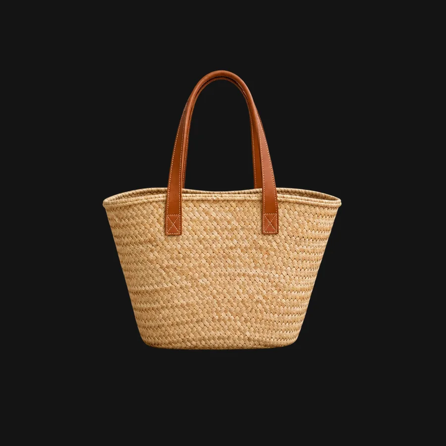
Black background product photos: A black background makes light, metallic, and glass products stand out and reads as premium. It suits ads, store pages, and social posts more than marketplace main images.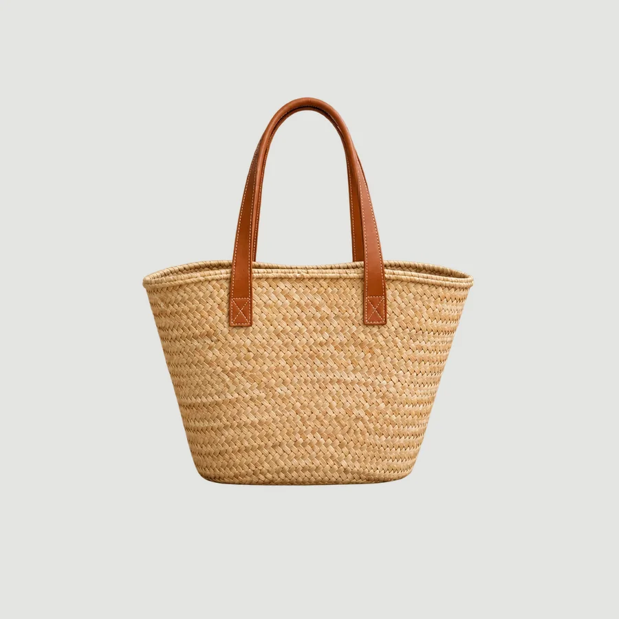
Gray background product photos: Light gray is the safest alternative to white. It keeps white and pale products visible, hides small edge flaws, and gives a catalog a calm, consistent look.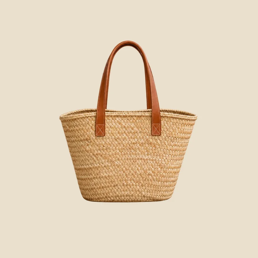
Beige background product photos: Beige and other warm neutrals give product photos a natural, handmade feel. They are popular for skincare, home goods, and anything sold on a calm, earthy brand palette.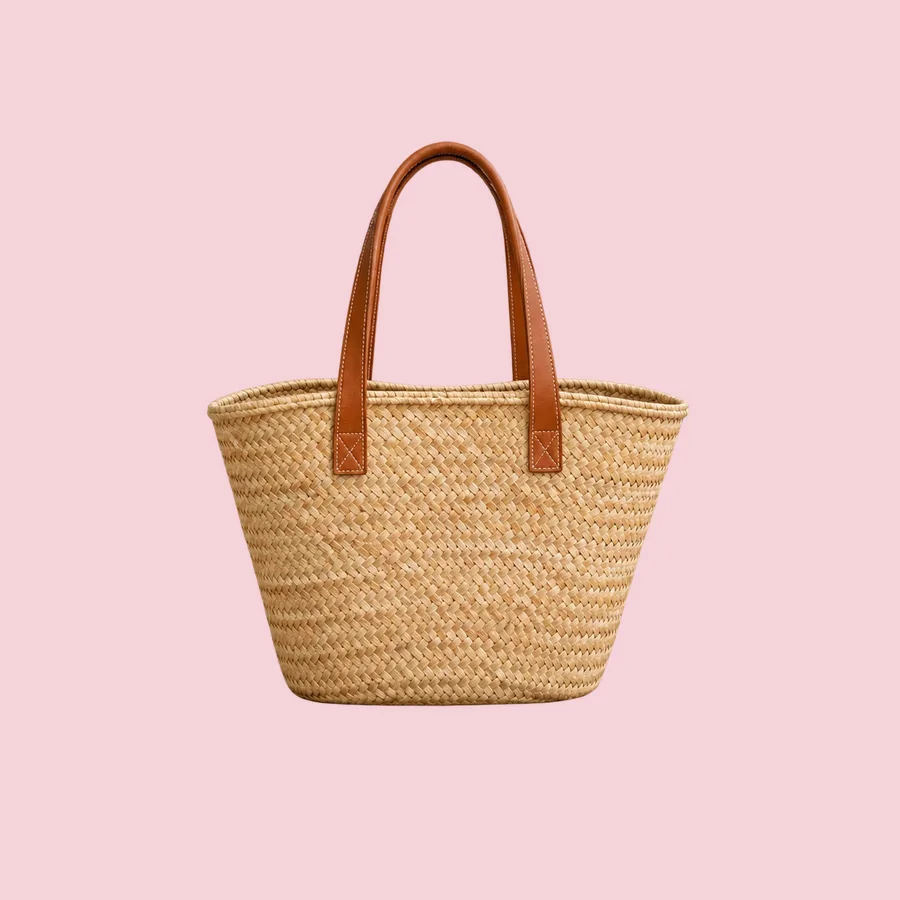
Pink background product photos: A pink background gives beauty, fashion, and gift products a soft, playful look. Blush tones read as gentle and premium; saturated pink is loud and works best for ads.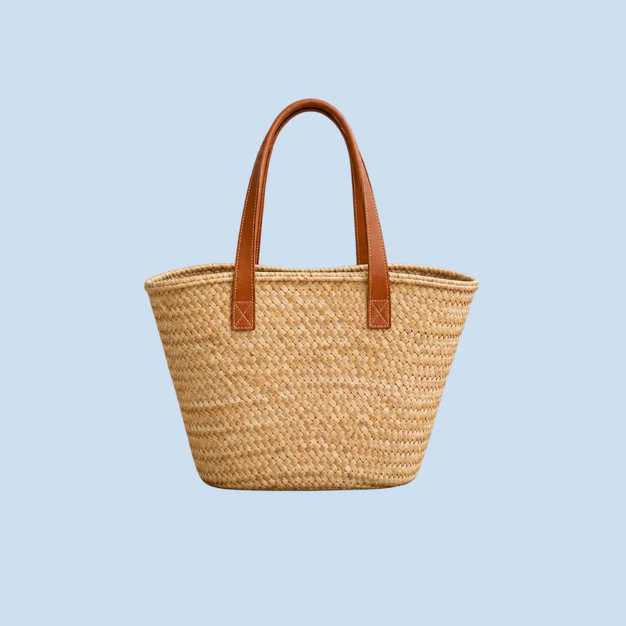
Blue background product photos: Blue backgrounds feel clean, cool, and trustworthy. Light blue suits tech, wellness, and baby products; navy gives a formal, premium backdrop for metal and white products.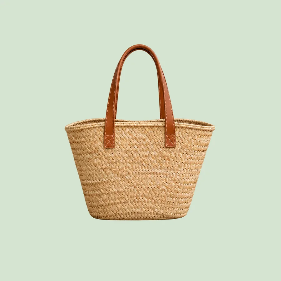
Green background product photos: Green backgrounds suggest natural, fresh, and sustainable. Sage is a gentle catalog color; forest green is a rich backdrop for gold, cream, and wood.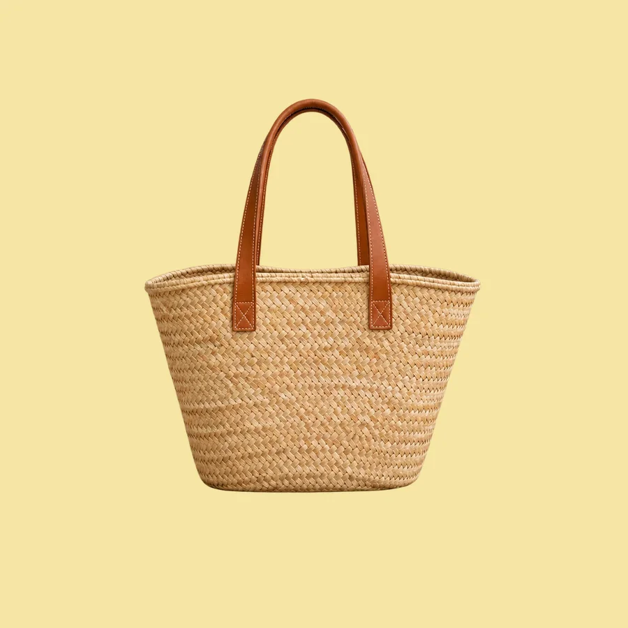
Yellow background product photos: Yellow backgrounds are bright, optimistic, and hard to ignore. Butter yellow is soft enough for a catalog; sunflower yellow is an attention color for ads and launches.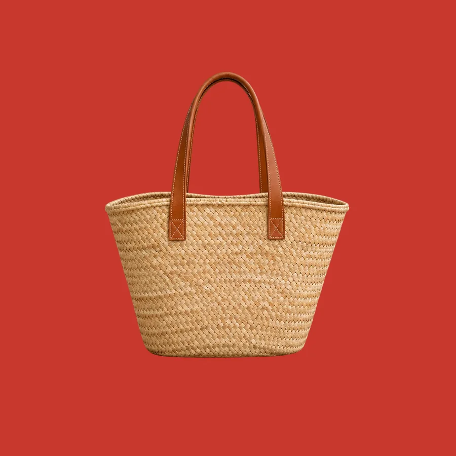
Red background product photos: A red background is the loudest choice: it signals energy, urgency, and celebration. It works for sale campaigns and festive seasons, and rarely for a whole catalog.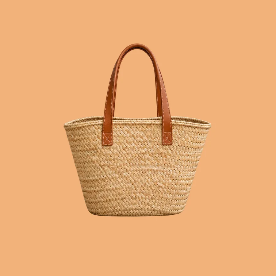
Orange background product photos: Orange backgrounds feel warm, friendly, and energetic without the urgency of red. Soft apricot suits lifestyle brands; terracotta gives an earthy, crafted look.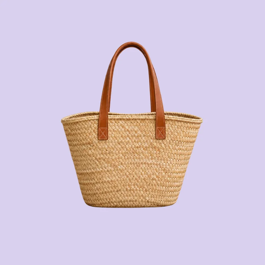
Purple background product photos: Purple backgrounds read as creative, calm, or luxurious depending on the shade. Lavender is gentle and popular for beauty and wellness; deep purple is a rich backdrop for gold and silver.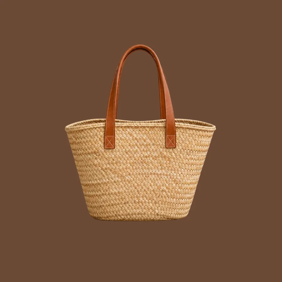
Brown background product photos: Brown backgrounds feel warm, grounded, and artisanal. They suit coffee, leather, and wood brands and make cream, white, and gold products stand out.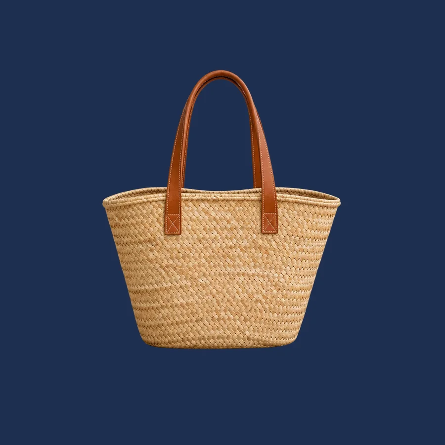
Navy background product photos: Navy is a softer alternative to black: still dark and premium, but calmer and more formal. It suits watches, tech, menswear, and anything with silver, white, or gold details.- White background product photos: the clean main image most marketplaces ask for.
One cutout, any background color
Remove the background once with the AI Background Remover and you get a transparent PNG. Place that cutout on any solid color in your design tool, or ask the Background Replacer for a colored studio background so the light and shadow match.
Use white for marketplace main images, and color for secondary images, store pages, ads, and social posts. Keep one background color per collection so the grid looks consistent.