Background colors
Gray Background for Product Photos
Light gray is the safest alternative to white. It keeps white and pale products visible, hides small edge flaws, and gives a catalog a calm, consistent look.
The same product on a gray background
The Background Remover cutout placed on solid gray (#E4E4E1). Cutouts are illustrative examples made with GPT Image models.
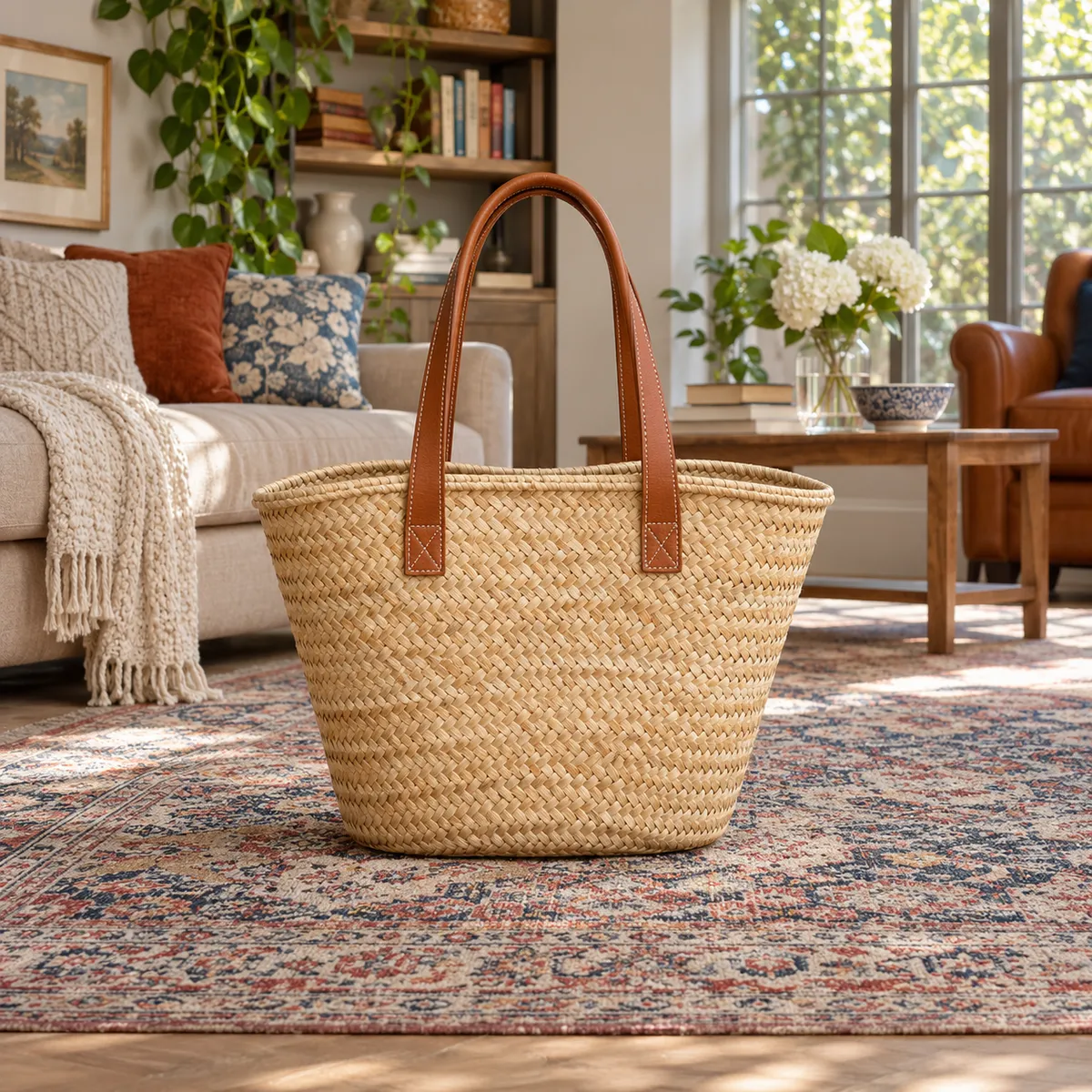
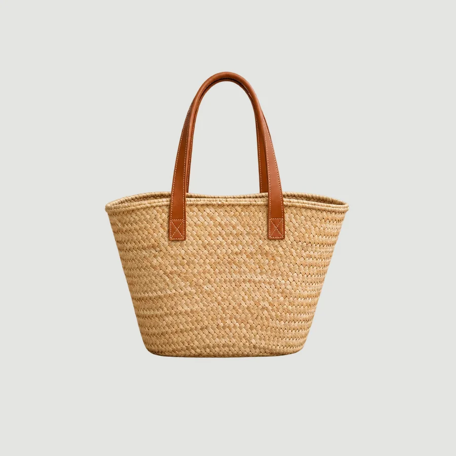
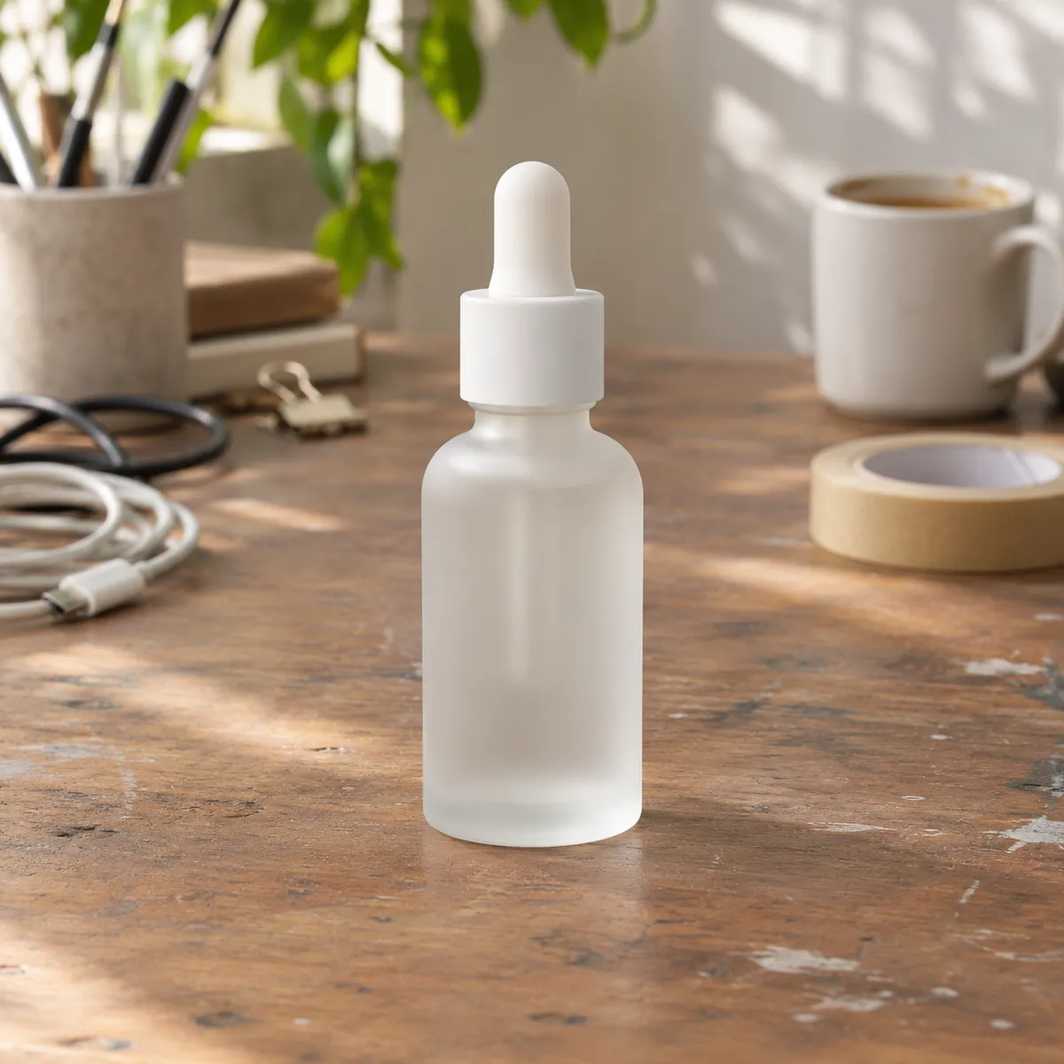
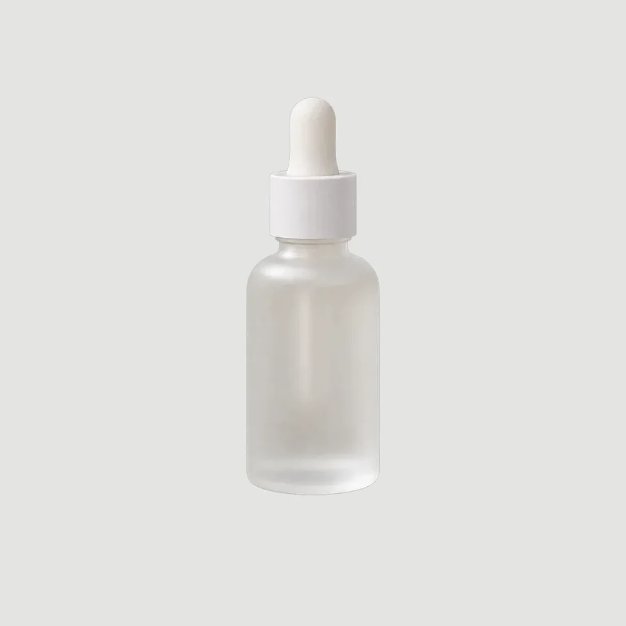
Products that suit a gray background
- White or pale products that vanish on pure white
- Furniture and homeware catalogs
- Shoes, bags, and apparel flat lays
- Store collection pages that need a uniform grid
Where gray goes wrong
- Gray can dull saturated colors; warm gray keeps food and wood tones lively
- Keep the same gray across a catalog or the grid looks patchy
- Check your marketplace's main image rule before replacing white with gray
Gray shades to try
- Light gray: #E4E4E1
- Mid gray: #BFC0BD
- Warm gray: #D9D5CF
How to change a product background to gray
- Upload your product photo to the AI Background Remover and download the transparent PNG.
- Place the cutout on a gray canvas (#E4E4E1) in any design tool. This keeps the product pixels untouched.
- Want matching light and shadow? Use Background Replacer with a prompt like: “seamless light gray studio background, soft even lighting, gentle contact shadow under the product”.
Frequently asked questions
Is a gray background acceptable for product listings?
On your own store, yes, and many brands use light gray for the whole catalog. On marketplaces, the main image often has to be pure white, so use gray for secondary images or check the current rules for your category.
Which gray works best for white products?
A light neutral gray around #E4E4E1 gives enough contrast to show the product's edge without looking dark. Use warm gray if the product has cream, wood, or gold tones.
Compare other background colors
- Black background product photos
- Beige background product photos
- Pink background product photos
- Blue background product photos
- Green background product photos
- Yellow background product photos
- Red background product photos
- Orange background product photos
- Purple background product photos
- Brown background product photos
- Navy background product photos
- White background product photos