Ecommerce
Home / Blog / Common Background Colors for Ecommerce Product Photography
Common Background Colors for Ecommerce Product Photography
A practical guide to white, gray, warm neutral, muted brand, and dark background colors for ecommerce product photography.
The best background color for ecommerce product photography is the color that makes the product easiest to inspect. White is still the safest choice for main product images, but light gray, warm beige, soft brand neutrals, and muted category colors can work better for detail images, store pages, and ads when they improve contrast without distracting from the product.
Practical rule: choose the background after you look at the product's color, material, edge contrast, and selling channel. A cream ceramic product may disappear on pure white but look clear on warm gray. A black accessory may need a light neutral. A skincare bottle might sell better on a clean beige or soft bathroom-toned background than on a flat empty scene.
This guide covers the common background colors for ecommerce product photography and when each one fits a real store workflow. KrafLayer helps with this when the original photo has the wrong background: you can start with the AI background remover, clean the product in the AI product photo editor, then create background versions for ecommerce product photography that still keep the product shape, material, label, scale, and shadow intact.
Quick Answer: Which Background Color Should You Use?
Use white when the image must be clean, flexible, and marketplace-friendly. Use light gray when a white or transparent product needs edge contrast. Use warm beige when the product is natural, handmade, beauty, home, coffee, or wellness-oriented. Use muted brand colors when the image is for a store page, detail section, email, or ad where brand feel matters.
A good ecommerce background should do three things:
- keep the product as the clearest subject
- make edges, material, and scale easy to read
- support the channel without adding visual noise
If a background color makes the buyer notice the backdrop before the product, it is too strong for a product image.
White Backgrounds: Best For Main Images And Clean Catalogs
White is the default background for many ecommerce product photos because it removes context and lets the product carry the page. It works well for catalog grids, comparison shopping, product feeds, clean PDP layouts, and images that need to be reused across channels.
Use a white background when:
- the product has a clear silhouette
- the product color does not disappear on white
- you need a consistent catalog grid
- the photo will be reused in many layouts
- the image should feel direct instead of editorial
The risk with white is that it can flatten pale, glass, transparent, or reflective products. A white mug, clear bottle, cream sweater, ivory tube, or translucent plastic case may lose its edge if the background is too bright. In those cases, keep a soft contact shadow or move to a very light gray.
White background product photography should not mean floating product photography. Even a clean main image needs believable grounding: a small natural shadow, crisp edges, and enough contrast to show the real object.
Light Gray Backgrounds: Best For Pale Products And Edge Contrast
Light gray is often the most practical neutral background for ecommerce product photography. It stays clean like white but gives pale products enough contrast to show shape, corners, fabric texture, glass thickness, packaging edges, or ceramic rims.
Use light gray when:
- the product is white, cream, silver, glass, or transparent
- the product needs a subtle shadow to feel real
- the store design is minimal but pure white feels too flat
- you want a premium neutral image without strong color styling
For ecommerce, keep the gray light and controlled. Dark gray can work for luxury, tech, or jewelry, but it can also make the product page feel heavy and reduce thumbnail clarity. If the product is small, detailed, or text-heavy, a pale gray is usually safer than charcoal.
Decision rule: if white hides the edge, test light gray before adding a decorative scene.
Warm Beige And Soft Neutrals: Best For Natural Product Categories
Warm beige, oatmeal, sand, ivory, taupe, and light wood-toned backgrounds can work well when the product category already has a tactile or natural buying story. Home goods, handmade products, coffee tools, ceramics, skincare, candles, baby products, linen, leather goods, and wellness products often benefit from a warmer neutral background.
Use warm neutrals when the product should feel:
- handmade
- calm
- organic
- soft
- giftable
- home-friendly
- premium but not cold
The background should still stay behind the product. Avoid making beige scenes too decorative with dried flowers, books, fabric folds, or props that compete with the SKU. If the buyer cannot identify the exact product in a thumbnail, the background is doing too much.
A good warm neutral background makes the product feel more real while keeping the image easy to crop, compare, and reuse.
Muted Brand Colors: Best For Store Pages, Detail Images, And Ads
Muted brand colors can make ecommerce product photography more ownable. A soft sage, dusty blue, pale peach, muted clay, or gentle lavender background can signal a brand mood without turning the image into a poster.
Use muted brand backgrounds for:
- product detail images
- collection pages
- homepage feature blocks
- email banners
- social posts
- paid ad creatives
- variant or bundle storytelling
Do not use brand colors blindly for every image. A background that looks beautiful in a hero banner may reduce product contrast in a marketplace thumbnail. If the color is close to the product color, add tonal separation with lighting, shadow, or a slightly different shade.
Brand color works best when it supports a product truth: freshness for skincare, warmth for home goods, precision for electronics, softness for textiles, or appetite appeal for food packaging.
Dark Backgrounds: Use Carefully For Luxury, Metal, Glass, And Jewelry
Dark backgrounds can make metal, glass, watches, jewelry, fragrance bottles, and premium accessories feel more dramatic. They are useful for campaign images and detail shots, especially when highlights and reflections are controlled.
For ecommerce main images, dark backgrounds are riskier. They can hide black products, compress details, make shadows muddy, and reduce readability in small thumbnails. They can also shift the page from product inspection into mood advertising too early.
Use dark backgrounds when:
- the product has bright reflective edges
- the product is not swallowed by the background
- the image is for a campaign or detail section
- the brand mood genuinely supports a darker look
- the product facts remain easy to inspect
Avoid dark backgrounds when the buyer needs to compare color, read a label, inspect stitching, or understand scale quickly.
Transparent Or Cutout Backgrounds: Best For Flexible Design Work
A transparent cutout is not a final background color, but it is often the best master asset. Once the product is isolated, you can place it on white, light gray, a brand color, a landing page hero, a PDP module, or a display ad without reshooting.
This is where a background removal workflow matters. In KrafLayer, the AI background remover creates a clean product cutout, and the next step is choosing a background that matches the image role.
Check the cutout before building background versions:
- edges should be clean
- transparent parts should remain transparent
- shadows should not look dirty or detached
- product corners should not be cropped
- color halos from the old background should be gone
If the cutout is weak, every background version will look weak.
A Simple Background Color Decision Framework
Use this five-step check before changing the background color.
1. Identify The Image Role
Main image, detail image, collection tile, ad creative, PDP module, email banner, and social post do not need the same background. Main images usually need clarity. Detail images can carry more style. Ads can use more brand color if the product stays readable.
2. Check Product Contrast
Look at the product edge against the background. If the silhouette blends into the color, change the background or add a soft shadow. The buyer should be able to understand the product shape at thumbnail size.
3. Protect Material And Color Truth
Background color can change how buyers perceive the product. Warm backgrounds can make white products look cream. cool backgrounds can make beige products look gray. Strong colored backgrounds can reflect onto glass, metal, or glossy packaging.
4. Keep The Background Quieter Than The Product
The background can support the product, but it should not become the visual headline unless the image is clearly a campaign asset. For product pages, the buyer should remember the product, not the backdrop.
5. Create A Small Background Set
Instead of choosing one background for everything, build a compact set:
- white or near-white for main images
- light gray for pale products and clean detail images
- one warm neutral for store storytelling
- one muted brand color for ads or feature sections
This gives the team consistency without making every image look identical.
Example Prompt For Background Replacement
Use this prompt pattern when the product is already correct and you only want to change the background:
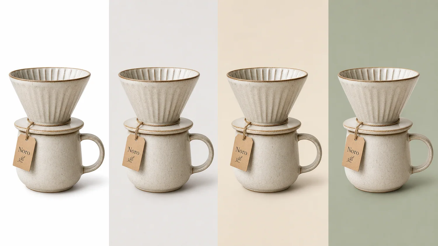
Replace the background with a soft warm gray ecommerce product-photo background. Keep the product shape, ceramic texture, rim, handle, paper tag, scale, camera angle, and natural contact shadow unchanged. Do not add extra products, logos, badges, barcodes, claims, or decorative props. The final image should look clean, realistic, and ready for an online store product page.
For brand color versions, replace "soft warm gray" with a specific muted color such as "muted sage", "pale beige", "dusty blue", or "warm ivory". Keep the rest of the prompt focused on product preservation.
FAQ
What is the best background color for ecommerce product photography?
White or near-white is the safest background color for ecommerce product photography because it keeps the product clear and reusable. Light gray is often better for pale, white, glass, silver, or transparent products because it gives the edges more contrast without becoming distracting.
Are colored backgrounds good for product photos?
Colored backgrounds are useful for store pages, detail images, ads, email banners, and social content when they support the product and brand. For main product images, keep colors muted and check thumbnail clarity. Strong colors can distract from the product or change how buyers perceive product color.
Should every product photo use the same background?
No. A consistent catalog helps, but each image role can use a different background. Use a clean white or neutral background for main images, then use light gray, warm neutrals, or muted brand colors for detail images, lifestyle modules, and campaign assets.
How do I choose a background for white products?
For white products, avoid pure white if the product edge disappears. Try light gray, warm gray, soft beige, or a muted brand color with a natural contact shadow. The goal is to show the product silhouette, material, texture, and scale without making the image feel busy.
Can KrafLayer change the background color of product photos?
Yes. KrafLayer can remove the original background, clean product edges, and help create new background versions for ecommerce product photos. The important step is reviewing the final image against the original so the product shape, color, material, label, and scale remain accurate.
Conclusion
Common background colors for ecommerce product photography work best when they are chosen for product clarity, not decoration. KrafLayer helps sellers turn one product photo into cleaner main images, neutral background versions, detail-page visuals, and campaign assets while keeping the product readable and trustworthy. For ecommerce teams, the advantage is a repeatable background workflow: remove the weak source background, choose the smallest useful color change, and review the final image against the real product before publishing.
Related articles
Ecommerce · 8 min read
Ecommerce Product Photography Trends 2026: What Online Stores Actually Need
The 2026 ecommerce product photography trend is not louder imagery. Stores need clearer product identity, faster content production, and image systems that work across listings, PDPs, ads, and marketplace channels.
Ecommerce · 7 min read
White Background vs Lifestyle Background for Product Photos
A practical guide to choosing white-background product photos for clarity and lifestyle backgrounds for ecommerce context.
Ecommerce · 7 min read
How to Create Ecommerce Product Photos Without a Studio
A practical no-studio workflow for turning one product reference into main images, detail images, lifestyle scenes, and ad creatives.
Ecommerce · 8 min read
Amazon Product Photo Requirements and AI Editing Checklist
Amazon product photo preparation should start with product clarity, a clean primary image, high-resolution source files, and careful secondary images. AI can help with cleanup and variants, but sellers should verify current Seller Central and category rules before uploading.
Ecommerce · 8 min read
Ecommerce Product Photography Services vs AI Product Photography
Ecommerce product photography services and AI product photography solve different parts of the same problem. Studios are best for physical proof and complex shoots; AI is strongest for fast image sets, edits, variants, and campaign testing.
Ecommerce · 7 min read
Shopify Product Image Size Guide for Product Pages and Collections
Shopify product images should start from large, clean source files, then be cropped consistently for product pages, collection grids, and campaign modules. Shopify's product media guidance supports large images up to 5000 x 5000 px or 25 megapixels, with product images under 20 MB.
Related KrafLayer tools
- AI product image tools — Browse the full tool list for ecommerce image editing and product visual workflows.
- Ecommerce product photography — Plan listing images, lifestyle scenes, detail shots, and store-ready ecommerce product photos.
- Listing main and detail images — Generate ecommerce listing main images and detail-page product visuals from product references.
- On-model product photos — Create product-on-model and lifestyle visuals when human context helps the product sell.
- Marketplace product images — Choose product image workflows for Shopify, Amazon, Etsy, Walmart, WooCommerce, and other selling channels.
- Product category image styles — Browse category-specific product image pages for beauty, jewelry, fashion, furniture, tech, food, and more.
- Product photo editor — Clean, retouch, upscale, restore, outpaint, and repair product photos before publishing.
- Reference-style product images — Generate ecommerce product images from competitor, brand, or campaign reference styles while preserving your own product identity.
- AI background remover — Create clean transparent product cutouts for listings, ads, and layout work.
- AI object eraser — Remove props, text, clutter, or distractions from product images.
- AI image upscaler — Increase product image resolution for listings, ads, and detail-page assets.
- AI image restoration — Refresh damaged, low-quality, or older product photos before reuse.
- AI background replacer — Move a product into a cleaner studio, lifestyle, or campaign background.
- AI mask edit — Edit selected regions while keeping the rest of the product image stable.
- AI reference image editor — Use extra references to guide product identity, material, style, or composition changes.
- AI scene compose — Place products into controlled commercial scenes without losing product clarity.