Image generation
Meta Ad Product Image Sizes: Square, Portrait and 9:16
TL;DR
Turn one verified product master into square, portrait, and vertical Meta ad images using crop maps, safe zones, native composition, and SKU checks.
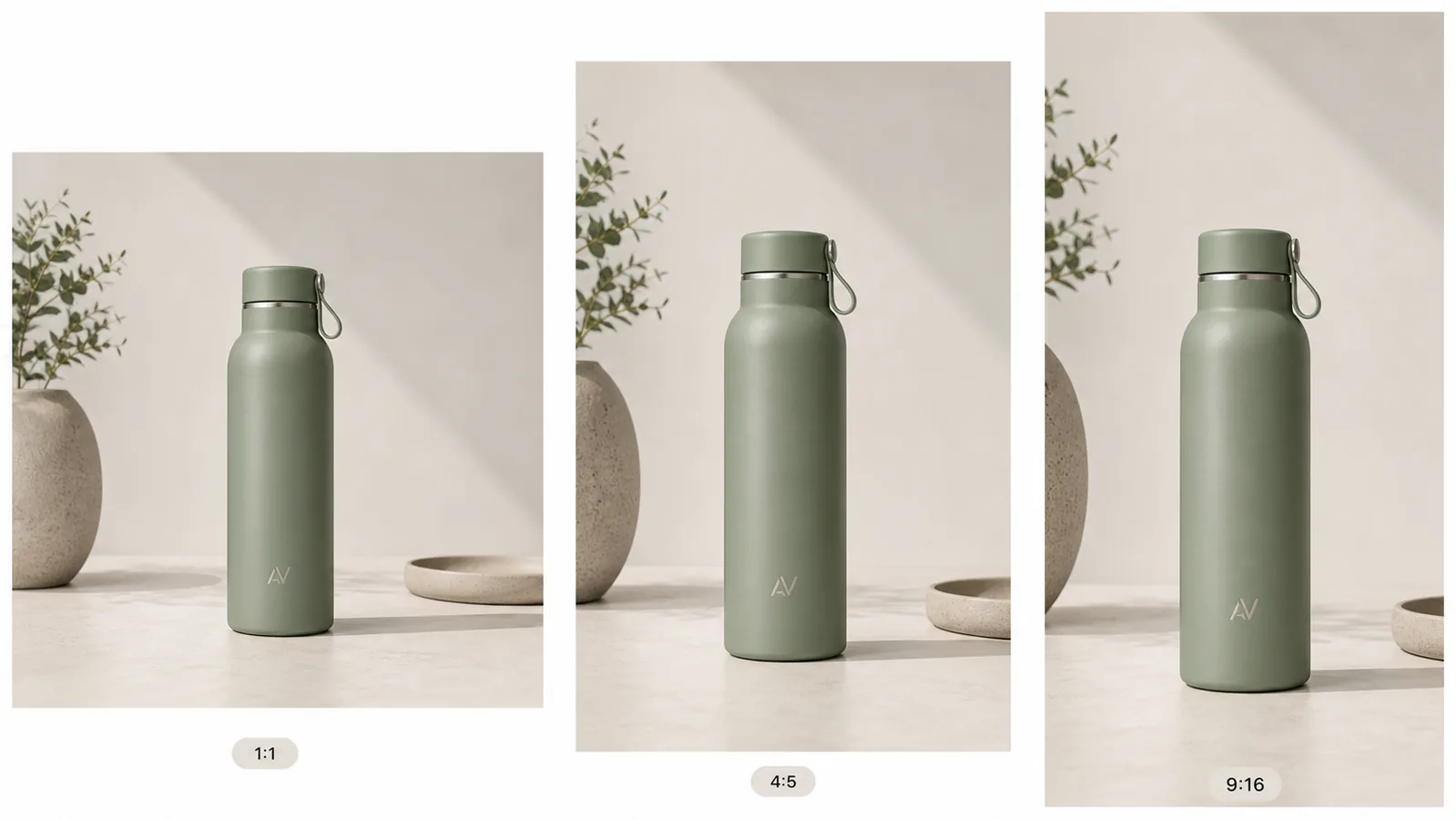
Meta ad product images should be recomposed for square, portrait, and vertical placements, not blindly cropped from one finished design. Start with a verified product master, protect the SKU, then let the background and layout adapt to each native frame.
Quick Summary
Build 1:1, 4:5, and 9:16 versions from the same product truth. Keep identity pixels protected, reserve safe space for placement controls, and preview every version in Ads Manager before launch.
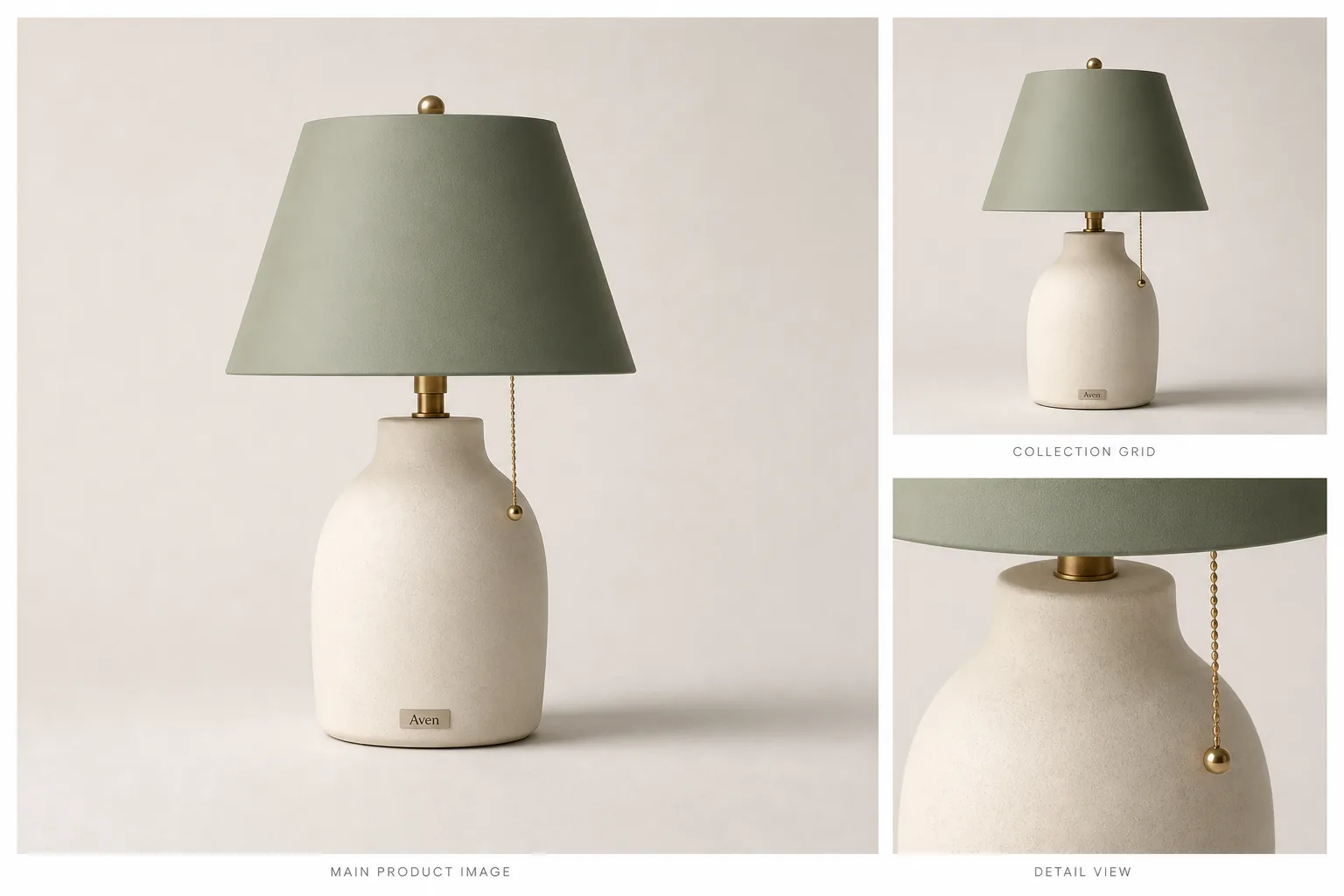
Meta ad product images in multiple sizes should look like one campaign, not three unrelated product shoots. The buyer should recognize the same product in the square, portrait, and vertical versions: same color, logo placement, cap, material, lighting direction, shadow, and selling context.
The practical rule is to create one product-truth image first, then adapt the composition for each crop. In KrafLayer, use an [AI product image generator](/ai-product-image-generator) or a strong existing product photo as the source, build the main visual around one clear ecommerce subject, and then create size variations only after the product facts are stable.
Why Multi-Size Ad Images Drift
Ad creative often breaks when teams resize at the end. A square image may show the full product, a portrait version may cut off the cap, and a vertical version may move the product into a different scene. The campaign then feels inconsistent even if the offer is the same.
For ecommerce, product identity matters more than decoration. A good multi-size product image set should preserve:
- product shape and silhouette
- true product color
- logo or label position
- cap, handle, strap, closure, pump, or hardware details
- lighting direction and contact shadow
- background mood and prop style
- product scale inside each crop
- enough empty space for ad copy or layout needs
If one format makes the product look taller, greener, shinier, cheaper, or like a different SKU, the set needs another pass.
Start With One Product-Truth Image
Do not begin by asking for every ad size at once. Start with the single image that defines the product.
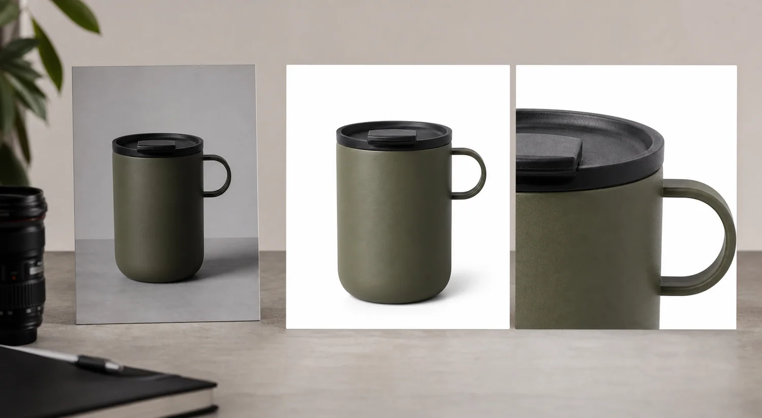
For a bottle, that means the body shape, cap, metal ring, carry loop, color, logo placement, and surface texture are correct. For shoes, it may be toe box shape, laces, sole profile, stitching, color blocking, and material. For skincare, it may be pump geometry, label plane, bottle transparency, liquid level, and cap finish.
This source image can come from a clean product photo, a generated ecommerce image, or a retouched listing visual. The important part is that the source image is already accurate enough to represent the product.
Use KrafLayer's [product photo editor](/product-photo-editor) before resizing if the source has background clutter, weak lighting, dust, crop issues, or soft product detail. Editing first gives every ad format a better base.
Decide The Role Of Each Crop
A multi-size product image set should not be a blind resize. Each crop has a job.
Use this planning pass:
- Square 1:1: strongest product recognition, good for feeds and reusable catalog-style ad creative.
- Portrait 4:5: product plus more selling context, useful when the item needs room for props, a headline area, or mobile feed presence.
- Vertical 9:16: full-screen story/reel style image, useful when the product needs taller framing, negative space, and a more immersive layout.
The product should remain recognizable across all three. The crop can change, but the SKU should not.
Build The Crop Set From Product Facts
When creating multi-size product images, write the protected facts into the prompt or editing brief before the crop instructions.
Use a prompt like:
Create a consistent ecommerce ad image set for the same matte sage insulated bottle. Preserve the bottle shape, cap, carry loop, metal ring, sage color, small fictional AV monogram position, texture, scale, lighting direction, and natural contact shadow. Create square 1:1, portrait 4:5, and vertical 9:16 crop compositions with the same product and a restrained neutral surface. Leave clean negative space for ad copy. Do not add real brand logos, Meta UI, marketplace badges, QR codes, barcodes, certification marks, sale stickers, or unsupported claims.
For an existing product photo, the edit brief can be simpler:
Keep this exact product unchanged. Create square, 4:5 portrait, and 9:16 vertical ad-ready variations. Preserve product color, label placement, silhouette, material, lighting direction, and shadow. Extend or adjust the background only where needed for each crop. Do not crop off product-defining details or invent new packaging.
The prompt should protect the product before it asks for ad polish.
What To Check In Each Ad Size
Review every version separately. A set can pass as a group but fail in one crop.
For the square version, check:
- product is immediately recognizable at feed size
- product is not too small
- logo, label, or defining feature is visible
- background does not compete with the product
For the 4:5 version, check:
- product still feels like the hero
- extra vertical space supports the layout
- props do not imply a false use case
- product shadow and perspective remain natural
For the 9:16 version, check:
- product is not stretched, enlarged unrealistically, or cut off
- there is usable empty space above or beside the product
- visual weight still works on a phone screen
- background extension does not create strange surfaces, duplicated props, or scale confusion
The best multi-size product images feel intentionally composed, not automatically resized.
Keep Ad Creative Honest
Meta ad creative can be more campaign-like than a marketplace main image, but it still needs product truth. Do not hide the product behind lifestyle mood or add unsupported visual claims.
Avoid:
- fake platform UI or social proof
- fake review stars, badges, guarantees, or certification marks
- impossible product scale
- product color changes between formats
- made-up label claims or unreadable fake label text
- backgrounds that imply a use case the product cannot support
- props that look like bundle components when they are not included
Useful creative restraint is usually stronger than visual noise. The product should remain the reason the ad exists.
A Practical KrafLayer Workflow
Use this workflow for Meta ad product images in multiple sizes:
1. Choose one product reference or listing image as the source of truth. 2. Clean the image first if the product has dust, clutter, weak crop, or bad background. 3. Generate or edit the main ecommerce product image. 4. Write the protected product facts: color, label, shape, material, scale, and shadow. 5. Create the square version for product recognition. 6. Create the 4:5 version with room for a feed layout. 7. Create the 9:16 version with full-screen mobile spacing. 8. Compare all versions side by side. 9. Reject any crop that changes product identity, hides key details, or invents ad claims. 10. Export the final set for your ad account, landing page, email, or retargeting workflow.
KrafLayer fits best at the visual-production stage: making the source image stronger, generating consistent product-led compositions, and letting the marketer review the set before campaign upload.
How This Connects To Ecommerce Product Photography
Multi-size ad creative works better when it starts from clear [ecommerce product photography](/ecommerce-product-photography). A blurry, cluttered, or inaccurate source image becomes harder to adapt. A clean product image with visible material, real scale, and stable lighting can be extended into more campaign formats without losing trust.
For paid social, the image has two jobs at once: stop the scroll and explain the product. If the crop is visually dramatic but buyers cannot tell what is being sold, the ad is weak. If the crop is accurate but dull, the ad may be ignored. The right set protects product facts while using composition, light, and spacing to fit each placement.
Which Meta ad formats should the master support?
Meta's own Reels guidance centers vertical 9:16 creative and safe zones, while its photo-ad guidance emphasizes one focal point, high-resolution inputs, minimal text, and visual consistency across ad sets. The practical answer is to design a flexible master, then compose native square, portrait, and vertical versions rather than cropping one finished ad ([Meta Reels ads](https://www.facebook.com/business/ads/facebook-instagram-reels-ads); [Meta photo ads](https://www.facebook.com/business/ads/photo-ad-format), 2026).
Use three working canvases:
| Canvas | Best starting role | Composition rule |
|---|---|---|
| 1:1 square | Feeds, catalog-style creative, broad reuse | Keep product and primary cue centered enough for automated crops |
| 4:5 portrait | Mobile feeds | Let the product occupy more vertical space without touching interface edges |
| 9:16 vertical | Stories and Reels | Keep product, logo, and essential copy inside the safe central area |
Do not treat those as file-size guarantees for every placement. Meta changes delivery surfaces and may apply automatic enhancements. Preview the actual selected placements in Ads Manager before launch.
Build a crop map before generating backgrounds
Meta says Advantage+ creative can expand images for different placements. Even when expansion is available, a crop map gives the model a safer job: it shows where the product must remain and which edges can be extended without inventing product pixels ([Meta Advantage+ creative](https://www.facebook.com/business/ads/meta-advantage-plus/creative), 2026).
Mark four zones on the clean master:
1. Identity zone: the product itself; never regenerate this region merely to change ratio. 2. Mandatory message zone: verified copy or offer that must survive a crop. 3. Flexible scene zone: background, surface, light falloff, and restrained props that can be extended. 4. Interface-risk zone: top, bottom, and side areas likely to be covered by placement controls.
If the source is already tightly cropped around the product, do not stretch it. Use background expansion or Scene Compose with the original product pixels protected, then inspect edges, reflections, and contact shadows at every ratio.
Should each ratio use the same composition?
Meta recommends consistent themes across ad sets, not mechanically identical layouts. Keep the same product, campaign idea, color treatment, type family, and value proposition while allowing the object to move for the native frame ([Meta photo ads](https://www.facebook.com/business/ads/photo-ad-format), 2026).
A square ad may center the product. A 4:5 version can enlarge it and move copy above. A 9:16 version may place the product lower to preserve top safe space. That is still one campaign system.
Before export, compare all ratios side by side and check:
- exact SKU color, label, shape, and included items;
- product size relative to the frame;
- legibility without zoom;
- no interface collision in placement preview;
- matching destination page and offer;
- one dominant focal point per frame.
FAQ
How do I create Meta ad product images in multiple sizes?
Start with one accurate product image, then create square, portrait, and vertical versions from that same product truth. Preserve product color, shape, logo placement, material, lighting, and shadow in every crop. Adapt the background and spacing, but do not redesign the SKU.
What sizes should I prepare for product ads?
A practical ecommerce set usually includes a square 1:1 image, a portrait 4:5 image, and a vertical 9:16 image. Exact upload options and placement behavior can change, so use these as creative planning formats and check the current ad account guidance before launch.
Can AI resize one product photo into ad formats?
AI can help extend backgrounds, recompose crops, and create product-led ad variations, but the output needs review. Check that the product shape, color, label, scale, and shadow stay consistent. Do not accept a resize that quietly changes the product.
Should each ad size use the same background?
The background should feel like the same campaign, but it does not need to be pixel-identical. Keep the lighting, surface, prop style, and color palette consistent. Adjust negative space and crop for each format so the product remains readable on mobile.
Can KrafLayer make product ad images from a listing photo?
Yes. KrafLayer can help turn a listing photo or product reference into ad-ready product visuals, then support editing and crop adaptation. The key is to keep product truth first: shape, color, material, label, scale, and buyer-relevant details should survive every ad version.
Conclusion
Multi-size product images for Meta ads work when every crop feels like the same product campaign: square for recognition, portrait for feed presence, and vertical for full-screen mobile space. KrafLayer helps ecommerce teams start from one product reference, create accurate product-led ad visuals, clean weak source photos, and adapt the image set without losing SKU details. For sellers running paid social, the advantage is faster creative variation while keeping product identity, ecommerce photography quality, and ad-ready consistency intact.
Keep exploring
Continue the story
More practical guidance on product accuracy, composition, and conversion-ready visuals.
Put it into practice
Take the next step in KrafLayer
Choose a generation or editing workflow that matches what you just learned.