Platforms
Shopify Collection Image Size: Build a Consistent Grid
TL;DR
Build a consistent Shopify collection grid with one theme-tested aspect ratio, product-specific safe zones, matched visual scale, and responsive review.
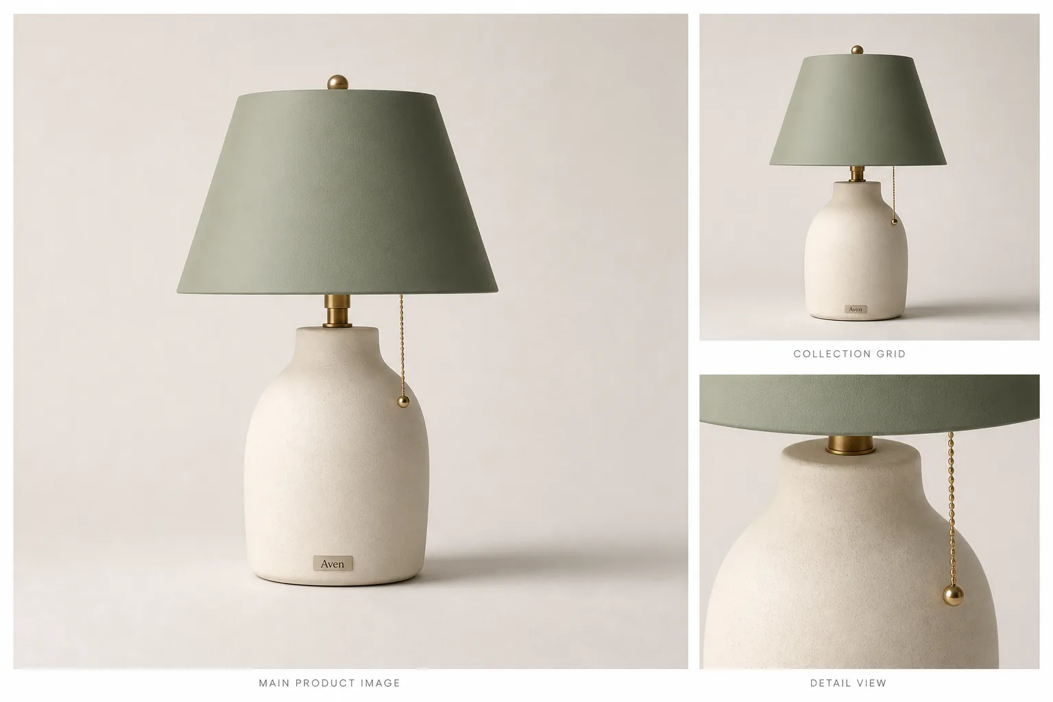
For a consistent Shopify collection grid, use the same aspect ratio for every featured product image and test that ratio in the active theme. Pixel dimensions matter, but crop behavior, product scale, safe zones, and responsive layout determine whether the grid actually looks aligned.
Shopify collection image size is less about one universal pixel number and more about using a consistent aspect ratio that your theme can crop cleanly. The practical rule: choose one grid ratio, keep the product centered with safe margins, set or check the focal point when your theme supports it, and preview the collection page on desktop and mobile before publishing.
Official Shopify guidance supports this cautious approach: collection pages can have featured images, store images need the correct aspect ratio to display as intended, and theme behavior can crop or resize images differently across layouts. Shopify also recommends uploading high-quality images and notes that storefront delivery may use automatic compression and modern formats. That means the safest answer is not a fixed "best Shopify collection image size" for every store; it is a theme-tested image system.
In KrafLayer, you can prepare that system before upload: create consistent product images, clean backgrounds, upscale useful detail, and build collection-safe crops that still show what the buyer is comparing.
Shopify Collection Image Size: The Practical Rule
Use a consistent Shopify image aspect ratio first, then choose pixel dimensions that give your theme enough detail for the product card and product page. For many catalogs, a square master is the easiest starting point because it keeps product grids calm and predictable. It is not a universal requirement, and it should not override your theme preview.
A collection-safe image should protect:
- the full product silhouette
- true color and material
- handles, cords, straps, shades, caps, or other edges
- enough empty margin for theme cropping
- a clear product center or focal point
- consistent scale across related SKUs
- detail that still reads at product-grid size
If the product looks good only at full size but breaks in the grid, the image is not ready for the collection page.
Why Shopify Collection Images Break
Collection images usually fail for one of four reasons.
The first is mixed ratios. A tall lamp, a wide bag, and a square bottle can all be good images on their own, but they make a messy grid when the theme forces them into the same card shape.
The second is unsafe cropping. A product that touches the frame edge can lose a handle, lampshade, shoe sole, or bottle cap when the theme crops it for mobile.
The third is uneven product scale. If one product fills the card and the next product floats in empty space, buyers compare the image layout instead of comparing the products.
The fourth is weak source detail. A collection card can hide softness, but the same asset may look poor when opened on a product page or zoomed.
A Collection-Grid Workflow
1. Pick The Grid Ratio Before Editing
Decide whether your collection grid will use square, portrait, or landscape cards. Then edit every image against that same ratio. This is more reliable than uploading assorted source files and hoping the theme makes them feel consistent.
For a mixed catalog, square images are often the least fragile. For fashion, furniture, and tall objects, a portrait ratio may give the product more natural space. The right Shopify product grid image size depends on your theme and product type, so preview before committing the whole catalog.
2. Build A Product-Safe Crop
Keep the product centered enough that theme cropping does not remove the item. Leave more margin than you think you need around handles, shades, cords, straps, and wide bases. If Shopify focal point behavior is available in your theme, use it to keep the product's most important area in frame.
In KrafLayer, use [AI product image generation](/ai-product-image-generator) or the [product photo editor](/product-photo-editor) to create a clean master image first. Then make the collection crop from the same product truth list so color, material, shape, and scale stay consistent.
3. Match Product Scale Across Cards
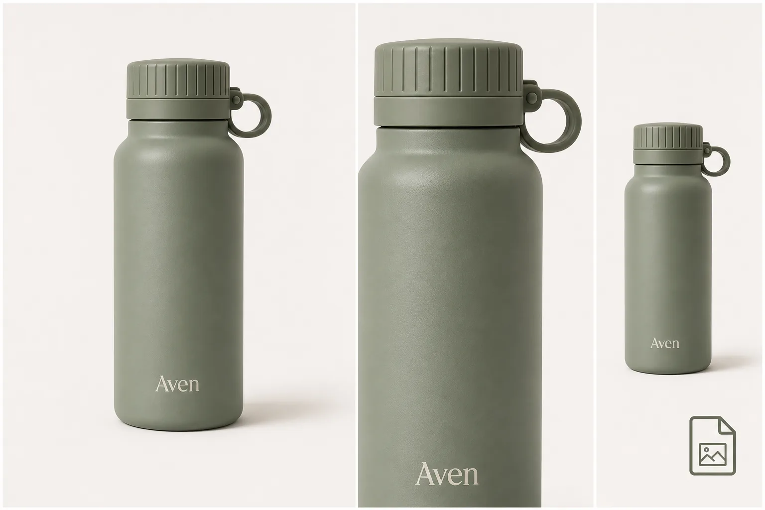
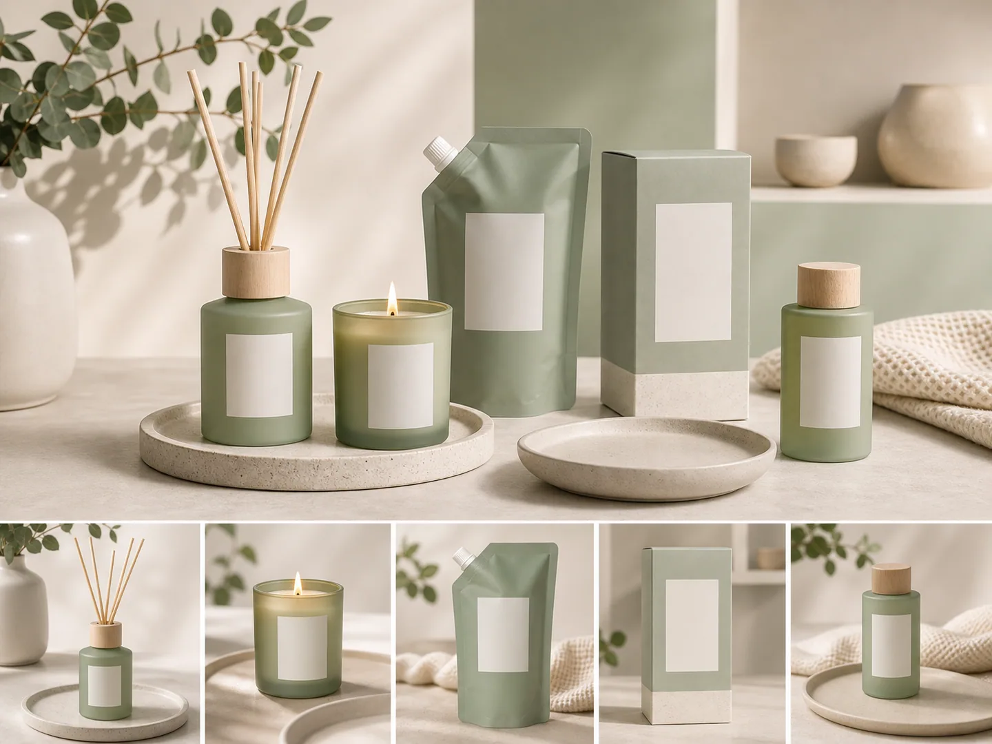
A collection page should feel like one visual system. When related products sit in the same grid, align their apparent height, baseline, shadow weight, and whitespace. A small ceramic lamp should not look larger than a floor lamp because its crop is tighter.
Use the same visual rule across variants: same angle, same crop ratio, similar product size, similar contact shadow, and similar background brightness.
4. Check Detail And Compression
Shopify collection images are small on the grid, but the same media often supports product-page inspection. If the source photo is too soft, use the [AI image upscaler](/tools/ai-image-upscaler), then inspect texture, edges, labels, and material. If the background is the problem, use the [AI background remover](/tools/ai-background-remover) before creating the final crop.
Do not publish an image just because it fits the grid. The product still has to look trustworthy when a buyer opens the item.
What To Avoid
- Do not claim one exact Shopify collection image size works for every theme.
- Do not crop so tightly that mobile cards cut off product edges.
- Do not mix square, portrait, and landscape images in the same product grid unless the theme is designed for it.
- Do not upscale a weak source and assume invented detail is accurate.
- Do not use collection images that hide color, material, texture, or scale.
- Do not rely on Shopify's automatic handling to fix a bad source image.
The strongest Shopify collection image crop starts with a product image that is already clear, centered, and honest.
Where KrafLayer Fits
Use KrafLayer before Shopify upload when the image itself needs work:
- Generate a clean main image and a grid-safe crop from one product reference.
- Use the editor to remove distractions without changing the SKU.
- Remove backgrounds when you need a controlled white or transparent master.
- Upscale source files that are useful but too small for product-page detail.
- Review the broader [Shopify product images](/marketplace-product-images/shopify-product-images) workflow before preparing a full catalog.
KrafLayer helps prepare the image set. Your Shopify theme preview decides whether the crop, ratio, and focal point work in the actual storefront.
Pre-Publish Checklist
Before uploading a collection image set, check:
- Does every product use the same grid ratio?
- Does the product stay recognizable in the collection card?
- Are edges, handles, cords, shades, straps, and bases protected from cropping?
- Is the product scale consistent across variants and related SKUs?
- Does the image still look clean on mobile?
- Does the focal point keep the most important product area in frame?
- Are color, material, labels, and scale accurate?
- Is the final file light enough for the storefront without damaging product detail?
If one image breaks the grid, fix that source image instead of changing the whole catalog around it.
What does Shopify currently support?
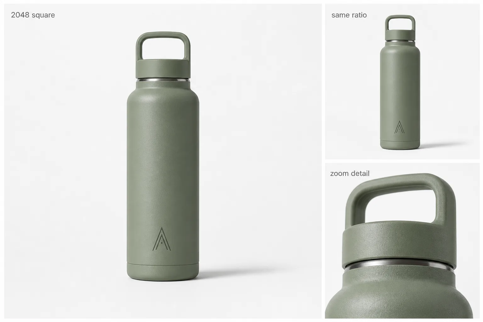
Shopify allows product and collection images up to 5000 × 5000 pixels or 25 megapixels, with files below 20 MB. Its help center says square product images at 2048 × 2048 pixels usually display best, but the more important grid rule is consistent aspect ratio across featured images ([Shopify product media types](https://help.shopify.com/en/manual/products/product-media/product-media-types), 2026).
That means there is no universal magic size for every theme. A clean 1600 × 1600 set can form a better grid than mixed 3000-pixel files with square, portrait, and landscape ratios. Select the ratio in the theme first, then prepare all featured product images for that container.
Audit the theme before recropping the catalog
Open the collection page on desktop and mobile and record:
- the grid image ratio selected in the theme settings;
- whether the theme crops with `cover` or contains the full image;
- whether secondary-image hover is enabled;
- card width at common breakpoints;
- the position of badges, quick-add buttons, and product text;
- any focal-point controls used by the theme.
Test a tall product, a wide product, a small accessory, and a product with an off-center handle. Shopify notes that responsive collection grids can expose inconsistent aspect ratios differently across screen sizes ([Shopify theme troubleshooting](https://help.shopify.com/en/manual/online-store/themes/theme-support/troubleshooting), 2026). Do not approve the grid from one desktop screenshot.
Use one canvas but product-specific safe zones
A shared canvas ratio does not mean every product should occupy the same percentage by area. Match perceived scale instead. A handbag may need more side clearance for handles, while a tall bottle needs more top and bottom space. Define safe-zone guides, then position each SKU so the visual weight feels consistent across the row.
Keep one high-resolution master with the complete silhouette. Export the collection crop as a derivative, not as the only product file. Shopify automatically creates multiple storefront sizes and uses its CDN to deliver suitable formats, so upload the strongest trustworthy source instead of repeatedly compressing a small image ([Shopify uploading images](https://help.shopify.com/en/manual/online-store/images/theme-images), 2026).
Diagnose a broken grid in the right order
When cards still look uneven, check in this order:
1. Confirm every featured image has the same pixel ratio. 2. Check whether transparent padding differs across files. 3. Compare product scale and optical center, not only canvas dimensions. 4. Inspect the theme's image-fit and crop settings. 5. Check hover images for ratio changes that cause layout movement. 6. Preview mobile, tablet, and desktop widths. 7. Confirm files use a standard sRGB profile if color changes after upload.
Do not solve a theme crop problem by stretching a product. Preserve product proportions and change the canvas, padding, focal point, or theme setting instead.
Maintain a reusable collection-image specification
Record the approved ratio, target long edge, background treatment, product safe zone, naming pattern, and mobile review width. Add one representative approved card for each product shape. This gives photographers, AI editors, and catalog operators the same visual target.
When the theme changes, test the specification on a small collection before recropping the full catalog. A theme migration can change the visible container even though all source files remain valid.
FAQ
What is the best Shopify collection image size?
The best Shopify collection image size depends on your theme, grid layout, product type, and whether the same image is reused on product pages. Use a consistent aspect ratio, keep safe margins around the product, and preview the collection grid on desktop and mobile before publishing.
Should Shopify collection images be square?
Square Shopify collection images are often practical because they keep product grids consistent and easy to scan. They are not mandatory for every store. Tall products, fashion images, or editorial collections may work better in a portrait ratio if the theme supports that layout cleanly.
How do I stop Shopify collection images from cropping badly?
Use a consistent image ratio, center the product with enough margin, and check the theme's focal point behavior when available. Avoid placing important product edges near the frame. Preview the collection page on mobile because mobile crops often reveal problems that desktop cards hide.
Is Shopify product grid image size the same as product image size?
Not always. A product page may need more detail for inspection or zoom, while the collection grid needs a predictable crop and consistent scale. Start with a high-quality master image, then create grid-safe versions that still preserve product facts.
Can AI help create Shopify collection images?
Yes. AI can help create cleaner product images, remove distracting backgrounds, upscale weak source files, and build consistent crops for a product grid. The review step still matters: product shape, color, material, label position, scale, and functional details must stay accurate.
Conclusion
Shopify collection image size should be handled as a theme-tested crop system, not a single fixed number copied across every store. Choose a consistent ratio, keep products centered with safe margins, protect detail, and preview the grid before publishing. KrafLayer helps create and clean the product images that go into that system, while Shopify theme testing confirms whether the final collection crop works for real shoppers.
Keep exploring
Continue the story
More practical guidance on product accuracy, composition, and conversion-ready visuals.
Put it into practice
Take the next step in KrafLayer
Choose a generation or editing workflow that matches what you just learned.