Ecommerce
White vs Lifestyle Product Photos: Which Should You Use?
TL;DR
Choose white-background and lifestyle product photos by image role, then combine factual, detail, scale, and contextual views into a useful ecommerce gallery.
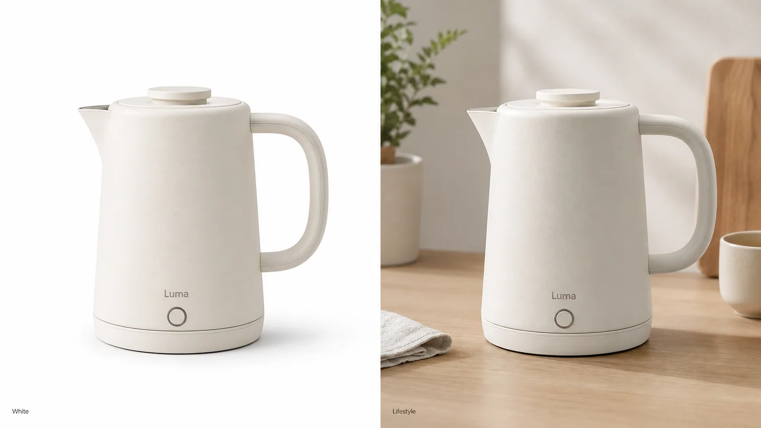
White-background and lifestyle product photos solve different buying problems. White isolates the item so buyers can identify shape, color, included parts, and variant. Lifestyle imagery explains use, scale, mood, and context. Most ecommerce galleries need both, in that order, rather than one style winning every slot.
The comparison uses current Google and Amazon guidance checked on August 11, 2026. The kettle and mug images are KrafLayer demonstrations, not conversion experiments or customer results.
Quick Summary
Google recommends white or transparent backgrounds, 75%–90% product fill, and accurate variants, while accepting clear staged images. Amazon treats pure white as the default for product shots and recommends lifestyle, scale, and detail views. Use white for identification and lifestyle for explanation.
Abstract
A white image identifies the item. A lifestyle image explains how it fits into use. Keep the factual view first, then add context that does not hide, resize, or redesign the SKU. Test gallery order instead of treating background style as a universal preference.
Key Takeaways
- White is the lower-risk main-image default.
- Lifestyle images should answer a real use or scale question.
- Props must not imply items are included when they are not.
- The product must remain the focal point in both treatments.
- A gallery is stronger when each image has a distinct job.
Table of Contents
1. [Official guidance](#what-the-platforms-actually-say) 2. [Side-by-side comparison](#white-versus-lifestyle-by-image-role) 3. [White-image checks](#building-a-factual-white-background-image) 4. [Lifestyle checks](#building-a-useful-lifestyle-image) 5. [Gallery sequence](#a-six-image-gallery-that-uses-both) 6. [Testing](#how-to-test-the-order) 7. [Frequently asked questions](#frequently-asked-questions)
What the Platforms Actually Say
Google recommends solid white or transparent backgrounds and product fill between 75% and 90%, but also accepts staged or lifestyle images when the product stays clear. Amazon says sellers should always have white-background images, then consider color, texture, and ambient scenes for creative or lifestyle roles ([Google Merchant Center](https://support.google.com/merchants/answer/6324350?hl=en); [Amazon](https://sell.amazon.com/blog/product-photos), 2026).
Those statements do not support an either-or rule. They support role separation. White improves comparability; lifestyle adds information that isolation cannot provide.
*KrafLayer demonstration comparison. Check whether the spout, handle, lid, button, body color, scale, and contact remain consistent across both roles.*
White Versus Lifestyle by Image Role
Amazon defines lifestyle, scale, detail, packaging, and individual shots as different product-photo types. A useful gallery assigns each slot to one unresolved buyer question rather than repeating the same product at different angles ([Amazon](https://sell.amazon.com/blog/product-photos), 2026).
| Decision | White background | Lifestyle background |
|---|---|---|
| Primary job | Identify and compare the item | Explain use, scale, or setting |
| Best slots | Main image, catalog grid, variant view | Secondary gallery, PDP story, ad |
| Strength | Low distraction and easy comparison | Context and emotional relevance |
| Main risk | Pale edges disappear; image feels generic | Props overpower product or imply false scale |
| Review focus | Crop, color, edge, included parts | Product fidelity, perspective, light, contact, props |
The decision changes by role, not by category alone. A lamp benefits from white identification and an illuminated desk scene. A refill cartridge may need white, detail, and dimension views but little lifestyle staging.
Building a Factual White-Background Image
Google requires an accurate view of the entire product and the correct variant. It forbids promotional overlays, borders, and unrelated items in the primary feed image. White is not a license to over-edit ([Google Merchant Center](https://support.google.com/merchants/answer/6324350?hl=en), 2026).
Check the outer silhouette, pale edges, transparent regions, color cast, crop, and contact shadow. A fully floating cutout may work for a catalog grid; a subtle grounded shadow can feel more natural in an owned store. Keep the background at true white when the destination requires it.
Create the factual asset before the scene
Use the [AI Background Remover](/tools/ai-background-remover) to make a clean product master, then branch into white and lifestyle versions instead of rebuilding the product twice.
Building a Useful Lifestyle Image
Amazon says lifestyle shots show a product in action, while scale shots help buyers understand size. A lifestyle image should therefore carry specific information: where the item sits, how a person handles it, what fits inside, or how large it is relative to a known setting ([Amazon](https://sell.amazon.com/blog/product-photos), 2026).
| Lifestyle check | Pass | Reject |
|---|---|---|
| Use | Scene matches normal product use | Unsupported or unsafe context |
| Scale | Props and perspective support real dimensions | Product appears materially larger or smaller |
| Focus | Product wins at thumbnail size | Decor becomes the subject |
| Inclusion | Styling props are clearly contextual | Composition suggests props ship with product |
| Physics | Light, shadow, reflection, and contact agree | Product floats or reflects the old room |
Keep one selling idea per image. A crowded kitchen cannot simultaneously prove capacity, portability, material, cleaning, and luxury positioning.
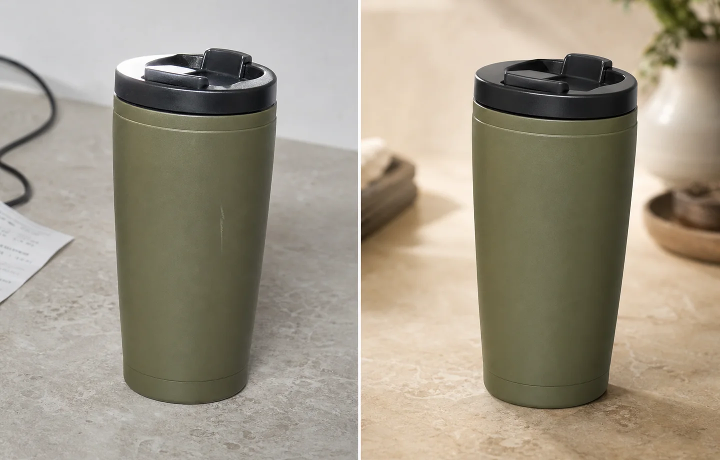
*Published demonstration. The scene succeeds only if the mug body, lid, color, proportion, and shadow remain credible.*
A Six-Image Gallery That Uses Both
Google supports additional images for other views, while Amazon recommends at least six product images in its photography guidance. A balanced six-image set can combine identification and explanation without duplication.
A practical sequence starts with a white-background main view, followed by a neutral angle that reveals rear or side construction. Use the third slot for material or mechanism detail and the fourth for verified scale or dimensions. Place the lifestyle use image next, then close with included items, packaging, or the buyer's biggest remaining objection.
Move lifestyle earlier when context is the main uncertainty. Move detail earlier when construction or material drives the purchase.
How to Test the Order
Amazon's Manage Your Experiments can test product images for eligible brand owners by randomly splitting viewers between Version A and Version B. Amazon says optimized content can increase sales by up to 20%, but that platform claim is not a guaranteed result for one listing ([Amazon](https://sell.amazon.com/tools/manage-your-experiments), 2026).
Test one hypothesis, such as white versus lifestyle in the second gallery slot. Keep other content stable, record the ASIN and dates, and let the experiment determine whether context should appear earlier for that product.
Verdict
White and lifestyle imagery are teammates. Use white to prove the SKU and lifestyle to explain it. If the lifestyle version cannot answer a buying question without changing the product, it does not earn a slot.
Which products need more than one lifestyle image?
Google allows up to 10 additional images in free listings, while Amazon recommends at least six product images and separates detail, scale, lifestyle, packaging, and group views. Use extra lifestyle images only when each one answers a different question ([Google free listings](https://support.google.com/merchants/answer/13889434?hl=en); [Amazon product photos](https://sell.amazon.com/blog/product-photos), 2026).
A chair may need a room-scale image and a close use-context frame. A serum may need one bathroom scene but gains more from a dropper detail and package-contents image than from three different marble counters. A handbag may need an on-model scale view and a real interior view. The scene earns its place by adding information.
Use this decision rule:
- add a white-background view when the buyer needs cleaner comparison;
- add a detail image when the buyer needs material or construction evidence;
- add a scale image when dimensions are hard to imagine;
- add a lifestyle image when setting or use changes the buying decision;
- add a second lifestyle image only when it demonstrates another real context.
How should white and lifestyle images share a visual system?
Shopify accepts product images up to 5000 × 5000 pixels or 25 megapixels and says consistent aspect ratios produce cleaner collection pages. A mixed gallery still needs stable crop, baseline, color, and product scale even when the backgrounds change ([Shopify product media](https://help.shopify.com/en/manual/products/product-media/product-media-types), 2026).
Keep the product's color temperature consistent between the white image and styled scene. Use the same variant, label, cap, hardware, and included parts. A warm room can cast warm light, but the item should not look like a different SKU.
The simplest gallery rhythm is factual first, contextual second: main image, alternate angle, detail, scale or contents, lifestyle, then a final proof view. Move lifestyle earlier only when context is essential to understanding the product.
Keep a transparent master even when you publish white
Google accepts white or transparent backgrounds but warns that transparent pixels behind light products can render against a dark field. Etsy similarly notes that transparency may display as black. A transparent file is therefore a production master, not a universal publishing answer ([Google Merchant Center](https://support.google.com/merchants/answer/6324350?hl=en); [Etsy Help](https://help.etsy.com/hc/en-us/articles/115015663347-Requirements-and-Best-Practices-for-Images-in-Your-Etsy-Shop), 2026).
Keep the high-resolution cutout with alpha, then export a flattened white version for channels that need predictable display. Build lifestyle scenes from the same cutout only after reviewing edge halos, translucent materials, fine fibers, handles, and contact shadows. This gives the team one reusable source without forcing every destination to interpret transparency the same way.
Frequently Asked Questions
Are white backgrounds required for every product photo?
No. They are the safest default for main and catalog images. Google accepts clear staged imagery, and Amazon encourages lifestyle, detail, and scale shots. Keep white for factual identification and use context in secondary roles.
Do lifestyle product photos convert better?
There is no universal result for every product and gallery position. Lifestyle helps when use or scale is unclear. Run a controlled platform experiment where available instead of applying an unsupported conversion percentage.
Can AI create the lifestyle version from my white image?
Yes, but review silhouette, label, material, components, scale, lighting, and contact against the source. Keep the white image in the gallery so the generated scene is not the buyer's only product evidence.
Which image should appear first?
For marketplace listings, start with the compliant factual main image. On an owned landing page, a lifestyle hero may lead, but the plain product view should remain easy to reach and should match the actual SKU.
How many lifestyle images should a gallery contain?
Use as many as needed to explain distinct uses or contexts, without repeating the same idea. One strong lifestyle view is often more useful than three decorative scenes that hide the product in similar ways.
References
1. [Google Merchant Center: Image link requirements](https://support.google.com/merchants/answer/6324350?hl=en), accessed August 11, 2026. 2. [Amazon: Six tips for product photos](https://sell.amazon.com/blog/product-photos), accessed August 11, 2026. 3. [Amazon: Manage Your Experiments](https://sell.amazon.com/tools/manage-your-experiments), accessed August 11, 2026.
Keep exploring
Continue the story
More practical guidance on product accuracy, composition, and conversion-ready visuals.
Put it into practice
Take the next step in KrafLayer
Choose a generation or editing workflow that matches what you just learned.