Edit tools
How to Match Color Tone Across Multiple Product Photos
TL;DR
A practical AI editing workflow for making a product photo set look consistent without changing the SKU color, material, hardware, or buyer-facing details. Includes how to do it in KrafLayer.
TL;DR
For Match Color Tone Across Multiple Product Photos, use KrafLayer for controlled local changes or reference-guided edits. Use Mask Edit for a local change with a short instruction, or Reference Image Editor when the result needs a visual example. The finished image should still prove that shape, material, labels, color, scale, and accessories still match the source SKU.
When multiple product photos have different color tones, buyers start doubting which color is real. The fix is not to make every image brighter or prettier. The goal is to choose one approved reference tone, then bring the rest of the set into that same neutral range while preserving product color, texture, hardware, scale, and shadow.
KrafLayer is an AI-powered visual editor for ecommerce product photography. For catalog teams, it can help clean up mixed supplier shots, phone photos, detail images, and campaign crops so one SKU reads as the same product across the listing.
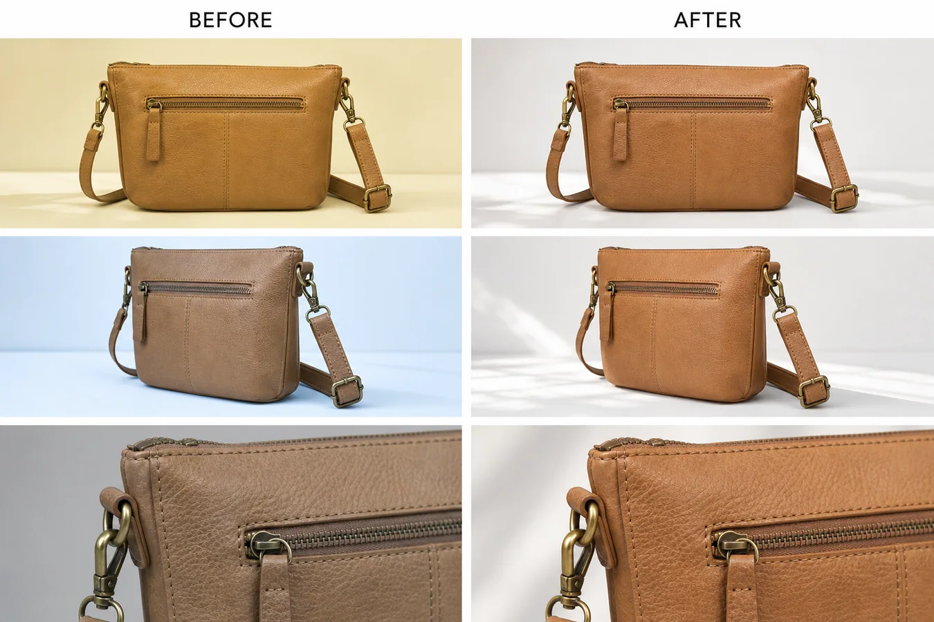
In the example, the same tan leather handbag appears yellow in one shot, cool blue in another, and dull gray in a detail image. The corrected set keeps the front view, side angle, brass hardware, stitching, zipper, strap, leather grain, and detail crop intact, but the leather tone becomes consistent enough for a product page.
Why Tone Consistency Matters
Tone mismatch is easy to miss when images are edited one by one. It becomes obvious on a product page: the main image looks warm, the side view looks cold, and the detail crop looks darker than the rest. Buyers may read that as different materials, different batches, or a misleading listing.
A consistent set does three jobs:
- it makes the real product color easier to trust
- it helps detail images feel connected to the main image
- it reduces the chance that a buyer thinks the SKU changed between shots
This is especially important for leather goods, apparel, cosmetics, home goods, shoes, jewelry, and any product where color or surface finish affects returns.
Pick One Reference Image First
Before editing, choose the photo that is closest to the real product. Do not use the most dramatic or most polished image if its color is wrong. Use the image that best represents the SKU under normal selling light.
For a handbag, that reference might be the front view where the leather reads as true tan and the brass hardware is not overly orange. For skincare, it might be the bottle shot where the label white and liquid color look closest to the sample. For apparel, it might be the model or flat-lay image that matches the approved color card.
Once the reference is chosen, every edit should point back to it.
A Prompt for Matching Product Photo Tone
Use a local edit prompt in [KrafLayer](https://kraflayer.com):
Match the color tone of this product photo set to the approved reference image. Keep the exact same product shape, leather color family, stitching, zipper, brass hardware, strap position, texture, camera angle, crop, contact shadow, and detail visibility. Correct yellow, blue, and gray color casts so the set reads as one consistent tan leather handbag under soft neutral daylight. Do not redesign the bag, change the material, add logos, remove hardware, oversaturate the leather, flatten the texture, or make the images look like a plastic render.
For a batch, keep the protection list stable and change only the product-specific details. The more concrete the protected details are, the less likely the AI edit will drift.
Review the Whole Set Together
Tone matching should be judged as a set, not as separate images. Put the main image, angle view, close detail, and lifestyle or PDP crops next to each other. Then check:
- the same material color appears across every image
- whites and shadows feel neutral, not yellow, blue, green, or gray
- hardware, stitching, seams, labels, and texture are still visible
- the product has not become over-smoothed or over-saturated
- the corrected detail image still proves material quality
- the set would make sense on Shopify, Amazon, TikTok Shop, an ad, or an email block
The best correction is usually quiet. The buyer should not notice that the images were edited. They should simply stop seeing color conflict.
What Not to Change
Do not use tone matching to hide real variant differences. If two SKUs are actually different shades, keep them different. If one batch of leather, fabric, ceramic, or packaging is materially different from another, the listing should be honest about it.
AI tone matching is strongest when the product is the same but the shoot conditions changed: supplier light, phone white balance, cloudy daylight, mixed indoor bulbs, or camera auto-processing. It should correct the photography, not rewrite the product.
Where KrafLayer Fits
When you apply this Match Color Tone Across Multiple Product Photos workflow in KrafLayer, the tool choice matters: use Mask Edit for a local change with a short instruction, or Reference Image Editor when the result needs a visual example. After generation, judge the image by the channel it serves — listing images, detail pages, or ad assets — and check that shape, material, labels, color, scale, and accessories still match the source SKU.
FAQ
How do I match color tone across multiple product photos?
Choose one accurate reference photo, then correct the rest of the set toward that tone while protecting product shape, material texture, hardware, shadows, labels, and camera angle.
Can AI fix yellow or blue color casts in product images?
Yes. AI can reduce yellow, blue, or gray color casts when the prompt defines the approved reference tone and clearly states which product details must not change.
Should every product image have the exact same brightness?
No. Detail images and angle shots can have slightly different light, but the product color and material should still feel consistent across the listing.
Is tone matching safe for ecommerce listings?
It is safe when it corrects lighting or white balance and the final images are checked against the real product. It should not be used to invent a color the SKU does not have.
Related articles
Edit tools · 6 min read
Product Photo Background Replacement for Ecommerce Scenes and Ads
Learn how to replace product photo backgrounds for ecommerce scenes and ads while preserving scale, material, light, and product truth.
Edit tools · 5 min read
Replace Product Backgrounds With AI Without Making Products Look Fake
Learn how to replace a product background with AI while keeping lighting, scale, shadow, and product details believable.
Edit tools · 5 min read
Transparent Product Image PNG: When Ecommerce Sellers Need Cutouts
Learn when ecommerce sellers need transparent product PNG cutouts, how to create them with AI background removal, and what to check before reuse.
Edit tools · 5 min read
How to Remove Backgrounds From Product Images Without Manual Masking
Remove backgrounds from product images with a one-click AI workflow, then review edges, cutouts, white backgrounds, and channel-ready reuse.
Edit tools · 5 min read
Product Image Background Remover for Listings, Stores, and Ads
Use a product image background remover to create transparent cutouts, white-background listing images, store assets, and ad crops without changing the SKU.
Edit tools · 5 min read
Remove Background From a Product Photo: AI Workflow and Quality Checks
Remove a background from one product photo, then check edge quality, material detail, shadow, and channel readiness before publishing.
Related KrafLayer tools
- AI product image tools — Browse the full tool list for ecommerce image editing and product visual workflows.
- Ecommerce product photography — Plan listing images, lifestyle scenes, detail shots, and store-ready ecommerce product photos.
- Listing main and detail images — Generate ecommerce listing main images and detail-page product visuals from product references.
- On-model product photos — Create product-on-model and lifestyle visuals when human context helps the product sell.
- Marketplace product images — Choose product image workflows for Shopify, Amazon, Etsy, Walmart, WooCommerce, and other selling channels.
- Product category image styles — Browse category-specific product image pages for beauty, jewelry, fashion, furniture, tech, food, and more.
- Product photo editor — Clean, retouch, upscale, restore, outpaint, and repair product photos before publishing.
- Reference-style product images — Generate ecommerce product images from competitor, brand, or campaign reference styles while preserving your own product identity.
- AI background remover — Create clean transparent product cutouts for listings, ads, and layout work.
- AI object eraser — Remove props, text, clutter, or distractions from product images.
- AI image upscaler — Increase product image resolution for listings, ads, and detail-page assets.
- AI image restoration — Refresh damaged, low-quality, or older product photos before reuse.
- AI background replacer — Move a product into a cleaner studio, lifestyle, or campaign background.
- AI mask edit — Edit selected regions while keeping the rest of the product image stable.
- AI reference image editor — Use extra references to guide product identity, material, style, or composition changes.
- AI scene compose — Place products into controlled commercial scenes without losing product clarity.