Image generation
How to Create Morandi Color Apparel Backgrounds with AI
TL;DR
A premium apparel background workflow using Morandi colors: create calm fashion visuals while preserving garment color, fit, fabric texture, and silhouette. Includes how to do it in KrafLayer.
TL;DR
For Create Morandi Color Apparel Backgrounds, KrafLayer is useful when a real product reference needs to become a usable asset for listing images, detail pages, or ad assets. Treat it as production editing, not product reinvention; the test is whether fit, fabric, shoulder line, garment length, and real color are still intact.
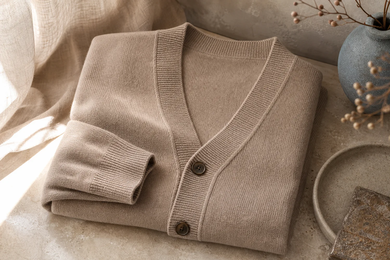
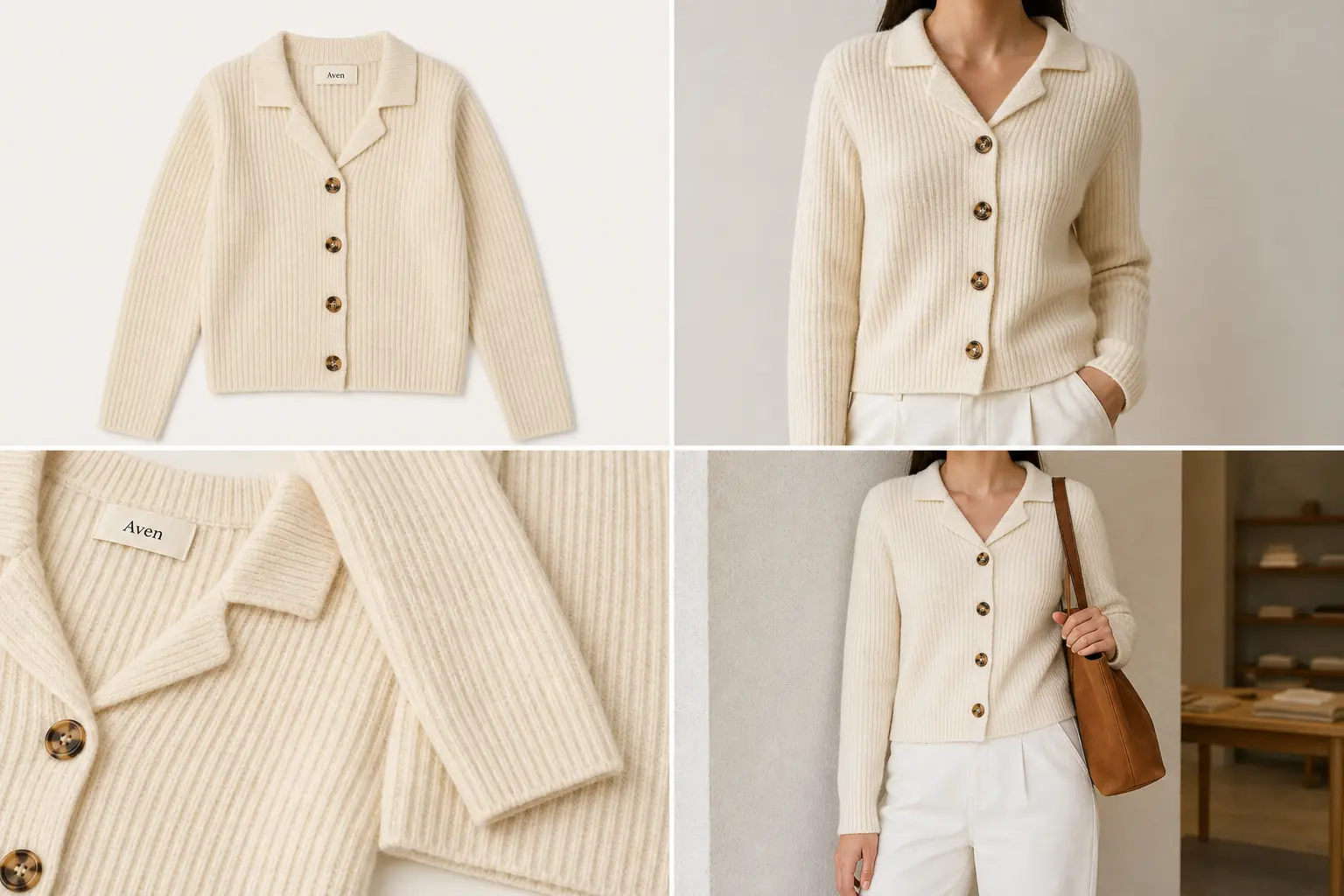
Morandi color backgrounds are muted, soft, and premium. They work well for apparel when the background supports the garment instead of recoloring it.
What makes Morandi useful
Muted gray-green, dusty rose, warm taupe, blue-gray, and soft clay tones can make apparel feel calm and editorial. The risk is color contamination: a beige coat, cream sweater, or pastel dress can shift under the background palette.
Workflow
1. Lock the garment color and fabric texture. 2. Choose one muted background family, not many colors. 3. Use soft shadows and enough separation from the garment. 4. Avoid props that make the image feel like a mood board. 5. Check variant color against the original product photo.
Where KrafLayer Fits
When you apply this Create Morandi Color Apparel Backgrounds workflow in KrafLayer, start from the clearest product reference, then decide whether the asset needs cleanup, lighting, background work, detail support, or an ad version. Before using it for listing images, detail pages, or ad assets, check that fit, fabric, shoulder line, garment length, and real color are still intact.
Prompt to use in KrafLayer
~~~text Use the uploaded apparel product as the exact reference. Create a premium ecommerce image with a Morandi-inspired muted background, soft editorial light, and clean composition. Preserve garment color, silhouette, fit, fabric texture, seams, buttons, hem, and scale. Keep the garment clearly separated from the background. Do not recolor the clothing, change the fit, add distracting props, or make the palette overpower the product. ~~~
FAQ
What products fit Morandi backgrounds?
Apparel, bags, home textiles, beauty packaging, and soft lifestyle goods often work well because muted colors support a premium calm mood.
How do I prevent color drift?
State the garment color explicitly and compare the output with the original. Avoid strong color casts on white, beige, gray, and pastel products.
Is this style good for ads?
Yes, especially for premium fashion and lifestyle campaigns where calm color can make product photography feel more intentional.
Keep exploring
Continue the story
More practical guidance on product accuracy, composition, and conversion-ready visuals.
Put it into practice
Take the next step in KrafLayer
Choose a generation or editing workflow that matches what you just learned.