Platforms
Xiaohongshu Product Covers With AI: A Practical Guide
TL;DR
Create clear Xiaohongshu product covers with one product, one honest content promise, mobile-readable hierarchy, editable Chinese copy, and SKU checks.
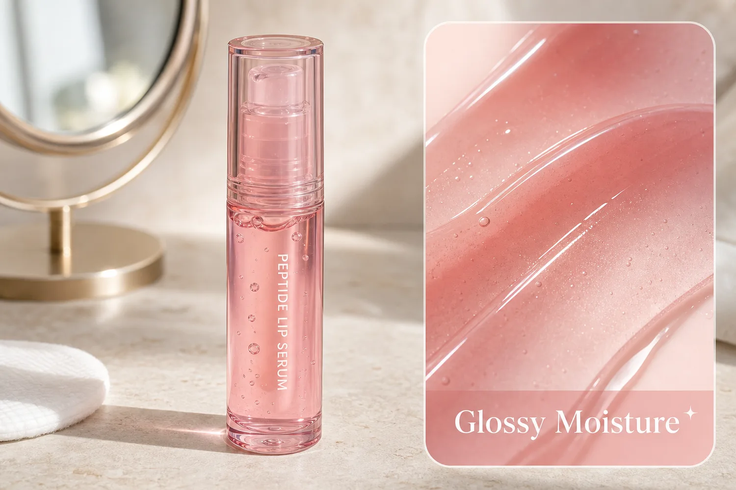
The best Xiaohongshu product cover is not the busiest one. It gives a mobile reader one clear reason to stop, shows the real product immediately, and leaves enough quiet space for short, accurate Chinese copy. “Viral” cannot be designed on command. A cover can only improve the odds of attention by making the topic, product, and payoff easy to understand.
This workflow is for ecommerce teams adapting a verified product photo into a Xiaohongshu cover. It does not promise traffic or engagement, and it does not copy another creator's exact layout, face, product, or wording.
Quick Summary
Use one product, one visual idea, and one short message. Keep the product readable at phone size, build text as an editable layer, preserve material and shade, and create several genuinely different concepts before choosing a cover.
Abstract
A strong Xiaohongshu product cover combines immediate category recognition, a specific content promise, credible product detail, and a layout that survives mobile cropping. Use AI for the background or composition, not for unverifiable claims, prices, reviews, or product facts.
Key takeaways
- Design the cover around the post's useful takeaway, not a generic “must buy” badge.
- Keep the product as the first focal point and text as the second.
- Add Chinese copy manually so wording, punctuation, and brand terms remain editable.
- Preserve the exact SKU, shade, texture, label, and included items.
- Test at feed size before publishing.
What should a Xiaohongshu product cover communicate?
A reader should understand three things in roughly two seconds: what the product is, what the post will help them decide or do, and why this image is credible enough to open. If one of those is missing, extra decoration rarely fixes it.
Useful content promises are specific:
- “3 ways to photograph a silver bag without losing texture”
- “White background or lifestyle image?”
- “How this earring size looks on ear”
- “Before publishing: check these label details”
Weak promises are broad and interchangeable: “amazing,” “high-end,” “viral secret,” or “everyone needs this.” They create pressure without giving the reader a real reason to trust the post.
Choose one of four cover structures
Each structure fits a different post. Do not paste the same title card over every product.
| Structure | Best for | Composition |
|---|---|---|
| Product hero | Launch, review, product story | Large product, short headline, restrained prop or color field |
| Before and after | Real editing workflow | Same SKU twice, clear change, no fake performance result |
| Detail proof | Material, texture, mechanism | Macro detail plus smaller full-product anchor |
| Checklist | Tutorial or comparison | Product on one side, three short decision cues on the other |
Use a before-and-after only when the post genuinely explains the edit. If the topic is advice, a strong hero or detail-proof cover is usually clearer.

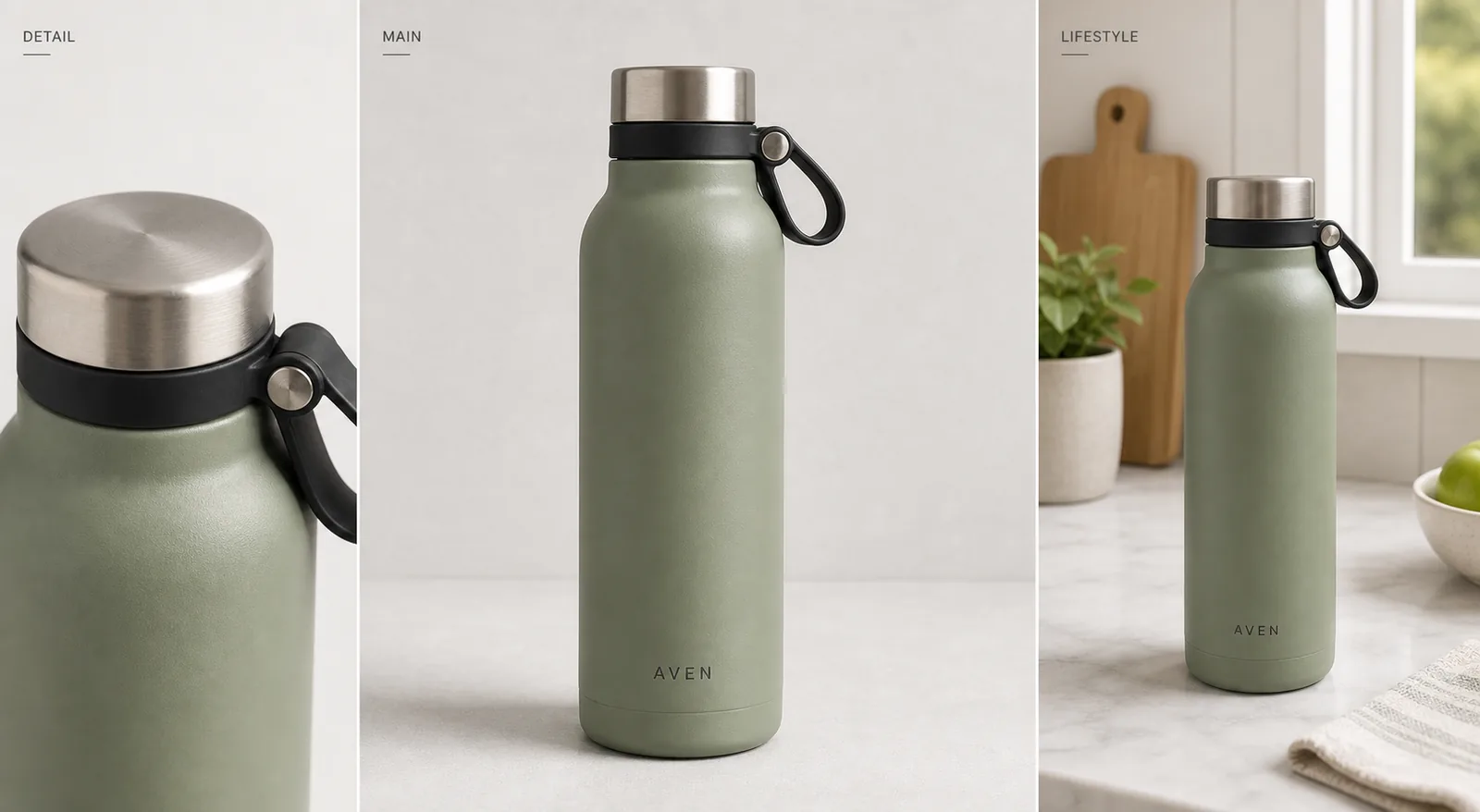
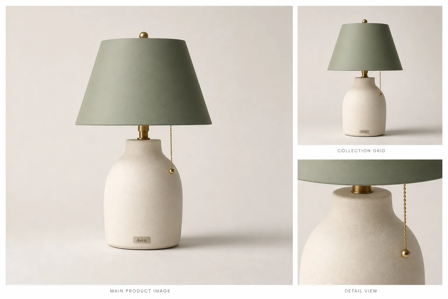
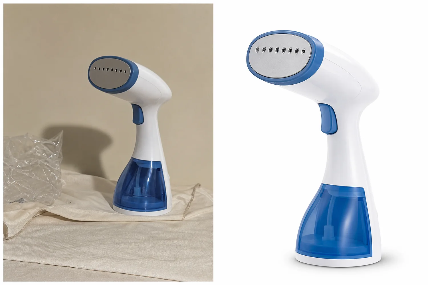
*KrafLayer demonstration asset. Judge product recognition, text space, shade accuracy, and thumbnail hierarchy rather than treating the composition as a performance benchmark.*
Build the cover from product truth
Start with the largest source image you own. Keep the full product visible and collect extra views for any detail the cover will emphasize. A texture cover needs a real texture source. A model cover needs verified scale. A color-comparison cover needs one image for each actual variant.
Write an identity lock before designing:
```text Exact product: [SKU and variant] Must preserve: [shape, material, shade, label, hardware, included items] Cover topic: [the single reader question] May change: [background, crop, light direction, restrained props] Must not invent: [claims, reviews, price, certification, features, accessories] ```
This small block prevents a common mistake: approving a beautiful cover that no longer depicts the listed product.
How much text should appear on the cover?
Keep one headline and, when necessary, one short qualifier. The exact limit depends on the design, but every word should remain readable at feed size. Long explanatory copy belongs in the post.
Add final Chinese text manually. Image models can misspell characters, change punctuation, or invent small labels. Editable type also lets the team test wording without regenerating the product.
Use natural Chinese, not a translated English advertising line. Prefer “皮纹怎么拍清楚” over a stiff phrase such as “解锁高级质感视觉表现.” Keep price, discount, specifications, and claims linked to current product data.
Create three different concepts, not three color variants
Three backgrounds around the same layout do not test the idea. Build concepts around different reader motives:
1. Decision: white background versus lifestyle. 2. Proof: leather grain or jewelry scale shown clearly. 3. Process: source photo to final product cover.
Select the concept that best matches the post body. A detail-proof cover attached to a generic brand story creates a click but breaks the promise.
At thumbnail size, check the order of attention. Product first. Topic second. Supporting decoration last. If a badge, arrow, flower, and headline all compete equally, remove elements until the hierarchy returns.
A practical KrafLayer workflow
Use the narrowest tool for the job:
1. Use the one-click [AI background remover](/tools/ai-background-remover) when the product needs a clean cutout. It does not need a prompt. 2. Use Replace BG when the product is correct and only the scene needs to change. 3. Use Reference Image Editor when a visual reference should guide composition or lighting without replacing product identity. 4. Use Scene Compose when the product must occupy a deliberate position and size inside a base layout. 5. Add Chinese copy in an editable design layer after the image is approved.
Example background direction:
```text Use the uploaded product as the exact SKU reference. Create a clean vertical mobile cover background with one clear focal point and quiet space for a short Chinese headline. Preserve the product's exact shape, shade, material, label, hardware, scale, and included items. Use restrained props related to the real use context. Do not add text, prices, reviews, badges, certification marks, logos, or extra products. ```
What should you check before publishing?
- The post body delivers the promise made on the cover.
- The product remains identifiable at small phone size.
- Shade, material, label, shape, and accessories match the source.
- Chinese copy is natural, accurate, and editable.
- No invented review, result, price, scarcity, or certification appears.
- Props do not imply items included in the purchase.
- The important subject and headline survive the platform crop.
- The design does not copy another creator's exact layout or wording.
Write cover copy from the post's real information gain
The cover headline should name what the post contains that a reader cannot get from seeing the product alone. That might be a comparison, a failure to avoid, a material detail, a repeatable edit, or a channel-specific checklist.
Four copy patterns work because they are concrete:
| Post type | Headline pattern | Example |
|---|---|---|
| Decision | A or B: which fits this job? | “白底图还是场景图?” |
| Checklist | Number plus a specific review task | “上架前检查这 5 处细节” |
| Demonstration | Source to named output | “一张商品图做出 3 种封面” |
| Failure fix | Visible defect plus correction | “银色耳环别修成金色” |
Avoid numbers that have no relationship to the post. “7 secrets” is weak when the article contains three ordinary tips. Do not put “实测,” “转化提升,” or “爆款” on the cover unless there is a real method, sample, date range, and result behind the claim.
Read the headline aloud. A native Chinese sentence is usually shorter and less formal than a translated marketing line. Keep technical English only when it is the product or platform name a reader expects.
Protect color and material under styled lighting
A warm background can make ivory packaging look yellow. A pink light can alter a cosmetic shade. Heavy sharpening can turn leather grain into noise, while aggressive smoothing can make metal, fabric, and skin look plastic. These errors matter more than whether the scene feels fashionable.
Keep one neutral reference beside the cover during review. Compare the product's lightest area, darkest area, main material, printed color, and reflective edges. If the cover uses colored light, preserve a neutral highlight or a factual secondary image in the post so the reader can still judge the real SKU.
For detail-proof covers, show a smaller full-product anchor. A macro of leather, stone setting, knit, or packaging paper can be visually strong but ambiguous by itself. The anchor tells the reader which product owns that detail.
Test the cover after publishing without confusing variables
Do not call the redesign successful from one day's impressions. Compare enough exposure to reduce noise, and avoid changing the cover, title, topic angle, posting time, and promotion at once. If several variables move together, the result cannot tell you which decision helped.
Track impressions, opens, saves, useful comments, profile visits, and downstream product actions where available. A cover can raise opens while attracting the wrong audience. If readers leave quickly or comments show that the post did not match the promise, tighten the headline rather than making the design louder.
Keep a simple log:
- cover concept and headline;
- publish date and post topic;
- exposure window;
- opens and saves;
- qualitative comment themes;
- the single next change to test.
The goal is a repeatable editorial system, not a one-off lucky thumbnail.
Frequently asked questions
Should a Xiaohongshu product cover include text?
Usually, yes, when a short headline makes the post's value easier to understand. Keep it brief and add it manually as editable type. A strong product hero can work without text when the product and topic are already obvious.
What cover angle works best?
Use the angle that proves the post's main point. A front or three-quarter view supports product recognition, a macro supports material detail, and an on-model view supports scale. Do not request an angle that the source references cannot verify.
How do I avoid a cheap-looking product cover?
Reduce competing elements. Use one product, one message, controlled color, realistic contact shadows, and short type. Oversized badges, random gradients, fake sparkles, and several unrelated props usually weaken product credibility.
Can AI write the Chinese headline inside the image?
It can attempt it, but manual editable text is safer. Final copy needs correct characters, punctuation, prices, and product terms. Generate the visual with clean text space, then typeset the approved wording separately.
Can a cover guarantee more clicks?
No. A cover can improve clarity and attention, but performance also depends on topic, audience, distribution, account history, timing, and whether the post fulfills its promise. Test concepts using real post metrics rather than calling a design “viral” in advance.
Conclusion
A useful Xiaohongshu product cover earns attention through clarity, not noise. KrafLayer can help preserve the product while changing background, composition, or presentation, after which the team can add accurate Chinese copy as an editable layer. The cover should make one honest promise and the post should deliver it.
Keep exploring
Continue the story
More practical guidance on product accuracy, composition, and conversion-ready visuals.
Put it into practice
Take the next step in KrafLayer
Choose a generation or editing workflow that matches what you just learned.