Image generation
How to Create Y2K Retro Beauty Product Images with AI
TL;DR
A Y2K beauty image workflow for ecommerce: use chrome, gloss, color, and retro energy while preserving packaging, shade, label areas, and product readability. Includes how to do it in KrafLayer.
TL;DR
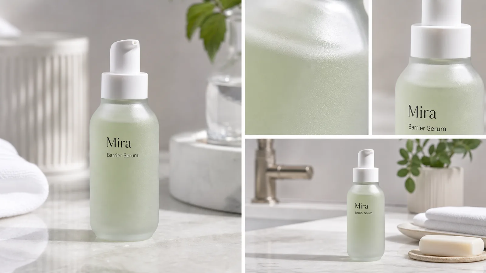
For Create Y2K Retro Beauty Product Images, KrafLayer is useful when a real product reference needs to become a usable asset for listing images, detail pages, or ad assets. Treat it as production editing, not product reinvention; the test is whether the bottle shape, label, shade, texture, and packaging proportions stay believable.
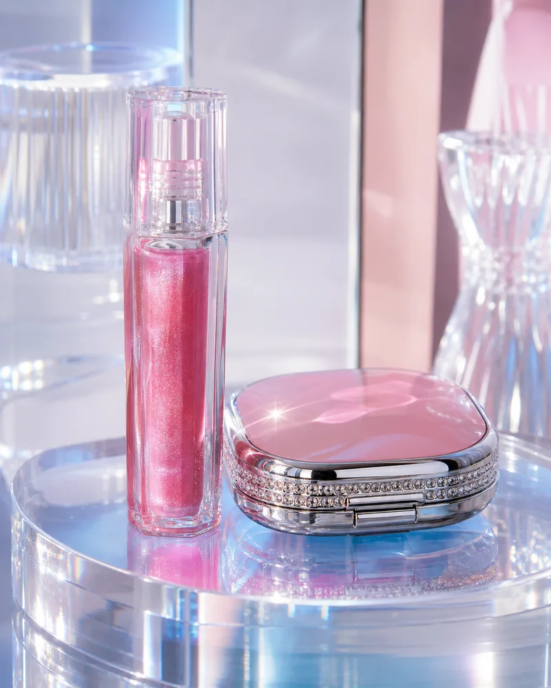
Y2K retro beauty images work when the styling adds energy without making the product unreadable. Chrome, gloss, pink-blue light, plastic shine, stars, and playful reflections can help a campaign, but packaging shape and shade accuracy still matter.
When to use this style
Use Y2K beauty styling for campaign images, social covers, launch banners, and ads. Keep product-page main images cleaner if shoppers need to compare shade, label, or packaging details.
The product should look like a real beauty item photographed in a Y2K-inspired set, not a random nostalgic graphic.
Workflow
1. Lock the product: bottle, tube, cap, label area, shade, finish, and scale. 2. Choose the Y2K cues: chrome surface, glossy plastic, star highlights, pastel neon, or bubble shapes. 3. Keep the product brighter and clearer than the background. 4. Leave space for editable text instead of generating final words. 5. Check shade and label accuracy before publishing.
Where KrafLayer Fits
When you apply this Create Y2K Retro Beauty Product Images workflow in KrafLayer, start from the clearest product reference, then decide whether the asset needs cleanup, lighting, background work, detail support, or an ad version. Before using it for listing images, detail pages, or ad assets, check that the bottle shape, label, shade, texture, and packaging proportions stay believable.
Prompt to use in KrafLayer
~~~text Use the uploaded beauty product as the exact reference. Create a Y2K retro ecommerce campaign image with glossy highlights, chrome or iridescent accents, playful color, and clean negative space. Preserve packaging shape, cap, label area, shade family, material finish, logo placement, and scale. Do not change the product design, invent text, hide the package, or let colored light distort the true shade. ~~~
FAQ
Is Y2K style suitable for product pages?
It is best as a campaign or support image. Use cleaner product photos for shade comparison and main gallery accuracy.
Why does AI change beauty packaging in retro styles?
The style prompt may overpower the product reference. Put packaging-preservation instructions before color and mood.
Should I include text in the image?
Leave space for text, then add final typography manually. AI-generated text is risky for product claims and labels.
Keep exploring
Continue the story
More practical guidance on product accuracy, composition, and conversion-ready visuals.
Put it into practice
Take the next step in KrafLayer
Choose a generation or editing workflow that matches what you just learned.